Introduction:
-----------------------------------------------------------
In the time period of April in 2021 Bitcoin reached its local high of roughly US $65,000 per coin, shortly after when May came along many social channels quickly lit up with the now infamous “Wyckoff Distribution Schematic” (This was one popular video that described it here: www.youtube.com/watch?v=Lhf_2gJJ...), and shortly after BTC came crashing down back to the $30,000 region playing this schematic almost perfectly. I myself was trading Bitcoin using the Wyckoff Method at this time, and I was introduced to a plethora of new traders and investors trying to understand the complicated Wyckoff method, but the fact of the matter was, many were sharing or educating others in incorrect ways to use this method. From this day I took more of an interest in educating others in the Wyckoff Method, and below I am going to pick apart, introduce and help you master some of the key concepts used in this method of analysis.
 Bitcoins Chart March-May 2021
Read more about the Crash in 2021:
www.aljazeera.com/ec...oge-all-plunge-lower
Who is “Wyckoff”?:
-----------------------------------------------------------
Richard Demille Wyckoff (November 2, 1873 – March 7, 1934) was considered one of the five “titans” of technical analysis, along with Dow, Gann, Elliott and Merrill. At age 15, he took a job as a stock runner for a New York brokerage. Afterwards, while still in his 20s, he became the head of his own firm. He also founded and, for nearly two decades wrote, and edited The Magazine of Wall Street, which, at one point, had more than 200,000 subscribers.
Wyckoff was an avid student of the markets, as well as an active tape reader and trader. He observed the market activities and campaigns of the legendary stock operators of his time, including JP Morgan and Jesse Livermore. From his observations and interviews with those big-time traders, Wyckoff codified the best practices of Livermore and others into laws, principles and techniques of trading methodology, money management and mental discipline.
Wyckoff's research claimed many common characteristics among the greatest winning stocks and market campaigners of the time. Wyckoff also has techniques he believed offered advantages when markets were rising or falling (bullish and bearish). Wyckoff offered a detailed analysis of the "trading range", a posited ideal price bracket for buying or selling a stock. One tool that Wyckoff provides is the concept of the Composite Operator, another is Volume based analysis.
Who is the Composite Operator / The Composite Man?:
-----------------------------------------------------------
“…all the fluctuations in the market and in all the various stocks should be studied as if they were the result of one man’s operations. Let us call him the Composite Man, who, in theory, sits behind the scenes and manipulates the stocks to your disadvantage if you do not understand the game as he plays it; and to your great profit if you do understand it.” (The Richard D. Wyckoff Course in Stock Market Science and Technique, section 9, p. 1-2)
Based on his years of observations of the market activities of large operators, Wyckoff taught that:
The Composite Man carefully plans, executes and concludes his campaigns.
-The Composite Man attracts the public to buy a stock (financial asset) in which he has already accumulated a sizable line of shares by making many transactions involving a large number of shares, in effect advertising his stock by creating the appearance of a “broad market.”
-One must study individual stock charts with the purpose of judging the behaviour of the stock and the motives of those large operators who dominate it.
-With study and practice, one can acquire the ability to interpret the motives behind the action that a chart portrays. Wyckoff and his associates believed that if one could understand the market behaviour of the Composite Man, one could identify many trading and investment opportunities early enough to profit from them.
Above excerpt from: school.stockcha...ts.com/doku.php?id=market_...
Many traders and investors who follow the Wyckoff Method treat the Composite man as a real entity, for Cryptocurrency holders this might be seen as a whale who controls the price. Wyckoff himself did not find it necessary to define a importance between the Composite man being an imaginary being, a creation of one's own mind or a real entity, but defined an importance towards “Thinking” like the Composite Man, by thinking like a “Large Operator” we change our Psychology.
But what does this mean?
In the book titled, “The Compound Effect” by Darren Hardy (Founder of Success Magazine) there is a section titled “Find Your Fight” in Chapter 3, in this section Darren describes how hate is often as strong as a motivating force as love, but why is this relevant?
A person who is in love may do crazy things, but so will a person who is consumed by hate, as both are powerfully motivating forces. By creating a “Enemy” (Someone to hate) our mindset changes to a defensive manner, we are now in “Battle” with our Enemy. Here is a quote from the book, which is one of my favourites:
“Contrary to social correctness, it can be good to hate. Hate disease, hate injustice, hate ignorance, hate complacency, and so on. Sometimes identifying an enemy lights your fire.Some of my greatest motivation, determination, and dogged persistence came when I had an enemy to fight. In history, the most transformation stories and political revolutions came about as a result of fighting an enemy. David had Goliath, America had the British. Luke had Darth Vader…”
And as traders; we have The Composite Man…
A great article on the Composite Man can be located here for further education:
www.wyckoffanalytics...08/V32C08822PRUD.pdf
Wyckoff's "Five Step Approach":
-----------------------------------------------------------
The Wyckoff Method involves a five-step approach to stock selection and trade entry, which can be summarized as follows:
1. Determine the present position and probable future trend of the market.
Determine what the current characteristics of the price structure and Supply & Demand are, (are we in a Uptrend, Downtrend or Sideways) by getting a general idea of the Price Structure, Sentiment & Supply and Demand we can determine if we want to be in a long or short trade, or no trade at all, and what the probable future direction of the market may be. Refer to Section “Market Phases & Cycles” below to understand this further.
2. Select stocks in harmony with the trend. In an uptrend, select stocks that are stronger than the market.
By selecting assets moving with the Primary Trend, we are increasing chances of success. (For example, if the dominant asset in Crypto, Bitcoin is on a strong uptrend is it fair to assume that you are going to have more success trying to long other Cryptocurrencies which are highly “correlated” and likely to follow in that direction. Financial Assets that “decorrelate” and show stronger increases during uptrends and smaller decreases on pull backs may be showing signs of being stronger then the market as a whole (long position), for shorts we are looking for Assets that are showing weakness and stronger decreases then the market as a whole.
3. Select stocks with a “cause” that equals or exceeds your minimum objective.
Every action, has a reaction, every cause, has an effect, this statement basically means that if you are going to enter the market and take a position, look for assets that have a rational and reasonable cause for you to reach your target objective. A great example is using Price Target Measurements when trading Chart Patterns, each Chart Pattern is the cause, and the Price Target is the effect. If there is a Cause, but no Effect, then it is a potential sign of weakness. Please see “Wyckoff Laws” below for more information.
4. Determine the stocks' readiness to move.
Use a pre determined system to determine how close assets are to entering the Mark Up or Mark Down Phases. Find the right system to see when a asset is about to Uptrend or Downtrend. Use the 9 Buying & Selling tests, aswell as the Wyckoff Schematics explained below to understand this concept further.
5. Time your commitment with a turn in the stock market index.
Financial Markets are highly correlated, this means that we want to be timing our investments and trades with the Leading Market Assets or Index’s (A Index is basically a grouping of the Top Stocks or Companies in that Industry, for example, SP500, AU200). Why do we want to time? Lets use Bitcoin as a example. Sometimes Bitcoin is almost correlated to 80-90% of the Stock Market, that means the price moves almost in sync, so by watching the price movements and analyzing the Stock Market we can also get clues on the direction of the asset we are trading. If Bitcoin is moving up, but the Stock Market is heading down, and the correlation is HIGH, we can assume that the upside move may not be likely to continue.
Market Phases & Cycles:
-----------------------------------------------------------
According to Wyckoff, the market can be understood and anticipated through detailed analysis of supply and demand, An idealized schematic of how he conceptualized the large interests' preparation for and execution of bull and bear markets is depicted in the figure above. The time to enter long orders is towards the end of the preparation for a price markup or bull market (accumulation of large lines of stock), while the time to initiate short positions is at the end of the preparation for price markdown. Also note the different Phases of the Market.
Before we continue below, please click on the image below for my basic introduction to Market Phases & Cycles, which is an important topic to have an understanding of before continuing onto Wyckoff Schematics. This is also relevant to understand Cause & Effect mentioned below. Notice how each Cause has an Effect!
To simplify the concept - Markets move in cyclical patterns, with a full cycle usually having Accumulation > Reaccumulation > Distribution >Redistribution, there can also be Micro trends within the cycle. Uptrends (HH, HL), Downtrends (LL, LH) and Sideways movements form the price structures which make up the Phases of the market, which in turn create the Cycles.
Three Laws of Wyckoff
-----------------------------------------------------------
Wyckoff Analysis is fundamentally based off the Three Laws of Wyckoff, which can be found and recognized across many different types of Analysis, the Laws help give insight to our analysis and choice of buying/selling.
1. Supply vs. Demand
---------------------------------
Wyckoff states when demand is greater than supply, prices rise, and when supply is greater than demand, prices fall.
When sellers outweigh the buyers, the market is dominated by Supply, a large supply of an asset to sell, means greater selling pressure and a higher probability of a decrease in price. A sign of Demand (Buying Pressure) is a shortage of Supply, in a Cryptocurrencies case it would mean that the demand of buyers on exchanges outweighs the supply available for purchase on exchanges. As the amount up for purchase quickly falls to a low number the greed of participants drives them to want to pay higher prices for an asset.
When buyers outweigh sellers, the latter occurs with a higher probability of increase in prices. A sign of Supply (Selling Pressure) is a shortage of Demand, in a Cryptocurrencies case it would mean that the demand of buyers on exchanges under weighs the supply available, institutional investors and funds hold majority share of the SUPPLY and with no interest in buying from the retail participants we see investors (sometimes impatient or fearful) become sellers in anticipation of there being no increase in price in the short term (relative to their perspective).
Using this secondary chart below, we can clearly see the "Demand (Green)" and "Supply (Red)" areas of Siacoin SC.
We can see that both the Demand & Supply areas are respected and have strong reactions, and with patience we will see if the dominating factor on Siacoin right now is Supply or Demand, but considering some of the points I will go into below so far its looking like it is shifting into the favour of demand currently with a visit to the 0.5 (50%) of the Trading Range. Take note of the small abbreviations at the start of the TR (Trading Range) for now - see Wyckoff Schematics section later.
Other ways to analyze Supply & Demand in Cryptocurrencies are more literal - for example you can literally go onto the Blockchain and see the wallets of coins, how many each holds, what % of the Supply is owned by Siacoin itself, the amount of wallet holders, I will not go into this type of analysis in a detailed manner as it is not my expertise.
2. Effort vs. Result
---------------------------------
Wyckoff states that every effort should lead to a result in the financial markets.
Here is a example of a “Effort Vs Result” in a Trading Range (Parallel Channel) using Volume & Price Analysis (Please Click the Image, for Further Educational Idea)
This statement is applied to our charts by using data on Trading Volume. When we see abnormally large trading volume at key areas on the chart, we can usually expect a continued move in that direction, if the Effort produces no result though, that abnormally large trading volume can give us a sign that the participants betting on the market to move in that direction have not gathered enough momentum to do so (Marked in Light Blue), which leads to them being trapped (Marked in Dark Blue) and then a reverse in the opposite direction in price (Marked in Purple).
Effort Vs Result can also be interpreted in a number of ways, lets analyse the above Siacoin SC chart using this concept:
In the first image, the Trading Range is created, once at the lower range, volume decreased (this was not just a singular occurrence, with the whole Crypto market having similar low volume and "choppiness" but within this low volume area we can see there was two larger red volume bars, these two bars showed us a increase in sellers in this area, (An effort) but no Result (further Decrease on the next candles) this gives us a sign that the sellers may not be the dominant force now (A “Divergence) leading us to test the previous dominant force area above as supply.
This then led us to test the upper Trading Range, where the exactly same thing happened in the opposite.
In the 3rd image, we can finally see that the effort of the buyers is now leading to zero result, the trading range is starting to drag out and the volume of sellers is dropping off, in a REAL breakout the volume should continue to increase with the prices. We can see below that never happens here. As the images progress the Supply is obviously Dominant.
This leads us to the current chart, where we can see that now the sellers are losing momentum and the buyers have just stepped in. (See the volume?)
In the current trading range on SC (Siacoin) we can see quite a lot of abnormally large green bars at the upper range, this shows us that even though a large amount of buyers did in fact come into play here, the upper ranges dominant force was the Supply, and prices then headed towards the lower range.We are now in the process of “Testing” that lower range for Demand. So far the circled Red Bars (in the First chart, the original chart of this post) show us the sellers may be trapped locally.
3. Cause vs. Effect
---------------------------------
Wyckoff states that every cause in the market leads to a proportional effect.
The market has phases, such as Accumulation, Reaccumulation, Distribution and Redistribution. Each phase should have a "Effect" to match the cause, Accumulation has a Markup, aswell as Reaccumulation, And Distribution and Redistribution are followed by a Mark Down. The phase is the cause, the mark up is the effect.
Click on this link for a quick infographic on the Market Phases (Consider each phase as a Cause) which then should have an Effect (Mark Up or Mark Down Phase), this creates the “Market Cycle” and all markets move in cycles: ibb.co/vQYKz5G
This is similar to how a Bull Flag has a target measurement (Mark Up) and a Bear Flag has a target measurement for the downside (Mark Down). For more information on Flag Patterns click the below image, notice on the bottom right picture how the Flag has a measurement which is represented by a extended line, the previous line and the Flag is the Cause, the extended line pointing upwards is the Effect in this case:
In this case, if we see a breakout to the upside of this current trading range on SC Siacoin (the Cause) we can assume the Effect will be a strong breakout above the range leading to Mark Up Phase, otherwise the Cause has no Effect, in this situation meaning the range might fail and break downwards.
This is similar in a way to Effort vs Result explained earlier, For every Effort, there should be a Result, for every Cause, there should be an effect.
Wyckoff Schematics
-----------------------------------------------------------
A trading range (Sideways Movement, Zig Zag) shows us an equilibrium between buyers and sellers, and the Wyckoff Theory & Schematics give us clues to which probable direction the price may head out of the horizontal moving price structure.
Each Trading Range can be an important Phase in the larger Market Cycle, giving us potential clues and hints within the overall trend.
The Wyckoff Schematics help us identify the different between Accumulation and Distribution Trading Ranges (Or Reaccumulation or Redistribution) - In a Trading Range the price Zig Zags up and down until eventually a breakout occurs, using the Wyckoff Accumulation Schematic we can see there are some clues in the similarities of the chart and the schematic that tell us Siacoin may be ready to at least test of the upper bounds of the Trading Range.
It is important to note that most Trading Ranges start with obvious characteristics, which we will delve into further below, the first characteristics of the Trading Range (TR) help us identify that we are now moving in a sideways trend:
When paired with the Wyckoff 9 Buying and Selling Tests - the Wyckoff Schematics are a great tool to help measure potential entries, exits, risk and to read the price movement in general.
There are four types: Accumulation, Reaccumulation, Distribution & Redistribution.
And each Trading Range is Analysed in 5 key phases:
By splitting our Schematics into 5 key phases, the characteristics become easier to recognize and identify.Remember this when moving forward in this section.
Phase A: The trading range (TR) is created (example above)
Phase B: The Supply & Demand of the TR is tested
Phase C: Deviation outside TR or Final point before reversal
Phase D: The new trend begins
Phase E: The trend continues
In phase D & E, the obvious “Change of Trend” is evident, refer to this infographic below and you can see how a trend contains Higher Highs, Higher Lows (HH, HL) or Lower Lows, Lower Highs (LL, LH); we will come back to this soon:
1. Accumulation:
---------------------------------
In accumulation, the shares purchased outnumber those sold.
There are roughly 9 characteristics of an Accumulation Range:
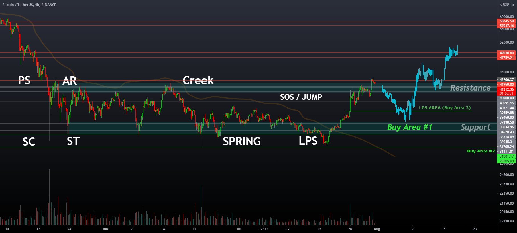
1. PS (Preliminary Support) the first Support area that was lost, creating the upper bound of the TR.
2. SC (Selling Climax) the climactic action that is bought up quickly creating the lower bound of the TR. It is a strong example of Effort vs Result usually, with abnormally large selling volume, but no further downside.
3. AR (Automatic Rally) a low volume, quick reaction visiting the other side of the TR, usually indicating short covering.
4. ST (Secondary Test) a secondary test of the initial Demand Area created by the SC.
5. Spring (Fake Out) & Test or LPS (Last point of Support). Spring is usually a great example of Effort vs Result. Spring is then confirmed by a test of Support. LPS (Last Point of Support) occurs when price revisits the recent Demand (Support) area, usually a former Resistance. The term may be used in a plural manner, with multiple LPS forming the Higher Lows that make up the basis of a market trend.
6. JAC (Jump Across the Creek) the Creek is an imaginary line created by the previous downtrend (similar to a Moving Average), we want to see the price “Jump” across the creek.
7. LPS (Last Point of Support) occurs when price revisits the recent Demand (Support) area, usually a former Resistance. The term may be used in a plural manner, with multiple LPS forming the Higher Lows that make up the basis of a market trend.
8. SOS (Sign of Strength) is an abnormally large volume signature upwards price movement which confirms the Spring or LPS.
9. BU/LPS (Back Up / Last Point of Support) occurs when price revisits the recent Demand (Support) area, usually a former Resistance. The term may be used in a plural manner.The SOS & LPS together form the Basis of a Uptrend, see this image for reference: ibb.co/wdrWGmp . The final LPS before leaving the Trading Range should start the Uptrend.The LPS can sometimes move to the 50% of the Trading Range.
We should then enter the Mark Up phase as described at the start of this article. Remember; Accumulation is the Cause, Markup is the Effect.
Examples & Links:
Accumulation Schematic #1:
school.stockcha...b/exe/fetch.php?media=mark...
In this schematic, the Spring is located in the end of the TR, showing trapped sellers.
Accumulation Schematic #2:
school.stockcha...b/exe/fetch.php?media=mark...
In this schematic, there is no Spring action, instead the price starts moving upwards from the LPS Area (Last Point of Support), the Spring (in this case, ST) is located at the middle of the TR, showing trapped buyers.
Example of Accumulation #1 Analysis (Click image, press play to see the result!):
Example of Accumulation #2 Analysis:
2. Reaccumulation:
---------------------------------
After Accumulation, comes Reaccumulation. Where after a extended upside move, a repeated sideways movement occurs which leads to another extended upside move.
ReAccumulation is known also as a Trend Continuation.
The characteristics are almost identical to Accumulation, except the previous price movement leading up to the trading range is upwards:
Here are the characteristics explained :
1. PS (Preliminary Supply) the first selling area creating the Trading Range.
2. BC (Buying Climax) the climactic action that is sold up quickly creating the upper bound of the TR. It is a strong example of Effort vs Result usually, with abnormally large buying volume, but no further upside.
3. Shakeout (Fake Out to the downside trapping sellers) (I have marked this as SC, to simplify the process as a Shakeout is quite similar in its characteristic.
4. AR (Automatic Rally) a low volume, quick reaction visiting the other side of the TR, usually indicating short covering.
5. ST Area (Secondary Test Area) a secondary test of the initial Demand Area created by the Shakeout.
6. Spring (Fake Out) or LPS (Last point of Support) A Spring occurs when price falls underneath the Trading Range, triggering stop losses and usually inducing investors to Panic Sell, (this is the most profitable area to buy). Spring is then confirmed by a test of Support. Spring is usually a great example of Effort vs Result. LPS (Last Point of Support) occurs when price revisits the recent Demand (Support) area, usually a former Resistance. The term may be used in a plural manner, with multiple LPS forming the Higher Lows that make up the basis of a market trend.
7. JAC (Jump Across the Creek) is when the price “Jumps” across the Trading Range, giving us a final clue before the breakout occurs. The “Creek” is an imaginary line formed from the projected path of the previous price swing highs, this can be used similar to a Moving Average.
8. SOS (Sign of Strength) is an abnormally large volume signature upwards price movement which confirms the Spring or LPS.
9. LPS (Last Point of Support) occurs when price revisits the recent Demand (Support) area, usually a former Resistance. The term may be used in a plural manner.The SOS & LPS together form the Basis of a Uptrend, see this image for reference: ibb.co/wdrWGmp . The final LPS before leaving the Trading Range should start the Uptrend.The LPS can sometimes move to the 50% of the Trading Range.
We should then enter the Mark Up phase as described at the start of this article. Reaccumulation = Cause, Mark Up = Effect
Examples & Links:
It is important to note that Reaccumulation can appear as Accumulation, in the image below we can see that MANAUSDT looked like Accumulation Schematic #2, yet was actually Reaccumulation due to the previous uptrend.
And in this example Reaccumulation looked exactly like Schematic #1 of Accumulation!
Reaccumulation Schematic #1:
ibb.co/kQWpZvt
In this schematic, the Spring is located at the end of the TR, showing trapped sellers.
Reaccumulation Schematic #2:
ibb.co/DWrnsvx
In this schematic, the ST (or Spring) is located at the middle of the TR, showing trapped buyers.
Traditional Reaccumulation Schematics:
ibb.co/kS3Qtkp
(Credit: Roman Bogomazov / www.wyckoffanalytics.com/)
Example of Traditional Reaccumulation #2 Analysis: (Press Play!):
3. Distribution:
---------------------------------
Above we learnt that in accumulation, the shares purchased outnumber those sold while, in distribution, the opposite is true. The shares sold outnumber those purchased.
In a Distribution Trading Range two of the key characteristics are the UTAD/UT (Upwards Thrust / Upwards Thrust & Distribution) above the Trading Range, and the SoW's Signs Of Weaknesses with strong volume at the bottom end of the range. The start of the trading range should be easily identified by a BC (Buying Climax). The extent of accumulation or distribution determines the cause that unfolds in the subsequent move out of the TR .
There are roughly 9 characteristics of an Distribution Range:
1. PS (Preliminary Supply) is the first selling area creating the Trading Range.
2. BC (Buying Climax) is the climactic action that is sold up quickly creating the upper bound of the TR. It is a strong example of Effort vs Result usually, with abnormally large buying volume, but no further upside.
3. AR (Automatic Rally) is a low volume, quick reaction visiting the other side of the TR, usually indicating long covering.
4. ST (Secondary Test) a secondary test of the initial Supply Area created by the BC.
5. SOW (Sign of Weakness) are strong moves to the lower bounds of the Trading Range (or Underneath) with strong volume signature.
6. UT or UTAD (Upwards Thrust) in a UT (Upwards Thrust) a significant amount of buyers enter the market, “Buying the Breakout”, but their Effort, leads to no Result and this variation of a “Bull Trap” is the most significant characteristic of the Distribution TR. A UTAD (Upwards Thrust and Distribution) forms within the middle or end of the Trading Range; there is an obvious lack of Result vs Effort, with abnormally large buying volume signature, yet price fails to get back above this area again. It can look similar to a miniature Trading Range (Distribution).
7. UTAD or LPSY (Last Point of Supply) In Schematic #1 we have the UTAD at the end, in Schematic #2 we have it in the middle (simplified). If the /UT is found in the middle then we are looking for the LPSY to confirm the Resistance, when price revisits the initial Supply area created at the start of the Trading Range, and then successfully decreases from that area.
8. SOW (Sign of Weakness, Fall under the Ice) just like how in Accumulation we Jump Across the creek, in Distribution we do the latter and Fall Under the Ice. SOW (Sign of Weakness) are strong moves to the lower bounds of the Trading Range (or Underneath) with strong volume signature.
9. LPSY (Last Point of Supply) instead of revisiting the initial Supply area created at the start of the Trading Range, in LPSY (Last Point of Supply) revisits the recent Supply (Resistance) area, usually a former Support. The term may be used in a plural manner, with multiple LPSY forming the Lower Highs (LH’s) that make up the basis of a market trend.
We should then enter the Mark Down phase as described at the start of this article. Distribution is the Cause, and Mark Down is the Effect.
Examples & Links:
Distribution Schematic #1:
school.stockcha...b/exe/fetch.php?media=mark...
In this schematic, the UTAD is located at the end of the TR, showing trapped buyers.
Distribution Schematic #2:
school.stockcha...b/exe/fetch.php?media=mark...
In this schematic, the UTAD is located in the middle of the TR, showing trapped buyers.
Example of Distribution #1 Analysis (Press Play!):
Example of Distribution # 2 Analysis (Press Play!):
4. Redistribution:
---------------------------------
After Distribution, Comes Redistribution. Where after a extended down move, a repeated sideways movement occurs which leads to another extended downwards move.
Redistribution is also known as a Downtrend Continuation. Redistribution is said to be difficult to analyse, so my general advice is to treat Redistribution as a method to spot an additional Distribution Schematic after a Distribution Schematic and a Mark Down has already occurred previously recently on the chart (Similar to a Bear Flag Pattern after a Distribution).
The characteristics are almost identical to Distribution sometimes, except the previous price movement leading up to the trading range is upwards:
Here are the characteristics explained :
1. PS (Preliminary Support) the first Support area that was lost, creating the upper bound of the TR.
2. SC (Selling Climax) the climactic action that is bought up quickly creating the lower bound of the TR. It is a strong example of Effort vs Result usually, with abnormally large selling volume, but no further downside.
3. AR (Automatic Rally) is a low volume, quick reaction visiting the other side of the TR, usually indicating long covering + (UT/UA Upwards Thrust / Action) The Upwards Action or Upwards Thrust takes out the Supply above the AR area, before heading back down.
4. ST (Secondary Test) a secondary test of the initial Demand Area created by the SC.
5. UT or UTAD (Upwards Thrust, or Upwards Thrust And Distribution), in a UT (Upwards Thrust) a significant amount of buyers enter the market, “Buying the Breakout”, but their Effort, leads to no Result and this variation of a “Bull Trap” is the most significant characteristic of the Distribution TR. A UTAD is basically a UT (Upwards Thrust) with a Distribution also (miniature Bearish Trading Range) that usually forms within the middle or end of the TR.
6. LPSY + Test (Last Point of Supply) is when price revisits the initial Supply area created at the start of the Trading Range, and then successfully decreases from that area, the test confirmed by tapping the upper Supply Area before heading into the TR again.
7. SOW (Sign of Weakness) *sometimes* with a potential UTAD (Upwards Thrust and Distribution): Signs of Weakness are strong moves to the lower bounds of the Trading Range (or Underneath) with strong volume signature.
8. SOW (Sign of Weakness, Fall under the Ice) just like how in Accumulation we Jump Across the creek, in Distribution we do the latter and Fall Under the Ice.
9. LPSY (Last Point of Supply) instead of revisiting the initial Supply area created at the start of the Trading Range, in this LPSY we are visiting the Supply area created near the bottom of the Trading Range.
We should then enter the Mark Down phase as described at the start of this article. Redistribution is the Cause, Mark Down is the Effect.
Examples & Links:
It is important to note that Redistribution can appear as Distribution just like Accumulation as Reaccumulation as mentioned earlier, here is a example on ETHUSDT:
Redistribution Schematic #1:
ibb.co/J2TRbFb
In this schematic, the UTAD is located at the end of the TR, showing trapped buyers.
Redistribution Schematic #2:
ibb.co/jWCrPkk
In this schematic, the UTAD is located in the middle of the TR, showing trapped buyers.
Example of Redistribution #1 Analysis (Press Play!):
Example of Redistribution #2 Analysis (Press Play!):
5. Failure of Schematic:
---------------------------------
Wyckoff based trades can also fail.
It is also important to note that Wyckoff Schematics are not a guarantee, more so a system for you to analyse the market and know potential lower risk areas to position your trades.
In this example below (Click+Press Play!) we can see that the Accumulation on BATUSDT did have a strong breakout, but never entered into a correct markup phase and then "failed" when the price came back inside of the TR (Trading Range):
Nine Buying/Selling Tests:
-----------------------------------------------------------
Whereas the three Wyckoff laws provide a big-picture foundation for the Wyckoff method, the nine buying and selling tests are a set of narrower, specific principles to help guide trade entry. These tests help delineate when a trading range is drawing to a close and a new uptrend (markup) or downtrend (markdown) is about to begin.
In the book, by Hank Pruden, named "The Three Skills of Top Trading" , as well as the following article by Jack K Hutson the Nine Buying and Selling Tests of Wyckoff are discussed and outlayed similar to the above image:
These nine tests can be difficult to understand, or even apply to your charts, so I have summarised them and modernised these tests for a purely candlestick chart and simplified point of view.
Alot of analysts beforehand made use of P&F (Point & Figure Charts). At the top of your Tradingview chart, you can see a small icon, if you click it you can see the different types of charts available, we are currently on Candlesticks, Point & Figure is another option that was used for some Wyckoff Analysis, but in my simplified version we are just using Candlesticks:
ibb.co/vXjPCtv
Here are my simplified Buying & Selling Tests explained with images
1. Buying Tests:
---------------------------------
I am using the chart of ZILUSDT as a example.
Wyckoff Buying Tests for Accumulation (Simplified Version)
1. Downside price target complete or close to complete of any previous Bearish Patterns
(Bear Flag Pattern used for Target Measurement: www.thepatternsite.com/flags.html )
2. PS, SC, and AR/ST on chart (Remember our first chart above, with Supply & Demand? ON the left we can see creation of the trading range with the Selling Climax (SC), Automatic Rally (AR), and Support Test (ST) we also covered this in the chart below (The 2nd below is showing that on ZILUSDT):
3. Bullish Signs (volume or price increases on rallies and diminishes during reactions)
4. Diagonal Resistance Broken
5. Higher lows & 6. Higher highs
7. Asset stronger than the market (more responsive on rallies and more resistant to reactions than the market index or other dominant assets)
8. Base forming (horizontal price line)
(It can resemble a Flat Base Pattern: www.thepatternsite.com/FlatBase.html)
9. Estimated upside profit potential is at least three times the loss if the initial stop-loss were hit (Risk to Reward; 3:1)
We can now see we have completed all 9 Buying Tests:
And for the final images, we can see that ZIL has a massive upside move, moving to the Mark Up phase from our Buying Tests Analysis:
Aswell as starting to complete a larger Accumulation #1 Structure as desribed above.
2. Selling Tests:
---------------------------------
I am using the chart of XTZBTC as a example.
If you missed it above, dont forget to see the original 9 Selling Tests:
ibb.co/g4RtJ0h
Wyckoff Buying Tests for Distribution (Simplified Version)
1. Upside price objective complete of any previous Bullish Patterns on higher timeframes, or close to complete
(Bull Flag Pattern used for Target Measurement: www.thepatternsite.com/flags.html )
2. Bearish Signs (volume decreases on rallies and increases on reactions)
3. Preliminary supply, buying climax (PSY, BC)
We also covered this in the chart below (The 2nd below is showing that on XTZBTC):
4. Asset weaker than the market (more responsive than the market on reactions and sluggish on rallies)
XTZ was a perfect example of Selling Test #4, as you can see it was much weaker than Bitcoin at the time, which was leading the market.
5. Diagonal Support Broken
6. Lower Highs & 7. Lower Lows
8. Crown forming
(It can resemble a ugly Double Top Pattern: www.thepatternsite.com/aadt.html)
9. Estimated downside profit potential is at least three times the loss if the initial stop-loss were hit (Risk to Reward; 3:1), we have now completed all 9 Selling Tests!
And for the final images, we can see that XTZBTC has a massive downside move, moving to the Mark Down phase from our Selling Tests Analysis:
As well as starting to complete a larger Distribution #2 Structure as described above. Refer to your schematics above if your confused.
Conclusion:
-----------------------------------------------------------
Not only does the Wyckoff Method teach the novice Investor/Trader the techniques, foundations and methods needed to analyse the market, it also helps create a system and mindframe towards observing and timing the market, which allows the trader to be much more rationalised and organised in their train of thought as well as much more risk averse.
By using the Wyckoff based analysis on Siacoin we can clearly see this token has potential for more upside, although we do need to be cautious as a significant pullback on Bitcoin could easily “Fail” the “Spring” action of the TR (Trading Range) in the original analysis image above.
What would a successful accumulation breakout look like on Siacoin?
Refer to the original chart at the start of the post. I have made a small drawing, describing the characteristics we need to see for this to progress further. You can use that drawing along with the next below to get a rough idea of what a successful breakout will look like, compare with the Accumulation Schematics you studied above.
What would a failure of accumulation look like on Siacoin?
I will give two examples:
1. Failure of Spring
2. Failure of Phase E (Uptrend)
I hope you enjoyed my explanation of the Wyckoff Method - Thank you and if you found this writeup insightful, educational and informative don't forget to hit Subscribe, Like & Comment so others can also potentially see and benefit from this post, if you wish to see these concepts in action, I recommend visiting my signature as well.
Other Resources & References:
-----------------------------------------------------------
Websites:
Wyckoff Analytics: wyckoffanalytics.com/
Wyckoff SMI: wyckoffsmi.com/
Videos:
Wyckoff Youtube: www.youtube.com/chan...nvMNNeBSRRh1KWuJ_BUQ
Wyckoff SMI Youtube: www.youtube.com/chan...6nOA9sC0GTbaSWi3nBSw
Stockcharts.com Youtube: www.youtube.com/watch?v=w9l9JbtS...
(I didnt cover volume much in this article, check out the above video for a Volume Tutorial)
Articles:
school.stockcha...ts.com/doku.php?id=market_...
school.stockcha...ts.com/doku.php?id=market_...
school.stockcha...ts.com/doku.php?id=market_...
www.wyckoffanalytics...08/V32C08822PRUD.pdf
www.wyckoffanalytics...08/V32C08822PRUD.pdf
Magazine of Wall Street Database:
(Founded by Wyckoff)
shorturl.at/djvG6
Books:
www.amazon.com/kindl...ty/author/B01GNTNM10
www.amazon.com/Three...ition/dp/0470050632/
References:
en.wikipedia.org/wiki/Richard_Wyckoff
school.stockcha...ts.com/doku.php?id=market_...
-----------------------------------------------------------
In the time period of April in 2021 Bitcoin reached its local high of roughly US $65,000 per coin, shortly after when May came along many social channels quickly lit up with the now infamous “Wyckoff Distribution Schematic” (This was one popular video that described it here: www.youtube.com/watch?v=Lhf_2gJJ...), and shortly after BTC came crashing down back to the $30,000 region playing this schematic almost perfectly. I myself was trading Bitcoin using the Wyckoff Method at this time, and I was introduced to a plethora of new traders and investors trying to understand the complicated Wyckoff method, but the fact of the matter was, many were sharing or educating others in incorrect ways to use this method. From this day I took more of an interest in educating others in the Wyckoff Method, and below I am going to pick apart, introduce and help you master some of the key concepts used in this method of analysis.
Read more about the Crash in 2021:
www.aljazeera.com/ec...oge-all-plunge-lower
Who is “Wyckoff”?:
-----------------------------------------------------------
Richard Demille Wyckoff (November 2, 1873 – March 7, 1934) was considered one of the five “titans” of technical analysis, along with Dow, Gann, Elliott and Merrill. At age 15, he took a job as a stock runner for a New York brokerage. Afterwards, while still in his 20s, he became the head of his own firm. He also founded and, for nearly two decades wrote, and edited The Magazine of Wall Street, which, at one point, had more than 200,000 subscribers.
Wyckoff was an avid student of the markets, as well as an active tape reader and trader. He observed the market activities and campaigns of the legendary stock operators of his time, including JP Morgan and Jesse Livermore. From his observations and interviews with those big-time traders, Wyckoff codified the best practices of Livermore and others into laws, principles and techniques of trading methodology, money management and mental discipline.
Wyckoff's research claimed many common characteristics among the greatest winning stocks and market campaigners of the time. Wyckoff also has techniques he believed offered advantages when markets were rising or falling (bullish and bearish). Wyckoff offered a detailed analysis of the "trading range", a posited ideal price bracket for buying or selling a stock. One tool that Wyckoff provides is the concept of the Composite Operator, another is Volume based analysis.
Who is the Composite Operator / The Composite Man?:
-----------------------------------------------------------
“…all the fluctuations in the market and in all the various stocks should be studied as if they were the result of one man’s operations. Let us call him the Composite Man, who, in theory, sits behind the scenes and manipulates the stocks to your disadvantage if you do not understand the game as he plays it; and to your great profit if you do understand it.” (The Richard D. Wyckoff Course in Stock Market Science and Technique, section 9, p. 1-2)
Based on his years of observations of the market activities of large operators, Wyckoff taught that:
The Composite Man carefully plans, executes and concludes his campaigns.
-The Composite Man attracts the public to buy a stock (financial asset) in which he has already accumulated a sizable line of shares by making many transactions involving a large number of shares, in effect advertising his stock by creating the appearance of a “broad market.”
-One must study individual stock charts with the purpose of judging the behaviour of the stock and the motives of those large operators who dominate it.
-With study and practice, one can acquire the ability to interpret the motives behind the action that a chart portrays. Wyckoff and his associates believed that if one could understand the market behaviour of the Composite Man, one could identify many trading and investment opportunities early enough to profit from them.
Above excerpt from: school.stockcha...ts.com/doku.php?id=market_...
Many traders and investors who follow the Wyckoff Method treat the Composite man as a real entity, for Cryptocurrency holders this might be seen as a whale who controls the price. Wyckoff himself did not find it necessary to define a importance between the Composite man being an imaginary being, a creation of one's own mind or a real entity, but defined an importance towards “Thinking” like the Composite Man, by thinking like a “Large Operator” we change our Psychology.
But what does this mean?
In the book titled, “The Compound Effect” by Darren Hardy (Founder of Success Magazine) there is a section titled “Find Your Fight” in Chapter 3, in this section Darren describes how hate is often as strong as a motivating force as love, but why is this relevant?
A person who is in love may do crazy things, but so will a person who is consumed by hate, as both are powerfully motivating forces. By creating a “Enemy” (Someone to hate) our mindset changes to a defensive manner, we are now in “Battle” with our Enemy. Here is a quote from the book, which is one of my favourites:
“Contrary to social correctness, it can be good to hate. Hate disease, hate injustice, hate ignorance, hate complacency, and so on. Sometimes identifying an enemy lights your fire.Some of my greatest motivation, determination, and dogged persistence came when I had an enemy to fight. In history, the most transformation stories and political revolutions came about as a result of fighting an enemy. David had Goliath, America had the British. Luke had Darth Vader…”
And as traders; we have The Composite Man…
A great article on the Composite Man can be located here for further education:
www.wyckoffanalytics...08/V32C08822PRUD.pdf
Wyckoff's "Five Step Approach":
-----------------------------------------------------------
The Wyckoff Method involves a five-step approach to stock selection and trade entry, which can be summarized as follows:
1. Determine the present position and probable future trend of the market.
Determine what the current characteristics of the price structure and Supply & Demand are, (are we in a Uptrend, Downtrend or Sideways) by getting a general idea of the Price Structure, Sentiment & Supply and Demand we can determine if we want to be in a long or short trade, or no trade at all, and what the probable future direction of the market may be. Refer to Section “Market Phases & Cycles” below to understand this further.
2. Select stocks in harmony with the trend. In an uptrend, select stocks that are stronger than the market.
By selecting assets moving with the Primary Trend, we are increasing chances of success. (For example, if the dominant asset in Crypto, Bitcoin is on a strong uptrend is it fair to assume that you are going to have more success trying to long other Cryptocurrencies which are highly “correlated” and likely to follow in that direction. Financial Assets that “decorrelate” and show stronger increases during uptrends and smaller decreases on pull backs may be showing signs of being stronger then the market as a whole (long position), for shorts we are looking for Assets that are showing weakness and stronger decreases then the market as a whole.
3. Select stocks with a “cause” that equals or exceeds your minimum objective.
Every action, has a reaction, every cause, has an effect, this statement basically means that if you are going to enter the market and take a position, look for assets that have a rational and reasonable cause for you to reach your target objective. A great example is using Price Target Measurements when trading Chart Patterns, each Chart Pattern is the cause, and the Price Target is the effect. If there is a Cause, but no Effect, then it is a potential sign of weakness. Please see “Wyckoff Laws” below for more information.
4. Determine the stocks' readiness to move.
Use a pre determined system to determine how close assets are to entering the Mark Up or Mark Down Phases. Find the right system to see when a asset is about to Uptrend or Downtrend. Use the 9 Buying & Selling tests, aswell as the Wyckoff Schematics explained below to understand this concept further.
5. Time your commitment with a turn in the stock market index.
Financial Markets are highly correlated, this means that we want to be timing our investments and trades with the Leading Market Assets or Index’s (A Index is basically a grouping of the Top Stocks or Companies in that Industry, for example, SP500, AU200). Why do we want to time? Lets use Bitcoin as a example. Sometimes Bitcoin is almost correlated to 80-90% of the Stock Market, that means the price moves almost in sync, so by watching the price movements and analyzing the Stock Market we can also get clues on the direction of the asset we are trading. If Bitcoin is moving up, but the Stock Market is heading down, and the correlation is HIGH, we can assume that the upside move may not be likely to continue.
Market Phases & Cycles:
-----------------------------------------------------------
Before we continue below, please click on the image below for my basic introduction to Market Phases & Cycles, which is an important topic to have an understanding of before continuing onto Wyckoff Schematics. This is also relevant to understand Cause & Effect mentioned below. Notice how each Cause has an Effect!

Three Laws of Wyckoff
-----------------------------------------------------------
Wyckoff Analysis is fundamentally based off the Three Laws of Wyckoff, which can be found and recognized across many different types of Analysis, the Laws help give insight to our analysis and choice of buying/selling.
1. Supply vs. Demand
---------------------------------
Wyckoff states when demand is greater than supply, prices rise, and when supply is greater than demand, prices fall.
When sellers outweigh the buyers, the market is dominated by Supply, a large supply of an asset to sell, means greater selling pressure and a higher probability of a decrease in price. A sign of Demand (Buying Pressure) is a shortage of Supply, in a Cryptocurrencies case it would mean that the demand of buyers on exchanges outweighs the supply available for purchase on exchanges. As the amount up for purchase quickly falls to a low number the greed of participants drives them to want to pay higher prices for an asset.
When buyers outweigh sellers, the latter occurs with a higher probability of increase in prices. A sign of Supply (Selling Pressure) is a shortage of Demand, in a Cryptocurrencies case it would mean that the demand of buyers on exchanges under weighs the supply available, institutional investors and funds hold majority share of the SUPPLY and with no interest in buying from the retail participants we see investors (sometimes impatient or fearful) become sellers in anticipation of there being no increase in price in the short term (relative to their perspective).
Using this secondary chart below, we can clearly see the "Demand (Green)" and "Supply (Red)" areas of Siacoin SC.
We can see that both the Demand & Supply areas are respected and have strong reactions, and with patience we will see if the dominating factor on Siacoin right now is Supply or Demand, but considering some of the points I will go into below so far its looking like it is shifting into the favour of demand currently with a visit to the 0.5 (50%) of the Trading Range. Take note of the small abbreviations at the start of the TR (Trading Range) for now - see Wyckoff Schematics section later.
Other ways to analyze Supply & Demand in Cryptocurrencies are more literal - for example you can literally go onto the Blockchain and see the wallets of coins, how many each holds, what % of the Supply is owned by Siacoin itself, the amount of wallet holders, I will not go into this type of analysis in a detailed manner as it is not my expertise.
2. Effort vs. Result
---------------------------------
Wyckoff states that every effort should lead to a result in the financial markets.
Here is a example of a “Effort Vs Result” in a Trading Range (Parallel Channel) using Volume & Price Analysis (Please Click the Image, for Further Educational Idea)

This statement is applied to our charts by using data on Trading Volume. When we see abnormally large trading volume at key areas on the chart, we can usually expect a continued move in that direction, if the Effort produces no result though, that abnormally large trading volume can give us a sign that the participants betting on the market to move in that direction have not gathered enough momentum to do so (Marked in Light Blue), which leads to them being trapped (Marked in Dark Blue) and then a reverse in the opposite direction in price (Marked in Purple).
Effort Vs Result can also be interpreted in a number of ways, lets analyse the above Siacoin SC chart using this concept:
In the first image, the Trading Range is created, once at the lower range, volume decreased (this was not just a singular occurrence, with the whole Crypto market having similar low volume and "choppiness" but within this low volume area we can see there was two larger red volume bars, these two bars showed us a increase in sellers in this area, (An effort) but no Result (further Decrease on the next candles) this gives us a sign that the sellers may not be the dominant force now (A “Divergence) leading us to test the previous dominant force area above as supply.
This then led us to test the upper Trading Range, where the exactly same thing happened in the opposite.
In the 3rd image, we can finally see that the effort of the buyers is now leading to zero result, the trading range is starting to drag out and the volume of sellers is dropping off, in a REAL breakout the volume should continue to increase with the prices. We can see below that never happens here. As the images progress the Supply is obviously Dominant.
This leads us to the current chart, where we can see that now the sellers are losing momentum and the buyers have just stepped in. (See the volume?)
In the current trading range on SC (Siacoin) we can see quite a lot of abnormally large green bars at the upper range, this shows us that even though a large amount of buyers did in fact come into play here, the upper ranges dominant force was the Supply, and prices then headed towards the lower range.We are now in the process of “Testing” that lower range for Demand. So far the circled Red Bars (in the First chart, the original chart of this post) show us the sellers may be trapped locally.
3. Cause vs. Effect
---------------------------------
Wyckoff states that every cause in the market leads to a proportional effect.
The market has phases, such as Accumulation, Reaccumulation, Distribution and Redistribution. Each phase should have a "Effect" to match the cause, Accumulation has a Markup, aswell as Reaccumulation, And Distribution and Redistribution are followed by a Mark Down. The phase is the cause, the mark up is the effect.
Click on this link for a quick infographic on the Market Phases (Consider each phase as a Cause) which then should have an Effect (Mark Up or Mark Down Phase), this creates the “Market Cycle” and all markets move in cycles: ibb.co/vQYKz5G
This is similar to how a Bull Flag has a target measurement (Mark Up) and a Bear Flag has a target measurement for the downside (Mark Down). For more information on Flag Patterns click the below image, notice on the bottom right picture how the Flag has a measurement which is represented by a extended line, the previous line and the Flag is the Cause, the extended line pointing upwards is the Effect in this case:

In this case, if we see a breakout to the upside of this current trading range on SC Siacoin (the Cause) we can assume the Effect will be a strong breakout above the range leading to Mark Up Phase, otherwise the Cause has no Effect, in this situation meaning the range might fail and break downwards.
This is similar in a way to Effort vs Result explained earlier, For every Effort, there should be a Result, for every Cause, there should be an effect.
Wyckoff Schematics
-----------------------------------------------------------
A trading range (Sideways Movement, Zig Zag) shows us an equilibrium between buyers and sellers, and the Wyckoff Theory & Schematics give us clues to which probable direction the price may head out of the horizontal moving price structure.
Each Trading Range can be an important Phase in the larger Market Cycle, giving us potential clues and hints within the overall trend.
The Wyckoff Schematics help us identify the different between Accumulation and Distribution Trading Ranges (Or Reaccumulation or Redistribution) - In a Trading Range the price Zig Zags up and down until eventually a breakout occurs, using the Wyckoff Accumulation Schematic we can see there are some clues in the similarities of the chart and the schematic that tell us Siacoin may be ready to at least test of the upper bounds of the Trading Range.
It is important to note that most Trading Ranges start with obvious characteristics, which we will delve into further below, the first characteristics of the Trading Range (TR) help us identify that we are now moving in a sideways trend:
When paired with the Wyckoff 9 Buying and Selling Tests - the Wyckoff Schematics are a great tool to help measure potential entries, exits, risk and to read the price movement in general.
There are four types: Accumulation, Reaccumulation, Distribution & Redistribution.
And each Trading Range is Analysed in 5 key phases:
By splitting our Schematics into 5 key phases, the characteristics become easier to recognize and identify.Remember this when moving forward in this section.
Phase A: The trading range (TR) is created (example above)
Phase B: The Supply & Demand of the TR is tested
Phase C: Deviation outside TR or Final point before reversal
Phase D: The new trend begins
Phase E: The trend continues
In phase D & E, the obvious “Change of Trend” is evident, refer to this infographic below and you can see how a trend contains Higher Highs, Higher Lows (HH, HL) or Lower Lows, Lower Highs (LL, LH); we will come back to this soon:
1. Accumulation:
---------------------------------
There are roughly 9 characteristics of an Accumulation Range:
1. PS (Preliminary Support) the first Support area that was lost, creating the upper bound of the TR.
2. SC (Selling Climax) the climactic action that is bought up quickly creating the lower bound of the TR. It is a strong example of Effort vs Result usually, with abnormally large selling volume, but no further downside.
3. AR (Automatic Rally) a low volume, quick reaction visiting the other side of the TR, usually indicating short covering.
4. ST (Secondary Test) a secondary test of the initial Demand Area created by the SC.
5. Spring (Fake Out) & Test or LPS (Last point of Support). Spring is usually a great example of Effort vs Result. Spring is then confirmed by a test of Support. LPS (Last Point of Support) occurs when price revisits the recent Demand (Support) area, usually a former Resistance. The term may be used in a plural manner, with multiple LPS forming the Higher Lows that make up the basis of a market trend.
6. JAC (Jump Across the Creek) the Creek is an imaginary line created by the previous downtrend (similar to a Moving Average), we want to see the price “Jump” across the creek.
7. LPS (Last Point of Support) occurs when price revisits the recent Demand (Support) area, usually a former Resistance. The term may be used in a plural manner, with multiple LPS forming the Higher Lows that make up the basis of a market trend.
8. SOS (Sign of Strength) is an abnormally large volume signature upwards price movement which confirms the Spring or LPS.
9. BU/LPS (Back Up / Last Point of Support) occurs when price revisits the recent Demand (Support) area, usually a former Resistance. The term may be used in a plural manner.The SOS & LPS together form the Basis of a Uptrend, see this image for reference: ibb.co/wdrWGmp . The final LPS before leaving the Trading Range should start the Uptrend.The LPS can sometimes move to the 50% of the Trading Range.
We should then enter the Mark Up phase as described at the start of this article. Remember; Accumulation is the Cause, Markup is the Effect.
Examples & Links:
Accumulation Schematic #1:
school.stockcha...b/exe/fetch.php?media=mark...
In this schematic, the Spring is located in the end of the TR, showing trapped sellers.
Accumulation Schematic #2:
school.stockcha...b/exe/fetch.php?media=mark...
In this schematic, there is no Spring action, instead the price starts moving upwards from the LPS Area (Last Point of Support), the Spring (in this case, ST) is located at the middle of the TR, showing trapped buyers.
Example of Accumulation #1 Analysis (Click image, press play to see the result!):
Example of Accumulation #2 Analysis:

2. Reaccumulation:
---------------------------------
ReAccumulation is known also as a Trend Continuation.
The characteristics are almost identical to Accumulation, except the previous price movement leading up to the trading range is upwards:
Here are the characteristics explained :
1. PS (Preliminary Supply) the first selling area creating the Trading Range.
2. BC (Buying Climax) the climactic action that is sold up quickly creating the upper bound of the TR. It is a strong example of Effort vs Result usually, with abnormally large buying volume, but no further upside.
3. Shakeout (Fake Out to the downside trapping sellers) (I have marked this as SC, to simplify the process as a Shakeout is quite similar in its characteristic.
4. AR (Automatic Rally) a low volume, quick reaction visiting the other side of the TR, usually indicating short covering.
5. ST Area (Secondary Test Area) a secondary test of the initial Demand Area created by the Shakeout.
6. Spring (Fake Out) or LPS (Last point of Support) A Spring occurs when price falls underneath the Trading Range, triggering stop losses and usually inducing investors to Panic Sell, (this is the most profitable area to buy). Spring is then confirmed by a test of Support. Spring is usually a great example of Effort vs Result. LPS (Last Point of Support) occurs when price revisits the recent Demand (Support) area, usually a former Resistance. The term may be used in a plural manner, with multiple LPS forming the Higher Lows that make up the basis of a market trend.
7. JAC (Jump Across the Creek) is when the price “Jumps” across the Trading Range, giving us a final clue before the breakout occurs. The “Creek” is an imaginary line formed from the projected path of the previous price swing highs, this can be used similar to a Moving Average.
8. SOS (Sign of Strength) is an abnormally large volume signature upwards price movement which confirms the Spring or LPS.
9. LPS (Last Point of Support) occurs when price revisits the recent Demand (Support) area, usually a former Resistance. The term may be used in a plural manner.The SOS & LPS together form the Basis of a Uptrend, see this image for reference: ibb.co/wdrWGmp . The final LPS before leaving the Trading Range should start the Uptrend.The LPS can sometimes move to the 50% of the Trading Range.
We should then enter the Mark Up phase as described at the start of this article. Reaccumulation = Cause, Mark Up = Effect
Examples & Links:
It is important to note that Reaccumulation can appear as Accumulation, in the image below we can see that MANAUSDT looked like Accumulation Schematic #2, yet was actually Reaccumulation due to the previous uptrend.
And in this example Reaccumulation looked exactly like Schematic #1 of Accumulation!
Reaccumulation Schematic #1:
ibb.co/kQWpZvt
In this schematic, the Spring is located at the end of the TR, showing trapped sellers.
Reaccumulation Schematic #2:
ibb.co/DWrnsvx
In this schematic, the ST (or Spring) is located at the middle of the TR, showing trapped buyers.
Traditional Reaccumulation Schematics:
ibb.co/kS3Qtkp
(Credit: Roman Bogomazov / www.wyckoffanalytics.com/)
Example of Traditional Reaccumulation #2 Analysis: (Press Play!):

3. Distribution:
---------------------------------
In a Distribution Trading Range two of the key characteristics are the UTAD/UT (Upwards Thrust / Upwards Thrust & Distribution) above the Trading Range, and the SoW's Signs Of Weaknesses with strong volume at the bottom end of the range. The start of the trading range should be easily identified by a BC (Buying Climax). The extent of accumulation or distribution determines the cause that unfolds in the subsequent move out of the TR .
There are roughly 9 characteristics of an Distribution Range:
1. PS (Preliminary Supply) is the first selling area creating the Trading Range.
2. BC (Buying Climax) is the climactic action that is sold up quickly creating the upper bound of the TR. It is a strong example of Effort vs Result usually, with abnormally large buying volume, but no further upside.
3. AR (Automatic Rally) is a low volume, quick reaction visiting the other side of the TR, usually indicating long covering.
4. ST (Secondary Test) a secondary test of the initial Supply Area created by the BC.
5. SOW (Sign of Weakness) are strong moves to the lower bounds of the Trading Range (or Underneath) with strong volume signature.
6. UT or UTAD (Upwards Thrust) in a UT (Upwards Thrust) a significant amount of buyers enter the market, “Buying the Breakout”, but their Effort, leads to no Result and this variation of a “Bull Trap” is the most significant characteristic of the Distribution TR. A UTAD (Upwards Thrust and Distribution) forms within the middle or end of the Trading Range; there is an obvious lack of Result vs Effort, with abnormally large buying volume signature, yet price fails to get back above this area again. It can look similar to a miniature Trading Range (Distribution).
7. UTAD or LPSY (Last Point of Supply) In Schematic #1 we have the UTAD at the end, in Schematic #2 we have it in the middle (simplified). If the /UT is found in the middle then we are looking for the LPSY to confirm the Resistance, when price revisits the initial Supply area created at the start of the Trading Range, and then successfully decreases from that area.
8. SOW (Sign of Weakness, Fall under the Ice) just like how in Accumulation we Jump Across the creek, in Distribution we do the latter and Fall Under the Ice. SOW (Sign of Weakness) are strong moves to the lower bounds of the Trading Range (or Underneath) with strong volume signature.
9. LPSY (Last Point of Supply) instead of revisiting the initial Supply area created at the start of the Trading Range, in LPSY (Last Point of Supply) revisits the recent Supply (Resistance) area, usually a former Support. The term may be used in a plural manner, with multiple LPSY forming the Lower Highs (LH’s) that make up the basis of a market trend.
We should then enter the Mark Down phase as described at the start of this article. Distribution is the Cause, and Mark Down is the Effect.
Examples & Links:
Distribution Schematic #1:
school.stockcha...b/exe/fetch.php?media=mark...
In this schematic, the UTAD is located at the end of the TR, showing trapped buyers.
Distribution Schematic #2:
school.stockcha...b/exe/fetch.php?media=mark...
In this schematic, the UTAD is located in the middle of the TR, showing trapped buyers.
Example of Distribution #1 Analysis (Press Play!):

Example of Distribution # 2 Analysis (Press Play!):

4. Redistribution:
---------------------------------
Redistribution is also known as a Downtrend Continuation. Redistribution is said to be difficult to analyse, so my general advice is to treat Redistribution as a method to spot an additional Distribution Schematic after a Distribution Schematic and a Mark Down has already occurred previously recently on the chart (Similar to a Bear Flag Pattern after a Distribution).
The characteristics are almost identical to Distribution sometimes, except the previous price movement leading up to the trading range is upwards:
Here are the characteristics explained :
1. PS (Preliminary Support) the first Support area that was lost, creating the upper bound of the TR.
2. SC (Selling Climax) the climactic action that is bought up quickly creating the lower bound of the TR. It is a strong example of Effort vs Result usually, with abnormally large selling volume, but no further downside.
3. AR (Automatic Rally) is a low volume, quick reaction visiting the other side of the TR, usually indicating long covering + (UT/UA Upwards Thrust / Action) The Upwards Action or Upwards Thrust takes out the Supply above the AR area, before heading back down.
4. ST (Secondary Test) a secondary test of the initial Demand Area created by the SC.
5. UT or UTAD (Upwards Thrust, or Upwards Thrust And Distribution), in a UT (Upwards Thrust) a significant amount of buyers enter the market, “Buying the Breakout”, but their Effort, leads to no Result and this variation of a “Bull Trap” is the most significant characteristic of the Distribution TR. A UTAD is basically a UT (Upwards Thrust) with a Distribution also (miniature Bearish Trading Range) that usually forms within the middle or end of the TR.
6. LPSY + Test (Last Point of Supply) is when price revisits the initial Supply area created at the start of the Trading Range, and then successfully decreases from that area, the test confirmed by tapping the upper Supply Area before heading into the TR again.
7. SOW (Sign of Weakness) *sometimes* with a potential UTAD (Upwards Thrust and Distribution): Signs of Weakness are strong moves to the lower bounds of the Trading Range (or Underneath) with strong volume signature.
8. SOW (Sign of Weakness, Fall under the Ice) just like how in Accumulation we Jump Across the creek, in Distribution we do the latter and Fall Under the Ice.
9. LPSY (Last Point of Supply) instead of revisiting the initial Supply area created at the start of the Trading Range, in this LPSY we are visiting the Supply area created near the bottom of the Trading Range.
We should then enter the Mark Down phase as described at the start of this article. Redistribution is the Cause, Mark Down is the Effect.
Examples & Links:
It is important to note that Redistribution can appear as Distribution just like Accumulation as Reaccumulation as mentioned earlier, here is a example on ETHUSDT:
Redistribution Schematic #1:
ibb.co/J2TRbFb
In this schematic, the UTAD is located at the end of the TR, showing trapped buyers.
Redistribution Schematic #2:
ibb.co/jWCrPkk
In this schematic, the UTAD is located in the middle of the TR, showing trapped buyers.
Example of Redistribution #1 Analysis (Press Play!):

Example of Redistribution #2 Analysis (Press Play!):

5. Failure of Schematic:
---------------------------------
Wyckoff based trades can also fail.
It is also important to note that Wyckoff Schematics are not a guarantee, more so a system for you to analyse the market and know potential lower risk areas to position your trades.
In this example below (Click+Press Play!) we can see that the Accumulation on BATUSDT did have a strong breakout, but never entered into a correct markup phase and then "failed" when the price came back inside of the TR (Trading Range):

Nine Buying/Selling Tests:
-----------------------------------------------------------
Whereas the three Wyckoff laws provide a big-picture foundation for the Wyckoff method, the nine buying and selling tests are a set of narrower, specific principles to help guide trade entry. These tests help delineate when a trading range is drawing to a close and a new uptrend (markup) or downtrend (markdown) is about to begin.
These nine tests can be difficult to understand, or even apply to your charts, so I have summarised them and modernised these tests for a purely candlestick chart and simplified point of view.
Alot of analysts beforehand made use of P&F (Point & Figure Charts). At the top of your Tradingview chart, you can see a small icon, if you click it you can see the different types of charts available, we are currently on Candlesticks, Point & Figure is another option that was used for some Wyckoff Analysis, but in my simplified version we are just using Candlesticks:
ibb.co/vXjPCtv
Here are my simplified Buying & Selling Tests explained with images
1. Buying Tests:
---------------------------------
I am using the chart of ZILUSDT as a example.
Wyckoff Buying Tests for Accumulation (Simplified Version)
1. Downside price target complete or close to complete of any previous Bearish Patterns
(Bear Flag Pattern used for Target Measurement: www.thepatternsite.com/flags.html )
2. PS, SC, and AR/ST on chart (Remember our first chart above, with Supply & Demand? ON the left we can see creation of the trading range with the Selling Climax (SC), Automatic Rally (AR), and Support Test (ST) we also covered this in the chart below (The 2nd below is showing that on ZILUSDT):
3. Bullish Signs (volume or price increases on rallies and diminishes during reactions)
4. Diagonal Resistance Broken
5. Higher lows & 6. Higher highs
7. Asset stronger than the market (more responsive on rallies and more resistant to reactions than the market index or other dominant assets)
8. Base forming (horizontal price line)
(It can resemble a Flat Base Pattern: www.thepatternsite.com/FlatBase.html)
9. Estimated upside profit potential is at least three times the loss if the initial stop-loss were hit (Risk to Reward; 3:1)
We can now see we have completed all 9 Buying Tests:
And for the final images, we can see that ZIL has a massive upside move, moving to the Mark Up phase from our Buying Tests Analysis:
Aswell as starting to complete a larger Accumulation #1 Structure as desribed above.
2. Selling Tests:
---------------------------------
I am using the chart of XTZBTC as a example.
If you missed it above, dont forget to see the original 9 Selling Tests:
ibb.co/g4RtJ0h
Wyckoff Buying Tests for Distribution (Simplified Version)
1. Upside price objective complete of any previous Bullish Patterns on higher timeframes, or close to complete
(Bull Flag Pattern used for Target Measurement: www.thepatternsite.com/flags.html )
2. Bearish Signs (volume decreases on rallies and increases on reactions)
3. Preliminary supply, buying climax (PSY, BC)
We also covered this in the chart below (The 2nd below is showing that on XTZBTC):
4. Asset weaker than the market (more responsive than the market on reactions and sluggish on rallies)
XTZ was a perfect example of Selling Test #4, as you can see it was much weaker than Bitcoin at the time, which was leading the market.
5. Diagonal Support Broken
6. Lower Highs & 7. Lower Lows
8. Crown forming
(It can resemble a ugly Double Top Pattern: www.thepatternsite.com/aadt.html)
9. Estimated downside profit potential is at least three times the loss if the initial stop-loss were hit (Risk to Reward; 3:1), we have now completed all 9 Selling Tests!
And for the final images, we can see that XTZBTC has a massive downside move, moving to the Mark Down phase from our Selling Tests Analysis:
As well as starting to complete a larger Distribution #2 Structure as described above. Refer to your schematics above if your confused.
Conclusion:
-----------------------------------------------------------
Not only does the Wyckoff Method teach the novice Investor/Trader the techniques, foundations and methods needed to analyse the market, it also helps create a system and mindframe towards observing and timing the market, which allows the trader to be much more rationalised and organised in their train of thought as well as much more risk averse.
By using the Wyckoff based analysis on Siacoin we can clearly see this token has potential for more upside, although we do need to be cautious as a significant pullback on Bitcoin could easily “Fail” the “Spring” action of the TR (Trading Range) in the original analysis image above.
What would a successful accumulation breakout look like on Siacoin?
Refer to the original chart at the start of the post. I have made a small drawing, describing the characteristics we need to see for this to progress further. You can use that drawing along with the next below to get a rough idea of what a successful breakout will look like, compare with the Accumulation Schematics you studied above.
What would a failure of accumulation look like on Siacoin?
I will give two examples:
1. Failure of Spring
2. Failure of Phase E (Uptrend)
I hope you enjoyed my explanation of the Wyckoff Method - Thank you and if you found this writeup insightful, educational and informative don't forget to hit Subscribe, Like & Comment so others can also potentially see and benefit from this post, if you wish to see these concepts in action, I recommend visiting my signature as well.
Other Resources & References:
-----------------------------------------------------------
Websites:
Wyckoff Analytics: wyckoffanalytics.com/
Wyckoff SMI: wyckoffsmi.com/
Videos:
Wyckoff Youtube: www.youtube.com/chan...nvMNNeBSRRh1KWuJ_BUQ
Wyckoff SMI Youtube: www.youtube.com/chan...6nOA9sC0GTbaSWi3nBSw
Stockcharts.com Youtube: www.youtube.com/watch?v=w9l9JbtS...
(I didnt cover volume much in this article, check out the above video for a Volume Tutorial)
Articles:
school.stockcha...ts.com/doku.php?id=market_...
school.stockcha...ts.com/doku.php?id=market_...
school.stockcha...ts.com/doku.php?id=market_...
www.wyckoffanalytics...08/V32C08822PRUD.pdf
www.wyckoffanalytics...08/V32C08822PRUD.pdf
Magazine of Wall Street Database:
(Founded by Wyckoff)
shorturl.at/djvG6
Books:
www.amazon.com/kindl...ty/author/B01GNTNM10
www.amazon.com/Three...ition/dp/0470050632/
References:
en.wikipedia.org/wiki/Richard_Wyckoff
school.stockcha...ts.com/doku.php?id=market_...
✅ Are you losing all your trades and getting nowhere? Have no time to learn how to trade? I have a solution: bit.ly/3uFJuev
📚 Join discord.gg/bitcoin Members Area to get my full Educational Database & Daily Updates of my trades
📚 Join discord.gg/bitcoin Members Area to get my full Educational Database & Daily Updates of my trades