Mastering Trend Reversals: Morning & Evening Star PatternsSo, you're trying to nail those trend reversals? The Morning and Evening Star patterns are perfect for that. They show up right when the market’s about to shift, giving you a chance to get in before the move really takes off. Let’s break down how these setups work and why they’re such solid tools for traders like you.
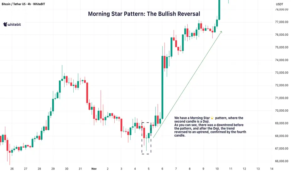
🌅 Morning Star Pattern: The Bullish Reversal
The Morning Star pattern is one of the best ways to catch a trend reversal from bearish to bullish. It usually pops up after a downtrend, signaling that the market is about to make a move to the upside. It’s made up of three candles:
A long red candle that shows the market’s been selling off.
A small candle, often a Doji, that indicates indecision or a pause in the downtrend.
A big green candle that confirms the shift, showing buyers are taking control.
When you spot a Morning Star candlestick pattern, it’s a strong indication that the downtrend might be over and the bulls could be taking over. The third candle plays a crucial role here, confirming that the trend is likely reversing.
🌇 Evening Star Pattern: The Bearish Reversal
On the flip side, the Evening Star pattern is the bearish cousin of the Morning Star. It shows up after an uptrend and signals that the market is ready to start heading down. It also consists of three candles:
A long green candle that continues the uptrend.
A small candle, again often a Doji, that suggests the market’s losing momentum.
A big red candle that confirms the reversal, showing sellers are stepping in.
When you see the Evening Star candlestick pattern, it tells you that the market could be shifting from bullish to bearish. The third candle confirms that the reversal might be taking place.
💡 Trading the Star Patterns
Both the Morning Star trading pattern and Evening Star patterns are great for spotting potential trend reversals, but they shouldn't be relied on as the only signal. To increase the reliability of these patterns, consider confirming them with other indicators like RSI (Relative Strength Index) , MACD (Moving Average Convergence Divergence) , or volume analysis.
For example, if a Morning Star pattern candlestick appears and is followed by increasing volume, it adds strength to the reversal signal. Similarly, if the Evening Star shows up with an overbought RSI, it could provide further confirmation that the market is due for a pullback.
By using these additional tools, you can have more confidence in your analysis and make better-informed decisions.
📈 Why These Patterns Matter
The Morning Star and Evening Star patterns are powerful tools for identifying potential trend reversals. They give traders a visual cue that a market shift could be on the horizon, helping to spot potential turning points.
However, it’s crucial to make your trading decisions based on a combination of factors and not rely solely on these patterns. Always make sure to consider the broader market context and other technical indicators before acting on any pattern.
Reversalpattern
Trading Rejection Strategy- A Visual Backtest💡 Overview
Here is everything you need to know about the strategy. But before you study it any further, all the visuals are at the end of this post- so don't miss that part.
This setup is built upon simple beliefs:
▶Price always remembers its key levels- Previous Day’s High (PDH), Previous Day’s Low (PDL)
▶Strong support/resistance zones often act as liquidity magnets.
▶When price revisits these areas and fails to break through, it gives us a clear rejection and that’s where the edge lies.
⚙️ Core Conditions
➡Price rejects PDH or PDL
➡Price retests a breakout / breakdown zone
➡Price rejects a tested support / resistance level
➡Timeframe: 15-Minute
➡Type of trade: Intraday only
➡Only one trade per day
🎯 Trade Plan
🔘Entry: One tick above/below the Pin Bar or reversal candle close
🔘Stop Loss: Just beyond the high/low of the rejection candle
🔘Target: Next liquidity zone (recent 15m swing or PDH/PDL)
🚫 Avoid Trading When:
➡No rejection at liquidity levels
➡Risk > 20 points
📊 October Backtest Results
(1 trade per day, tested manually)
Total trades taken= 14
Winners= 6
Losers= 8
Total points made out of winner= 263
Total points lost in losers= 75
Net points made= 188
🧠 Takeaway
Even though the backtest covers only October, the results are encouraging.
The logic is built on price behavior around institutional levels, and that tends to hold steady across time.
📈 Try extending the backtest further:
If results remain consistent, this could become a reliable rejection-based intraday setup worth adding to your toolkit.
Here is a visual to guide to all the Entries, Exits and about how it went.
Enjoy the charts and do let me know what you think about this strategy or if I missed an opportunity ;)
📣Disclaimer:
Everything shared here is meant for education and general awareness only. It’s not financial advice, nor a recommendation to buy, sell, or hold any asset. Do your own research, manage your risk, and make sure you understand what you’re getting into.
How to Use Engulfing Candles in TradingViewEngulfing patterns are among the most powerful candlestick formations because they signal strong momentum shifts and can help you spot dramatic trend reversal opportunities.
What You'll Learn:
• How to identify valid engulfing formations where one candle completely covers another's body
• The two types: bullish engulfing (green candle engulfs red) and bearish engulfing (red candle engulfs green)
• Psychology behind engulfing patterns: when one side completely overwhelms the other
• Using volume analysis to confirm engulfing pattern validity
• Finding meaningful engulfing patterns at trend highs and lows for reversal setups
• Timeframe considerations for engulfing analysis on any chart period
• Step-by-step trading strategy for engulfing reversal setups
• Setting proper stop losses above engulfing candle highs
• Determining profit targets below engulfing candle lows
• Managing wide-range drawdowns common with strong momentum shifts
• Advanced entry technique: waiting for retracements to improve risk-reward ratios
This tutorial may help futures traders and technical analysts who want to use powerful candlestick patterns to identify significant momentum changes.
The strategies covered could assist you in creating effective reversal setups when strong buying or selling pressure appears at key price levels.
Learn more about futures trading with Tradingview: optimusfutures.com
Disclaimer:
There is a substantial risk of loss in futures trading. Past performance is not indicative of future results. Please trade only with risk capital. We are not responsible for any third-party links, comments, or content shared on TradingView. Any opinions, links, or messages posted by users on TradingView do not represent our views or recommendations. Please exercise your own judgment and due diligence when engaging with any external content or user commentary.
This video represents the opinion of Optimus Futures and is intended for educational purposes only. Chart interpretations are presented solely to illustrate objective technical concepts and should not be viewed as predictive of future market behavior. In our opinion, charts are analytical tools—not forecasting instruments. Market conditions are constantly evolving, and all trading decisions should be made independently, with careful consideration of individual risk tolerance and financial objectives.

Head and Shoulders Pattern: Advanced Analysis for Beginners█ Head and Shoulders Pattern: Advanced Analysis for Beginners
The Head and Shoulders pattern is one of the most widely recognized and reliable patterns in technical analysis. And today, I am going to teach you how to use it as efficiently as an experienced trader would.
Learning to spot and trade this pattern can be a great asset in your tool belt —whether you’re trading stocks, forex, or cryptocurrencies.
The Head and Shoulders is a well-known reversal pattern in technical analysis that signals a potential trend change.
⚪ It consists of three peaks:
The Left Shoulder: A peak followed by a decline.
The Head: A higher peak formed after the left shoulder, followed by a decline.
The Right Shoulder: A smaller peak resembling the left shoulder, followed by another decline.
When these peaks form in a specific order and the price breaks below the neckline (the line connecting the two troughs between the shoulders), it indicates a bearish reversal from an uptrend to a downtrend.
█ What about Bullish reversals? Don’t worry — there's good news!
Conversely, the Inverse Head and Shoulders pattern forms at the bottom of a downtrend and signals a potential reversal to the upside. By recognizing the pattern early, you can position yourself for a high-probability trade with a clear entry and exit strategy.
█ How to Identify a Head and Shoulders Pattern?
I truly believe the best way to learn any trading strategy is to keep it simple, away from the “technical” jargon unless absolutely necessary. We’ll do the same with this strategy.
Despite its varied usage, you can break it down into four simple steps:
1. Look for the Left Shoulder
The first part of the pattern forms when the price rises , creating a peak. Then, it declines back down to form the trough . This creates the Left Shoulder of the pattern.
Example: If the price of Bitcoin (BTC) rises from $85,000 to $90,000, and then declines to $87,500. This is your Left Shoulder.
2. Spot the Head
The second part of the pattern is the Head . After the Left Shoulder, the price rises again , but this time, it forms a higher peak than the Left Shoulder. The price then declines again, creating a second trough .
Example: Continuing with Bitcoin, after the price dropped to $87,500, it rises to a new high of $95,000 before dropping back to around $90,000. This $95,000 peak is the Head, which is higher than the Left Shoulder.
3. Find the Right Shoulder
After the decline from the Head, the price rises again, but this time, the peak should be smaller than the Head, forming the Right Shoulder . The price then starts declining again, and this is where the neckline is formed (connecting the two troughs).
Example: Bitcoin then rises from $90,000 to $92,000 (lower than the $95,000 peak). This forms the Right Shoulder, and the price starts to decline from there.
4. Draw the Neckline
The neckline is drawn by connecting the lows (troughs) between the Left Shoulder and the Head, and between the Head and the Right Shoulder. This is your key reference level.
█ How to Trade the Head and Shoulders Pattern
Once you've spotted the Head and Shoulders pattern on your chart, it’s time to trade it. And yes, it did need a separate section of its own. This is where most amateur traders mess up - the finish line.
1. Wait for the Neckline Breakout
The most crucial part of the Head and Shoulders pattern is the neckline breakout . This is when the price breaks below the neckline, signaling the start of the trend reversal.
Example: After the price rises to form the Right Shoulder at $92,000, Bitcoin then drops below the neckline (around $90,000). This is the confirmation that the pattern is complete. The price of BTCUSD is likely to continue downward past the 90k mark.
2. Enter the Trade
Once the price breaks below the neckline, enter a short position (for a bearish Head and Shoulders pattern). This is your signal that the market is reversing from an uptrend to a downtrend.
3. Set Your Stop Loss
Your stop loss should be placed just above the right shoulder for a bearish Head and Shoulders pattern . This makes sure you are protected in case the pattern fails and the price reverses back upward.
Example: Place your stop loss at around $93,000 (just above the Right Shoulder at $92,000) on BTCUSD.
You can also try one of these strategies I have used in the past:
⚪ Conservative Stop: Place the stop above the head (for bearish H&S) or below the head (for bullish iH&S) for maximum safety.
⚪ Aggressive Stop: Place the stop above the right shoulder (for bearish H&S) or below the right shoulder (for bullish iH&S) to reduce your stop size.
⚪ Neckline Reclaim Invalidation: Exit the trade if the price reclaims the neckline after breaking it. This could be an indication of a false positive/invalid pattern.
4. Set Your Profit Target
To calculate your profit target, measure the distance from the top of the Head to the neckline and project that distance downward from the breakout point.
Example: The distance from the Head at $95,000 to the neckline at $90,000 is $5,000. So, after the price breaks the neckline, project that $5,000 downward from the breakout point ($89,800), which gives you a target of $84,800.
5. Monitor the Trade
We’re in the home stretch now, people. This is the 9th inning.
There’s only one job left: keeping an eye on any retests or contrarian moves.
As the price moves in your favor, you can scale out or move your stop loss to break even to lock in profits.
█ What makes H&S strategy an all-time classic?
It’s simple. It works.
This pattern works because it reflects a shift in market sentiment:
In a Head and Shoulders pattern , the uptrend slows down as the market struggles to make new highs, and then the price ultimately breaks down, signaling that the bulls have lost control.
In an Inverse Head and Shoulders pattern , the downtrend weakens as the market fails to make new lows, and the price breaks upwards, signaling a bullish reversal.
⚪ Here are a few points to remember as a cheatsheet for Head and Shoulders patterns:
Wait for the neckline breakout to confirm the pattern.
Set a stop loss above the right shoulder for protection.
Project the price target using the height of the head for a realistic profit goal.
Always monitor the trade for any signs of reversal or false breakouts.
Mastering this pattern can be a game-changer for any trader, but like any tool, it’s only effective when combined with other indicators, strategies, and a solid risk management plan.
-----------------
Disclaimer
The content provided in my scripts, indicators, ideas, algorithms, and systems is for educational and informational purposes only. It does not constitute financial advice, investment recommendations, or a solicitation to buy or sell any financial instruments. I will not accept liability for any loss or damage, including without limitation any loss of profit, which may arise directly or indirectly from the use of or reliance on such information.
All investments involve risk, and the past performance of a security, industry, sector, market, financial product, trading strategy, backtest, or individual's trading does not guarantee future results or returns. Investors are fully responsible for any investment decisions they make. Such decisions should be based solely on an evaluation of their financial circumstances, investment objectives, risk tolerance, and liquidity needs.

Diamond Pattern Trading: How to Spot and Trade This SignalSome patterns scream for attention, while others sneak up on traders who aren’t looking closely. The diamond pattern is one of those sneaky ones—a formation that hints at a brewing reversal but requires a sharp eye to catch. Let’s dive into what this pattern looks like, how it forms, and the best strategies for effectively trading diamond top patterns and diamond bottom patterns.
What Is a Diamond Pattern?
The diamond pattern is a reversal chart pattern that occurs after a strong trend, indicating a potential shift in market direction. It forms when price action expands and then contracts, creating a shape that resembles a diamond.
This pattern is rare compared to triangles or head and shoulders formations, but it often signals significant price moves when it appears. There are two types of diamond patterns:
Diamond Top Pattern – A 🐻 Reversal Pattern That Appears After an Uptrend.
Diamond Bottom Pattern – A 🐂 Reversal Pattern That Forms After a Downtrend.
These patterns can help traders identify potential turning points and prepare for a change in trend.
How to Identify a Diamond Pattern in Trading?
To spot a diamond pattern trading setup, look for the following characteristics:
Broadening Formation: The price action initially expands, creating higher highs and lower lows.
Narrowing Structure: After the expansion, the price contracts, forming lower highs and higher lows.
Symmetrical Shape: When trendlines are drawn connecting the highs and lows, they create a diamond shape.
Breakout Point: The pattern is confirmed when the price breaks out of the structure, either to the upside or downside.
While it might resemble a diamond quilt pattern or diamond tile pattern on the chart, the key difference is its role as a market reversal signal.
Diamond Top Pattern: Bearish Reversal
A diamond top pattern forms at the peak of an uptrend and signals that bullish momentum is weakening. Traders often look for a downside breakout to confirm the reversal.
How to Trade a Diamond Top Pattern:
Identify the diamond formation after a strong uptrend.
Wait for a breakout below the lower trendline with increased volume.
Enter a short position once the breakout is confirmed.
Set a stop-loss above the recent high.
Target price: Measure the height of the pattern and project it downward.
This pattern suggests buyers are losing control, and a downtrend will likely follow.
Diamond Bottom Pattern: Bullish Reversal
A diamond bottom pattern appears at the end of a downtrend, indicating a potential shift to bullish momentum.
How to Trade a Diamond Bottom Pattern:
Identify the diamond shape forming after a downtrend.
Wait for an upside breakout above the upper trendline with strong volume.
Enter a long position once the breakout is confirmed.
Set a stop-loss below the recent low.
Target price: Measure the pattern’s height and project it upward.
This pattern signals that selling pressure decreases, and buyers may take control.
Why the Diamond Pattern Is Important for Traders
Reliable Reversal Signal. The diamond pattern trading setup strongly indicates trend reversals.
Clear Entry and Exit Points. Well-defined breakout levels make risk management easier.
Works in Different Markets. Whether trading stocks, forex, or crypto, the diamond pattern remains effective.
Final Thoughts
The diamond pattern is a rare but powerful tool that can help traders confidently spot trend reversals. Whether you’re trading a diamond top pattern for bearish setups or a diamond bottom pattern for bullish breakouts, understanding this formation can give you an edge in the market.
So, traders, have you spotted a diamond pattern trading setup recently? Share your experiences and strategies in the comments!

Different Types of W Patterns and How to Trade ThemHello dear KIU_COIN family 🐺 .
Recently, I decided to provide some educational content for you, my dear audience, and introduce some essential and basic trading terms.
Here’s what you should know: In these lessons, we will cover three different seasons:
🔹 Season 1: Reversal and continuation patterns.
🔹 Season 2: How to use RSI and other indicators to find good entry points.
🔹 Season 3: Definitions of Fibonacci and seasonality in trading.
Stay tuned for valuable insights! 🚀
✅ For the first section of 🔹 Season 1 , I’ll be covering W patterns— a well-known bullish reversal pattern :
As you can see in the chart above, we usually have three types of W recovery patterns , which are the most important ones for us. However, in this section, we just want to get a general understanding of them. In the upcoming section, we will learn how to trade them and explore how they actually appear on the chart and the story behind them !
✅ This is the first and most common type of W pattern:
✅ This is the second type of W pattern:
✅ This is the third type of W pattern:
Ok, guys; I think this is enough for today, and I hope you enjoyed this educational content. However, don't forget to ask your questions below and support me with your likes and follows for more of this content. 🐺🔥

Textbook Reversal Setup: Liquidity Zone + Channel BreakReversal Setup Analysis: HTF Liquidity Zone + Ascending Channel Breakdown
This chart highlights a high-probability bearish reversal setup based on key technical confluences. Here’s a step-by-step breakdown of the analysis:
1. High-Timeframe (HTF) Liquidity Zone (LQZ):
- The red zone marks a major HTF supply area where price previously rejected with a strong impulsive move downward. This liquidity zone is critical as it represents an area where institutional players have shown activity, creating a high-probability region for a potential reversal.
- As price approached this zone again, it did so in a corrective manner (via an ascending channel), which indicates weakening bullish momentum.
2. Impulsive vs. Corrective Structures:
- Impulsive Move: The strong move away from the HTF LQZ (highlighted earlier in the chart) confirms bearish intent, serving as a key reference point for this trade idea.
Corrective Structure: The price forms an ascending channel on the way back to retest the HTF LQZ, signaling exhaustion of buyers.
- The third touch of the channel’s trendline coincides with the HTF LQZ, adding confluence for a potential bearish reversal.
3. Liquidity Zones in Play:
- HTF Liquidity Zone (Supply): Serves as the key resistance level and primary rejection zone.
- 15-Minute Liquidity Zone (Demand): Acts as a potential target for bearish momentum post-breakdown.
- This multi-timeframe liquidity alignment strengthens the trade idea by providing clear areas of interest for entry, stop-loss, and take-profit placement.
4. Breakdown Entry and Structure:
- Entry Trigger: The trade is triggered on the break of structure, where price falls through the lower boundary of the ascending channel. This breakdown confirms bearish momentum resuming after the corrective phase.
- Stop-Loss Placement: Ideally placed above the HTF liquidity zone and beyond the third touch of the channel to account for potential fake-outs.
- Take-Profit Levels: Targets can be set near the 15M liquidity zone or prior swing lows for a solid risk-to-reward ratio.
5. Key Takeaways:
- This setup offers an excellent example of combining HTF liquidity zones, structural patterns, and market context to develop a high-probability trade idea. The rejection from the HTF LQZ aligns with the broader bearish narrative, while the ascending channel acts as a corrective structure leading to a continuation of the downward move.
- By focusing on confluence factors like liquidity zones, impulsive vs. corrective moves, and structural breaks, this trade idea demonstrates a disciplined and strategic approach to trading reversals.
Educational Insights:
- Always zoom out to identify HTF zones of significance to ensure alignment with the larger market context.
- Differentiate between impulsive and corrective structures to gauge the strength and intent of price movements.
- Use pattern confluences (e.g., ascending channels) in combination with key zones to identify high-probability entries.
- Prioritize patience and discipline by waiting for clear structural breaks to confirm your setup.

Catch Big Reversals Like a Pro Using the GOLDEN RSIHow to Catch Market Tops and Bottoms Using the GOLDEN RSI Indicator
Trading market reversals can feel like a daunting task. But what if you had a secret weapon to help you identify tops, bottoms, and potential reversals with ease? Enter the GOLDEN RSI Indicator—a custom-built tool designed to revolutionize your trading strategy. In this tutorial, I’ll show you how to leverage this powerful indicator to spot reversal trades like a seasoned pro.
What is the GOLDEN RSI Indicator?
The GOLDEN RSI builds on the traditional RSI (Relative Strength Index) by adding optimized zones and visual signals that highlight potential bullish and bearish reversals. Unlike the standard RSI, which requires subjective interpretation, this indicator provides precise entry and exit signals by visually marking key market conditions.
How to Use the GOLDEN RSI to Catch Market Reversals?
Understand the Key Zones:
Overbought Zone (Above 80): Signals a potential market top or reversal from bullish to bearish.
Oversold Zone (Below 20): Indicates a potential market bottom or reversal from bearish to bullish.
Neutral Zone (60-40): Consolidation phase where trends are less decisive.
Spotting Bullish Reversals
When the RSI dips into the oversold zone (below 20) and begins to reverse upward, the GOLDEN RSI will highlight a Bull signal. This suggests a potential upward move, ideal for long trades.
Pro Tip: Look for confirmation with price action, such as a bullish candlestick pattern or a break of resistance.
Spotting Bearish Reversals
When the RSI climbs into the overbought zone (above 80) and starts to turn down, the GOLDEN RSI will mark a Bear signal. This indicates a potential downward move, perfect for short trades.
Pro Tip: Combine with chart patterns like double tops or bearish engulfing candles to strengthen your confidence in the trade.
The Hidden Power of Divergences
Bullish Divergence: Price makes lower lows while the RSI makes higher lows. This signals potential bullish momentum.
Bearish Divergence: Price makes higher highs while the RSI makes lower highs. This signals potential bearish momentum.
The GOLDEN RSI visualizes divergences clearly, so you can spot them effortlessly.
Use Risk Management Tools
Set stop-loss levels below recent swing lows (for bullish trades) or above recent swing highs (for bearish trades).
Use risk-reward ratios of at least 1:2 to maximize your profit potential.
Real Trade Example Using GOLDEN RSI
In the SPX 15-minute chart above, the GOLDEN RSI accurately identified:
A Bearish Reversal near the market top, as the RSI entered overbought territory and started to fall.
A Bullish Reversal as the RSI dipped into the oversold zone and recovered upward.
These signals allowed for precise entry points, minimizing risk and maximizing rewards.
Why the GOLDEN RSI is a Game-Changer
Unlike generic RSI tools, the GOLDEN RSI is designed with traders in mind. It eliminates the guesswork by providing visual cues for market reversals. Whether you’re trading stocks, indices, or crypto, this indicator is a must-have in your toolkit.
How to Get the GOLDEN RSI Indicator?
Want to try it for yourself? Head over to TradingView and add the GOLDEN RSI Indicator to your chart. Use it alongside your favorite price action strategies to take your trading to the next level.
Conclusion
Reversals can make or break a trader’s portfolio. By mastering the GOLDEN RSI, you can confidently spot market tops, bottoms, and reversals with precision. Start using this custom indicator today and watch your trading results improve dramatically!
Don’t forget to like, share, and follow me on TradingView for more tutorials like this one. Let’s catch those reversals together!

Mastering Institutional Order Flow & Price DeliveryGreetings traders!
Welcome back to today's video! In this educational session, we'll delve into the concept of institutional order flow. Our objective is to accurately identify market reversals and trend continuations. By mastering the draw on liquidity, we will gain a clearer understanding of whether the market is experiencing bullish or bearish institutional order flow. To accomplish this, we will analyze the behavior of smart money and trace their footprints.
Join us as we uncover these crucial insights together.
If you haven't seen the " Premium & Discount Price Delivery in Institutional Trading " video, here is the link:
Happy Trading,
The_Architect

Mastering High Probability Trading EnvironmentsIn this educational video, we'll delve into High Probability Trading Environments and introduce a simple yet effective concept to confirm their presence . Understanding these environments will empower you to confidently navigate the market with consistency and success.
For a comprehensive understanding, I recommend watching my previous video on Understanding Trend Analysis, SMT, and ICT Concepts below.
If you have any questions, feel free to leave them in the comments section.
Happy trading!
The_Architect

Understanding Trend Analysis, SMT and ICT ConceptsIn this video, I'll delve into the concept of Institutional Market Structure, a vital tool for trend analysis. Specifically, we'll explore the Smart Money Tool/Technique (SMT), which provides insights into whether a market will continue its trend or potentially reverse. Understanding these concepts is crucial for effective trading strategies. Sit back, relax, and enjoy the video!
Please do leave any questions in the comment section if you have any.
Kind Regards,
The_Architect

Using Multi-timeframe analysis to make better trading decisionsTrading on multiple timeframes can significantly improve your risk-reward ratio, regardless of what TA technique, you are using. Let’s look at the recent example (SPY ETF)
Third week of February started with a strong sell-off (Monday-Tuesday 13th). Price retraced >50% of the previous move, signaling potential trend reversal. At this point market Bears started scouting for daily low high to enter short trade. They received signal on Friday 16th when price broke previous day low.
A short trader, who trades only daily chart, would enter this trade at Friday close with stop-loss slightly above daily high and 1st profit target near Tuesday low. This setup provides a decent risk-reward ration >2. There is also a chance that previous low will be broken and price will fall even further, adding to profit. So taking this trade makes a lot of sense. On the main graph to this post you can see how it developed.
Price has not reached our profit target, reversed and made new high. Trade got stopped-out. Even if trader was using trailing stop (stop moved slightly above each new day high) this would not have saved him from huge overnight price jump
Could have the trader done better? Yes, if he had zoomed into lower timeframe and monitored price action there.
Here is what we can see on the 15m chart. (boxes show hourly candles, color coding matches hourly wave direction, you can read about how waves are constructed here )
Bearish reversal pattern shaped on Thursday- Friday. It is not an ideal triple top but there was a clear weakening of upthrust. Also, on Friday morning price broke previous day low, a sign of an increased bearish strength.
Basically, at 21.30 (UTC+1) short trader already had enough evidence to enter trade. He could have done it w/o waiting for day closure. This would have already been a better entrance than in the first scenario.
After entering the trade, trader could start monitoring for continuation. Tuesday was clearly bearish but on Wednesday there were multiple signs of shift of control. Firstly, price was able to set hourly higher low. Secondly, bearish wave was progressing very slowly. Finally, there was a 15 m equilibrium (end of Wednesday RTH) that resolved convincingly bullish. At this point a reasonable trader should have closed his trade without hesitation.
This would not be a great trade still, but it will be a profitable one, with risk-reward 1.7 . It is nearly impossible to achieve same results looking just on the daily chart.
Disclaimer
I don't give trading or investing advices, just sharing my thoughts

Bollinger Bands Part II: Reversal PatternsBollinger Bands Part II: Reversal Patterns
Analzying Two Key Patterns Called M-Tops and W-Bottoms
This post will go into greater depth than the basic introduction to Bollinger Bands published last week. In particular, it will discuss two key reversal patterns. Both the M-top reversal pattern and W-bottom reversal pattern are price patterns that form in conjunction with the Bollinger Bands.
M-Top Pattern
The classic M-top reversal pattern forms when two consecutive price highs form an M-shaped price pattern with the first high tagging the upper band and the second high exhausting before tagging the upper band. An example is shown on Supplemental Chart A involving a topping pattern in BTCUSD from early 2021. This weekly chart shows the M-top in red. The second high meets the traditional (strict) criteria of a second peak near—but not touching—the upper band. This is soon evident as a price failure.
Supplemental Chart A
But an M-top reversal pattern may arise even when two actual tags or pierces of the upper band occur, i.e., the second high may tag the band without invalidating the pattern. This is based on the email discussion this author had with the creator of the Bollinger Bands a while back in 2022, recounted at the end of this post.
In short, the most important feature of the pattern is price exhaustion and reversal at the second high . In other words, look for failure of the price move at or near band resistance (e.g., a failed breakout). The following technical signals may provide additional confirmation: weakening momentum indicators, including negative divergences in momentum indicators or a lower high on %B indicator which may present as a %B line divergence.
W-Bottom Pattern
The classic W-bottom reversal pattern forms when two consecutive price lows form a W-shaped price pattern with the first low tagging the lower band and the second low exhausting before tagging the lower band.
Supplemental Chart B
But note that a W-bottom reversal pattern may arise even when two actual tags or pierces of the lower band occur, i.e., the second low may tag the band without invalidating the pattern. This is based on the email discussion this author had with the creator of the Bollinger Bands a while back in 2022, recounted at the end of this post. In short, the most important feature of the pattern is price exhaustion and reversal at the second low. In other words, look for failure of the price move at band support (e.g., a failed breakdown). The following technical signals may provide additional confirmation: Strengthening momentum indicators, including positive divergences in momentum indicators or a higher low on % B indicator which may present as a %B line divergence.
Understanding the Nuances
In June 2022, John Bollinger, the creator of the Bollinger Bands, posted a monthly chart of BTC/USD on Twitter. He described the chart as a “picture perfect double (M-type) top in BTCUSD on the monthly chart complete with confirmation” from %B and bandwidth indicators. He noted also that the signal led to a tag of the lower band. Supplemental Chart C is my own attempt to recreate the monthly chart Bollinger had shown to reflect the same two major monthly highs in BTCUSD in early 2021 and then again in late 2021. Please note that Supplemental Chart C shows a different M-top than the one shown on the weekly time frame above on Supplemental Chart A, which only focuses on one of the two peaks analyzed in this monthly chart.
Supplemental Chart C
This chart that Bollinger originally posted in 2022 showed two actual tags of the upper band. This was not quite technically within the definition of an M-top in much of the technical literature. My previous reading on M-tops and W-bottoms found that all the definitions and examples showed that the second high or low must not touch or tag the relevant band. But this is incorrect to assume that M-tops and W-bottoms are invalid when this technical definition has not been strictly met, i.e., when two (or more) tags of the bands occurred at both price extremes.
Responding to Bollinger’s chart of a “perfect M-top pattern,” I messaged John Bollinger, the creator of the bands, directly, hoping for clarification about the strict definition of M-tops and W-bottoms. My question was whether they can be valid while having two actual tags of the bands at both price extremes—two tags at both highs of an M-top and two tags at both lows of a W-bottom. Or were the technical books correct to say that the second peak or low must approach the bands but fail to touch them.
In response to my questions, Bollinger clarified that whether a tag occurs at the second peak / high of an M-top is not important as price failure at upper band resistance. This reasoning can be applied in the inverse to W-bottoms as well. In other words, completing the second half of each formation requires a price failure, rather than a band-tag failure, upper band resistance (M-top) or lower band support (W-bottom).
So this broadens the scope of what constitutes a valid M-top or W-bottom pattern. But it does not exclude patterns that meet the conventional technical definition. This means that valid M-top and W-bottom patterns include cases where the secondary high / low fails to tag the upper / lower band. Stated differently, failures to tag the bands at a secondary price high / low can also form valid topping and bottoming patterns.
Finally, beware of seeking reversals too soon when price is trending strongly, or walking the bands —pullbacks in that specific scenario are not at all "price failures," and it's important to recognize the difference.
Conclusion
In short, the key is to apply substance over form, to follow the core concept rather than strictly adhering to the technical rules / definitions. Broaden the scope of the technical requirements to include price failures—on the secondary test—at band resistance or support. This will help traders recognize the patterns arising from this technical indicator more effectively.
Further, Bollinger himself recommended using other indicators for confirmation, such as RSI or another indicator that isn't overlapping in its operation too much. Lastly, it may be important to realize that the final failure at or near the bands may not be the second peak or low but the fourth, fifth or sixth. Just draw the M at the end where it fits if there has been strength followed by a failure at or near the bands. And remember trading time frame (M-tops and W-bottoms that are valid have much less significance on shorter time frames and much more and lasting significance on longer time frames. And keep risk management on as always.
________________________________________
Author's Comment: Thank you for reviewing this post and considering its charts and analysis. The author welcomes comments, discussion and debate (respectfully presented) in the comment section. Shared charts are especially helpful to support any opposing or alternative view. This article is intended to present an unbiased, technical view of the security or tradable risk asset discussed.
Please note further that this technical-analysis viewpoint is short-term in nature. This is not a trade recommendation but a technical-analysis overview and commentary with levels to watch for the near term. This technical-analysis viewpoint could change at a moment's notice should price move beyond a level of invalidation. Further, proper risk-management techniques are vital to trading success. And countertrend or mean-reversion trading, e.g., trading a rally in a bear market, is lower probability and is tricky and challenging even for the most experienced traders.
DISCLAIMER: This post contains commentary published solely for educational and informational purposes. This post's content (and any content available through links in this post) and its views do not constitute financial advice or an investment or trading recommendation, and they do not account for readers' personal financial circumstances, or their investing or trading objectives, time frame, and risk tolerance. Readers should perform their own due diligence, and consult a qualified financial adviser or other investment / financial professional before entering any trade, investment or other transaction.

Harmonics don't work...Here's how I find my set ups I thought I'd share with you guys the process I use to find my shark setups, this is a strategy I've back-tested and tested several times. I must say textbook harmonic talk poop, the values I use work but the set-up I see written for the shark uses different values. I noted this and thought about it for a minute - then I said so can I break the rules or amend it, because what I see is making sense but following the book is frustrating me lol...
I mean it got through to me through multiple accounts including personal and funded accounts - (side note I'm not rich) hopefully this helps to to understand how I spot moves.
As long as you journal then you have a chapter to start from and that 1!!!!!

SPY: Don’t “Guess” the Top.We can learn a very interesting lesson by looking at the SPY chart. Anyone who tries to guess the next top or bottom is a gambler, not a trader, and as someone who has gambled a lot in the past, this rally brings back some memories.
It's very easy for someone to see such an explosive movement and think: "It's already gone up a lot, it's going to have to come down soon". It's very easy to look for clues in other indicators, for example, and get excited when you see the RSI exploding close to 70. Looking for clues that reinforce a pre-existing belief is common among individuals corrupted by the "confirmation bias", which is something else, and would be content for a future article.
Still talking about the RSI, it's important to mention that the RSI was already at 70 when the price was at $450. Since then it has risen by more than $20 (approximately 5%), and there is no sign of a top yet. Far from being a criticism of such an efficient indicator, this is just evidence that the use of indicators should be aligned with what we see on the chart.
Top or bottom signals are confirmed when we see a clear breakout from a notorious reversal pattern. As we can see from the SPY chart below, just one or two bearish patterns, even when appears close to clear resistance, is not enough. There needs to be confirmation of a good breakout.
Perhaps this is one of the reasons why so many are rushing to sell a possible top, even without confirmation. By waiting for confirmation, you sacrifice part of your profits, and amateurs hate that. To feel like a pro, you have to feel the satisfaction of buying the bottom and selling the top, all the time. Which is ironic, because that's not the focus of a professional. A real trader seeks long-term consistency.
Speaking for myself, as far as I can see it's a strong rally in the SPY, and the next resistance is the all-time high at $479.98. So far, there is no clear reversal pattern for me, although I personally would like to see a correction to a support point.
What if the SPY made a bearish candlestick pattern today? Just as we see on November 9, 15 and 29, and on December 6, a top signal is plausible, but we need to wait for confirmation via a breakout. Otherwise, it would just be another bear trap.
Another thing I like to do is wait for a clear bearish reversal structure to appear on shorter time frames, such as the hourly chart. Uptrends are characterized by rising tops and bottoms, and the reverse applies to downtrends. When a stock is in a clear uptrend, but the hourly chart suddenly makes a lower top and bottom, it's a warning sign. If such a reversal occurs near a resistance area, all the better, as was the case with NVDA at the end of last month.
One of the most overlooked principles of Dow Theory is the number 6: "Trends Persist Until a Clear Reversal Occurs". When Charles Dow, founder of the Dow Jones index and the Wall Street Journal, began working on the principles more than a century ago, he never imagined that in the 21st century there would still be traders who anticipate and don't wait for confirmation (again, I was among these gamblers in the past).
Therefore, trading reversals is interesting and can be very profitable, but you need to base your decisions on technical reasons. I shared how I like to trade reversals, but there are more strategies that you can use. Feel free to share yours. That's the difference between a gambler and a trader. Moreover, remember to follow me for more content like this, and support this idea if you liked it!
All the best,
Nathan.

E9 ERASER PATTERN
Naming this the E9 Eraser Pattern as it literally erases traders out the game...
Impulse leg creates a peak with liquidity pool above the peak, this area (usually the wick area) is eaten into signalling to go short, as price moves in that direction price is sharply reversed after an internal structure break, trapping said short traders. As price breaks/pushes out of the prior Initial high, triggering buy stops / stop losses, once again we can expect price to sharply reverse.
Ideally we will see an OVERWATCH candle signal print, signalling potential reversal pattern in play.

Learn Top 4 Price Action Pattern to Trade Reversals
Hey traders,
In this article, I will share with you the list of 4 best reversal price action patterns.
📍Ascending & Descending Triangles
The main element of the ascending triangle as the REVERSAL pattern is the BEARISH impulse leg, preceding the formation of the pattern.
The pattern consist of 2 main elements:
a horizontal neckline based on the equal highs,
a rising trend line based on the higher lows.
❗️The trigger is a bullish breakout of a neckline of the pattern and candle close above.
📈The position is opened on a retest.
🔴Stop loss is lying at least below the level of the last higher low.
🎯Take profit is the next historical resistance.
——————
📍The main element of the descending triangle formation as the reversal pattern is the BULLISH leg, preceding the formation of the pattern.
The pattern consist of 2 main elements:
a horizontal neckline based on the equal lows,
a falling trend line based on the lower highs.
❗️The trigger is a bearish breakout of a neckline of the pattern and candle close below.
📉The position is opened on a retest.
🔴Stop loss is lying at least above the level of the last lower high.
🎯Take profit is the next historical support.
📍Rising & Falling Wedges
What makes a rising wedge pattern a reversal pattern?
Before the formation of the pattern, the price should form a strong bullish impulse and trade in a bullish trend.
The pattern consists of 2 contracting, rising trend lines based on the higher highs and higher lows.
❗️The trigger is a bearish breakout of a support of the pattern and candle close below.
📉The position is opened on a retest.
🔴Stop loss is lying above the high of the pattern.
🎯Take profit is the closest horizontal support.
——————
What makes a falling wedge pattern a reversal pattern?
Before the formation of the pattern, the price should form a strong bearish impulse and trade in a bearish trend.
The pattern consist of 2 contracting falling trend lines based on the lower lows and lower highs.
❗️The trigger is a bullish breakout of a resistance of the pattern and candle close above.
📈The position is opened on a retest.
🔴Stop loss is lying below the low of the pattern.
🎯Take profit is the closest horizontal resistance.
📍Double Top & Bottom
Double bottom pattern usually forms at the end of a bearish trend.
After a strong bearish impulse, the price retraces, sets a lower high and retests the current low.
Instead of going lower, the price retraces one more time, retests the level of the last lower high and breaks it.
Such a formation confirms a bullish reversal.
❗️The trigger is a bullish breakout of a neckline of the pattern and a candle close above.
📈The position is opened on a retest.
🔴Stop loss is lying below the lows of the pattern.
🎯Take profit is the closest horizontal resistance.
——————
Double top pattern usually forms at the end of a bullish trend.
After a strong bullish impulse, the price retraces, sets a higher low and retests the current high.
Instead of going higher, however, the price retraces one more time, retests the level of the last higher low and breaks it.
Such a formation confirms a bearish reversal.
❗️The trigger is a bearish breakout of a neckline of the pattern and a candle close below.
📈The position is opened on a retest.
🔴Stop loss is lying above the highs of the pattern.
🎯Take profit is the closest horizontal support.
📍Head & Shoulders Pattern & Inverted One
Inverted H&S pattern usually forms at the end of a bearish trend.
The price forms a zig-zag movement with 3 main elements:
the left shoulder with a lower low, the head with a new lower low, and the right shoulder with a higher low.
While the price sets multiple lows, it keeps setting the equal highs, composing a so-called horizontal neckline.
A bullish reversal becomes confirmed once the price breaks and closes above the neckline.
❗️The trigger is a bullish breakout of a neckline of the pattern and a candle close above.
📈The position is opened on a retest.
🔴Stop loss is lying below the lows of the pattern.
🎯Take profit is the closest horizontal resistance.
——————
Head & Shoulders pattern usually forms at the end of a bullish trend.
The price forms a zig-zag movement with 3 main elements:
the left shoulder with a higher high, the head with a new higher high, and the right shoulder with a lower high.
While the price sets multiple highs, it keeps setting the equal lows, composing a so-called horizontal neckline.
A bearish reversal becomes confirmed once the price breaks and closes below the neckline.
❗️The trigger is a bearish breakout of a neckline of the pattern and a candle close below.
📈The position is opened on a retest.
🔴Stop loss is lying above the highs of the pattern.
🎯Take profit is the closest horizontal support.
In order to increase the accuracy of trading these patterns, I would recommend trading them only if they are formed on key levels:
Bearish patterns on key resistances and bullish patterns on key supports.
Also, higher is the time frame where you spotted the patterns, higher is the chance that it will give a valid reversal signal.
❤️Please, support my work with like, thank you!❤️

📉Bearish Reversal Patterns & Showcase📉What are Reversal Patterns?
In trading, candlestick patterns are used to analyze the behavior of the market and identify potential opportunities to enter or exit a trade. Reversal patterns and continuation patterns are two types of candlestick patterns that traders look for.
Reversal patterns are characterized by a change in the direction of the trend. These patterns indicate that the market is likely to reverse its direction and move in the opposite direction. In contrast, continuation patterns signal that the trend is likely to continue in the same direction after a temporary pause or consolidation.
Reversal patterns usually take longer to form than continuation patterns because it's easier for the market to continue moving in the same direction than to change course. For example, if sellers are pushing the market lower, it takes more effort for buyers to turn the market around and initiate an uptrend.
A reversal pattern may occur after a period of strong selling or buying pressure, as traders become exhausted or the market reaches a key support or resistance level. Once this happens, traders who missed the initial move may see an opportunity to enter a new trade in the opposite direction of the previous trend.
However, for a reversal pattern to be considered valid, there must have been a previous trend in place. A sideways market cannot be classified as a reversal because it doesn't reflect a change in trend direction. Traders typically look for confirmation of a reversal pattern, such as a breakout from a trendline or a significant price movement in the opposite direction of the previous trend.
👤 @AlgoBuddy
📅 Daily Ideas about market update, psychology & indicators
❤️ If you appreciate our work, please like, comment and follow ❤️

How To Spot A Reversal Like a Pro!Hello Traders,
Spotting a reversal is always a daunting task I know. That is I use a 2 Step Down Timeframe Method to spot a reversal in correct way. I have explained step by step so please watch in full to understand it clearly. Also do not forget to like the video and let me know in the comment section if you have nay questions.

Candlestick Reversal Patterns of Technical Analysis !!!👨🏫 In this post, I tried to show you the most important Candlestick Reversal Patterns of Technical Analysis with Entry points & Stop loss points . you can use these patterns for Triggers of your traders at any timeframe ⏰ (These patterns are more valid at higher timeframes).
Please do not forget the ✅ 'like' ✅ button 🙏😊 & Share it with your friends, Thanks, and Trade safe.
What Is A Candlestick ❗️❓
A candlestick is a type of price chart used in technical analysis that displays the high, low, open, and closing prices of a security for a specific period. It originated from Japanese rice merchants and traders to track market prices and
daily momentum for hundreds of years before becoming popularized in the United States. The wide part of the candlestick is called the "real body" and tells investors whether the closing price was higher or lower than the opening price
(black/red if the stock closed lower, white/green if the stock closed higher).
Bullish Pattern 🌅:
🟢 Hammer Pattern : A hammer is a price pattern in candlestick charting that occurs when a security trades significantly lower than its opening, but rallies within the period to close near the opening price. This pattern forms a hammer-shaped candlestick, in which the lower shadow is at least twice the size of the real body. The body of the candlestick represents the difference between the open and closing prices, while the shadow shows the high and low prices for the period.
🟢 Inverted Hammer Pattern : The inverted hammer candlestick pattern (or inverse hammer) is a candlestick that appears on a chart when there is pressure from buyers to push an asset’s price up. It often appears at the bottom of a downtrend, signaling a potential bullish reversal. The inverted hammer pattern gets its name from its shape – it looks like an upside-down hammer. To identify an inverted hammer candle, look out for a long upper wick, a short lower wick, and a small body.
🟢 Bullish Engulfing Pattern : A bullish engulfing pattern is a white candlestick that closes higher than the previous day's opening after opening lower than the previous day's close. It can be identified when a small black candlestick, showing a bearish trend, is followed the next day by a large white candlestick, showing a bullish trend, the body of which completely overlaps or engulfs the body of the previous day’s candlestick. A bullish engulfing pattern may be contrasted with a bearish engulfing pattern.
🟢 Bullish Piercing Line Pattern : A piercing pattern is a two-day, candlestick price pattern that marks a potential short-term reversal from a downward trend to an upward trend. The pattern includes the first day opening near the high and closing near the low with an average or larger-sized trading range. It also includes a gap down after the first day where the second day begins trading, opening near the low and closing near the high. The close should also be a candlestick that covers at least half of the upward length of the previous day's red candlestick body.
🟢 Bullish Harami Pattern : The Bullish Harami candle pattern is a reversal pattern appearing at the bottom of a downtrend. It consists of a bearish candle with a large body, followed by a bullish candle with a small body enclosed within the body of the prior candle. As a sign of changing momentum, the small bullish candle ‘gaps’ up to open near the mid-range of the previous candle. The opposite of the Bullish Harami is the Bearish Harami and is found at the top of an uptrend.
🟢 Morning Star Pattern : A morning star is a visual pattern consisting of three candlesticks that are interpreted as bullish signs by technical analysts. A morning star forms following a downward trend and it indicates the start of an upward climb. It is a sign of a reversal in the previous price trend. Traders watch for the formation of a morning star and then seek confirmation that a reversal is indeed occurring using additional indicators.
🟢 Three White Soldiers Pattern : Three white soldiers is a bullish candlestick pattern that is used to predict the reversal of the current downtrend in a pricing chart. The pattern consists of three consecutive long-bodied candlesticks that open within the previous candle's real body and a close that exceeds the previous candle's high. These candlesticks should not have very long shadows and ideally open within the real body of the preceding candle in the pattern.
Bearish Patterns 🌄:
🔴 Hanging Man Pattern : The hanging man is a type of candlestick pattern. Candlesticks display the high, low, opening, and closing prices for a security for a specific time frame. Candlesticks reflect the impact of investors' emotions on security prices and are used by some technical traders to determine when to enter and exit trades. The term "hanging man" refers to the candle's shape and what the appearance of this pattern infers. The hanging man represents a potential reversal in an uptrend. While selling an asset solely based on a hanging man pattern is a risky proposition, many believe it's a key piece of evidence that market sentiment is beginning to turn. The strength in the uptrend is no longer there.
🔴 Shooting Star Pattern : A shooting star is a bearish candlestick with a long upper shadow, little or no lower shadow, and a small real body near the low of the day. It appears after an uptrend. Said differently, a shooting star is a type of candlestick that forms when a security opens, advances significantly, but then closes the day near the open again. For a candlestick to be considered a shooting star, the formation must appear during a price advance. Also, the distance between the highest price of the day and the opening price must be more than twice as large as the shooting star's body. There should be little to no shadow below the real body.
🔴 Bearish Engulfing Pattern : A bearish engulfing pattern is a technical chart pattern that signals lower prices to come. The pattern consists of an up (white or green) candlestick followed by a large down (black or red) candlestick that eclipses or "engulfs" the smaller up candle. The pattern can be important because it shows sellers have overtaken the buyers and are pushing the price more aggressively down (down candle) than the buyers were able to push it up (up candle).
🔴 Bearish Dark Cloud Cover Pattern : Dark Cloud Cover is a bearish reversal candlestick pattern where a down candle (typically black or red) opens above the close of the prior up candle (typically white or green), and then closes below the midpoint of the up candle. The pattern is significant as it shows a shift in the momentum from the upside to the downside. The pattern is created by an up candle followed by a down candle. Traders look for the price to continue lower on the next (third) candle. This is called confirmation.
🔴 Bearish Harami Pattern : A bearish harami is a two-bar Japanese candlestick pattern that suggests prices may soon reverse to the downside. The pattern consists of a long white candle followed by a small black candle. The opening and closing prices of the second candle must be contained within the body of the first candle. An uptrend precedes the formation of a bearish harami.
🔴 Evening Star Pattern : An evening star is a stock-price chart pattern used by technical analysts to detect when a trend is about to reverse. It is a bearish candlestick pattern consisting of three candles: a large white candlestick, a small-bodied candle, and a red candle. Evening star patterns are associated with the top of a price uptrend, signifying that the uptrend is nearing its end. The opposite of the evening star is the morning star pattern, which is viewed as a bullish indicator.
🔴 Three Black Crows Pattern : Three black crows is a phrase used to describe a bearish candlestick pattern that may predict the reversal of an uptrend. Candlestick charts show the day's opening, high, low, and closing prices for a particular security. For stocks moving higher, the candlestick is white or green. When moving lower, they are black or red. The black crow pattern consists of three consecutive long-bodied candlesticks that have opened within the real body of the previous candle and closed lower than the previous candle. Often, traders use this indicator in conjunction with other technical indicators or chart patterns as confirmation of a reversal.

The Doube Bottom Pattern - Bullish PatternThe **Double Bottom** is a price action pattern that is indicative of a trend change once activated. Price needs to establish a bearish expansion towards the lows before reversing with an impulse. The impulse then needs to get sold into; this will create a retest of the previous low that must hold. Price action will establish a “W” structure which become a sign of demand that leads to a bullish expansion.
Key Characteristics of the **Double Bottom**
- Price Action must first establish a bearish expansion
- The retest of the previous low most hold
- A ‘W’ like formation will confirm demand at the lows

Signs of trend strength and weaknessThe signs that I taught you in this lesson can be very useful
If they are recognized in the right place
One of the best situations to use these signs is near support or resistance

Island Reversal PatternThe Island Reversal pattern is when increased distributions in overnight activity cause gaps up and eventually volume exhaustion a second gap down forming an island of candles.
The Island Reversal can be Bullish (inverted island) or a Bearish Island and is preceded by lengthy trends with a reversal trend the other way.
No real profit targets for the island reversal. I would just use the island as a head as it seems to fit the profile of a head and shoulders pattern or double top / bottom.
Island Reversals are not common and traders are mixed on the results.
Credit to Vixtine for island reversal.
