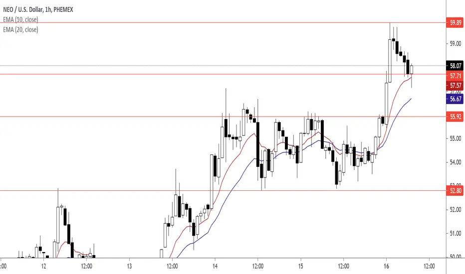
How To Trade Quality Pin BarsAfter the Pin Bar Formed At The EMA 10 EMA 20, Do The Following Actions
Draw Your Fibonacci Retracement Levels
Draw Horizontal Support Levels
Enter At Pin Bar Close Price
Exit At The Previous Swing Low Level
The attributes that made this a quality Pin Bar:
Pin Bar Close Price is in the Fibonacci Retracement 50% and 38.2% Range Area
Pin Bar Close Price is in the EMA 10 EMA 20 Range Area
Pin Bar at Lower High
Downtrend
Technical Chart Of How To Trade The Pin Bar. Before and After Charts. Click on Charts.
Support and Resistance

How To Trade The Pin Bar With Support Resistance Levels 08-16-21This pin bar is in a pull back. The horizontal level was broken and the horizontal level was retested with a pin bar candlestick. In this case, the pin bar tail intersects the EMA 10 and horizontal support level. Price closed above the horizontal level. Entry for this strategy is at the pin bar close. The Target is the previous swing high.
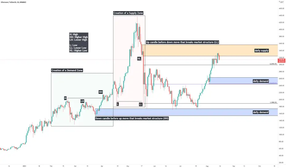
Price Action Study: Single Candle Supply & Demand ZonesHappy Sunday everybody, today I'll be providing a quick writeup on identification of single-candle Supply & Demand zones, otherwise known as "Orderblocks" (Credits to ICT for coining this phrase)
Supply & Demand are one of the most fundamental aspects of trading securities.
In price action - liquidity is believed to be the driving force behind market movements. The primary reason assets move is because of an imbalance between buyers and sellers - supply & demand.
If supply outweighs demand, price moves down.
If demand outweighs supply, price moves up.
If supply and demand are relatively the same - the market consolidates.
Supply and demand zones are created during consolidations - and today we are going to look at how to identify them. When prices is to return to these zones, we look for signs of accumulation to go long, or distribution to short.
Single candle supply and demand zones are also commonly referred to as "orderblocks" - here's how to identify them.
Demand/Bullish OB: A down candle before an up move that breaks market structure - a higher high.
Supply/Bearish OB: An up candle before a down move that breaks market structure - a lower low.
It is an important distinction - we need a structural break for the zone to be a meaningful region to watch if/when price is to return.
-Will, OptionsSwing Analyst
What Is a Failed Break?A failed break (false breakout) occurs when a price moves through an identified level of support or resistance but does not have enough momentum to maintain its direction.
Failed breaks may also signal traders to enter a trade in the opposite direction of the attempted breakout. Since the breakout attempt failed, the price could head the other direction.
A throwback is when the price retraces back toward the resistance or support level just broken. A throwback is not a failed breakout.
How to detect failed breaks?
A failed breakout reveals that there was not enough buying interest to keep pushing the price above resistance or below support.
If a security does not see strong volume and substantial price moves supporting the breakout direction, the chance of a false breakout increases. Take a look at the chart and see how the uptrend line is broken with unexpected low trading volume.
If there is significantly increased volume on a breakout, the likelihood of a false breakout developing decreases (but is not eliminated). However, a throwback may still occur.

Crypto/Investing Cycle - How INVESTING really works, EducationWhen we hear the first time about investing the majority thinks that this is rocket science. But it is not. I do not mean that it super easy but with the right knowledge it will super clear on how to participate and how take advantage of it.
In this video I will explain everything which is important to know
- Investing Cycle
- Crypto Cycle
- how money is moving
- big institutions
What do you think?

The MYTH of 3HITS (that what I called it)I've been back testing this method and using it on multiple Timeframes.
it's quite simple Price Action.
I use this hits ass a guide for strength of the trend, and to spot the reversal area ( Strong Support and Strong Resistant)
However, I do not use this method alone but also have other confluence.
Mostly, when price is at this area, I will look for entry at Lower Timeframes.
Hopefully this will help you in your trades.
Please do back test on multiple Timeframes and also other pairs to master this.
I will share more notes on this method on other pairs and Timeframes in the future, InshaaAllah.
Happy Trading Guys.
Learn and Learn more, You'll Earn and Earn More.

What is Double Bottom Pattern?What is Double Bottom Pattern?
The double bottom pattern looks like the letter "W". It indicates an trend and momentum reversal in a particular asset. It is best for analyzing the intermediate to longer-term view of a market. Double Bottom Pattern one of the most reliable reversal pattern after Head and Shoulders Pattern.
How does Double Bottom Pattern Work?
Double Bottom Pattern works in two phases:
Phase 1:
When the major trend is downtrend and forms the first down peak, then from the support the prices bounce to a new higher resistance and unable to break that resistance.
Phase 2:
When prices are not able to break the resistance it again goes to the same level and take support form similar levels forming second down peak also double bottom. Again due to demand the prices rises up to the resistance and break that resistance. Increase in volumes during breakouts further confirms the reversal move. This marks the completion of the pattern.
Above Chart Explanation:
This is the daily chart of EGLDUSDT here we can see in a downtrend prices take support and forms a down peak one and took support form there and bounce back to the above resistance. But prices were not able to break it instead prices got rejection from resistance and the prices again go down forming second down peak. After taking support prices bounces and break resistance due to heavy demand with great volumes.
Usually traders enter on the breakouts and target the next resistance.
Conclusion:
Hence, the Double Bottom Pattern is great reversal pattern after Head and Shoulders Pattern. And it occurs quite often. Most of the traders use it on large time frames like 1D, 1W, 1M.
Please let me know in the comments what do you think about Double Bottom Chart Pattern!
Disclaimer:
This is just an educational post never trade just any pattern. And please do your research before taking any trades.

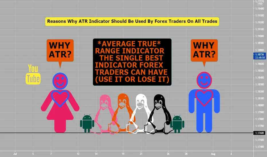
ATR indicator (Always Use This)The ATR (average true range) indicator is the single best indicator that all FOREX traders should be using for all trades (use it or lose it).
You can put ATR indicator on your chart always and/or just glance at number (in upper left) and take it off your chart, just have it handy always.
What is the ATR: (Default setting (14) works fine for me in FX trading.
It tells you how many pips the currency pair has moved, on average, in the past X amount of candles.
Why you should be using ATR 100% of the time on every trade:
1) The ATR is crucial for Money Management
2) Money Management is crucial to winning
*Know that money management is what will separate you from the losing traders.
How To Use ATR In Setting Up Trades: (Never Trade Without It)
1) To know how far back from entry price away your stop loss, which is either ATR x 1.5 (works mostly) or ATR x 2.0 (if you want larger stop loss)
2) To know where to place profit targets and/or targets, 1st target is same as risk or stop loss is and 2nd target is double what the stop loss is.
When you are describing Forex RISK, instead of saying unit size or dollar amounts, instead say How much are you trading per pip?
Using the ATR will prevent you from getting stopped out of more trades, will keep in more trades. The professionals use ATR for stop losses and targets. ATR can be used on any time frames, but look for other evidence like price action at support and resistance areas, fib ret (golden zone) 50%-61.8%, pivot points, doji candles, harami setups, and engulfing setups to use ATR indicator for possible trades.
Bull Trap vs PullbackWhat Is a Bull Trap?
A bull trap denotes a reversal that forces market participants on the wrong side of price action to exit positions with unexpected losses.
Bull traps occur when buyers fail to support a rally above a breakout level.
Traders and investors can lower the frequency of bull traps by seeking confirmation following a breakout through technical indicators and/or pattern divergences.
What is a Pullback?
A pullback is a temporary reversal in the price action of an asset or security.
The duration of a pullback is usually only a few consecutive sessions. A longer pause before the uptrend resumes is generally referred to as consolidation.
Pullbacks can provide an entry point for traders looking to enter a position when other technical indicators remain bullish.
This may help you decide better!
Related Articles:
www.investopedia.com
www.investopedia.com

Trap Strategy Hello guys,
I would like to point out how bull or beartrap can provide strong reaction. and how would you know if it is trap or not? the answer is whenever resistances or supports are broken but then the second or third candle comes bake sharply inside the range make sure it is a trap.
trade save
thank you

Scalping Axie Infinity on the 1 minute and 15 second timeframeIt's not rocket science. Scalping using the 1m timeframe is highly risky, but profitable when used properly.

Why Trend Lines are so important!Yesterday I put my main setup on the Activision Blizzard with SMA 20,50,100,200; Horizontal Ray and the trendlines.
Many would see that in the past the price often had support at the range of 89-90 Dollar and would think that the share price would jump again including with the SMA200 support.
But with implementing the Trendline-Function by connecting dots of the lower/higher spikes you get a good understanding in what the trend could looks like.
This can be drawn in a timeline of a few years, months or days.

Double EMA (DEMA) From ScratchHello, traders!
Today we’ll speak about the most trivial, but very useful indicator that’s called DEMA. As you know, moving average is a backbone of 90% complicated indicators. It’s able to give lots of information about the price action. Well, let’s speak about it.
The double exponential moving average (DEMA) is a technical indicator introduced by Patrick Mulloy in his January 1994 article "Smoothing Data With Faster Moving Averages" in Technical Analysis of Stocks & Commodities magazine.
The DEMA uses two exponential moving averages (EMAs) to eliminate lag, as some traders view lag as a problem. The DEMA is used in a similar way to traditional moving averages (MA), but DEMAs react quicker than traditional MAs.
How to use DEMA?
-The average helps confirm uptrends when the price is above the average, and helps confirm downtrends when the price is below the average. When the price crosses the average that may signal a trend change.
-Indicate areas of support or resistance.
-Cross overs of 2 DEMAs. We sometimes draw fast DEMA(20) and slow DEMA(50). When the fast line crosses the slow below, it’s a bearish signal, when above - bullish. It’s consider to be a good entering signal. However, we shouldn’t forget that the indicator is still lagging.
Guys, I should remember you that every indicator shouldn’t be used in solo. You should only use them in conjunction with other indictor when they confirm each other. I hope, this knowledge will boost your trading skills and make your trading staff more interesting and profitable. Have a nice day, dear traders.

3 Steps Of A Trade (Step #3 Exit Order)Forex Exit Strategies: Tricks on Setting Limit Orders:
Forex exit strategies and exiting a trading position at the right time and price is arguably more important than your entry order. Because only when you exit, you lock in and confirm your profit. Choose the best currency pairs and the best times to trade.Today, let’s talk about getting out, WITH profit. By paying attention to a small trick when setting limit exit orders in your long-term trades.
There are many ways to calculate your Forex exit strategies. They highly depend on your trading time frame, your account’s margin and on the market sentiment in general.Identifying Limit orders or Profit Taking Levels is one of them. These are the areas you calculate to get out of your position and manage your Forex exit strategies when the market prices reach your target.
Limit Orders
Traders usually use market orders to exit trades with a big profit. If you use a limit order while you are going long, then your limit order will be higher than the market price.On the other hand, if you go short with a limit order, then your limit order will be below the market price. Imagine a limit order like a finish line. Your trades will be directly closed every time the market price crosses your limit orders.
Put bull exit orders below obvious psychological round numbers (ex: 1.50000, etc...) and above bearish psychological numbers, support and resistance areas. Most of time big banks on purpose do not go to these areas knowingly that a lot of traders are TRAPPED in these areas.

Bitcoin: Multiple time frame analysisWhat is your favorite time frame? When you finally decide on your preferred time frame, that’s when the fun begins!
SHORT-TERM (SWING)
PERSPECTIVE: "Earning assets with trades. Looking to sell near the top to buy near the bottom.".
Short-term traders use hourly time frames and hold trades for several hours to a week.
ADVANTAGE: More opportunities for trades. Less chance of losing months.
DIFFICULT: HARD - The smaller the time frame, the greater the difficulty. Study the market daily and be prepared for the worst.
MEDIUM-TERM
Mix of shorts and longs. It's my favorite.
LONG-TERM
Trades usually from a few weeks to many months, sometimes years.
PERSPECTIVE: "Buy and to forget and when it falls, buy more."
ADVANTAGE: Don’t have to watch the markets intraday.Fewer transactions mean fewer times to pay the spread. More time to think through each trade.
DIFFICULT: EASY - With cash in reserve to take advantage of opportunities, it's easy.

Pivot Point StrategyIf you are scalping or day trading and use time frames under 4 hour, 1 hour, 15 minutes- then try this all pivot point strategy for one week.
Example chart is on a one hour time frame of GBPCAD.
Add:
Daily pivot points (RED line on chart)
Weekly pivot points (WHITE line on chart)
& Monthly pivot points (BLUE line on chart)
on your charts only (three sets of pivot points).
You can add trend lines, Elliot waves, fib ret etc... as needed overlaying charts when you are trading.
You could have had an easy three trades (two sells and one buy) on Fridays price action related to this pivot point strategy. Rules: if price action has stopped by one of these pivot points, set up either a breakout trade, or reversal of trend trade if an Harami, Engulfing or Pinbar pattern presents its self. Trading the pivot point strategy is great in-between Tokyo end of session to London end of session (12 hours). If two pivot point lines are close: like daily and weekly this area is stronger and harder for price action to break thru, if a weekly and monthly are close together this area is very strong and hard for PA to get thru.
Look what happened on chart example with price action around daily, weekly and monthly pivot points--- you can trade only these when scalping or day trading, please do some back testing on this... you will be very surprised by the positive results.

Accumulation-Manipulation-Distribution PhasesOut of these three phases:
Manipulation phase is where trend is and where the general public and/or retail traders mostly trade in. This is where the easy money is made.
The Accumulation and Distribution phases are where trading is difficult and where the general public and/or retail traders lose most of their money and blow their accounts.
You need to under where price action is in the big picture and trade accordingly.

Video | Identifying Key and Critical Support/Resistance Educational video on determining market structure (key vs critical support/resistance)

Support zone instead of simple support (Bitcoin fake breakouts)Sometimes just a simple line is not working and this is the time that zone gets its meaning.
so instead of using so many lines, we can use <> and create some support and resistance zones instead of simple support and resistance.
here take look at the Bitcoin example in previous weeks:
But let's take look at the 30K support zone instead of the 30K support:
and let's take look at Forex and the same scenario:
here take look at the USDCAD example in the previous month:
But let's take look at the 1.2060 support zone instead of the 1.2060 support:
<<👍hope you enjoy👍 >>

What is Rounding Bottom Pattern?What is Rounding Bottom Pattern?
Round bottom can be identified when the price changes graphically form the shape of a "U" on charts. It is also called a saucer bottom pattern. It shows potential reversal in price movements. It shows a very slow and gradual turn from down to sideways to up. The longer it stays the longer the more possibility it gives for reversal.
How does Rounding Bottom Pattern Work?
Rounding Bottom Pattern can be divided into three phases:
1. Declining Phase
The decline phase indicates the excessive supply which leads to the price decline.
2. Sideways Phase
After the excessive supply and price decline their is nor demand or supply. Which leads to sideways phase. Usually the prices in this phase will trade flat which means price movement will be very less here with the volume.
3. Recovering Phase
Here in Recovering phase demand start to rise again. Due to excessive demand the price starts to recover.
Above Chart Example:
Here you can see the Bitcoin chart at 1 Day Time frame. It is forming the same Rounding Bottom Pattern. You can see the price price declining in the first phase of the pattern with good volumes.
After that we can also see the sideways phase where the price did not move much.
And finally last phase the prices start to recover again. Here traders can enter in long position after the prices breakout the resistance.
Conclusion:
Hence, Rounding Bottom Pattern is a rare long term reversal pattern to identify the end of a downtrend and the beginning of a potential uptrend.
Disclaimer:
This is just an educational post never trade just any pattern. And please do your research before taking any trades.


End Of Tokyo 2 End Of London (12 hours)During these 12 hours per day are the highest liquidity and volume during the day, trading Forex. Why? Encompassing Tokyo/London overlap session then only London session then finally London/NY session overlap.
If you are day trading or scalping, these 12 hours are best for doing both. Use highest ADR pairs with either Gbp or Eur pairs, you should be able to with right risk management and set ups make piece of pip pie (or make a profit), on one to five trades depending on your strategy and trading edge.
On attached 15 minute chart you see up to 70 pips in bullish move during this high liquidity and volume move. Times noted are PST/USA times so please convert to local times. Keeping trading simple with price action always #1, then using maybe daily pivot points, session indicator and alligator- will lead to success.
Yellow lines are 4 hour divide lines and peach lines are noting the 9 pm to 9 am (12 hour) period which has high of both liquidity and volume.
If you do day trade, think about trading from main daily pivot point or (PP) to either S1 or R1 every day only, this will give you a very high win rate %, please back check. (noted on chart is main (P) pivot point (RED line) to resistance R1 (WHITE line)- would give you a 1:3 or more risk reward set up with 20 pip stop vs 70 pip target... with right risk management on this one trade and with trailing stop.

How to trade based on a Multi-Timeframe Analysis?Good morning, traders! Today we will do an explanatory post on how a Multi-Timeframe Analysis (Weekly-Daily-4H) can be used to take a trade. The benefit of this is that we will be trading taking into account the short, medium, and long-term behavior of the price, which gives us a higher success rate. Many times, we take a trade focusing only on one timeframe, and we are missing relevant information of higher temporalities, such as areas that we are not seeing.
Let's see how it would look in practice:
🔸The first thing is to start with the chart with the higher temporality, in this case, the Weekly:
- We see here that the price is in a range and bouncing in the support zone where a strong bullish momentum was previously generated. This gives us a first bullish hint.
🔸Then, in the Daily chart (published), we see that the price bounces off the previously marked zone and breaks the downtrend channel. This is the second bullish sign.
- In addition, in this chart, we proceed to mark the potential targets of the movement.
🔸Finally, in the 4H chart is where we will look for our entry into the market:
- After the break of the bearish channel, the price begins a corrective process at the edge of the trend line. When the breakout of this structure happens, the optimal thing is to place an income above the last lower high of the structure to avoid potential fakeouts.
