How i Sell Spot btc & Close my Longs at TopThis isn’t a call on where Bitcoin goes next. It’s simply the chart that helped me exit my long positions right near the top.
I’ve kept this setup unchanged for years. No fancy indicators, no complicated overlays. Just the long-term trend lines that have guided every major expansion and slowdown since Bitcoin’s early cycles. When price tapped the upper boundary of this structure, the reaction was enough for me to start unwinding my longs. Nothing mystical here — just respecting a level that has mattered for nearly a decade.
The point of sharing this is to show how even the oldest, simplest charts can keep you grounded. Markets get noisy. Narratives change every week. But the big structure rarely lies. This chart helped me stay disciplined, and it still sits on my screen the same way it did years ago.
Community ideas

GOOG: Is a 10% Surge Imminent? The Setup for $340 Explained🚀 NASDAQ:GOOG : Is a 10% Surge Imminent? The Setup for $340 Explained
In the noisy world of trading, clarity is power.
Today, we are looking at Alphabet Inc. (GOOGL). We are not predicting the future, we are simply preparing for a high-probability outcome.
We have identified a textbook Bull Flag pattern. As noted in the chart, this specific structure historically carries a 71% success rate. However, a statistic is only as good as the execution plan behind it.
The Technical Analysis
The price action is currently consolidating between two parallel yellow lines. This "pause" is healthy, it allows the market to build energy for the next potential leg up.
The key level to watch is $323 . We are looking for a clean breakout above this resistance.
A breakout is only valid if it is accompanied by significant volume . Without volume, a move above $323 could be a "fake-out", and that would be bearish.
If the price loses the $305–$309 zone , the Bull Flag structure is broken, and this specific trade idea is invalid . We must respect the market's "no."
The Projection
If the market gives us the green light at $323 , we have two targets based on standard projections:
Conservative : The 100% projection lands us at $336 .
Aggressive : For those holding longer, the 161.8% extension points higher ( approx. $346) .
Here are the levels I would use to set-and-forget in my trading system:
🎯 Take Profit: White lines ($336 - $346) | > 4-7% Potential
🛡️ Stop Loss : ~$314 Zone (Inside the flag structure) | ~ 2.5% Risk
⚖️ Risk/Reward : 2:1 Ratio or more
🎁 Let’s make a simple deal.
I will handle the heavy lifting to find the top 1% of setups like this, and you just HIT the 🚀 Rocket, Follow and Enjoy.
🤝 Deal?

DOGE pulls back before major decline DOGECOIN is in a range formed against the backdrop of a downtrend. The market is under pressure from above at 0.155 - 0.153 - 0.150. The structure is bearish. The rebound from 0.134 is directed towards 0.1415. A false breakout could trigger a decline.
There is no volume from the bulls, and the market is weak. After each correction, the market updates its lows. The zone of interest is 0.1415 - an order block and a retest of resistance could stop the correction.
Scenario: false breakout of 0.1400 - 0.1415 and further decline to 0.1332

BTC Corrections Don’t Kill Bull Market. They Power Them1. Primary Trend Structure
Macro trend: Clearly bullish. Price has respected a rising diagonal trendline since the 2022–2023 cycle low. Market structure shows higher highs and higher lows, confirming an intact uptrend.
This is a classic bull market staircase: impulsive advances (green boxes) followed by corrective consolidations (red boxes).
2. Cycle & Time Symmetry Observation
Advancing phases lasting roughly 120–225 days
Corrective phases averaging 80–120 days
Volume tends to expand during upswings and contract during consolidations
This suggests:
Healthy demand-driven rallies
Corrections are time-based rather than price-destructive
Importantly, the current corrective phase (~118 bars) is statistically aligned with prior pullbacks.
3. Current Price Action (Key Focus)
Price is pulling back toward the rising trendline. This is the first meaningful retest after a strong impulsive leg.
Historically, BTC has often reacted positively at this trendline
This zone acts as:
Dynamic support
A decision point between trend continuation vs. deeper correction
4. RSI & Momentum Context
RSI is around 45
This is neutral-to-bullish, not oversold. Momentum has cooled without breaking down
Interpretation:
No bearish divergence visible
RSI reset is consistent with bull market consolidations, not trend reversals
5. Volume Behavior
Declining volume during the pullback
Higher volume during prior upswings
This supports:
Profit-taking, not aggressive distribution
Sellers lack conviction so far
6. Key Levels to Watch
Support
Rising trendline (critical)
Prior consolidation midpoint (green box support area)
Psychological zone near previous cycle high region
Resistance
Recent local highs
Upper range of the last distribution box
Break-and-hold above prior ATH zone would signal continuation
7. Probable Scenarios
Scenario 1: Bullish Continuation (Higher Probability)
Trendline holds
Price forms a base
Next impulsive leg begins → new highs
Scenario 2: Deeper Correction (Lower Probability but Possible)
Daily close below trendline
Retest of prior green box support
On-Chain Confirmation
a) Long-Term Holder (LTH) Behavior
LTH supply remains stable to rising. No evidence of aggressive LTH distribution yet
Interpretation:
Smart money is holding, not exiting.
Exchange Balances
BTC on exchanges continues a structural decline
Indicates:
Reduced sell-side pressure
More cold storage / institutional custody
This supports the idea that pullbacks are liquidity-driven, not supply-driven.
Macro Liquidity Context (Primary Driver)
Global Liquidity (M2 & Financial Conditions)
Bitcoin’s major uptrends historically align with expanding global liquidity, not strictly rate cuts.
Even with policy rates elevated, financial conditions have eased via:
Treasury issuance absorption
Stable banking reserves
Risk-on capital rotation
Implication:
BTC can continue trending higher before rate cuts, as long as liquidity is not contracting aggressively.
ETF & Institutional Flow Impact:
Spot BTC ETFs introduced:
Persistent baseline demand
Structural bid during dips
Even during corrections:
Flows slow, but do not reverse violently
This changes historical cycle dynamics (less violent bear legs)
Risk Signals to Monitor (Invalidation Checklist)
This bullish macro/on-chain thesis weakens if:
Global liquidity contracts sharply
LTH supply begins sustained decline
Exchange inflows spike aggressively
Daily & weekly close below the rising trendline + failure to reclaim
Absent these, pullbacks remain buy-the-dip corrections.

2025 BITCOIN TARGETS: Reality Check
Forecasting is easy. Being right is hard.
1. When Targets Turn Into Illusions
Look at this chart.
Bitcoin at $90,000. Sixteen days left in 2025.
And every “expert” target — JPMorgan, VanEck, Standard Chartered, Tom Lee, Kiyosaki, BlackRock, Cathie Wood —
all of them missed. Every single one.
Why?
Because it’s almost impossible to stay objective when you own the asset you’re predicting.
When you hold a position, your mind paints infinity.
You stop seeing the market — you start seeing your hopes.
You stop analyzing — you start believing.
These price targets were never forecasts.
They were wishful thinking, dressed up as analysis.
2. My Position — Stay Sane
In my posts, I always try to remain objective and grounded.
I don’t trade emotions.
I observe, analyze, and share what I actually see — not what I want to see.
And here’s what I see now:
Those bullish targets might still be achieved one day —
but not by the end of 2025.
Not even by the end of 2026.
According to my cycle analysis, the next real bull market peak will come around 2029.
And even then, it’s hard to name a precise number.
But if history repeats — and each new cycle doubles the previous one —
then levels like $250k, $275k, or even $300k are possible.
Still, even those words must be questioned.
Because the market has one constant lesson — humility.
And those who sound most confident are usually the first to be wrong.
3. Why Bitcoin Will Keep Growing Anyway
Despite all the chaos and uncertainty, one thing remains clear:
Bitcoin will keep growing in the long run.
The reasons are structural, not emotional:
mining difficulty keeps rising,
competition among miners is increasing,
the industry is expanding,
institutional interest is growing,
the circulating supply is shrinking,
the market is becoming more concentrated, leveraged, and volatile.
We’re witnessing moves that a few years ago were unimaginable.
A $20,000 daily swing is no longer shocking — it’s the new normal.
Just look back at October 11th — Bitcoin dropped $20,000 in a single day.
That’s a record.
And it will be broken again.
Because the game keeps escalating.
Bitcoin won’t die.
Unlike thousands of altcoins that fade into oblivion,
Bitcoin has too many players, too much capital, too much gravity to disappear.
4. Where We Are Now
Let’s be honest —
we’re not even halfway through this bear market.
Not even close.
Maybe 20% of the way.
The real pain is still ahead — disappointment, capitulation, and exhaustion.
And not only among retail traders.
Funds, miners, corporations — all of them will face it.
Every cycle demands maximum rejection.
It needs the crowd to give up.
That’s how markets reset.
Bear markets are not crashes — they’re slow, grinding declines that strip away hope.
They don’t destroy capital first — they destroy conviction.
5. The Bicycle Metaphor
If you plan to stay in this market the whole way down,
I’ll compare you to a man riding a bicycle downhill.
He tells himself:
“Yes, I’m going down, but I’ll keep pedaling.
When others quit, I’ll be ahead.”
But the truth is —
when he reaches the bottom,
and the next uphill begins,
he’ll have no strength left to climb.
He’ll be burned out — mentally, financially, emotionally.
He won’t make it up the next mountain.
6. What’s Happening Now
Right now, we’re in a correction phase.
The impulse move is over.
The small bounces you see — they’re not a reversal,
just temporary relief before the next leg down.
This is not the start of a new bull market — it’s a pause between declines.
The macro setup doesn’t support growth yet.
The structure isn’t there.
The market simply isn’t ready.
Every cycle gets heavier.
Each one demands more pain, more time, more cleansing.
7. The Bottom Line
I have no illusions.
No fantasies about instant rallies to $300k.
Only realism and patience.
The market will sort itself out.
But by the time the next real bull run begins,
most of those who are still “pedaling downhill” now
won’t have the energy — or the faith — to climb again.
Best regards, EXCAVO

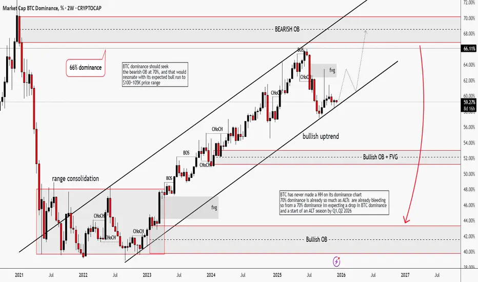
BTC Dominance | Winter is "Almost" ComingHello traders,
Its been a minute since I last checked my wallet, cause I don't love seeing red. Who loves to?
BTC dominance on the 2W timeframe has been in an impulsive bullish uptrend. Structure-wise, it has printed multiple BOS + CHoCH, which tells me that capital are still rotating into Bitcoin, not alts.
What make me believe this further, is that BTC is forming a short-term bullish structure that might target $100-105k price range
Only after BTC dominance reaches 70% area, we might start expecting shift. Distribution on BTC.D and the conditions for an ALT season.
Historically, BTC dominance has struggled to make HH that is why I'm expecting a drop from the previous Bearish OB
TL;DR: BTC dominance shall drop from the range of the bearish OB 70% which shall align with its projected bull run to $100k-105k price range. After that, we can call for ALT season.
Good Luck!
Please drop a like and share your thoughts traders.
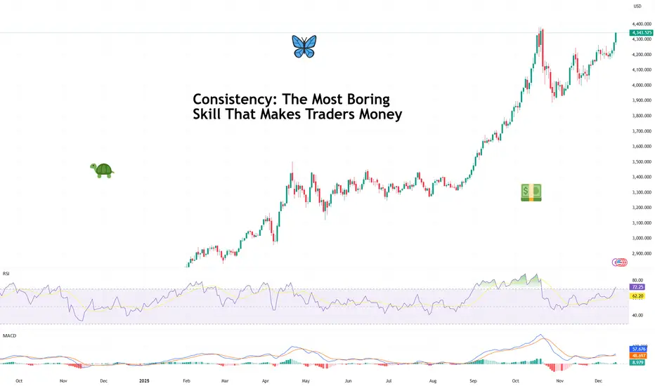
Consistency: The Most Boring Skill That Makes Traders MoneyAsk traders how they made their money and you’ll hear stories about perfect entries, heroic conviction, and that one legendary going-for-the-jugular trade they’ll mention at every dinner party.
What you almost never hear about is consistency — because it’s not glamorous, it doesn’t screenshot well, and it definitely doesn’t come with fireworks.
But consistency is the skill that turns trading from an emotional roller coaster into a durable business. It’s boring. It’s repetitive. And it’s responsible for more profitable careers than any secret indicator ever will.
🧠 Why the Market Rewards the Unexciting
Markets don’t pay you for being clever. They pay you for being repeatable.
Consistency works because markets are probabilistic systems. No single trade matters in the long run. What matters is what happens over time, across dozens or hundreds of decisions. (Good time to look back and see how you did this year.)
The trader who makes reasonable decisions again and again — even without brilliance — will eventually outperform the trader who occasionally nails a perfect call but can’t stop freelancing.
Think of it less like poker and more like compound interest. It doesn’t wow you at first. Then one day, you realize you’ve done pretty darn well.
📊 The Myth of the Big Trade
Every trader remembers their biggest win. And there’s nothing wrong with that. Some big trades can pay for a lot of small mistakes .
Big wins feel validating. They trigger confidence. But they also create dangerous expectations. Traders start chasing that feeling — trading bigger, faster, looser — and consistency quietly exits through the back door.
Professional traders know that a great trade doesn’t prove skill. A series of disciplined trades does.
The market doesn’t care how exciting your best trade was. It cares how well you behaved on the other ninety-nine.
🧮 Consistency Is Math, Not Motivation
Consistent traders don’t wake up feeling like it’s their lucky day.
They operate within a framework that reduces randomness in their decisions. They trade fewer setups, not more. They accept that being flat for the week is a position. They understand that not every day is designed to reward them.
This isn’t about grinding harder. It’s about removing unnecessary choices so execution becomes automatic.
Ironically, the less you try to be exceptional, the more real and reliable your results become.
📉 Losing Is Part of the Job
Consistency shows up most clearly during losing streaks. Anyone can look disciplined after a winning week. The test comes when trades stop working, narratives shift, and the urge to “make it back” creeps in.
Consistent traders don’t panic. They don’t revenge trade . They don’t rewrite their strategy after three red days.
Instead, they understand that drawdowns are not failures — they’re rent paid for staying in the game. The goal isn’t to avoid losses. It’s to keep losses from changing behavior.
🧠 Confidence Comes from Repetition
One of the quiet benefits of consistency is confidence — the real kind. Not the loud, chest-thumping confidence that comes from a hot streak. But the calm assurance that comes from knowing you’ve executed your plan a hundred times before.
That confidence allows traders to stay neutral when others get emotional. To reduce size when conditions change. To wait without feeling left out.
It’s the difference between reacting to the market and responding to it. Regardless if it’s fever-pitch earnings season or the Economic Calendar is jam-packed with events.
🕰️ The Long Game Always Wins
With that in mind, trading careers aren’t built in viral moments. They’re built in years upon years of working on your craft.
The traders who last aren’t necessarily the smartest or fastest. They’re the ones who made it boring enough to sustain it. And eventually, almost accidentally, the process builds itself into something that looks a lot like success.
Off to you : What’s your consistency strategy saying? Is boring beautiful or is risk-taking maxed out in your portfolio? Share your thoughts in the comments!
Gold – Potential Choppy Price Action AheadThe market got what it wanted from the Federal Reserve last night when a widely anticipated interest rate cut of 25bps (0.25%) was announced, a move which as a rule is positive for Gold prices as it is an asset that doesn’t bear any interest itself. Initially this was the case, with the popular metal trading from opening levels at 4210 before the Fed decision on Wednesday up to a one week high of 4248 early this morning. However, that is where the positive story ended and Gold prices have since traded back down to 4210 again at the time of writing (0700 GMT).
On a longer-term basis, the drivers underpinning prices still seem to remain in place, namely central bank buying dips, concerns over swelling government debt and an uncertain geopolitical outlook, but in the short-term Gold prices could be at the mercy of general risk sentiment, which is wavering after a disappointing Q3 earnings release from Oracle overnight, and positioning readjustment. This situation isn’t helped by the reality that there is little in the way of scheduled risk events for traders to focus on until the release of US Non-farm Payrolls next Tuesday, December 16th (1330 GMT) and the interest rate decisions from the Bank of England, European Central Bank (December 18th) and Bank of Japan (December 19th).
This backdrop could suggest potential for some choppy price action ahead which may require traders to keep monitoring important support and resistance levels that could impact the direction of Gold moving forward.
Gold Technical Update: Watching the 4245/4265 Resistance Band
Since posting the 4381 October 20th high and 3887 October 28th low, Gold has entered a more balanced phase of sideways trading between these extremes. The over‑extended upside price conditions seen after the recent sharp acceleration higher are currently being unwound by this activity.
This current balance between buyers and sellers is evident in the chart below, but it also highlights that no successful closing breakout has yet materialised in price.
Gold’s initial response to the Fed interest rate cut and subsequent press conference yesterday was more positive, with fresh price strength emerging. However, there is still no evidence of a successful breakout to the topside on a closing basis.
As such, maintaining an awareness of both key support and resistance levels could be important in gauging whether the recent sideways trading range is nearing an end.
Possible Resistance Levels:
As the chart below highlights, there is a combination of potential resistance levels situated just above current price activity. This zone reflects both the downtrend line connecting price highs back to October 20th, which sits at 4245 and the December 1st high at 4265. Having previously marked areas where selling pressure has emerged, traders may now be focused on how this resistance band is defended on a closing basis.
Closing breaks above 4245/4265 could lead to a fresh phase of price strength, marking an upside break in Gold from its sideways activity. While not a guarantee of sustained gains, such a move could open potential to challenge the 4381 October 20th extreme and possibly extend further if that level also gives way on a closing basis.
Potential Support Levels:
For now, the 4245/4265 resistance band remains intact. While this area continues to cap attempts at price strength on a closing basis, risks may shift toward the downside, bringing the Bollinger mid‑average at 4155 into play as a potential support level to monitor.
Closing breaks below this support at 4155, if seen, could suggest scope for continued declines toward 3998, the November 18th low. If this level also gave way, it may open the path toward 3887, the October 28th downside extreme.
The material provided here has not been prepared accordance with legal requirements designed to promote the independence of investment research and as such is considered to be a marketing communication. Whilst it is not subject to any prohibition on dealing ahead of the dissemination of investment research, we will not seek to take any advantage before providing it to our clients.
Pepperstone doesn’t represent that the material provided here is accurate, current or complete, and therefore shouldn’t be relied upon as such. The information, whether from a third party or not, isn’t to be considered as a recommendation; or an offer to buy or sell; or the solicitation of an offer to buy or sell any security, financial product or instrument; or to participate in any particular trading strategy. It does not take into account readers’ financial situation or investment objectives. We advise any readers of this content to seek their own advice. Without the approval of Pepperstone, reproduction or redistribution of this information isn’t permitted.

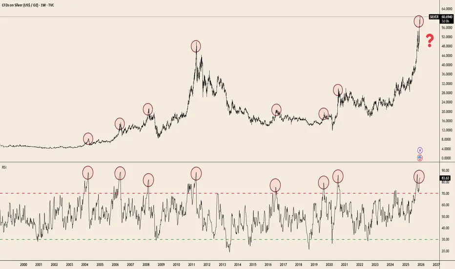
Silver at Extremes: RSI Signals Haven’t Missed in 20 YearsTVC:SILVER has delivered a massive breakout — up +109.9% YTD — but the weekly RSI is now pushing into one of the most extreme zones seen in two decades. Historically, every major spike into the 80–85 RSI band has preceded cooling periods, consolidations, or full reversals.
The chart makes the pattern clear:
• Each parabolic advance since 2004 ended with RSI extremes similar to today.
• Price is testing the same overextension zone seen at the 2011 blow-off top and the 2020 surge.
• Weekly RSI rarely stays above 80 for long — momentum tends to reset before the next leg can form.
This doesn’t guarantee a top.
But when a commodity doubles in a single year and hits long-term RSI ceilings simultaneously, risk/reward becomes asymmetric.
Silver’s trend remains powerful — the question now is how sustainable the slope is.
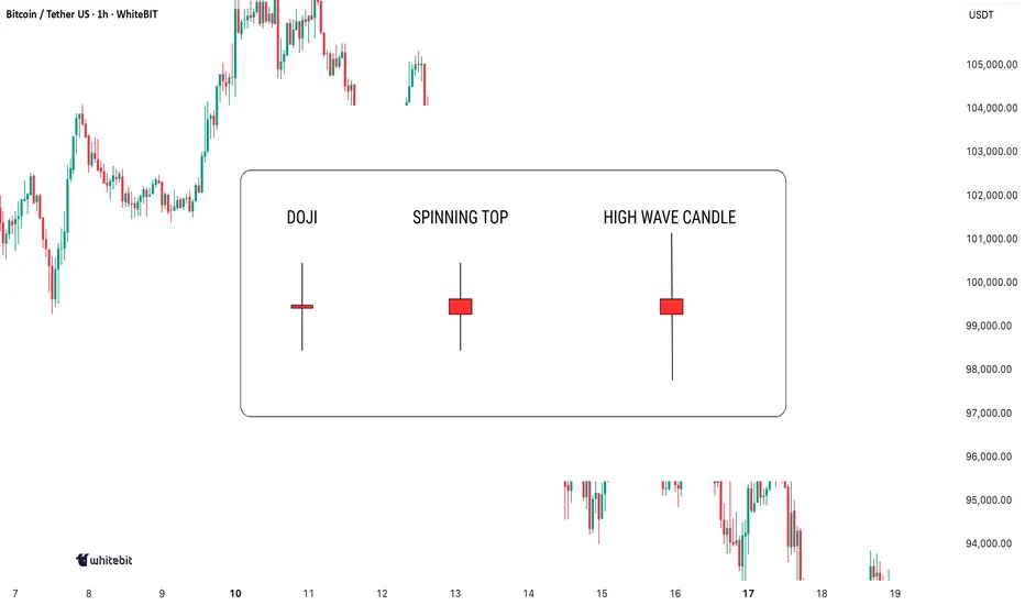
Indecision on the Chart: What These Candles Really MeanIndecision in the market? You're not alone. Every trader has faced those moments when the charts seem to scream confusion. But here's the thing: indecision candlestick patterns aren't just noise. They hold secrets that, when decoded, can give you the upper hand. Let's dive in and learn how to spot these patterns and use them to your advantage.
Mastering Indecision Candlestick Patterns
The most well-known indecision candles are the Doji, Spinning Top, and High Wave Candle. These candlesticks might seem tricky at first, but once you learn to recognize them and understand their context, they can serve as valuable tools in your trading strategy.
Doji
A Doji has a small body with nearly identical open and close prices, and long upper and lower wicks, indicating market indecision—neither buyers nor sellers gain control during that period.
When to look for confirmation: A Doji alone isn’t enough to trade. Wait for confirmation from the next candle: a bearish one after an uptrend may signal a reversal, while a bullish one after a downtrend might indicate the start of a rally.
Spinning Top
A Spinning Top is an indecision candle with a small body and longer upper and lower shadows. It indicates uncertainty, with more volatility than a Doji.
When to look for confirmation: A Spinning Top is more meaningful after a strong trend. Following an uptrend, it could signal weakening momentum. Wait for the next few candles to confirm the market’s direction.
High Wave Candle
The High Wave Candle is like the Spinning Top but with even longer wicks. It shows high volatility with no clear direction, as the price fluctuates widely but the open and close remain close, indicating indecision.
When to look for confirmation: Use the High Wave Candle with trend analysis. If it appears during consolidation or after a major move, it may signal a breakout. As with other indecision candles, wait for confirmation before acting.
Combining Indecision Candles with Indicators
While indecision candle patterns can provide useful insights, they are most effective when combined with other technical indicators. Here are some ways to use them in combination:
Moving Averages: Use moving averages (like the 50-period or 200-period) as a trend filter. If a Doji or Spinning Top forms above a moving average and the next candle confirms a reversal, it may signal trend continuation.
Relative Strength Index (RSI) : If an indecision candle forms when RSI is at extreme levels (above 70 or below 30), it may signal an upcoming pullback or reversal.
Volume: A high-volume candle following an indecision candlestick often confirms strong follow-through. Without volume, these patterns may be less reliable.
Where to Avoid Using Indecision Candles
While indecision candles are useful, there are some scenarios where relying on them without confirmation can be misleading:
Choppy Markets: Indecision candles appear frequently and may not signal real reversals.
During News Events: Sharp price spikes can create false indecision signals.
Lack of Context: A Doji in sideways price action has less significance than one after a strong trend.
Indecision candles signal uncertainty, but don’t act on them blindly. Always combine them with other analysis and make decisions based on your own judgment!
If you don’t know this pattern, you’ll miss out the main profits🌀 Complete Guide to Rounded Bottom and Rounded Top Patterns for Traders
The rounded bottom and rounded top patterns are among the most reliable reversal patterns in technical analysis. They form gradually and usually indicate a major trend reversal in the market.
🔵 Rounded Bottom Pattern
📌 Definition
A rounded bottom forms when the price gradually declines and then slowly starts to rise.
This pattern looks like a large U-shape or semicircle.
📌 Nature of the Pattern
Downtrend → exhausted
Sellers → weakening
Buyers → gradually entering
📌 Key Features
1️⃣ Gradual Formation
Unlike double bottoms or twin peaks that form quickly, this pattern takes time.
2️⃣ Gradual Volume Decrease
Volume decreases at first
Lowest volume occurs in the middle
Volume rises again as the price recovers
⚠️ In low-volume markets (e.g., some crypto assets), be cautious.
3️⃣ No Sharp Candlestick Shadows
Candles usually have smooth and steady movement.
4️⃣ Curved Path
The price moves along a curved trajectory.
🔍 How to Identify a Rounded Bottom
The prior trend must be downward. Without a preceding downtrend, the pattern is meaningless.
Candles should start from a point and move with low volatility, indicating a “tired” market.
The middle of the pattern has lowest price fluctuation and volume, like the bottom of a bowl.
After the midpoint, candles gradually become larger and buyers gain strength.
If a curved line is drawn, the price should not break it; otherwise, the pattern is invalid.
🔵 Rounded Top Pattern
Same as the rounded bottom, but in reverse.
Prior trend: uptrend
Buyer enthusiasm decreases
Price gradually reverses
Price begins to decline
🎯 Best Timeframes
H1, H4, D1
Smaller timeframes (1m, 5m, 15m) are noisy and can produce false breakouts.
🧠 Entry Points (Trading Setup)
1️⃣ Entry after Breakout (Safer)
Rounded Bottom: draw a resistance line at the highest peak on the right → enter when candle closes above it.
Rounded Top: draw a support line → enter short after a confirmed breakout.
2️⃣ Entry on Pullback (Lower Risk + Higher Reward)
Wait for the price to pull back after the breakout
Enter after confirmation of the reversal
🛑 Stop Loss
Rounded Bottom: below the center or lowest point on the right
Rounded Top: above the center or highest peak on the right
🎯 Take Profit
Set the target equal to the height of the pattern from the breakout point.
Subsequent targets can be set at next support/resistance levels.
✔️ Psychological Aspect on Chart
Rounded Bottom: 🟢 from despair to hope
Rounded Top: 🔴 from euphoria to selling pressure
🎯 Professional Confirmation Filters
Positive divergence in rounded bottom
Negative divergence in rounded top
Volume increase after breakout
Strong breakout candle
⚠️ Common Mistakes
Using very small timeframes → fractal patterns look like rounded but are false
Entering before breakout → most common cause of losses
Drawing wrong curve → sharp spikes or shadows invalidate the pattern
Ignoring volume → shallow markets (e.g., small altcoins) can distort the pattern
📌 Golden Rule for Traders
Rounded Bottom → signals the start of a long-term uptrend
Rounded Top → signals a correction or temporary decline
✅ Best practice: enter at the breakout point and ride the main trend

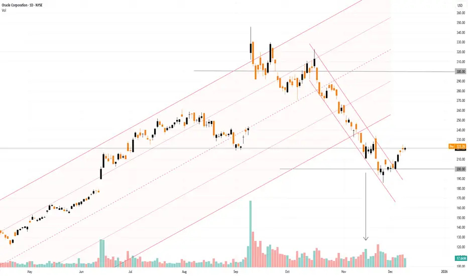
Oracle (ORCL) Share Price Rebounds Ahead of Earnings ReleaseOracle (ORCL) Share Price Rebounds Ahead of Earnings Release
Oracle is due to publish its quarterly results today after the close of the main trading session. Analysts are expecting solid year-on-year growth compared with the same period last year:
→ Revenue: forecast to rise by around 15% to $16.15–16.2 billion.
→ Earnings per share (EPS): expected at $1.63–1.65, up roughly 11%.
At the same time, the market’s focus will be on the company’s plans in two key areas:
→ Order backlog growth: investors are looking for confirmation that demand for AI infrastructure remains strong. Previously, orders exceeded $500 billion.
→ Debt and capital expenditure (capex): Oracle is spending aggressively on data centres (capex could rise to as much as $25 billion per year) while taking on additional debt. This has raised concerns that costs may be increasing faster than the actual profits generated from AI.
Today’s results are particularly important in light of the market reaction to the previous earnings release.
On 15 September, we noted that ORCL shares surged with a bullish gap above the psychological $300 level. Since then, however, the share price has fallen by more than 30%. One possible explanation is that “smart money” used the spike in speculative demand to lock in profits on long positions — a view supported by exceptionally high trading volumes. Once demand faded, the price moved lower within a descending channel.
Within the broader long-term channel (shown in orange), the price briefly broke below the lower boundary but failed to follow through. Meanwhile, the narrowing candle body on 21 November (marked by the arrow), combined with a spike in volume, may suggest that institutional investors were absorbing selling pressure, potentially signalling expectations of higher prices ahead.
Positive signs include:
→ a false bearish break below the psychological $200 level;
→ a break of the red downward trajectory;
→ a rise in ORCL shares in pre-market trading today.
If Oracle’s actual results and management’s outlook impress investors, the ORCL share price could move back into the orange ascending channel.
This article represents the opinion of the Companies operating under the FXOpen brand only. It is not to be construed as an offer, solicitation, or recommendation with respect to products and services provided by the Companies operating under the FXOpen brand, nor is it to be considered financial advice.
USDJPY breakout supported at 155.60The USDJPY remains in a bullish trend, with recent price action showing signs of a corrective pullback within the broader uptrend.
Support Zone: 155.60 – a key level from previous consolidation. Price is currently testing or approaching this level.
A bullish rebound from 155.60 would confirm ongoing upside momentum, with potential targets at:
158.00 – initial resistance
159.00 – psychological and structural level
159.70 – extended resistance on the longer-term chart
Bearish Scenario:
A confirmed break and daily close below 155.60 would weaken the bullish outlook and suggest deeper downside risk toward:
155.00 – minor support
154.60 – stronger support and potential demand zone
Outlook:
Bullish bias remains intact while the USDJPY holds above 155.60. A sustained break below this level could shift momentum to the downside in the short term.
This communication is for informational purposes only and should not be viewed as any form of recommendation as to a particular course of action or as investment advice. It is not intended as an offer or solicitation for the purchase or sale of any financial instrument or as an official confirmation of any transaction. Opinions, estimates and assumptions expressed herein are made as of the date of this communication and are subject to change without notice. This communication has been prepared based upon information, including market prices, data and other information, believed to be reliable; however, Trade Nation does not warrant its completeness or accuracy. All market prices and market data contained in or attached to this communication are indicative and subject to change without notice.

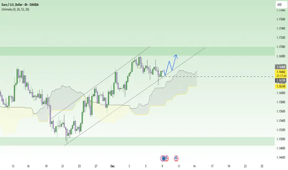
Waiting for the Fed: EURUSD set to explode!When the entire market is focused on the upcoming Fed meeting , EURUSD looks like an athlete that has fully warmed up and is just waiting for the starting whistle. The current context slightly favors the euro, as the Fed is expected to cut rates soon after a series of weakening labor data, while Eurozone GDP and inflation remain relatively stable. With U.S. interest rates trending lower and the ECB not too dovish, conditions are quite supportive for the euro to regain strength against the USD.
On the H4 chart, price has repeatedly bounced from the lower boundary of the ascending channel and the Ichimoku cloud, showing that the main trend is still upward. The area around 1.1630 acts as a near support level, aligning with the trendline and the upper edge of the cloud, meaning any pullback here is more of a buying opportunity rather than a reversal signal.
The preferred scenario is that if price holds above 1.1630 and forms a strong bullish candle, EURUSD may continue climbing towards 1.1680, which is the previous high and a short-term resistance zone. In short, with both fundamentals and technicals aligned, the sensible strategy right now is to wait for a retest of support to buy with the trend, instead of trying to call a top in a market still driven by bullish fundamentals .
UNH: 50% Inception"All I want to buy in 2025 is Healthcare" has been what I've told people that ask me about this tech stock or that AI company. It is my nature to look for what sector is the most downtrodden and find opportunity there... NOT in what "everyone" is talking about. I still feel that way as 2025 comes to a close.
The big move in this sector this year was $NYSE:UNH. I played this a few ways on the drop. My first entry was on the raw 50% Retracement of the trend from the bottom of 2008 to the All Time High of November 2024. Such a fast and deep retracement on such a high capitalization stock cannot be ignored. These things come around literally once per generation.
The second entry was the Volume Profile level of the pre-COVID years. This was the last possible Support and if price had traded any lower I would have had to cut my position for risk management. However, it was then soon reported that both the GOAT trend trader, Warren Buffet... and the GOAT contrarian Michael Burry... had BOTH taken large positions in the company and price responded bullishly.
I have continued to watch my position and today on my scanner for morning 30m Spikes I saw UNH.
This Spike comes at the near perfect intersection of both the short term (November 19th-December 4th) trend AND the long term generational 50%. It's a "must take" trade so I added it to my short term trading accounts to supplement my long term position.

Solana ~ TRADE The CHOP: 3 Ways to Make ATLEAST +15%Choppy markets are identified by low volume and sideways trading / range trading. It seems uninteresting in most cases, but you don't have to sit around and wait for the next big impulse wave!
Here are three plays YOU can take during choppy markets:
1) 4H : Short Resistance
Chop trading can be a blessing - the price often touches the same support zone and the same resistance zone 2 - 3 times, before breaking out either way. This means that if you spot your zone early, you could take a short timeframe swing trade. Another way to find a trade is to look for gaps in the candles, for example:
2) 4H : Long Support
South Africa is in a time of turbulence, and the Rand is unpredictable as the effects of G20 settle in. During these times, and this counts for all markets, placing a low risk leveraged long on support is a way to trade the chop:
3) Daily : SPOT Hold to TP Zone
Nothing like a classic low risk trade - but you may need some patience with it! If you're not willing to look at charts all day, or have alarms wake you up at 2:30am to take a trade then this is your style., for example:
What do you do during choppy markets?

Trading Wedges - Quick Guide in 5 StepsWelcome back everyone to another guide, today we will speed run "Trading wedges" in a quick 5 step guide. Be sure to like, follow and join the community!
1) Identify the wedges:
- Falling Wedge
- Rising Wedge
- Symmetrical Wedge (Triangle)
2) Identify Breakout Direction:
- Falling Wedge > Bullish Breakout Expected
- Rising Wedge > Bearish Breakout Expected
- Symmetrical Wedge (Triangle) > Consolidation Expected
Breakout should show a candle closing outside the wedge.
3) Wait for retest to take place on previous key level or resistance (which would now be support)
If the retest holds with a strong rejection candle or consolidation - begin to long.
4) Enter Trade:
Enter on successful retest confirmation
SL for longs should be below previous low's
SL for shorts should be above previous highs.
5) TP levels:
TP 1) First high target
TP 2) Second high target
TP 3) Third high target.
RESULTS:
Price has soared up high and hit all three Take profits.
For trader who are wanting more profits you can potentially enable TP trailing afterwards - however I don't recommend this as you need to factor in your emotions of "GREED"
Thank you all so much for reading! Hopefully this is a useful guide in the future or present! If you would like me to make any simplified guides, let me know in the comments below or contact me through trading view!

Tesla Stock Lifts 2025 Gains to 20% as Traders Eye Santa RallyA megacap squeezing in one more rally before year-end? Yes, please.
🚗 A Holiday Glide Higher for Tesla Shares
Tesla NASDAQ:TSLA is heading into December with solid momentum. Coming into Monday, the stock has risen 20% since January, putting it on track for a third straight annual gain .
Investors will gladly take it. Tesla isn’t exactly a low-volatility cuddle toy — this is a stock that fell 65% in 2022, then turned around and doubled in 2023, then tacked on another 63% in 2024.
Still, the long arc is impressive: since Tesla's 2010 IPO, the stock has only posted annual declines twice — in 2016 and that infamous crash year of 2022. This year’s 20% gain looks tame by Tesla standards, but context matters: tame is good.
🎅 Santa Rally Season: Will Tesla Join the Party?
This is the time of year when traders start looking for that special year-end swing called Santa rally.
Fortunately, December has been good to Tesla shares. Really good. The stock has risen in more than half of all Decembers since its flotation 15 years ago, with nine monthly gains and six declines over its life as a public company.
Why does the Santa rally happen?
• Some say it’s psychology: investors in a good mood tend to buy.
• Some say it’s portfolio managers smoothing out their year-end reports.
• Others point to tax strategies, retail flows, or just holiday optimism.
No one really knows — which makes it the perfect market myth. But if Santa does show up this year, Tesla benefits. A few cheerful sessions could be enough to lock in another positive annual finish.
Just don’t confuse December with easy money. Historically, it’s just as volatile as every other month — and sometimes worse.
🔥 When December Isn’t So Jolly
Want a reminder that Tesla can rewrite the script in both directions? Look no further than December 2022, when the stock plunged 37% in a single month.
Back then, investors worried CEO Elon Musk’s bold acquisition of Twitter (now X) was consuming far too much of his attention — at the cost of Tesla’s market cap.
The 2025 backdrop is far calmer. Today’s concerns are more traditional Tesla fare:
• How many cars will it deliver?
• What will margins look like?
• Is the growth runway intact?
• What type of robots will Elon talk about on the next call?
December can still swing.
📦 Deliveries: The Real Catalyst on Deck
But traders love a year-cap rally. Even more so when there’s something to bet on.
Expectations for Tesla’s Q4 2025 deliveries sit between 507,000 and 512,000 vehicles, a number that would help confirm a steady, if not explosive, growth narrative.
More importantly, full-year 2025 deliveries are projected to exceed 2 million units, aligning with Elon Musk’s long-term growth target of 20–30% year-over-year production.
In Tesla’s world, hitting numbers is the difference between “Tesla has momentum” and “Tesla is broken again.”
That means Q4 data — arriving Thursday, January 1 or Friday, January 2, 2026 — will be key for this year’s narrative. The numbers drop early in the morning while everyone is still recovering from celebrations, and suddenly your phone buzzes with either joy or existential dread.
Earnings are a big factor, too. The next report date, as per the earnings calendar , is set for January 28.
🎁 The Takeaway: A Rally Within Reach
Tesla’s 20% gain in 2025 looks solid heading into the final stretch, and seasonality is on its side.
• December tends to be kind.
• Santa rallies tend to lift boats.
• Analysts are optimistic about deliveries.
• The stock has historical resilience.
But this is still Tesla — a stock with a personality, a fanbase, a fierce opposition , and a volatility profile that can make your stomach churn.
Off to you : How do you see Tesla stock performing in December? Share your views in the comments!

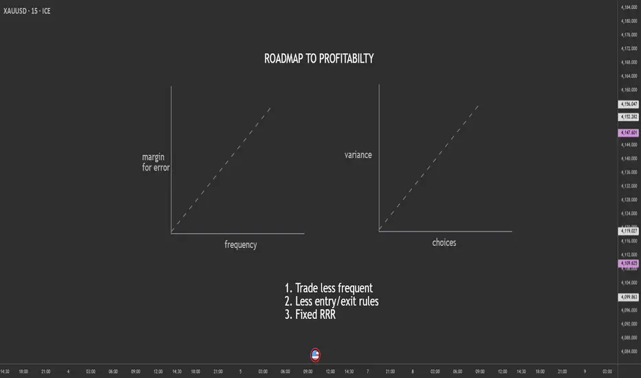
Trade Less, Choose Less, Profit More: The Counterintuitive Edge.Most retail traders believe they need more—more trades, more setups, more indicators, more signals. But in reality, the traders who survive (and thrive) do the opposite. They trade less frequently, reduce the number of decisions, and lock in a fixed risk-to-reward ratio that keeps their edge stable.
Here’s why simplifying your trading increases your chances of long-term profitability.
1. Trading Less Reduces Mistakes
Every trade is a decision.
Every decision carries emotional and cognitive load.
The more trades you take:
the more tired your brain becomes
the more emotional impulses creep in
the more likely you are to overreact to noise
the more commissions/spreads you pay
the more small errors compound into big losses
By reducing trading frequency, you automatically reduce the number of opportunities for mistakes.
Fewer trades → Higher quality → More consistency.
Elite traders don’t take every “okay” trade.
They wait for the A+ setups that align perfectly with their plan.
2. Fewer Choices = Lower Variance in Outcomes
When you have too many signals, too many strategies, or too many timeframes, your decision-making becomes inconsistent. Choice overload raises the variance in outcomes—you might catch a big win today and then give it all back tomorrow on impulsive trades.
Reducing choices tightens your performance curve.
When you:
trade one setup type
focus on one pair or market
use one timeframe
follow one clear trigger
…your results stabilize. The randomness disappears, and your edge becomes measurable.
A stable edge is a profitable edge.
3. A Fixed RRR Protects You From Yourself
Most traders blow accounts not because of strategy, but because of inconsistent risk-to-reward ratios.
Sometimes they take 1:3, sometimes they settle for 1:1, sometimes they hold for 1:6 and give it back. This inconsistency destroys expectancy.
A fixed RRR:
forces discipline
keeps losses small
standardizes wins
makes your edge mathematically trackable
creates predictable long-term performance
Your job is NOT to predict the market.
Your job is to control the asymmetry between risk and reward.
A consistent 1:2 or 1:3 turns even a 40% win rate into profitability.
Final Thought
If you feel stuck, overwhelmed, or inconsistent, don’t add more tools.
Remove them.
The fewer decisions you have to make, the fewer mistakes you make.
The fewer trades you take, the higher your quality becomes.
And the more consistent your RRR, the more likely you are to stay profitable.
In trading, less really is more.
Understanding the Midpoint Magnet: Weekly Price Filling The concept of 50% price filling on a weekly candle within a consolidation area relates to the common technical analysis practice of looking for a midpoint retracement before a potential breakout. When an asset's price enters a consolidation phase on the weekly chart—meaning it's trading sideways within a defined high and low (often forming patterns like rectangles or triangles)—traders view the 50% level of that range (the distance from the high to the low) as a key point of equilibrium or balance between buyers and sellers. This level, which is a psychological point often included in the Fibonacci retracement tool despite not being a true Fibonacci ratio, can act as a magnet where price action is likely to 'fill' or return to before initiating the next major move. Therefore, a weekly candle's wick or body penetrating and reversing at this 50% level suggests a rebalancing of orders and offers a high-probability zone for traders to anticipate either a continuation of the prior trend or a strong breakout from the consolidation range.
Consolidation area
Identifying Consolidation and Key Levels
Consolidation Area: The broader charts show the price of Gold Spot (XAUUSD) entering a period of sideways trading, characterized by alternating weekly bullish (green) and bearish (red) candles, often within a defined high and low range. This area represents a balance or indecision between supply and demand.
Key Candle/Range: The concept then focuses on a specific high-momentum candle (e.g., the Nov 2nd Week Candle) or the entire range of the consolidation to establish the boundaries for the analysis.
The 50% Level: The critical level is the 50% retracement (or midpoint) of this chosen range. This level is considered the Equilibrium (EQ) point, where buyers and sellers are perfectly balanced.
Example
On this chart, we see:
Each weekly candle dipped into the midpoint of the one before it,
Created reaction,
And built a foundation for continuation.
As long as the market keeps holding above the 50% zone, the structure remains intact and biased toward continuation.
During consolidation phases, the market often displays a repetitive behaviour:
each weekly candle tends to retrace and fill approximately 50% of the previous week’s candle before continuing in either direction.
This happens because the midpoint of a strong weekly candle is a fair value zone, where:
liquidity is gathered,
trapped orders are resolved,
and the market achieves balance before the next move.
How the Chart Demonstrates This
November 2nd week candle
A large bullish candle created a strong move upward.
This left an imbalance in price.
The midpoint of this candle sits around 4,122.
Following weeks
Price entered consolidation.
Each weekly candle retraced into the 50% zone of the previous week’s candle.
When price reached the midpoint, buyers stepped in again, causing a bounce.
Repeat Structure
This pattern repeated across the next candles:
wick down → fill midpoint → rejection → continuation
Showing a rhythmic behaviour characteristic of consolidation:
Slow pullback
Midpoint fill
Reaction
Next candle repeats
Current Candle
Again moved back into the midpoint zone, confirming the same behaviour.
Holding above the 50% level maintains a bullish continuation structure.
Why This Happens
The 50% zone of a strong candle is often where:
-institutions reload
-pending orders sit
-imbalances are corrected
This zone is neither expensive nor cheap — it’s fair value.
So, during sideways phases, price frequently returns there to:
✔ collect liquidity
✔ balance the market
✔ establish support or resistance
Before the next directional move occurs.
Key Takeaway
In consolidation, the market does not trend strongly.
Instead, it oscillates around the previous candle’s midpoint.

Why Bitcoin Endures While 90% of Altcoins Are Born to… Die Over more than five years of observing the crypto market, one clear pattern stands out: Bitcoin survives every cycle, while most altcoins only last a few storms before vanishing. This is not a subjective impression but a reality that any serious investor must understand. Bitcoin and altcoins differ in origin, value, and market strength, and these differences are what allow BTC to endure while most altcoins fade away early.
Bitcoin was created with the mission of becoming “digital gold.” It has a fixed supply of 21 million, operates in a decentralized manner, is not controlled by any single organization, and is widely accepted as a global asset. In contrast, around 90% of altcoins are launched primarily to raise capital, for marketing purposes, or to chase technological trends. Bitcoin exists because of real value; altcoins exist on temporary expectations. When these expectations fade, altcoins die, while trust in BTC grows, allowing Bitcoin to continue evolving and remain a cornerstone of the market.
Another distinction lies in cycles. Bitcoin follows a four-year halving cycle, moving through stages of accumulation, boom, correction, and re-accumulation. BTC consistently surpasses previous highs thanks to its stable cycle and long-term capital, which ensures enduring vitality. Altcoins, however, often experience a short life cycle: launch, hype, pump, dump, and eventual oblivion. Most altcoins stop at the final stage and never return to previous peaks, while Bitcoin always finds a way to reach new highs, demonstrating superior resilience.
Capital backing is also a decisive factor. Bitcoin is accumulated by ETFs, major banks, financial institutions, certain countries like El Salvador, and large corporations such as MicroStrategy. This represents long-term, sustainable capital capable of withstanding market fluctuations. Altcoins, on the other hand, rely mainly on short-term traders, retail FOMO, or social media marketing, making their prices highly volatile when capital exits. Thanks to stable institutional flows, Bitcoin is continuously accumulated and is rarely at risk of “dying” in any cycle.
Token structure creates another clear difference. Altcoins often undermine their own value through tokenomics: early unlocks, large team allocations, high inflation, and weak real demand. Bitcoin is entirely different: fixed supply, no one can mint more, and halving reduces supply over time. This increasing scarcity acts as a shield for its value, explaining why Bitcoin endures over time.
The biggest distinction also lies in the role of each type of currency. Bitcoin serves as the standard and backbone of the market; altcoins are merely “experimental products.” When BTC rises, altcoins revive; when BTC moves sideways, altcoins pump along with the flow; when BTC drops sharply, altcoins crash the hardest. This is a crucial reason for investors to understand that Bitcoin is a real asset, whereas altcoins are interchangeable products that can fail at any time.
Smart investing starts with understanding this difference. Bitcoin survives because of trust, economic structure, and real value, while altcoins exist on expectations, marketing, and short-term capital. To thrive long-term in the crypto market, you should treat Bitcoin as a foundational, enduring pillar and view altcoins as short-term, high-risk opportunities. Once you grasp this rule, you will avoid being swept into “moonshot” projects or holding altcoins that never return to previous highs, and instead invest with strategic vision rather than emotion.

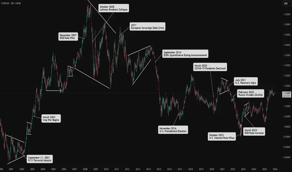
How Market Drivers Influence Forex PhasesI examined the key drivers and major players in the Forex market. Price patterns are a direct reflection of human psychology responding to significant events and the subsequent flow of institutional money. Therefore, understanding what influences overall market direction is crucial.
Above, you'll find a few historical events on the EUR/USD chart to analyze their effects on price movements.
Below is a brief overview of the four main drivers and the role of speculation in the Forex market.
******************
Key Triggers for Market Shifts
Market shifts in Forex are influenced by several key drivers. Grasping these drivers enables better identification of market phases and the price patterns that emerge within them.
Economic Health
Refers to consumers' financial stability and purchasing power.
A healthy consumer sector boosts economic growth and strengthens a country's currency.
Positive consumer sentiment leads to bullish currency trends, while negative sentiment results in bearish trends.
Monetary Policy
Central banks influence currency rates through interest rate policies.
Decisions regarding interest rates are high-impact news in Forex.
Central banks aim for maximum employment and inflation control, affecting currency value through their policies.
Fiscal Policy
Government expenditure on services and infrastructure impacts aggregate demand and GDP.
Increased spending can stimulate the economy, leading to currency appreciation.
However, if spending is funded by borrowing, it may lead to a higher budget deficit, causing loss of investor confidence and currency depreciation.
Political Stability
Refers to the reliability of a country's government and policies.
Stability encourages foreign investment and capital inflow, leading to currency appreciation.
Political unpredictability can deter investment and negatively impact currency value.
******************
Role of Speculation
Speculation from investors, based on perceived outcomes of these market drivers, creates volatility.
Major Market Players:
Investment Banks: The largest players in the Forex market, trading significant volumes between themselves and on behalf of clients like hedge funds and governments.
Hedge Funds: The third-largest players, trading pooled capital with long-term strategies.
Retail Traders: Although they contribute a high volume of transactions, their collective impact is smaller compared to institutional investors.
Speculation fuels volatility and price fluctuations.
Understanding these components helps identify patterns in the Forex market, leading to better trading strategies.
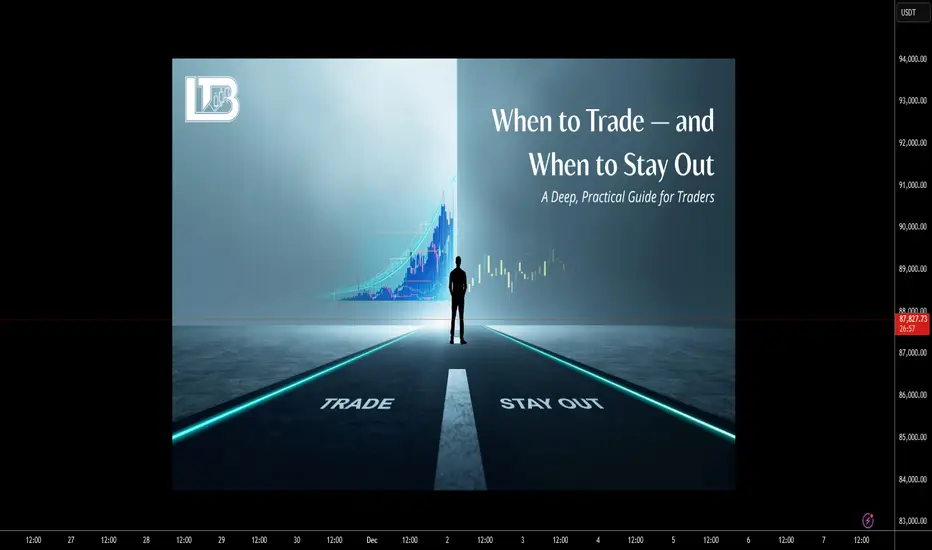
When to Trade — When to Stay OutWhen to Trade — When to Stay Out: A Deep, Practical Guide for Traders
Timing is a core edge. Not every hour, session, or chart condition is trade-worthy. The difference between a profitable trader and an active losing trader is not how many trades they take — it’s which trades they take and when. This article gives you a detailed, systematic framework to decide when to trade and when to stay out, with concrete rules, time windows, checklists and worked examples.
Big-picture logic
Markets are driven by liquidity (where orders sit), volatility (how fast price moves) and participants (who is trading). Good timing aligns these three:
Liquidity concentration (institutions, marketmakers) produces cleaner, higher-probability moves.
Right volatility means enough movement to reach targets but not so much that stop losses are random.
Recognizable market structure (trends, ranges, breaks) allows rules to be applied consistently.
If any of the three is missing, edge declines and risk of random losses rises.
Session windows — when the market is most tradable
Below are standard session definitions in UTC+00:00. Adjust for daylight savings if required (noted where relevant).
Tokyo / Asian Session
⏵ UTC+00:00: 23:00 – 08:00 ( main liquidity often 23:00–02:00 UTC )
⏵ Characteristic: lower liquidity for major FX pairs, choppier price action. Exceptions: JPY crosses, pairs with Asia-led liquidity, and crypto (24/7).
London Session
⏵ UTC+00:00: 07:00 – 16:00 (most active 08:00–11:00 UTC)
⏵ Characteristic: heavy institutional flow, high liquidity. Many clear directional moves begin here.
New York Session
⏵ UTC+00:00: 12:00 – 21:00 (most active 13:00–16:00 UTC)
⏵ Characteristic: continuation or reversal of London moves; major news releases occur here.
Key overlap (best single window)
⏵ London–New York overlap: UTC+00:00 ~12:00–16:00. Highest combined liquidity and volatility; most “clean” trends and reliable breakouts occur here.
Rule of thumb: Prefer intraday trades during the London session and the London–New York overlap. Be selective in Asia unless trading JPY pairs or range-break strategies designed for low liquidity.
Concrete: Best times to trade (prioritized)
Session open impulse — first 60–120 minutes of London or New York sessions.
Overlap window — London + New York overlap (UTC+00:00 ~12:00–16:00).
Post-news verified moves — 10–30 minutes after high-impact macro prints, if market structure becomes clear and isn’t just noise.
Clear breakouts after consolidation during active sessions (volume confirmation, sweep of liquidity, not just a one-bar spike).
When to avoid trading (and why)
Low-volume Asian hours for majors — price tends to chop and give false signals.
Right before major macro releases (NFP, CPI, FOMC) — price can gap or spike unpredictably. Exceptions: defined volatility playbook with strict hedges.
Midday lulls after initial session impulse — often flat ranges and low edge.
On unclear structure / messy price action — wide, overlapping candles, no clear swing highs/lows.
During market holidays or early close days — liquidity is thin; spreads widen.
Pre-trade checklist
Time window OK? (London / NY open or high liquidity event)
Major news? (No significant release within ±30 mins)
Higher timeframe structure clear? (H4 or Daily trend / range)
Trade idea defined (entry, stop, target) — use price levels, not indicators only.
Risk per trade ≤ planned % of account (see position sizing).
Reward : Risk ≥ your minimum (e.g., 1.5–3:1 depending on edge).
Catastrophic stop capability confirmed (can you absorb worst-case slippage?)
Exit rules set (profit-taking scale or full exit)
Trade logged in journal immediately after (reason, setup, time, bias)
Position sizing — exact worked example (step-by-step)
Use a fixed % of equity for risk per trade (commonly 0.5%–2%). Example uses 1% risk.
Assume:
Account size = $10,000.
Risk per trade = 1% of account = $10,000 × 0.01.
We compute digit-by-digit: 10,000 × 0.01 = 100. So maximum $100 risk on this trade.
Generic position-size formula:
Position size (units) = (Account Size × Risk%) ÷ (Stop Distance in price units × Value per price unit per 1 unit)
Always recalc pip/value for cross rates and for instruments (stocks, futures, crypto) — adapt the “value per price unit” accordingly.
Money Management is much more important than a strategy. You should learn Money Management before trying any strategy.
Order types & execution rules
Limit entries at confluence levels (support/resistance + liquidity sweep zone) — better price and less slippage.
Stop orders for breakout entries — use when you want to enter only after momentum confirms.
OCO (One Cancels Other) for scaling / invalidation management — reduces manual errors.
Avoid market entries during major news due to slippage/gap risk, unless your plan accounts for it.
Trade management & exits
Initial target: defined by structure (previous swing, ATR multiples, measured moves).
Scale out: consider taking partial profits at the first reasonable target, let the rest run with a trailing stop.
Stop relocation: only move stop to breakeven after a predefined profit multiple reached (e.g., after +1R or after price clears a new structure). Don’t move stops based on emotion.
If price returns and breaks your entry zone invalidating the setup, exit — the market changed.
Strategy-specific timing tweaks
Trend-following: prefer strong sessions (London/NY) and avoid Asian low-liquidity hours. Enter on retracements that align with higher timeframe trend.
Range / mean-reversion: worst during session opens; best during mid-session lulls, but only if volatility is low and boundaries are clear.
Breakout strategies: require confirmation — e.g., breakout during overlap or accompanied by increased volume / volatility. Avoid breakouts in thin Asian hours.
News scalping: high risk; only for experienced traders with defined entry, strict spread/latency controls, and capital to absorb spikes.
Common mistakes (and how to fix them)
Trading outside your chosen time windows — fix: enforce a trading clock.
Overtrading in chop — fix: increase minimum R:R and wait for clear structure.
Ignoring spreads and liquidity — fix: include spread in stop/target math and avoid thin sessions.
Moving stops prematurely — fix: use rules (e.g., only move after +1R).
Trading news impulsively — fix: have a news plan: either avoid or have a predefined volatility playbook.
Emotional trading (e.g. not closing the position when the price hits stop-loss)
Psychological & routine rules
Trade only when rested and focused.
Limit screen time to your pre-set sessions.
Keep a journal: reason for trade, outcome, lessons. Review weekly.
Daily routine: pre-market scan 30–60 minutes before your active session, post-session journal entry.
FAQ
Q: Can I trade during Asian hours?
A: Yes — but selectively. Prefer JPY pairs, Asia-centric instruments, or strategies built for low volatility.
Q: What if my timeframe and session disagree?
A: Give priority to higher timeframe structure. If H4 / Daily shows trend, trade during active sessions for better fills.
Q: How much should I risk per trade?
A: Conservative traders use 0.5%–1% per trade. More aggressive ones use up to 2%. The key is consistency and drawdown planning.
Focus your trading during high-liquidity windows (London, New York, and their overlap), avoid low-volume and pre-news periods, always validate trades with liquidity + volatility + clear market structure, use strict risk management (e.g., 1% per trade with position sizing), and follow a pre-trade checklist to avoid low-quality setups. Better timing = better edge.
Enjoy!