WILL DBD MARKING UP?This looks like an Atypical Re-Accmulation Schematic #2 Wyckoff
Phase C probably around 3feb-10feb,
SpringBoard detected (red line)
No trigger bar yet, agressive positioning here.
Tight risk, trading around danger point
upcoming earning pls be good
Wyckoffmethod

TJX TO CONT MARK UPLooks like, this is an atypical Re-Accmulation scehmatic 2 of Wyckoff
Supply from 26th jan- 1st feb succesfully absorbed
With Springboard , (Red line)
position intiated based on trigger bar today
**trigger bar still incomplete at the moment

Spring in play?The crypto market just went through another heavy liquidation event, with BTC flushing down to 59k. As expected, altcoins took the brunt of the move with many breaking structural lows and sentiment capitulating.
Even so, a number of alts are now showing tradeable relief‑rally structures. These aren’t guarantees nothing ever is, but the setups are technically clean, with clear invalidation levels and logical upside targets if the market stabilises.
The key thing to keep in mind:
If BTC continues lower (which is still very possible), many of these setups will likely get invalidated and push into their yearly S2 pivots or deeper support zones. Until then, the structure on several alts supports the idea of short‑term relief before the next major decision point.
I’ll be using this same template across multiple charts so the logic stays consistent.
Price swept the October 10th lows and printed a low‑volume spring relative to the selling climax. It has since closed back inside the range and is currently holding above the new yearly S1 support (at least for now).
Targets & Management
TPs
- First target sits just below the yearly pivot
- If price reaches that level, trail the stop toward the range EQ
Depending on BTC’s strength, the stop can continue to trail, but one step at a time
Risk
As always, risk management is everything. These setups are valid only while structure holds, and BTC remains the dominant variable.

Spring in play? The crypto market just went through another heavy liquidation event, with BTC flushing down to 59k. As expected, altcoins took the brunt of the move with many breaking structural lows and sentiment capitulating.
Even so, a number of alts are now showing tradeable relief‑rally structures. These aren’t guarantees nothing ever is, but the setups are technically clean, with clear invalidation levels and logical upside targets if the market stabilises.
The key thing to keep in mind:
If BTC continues lower (which is still very possible), many of these setups will likely get invalidated and push into their yearly S2 pivots or deeper support zones. Until then, the structure on several alts supports the idea of short‑term relief before the next major decision point.
I’ll be using this same template across multiple charts so the logic stays consistent.
Price swept the October 10th lows and printed a low‑volume spring relative to the selling climax. It has since closed back inside the range and is currently holding above the new yearly S1 support (at least for now).
Targets & Management
TPs
- First target sits just below the yearly pivot
- If price reaches that level, trail the stop toward the range EQ
Depending on BTC’s strength, the stop can continue to trail, but one step at a time
Risk
As always, risk management is everything. These setups are valid only while structure holds, and BTC remains the dominant variable.

Spring in play?The crypto market just went through another heavy liquidation event, with BTC flushing down to 59k. As expected, altcoins took the brunt of the move with many breaking structural lows and sentiment capitulating.
Even so, a number of alts are now showing tradeable relief‑rally structures. These aren’t guarantees nothing ever is, but the setups are technically clean, with clear invalidation levels and logical upside targets if the market stabilises.
The key thing to keep in mind:
If BTC continues lower (which is still very possible), many of these setups will likely get invalidated and push into their yearly S2 pivots or deeper support zones. Until then, the structure on several alts supports the idea of short‑term relief before the next major decision point.
I’ll be using this same template across multiple charts so the logic stays consistent.
Price swept the October 10th lows and printed a low‑volume spring relative to the selling climax. It has since closed back inside the range and is currently holding above the new yearly S1 support (at least for now).
Targets & Management
TPs
- First target sits just below the yearly pivot
- If price reaches that level, trail the stop toward the range EQ
Depending on BTC’s strength, the stop can continue to trail, but one step at a time
Risk
As always, risk management is everything. These setups are valid only while structure holds, and BTC remains the dominant variable.

Spring in play? The crypto market just went through another heavy liquidation event, with BTC flushing down to 59k. As expected, altcoins took the brunt of the move with many breaking structural lows and sentiment capitulating.
Even so, a number of alts are now showing tradeable relief‑rally structures. These aren’t guarantees nothing ever is, but the setups are technically clean, with clear invalidation levels and logical upside targets if the market stabilises.
The key thing to keep in mind:
If BTC continues lower (which is still very possible), many of these setups will likely get invalidated and push into their yearly S2 pivots or deeper support zones. Until then, the structure on several alts supports the idea of short‑term relief before the next major decision point.
I’ll be using this same template across multiple charts so the logic stays consistent.
Price swept the October 10th lows and printed a low‑volume spring relative to the selling climax. It has since closed back inside the range and is currently holding above the new yearly S1 support (at least for now).
Targets & Management
TPs
- First target sits just below the yearly pivot
- If price reaches that level, trail the stop toward the range EQ
Depending on BTC’s strength, the stop can continue to trail, but one step at a time
Risk
As always, risk management is everything. These setups are valid only while structure holds, and BTC remains the dominant variable.

Spring in Play?The crypto market just went through another heavy liquidation event, with BTC flushing down to 59k. As expected, altcoins took the brunt of the move with many breaking structural lows and sentiment capitulating.
Even so, a number of alts are now showing tradeable relief‑rally structures. These aren’t guarantees nothing ever is, but the setups are technically clean, with clear invalidation levels and logical upside targets if the market stabilises.
The key thing to keep in mind:
If BTC continues lower (which is still very possible), many of these setups will likely get invalidated and push into their yearly S2 pivots or deeper support zones. Until then, the structure on several alts supports the idea of short‑term relief before the next major decision point.
I’ll be using this same template across multiple charts so the logic stays consistent.
Price swept the October 10th lows and printed a low‑volume spring relative to the selling climax. It has since closed back inside the range and is currently holding above the new yearly S1 support (at least for now).
Targets & Management
TPs
- First target sits just below the yearly pivot
- If price reaches that level, trail the stop toward the range EQ
Depending on BTC’s strength, the stop can continue to trail, but one step at a time
Risk
As always, risk management is everything. These setups are valid only while structure holds, and BTC remains the dominant variable.

#WLFI –Smart Money Is Distributing.. Are You Holding the Bag?
Yello Paradisers! Are you ready for what might be the final phase of a textbook Wyckoff distribution on #WLFI? This setup is unfolding with near-perfect precision — and the window for positioning before a potential breakdown is closing fast.
💎#WLFI is currently displaying a textbook Wyckoff distribution pattern that began with clear signs of buyer exhaustion. A steep parabolic rally marked the Buying Climax (BC), where price action turned aggressive and unsustainable. This was quickly followed by a classic Upthrust After Distribution (UTAD), where price briefly pushed above previous highs — only to reverse sharply, trapping breakout buyers and signaling a major shift in market intent. What followed was even more telling: a clear structural shift from higher highs to a lower low, a classic Sign of Weakness (SOW) indicating the distribution phase was well underway.
💎Most recently, we saw a weak bounce, known in the Wyckoff model as the Last Point of Supply (LPSY). Price attempted to retest the upper supply zone but was quickly rejected to the downside — a strong signal that bears are taking control and the final distribution push may be complete. The UTAD zone now acts as a major resistance level, and as long as price remains below that zone, the path of least resistance remains downward.
💎In terms of key levels, minor support sits around $0.1475. However, a break below that level could accelerate the move down toward the stronger support area at $0.1275 — a level that could trigger emotional selling if breached.
But it never is and never will be a free ride. Make sure you play it smart, Paradisers. Discipline, patience, robust strategies, and trading tactics are the only ways you can make it long-term in this market.
MyCryptoParadise
iFeel the success🌴

KLCI SELLThis is a continuation, update from my previous post -
I calculated the estimation projection for KLCI based 3rd Wyckoff Law @ late October 2025 :
Conservative Target : 1640 - 1676
Agressive Target : 1771
In a hindisght, i never thought that it would reach the agressive target
-im closely monitoring this level
Since october 2025, i have been on cash mostly.
With periodic swing in between around mid october, and %100 sitting + resting at the moment
Our attempt shorting the KLCI failed for 2x :
1/
2/
Based on my previous data, my timing for the top would always, be too early.
As always i am preparing for the next opportunity.
In stock market, nothing much has changed except the names of companies & players.
Histroy will always repeat.

SOL - you won’t like this idea.Greetings! You’re looking at the analysis from Financier Monitors, which means you’re in for some high-quality analytics.
Today we’ll take a look at SOL.
1) The asset has been truly impressive this cycle. Not even so much in terms of its price growth as a coin, but in terms of growth as a project. All these memes, tons of projects, and overtaking ETH — that’s significant.
It also started growing together with Bitcoin, and for 749 days it managed to do this quite successfully. However, the ATH may be nothing more than a possible last high for Solana over the next 1.5–2 years.
2) Sentiment.
So far, I don’t see bearish scenarios. Either people lost money on 11.10 and are hoping to recover it and sell their spot altcoins, or they simply didn’t get the multiples (x’s) they were expecting — overall, who knows.
The verdict is simple: the crowd and major influencers have been deep in alts since 2021, deep in longs, believing in altseason, etc.
We have no right to judge them, because there’s always a chance that I’m the one who’s wrong. For now, I’ll base my view purely on the chart, so let’s move on to it.
3) Chart.
On the weekly timeframe, SOL has entered a range. But is it just a range? No. In the PSY and BC zones, the first volume spikes appeared — position profit-taking.
Next, we see a not entirely classic Wyckoff distribution, because it lacks a UTAD (another higher high after the UT). However, this is normal when buyers simply don’t have enough strength to counteract selling from large investors.
A nice rise within an ascending channel in LPSY, followed by a breakdown of that channel.
Overall, I’ve attached the schematic, so this is roughly what I expect.
Subscribe.

Gold needs a correction after the ATH!Greetings!
If you see me at the charts, it means a fresh dose of solid analysis is coming.
Today my focus is on XAUUSD.
Yesterday we updated the ATH at 4642. Congrats to all holders and bullish traders. 🔥
This move happened amid global uncertainty. Greenland, Cuba, Iran, Trump is actively talking about all of this after what happened in Venezuela.
Because of that, investors are rushing into safe-haven assets to protect capital from a potential crisis.
And gold is the #1 safe-haven asset of all time.
Now to the chart:
The local uptrend started with Wyckoff accumulation. After that, at the top of the channel, price went sideways and formed a Wyckoff distribution.
For those who don’t know:
Accumulation → potential reversal up
Distribution → potential reversal down
At the highs, smart money distributes, so I’m expecting the start of a correction (for now, local).
There are 2 key zones where we could potentially see a reversal.
Profits to everyone! 💰
Follow for more 🚀

EUR/USD buys up to sells ideaThis week’s outlook for EU is slightly different from the other pairs as price is approaching a very clean demand zone. Although the short-term momentum may still appear bearish, I’ll be watching closely for clear confirmation to potentially take a counter-trend buy back to the upside.
The main reason for this is that the nearest supply zone is quite far from current price, so I’ll wait to see how price opens on Sunday night and reacts around this area.
Confluences for EU Buys:
• Price slowing down before tapping demand would be a strong sign
• Overall structure has been bullish over the past month
• DXY approaching supply, which could support upside on EU
• A clean, unmitigated demand zone below price
• Asia high liquidity resting above that price may look to take
P.S. If price breaks cleanly through this demand, I’ll reassess and look for a closer, valid supply zone to potentially trade from instead.

GU Sells to continue short term trendMy outlook is consistent across all pairs this week, with a focus on selling opportunities to continue the downside trend. While there is a stronger demand zone much lower, I’ll be looking to sell pullbacks that can take price into that area.
Confluences for GU Sells:
• DXY remains bullish, supporting downside pressure on GU
• GU has been strongly bearish over the past week
• Multiple breaks of structure confirm bearish momentum
• Clean supply zones above price that offer sell opportunities
P.S. If price retraces and sweeps the inducement I’ve marked, this could present a solid sell opportunity around the 1.34300 level.

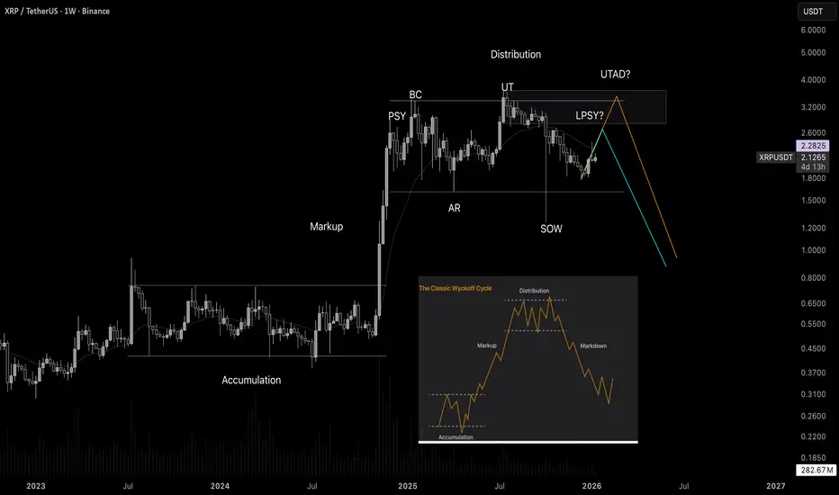
The XRP chart is like from a textbook! Wyckoff tutorialWelcome! When finance professionals are watching, you can expect solid analytics and real education.
Today we’re going to break down Wyckoff market cycles using the XRP chart in real time.
Wyckoff cycles are not just theory - they are an established concept that works in all markets. This is a model of price behavior based on the actions of large players ("smart money"). It shows how professionals accumulate positions, drive the market, and distribute assets, creating repeating phases of growth and decline.
Any market moves cyclically. Wyckoff identified two major cycles:
Bull market cycle (Accumulation → Markup → Distribution → Markdown)
Bear market cycle (the mirror reflection of the first)
Each cycle consists of four phases:
-Accumulation
-Markup (Growth)
-Distributio
-Markdown (Decline)
Phase 1. Accumulation
This is the phase when "smart money" buys the asset in large volumes while trying not to push the price too high. Conditions are created where regular market participants do not want to buy the asset, and may even sell it near market lows. Usually during this period there is bad news, lack of confidence, etc. Large players quietly buy up all this negativity.
Phase 2. Markup (Growth)
An impulsive upward movement begins - a trend that everyone notices when it is already too late. The crowd starts to wake up and enters the market at high prices.
Phase 3. Distribution
The price again enters a trading range, but now major participants sell their positions to retail traders who come in euphoric after the rise. Usually, the news is excellent here, everyone expects further growth, there is general euphoria, people load into the asset to the maximum while large players quietly unload their positions.
Phase 4. Markdown (Decline)
Professionals have sold everything they wanted, and now the market goes down almost without resistance. Retail - back to the factory.
EURJPY smart money is here!Hi! A financier is at the screens - today I’ll show you the trade I entered.
In front of us is the EURJPY chart.
First, it’s worth noting that the inverse chart JPYEUR looks very weak. This tells us that the euro is indeed stronger now, and we may see growth.
Second, in mid-December we had a similar structure. I’ve highlighted these structures with a blue rectangle.
Inside these rectangles, an accumulation schematic based on Wyckoff formed. This suggests that we have potential for a reversal and solid upside. It’s also worth noting that the structures are similar to each other and exhibit fractality.
So overall, I opened a long position, aiming to trade it up to the high where we have a liquidity shelf.

SPX/ES - Bayesian Market thesis 📊 SPX / ES — Bayesian Market Thesis (Academic Summary)
🎯 Objective
Frame current market conditions using a probabilistic research process, not directional prediction, with emphasis on regime identification and invalidation logic.
🧠 Research Methodology (High-Level Transparency)
Our process integrates multiple, independent analytical domains into a single probabilistic view:
Probabilistic inference
We evaluate competing market regimes and assign likelihoods that update as new information emerges.
Market structure analysis (Modern Wyckoff)
Focus on acceptance vs rejection, testing behavior, and transitions between accumulation, markup, distribution, and markdown.
Flow & derivatives context
Options-related positioning and transaction flow are used to understand how positioning may shape price behavior, not to forecast direction.
Classical technical structure
Trend quality, range behavior, and relative location within recent value are used as structural constraints.
These inputs are cross-validated. No single signal determines the thesis.
🧱 Current Structural Context (Wyckoff Lens)
Price is operating near upper range boundaries
Multiple high-area tests with reduced follow-through
Structure consistent with late markup transitioning into distribution risk
➡️ Upside continuation is conditional, not assumed.
📐 Bayesian Scenario Assessment
Probability-weighted view (dynamic):
Regime Probability Characteristics
🔴 Distribution / Downside Rotation ~60–65% Failed acceptance, rotational volatility
🟢 Bullish Continuation ~35–40% Requires sustained acceptance above highs
Probabilities adjust as price resolves uncertainty.
🚦 Invalidation Criteria (Bullish Reassessment)
The current thesis is invalidated only by structural confirmation, not isolated price excursions.
Required conditions:
Sustained acceptance above range highs
Higher high followed by a higher low holding above prior resistance
Expansion in range and follow-through consistent with demand-led control
Absent these, upside moves are treated as tests, not confirmations.
🧭 Interpretation Guidance
This is a location- and regime-based assessment
Elevated prices increase sensitivity to invalidation signals
Risk management outweighs conviction in late-cycle structure
🧩 Closing Note
This framework is designed to continuously update expectations, not predict outcomes.
Markets resolve uncertainty first — direction follows.

The Wyckoff Trading MethodThe Wyckoff Trading Method
The Wyckoff Method is a classical approach to market analysis designed to help traders understand trend development, market cycles, and potential reversals. Despite being developed over a century ago, it remains highly relevant in modern financial markets and is widely used across stocks, forex, and cryptocurrencies.
What Is the Wyckoff Method?
The Wyckoff Method is a form of technical analysis created in the early 20th century by Richard D. Wyckoff, a pioneering trader and market analyst. The core idea behind this method is that price movements are governed by supply and demand, and that large institutional participants (often referred to as “composite operators”) leave identifiable footprints on the chart.
Wyckoff believed that by studying price, volume, and time, traders could anticipate future price behavior rather than react to it.
Core Principles of the Wyckoff Method
The Wyckoff methodology is built around several foundational concepts:
1. Supply and Demand
Price rises when demand exceeds supply and falls when supply exceeds demand. Observing how price responds to changes in volume helps traders identify who is in control of the market.
2. Market Structure and Phases
Markets move in recurring cycles, typically broken down into:
- Accumulation
- Markup
- Distribution
- Markdown
Recognizing these phases allows traders to align with institutional activity rather than trade against it.
3. Price and Volume Relationship
Volume acts as a confirmation tool. Strong price movement with weak volume often signals exhaustion, while strong volume supports trend continuation.
4. Liquidity and Institutional Behavior
The method emphasizes how large players accumulate or distribute positions over time, often through range-bound price action designed to absorb liquidity.
The Market Cycle
The Wyckoff Market Cycle
The Wyckoff methodology describes market behavior as a repeating four-phase cycle driven by supply and demand. These phases help traders understand where the market is in its process, rather than simply reacting to price movements.
Accumulation Phase
Accumulation typically appears as a range-bound market after a decline. During this phase, large institutional participants quietly build long positions while price remains relatively stable. To most traders, the market appears directionless, but in reality, buying is taking place without pushing price higher. The true intent of the market is concealed until accumulation is complete.
Markup Phase
Once sufficient long positions have been accumulated, institutions begin to drive price higher. This phase is characterized by a clear uptrend as increased demand attracts additional buyers. Breakouts from accumulation ranges often trigger momentum traders and breakout strategies, reinforcing the trend. Markups may include re-accumulation phases, where price pauses and consolidates before continuing higher.
Distribution Phase
Distribution occurs after an extended advance, when upward momentum begins to slow. During this phase, large players gradually offload long positions and build short exposure. Price often moves sideways in a range, giving the illusion of stability, while smart money exits positions. This phase prepares the market for the next directional move lower.
Markdown Phase
The markdown is the declining phase that follows distribution. Selling pressure overwhelms demand, leading to a sustained downtrend. As price falls, traders are encouraged to enter short positions, further accelerating the move. Similar to markups, markdowns may include redistribution phases, where price consolidates before continuing lower.
Why the Wyckoff Model Works
Large financial institutions must execute trades of significant size, which requires liquidity. Liquidity is often found around stop losses, breakout levels, equal highs and lows, and key support or resistance zones. By intentionally pushing price into these areas, institutions can fill large orders efficiently without excessive slippage. This interaction between liquidity and market psychology forms the foundation of the Wyckoff model across all asset classes.
Core Principles of the Wyckoff Method
A key concept in Wyckoff theory is the Composite Man, a symbolic representation of institutional or “smart money” participants. Traders are encouraged to analyze price action as if a single, highly informed entity is controlling the market. The Composite Man accumulates or distributes positions strategically before allowing price to trend.
The Law of Supply and Demand explains that price rises when demand exceeds supply and falls when supply exceeds demand. The Law of Cause and Effect states that the size and duration of accumulation or distribution determine the magnitude of the subsequent price move, with higher-timeframe structures producing larger effects. The Law of Effort versus Result compares volume (effort) with price movement (result), highlighting potential trend continuation or exhaustion when these two factors diverge.
Wyckoff Schematics
Wyckoff schematics visually represent accumulation and distribution structures. Although these patterns may appear complex at first, they are mirror images of each other, with accumulation and distribution sharing identical phases and logic—only inverted. Studying these schematics helps traders recognize institutional behavior and align their trades with the dominant market process.
Type 1 Schematics
Accumulations
Phase A: Stopping the Downtrend
Phase A marks the transition from a markdown to the beginning of accumulation, where selling pressure starts to weaken.
- Preliminary Support (PS) : After a prolonged decline, initial buying emerges and temporarily halts the downtrend. Volume increases as early demand appears, signaling that selling pressure is no longer dominant.
- Selling Climax (SC) : Panic selling accelerates as long positions are stopped out and breakout traders enter short positions. At this point, the Composite Man absorbs this excess supply. The SC often leaves long lower wicks, reflecting strong buying interest.
- Automatic Rally (AR) : Once selling pressure is exhausted, price rebounds quickly as shorts cover and new buyers step in. The high of the AR establishes the first resistance boundary of the accumulation range.
- Secondary Test (ST) : Price revisits the SC area to test remaining supply. This test may form equal or slightly higher/lower lows, usually with reduced volume, confirming that selling pressure has diminished.
Phase B: Building the Cause
Phase B is where accumulation develops over time. The Composite Man continues to build long positions while price fluctuates within a range.
- Sign of Strength in Phase B (SOS(b)): In some cases, price rallies above the AR, creating a higher high within the range. This move suggests improving demand but still remains below preliminary resistance.
- Secondary Test in Phase B (ST(b)): A sharp decline follows, designed to trigger stop losses below prior lows and attract breakout sellers. This “liquidation” move provides the liquidity institutions need to continue accumulating, forming the underlying cause for the next trend.
Phase C: The Final Shakeout
Phase C is the critical phase that distinguishes accumulation from continuation lower.
- Spring: Price makes a final push below established support, sweeping remaining stop losses and trapping late sellers. This move briefly violates the range before quickly reversing.
- Test: After the Spring, price retests the area to confirm that supply has been fully absorbed. These tests typically form higher lows and occur on lower volume, signaling reduced selling interest.
Phase D: Transition to Markup
Phase D confirms that accumulation is complete and the market is ready to trend higher.
- Last Point of Support (LPS): Following the test and a rally, price pulls back shallowly, forming a higher low. This pullback reflects strong demand and is often the final opportunity before markup.
- Sign of Strength (SOS): Price breaks above the accumulation range with expanding volume, confirming bullish control. After this breakout, the market enters the markup phase, where the effect of prior accumulation is realized through sustained upward movement.
Distributions
Phase A: Stopping the Uptrend
Phase A marks the transition from an uptrend into distribution, where demand begins to weaken and supply quietly enters the market.
- Preliminary Supply (PSY) : After a sustained advance, large operators start unloading positions, causing the first noticeable pause or pullback in price.
- Buying Climax (BC): Buying pressure reaches an extreme as late buyers enter aggressively, often accompanied by very high volume. This is where smart money sells into strength.
- Automatic Rally (AR): Once buying is exhausted, price pulls back sharply as demand fades. The AR typically forms below the BC and defines the first support boundary of the distribution range.
- Secondary Test (ST): Price revisits the BC area to test remaining demand, usually failing to make a new high. Volume is generally lower, indicating reduced buying interest and building liquidity for later phases.
Phase B: Building the Distribution
Phase B is where the Composite Man continues distributing positions while price fluctuates within a range.
- Sign of Weakness in Phase B (SOW(b)): A decline below the AR signals that supply is beginning to dominate. This move does not always appear, but when it does, it establishes a second support boundary.
- Upthrust (UT): Price briefly breaks above resistance to trigger buy stops and attract breakout buyers. This false breakout allows institutions to sell into increased demand and build short exposure.
Phase C: The Final Liquidity Grab
Phase C completes the distribution process by targeting remaining demand.
- Upthrust After Distribution (UTAD): Similar to a Spring in accumulation, UTAD is the final false breakout above resistance. It is designed to capture the last wave of liquidity before the true bearish move begins.
- Test: Price often revisits the UTAD area to confirm that demand has been fully absorbed. These tests typically occur on lower volume, signaling weakening bullish participation.
Phase D: Transition to Markdown
Phase D confirms that distribution is complete and bearish control is established.
- Last Point of Supply (LPSY): After price begins to decline, weak rallies attempt to test demand. These rallies are shallow and usually represent the final bullish reactions before the markdown.
- Sign of Weakness (SOW): Price breaks decisively below the range, confirming a bearish structure. Additional LPSYs may form, but this phase marks the final transition into the markdown.
Type 2 Schematics
Type 2 Wyckoff schematics contain the same structural components as Type 1, but without a Spring (in accumulation) or a UTAD (in distribution). In these cases, the market does not perform a final liquidity sweep before trending.
A Type 2 schematic can be identified by observing a direct transition into trend confirmation:
- In accumulation, price forms a Secondary Test (ST) and possibly an ST(b), then proceeds directly into a Sign of Strength (SOS) followed by markup.
- In distribution, price forms an ST or Upthrust (UT), then transitions directly into a Sign of Weakness (SOW) followed by markdown.
If markup or markdown begins without a Spring or UTAD, the structure should be classified as Type 2. Importantly, Type 2 schematics are traded using the same principles and execution logic as Type 1 structures.
The Five-Step Wyckoff Trading Strategy
Richard D. Wyckoff proposed a structured five-step approach to applying his methodology in real market conditions. This framework helps traders align with market structure and institutional intent.
1. Determine the Market Trend
Identify whether the broader market environment is bullish or bearish. Trading in alignment with the dominant trend increases probability.
2. Select a Suitable Market
Choose an asset or trading pair that clearly reflects the identified market trend and shows strong structural clarity.
3. Identify Accumulation or Distribution
Focus on assets that are currently forming a Wyckoff accumulation or distribution structure rather than those already trending.
4. Assess Readiness for a Move
Analyze the current Wyckoff phase and volume behavior. Events such as a Spring, UTAD, SOS, or SOW help confirm whether the market is prepared for markup or markdown.
5. Execute the Entry
Entries are commonly taken on Tests, Last Points of Support (LPS), or Last Points of Supply (LPSY), where risk can be controlled and structure is clear.
Does the Wyckoff Method Still Work?
- Despite being developed nearly a century ago, the Wyckoff Method remains highly relevant in modern markets. Its core principles supply and demand, market structure, volume analysis, and liquidity behavior are universal and apply across forex, stocks, commodities, and cryptocurrencies.
- When combined with complementary tools such as support and resistance, indicators, or pattern analysis, Wyckoff can form the foundation of a robust and disciplined trading approach. Its enduring value lies in teaching traders how markets move, not just where price is going.
Educational Disclaimer
This material is provided for educational purposes only. It reflects a general interpretation of the Wyckoff methodology and should not be considered financial advice, investment recommendations, or an offer to trade. Traders should always conduct their own analysis and manage risk responsibly.

EURUSD analyticsAfter the downward movement on the chart, there was an upward wave. It began with the formation of an order block at the bottom. Then we saw a return to the order-block zone with a strong bullish candle.
In addition to this, I also see potential Wyckoff accumulation here, which can also reverse the price.
I expect a move toward the upper order block during this week.

Relief rally Inbound? IMX is shaping up for a potential reversal.
After the aggressive October 10 sell‑off, price responded with a clean Automatic Rally (AR) before rolling over into a controlled pullback. This latest dip appears to be sweeping the October 10 lows, and the December 19 bullish engulfing candle is the first meaningful sign of demand stepping back in.
Crucially, price closed back inside the prior range, which keeps the structure constructive. While heavier volume on the reversal would’ve added confidence, the low‑volume nature of the sweep actually supports a spring narrative — supply has been drying up for weeks, and there’s been no evidence of aggressive selling pressure. That’s exactly what you want to see heading into a potential Wyckoff spring.
Trade Scenario
Initial TP would be just below the range EQ which lines up with the yearly pivot and 50% of the range retracement. From here, if the price can close, hold and form higher lows above this level, would strongly suggest that a bottom is in. The next meaningful upside target sits around $0.58, where prior resistance and structural alignment converge.
Market Context
A surprising number of alts are printing similar spring‑like structures right now:
• Washed‑out lows
• Diminishing volume
• Reclaims back into range
• Early signs of demand returning

Relief Rally Inbound? S is shaping up for a potential reversal.
After the aggressive October 10 sell‑off, price responded with a clean Automatic Rally (AR) before rolling over into a controlled pullback. This latest dip appears to be sweeping the October 10 lows, and the December 19 bullish engulfing candle is the first meaningful sign of demand stepping back in.
Crucially, price closed back inside the prior range, which keeps the structure constructive. While heavier volume on the reversal would’ve added confidence, the low‑volume nature of the sweep actually supports a spring narrative — supply has been drying up for weeks, and there’s been no evidence of aggressive selling pressure. That’s exactly what you want to see heading into a potential Wyckoff spring.
Trade Scenario
Initial TP would be just below the range EQ which lines up with the yearly pivot and 50% of the range retracement. From here, if the price can close, hold and form higher lows above this level, would strongly suggest that a bottom is in. The next meaningful upside target sits around $0.16593, where prior resistance and structural alignment converge.
Market Context
A surprising number of alts are printing similar spring‑like structures right now:
• Washed‑out lows
• Diminishing volume
• Reclaims back into range
• Early signs of demand returning

Relief Rally Inbound? VET is shaping up for a potential reversal.
After the aggressive October 10 sell‑off, price responded with a clean Automatic Rally (AR) before rolling over into a controlled pullback. This latest dip appears to be sweeping the October 10 lows, and the December 19 bullish engulfing candle is the first meaningful sign of demand stepping back in.
Crucially, price closed back inside the prior range, which keeps the structure constructive. While heavier volume on the reversal would’ve added confidence, the low‑volume nature of the sweep actually supports a spring narrative — supply has been drying up for weeks, and there’s been no evidence of aggressive selling pressure. That’s exactly what you want to see heading into a potential Wyckoff spring.
Trade Scenario
Initial TP would be just below the range EQ which lines up with the yearly pivot and 50% of the range retracement. From here, if the price can close, hold and form higher lows above this level, would strongly suggest that a bottom is in. The next meaningful upside target sits around $0.0194, where prior resistance and structural alignment converge.
Market Context
A surprising number of alts are printing similar spring‑like structures right now:
• Washed‑out lows
• Diminishing volume
• Reclaims back into range
• Early signs of demand returning
