If the markets had a secret language, the ABCD pattern would probably be one of the first letters you’d learn. Clean, geometric, and surprisingly common, this formation has been studied for decades. In abcd pattern trading, it’s not about spelling words. It’s about spotting balance, symmetry, and rhythm in price movements.
📐 What Is the ABCD Pattern?
Think of the ABCD pattern like a zigzag that markets often draw. It’s one of the simplest chart patterns in technical analysis because it shows how price usually moves in waves, not straight lines. Here’s how it works:
A → B (Impulse Move):
This is the first strong move, either up or down. In trading terms, it’s called an impulse leg — the market pushes in one direction with momentum.
B → C (Correction):
After a big push, the price takes a breather. This is the corrective leg. It doesn’t usually erase the whole move, just part of it.
C → D (Continuation Move):
Here’s the key: the price often makes another move, similar in size and angle to A → B. That’s why people say the ABCD has “symmetry.”
So, when you connect the dots A-B-C-D, you get a neat geometric shape that traders call the ABCD trading pattern. ⚠️ But a warning straight away: no matter how perfect an ABCD looks on paper, it cannot be read in isolation. Without confirmation from other tools — volume, momentum indicators, or broader market context — it’s just a geometric doodle on your chart.
🟩 Bullish and Bearish Variants
Like most patterns, ABCD has two moods. The bullish ABCD pattern shows up after a down-move, hinting that the market might be ready for a rebound. The bearish sibling often forms after an up-move, suggesting exhaustion.
The structure doesn’t change — it’s always AB, BC, and CD — but the meaning depends on where it forms. In a bullish ABCD, sellers push the price down twice before running out of strength, and that’s when buyers often step in. In a bearish ABCD, buyers push the price up twice, but eventually lose momentum, giving sellers a chance to take over. So when you see an ABCD chart pattern, you’re not just connecting dots — you’re watching how buyers and sellers take turns, and where one side might finally give up control.
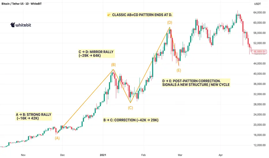
📊 Real Market Example
Take Bitcoin in early 2021. After a powerful rally from around ~$14K to ~$42K, BTC corrected back to ~$29K before surging again to new highs near ~$64K. This sequence mapped cleanly into a textbook ABCD pattern:
A → B: The rally into the ~$42K peak.
B → C: The correction down to the ~$29K zone.
C → D: A rebound to ~$64K, completing the mirrored leg.
It wasn’t a trading signal on its own — far from it. However, when combined with fading momentum and volume divergence, the ABCD chart pattern provided a visual anchor for identifying exhaustion in what was becoming an overheated market.
🧩 Why the ABCD Pattern Still Matters
The appeal of the abcd trading pattern lies in its simplicity. Markets are noisy, messy, and emotional. The ABCD strips that down to a geometric rhythm that even a beginner can spot. But here’s the catch: if you lean only on it, you’ll miss the bigger story. Professional analysts stress this constantly: the ABCD pattern works best as part of a toolkit. Pair it with Fibonacci retracements, moving averages, or support/resistance zones, and you’ll see how it fits into the wider puzzle. Alone, it’s just half a sentence. Together with other tools, it becomes part of the market’s story.
🎯 Final Thoughts
So, what is the ABCD pattern? It’s not magic, not a guarantee, but a visual lens. Think of it as one of the market’s favorite ways of whispering: “Something’s happening here.” The trick is listening carefully and comparing it with the rest of the orchestra. Because in trading, and especially in crypto, a single instrument never plays the whole song.
📐 What Is the ABCD Pattern?
Think of the ABCD pattern like a zigzag that markets often draw. It’s one of the simplest chart patterns in technical analysis because it shows how price usually moves in waves, not straight lines. Here’s how it works:
A → B (Impulse Move):
This is the first strong move, either up or down. In trading terms, it’s called an impulse leg — the market pushes in one direction with momentum.
B → C (Correction):
After a big push, the price takes a breather. This is the corrective leg. It doesn’t usually erase the whole move, just part of it.
C → D (Continuation Move):
Here’s the key: the price often makes another move, similar in size and angle to A → B. That’s why people say the ABCD has “symmetry.”
So, when you connect the dots A-B-C-D, you get a neat geometric shape that traders call the ABCD trading pattern. ⚠️ But a warning straight away: no matter how perfect an ABCD looks on paper, it cannot be read in isolation. Without confirmation from other tools — volume, momentum indicators, or broader market context — it’s just a geometric doodle on your chart.
🟩 Bullish and Bearish Variants
Like most patterns, ABCD has two moods. The bullish ABCD pattern shows up after a down-move, hinting that the market might be ready for a rebound. The bearish sibling often forms after an up-move, suggesting exhaustion.
The structure doesn’t change — it’s always AB, BC, and CD — but the meaning depends on where it forms. In a bullish ABCD, sellers push the price down twice before running out of strength, and that’s when buyers often step in. In a bearish ABCD, buyers push the price up twice, but eventually lose momentum, giving sellers a chance to take over. So when you see an ABCD chart pattern, you’re not just connecting dots — you’re watching how buyers and sellers take turns, and where one side might finally give up control.
📊 Real Market Example
Take Bitcoin in early 2021. After a powerful rally from around ~$14K to ~$42K, BTC corrected back to ~$29K before surging again to new highs near ~$64K. This sequence mapped cleanly into a textbook ABCD pattern:
A → B: The rally into the ~$42K peak.
B → C: The correction down to the ~$29K zone.
C → D: A rebound to ~$64K, completing the mirrored leg.
It wasn’t a trading signal on its own — far from it. However, when combined with fading momentum and volume divergence, the ABCD chart pattern provided a visual anchor for identifying exhaustion in what was becoming an overheated market.
🧩 Why the ABCD Pattern Still Matters
The appeal of the abcd trading pattern lies in its simplicity. Markets are noisy, messy, and emotional. The ABCD strips that down to a geometric rhythm that even a beginner can spot. But here’s the catch: if you lean only on it, you’ll miss the bigger story. Professional analysts stress this constantly: the ABCD pattern works best as part of a toolkit. Pair it with Fibonacci retracements, moving averages, or support/resistance zones, and you’ll see how it fits into the wider puzzle. Alone, it’s just half a sentence. Together with other tools, it becomes part of the market’s story.
🎯 Final Thoughts
So, what is the ABCD pattern? It’s not magic, not a guarantee, but a visual lens. Think of it as one of the market’s favorite ways of whispering: “Something’s happening here.” The trick is listening carefully and comparing it with the rest of the orchestra. Because in trading, and especially in crypto, a single instrument never plays the whole song.
Get guaranteed rewards of up to 1,000 USDT in Crypto Evolution by WhiteBIT on TradingView, partnered with Tether.
whitebit.com/m/crypto-evolution?utm_source=tradingview&utm_medium=signature&utm_campaign=cryptoevolution
whitebit.com/m/crypto-evolution?utm_source=tradingview&utm_medium=signature&utm_campaign=cryptoevolution
Disclaimer
The information and publications are not meant to be, and do not constitute, financial, investment, trading, or other types of advice or recommendations supplied or endorsed by TradingView. Read more in the Terms of Use.