Market Seasonality: Finding Statistical Edges in Price Patterns🟢 Overview
Market seasonality refers to recurring, quantifiable patterns in asset price movements that appear consistently across different time periods. Rather than mystical predictions, these patterns reflect systematic behavioral trends, institutional flows, and market structures that have persisted across years, and in some cases, centuries, of trading history.
🟢 How Seasonality Works
Seasonality analysis examines historical price data to identify months or periods when specific assets have historically shown strength or weakness. The approach replaces emotion-driven decision-making with probabilistic insights based on historical performance across complete market cycles, including bull markets, bear markets, and periods of consolidation. By quantifying these patterns, traders and investors can identify potential statistical edges in their execution timing.
🟢 Evidence Across Asset Classes
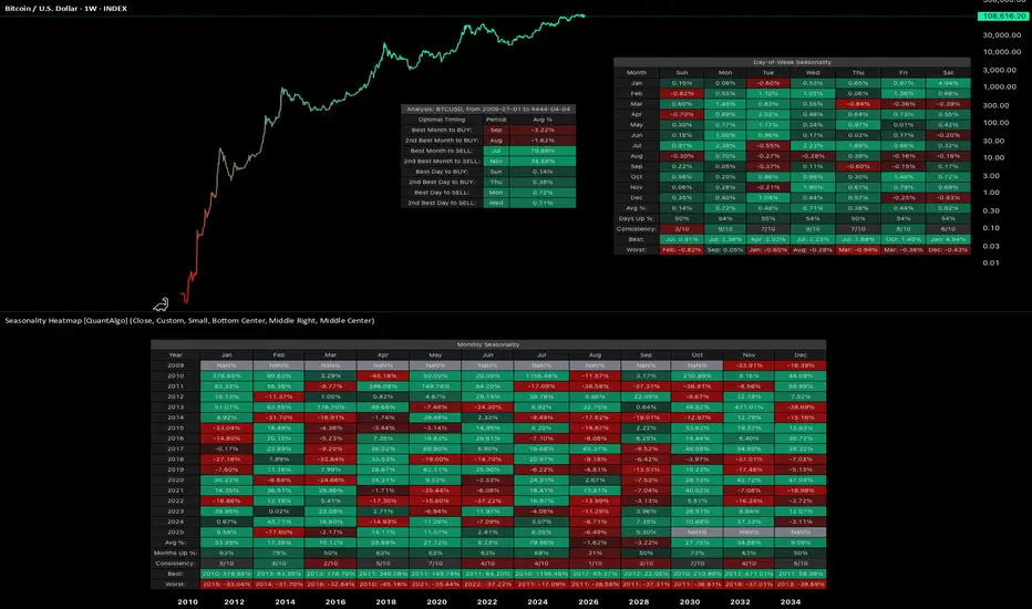
1. Bitcoin INDEX:BTCUSD
Since the development of futures markets and institutional participation, Bitcoin has demonstrated notable seasonal patterns with measurable statistical significance. September has averaged -1.92% returns, establishing it as the weakest month. In contrast, October has emerged as the strongest performer with average returns of +21.59% and a 90% positive occurrence. This level of consistency suggests a robust statistical edge rather than random variation.
Day-of-week patterns in modern Bitcoin are relatively tight, with differences ranging from 0.07% to 0.50%. Monday edges out as the optimal day for selling positions. However, these daily patterns offer considerably less statistical significance than the monthly seasonality effects, as the weekly variations have smoothed out compared to Bitcoin's earlier history.
2. Ethereum INDEX:ETHUSD
Ethereum displays even more pronounced seasonal variations with stronger directional bias. September has been particularly challenging, averaging -10.04% returns and showing negative performance in eight out of ten years, representing an 80% probability of decline. June also demonstrates weakness at -7.20% average returns. Conversely, May stands out as the strongest month with average returns of +34.97%, positive 70% of the time across the dataset. May has delivered positive returns in seven out of ten years, providing a statistically meaningful edge.
Day-of-week analysis reveals differences of 0.2% to 0.6%, with Wednesday edging out slightly for selling and Tuesday showing marginally better performance for buying. However, these daily variations lack statistical significance when compared to the dramatic monthly patterns, representing more noise than actionable alpha for systematic strategies.
3. S&P 500 SP:SPX
With over 50 years of data dating back to 1971, the S&P 500 demonstrates the famous "September Effect." September averages -0.90% returns and has been negative with notable consistency, establishing statistical significance through sheer sample size. November, capturing typical year-end institutional positioning, averages +1.73% with positive performance 70% of the time. April comes in second at +1.44% average returns. The persistence of these patterns across five decades provides robust evidence of systematic seasonal effects even in highly efficient markets.
Day-of-week effects in the S&P 500 are minimal, ranging from just 0.01% to 0.07%. Monday shows a slight negative drift at -0.01%, while Wednesday edges up 0.07%. These intraday variations fall well within normal variance and lack statistical significance for execution timing. For this index, monthly patterns provide the primary source of seasonal alpha.
4. Gold OANDA:XAUUSD
Perhaps most compelling is gold's seasonal data spanning nearly 200 years since 1832, offering an extraordinarily large sample size for statistical validation. January shows the strongest average returns at +0.99% and has been positive 80% of the time, representing a highly reliable statistical edge. June represents the weakest period at -0.18% average returns, with October also serving as a potential entry point at just 0.05% average returns. July comes in as the second-best month at +0.79%. The consistency of these patterns across multiple centuries, world events, and monetary system changes indicates deeply embedded structural inefficiencies in market dynamics.
Day-of-week patterns in gold are similarly minimal. Thursday edges out at 0.09% for optimal selling, while Sunday shows 0.01% for buying opportunities. Like the S&P 500, gold trades predominantly on monthly patterns rather than daily variations, with intraweek effects lacking statistical significance.
🟢 TL;DR
1. Bitcoin INDEX:BTCUSD : Accumulate during September weakness (-1.92%), sell into October strength (+21.59%). October has been positive 9 out of 10 years since 2015, representing a 90% positive occurrence. Day of week: Sunday dips for buying, Monday for selling.
2. Ethereum INDEX:ETHUSD : Summer pain is real. September (-10.04%) and June (-7.20%) are buying opportunities. May (+34.97%) is the monster month historically, positive 7 out of 10 years (70% positive frequency). Day of week: Tuesday buying, Wednesday selling, but minimal statistical significance.
3. S&P 500 SP:SPX : The September Effect demonstrates statistical significance (-0.90% average over 50+ years). November (+1.73%) captures the year-end rally with 70% positive occurrence. Day of week effects are negligible (0.01-0.07%) and lack statistical significance.
4. Gold OANDA:XAUUSD : January strength (+0.99%, 80% positive frequency) after June weakness (-0.18%). Nearly 200 years of data backing these patterns provides exceptional statistical validation. Day of week: Sunday buying, Thursday selling, but minimal differences.
🟢 Final thoughts
Ultimately, seasonality analysis does not guarantee future results, but it provides a framework for probabilistic decision-making with quantifiable statistical edges. Rather than attempting to time markets based on sentiment or short-term price movements, systematic traders and investors can align decisions with periods that have historically shown consistent strength or weakness with statistical significance. This approach is particularly valuable for planning entry and exit points, portfolio rebalancing, and managing position sizing within a rules-based framework.
Notably, while day-of-week patterns exist in some assets, monthly seasonality tends to provide more significant and statistically reliable edges across most markets. The data suggests that seasonal patterns persist even in highly efficient markets, driven by recurring institutional behaviors, tax considerations, and structural market dynamics that create exploitable inefficiencies.
Market seasonality should be viewed as one analytical tool within a comprehensive quantitative framework, not a guarantee of performance, but a method to incorporate historical probabilities and statistical edges into systematic investment decisions.
This isn't about perfect timing either. It's about leveraging statistical edges based on historical probabilities instead of emotion. You'll still be wrong sometimes, but less often when operating with decades of data and quantifiable patterns rather than sentiment alone.
👉 Try the Seasonality Heatmap indicator yourself on TradingView to explore these patterns across different assets and timeframes.
*This analysis is for educational purposes only and is not financial advice. Past performance does not guarantee future results. Always do your own research and consult with a qualified financial advisor before making investment decisions.
Heatmap
Sector Rotation Analysis: A Practical Tutorial Using TradingViewSector Rotation Analysis: A Practical Tutorial Using TradingView
Overview
Sector rotation is an investment strategy that involves reallocating capital among different sectors of the economy to align with their performance during various phases of the economic cycle. While academic studies have shown that sector rotation does not consistently outperform the market after accounting for transaction costs, it remains a popular framework for portfolio management.
This tutorial provides a step-by-step guide to analyzing sector rotation and identifying leading and lagging sectors using TradingView .
Understanding Sector Rotation and Economic Cycles
The economy moves through distinct phases, and each phase tends to favor specific sectors:
1. Expansion : Rapid economic growth with rising consumer confidence.
- Leading Sectors: Technology AMEX:XLK , Consumer Discretionary AMEX:XLY , Industrials AMEX:XLI
2. Peak : Growth slows, and inflation may rise.
- Leading Sectors: Energy AMEX:XLE , Materials AMEX:XLB
3. Contraction : Economic activity declines, and unemployment rises.
- Leading Sectors: Utilities AMEX:XLU , Healthcare AMEX:XLV , Consumer Staples AMEX:XLP
4. Trough : The economy begins recovering from a recession.
- Leading Sectors: Financials AMEX:XLF , Real Estate AMEX:XLRE
Step 1: Use TradingView to Monitor Economic Indicators
Economic indicators provide context for sector performance:
GDP Growth : Signals expansion or contraction.
Interest Rates : Rising rates favor Financials; falling rates benefit Real Estate.
Inflation : High inflation supports Energy and Materials.
Step 2: Analyze Sector Performance Using Relative Strength
Relative Strength RS compares a sector's performance against a benchmark index like the
SP:SPX This helps identify whether a sector is leading or lagging.
How to Calculate RS in TradingView
Open a chart for a sector TSXV:ETF , such as AMEX:XLK Technology.
Add SP:SPX as a comparison symbol by clicking the Compare ➕ button.
Analyze the RS line:
- If RS trends upward, the sector is outperforming.
- If RS trends downward, the sector is underperforming.
Using Indicators
e.g.: You may add the Sector Relative Strength indicator from TradingView’s public library. This tool ranks multiple sectors by their relative strength against SP:SPX
Additionally, you can use the RS Rating indicator by @Fred6724, which calculates the Relative Strength Rating (1 to 99) of a stock or sector based on its 12-month performance compared to others in a selected index.
Example
In early 2021, during economic recovery, AMEX:XLK 's RS rose above SP:SPX , signaling Technology was leading.
Step 3: Validate Sector Trends with Technical Indicators
Technical indicators can confirm sector momentum and provide entry/exit signals:
Moving Averages
Use 50-day and 200-day Simple Moving Averages SMA.
If a sector TSXV:ETF trades above both SMAs, it indicates bullish momentum.
Relative Strength Index RSI
RSI > 70 suggests overbought conditions; <30 indicates oversold conditions.
MACD Moving Average Convergence Divergence
Look for bullish crossovers where the MACD line crosses above the signal line.
Example
During the inflation surge in 2022, AMEX:XLE Energy traded above its 200-day SMA while RSI hovered near 70, confirming strong momentum in the Energy sector.
Step 4: Compare Multiple Sectors Simultaneously
TradingView allows you to overlay multiple ETFs on one chart for direct comparison:
Open AMEX:SPY as your benchmark chart.
Add ETFs like AMEX:XLK , AMEX:XLY , AMEX:XLU , etc., using the Compare tool.
Observe which sectors are trending higher or lower relative to AMEX:SPY
Example
If AMEX:XLK and AMEX:XLY show upward trends while AMEX:XLU remains flat, this indicates cyclical sectors like Technology and Consumer Discretionary are outperforming during an expansion phase.
Step 5: Implement Sector Rotation in Your Portfolio
Once you’ve identified leading sectors:
Allocate more capital to sectors with strong RS and bullish technical indicators.
Reduce exposure to lagging sectors with weak RS or bearish momentum signals.
Example
During post-pandemic recovery in early 2021:
Leading Sectors: Technology AMEX:XLK and Industrials AMEX:XLI
Lagging Sectors: Utilities AMEX:XLU
Investors who rotated into AMEX:XLK and AMEX:XLI outperformed those who remained in defensive sectors like AMEX:XLU
Real-Life Case Studies of Sector Rotation
Case Study 1: Post-Pandemic Recovery
In early 2021, as economies reopened after COVID-19 lockdowns:
Cyclical sectors like Industrials AMEX:XLI and Financials AMEX:XLF outperformed due to increased economic activity.
Defensive sectors like Utilities AMEX:XLU lagged as investors shifted away from safe havens.
Using TradingView’s heatmap feature , investors could have identified strong gains in AMEX:XLI and AMEX:XLF relative to AMEX:SPY
Case Study 2: Inflation Surge in Late 2022
As inflation surged in late 2022:
Energy AMEX:XLE and Materials AMEX:XLB outperformed due to rising commodity prices.
Technology AMEX:XLK underperformed as higher interest rates hurt growth stocks.
By monitoring RS lines for AMEX:XLE and AMEX:XLB on TradingView charts, investors could have rotated into these sectors ahead of broader market gains.
Limitations of Sector Rotation Strategies
Transaction Costs : Frequent rebalancing can erode returns over time.
Market Timing Challenges : Predicting economic cycles accurately is difficult and prone to errors.
False Signal s: Technical indicators like MACD or RSI can produce false positives during volatile markets.
Historical Bias : Backtested strategies often fail when applied to future market conditions.
Conclusion
Sector rotation is a useful framework for aligning investments with macroeconomic trends but should be approached with caution due to its inherent limitations. By leveraging TradingView ’s tools, such as relative strength analysis, heatmaps, and technical indicators, investors can systematically analyze sector performance and make informed decisions about portfolio allocation.
While academic research shows that sector rotation strategies do not consistently outperform simpler approaches like market timing or buy-and-hold strategies, they remain valuable for diversification and risk management when used judiciously.

Crypto Coins Heatmap: The Ultimate Guide for Beginners (2024)Discover the easiest way to track, group and sort your favorite tokens in one place — the TradingView Crypto Coins Heatmap.
Everyone — from the aspiring crypto enthusiast to the professional digital asset fund manager — needs it. Meet the ultimate cryptocurrency tracking and monitoring tool, the TradingView Crypto Coins Heatmap.
What Is Crypto Coins Heatmap?
Slick-looking, feature-rich, and aesthetically pleasing, the Crypto Coins Heatmap is a visual tool developed by TradingView. It displays the performance of crypto coins plastered over a single interface that allows users to keep tabs on price movements through color coding and percentage performance.
Key Features
Let’s start off with the basic features of the Crypto Coins Heatmap.
1. Color-Coded Performance Indicators
Green indicates positive performance (coin go up — good.)
Red indicates negative performance (bad coin — goes down.)
Grey indicates slim to no price movement, typical for stablecoins.
2. Real-Time Price Data
The heatmap is updated in real-time and shows the most current information so crypto geeks could know the price of everything all the time.
3. Market-Cap-to-Size Ratio
The size of each crypto coin corresponds to its market capitalization, i.e. the more room it takes on the screen, the bigger the market value. Bitcoin ( BTCUSD ), the original cryptocurrency , takes up over half the entire screen because its dominance is over 50% of the total market’s worth.
Key Functionalities
What can you actually do with that data and can you customize it? Yes — let’s find out how.
1. Select Source
At the top left, select “Crypto coins” and choose your preferred grouping.
Crypto coins
Crypto coins (Excluding Bitcoin)
Crypto coins (Excluding Stablecoins)
Coins DeFi
2. Size By
Next up, hit the “Market cap” menu to arrange the digital assets by various sizes and parameters. Also, for a more detailed look, make sure to check the dedicated crypto market cap corner on the TradingView website.
Market cap
FD market cap
Volume in USD 24h
Total value locked
Volume 24h / Market cap
Market cap / TVL (total value locked)
3. Color By
The third option from the top bar menu — “Performance” — shows you the tokens’ percentage return on various time frames.
Performance from 1-hour to 1-year time frame.
24-hour volume change, measured in %.
Daily volatility, measured in %.
Gap, measured in % (previous day’s closing price to today’s opening price).
4. Toggle Mono Size
The grid icon allows you to display all tokens in the same size.
5. Filter
The filter icon is where it gets really precise — fine-tune your results by various size and performance metrics.
6. Settings
The gear icon displays the layout settings and allows you to add or remove certain visual elements.
Add or remove Title (by Description or Symbol).
Add or remove Logo.
Add or remove First value, measured in %.
Add or remove Second value, measured in price or market cap.
Color scheme: Classic, Color blind, Monochrome.
7. Share Icon
Tell your crypto friends or cool uncle about this nifty interface by clicking on the Share icon to:
Save image
Copy link
Share on Facebook
Share on Twitter (X)
8. Heat Multiplier
The x1 (by default) icon is the Heat Multiplier, which narrows down your search based on the percentage return on a given time frame. Play around with it to find out the biggest losers and winners in the crypto world.
Why You Need the TradingView Crypto Coins Heatmap
Interactive Charting
Click on any token on the screen to bring up a detailed chart with all the key data you could want. Here’s an example of Ethereum’s ( ETHUSD ) interactive chart:
Quickly grasp market conditions, sentiment, and trends with the intuitive interface.
Comprehensive Market Overview
Make precise comparisons between different cryptocurrencies to see how price performances stack up against each other.
Final Considerations
The TradingView Crypto Coins Heatmap is your gateway to current price data spanning all over cryptoland. Be sure to check it whenever you need a glimpse into the digital asset market and its volatile prices.
And finally, maximize the heatmap’s potential by transferring the insights into your trading plan .
Let us know if you use the Crypto Coins Heatmap — leave your comments below!

Stock HeatmapHave you ever heard of a stock heatmap? 📈 It's an innovative and visually appealing tool used in the world of finance to analyze and interpret market data. Let's explore what it is and how it can be useful in your trading journey.
🌡️ What is a Stock Heatmap?
A stock heatmap is a graphical representation of a large set of stocks or securities, where each individual stock is color-coded based on its performance or specific metrics. It provides a visual snapshot of the entire market or a specific sector, helping traders quickly identify trends, strengths, and weaknesses.
🔍 Utilizing Heatmaps
1️⃣ Market Analysis: Heatmaps allow you to assess the overall market sentiment and identify which stocks are performing well and which ones are underperforming.
2️⃣ Sector Analysis: By using sector-specific heatmaps, you can easily spot strong sectors and weak sectors, helping you make informed decisions about sector rotation strategies.
3️⃣ Stock Selection: Heatmaps can assist in narrowing down potential trading opportunities by highlighting stocks with significant price movements, volume surges, or specific technical indicators.
4️⃣ Risk Management: Heatmaps help you assess the risk-reward profile of different stocks, enabling you to prioritize stocks that align with your risk tolerance and investment goals.
Remember, a stock heatmap should be used as a complementary tool alongside other fundamental and technical analysis techniques. It provides a dynamic and intuitive way to visualize market data, aiding in decision-making and identifying potential trading opportunities.

Stock Heatmap: The Ultimate Guide for Beginners (2023)How to use the Stock Heatmap on TradingView to find new investment opportunities across global equity markets including US stocks, European stocks, and more.
Step 1 - Open the Stock Heatmap
Click on the "Products" section, located at the top center when you open the platform. Then click on "Screeners" and “Stock” under the Heatmap section. Members who use the TradingView app on PC or Mac can also click on the "+" symbol at the top of the screen and then on "Heatmap - stocks".
Step 2 - Create a Heatmap with specific stocks
Once the Heatmap is open, you have the capabilities to create a Heatmap based on a number of different global equity markets including S&P 500, Nasdaq 100, European Union stocks, and more. To load these indices, you must click on the name of the current selected index, located at the top left corner of the screen. In this example, we have the S&P 500 heatmap loaded, but you can load any index of your choice by opening the search menu and looking for the index of your choice.
Step 3 - Customize the Stock Heatmap
Traders can configure their Heatmap to create highly custom visualizations that’ll help discover new stocks, insights, and data. In this section, we’ll show you how to do that. Keep on reading!
The SIZE BY: Button changes the way companies are sized on the chart. If we click on "Market Cap" in the top left corner of the Heatmap, we can see the different ways to configure the heatmap and how the stocks are sized. By default, "Market Cap" is selected with the companies, which means a company with a larger market capitalization will appear bigger than companies with smaller market capitalizations. Let’s look into the other options available!
Number of employees: It measures the size of the squares based on the number of employees in the company. The larger the square size, the more employees it has relative to the rest of the companies. For example, in the S&P 500, Walmart has the largest size with 2.3 million employees. If we compare it to McDonalds, which has 200,000 employees, we can see that Walmart's square size is 11 times larger than McDonalds. This data is usually updated on an annual basis.
Dividend Yield, %: If you choose this option, you will have the size of the squares arranged according to the annual percentage dividend offered by the companies. The higher the dividend, the larger the size of the square. It is important to note that companies with no dividend will not appear in the heatmap when you have chosen to arrange the size by Dividend Yield, %.
Price to earnings ratio (P/E): It is a calculation that divides the share price with the net profit divided by the number of shares of the company. Normally the P/E of a company is compared with others in its own sector, i.e. its competitors, and is used to find undervalued investment opportunities or, on the contrary, to see companies that are overvalued in the market. Oftentimes a high P/E ratios indicate that the market reflects good future expectations for these companies and, conversely, low P/E ratios indicate low growth expectations. Going back to heatmaps, it will give a larger square size to those companies with higher P/E ratio over the last 12 months. Companies that are in losses will not appear in the heatmap as they have an undetermined P/E.
Price to sale ratio: The P/S compares the price of a company's shares with its revenue. It is an indicator of the value that the financial markets have placed on a company's earnings. It is calculated by dividing the share price by sales per share. A low ratio usually indicates that the company is undervalued, while a high ratio indicates that it is overvalued. This indicator is compared, like the P/E ratio, to companies in the same sector and is also measured over the most recent fiscal year. A high P/S indicates higher earnings expectations for the company and therefore could also be considered overvalued, and vice versa, companies with a lower P/S than their competitors could be considered undervalued.
Price to book ratio: The P/B value measures the stock price divided by the book value of its assets, although it does not count elements such as intellectual property, brand value or patents. A value of 1 indicates that the share price is in line with the value of the company. High values indicate an overvaluation of the company and below, oversold. Again, as in the P/E and P/S Ratio, it is recommended to compare them with companies of the same sector. Regarding the heatmaps, organizing the size of the squares by P/B gives greater size to companies with high values and it is measured by the most recent fiscal year.
Volume (1h, 4h, D, S, M): This measures the number of shares traded according to the chosen time interval. Within the heatmaps comes by default the daily volume, but you can choose another one depending on whether your strategy is intraday, swing trading or long term. It is important to note that companies with a large number of shares outstanding will get a higher trading volume on a regular basis.
Volume*Price (1h, 4h, D, S, M): Volume by price adjusts the volume to the share price, i.e. multiplying its volume by the current share price. It is a more reliable indicator than volume as some small-cap stocks or penny stocks with a large number of shares would not appear in the list among those with the highest traded volume. Also available in 1-hour, 4-hour, daily, weekly and monthly time intervals.
COLOR BY:
In this area we will be able to configure how individual stocks are colored on the Heatmap. If you’re wondering why some stocks are more red or green than others, don’t fret, as we’ll show you how it works. For example, click on the top left of the Heatmap where it says "Performance D, %" and you’ll see the following options:
Performance 1h/4h/D/S/M/3M/6M/YTD/Year (Y), %: This option is the most commonly used, where we choose the intensity of the colors based on the performance change per hour, 4 hours, daily, weekly, monthly, in 3 or 6 months, in the current year, and in the last 12 months (Y). Tip: this feature works in unison with the heat multiplier located at the top right of the Heatmap. By default, x1 comes with 3 intensity levels for both stocks in positive and negative, as well as one in gray for stocks that do not show a significant change in price. This takes as a reference values below -3%/-2%/-1% for stocks in negative or above +1%/+2%/+3% for stocks in positive and each of the levels can be turned on or off independently.
As for how to configure this parameter, you can use the following settings according to the chosen intervals. For 1h/4h intervals, multipliers of: x0.1/x0.2/x0.25/x0.5 are recommended.
For daily heat maps, the default multiplier would be x1. And finally, for weekly, monthly, 3 or 6 months and yearly intervals, it is recommended to increase the multiplier to x2/x3/x5/x10.
Pre-market/post-market change, %: When this option is selected, you can monitor the changes before the market opens and the after hours trading (this feature is not available in all countries). For example, if we select the Nasdaq 100 pre-market session change, we will see the day's movements between 4 a.m. and 9:30 a.m. (EST time zone). Or, if we prefer to analyze the Nasdaq 100 post-market, we will have to choose that option; this would cover the 4 p.m. to 8 p.m. time zone. For heatmaps in after-hours trading we recommend using very low heat multipliers (x0.1; x0.2; x0.25; x0.5).
Relative volume: This indicator measures the current trading volume compared to the trading volume in the past during a given period and it measures the level of activity of a stock. When a stock is traded more than usual, its relative volume increases. Consequently, liquidity increases, spreads are usually reduced, there are usually levels where buyers and sellers are fighting intensely and where an important trend can occur. The possible strategies are diverse. There are traders who prefer to enter the stock at very high relative volume peaks, and others who prefer to enter at low peaks, where movements tend to be less parabolic in the short term. In the stock heatmap, relative volume is identified in blue colors. Heat multipliers of x1, x2 or x3 are usually the most common for analyzing the relative volume of stocks. Let's do an example: Imagine that we want to see the most unusual movements in today's Nasdaq 100 after the market close. We select the color by Relative Volume and apply a default heat multiplier of x1. Then, in order to be able to see only those stocks that stand out the most, we uncheck the numbers 0; 0.5; 1 at the top right of the screen. After this, we will have reduced the number of stocks to a smaller group, where we will be able to see chart by chart what has happened in them and if there is an interesting opportunity for trading.
Volatility D, %: It measures the amount of uncertainty, risk and fluctuation of changes during the day, i.e., the frequency and intensity with which the price of an asset changes. A stock is usually referred to as volatile when it represents a very high volatility compared to the rest of the chosen index. Volatility is usually synonymous with risk, since the price fluctuation is greater. For example, we want to invest in a stock with dividends on the US market, but we are somewhat averse to risk. To do so, we decide to look for a stock with a high dividend yield with low volatility. We select the index source "S&P 500 Index", then size by "Dividend yield, %" and color by "Volatility D, %". Now, we deactivate the heat intensity levels higher than 2%, but higher than 0% (those that do not suffer movement, usually have low liquidity). From the list obtained, we would analyze the charts of the 10 companies that offer us the best dividend.
Gap, %: This option measures the percentage gap between the previous day's closing candle and the current day's opening candle, i.e. the difference in percentage from when the market closes to when it opens again.
GROUP BY:
Here you can enable or disable the group mode. By default all stocks are grouped by sector, but if you select ‘No group’, you will see the whole list of companies in the selected index as if it were a single sector. It is ideal for viewing opportunities at a general level, you can sort directly by dividend percentage and see the companies in the index with the best dividend from highest to lowest or, for example, the best yielding stocks by market capitalization size.
Another important note is that when you have chosen to group stocks by sector, you can zoom in on a specific sector by clicking on the sector name. Doing so, you will be able to analyze the assets of that sector in more depth.
TOGGLE MONO SIZE:
Here you can split all the stocks in the selected index completely equally in size, while still respecting the order of the chosen configuration. That is, if we have toggled the mono size by market cap, all the stocks will have the same square size with the first ones being the ones with the largest capitalization, from largest to smallest.
FILTERS:
One of the most interesting settings, where it allows you to filter certain data to eliminate "noise" and have a selection of interesting stocks according to the chosen criteria. It is important to note that in filters we can see in each of the parameters where most of the stocks are located by vertical lines of blue color. It is especially useful in indexes where all stocks of a certain country are included, for example, the index of all US companies. Making a good filter will help you find companies in a heatmap with very specific criteria. The parameters are the same as those found in the SIZE BY section, i.e. market cap, number of employees, dividend yield, price to earnings ratio, price to sales ratio, price to book ratio, and volume (1h/4h/D/W/M).
Primary listing: When you work on an index with stocks that may be, for example, from another country or not traded within the main market, they will be categorized outside the primary listing.
STYLE SETTINGS:
Here you can change the content of the inner part of the heatmap squares:
Title: The company symbol or ticker (e.g., AAPL - Apple Inc.).
Logo: The company logo.
First value: Shows you the value you have chosen in the COLOR BY section (performance 1h/4h/D/S/3M/6M/YTD/Y, pre-market and post-market change, relative volume, volatility D, and gap).
Second value: You can choose between the current price of the asset or its market cap.
These values are also available when you hover your mouse over one of the stocks and hold it over its square for a few seconds.
SHARE:
On TradingView, we can easily share our trading analysis and our heatmaps! You can download your Heatmap as images or you can copy the link to share it across social networks like Facebook,Twitter, and more.
If you made it this far, thanks for reading! We look forward to seeing how you master the Heatmap and all it has to offer. We also want to hear your feedback!
Leave us your comments below! 👇
- TradingView Team

CURRENCY CORRELATION HEAT MAPCurrency correlation is important to understand in forex trading because it could impact your trading results often without you even knowing it.
In this post, I will share some information about correlations in forex trading and how you are able to use it to your advantage to avoid unnecessary losses. Throughout my journey as a beginner trader, I have bought or sold 2 different currency pairs many times without knowing they are negatively correlated just to let the gains be offset by
the other pair.
My aim in this short post is to bring awareness about the positive and negative correlations between the currencies, specifically the most traded major pairs in the forex market.
What is correlation in forex trading?
A foreign exchange correlation is the connection between 2 different currency pairs. There is a positive correlation when 2 pairs move in the same direction, a negative correlation when they move in opposite direction, and no correlation if the pairs move with no relationship. In order to understand the relationship between 2 currencies, you must know the correlation coefficient and how it relates.
What is correlation coefficient?
A correlation coefficient represents how strong or weak a correlation is between 2 forex pairs. They are expressed in values and range from -100 to 100 or -1 to 1, with the decimal representing the coefficient. The higher the value of the correlation coefficient will largely reflect the movement of the other pair.
See Figure 1. Correlation Heat Map
For example, If the reading is -70 and above 70, it is considered to have strong correlation between the two. Readings anywhere between -70 to 70 means that the pairs are less correlated. With coefficients near the 0 mark, means little or no relationship with one or another. As traders, implementing risk management in our trading plan also reflects to correlations as you may think its a good ides to buy 2 highly correlated pairs thinking you will double your profits when in reality you may lose double the money as both trades could end up in a loss as you're doubling your risk.
Figure 2 . Positive Correlation: EURUSD / AUDUSD
As we can see on this line chart between EURUSD / AUDUSD, both pairs have a strong correlation coefficient as they are moving in almost the same direction. The correlation coefficient is valued at 75 as noted on the heat map. For example, if you place a buy order EURUSD and place a sell order on AUDUSD, expect a win and a loss in most cases.
Figure 3. Negative Correlation: EURGBP / GBPUSD
On this line chart, we can see that both of these parts are moving in opposite directions which are showing a negative correction between the two which in fact is also known as an inverted correction. The correlation coefficient is valued at -90 on the heat map which means if you place a buy order on EURGBP and a place a sell order on GBPUSD you may double your profits, but again you're doubling your risk.
Figure 4. No Correlation: GBPJPY / USDJPY
This line chart shows that both of these pairs move in the same direction with a correlation coefficient of -9 which has almost no correlation. If you place a buy order on GBPJPY and place a sell order on USDJPY, one of these trades will most likely end up in a loss. The pairs that have no correlation usually have different and separate economic conditions therefore coefficient values tend to be lower.
In summary, understanding which pairs are correlated with one another will be able to help build your strategy and improve your trading results. Every trading strategy NEEDS to have Risk Management implemented in it as it is the key to sustainability for the long run.
Trading is a marathon NOT a sprint.
To learn more about forex correlations and their relationships, please see the following links.
References:
www.tradingview.com
ca.investing.com
If you felt this information was helpful, and hit the LIKE button and FOLLOW me for more educational
posts and analysis.
Feel free to leave a comment if you have any questions!
I appreciate all the feedback.
Thanks
Trade Safe

Using scatterplot to understand the impact of RSI eventHello Everyone,
In this video we have discussed following things.
Scatter plot and implementation in Pine using heat map representation on tables.
Different quadrants and what it means.
RSI use case implemented in the indicator - RSI Impact Heat Map
How to use different settings and how to interpret the derived output.
General belief is when RSI crosses over 70, it is considered as overbought and people expect price to drop and when RSI crosses under 30, it is considered oversold and people expect price to move up. But, using this indicator, we can measure and plot the outcome of these events as scatter plot and use that to understand if these sentiments about overbought/oversold is right.
This can also be used with any entry condition. I look forward to developing a generic library for this so that other developers can make use of this to test their own criteria.
Thanks for watching this video. Let me know if you have any questions :)

Cómo funciona EP TREND HEATMAPHola a todos, en esta ocasión explico el funcionamiento de un nuevo indicador, EP Trend Heatmap (mapa de color de tendencia).
Es un indicador que muestra de forma simultánea la tendencia en varios timeframes, de forma que nos da una visión de conjunto de la situación del activo, ayudándonos a tomar decisiones con más seguridad.
Se relaciona estrechamente con otro indicador, EP PRISM, que se basa en las mismas medias.
EP Trend Heatmap muestra algunos patrones muy interesantes que nos ayudan a encontrar zonas de entrada en compra bastante seguras. Muy interesante el patrón "cielo despejado" que comentamos en el vídeo.
Este indicador puede tomarse también como filtro adicional para las llamadas a compra del indicador EP PRISM. A pesar de que estas señales son por si mismas muy eficaces, nunca bien mal una "segunda opinión" que nos permita tomar decisiones con más seguridad.
Espero que os guste!

Heat Map of watch list with indicator table..Now use alerts fully with setting multiple alerts on your favorite watchlists...be as granular as you want!!
Also explore the power of table labels for your favorite indicators !!

Heat Map of Your fav W/List and Table LabelsNow use alerts fully with setting multiple alerts on your favorite watchlists...be as granular as you want!!
Also explore the power of table labels for your favorite indicators !!
