The Christmas Effect: Why Markets Slow Down Before They MoveEvery December, traders ask the same question:
Will we get a Christmas rally?
But the real lesson Christmas teaches the market isn’t about rallies.
It’s about behavior.
1️⃣ Christmas Is a Liquidity Event 🎄
As the year comes to an end:
- institutions reduce exposure
- desks thin out
- volume drops
- participation becomes selective
This doesn’t make markets weak.
It makes them quiet .
And quiet markets are where structure forms.
2️⃣ Low Activity Doesn’t Mean No Opportunity
During Christmas weeks, price often:
- compresses
- ranges tightly
- respects key levels
- moves slowly
Many traders mistake this for boredom.
Professionals see it differently.
Low-volatility environments often act like wrapping paper...
they hide the move that comes after the holidays.
3️⃣ Why Breakouts After Christmas Matter More
When markets return to full participation in January, two things happen:
- liquidity comes back
- intent becomes clear
That’s why post-Christmas breakouts tend to be:
- cleaner
- more directional
- better sustained
The move doesn’t start with fireworks.
It starts with patience.
4️⃣ Christmas Rewards the Prepared Trader
While most traders look for action, experienced ones:
- mark levels
- define scenarios
- reduce overtrading
- protect capital
Christmas is not about forcing trades.
It’s about preparing for the next chapter.
Final Thought 🎄
The market doesn’t move because it’s Christmas.
It moves because participants return.
And the traders who respect the quiet season
are usually the ones best positioned when the noise comes back.
So here’s the question:
Are you trying to trade Christmas… or preparing for what comes after it?
⚠️ Disclaimer: This is not financial advice. Always do your own research and manage risk properly.
📚 Stick to your trading plan regarding entries, risk, and management.
Good luck! 🍀
All Strategies Are Good; If Managed Properly!
~Richard Nasr
Return

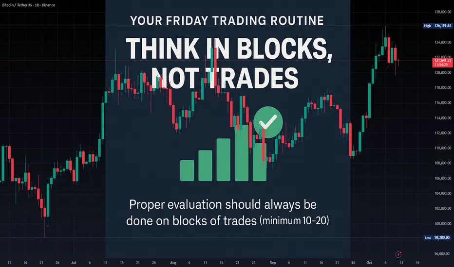
The Process Notebook #1 — The Successful Trader’s RoutineThe Successful Friday's Trader Routine: Evaluate but Think in Blocks, Not Trades
Another trading week is about to end. For most traders, Friday means checking wins and losses. For professional traders, it means evaluating the system.
💡 Remember: a single trade means nothing.
Proper evaluation, to avoid emotional bias caused by variance, should always be done on blocks of trades (minimum 10–20).
But here’s the real twist: If you’re judging your system only by Win Rate (WR) or Reward-to-Risk (RR)… you’re missing the real picture.
A robust trading system needs to be monitored through a small set of key metrics that reflect not just how much you earn, but how consistent and reliable your edge truly is.
Here’s the minimum you should be tracking 👇
📈 Return Metrics (How much your system makes)
Expectancy (average return per trade): quantifies the true profitability of your edge.
CAGR (Compound Annual Growth Rate): shows long-term compounding efficiency.
Payoff Ratio (avg win / avg loss): evaluates quality of your wins vs. losses.
📉 V olatility & Risk Metrics (How stable your system is)
Standard Deviation of Returns: measures the variability of your outcomes.
Max Drawdown: identifies the deepest pain your account can face.
Recovery Factor (Net Profit / Max DD): shows resilience and system efficiency.
⚙️ Consistency Metrics (How repeatable your process is)
Sharpe Ratio: return per unit of volatility — higher = more efficient risk use.
Win/Loss Streak Distribution: reveals your emotional endurance threshold.
Trade Frequency Stability: checks if your system behaves consistently over time.
🧠 Why this matters
When you evaluate your trading in blocks (using statistics, not emotions), you detach from the noise and connect with your system’s real performance.
You stop judging yourself trade by trade… and start thinking like a risk
manager.
How do you evaluate your system — by emotion or by metrics?
Predict your future profits with EXPECTANCY formulaEXPECTANCY is a formula you use to determine how reliable your system is.
You should measure all your trades that were winners versus losers, then determine how PROFITABLE your winning trades were versus how much your losing trades lost.

FINDING THE BEST ROI BETWEEN SIMILAR ASSETS 📚 With Alpha's PoP💬Introduction :
Today we are comparing the Dow Jones, NASDAQ, and the S&P by their annual performance to show how our open source indicator "Alpha Performance of Period" (PoP) can be used and why the results are useful. We will also look at other markets later in the writeup to see how they compare and to get a sense of which markets provide the best risk-to-reward and ROI.
The idea here is to compare highly correlated markets over time to see which of these markets preforms the best overall represented by a period chosen by the user. This will help tell us which of these indexes is the best/worst to trade/invest with on average.
For this article we will assume "best" equates to "best for long positions", but the indicator could be used for other purposes such as best shorting opportunities (largest drawdown amounts).
Comparing these indexes shows that the NASDAQ has historically outperformed, while the DOW underperformed, and the S&P has been somewhere in the middle since the tech bubble on a year-over-year basis.
You can also see this on the chart as represented by the indicator's metrics contained within its label, but we will summarize it below:
NOTE: The figures below are rounded up to the nearest .01%, see charts for exact %'s.
Equity Indices Total Annual performance results: (main chart)
(Jan. 2000 - present)
SPX = +111.79%
NDX = +156.10%
DJI = +117.65%
Now let's look at the quarterly and monthly performance:
Equity Indices Total Quarterly performance results:
(Jan. 2000 - present)
SPX = +104.57%
NDX = +160.75%
DJI = +111.65%
Equity Indices Total Monthly performance results:
(Jan. 2000 - present)
SPX = +91.22%
NDX = +125.274%
DJI = +101.68%
Equities Summary:
While the NASDAQ has had periods of underperformance (for example the dot com bubble burst), on each of the charts you can see that not only has the NASDAQ outperformed (and the Dow underperformed) over time, the NASDAQ has also generally outperformed during each different period measurement. We won't do the math for each period here as that's the main purpose of this indicator, but you can apply the indicator on your own chart and take a look at it yourself.
The main takeaways for us are this:
1. You are better off trading and/or holding the NASDAQ when compared to the 3 main indexes.
2. You are better off trading the S&P than the DJI.
3. The performance of the NASDAQ during COVID isn't an anomaly, and it doesn't necessarily indicate a tech bubble, outperformance in a specific period and overtime is the norm with this index.
Now that you see how this works on the indexes, let's showcase how it can work for other markets.
-----
RARE EARTH METALS~
Rare Earth Metals Total Annual performance results:
(Jan. 2000 - present)
GOLD = 193.87%
SILVER = 186.72%
PALLADIUM = 361.27%
Rare Earth Metals Total Quarterly performance results:
(Jan. 2000 - present)
GOLD = 201.80%
SILVER = 197.60%
PALLADIUM = 304.04%
Rare Earth Metals Total Monthly performance results:
(Jan. 2000 - present)
GOLD = 206.59%
SILVER = 209.60%
PALLADIUM = 283.25%
Rare Earth Metals Summary:
As you can see, despite the general public's love of Gold, Palladium vastly outperforms it. Meanwhile, we can confirm Silver underperforms. Many people wouldn't suspect Palladium was superior, but we now know from the resulting data (Hooray!).
-----
FOREX~
Main Forex USD pairs Total Annual performance results:
(Jan. 2000 - present)
EURUSD = 19.48%
GBPUSD = -9.03%
AUDUSD = 23.90%
Main Forex USD pairs Total Quarterly performance results:
(Jan. 2000 - present)
EURUSD = 20.75%
GBPUSD = -16.53%
AUDUSD = 20.98%
Main Forex USD pairs Total Monthly performance results:
(Jan. 2000 - present)
EURUSD = 19.57%
GBPUSD = -16.70%
AUDUSD = 21.93%
Forex Summary:
As you can see against a USD base-pair, GBP is the worst performing from the 2000's by all periods. One might assume the more popular EUR pair preformed better than for example AUD, but the reality is AUD takes the cake and preformed better than both EUR and USD by each period over time.
-----
CRYPTOCURRENCY~
Main Crypto USD(T) pairs Total Annual performance results:
(Jan. 2017 - present)
BLX = 1351.18%
ETHUSDT = 8967.62%
LTCUSD = 5012.80%
Main Crypto USD(T) pairs Total Quarterly performance results:
(Jan. 2017 - present)
BLX = 504.60%
ETHUSDT = 1124.81%
LTCUSD = 824.44%
Main Crypto USD(T) pairs Total Monthly performance results:
(Jan. 2017 - present)
BLX = 357.63%
ETHUSDT = 739.39%
LTCUSD = 530.67%
Crypto Summary:
Crypto has the largest period losses, but it also has the largest period gains (by far). Of all the crypto pairs, ETH offers the best ROI. Interestingly, ETH offers the best ROI of all markets mentioned in this article as well (although it also has the biggest losses and highest risk associated with its uptrends). Some might find it odd that Litecoin outperforms Bitcoin (although like with ETH, the drawdown is notably more intense).
-----
Conclusion:
Use "Alpha Performance of Period" (PoP) to compare markets for what is best suited to your portfolio depending on your individual risk appetite. It is meant to be used on highly correlated markets, but as you can see you can also compare different sets of markets together to get a sense of which offers the best risk-to-reward, ROI, etc. This tool thus has many uses related to figuring out which markets you want to trade based on historical data and offers a simple way to quickly compare past performance. Hope you guys enjoy it! :D
Resources:
apple.news
Hit that 👍 button to show support for the content!
Help the community grow by giving us a follow 🐣
