Double Top Pattern – A Classic Bearish Reversal Structure📚 Double Top Pattern – A Classic Bearish Reversal Structure
The Double Top is one of the most widely recognized and reliable bearish reversal patterns in technical analysis. It typically forms after a well-established uptrend and reflects a gradual loss of bullish momentum as market control transitions from buyers to sellers. Understanding the structure, confirmation rules, and market logic behind the Double Top helps traders avoid false signals and improve overall trade accuracy.
🔍 Structural Components of the Double Top
The Double Top consists of three primary phases:
Phase One – First Top
- Price rallies strongly in line with the prevailing uptrend and forms the first peak, indicating dominant bullish momentum.
- A subsequent pullback creates a temporary low, which later serves as the neckline of the pattern.
Phase Two – Second Top
- Price attempts another upward push but fails to break above the first top.
- This failure signals weakening buying pressure and early signs of distribution by larger market participants.
Phase Three – Neckline Breakdow n
- The pattern is confirmed only when price breaks below the neckline.
- This breakdown marks a shift in market control from buyers to sellers and confirms the potential trend reversal.
⚠️ Important note:
Without a clear neckline break, a Double Top is not considered valid.
📉 Market Meaning Behind the Pattern
From a price behavior perspective, the Double Top indicates:
- Diminishing bullish momentum after the second top
- Buyers losing the ability to push price higher
- Sellers gradually stepping in
- A confirmed neckline break signaling a trend reversal
When formed after a clear uptrend, the Double Top is considered a high-probability bearish reversal pattern.
✅ Conditions for a High-Quality Double Top
To improve reliability, the following conditions should ideally be present:
✔️ A clearly defined prior uptrend
✔️ Both tops are approximately equal in height
✔️ Volume is higher on the first top and lower on the second
✔️ Strong bearish candles or volume expansion during the neckline break
🛠️ How to Trade the Double Top
🔴 Sell Entry
The safest approach is to:
Wait for a confirmed neckline break
Enter a SELL on the retest of the neckline
This method reduces the risk of false breakdowns and improves the risk-to-reward profile.
❌ Stop Loss
Place the stop loss above the second top (or above both tops)
The stop should remain outside the structure to avoid liquidity sweeps
🎯 Take Profit
To estimate the target:
Measure the distance from the top to the neckline
Project that same distance downward from the neckline break
⚠️ Common Mistakes to Avoid
❌ Selling simply because a second top forms
❌ Ignoring neckline confirmation
❌ Trading without volume or candle validation
❌ Using the pattern in isolation without confluence
📌 Pro Tip for Higher Accuracy
For higher-probability setups, combine the Double Top with:
- RSI divergence
- Fair Value Gaps (FVG)
- Trendlines
- Liquidity zones
A multi-confirmation approach significantly improves trade quality and consistency.
W-m-pattern

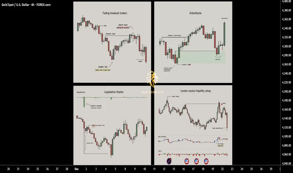
How Price Really Moves: 4 Entry Triggers Driven by LiquidityThis breakdown explains four recurring entry triggers that appear consistently across real market structure.
These are not indicators and not prediction tools. They are observable behaviors driven by liquidity, positioning, and trader psychology.
Each trigger is rooted in why price moves, not what price might do next.
1. Fading breakout traders (Failed Momentum / Trap Model)
When price breaks a key level and open interest jumps, breakout traders rush in expecting continuation. If price quickly snaps back, those new traders become trapped and their exits fuel a move in the opposite direction. This creates one of the cleanest reversal triggers since you are trading directly against failed momentum.
► What usually happens
Markets frequently approach obvious highs, lows, or range boundaries where:
•Retail breakout traders anticipate continuation
•Algorithms and short-term momentum systems enter aggressively
•Open interest or volume often expands rapidly
At this moment, new positions are created late , directly into resistance or support.
► The key failure
If price:
•Breaks a key level
•Fails to hold acceptance beyond it
•Quickly closes back inside the prior range
Then the breakout has failed structurally.
This means:
•Buyers who entered above resistance are now trapped
•Sellers who entered below support are trapped
•Their exits (stops + panic closes) become fuel for the opposite move
► Why this works
Markets move efficiently when traders are positioned correctly.
They move violently when traders are positioned incorrectly.
A failed breakout converts hope-based positions into forced exits.
► Educational takeaway
You are not trading the level,
you are trading the failure of belief at the level.
This is why failed breakouts often produce:
•Fast reversals
•Clean directional candles
•Strong continuation after rejection
2. Liquidation flushes (Forced Exit & Rebalance Model)
Sharp liquidation events create long wicks and temporary price inefficiencies. Markets tend to rebalance after these shocks as liquidity returns, which is why these wicks often get filled quickly. This setup works well in volatile phases and near exhaustion points where forced selling or buying pushes price too far.
► What a liquidation flush is
A liquidation flush occurs when:
•Price moves aggressively in one direction
•Overleveraged positions are forcibly closed
•Stops and liquidations cascade simultaneously
This often creates:
•Long wicks
•One-sided impulsive candles
•Temporary price inefficiencies
Importantly, this move is not driven by new conviction, but by forced exits.
► What happens after
Once forced liquidations are complete:
•Selling or buying pressure rapidly decreases
•Liquidity returns to the market
•Price frequently retraces part or all of the wick
This retracement is not random
it is the market rebalancing after stress.
► Where flushes matter most
Liquidation flushes are most meaningful when they occur:
•Near prior highs/lows
•At range extremes
•After extended directional moves
•During high-volatility sessions
► Educational takeaway
A liquidation wick does not mean “strong trend”.
It often means the move is temporarily exhausted.
You are not trading momentum,
you are trading the absence of remaining pressure.
3. Orderblocks
Orderblocks are zones where previous heavy participation occurred, usually during sideways movements before a strong move away. When price revisits these levels, the same participants often defend the area, creating reliable reaction points. Clean pivots with no messy wicks are the strongest since they signal clear institutional activity.
► What an orderblock represents
Orderblocks are areas where:
•Large participants accumulated or distributed positions
•Price moved sideways briefly
•A strong directional move followed immediately after
This sideways phase exists because large players cannot enter all at once without moving price against themselves.
► Why orderblocks matter
•When price returns to these zones:
•Previous participants may still be active
•Unfilled orders may remain
•Defensive reactions are more likely than random continuation
Clean orderblocks typically show:
•Tight consolidation
•Minimal wicks
•Strong departure afterward
Messy structures often indicate mixed participation and weaker reactions.
► How orderblocks are used
Orderblocks are reaction zones , not signals.
They provide:
•Logical areas to expect interest
•Defined risk zones
•Context for entry triggers like wicks or failed breaks
► Educational takeaway
Orderblocks work because institutions remember their prices , even if retail traders forget them.
You are trading where participation previously mattered, not arbitrary support or resistance.
4. London session liquidity setup
London frequently sets the daily low or high early in the session. Later in the day price often returns to sweep internal liquidity around that level before continuing the trend. This repeatable behavior offers structured entries based on predictable liquidity grabs tied to session mechanics.
► Why London matters
The London session is:
•One of the highest liquidity windows globally
•Often responsible for setting the initial daily structure
•Heavily watched by institutions and algorithms
In many markets, London establishes:
•The daily high
•The daily low
Or a key internal liquidity level early in the session
► The repeatable behavior
Later in the day (often London continuation or New York):
•Price returns to that London high or low
•Sweeps internal liquidity around it
•Rejects after stops are collected
•Continues in the higher-timeframe direction
This is not coincidence,
it is session-based liquidity engineering.
► Why it works
Institutions prefer:
•Liquidity-rich entries
•Known pools of resting stops
•Session transitions for execution
London levels provide exactly that.
► Educational takeaway
Sessions are not just time zones,
they are liquidity cycles.
Understanding when liquidity is created is just as important as where.
How These Triggers Fit Together
These models are not standalone strategies.
They are contextual tools.
Very often:
•A London sweep causes a liquidation wick
•A failed breakout forms at an orderblock
•A liquidation flush completes a failed momentum move
The strongest setups occur when multiple triggers overlap , but each can stand alone as a learning framework.
Why These Triggers Work Long-Term
They work because they are based on:
• Trader positioning
• Forced behavior (stops, liquidations)
• Institutional execution constraints
• Repeating session mechanics
They do not rely on:
•Indicator crossovers
•Lagging calculations
•Pattern prediction
Price moves because someone is forced to act.
These triggers show where and why that happens.
These 4 triggers work because they exploit trapped traders, forced liquidations and consistent liquidity patterns rather than relying on indicators. Keep them simple, wait for clean context and let the setups come to you.
Note
These concepts are:
•Descriptive, not predictive
•Contextual, not mechanical
•Dependent on execution skill and risk management
The goal is not to trade more,
it is to wait for situations where the market gives you an advantage.
I have made a script which might help identify all 4 triggers.
Disclaimer
The script is provided for educational and informational purposes only.
It does not constitute financial advice, investment advice, or a recommendation to buy or sell any instrument.
The script does not execute trades, manage risk, or replace the need for trader discretion. Market behavior can change quickly, and past behavior detected by the script does not ensure similar future outcomes.
Users should test the script on demo or simulation environments before applying it to live markets and must maintain full responsibility for their own risk management, position sizing, and trade execution.
Trading involves risk, and losses can exceed deposits. By using the script, you acknowledge that you understand and accept all associated risks.
What Bees Can Teach Us About Trading!At first glance, bees and trading seem worlds apart. But look closer, and you’ll find powerful lessons traders can learn from the hive:
🏗️ Discipline & Structure
Every bee knows its role and sticks to it. Traders too must follow their plan with precision.
🛡️ Risk Management
Forager bees never all leave at once; they manage risk for the colony. Traders should also protect capital and avoid going “all in” on one setup.
🔍 Pattern Recognition
Bees know when and where to collect nectar. Traders rely on recognizing price patterns and market cycles.
⏳ Patience & Consistency
A single bee’s contribution is small, but millions of trips create honey. Trading success also comes from consistent small gains that compound.
🧘 Emotional Control
Bees don’t let fear or greed guide them; they follow their system. The same applies to traders who stay calm and disciplined.
👉 In short: Trade like a bee — structured, patient, and focused on the bigger picture.
📚 Always follow your trading plan regarding entry, risk management, and trade management.
Good luck!
All Strategies Are Good; If Managed Properly!
~Richard Nasr
Disclosure: I am part of Trade Nation's Influencer program and receive a monthly fee for using their TradingView charts in my analysis.
Mastering bearish candlestick patterns - How to use it!Bearish candlestick patterns are a cornerstone of technical analysis, relied upon by traders across financial markets to assess the likelihood of price reversals or continued downward trends. At their core, these patterns are visual representations of shifts in market sentiment, formed by the open, high, low, and close prices over one or several trading sessions. When recognized accurately and interpreted in context, bearish candlestick setups can alert market participants to the fading strength of buyers and the increasing presence of sellers, which often precedes downward price movements. Expanding on this, a comprehensive understanding of each pattern’s nuances, psychological underpinnings, and optimal trading applications can significantly enhance a trader’s analytical toolkit.
What will be discussed?
- What is a shooting star?
- What is a hanging man?
- What is a gravestone dojo?
- What is an evening star?
- What are the three black crows?
- How to trade the bearish candlestick patterns?
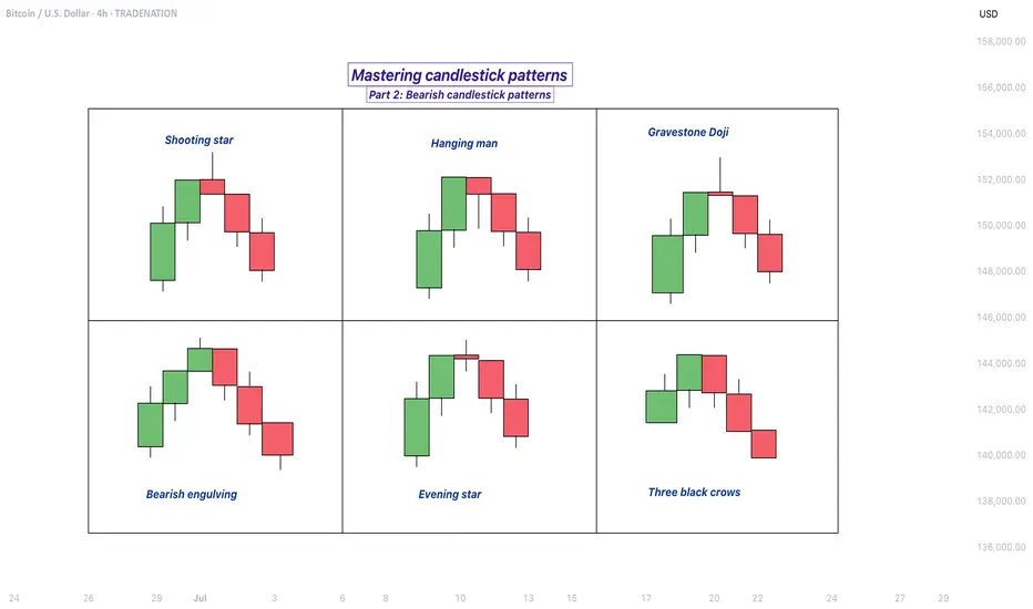
Shooting star
The shooting star pattern stands as a prominent candlestick configuration foreshadowing potential bearish reversals after an uptrend. This single-candle pattern is distinguished by a small real body situated near the lower end of the price range, a long upper shadow that is at least twice the length of the body, and little to no lower shadow. The psychological narrative implied by the shooting star is compelling: buyers initially control the session, pushing prices sharply higher, but by the close, sellers have overwhelmed this optimism, pulling the price back down to near or below the opening point. This abrupt shift in control suggests that the bullish momentum is waning, priming the market for a price correction or reversal.
Hanging man
The hanging man, while visually similar to the hammer pattern of bullish reversals, is distinctly bearish because of its position at the top of an established uptrend. This single-candle pattern features a small body at the upper part of the trading range and a markedly long lower shadow, again with minimal or absent upper shadow. During the session, substantial selling pressure drives prices down, accounting for the extended lower shadow, yet buyers temporarily regain some control, recovering much of the loss by the close. Despite this late-session recovery, the appearance of the hanging man warns traders that sellers are growing more aggressive – especially if the next candle confirms the weakness with a lower close.
Gravestone doji
A classic and somewhat ominous formation, the gravestone doji is a specialized form of doji candlestick that carries even greater weight when it appears after a rising market. Here, the open, close, and low are all clustered near the session’s low, forming a long upper shadow with no lower shadow. This structure vividly illustrates a dramatic shift in sentiment: buyers propel prices higher during the session, only to be met by intense selling which pushes prices back to the opening level by the close. This failed rally, marked by the upper wick, reflects the exhaustion of buying interest and the potential onset of bearish dominance.
Bearish engulfing
Turning to multi-candle setups, the bearish engulfing pattern is a powerful, two-bar reversal pattern. The initial candle is bullish and typically a continuation of the prevailing uptrend, but the second candle is bearish and must open above and close below the body of the first candle, “engulfing” it completely. The transition from a relatively small upward move to a much larger downward move highlights a rapid escalation in sell-side enthusiasm. Importantly, the larger the second candle and the greater the volume accompanying it, the more reliable the signal.
Evening star
The evening star expands the analysis further into a three-candlestick formation, representing a storyline of shifting market dynamics. The pattern commences with a long bullish candle, followed by an indecisive small candle (the star) that gaps above the previous close, and concludes with a large bearish candle that closes deep into the first candle’s body. The evening star is especially meaningful because it narrates a transition from bullish exhaustion to bearish control over three sessions, making it a robust signal of a pending trend reversal. The reliability of the evening star increases if the bearish candle is accompanied by high volume, confirming a surge in selling pressure.
Three black crows
Among the most striking bearish signals is the three black crows pattern. It comprises three consecutive large bearish candles, each opening within the body of the previous candle and closing successively lower. This pattern demonstrates relentless selling over several sessions, erasing prior gains and indicating that bearish sentiment is in full swing. Collectively, the three black crows can shift market psychology significantly when they appear after a lengthy uptrend, especially if accompanied by increased trading volume.
How to trade the bearish candlestick patterns?
Effectively using bearish candlestick patterns in a trading strategy requires more than mere recognition of shapes. The context in which these patterns emerge matters greatly; traders should analyze preceding price action, the scope of the trend, and any converging signals from other technical tools such as momentum oscillators or volume indicators. Confirmation is a best practice, waiting for a subsequent session that continues in the bearish direction can filter out false signals and decrease the chances of whipsaw trades.
In practice, traders may use these patterns to identify short-selling opportunities, define entry and exit points, or adjust stop-loss levels to protect profits as a trend appears to reverse. Risk management is crucial, as no pattern is infallible. Position sizing, stop-loss placement, and ongoing evaluation of the broader market environment all contribute to the prudent use of candlestick analysis. By integrating these patterns into a comprehensive market analysis framework, traders are better positioned to interpret crowd psychology, anticipate significant reversals, and navigate the complexities of price movement with a higher degree of confidence and skill.
-------------------------
Disclosure: I am part of Trade Nation's Influencer program and receive a monthly fee for using their TradingView charts in my analysis.
Thanks for your support. If you enjoyed this analysis, make sure to follow me so you don't miss the next one. And if you found it helpful, feel free to drop a like 👍 and leave a comment 💬, I’d love to hear your thoughts!
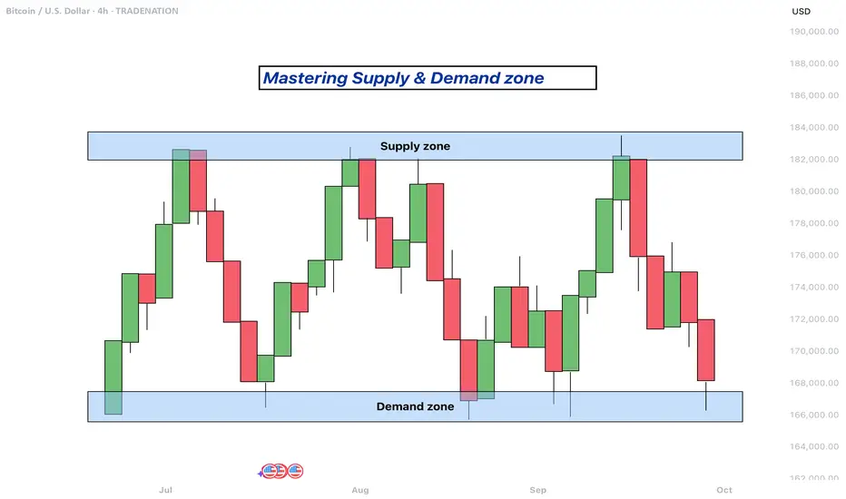
Mastering supply and demand zones - how to use it in trading?Supply and demand zones are key concepts in technical analysis used by traders to identify potential price reversal areas on a chart. They are based on the idea that prices move due to an imbalance between buyers (demand) and sellers (supply).
-------------------------
What will be discussed?
- What are supply and demand zones?
- How to detect supply and demand zones?
- Examples from supply and demand zones?
- How to trade using supply and demand zones?
-------------------------
What are supply and demand zones?
Supply and demand zones are areas on a price chart where the forces of buying and selling are strongly concentrated, causing significant movements in price. In simple terms, a supply zone is an area where selling pressure exceeds buying pressure, often leading to a drop in price. It usually forms when price moves upward into a region where sellers begin to outnumber buyers, pushing the price back down. On the other hand, a demand zone is a region where buying pressure exceeds selling pressure, typically resulting in a rise in price. This occurs when price moves downward into a region where buyers see value and begin to outnumber sellers, causing the price to increase again.
These zones reflect areas of imbalance in the market. In a supply zone, sellers are more eager to sell than buyers are to buy, often due to overbought conditions, news, or fundamental changes. In a demand zone, buyers are more eager to buy than sellers are to sell, often because the price has become attractive or undervalued. Traders look for these zones because they provide clues about where price may reverse or stall, offering potential entries or exits for trades.
-------------------------
How to detect supply and demand zones?
Identifying supply and demand zones involves analyzing price action on a chart, typically using candlestick patterns. A common way to detect a supply zone is to look for a sharp upward move followed by a sudden reversal or strong drop in price. The area where the price stalled before falling sharply is likely to be a supply zone. This zone includes the highest candle body or wick before the drop, and a few candles before it that mark where the selling pressure began.
To identify a demand zone, you would look for a sharp drop in price followed by a strong rally upward. The area where the price paused before rising significantly can be considered a demand zone. Like with supply zones, the demand zone includes the lowest candle before the price reversed and a few candles leading up to it.
These zones are not exact price levels but rather ranges. Price does not have to touch an exact line to react; it often moves within the general area. For more accuracy, traders often refine their zones by identifying them on higher time frames such as the 4-hour or daily chart, then adjusting them slightly on lower time frames like the 1-hour or 15-minute chart.
-------------------------
Examples from supply and demand zones:
-------------------------
How to trade using supply and demand zones?
Trading supply and demand zones involves anticipating how price is likely to behave when it returns to one of these key areas. A common method is to wait for price to enter a zone and then watch for confirmation that it is going to reverse. For example, if price rises into a supply zone, you might look for signs like a bearish candlestick pattern, a drop in volume, or a rejection wick to signal that sellers are stepping in again. This would be an opportunity to enter a short trade with the expectation that price will fall.
Conversely, if price falls into a demand zone, you would wait for bullish signals—such as a strong bullish candle, a double bottom pattern, or clear rejection of lower prices—to confirm that buyers are returning. This would be a potential setup for a long trade, expecting the price to move up from the zone.
Traders often place stop losses just beyond the zone to limit risk in case the level fails. For a supply zone, the stop loss would go just above the zone, while for a demand zone, it would go just below. Targets can be set at recent support or resistance levels, or by using risk-reward ratios like 1:2 or 1:3 depending on the trader’s strategy.
Patience and discipline are important when trading these zones. Not every zone will lead to a reversal, and false breakouts can occur. Therefore, combining supply and demand analysis with other tools such as trendlines, moving averages, or indicators can improve the chances of a successful trade.
In summary, supply and demand zones help traders understand where large buying or selling forces are likely to influence price. By learning to identify these zones and waiting for confirmation signals, traders can enter high-probability trades with clear risk and reward levels.
-------------------------
Disclosure: I am part of Trade Nation's Influencer program and receive a monthly fee for using their TradingView charts in my analysis.
Thanks for your support. If you enjoyed this analysis, make sure to follow me so you don't miss the next one. And if you found it helpful, feel free to drop a like and leave a comment, I’d love to hear your thoughts!
Pattern Identification ExerciseHere I run through an exercise I first started carrying out around 4 years ago. It is a brilliant tool to help train yours eyes to spot patterns within the market, log the data across multiple different instruments and find specific characteristics with that instrument.
The importance behind carrying out an exercise like this is training your lens to spot these in the live markets, and also stacking your confidence so when you see these develop you are able to approach them in the best way possible.
Any questions just drop them below 👇

Stock Market Logic Series #13The double bottom and double top patterns are among the most powerful and reliable indicators in technical analysis. These formations provide traders with insights into potential trend reversals, making them valuable tools in a trader's arsenal. However, one must approach these patterns with patience and discipline to truly harness their power.
Statistically, the price often does not move decisively on the first attempt, and waiting for confirmation can significantly improve the likelihood of a successful trade entry.
A double bottom pattern occurs when a stock's price hits a low point, rebounds, and then retests the same low point before moving upward. This pattern suggests that the selling pressure is diminishing, and buyers are starting to take control. Conversely, a double-top pattern forms when the price reaches a high point, retraces, and then retests the same high point before moving downward. This indicates that buying pressure is waning, and sellers are gaining the upper hand.
One of the key aspects of trading these patterns is patience. It's essential to wait for the price to confirm the pattern before entering a trade. For a double bottom, this means waiting for the price to break above the resistance level formed between the two lows. For a double top, it involves waiting for the price to break below the support level formed between the two highs. By waiting for these confirmations, traders can avoid false signals and increase their chances of entering a profitable trade. This is because you will not fall into the trap of HINDSIGHT backtesting and it is clear that an M or W happened.
HINDSIGHT backtesting is that you have the hindsight advantage when you backtest, but you don't have it when you do REAL-TIME trading.
FYI, TradingView gives you the ability to do a reply of bars ... This gives you the dramatic advantage of seeing if your trading rules are REAL-TIME approved.
Patience is particularly crucial because, statistically, the price often makes multiple attempts to break through these key levels. Impatient traders who jump in too early may find themselves caught in a false breakout or worse an "imaginary breakout", resulting in losses. By waiting for the price to confirm the pattern, traders can ensure that the trend reversal is genuine and increase their odds of success.
Imaginary breakout is when you imagine the price will do what you believe it will do, and it never does it. This cognitive error causes you to enter trades you would have never taken when you backtested your strategy.
John Bollinger, the creator of the Bollinger Bands, recognizes the power of double bottom and double top patterns. Bollinger Bands are a popular technical analysis tool that measures market volatility and provides a dynamic range within which prices are likely to move. When combined with double bottom and double top patterns, Bollinger Bands can further enhance a trader's decision-making process.
TradingView also functions as the best Trading Journal , I have my whole series of stock market logic ideas which I always refer back to. Also, you can add inside the journal idea a picture of the chart that is automatically stored and displayed on the TradingView ideas.
What you see on the chart is a confirmed validated M-pattern (the pink is the manifestation of the pattern), then after it you see a period of "NOT LONG".
This gives you a "TELL" that the probability of the rallies... they are fake.
Then, you see a confirmed W-pattern (the pink is the manifestation of the pattern), then after it, you see a period of "LONG".
This gives you a "TELL" that the probability of the corrections... they are fake.
When YOU, yes YOU, "KNOWS" statistically, when a fake pricing happens... this is a very lucrative business opportunity...

QM PATTERNhello friends
We have come up with a good and frequent pattern.
This pattern starts with a sharp movement in the direction of the trend, and its return must hit the previous ceiling, and we enter the trade in the determined pullback.
The first target is the previous ceiling and the second target is twice its movement.
*Trade safely with us*

How to Identify and Trade Flag Patterns EffectivelyThe flag pattern is one of the most effective trading setups in the crypto market, known for its reliability and high probability of continuation in trending markets. Here’s a detailed overview of what a flag pattern is, how to identify it, and why it works so well in crypto trading.
What is a Flag Pattern?
A flag pattern appears as a brief consolidation following a strong price movement, resembling a rectangular shape. There are two main types of flag patterns: bull flags and bear flags.
Bull Flag: This pattern typically forms after a strong upward price movement (the flagpole), followed by a slight pullback or consolidation (the flag) before the price continues its upward trend. The flag usually slopes downward or moves sideways.
Example of Bullish Flag Pattern.
Bear Flag: Conversely, a bear flag occurs after a significant downward movement, followed by a consolidation that trends slightly upward, indicating a continuation of the downward trend once the price breaks down through the flag.
Example of Bearish Flag Pattern.
Identifying Flag Patterns
To identify a flag pattern, traders look for:
🏳️ Flagpole: This is the initial sharp price movement.
🏳️ Flag Formation: This should be a consolidation phase that lasts from 2-3 candles up to more than ten, depending on the timeframe.
🏳️ Volume Analysis: Ideally, the volume should be higher during the flagpole and lower during the flag consolidation. An increase in volume upon breakout is a strong confirmation of the continuation.
Here is the example chart for identifying the flag pattern:
Trading the Flag Pattern
To trade a flag pattern effectively, follow these steps:
📈 Entry: For a bull flag, consider entering the trade once the price breaks above the upper boundary of the flag. For a bear flag, enter on a break below the lower boundary.
📈 Stop Loss: Place your stop loss just below the flag (for bull flags) or above the flag (for bear flags).
📈 Profit Target: A common target is to measure the height of the flagpole and project that distance from the breakout point.
Example chart showing how to place a trade using the flag pattern:
Why It Works in Crypto Markets
The flag pattern is particularly effective in the crypto market for several reasons:
📊Volatility: Cryptocurrencies are highly volatile, which can create strong price movements leading to clear flag formations.
📈 Trend Continuation: Flags often appear in trending markets, where there’s a significant amount of bullish or bearish momentum.
🧠 Psychological Factors: Traders recognize these patterns, leading to increased buying or selling pressure at breakout points.
Example of Bullish and Bearish Flag Pattern:
Bullish Flag:
Bearish Flag:
Flag patterns are highly effective in crypto trading, offering clear signals for trend continuation. They are especially useful in volatile markets, providing reliable entry and exit points. By identifying strong momentum during the breakout and combining it with volume analysis, traders can use flag patterns to make well-informed, high-probability trades.

A classic setup for finding trading opportunitiesHi traders and investors!
In a recent post, I talked about a classic setup. You can find the post below in the related ideas section. I decided to elaborate on it a bit more because this setup frequently appears across different assets, and certain elements of this setup are common in various trading methodologies. In this article, I used a bar chart because bars take up less space, making it easier to see other elements of the chart.
Take a look at the chart. The seller's move from the 52,550 level updated the previous local high. The bar with the highest volume in this entire buyer's movement is the bar from September 18. The 50% level of the entire buyer's movement lies within this bar (!).
Next, we see the seller's movement, and on October 3, a test is formed within the key buyer's bar, at the level of 59,828.11. The price didn't reach the 50% level (59,524).
The key seller's bar in this movement (the bar with the highest volume) is the bar from October 1. The 50% level of the entire seller's movement is within this bar (!).
Next, we see the buyer's movement, and on October 5, a test is formed within the key seller's bar, at the level of 62,484.85. The price didn't reach the 50% level (63,163.06).
Then we see the buyer's attack on the test level of 62,484.85 and the 50% level of the seller's movement (63,163.06), followed by the seller returning the price below the test level, accumulating volume for a downward move. After that, the local minimum of 59,828.11 was updated.
Then, the seller attacks the test level of 59,828.11 and the 50% level of the buyer's movement (59,524), and the buyer returns the price above the test level, gathering volume for an upward move. What happens next... we will soon see.
This is how the buyer's attack on the 50% level of the seller's movement looked on the 4-hour time frame.
No differences whatsoever. Although, maybe I didn’t look hard enough. The key bar of the seller's movement intersects the 50% movement. First, there’s a test below the 50% level (test level 62,975), then an attack on the test level and the 50% level.
Hope you found it interesting.
Good luck with your trading and investments!

All About the Flag Pattern (Beginner-Friendly)Hello everyone,
Today, I’ve prepared an educational guide on chart patterns, specifically focusing on the Flag Pattern.
This content is designed to be easy for beginners to follow, so I hope you find it engaging and informative. :)
Below is the outline I’ll be using for this post:
————
✔️ Outline
1. What is a Flag Pattern?
Definition
Key Components
Characteristics
2. Bullish Flag Pattern
Basic Characteristics
Examples
3. Bearish Flag Pattern
Basic Characteristics
Examples
————
1. What is a Flag Pattern?
1) Definition
A Flag Pattern forms during a brief consolidation phase after a strong price movement, often signaling the continuation of a trend. It typically appears when prices make a sharp move, either up or down, followed by a period of sideways or slightly counter-trend movement.
Flag Patterns can occur in both uptrends and downtrends, named for their resemblance to an actual flag. After a strong price move, the market consolidates briefly before continuing in the original trend direction.
2) Key Components
Flagpole: The initial strong price movement that sets the overall trend direction before the consolidation phase.
Flag: The consolidation period where prices move sideways or slightly counter to the trend, often forming a rectangle or parallelogram. This phase typically occurs with a decrease in trading volume.
Breakout: The moment when the price resumes its original trend direction. In an uptrend, this is an upward breakout, and in a downtrend, a downward breakout, confirming the continuation of the trend.
3) Characteristics
Duration: The Flag Pattern typically lasts longer than the Flagpole but varies depending on the timeframe.
Volume: Volume usually decreases during the Flag’s formation and increases once the breakout occurs.
Reliability: The Flag Pattern is considered a reliable indicator of trend continuation, making it a favorite among traders using trend-based strategies.
————
2. Bullish Flag Pattern
1) Basic Characteristics
A Bullish Flag forms after a strong upward price movement, signaling a temporary consolidation phase. During this consolidation, volume typically decreases, suggesting that the market is pausing rather than reversing. After this phase, the price often continues its upward trend, accompanied by an increase in volume. Bullish Flag Patterns also help relieve overbought conditions in technical indicators, providing the market with a chance to prepare for another move up.
2-1) Example 1
This chart from May 2023 shows a strong Flagpole followed by a long consolidation phase (Flag). The volume then increased as the price broke out, completing the Bullish Flag Pattern.
2-2) Example 2
In this chart from March 2021, we see a similar setup: a strong Flagpole, followed by a consolidation phase, leading to a breakout that continued the upward trend.
————
3. Bearish Flag Pattern
1) Basic Characteristics
The Bearish Flag Pattern is the inverse of the Bullish Flag. It follows a strong downward move (Flagpole) and is followed by a period of consolidation (Flag) with decreasing volume. Like its bullish counterpart, the Bearish Flag can relieve oversold conditions, leading to a continuation of the downtrend after a breakout.
2-1) Example 1
This chart from May 2022 displays a Bearish Flag Pattern: a strong downward Flagpole, followed by a Flag consolidation phase. After the consolidation, a breakout occurred, continuing the downtrend.
2-2) Example 2
This chart from February 2022 also illustrates a strong downward Flagpole, followed by a consolidation phase (Flag), leading to a breakout that completed the Bearish Flag Pattern.
This guide will help you better understand the Flag Pattern and how it can be used in your trading strategy effectively!
————
✔️ Conclusion
I hope the various Flag Patterns and market analysis techniques covered in this post prove helpful in your investment journey. Chart analysis is not merely a technical skill but also a deeper understanding of market psychology and movement. Flag Patterns, along with other chart patterns, visually reflect the psychological dynamics of the market. Mastering their use can greatly contribute to successful trading.
That being said, the crypto market is inherently unpredictable and fast-moving. While technical analysis is a valuable tool, it’s important to adopt a comprehensive approach that considers broader market trends and external factors. I encourage you to apply the insights gained from this post with a balanced and cautious perspective when making investment decisions.
New opportunities are constantly emerging, and those who are prepared to seize them will find success. The chart represents the market’s voice. Listening to it, interpreting it, and making informed decisions based on that interpretation is "the essence" of chart analysis.
I sincerely hope that, through continuous learning and experience, you’ll evolve into a more confident and successful investor.

Unlock Winning Strategies: Spot High-Probability Trades!Chart Analysis: XAU/USD (Gold Spot vs. USD)
Based on the two charts you have provided, here is a detailed technical analysis of XAU/USD using price action and chart pattern observations:
1. Weekly Flag Trendline (Higher Time Frame Context)
The upper and lower yellow trendlines represent a possible flag pattern on the weekly chart. This suggests a consolidation phase after a strong impulsive move. A flag pattern typically signals a continuation of the previous trend, which, if the context is bullish, indicates that after consolidation, there may be a continuation to the upside.
On both charts, we can observe that price action is contained within this broader structure, indicating that price is in a correction phase rather than an impulsive phase.
2. Key Horizontal Levels
2,532.144 and 2,506.245: These levels act as strong resistance zones. The price has struggled to break above these levels multiple times, indicating significant selling pressure or profit-taking at these points.
2,471.313: This is a key support level. The price has reacted to this level before and, most recently, has bounced back after testing this support zone. This suggests that buyers are willing to step in at this level, providing a floor for the price.
3. Descending Channel and Price Action Patterns
Descending Triangle/Channel Pattern: On the 15-minute chart, the price seems to be forming a descending triangle pattern (lower highs and a flat support at 2,471.313). This pattern is typically bearish, suggesting a potential breakdown if the support does not hold.
Potential Reversal Patterns: After testing the lower trendline of the weekly flag pattern and finding support at the 2,471.313 level, there was a notable bullish reaction. This can imply a short-term reversal, especially if confirmed by a break above the minor resistance level of 2,494.370.
4. Consolidation Zone and Lower Time Frame Patterns
The 15-minute chart shows a clear consolidation pattern after the sharp decline, with price action currently moving sideways between 2,494 and 2,506. A break above this consolidation range could signal a short-term bullish continuation towards the upper resistance levels, while a break below would imply a continuation of the bearish trend observed previously.
5. Breakout and Pullback Zones
The yellow dotted lines on the 15-minute chart indicate key areas where the price broke out from consolidation phases. These areas are crucial for identifying potential entry points in a trending market. If the price retests these zones and finds resistance or support, they could act as triggers for either continuation or reversal trades.
Trading Strategy Considerations
Bullish Bias: Traders with a bullish bias might consider waiting for a breakout above the 2,506.245 resistance, looking for a confirmation with a pullback to this level as support. The target could be the upper boundary of the flag around 2,532.144 or higher, depending on momentum and broader market conditions.
Bearish Bias: A trader with a bearish outlook might wait for the price to break below the 2,471.313 support level, looking for short positions targeting lower levels aligned with the descending channel's trajectory.
Range Trading: Given the current consolidation between 2,494.370 and 2,506.245, range traders could look for entries at the edges of this range with tight stops and defined profit targets within the range.
Conclusion
Given the price action analysis and current chart patterns, the XAU/USD market appears to be in a consolidation phase within a broader flag pattern. This suggests that while the immediate outlook may be neutral to bearish, there is potential for a bullish breakout if key resistance levels are breached. Traders should watch for confirmed breakouts or breakdowns from these levels to guide their trading decisions, keeping in mind the broader market trend and any fundamental drivers influencing gold prices.

Unlock the Secrets of Gold Trading: Pericles' Ancient WisdomIn this video, we explore the profound perspectives on fear from historical figures like Pericles and modern thinkers like Ryan Holiday. Pericles, the esteemed Athenian statesman, saw fear as a natural emotion that should not paralyze us. He believed in confronting fear with courage, rational thought, and strategic planning, using it as a tool for effective decision-making.
Ryan Holiday, drawing on Stoic philosophy in his works, echoes these sentiments with stories of historical figures who turned fear into fuel for success. He recounts how John D. Rockefeller faced market crashes with calm calculation and how Theodore Roosevelt overcame health challenges by embracing adversity.
Both Pericles and Holiday teach us that fear, when managed correctly, can become a powerful ally. By acknowledging fear, confronting it with rationality and courage, and using it to sharpen our focus and strategy, we can transform challenges into opportunities for growth and success. This approach is especially relevant in the realm of trading, where mastering fear can lead to better decision-making and greater resilience.
Key Levels and Patterns:
Higher Highs (HH) and Higher Lows (HL):
The chart shows a series of higher highs (HH) and higher lows (HL), indicating an overall uptrend. This pattern suggests that the bullish momentum is still in play.
Ascending Channel:
There is a well-defined ascending channel where the price has been moving upwards within parallel trendlines. This channel can act as a guide for potential support and resistance levels.
Reversal Points (LQZ):
1-Hour LQZ / Reversal Point: Located at 2,429.190. This level is a potential area where price may reverse or find support.
4-Hour LQZ / Reversal Point: Located at 2,391.394. This level also serves as a significant support zone.
Take Profit (TP) Levels:
TP 1: 2,319.385
TP 2: 2,288.085
TP 3: 2,265.369
Recent Price Action:
The price recently reached a higher high at around 2,458.755 and then pulled back slightly, indicating a potential short-term correction within the overall uptrend.
The ascending channel suggests that if the price remains above the lower boundary of the channel, the uptrend is likely to continue.
If the price breaks below the 1-hour LQZ / Reversal Point at 2,429.190, it could test the 4-hour LQZ / Reversal Point at 2,391.394. A further breakdown below this level might lead to the next support at TP 1.
Analysis Summary:
Bullish Scenario: The price could bounce from the current levels or the lower boundary of the ascending channel, aiming for new highs. Traders might look for buying opportunities near the support levels of the channel and reversal points.
Bearish Scenario: If the price breaks below the identified reversal points and the ascending channel, it might signal a deeper correction, potentially heading towards the TP levels for possible buying opportunities at lower prices.
By applying Pericles' wisdom of confronting fear with rationality and Ryan Holiday's insights on turning fear into strategic advantage, traders can approach these levels with a clear, disciplined mindset, making informed decisions even in volatile market conditions.

three drives patternhello guys...
Before anything you should know I don't follow the exact fibo level and strict rules to find patterns!
Only the generalities of the subject matter to me.
rules:
- a sharp movement
- three-five drive one after the other
- the correction waves don't engulf the last correction
- always a divergence (rsi) helps
let's see some examples

DOUBLE BOTTOMThe double bottom pattern is a technical analysis chart pattern that appears during a downtrend and indicates a possible trend reversal. It is formed by two consecutive lows that are approximately equal and separated by a peak in between
LIKE SHARE FOLLOW US

What is the ( Flag pattern) ?A flag pattern is a technical analysis chart pattern that can be observed in the price charts of financial assets, such as stocks, currencies, or commodities. It is considered a continuation pattern, indicating that the prevailing trend is likely to continue after a brief consolidation or pause.
The flag pattern is formed by two main components:
Flagpole : The first part of the pattern is a strong and sharp price movement, either upward (bullish flag) or downward (bearish flag). This initial move is known as the flagpole and represents a strong surge in buying or selling activity.
Flag : Following the flagpole, there is a period of consolidation where prices move in a rectangular or parallelogram-shaped pattern. This consolidation phase is referred to as the flag. The flag is characterized by decreasing volatility and typically forms a channel or a rectangle.
There are two types of flag patterns:
Bullish Flag: The flagpole is an upward price movement, and the flag is a downward-sloping consolidation. This pattern suggests a temporary pause in the upward trend before a potential continuation.
Bearish Flag: The flagpole is a downward price movement, and the flag is an upward-sloping consolidation. This pattern indicates a temporary pause in the downward trend before a potential continuation.
Traders often look for flag patterns as they may provide insights into the market sentiment and offer potential trading opportunities. The breakout direction (up or down) from the flag pattern is considered a signal for the potential future price movement. However, it's important to note that not all flags result in a continuation of the previous trend, and traders often use other technical indicators and analysis to confirm signals and manage risk.

Swing Trading - Concept of Accumulation and Distribution Following stocks have been discussed in the video
1. HG Infra
2. NFL
3. SPIC
Accumulation - Is always found on downside and any breakout may give 8-14% returns in short trade
Distribution - Is always found on top from where the price may reverse to downside
This video is made only for educational purpose. Do your own study before taking any trades.

Harmonic Patterns in Trading: A simple introductionIntroduction
In the world of trading, we often hear about harmonic patterns. These are very special tools in the trader's toolkit. They are complex but very important. In this article, we look into these patterns, how traders use them, and why they are crucial.
Understanding Harmonic Patterns
Harmonic patterns are part of technical analysis in trading. They come from Fibonacci numbers and show potential future price movements. These patterns are not random; they are specific geometric shapes in the markets. Some well-known patterns are Gartley, Bat, Butterfly, Crab, and Shark. Each pattern is unique and uses Fibonacci in a different way.
Top Harmonic Patterns
Gartley Pattern: This is a very famous pattern. It looks like an 'M' or 'W' shape. It helps traders to find good points for buying or selling.
Bat Pattern: This pattern is similar to Gartley but with different Fibonacci measurements. It's known for its high accuracy in predicting market reversals.
Butterfly Pattern: This pattern indicates a strong reversal. It's like Gartley and Bat but has a longer 'wing'.
Crab Pattern: Known for its extreme accuracy, the Crab pattern offers precise entry and exit points.
Shark Pattern: This is a newer pattern. It helps to identify very sharp and sudden changes in the market.
Fibonacci and Markets: A Symbiotic Relationship
Fibonacci sequence is a series of numbers important in many areas, including markets. Traders use these numbers to predict where the market might go.
Importance of Harmonic Patterns in Trading
Predicting Markets: These patterns help traders to guess future market movements, unlike other tools that only analyze past data.
Strategic Trading: They offer clear points for entering and exiting trades, which helps in planning.
Versatility: Useful in various markets like forex, stocks, and cryptocurrencies.
Risk Management: They provide structured ways to manage trading risks.
Complementing Strategies: Harmonic patterns can be combined with other market analysis methods for stronger trading strategies.
Learning Curve
Understanding harmonic patterns requires time and market knowledge. But they offer a clear insight into market behavior, which is very valuable for traders.
Challenges
Using harmonic patterns can be tricky. They need correct identification, and market volatility can sometimes affect their accuracy. So, traders need to be adaptable.
Conclusion
Harmonic patterns are a mix of mathematics and market understanding. They use Fibonacci to interpret market movements. For traders willing to learn, they offer deeper market insights. In trading, understanding these patterns can be a great advantage.

Candlestick-Formations: How To Spot The Patterns Like A Pro!Hello,
Welcome to this tutorial about Candlesticks and in particular the very various candlestick patterns that form in the financial markets. The charting technique under which Candlesticks operate are candlestick charts and the candlesticks firstly came up in the 18th century, till today they established as a widespread technique that many traders use for their charting. What is so amazing with these candlesticks compared to a line or point-and-figure charting is that they can determine very precisely if a market is trending, if a reversal is establishing or the momentum of price-action is slowing down. The various single candlesticks can add up to decisive candlestick-patterns that can be used for trading and trading decisions, especially with other indicators such as oscillators or channeling they can be a strong tool for today's trading principally also in modern markets where there is decent liquidity and not many gaps such as Cryptocurrency or Forex.
__
Characteristics:
- In my chart, I have listed 34 contrasting cryptocurrency patterns that can be spotted in the markets. On the left side, there are 16 bearish candlestick patterns and on the right side, there are 16 bullish candlestick patterns together with the 2 candlestick patterns in the middle which have the same name regardless of direction.
- From the 17 patterns for each side are 15 possible in both directions bullish as well as bearish while there are only 2 patterns in each direction that only form in this bearish or bullish direction.
- The patterns can be divided into continuation patterns and reversal patterns. Continuation patterns can be used to make sure the established trend moves on and reversal patterns can be used to spot actual reversals to properly prepare on it.
- The patterns are functioning in the underlying timeframes similarly with the trend established in this timeframe however from a broader perspective the bigger the timeframe in which the particular pattern forms the more consistent and strong this direction is for the bigger trend. So when for example a reversal pattern forms on the weekly timeframe it is stronger than patterns forming on the daily timeframe.
__
Candlestick-Patterns:
Bearish/Bullish 3 Continuations:
- A very typical continuation pattern. The first big candle sets the tone for the pattern following up with 3 minor little candlesticks with no strength in the reverse direction till a further major candlestick emerges pushing the price toward the established direction.
Bearish/Bullish Harami:
- This is a good example of a reversal pattern. The first candlestick is a candle against the trend direction followed up by a new candle in the trend direction showing still possible continuation till a final smaller candlestick with a smaller body than the previous one sets the tone for the reversal.
Bearish/Bullish Harami Cross:
- A great continuation pattern. As the first candle is a big candle setting the pattern up with strength a little cross following up with the same close and open which is showing a consolidation in this range to build up and continue with the further volatility into the established direction.
Dark Cloud Cover/Piercing Line:
- A very very strong reversal pattern. While the two trend candles still suggest that the previous trend is ongoing the next third candle is very weak as it is small and does not rally the full length of the previous candle and shows up win the ends of the previous candle signaling high weakness of the bulls or bears and setting up the determined reversal.
Engulfing Bearish Line/Engulfing Bullish Line:
- The next substantial reversal pattern. It happens in a developed up or downtrend with the last candles low forming a line, the body of the next candle is bigger than the previous however it's close or open exactly forms there where the previous candle had its low, when the next individual candles moving to continue in this reverse direction then the pattern fully confirms.
Evening Doji Start/Morning Doji Star:
- This is a very interesting reversal pattern. As one normal candle into the trend directions sets up the pattern one continued weak start Doji is formed above the top or bottom of the previous body showing exhaustion and momentum slowing down, when the next candle moves into the reverse direction the pattern and continuation are validated.
Evening Star/Morning Star:
- A great reversal pattern. The first candles close or open set up a line where the next close or open travels outside the line with the candle showing a weak breakout while the next line into the reverse direction confirms the reversal and the formation to set up further volatilities into the reverse continuation-zone.
Gravestone Doji/Dragonfly Doji:
- These candles signal the initial exhaustion of the trend with a candlestick with a long shadow and the smallest possible body with the same open and close, they can be reversal as well as continuation patterns. Either the body is in the upper range or the lower range of the shadow, this is which direction the next movements will likely go.
Separating Line Bearish/Separating Line Bullish:
- This is a strong continuation pattern. As the first candle's body with the open or close sets up a line the next candle's close or long is below or above the line which means a weakness of this next candle regardless of the direction and estimates the further continuations into the trend direction.
Evening Window Star/Morning Window Start:
- This is a good example of a reversal pattern including a gap in the structure. As the first candle moves into the established direction there comes a gap before the next candle emerges which closes outside the body of the previous candle above or below, after that following candles into the new direction validate the final reversal of the previous trend.
3 Bullish Soldiers/3 Bearish Soldiers:
- This is a very typical reversal pattern as the established trend exhausts with three small candles the momentum of this trend gets smaller and when the next candles follow up with a much bigger body into the other direction the pattern is completed and will determine the bearish or bullish continuations into the reversal direction.
Inverted Hammer:
- This is a reversal pattern that stops the previous trend and moves in the other direction. It has a high similarity with the hammer however in this case the small bodies close or open is at the same price as the low of the candle showing the exhaustion of the previous trend direction and builds the setup for the full reversal.
On-Neck Line:
- This is a pattern that shows the incoming bullish reversal of a previously established bearish trend as one first bullish candle signals the possible reversal it is followed by a bearish one still pushing downward and forming a new low till a snap-back move on finally confirming the reversal.
Shooting Star/Inverted Hammer:
- This is a pattern that determines a strong reversal as the first candles open or close forms a line, the following candles move above or below this line and then close or open is exactly on this line just outside after that the next big candle forms into the reverse direction again below or above this line and the final reversal is formed.
Long Upper Shadow/Long Lower Shadow:
- This pattern can move in the bearish or bullish direction showing up a reversal, as the price-action is exhausted in the particular direction a long shadow builds up while the body of the candlestick is very small in the previous direction weakens further and the reversal is easily established.
Tweezer Tops/Tweezer Bottoms:
- This reversal pattern can come in two variants in both it is important on where the close of the new candle lies to the previous candle or in reverse the open to the new candle, similarly with the low or high of the new candle. When these are at the same price action the reversal is determined into the new direction.
Hanging Man/Hammer:
- This pattern signals a determined reversal and in comparison to the long upper shadow/long lower shadow fills out the complete end of the shadow with the close or open at the same price level as the high.
Tri-Star:
- The Tri-Star is a pattern that shows a reversal with three candles each one with very small shadows as well as a same-close-and-same-open body, in the bearish reversal two bullish candles are followed by a third bearish and in the bullish reversal, the reciprocal determinations hold true.
Spinning Top:
- This pattern is an amazing reversal pattern with a very large shadow and the body exactly in the middle. Depending on whether the candlestick is green or red this will be the direction in which the further continuations move.
__
As we can see now there are a lot of great patterns to be formed in modern markets and when done right they can be spotted and can provide the proper informational inputs for trading planning especially in combination with other technical analysis tools they can function exceptionally well and building a solid alternative for the other charting techniques, the success story tells itself as they have established well in the trading world. In trading these types of candlestick patterns it is necessary to recognize in which timeframe they form, as bigger timeframes can invalidate lower and in which trending constellation they are forming, therefore it is also good to look at previous candles and their patterns in the individual asset.
__
In this manner, thank you everybody for watching, support the idea with a like and follow or comment, have a good day, and all the best to you!
Information provided is only educational and should not be used to take action in the markets.
__

Bearish and Bullish Flag Chart PatternsFlag Pattern:
A flag is a chart pattern formed during a counter-trend move after a sharp price movement.
Why is it called Flag?
It is named because of the way it reminds the viewer of a flag on a flagpole.
What does the Flag Pattern represent?
It signifies trend reversals or breakouts after a period of consolidation.
The five main characteristics of a Flag Pattern are:
1. The preceding trend
2. The consolidation channel
3. The volume pattern
4. A breakout
5. A confirmation occurs when the price moves in the same direction as the breakout.
How to identify the Flag Pattern:
The most important part of the flag pattern is to identify a strong trend (in either direction, as the flag may be inverted, triggering a bearish move!). Take a look at the higher time frames when you find a flag pole to ensure the price is not simply ranging. It could be meeting a large area of resistance!
Bullish Flag Pattern:
When the prices are in an uptrend, a bullish flag pattern shows a slow consolidation lower after an aggressive uptrend. This indicates that there is more buying pressure moving the prices up than down and indicates that the momentum will continue in an uptrend.
Traders wait for the price to break above the resistance of the consolidation after this pattern is formed to enter a long position.
The breakout indicates that the prior uptrend will continue.
Example of a Bullish Flag Pattern:
Bearish Flag Pattern:
When the prices are in a downtrend, a bearish flag pattern shows a slow consolidation higher after an aggressive downtrend. This indicates that there is more selling pressure moving the prices down than up and indicates that the momentum will continue in a downtrend.
Traders wait for the price to break below the support of the consolidation after this pattern is formed to enter a short position.
Example of a Bearish Flag Pattern:
Conclusion:
A flag pattern is a type of chart continuation pattern that shows candlesticks contained in a small parallelogram. When the prices are in an uptrend, a bullish pattern shows a slow consolidation lower after an aggressive uptrend. When the prices are in a downtrend, a bearish pattern shows a slow consolidation higher after an aggressive downtrend. It is formed when there is an increase in demand or supply that causes the prices to move up or down.
May you all be PROFITABLE,

📈 4 BULLISH PATTERNS YOU NEED TO KNOW📌How to easily identify these patterns?
🟢Cup and Handle Pattern
The cup and handle pattern is a bullish continuation pattern that typically occurs after a significant uptrend. It is characterized by a U-shaped "cup" followed by a smaller consolidation known as the "handle." The cup portion represents a temporary pause or correction in the price, forming a rounded bottom. This signifies that selling pressure has diminished, and buyers are stepping in. After the cup formation, the handle is formed as a slight downward drift in price, usually in the form of a small consolidation or a shallow retracement. The handle represents a final consolidation before the resumption of the bullish move. The handle should be relatively smaller in size and have a downward-sloping price action.
🟢Double Bottom
The double bottom pattern is a bullish reversal pattern that signifies a potential trend reversal from bearish to bullish. It consists of two consecutive lows that are approximately at the same level, forming a support level. The first low represents a selling climax or a period of intense selling pressure. After the first low, the price rebounds and retraces to form a temporary high, creating a potential resistance level. However, buyers step in again, pushing the price back up, resulting in a second low that matches or is very close to the level of the first low. This double bottom formation indicates a significant level of support where buying interest outweighs selling pressure.
🟢 Bullish Flag
The bullish flag pattern is a continuation pattern that occurs after a strong upward move in price. It is characterized by a brief period of consolidation, where the price forms a narrow and rectangular range, resembling a flagpole and a flag. The flag portion of the pattern is typically slanted in the opposite direction of the initial price move. The flagpole represents the initial strong upward move, indicating a surge in buying interest. Following the flagpole, the price enters a consolidation phase, represented by the flag. This consolidation allows the price to stabilize and absorb selling pressure. The flag pattern should have parallel trendlines that contain the price action.
🟢Inverse Head and Shoulders
The inverse head and shoulders pattern is a bullish reversal pattern that indicates a potential shift from a bearish to a bullish trend. It consists of three consecutive lows, with the middle low (the head) being lower than the two outer lows (the shoulders). The pattern resembles a head between two shoulders. The left shoulder forms as the price declines, followed by a subsequent rally to create a temporary high. The price then retraces, forming the head, which is lower than both the left and right shoulders. After the head, the price rallies again to form the right shoulder, which is usually slightly higher than the left shoulder.
👤 @QuantVue
📅 Daily Ideas about market update, psychology & indicators
❤️ If you appreciate our work, please like, comment and follow ❤️

THE KING OF THE HEAD AND SHOULDERS | How to find this pattern
⚡Zer0_Trader
The essence of the strategy is to search for the direct and inverted "Head & Shoulders" pattern
Shoulders" pattern with the simultaneous confirmation of its potential workout on
Zer0 Trader Indicator" indicator, which makes it possible to trade regularly,
minimizing the closing of trades by stops.
❌TRADING WITHOUT AN INDICATOR
We see the "Head & Shoulders" formation, enter the trade 🔜 the trade is closed by a Stop Loss⛔
✅Trading with the "Zer0 Trader Indicator" indicator
We see the formation "GIP", we see the confirmation of the result on the indicator, we go into
trade 🔜 trade is closed at Take Profit
As you can see from the examples above, it is absolutely not enough to find
only a formation because:
- Perfect formations are quite rare in the market, and full-fledged
it is necessary to trade regularly to make a full-fledged profit;
- Every trader tends to see or "complete" a formation where it is not
any trader has a tendency to see or "draw" a formation where it doesn't exist and this leads to an increase in loss-making trades;
- without additional confirmation of a potential working out of a formation your deals
form, your trades will be closed by stops more often and take unnecessary losses which
you could have avoided using the indicator.
📈 INDICATOR "Zer0 Trader Indicator"
In order to enter non-obvious but potentially profitable situations and
I created the "Zer0 Trader Indicator" indicator to minimize errors. Thanks to
which increased the percentage of profitable trades by 90%, and the percentage of trades closed
of trades closed by stop was reduced to 10%.
The signal to enter the trade, along with the formation of Head & Shoulders/reverse Head & Shoulders, are the reduction of
strength on the indicator, namely, descending peaks (divergence/convergence), as in the
examples below.
🔎EXAMPLES OF WORKOUTS
In the framework of the trading strategy with the use of the indicator all situations can be
can be divided into 2 types:
- Head & Shoulders/ reverse Head & Shoulders with a flat base
- Head & Shoulders/ reverse Head & Shoulders with diagonal base
🟢Head & Shoulders/ reverse Head & Shoulders with flat base
*ideal, but rather rare situation
🟢Head & Shoulders/ reverse Head & Shoulders with a diagonal base
*The situation you will deal with most often
✍️ STEP BY STEP INSTRUCTIONS FOR WORK
Setting up a chart in TradingView
- Line" chart view
- logarithmic scale
Searching for the Head & Shoulders/ reverse Head & Shoulders pattern
- it is important that similar patterns draw several coins simultaneously
- on a downtrend, the chart and the indicator should be reversed (the scale should be inverted)
- you can look for a pattern by the indicator (divergence)
- the more ideal-looking is the pattern, the higher is the probability of its execution
- it is important that the pattern is drawn correctly not only on the line, but also on a candlestick chart
chart
Comparison of the chart and the indicator
The indicator must show a decrease in strength (three
divergence).
Searching for the entry point
TVX - entry point when the neckline is broken and the
of the candle behind it. It's important to have an identical pattern
on other coins as well.
Risk evaluation
Potential of the trade is measured from the top of the head to
the level of the neck line. We draw a line from the peak of the head to the
the neck line and re-position it to the potential breakout point.
We take the "Short/Long Position" tool and put
it in the TVX. Then we stretch out the targets by the level of potential,
and stop 3-4% above the head (on the candlestick chart).
Setting targets
Objective 1 (45%) - from the entry point to the middle of the breakout
Target 2 (45%) - till the end of analysis
Target 3 (10%) - to the moon, based on the previous extremums
*At achievement of the first target we move the stop to the Buy
☢️ THE MOST COMMON MISTAKE
Entering a trade in the absence of a pronounced divergence on the indicator
Such an error leads, at a minimum, to unjustified and useless losses, and, at a maximum, to
at most, liquidation, if there were no stops at all!
🔴THE MOST IMPORTANT SECTION
WHERE TO START TRADING?
You have read this tutorial, you understand everything and you are ready to fix the profit. BUT!
The first thing you need to start with is training on history and developing
observation of not just the chart, but the chart through the prism of this strategy. For
I strongly recommend each of you to do your homework.
Despite the fact that I've been trading for several years now, I myself regularly
myself on a regular basis.
HOW TO DO MY HOMEWORK?
1. You pick any coin and any year that has already completely passed.
2. Rewind the chart to January 1 and press "Market Simulator", which
will hide the chart movement from you after that date.
3. Choose a simulation speed of x10 and press the "Forward" button until you see the potential formation of the right shoulder,
until you see the potential formation of the right shoulder and head.
4. Next, you draw a potential neck line, a working pattern, and wait for
for confirmation of the formation. Additionally, see if a similar situation is drawn on other charts.
situation on other charts.
5. The deal worked out.
6. Make 2 screenshots (line + candlestick) and enter the results in the table
"Home" in your worksheet.
7. You save the screenshots in the folder with the name of the coin and drop them into the chat room, where I will
give comments.

How To Trade Double Bottom Pattern?
✅In the world of forex trading, understanding patterns and trends can make all the difference between profit and loss. One popular pattern that traders often look out for is the double bottom, also known as the "W" pattern.
✅The double bottom pattern occurs when the price of a currency pair reaches a low point, bounces back up, dips again to the same level, and then bounces back up again, creating a "W" shape. Essentially, the market has twice failed to break through the support level, indicating a potential reversal to the upside.
✅This pattern is often seen as a bullish indicator, as it suggests that buyers are stepping in and pushing the price up. It is important to note, however, that the second bounce should not dip below the first one, as this could indicate a continuation of the bearish trend.
✅So, how can traders take advantage of the double bottom pattern? One strategy is to enter a long position once the price breaks out above the resistance level created by the two bounces. This breakout confirms the reversal and can signal a potential uptrend.
✅It is also important to combine the double bottom pattern with other technical indicators, such as the Relative Strength Index (RSI) or Moving Average Convergence Divergence (MACD), to confirm the potential reversal.
✅However, as with any trading pattern, it is important to approach the double bottom with caution and to always have a solid risk management strategy in place. Traders should also be aware of potential false signals and market noise that could obscure the true trend.
✅In summary, the double bottom pattern can be a useful tool for forex traders looking to identify potential reversals and enter profitable trades. By combining it with other technical indicators and practicing proper risk management, traders can improve their chances of success in the ever-changing and unpredictable world of forex trading.
I hope this post was helpful to some of our beginner traders😊
Dear followers, let me know, what topic interests you for new educational posts?
