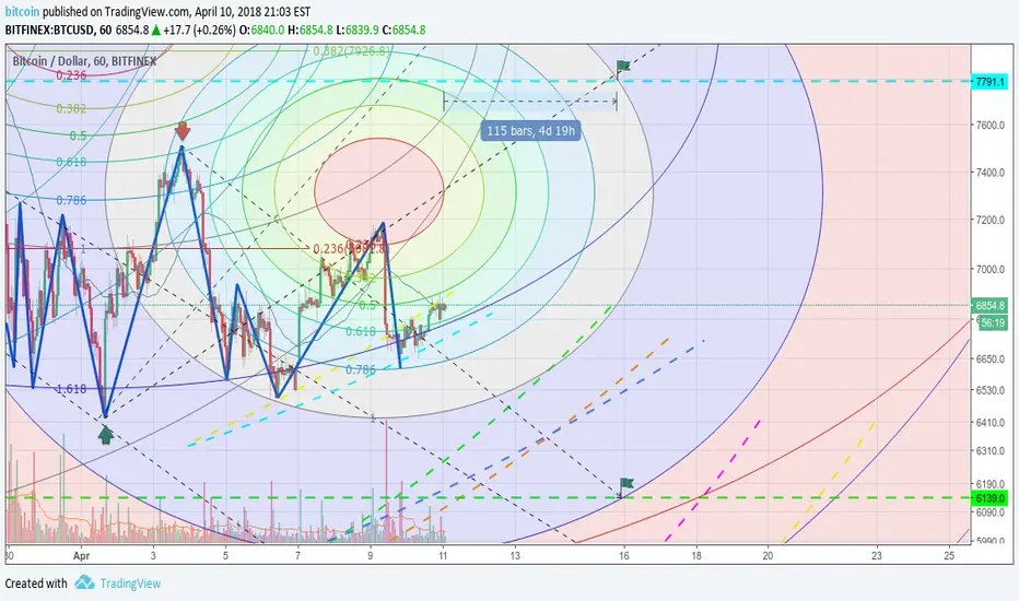
ABSOLUTELY SCRUMPTIOUS Bitcoin Price and Time Analysis Hey guys! Happy mid-December and welcome to the start of another exciting week in crypto. I hope these times of wonderful volatility have been good to you all. I promised you guys a Bitcoin analysis a few days ago over on my highly successful ETH chart that I'll link below, but I didn't get round to it because I didn't really have anything to say which hadn't already been said by some of the other great analysts here on TV. Now we've seen a nice move upwards, I think I got something a little different for you guys.
If I can stop you getting distracted by the pretty colours for a moment, I have a quick explanation of why I'm analysing the chart in this way. Many people overlook that time plays as much into technical analysis as does the price. Look at any price chart and it's got 2 axis, not just price. The reason I'm telling you this is that the top of this bull flag is a major trendline from the past month. Of course time relates to this, otherwise it could have hit that level in the past and not been resistance, as those lines wouldn't have lined up! Follow that dotted line with your finger... Yes, you see, it hits it exactly and makes a triangle shape plotted by price and time. Because many people are looking at this trendline over a decent amount of time, I think we can take this one step further and factor in the time taken with our fibonacci lines.
Now, I love fibonacci and I noticed that this bull flag we've currently formed has a very curious shape, and how it's noticeably different for the different exchanges. But I noticed something very interesting on this bitfinex chart when you connect the lines to the top of this bull flag using the circle fibonacci tool.
What do you notice? Firstly, this chart looks absolutely beautiful and I want to eat it like a whole load of flavours of Christmas-y ice cream that have come to party over at Bitcoin's house. But secondly, the circles overlap with a lot of the key levels that many traders are currently talking about, and it might give us some insight to the timeframe if/when we reach them. I've highlighted these levels in yellow on the chart. One could imagine an Elliot wave type structure forming through these points at key levels that many traders are waiting for. This isn't to show that it must hit these exact levels, but just an idea to show a possibility of WHEN they might be hit. I didn't think I'd need to explain the levels simply because it seems like everyone is eyeing them for bitcoin at the moment and you need to give the time piece of the chart some love as well <3
Let's see where this gets us! I'll be studying this type of analysis in the future so stay tuned by following my page because I have much more to come. If you saw my ETH analysis you'll know that it's been going really well for these more radical kinds of analysis which nobody else is touching. So you should follow me on Tradingview and hit like if you want to see more. I'll be updating this chart often with some new input and to see how this develops because I think this is a very interesting and underused method.
Enjoy the holidays!
-Etch
ETH trade:
XLM trade:
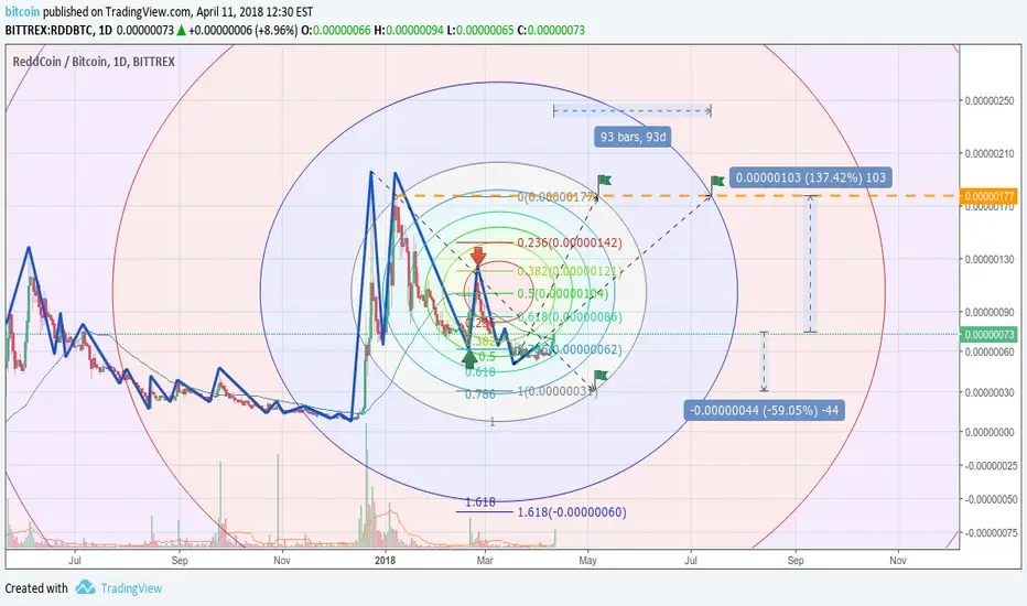
Fibonacci Circles

Another oil blood bath ?American shale oil, Iran mass sales, the world is about to change ! Let's see how fast this is going to be !

Bitcoin BTC possible scenarios - Fib Circles updatedPreface: I know some may not understand where do those circles come from... But if you look at my previous works they tend be accurate - keep reading. This is still a theory in the making 'tho.
I'll start with "classical" theory first, then I'll be talking about my own method.
If you like this analysis make sure to "like" - it helps :)
"Classic view":
i) 6350 support has been broken. If 6150-6200$ does not hold, then 6000$ should be a very strong support. (my other theory is that is can touch 5850 if it reaches 6000$).
ii) MACD is diverging like crazy towards the bottom. That is never a good sign
iii) 2.27% ) RSI is in BEAR territory with resistance levels at 36-40. Above this level we might see a stabilisation of the price.
iv) StochRSI is oversold. BUT, coupled with MACD + RSI bear signs, this is not a good sign.
v) ALL Moving Average lines are going dowwards with the continuous rejection of the MA200(3h) line at 6400$.
So yeah, all signs point to "down" ...
But how far down? When "moon" ?
Well, read on for my 2nd theory.
Basically, the theory is like this - We have 3 circles:
1) RED ONE that attracts the price upwards and has been rejected continuously in the past month as you can see on the bubble charts.
RED Circles are resistance if the price is moving upwards and support if the price is going down.
2) YELLOW ONE is the one that might move sideways and is short term.
Yellow is here to better see the movements between the two major circles.
It could also predict when a major move might happen, because of it's horizontal position that gives something like a "time resistance" on the X axis.
3) BLUE ONE is the one the pulls the price down at the moment - but also offers STRONG support at 5850-6000 area together with the RED one.
BLUE again gives support/resistance levels - but on different time frames than the RED circle.
Why I like this theory is because it allows me to see A LOT of possibilities AT ONCE and help me make a choice for that is suitable for me in the time frame that I'm trading.
The Green area is what I like to call "uncertainty area". Depending on the exit zone of the asset, new possibilities arise - hence the Purple drawn sticks.
For example at the moment of this publication I'm expecting a 6150$/6000$/5850$ touchdown. So I'm going to have orders at those levels (of course, the bulk of the orders being at 5850$ for maximum profit and lowest risk).
Afterwards, I shall wait and see if the support lines hold. If not - 5500$ is the worst possibility in the nearby future. BUT it has *a lot* of support until then. So I'm taking my chances.
And that's about it for today.
If you like this analysis make sure to "like" - it helps :)

Bitcoin XBT - 'Squaring the Fib Circles'Like any chart, any line encountered = potential support or resistancece, break a zone, continue to the next zone.
For the Twitter squads..

Where is this going ?Another hard to chart, could go either way, but everything on your time and time is about to come on our green dashed curve.

BCH - Fibo Spiral Analysis - Bottom & Breakout Fibonacci Spiral Analysis.
Chart patterns follow Fibonacci Spirals and gives you ideas on where the price of a security is heading.
If you would like to see this analysis again or would like more information please leave comments.
Notable Screenshots:
See Related Idea for updated analysis on BCH.


Bullish perspective to 11KThis is how I see a bullish perspective for BTC, for bears another idea will follow.


Still early to say something but...MAID is going alongside the 1.618 Circle Fib, it may look it will break down soon but if NOT ? That's a lot to go up, how good is this risk reward ?

Still acumulatingReally hard to get the perfect curve market is strong with, because there is a really lot of harmonics and very wide options. Anyway market is still running sideways, the most obvious run is a bearish one but things are not always so simple and bulls are still on the game.
Triple bottom +60%NEO got a triple bottom and looks like it is going for a very long run. Everything on Chart.


Divided It may look with current engulfing market will resume bearish but bulls also looks alive. This setup has all the bears simulations from previous idea also the same bull target now with a better zoom in, and inner bull and bear circles competing each other.

Exercise against biased thinking 18K 2 monthsMarket is like a chess game, and if you only keep looking at your own side, enemy will get you uncovered. This is an exercise of the kind "What if...". So What if this is the end ? Well on circle fibs there is almost no confirmation, it is looking weak and unfinished so this is spot that could surprise you opponent because it is not expected and this is exactly an exercise to expect the unexpected and get covered. Going long from here would mean some huge unexpected rally just like the path to ATH. So it is a rather long move, something to keep on mind in case it happens.

Bears SimulationsThis is a series of studies to try and simulate Bears setups. There is a lot of scenarios, and this methodology is still empirical. So I still don't have magic perfect crystal balls predictions but this is not the target, my target is always to have a base for risk management. To calculate high ratios risk rewards.
The fact is there is several curves and drawing an idea for each one doesn't help too much ! So I put together all the strongest curves on this chart.

Unified ViewThis is a unified bull and bear view, this time not from ATH but this curve is looking more strong with current action.

Bear Simulation 1This is a series of studies to try and simulate Bears setups. There is a lot of scenarios, and this methodology is still empirical. So I still don't have magic perfect crystal balls predictions but this is not the target, my target is always to have a base for risk management. To calculate high ratios risk rewards. This is attempt 1, ONLY for a bear market ! This simulation put into conflict the possible end of bear market with 1.618 Circle Fib into the last previous low, if it ever breaks down them this is the fastest confirmation you get that bears market is still ON.

Some consolidation and +50% 29 daysXVG is rocketing, and to take a rocket on the fly is a lot of risk. Anyway it is stronger than anticipated and now it should go for some consolidation, there is a lot of risk here about where to join again and time target is rather long. This is just a base to monitor for further entries, use it with care and risk management with a stop loss.

Bulls perspectiveBulls got back on foot and is a bit delayed to target, but setup is still valid. It needs to hold a bit here in order to go for a 12345 wave.

Bear Simulation 2This is a series of studies to try and simulate Bears setups. There is a lot of scenarios, and this methodology is still empirical. So I still don't have magic perfect crystal balls predictions but this is not the target, my target is always to have a base for risk management. To calculate high ratios risk rewards. This is attempt 2, ONLY for a bear market !
This simulation assumes bear market is ON but it's end is very close.
