XAUUSD – Ascending channel in play, eyes on the 4,240 regionXAUUSD – Ascending channel in play, eyes on the 4,240 region
Brian – Buying the dip within structure, watching for a fade at higher resistance
Market overview & structure
On the H4 chart, gold is trading neatly inside a well-defined ascending channel, printing higher highs and higher lows. The current leg is pushing up towards the 4,237–4,240 area, which lines up with:
The upper boundary of the channel
A key resistance zone
The 1.618 Fibonacci extension and resting liquidity above recent highs
So for now, the broader bias remains bullish, but as price creeps closer to 4,240, the risk of profit-taking and short-term selling naturally increases.
Wave & technical context
This move is an extension of the previous bullish structure after price broke out of the old descending channel and started to build a new bullish one.
Liquidity levels around 4,193 and above suggest the market has been building positions and still has room to drive price into the higher resistance band.
The buy zone around 4,154–4,157, near the lower edge of the channel, is where buyers are likely to step back in to defend the trend.
As long as price holds above 4,150–4,154, the continuation scenario towards 4,240 remains the higher-probability path.
Key zones & trading plan
Primary scenario – Buy with the trend
Buy zone: 4,154–4,157 (channel support + marked buy zone).
Idea: Wait for a pullback towards the lower boundary of the channel, or a brief liquidity sweep into this region, then look for a clear rejection candle on H1/H4 before going long.
Targets:
Short term: 4,190–4,200 (mid-channel / interim liquidity).
Extended: 4,237–4,240 (major resistance + 1.618 Fib extension).
This is a trend-following “buy the dip” setup, more suited to swing and short-term position traders rather than scalpers.
Secondary scenario – Short-term fade from 4,237–4,240
Sell zone: 4,237–4,240 – confluence of strong resistance and the 1.618 Fibonacci extension.
Idea: If price tags this zone and shows clear rejection (long upper wicks, bearish reversal pattern on H1/M15), it may offer a counter-trend short back towards the middle of the channel or the 4,190–4,200 support area.
As this is a counter-trend play:
Keep position size smaller than the main long idea.
Use a tight stop above 4,240 and avoid widening it out of emotion.
Macro and liquidity backdrop
Liquidity is likely to thin out towards the end of the session with the US Thanksgiving period in play, which can lead to the odd sharp spike or stop-hunt, especially around obvious liquidity pools.
On the political front, headlines such as Mr Trump’s comments about “permanently suspending immigration from third-world countries” add to broader policy uncertainty, but the impact on gold is indirect via risk sentiment rather than a direct driver.
It’s also worth noting that silver has been rallying strongly, supported by solar-related demand and supply concerns – a bit of a “silent workhorse” at the moment. That doesn’t remove gold’s role, but it does show that precious metals as a whole are attracting capital.
Strategy & risk management
For now, my focus is on buying dips around 4,154–4,157 in line with the ascending channel, and only looking for tactical shorts if price clearly rejects the 4,237–4,240 band.
I prefer not to open fresh trades when US liquidity is extremely thin or straight into major holiday sessions, as spreads can widen and price can behave erratically.
If we see a decisive close below the buy zone and a clean break of the channel structure, this bullish plan is invalidated – at that point it’s better to step aside and reassess rather than forcing trades.
What do you reckon – does this structure still favour the bulls, or are you leaning towards a deeper correction from the 4,240 region? Feel free to share your view in the comments.
Macdcross

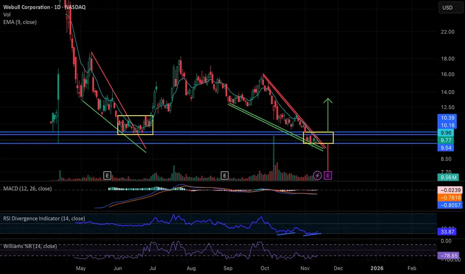
Webull: Falling Wedge Breakout ImminentNASDAQ:BULL has been in a steady decline essentially since the start of the government shutdown, forming a clean falling wedge structure very similar to the setup we saw in May and June. Back then, the wedge resolved with a brief breakout but ultimately moved into a sideways consolidation inside the yellow range before finally lifting in late June/early July.
Price is now sitting at the apex of a new wedge right as the government has officially reopened, almost to the day. With the president signing the bill, this may act as a macro green light for liquidity into year end, and BULL is positioned to potentially benefit from that.
Technically, the stock is deeply beaten down (roughly 40 percent from pre-shutdown levels), the MACD is starting to curl up, and there’s a clear daily RSI divergence. Together, these conditions make a relief move or breakout increasingly plausible.
If we don’t get a meaningful directional move between now and earnings on 11/20, then the most likely scenario is a replay of the May/June pattern: a period of sideways chop inside its current established support and resistance band zone around 9.54-10.18/10.39 while the market waits for the earnings catalyst. That report would then determine the next substantial move up or down.
In short: BULL is at a technical decision point, with momentum indicators improving, macro pressure easing, and earnings close enough that either a near-term wedge break or a consolidation-before-catalyst are both reasonable outcomes from here.
PATTERN logic + MACD LOWS/POTENCIAL = High probabilities.If you combine basic FACTORS of Patterns + MACD (weaknesses or Lows/Highs) you get pretty straightforward probability.
Weekly MACD above zero (and daily macd above zero) mean strong impulse, trend. But sometimes deep corrections in negative territory (bears) are not negative, because every chart pattern require strong "push" to break the pattern. I think you can see if there's smoke, in advance.
Swing-trading market regime.Bullish Bitcoin means RISK-ON equities. Using Raschke's macd, we can pinpoint accumulating inertia (Maybe S/D Pivots?) opportunities. Also pinpoint red flag regime (market weakness).
Use market PATTERN/STRUCTURE + (accum.) MACD for precision + 50dma/200dma crosses.

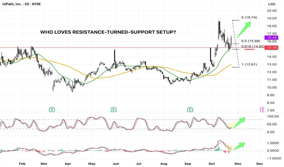
PATH - Textbook R/S Flip at Key Fib & MA Support (Bullish Setup)UiPath ( NYSE:PATH ) spent the majority of 2025 range-bound, oscillating between the $10 and $15 marks. This consolidation phase ended dramatically in early October, when the price decisively breached the long-standing 2025 horizontal resistance at approximately $15.
The breakout led to a swift rally, tagging a new year-to-date high of $18.74 . Following this strong move, the stock began a healthy retracement, pulling back to test the very level that had previously acted as resistance—the classic Resistance-Turned-Support (R/S Flip) setup.
The Confluence of Support
This current pullback is resting on a powerful confluence of technical supports, significantly increasing the probability of a bullish continuation:
1. Horizontal Support: The previous major resistance line (around $15) now acts as a crucial horizontal support.
2. Moving Average Support: The price is testing the 20-day Simple Moving Average (SMA 20, Green Line) . Importantly, this is the first time the price has pulled back to the SMA 20 since the bullish SMA 20/SMA 50 Golden Cross , signaling a strong trend retest.
3. Fibonacci Golden Pocket: The retracement has landed perfectly into the 0.618 Fibonacci Retracement level (from the $12.61 swing low to the $18.74 swing high), a statistically significant reversal zone often called the "Golden Ratio."
Momentum Indicators Confirm Bullish Bias
Beyond the price action, our auxiliary indicators are flashing constructive signals:
* Stochastic: The Stochastic oscillator is reversing from the oversold territory and is showing a clear bullish cross , indicating waning selling pressure and the start of a new upward momentum cycle.
* MACD: The Moving Average Convergence Divergence (MACD) indicator is attempting a bullish cross above the zero line , a powerful sign of increasing positive momentum.
Conclusion
The confluence of price action and indicator signals presents a high-probability bullish setup. The market is currently rewarding the successful test of the R/S flip at the 0.618 Fib and SMA 20 support.
While this setup suggests a strong likelihood for the next leg higher, traders must remember that trading involves probabilities. A clearly defined stop-loss is essential to manage risk should the market invalidate this robust support zone.
INFY Turning Bullish: IT Giant Ready for the Next Leg UpINFOSYS — 1 Hour Timeframe Analysis
INFY is showing strong momentum after respecting its support zone around 1400–1420. The stock has rebounded well and is now approaching its resistance zone near 1580–1590.
The Supertrend indicator is displaying a positive bias, while the MACD has confirmed a bullish crossover in the positive zone, further validating the ongoing strength in momentum.
Any buy-on-dip opportunity near the Supertrend support around 1450–1460 could offer another round of bullish momentum. The stock is currently maintaining a Higher Low – Higher High (HL–HH) structure, indicating a healthy uptrend continuation.
If the support zone holds firmly, we may witness higher prices in INFY in the coming sessions.
Thank You !!

Is Palantir (PLTR) Entering a Consolidation Phase? A Technical aTechnical Analysis: Palantir Technologies (PLTR) Amid Overbought Signals and Valuation Gaps
Palantir Technologies Inc. (NASDAQ: PLTR) has experienced significant volatility in recent sessions, reflecting growing uncertainty among investors regarding its valuation and technical positioning. The stock closed at $173.07, down by 7.47%, after testing its resistance area near $186. Both daily and weekly technical indicators are now suggesting that a potential short-term correction could be underway.
Weekly Chart Outlook: Approaching Resistance After a Prolonged Rally
From the weekly timeframe, NASDAQ:PLTR has been trending upward since early April, supported by consistent higher lows and strong momentum in the technology sector. The recent breakout above the $160–$165 zone confirmed bullish sentiment, but the latest candlestick formation shows rejection near $186, indicating profit-taking pressure.
The Stochastic RSI on the weekly chart is hovering in the overbought zone, signaling that the rally may be losing strength. While this does not necessarily imply an immediate reversal, it often precedes a consolidation phase or a short-term pullback. Volume patterns also show a slight decline compared to the early phase of the uptrend, reinforcing the possibility of slowing momentum.
Additionally, the price is now slightly extended from its key moving averages, suggesting that any correction toward the $160–$165 support zone would still maintain the longer-term bullish structure.
Daily Chart Confirmation: Stochastic RSI and MACD Turning Cautious
Read full analysis on my website :
darrismanresearch com

Price broke below EMA200 on M15 + Shooting Star + MACD CrossPrice below EMA200 on M15 + Shooting Star + MACD bearish cross - Tokyo.
Entered this trade a few hours ago during Tokyo session. Price finally broke through the EMA200 on M15 putting us into sell territory. A shooting star had been printed and the MACD produced a bearish cross.
As several of you noted, there’s a clean FVG stack below — I placed my TP at the end of that block.
SL was set just above the most recent structure high, giving this trade a strong R:R of nearly 1:9.
RSI is already oversold, but in strong trending conditions, it can remain that way for a while.
Looks like we’re (hopefully lol) printing the closing leg of a clean M-pattern.

EMA200 Reject on M15 + RSI ReboundPrice was going down but reacted hard off of the EMA200. RSI was coming up from a very low c.14% on M5. 3 down liquidity spikes in a row on M5. As soon as I got into the trade momentum got behind it. Great trade so far. Also once in, MACD crossed over bullish on M5.
BTC/USD Eyes 50-Week EMA with Bearish MACD CrossoverSo, we just had a bearish cross on the MACD 1-Week chart.
Looking at the long history of BTC price action, this has happened 15 times. In 12 instances, this resulted in a pullback to the 50-Week EMA. In 3 other instances, price was already at or below the EMA and experienced even deeper drawdowns.
In the current cycle, this has already occurred 3 times. During the last cycle this happened 5 times, with the fourth crash marking the cycle top.
Conclusion: 100% of such MACD crossovers resulted in significant pullbacks to or well below the 50-Week EMA.
I hate to bear post, but charts are saying we dip to the 50-Week EMA in 1-5 weeks. Could be a good buying opportunity if price dips that low.
I am new to TA, so always happy to learn your thoughts and criticisms. NFA. DYOR.

LINK Macro signs pointing towards a buyHi,
This is a Macro analysis on the 1 Month timeframe for LINKUSD pair.
I've been looking for opportunities to trade in altcoin market. With BTC in price discovery mode and other signs appearing like altcoin only market cap charts point towards liquidity coming in, it is important now than ever to be spending time to scope out opportunities here.
I do think that not all altcoins will behave the same, im trying to use TA to find those with strong technicals.
LINKUSD sticks out due to several factors.
1. We are in an ascending channel, that i believe currently price action will eventually attempt to reach the upper trend line. (We could be at the very moment be attempting this.)
2. Momentum indicators are flashing bullish, though note that there is still a long way to go for the current monthly candle to close.
Both MACD and STOCH RSI are flashing buys in my opinion.
If our August Candle closes with:
MACD flashing histogram bar as deep green with bullish cross and
STOCH RSI flashing bullish cross and cross occurs above the 20 line.
This would indicate a potential for Macro Bullish move to the upside. ANd i believe that move to be at the very least to the previous highs, if not to new all time highs.
For the 1Month to stay bullish, we need to look for more bullish evidence such as in lower timeframes like the 1 week or 3 day to support 1 Month changes. And Bulls need to maintain dominance in those timeframes for 1 Month to print bullish.
Stay tuned for more updates.

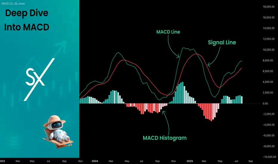
Deep Dive Into Moving Average Convergence Divergence (MACD)🗓 The Moving Average Convergence Divergence (MACD) is one of the most popular momentum indicators in technical analysis. Whether you're a beginner or an experienced trader, understanding how the MACD works can significantly enhance your trading decisions.
📚 Introduction: What Is MACD and Why It Matters
The MACD (Moving Average Convergence Divergence) is one of the most powerful and widely used momentum indicators in technical analysis. It was developed by Gerald Appel in the late 1970s and has since become a staple in the toolkit of traders and investors across markets — from stocks and forex to cryptocurrencies.
At its core, MACD helps traders understand the relationship between two moving averages of an asset’s price, providing insight into both trend direction and momentum strength. By analyzing how these averages converge and diverge, the indicator offers valuable signals for entries, exits, and trend reversals.
What makes MACD especially popular is its versatility — it works well in trending markets, can be used across all timeframes, and combines both leading and lagging components. Whether you're a day trader or a long-term investor, understanding how MACD works gives you an edge in making timely and informed trading decisions.
📚 How the MACD Is Calculated: The Components Explained
The MACD is built from three core components: MACD line, Signal line and MACD histogram.
🔹 Calculating the MACD Line:
The MACD line is the difference between two Exponential Moving Averages (EMAs), typically 12-period EMA (fast) and 26-period EMA (slow). The formula is:
MACD Line = EMA(12) − EMA(26)
This line captures momentum by tracking how the shorter-term average diverges from the longer-term average. When the MACD line rises, the short-term momentum is increasing faster than the longer-term trend — a sign of bullish acceleration. The reverse implies bearish momentum.
🔹 Calculating the Signal Line:
To reduce noise and provide clearer signals, a 9-period EMA of the MACD line is plotted on top. This is the Signal Line, and it acts as a trigger:
When the MACD line crosses above the signal line → bullish signal (buy)
When the MACD line crosses below the signal line → bearish signal (sell)
Signal Line = EMA(9)(MACD Line)
🔹 Calculating the MACD Histogram:
The Histogram shows the difference between the MACD Line and the Signal Line:
Histogram = MACD Line − Signal Line
It provides a visual representation of momentum strength. The histogram bars expand when momentum strengthens and contract as it fades. It helps you spot shifts in momentum earlier than a basic crossover.
📚 How to Use MACD in Trading Strategies
⚡️MACD Signal Line Crossover
Buy Signal:
MACD Line crosses above the Signal Line from below (bullish crossover)
Preferably when both lines are below the zero line (early in the trend)
Price closes above the long-term trend approximation, in our case we use 200-period EMA
Sell Signal:
MACD Line crosses below the Signal Line from above (bearish crossover)
Preferably when both lines are above the zero line (early in the trend)
Price closes below the long-term trend approximation, in our case we use 200-period EMA
📈Long Trading Strategy Example
1. Wait until MACD line crosses over the Signal line from down to up. In our example we use 1D time frame for BITMART:BTCUSDT.P . Open long trade if point 2 will be completed.
2. Price candle shall be closed above the 200-period EMA. This is long-term trend filter to increase the probability that trades will be open only in the direction of the main trend.
3. Close the long trade when the MACD line crosses under the Signal line. This is an approximation that short-term impulse is over and correction is about to start.
In our case we have +20% return on this long trade, but, please, notice that we have not used initial stop-loss in this strategy. Trade was closed according to the technical condition, this approach can violate the risk management rules, but also can be applicable if you trade the amount ready to lose using this strategy. We will talk about stop-loss later.
📉Short trading strategy example
1. Wait until MACD line crosses under the Signal line from up to down. In our example we use 1D time frame for BITMART:ETHUSDT . Open short trade if point 2 will be completed.
2. Price candle shall be closed below the 200-period EMA. This is long-term trend filter to increase the probability that trades will be open only in the direction of the main trend.
3. Close the short trade when the MACD line crosses over the Signal line. This is an approximation that short-term impulse is over and correction is about to start.
In this case we have +15% return on the short trade. Again, strategy used the technical condition to close the trade and now let's cover how to place the stop-loss. There is no right answer how to use stop-losses. The first and the most obvious way to place stop-loss is using recent swing low/high, but the problem is that all traders are seeing them and do the same. Price tends to reach such levels to collect liquidity.
Another one way to place stop-loss is using the signal candle's high/low. This is so-called 1 candle stop-loss. Usually it's very tight and can allow to have the fantastic risk to reward ratio, but we are now recommend to use it if you are not a professional trader because win rate of such strategy decreases.
Third approach in placing stop-loss which we often use in our algorithmic strategies is the Average True Range (ATR). ATR is the volatility measurement, it allows to take into account the current volatility. Sometimes it helps to avoid the stop-loss hit when trade finally goes in your direction. You can just simply subtract (in case of long trade) or add (in case of short trade) ATR value to the entry price and obtain the dynamic stop loss based on current market condition. Also multiplier can be used for ATR. You shall choose the approach which is more comfortable for you, backtest all these approached to make your choice.
🧪Important: we used the long signals only below the zero-line and short signals above it in the attempt to catch the beginning of a trend and have large potential move. On the picture below you can see the same BITMART:BTCUSDT.P , but what will happen if we open long on the lines crossover above zero line? This trade will not be profitable because of restricted potential.
⚡️MACD Zero Line Crossover
Buy Signal:
MACD Histogram crosses above the zero line (momentum shifts from bearish to bullish)
Price closes above the long-term trend approximation, in our case we use 200-period EMA
Sell Signal:
MACD Histogram crosses below the zero line (momentum shifts from bullish to bearish)
Price closes below the long-term trend approximation, in our case we use 200-period EMA
📈Long Trading Strategy Example
1. Wait until MACD Histogram crosses over zero line. Open long trade if point 2 will be completed.
2. Price candle shall be closed above 200-period EMA. This is long-term trend filter to increase the probability that trades will be open only in the direction of the main trend.
3. Take profit when price reaches 3:1 risk to reward ratio according to the stop-loss from point 4.
4. Stop-loss shall be placed below recent swing low. This point can be discussed, you can use any stop-loss technique described earlier in this article. We demonstrate the simplest one, the key here is using at least 3:1 RR.
📉Short trading strategy example
1. Wait until MACD Histogram crosses under zero line. Open short trade if point 2 will be completed.
2. Price candle shall be closed below 200-period EMA. This is long-term trend filter to increase the probability that trades will be open only in the direction of the main trend.
3. Take profit when price reaches 3:1 risk to reward ratio according to the stop-loss from point 4.
4. Stop-loss shall be placed above recent swing high. This point can be discussed, you can use any stop-loss technique described earlier in this article. We demonstrate the simplest one, the key here is using at least 3:1 RR.
⚡️MACD Divergence Strategy
MACD Divergence is a strategy that helps traders identify potential reversals in market direction before they become obvious on the price chart. This makes it a favorite tool among swing traders and crypto enthusiasts looking to catch major moves early.
But what exactly is a divergence? In simple terms, divergence occurs when price and momentum (MACD) are moving in opposite directions — signaling that the current trend may be losing strength and preparing for a reversal. There are two main types of divergence.
🐂 Bullish Divergence
Price makes a lower low
MACD Histogram makes a higher low
This suggests that while price is still falling, downward momentum is weakening. The bears are losing control, and a bullish reversal may be near. Trading signal is very simple, when bullish divergence happens wait for the first increasing column on MACD histogram and open long trade. Place stop-loss under recent swing low and take profit at 3:1 RR.
🐻Bearish Divergence
Price makes a higher high
MACD makes a lower high
This suggests that while price is still falling, downward momentum is weakening. The bears are losing control, and a bullish reversal may be near. Trading signal is very simple, when bearish divergence happens wait for the first decreasing column on MACD histogram and open short trade. Place stop-loss above recent swing high and take profit at 3:1 RR.
🧪 Important hint: MACD histogram shall cross the zero line between two lows/high to create the most reliable divergence signals. We are not recommend to use it without zero-line crossover to decrease number of false signals.
📈Long Trading Strategy Example
1. MACD Histogram shall create higher low.
2. Price shall create lower low.
3. MACD Histogram shall cross the zero line between lows.
4. MACD Histogram shall show the first increasing column.
5. Put stop-loss under the recent swing low.
6. Put take profit at 3:1.
🧪 You can enhance the long signal with the MACD Line divergence. In our case we have both divergences: with MACD Histogram and MACD Line.
📉Short trading strategy example
1. MACD Histogram shall create lower high.
2. Price shall create higher high.
3. MACD Histogram shall cross the zero line between lows.
4. MACD Histogram shall show the first decreasing column.
5. Put stop-loss above the recent swing high.
6. Put take profit at 3:1.
🧪Divergence is extremely strong signal, but when price continue it's move in the direction of a trend and it's not reversing it can also be the signal for the trend continuation. This situation is called "Baskerville Hound" signal, this name was given by famous trader Alexander Elder. We don't recommend to use it for novice traders, but it's useful to know about it.
📚 Conclusion
The Moving Average Convergence Divergence (MACD) is more than just a crossover tool — it's a powerful momentum indicator that offers deep insight into the strength, direction, and timing of market trends. By understanding how the MACD line, Signal line, and Histogram interact, traders can uncover early trend shifts, spot momentum divergences, and time entries and exits with greater confidence.
Whether you're a short-term trader using fast crossovers for scalping or a long-term investor watching for weekly divergences, MACD can adapt to your style when used thoughtfully. Like all indicators, it works best when combined with price action, support/resistance levels, and other indicators — not in isolation.
Ultimately, mastering MACD is not about memorizing patterns, but about learning to read the story of momentum that unfolds beneath the surface of price. With disciplined application and practice, MACD can become a reliable compass in your trading strategy.
$Moonpig MACD bullish crossover?$Moonpig MACD bullish crossover?
$MOONPIG just bounced off a key trendline on the 4H chart with a strong wick and MACD bullish crossover.
This setup hints at a possible 189% move if momentum holds. Eyes on this for a breakout play.
DYRO, NFA

MACD: More Than Just a Crossover ToolHello, traders! 🔥
The MACD (Moving Average Convergence Divergence) indicator is one of the most trusted tools in technical analysis — but often one of the most oversimplified. While many traders focus on signal line crossovers, the real power of MACD lies in its ability to visualize market momentum, subtle shifts in trend strength, and early signs of potential reversals.
Let’s unpack how MACD behaves using the weekly BTC/USDT chart ✍🏻.
🔧 Understanding the Mechanics
At its core, MACD is the difference between two exponential moving averages — typically the 12-period EMA and the 26-period EMA. The result is the MACD line (blue). The orange line represents a 9-period Exponential Moving Average (EMA) of the MACD line, commonly referred to as the signal line. The histogram reflects the distance between them, helping to visualize when momentum is building or fading.
📊 MACD in Action — Weekly BTC Chart Breakdown
Looking at the BTC/USDT weekly chart, several notable MACD behaviors stand out:
1. The Bullish Acceleration in Early 2023
In early 2023, MACD crossed above the signal line, accompanied by a sharp rise in the histogram. This indicated strong positive momentum, as the price began recovering from the 2022 lows. The histogram’s expansion confirmed increasing divergence between the short- and long-term EMAs — a classic sign of trend acceleration.
2. Peak Momentum in Late 2023
Around late 2023, the MACD line peaked while the histogram also reached maximum height. This wasn’t just a confirmation of strength — it also hinted that momentum may have reached a climax. Despite price continuing to rise slightly, the MACD curve started to flatten — an early warning of potential exhaustion in trend strength.
3. Bearish Convergence into Q1 2025
In early 2025, the MACD line turned downward and eventually crossed below the signal line, while the histogram flipped to red. This reflected a cooldown in bullish momentum rather than an immediate reversal. What’s notable is how price didn’t collapse sharply, but moved into a pullback phase — illustrating how MACD can show momentum softening before price visibly reacts.
📌 What This Can Tells Us
The MACD indicator on this weekly BTC chart shows how momentum often shifts before the trend itself breaks. Each crossover, divergence, or histogram change is not a guarantee, but a cue to pay closer attention.
Key takeaways:
Strong Histogram Expansion = Confidence in the Current Move.
Peaks in MACD Without Price Making New Highs = Potential Divergence.
Shrinking Histogram + Converging Lines = Momentum Stalling.
🧠 Final Thought
MACD isn’t just about “buy when it crosses” or “sell on red bars.” It’s a narrative tool, showing how the story of the price develops beneath the surface. On higher timeframes, such as the weekly chart, it can potentially highlight macro momentum shifts long before they become apparent in price action alone.

$SPX Monthly MACD Cross – Reset or Breakdown?The monthly MACD for the S&P 500 ( SP:SPX ) just crossed to the downside 📉 — a signal we’ve only seen a few times in the past decade.
Looking at the chart, this indicator also triggered during:
📉 2018 (Quick pullback)
🦠 2020 (COVID crash)
🐻 2022 (Extended bear market)
Now in 2025, we’re facing another sharp decline — but the question is:
👉 Is this just another quick reset like '18 & '20... or are we about to grind lower like 2022?
The MACD histogram is already in negative territory, and the price action is following the same pattern we saw before extended drawdowns.
What do you think: is this the beginning of something deeper? Or are we prepping for a snapback rally?
Drop your thoughts below 👇

BTC fall to 89k this weekThis is a look at the BTC Weekly chart. Expecting BTC to fall to 89k this week. That is bottom trend line within the current structure.
Supporting evidence:
- BBW falling toward neutral
- MACD high cross-under, ready to decline
- Reaction to Trump trade war incomplete
Not investment advice, do your own research.

ETH copying pattern? Potential drop below $3,000?CRYPTOCAP:ETH seems to be repeating an old pattern—I’ve marked it with an arrow. I first noticed this about 10 days ago, and as time goes on, it’s looking more and more like the left shoulder of a classic head-and-shoulders bottom. Interestingly, the #MACD is perfectly mirroring the same movement too.
If #ETH is indeed forming the right shoulder, we could see a pullback of around 31%, dropping it below 3000 to roughly 2800. This move makes sense, as key players often target psychological levels like 3000, where a lot of stop-loss orders are placed, potentially triggering larger price shifts.
What’s even more intriguing is that a drop to 2800 would push ETH below the lower edge of the symmetrical triangle, which could seriously dent market confidence.
What do you think? Does this match your analysis, or are you seeing it play out differently?
---
Let me know if you'd like further tweaks!

PEPE in the coming days!BINANCE:PEPEUSDT
Pepe is forming a bullish pattern.
It hasn't been completed yet!
the price shall increase after complition.
It's a double bottom pattern.but MACD shows a bearish signal which is fine cause we want to see the second bottom created!
⚠️ Disclaimer:
This is not financial advice. Always manage your risks and trade responsibly.
👉 Follow me for daily updates,
💬 Comment and like to share your thoughts,
📌 And check the link in my bio for even more resources!
Let’s navigate the markets together—join the journey today! 💹✨

SWING IDEA - POLYPLEXNSE:POLYPLEX has hit its 3 year low of 800 levels recently. At this zone, it can been that while the Price Action has been making Lower Low Pattern, the MACD however is starting to form a Higher High Pattern.
This MACD Higher Higher Pattern the recent crossover as well indicates a move in the upward direction.
Follow Strict Stop Loss here as any weekly closing below the Swing Low levels can only take the stock further downward.
This could potentially be a High Risk High Reward Trade. Take it only based on your Risk Appetite and Management.


Welcome to the Bitcoin Christmas PUMP! BTC 1D MACD Crossover↖️⬆️ Click the 🚀
Welcome to the Bitcoin Christmas PUMP!
₿ ₿ ₿ ₿ ₿ 🚀🚀🚀🚀🧑🏻🎄🧑🏻🎄🧑🏻🎄🎅🎅🎅🧑🏻🎄🧑🏻🎄🧑🏻🎄🚀🚀🚀🚀₿ ₿ ₿ ₿ ₿
The 1D MACD Crossover just signaled on COINBASE:BTCUSD BTC 1 Day candle.
But that's not all. It's the type of crossover. Text book.
RSI just entering 70 area.
The last time the 1D MACD crossover happened, Bitcoin saw a 45% pump.
looks like it should go to just past new year. The big question is does it continue before taking a breather.....?
In fact, when using the last pump as a guide, it falls perfectly in line with the Fib levels and lands right around $150,000. (just my silly extrapolation. I'm sure it's nothing. ;)

AU Small Finance Bank - Technical Analysis Update and Key LevelsChart Overview:
The price action for AU Small Finance Bank shows it has been moving within a rising channel for the past few years, currently testing key support levels. The bank recently saw a price downgrade from Nomura, which adjusted the target price to ₹670, retaining a neutral rating. This adjustment reflects some cautious sentiment among analysts.
Key Levels and Fibonacci Retracement:
Channel Support - The stock is currently near the lower boundary of the long-term rising channel, a crucial area where it previously found support.
Fibonacci Levels - The stock has pulled back to the 61.8% Fibonacci retracement level around ₹565.65 from its recent highs, which often acts as a strong support level in technical setups. A further breakdown could push it towards the 50% retracement at ₹492.40, a potential next support.
Resistance - On the upside, resistance lies around the upper channel boundary and recent highs near ₹670-₹700, which aligns with Nomura’s target.
MACD Indicator:
The MACD currently shows a weakening momentum on the weekly chart, hinting at possible bearish pressure. A recovery in MACD or a bullish crossover could indicate a return to upward momentum.
RSI Analysis:
The RSI is approaching the oversold region. A bounce from this area might signal potential for reversal if accompanied by strong buying volume.
Conclusion:
AU Small Finance Bank is at a critical support level within a broader uptrend channel. Holding above ₹565-₹570 could lead to a rebound towards the upper end of the channel, with ₹670-₹700 as potential targets. However, if the price fails to hold, watch for the ₹492 level for possible support. The current technical setup suggests caution, especially with Nomura's neutral outlook.

BTC Short Trade Opportunity and SetupBYBIT:BTCUSDT.P / BYBIT:BTCUSDT / CRYPTO:BTCUSD Bitcoin/BTCUSD has recently hit the resistance level of a pattern that has generally held true since mid March 24 (4 preceding resistance and support confirmations).
Furthermore, it has started a return downward move following on from a 3 day filter for confirmation of the resistance level (an example of how a 3/5 day filter is an important tool for crypto trading).
Additionally:
The RSI resistance level of 70 has been recently reached and the RSI is trending downwards - a usually statistically significant indicator
The downward return move is supported by reasonable (although not enough on it's own) volume
A 3 bar pattern (downward move, pause, further downward move for confirmation)
A rate of change approaching and trending negative
A MACD also approaching negative
It's always important to assess the risk that might prove the thesis wrong. And they are:
Today's candlestick pattern is close to a dragonfly, i.e. there might be a return upwards move imminent (although this is unlikely to constitute a beginning of a move beyond the previous high as an actual dragonfly candlestick is at the end of a downtrend)
The MACD is trending down but has not actually turned negative yet, i.e. it is a bit early to say this indicator is stating a downward trend
The ROC hasn't turned negative yet either (but is trending downwards for sure)
This all leads to the following conclusion: For those with a high enough risk appetite (and usually crypto traders are those with the highest :-)) this is a good entry point for a short trade.
Using the (admittedly early but still reasonable) trend for the past three days to determine the final take profit point of 45500 (blue arrow) by approx. 19 Nov 24, the following can be set as a guide for a trade:
Entry: Now or latest tomorrow in case today's candlestick is an indicator of a minor move upwards
SL: $70,500
TP1: $63,450 - based on the first potential moving average being a resistance (200 MA)
TP2: $60,500 - based on the previous move's consistent (and twice confirmed) low
TP3: $54,500 -based on a previous historic low (i.e. psychologically important price point) which also acts as a confirmation of support to a previous move
TP4: $45,500 - The approximate price point of an estimated downward trend
Exit date (independent of TP level): 19 Nov 24
NOTE: the 19 Nov date here is important. It is the forecasted date by which the current downward price trend would linearly reach the support level. This date would be used as a checkpoint to exit the entire trade to safeguard against the normal, usually dramatic and beyond rational calculation price gyrations of crypto.
