Updated Renko Strategy Combined with a Weekly ChartWeekly candlestick
Linear Regression indicator x3 with STD set to 1, 2, and 3 respectively. I set the color gradient to 25% on 1, 15% on 2, and 5% on 1 to differentiate the color. On the weekly charts, I set the lookback period to 45 for 45 weeks
Pivots (standard pivots) on a Yearly timeframe x2. One set to 'traditional' and one set to 'camarilla'
(I'll cover the static volume profile and the opening range and the volume range in an update to this at a later date)
Renko charts
I use the same configuration for the Linear Regression with the exception of the lookback period which is set to 90 blocks. Renko charts are not truly time based though time does play a factor in how they're implemented in trading view.
I don't use pivots on the Renko charts.
On both charts, you can see from the settings how the moving averages are configured
On both charts, I use a dual Stoch overlayed configured at 5,3,3 and 50,3,3
Commodities channel Index
Directional Movement Index
I configure these indicators with a 5/50 combination regardless of the Renko or the weekly candlestick chart
I track the following markets and with these Renko settings
Crude oil: close/traditional/blksize=2.5
S&P 500 mini: close/traditional/blksize=50
Natural Gas: close/traditional/blksize=0.2
Soybean Meal: close/traditional/blksize=5
Aussie Dollar: close/traditional/blksize=0.005
Bitcoin: close/traditional/blksize=1000
With bitcoin trading 24x7, it's a create market to practice with using the Trading view 'paper trading' broker
My intent is to expand on this setup with ideas on how to trade against these configurations:
Renko

throwback to the range areaSPX throwbacks to the range area. This currently increases the likelihood that the downtrend will continue. To confirm this, we have to wait for the breakdown the lowest brick in the range area

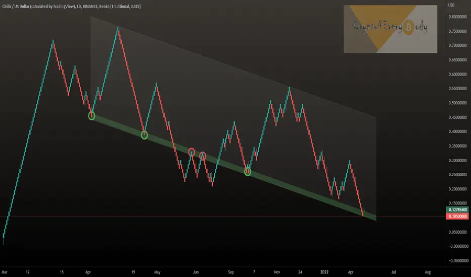
Simple and clean TA - Renko chart for Chiliz CHZWith the help of Renko charts you can filter out the noise and see a more clear and clean picture.
Chiliz is now at a very important support level - will we see huge recovery soon?
Give me your thoughts on that chart - do you want to see more Renko analysis?
*not financial advice
do your own research before investing
Renko: The First target: 33500-34500$As I predicted before, Bitcoin has started an uptrend (possibly short-term):
In the Ranko chart, Bitcoin respects the support area of the Ranko MA channel and forms a green brick. The bitcoin target will be the middle line of the channel (33500-34500$)

#THORChain #RUNE without the noise - good entry pointsTHORChain RUNE without the noise - good entry points
These Renko-Charts are great for more calm and clear view - so we see the potential good entry area and the next support if $2.85 breaks.
Do you use Renko-charts dear Crypto Nation?
Drop me a nice comment if you'd like me to analyze any other cryptocurrency or do another comparison.
*not financial advice
do your own research before investing

Reaction to supply
We have an unused supply area. Due to the liquidity, we can consider reaching this area.
The price target is to at least reach the bottom of the liquidity area.

BTCUSD 4hr renko 500 brick sizeIs the bottom in? Who knows? The Renko chart does not predict tops of bottoms but it shows a clear trend in one direction. Money is made in the middle, not catching the tops or bottoms - that's gambling. Either that or you're a market manipulator yourself.
Anyway, we are still below the red moku cloud and the lagging line is still below price action. So this indicates that the trend is still lower.
I would point your attention towards the circled area. notice we tried to consolidate in this area but ultimately got rejected back down? As long as the price action has not gone above a green moku cloud and the lagging line has not gone above the price action, we are still remaining bearish.
As investors, it is not yet time to cost average in. As speculators, it would be better to stay on the sidelines for more clear indications of a trend to trade. Not financial advice, but I would not touch this for now.

ETH CAN'T DECIDE WHAT TO DOAlthough I view crypto market as a bear, I am not saying it can't have one more bounce. And if we take a look at the 2nd biggest coin ETH we can clearly see that price is still moving inside this big channel. This is renko 1d chart with a block size 1% of max price - 48$. There was 2 attempts this year to break this channel, but every time price has bounced of it. And right now price is trying to bounce one more time. To get out of it bears need to break 2600-2500 zone, otherwise bulls will make another mini rally. (Which can also lead to a bigger rally).
So at the moment I am looking forward to further confirmation to see the direction chosen by the market.
Do you think bulls will make another bounce here?

SPX Renko Chart = Bearish (~13% to 26% Potential Drop)The Renko chart for the S&P 500 Index (SPX) is now showing a sell signal.
This charting system is used exclusively to spot a trend.
We have the same candle pattern as back in February 2020 before a major correction.
This pattern came up again January 2022.
We can also draw the classic ABC EW correction here:
We are looking at a ~13% drop from the current price and up to 26% if things get really bad.
Namaste.

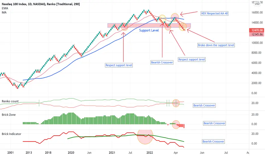
NDX broke down support levelAfter a bearish crossover of EMA 20 and MA 40, NDX broke down the support level. we can also find bearish crossover on Renko oscillator.
These are signals for the downtrend to continue
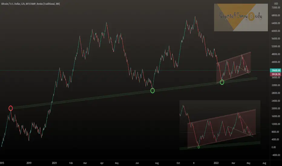
Breakdown can not be confirmed yetAlthough the breakdown occurred in the weekly timeframe, it is still early to confirm. The reason is that in the Renko daily time frame, bitcoin is still above the support level. Until the breakdown is confirmed, it will be difficult to tell if it is a breakdown or a trap.
But there is a point in the TSI indicator that increases the likelihood of facing a real breakdown. The TSI has a negative bias and has a descending crossover.
However, I would rather be patient to have a confirmed breakdown signal.

BTC met All conditions for the continuation of the downtrend1 minute ago
Renko_Ichimoku Analysis:
Bitcoin met all three conditions for the continuation of the downtrend in Ichimoku analysis:
1- the red Cloud
2- New red brick below the red Cloud
3- The lagging span below the red cloud
Weis wave Renko Volume:
The volume in the recent downtrend wave is greater than the uptrend waves in the range area.
It seems that we have to wait for the downtrend to continue. This support level of 34,000 $ should be broken down to confirm the downtrend

Renko Analysis: MACD bearish CrossoverAlthough we have seen rapid growth in SPX over the past few days, this is not a confirmed reason for an uptrend. Although this may indicate a potential spring, SPX must break the swing area to confirm it. In Renko analysis, we see a bearish crossover of MACD and also the breakdown of the RSI support line

Renko charts - Clean out the noiseI recently attended a talk by Stephen Hoad on behalf of the STA for the CISI, where he discussed his use of Renko charts. Well, it piqued my interest and I decided to take a closer look myself.
Renko charts were invented in Japan, they ignore time and just use price changes that meet a minimum requirement, which to my mind sounds exactly like Point & Figure charts (I love these). Instead of X-Columns and O-Columns, Renko charts use price “bricks” that represent a fixed price move. These bricks are sometimes referred to as “blocks” or “boxes.” They move up or down in 45-degree lines with one brick per vertical column. Bricks for upward price movements are one colour while bricks for falling price movements are filled in another colour. In the example attached I have a chart of the US Dollar Index, where upward price moves are green and downwards are red. This example uses a 0.5 brick size.
Please note the irregular time span along the y-axis . Also note that it uses an average true range of 14 days. For an explanation of average true range (ATR) please follow this link school.stockcharts.com
N.B when adding indicators say a 20-period moving average, this will be based on the last 20 Renko values NOT the last 20 days.
I always think that these types of charts look optically ‘cleaner’ or clearer than the more typical bar chart. They completely ignore time, and a brick is only drawn if price moves by a set amount. If it moves less than the set amount, no brick is drawn.
In contrast to fixed price bricks, using ATR values results in fluctuating brick sizes. The default ATR is based on 14 periods and the Average True Range fluctuates over time. The brick size is based on the ATR value at the time the chart is created. Should the ATR value change the next day, then this new ATR value will be used to set the brick size. Also note that ATR values are based on standard charts, such as close-only, bar and candlestick.
Disclaimer:
The information posted on Trading View is for informative purposes and is not intended to constitute advice in any form, including but not limited to investment, accounting, tax, legal or regulatory advice. The information therefore has no regard to the specific investment objectives, financial situation or particular needs of any specific recipient. Opinions expressed are our current opinions as of the date appearing on Trading View only. All illustrations, forecasts or hypothetical data are for illustrative purposes only. The Society of Technical Analysts Ltd does not make representation that the information provided is appropriate for use in all jurisdictions or by all Investors or other potential Investors. Parties are therefore responsible for compliance with applicable local laws and regulations. The Society of Technical Analysts will not be held liable for any loss or damage resulting directly or indirectly from the use of any information on this site.

Bitcoin Renko-Chart - BTC with breakout of falling wedgeBitcoin Renko-Chart - BTC with breakout of falling wedge
Will we soon see the next leg up in the still valid bearish flag until $50.000?
Not unlikely IMO - what is your opinion?
Drop me a nice comment if you'd like me to analyze any other cryptocurrency.
*not financial advice
do your own research before investing

Bitcoin Renko Chart w/ Daily TimeframesBTC price action with the removal of time via Renko indicates a clear culmination point is in play... as BTC hits the lower end of a long-term ascending parallel channel.
Reversal or bounce is likely based on support trend-line, key distinction being the macro headwinds the markets are facing from the economy.
Useful chart view to gain another perspective.

Bitcoin BTC Renko-Chart - Fakeout or breakout ?!Bitcoin BTC Renko-Chart - Fakeout or breakout ?!
Bullish:
Fakeout could lead to a break of the red trendline resistance and higher prices.
Bearish:
Breakout might get confirmed and the green support trendline could get tested.
What do you think?
Drop me a nice comment if you'd like me to analyze any other cryptocurrency.
*not financial advice
do your own research before investing

Bitcoin still is bearish in Renko chartBitcoin still is bearish in Renko chart. it resected the MA 40 resistance and breakdown the trendline support. Renko analysis does not show any signs of trend changing. we can not confirm the breakdown now. if bitcoin returns again inside the value area, We can consider this breakdown as a potential spring

Bitcoin Renko-Chart - BTC in falling wedge but also bear flagBitcoin Renko-Chart - BTC in falling wedge but also bear flag
The falling wedge more likely breaks out to the upside... the bear flag more likely to the downside.
This overall Renko-Chart shows the history until 2015 and before we don't see a break through of the green trendline there is no reasons for concerns IMO - are you with me?
Drop me a nice comment if you'd like me to analyze any other cryptocurrency.
*not financial advice
do your own research before investing
In which direction will the Kumo cloud breakout?Bitcoin has been in the range area for more than 3 months, and the prolongation of this period has tired analysts. During these three months, analysts have had differing views on where the breakout will take place. The movement in the swing zone should end gradually and we should see a bitcoin breakout. During this period, not even a confirmed spring or upthrust has been performed.
Bitcoin is now inside the Kumo cloud (in Renko chart), respecting the support and resistance of the Kumo cloud. There seems to be nothing left until the Kumo cloud breakout. Now we have to wait and see In which direction will the Kumo cloud breakout?

xau/usd trend by renkou can see here a nice entry sign for the buy in 1 hr timeframe ( if u go down more for ex 5 mins u can make an entry in more good position )

BTCUSD 4hr renko 500 brick size- The Moku cloud is still conflicted between red and green, signaling market indecision.
- The long wick to the top of the current brick shows that while we tried to rally above 40.5k, we couldn't hold it long enough to make a stand there.
- We are still under the green cloud, which means bulls are not ready yet.
- At the previous brick, we didn't manage to get above the 10 SMA, which would be another signal of an uptrend.
- Lagging indicator in the cloud, which is a no touch zone.
Note that the Renko chart is simple a trend indicator not a top/bottom finder, and it is telling us there is no clear trend yet.

BTC still has bearish biasBitcoin respected the moving average of 40 bricks in the daily time frame of the Ranko chart. This indicates that the bitcoin bear bias still continues, and we still do not see any sign of a possible change in the trend
