OPEN-SOURCE SCRIPT
Updated ka66: Normalised/Relative Volume
This is an idea taken from a John Bollinger (of Bollinger Bands fame) talk. Instead of showing volume with a moving average overlay, we show volume relative to its moving average:
Pine Script®
Now if we get a value of 1, that means the current volume is the same as its historical average. Under 0, less than average, and above zero, greater than its average.
If we get a value like 2, then current volume is twice its average. I hope the implication of this being displayed visually is becoming clearer.
I am still exploring volume as trading data point, but we see some ideas from this visual representation:
avgVolume = sma(volume, 10) // several configurable MAs allowed
relativeVolume = volume / avgVolume
Now if we get a value of 1, that means the current volume is the same as its historical average. Under 0, less than average, and above zero, greater than its average.
If we get a value like 2, then current volume is twice its average. I hope the implication of this being displayed visually is becoming clearer.
- We plot this relative volume as columns.
- We then plot horizontal levels, like 1, 2, 3 to see the magnitude of the current volume relative to its average.
- Consecutive rising or falling relative volume is shown in the same colour.
I am still exploring volume as trading data point, but we see some ideas from this visual representation:
- How do volume patterns change across timeframes? Do we get better signals or higher or lower time frames (e.g. big relative volume spikes)
- Can consecutive rises or falls indicate a big potential move, even though price is just fluctuating.
- What about a switch from rise to fall.
- If we get pinbars/spikes with a big relative volume spike, can we then infer more clearly whether buyers or sellers are in control.
Release Notes
Changelog- Remove prior coloring scheme, based on rising/falling bars, it was confusing and useless.
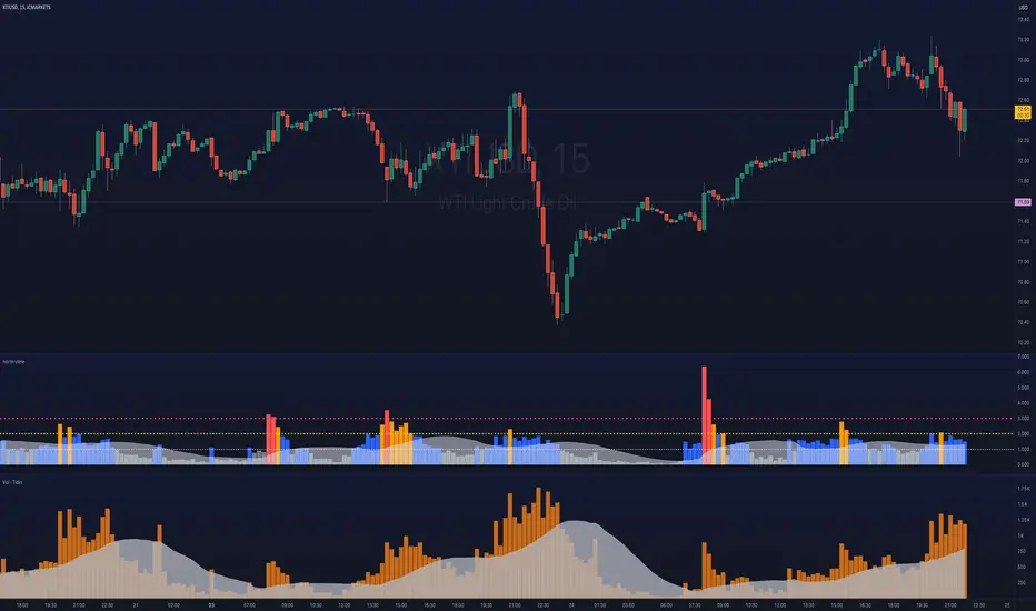
- Now color the bar, depending on what relative level it hits, by default: Gray, if below its average, blue if greater than its average, but below twice the average. Orange if twice the average but lower than thrice the average, and red if greater than thrice its average.
- Apply the moving average on top of the normalised volume, thus we now get essentially the same information as with regular volume, just on a normalised/relative scale!
- Allow the relative levels to be adjusted, but we expect that level 1 > level 2 > level 3, or you'll get odd colours!
In the chart, the bottom pane shows regular volume, with a moving average plotted with an area plot style. And above that, the relative volume indicator, to provide an illustration of how they are similar. We have the same relative magnitudes, but we get to quantify how much larger or smaller the volume is compared to the average, on a scale of 0 to N.
3 configurable scale levels are provided, defaulting to 1 (meaning: volume equals its average), 2 (volume twice its average), and 3 (volume thrice its average).
Traders may decide to adjust or even remove some levels, depending on their strategy parameters.
Open-source script
In true TradingView spirit, the creator of this script has made it open-source, so that traders can review and verify its functionality. Kudos to the author! While you can use it for free, remember that republishing the code is subject to our House Rules.
Disclaimer
The information and publications are not meant to be, and do not constitute, financial, investment, trading, or other types of advice or recommendations supplied or endorsed by TradingView. Read more in the Terms of Use.