OPEN-SOURCE SCRIPT
Updated OHLC StatMap (Multi-Timeframe)
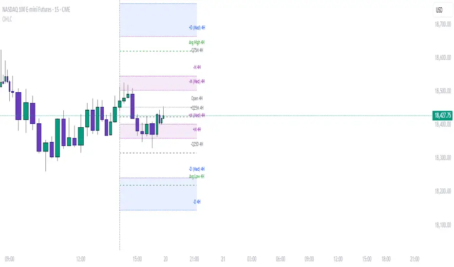
The OHLC StatMap (Multi-Timeframe) is a flexible Pine Script v6 indicator designed to overlay key statistical levels derived from OHLC (Open, High, Low, Close) data across multiple user-defined timeframes (e.g., 1H, 4H, 1D, 1W, 1M). It equips traders with a visual map of significant price levels, including open prices, manipulation ranges, distribution ranges, and median levels, projected forwards for a customisable number of bars (default: 24).
The indicator is highly customisable, allowing users to toggle visibility, adjust styles, colours, and shading for each timeframe and level type.
Key Features:
Multi-Timeframe Support: Choose up to four timeframes (e.g., 1H, 1D, 1W, 1M) to analyse concurrently.
Level Types:
Open Line: Plots the opening price of each new candle on the selected timeframe.
Manipulation Levels: Calculated as the average distance from the open to the extreme (high/low) in the direction opposite to the candle’s close.
Distribution Levels: Calculated as the average distance from the open to the extreme (high/low) in the direction of the candle’s close.
Median Levels: Median values of manipulation and distribution ranges for additional statistical insight.
Historical Data: Utilises a configurable number of past candles (default: 20) to compute averages and medians.
Visual Customisation: Options for line styles (solid, dashed, dotted), colours, widths, labels, and shaded areas between average and median levels.
Anchor Line: Marks the beginning of each new timeframe period for reference.
Important Note on Higher Timeframe Levels:
The indicator plots levels (e.g., daily, weekly, monthly) at the start of their respective periods. Consequently, these levels may not always be visible on lower timeframe charts (e.g., 15M or 1H) unless the chart’s current view includes the start of the higher timeframe period. For instance, a daily level is plotted at the beginning of each day, a weekly level at the start of each week, and a monthly level at the start of each month.
How to Use Higher Timeframe Levels: To effectively utilise daily, weekly, or monthly levels, switch your chart to a higher timeframe (e.g., 1h for daily levels) to ensure the starting point of the period is visible. Alternatively, you can extend the projection from 24 to a higher number, or zoom out on a lower timeframe chart to encompass the start of the higher timeframe period. These levels remain active and projected forwards (based on the "Projection Offset" setting), offering context for potential support, resistance, or price targets, even if they originate outside the current view.
Usage Tips:
Adjust the Projection Offset to control how far into the future levels extend.
Enable/disable specific levels (e.g., manipulation, distribution) or shading via the settings to reduce clutter.
Use higher timeframe levels (e.g., 1W, 1M) for long-term analysis and lower timeframes (e.g., 1H, 4H) for intraday trading.
Combine with other indicators to confirm key levels identified by the StatMap.
Release Notes
Updated to include avg high/low from open levels and tidied the inputs panelRelease Notes
Updated to include quantilesQuantile Logic Summary for OHLC StatMap (Multi-Timeframe)
What Are Quantiles?
Quantiles are statistical measures that divide a dataset into equal parts based on its distribution. Imagine you have a list of numbers sorted from smallest to largest—quantiles mark specific points along that list. For example:
The 50th percentile (or median) is the middle value, where 50% of the data lies below and 50% lies above.
The 25th percentile (or first quartile) is the value below which 25% of the data falls.
The 75th percentile (or third quartile) is the value below which 75% of the data falls.
In trading, quantiles help identify key price levels by analyzing historical price movements, such as how far prices typically move above or below a reference point (e.g., the open price of a candle). Unlike averages, which can be skewed by extreme values, quantiles provide a more robust view of typical price behavior by focusing on specific portions of the data distribution.
How Quantiles Are Used in the Indicator
The OHLC StatMap indicator now includes quantile-based levels to enhance its analysis of manipulation and distribution price movements across multiple timeframes. Here's how it works:
Data Collection:
For each selected timeframe (e.g., 1H, 4H, 1D), the indicator tracks historical price movements over a user-defined number of candles (default: 20).
Manipulation distances measure the price movement in the direction opposite to the candle’s close (e.g., high to open for a bearish candle, open to low for a bullish candle).
Distribution distances measure the price movement in the direction of the candle’s close (e.g., open to high for a bullish candle, open to low for a bearish candle).
These distances are stored in arrays for each timeframe.
Quantile Calculation:
The indicator calculates user-specified quantiles (e.g., 25th and 75th percentiles) for both manipulation and distribution distances.
For example, the 25th percentile of manipulation distances represents a level where 25% of past manipulation moves were smaller, and the 75th percentile represents a level where 75% were smaller.
This is done by sorting the array of distances and selecting the value at the appropriate position based on the percentile.
Plotting Quantile Levels:
For each timeframe, the indicator plots four quantile-based levels relative to the open price of the latest candle:
High Manipulation Quantile (e.g., 75th percentile): A level above the open where larger manipulation moves occur.
Low Manipulation Quantile (e.g., 25th percentile): A level below the open where smaller manipulation moves occur.
High Distribution Quantile (e.g., 75th percentile): A level above the open where larger distribution moves occur.
Low Distribution Quantile (e.g., 25th percentile): A level below the open where smaller distribution moves occur.
These levels are drawn as horizontal lines, color-coded (default: orange), with customizable styles and labels showing the percentile and timeframe (e.g., “+Q75D 1H” for the 75th percentile distribution level on the 1-hour timeframe).
User Customization:
Users can enable/disable quantile levels via the “Use Quantile Levels” setting.
Adjustable inputs allow users to set the low and high quantile percentages for manipulation (e.g., 25% and 75%) and distribution (e.g., 25% and 75%).
Additional settings control the color, line style, line width, and visibility of quantile labels.
How Traders Can Use Quantile Levels
Quantile levels provide traders with statistically significant price zones based on historical data, offering insights into potential support, resistance, or reversal areas. Here’s how they can be applied:
Identifying Key Price Zones:
The 75th percentile manipulation level might act as a resistance (for bullish candles) or support (for bearish candles), as it represents where larger counter-trend moves have historically occurred.
The 25th percentile distribution level could indicate a conservative target for trend-following moves, as it captures smaller but frequent price extensions.
Risk Management:
Traders can place stop-loss orders beyond the high manipulation quantile (e.g., 75th percentile) to account for extreme counter-trend moves.
Take-profit levels can be set near the high distribution quantile to target significant trend extensions.
Market Context:
By comparing quantile levels across multiple timeframes (e.g., 1H, 4H, 1D), traders can identify confluence zones where levels align, increasing their significance.
Quantiles help filter out noise by focusing on typical price behavior, making them useful for confirming trends or spotting reversals.
Robustness:
Unlike averages, which can be distorted by outliers (e.g., extreme price spikes), quantiles focus on specific percentiles, providing a more reliable measure of typical price movements.
The 25th and 75th percentiles (default settings) capture the interquartile range, representing the middle 50% of historical moves, which is often a stable indicator of price behavior.
Example
Suppose you’re analyzing a 1-hour chart with the indicator set to track 20 candles:
The 75th percentile manipulation level might show a price 50 pips above the open, indicating that 75% of past manipulation moves were 50 pips or less.
The 25th percentile distribution level might show a price 30 pips below the open, suggesting that 25% of past trend-following moves were 30 pips or less.
These levels are plotted as lines extending into the future (default: 24 bars), helping you anticipate where price might react based on historical patterns.
Why Use Quantiles in OHLC StatMap?
The addition of quantile levels enhances the indicator’s ability to map out statistically meaningful price levels. By combining quantiles with existing average and median levels, traders gain a comprehensive view of price dynamics across multiple timeframes. Whether you’re a day trader looking for short-term targets or a swing trader analyzing higher timeframes, quantile levels offer a data-driven way to understand where price is likely to move, pause, or reverse.
Open-source script
In true TradingView spirit, the creator of this script has made it open-source, so that traders can review and verify its functionality. Kudos to the author! While you can use it for free, remember that republishing the code is subject to our House Rules.
Disclaimer
The information and publications are not meant to be, and do not constitute, financial, investment, trading, or other types of advice or recommendations supplied or endorsed by TradingView. Read more in the Terms of Use.