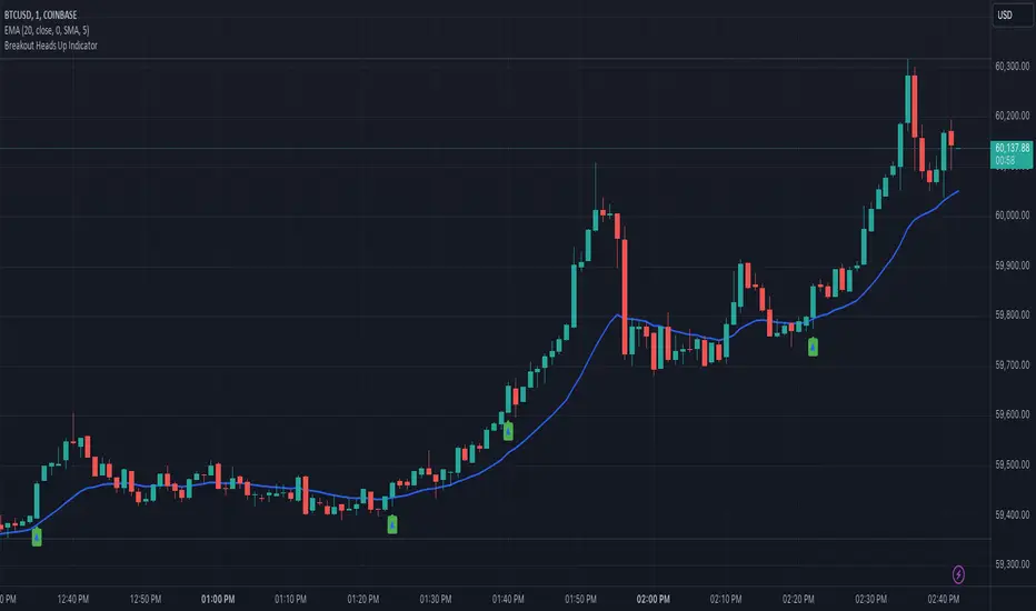
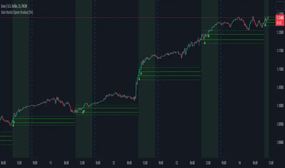
Auction Weighted Support and Resistance [Metrify]This script builds an “auction-weighted” S/R map that’s intentionally closer to a microstructure proxy than a classic “draw pivots → draw lines” approach.
The core idea: treat repeated interactions around the same price as evidence of auction behavior (acceptance vs rejection), then compress that behavior into a small set of ranked horizontal zones per horizon. Instead of outputting dozens of levels, it runs a selection pass to keep only the strongest, spatially distinct levels.
Candidate discovery is pivot-driven, but not used naively. The script collects pivot highs/lows into rolling buffers for three horizons (Micro/Short/Medium) with different pivot lengths and memory caps. Those candidates don’t become “levels” directly; they’re just seeds that get clustered and rescored. Clustering is ATR-normalized (distance measured in ATR multiples), so the same logic doesn’t fall apart when you change symbol volatility or timeframe. Each horizon has its own clustering radius (distATR_micro/short/medium), which makes Micro more granular and Medium more tolerant.
The “weight” you see is not a single metric. It’s a composite score that tries to approximate how meaningful a price is in an auction sense:
Touch count (distinct): interactions are counted only when the candle range gets within a near-band threshold (ATR-normalized), and then gated by minimum bar separation so you don’t get spam from chop printing 20 touches in a row. (this is done with a stride-based loop to avoid blowing runtime on deep lookbacks)
Acceptance: a rolling overlap rate of candle ranges inside the box. It’s exponentially weighted (half-life decay), so recent acceptance matters more, but older acceptance still contributes. If price has been “living” around that level, acceptance rises.
Rejection quality: wick-aware rejection, but range-gated (not close-gated). The scoring looks at whether the candle range overlaps/approaches the level, then measures wick dominance on the rejecting side plus where the close sits inside the bar range.
Age decay: older levels aren’t thrown away automatically, but they get downweighted via an exponential decay term so stale structure doesn’t dominate forever.
Those components get combined by f_weightCompose() into a bounded weight using saturating transforms (so touches don’t scale linearly forever) and a decay factor tied to age. When multiple candidates land in the same cluster, the merge is done with a saturating union on weights (1 - (1-oldW)*(1-wAdd)) rather than simple addition, so weights don’t explode and a level can converge toward 1.0 without becoming meaningless. The cluster center price is updated via a weight-based average to prevent random drift from weak additions.
After clustering, we does an explicit selection pass instead of drawing everything. First it filters by minScore, then sorts by weight, then applies a spatial suppression step (basically NMS for horizontal levels). The minimum spacing is ATR-based and incorporates both a horizon spacing floor and the zone thickness, so you don’t end up with two bands that overlap visually or convey the same information. On top of that, there’s a global cross-horizon collision gate (f_canDraw) so Medium zones can coexist with Short/Micro without the chart turning into a layered fog of rectangles.
Visualization is intentionally “zone-first.” Each selected level becomes a box band whose half-thickness is ATR-scaled per horizon (bandThicknessATR_*). Opacity isn’t linear: it normalizes weight above minScore, applies a power curve to compress mid-range values, and also scales relative to the strongest level in that horizon (so you still get contrast when everything is “kind of strong”).
The pressure overlay is not volume-based and not orderflow (pine can’t read L2), but it tries to expose short-term imbalance while price is inside a band. When the last price is inside a zone, it computes a pressure score from two parts: proximity to the center (closer = higher) and a directional imbalance proxy from recent returns sampled only on bars that intersect the band. It then draws two thin lines at the band edges with alpha proportional to that pressure score. This is meant as a “are we being pushed out or absorbed here” hint (not a prediction engine).
If you enable the audit panel, the script builds a table listing the levels that actually got drawn (post-selection + collision filtering). The columns map directly to the internal metrics (weight, touches, acceptance, rejection), so you can sanity-check why a level exists. Level IDs are horizon-prefixed (MC/ST/MD) and assigned based on ranking within each horizon.
note:
rebuild is throttled (rebuildEveryN) and only runs on the last bar. Loops that can go deep use a stride heuristic (1/2/4) to keep runtime predictable on large lookbacks. Arrays are used as bounded buffers for candidate storage, and drawing objects are aggressively deleted/rebuilt to avoid object leaks.
Pine Script® indicator