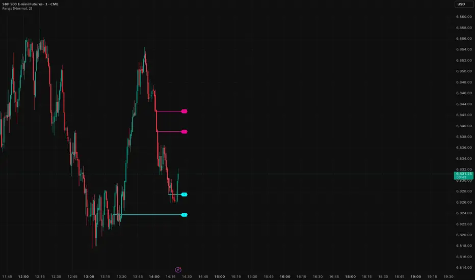
SignalViper FangsSee where smart money is likely to react. Fangs automatically identifies high-probability support and resistance levels, displaying them as horizontal zones (cyan for support, magenta for resistance).
▸ Automatic detection of key reaction zones
▸ Institutional-level price structure analysis
▸ Dynamic level management (auto-removed when broken)
▸ Sensitivity presets controlling max levels and spacing
▸ Levels flip from S to R as price moves through
Educational
SignalViper SnapGet out before the crowd. Snap detects bullish and bearish divergences between price and underlying momentum, warning you when a move is losing steam and a reversal is likely.
▸ Automatic divergence detection engine
▸ Bearish divergence alerts when momentum weakens
▸ Bullish divergence alerts when selling exhausts
▸ Visual divergence lines and labels on chart
▸ Configurable sensitivity settings

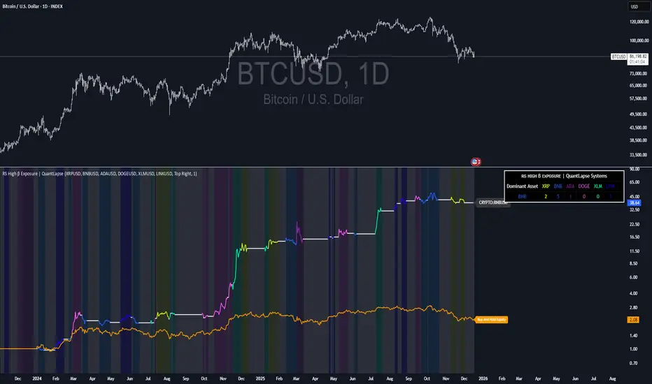
RS High Beta Exposure | QuantLapseRS High Beta Exposure | QuantLapse
Conceptual Foundation and Innovation
The RS High Beta Exposure indicator from QuantLapse is a comprehensive multi-asset allocation and momentum-ranking system that integrates beta and trend analysis, pairwise relative strength comparison, and volatility-adjusted filtering.
Its objective is to identify dominant crypto assets while dynamically reallocating High Beta exposure based on a calculated relative strength. The objective is to integrate trend analysis along with volatility filtering to these pairs to determine its relative strength.
At its core, RS High Beta Exposure indicator measures the systematic (β) performance of each asset relative to other assets provided combining these measures with inter-asset ratio trends to determine which assets exhibit superior strength and momentum relative to the other assets.
This integration of relative strength comparison, and trend and filtering analysis represents a quantitative evolution of traditional relative strength analysis, designed for adaptive asset rotation across major cryptocurrencies.
Technical Composition and Calculation
The indicator is structured around three major analytical layers:
1. Beta and Alpha Analysis
-Each asset’s return is decomposed into systematic components relative to the other assets by using a trend based, volatility filtering model.
-Assets with the highest point on a relative strength basis above the median are considered outperformers and eligible for allocation.
2. Pairwise Ratio Momentum
-Every asset is compared against all others through a ratio-trend, where momentum based trend scores quantify the directional momentum between each pair.
-In addition, we filter any false signals with volatility adjusted trends in which ensure high quality signals.
3. High Confidence Ranking
-Using the Pairwise Momentum signals, the RS High Beta Exposure scores them. If the asset comparison is given a signal, the RS High Beta Exposure scores points for each asset.
-If the total points of an asset is 5, its given the rank the dominant asset and is most likely to outperform.
By combining these layers, RS High Beta Exposure determines not only which assets is the strongest but also which assets to be invested.
User Inputs and Feature Adaptability
The indicator includes set of customizable parameters to support portfolio and risk management preferences:
Start Date Filter – Defines the beginning of live strategy evaluation.
Display Options – Able to change the location of the RS Table, Background and equity color.
Asset Selection – Modify or replace up to six crypto assets in the ranking matrix
asset1 = input.symbol("CRYPTO:XRPUSD", title ="Asset 1")
asset2 = input.symbol("CRYPTO:BNBUSD", title ="Asset 2")
asset3 = input.symbol("CRYPTO:ADAUSD", title ="Asset 3")
asset4 = input.symbol("CRYPTO:DOGEUSD", title ="Asset 4")
asset5 = input.symbol("CRYPTO:XLMUSD", title ="Asset 5")
asset6 = input.symbol("CRYPTO:LINKUSD", title ="Asset 6")
Each module operates cohesively to maintain analytical transparency while allowing user-level control over system sensitivity and behavior.
Real World, Practical Applications
The RS High Beta Exposure indicator is designed for systematic traders and quantitative portfolio managers who seek a disciplined framework for dynamic crypto asset rotation.
Key applications include:
High-Beta Asset Identification: Systematically identify crypto assets exhibiting relative dominance and stronger momentum characteristics versus peers within the comparison set.
Rule-Based Portfolio Rotation: Reallocate exposure toward leading assets using objective pairwise signals, reducing emotional decision-making and FOMO-driven trades.
Trend-Aligned Risk Participation: Employ the pairwise relative strength model to maintain exposure only during favorable momentum conditions, helping avoid prolonged participation in weak or deteriorating trends.
By combining relative strength comparisons with trend-aware filtering, this framework bridges quantitative finance and market regime analysis, providing a structured, data-driven approach to crypto asset allocation.
Advantages and Strategic Value
RS High Beta Exposure goes beyond conventional relative strength tools by integrating multi-asset comparison, ratio-based dominance scoring, and volatility-aware regime filtering into a single coherent framework.
By employing a three-layer confluence model — combining trend integrity, relative performance attribution, and volatility-state confirmation — the system improves the reliability of rotation and trend-following decisions.
The model is particularly valuable for traders seeking to:
Mitigate drawdowns while participating in higher-beta assets through regime-aware exposure control.
Identify persistent outperformers early in emerging market trends.
Maintain capital exposure only when statistical and momentum conditions signal elevated confidence.
The inclusion of visual allocation tables and a dynamic alert system makes RS High Beta Exposure both transparent and actionable, supporting discretionary analysis as well as systematic or automated trading workflows.
Alerts and Visualization
The script delivers clear, intuitive visual cues and alert-based feedback to support real-time decision-making:
Color-coded background states visually indicate the current allocation regime.
Allocation labels and summary tables display the dominant asset and its relative strength in real time.
An integrated alert system automatically notifies users whenever allocation states change (e.g., “100% XRP” or “100% CASH”).
Together, these visualization and alert features make RS High Beta Exposure both analytically rigorous and easy to interpret, even in fast-moving live market conditions.
Summary and Usage Tips
RS High Beta Exposure is an advanced interpretation of relative strength analysis, blending pairwise momentum comparisons, multi-asset dominance scoring, and adaptive volatility filters into a disciplined framework for crypto asset rotation.
By combining cross-asset selection with systematic allocation logic, the indicator helps traders determine when to be exposed, which asset demonstrates leadership, and when to step aside during unfavorable conditions. The model is best applied on the 1D timeframe, where its structure is optimized for identifying sustained leadership rather than short-term price noise. For broader context and confirmation, it can be used alongside other QuantLapse systematic models at the portfolio level.
Note: Past performance does not guarantee future results. This indicator is intended for research and educational use within TradingView.
Futures Sizing Calculator (NQ,MGC,MES)Clean simple, risk indicator that will allow you to see risk before entering trade. This will allow you to use it on MES, MGC and MNQ.
For any ideas or improvements, don't hesitate to contact me.

Bullish Breakout Finder by St0icTraderThis breakout finder is for PSEI. Buy on breakout candle close with stop loss of 5%.

SS Critical Advanced Swing Trading Decision Matrix
📊 How to Use the SS Critical Advanced Swing Trading Decision Matrix Indicator
Installation & Setup
Adding to TradingView
Open TradingView and Click "Add to Chart"
The indicator will load with the dashboard on your selected position
Recommended Timeframes
Daily charts: Primary timeframe for swing trading signals
4-hour charts: For fine-tuning entry/exit points
Weekly charts: For confirming long-term trends
Interpreting the Decision Matrix Scores
Final Score Ranges
Component Breakdown
Trend (25%): MA alignment + SuperTrend direction + ADX strength
Momentum (30%): RSI + MACD + Stochastic + ROC + MFI
Volume (20%): Volume surge + MFI confirmation
Volatility (15%): Bollinger Bands position + ATR
Oscillators (10%): CCI + Williams %R + ADX
Trading Signals
BUY Signal
Triggers when Final Score crosses above 65
Confirms bullish momentum building
Enter within 1-2 bars of signal for best results
SELL Signal
Triggers when Final Score drops below 35
Indicates bearish pressure intensifying
Exit or consider shorting opportunities
Signal Quality Validation
Check Previous Close score for trend confirmation
Higher previous score = stronger continuation
Diverging scores = potential reversal or consolidation
Customisation for Your Strategy
Adjusting Signal Weights
Trending Markets: Increase Trend Weight to 30-35%
Volatile Markets: Increase Volatility Weight to 20-25%
Low Volume Stocks: Decrease Volume Weight to 10-15%
High Volume Stocks: Increase Volume Weight to 25-30%
Parameter Optimization
Fast MA (9): For aggressive entries, reduce to 5-7
Slow MA (50/200): For longer holds, keep standard
RSI Length (14): Increase to 21 for smoother signals
Profit Target: Set based on stock volatility (6-7% default)
Best Practices
Entry Strategy
Wait for score ≥ 65 (STRONG or EXCELLENT)
Confirm trend on higher timeframe (weekly)
Check volume is above average
Enter on price pullback or breakout
Exit Strategy
Target: Achieve 6-7% profit within timeframe
Stop-loss: When score drops below 50 (MODERATE)
Trailing stop: Move to breakeven at 3% profit
Risk Management
Never risk more than 2% of capital per trade
Use position sizing based on signal quality:
EXCELLENT: 100% of planned position
STRONG: 75% of planned position
MODERATE: 25% or skip
Avoiding False Signals
Use multiple timeframe confirmation (daily + weekly)
Avoid trading during low volume periods
Check fundamentals for stocks with EXCELLENT scores
Don't overtrade - wait for quality setups
Dashboard Interpretation
Current Bar Section
Shows real-time analysis of ongoing candle
Component scores color-coded (Green/Yellow/Red)
Weighted column shows actual contribution to final score
Previous Close Section
Displays confirmed signal from last closed bar
Use for backtesting and strategy validation
Compare with current to spot trend changes
Alerts Setup
Create alerts for Buy/Sell signals
Set notifications for EXCELLENT quality signals
Combine with price alerts for automated monitoring
Practical Example
EXCELLENT Signal (Score 85)
All 5 components show green (>60 points)
Strong uptrend with high volume
Action: Enter full position, target 6-7% in 5 -15 days
WEAK Signal (Score 40)
Mixed indicators, declining momentum
Action: Avoid new entries, monitor existing positions
Pro Tip: Backtest this indicator on your favorite stocks using historical data before live trading. Adjust weights and parameters based on which components work best for your specific market/timeframe.
© Dr Shantanu Samanta - This indicator combines proven swing trading indicators into a single decision matrix for clearer trade execution.
For Educational purposes only

Futures Risk-Based Position CalculatorFutures Risk‑Based Position Calculator — Description
This TradingView indicator automatically calculates and displays Entry, Stop Loss (SL), and Take Profit (TP) levels for futures trades based on a fixed dollar‑risk amount.
What it does
Uses your account balance, dollar risk, number of contracts, point value, and tick size to compute how far the stop should be from the entry.
Determines the take‑profit level using a chosen risk‑to‑reward ratio.
Draws three lines on the chart:
Entry line
Stop loss line
Take profit line
Places labels next to the SL and TP lines showing prices and point distances.
Key features
Supports long or short calculation mode.
Configurable line styling:
Width, style (solid/dashed/dotted), color, opacity.
Separate styling for entry, SL, and TP.
Configurable label behavior:
Optional background.
Text color choices.
Adjustable vertical offset to avoid overlapping the lines.
Lines extend left/right by user‑defined bar amounts.
Values are always rounded to the market's tick size.
How levels are calculated
Entry = current close rounded to tick size.
Stop distance (points) = dollarRisk / (contracts × pointValue).
SL = entry − distance (long) or entry + distance (short).
TP = entry + distance × RR (long) or entry − distance × RR (short).
Visual behavior
Lines and labels update only on the last bar to avoid clutter.
Labels show:
SL: price, point distance, and contract count.
TP: price and point distance.

Risk & Order Size Calculatorhello,
this will calculate the risk and you may change the script as per your risk appetite, my advise do not risk more than 2% of your capital.
Thank you

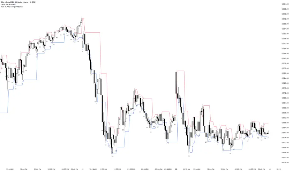
Task 9 , Alka Swing DetectionFirst swing detection code First swing detection code, inspired by Alka, Trading view is asking me to write more description First swing detection code, inspired by Alka, Trading view is asking me to write more description First swing detection code, inspired by Alka, Trading view
Aidous SuperTrader🔑 WHAT IT IS
Aidous SuperTrader is a fully-automized, all-in-one trend-following toolkit for TradingView.
It combines a volatility-adaptive Super-Trend engine with built-in risk-management (entry, stop-loss, up to 10 partial take-profits, breakeven and trailing-stop logic) and real-time visual guidance.
Once added to your chart you immediately see exact entry prices, SL, TP ladders and dynamic trailing levels without writing a single line of code yourself.
🎯 WHO IT IS FOR
• Day- and swing-traders who want to outsource trade mechanics and focus on discretion & market selection.
• Alert-bot users who need clean, JSON-formatted signals that any webhook/automation service can consume.
• Strategy-developers who require a robust, pre-vetted position-manager to pair with higher-time-frame filters of their choice.
📌 HOW TO USE IT (3-MINUTE SET-UP)
Add the indicator
‑ Click “Add to Chart” – the script is locked, so the code stays private.
Choose your risk profile in the settings panel
‑ Risk : Reward ratio (default 1.2)
‑ SL distance in ATRs (default 1.8)
‑ Number of partial TP levels 1-10 (default 3)
‑ Toggle “Move SL to entry after TP1” and/or “Trail after final TP” on/off.
Wait for a signal
‑ Green triangle = LONG, Red triangle = SHORT.
‑ Horizontal white line = entry; coloured dashed line = initial SL; stacked dashed lines = TP ladder.
Act or Automate
‑ Manual: place the exact prices shown on your broker.
‑ Automation: use the built-in alert messages – they already arrive in ready-to-send JSON
{"side":"buy","price":1234.56,"sym":"NASDAQ:AAPL","tf":"15"}
(works with any webhook, Telegram-bot, or trading bridge that ingests JSON).
⚙️ KEY FEATURES
✔ Volatility-adaptive confirmation – fewer false breakouts in choppy markets.
✔ Time-frame-aware multiplier – internally optimises Super-Trend factor for 3 m → 4 H without user input.
✔ Multi-step TP & automatic position sizing helpers (Risk box vs Reward box drawn on chart).
✔ Trailing stop that activates only after the last TP is hit – keeps you in the trend while protecting late gains.
✔ Clean visual feedback: candles colour with the active trend, hit levels are ticked ✔, SL hit is crossed ✖.
✔ Lightweight code – max 50 labels/lines, 25 boxes; runs lag-free on 1 m charts.
⚠️ BEFORE YOU GO LIVE
• The indicator shows hypothetical levels – it cannot place orders for you.
• Always back-test the default values on the instrument AND time-frame you trade; adjust ATR period, RR ratio and SL multiplier until the equity curve fits your style.
• Combine with higher-time-frame bias or fundamental filter to avoid counter-trend signals.
• Never risk more than you can afford to lose; past performance is not indicative of future results.

ETIQUETAS 5M.This is the best way to determinate interval from five minutes to 1 minute in that time range of 9:25 am to 4:15 pm. you can know how to enter or exit trading action.

NY LONDON LUNCH AUTO**NY London Lunch Auto** is a precision session-anchor indicator designed for traders who focus on institutional timing and liquidity behavior.
This script automatically marks the **high and low of three key 15-minute New York session candles**:
• **3:00 AM NY** — London session expansion
• **8:00 AM NY** — New York open / kill zone
• **2:00 PM NY** — NY lunch / power hour transition
Each time one of these candles prints on the **15-minute chart**, the script captures its exact high and low and extends them forward as horizontal levels.
The levels remain **locked and unchanged** until the next key session candle appears, ensuring clean, non-repainting reference zones.
### Key Features
• Works **exclusively on the 15-minute timeframe**
• Automatically updates at **3AM, 8AM, and 2PM NY time**
• Levels stay fixed — no drifting or recalculation
• Clean, minimal design with customizable colors
• Ideal for liquidity sweeps, displacement, and ICT-style execution models
This indicator is built for traders who want **clarity, patience, and structure**, not clutter. It pairs seamlessly with liquidity sweep, displacement, and fair value gap strategies.


Displacement## Displacement Indicator (Institutional Momentum Filter)
This indicator highlights **true price displacement** — candles where price moves with **abnormal force relative to recent volatility**.
It is designed to help traders distinguish **real momentum** from normal market noise.
Displacement often precedes:
- Breaks of structure
- Fair Value Gaps (FVGs)
- Strong continuation or meaningful pullbacks
This tool focuses on **confirmation**, not prediction.
---
### 🔍 How Displacement Is Defined
A candle is marked as *displacement* only when **all conditions are met**:
• Candle body is larger than a multiple of ATR (volatility-adjusted)
• Candle body makes up a high percentage of the full candle (strong close)
• Directional conviction (bullish or bearish close)
This filters out:
- Small or average candles
- Wick-heavy indecision
- Low-quality breakouts
---
### 🎯 What This Indicator Is Best Used For
✔ Confirming impulsive moves
✔ Validating structure breaks
✔ Anchoring Fair Value Gaps
✔ Filtering low-probability setups
✔ Identifying institutional participation
Works best on **M5, M15, and H1**, especially during **London and NY sessions**.
---
### ⚠️ Important Notes
• This is **not** a buy/sell signal by itself
• Best used with trend, structure, or liquidity context
• Not designed for ranging or low-volatility markets
Think of this indicator as a **momentum truth filter** —
if displacement is missing, conviction is likely missing too.
---
### ⚙️ Inputs Explained
• ATR Length – defines normal volatility
• ATR Multiplier – how aggressive displacement must be
• Minimum Body % – ensures strong candle closes
All inputs are adjustable to fit different markets and styles.
---
### 🧠 Philosophy
Displacement reflects **commitment**, not anticipation.
This tool helps you wait for **proof**, not hope.
---
If you want, I can:
- Tighten this for **ICT-style language**
- Rewrite for **beginner clarity**
- Add a **“How I personally use it”** section
- Optimize it for **TradingView algorithm visibility**
**Tell me which you want changed.**

DCT - Liquidity Heatmap - ProDCT - Liquidity Heatmap - Pro
Overview
This indicator maps liquidity concentration zones by analyzing volume distribution across price levels. It identifies areas where significant trading activity has accumulated, potentially indicating zones of interest for future price interaction.
Methodology
Volume Intensity Calculation
Each price level accumulates a normalized volume score calculated as:
- Volume Intensity = Current Bar Volume / SMA(Volume, lookback period)
- This normalization allows comparison across different volatility regimes and trading sessions
Level Construction
- Price levels are distributed symmetrically above and below current price using percentage-based spacing
- Each level maintains cumulative volume data, tracking both raw volume and normalized intensity
- Levels are visualized as zones with height proportional to the spacing parameter
Sweep Detection Logic
A level is marked as "swept" when price action crosses through it:
- Condition: Low ≤ Level Price AND High ≥ Level Price
- Swept levels stop accumulating new volume and can be styled differently (fade, hide, or preserve)
Color Intensity Grading
Zones are color-coded based on their normalized volume relative to the maximum observed:
- Purple: < 25% of max intensity
- Yellow: 25-50% of max intensity
- Orange: 50-75% of max intensity
- Red: > 75% of max intensity
Optional CVD (Cumulative Volume Delta) Mode
When enabled, directional volume is estimated using candle structure:
- Bullish candles: Buy pressure weighted by (Close - Open) / (High - Low)
- Bearish candles: Sell pressure weighted by (Open - Close) / (High - Low)
- Levels display green/red bias based on accumulated directional volume ratio
Adaptive System
The indicator includes a three-layer adaptive system:
1. Timeframe adaptation: Spacing, level count, and retention automatically adjust for M5 through Daily charts
2. Volatility adaptation: ATR-based adjustments widen spacing during high volatility and tighten during consolidation
3. Market type adaptation: Different imbalance thresholds for BTC/ETH, large altcoins, and small caps
Imbalance Detection
Buy/sell imbalance markers appear when the ratio of accumulated buy volume to sell volume exceeds a configurable threshold (default 1.5x for BTC/ETH, 2.0x for small caps).
What Makes This Implementation Unique
- Dollar-denominated liquidity display: Labels show estimated liquidity in USD (K/M/B format) rather than abstract values
- Three-layer adaptive logic: Combines timeframe, volatility (ATR), and asset-class adjustments simultaneously
- Memory-optimized architecture: Automatic cleanup of old swept levels prevents performance degradation on extended charts
- Forward projection: Active levels extend into future bars for cleaner visualization
- Granular visibility controls: Each intensity tier can be toggled independently
Settings Guide
- Dynamic: Enable adaptive adjustments (recommended)
- Spacing: Distance between levels as % of price
- Levels: Number of levels above/below price
- CVD: Enable directional volume analysis
- Forward: Project levels ahead by specified bars
Usage Notes
- Works on both Perpetual and Spot crypto markets
- Optimized for crypto assets; results may vary on other instruments
- Higher timeframes show broader liquidity structure; lower timeframes show granular detail
- Combine with your own analysis framework
Disclaimer
This indicator visualizes historical volume distribution and does not predict future price movement. Not financial advice. Use appropriate risk management.


Expectativa de Juros (Fed)An indicator that measures future expectations for US interest rates, measured by the difference between the Fed's interest rate and pricing on the CME.

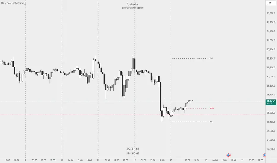
Daily Context (yctrades_)This indicator automatically marks the Previous Day’s High and Low, as well as the market’s midnight opening price.
These levels are updated at the start of each new trading day and remain visible throughout the entire session.
By providing key daily reference points, the indicator helps establish a clear market context and allows traders to immediately understand where price is positioned relative to the previous day’s range and the daily open.
The New York midnight line (00:00 NY) now appears only at the actual NY midnight.
Any previous day’s NY midnight line is automatically deleted when the day changes.
Between the previous NY midnight and the current one, no line is displayed, avoiding clutter or outdated lines.
The line’s color can now be individually customized via NY 00:00 Line + Text Color input, applying to both the line and its label.
Displays a vertical line between each trading day.
Fully customizable in the settings:
Color of the line
Width of the line
Style (solid, dashed, dotted)
This makes it easy to visually separate trading sessions directly on the chart.
PDH / PDL are calculated using UTC 00:00–23:59 to ensure identical levels for all traders worldwide, regardless of market or timezone.

SS Critical Advanced Multi-Timeframe Trend & MomentumThis indicator analyses the trend , Momentum & reversal across multiple timeframes to help find a data driven entry point. For Educational use only

Moving Averages 20 & 200Moving Averages 20&200. Help you decide buy signal to find bullish or bearish.
50% level of Daily RangeThe 50% or midpoint between the current days highest and lowest points be used to divide the premium and discount of the days range. Price often reacts at this point and it can be used as a target for reversal trades. This indicator plots the level as it moves through out each day so is useful for backtesting as well as determining whether the current price is in premium or discount.

AETHER II: Quantum Liquidity EngineAETHER II is the final evolution of market scanning. It does not analyze price; it analyzes Physics.
Most traders view the chart as empty space where price moves freely. AETHER views the market as a Fluid Environment with varying degrees of Density and Viscosity.
Sometimes the market is "Thick" (High Friction). Price hits invisible walls and stops dead, even with high volume.
Sometimes the market is "Thin" (Zero Friction). Price slips rapidly through air pockets, leaving vacuums behind.
AETHER II simulates these fluid dynamics in real-time, visualizing the invisible "Dark Pool" orders that absorb liquidity and the "Liquidity Vacuums" that act as magnets for price.
Core Capabilities
1. 🛡️ Iceberg Detection (The Walls)
The Physics: When massive volume hits the market but price refuses to move, it means an institution is absorbing orders via hidden "Iceberg" limit orders.
The Signal: AETHER paints a persistent "Blockade Zone" (Green for Support, Red for Resistance).
Action: Treat these zones as concrete walls. Do not trade into them. Place your stops behind them.
2. 👻 Vacuum Detection (The Ghosts)
The Physics: When price moves rapidly with tiny volume, it creates a "Liquidity Vacuum." This is fake movement caused by slippage (Zero Friction).
The Signal: AETHER paints a "Ghost Zone" (Purple).
Action: Price hates vacuums and will almost always snap back to fill them. These are high-probability magnetic targets for Take Profits.
3. 📟 Quantum HUD (Heads-Up Display) A real-time dashboard in the top corner that grades the current market physics:
STATE: Tells you if the market is in "FLOW," hitting a "WALL," or slipping into a "VACUUM."
FRICTION: A raw density score. If this number spikes, movement is about to stop.
How to Use (The "Physics" Protocol)
AETHER is your map of the battlefield's terrain.
Scenario A (The Trap): You want to Buy. You check AETHER. There is a Red "Iceberg Zone" right above you.
Decision: WAIT. The friction is too high. Buying here is like running into a concrete wall. Wait for the wall to be breached.
Scenario B (The Slip): Price crashes down rapidly, leaving a trail of Purple "Vacuum Zones" behind.
Decision: TARGET THE GHOSTS. The move down was fake (low density). Price will likely reverse to fill the vacuum.
Disclaimer
This tool simulates order book density using Volume-Range efficiency metrics. It does not access Level 3 Dark Pool data (which is unavailable to retail traders).
