[ayana] TFPS - TradFi Pressure ScoreTFPS - TradFi Pressure Score: Your Market Pressure Barometer
Understand what moves Wall Street, before it moves Crypto.
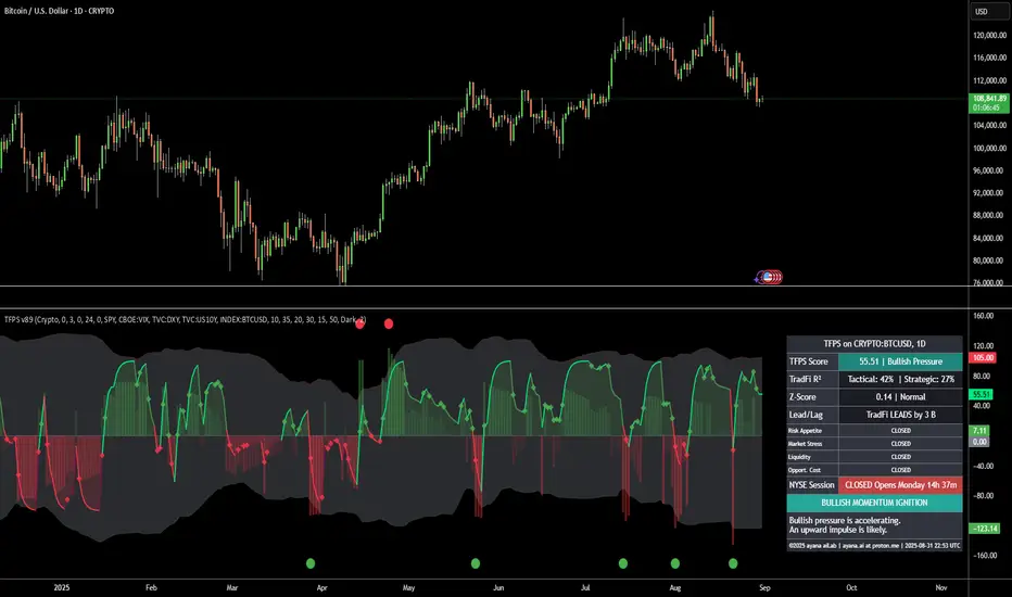
This indicator is your real-time barometer for the influence of traditional financial markets (TradFi) on Crypto. It measures the combined pressure from four key quadrants—Risk Appetite (S&P 500), Market Stress (VIX), Liquidity (DXY), and Macro Expectations (US10Y)—to answer one question: "Do I have a tailwind or a headwind from the global markets?"
How to Read Your "Cockpit" in 60 Seconds
The Main Line (Overall Market Pressure)
GREEN / ABOVE 0: Bullish Tailwind. The macro environment is supportive for Crypto.
RED / BELOW 0: Bearish Headwind. The macro environment is creating pressure on Crypto.
BRIGHT Color: Pressure is ACCELERATING.
DARK Color: Pressure is DECELERATING (losing momentum).
The Dashboard (Your Command Center)
Lead/Lag Analysis: The game-changer. Tells you if TradFi is currently leading the price or vice-versa. This is your key to knowing whether to watch macro news or focus on crypto-specifics.
TradFi Influence (R²): Shows you HOW RELEVANT the macro pressure is right now. High R² means Wall Street's influence is dominant. Low R² means crypto is moving on its own narrative.
Dynamic Weights: Reveals the market's primary NARRATIVE. Is the pressure coming from Fear (VIX), Liquidity (DXY), or general Risk Appetite (SPX)?
Extreme Signals (Reversal Zones)
Stress Cloud (Z-Score): Large, opaque bars warn of statistically EXTREME greed or fear levels.
Extreme Dots: Pinpoint the moments when pressure has likely reached an unsustainable peak, often preceding turning points.
Key Strategies & Use Cases
As a Trend Filter: Simply avoid fighting the color. Don't force long trades when the TFPS shows a strong red headwind.
For Precision Entry/Exits: Use the Extreme Dots and a decelerating color on the Main Line to time your entries in confluence with your own strategy.
For Strategic Decisions: Use the Lead/Lag and R² metrics to decide where to focus your attention and how to manage portfolio risk based on the current macro regime.
Configuration
For best results, leave the engine settings on their default (auto-adaptive) mode. The indicator's core intelligence lies in its ability to adapt to changing market dynamics automatically. You can adjust the visual theme to match your chart.
Intermarketanalysis
TFPS - TradFi-Pressure-Score (Adaptive)The data-driven answer to an irreversible market reality.
This indicator quantifies the combined pressure from the S&P 500, VIX, DXY, and US10Y, whose correlation to crypto has reached peak values of 0.87. Your decisive macro edge, in real-time.
This indicator is built on a fundamental analysis of market data from the last five years. The analysis proves an irreversible transformation: The crypto market has evolved into a high-beta risk asset, its fate inextricably linked to Traditional Finance (TradFi).
The empirical data is clear:
Bitcoin increasingly behaves like a leveraged version of the S&P 500.
The correlation to stock indices, with peak values of up to 0.87, is statistically highly significant.
The "digital gold" safe-haven narrative is refuted by the data; the correlation to gold (0.04) is virtually non-existent and statistically insignificant.
This means: Standard indicators like RSI or MACD are insufficient for today's market conditions. They only see price, ignoring the powerful external context that now dominates price action.
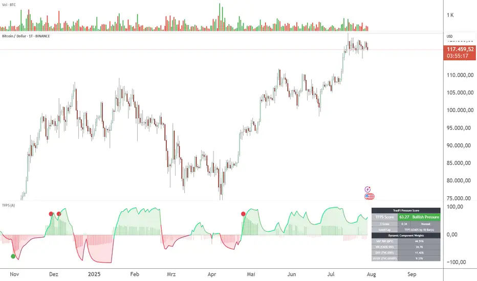
The TradFi Pressure Score (TFPS) is the answer to this data-driven reality. It's your institutional-grade macro dashboard, aggregating the four most dominant external forces into a single, actionable score:
S&P 500 (SPY): The pulse of global risk appetite. A rising S&P signals a "risk-on" environment, fueling capital flows into crypto.
VIX: The market's "Fear Gauge". A rising VIX signals a "risk-off" flight to safety, draining liquidity from crypto.
DXY (US-Dollar Index): The counter-pole to risk assets. A strong Dollar (rising DXY) tightens global liquidity, creating significant headwinds for Bitcoin.
US 10Y Yield: The opportunity cost of capital. Rising yields make risk-free assets more attractive, pulling capital away from non-yielding assets like crypto.
What makes TFPS truly unique?
Dynamic Weighting (its secret weapon): Which factor matters most today? The DXY or the VIX? TFPS continuously analyzes the correlation of all four factors to your chosen asset (e.g., Bitcoin) and automatically adjusts their weight in real-time. This ensures you're always focused on what's currently driving the market.
Adaptive Engine : What drives a 15-minute chart is different from a daily chart. The TFPS engine automatically adapts its lookback periods and calculations to your chosen timeframe for optimal relevance.
Clear, Actionable Signals Designed for Traders:
Pressure Line (>0 or <0): Instantly see if the world's largest financial forces are providing a tailwind or a headwind for your trade.
Z-Score (Extreme Readings) : Get early warnings of extreme macro "Greed" or "Fear". Readings above +2 or below -2 have historically pinpointed moments of market exhaustion that often precede major trend reversals.
Regime Change : A fundamental shift in the nature of TradFi pressure is visualized with a clear signal, providing unambiguous macro insights.
Lead/Lag Status : Gain a critical edge by knowing who's in the driver's seat. The dashboard tells you if TradFi is LEADING the price action or if crypto is moving independently, allowing you to focus on the right information source.
This is a private beta. I am granting exclusive access to a limited number of traders who understand this new market reality. In exchange for your valuable feedback, you will be among the first to leverage what I believe is the new standard for macro analysis in crypto trading.
Request access to trade with the full context.
Intermarket Correlation Oscillator (ICO)The Intermarket Correlation Oscillator (ICO) is a TradingView indicator that helps traders analyze the relationship between two assets, such as stocks, indices, or cryptocurrencies, by measuring their price correlation. It displays this correlation as an oscillator ranging from -1 to +1, making it easy to spot whether the assets move together, oppositely, or independently. A value near +1 indicates strong positive correlation (assets move in the same direction), near -1 shows strong negative correlation (opposite movements), and near 0 suggests no correlation. This tool is ideal for confirming trends, spotting divergences, or identifying hedging opportunities across markets.
How It Works?
The ICO calculates the Pearson correlation coefficient between the chart’s primary asset (e.g., Apple stock) and a secondary asset you choose (e.g., SPY for the S&P 500) over a specified number of bars (default: 20). The oscillator is plotted in a separate pane below the chart, with key levels at +0.8 (overbought, strong positive correlation) and -0.8 (oversold, strong negative correlation). A midline at 0 helps gauge neutral correlation. When the oscillator crosses these levels or the midline, labels ("OB" for overbought, "OS" for oversold) and alerts notify you of significant shifts. Shaded zones highlight extreme correlations (red for overbought, green for oversold) if enabled.
Why Use the ICO?
Trend Confirmation: High positive correlation (e.g., SPY and QQQ both rising) confirms market trends.
Divergence Detection: Negative correlation (e.g., DXY rising while stocks fall) signals potential reversals.
Hedging: Identify negatively correlated assets to balance your portfolio.
Market Insights: Understand how assets like stocks, bonds, or crypto interact.
Easy Steps to Use the ICO in TradingView
Add the Indicator:
Open TradingView and load your chart (e.g., AAPL on a daily timeframe).
Go to the Pine Editor at the bottom of the TradingView window.
Copy and paste the ICO script provided earlier.
Click "Add to Chart" to display the oscillator below your price chart.
Configure Settings:
Click the gear icon next to the indicator’s name in the chart pane to open settings.
Secondary Symbol: Choose an asset to compare with your chart’s symbol (e.g., "SPY" for S&P 500, "DXY" for USD Index, or "BTCUSD" for Bitcoin). Default is SPY.
Correlation Lookback Period: Set the number of bars for calculation (default: 20). Use 10-14 for short-term trading or 50 for longer-term analysis.
Overbought/Oversold Levels: Adjust thresholds (default: +0.8 for overbought, -0.8 for oversold) to suit your strategy. Lower values (e.g., ±0.7) give more signals.
Show Midline/Zones: Check boxes to display the zero line and shaded overbought/oversold zones for visual clarity.
Interpret the Oscillator:
Above +0.8: Strong positive correlation (red zone). Assets move together.
Below -0.8: Strong negative correlation (green zone). Assets move oppositely.
Near 0: No clear relationship (midline reference).
Labels: "OB" or "OS" appears when crossing overbought/oversold levels, signaling potential correlation shifts.
Set Up Alerts:
Right-click the indicator, select "Add Alert."
Choose conditions like "Overbought Alert" (crossing above +0.8), "Oversold Alert" (crossing below -0.8), or zero-line crossings for bullish/bearish correlation shifts.
Configure notifications (e.g., email, SMS) to stay informed.
Apply to Trading:
Use positive correlation to confirm trades (e.g., buy AAPL if SPY is rising and correlation is high).
Spot divergences for reversals (e.g., stocks dropping while DXY rises with negative correlation).
Combine with other indicators like RSI or moving averages for stronger signals.
Tips for New Users
Start with related assets (e.g., SPY and QQQ for tech stocks) to see clear correlations.
Test on a demo account to understand signals before trading live.
Be aware that correlation is a lagging indicator; confirm signals with price action.
If the secondary symbol doesn’t load, ensure it’s valid on TradingView (e.g., use correct ticker format).
The ICO is a powerful, beginner-friendly tool to explore intermarket relationships, enhancing your trading decisions with clear visual cues and alerts.

Cross Market AdvancedEnglish Description:
Cross Market Advanced is a TradingView indicator designed for intermarket analysis between two tickers. It compares the price of the primary market (the chart’s ticker) with a secondary market (user-selectable) by calculating their ratio—optionally with a configurable time delay. This feature is especially useful for markets such as oil and gold. Statistical studies show that the gold price typically lags behind the oil price by about 140–150 days, meaning that an oil rally can potentially trigger a gold rally after approximately 145 days.
Key features include:
• Intermarket Comparison: Analyzes the relationship between two different markets.
• Customizable Ratio Calculation: Choose between EMA and SMA smoothing, set evaluation periods, and apply a time delay for the secondary ticker. This delay can be tailored to match market-specific relationships, like the oil-to-gold lag.
• Overbought & Oversold Levels: Visual cues are provided with horizontal reference lines at 70 (overbought) and 30 (oversold), with a shaded zone between, helping to identify extreme market conditions.
• Divergence Detection: Identifies potential divergences between the ticker price and the scaled index. Divergence signals are color-coded (red for bearish, green for bullish) as a rough guide—note that this does not replace detailed technical analysis.
• Additional Plots: Optionally display the raw ratio and z‑score.
• Visual Aids: The indicator displays the selected tickers on the chart along with clear reference levels.
This tool is ideal for traders looking to explore cross-market relationships, identify early signs of potential market reversals, and incorporate time delay effects—particularly in markets like oil and gold.
Deutsche Beschreibung:
Cross Market Advanced ist ein TradingView-Indikator, der eine Intermarket-Analyse zwischen zwei Tickern ermöglicht. Er vergleicht den Kurs des primären Marktes (dem im Chart dargestellten Ticker) mit einem sekundären Markt (frei wählbar), indem er deren Verhältnis berechnet – optional mit einem einstellbaren Zeitversatz. Dieser Zeitversatz ist besonders nützlich, wenn beispielsweise Öl und Gold verglichen werden. Statistischen Untersuchungen zufolge läuft der Goldpreis etwa 140–150 Tage hinter dem Ölpreis her, was bedeuten kann, dass eine Öl-Rallye zu einer Gold-Rallye mit einem Verzögerungsfaktor von etwa 145 Tagen führen kann.
Wichtige Funktionen im Überblick:
• Intermarket-Vergleich: Analyse der Beziehung zwischen zwei unterschiedlichen Märkten.
• Anpassbare Verhältnis-Berechnung: Auswahl zwischen EMA und SMA, Festlegung der Evaluationsperiode sowie Anwendung eines Zeitversatzes für den zweiten Ticker. Dieser Versatz kann an marktspezifische Zusammenhänge angepasst werden, wie z.B. das Öl-Gold-Verhältnis.
• Überkauft & Überverkauft: Mit horizontalen Referenzlinien bei 70 (Überkauft) und 30 (Überverkauft) wird die aktuelle Marktlage visualisiert – der dazwischen liegende, hervorgehobene Bereich hilft, extreme Marktbedingungen zu erkennen.
• Divergenzerkennung: Ermittelt mögliche Divergenzen zwischen dem Ticker-Kurs und dem skalierten Index. Divergenzsignale werden farblich hervorgehoben (rot für bärisch, grün für bullisch) und dienen als grobe Orientierung – sie ersetzen jedoch keine ausführliche charttechnische Analyse.
• Zusatzplots: Optionale Darstellung des Rohwerts des Verhältnisses sowie des z‑Scores.
• Visuelle Hilfen: Der Indikator zeigt die ausgewählten Ticker im Chart sowie die klaren Referenzniveaus an.
Dieser Indikator eignet sich ideal für Trader, die Cross-Market-Beziehungen untersuchen, frühzeitig Hinweise auf mögliche Trendumkehrungen erkennen und auch Verzögerungseffekte – wie etwa beim Öl-Gold-Verhältnis – in ihre Analyse einbeziehen möchten.

Intermarket Correlation TableThe Correlation Coefficient is used to measure the correlation between two sets of data. In the trading world, the Correlation Coefficient is a measure of the correlation between two data sets of financial instruments. The correlation between two financial instruments is the degree in which they are related. Correlation is based on a scale of 1 to -1. The closer the Correlation Coefficient is to 1, the higher their positive correlation. The instruments will move up and down together. The closer the Correlation coefficient is to -1, the more they move in opposite directions. A value at 0 indicates that there is no correlation.
This indicator uses the built in ta.correlation function to calculate the correlation coefficient between DXY and NQ, ES, YM, US10Y, and ZN respectively. It then presents the data in a customizable table that is view as an overlay on your chart.
Adjust the length of the correlation factor to calculate higher time frame correlation.
Asset background changes based on current candle direction.
Coefficient background color changes based on whether the assets are properly correlated.
DXY is inversely correlated to NQ, ES, YM, and ZN.
DXY is directly correlated to US10Y.
The colors are reflected as such.

Strength Comparison @joshuuuexample:
if you want to find the stronger/weaker pair between eurusd and gbpusd, what you can do is check the eurgbp charts. if eurgbp is bullish, that means, that longs longs on eurusd are better than on gbpusd.
Unfortunately, there is no such thing to compare for example usoil with ukoil, or us100 with us500.
That's where this indicator comes in handy. You can choose whatever two symbols you want, that are supported by tradingview and you will get a chart, which shows symbol1/symbol2.
Now you can use normal market structure, or the ema option, to find out the stronger symbol.
This can also help predicting the so called SMT Divergences, taught by ICT.
⚠️ Open Source ⚠️
Coders and TV users are authorized to copy this code base, but a paid distribution is prohibited. A mention to the original author is expected, and appreciated.
⚠️ Terms and Conditions ⚠️
This financial tool is for educational purposes only and not financial advice. Users assume responsibility for decisions made based on the tool's information. Past performance doesn't guarantee future results. By using this tool, users agree to these terms.
