APXTradez - Intraday Overlay (VWAP + EMAs)🔹 APXTradez Intraday Overlay (VWAP + EMAs)
Purpose:
A clean, real-time intraday framework built for options scalpers and day traders.
This overlay combines VWAP, 8/21 EMAs, Bollinger Bands, and Keltner Channels to visualize short-term momentum, trend structure, and volatility compression directly on your chart.
What It Shows
8 EMA (teal) → Fast momentum and micro-trend direction.
21 EMA (orange) → Short-term trend confirmation and pullback zone.
VWAP (aqua) → Institutional average price; key intraday bias level.
Bollinger Bands (lime) → Standard deviation volatility envelope.
Keltner Channels (fuchsia) → ATR-based volatility range.
Compression Highlight (orange) → Shows when BBs are inside KCs, signaling volatility contraction and potential breakout setup.
How to Use
Apply on 1-min to 15-min charts for intraday trading.
Trend bias:
Price above VWAP and 8/21 EMA stack = bullish intraday momentum.
Price below VWAP and 8/21 EMA stack = bearish bias.
- Compression zones (orange highlights):
Indicates low-volatility consolidation → prepare for breakout.
Wait for breakout direction confirmation before entry.
Combine with momentum indicators (like APX TTM Squeeze, APX RSI or MACD) for confirmation.
Best Use Case
Scalping or day-trading options during high-volume sessions where VWAP and EMA structure drive precision entries and exits.
Johncarter

APXTradez - MACD🔹 APXTradez MACD — Summary & Usage Guide
Purpose
- The APXTradez MACD measures momentum shifts and trend reversals using exponential moving averages (EMAs).
- It helps you see when momentum changes direction before price fully reacts — perfect for catching early entries or confirming strength behind a move.
Core Components
- MACD Line (Aqua / Orange)
- Calculated as the difference between the 12 EMA and 26 EMA.
- Shows short-term vs. long-term momentum.
- Aqua: Fast EMA above slow EMA → bullish momentum building.
- Orange: Fast EMA below slow EMA → bearish momentum dominating.
- Signal Line (Blue)
- A 9-EMA of the MACD line that smooths the momentum swings.
When the MACD Line crosses above it → bullish crossover.
When the MACD Line crosses below it → bearish crossover.
-Histogram (Green/Red Columns)
Represents the distance between the MACD Line and Signal Line.
Lime = Bullish momentum expanding.
Faded Lime = Bullish momentum fading.
Red = Bearish momentum expanding.
Faded Red = Bearish momentum fading.
The histogram visually shows when momentum is increasing or losing strength.
-Zero Line
Center baseline separating bullish (above) and bearish (below) momentum.
Crosses through zero often mark early trend reversals.
How to Use It
1️⃣ Identify Trend Direction
- MACD Line above Signal Line & Histogram above Zero:
→ Bullish momentum. Confirms uptrend or call-side bias.
- MACD Line below Signal Line & Histogram below Zero:
→ Bearish momentum. Confirms downtrend or put-side bias.
2️⃣ Spot Momentum Shifts (Crossovers)
- Bullish Crossover:
MACD (Aqua) crosses above Signal (Blue).
→ Potential start of new upward leg or reversal.
- Bearish Crossover:
MACD (Orange) crosses below Signal (Blue).
→ Possible start of new downward leg.
These are your “momentum pivot” moments — strongest when aligned with a squeeze fire or RSI midline cross.
3️⃣ Read Momentum Strength (Histogram)
- Growing Lime bars → momentum accelerating upward.
- Shrinking Lime bars → bullish side fading.
- Growing Red bars → bearish momentum accelerating.
- Shrinking Red bars → bearish side weakening.
When you see histogram bars shrink or color fade, it often signals a pause or pullback before a potential flip.
4️⃣ Combine with APX Squeeze & RSI
- MACD crosses up + TTM Squeeze fires + RSI > 50 → powerful bullish swing signal.
- MACD crosses down + Squeeze fires down + RSI < 50 → strong bearish setup.
This triple-stack alignment confirms momentum, volatility, and sentiment all pointing in one direction.
- The APXTradez MACD is your momentum confirmation tool.
- It helps you visually see when momentum flips, builds, or fades, giving you precise entry timing inside larger swing or intraday setups.
- Used with the APX RSI and APX TTM Squeeze, it forms one of the three core pillars of the APX Momentum Framework — confirming when volatility, strength, and direction all align.

APXTradez - Swing RSI🔹 APXTradez Swing RSI — Summary & Usage Guide
Purpose
- The APXTradez Swing RSI measures momentum strength and exhaustion in a stock’s price movement.
- It tells you when price is overextended, balanced, or reversing, helping you time entries, exits, and confirmation on swing trades.
This version is tuned for clean visual momentum tracking during 2-to-5-day swings or multi-week trends.
Core Components
-RSI (14-period)
- Uses a standard 14-bar calculation on the closing price (or whichever source you choose).
- Ranges between 0 and 100, showing how strong the recent price push has been.
- Smooth enough for swing trading; reactive enough to catch early turns.
- Color-Coded RSI Line
White = Neutral zone (healthy price action).
Lime = Oversold (< 30) → buying opportunity or short-covering zone.
Red = Overbought (> 70) → profit-taking or potential pullback zone.
Color shifts automatically as RSI crosses key thresholds, so you see sentiment flips instantly.
Horizontal Levels
70 = Overbought (red dashed line)
30 = Oversold (lime dashed line)
50 = Midline (gray dotted line, optional toggle)
These levels frame the RSI’s “zones of strength.”
How to Use It
1️⃣ Identify Momentum Regime
-Above 50 → Bullish Bias
Momentum favors buyers. Use this to confirm call or long positions.
- Below 50 → Bearish Bias
Momentum favors sellers. Confirms put or short setups.
- The 50 midline is your “momentum compass.”
Crosses above or below often precede trend reversals.
2️⃣ Spot Extremes (30 / 70 Zones)
RSI > 70 = Overbought
Price is stretched; risk of pullback or short-term cooling.
→ Good area to trim longs or watch for reversal candles.
RSI < 30 = Oversold
Price is washed out; potential bounce forming.
→ Good area to look for bullish reversal + volume confirmation.
3️⃣ Combine with APX TTM Squeeze and Overlay
- When RSI > 50 and rising + TTM histogram bright teal + Squeeze fires black dot up → high-probability long swing.
- When RSI < 50 and falling + TTM histogram bright yellow + Squeeze fires down → high-probability short swing.
- When RSI flat around 50 → trendless; wait for compression + momentum confirmation.
4️⃣ Divergences (Advanced Use)
- Bullish Divergence: Price makes a lower low, RSI makes a higher low → momentum turning up before price.
- Bearish Divergence: Price makes a higher high, RSI makes a lower high → momentum weakening.
- These signals are strongest when combined with a Squeeze firing or EMA crossover from your Swing Overlay.
Best Timeframes
Daily / 4-Hour: Ideal for swing entries and momentum tracking.
1-Hour: For fine-tuning entries inside larger setups.
- The APXTradez Swing RSI gives you a clean, visual read on who controls momentum and when that strength is fading or reversing.
- It’s not meant to predict exact tops or bottoms — it’s a confirmation and rhythm tool:
Use the 50-line for trend bias.
Use 30/70 for exhaustion.
Use color shifts for quick sentiment reads.
Combine with your APX Squeeze and Overlay for the complete swing-timing system.

MTF SqzMom [tradeviZion]Credits:
John Carter for creating the TTM Squeeze and TTM Squeeze Pro.
Lazybear for the original interpretation of the TTM Squeeze: Squeeze Momentum Indicator.
Makit0 for evolving Lazybear's script by incorporating TTM Squeeze Pro upgrades – Squeeze PRO Arrows.
MTF SqzMom - Multi-Timeframe Squeeze & Momentum Tool
MTF SqzMom is a tool designed to help traders easily monitor squeeze and momentum signals across multiple timeframes in a simple, organized format. Built using Pine Script 5, it ensures that data remains consistent, even when switching between different time intervals on the chart.
Key Features:
Multi-Timeframe Monitoring: Track squeeze and momentum signals across various timeframes, all in one view. This includes key timeframes like 1-minute, 5-minute, hourly, and daily.
Dynamic Table Display: A color-coded table that automatically adjusts based on the selected timeframes, offering a clear view of market conditions.
Alerts for Key Market Events: Get notifications when a squeeze starts or fires across your chosen timeframes, so you can stay informed without needing to monitor the chart continuously.
Customizable Appearance: Tailor the look of the table by selecting colors for squeeze levels and momentum shifts, and choose the best position on your chart for easy access.
How It Works:
MTF SqzMom is based on the concept of the squeeze, which signals periods of lower volatility where price breakouts may occur. The tool tracks this by monitoring the contraction of Bollinger Bands within Keltner Channels. Along with this, it provides momentum analysis to help you gauge the potential direction of the market after a squeeze.
Squeeze Conditions: The script tracks four levels of squeeze conditions (no squeeze, low, mid, and high), each represented by a different color in the table.
Momentum Analysis: Momentum is visually represented by colors indicating four stages: up increasing, up decreasing, down increasing, and down decreasing. This color coding helps you quickly assess whether the market is gaining or losing momentum.
Using Alerts:
You can enable two types of alerts: when a squeeze starts (indicating consolidation) and when a squeeze fires (indicating a breakout). These alerts cover all timeframes you’ve selected, so you never miss important signals.
How to Set It Up:
1. Enable Alerts in Settings: Turn on "Alert for Squeeze Start" and "Alert for Squeeze Fire" in the settings.
2. Add Alerts to Your Chart:
Click the three dots next to the indicator name.
Select "Add alert on tradeviZion - MTF SqzMom."
3. Customize and Save: Adjust alert options, choose your notification type, and click "Create."
Why Use MTF SqzMom ?
Consistent Data: The tool ensures that squeeze and momentum data remain consistent, even when you switch between chart intervals.
Real-Time Alerts: Stay updated with alerts for squeeze conditions without needing to constantly watch the chart.
Simple to Use, Customizable to Fit: You can easily adjust the table’s look and choose the timeframes and colors that best suit your trading style.
Acknowledgment:
While this tool builds on the TTM Squeeze concept developed by John Carter of Simpler Trading, it offers added flexibility through multi-timeframe analysis, alerts, and customizability to make monitoring market conditions more accessible.

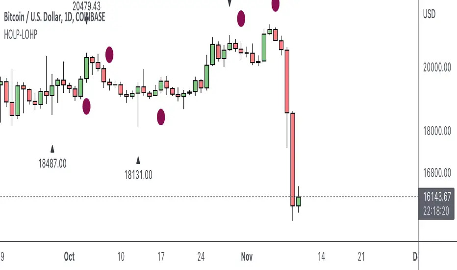
HOLP LOHP PivotCOINBASE:BTCUSD
HOLP and LOHP based on John Carter's Mastering the Trade.
HOLP stands for High Of the Low Period
LOHP stands for Low Of the High Period
This indicator is based on John Carter’s HOLP and LOHP from Mastering the Trade. The basic idea is to identify the session high and mark the low of the session high for a short entry, and vice versa for a long entry.
The default look back period is set to 10 here, albeit John Carter didn’t specify a hard coded number but rather the use of experience and common sense.
Option to turn on labels of the highs and lows of the pivots.
Multi-Timeframe 10XIMPORTANT NOTE:
-> The timeframe for this indicator must be set at 1 minute;
-> If the chart timeframe is higher than 1 minute, the results shown in the table for timeframes lower than the chart will not be correct;
-> Tradingview's own documentation explains this as follows: " It is not recommended to request data of a timeframe lower that the current chart timeframe, for example 1 minute data from a 5 minutes chart. The main problem with such a case is that some part of a 1 minute data will be inevitably lost, as it’s impossible to display it on a 5 minutes chart and not to break the time axis. In such cases the behavior of security can be rather unexpected "; and
-> It is therefore recommended that this indicator is placed in a standalone 1min chart window, and the window resized to only show the table to avoid any issues.
Credits:
-> J. Welles Wilder creating the Directional Movement System (DMS) (1978); and
-> John Carter applying the DMS to create the popular Simpler Trading 10X Bars indicator.
Introduction:
Quickly see the quality and strength of a trend based on Directional Movement Index (DMI).
The Average Directional Index (ADX), Minus Directional Indicator (-DI) and Plus Directional Indicator (+DI) represent a group of directional movement indicators that form a trading system developed by Welles Wilder. Although Wilder designed his Directional Movement System with commodities and daily prices in mind, these indicators can also be applied to stocks. Wilder determined directional movement by comparing the difference between two consecutive lows with the difference between their respective highs.
+DI and -DI are derived from smoothed averages of these differences and measure trend direction over time. These two indicators are often collectively referred to as the DMI. ADX is in turn derived from the smoothed averages of the difference between +DI and -DI; it measures the strength of the trend (regardless of direction) over time.
Trade Signals:
-> Green indicates an uptrend i.e. when +DI is above -DI and ADX is greater than 20 - there is more upward pressure than downward pressure in the price;
-> Red indicates a downtrend i.e. when -DI is above +DI and ADX is greater than 20 - there is more downward pressure on the price; and
-> Yellow indicates no strong directional trend and potential for a reversal.
Standalone Indicator:
The 10X Bars version of the indicator can be found here:

Trading Made Easy ATR BandsAs always, this is not financial advice and use at your own risk. Trading is risky and can cost you significant sums of money if you are not careful. Make sure you always have a proper entry and exit plan that includes defining your risk before you enter a trade.
Background:
This is my take on two relatively famous indicators that paint the colour of your candles in order to help identify trend direction and smooth out market noise. The Elder Impulse System was designed by Dr . Alexander Elder in his book Come Into My Trading Room and attempts to identify the change of trends and when these trends speed up and slow down (school.stockcharts.com). The system used a 13 period EMA and a MACD histogram, and compared each of these indicators to the previous period. In short, when both the histogram and the EMA were rising, the trend was accelerating to the upside and when both were falling, accelerating to the downside. Conversely, when the indicators were not in alignment, say the MACD falling but the EMA rising, it signaled a slowing down of momentum. The downside of this indicator is that it be can rather jumpy, focusing on a short period EMA for 50% of its calculation, leaving a trader to potentially sit on the sidelines during opportune pull backs to enter winning positions, or exit early when there is still a lot of gas left in the tank.
A similar concept has been employed by John Carter and his organization, SimplerTrading, with the 10X bars indicator. However, here they use the famous Directional Movement Index (DMI) created by J. Welles Wilder as the basis for their bars (www.simplertrading.com). John Carter states that the use of this indicator can lead to getting in earlier on more, bigger, and faster setups. The downside of this indicator is the reliance on the ADX calculations to keep you out of rangebound trades. Anyone who is familiar with the DMI system understands it has unparalleled ability to identify longer term trends, but it is also quite slow, leaving the trader to miss a good portion of the initial runup due to this ADX portion that is very slow to get moving and also slow to signal exits.
In short, both of these systems are designed with one thing in mind: keeping the trader on the right side of the move --- but both suffer from the same issue but on opposite sides of the spectrum. One is too fast and the other is too slow. Ultimately, leaving profits on the table for the trader when such a situation could be avoided.
Here I present my own take on these and have made the “Trading Made Easy ATR Bands”. I name it this because trading is much easier when you trade with the prevailing trend, and this system identifies these periods quite effectively while doing a better job of handling the speed flux of most markets. The base formula uses the DMI as its main calculation and the relationship between the DMI+ and DMI- lines, respectively, like the 10X bars. While the trader can investigate these on their own to understand these more intimately, essentially the DMI+ and DMI- lines are calculating the highs and lows respectively of each bar compared to a period in the past and smoothed with the true range, a measurement of volatility . What this ultimately presents is a picture of uptrends and downtrends, where price is making consistently more highs or more lows over a period of time. Where I have modified this relative to the 10X bars is I have ignored the ADX calculations. Further, values over 25 have been discussed as “strong” momentum, in my calculations, I have sped this up to 20 to get a trader into the move earlier. Second, I have added an additional calculation based around the 21-period exponential moving average calculated against its previous output. This then, like the Elder Impulse System, has two forms of market momentum as its calculation to smooth out noise, but has the benefit of being less jumpy, like the original 10X bar system. I have added a series of exponential moving averages following the Fibonacci sequence from 8-144 as a system of dynamic support and resistance showing the sentiment of both the shorter and longer term market participants. Last, I have added a series of Keltner Channels , from 1X-4X, that encompass the 21 period EMA as a base line. The 21 EMA is a stable in all of John Carter’s work and I do believe he is correct that the market is mostly structured around this line, since it roughly approximates one month of trading data. It is not uncommon to see price expand and contract back to this line over and over again.
Trade Signals:
Strong Bullish Momentum – The system will generate a green bar when the DMI+ line is over the DMI- line, the DMI+ line is equal or greater than 20 and the 21 EMA has increased relative to its last close.
Weak Bullish Momentum – The system will generate a blue bar in several scenarios. First, when the DMI+ line is over the DMI- line but the DMI+ line is not over 20 and the EMA is equal or less than the previous close. It will also print a blue bar if either the DMI or the EMA are not aligned, such as the DMI+ is over the DMI- but not over 20 but the EMA has risen compared to the last bar. Last, it will also print a blue bar if the DMI- is over the DMI+ but the EMA is rising.
Strong Bearish Momentum – The system will generate a red bar when the DMI- line is over the DMI+ line, the DMI- line is equal or greater than 20, and the 21 EMA has fallen relative to its last close.
Weak Bearish Momentum – The system will generate an orange bar in several scenarios. First when the DMI- line is over the DMI+ line but the DMI- line is not over 20 and the EMA is equal or greater than the last bar. It will also print an orange bar if either the DMI or the EMA are not aligned, such as the DMI- is over the DMI+ but not over 20 but the EMA has fallen. Lastly, it will also print an orange bar if the DMI+ line is over the DMI- and the EMA has fallen relative to the last bar.
Uses:
1) Like the Elder Impulse System and 10X Bar systems, these should be used as trade filters only.. It is in the trader’s best interest to trade with the trends and these bars identify these periods but may not always generate the most opportune time to enter a market. For instance, trying to short a market when the market is in a phase of Strong Bullish Momentum would not be wise, and vice versa with trying to open long positions when the market is exhibiting Strong Bearish Momentum. Use multiple forms of evidence to confirm the signals shown before entering any trade and to not take these signals on their without confluence of ideas. A viable system could use the Elder Triple Screen System (for reference, see this decent write up --- www.dailyforex.com) with the Trading Made Easy Bands as your “Tide” or longer term filter, and a further trading plan to establish an entry on a short time frame pull back.
2) Interim Trend Exhaustion – Keltner channels work as moving standard deviations from the 21 EMA . 3X multipliers will encompass 99.7% of price and 4X will encompass 99.9% of price away from the 21 EMA . During a trend it would be a good idea to lock in partial profits when price reaches these outer extrema as it is very highly probable that a retracement back to the mean is approaching. While not part of the system, and not recommended to be used by this system, a mean reversion trader could in theory look for reversals at these extrema points and trade a mean reversion strategy back to the 21EMA, but is a much riskier trade with lower probability of success. A trend trader should look to enter trades when a signal is given within the 1ATR or 2ATR zone as this is when price has not really started accelerating yet and is likely to see continued momentum in that direction.

TrendStrength Turbo Bars - Directional TrendsMy interpretation of Danielle Shay's popular SimplerTrading TrendStrength Turbo indicator.
The TrendStrength indicator is based on a Fibonacci-based stacked EMA arrangement using the 5, 8, 13, 21 and 34 EMAs:
-> Green bars indicate an uptrend i.e. when the EMAs are positively stacked - there is more upward pressure than downward pressure in the price;
-> Red bars indicate a downtrend i.e. i.e. when the EMAs are negatively stacked - there is more downward pressure on the price; and
-> Yellow bars indicate no strong directional trend and potential for a reversal.
Volume spikes 50% above average volume are then flagged as dots at the bottom of the chart further confirming price momentum.
This indicator should compliment other popular indicators, as confirmation whether to stay in a position or not.
10X Market DirectionMy interpretation of John Carter's popular Simpler Trading 10X Bars indicator. Now you can see directional market strength for a variety of key futures , indices and industry groups for quick comparison with individual stocks.
Momentum is displayed to quickly see the quality and strength of a trend based on a calculation of the Directional Movement Index (DMI). The DMI is an indicator developed by J. Welles Wilder in 1978 that identifies in which direction the price of an asset is moving. The DMI is calculated by comparing prior highs and lows and produces 2 measurements illustrating the strength of the current trend:
-> a positive directional movement line ( +DI ); and
-> a negative directional movement line ( -DI ).
The average directional index ( ADX ) measures the strength of the current trend, either +DI or +DI ; a reading above 20 typically indicates a strong trend.
-> Green bars indicate an uptrend i.e. when +DI is above -DI and ADX is greater than 20 - there is more upward pressure than downward pressure in the price;
-> Red bars indicate a downtrend i.e. when -DI is above +DI and ADX is greater than 20 - there is more downward pressure on the price; and
-> Yellow bars indicate no strong directional trend and potential for a reversal.
This indicator should compliment other popular indicators, as confirmation whether to stay in a position or not.

10X Bars - Directional TrendsMy interpretation of John Carter's popular Simpler Trading 10X Bars indicator.
Momentum is displayed to quickly see the quality and strength of a trend based on a calculation of the Directional Movement Index (DMI). The DMI is an indicator developed by J. Welles Wilder in 1978 that identifies in which direction the price of an asset is moving. The DMI is calculated by comparing prior highs and lows and produces 2 measurements illustrating the strength of the current trend:
-> a positive directional movement line (+DI); and
-> a negative directional movement line (-DI).
The average directional index (ADX) measures the strength of the current trend, either +DI or +DI; a reading above 20 typically indicates a strong trend.
-> Green bars indicate an uptrend i.e. when +DI is above -DI and ADX is greater than 20 - there is more upward pressure than downward pressure in the price;
-> Red bars indicate a downtrend i.e. when -DI is above +DI and ADX is greater than 20 - there is more downward pressure on the price; and
-> Yellow bars indicate no strong directional trend and potential for a reversal.
Volume spikes 50% above average volume are then flagged as dots at the bottom of the chart (although you can change this location), confirming the momentum further.
This indicator should compliment other popular indicators, as confirmation whether to stay in a position or not.
HOLP/LOHPThe HOLP strategy was developed by trader-author John F. Carter in his book 'Mastering the trade: proven techniques for profiting from intraday and swing trading set ups' (ISBN 0-07-145958-8). The strategy, which gives buy signals, is a reversal strategy. Reversal strategies try to determine the point in time when a trend reverses direction. In his book John F. Carter is actually skeptical of taking a position against the trend, quoting classics like "never catch a falling knife" (buy a steep sell off) and "never step in front of a train" (short sell a strong market). Given his skepticism he decides to base his strategy on the one single factor which he deems relevant: the market price.

John Carter's Buy/Sell Scalper V2After a couple adjustments, double signals are now being ignore.
Here's how this script works:
Based entirely on a John Carter scalping setup, a candle will be painted purple if the next two closes are in a opposite direction of the past trend.
Green triangles indicates that the reversal is bullish, red triangles indicates that the reversal is bearish. Both are entry/exit points if you want to follow this set up.
Personally, I find this setup to work best in trending days, but it does a great job on choppy days if you use it as a confirmation.
John Carter's Buy/Sell Scalper (with alert)Basic indicator with signals. Con: Presents multiple signals in the same direction (should be ignored, according with the strategy).

Simpler Trading SqueezeWhen the Bollinger Bands cross inside the Keltner Channels this indicates a quiet period in the market AKA “it’s in a squeeze” and when the “squeeze fires” this means the Bollinger Bands have crossed outside of the Keltner Channels and price is moving.
The oscillator is a momentum indicator identifying which direction the squeeze has fired. If a squeeze “loses momentum” that means the move is over.
Again, the indicators that embody the Squeeze is available for free on all trading platforms, BUT if you don’t want to go cross eyed looking at all the squiggle lines and want an easy to use visual representation then pick up the Squeeze for your trading platform today.
