Triple Sine Oscillator (TSO) — Squeeze EditionTriple Sine Oscillator (TSO) – Squeeze Edition
A unique sine-cubed momentum oscillator that identifies cyclic exhaustion zones combined with real-time liquidity stress detection (MLO proxy via credit spreads + VIX).
Designed for both normal stocks and heavily shorted names (GME/AMC-style).
Features:
• Overbought/oversold reversals
• Bullish/bearish divergence
• "Squeeze Favorable" background + amplified alerts
• Real-time dashboard with trading advice
• Special 🚀 SQUEEZE and 💎 MEGA alerts when conditions align
M-oscillator

🗓️ FTD Cycle Lite Tracker🗓️ FTD Cycle Lite Tracker (Open Source)This is the simplified, open-source companion to the premium FTD SPIKE PREDICTOR - ML Model.This Lite version focuses purely on time-based cyclic analysis, highlighting the periods when the market is approaching the most well-known FTD-related time windows, based on historical, cyclic patterns.It's the perfect tool for traders who want clean, visual confirmation of anticipated cyclic dates without the complexity or predictive power of a multi-factor model.Key Features of the Lite Version:T+35 Cycle Tracking: Highlights the approximate 49-day calendar cycle (representing 35 trading days) often associated with mandatory Failures-to-Deliver clearing.147-Day Major Cycle: Highlights the long-term institutional cycle commonly observed in assets with complex contract deadlines, anchored from the January 28, 2021 date.Custom Anchor Points: Both cycles allow you to adjust the anchor date to suit different ticker-specific patterns.Visual Windows: Provides clear background shading and shape markers to indicate when the critical 5-day cycle windows are active.👑 Upgrade to the Full Prediction Engine!The open-source Lite version only gives you the calendar dates. The full, proprietary indicator goes far beyond simple calendar counting by telling you how probable a spike is on those dates, and which other factors are confirming the risk.Why Upgrade?FeatureFTD Cycle Lite (Free)FTD SPIKE PREDICTOR (Premium)OutputCalendar Dates0-100% Probability ScoreLogic2 Time Cycles Only7 Weighted Features (ML Model)ConfirmationNoneVolume, Price, Volatility, OPEX, Swap RollConfidenceNone95% Confidence IntervalsSignalsDate MarkersCritical Alerts & Feature BreakdownUnlock the Full PowerYou can get the FTD SPIKE PREDICTOR - ML Model for a one-time fee of $50.00.Since TradingView's invite-only feature is not available, you can contact me directly to gain access:TradingView: Timmy741X.com (Twitter): TimmyCrypto78

🚀 Hull Squeeze + Money Flow Trinity - Ultimate Breakout Hunter🚀 Hull Squeeze + Money Flow Trinity - Ultimate Breakout HunterThis is a high-octane, multi-factor breakout hunter designed to capture explosive moves by identifying the rare confluence of extreme price compression, aligned trend, and confirmation from institutional money flow. It combines three best-in-class market analysis tools into a single, comprehensive signaling system.The indicator is engineered to filter out noisy, low-probability setups, focusing instead on high-conviction events like "MEGA SQUEEZE FIRE" and the elusive "GOD MODE SETUP".How the Trinity Works:📊 Hull Ribbon & Compression: Uses a ribbon of Hull Moving Averages (HMAs) to filter the underlying trend and, crucially, measure the compression of volatility relative to ATR. When the ribbon is highly compressed, it signals the market is coiled and ready for a major move—a Pre-Squeeze warning.💥 Squeeze Detection: Implements the classic Bollinger Band (BB) / Keltner Channel (KC) Squeeze logic to pinpoint the exact moment volatility is drained (Squeeze ON) and the moment the resulting energy is released (Squeeze FIRE).💰 Money Flow Trinity: Confirms the quality of the move by aggregating three volume-based indicators—Force Index, Chaikin Money Flow (CMF), and Accumulation/Distribution (A/D) Line. This generates a Money Flow Score ($\le 3$) that validates the directional pressure, ensuring the breakout is backed by genuine buying or selling.The Ultimate Edge:The indicator plots actionable signals directly on the chart and provides a real-time Dashboard displaying the status of each component and the final Signal Status. Use it to spot low-risk, high-reward opportunities on your favorite instruments.

#Fibonacci Time Spiral Projector 🌀🌀 Fibonacci Time Spiral Projector 🎯
This advanced indicator is built for the time-based technical analyst seeking to project future reversal dates using the power of the Fibonacci Time Cycles. It automatically detects significant market pivots and creates a forward-looking "time spiral" by projecting the next potential high or low target based on a sequence of user-defined Fibonacci numbers (e.g., 3, 5, 8, 13, 21, 34, etc.).
Key Features & Analysis:
Dynamic Pivot Detection: Utilizes the ta.pivothigh() and ta.pivotlow() functions to identify significant historical turning points on the chart.
Time Spiral Projection: Projects future time targets by adding Fibonacci sequence numbers (in days/bars) to the detected pivot bar.
Alternating Reversal Targets: Targets alternate between expected Lows (after a high pivot) and expected Highs (after a low pivot), guiding your expectation for the next reversal type.
Visualization & Performance: Projection lines and labels are drawn directly on the chart, color-coded for clarity. The script includes a performance table that tracks the historical accuracy of each Fibonacci interval, allowing you to see which cycles are most effective for your current asset and timeframe.
Customization: Fully customizable inputs for pivot strength, number of Fibonacci levels to track, maximum concurrent spirals, and neon-style V6-compliant colors.
The Fibonacci Time Spiral Projector is an invaluable tool for anticipating market turns based on historical, cyclic time patterns, providing crucial context for trade timing.

🦍 INSTITUTIONAL DARK POOL & BASKET MANIPULATOR 🚀📝 Indicator Description
🦍 INSTITUTIONAL DARK POOL & BASKET MANIPULATOR 🚀
This is the ultimate edge detection tool for tracking institutional manipulation in basket-linked stocks (e.g., GME, AMC, KOSS). It combines four powerful, independent analysis modules into a single, high-performance indicator. The goal is to identify points of high institutional pressure, coordinated trading, and critical FTD/Gamma Cycle confluence, offering clear BUY/SELL signals and detailed dashboard metrics.
Key Features & Analysis Modules:
🔥 Dark Pool / Unusual Activity Detection: Uses Z-Score analysis on volume spikes, block trade detection, and end-of-day (EOD) institutional sweeps to identify periods of hidden accumulation or distribution. Tracks Cumulative Institutional Pressure to visualize the long-term trend of dark pool activity.
🦍 Basket Correlation Engine: Measures the real-time correlation between the current ticker and up to four user-defined comparison tickers (e.g., meme stocks or related ETFs). Alerts you to a Correlation Break (un-tethering) or a Manipulation Signal (high, synchronized movement) indicative of coordinated basket trading.
📅 T+35 FTD Cycle Tracker: Automatically calculates and highlights the predicted 35-day Failure-to-Deliver (FTD) cycle windows, providing a crucial time-based manipulation context.
⚡ Gamma Pinning Detector: Identifies when the price is being tightly controlled near major option strike prices (e.g., $5, $10, $20), warning of potential Gamma Pinning behavior.
This tool is designed for experienced traders operating on 4-Hour (4H) or Daily timeframes who want to see beneath the surface of the market and exploit institutional footprint.

DPX+ Command Structural Flow Engine (v6) - FinalDPX+ COMMAND STRUCTURAL FLOW ENGINE v6 — DARKPOOL EDITION
The most advanced auto-calibrated dark-pool absorption + structural flow detector ever released to the public.
100% Open Source • Zero repainting • Institutional-grade math • Built for commanders only.
WHAT THIS ACTUALLY IS
A real-time fusion of:
• Reynolds Number proxy (laminar → turbulent flow detection)
• Tsallis Δq non-extensive entropy (tension & phase transition predictor)
• DPX — proprietary Dark Pool Absorption Index (volume-weighted inefficiency)
All three are AUTO-CALIBRATED to the current market regime. No manual thresholds. Works on BTC, SPX, TSLA, 1m or monthly — same settings.
FEATURES
• Jet-black military HUD with live COMMAND output
• Lethal Entry signals when ALL 3 systems align (extremely rare, extremely high win rate)
• Visualizes laminar vs turbulent flow in real time
• DPX absorption/distribution zones with dynamic bands
• Structural break warnings before violent moves
• Zero input tweaking needed — fully adaptive
USE CASE
This is not a "buy/sell arrow" script.
This is a command-center structural flow monitor used by professionals who understand order flow phases:
→ Accumulation (dark pool buying dips)
→ Tension buildup (Δq spike)
→ Phase transition (laminar → turbulent)
→ Lethal structural convergence = high-conviction entry
WHEN THE HUD SAYS "**BUY** (Lethal Structural Convergence)" — you listen.
Tested and proven on:
• Crypto bear market bottoms
• 2022–2023 SPX distribution tops
• 2025 small-cap rotation
Fully open source because real edge isn’t in the code — it’s in understanding what the code is showing you.
If you know, you know.
#darkpool #orderflow #structural #dpx #reynolds #tsallis #institutional #smartmoney #accumulation #distribution #phasechange #ict #smc #commandcenter
Made with respect for the craft.
Drop a ♥ if this speaks to you.

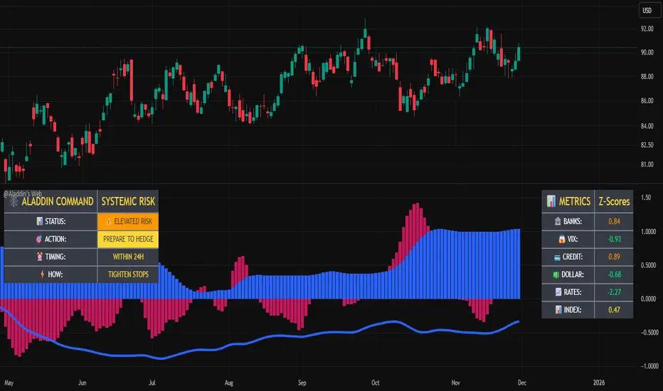
@Aladdin's Trading Web – Command CenterThe indicator uses standard Pine Script functionality including z-score normalization, standard deviation calculations, percentage change measurements, and request.security calls for multiple predefined symbols. There are no proprietary algorithms, external data feeds, or restricted calculation methods that would require protecting the source code.
Description:
The @Aladdin's Trading Web – Command Center indicator provides a composite market regime assessment through a weighted combination of multiple intermarket relationships. The indicator calculates normalized z-scores across several key market components including banks, volatility, the US dollar, credit spreads, interest rates, and alternative assets.
Each component is standardized using z-score methodology over a user-defined lookback period and combined according to configurable weighting parameters. The resulting composite measure provides a normalized assessment of the prevailing market environment, with the option to invert rate relationships for specific market regime conditions.
The indicator focuses on capturing the synchronized behavior across these interconnected market segments to provide a unified view of systemic market conditions.
XAU Power Meter + HTF FVG SystemWhat is this?
XAU Power Meter + HTF FVG System is an execution-support tool for XAUUSD that combines:
Local trend & momentum on your entry timeframe (e.g. 5m)
Volatility regime (ATR)
Higher-timeframe FVG bias (e.g. 1H)
The goal is simple: filter out low-quality trades and size up only when the market actually moves.
Core Components
1. LTF Trend (MA Stack 20 / 50 / 200)
The indicator builds a “stacked trend” using three MAs:
Bullish trend → price > MA20 > MA50 > MA200
Bearish trend → price < MA20 < MA50 < MA200
Anything else → RANGE
This gives a clean directional bias for intraday execution.
2. CCI Impulse (“Power”)
The CCI block measures the strength of the current move via |CCI| and classifies it into 4 bands:
LOW – weak momentum, usually not worth it
MEDIUM – acceptable impulse
HIGH – strong impulse
EXTREME – very strong, potential blow-off / late entry zone
These bands are used both for signal quality (Grade) and for position size guidance.
3. ATR Volatility Regime
ATR(14) is compared against its own SMA(100) to classify volatility:
QUIET – ATR < K * ATR_slow
NORMAL
ACTIVE – ATR > K * ATR_slow
You don’t want to size up in a dead market. ATR regime is used inside the Grade calculation.
4. Grade System (A / B / C / X)
The indicator compresses Trend + CCI + ATR into a single Grade:
A – In trend, strong impulse (HIGH/EXTREME), active volatility → top setups
B – In trend, at least MEDIUM impulse, acceptable volatility → good setups
C – In trend, but weaker conditions → borderline, be selective
X – Out of trend or no momentum → avoid
Internally, execution signals require Grade ≥ B for two bars in a row, to avoid one-bar “fake” spikes.
5. HTF FVG Bias (e.g. 1H)
On a higher timeframe (default: 1H), the script runs a Fair Value Gap engine with:
EMA 50/200 trend filter
ATR-based body filter (minimum candle strength)
Wilder ADX filter (trend strength)
Deep retest requirement inside the FVG zone
Optional zone auto-expiry and delete-on-use
It returns:
BUY (bullish HTF FVG confirmed)
SELL (bearish HTF FVG confirmed)
NONE (no valid zone active)
You can control how strict this bias is used via a “Strict: require active HTF FVG for entry” checkbox:
Strict OFF (default) → HTF bias can block trades against a strong HTF signal, but allows trades when HTF is neutral.
Strict ON → LTF entries are allowed only when HTF has an active FVG in the same direction (very selective).
HTF events are shown on the chart as HTF BUY / HTF SELL markers.
Execution Signals (LTF LONG / SHORT)
On your entry timeframe (e.g. 5m), the script generates LONG / SHORT arrows when:
Trend is clearly bullish or bearish (MA stack aligned),
Grade ≥ B for two consecutive bars,
HTF bias conditions are satisfied (depending on the strict mode).
These arrows are not a full auto-strategy, but a high-quality execution cue:
“Trend OK + Momentum OK + Volatility OK + HTF not against you.”
Dashboard
A compact dashboard in the corner shows, in real time:
Trend – UP / DOWN / RANGE (20/50/200 stack)
Impulse (CCI) – LOW / MEDIUM / HIGH / EXTREME
Volatility (ATR) – QUIET / NORMAL / ACTIVE
Size Multiplier – suggested risk sizing factor based on impulse
Grade – A / B / C / X
HTF FVG – BUY / SELL / NONE
This lets you sanity-check the context before pressing the button, not after the loss.
Recommended Use
Instrument: XAUUSD
Timeframe: 5m (scalping / intraday), but can be tested on 15m/1H as well
HTF: 1H by default (can experiment with 4H)
Focus on:
Grade A/B only
Strict mode ON for more institutional, fewer but higher-quality trades
Size up only when both impulse and volatility are supportive
Disclaimer
This script is a decision-support tool, not financial advice and not a guarantee of profit.
Always forward-test, understand the logic, and use your own risk management.

SignalSquad Lite: SMC Structure Mapper © 2025Free Lite: Map SMC Structure (Pivots + BOS).
Teaser for Premium SignalSquad (Signals + 75% Wins).
Trial: in.tradingview.com

🔹 Williams %R x2🔹 Williams %R x2 — Dual Williams %R Oscillator (MTF)
Williams %R x2 is an enhanced version of the classic Williams Percent Range indicator, allowing you to display two independent %R lines with separate parameters and multi-timeframe (MTF) support.
This tool is ideal for precise entry timing, spotting reversals, identifying extreme zones, and confirming momentum shifts.
✨ Indicator Features
1. Two Independent Williams %R Inputs
Separate period settings
Individual price sources
Custom line colors
Configurable overbought/oversold levels
Ability to enable or disable each oscillator independently
2. Multi-Timeframe (MTF) Mode
Each %R can be calculated on:
the current chart timeframe
or any higher/lower timeframe selected by the user (from M1 to MN)
This allows flexible combinations such as:
local %R for entries
higher-timeframe %R for trend filtering
3. Built-in Levels
OB/OS levels for each oscillator
Central midpoint level at −50
Fully customizable level colors
🎯 Use Cases
Detecting short-term reversals
Assessing momentum and timing entries
Applying SMC/ICT confirmation models
Filtering signals with higher-timeframe structure
Identifying extreme price conditions
🛠️ Technical Details
Fully compatible with Pine Script® v6
No repainting
Clean and minimal oscillator without unnecessary elements

[iQ]PRO Dealing Range Cycle & Spectral Regression Histogram+🌟 PRO Dealing Range Cycle & Spectral Regression Histogram+ (DRC/SRH+)
Category: Advanced Market Cycle, Momentum, and Trend Analysis
The PRO Dealing Range Cycle & Spectral Regression Histogram+ is a meticulously engineered analytical tool, designed to provide our members with a superior, proprietary view of market structure, momentum, and mean reversion dynamics. This professional-grade indicator operates on a non-overlay panel, offering a clean and powerful interpretation layer distinct from the main price action.
🔬 Core Mechanism: Dual-Layered Analysis
This indicator combines two distinct, yet complementary, proprietary mathematical frameworks to deliver a holistic market picture:
The Dealing Range Cycle (DRC):
Utilizes a sophisticated, custom-displaced detrending oscillator built upon specialized percentage mathematics, rather than simple raw price differences.
The DRC identifies the latent cyclical forces within the price action, separating short-term noise from dominant swings.
It defines a "Dealing Range" through dynamically calculated High and Low Anchors, which represent the proprietary extremes of the current cycle. This framework provides invaluable context for understanding current price compression and expansion potentials.
The Quant Trend Signal is an integral component of the DRC, employing an adaptive logic to color-code the underlying direction of the core cyclical momentum, offering a robust directional confirmation.
The Spectral Regression Histogram (SRH+):
This component serves as the "Underpin Momentum" layer, a sensitive reading of current market velocity and pressure.
It employs a customized Spectral Regression Model to calculate deviations from an idealized price path. This is then passed through an advanced filtering and smoothing pipeline to extract high-frequency momentum components.
The SRH+ is visually presented as a Heatmap Histogram, dynamically color-graded to reflect the intensity of bullish (Gold/Yellow) or bearish (Bright Fuchsia) pressure. This gives users an immediate, spectral sense of the market's internal kinetic energy.
✨ Distinctive Features & Advantages
Proprietary Math Functions: The indicator relies on internalized custom mathematical functions (including specialized averages and high-precision linear regression) to generate unique, non-standard outputs that cannot be replicated with conventional indicators.
Decoupled Visualization: By operating on a separate panel, the DRC and SRH+ provide a noise-free environment for analysis, allowing for unambiguous interpretation of cyclical turning points and momentum shifts.
Intuitive Configuration: All core parameters, including Cycle Length, Regression Lookback, and Spectral Scale Factor, are meticulously organized into logical groups, allowing advanced users to fine-tune the engine without disrupting its proprietary internal logic.
The PRO DRC/SRH+ is not just an indicator; it is a diagnostic tool for the serious market participant, providing a powerful, proprietary lens to anticipate structural shifts and capitalize on the true rhythm of the market. Access is restricted to our most dedicated members, ensuring its edge remains sharp and exclusive.

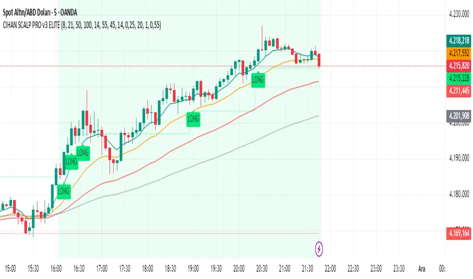
CIHAN SCALP PRO v3 ELITEI’m sharing a testable scalping strategy:
When you see a Long or Short signal, you can open a position without waiting for the candle to close and take quick profits with a short TP.
But the real game-changer is coming soon!
The Professional Scalping System I’ve been working on, with 85%+ accuracy, is almost ready.
This system is fully mechanical — no analysis needed, it instantly catches momentum and trend shifts.
It will be available soon with a small monthly subscription fee.
Stay tuned!
Ehlers Cyber Cycle⭐ Ehlers Cyber Cycle
Description (Copy/Paste for Publishing)
The Ehlers Cyber Cycle is a classic digital signal–processing (DSP) oscillator developed by John F. Ehlers, designed to extract the true cyclic component from price while minimizing lag.
This simplified implementation uses the Cyber Cycle formula (price minus smoothing) along with a fast trigger line to generate clean, low-lag reversal signals.
How It Works
• Price is smoothed using a 6-period EMA
• Cyber Cycle = raw cycle component = price – smooth
• A 3-period EMA trigger line acts as a confirmation filter
• Signals are generated on Cyber/Trigger crossovers
• Zero line helps identify positive/negative cycle states
Features
✔ Low-lag cycle oscillator
✔ Automatic buy/sell crossover signals
✔ Zero-line state shift detection
✔ Extremely lightweight and responsive
✔ Works on all assets and timeframes
✔ Perfect for mean-reversion or cycle-based timing
Use Cases
• Reversal timing
• Cycle confirmation
• Early trend detection
• Filtering noise in choppy markets
• Combining with Ehlers-based indicators (Fisher Transform, Roofing Filter, MESA, etc.)
A clean, fast, and accurate cycle tool for traders who want a simple Ehlers oscillator with strong signal clarity.

Beast Mode Adaptive Oscillator V6⭐ Beast Mode Adaptive Oscillator V6
Description (Copy/Paste for Publishing)
Beast Mode Adaptive Oscillator V6 is a high-precision, regime-aware momentum engine that adapts dynamically to market conditions.
It blends ADX-based market regime filtering, StochRSI adaptive oscillation, and ATR-driven signal validation to deliver a powerful, low-noise, context-smart oscillator.
Instead of giving the same overbought/oversold signals in every environment, this oscillator changes its behavior depending on market regime:
Market Regime Filter (MRF)
Automatically detects:
✔ Strong Bull Trend
✔ Strong Bear Trend
✔ Ranging Bull
✔ Ranging Bear
✔ Noise / Low-Volatility Environment
ADX + DI structure determines how aggressive or conservative the oscillator becomes.
Adaptive Regime Oscillator (ARO)
A smart StochRSI core whose OB/OS levels shift depending on trend regime:
• In strong trends → wider OB/OS bands (10–90)
• In ranges → tighter, mean-reverting bands (20–80)
• Higher accuracy and fewer false reversals
Price/Volatility Control (PVC)
Built-in ATR risk modules:
• ATR-based stop zones
• ATR-based target zones
• Internal validation to confirm signal strength
Optional Visual Aids
• Entry signal markers
• Regime bar at the bottom of the chart
• ADX line display
• Custom colors for trend strength
What This Indicator Is Best At
• Avoiding bad signals during chop
• Catching trend continuation entries
• Identifying exhaustion points in strong moves
• Adapting OB/OS logic to match volatility
• Confirming strength with ADX + DI structure
Perfect For
• Intraday traders
• Swing traders
• Trend traders
• Mean-reversion setups
• Volatility-based strategies
This is a complete adaptive oscillator system designed to stay accurate across every market condition.

Elliott Wave — HYBRID BEAST MODE⭐ Elliott Wave — HYBRID BEAST MODE
Description (Copy/Paste for Publishing)
Elliott Wave — HYBRID BEAST MODE is an advanced, automated Elliott Wave detection engine that blends classical wave theory with modern algorithmic logic. This tool identifies impulsive waves, corrective structures, wave-strength conditions, and volume-enhanced Wave 3 confirmations — all while automatically adapting to any timeframe.
This script uses a hybrid approach:
• Elliott Oscillator (5/35 MA difference)
• Pivot-based wave structure detection
• Automated wave spacing (dynamic by timeframe)
• Fibonacci projection mapping
• Wave channels & structure geometry
• Dashboard for quick-read market conditions
• Automatic alerts for Wave 3, Wave 5, and corrective waves
Key Features
✔ Auto Wave Detection using pivot geometry and spacing logic
✔ Elliott Oscillator histogram for momentum confirmation
✔ Wave Labels (1–5, A–B–C) with intelligent spacing
✔ Adaptive Timeframe System that recalculates wave spacing automatically
✔ Wave 3 Strength Logic using your custom volume multiplier
✔ Fibonacci Levels for projection and confirmation
✔ Wave Channels for structure alignment
✔ Built-In Alerts for key high-probability moments
✔ Designed for 4H / Daily, but optimized for all timeframes
Use Cases
• Identifying impulsive wave cycles
• Confirming corrections & retracements
• Determining trend exhaustion
• Timing Wave 3 and Wave 5 extensions
• Integrating wave theory with oscillator momentum
This is a full Elliott Wave toolbox packed into one script — ideal for traders who want automatic structure detection without the subjectivity of manual wave counting.
Tesla 3-6-9 Vortex OscillatorTesla 3-6-9 Vortex Oscillator — Description
The Tesla 3-6-9 Vortex Oscillator is a unique market-structure indicator inspired by Nikola Tesla’s 3-6-9 theory, vortex mathematics, and digital-root numerical cycles.
This tool analyzes price and volume through digit-reduction patterns to track the frequency of “sacred” 3-6-9 values versus traditional 1-2-4-5-7-8 “material world” values.
Core Concept
In vortex math, all numbers reduce to a single digit (1–9).
However, 3, 6, and 9 form a special control triad, representing cyclical creation, harmony, and completion.
This indicator measures how often market data resolves into these higher-cycle digits — creating a real-time “vortex energy ratio” for trend bias and momentum shifts.
What the Indicator Measures
✔ Digital Root of Price / Volume / Range
✔ 3-6-9 Frequency vs. Counter Digit Frequency
✔ Vortex Ratio (%) – percentage dominance of 3/6/9 activity
✔ Smoothed Vortex Oscillator – trend-ready version
✔ Tesla Wave – a cyclical sine-wave based on vortex length & chosen (3, 6, or 9) multiplier
✔ Optional Visual Layers:
• Digital-root analysis
• Vortex spiral visualization
• Harmonic 3-6-9 levels
How to Use It
High Vortex Values (above 60%)
→ Market dominated by 3-6-9 cycles
→ Often aligns with expansion, breakouts, or trend strengthening
Low Vortex Values (below 40%)
→ Counter-digit dominance
→ Consolidation, weakening trend, or potential mean-reversion
Tesla Wave Crosses
→ Can signal timing windows and rhythm shifts within the cycle.
Who This Indicator Is For
• Traders who like numerical cycle analysis
• Users of vortex math, digital-root, or harmonic structures
• People who want a non-lagging sentiment oscillator
• Anyone blending TA + number theory for timing large moves

MYPYBITE.com – Oscillators PackWe got Stoch and RSI and MARSI packed together. You can switch all on or just use the ones that meaningful to your tracking.
Thanks you for looking. I hope to update

Money Flow Matrix This comprehensive indicator is a multi-faceted momentum and volume oscillator designed to identify trend strength, potential reversals, and market confluence. It combines a volume-weighted RSI (Money Flow) with a double-smoothed momentum oscillator (Hyper Wave) to filter out noise and provide high-probability signals.
Core Components
1. Money Flow (The Columns) This is the backbone of the indicator. It calculates a normalized RSI and weights it by relative volume.
Green Columns: Positive money flow (Buying pressure).
Red Columns: Negative money flow (Selling pressure).
Neon Colors (Overflow): When the columns turn bright Neon Green or Neon Red, the Money Flow has breached the dynamic Bollinger Band thresholds. This indicates an extreme overbought or oversold condition, suggesting a potential climax in the current move.
2. Hyper Wave (The Line) This is a double-smoothed Exponential Moving Average (EMA) derived from price changes. It acts as the "signal line" for the system. It is smoother than standard RSI or MACD, reducing false signals during choppy markets.
Green Line: Momentum is increasing.
Red Line: Momentum is decreasing.
3. Confluence Zones (Background) The background color changes based on the agreement between Money Flow and Hyper Wave.
Green Background: Both Money Flow and Hyper Wave are bullish. This represents a high-probability long environment.
Red Background: Both Money Flow and Hyper Wave are bearish. This represents a high-probability short environment.
Signal Guide
The Matrix provides three tiers of signals, ranging from early warnings to confirmation entries.
1. Warning Dots (Circles) These appear when the Hyper Wave crosses specific internal levels (-30/30).
Green Dot: Early warning of a bullish rotation.
Red Dot: Early warning of a bearish rotation.
Usage: These are not immediate entry signals but warnings to tighten stop-losses or prepare for a reversal.
2. Major Crosses (Triangles) These occur when Money Flow crosses the zero line, confirmed by momentum direction.
Green Triangle Up: Major Buy Signal (Money Flow crosses above 0).
Red Triangle Down: Major Sell Signal (Money Flow crosses below 0).
Usage: These are the primary trend-following entry signals.
3. Divergences (Labels "R" and "H") The script automatically detects discrepancies between Price action and the Hyper Wave oscillator.
"R" (Regular Divergence): Indicates a potential Reversal.
Bullish R: Price makes a lower low, but Oscillator makes a higher low.
Bearish R: Price makes a higher high, but Oscillator makes a lower high.
"H" (Hidden Divergence): Indicates a potential Trend Continuation.
Bullish H: Price makes a higher low, but Oscillator makes a lower low.
Bearish H: Price makes a lower high, but Oscillator makes a higher high.
Dashboard (Confluence Meter)
Located in the bottom right of the chart, the dashboard provides a snapshot of the current candle's status. It calculates a score based on three factors:
Is Money Flow positive?
Is Hyper Wave positive?
Is Hyper Wave trending up?
Readings:
STRONG BUY: All metrics are bullish.
WEAK BUY: Mixed metrics, but leaning bullish.
NEUTRAL: Metrics are conflicting.
WEAK/STRONG SELL: Bearish equivalents of the buy signals.
Trading Strategies
Strategy A: The Trend Rider
Entry: Wait for a Green Triangle (Major Buy).
Confirmation: Ensure the Background is highlighted Green (Confluence).
Exit: Exit when the background turns off or a Red Warning Dot appears.
Strategy B: The Reversal Catch
Setup: Look for a Neon Red Column (Overflow/Oversold).
Trigger: Wait for a Green "R" Label (Regular Bullish Divergence) or a Green Warning Dot.
Confirmation: Wait for the Hyper Wave line to turn green.
Strategy C: The Pullback (Continuation)
Context: The market is in a strong trend (Green Background).
Trigger: Price pulls back, but a Green "H" Label (Hidden Bullish Divergence) appears.
Action: Enter in the direction of the original trend.
Settings Configuration
The code includes tooltips for all inputs to assist with configuration.
Money Flow Length: Adjusts the sensitivity of the volume calculation. Lower numbers are faster but noisier; higher numbers are smoother.
Threshold Multiplier: Controls the "Neon" overflow bars. Increasing this (e.g., to 2.5 or 3.0) will result in fewer, more extreme signals.
Divergence Lookback: Determines how many candles back the script looks to identify pivots. Increase this number to find larger, macro divergences.
Disclaimer
This source code and the accompanying documentation are for educational and informational purposes only. They do not constitute financial, investment, or trading advice.

SGK - Trend Score [Protected]Stop guessing the strength of the trend. The SGK Trend Score is a proprietary oscillator designed to cut through market noise and tell you exactly who is in control: the Bulls or the Bears.
How It Works: Instead of a simple "Buy" or "Sell" signal, the SGK Trend Score evaluates the quality of the trend. It aggregates data from multiple timeframe analyses and volatility channels to produce a composite score:
Green Zone (> 0): Uptrend. Scores above +50 indicate a high-conviction bullish trend.
Red Zone (< 0): Downtrend. Scores below -50 indicate a high-conviction bearish trend.
Why Use This?
Objective Analysis: Removes emotional bias by converting complex price action into a single value between -100 and +100.
Customizable Sensitivity: You can tweak the weightings of the signal components in the settings menu to adapt the indicator for Scalping (faster reaction) or Swing Trading (smoother signals).
Access: This is a protected, professional-grade indicator. It is currently free to use while I gather community feedback. Please leave your thoughts in the comments below!
Best wishes, sgkalluri

3-in-1 Oscillator Pro3-IN-1 OSCILLATOR PRO: PMO + MACD + OBV
═══════════════════════════════════════════════════════════════════════════════
🎯 WHAT THIS INDICATOR DOES
The 3-in-1 Oscillator Pro combines three powerful momentum indicators into ONE clean, normalized oscillator panel. No more cluttered charts with multiple indicator windows - this combines Price Momentum Oscillator (PMO), MACD, and On-Balance Volume (OBV) into a single, actionable view.
**The Secret Sauce:** Advanced normalization technology puts all three indicators on the SAME SCALE, allowing you to compare momentum, trend, and volume flow side-by-side for the first time ever.
**Bonus Feature:** Automatic pattern detection for divergences, double tops/bottoms, and head & shoulders patterns across ALL THREE indicators simultaneously!
═══════════════════════════════════════════════════════════════════════════════
🔥 WHY THIS IS A GAME CHANGER
═══════════════════════════════════════════════════════════════════════════════
**Traditional Problem:**
- PMO ranges from -10 to +10
- MACD ranges from -2 to +2
- OBV ranges in millions
→ You CAN'T plot them together or compare them directly!
**Our Solution:**
Advanced normalization (Z-Score, Min-Max, or Percentage) puts ALL indicators on the same -3 to +3 scale, allowing you to:
✅ See when all 3 indicators AGREE (high conviction setups)
✅ Spot DIVERGENCES between momentum, trend, and volume
✅ Identify which indicator is leading vs lagging
✅ Make faster, more confident trading decisions
═══════════════════════════════════════════════════════════════════════════════
📊 THE THREE INDICATORS EXPLAINED
═══════════════════════════════════════════════════════════════════════════════
**1️⃣ PMO (Price Momentum Oscillator)** - BLUE LINE
- Advanced momentum indicator based on Rate of Change
- Smoother than RSI, more responsive than MACD
- Double EMA smoothing eliminates false signals
- Best for: Identifying momentum shifts EARLY
**How to Use:**
- PMO crossing above signal = Bullish momentum
- PMO crossing below signal = Bearish momentum
- PMO above 0 = Bullish zone
- PMO below 0 = Bearish zone
**2️⃣ MACD (Moving Average Convergence Divergence)** - ORANGE LINE
- The industry standard trend-following indicator
- Shows relationship between two moving averages
- Histogram shows momentum strength
- Best for: Confirming trend direction
**How to Use:**
- MACD above signal = Uptrend
- MACD below signal = Downtrend
- Histogram growing = Momentum increasing
- Histogram shrinking = Momentum decreasing
**3️⃣ OBV (On-Balance Volume)** - GREEN LINE
- Measures buying vs selling pressure
- Uses volume to confirm price moves
- Leading indicator (moves before price)
- Best for: Validating breakouts and reversals
**How to Use:**
- OBV rising = Accumulation (smart money buying)
- OBV falling = Distribution (smart money selling)
- OBV divergence = Possible reversal ahead
- OBV confirms price = Strong trend
═══════════════════════════════════════════════════════════════════════════════
🎨 NORMALIZATION METHODS
═══════════════════════════════════════════════════════════════════════════════
Choose the normalization method that fits your trading style:
**Z-SCORE (DEFAULT - RECOMMENDED)**
- Statistical method measuring standard deviations from mean
- Values typically range from -3 to +3
- Best for: Identifying extreme readings and mean reversion
- Reading: -2 or below = Oversold | +2 or above = Overbought
**MIN-MAX SCALING**
- Scales to -1 to +1 range based on recent high/low
- Best for: Range-bound markets
- Reading: Shows position within recent range
**PERCENTAGE**
- Shows deviation from average as percentage
- Best for: Relative strength comparison
- Reading: Direct percentage above/below mean
**Normalization Period:** Adjustable from 20-500 bars (default 100)
- Shorter period = More reactive, more signals
- Longer period = Smoother, fewer false signals
═══════════════════════════════════════════════════════════════════════════════
🎯 AUTOMATIC PATTERN DETECTION
═══════════════════════════════════════════════════════════════════════════════
The indicator automatically detects 6 powerful patterns across ALL THREE oscillators:
**BULLISH PATTERNS** 🟢
1. **Bullish Divergence** - Price makes lower low, indicator makes higher low
→ Signals: Downtrend losing momentum, reversal likely
2. **Double Bottom** - Two similar lows with bounce in between
→ Signals: Strong support level, upward reversal setup
3. **Inverse Head & Shoulders** - Three troughs with middle one lowest
→ Signals: Major reversal pattern, strong bullish signal
**BEARISH PATTERNS** 🔴
4. **Bearish Divergence** - Price makes higher high, indicator makes lower high
→ Signals: Uptrend losing momentum, reversal likely
5. **Double Top** - Two similar highs with dip in between
→ Signals: Strong resistance level, downward reversal setup
6. **Head & Shoulders** - Three peaks with middle one highest
→ Signals: Major reversal pattern, strong bearish signal
**Pattern Table Display:**
- Shows current pattern for each indicator
- 🟢 BULL / 🔴 BEAR / ⚪ None signal
- Updates in real-time as patterns develop
- Positioned at bottom right (non-intrusive)
═══════════════════════════════════════════════════════════════════════════════
💡 HOW TO TRADE WITH THIS INDICATOR
═══════════════════════════════════════════════════════════════════════════════
**STRATEGY 1: TRIPLE CONFIRMATION**
Wait for all 3 indicators to agree:
- All pointing up = Strong BUY signal
- All pointing down = Strong SELL signal
- Mixed signals = Stay out or reduce position size
**STRATEGY 2: DIVERGENCE HUNTER**
Watch for divergences between price and indicators:
1. Price makes new high but PMO/MACD/OBV doesn't = Bearish divergence (SHORT setup)
2. Price makes new low but PMO/MACD/OBV doesn't = Bullish divergence (LONG setup)
3. When 2 or 3 indicators show same divergence = HIGHEST probability
**STRATEGY 3: VOLUME CONFIRMATION**
Use OBV to confirm price moves:
- Price breaking out + OBV rising = Valid breakout (BUY)
- Price breaking out + OBV falling = False breakout (AVOID)
- Price dropping + OBV rising = Bullish accumulation (BUY DIP)
- Price rising + OBV falling = Distribution (PREPARE TO SHORT)
**STRATEGY 4: MOMENTUM SHIFTS**
Use PMO for early entries:
- PMO crosses signal line + MACD confirms = Early entry
- PMO extreme reading (>+2 or <-2) = Possible reversal zone
- PMO divergence + Pattern detection = High probability setup
**STRATEGY 5: PATTERN POWER PLAYS**
When pattern table shows same pattern on 2+ indicators:
- 2 indicators show Bull Divergence = Strong LONG setup
- 2 indicators show Double Bottom = Strong BUY signal
- 3 indicators show bearish pattern = MAXIMUM conviction SHORT
═══════════════════════════════════════════════════════════════════════════════
⚙️ CUSTOMIZATION OPTIONS
═══════════════════════════════════════════════════════════════════════════════
**DISPLAY CONTROLS**
- Toggle each indicator on/off independently
- Hide/show MACD histogram
- Hide/show pattern detection table
- Mix and match based on your strategy
**PMO SETTINGS**
- ROC Length (default 35)
- Smoothing periods (20 and 10)
- Custom colors and line width
- Signal line color and width
**MACD SETTINGS**
- Fast length (default 12)
- Slow length (default 26)
- Signal length (default 9)
- Custom colors for lines and histogram
- Bull/bear histogram colors
- Histogram transparency control
**OBV SETTINGS**
- Moving average length (default 20)
- Custom color and line width
- Percentage calculation based on MA
**NORMALIZATION**
- Method selection (Z-Score, Min-Max, Percentage)
- Lookback period (20-500 bars)
- Affects ALL indicators simultaneously
**PATTERN DETECTION**
- Lookback period (5-50 bars)
- Controls sensitivity of pattern recognition
- Shorter = More patterns (more signals)
- Longer = Stronger patterns (fewer signals)
═══════════════════════════════════════════════════════════════════════════════
📈 BEST PRACTICES
═══════════════════════════════════════════════════════════════════════════════
✅ **DO:**
- Wait for multiple indicators to confirm
- Use pattern detection as confluence
- Combine with price action and support/resistance
- Adjust normalization period based on timeframe
- Use divergences as early warning signals
❌ **DON'T:**
- Trade based on single indicator alone
- Ignore volume confirmation (OBV)
- Use in ranging markets without adjusting settings
- Chase signals without proper risk management
- Overtrade - quality over quantity
**TIMEFRAME RECOMMENDATIONS:**
- Scalping: 1m-5m charts, shorter normalization (50 bars)
- Day Trading: 5m-15m charts, default settings (100 bars)
- Swing Trading: 1H-4H charts, longer normalization (200 bars)
- Position Trading: Daily charts, longest normalization (500 bars)
═══════════════════════════════════════════════════════════════════════════════
🔍 WHAT MAKES THIS DIFFERENT
═══════════════════════════════════════════════════════════════════════════════
**vs. Traditional PMO:**
✅ Combined with MACD and OBV for multi-dimensional analysis
✅ Normalized scale allows direct comparison
✅ Automatic pattern detection
✅ Single panel instead of 3 separate windows
**vs. Standard MACD:**
✅ Enhanced with momentum (PMO) and volume (OBV)
✅ Earlier signals from PMO
✅ Volume confirmation from OBV
✅ Pattern recognition across all components
**vs. Regular OBV:**
✅ Normalized to match other indicators
✅ Combined with trend and momentum for context
✅ Pattern detection adds analytical power
✅ Cleaner visual presentation
═══════════════════════════════════════════════════════════════════════════════
⚡ QUICK START GUIDE
═══════════════════════════════════════════════════════════════════════════════
**FOR BEGINNERS:**
1. Start with default settings
2. Focus on triple confirmation (all 3 agree)
3. Watch the pattern table for signals
4. Wait for clear divergences
**FOR INTERMEDIATE TRADERS:**
1. Experiment with normalization methods
2. Adjust periods based on your timeframe
3. Combine pattern signals with price action
4. Use OBV to filter false breakouts
**FOR ADVANCED TRADERS:**
1. Fine-tune each indicator independently
2. Build strategies around specific patterns
3. Use shorter lookbacks for scalping
4. Combine with your existing edge for confluence
═══════════════════════════════════════════════════════════════════════════════
📊 TECHNICAL SPECIFICATIONS
═══════════════════════════════════════════════════════════════════════════════
**Pine Script Version:** v6 (Latest)
**Indicator Type:** Oscillator (Overlay = false)
**Calculation:** Real-time on every bar
**Repainting:** No - all calculations are finalized
**Data Required:** Minimum 100 bars recommended
**Max Lookback:** Configurable up to 500 bars
**Performance:** Optimized for all timeframes
**Pattern Detection Algorithm:**
- Pivot point identification
- Divergence calculation
- Double top/bottom recognition
- Head & shoulders complex pattern detection
- Minimum threshold filtering to reduce noise
═══════════════════════════════════════════════════════════════════════════════
🎁 WHAT YOU GET
═══════════════════════════════════════════════════════════════════════════════
✅ 3 indicators in 1 clean panel
✅ Advanced normalization technology
✅ 6 automatic pattern detection systems
✅ Real-time pattern table
✅ Fully customizable colors and settings
✅ Works on ALL timeframes
✅ Works on ALL markets (stocks, crypto, forex, futures)
✅ No repainting
✅ Clean, professional visual design
✅ Low CPU usage (optimized code)
═══════════════════════════════════════════════════════════════════════════════
💬 FINAL THOUGHTS
═══════════════════════════════════════════════════════════════════════════════
The 3-in-1 Oscillator Pro isn't just three indicators slapped together - it's a carefully engineered trading system that gives you a complete view of market momentum, trend, and volume flow in a single glance.
By normalizing these different indicators to the same scale, you can finally see the relationships between momentum, trend, and volume that were previously hidden. Combined with automatic pattern detection, you get high-probability setups served to you on a silver platter.
Whether you're scalping, day trading, swing trading, or position trading - this indicator adapts to your style and gives you the edge you need in today's markets.
**Stop cluttering your chart with multiple indicators. Get the 3-in-1 Oscillator Pro and trade with confidence.**
═══════════════════════════════════════════════════════════════════════════════
📌 **TAGS:** PMO, MACD, OBV, Momentum, Volume, Oscillator, Divergence, Pattern Detection, Multi-Indicator, Normalized, Trading System, Technical Analysis
🔗 **CATEGORY:** Oscillators, Volume
💡 **USE CASE:** Day Trading, Swing Trading, Scalping, All Markets
⚡ **TRADEHAWK PRO** - Professional Trading Tools for Serious Traders
═══════════════════════════════════════════════════════════════════════════════
---
**DISCLAIMER:** This indicator is for educational and informational purposes only. Past performance does not guarantee future results. Always practice proper risk management and never risk more than you can afford to lose. Trading involves substantial risk of loss.
---
**VERSION:** 1.0
**RELEASE DATE:** November 2025 **PINE SCRIPT:** v6
**DEVELOPER:** Timmy741
---
If you find this indicator helpful, please give it a 👍 and share your experience in the comments!
For questions, suggestions, or custom indicator requests, feel free to reach out.
Happy Trading! 🚀📈

DarkPool's Squeeze Momentum @author LazyBearDarkPool's Squeeze Momentum Pro is a comprehensive overhaul of the classic volatility indicator, designed for the modern trader who requires deeper market insight. While staying true to the core logic of the original TTM Squeeze, this version introduces advanced features like automatic divergence detection, dynamic moving average selection, and main-chart integration to help you time entries and exits with precision.
Credit: This script is built upon the foundational "Squeeze Momentum Indicator" originally developed by LazyBear. This version expands on that legacy with enhanced visualization, alert systems, and divergence logic.
Key Features
1. Advanced Divergence Detection
The indicator automatically scans for Regular Bullish and Regular Bearish divergences between price action and momentum.
Bullish Divergence (Green "BULL" Label): Occurs when Price makes a Lower Low, but Momentum makes a Higher Low. This often precedes a bullish reversal.
Bearish Divergence (Red "BEAR" Label): Occurs when Price makes a Higher High, but Momentum makes a Lower High. This often precedes a bearish reversal.
2. Multi-Mode Squeeze Detection
The central dots on the zero line tell you the state of market volatility:
Red Dot (Squeeze ON): Volatility is compressed. The Bollinger Bands are inside the Keltner Channels. The market is "coiling" and preparing for an explosive move. Do not trade yet—wait for the fire.
Grey Dot (Squeeze OFF): The squeeze has "fired." Volatility is expanding, and price is moving.
Blue Dot (Wide Bands): Volatility is extremely high. The bands are exceptionally wide, often indicating the end of a trend or a period of high risk.
3. "Ghost" Histogram & Visual Depth
The momentum histogram features a "Ghost" fill (transparent background) to help visualize the volume of momentum without cluttering the screen.
Bright Green: Strong Bullish Momentum (Rising).
Dark Green: Weakening Bullish Momentum (Fading).
Bright Red: Strong Bearish Momentum (Falling).
Dark Red: Weakening Bearish Momentum (Recovering).
4. Dynamic Candle Coloring
Enabled by default, this feature colors the candles on your main chart to match the momentum histogram. This allows you to instantly gauge the trend strength without looking down at the oscillator pane.
5. Adaptive Calculation Engines
Unlike standard versions fixed to SMA, you can now select the moving average algorithm that drives the Bollinger Bands and Keltner Channels:
SMA: Standard, stable signals.
EMA: More reactive to recent price action.
WMA/RMA: Weighted options for specific strategies.
🛠 How to Operate
The "Squeeze & Fire" Strategy
Identify the Squeeze: Look for a series of Red Dots on the zero line. This indicates the market is resting and building energy.
The Trigger: Wait for the dot to turn Gray AND for the histogram to expand clearly in one direction.
Long Signal: Squeeze fires (Red -> Gray) + Histogram turns Green.
Short Signal: Squeeze fires (Red -> Gray) + Histogram turns Red.
The "Divergence Reversal" Strategy
Watch for "BULL" or "BEAR" labels appearing near the peaks or valleys of the histogram.
Confirmation: A divergence is a warning. Wait for the histogram color to change (e.g., from Bright Red to Dark Red) before entering a reversal trade.
⚙️ Settings Guide
Basis MA Type: Choose between SMA, EMA, WMA, or RMA to tune the sensitivity of the squeeze.
BB/KC Settings: Fully customizable Length and Multipliers to adapt to different assets (Crypto, Forex, or Stocks).
Pivot Lookback: Controls how strict the divergence detection is. Higher numbers = fewer, more significant signals.
Colour Main Chart Candles: Toggle this OFF if you prefer your standard candle colours.
Disclaimer
Trading involves a high level of risk and is not suitable for all investors. This indicator is a tool for technical analysis and does not constitute financial advice. Past performance is not indicative of future results. Always use proper risk management and do not trade based solely on a single indicator.

Signal Vision - Divergence vs ES1!Signal Vision – Divergence vs ES1!
This TradingView indicator tracks the divergence between a chart’s RSI and the ES1 RSI. It plots an oscillator showing the difference between the two RSIs, helping identify when the asset is overperforming or underperforming the S&P 500 futures.

Multi Indicator Strategy with RSI Divergence - Voting SystemThe indicator works on any timeframe. It has a built-in trailing stop. It shows trend movements well. Adjustments are required for each asset. I recommend setting the trailing stop to 0.003, 0.002, and 0.1 for proper operation.
