Relative Performance Areas [LuxAlgo]The Relative Performance Areas tool enables traders to analyze the relative performance of any asset against a user-selected benchmark directly on the chart, session by session.
The tool features three display modes for rescaled benchmark prices, as well as a statistics panel providing relevant information about overperforming and underperforming streaks.
🔶 USAGE
Usage is straightforward. Each session is highlighted with an area displaying the asset price range. By default, a green background is displayed when the asset outperforms the benchmark for the session. A red background is displayed if the asset underperforms the benchmark.
The benchmark is displayed as a green or red line. An extended price area is displayed when the benchmark exceeds the asset price and is set to SPX by default, but traders can choose any ticker from the settings panel.
Using benchmarks to compare performance is a common practice in trading and investing. Using indexes such as the S&P 500 (SPX) or the NASDAQ 100 (NDX) to measure our portfolio's performance provides a clear indication of whether our returns are above or below the broad market.
As the previous chart shows, if we have a long position in the NASDAQ 100 and buy an ETF like QQQ, we can clearly see how this position performs against BTSUSD and GOLD in each session.
Over the last 15 sessions, the NASDAQ 100 outperformed the BTSUSD in eight sessions and the GOLD in six sessions. Conversely, it underperformed the BTCUSD in seven sessions and the GOLD in nine sessions.
🔹 Display Mode
The display mode options in the Settings panel determine how benchmark performance is calculated. There are three display modes for the benchmark:
Net Returns: Uses the raw net returns of the benchmark from the start of the session.
Rescaled Returns: Uses the benchmark net returns multiplied by the ratio of the benchmark net returns standard deviation to the asset net returns standard deviation.
Standardized Returns: Uses the z-score of the benchmark returns multiplied by the standard deviation of the asset returns.
Comparing net returns between an asset and a benchmark provides traders with a broad view of relative performance and is straightforward.
When traders want a better comparison, they can use rescaled returns. This option scales the benchmark performance using the asset's volatility, providing a fairer comparison.
Standardized returns are the most sophisticated approach. They calculate the z-score of the benchmark returns to determine how many standard deviations they are from the mean. Then, they scale that number using the asset volatility, which is measured by the asset returns standard deviation.
As the chart above shows, different display modes produce different results. All of these methods are useful for making comparisons and accounting for different factors.
🔹 Dashboard
The statistics dashboard is a great addition that allows traders to gain a deep understanding of the relationship between assets and benchmarks.
First, we have raw data on overperforming and underperforming sessions. This shows how many sessions the asset performance at the end of the session was above or below the benchmark.
Next, we have the streaks statistics. We define a streak as two or more consecutive sessions where the asset overperformed or underperformed the benchmark.
Here, we have the number of winning and losing streaks (winning means overperforming and losing means underperforming), the median duration of each streak in sessions, the mode (the number of sessions that occurs most frequently), and the percentages of streaks with durations equal to or greater than three, four, five, and six sessions.
As the image shows, these statistics are useful for traders to better understand the relative behavior of different assets.
🔶 SETTINGS
Benchmark: Benchmark for comparison
Display Mode: Choose how to display the benchmark; Net Returns: Uses the raw net returns of the benchmark. Rescaled Returns: Uses the benchmark net returns multiplied by the ratio of the benchmark and asset standard deviations. Standardized Returns: Uses the benchmark z-score multiplied by the asset standard deviation.
🔹 Dashboard
Dashboard: Enable or disable the dashboard.
Position: Select the location of the dashboard.
Size: Select the dashboard size.
🔹 Style
Overperforming: Enable or disable displaying overperforming sessions and choose a color.
Underperforming: Enable or disable displaying underperforming sessions and choose a color.
Benchmark: Enable or disable displaying the benchmark and choose colors.
Multiassets

Market Echo Screener [BigBeluga]
The Market Echo Screener is a structured multi-asset dashboard capable of tracking up to 15 symbols simultaneously .
Designed to condense complex market data into an actionable format. Each column represents a specialized calculation, giving traders insight into signals, phases, retests, and volatility — all updated in real time.
For each symbol, it displays a full set of analytics: trend signals, take profit progression, wave structure, equilibrium pulls, volatility-adjusted flows, smart band retests, volatility regimes, and live price context — all condensed into one unified table.
Instead of flipping through multiple charts, traders get an instant overview of market dynamics across an entire watchlist, making it easier to spot alignment and high-probability opportunities.
⬤ Trend Signals
This column is powered by a low-pass digital trend filter that smooths short-term fluctuations and isolates directional momentum.
It produces Buy and Sell signals when price crosses adaptive thresholds relative to the smoothed baseline. Stronger “+” signals appear when slope acceleration or momentum divergence confirms additional conviction.
• Uses recursive filtering to eliminate noise.
• Signal strength is determined by the magnitude of deviation from the baseline.
• Tracks how many bars back the signal occurred, using a bar-counting algorithm.
• Combines both normal and power signals to reflect phases of market conviction.
⬤ TPs (Take Profits)
The take profit ladder is generated through an adaptive volatility-projection model .
When a signal fires, projected levels are based on volatility-weighted extensions. Each level (TP1–TP6) represents an incrementally wider confidence band, dynamically recalculated with every new bar.
• Uses volatility-normalized ranges for TP distances.
• Level activation is sequential, progressing as price reaches thresholds.
• Reset occurs when opposite signals are detected.
• Higher TPs imply extended momentum runs, while early TP triggers highlight conservative exits.
⬤ ActionWave
The ActionWave column applies a dual-smoothing algorithm combining custom MA stacks and polynomial regression to capture the underlying wave structure.
It identifies macro phases (Bullish ∆ / Bearish ∇) and flags retests when price folds back into the average after expansion.
• Wave slope is calculated using gradient differentials.
• Retests are confirmed within a bar-window threshold (e.g., 20–25 bars).
• Distinguishes continuation from exhaustion by analyzing whether slope remains positive/negative.
• Provides a clean map of trend rhythm without intrabar noise.
⬤ Magnet
The Magnet measure calculates a dynamic equilibrium band around price.
By averaging the midpoints of recent high–low ranges and weighting them by volatility, it defines a “fair zone” where price tends to trend and mean-revert.
• Bullish/Bearish status is derived from price position relative to the equilibrium mean.
• Retests occur when price leaves the zone and then re-enters within a tolerance band.
• Incorporates a mean-reversion index to highlight strength of pull.
• Acts as a gravitational anchor, showing when price is likely to snap back.
⬤ FlowTrend
FlowTrend is calculated using volatility and noise adjusted envelope bands .
It determines the active market flow by testing whether price consistently holds above or below the smoothed envelope. Retests are logged when price touches the envelope and respects trend direction.
• Bands expand/contract based on ATR and rolling variance.
• Flow state = Bullish if closing above upper envelope, Bearish if below.
• Retests validated only if trend slope and band alignment remain intact.
• Helps identify continuation setups by filtering false flips.
⬤ Smart Bands
Smart Bands employ an adaptive trailing stop framework that shifts with volatility and momentum.
Price interaction with these bands is tracked for bullish (∆) or bearish (∇) retests, highlighting whether the current move has revalidated at its volatility boundary.
• Bands derived from trailing volatility-adjusted stops.
• Upward retest fires when price tests support bands during uptrend.
• Downward retest occurs when resistance bands are tapped in downtrend.
• Provides structured “confirmation points” that validate signals.
⬤ Volatility
Volatility is measured via a hybrid standard deviation logic .
First, the standard deviation of closing prices over 10 bars is scaled by a factor, then normalized against its own 20-bar rolling standard deviation. The result is converted into a 0–100 index, producing three regimes:
❄️ Calm (<50): low dispersion, mean-reversion conditions dominate.
⚠️ Elevated (50–70): directional expansion likely, watch for breakout tension.
💥 Explosive (>70): strong dispersion, trend-following setups favored.
• Uses layered smoothing to dampen noise.
• Normalization ensures comparability across different assets.
• Acts as a meta-filter for selecting strategy type (range vs. momentum).
⬤ Price
The price column displays the latest close rounded to the nearest tick size.
It is color-coded by candle bias: green for bullish closes, red for bearish closes.
• Tick normalization ensures clean display across assets with different decimal precision.
• Color-coding gives instant sentiment context.
• Serves as the anchor reference for all other metrics in the row.
The Market Echo Screener is not a simple signal table — it’s a layered analytics framework.
Each column is driven by technical calculations: smoothing filters, volatility projections, equilibrium models, and adaptive band logic. Together, they create a unified lens on multiple assets, allowing traders to rapidly identify alignment, filter out noise, and focus on the clearest opportunities.

Uptrick: Relative Strength Rotation SystemIntroduction
The Uptrick: Relative Strength Rotation System is an indicator engineered to implement a regime-aware tactical allocation strategy across a predefined set of user-specified assets. It visualizes a simulated equity curve produced by a closed, managed rotation engine. The system is designed to identify relative strength relationships dynamically and rotate into stronger-performing assets, while offering an optional fallback into a defensive state when market conditions are deemed unfavorable by the logic.
Overview
This indicator allocates capital by continuously evaluating the relative strength between all asset pairs within the selected group. Unlike simplistic momentum models or rank-based selectors, this system uses internally calculated scores that compare each asset across multiple dimensions, forming a comprehensive decision matrix. These scores are evaluated through a regime-aware layer that determines whether the system should remain invested or move into an idle allocation. The rotation logic is implemented through a rebalancing structure that maintains exposure to a single asset at any time, or transitions into a fallback asset such as cash or PAXG based on internal conditions. Outputs include a dynamically colored equity curve, context-sensitive labels, and optional overlays comparing buy-and-hold performance of the selected assets.
Originality
The indicator utilizes a scoring matrix based on custom asset-to-asset comparative ratios, resulting in a relational framework that evaluates assets in the context of each other rather than in isolation. Each asset is analyzed through multiple statistical dimensions, including trend strength and normalized deviation using Z-score calculations. These metrics form the foundation of an adaptive matrix used to derive consensus leadership. A key differentiator lies in the optional routing of idle allocations to PAXG—a tokenized gold asset—offering a non-cash defensive alternative that introduces both diversification and risk modulation not typically seen in rotation models. The engine also includes an override layer that filters decisions through market state awareness, adding tactical discipline during ambiguous or bearish regimes. Taken together, these features form a self-contained rotation mechanism with multiple embedded controls and fallback logic, all of which are abstracted from the user.
Inputs and Features
Exponential Length (EMA Length)
Specifies the smoothing length used by one of the internal scoring models. Lower values allow for more responsive asset comparisons, while longer values smooth out short-term volatility in score changes.
Z Score
Controls the statistical lookback length used for normalized relative comparisons. This Z-score is a cornerstone of the system’s comparative matrix, standardizing inter-asset ratio behaviors to detect statistically significant deviations from recent behavior. It allows the rotation engine to isolate and prioritize sustained leadership across assets, regardless of price volatility.
Rebalance Every N Bars
Sets how frequently the system evaluates potential changes in leadership. This controls the cadence of reallocation and can be tuned for faster or slower responsiveness.
When Bearish / Neutral, go to
Lets the user select how the system behaves during non-confirmed or bearish conditions. It can either route to a flat cash-equivalent state or into a user-defined defensive asset (such as PAXG), introducing an added layer of optional protection.
Cash Filter
Activates an override that forces the system into an idle state during unfavorable market regimes, even if a leader is otherwise present. This regime-aware mechanism adds another layer of conditional control to mitigate exposure risk.
Start Date
Defines the point in history from which the equity simulation begins. All calculations and equity values prior to this point are excluded.
Asset Inputs (Asset 1 to Asset 4)
Allow the user to specify up to four assets to be evaluated within the rotation universe. These may include crypto, forex, or other tradable symbols supported by TradingView.
PAXG Fallback Asset
Specifies the asset used as a fallback when the idle state is active and the defensive mode is set to PAXG rather than cash.
Color Settings
Users can customize the chart color palette for each asset and idle condition for enhanced clarity.
HODL Curve Toggles
Enable buy-and-hold equity curves for each input asset to be plotted for direct performance comparison with the system’s output.
Simple Mode
Reduces visual noise by simplifying the chart’s appearance and removing optional elements.
Background Color and Shadow Equity Fill
Offer additional styling options that reflect the system's current allocation, enhancing chart readability.
COLORED EQUITY CURVE - PAXG
COLORED EQUITY CURVE - CASH
SYSTEM
Current System Text Color
Allows further customization of label text for visibility across different asset themes.
Summary
The Uptrick: Relative Strength Rotation System is a rotation engine that leverages a proprietary scoring matrix to simulate tactical asset allocation. It analyzes inter-asset behavior through pairwise ratio metrics and statistically normalized scoring methods, enabling it to identify leadership dynamics within a defined universe. The inclusion of PAXG as a defensive fallback, regime-aware cash filtering, and customizable rebalancing cadence gives the system adaptability beyond traditional relative strength models. Users are provided with transparent visual feedback through an equity curve, contextual labels, buy-and-hold overlays, and real-time equity statistics. The system is not designed to disclose its internal mechanics, but it enables full visualization of its output and decisions for comparative analysis.
Disclaimer
This script is intended solely for educational and informational purposes. It does not constitute financial advice, trading signals, or an offer to buy or sell any financial instrument. Trading and investing carry risk, and past performance does not guarantee future outcomes. Users should perform their own research and consult a licensed financial advisor before making trading decisions.

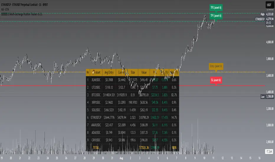
𝙷✪𝚕𝚍𝚎𝚖 🦇 Multi-Exchange Position Tracker v5.51
𝙷✪𝚕𝚍𝚎𝚖 🦇 Multi-Exchange Position Tracker v5.51
Overview
The 𝙷✪𝚕𝚍𝚎𝚖 🦇 Multi-Exchange Position Tracker v5.51 is a powerful and highly customizable Pine Script v6 indicator designed for traders managing portfolios across multiple exchanges and assets. This advanced dashboard provides real-time tracking of up to 20 positions, offering comprehensive insights into your trading performance with support for Dollar-Cost Averaging (DCA), leverage, and risk management.
Key Features
Multi-Exchange Support : Track positions across major exchanges like Binance, Bybit, Bitvavo, Coinbase, Kraken, and OKX.
Multi-Asset Management : Monitor up to 20 assets with customizable symbols, directions (Long/Short), and leverage settings.
DCA Calculations : Input comma-separated entry prices and sizes for accurate Dollar-Cost Averaging calculations.
Real-Time Data : Fetches current prices for each asset to calculate position value, profit/loss (P/L), and allocation percentages.
Customizable Dashboard : Display key metrics such as Asset, Direction, Leverage, Average Entry, Current Price, Size, Value, P/L, P/L (%), Allocation (%), Risk (%), TP1 (%), and TP2 (%) in a flexible table.
TP/SL/Entry Visualization : Plot Take Profit (TP1, TP2), Stop Loss (SL), and Entry levels directly on the chart with customizable line styles, widths, and colors.
Alerts : Receive notifications when TP1, TP2, or SL levels are hit for any enabled asset.
Theming Options : Choose between Dark and Light themes with adjustable transparency, zebra row styling, and cell padding for enhanced readability.
Currency Conversion : Supports USD and EUR as base currencies, with automatic conversion for assets quoted in different currencies.
Debugging Tools : Enable debug labels to troubleshoot NaN issues or DCA mismatches.
How to Use
1. Configure Assets : In the "Asset Positions" section, enable up to 20 assets and specify their exchange, symbol, direction, leverage, entry prices, sizes, stop loss, and take-profit levels.
2. Customize Dashboard : Adjust visibility of columns, table position, size, and styling under "Dashboard Settings" and "Column Visibility" sections.
3. Set Base Currency : Choose USD or EUR for unified P/L and value calculations.
4. Visualize Levels : Enable TP/SL/Entry plotting to see key price levels on the chart, with customizable styles and label positions.
5. Enable Alerts : Turn on alerts to get notified when price crosses TP or SL levels.
6. Debugging : Use debug labels to identify and resolve any input errors or invalid symbols.
Settings Breakdown
Dashboard Settings : Toggle dashboard visibility, hide zero-size positions, show total account row, and set table position/size.
Column Visibility : Select which columns to display (e.g., Asset, P/L, Risk %).
Styling & Colors : Customize themes (Dark/Light), transparency, zebra row colors, and border styles.
TP/SL/Entry Styling : Adjust line styles, widths, colors, and label positions for Stop Loss, Take Profit, and Entry levels.
Asset Positions : Input details for each asset, including exchange, symbol, direction, leverage, and DCA entries.
Notes
Ensure correct symbol formats (e.g., BTCUSDT for Binance, ADAEUR for Bitvavo) to avoid price fetch errors.
DCA entries and sizes must match in count and be valid numbers to prevent calculation errors.
The indicator supports up to 500 lines and labels for optimal performance.
For best results, use on a chart matching one of your tracked asset symbols to visualize TP/SL/Entry lines.
Why Use This Indicator?
This indicator is ideal for traders juggling multiple positions across exchanges. It consolidates critical data into a single, visually appealing dashboard, saving time and improving decision-making. With robust customization, real-time calculations, and alert functionality, it’s a must-have tool for both novice and experienced traders.
Developed by 𝙷✪𝚕𝚍𝚎𝚖 🦇, 2025 ©
Trade-o-Scope: Multi-Asset Price TrackerTrade-o-Scope team presents the "Multi-Asset Price Tracker" indicator.
"Multi-Asset Price Tracker" is designed to help analyze price changes across multiple assets within time intervals you define.
Motivation:
Most screeners on the market track price changes over predefined periods, like 1H\4H\12H\1D\3D\7D\etc. Typically, they compare initial and current prices.
But what if you want to analyze assets' performance over arbitrary historical intervals?
Perhaps you want to spot which assets dropped most within 7 hours after a specific industry announcement? Or do you want to check which asset grew the most in January last year?
This is where the "Multi-Asset Price Tracker" shines. It lets you define arbitrary intervals and track price changes for selected assets.
Overview and functionality:
Define arbitrary time intervals in history for analyzing price changes.
Create up to 10 lists, each with up to 40 symbols to track. Populate lists with data from text files, Excel, or CSV. Lists are just multiline text strings, each line representing an individual symbol.
Switch between lists, with one active list at a time.
Specify up to 3 fixed symbols for additional analysis alongside active list symbols. You may use them as reference points to compare price changes of the symbols in the List.
Customize table appearance and position.
Set sorting criteria and direction for displayed values.
View the results in a table on the chart.
How it works:
"Multi-Asset Price Tracker" will track the symbol's price during the interval you define.
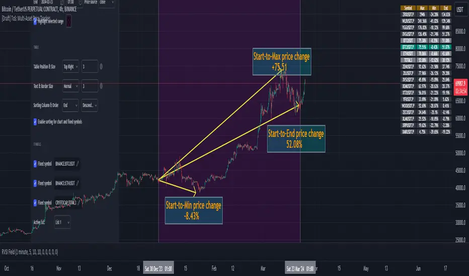
The indicator identifies each symbol's Start, Max, Min, and End prices during the interval. It then calculates relative changes: Start-to-Max, Start-to-Min, and Start-to-End.
The list of relative changes is ordered by the column chosen in settings and displayed on the chart.
List example (up to 10 Lists):
BINANCE:WLDUSDT.P
BINANCE:WOOUSDT.P
BINANCE:XEMUSDT.P
...
...
(up to 40 symbols per List)
Calculation example:
Symbol Start-price = $100
Symbol Max-price = $150
Symbol Min-price = $75
Symbol End-price = $110
Start-to-Max = 100% * (Max-price - Start-price) / Start-price = 100% * ($150 - $100) / $100 = 50%
Start-to-Min = 100% * (Min-price - Start-price) / Start-price = 100% * ($75 - $100) / $100 = -25%
Start-to-End = 100% * (End-price - Start-price) / Start-price = 100% * ($110 - $100) / $100 = 10%
Chart example:
In the provided chart, you can observe an example with a table generated by the indicator, along with manually added arrows and labels explaining the calculation process for an individual symbol from the list.
How to use:
1) Add "Multi-Asset Price Tracker" indicator to the chart
2) The indicator will ask you to define the start and the end of the interval using the mouse on the chart.
Voila! You'll see the table with sorted relative price changes based on default list values and settings.
3) Customize the indicator's settings:
Define the interval Start and End datetime.
Optionally, change the interval Start and End by clicking on the indicator name and dragging the vertical mark at the edges of the interval to a new position.
Define the Start and End price sources.
Choose a color to highlight the interval on the chart's background.
Set the table position, size, text size, and border size.
Specify the column for sorting and its direction.
Choose whether to sort chart symbols and fixed symbols together with list symbols or display them at the top of the table irrespective of their relative price change.
Enable fixed symbols if needed, and define up to 3 fixed symbols.
Define symbol lists, with up to 10 lists and 40 symbols each.
Select which List to make active - symbols from the active list will be calculated and displayed.
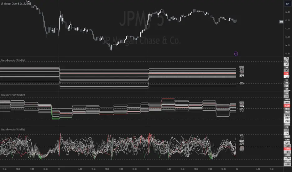
Mean Reversion Watchlist [Z score]Hi Traders !
What is the Z score:
The Z score measures a values variability factor from the mean, this value is denoted by z and is interpreted as the number of standard deviations from the mean.
The Z score is often applied to the normal distribution to “standardize” the values; this makes comparison of normally distributed random variables with different units possible.
This popular reversal based indicator makes an assumption that the sample distribution (in this case the sample of price values) is normal, this allows for the interpretation that values with an extremely high or low percentile or “Z” value will likely be reversal zones.
This is because in the population data (the true distribution) which is known, anomaly values are very rare, therefore if price were to take a z score factor of 3 this would mean that price lies 3 standard deviations from the mean in the positive direction and is in the ≈99% percentile of all values. We would take this as a sign of a negative reversal as it is very unlikely to observe a consecutive equal to or more extreme than this percentile or Z value.
The z score normalization equation is given by
In Pine Script the Z score can be computed very easily using the below code.
// Z score custom function
Zscore(source, lookback) =>
sma = ta.sma(source, lookback)
stdev = ta.stdev(source, lookback, true)
zscore = (source - sma) / stdev
zscore
The Indicator:
This indicator plots the Z score for up to 20 different assets ( Note the maximum is 40 however the utility of 40 plots in one indicator is not much, there is a diminishing marginal return of the number of plots ).
Z score threshold levels can also be specified, the interpretation is the same as stated above.
The timeframe can also be fixed, by toggling the “Time frame lock” user input under the “TIME FRAME LOCK” user input group ( Note this indicator does not repain t).
PGT: Pretty Good TraderLittle bit of background :
I am a broke college student on the East coast, and I have developed a hobby for creating trading algorithms. This is one of the better scripts that I have written. Unfortunately, as a broke college student, I don't have the disposable income to actually trade using real money. If you are interested in donating to my broke college student fund, please message me!
On to the script :
This script was written in pine version 3 and does not calculate_on_tick . This means that it does not repaint . The numbers you see are, to the best of my knowledge, accurate.
Because most scripts tend to overfit data to generate the "best looking data", I decided to create an algorithm that would be generalizable as possible to a diverse number of trading pairs. This script works on both crytpo markets(works best on smaller time frame) and stock markets(works best on larger time frames).
I am publishing this script to both gauge and generate interest in a Python trading bot which I have written which automatically buys and sells on different exchanges by using the predictive signals of this indicator.
