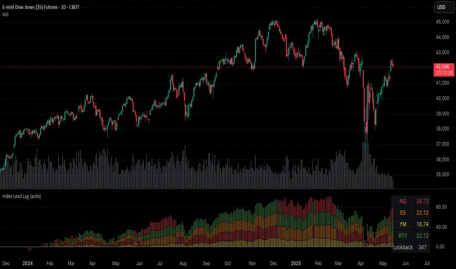
Index Lead LagPlots the percent change of each index over a given input lookback window length.
Indices are color coded (and customizable) to identify their respective percent change in the stacked column plot.
Table at the bottom right shows the previously closed bar's percent changes.
Indicator indicates which indices are leading and lagging over the given lookback period.
Relative Strength Comparison
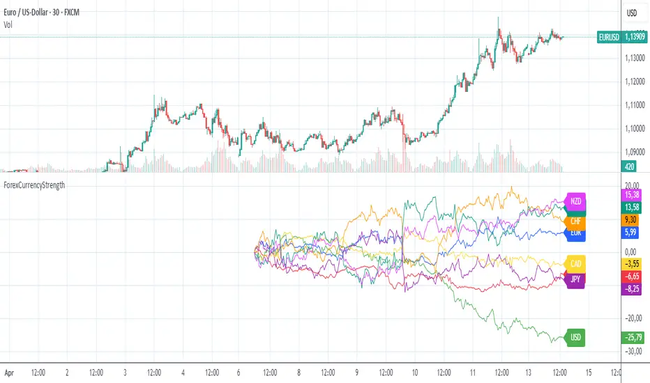
ForexCurrencyStrengthThe "ForexCurrencyStrength" indicator is a powerful tool designed to analyze the relative strength of the eight major currencies in the Forex market: EUR, USD, GBP, JPY, CHF, CAD, AUD, and NZD.
🔍 What does this indicator do?
The ForexCurrencyStrength indicator calculates the strength of each currency based on price changes across a variety of major currency pairs. It analyzes logarithmic returns (Log Returns) from 28 Forex pairs to give a comprehensive view of the market strength of each individual currency.
⚙️ How does it work?
The indicator calculates the strength of each of the 8 currencies by analyzing the changes in relevant currency pairs.
The strength is calculated based on the cumulative price changes since a user-defined start date.
Each currency is plotted as a separate line on the chart for easy comparison and identification of trends.
📅 Custom Start Date
You can set a custom start date for the calculation, allowing you to begin analysis from an important event or any preferred date.
📈 Use Cases
Identify the strongest and weakest currencies at a glance.
Help in choosing optimal Forex pairs for long or short trades.
Ideal for trend-following and relative strength strategies in Forex trading.
🎨 Features
Clear line plots for each currency.
Color-coded for easy visual differentiation.
Real-time values displayed as labels directly on the chart.
Constance Brown RSI with Composite IndexConstance Brown RSI with Composite Index
Overview
This indicator combines Constance Brown's RSI interpretation methodology with a Composite Index and ATR Distance to VWAP measurement to provide a comprehensive trading tool. It helps identify trends, momentum shifts, overbought/oversold conditions, and potential reversal points.
Key Features
Color-coded RSI zones for immediate trend identification
Composite Index for momentum analysis and divergence detection
ATR Distance to VWAP for identifying extreme price deviations
Automatic divergence detection for early reversal warnings
Pre-configured alerts for key trading signals
How to Use This Indicator
Trend Identification
The RSI line changes color based on its position:
Blue zone (RSI > 50): Bullish trend - look for buying opportunities
Purple zone (RSI < 50): Bearish trend - look for selling opportunities
Gray zone (RSI 40-60): Neutral/transitional market - prepare for potential breakout
The 40-50 area (light blue fill) acts as support during uptrends, while the 50-60 area (light purple fill) acts as resistance during downtrends.
// From the code:
upTrendZone = rsiValue > 50 and rsiValue <= 90
downTrendZone = rsiValue < 50 and rsiValue >= 10
neutralZone = rsiValue > 40 and rsiValue < 60
rsiColor = neutralZone ? neutralRSI : upTrendZone ? upTrendRSI : downTrendRSI
Momentum Analysis
The Composite Index (fuchsia line) provides momentum confirmation:
Values above 50 indicate positive momentum
Values below 40 indicate negative momentum
Crossing above/below these thresholds signals potential momentum shifts
// From the code:
compositeIndexRaw = rsiChange / ta.stdev(rsiValue, rsiLength)
compositeIndex = ta.sma(compositeIndexRaw, compositeSmoothing)
compositeScaled = compositeIndex * 10 + 50 // Scaled to fit 0-100 range
Overbought/Oversold Detection
The ATR Distance to VWAP table in the top-right corner shows how far price has moved from VWAP in terms of ATR units:
Extreme positive values (orange/red): Potentially overbought
Extreme negative values (purple/red): Potentially oversold
Near zero (gray): Price near average value
// From the code:
priceDistance = (close - vwapValue) / ta.atr(atrPeriod)
// Color coding based on distance value
Divergence Trading
The indicator automatically detects divergences between the Composite Index and price:
Bullish divergence: Price makes lower low but Composite Index makes higher low
Bearish divergence: Price makes higher high but Composite Index makes lower high
// From the code:
divergenceBullish = ta.lowest(compositeIndex, rsiLength) > ta.lowest(close, rsiLength)
divergenceBearish = ta.highest(compositeIndex, rsiLength) < ta.highest(close, rsiLength)
Trading Strategies
Trend Following
1. Identify the trend using RSI color:
Blue = Uptrend, Purple = Downtrend
2. Wait for pullbacks to support/resistance zones:
In uptrends: Buy when RSI pulls back to 40-50 zone and bounces
In downtrends: Sell when RSI rallies to 50-60 zone and rejects
3. Confirm with Composite Index:
Uptrends: Composite Index stays above 50 or quickly returns above it
Downtrends: Composite Index stays below 50 or quickly returns below it
4. Manage risk using ATR Distance:
Take profits when ATR Distance reaches extreme values
Place stops beyond recent swing points
Reversal Trading
1. Look for divergences
Bullish: Price makes lower low but Composite Index makes higher low
Bearish: Price makes higher high but Composite Index makes lower high
2. Confirm with ATR Distance:
Extreme readings suggest potential reversals
3. Wait for RSI zone transition:
Bullish: RSI crosses above 40 (purple to neutral/blue)
Bearish: RSI crosses below 60 (blue to neutral/purple)
4. Enter after confirmation:
Use candlestick patterns for precise entry
Place stops beyond the divergence point
Four pre-configured alerts are available:
Momentum High: Composite Index above 50
Momentum Low: Composite Index below 40
Bullish Divergence: Composite Index higher low
Bearish Divergence: Composite Index lower high
Customization
Adjust these parameters to optimize for your trading style:
RSI Length: Default 14, lower for more sensitivity, higher for fewer signals
Composite Index Smoothing: Default 10, lower for quicker signals, higher for less noise
ATR Period: Default 14, affects the ATR Distance to VWAP calculation
This indicator works well across various markets and timeframes, though the default settings are optimized for daily charts. Adjust parameters for shorter or longer timeframes as needed.
Happy trading!

SuperTrend Momentum OscillatorOverview
The SuperTrend Momentum Oscillator (SMO) is a powerful technical analysis tool designed to identify trend direction and strength in financial markets. It combines short-term and long-term oscillator calculations to provide traders with a comprehensive view of market conditions through an intuitive candle-based visualization system.
Key Features
Dual-period oscillator system (short-term and long-term)
Candle-based visualization showing trend direction and alignment
Color-coded trend direction based on the main (slower) trend line
Candle size reflecting alignment between fast and slow components
High-confidence "Super" signals (green diamonds for buys, purple diamonds for sells)
Market liquidity insights through oscillator readings
Understanding the Candle Visualization
Main Trend vs. Fast Money
The SMO uses two key components that work together:
Main Trend Line (Slower): The longer-period oscillator that acts as the primary trend indicator
Dictates the overall color of the candles (green for uptrend, red for downtrend)
Represents the dominant market direction
Fast Line (Quicker): The shorter-period oscillator that reacts more quickly to price changes
Helps determine the size of candles through its alignment with the main trend
Represents "fast money" or shorter-term price reactions
Candle Components and Their Meaning
1. Candle Color
The color of each candle is determined by the direction of the main trend line:
Green Candles: Main trend line is rising (bullish)
Indicates an overall uptrend regardless of short-term fluctuations
Remains green even when the fast line temporarily moves against the trend
Red Candles: Main trend line is falling (bearish)
Indicates an overall downtrend regardless of short-term fluctuations
Remains red even when the fast line temporarily moves against the trend
2. Candle Body Size
The body size of each candle represents the alignment between fast and main trend lines:
Large Bodies: Both fast and main trend lines are moving in the same direction
Trading Action: Strong confirmation of the trend direction
Confidence Level: High confidence signals
Small Bodies: Fast line is moving against the main trend line
Trading Action: Exercise caution; potential for temporary pullback or consolidation
Confidence Level: Lower confidence in immediate continuation
3. Wick Length
Wicks (shadows) provide additional information about price rejection and volatility:
Long Wicks: Indicate price rejection and potential volatility
Trading Action: Be cautious of trend continuation when long wicks appear
Confidence Level: Reduced confidence in immediate trend continuation
Short Wicks: Indicate strong directional control with minimal rejection
Trading Action: More confidence in trend continuation
Confidence Level: Higher confidence in the current trend direction
Candle Patterns Over Time
The progression of candles provides valuable trend information:
Large Green Candles: Main trend is up and fast line confirms (strong bullish)
Trading Action: Consider entering or adding to long positions
Confidence Level: High confidence in uptrend
Small Green Candles: Main trend is up but fast line is moving down (caution in uptrend)
Trading Action: Hold existing long positions but wait before adding
Confidence Level: Moderate confidence in uptrend, possible short-term pullback
Large Red Candles: Main trend is down and fast line confirms (strong bearish)
Trading Action: Consider entering or adding to short positions
Confidence Level: High confidence in downtrend
Small Red Candles: Main trend is down but fast line is moving up (caution in downtrend)
Trading Action: Hold existing short positions but wait before adding
Confidence Level: Moderate confidence in downtrend, possible short-term bounce
Super Signals - High Confidence Trading Opportunities
The SMO focuses exclusively on high-confidence "Super" signals:
Green Diamond Super Buy Signals
Meaning: Both short-term and long-term oscillators are generating buy signals simultaneously
Visual Indicator: Green diamond markers at the bottom of the indicator (0 level)
Trading Action: Strong entry signal for long positions
Confidence Level: High confidence signal, especially when accompanied by large green candles
Purple Diamond Super Sell Signals
Meaning: Both short-term and long-term oscillators are generating sell signals simultaneously
Visual Indicator: Purple diamond markers at the top of the indicator (100 level)
Trading Action: Strong entry signal for short positions or exit signal for long positions
Confidence Level: High confidence signal, especially when accompanied by large red candles
Market Liquidity Concept
The SMO provides a unique perspective on market conditions that goes beyond traditional oscillator interpretations:
Low Oscillator Readings (Below 20)
When the oscillator shows low readings (below 20), this indicates:
Traditional interpretation: Market is oversold, potential for upward reversal
Liquidity interpretation: Insufficient money in the market
This suggests thin trading conditions where large orders may have outsized impact
Price movements may be more erratic and less predictable
Breakouts may lack follow-through due to insufficient participation
High Oscillator Readings (Above 80)
When the oscillator shows high readings (above 80), this indicates:
Traditional interpretation: Market is overbought, potential for downward reversal
Liquidity interpretation: Abundant money in the market
This suggests deep trading conditions with high participation
Price movements tend to be more orderly and trend-based
Breakouts may have stronger follow-through due to high participation
Trading Strategies with SMO
Strategy 1: Main Trend with Alignment Confirmation
This strategy uses the main trend direction with alignment confirmation:
Entry Criteria:
Main trend direction is established (green or red candles)
Fast line aligns with main trend (large candles)
Super signal confirms (green or purple diamond)
Exit Criteria:
For long positions: When candles turn red or Super Sell signal appears
For short positions: When candles turn green or Super Buy signal appears
Stop Loss Placement:
For long positions: Below recent swing low
For short positions: Above recent swing high
Strategy 2: Counter-Trend Opportunity Detection
This strategy identifies potential counter-trend opportunities:
Entry Criteria:
Small candles appear (indicating disagreement between fast and main trend lines)
Oscillator reaches extreme levels (above 80 or below 20)
Wait for candle color change before entering
Position Sizing:
Use smaller position sizes for counter-trend trades
Increase size only when main trend confirms the new direction
Exit Criteria:
Take profit at the first sign of alignment in the opposite direction
Use tighter stops than with trend-following trades
Strategy 3: Market Liquidity Strategy
This strategy incorporates the market liquidity concept:
For Low Liquidity Conditions (Readings below 20):
Wait for Super Buy signals (green diamond)
Use smaller position sizes
Be prepared for potentially erratic price movements
Look for signs of increasing liquidity (expanding candle bodies) before adding to positions
For High Liquidity Conditions (Readings above 80):
Consider holding positions longer despite "overbought" readings
Use trailing stops to capture extended moves
Be aware that trends may persist longer than expected
Practical Trading Scenarios
Scenario 1: Strong Trend Confirmation
Candle Pattern: Series of large green candles (main trend up, fast line confirms)
Signal: Green diamond Super Buy marker at the bottom (0 level)
Background: Intensifying green gradient
Action: Enter long position with confidence
Stop Loss: Below recent swing low
Take Profit: When candles become small or turn red
Scenario 2: Trend Weakening Detection
Candle Pattern: Green candles becoming smaller (main trend still up, but fast line diverging)
Signal: No new signals
Background: Fading green gradient
Action: Tighten stops on long positions, prepare for potential reversal
Reasoning: Fast money is starting to move against the main trend
Scenario 3: Trend Reversal Identification
Candle Pattern: Transition from small green candles to red candles (main trend changing)
Signal: Appearance of purple diamond Super Sell marker at the top (100 level)
Background: Changing from green to red gradient
Action: Exit long positions and potentially enter short positions
Timing: Most effective when reversal occurs near overbought (80) level

Stock versus IndustryStock vs. Industry Indicator
The Stock vs. Industry Indicator is designed to help traders assess the performance of individual stocks relative to their respective industries. This tool automatically identifies the industry classification of a stock, compares it to a relevant industry ETF, and calculates the stock-to-industry performance ratio in real-time.
Key Features:
Real-Time Performance Comparison: The indicator tracks and compares the price movement of an individual stock against the most relevant ETF for its industry, providing a dynamic view of relative strength.
Stock-to-Industry Ratio: Displays the ratio of stock performance versus industry performance, allowing traders to easily identify outperforming and underperforming stocks within their industry.
SMA Trend Line: The indicator includes a simple moving average (SMA) trend line to assist with visual trend analysis, offering additional context to the stock’s movement in relation to the broader industry.
Customizable Parameters: Users can customize SMA periods, adjust comparison overrides, and use color highlighting to suit their trading preferences and strategies.
Industry Classification: Automatically assigns the correct industry classification to any stock, providing a reliable and automated method for comparing stocks within the same industry.
Benefits:
Identify Leaders and Laggards: Easily distinguish which stocks are outperforming their industry and which are underperforming. This allows traders to make more informed decisions based on relative strength.
Sector Rotation Detection: The indicator helps detect when a stock begins to underperform its industry, which can signal a shift in sector strength. This allows traders to adjust their positions and strategies accordingly.
Breakout Confirmation: When a stock breaks out while outperforming its industry, the indicator provides additional confidence in the breakout’s validity and potential for continued performance.
Avoid Value Traps: By comparing a stock’s performance against its industry, the indicator helps avoid investing in stocks that appear undervalued but are underperforming relative to their peers, reducing the risk of falling into value traps.
Usage:
Timeframes: The indicator works across various timeframes and is adaptable for both short-term and long-term traders.
Customization: Users can modify the parameters and settings to align with their specific trading style, whether day trading or position trading.
Visual Aid: The indicator provides an intuitive chart display, making it easy to understand a stock’s performance relative to its industry at a glance.
Disclaimer:
This indicator does not guarantee future performance or predict market movements. The information provided is based on historical data and current market conditions, which can change rapidly. It is important to use this tool as part of a broader trading strategy, taking into account other market factors and risk management techniques.

Cumulative Weighted Change (Session) with 14 MAThis indicator provides the session weighted cumulative change of the Magnificent 7(AAPL META GOOG AMZN MSFT NVDA TSLA), it is weighted according to their market capitalization and size in relation to size of the market. The bar to bar current change is plotted by the fast line that begins its calculations at the start of each daily session, the smoother(slower) line is the 14 period Volume Weighted Moving Average of the cumulative change.
I use this in conjunction with a timeframe continuity indicator in order to weed out invalid signals, I have one that I have recently published. I use this to trade futures and index stock options, since the 7 tickers that this indicator is built off of are the biggest force that moves markets this ends up acting as an alpha indicator if you can find a consistent and reliable way to weed out false signals.
Happy Trading!
-Drgzzz

[#ps #mft] RDT's Real Relative StrengthIndicator to use with Pine Screener for filtering watchlists with RDT's Real Relative Strength.
See r/realdaytrading for more info on the RRS.
How to:
1. Mark the indicator as "Favorite".
2. Open Pine Screener.
3. Choose a watchlist.
4. Choose this indicator.
5. Change the settings as needed.
6. Make sure you set timeframe to "5 minutes" and not the default "1 day".
If you choose "Bullish trend", then "Signal X" is a shortcut for RRS > 0 for that timeframe. Similarly "Bearish trend" for "Signal X" means RRS < 0.
Pro-tip #1: use Symbol syncing between tabs to easily go over the results.
Pro-tip #2: you can have two tabs open for "Bullish" and "Bearish" pine screeners (even synced to the same color), so you don't have to change settings everytime.
Ragi's Divergence HelperThis is Ragi's Divergence Helper is a TradingView indicator designed to track bullish and bearish divergences across multiple timeframes. It provides a clear, structured dashboard that remains fixed in a chosen corner of the chart for easy visibility.
Recommendations:
Put dashboard on lower left corner is less obstructive.
Use along with any RSI indicator for confirmations of bullish and bearish divergences.
Key Features:
✅ Timeframe Coverage: Monitors 5m, 10m, 15m, 30m, 1H, 2H, 4H, and Daily timeframes.
✅ Divergence Detection: Identifies whether a bullish (green) or bearish (red) divergence is present on each timeframe, displaying "None" if no divergence is detected.
✅ Divergence Lineup: Summarizes the overall market direction by checking if multiple timeframes align bullish or bearish.
✅ Customizable Settings: Users can adjust colors, panel position (Top Right, Bottom Right, Bottom Left, Top Left), and background color for better chart integration.
✅ Fixed & Readable Panel: Ensures the information is always visible without interfering with price action analysis.
How to Use It:
If multiple timeframes show bullish divergences, it may indicate a potential trend reversal or continuation to the upside.
If multiple timeframes show bearish divergences, it may signal a possible price drop or reversal downward.
When no divergences are present, it suggests no immediate divergence-based trading opportunity.
This indicator is ideal for traders looking for quick divergence insights across different timeframes without needing to analyze multiple indicators manually. 🚀

Multi-Ticker RS vs SPYThis Pine Script, titled "Multi-Ticker RS vs SPY," is a clean and efficient indicator designed for TradingView, enabling traders to monitor the relative strength (RS) of up to 10 ticker symbols compared to the S&P 500 ETF (SPY) on a single chart. Ideal for options traders, such as those managing a $1,400 account, it provides a simple way to assess which stocks are outperforming or underperforming the broader market. As of February 26, 2025, the script supports any chart timeframe, such as 5-minute or daily intervals, and calculates RS based on a user-defined lookback period, defaulting to 1 bar for real-time insights.
Users can input ticker symbols via customizable settings, with defaults set to popular stocks like AAPL, TSLA, NVDA, GOOGL, AMZN, MSFT, FB, NFLX, INTC, and PYPL. The script fetches closing prices for each ticker and SPY, computes their percentage changes over the lookback period, and determines RS as the ratio of each ticker’s change to SPY’s change, handling division by zero gracefully. It displays each ticker’s current RS score in a vertical column of labels on the chart’s top-left corner, updated on the last bar to avoid clutter. Users can adjust label size (tiny, small, normal, large) and text color for visibility, ensuring a tailored, error-free experience for quick market analysis.

Islamic Tijarat -Dual Relative StrengthIslamic Tijarat - Dual Relative Strength
Islamic Tijarat - Dual Relative Strength is a powerful indicator designed to compare the relative performance of two securities, such as a stock against its sector index or Nifty 50 (default benchmark) . This helps traders assess whether a stock is outperforming (> 0) or underperforming (< 0) relative to the chosen benchmark.
Key Features:
✔ Relative Strength Comparison – Measure the performance of a stock relative to Nifty 50, industry index, or sector index.
✔ Multiple Timeframes – Works best on Daily Timeframe (TF) but can also be applied to Weekly, Monthly, or Intraday charts based on the preferred calculation period.
✔ Customizable Calculation Period – Choose the desired number of hours when applying it to smaller timeframes.
✔ Box Table Display – Provides a clear performance comparison against both Nifty 50 and the selected sector index .
✔ Toggle Color Option on Crossovers – Visually highlights significant crossovers in relative strength for better readability.
✔ Enhanced Label Display – Fixed label visibility issue when plot options were disabled.
✔ Superimposed Price Action on RS Line – In addition to standard Relative Strength (RS) behavior, users can now overlay price action movements onto the RS line for a more holistic analysis.
✔ Customizable Moving Averages for RS – Added SMA/EMA (length: 9) to smoothen the RS calculation, helping traders filter noise and identify trends more effectively.
Usage:
✅ Compare stock performance against Nifty 50 , industry index, sector index, or any other security within the same sector.
✅ Identify strength and weakness trends over different timeframes.
✅ Use crossovers, trend direction, and price action integration for better decision-making.
This brings enhanced functionality, improved visualization, and bug fixes, making it a must-have tool for traders focusing on relative strength analysis.
Relative Performance SuiteOverview
The Relative Performance Suite (RPS) is a versatile and comprehensive indicator designed to evaluate an asset's performance relative to a benchmark. By offering multiple methods to measure performance, including Relative Performance, Alpha, and Price Ratio, this tool helps traders and investors assess asset strength, resilience, and overall behavior in different market conditions.
Key Features:
✅ Multiple Performance Measures:
Choose from various relative performance calculations, including:
Relative Performance:
Measures how much an asset has outperformed or underperformed its benchmark over a given period.
Relative Performance (Proportional):
A proportional version of relative performance,
factoring in scaling effects.
Relative Performance (MA Based):
Uses moving averages to smooth performance fluctuations.
Alpha:
A measure of an asset’s performance relative to what would be expected based on its beta and the benchmark’s return. It represents the excess return above the risk-free rate after adjusting for market risk.
Price Ratio:
Compares asset prices directly to determine relative value over time.
✅ Customizable Moving Averages:
Apply different moving average types (SMA, EMA, SMMA, WMA, VWMA) to smooth price inputs and refine calculations.
✅ Beta Calculation:
Includes a Beta measure used in Alpha calculation, which users can toggle the visibility of helping users understand an asset's sensitivity to market movements.
✅ Risk-Free Rate Adjustment:
Incorporate risk-free rates (e.g., US Treasury yields, Fed Funds Rate) for a more accurate calculation of Alpha.
✅ Logarithmic Returns Option:
Users can switch between standard returns and log returns for more refined performance analysis.
✅ Dynamic Color Coding:
Identify outperformance or underperformance with intuitive color coding.
Option to color bars based on relative strength, making chart analysis easier.
✅ Customizable Tables for Data Display:
Overview table summarizing key metrics.
Explanation table offering insights into how values are derived.
How to Use:
Select a Benchmark: Choose a comparison symbol (e.g., TOTAL or SPX ).
Pick a Performance Metric: Use different modes to analyze relative performance.
Customize Calculation Methods: Adjust moving averages, timeframes, and log returns based on preference.
Interpret the Colors & Tables: Utilize the dynamic coloring and tables to quickly assess market conditions.
Ideal For:
Traders looking to compare individual asset performance against an index or benchmark.
Investors analyzing Alpha & Beta to understand risk-adjusted returns.
Market analysts who want a visually intuitive and data-rich performance tracking tool.
This indicator provides a powerful and flexible way to track relative asset strength, helping users make more informed trading decisions.

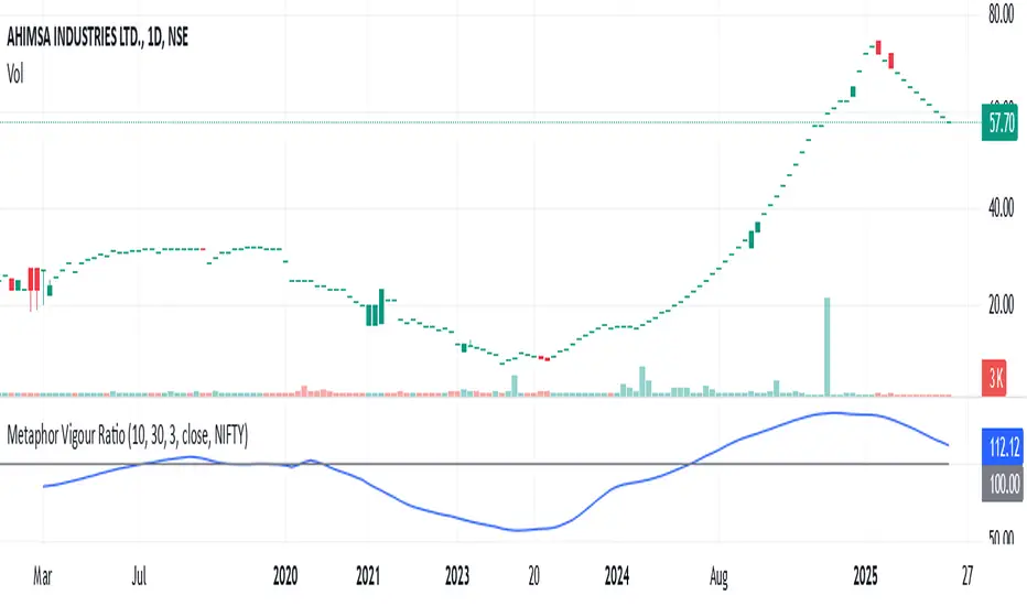
Metaphor Vigour Ratio### **Script Name:** Metaphor Vigour Ratio
**Short Title:** Metaphor Vigour Ratio
**Author:** Sovit Manjani, CMT
**Description:**
The Metaphor Vigour Ratio (MVRatio) is a powerful Relative Strength Indicator designed for assessing normalized relative strength. It is versatile and can be applied to any script or used to rank symbols based on their intermarket relative strength.
---
### **Features:**
1. **Bullish and Bearish Signals:**
- **Above 100:** Indicates a bullish trend.
- **Below 100:** Indicates a bearish trend.
2. **Trend Analysis with Slope:**
- **Slope Rising:** Suggests bullish momentum.
- **Slope Falling:** Suggests bearish momentum.
3. **Stock Selection Strategy:**
- Identify and rank stocks based on the MVRatio. For example, buy the top 10 stocks of Nifty with the highest MVRatio values for strong performance potential.
---
### **Inputs:**
1. **Fast EMA Period (RSEMAFast):** Default set to 10. Controls the sensitivity of the Fast Moving Average.
2. **Slow EMA Period (RSEMASlow):** Default set to 30. Provides a stable trend base with the Slow Moving Average.
3. **Smooth EMA Period (SmoothEMA):** Default set to 3. Smooths the MVRatio for better clarity.
4. **Close Source:** Default is the closing price, but it can be customized as needed.
5. **Comparative Symbol (ComparativeTickerId):** Default is "NSE:NIFTY," allowing comparison against a benchmark index.
---
### **Calculation Logic:**
1. **Relative Strength (RS):**
- Calculated as the ratio of the base symbol's price to the comparative symbol's price.
2. **Exponential Moving Averages (FastMA and SlowMA):**
- Applied to the RS to smooth and differentiate trends.
3. **Metaphor Vigour Ratio (MVRatio):**
- Computed as the ratio of FastMA to SlowMA, scaled by 100, and further smoothed using SmoothEMA.
---
### **Visualization:**
1. **MVRatio Plot (Blue):**
- Represents the relative strength dynamics.
2. **Reference Line at 100 (Gray):**
- Helps quickly identify bullish (above 100) and bearish (below 100) zones.
---
### **How to Use:**
1. Add the indicator to your chart from TradingView's Pine Script editor.
2. Compare the performance of any symbol relative to a benchmark (e.g., Nifty).
3. Analyze trends, slopes, and ranking based on MVRatio values to make informed trading decisions.
---
**Note:** This indicator is for educational purposes and should be used alongside other analysis methods to make trading decisions.
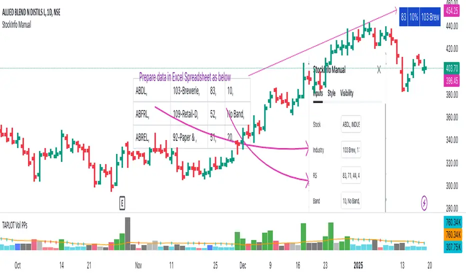
StockInfo ManualScript Description:
The StockInfo Manual is designed to display detailed stock information directly on the chart for the selected symbol. It processes user-provided input data, including
stock symbols
Industries
Relative Strength (RS) values
Band information
Key Features:
1. Symbol-Specific Data Display: Displays information only for the current chart symbol.
2. Customizable Table: Adjust the table's position, text size, colors, and headers to match your preferences.
3. Low RS/Band Conditions: Highlights critical metrics (RS < 50 or Band < 6) with a red background for quick visual cues.
4. Toggle Information: Choose to show or hide RS, Band, and Industry columns based on your needs.
How to Use the Script:
1. Use any platform (ex: chartsmaze) to get Industry,RS and Band information of any Stock. Prepare the data as separate column of excel
2. Configure Inputs:
- Stock Symbols (`Stock`): Enter a comma-separated list of stock symbols (e.g.,
NSE:ABDL,
NSE:ABFRL,
NSE:ABREL,
NSE:ABSLAMC,
NSE:ACC,
NSE:ACE,
- Industries (`Industry`): Provide a comma-separated list of industries for the stocks (e.g., 103-Brewerie,
109-Retail-D,
92-Paper & ,
19-Asset Ma,
62-Cement,
58-Industri,
- Relative Strength (`RS`): Input RS values for each stock (e.g.,
83,
52,
51,
81,
23,
59,
- Band Information (`Band`): Specify Band values for each stock. Use "No Band" if 10,
No Band,
20,
20,
No Band,
20,
3. Customize the Table:
-Display Options: Toggle the visibility of `RS`, `Band`, and `Industry` using the input checkboxes.
-Position and Appearance: Choose the table's position on the chart (e.g., top-right, bottom-center). Customize text size, background colors, header display, and other visual elements.
4. Interpret the Table:
- The table will dynamically display information for the current chart symbol only.
- If the `RS` is below 50 or the Band is below 6, the corresponding row is highlighted with a red background for immediate attention.
One need to enter details at least weekly for a correct result
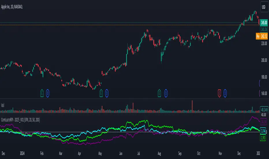
Relative Performance Indicator by ComLucro - 2025_V01The "Relative Performance Indicator by ComLucro - 2025_V01" is a powerful tool designed to analyze an asset's performance relative to a benchmark index over multiple timeframes. This indicator provides traders with a clear view of how their chosen asset compares to a market index in short, medium, and long-term periods.
Key Features:
Customizable Lookback Periods: Analyze performance across three adjustable periods (default: 20, 50, and 200 bars).
Relative Performance Analysis: Calculate and visualize the difference in percentage performance between the asset and the benchmark index.
Dynamic Summary Label: Displays a detailed breakdown of the asset's and index's performance for the latest bar.
User-Friendly Interface: Includes customizable colors and display options for clear visualization.
How It Works:
The script fetches closing prices of both the asset and a benchmark index.
It calculates percentage changes over the selected lookback periods.
The indicator then computes the relative performance difference between the asset and the index, plotting it on the chart for easy trend analysis.
Who Is This For?:
Traders and investors who want to compare an asset’s performance against a benchmark index.
Those looking to identify trends and deviations between an asset and the broader market.
Disclaimer:
This tool is for educational purposes only and does not constitute financial or trading advice. Always use it alongside proper risk management strategies and backtest thoroughly before applying it to live trading.
Chart Recommendation:
Use this script on clean charts for better clarity. Combine it with other technical indicators like moving averages or trendlines to enhance your analysis. Ensure you adjust the lookback periods to match your trading style and the timeframe of your analysis.
Additional Notes:
For optimal performance, ensure the benchmark index's data is available on your TradingView subscription. The script uses fallback mechanisms to avoid interruptions when index data is unavailable. Always validate the settings and test them to suit your trading strategy.
S&P 500 E-Mini TrackerThis script generates a reference price for the S&P 500 ETF - SPY based on the current price of the ES contract, which is an E-Mini Futures contract representing the S&P 500 index. The indicator plots this reference price on the chart, providing a unique view of the relationship between these two popular markets.
Advantages:
Identifies divergence between the ES and SPY prices, indicating potential trading opportunities or shifts in market sentiment.
Confirms trends by showing the correlation between the ES and SPY prices.
Eliminates the need for multiple charts, allowing traders to focus on a single screen and make more informed decisions.
Customizable Parameters:
Color Scheme: Choose from various color options to customize the appearance of the indicator.
Line Style: Select from different line styles to change the visual representation of the reference price.
Divisor: Set the dividing factor to adjust the ratio at which the reference price is calculated. (Default value: 10). It is recommended to keep it at 10 for SPY.
To use it with other Stocks/ ETFs, use simple ratio math to calculate the divisor and you can customize the indicator to scale accordingly.
By using this indicator, traders can gain a deeper understanding of the relationship between the E-Mini and SPY markets, making it easier to identify trading opportunities and confirm trends.

Relative Price Strength (RPS)Relative Price Strength (RPS) is a technical analysis indicator that measures the performance of a specific symbol relative to a benchmark or "Base Symbol".
It's essentially a ratio that compares the price of the specific symbol to the price of the benchmark.
Rising RPS: Indicates that the symbol is outperforming the benchmark.
Falling RPS: Suggests that the symbol is underperforming the benchmark.
RSP is smoothed over a period for better visualization.

Relative Strength vs SPX
This indicator calculates the ratio of the current chart's price to the S&P 500 Index (SPX), providing a measure of the stock's relative strength compared to the broader market.
Key Features:
Dynamic High/Low Detection: Highlights periods when the ratio makes a new high (green) or a new low (red) based on a user-defined lookback period.
Customizable Lookback: The lookback period for detecting highs and lows can be adjusted in the settings for tailored analysis.
Visual Overlay: The ratio is plotted in a separate pane, allowing easy comparison of relative strength trends.
This tool is useful for identifying stocks outperforming or underperforming the S&P 500 over specific timeframes.
Profit Hunter - RS Supernova中文說明
狩利 (Profit Hunter) - RS 超新星 是一款專為加密貨幣市場設計的相對強度篩選指標,靈感來自 Mark Minervini 和 William O'Neil 的投資理念。此指標透過「RS 超新星」篩選概念,幫助交易者聚焦在市場中的極端強勢標的,從而更精準地捕捉高潛力的進場機會。
指標用途
RS 評級 (RS Rating):基於相對強度 (Relative Strength) 概念,將標的與整體市場 (TOTAL 指數) 進行比較,得出 RS 評級。當 RS 評級超過 85 時,該標的被視為具有極強的上漲動能,是潛在的進場目標。
高潛力篩選:此指標利用動態加權計算方式,篩選出相對強勢的標的,讓交易者可以聚焦於具有突破潛力的資產。
即時數據顯示:在圖表上即時顯示 RS 評級,提供清晰的數據支持,使交易者快速判斷標的的強度並做出即時決策。
狩利-RS 超新星 專為追求市場主流趨勢的交易者設計,特別適合應用 Minervini 和 O'Neil 理論的投資者。該指標幫助您在市場波動中篩選出最具相對強度的標的,確保每次進場都是基於高潛力的技術分析。
English Description
Profit Hunter - RS Supernova is a relative strength (RS) filtering indicator specifically designed for the cryptocurrency market, inspired by the investment philosophies of Mark Minervini and William O'Neil. Through the concept of the "RS Supernova," this indicator helps traders focus on exceptionally strong assets within the market, enabling precise entry into high-potential opportunities.
Indicator Purpose
RS Rating: Based on Relative Strength (RS) analysis, the indicator compares the asset to the overall market (TOTAL index) to generate an RS Rating. When the RS rating exceeds 85, the asset is considered to have substantial upward momentum, marking it as a potential entry target.
High-Potential Screening: Utilizing a dynamic weighted calculation, this indicator filters out assets with relative strength, allowing traders to concentrate on those with breakout potential.
Real-Time Data Display: The RS Rating is displayed on the chart, providing clear data for quick assessment of asset strength and enabling real-time decision-making.
Profit Hunter - RS Supernova is designed for traders seeking to capture mainstream market trends, especially those following Minervini and O'Neil's theories. This indicator aids in identifying the strongest assets amidst market fluctuations, ensuring each entry is backed by high-potential technical analysis.

Real Relative Strength Indicator (Multi-Index Comparison)The Real Relative Strength (RRS) indicator implements the "Real Relative Strength" equation, as detailed on the Real Day Trading subreddit wiki. This equation measures whether a stock is outperforming a benchmark (such as SPY or any preferred ETF/index) by calculating price change normalized by the Average True Range (ATR) of both the stock and the indices it’s being compared to.
The RRS metric often highlights potential accumulation by institutional players. For example, in this chart, you can observe accumulation in McDonald’s beginning at 1:25 pm ET on the 5-minute chart and continuing until 2:55 pm ET. When used in conjunction with other indicators or technical analysis, RRS can provide valuable buy and sell signals.
This indicator also supports multi-index analysis, allowing you to plot relative strength against two indices simultaneously—defaulting to SPY and QQQ—to gain insights into the "real relative strength" across different benchmarks. Additionally, this indicator includes an EMA line and background coloring to help automatically identify relative strength trends, providing a clearer visualization than typical Relative Strength Comparison indicators.

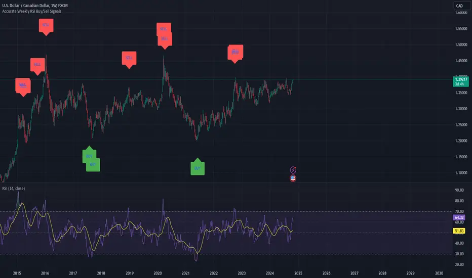
Weekly RSI Buy/Sell SignalsWeekly RSI Buy/Sell Signal Indicator
This indicator is designed to help traders identify high-probability buy and sell opportunities on the weekly chart by using the Relative Strength Index (RSI). By utilizing weekly RSI values, this indicator ensures signals align with broader market trends, providing a clearer view of potential price reversals and continuation.
How It Works:
Weekly RSI Calculation: This script calculates the RSI using a 14-period setting, focusing on the weekly timeframe regardless of the user’s current chart view. The weekly RSI is derived using request.security, allowing for consistent signals even on intraday charts.
Signal Conditions:
Buy Signal: A buy signal appears when the RSI crosses above the oversold threshold of 30, suggesting that price may be gaining momentum after a potential bottom.
Sell Signal: A sell signal triggers when the RSI crosses below the overbought threshold of 70, indicating a possible momentum shift downwards.
Visual Cues:
Buy/Sell Markers: Clear green "BUY" and red "SELL" markers are displayed on the chart when buy or sell conditions are met, making it easy to identify entry and exit points.
RSI Line and Thresholds: The weekly RSI value is plotted in real time with color-coded horizontal lines at 30 (oversold) and 70 (overbought), providing a visual reference for key levels.
This indicator is ideal for traders looking for reliable, trend-based signals on higher timeframes and can be a helpful tool for filtering out shorter-term market noise.
Industry Group Strength - IndiaPresenting the Industry Group Strength Indicator for India market, designed to help traders identify top-performing stocks within specific industry groups that are predefined.
⦿ Identifies Leading Stocks in Industry Groups
⦿ Analyses the following metrics
YTD Return : Measures stock performance from the start of the year.
RS Rating : Relative Strength rating for user-selected periods.
% Return : Percentage return over a user-selected lookback period.
Features
This indicator dynamically recognises the industry group of the current stock on the chart and ranks stocks within that group based on predefined data points. Traders can add this indicator to focus on top-performing stocks relative to their industry.
⦿ Color-coded for Easy Visualisation
You can choose from the following key metrics to rank stocks:
YTD Return
RS Rating
% Return
⦿ Table Format with Performance Metrics Compact mode
Vertical View
Horizontal View
All of the three metrics are shown in the compact mode and the current stock that is viewed is highlighted!
Vertical view
Horizontal view
Stock Ranking
Stocks are ranked based on their performance within industry groups, enabling traders to easily spot leaders and laggards in each sector. Color-coded gradients visually represent the stocks’ performance rankings, with higher percentile rankings indicating better performance.
Relative Strength (RS)
Relative Strength (RS) compares a stock’s performance against the benchmark index. The RS value is normalized from 1 to 99, making it easier to compare across different stocks. A rising RS value indicates that the stock is outperforming the market, helping traders quickly gauge relative performance within industry groups.
Limitations
At the time of developing this indicator, Pine requests are limited to 40 per script so the predefined symbols had to be filtered to 40 per Industry group
Stocks Filters
Filters that are used to filter the stocks in an Industry group to have maximum of 40 stocks
⦿ Auto, Chemical, Engineering, Finance, Pharma
Market Cap >= 1000 Crores and Market Cap <= 60000 Crores
Price >= 30 and Price <= 6000
50 Days Average ( Price * Volume ) >= 6 Crores
⦿ For rest of the Industry groups
Market Cap >= 1000 Crores and Market Cap <= 100000 Crores
Price >= 20 and Price <= 10000
50 Days Average ( Price * Volume ) >= 3 Crores
Credits
This indicator is forked from the Script for US market by @Amphibiantrading Thanks Brandon for the beginning of this indicator.
This indicator is built on TradingView’s new dynamic requests feature, thanks to @PineCoders for making this possible!

OutperformX VCPSwingDesigned to measure and visualize the relative strength and outperformance of a stock compared to a benchmark. Here’s a feature-by-feature breakdown
Credits to Eeshan for all the help
—————-
Alpha Calculation: What's it About?
The key component of this indicator is the Alpha calculation, which measures a stock's outperformance relative to a base index (e.g., Nifty Midsmall 400) while accounting for risk-free returns. By comparing the stock's performance with the base and risk-free rates, we get the Alpha.
The Alpha logic has been slightly modified, not strictly following the textbook approach
——————
Customizable Inputs: Tailored for You
You can choose whether to display Alpha.
Change the Base Index (e.g., NiftyMidsmall400).
Adjust the Performance Period (Days) for custom Alpha/Outperformance calculations.
Performance options range from 5 to 252 days, helping to fine-tune the outperformance tracking.
—————
Highlighting Performance Peaks: Short-Term & Long-Term
The indicator automatically highlights Short-Term Peak Performance over customizable short-term windows (e.g., 21 days).
It also detects Long-Term Performance Peaks, spanning up to 52 weeks. These peaks are represented as dots on the Alpha line.
——————
Color-Coded Alpha: Clear Visuals
To make the indicator visually intuitive:
Positive Alpha (outperformance) is marked in green.
Negative Alpha (underperformance) is shown in red. These are customizable so you can adjust colors to your preference!
—————
Outperformance Before Price Peaks
One cool feature is tracking whether Alpha outperforms before the price hits new highs. If Alpha breaks out but price lags, a “dot” is drawn, giving a heads-up on potential upcoming price moves.
——————
Background Color Highlighting
Background colors change dynamically based on performance:
Green for positive Alpha (outperformance).
Red for negative Alpha (underperformance). This gives a quick visual reference of the stock’s performance at a glance.
——————-
Filling the Alpha Zone
The indicator fills the area between the Alpha line and zero. This shading helps highlight the magnitude of outperformance (or underperformance) and provides a quick visual cue about trends.
———————
Get Started
With all these features combined, the Outperformance indicator becomes a powerful tool for spotting leading stocks, tracking risk-adjusted performance, and identifying performance peaks before price catches up.

Relative Strength Price Oscillator Indicator (RS PPO)Percentage Price Oscillator (PPO)
The Percentage Price Oscillator (PPO) is a momentum oscillator that measures the difference between two moving averages as a percentage of the larger moving average. As with its cousin, MACD, the Percentage Price Oscillator is shown with a signal line, a histogram and a centerline. Signals are generated with signal line crossovers, centerline crossovers, and divergences.
PPO readings are not subject to the price level of the security and the PPO values for different securities can be compared, regardless of the price of the security.
Relative Strength (RS)
Relative strength is a strategy used in momentum investing and focuses on investing in stocks or other securities that have performed well relative to the market as a whole or to a relevant benchmark.
Chart
In the chart, Microsoft stock (MSFT) is plotted against the VanEck Semiconductor ETF (SMH).
In the example on the left, from the negative values of the RS PPO it can be seen that MSFT, although trending upward, is losing out in negative terms to the SMH etf.
In the example on the right, during a correction phase with a downward price trend, Microsoft held up relatively well compared to the Van Eck Semiconductor etf.
