Hammer / Shooting Star ScannerAlways missing hammer and shooting star candlestick pattern?
This script will help you to alert hammer shooting star candlestick.
Please leave your comments for improving this script.
Search in scripts for "Candlestick"

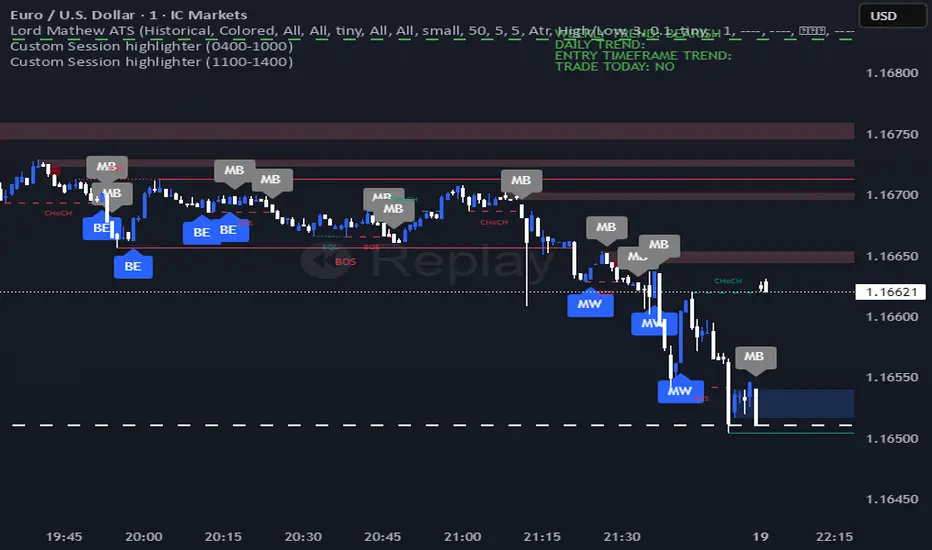
Lord Mathew ATSThe Smart Money Structure & Pattern Analyzer is a complete, all-in-one visual trading system that brings together every essential element of Smart Money Concepts (SMC), ICT methodology, and candlestick psychology into one powerful indicator.
It is designed to help traders instantly understand the market’s structure, liquidity flow, and potential turning points without switching tools or manually marking charts. Whether you trade forex, indices, crypto, or commodities, this indicator automatically identifies where institutional activity, imbalances, and price inefficiencies occur in real time.
With its advanced algorithm, it plots market structure shifts, equal highs and lows, liquidity zones, order blocks, fair value gaps (FVGs), and previous week and day levels (PWO, PWH, PWL, PWC, PDO, PDH, PDL, PDO). It also integrates a deep candlestick recognition engine that detects over ten classic and advanced candle formations including engulfing patterns, dojis, hammers, shooting stars, morning/evening stars, and spinning tops to provide precise confirmation at critical points of interest.
This indicator isn’t just a tool it’s a complete market map that helps traders visualize how institutional order flow and candlestick sentiment interact.
Core Features
📊 Market Structure Detection:
Automatically marks swing highs/lows, Break of Structure (BOS), and Change of Character (CHOCH) in real time.
💧 Liquidity Mapping:
Highlights equal highs/lows and liquidity grabs, showing where price is likely to target before a reversal or continuation.
🧱 Order Block Visualization:
Displays the last bullish or bearish candle before an impulsive displacement, acting as a potential institutional entry zone.
⚡ Fair Value Gap (FVG) Scanner:
Detects and highlights imbalances where price moved too fast, helping you identify high-probability retracement areas.
🕯️ Candlestick Pattern Recognition:
Recognizes key reversal and continuation patterns (engulfing, hammer, shooting star, doji, morning/evening star, etc.) in real time.
📅 Institutional Reference Points:
Plots previous week & day open (PWO, PDO), previous week & day high (PWH, PWH), previous week & day low (PWL, PDL), previous week & day close (PWC, PDC) and optionally previous day levels to help frame bias.
🎨 Customizable Design:
Toggle any feature, change colors, and set alerts when multiple Smart Money signals align for cleaner, faster decision-making.
How It Works
Add the indicator to your chart on any timeframe or market.
The algorithm automatically detects structure, liquidity, and imbalance zones.
Candlestick patterns are highlighted when they form near high-probability areas (like OBs or FVGs).
When confluence occurs such as a liquidity grab, FVG fill, and bullish engulfing candle—the indicator provides a visual signal zone for your confirmation-based entries.
You can refine your trades using higher-timeframe bias (HTF order flow) and lower-timeframe execution (LTF confirmation).
Best For
Traders using ICT, Smart Money Concepts, or price-action systems.
Intraday and swing traders looking for clear, data-driven chart structure.
Traders who want to simplify confluence analysis and focus on precision execution.
Why It Stands Out
Unlike standard candlestick or pattern scanners, this indicator merges institutional market logic with technical candle behavior, allowing traders to see where smart money might be entering or exiting positions.
It’s not about random signals it’s about context, structure, and confirmation.
Every feature in this indicator is built around the principle of liquidity engineering:
price creates liquidity, grabs it, and moves toward imbalance or order flow efficiency.
By merging that institutional logic with candlestick patterns, this tool gives traders an edge in recognizing not only where to trade but why price is reacting in that exact area.
Disclaimer
This indicator is intended for educational and analytical use. It does not provide financial advice or guaranteed trading results. Always backtest and manage your risk responsibly.
Devil Marks - Multi TimeframeA handy completely new script that shows Devil Marks for several time frames on the current time frame.
Devil Marks are where candles have no wick at one end of the candlestick. These levels are seen as areas that price needs to go back to at some point to re-balance the imbalance. These levels can add confluence to a trade idea.
A table is included that shows the closest devil mark for each time frame.
Devil Marks should show until that level is mitigated by price trading at that level.

Session Top Bars — Equities Sessions (Asia / London / US) — MelbA minimal, non-obstructive session overlay that draws thin top bars for the Asia, London, and US equity sessions on any chart and timeframe. Designed to stay out of the way while giving instant session context—perfect for crypto, indices, futures, and stocks.
Default sessions (AEDT / Australia-Melbourne):
Asia: 10:00 → 17:45
London: 18:00 → 23:30
US: 23:00 → 07:00
(Weekends on by default for crypto; turn off for equities.)
Why it’s different
Top-only bands (no heavy background shading) so price action stays readable.
Asset-agnostic: works on any symbol/candlestick.
Adaptive top placement: hugs the top of the visible price area without distorting autoscale.
Session labels appear once at each session start, right on the strip (optional).
Inputs
Timezone: choose your clock (default Australia/Melbourne).
Show weekends: on for crypto, off for stocks.
Intraday-only: hide the overlay on 1D+ if you prefer.
Session windows: edit HHMM-HHMM for Asia / UK / US.
Colors & thickness: tweak gap from top, band thickness, and label size.
Tips
If the strip feels a touch low/high on your layout, nudge Gap below chart top or Band thickness.
To reduce small shifts when new extremes print, increase Recent range length (bars).
Use cases
Quickly spot which session drove a move.
Align entries/exits to cash session volatility (e.g., NYSE open).
Compare behavior across assets with a unified session view.
Notes
Times reflect equity session focus in AEDT by default; adjust to your needs.
For FX-style windows, just edit the session inputs.
Credits
Built from community feedback for a clean, professional session overlay.

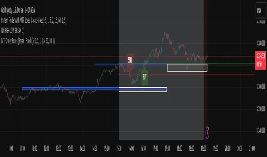
Pattern Finder with MTF Boxes (Break - Fixed)Script Title:
MTF Supply/Demand Zone Indicator with Candlestick Pattern Confirmation
Short Description:
This advanced strategy identifies key Supply and Demand zones (Order Blocks) on higher timeframes (30m & 1h) and then waits for a pullback to these zones on the current timeframe. The final entry signal is triggered upon the appearance of a valid candlestick pattern (e.g., Hammer, Engulfing) within these zones.
Full Description:
Introduction & Core Concept
This script is a powerful trading tool based on a combination of the following concepts:
Multi-Timeframe (MTF) Analysis: Identifying significant structures on higher timeframes to understand the bigger market picture.
Supply and Demand Zones: Finding areas where an imbalance between buyers and sellers has caused strong price movements.
Candlestick Patterns: Using classic candlestick patterns as the final confirmation for entering a trade at these key zones.
The main idea is to avoid trading blindly and instead wait for the price to react to a significant zone, then enter with a confirmation signal.
How the Strategy Works (Step-by-Step)
Identifying the Key Pattern on Higher Timeframes:
The script continuously monitors the 30-minute and 1-hour charts to find a specific pattern: a short consolidation period (usually 1-4 candles) immediately followed by a breakout with a powerful, high-momentum candle (Long Bar). This pattern indicates the formation of a fresh Supply or Demand Zone.
Drawing the Supply and Demand Boxes:
Green Box (Demand Zone): When a minor high is broken by a bullish Long Bar, this area is identified as potential support and marked with a green box.
Red Box (Supply Zone): When a minor low is broken by a bearish Long Bar, this area is identified as potential resistance and marked with a red box.
White Box (Long Bar / Trigger Zone): This box highlights the range of the Long Bar candle itself. A break of or return to this zone provides important signals.
Waiting for a Pullback:
After a zone is identified and drawn, the strategy waits for the price on your current chart to pull back into this box.
Entry Confirmation with Candlestick Patterns:
Once the price enters the box, the script looks for reversal candlestick patterns:
In a Demand Zone (Green Box): It looks for bullish patterns like the Hammer, Bullish Engulfing, Bullish Harami, and Morning Star. Upon detection, a BUY label appears on the chart.
In a Supply Zone (Red Box): It looks for bearish patterns like the Hanging Man, Shooting Star, Bearish Engulfing, Bearish Harami, and Evening Star. Upon detection, a SELL label appears.
Breakout Signal:
In addition to reversal signals, if the price breaks the White Box (Long Bar Zone) in the opposite direction, a breakout signal is generated, which could indicate a trend continuation.
Visual Elements on the Chart
Green/Red Boxes: The primary Supply and Demand zones from higher timeframes.
White Boxes: The range of the Long Bar candle that activated the primary zone.
BUY/SELL Labels: Trade signals that appear after a candlestick confirmation within the zones.
Moving Averages (SMA 100 & 200): Included to help identify the overall market trend. Trades aligned with the trend are generally more reliable.
Input Settings
period ATR & Bar multiplayer: Allow you to customize the definition of a "Long Bar" based on market volatility.
Number of candle for long bar avrage: The lookback period for calculating the average candle body size.
multiplayer for tp: A multiplier to calculate the take-profit based on the stop-loss size (Risk-to-Reward ratio).
How to Use This Strategy
Apply the script to your main trading timeframe (e.g., 5-minute or 15-minute).
Wait for a Supply (Red) or Demand (Green) zone to be drawn on your chart.
Be patient and wait for the price to return to this zone.
If a BUY or SELL label appears, consider it a valid entry signal.
Always combine these signals with your own analysis and the overall market context.
Disclaimer: This script is an analytical tool and should not be the sole basis for your trading decisions. Always practice proper risk management and thoroughly backtest its performance before using it in a live account.
Whale Activity Classic[nakano]## Whale Activity Classic
### Uncover the Hidden Intent of Volume
The **Whale Activity Classic ** indicator provides an unparalleled view into the nuanced volume dynamics within each candlestick. By analyzing sub-timeframe volume, it visually separates significant **large investor** activity from typical "Noise" volume, helping you understand the true forces driving price action.
This tool is designed to reveal the otherwise invisible movements of **large investors** and gauge overall market participation, giving you a deeper understanding than standard volume bars alone.
---
### Key Features:
* **Multi-Layered Volume Bars:**
* **Large Investor Volume (Densely Colored Bars):** Represents the aggregated volume from sub-timeframe candles where individual volume exceeded your defined threshold. Green indicates buying pressure (positive), and red indicates selling pressure (negative).
* **Normal Volume (Lightly Colored Bars):** Shows the total volume from sub-timeframe trades that fell *below* the threshold. This provides context about general market participation.
* **Comprehensive Customization:**
* **Symbol Selection:** Analyze the current chart's symbol or specify any custom symbol (e.g., crypto, stocks, forex) for in-depth analysis.
* **Lower Timeframe Analysis:** Choose your desired granularity from 1-second, 5-second, 10-second, 30-second, 1-minute, 5-minute, or 15-minute sub-timeframes.
* **Volume Thresholding:** Opt for a `Manual` fixed threshold or an `Automatic` calculation that adapts to current market conditions.
* **Noise Volume Visibility:** Toggle the display of "Normal Volume" bars to focus on **large investor** activity or view the complete picture.
* **Extensive Color Settings:** Customize the colors and transparency for all four volume types (**large investor** Positive/Negative, Normal Positive/Negative) to match your visual preferences.
---
### How to Use & Interpretation Tips:
* **Understanding Auto-Calculated Thresholds:** When `Automatic` calculation is selected, hover your cursor over any bar. The exact "Current Threshold" applied to that bar will be displayed in the status line at the top-left of the indicator panel.
* **Spotting Large Investor Intent:**
* If **Large Investor Volume (green/red bars)** is prominent while **Normal Volume (lightly colored bars)** is small, it suggests a sudden, significant move by a **large investor**, potentially against the prevailing retail sentiment.
* Conversely, if both **Large Investor Volume** and Normal Volume are large, it indicates strong trend momentum, drawing in both large institutions and retail participants.
* **Measuring Trend Strength:** Combined large **Large Investor Volume** and Normal Volume bars signify a robust trend with broad market participation.
* **Default Settings:** The automatic threshold's default settings (Period: 100, Multiplier: 25) are balanced for broad market application. However, we recommend adjusting these values to optimize performance for your specific asset and trading style.
---
### Important Notes:
* Analyzing longer chart timeframes (e.g., 1-hour, daily) with very low sub-timeframes may process a large amount of data, potentially affecting performance or causing errors. Using this indicator on **minute timeframes** is recommended.
* Always ensure your `Analysis Timeframe (Lower)` is **shorter** than your main chart's timeframe.
* Access to second-based timeframes (1S, 5S, etc.) requires a paid TradingView plan.
---
---
### 出来高の隠れた意図を解き明かす
**Whale Activity Classic ** インジケーターは、各ローソク足内で展開される微細な出来高の力関係を、かつてないほど詳細に可視化します。より短い時間足の出来高を分析することで、重要な**大口投資家**の活動と、一般的な「通常出来高(ノイズ)」を視覚的に分離し、値動きを動かす真の力を理解する手助けをします。
このツールは、通常の出来高バーでは見えない**大口投資家**の動きと、市場全体の参加状況を同時に把握するために設計されており、標準的な出来高表示だけでは得られない深い洞察を提供します。
---
### 主な機能:
* **多層的な出来高バー:**
* **大口投資家出来高(濃い色のバー):** 指定した閾値を超えた、より短い時間足の個々の出来高を合計したものです。緑色は買い圧力(プラス方向)、赤色は売り圧力(マイナス方向)を示します。
* **通常出来高(薄い色のバー):** 閾値に満たなかった取引の合計出来高を示します。これにより、一般的な市場参加の状況を把握できます。
* **包括的なカスタマイズ性:**
* **銘柄選択:** 現在のチャートの銘柄を分析することも、暗号資産、株式、FXなど、任意のカスタム銘柄を指定して詳細な分析を行うこともできます。
* **分析する時間足 (下位):** 1秒、5秒、10秒、30秒、1分、5分、15分から、分析の粒度を選択できます。
* **出来高の閾値:** 固定値を設定する「手動」モードと、現在の市場状況に適応する「自動」計算モードを選択できます。
* **通常出来高の表示:** チェックボックスで「通常出来高」バーの表示/非表示を切り替え、**大口投資家**の活動に焦点を当てるか、全体像を見るかを選択できます。
* **詳細なカラー設定:** 4種類の出来高タイプ(**大口投資家**プラス/マイナス、通常プラス/マイナス)すべての色と透明度を自由にカスタマイズできます。
---
### 使い方と分析のヒント:
* **自動計算された閾値の確認方法:** 「自動」計算を選択した場合、任意のバーにカーソルを合わせると、インジケーターパネルの左上にあるステータスラインに、そのバーに適用された正確な「現在の計算閾値」が表示されます。
* **大口投資家の意図を読み解く:**
* **大口投資家出来高(緑/赤のバー)が際立っている一方で、通常出来高(薄い色のバー)が小さい場合**、それは一般的な小売りのセンチメントとは異なる、**大口投資家**による突然の重要な動きを示唆している可能性があります。
* 逆に、**大口投資家出来高**と通常出来高の両方が大きい場合、それは大規模な機関投資家と個人投資家の両方を巻き込んだ、強いトレンドが発生していることを示します。
* **トレンドの勢いを測る:** **大口投資家出来高**と通常出来高のバーの両方が大きい場合、それは活発な市場参加を伴う、堅調なトレンドを示します。
* **デフォルト設定について:** 自動閾値のデフォルト設定(期間:100、倍率:25)は、幅広い市場に適用できるようバランスが取れています。ただし、ご自身の分析対象となる資産や取引スタイルに合わせて、これらの値を調整することをお勧めします。
---
### 重要な注意事項:
* メインチャートの時間足を長く(例:1時間足、日足)しすぎると、非常に細かい下位の時間足で大量のデータを処理することになり、パフォーマンスが低下したり、エラーが発生する可能性があります。このインジケーターは**分足での使用を推奨**します。
* 「分析する時間足 (下位)」は、必ずメインチャートの時間足より**短いもの**を選択してください。
* 秒足(1S、5Sなど)での分析には、TradingViewの有料プランへの加入が必要です。
---
Whale Activity[nakano]#### **Title**
Whale Activity
#### **Summary**
This indicator visualizes the micro-level power dynamics occurring inside each candlestick. It analyzes the volume of a user-defined lower timeframe (e.g., 1-second) within each bar of the main chart (e.g., 5-minute) and separately plots the total "buying pressure" (bullish volume) and "selling pressure" (bearish volume) that exceeded a significant volume threshold.
It's a tool designed to help you trace the footprints of "whales" (large-scale investors) that are often hidden in standard volume bars.
#### **Key Features**
* **Bi-directional Volume Bars:**
* **Upward Green Bars:** Represent the sum of volume from bullish (up) lower-timeframe candles that exceeded the volume threshold, signifying buying pressure.
* **Downward Red Bars:** Represent the sum of volume from bearish (down) lower-timeframe candles that exceeded the threshold, signifying selling pressure.
* **Complete Customization:**
* **Symbol to Analyze:** Freely select any instrument from any market (Crypto, Stocks, Forex, etc.).
* **Analysis Timeframe (Lower):** Choose the granularity of your analysis (1S, 5S, 10S, 1M, etc.) from a dropdown menu.
* **Volume Threshold (Lower TF):** Set a minimum volume to filter out market noise and focus only on significant trades.
#### **How to Use & Interpretation Tips**
* **See Through "Deceptive Volume":**
If a 5-minute candle has high total volume, but this indicator shows small green and red bars, it suggests the volume was comprised of many insignificant trades with no clear intent from large players ("whales").
* **Identify Dominant Pressure:**
Conversely, a large, protruding green bar with a small red bar indicates strong, persistent buying pressure and potential accumulation. The same applies to selling pressure.
* **Threshold Adjustment is Key:**
The "Volume Threshold" is critical and varies greatly between assets. A value of `1.0` might be suitable for BTC, while a stock like AAPL might require `100000` (shares). Adjust this value to fit the instrument you are analyzing to unlock the full potential of this tool.
#### **Disclaimer**
* Using this indicator on high chart timeframes (e.g., 1H, 1D) requires fetching a very large amount of data from the lower timeframe, which may lead to performance issues or script errors. It is recommended for use on intraday timeframes (e.g., 1M, 5M, 15M).
* Always ensure the selected "Analysis Timeframe (Lower)" is shorter than or equal to your main chart's timeframe.
---
#### **タイトル**
Whale Activity
#### **概要 (Summary)**
このインジケーターは、ローソク足の内部で起きている微細な力関係を可視化します。指定した時間足(例:5分足)の中に含まれる、さらに短い時間足(例:1秒足)の出来高を分析し、閾値を超えた「買い圧力(陽線出来高)」と「売り圧力(陰線出来高)」をそれぞれ合計して、上下のバーで表示します。
通常の出来高バーでは見えない「クジラ(大口投資家)」の動きの痕跡を探るためのツールです。
#### **主な機能 (Key Features)**
* **上下の出来高バー:**
* **緑のバー(上向き):** 閾値を超えた陽線(買い)の出来高の合計値を表します。
* **赤のバー(下向き):** 閾値を超えた陰線(売り)の出来高の合計値を表します。
* **完全なカスタマイズ性:**
* **分析する銘柄:** 暗号資産、株式、FXなど、あらゆる銘柄を自由に選択して分析できます。
* **分析する時間足 (下位):** 1秒、5秒、10秒など、分析の粒度をドロップダウンから選択できます。
* **出来高の閾値 (下位TF):** 市場のノイズを除去し、「意味のある」と判断する出来高の基準値を自由に設定できます。
#### **使い方・分析のヒント (How to Use & Interpretation Tips)**
* **「見せかけの出来高」を見破る:**
例えば、5分足の出来高が大きくても、このインジケーターのバーが両方とも小さい場合、それは閾値以下の小さな取引の集合であり、大口の明確な意図はないかもしれません。
* **優勢な力の特定:**
逆に、緑のバーだけが突出している場合、誰かが継続的に買い集めている強いシグナルと解釈できます。売りも同様です。
* **閾値の調整が鍵:**
「出来高の閾値」は、分析する銘柄や時間帯によって大きく異なります。BTCなら`1`、AAPL株なら`100000`のように、適切な値に調整することで、初めてこのツールは真価を発揮します。
#### **注意点 (Disclaimer)**
* チャートの時間足を長くする(例: 1時間足、日足)と、計算するデータ量が膨大になり、パフォーマンスが低下したり、エラーが発生する可能性があります。分足での使用を推奨します。
* 「分析する時間足 (下位)」は、必ずチャート本体の時間足よりも短いものを選択してください。

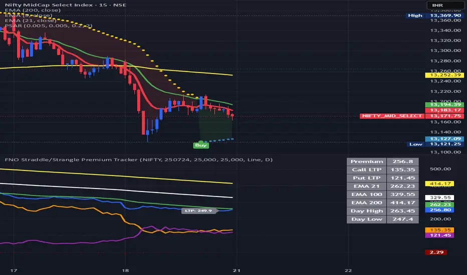
FNO Straddle/Strangle Premium TrackerThe FNO Straddle/Strangle Premium Tracker is a powerful Pine Script indicator designed for options traders to monitor the combined premium of a straddle or strangle strategy for Indian F&O instruments. It tracks the sum of call and put option prices, visualizes the premium as a candlestick or line chart, and includes technical indicators like EMAs and premium percentage change. The indicator also provides a real-time data table, alerts for key events, and exportable data for analysis, making it ideal for tracking premium movements and identifying trading opportunities.
Key Features
Customizable Inputs: Select from a wide range of underlying symbols (e.g., NIFTY, BANKNIFTY, stocks like RELIANCE, TCS), expiry date, call/put strike prices, chart type (Candlestick or Line), and timeframe (1-min to Daily).
Premium Visualization: Plots the combined premium (Call + Put) as a candlestick or line chart, with customizable colors for easy trend identification.
Exponential Moving Averages (EMAs): Displays 21, 100, and 200-period EMAs to track premium trends, with alerts for premium crossing above/below the 21-period EMA.
Premium % Change: Shows the percentage change in the combined premium as a histogram for quick momentum analysis.
Real-Time Data Table: A table in the top-right corner displays the latest premium, call/put Last Traded Prices (LTP), and EMA values (21, 100, 200).
Error Handling: Alerts users with a warning label if the selected symbol, expiry, or strike is invalid or data is unavailable.
Data Export: Outputs the latest premium, call LTP, and put LTP as a text string for easy copying or analysis.
LTP Label: Displays the current premium value every 5 bars for quick reference.
How It Works
Input Selection: Choose the underlying symbol, expiry date (YYMMDD format, e.g., 250626 for June 26, 2025), call and put strike prices, chart type, and timeframe.
Data Fetching: The script fetches real-time OHLC (Open, High, Low, Close) data for the selected call and put options using the specified symbol and expiry.
Premium Calculation: Combines the call and put option prices to calculate the straddle/strangle premium (Open, High, Low, Close).
Visualization: Plots the premium as a candlestick (green for bullish, red for bearish) or a blue line chart, along with EMAs, call/put LTP lines, and a premium % change histogram.
Alerts & Notifications: Triggers alerts when the premium crosses the 21-period EMA and displays a warning if data is invalid.
Data Display: Shows key metrics in a table and provides exportable data for further analysis.
Inputs
Select Symbol: Choose the underlying instrument (e.g., NIFTY, BANKNIFTY, RELIANCE, etc.).
Expiry Date: Enter the option expiry in YYMMDD format (e.g., 250626).
Call/Put Strike: Specify the strike prices for the call and put options.
Chart Type: Select "Candlestick" or "Line" to visualize the premium.
Timeframe: Choose the data aggregation period (e.g., 1-min, 5-min, Daily).
Outputs
Chart: Candlestick or line plot of the combined premium, with EMAs (21, 100, 200), call/put LTP, and premium % change histogram.
Table: Real-time display of premium, call/put LTP, and EMA values.
Alerts: Notifications for premium crossing EMA21 or invalid data.
Export Data: A text string with the latest premium, call LTP, and put LTP for external use.
Use Cases
Straddle/Strangle Trading: Monitor premium movements for at-the-money (ATM) straddles or out-of-the-money (OTM) strangles to time entries/exits.
Trend Analysis: Use EMAs to identify bullish or bearish trends in the premium.
Momentum Trading: Leverage the premium % change histogram to spot rapid price movements.
Risk Management: Track call and put LTP individually to assess option price behavior.
Data Analysis: Export premium data for backtesting or strategy development.
How to Use
Add the indicator to your TradingView chart.
Configure the inputs (symbol, expiry, strikes, chart type, timeframe) based on your trading setup.
Monitor the chart for premium trends, EMA crossovers, and % change signals.
Use the table and export data for real-time insights or external analysis.
Set up alerts to get notified when the premium crosses the 21-period EMA.
Notes
Ensure the symbol, expiry, and strike prices are valid for your data provider to avoid "Invalid Symbol" errors.
The indicator works best on Indian F&O instruments (NSE/BSE) with active options chains.
For optimal performance, use shorter timeframes (e.g., 1-min, 5-min) for intraday trading or Daily for positional analysis.
The premium % change histogram helps identify volatility spikes, useful for breakout strategies.
Limitations
Requires valid option chain data from TradingView’s data provider.
Performance may vary on low-liquidity instruments or illiquid strike prices.
Alerts are limited to EMA21 crossovers; additional custom alerts can be added as needed.
Feedback
If you have suggestions or need additional features (e.g., Bollinger Bands, RSI, or volatility metrics), feel free to comment! Happy trading!
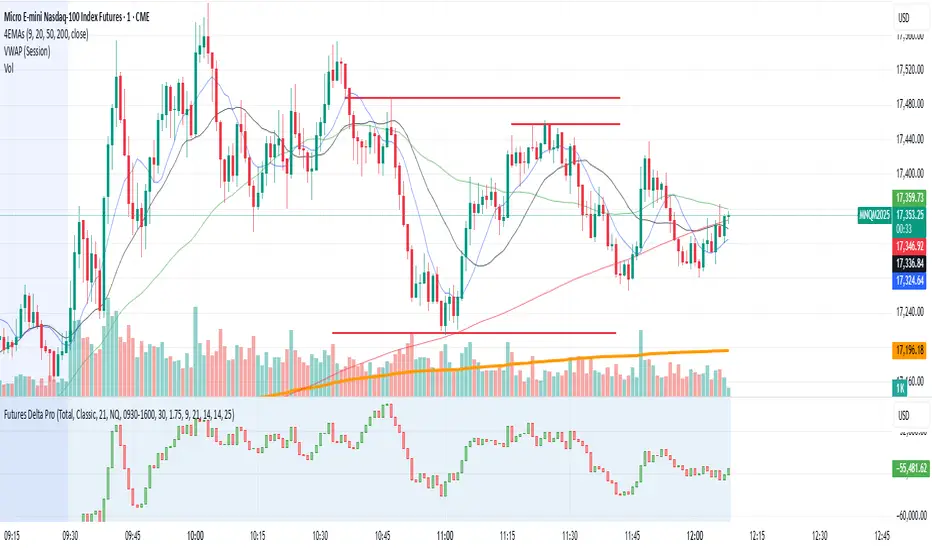
NQ/MNQ Futures Delta+ with Price Action EntriesNQ/MNQ Futures Delta+ with Price Action Entries
Description: This TradingView indicator combines Futures Delta analysis with advanced price action techniques to provide an enhanced trading strategy for the NQ/MNQ futures market. The script analyzes the market using a variety of methods including Delta, volume analysis, and candlestick patterns, while also incorporating price action factors like support/resistance levels and breakouts to offer more refined buy and sell signals.
Key Features:
Delta Analysis:
The Delta calculation tracks the difference between buying and selling pressure within each market bar. The indicator calculates delta based on different modes (Classic, Volume Based, Tick Based), and then applies cumulative delta for trend analysis.
The Cumulative Delta is calculated using one of the three available modes:
Total: Tracks the cumulative delta over time.
Periodic: Measures delta over a defined period (user-configurable).
EMA: Applies an Exponential Moving Average to smooth the delta values.
Volume Confirmation:
The script includes volume analysis to confirm price movements. A volume spike is used to validate buy/sell signals, ensuring that price movements are supported by significant trading volume.
Price Action-Based Entries:
Support and Resistance: Dynamic support and resistance levels are calculated based on the lowest low and highest high of the last 20 bars. These levels are used to identify breakout points, providing context for potential buy/sell entries.
Candlestick Patterns: The script recognizes Bullish Engulfing and Bearish Engulfing candlestick patterns. These patterns signal potential reversals in price direction and are used to confirm trade entries.
Breakout Logic: Buy signals are triggered when the price breaks above resistance, and sell signals are triggered when the price breaks below support, providing high-probability entry points during trend reversals or continuations.
Moving Average Trend Confirmation:
The script uses two moving averages:
9-period Exponential Moving Average (EMA): Short-term trend indicator.
21-period Exponential Moving Average (EMA): Longer-term trend indicator.
Trades are only considered in the direction of the prevailing trend:
A bullish signal is confirmed if the price is above both EMAs.
A bearish signal is confirmed if the price is below both EMAs.
Buy/Sell Signal Triggers:
Buy Signal: A buy signal is triggered when:
A bullish divergence is confirmed with volume support.
A bullish engulfing candlestick pattern forms.
The price breaks above resistance.
The price is above both the 9 EMA and 21 EMA, indicating an uptrend.
Sell Signal: A sell signal is triggered when:
A bearish divergence is confirmed with volume support.
A bearish engulfing candlestick pattern forms.
The price breaks below support.
The price is below both the 9 EMA and 21 EMA, indicating a downtrend.
Visualization:
Delta Candles: The cumulative delta is plotted as a candlestick on the chart, with green and red coloring to show buying or selling dominance.
Support and Resistance Levels: Support and resistance zones are plotted to show key levels where price action may react.
Moving Averages: The 9 EMA and 21 EMA are plotted to show short-term and long-term trend direction.
Signal Markers: Buy and sell signals are marked on the chart with green triangles (buy) and red triangles (sell) for easy visualization of trade opportunities.
Alerts:
Alerts can be set up for buy and sell signals, enabling you to be notified when the script identifies potential trade opportunities based on Delta analysis, volume confirmation, and price action.
How to Use This Script:
Market: This script is optimized for NQ and MNQ futures contracts but can be adapted for other markets as well.
Signal Interpretation: Use the buy and sell signals for trend-following or counter-trend trades. These signals are particularly useful for 1-minute or 5-minute charts but can be adjusted to fit other timeframes.
Support/Resistance: Pay close attention to the dynamic support and resistance levels, as these are key price action points where significant price movements can occur.
Trend Confirmation: Ensure that trades are aligned with the overall trend confirmed by the 9 EMA and 21 EMA. The script prioritizes signals that align with the broader market trend.
Breakouts: Use the breakout logic to catch price moves when the market breaks key support or resistance levels. These can often lead to strong moves in the direction of the breakout.
tripleFlows Master EUR - by ManhDNThe TripleFlows Master EUR indicator is a technical analysis tool designed for TradingView to systematically evaluate the strength or weakness of the Euro (EUR) across 7 major currency pairs. This indicator provides a clear and objective measure of EUR momentum by analyzing moving averages, aggregating the data into a comprehensive Flow Index, and visualizing the collective price action of the Euro.
---
How It Works
1. Data Collection:
- The indicator pulls price data from the 7 most significant EUR currency pairs:
EUR/USD, EUR/JPY, EUR/GBP, EUR/AUD, EUR/CAD, EUR/NZD, and EUR/CHF.
2. Moving Average Calculation:
- For each of the 7 currency pairs, the indicator computes:
- A 5-period moving average (MA).
- A 20-period moving average (MA).
- It then compares these two moving averages to identify whether the trend for each pair is bullish or bearish:
- If MA(5) > MA(20), the trend is considered bullish for the Euro.
- If MA(5) < MA(20), the trend is considered bearish for the Euro.
3. Flow Index Aggregation:
- The indicator aggregates the trend signals from all 7 currency pairs to calculate a Flow Index, which ranges from -100 to +100:
- +100: All 7 pairs indicate a bullish trend for EUR (maximum strength).
- -100: All 7 pairs indicate a bearish trend for EUR (maximum weakness).
- Values closer to 0 indicate a more neutral market condition.
4. Visual Representation of Composite Price Action:
- In addition to the Flow Index, the TripleFlows Master EUR generates a **composite candlestick chart** based on the aggregated price action of the 7 EUR pairs.
- This chart provides a clear visual representation of the Euro's overall price behavior, allowing traders to analyze trends directly through candlestick patterns and moving averages.
- By observing this chart, traders can make decisions based on the combined action of all 7 pairs, rather than relying on a single pair.
5. Triple Flow Calculation Across Timeframes:
- The Flow Index is calculated on three timeframes:
- Junior (short timeframe).
- Medior (medium timeframe).
- Senior (long timeframe).
- The indicator evaluates the Flow Index across these three timeframes to determine Triple Flow:
- Triple Flow Up (Bullish): All three timeframes show a Flow Index of +100.
- Triple Flow Down (Bearish): All three timeframes show a Flow Index of -100.
---
Purpose and Application
- Trend Confirmation:
The TripleFlows Master EUR provides objective trend confirmation by synthesizing data across multiple pairs and timeframes.
- Bullish Trend: Look for opportunities to go long when Triple Flow Up is confirmed.
- Bearish Trend: Look for opportunities to go short when Triple Flow Down is confirmed.
- Multi-Timeframe Consistency:
The synchronization of the Flow Index across junior, medior, and senior timeframes ensures high-probability setups by aligning short-term and long-term trends.
- Composite Price Action Analysis:
The composite candlestick chart simplifies the analysis of EUR price behavior by aggregating data from 7 pairs, helping traders identify trends, key levels, and patterns visually.
---
Outputs and Visuals
1. Flow Index:
- Displayed as a value between -100 and +100, showing the aggregated strength or weakness of the Euro.
2. Composite Candlestick Chart:
- A real-time chart that represents the Euro's collective price action across 7 pairs.
3. Triple Flow Status:
- Visual indication of Triple Flow conditions (e.g., Triple Flow Up or Triple Flow Down) based on the alignment of Flow Index values across all three timeframes.
4. Alerts:
- The indicator includes alerts for when a Triple Flow Up or Down condition is detected, allowing users to respond to key market opportunities.
---
Technical Notes
- Flow Index Calculation:
The calculation is based purely on the relative position of the 5-period and 20-period moving averages across 7 pairs. It does not rely on external factors, ensuring the results are fully derived from price data.
- Composite Price Action:
The composite candlestick chart integrates the aggregated price movements of 7 pairs into a single, easy-to-read visual representation.
- Scalability Across Timeframes:
The TripleFlows Master EUR can be applied to any trading style, as it adapts to various timeframes:
- Junior timeframe for intraday analysis.
- Medior timeframe for swing trading.
- Senior timeframe for position trading.
---
Conclusion
The TripleFlows Master EUR indicator provides a robust, data-driven solution for analyzing the Euro’s performance across major currency pairs. By aggregating price action from 7 pairs into a composite candlestick chart and synchronizing trends across multiple timeframes, the indicator eliminates the limitations of analyzing individual pairs in isolation. This comprehensive approach ensures traders can identify trends and opportunities with greater accuracy and confidence.
Holy-Cow IndicatorHoly-Cow Indicator
Advanced Multi-Pattern Candlestick Analyzer (HC, NV, RN)
Description
Overview
This indicator is designed to detect key candlestick patterns based on foundational principles of price action analysis, now presented with a modernized approach for easier recognition and enhanced utility. Drawing inspiration from the work of candlestick charting pioneer Steve Nison (Japanese Candlestick Charting Techniques) and advanced price action strategies popularized by Linda Raschke (Street Smarts), this tool identifies and highlights unique combinations such as the Holy-Cow (HC), Nova (NV), and Red-Nova (RN) patterns.
These patterns simplify the complexities of price action into actionable setups, making them suitable for all types of traders.
Features
Inside Bars (IB):
Marks consolidation zones where the current candle’s range is inside the previous candle’s range. Useful for spotting breakout opportunities.
Outside Bars (OB):
Identifies candles where the current range exceeds the previous candle’s range.
Indicates potential reversals or trap setups.
Holy-Cow Pattern (HC):
Inspired by: Trap + Consolidation Setup
An Outside Bar followed by an Inside Bar.
Highlights volatility followed by tight consolidation, often preceding a breakout.
Nova Pattern (NV):
Inspired by: Breakout Trap + Expansion
An Inside Bar followed by an Outside Bar.
Signals breakout traps and subsequent volatility, useful for reversals or momentum moves.
Red-Nova Pattern (RN):
Inspired by: Volatility Trap + Major Breakout Zone
A combination of Holy-Cow (HC) and Nova (NV) patterns.
Represents a highly compressed market state, often leading to significant, high-intensity moves.
Bollinger Bands Integration:
Provides context on volatility and potential overbought/oversold levels.
Customizable Visibility:
Toggle specific patterns (IB, OB, HC, NV, RN) to suit your trading strategy.
How to Use
Pattern Detection:
Enable the patterns you want to focus on through the settings panel (e.g., HC for breakout setups, RN for high-intensity moves).
Observe highlighted zones and labels for actionable trade setups.
Trading Strategies:
Breakout Trades:
Look for HC, NV, or RN patterns near support/resistance and trade in the breakout direction.
Reversal Trades:
Use NV or RN patterns forming near key levels to catch reversals.
Stop-Loss:
Place below/above the low/high of the identified pattern.
Take Profit:
Use support/resistance levels, Fibonacci extensions, or a predefined risk-reward ratio (e.g., 2:1).
Recommended Timeframes:
1–15 minutes: Scalping or intraday trading.
1-hour: Intraday and swing trading.
Daily/Weekly: Ideal for significant trend analysis and major market moves.
Acknowledgments
This indicator is based on well-established trading principles and enhanced with unique combinations for modern trading. The foundational ideas behind these patterns are drawn from:
Steve Nison: Who introduced candlestick charting to Western traders in his seminal work, Japanese Candlestick Charting Techniques, and popularized concepts such as Inside and Outside Bars.
Linda Raschke: Who furthered the application of price action patterns in her book Street Smarts, showcasing multi-bar setups and momentum strategies.
While the patterns Holy-Cow (HC), Nova (NV), and Red-Nova (RN) are unique to this indicator, they build upon these foundational principles to offer traders actionable insights.
Disclaimer
This indicator is an independent creation inspired by publicly available price action principles. It is not affiliated with any proprietary tool or service. Back testing and proper risk management are strongly advised before live trading.

Pin Bar, Inside Bars and Engulfing Candle SticksIntroducing the Candlestick Pattern Plotter, a comprehensive TradingView indicator designed to elevate your technical analysis by automatically identifying and plotting three essential candlestick patterns – Pin Bars, Engulfing Candles, and Inside Bars. This powerful tool equips traders with a holistic view of market dynamics, enabling them to make informed decisions based on key price action signals.
Pin Bar Identification:
The indicator adeptly recognizes Pin Bars, a pivotal candlestick pattern characterized by a small body and a long wick in the opposite direction of the prevailing trend.
Pin Bars are instrumental in signaling potential trend reversals or continuations, providing crucial insights for strategic decision-making.
Engulfing Candle Detection:
Identify Engulfing Candles effortlessly with this indicator, showcasing instances where the body of one candle fully engulfs the body of the previous candle.
Engulfing Candles serve as powerful reversal indicators, offering valuable insights into shifts in market sentiment and potential trend reversals.
Inside Bar Recognition:
The indicator goes beyond traditional patterns by identifying Inside Bars, where the range of a candle is entirely within the previous candle's high and low.
Inside Bars often signify consolidation or a period of indecision in the market, providing traders with crucial information about potential breakouts or reversals.
Seamlessly integrate the Candlestick Pattern Plotter into your TradingView chart, enjoying a user-friendly interface for swift interpretation of candlestick patterns.
Toggle the display of Pin Bars, Engulfing Candles, and Inside Bars on and off with ease, allowing you to focus on the specific patterns most relevant to your analysis.
Real-Time Alerts:
Stay ahead of the market with real-time alerts that notify you when a Pin Bar, Engulfing Candle, or Inside Bar is identified on the chart.
Timely notifications keep you informed, ensuring you never miss a potential trading opportunity based on these crucial candlestick patterns.
Enhance your trading strategy with the precision of Pin Bars, Engulfing Candles, and Inside Bars, seamlessly integrated into your analysis through the Candlestick Pattern Plotter. Gain a comprehensive understanding of market movements and make well-informed decisions in real-time.
High Volume Engulfing Candle_bullHornThe "High Volume Engulfing Candle" indicator is a technical analysis tool used in trading to identify specific candlestick patterns that suggest potential reversals or significant price movements in a financial instrument. It focuses on two key criteria: the engulfing candlestick pattern and high trading volume. Here's a brief description of the indicator:
Engulfing Candlestick Pattern: The indicator looks for bullish and bearish engulfing candlestick patterns.
Bullish Engulfing: This pattern occurs when the current candlestick completely engulfs the previous one. In other words, the current candlestick's body (the open and close prices) is larger than the previous candlestick's body, and it closes higher than the previous candle's close. It suggests a potential bullish reversal.
Bearish Engulfing: This pattern occurs when the current candlestick's body completely engulfs the previous one, but in the opposite direction. The current candlestick's body is larger than the previous candlestick's body, and it closes lower than the previous candle's close. It suggests a potential bearish reversal.
High Volume Confirmation: In addition to the engulfing pattern, the indicator considers trading volume. It looks for instances where the volume accompanying the engulfing candle is significantly higher than a moving average of the volume. This indicates strong market participation and validates the importance of the engulfing candle pattern.
Arrows on the Chart: When a high volume engulfing candle pattern is detected, the indicator plots arrows on the price chart. A green triangle pointing up is used for bullish engulfing patterns, while a red triangle pointing down is used for bearish engulfing patterns. These arrows help traders quickly identify potential reversal points.
Overall, the "High Volume Engulfing Candle" indicator combines the visual recognition of candlestick patterns with volume analysis to provide traders with potential signals for trend reversals or significant price moves in the market. Traders can use these signals as part of their technical analysis and trading strategies.
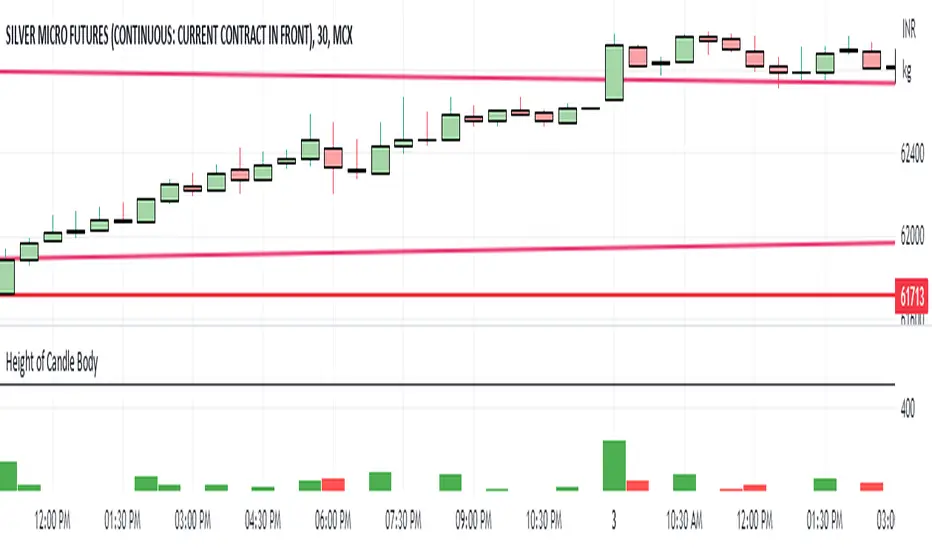
Height of Candle BodyUnderstanding the Height of Candlestick Body
Candlestick charts are a popular method of displaying price data in financial markets. They provide a visual representation of price movements and are used by traders to make informed decisions about buying and selling assets. Understanding the height of a candlestick body is an important aspect of technical analysis and can help traders identify trends and make profitable trades.
The height of a candlestick body is the distance between the opening and closing price of an asset over a given time period. When the closing price is higher than the opening price, the candlestick body is typically colored green or white and is considered bullish. Conversely, when the closing price is lower than the opening price, the candlestick body is typically colored red or black and is considered bearish.
The height of the candlestick body is important because it can provide valuable information about market sentiment. If the candlestick body is relatively small, it suggests that there is indecision in the market and that buyers and sellers are evenly matched. Conversely, if the candlestick body is relatively large, it suggests that there is a significant amount of buying or selling pressure in the market.
Engulfing Candles (Bullish and Bearish) + Trend | by Octopu$⛳ Engulfing Candles (Bullish and Bearish ) with Trend Recognition | by Octopu$
This Indicator identifies and plots Engulfing Candlestick Patterns.
Engulfing Candles are a combination of two bars on a price chart.
They are used to indicate/anticipate a market reversal.
The second candlestick must be bigger than the first, so it 'engulfs' the previous bar.
This indicator identifies both Price Movements:
Bullish stands for Upside
Bearish stands for Downside
These are NOT entry/exit signals to buy or sell securities*
(*The combination of your understanding and analysis as well as other Indicators and Factors as Confluence, you can improve your Charting Analysis.)
www.tradingview.com
SPY
ANY Ticker. ANY Timeframe.
( SPY 5m as an example only.)
Features:
• Engulfing Candles
• Bullish Setups
• Bearish Setups
• Symbol Signals
Options:
• Color Picker
• Symbol Selector
• Toggle On/Off
• Show name
• Trend Direction
Notes:
v1.0
Indicator release.
Changes and updates can come in the future for additional functionalities or per requests. Follow and Stay Tuned!
Did you like it? Please Support and Shoot me a message! I'd appreciate if you dropped by to say thanks! Thank you.
- Octopu$
🐙
Easy Scalping by JayKasunBINANCE:BTCUSDTPERP
This indicator can show stochastic RSI K and D line crosses and some candlestick patterns on chart.
You can use this indicator to scalping, check usage for more info. Always backtest before trading with your real money.
This indicator will also help mobile TradingView users to get an idea when getting stochastic RSI signals, they can use this indicator to check if stochastic RSI K and D crossed or not. ( Because they have limited area to view chart ) .
4 Exponential moving averages are there in the indicator with easy enable disable option. 9 , 21 , 55 , 100 is suggested as default values.
Meanings of signs in chart
Blue triangle bellow candle means it's a stochastic RSI K and D line cross in oversold level
Red triangle above candle means it's a stochastic RSI K and D line cross in overbought level
Green plus sign shows when EMA 50 crossover EMA 100
Red plus sign shows when EMA 50 cross bellow EMA 100
Features
You can enable candlestick pattern displaying when stochastic RSI K and D cross happen. Check indicator settings.
You can enable displaying ATR Trailing Stops in indicator settings.
Indicator will only show blue triangle after Green plus sign and Red triangles after Red plus sign
After you enable candlestick pattern option, stochastic RSI crosses with candlestick patterns will show in deferent colors. Blue triangle will turn into green and Red triangle into pink.
Usage
Use lower time frames like 5m or 15m
After green plus sign, if price retouched 21 EMA or 55 EMA and blue triangle appeared , you can enter a long position.
After red plus sign, if price retouched 21 EMA or 55 EMA and red triangle appeared , you can enter a short position.
Always wait for candle close . signs of chart can be changed when candle closing. ( Does repaint until candle close )
Use ATR trailing to get a stop loss price.
Use 1:1 or 1:0.5 Risk Reward ratio. Because it's scalping and lower time frame.
Use more indicators like RSI to get more confirmations ( like divergences ) before entering a trade. Its more reliable.
Candlestick Patterns Short names
H - Hammer
IH -Inverted Hammer
BE - Bullish Engulfing ( green triangle )
BE - Bearish Engulfing ( pink triangle )
BH - Bullish Harami ( green triangle )
BH - Bearish Harami ( pink triangle )
I have included ATR + Trailing Stops by SimpleCryptoLife and Candlestick Patterns Identified (updated 3/11/15) by repo32
this is a combination of multiple indicators
credit goes to original creators of above indicators
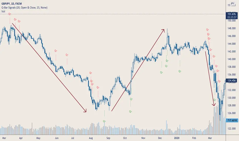
Q-Bar SignalsHello Traders & Q Zoners
I introduce to you my latest indicator “Q-Bar Signals”. This indicator compares candlestick sizes as well as volume levels to check if latest candle is greater in both size and volume to a user-defined set of bars back.
Condition 1: For bullish candles, the indicator will measure the candlestick size of x number of bearish candles back and take the average size. It then takes the size of the bullish candle and if it is bigger than the average of x number of bearish candles, then it will display a green “Q” below that bullish candle. The opposite signal is true for bearish candles, displaying a red “Q” above the candlestick when the bearish candle is larger in size than the average number of bullish candles back.
Condition 2: The second part of this indicator compares volume. If a candlestick has met the first condition, it will also measure the volume of that candlestick and compare it to the volumes of a user-defined number of bars back. If the candlestick is bullish, it will look at the last x number of bearish volume bars and check if the bullish volume is higher than the highest volume of the bearish candles. If the condition is met, a green “Q+” will appear below the candle for bullish candles, and a red “Q+” will appear above the candle for bearish candles.
The user has a few different input options as well as alerts:
- Number of bars back to measure candlestick size from and take its average
- The candlestick measurement method: Between high to low, between open to close, or between the high/low to close (bullish candles measured between low to close, bearish candles measured between high to close)
- Number of bars back to check highest volume from and compare to current candlestick volume.
- Option to show only Q signals or both Q+ signals.
- Alerts for when signal first appears.
The signal waits for the candle to close and will then display signal and/or alert on the very opening of the next bar.
Tooltips have been added to the Q and Q+ labels which will display information containing the candlestick sizes and volume sizes to show you how the calculation is being performed and how big the differences are.
This indicator is meant to be used in conjunction with other tools and methods to help traders spot significant changes in price action and volume spikes.
Enjoy!
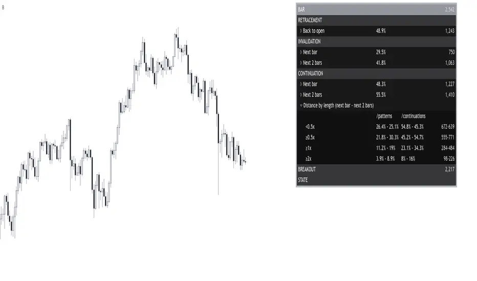
Bar█ OVERVIEW
This indicator demonstrates how we can use Pine script for collecting data to study the market.
By building a statistical report based on the chart candlestick analysis, discover if there is an edge or not, when and where?
Compare it with a specific candlestick pattern and know how its behavior diverges. I have already covered some here .
I hope it can bring you ideas for researching new edges, testing, and trying new things.
█ FEATURES
Sections
The report organizes the data into the following sections: retracement , invalidation , continuation , breakout , and state . Each of them provides insights into the price behavior and answers to questions such as: How often does price retrace? Does the pattern often invalidate? If it does not, does it break in the pattern's direction? How far does the price go? What are the odds of a false breakout? What is the likelihood of the next bar being a down candle?
Highlighter
The indicator highlights flat bars (open and close at the same price). It also highlights bullish and bearish bars once a filter is applied.
Settings
Filtering of bars closing beyond their prior bar’s high and low;
Filtering of reversal bars (two modes available);
Displaying distances relative to the bars length or Average True Range;
Collapsing/expanding each section;
Changing the report’s coloring and positioning;
█ NOTES
Computation
The script computation occurs on bar close.
Distances in ATR
When using a period of 20, for example, the first 19 candles are ignored because the ATR is not defined yet.
Multiple Candle Stick PatternsMultiple Candle Patterns (added multiple indicators regarding candle stick patterns)
1. Ichimoku cloud and candle
2. Candlestick Patterns Identified (updated 3/11/15) by repo32
3. Candlestick Patterns With EMA and Stochastic by rmwaddelljr
4. TUX Candles
Please note me when the signals are overlapped or unrecognizable, then they will be fixed.
- Korean -
캔들 스틱 패턴에 관한 여러가지 지표를 합쳐서 하나로 만들었습니다.
시각적으로 시그널이 곂치거나, 잘 안보이는 부분은 코멘트 남겨주시면 수정하겠습니다.

DisruptNEX Edge SystemDisruptNEX Edge System is an analytical overlay indicator designed to visualize market direction, trend maturity, exhaustion conditions, and impulse activity within a single, coherent framework.
The system is built as a structured analytical model rather than a collection of independent tools.
All visual elements are derived from a shared internal reference, ensuring consistency between trend context, exhaustion states, impulse activity, and higher-timeframe structure.
1. Market Regime & Trend Visualization
Illustration 1: Market regime visualization through candle coloring.
At the foundation of the system lies a price-centered baseline, computed as a windowed mid-range estimator with optional adaptive smoothing.
This baseline defines the current market regime:
Price above the baseline represents bullish directional pressure.
Price below the baseline represents bearish directional pressure.
The regime is expressed directly through candle coloring, allowing traders to visually identify the active trend without relying on additional overlays or separate panels.
This regime context acts as the primary reference for all subsequent components of the system.
2. Exhaustion Zones on the Price Chart
Illustration 2: Overbought / Oversold ribbons visualized directly on price.
DisruptNEX Edge System identifies potential exhaustion using a persistence-based evaluation of how consistently price holds above or below a volatility-adjusted reference.
Unlike oscillators displayed in a separate pane, exhaustion is visualized directly on the price chart using bounded ribbons.
Key characteristics of the exhaustion logic:
Overbought and Oversold states are detected as discrete state transitions.
Zones are marked at their initial appearance.
Visual persistence reflects state continuity rather than momentary fluctuations.
This approach helps traders assess when price reaches statistically stretched conditions relative to the active regime, often corresponding to areas where pullbacks or pauses may develop.
3. Candlestick Pattern Context
Illustration 3: Candlestick patterns displayed within the active trend context.
The system includes optional candlestick pattern detection displayed directly on the price chart as contextual information.
Patterns are evaluated relative to the active market regime and are commonly associated with short-term pauses, pullbacks, or localized price reactions within an existing trend.
Patterns are not interpreted as standalone reversal signals and do not provide trade instructions.
Their role is to complement trend context by highlighting moments where traders may choose to observe price behavior more closely.
4. Spark Impulses & Structural Reference Zones
Illustration 4: Spark impulses and dynamic structural reference zones.
Spark impulses highlight moments when directional pressure increases within the active market regime.
They are derived from a volatility-normalized measure of price displacement relative to the internal baseline and evaluated across multiple smoothing horizons.
This allows the system to identify shifts in directional activity rather than isolated price fluctuations.
Spark impulses commonly appear after consolidation, pullbacks, or localized hesitation and act as analytical confirmation that market activity is resuming in a given direction.
Alongside impulse visualization, the system derives dynamic structural reference levels based on recent price behavior and volatility.
These levels are updated only on the most recent bar and represent contextual support and resistance zones.
Structural reference levels are not predictive targets.
They serve as spatial guides, helping traders evaluate price positioning relative to recent structure and impulse activity.
5. Trend Power & Multi-Timeframe HUD
Illustration 5: Right-side HUD summarizing multiple timeframes.
The indicator includes a compact HUD panel that aggregates key structural information across multiple timeframes:
Overbought / Oversold state
Trend Power level
Trend direction
Trend Power quantifies how extended the current regime is by measuring price progression since the last confirmed regime change, normalized by volatility and mapped to a bounded scale.
This allows traders to distinguish between developing, established, and extended trends, while the multi-timeframe layout helps assess alignment between the current chart and higher-level market structure.
How to Read the Indicator
Start by observing candle coloring to identify the active market regime.
Use exhaustion ribbons to recognize areas where price may pause or pull back relative to the regime.
Treat candlestick patterns as contextual signals highlighting potential short-term reactions.
Look for Spark impulses as confirmation of renewed directional activity.
Use structural reference zones as orientation points when evaluating price location.
Consult the HUD to check trend direction, maturity, and exhaustion across higher timeframes.
Alerts & Usage Notes
Alerts are event-based and triggered only on confirmed state changes, including:
Regime transitions
Exhaustion state entries
Candlestick pattern detection
Spark impulse events
Important Notes
DisruptNEX Edge System is not an automated trading system.
It does not execute trades or provide trade instructions.
All outputs are analytical and visual in nature and are intended to support discretionary decision-making.

Level Founder indicatorQuesto strumento, ideato per l'individuazione dei livelli orizzontali sensibili si prepone l'obiettivo di semplificare la lettura tecnica dei grafici. Alla base di questo indicatore c'è il concetto di volatilità, inteso come scontro tra domanda ed offerta, come escursione delle forze nel campo di battaglia fino alla determinazione del prezzo finale di ogni candela. Di fatto, andando a cogliere quella che è la volatilità candela per candela, l'indicatore la calcola in termini assoluti rendendola un numericamente comparabile, in un range tra 0 e 100. Quando questo valore tocca i 100 si genera un picco di volatilità, il quale va ad identificare un punto di attenzione sul grafico di uno strumento. In corrispondenza di questi picchi si osserva dove la battaglia tra compratori e venditori si è conclusa, ovvero dove domanda ed offerta si sono incontrati per definire un prezzo: la chiusura di candela. In corrispondenza di tale prezzo si ha, quindi, un accordo certo tra domanda ed offerta dopo un periodo di contrattazione volatile, andando a certificare quello che è un livello di prezzo "sudato" per un determinato sottostante. Tale soglia si traduce in un livello orizzontale sensibile, che in futuro (avendo il mercato memoria degli scontri passati) potrà comportarsi da supporto o da resistenza, a seconda della situazione. In breve quindi, si traccia una linea orizzontale in corrispondenza delle chiusure di candela che condividono un picco sull'indicatore "Level Founder Indicator". Funziona su ogni time-frame e sottostante.
N.B. A ridosso di questi livelli si possono cercare pattern per l'operatività oppure cercare delle rotture di questi livelli per delle conferme/inversioni, spaziando dal trading intraday all'investimento di lungo periodo.
ENGLISH VERSION:
This tool, designed to identify sensitive horizontal levels, aims to simplify the technical reading of charts. This indicator is based on the concept of volatility, understood as the clash between supply and demand, the oscillation of forces on the battlefield until the final price of each candlestick is determined. By capturing the volatility candlestick by candlestick, the indicator calculates it in absolute terms, making it numerically comparable, within a range between 0 and 100. When this value reaches 100, a volatility spike is generated, which identifies a point of focus on an instrument's chart. At these peaks, we observe where the battle between buyers and sellers has concluded, that is, where supply and demand have met to define a price: the candlestick's close. At this price, therefore, a definite agreement between supply and demand occurs after a period of volatile trading, certifying what is a "hard-earned" price level for a given underlying asset. This threshold translates into a sensitive horizontal level, which in the future (given the market's memory of past clashes) could act as support or resistance, depending on the situation. In short, a horizontal line is drawn at the candlestick closes that share a peak on the "Level Founder Indicator." It works on any timeframe and underlying asset.
N.B.: Near these levels, you can look for trading patterns or look for breakouts of these levels for confirmations/reversals, ranging from intraday trading to long-term investing.
IB with Range PercentageThis Pine Script indicator for TradingView combines several powerful technical analysis tools to give traders a comprehensive view of market action:
Inside Bar Detection: Identifies the classic inside bar candlestick pattern.
Moving Averages: Provides multiple moving averages to help determine trend and potential support/resistance levels.
Information Table: Displays key market data in a concise table format.
1. Inside Bar Detection and Range
The indicator marks inside bars on the chart. An inside bar is a candlestick where its entire range (high and low) falls within the range of the preceding candlestick (often called the "mother bar"). This pattern often signifies market consolidation or indecision.
Customizable Marking: Users can choose the shape and color used to mark the inside bars, such as triangles, squares, or circles.
Range Percentage: A label shows the range of the inside bar as a percentage of the previous bar's low, providing a quantitative measure of its size.
Time Restriction: A setting allows displaying inside bars only for a specified number of past days, focusing analysis on recent price action.
Customizable Label Size: Users can choose the size of the range percentage label for optimal visibility.
2. Moving Averages for Trend Analysis
The indicator can plot up to four moving averages (MAs) on the chart. Moving averages smooth out price data to help identify trends and potential support and resistance levels.
User-Selectable MA Type: For each MA, traders can choose between Simple Moving Average (SMA) or Exponential Moving Average (EMA).
Customizable Length: Users can specify the length (number of periods) for each MA, such as 20, 50, 100, or 200.
Customizable Color: Each MA's line color can be chosen to suit personal preferences.
Trend Identification: When the price is above an MA, it suggests an uptrend, while prices below suggest a downtrend. The slope of the MA also indicates trend momentum.
3. Information Table for Key Data
A customizable information table is displayed on the chart, providing a quick overview of important market data.
Average Daily Range (ADR) Percentage: Shows the average daily range of the asset as a percentage, reflecting its historical volatility.
Distance from EMAs: Displays how far the current price is from the 10, 20, and 50 period Exponential Moving Averages. A positive percentage indicates the price is above the MA, while a negative percentage means it's below.
Customizable Table Elements: Users can choose the table's background color, text color, and text size for optimal readability.
How to Use This Indicator:
This indicator can be a valuable tool for traders using technical analysis:
Inside Bar Breakouts: Inside bars often precede breakouts. Traders can use the inside bar markings and range percentage to identify potential breakout opportunities.
Confirmation of Trends: Moving averages help confirm the direction of the trend, enabling traders to align their inside bar strategies with the prevailing market direction.
Support and Resistance: Moving averages can act as dynamic support and resistance levels. Traders can look for inside bars forming near these levels as potential entry or exit points.
Volatility and Range Analysis: The ADR percentage helps assess the normal daily range of an asset, which can be useful for setting realistic price targets and managing risk.
Risk Management: The distance from EMAs can alert traders to potential overextended moves, providing information for setting stop-loss or take-profit levels.
By combining these elements, this indicator provides a layered approach to market analysis, allowing traders to identify potential trading opportunities and manage risk effectively based on both candlestick patterns and trend-following indicators. Remember that no indicator guarantees success, and it's essential to use this tool in conjunction with other analysis techniques and proper risk management practices.

Pinbar signal 顶/底分型 指标Top/Bottom Fractal Indicator is a technical analysis tool used to identify potential reversal points in a market trend. It is based on the concept of fractal patterns, which consist of specific candlestick formations that signal local highs (top fractals) or lows (bottom fractals).
A top fractal typically occurs when the high of a middle candlestick is higher than the highs of the two candles on either side. This formation suggests that upward momentum may be weakening and a downward reversal could follow. Conversely, a bottom fractal forms when the low of a middle candlestick is lower than the lows of the two adjacent candles, indicating a potential shift from a downtrend to an uptrend.
This indicator is commonly used to spot market turning points, determine entry or exit signals, and enhance the reliability of other indicators such as Bollinger Bands or MACD. Because of its clear structure and reliable reversal signals, the Top/Bottom Fractal Indicator is also widely applied in wave theory and price action strategies.
A Pin Bar is a powerful candlestick pattern used in technical analysis to identify potential price reversals or continuations in the market. It is characterized by a small body located at one end of the candle and a long tail or wick on the opposite side, which indicates a strong rejection of price in that direction. A bullish Pin Bar has a long lower wick, showing that sellers pushed the price down but buyers regained control, suggesting a potential upward move. Conversely, a bearish Pin Bar has a long upper wick, indicating that buyers attempted to drive prices higher but were overpowered by sellers, hinting at a possible downward move. For high-probability setups, traders typically look for Pin Bars that form at key support or resistance levels, trendlines, or Fibonacci zones, and they often use them in combination with overall trend direction. Entry strategies include entering at the close of the Pin Bar, on a retracement, or above/below the wick with stop-losses placed beyond the wick’s extreme. When used correctly in the right context, the Pin Bar can be a highly effective signal in a trader’s toolkit.
