Yield Curve Approximation
A yield curve is a graph that plots the yields (interest rates) of bonds with the same credit quality but different maturity dates. It helps investors understand the relationship between short-term and long-term interest rates.
🔹 Types of Yield Curves
1️⃣ Normal Yield Curve – Upward-sloping, indicating economic expansion.
2️⃣ Inverted Yield Curve – Downward-sloping, often a recession warning.
3️⃣ Flat Yield Curve – Suggests economic uncertainty or transition.
The yield curve is widely used to predict economic conditions and interest rate movements. You can learn more about it here. Would you like insights on how traders use the yield curve for investment decisions?
How to Trade Using This?
✅ If the yield curve is steepening (green) → Favor growth stocks, commodities, and high-risk assets.
✅ If the yield curve is flattening or inverting (red) → Consider bonds, defensive sectors, or hedging strategies.
✅ Pair with economic news and interest rate decisions to refine predictions.
Search in scripts for "Cycle"

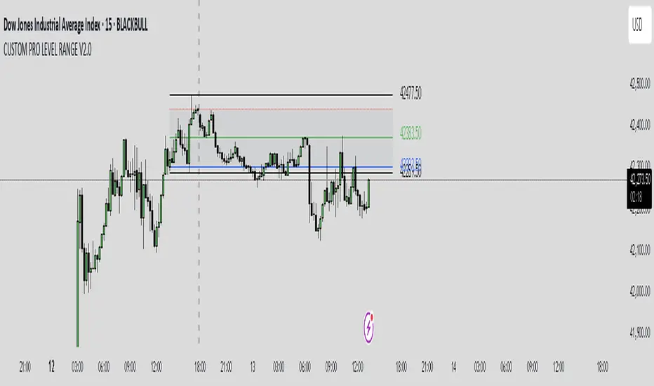
CUSTOM PRO RANGE V2.0 with AlertsCore Functions
Tracks High/Low Ranges
Daily (DR) or Initial (IDR) ranges within custom time windows (e.g., 9:30 AM–4:00 PM).
Optional extended hours (e.g., overnight).
Visual Tools
Draws boxes/lines for range boundaries, midpoints, and opening prices.
Custom colors/styles for clarity.
Smart Alerts
Notifies when price breaks high/low/mid of the range.
Avoids spam with once-per-bar alerts.
Flexible Timeframes
Works for intraday, daily, or even quarterly ranges with minor tweaks.
🎯 Who It Helps
Day Traders: Spot breakouts/reversals.
Swing Traders: Identify key support/resistance.
Analysts: Study price behavior in specific sessions.
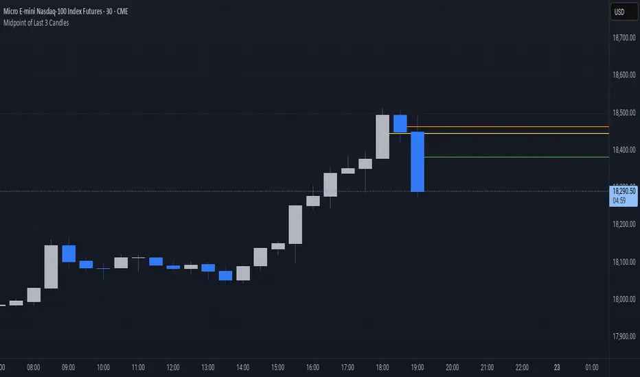
Midpoint of Last 3 CandlesThis indicator highlights the market structure by plotting the midpoints of the current and previous two candles. It draws a horizontal line at the average of the high and low for each of these candles, giving a visual cue of the short-term balance point in price action. These midpoints can act as dynamic support and resistance levels, helping traders assess areas of potential reaction or continuation.
Each line is color-coded for clarity: green represents the current candle, orange marks the previous candle, and yellow indicates the one before that. All lines extend into the future on the chart, allowing you to see how price interacts with these levels as new candles form. This simple yet effective tool can be useful in various strategies, especially those focused on price action, scalping, or intraday analysis.
Stochastic Strategy Table with Trend (1m–4H) + Toggle📊 Multi-Timeframe Stochastic Strategy Table with Trend Detection
This script is designed for intraday and swing traders who want to monitor Stochastic momentum across multiple timeframes in real-time — all directly on the main chart.
🔎 What This Script Does
This script builds a compact, color-coded table that displays:
✅ %K and %D values of the Stochastic oscillator
✅ Cross direction (K > D or K < D)
✅ Overbought/Oversold zone conditions
✅ Short-term trend detection via %K movement
It covers ten timeframes:
1m, 2m,3m,5m, 15m, 30m, 1H, 2H, 3H, 4H
🟩 How to Use It
Trend colors in header:
🟢 Green = %K is rising (uptrend)
🔴 Red = %K is falling (downtrend)
⚪ Gray = flat or neutral
Cross Row:
Green background = Bullish (%K > %D)
Red background = Bearish (%K < %D)
Zone Row:
Green = Oversold (%K and %D below 20)
Red = Overbought (%K and %D above 80)
Gray = Neutral zone
Use Case:
Look for multiple timeframes aligning in trend
Enter trades on short timeframes (e.g. 5m) when HTFs confirm direction
Especially powerful when used with price action on 5m/15m candles
⚙️ Configurable Inputs
%K Length
%K Smoothing
%D Length
Table location
Table size
💡 Why This Script Is Unique
Shows true higher timeframe Stochastic values (not interpolated from current chart)
Works in real-time with consistent updates
Trend direction is visualized without needing extra space
Built for serious intraday traders who rely on clean data and signal alignment
🙏 Credits & Notes
This tool was created to solve a real problem: getting accurate HTF stochastic data in a clean, real-time, decision-friendly format.
I built it for my own use — and now I'm sharing it for luck, and for anyone else looking to trade more clearly and confidently.
Feel free to fork, customize, or build upon it.
Good luck, and trade safe! 🍀💹

[blackcat] L2 Rhythm RiderOVERVIEW
The L2 Rhythm Rider is an advanced technical analysis tool meticulously crafted to assist traders in identifying intricate market rhythms and uncovering lucrative trading opportunities. By integrating sophisticated calculations such as weighted averages, deviations from Simple Moving Averages (SMAs), and bespoke oscillators, this indicator offers profound insights into market dynamics, momentum, and trend reversals. Whether you're a seasoned trader looking to refine your strategies or a novice seeking robust analytical tools, the Rhythm Rider provides a comprehensive suite of features tailored to enhance your decision-making process 📊✅.
FEATURES
Comprehensive Calculation Suite:
Percentage Deviation from SMA: Quantifies the deviation of the current price from the Simple Moving Average, providing a nuanced understanding of price behavior relative to historical trends.
Normalized Price Range: Standardizes price movements within a defined range, offering a clearer perspective on market volatility and stability.
Explore Line and Average: Utilizes Exponential Moving Averages (EMAs) to gauge market momentum, helping traders anticipate potential shifts in direction.
Banker Fund and Average: Evaluates market sentiment across varying timeframes, enabling traders to align their strategies with broader market trends.
RSI-Like Indicator: Delivers a Relative Strength Index-inspired metric that assesses the magnitude of price changes, akin to traditional RSI but with unique enhancements.
Bear Power: Analyzes selling pressure by examining recent highs and lows, providing valuable insights into bearish market conditions.
Enhanced Color Coding:
Overbought Conditions: Values exceeding 70 are emphasized with warm hues like red and orange, signaling potential overbought scenarios where caution is advised 🔥.
Oversold Conditions: Values falling below 60 are accentuated with cool tones such as blue and cyan, indicating oversold situations ripe for potential buying opportunities ❄️.
Adjusted Line Widths:
Improved Visibility: Line widths have been fine-tuned to ensure clear differentiation between various plotted elements, making it easier to interpret complex market data at a glance 👀.
Visual Representation:
Explore Line: Displayed in blue or red, depending on its value, to signify bullish or bearish momentum.
Banker Fund: Illustrated in orange or aqua, reflecting differing levels of market sentiment.
Bear Power: Depicted through purple columns, highlighting areas of significant selling pressure.
Trade Signals:
Buy ('B') and Sell ('S') Labels: Clearly marked on the chart to indicate optimal entry and exit points, facilitating swift and informed trading decisions 🏷️.
Automated Alerts:
Customizable Notifications: Generate alerts based on predefined conditions, ensuring traders never miss out on critical market movements 🔔.
HOW TO USE
Adding the Indicator:
Navigate to your TradingView chart and select the L2 Rhythm Rider from the indicators list.
Interpreting Visual Elements:
Familiarize yourself with the various plotted lines and columns, each representing distinct facets of market momentum and sentiment.
Monitoring Trade Opportunities:
Keep an eye on the chart for buy and sell labels, which signal potential trading opportunities based on the indicator's calculations.
Setting Up Alerts:
Configure alerts to notify you when specific conditions are met, allowing for timely action without constant chart monitoring 📲.
Combining Insights:
Integrate the information derived from all plotted elements to form a holistic view of the market, enhancing the reliability of your trading decisions.
LIMITATIONS
Market Volatility: In highly volatile or ranging markets, the indicator might produce false signals, necessitating additional confirmation from other analytical tools 🌪️.
Supplementary Analysis: For enhanced accuracy, users should complement this indicator with other forms of technical and fundamental analysis.
Asset and Timeframe Sensitivity: The performance of the indicator can fluctuate based on the asset type and chosen timeframe, requiring periodic adjustments and evaluations.
NOTES
Data Sufficiency: Ensure ample historical data is available to facilitate precise calculations and reliable results.
Demo Testing: Thoroughly test the indicator on demo accounts prior to deploying it in live trading environments to understand its nuances and limitations 🔍.
Personalization: Tailor the indicator’s settings and visual preferences to better suit individual trading styles and objectives.

Renko Momentum Wave (RMW)Renko Momentum Wave
The Renko Momentum Wave (RMW) is a custom momentum oscillator specifically designed for Renko-based price action analysis. Unlike traditional oscillators that rely on time-based data, the RMW focuses on the directional consistency of Renko bricks, measuring the strength of trend momentum purely based on price movement.
Midnight (Daily) OpenMidnight (Daily) Open v1.0
Overview
Plots a real‑time horizontal line at the U.S. session “midnight” open (i.e. the daily candle’s open price) on any intraday chart. Optionally displays a label with the exact price, making it easy to see how price reacts to the session open.
Key Benefits
Immediate Context: See at a glance where today’s session began, helping identify support/resistance.
Consistent Reference: Works on any symbol or intraday timeframe.
Customizable Styling: Tweak colors, line thickness, and label appearance to match your chart theme.
Features
Retrieves the daily open via request.security() (Pine v6).
Draws or updates a single horizontal line that extends into the future.
Optional price label on the last bar, with user‑defined text and background colors.
Zero repainting—always shows the true daily open.

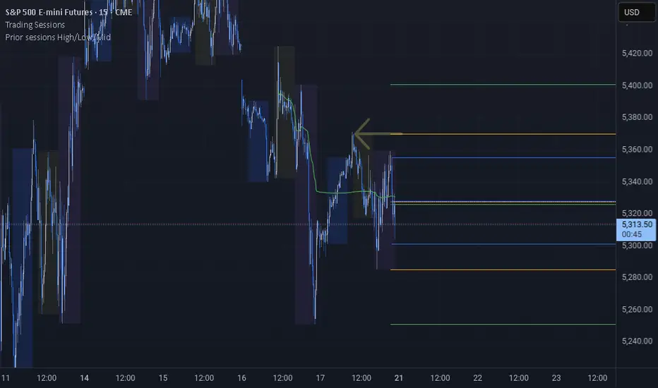
Prior sessions High/Low/MidThis indicator highlights the High, Low, and Midpoint of the most recently completed trading sessions. It helps traders visualize key price levels from the previous session that often act as support, resistance, or reaction zones.
It draws horizontal lines for the high and low of the last completed session, as well as the midpoint, which is calculated as the average of the high and low. These lines extend to the right side of the chart, remaining visible as reference levels throughout the day.
You can independently enable or disable the Tokyo, London, and New York sessions depending on your preferences. Each session has adjustable start and end times, as well as time zone settings, so you can align them accurately with your trading strategy.
This indicator is particularly useful for intraday and swing traders who use session-based levels to define market structure, bias, or areas of interest. Session highs and lows often align with institutional activity and can be key turning points in price action.
Please note that this script is designed to be used only on intraday timeframes such as 1-minute to 4-hour charts. It will not function on daily or higher timeframes.
[blackcat] L2 Ehlers Convolution Indicator V2OVERVIEW The L2 Ehlers Convolution Indicator V2 is an advanced technical analysis tool that applies convolution techniques to identify market trends and potential reversal points. It uses adaptive filtering to analyze price movements across multiple timeframes.
FEATURES
• Advanced convolution algorithm based on Ehlers' methodology
• Multiple timeframe analysis (S2 through S60)
• Dynamic color coding for trend direction:
Red: Downward trend
Green: Upward trend • Adjustable sensitivity through period inputs
HOW TO USE
Input Parameters:
• ShortestPeriod: Minimum period length for calculations
• LongestPeriod: Maximum period length for calculations
Interpretation:
• Red bars indicate downward momentum
• Green bars indicate upward momentum
• Bar height corresponds to the timeframe analyzed
LIMITATIONS
• Requires sufficient historical data for accurate calculations
• May produce false signals during volatile markets
• Performance depends on selected period parameters
NOTES
• The indicator uses arrays to store correlation, slope, and convolution values
• Each bar represents a different timeframe analysis
• Color intensity varies based on the strength of the signal

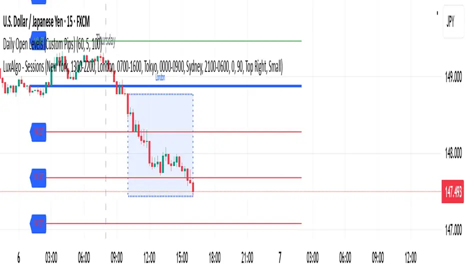
Daily Open Levels (Custom Pips)Daily Open Levels Indicator
Overview: The Daily Open Levels indicator is a simple but powerful tool designed for intraday traders who focus on the daily open price and pip-based levels for decision-making. This indicator helps you visualize key price levels based on the daily opening price, with configurable upper and lower levels calculated in pips. It is especially useful for tracking price movements relative to the previous day’s open and can help traders identify breakout zones, potential support/resistance, and key entry/exit points.
eatures:
Daily Open Price: The indicator automatically calculates and plots the daily open of the current trading day.
Upper and Lower Levels: Configurable upper and lower levels based on a user-defined pip interval. These levels can act as potential resistance or support zones.
Adjustable Pip Interval: You can customize the pip distance for the upper and lower levels to suit different trading styles and volatility.
Works for All Pairs: Option to automatically detect JPY pairs with a different pip value (0.1), or you can manually select your pair setting.
Color Customization: You can choose different colors for the daily open line, upper levels, and lower levels for easy visualization.
Immediate Visual Feedback: The indicator immediately draws the lines on the chart when added, without waiting for any market data.
How It Works:
The daily open price is retrieved from the current trading day, and horizontal lines are drawn at this price level, as well as at pip-based distances above and below it.
The pip distance is calculated using the Pip Interval setting and can be adjusted for any pair. For example, a 225-pip interval would create lines at 225 pips above and below the daily open.
The indicator dynamically updates every minute to reflect new daily opens and adjustments for each trading day.
Lines are drawn using the HLine (horizontal line) objects in MetaTrader 5, making them easy to spot and follow.
Parameters:
Pip Interval: Defines the pip distance for upper and lower levels (e.g., 225 pips). This affects how far above and below the daily open the levels are drawn.
Number of Levels: Sets how many upper and lower levels are drawn.
JPY Pairs: An option to adjust the pip value for JPY pairs (0.1 pip for JPY pairs vs. 0.01 pip for others).
Line Colors: Customize the colors for the daily open, upper levels, and lower levels.
Style & Width: Adjust the style (solid/dashed) and width of the lines to match your preferences.
AsianRange&Midnight 2.2### Midnight Setup: Trading Strategy
#### **Bias Definition (Trend Identification)**
- The Daily (D) bias is defined the previous day and validated on the line chart.
- On the Daily chart, identify the nearest V-shaped formation that has broken close to the current price. This formation determines the Daily bias direction.
#### **H4 Bias Analysis (Trend Confirmation)**
- Switch to an H4 chart to refine the analysis.
- Identify a similar V-shaped formation that has broken in the H4 timeframe.
- If the Daily and H4 biases are aligned, the setup is valid.
#### **Entry Strategy (Position Entries)**
- **Bearish Bias (D and H4 identical):**
- Short entry at the high level of the Midnight range.
- **Bullish Bias (D and H4 identical):**
- Long entry at the low level of the Midnight range.
#### **Bias Divergence (Context Adaptation)**
- If the H4 bias is opposite to the Daily bias, this indicates an H4 retracement of the Daily bias.
- Enter a counter-trend trade with reduced risk.
- No TP target beyond 50% of the extension validating the Daily break. It is also not recommended to enter against this divergence beyond 50%.
#### **Divergence Scenarios (Reactions to Divergences)**
- **Daily Bearish Bias, H4 Bullish Bias:**
- Long entry at the Midnight Low.
- **Daily Bullish Bias, H4 Bearish Bias:**
- Short entry at the Midnight High.
#### **Daily Bias Resumption (Trend Alignment)**
- As soon as the H4 bias resumes the Daily bias direction, follow this trend and adjust the position accordingly.
#### **Instructions for Divergent Bias (Managing Divergence)**
- When holding a position with a divergent bias, it is crucial to manage it carefully.
- Exit counter-trend trades as soon as the H4 bias realigns with the Daily bias.
- Limit the duration of counter-trend trades per session and adjust the H4 bias for the next session if needed.
#### **SL/TP Management (Profit Taking and Protection Optimization)**
- **Take Profit (TP):**
- Entry in M15 with a minimum RR of 3.
- TP at 5H NYE, or RR 5, or 15H NYE.
- **Stop Loss (SL):**
- Minimum 15 pips, placed just above the nearest swing to the entry point to protect capital.
- **Red Announcement Days:**
- Either abstain from trading or set a 40-pip SL to limit volatility impact.
- **At 6H/7H NYE:**
- Manage the trade based on its progress: exit, set to BE (Break Even), or keep the SL in place.
- Any SL adjustment outside these rules can only be made if supported by data or backtests.
#### **Risk Management (Capital Protection)**
- Maximum risk of **1% of capital per trade** (allowing for **10 consecutive losses** without significantly affecting capital).
- In case of a loss, **reduce risk by 50% on the next trade** until the loss is recovered.
#### **Efficiency Conditions (When This Setup Works Best)**
- This setup is particularly effective in **strong trends**, where the market has a clear direction.
- It is **less effective in ranging markets**, where prices move within a narrow range without a clear trend.
Setup Midnight : Stratégie de Trading

Session Color Blocks🧠 Purpose:
To visually highlight different market sessions — Asia, London, Premarket (US), and New York — using colored background blocks on the chart for better timing, context, and trade planning.
🕓 Session Times Used (Eastern Time / New York Time):
Session Time (ET) Color
Asia 8:00 PM – 3:00 AM 🟨 Yellow
London 3:00 AM – 8:30 AM 🟥 Red
Premarket 8:30 AM – 9:30 AM 🟦 Blue
New York 9:30 AM – 4:00 PM 🟩 Green
(DST is automatically handled via "America/New_York" timezone)
✅ Features:
Session colors appear only when that session is active.
Sessions are mutually exclusive, so no overlapping blocks.
Works on any symbol, especially useful for US stock/futures traders.
Auto-adjusts for daylight savings (using TradingView's IANA timezones).
🔧 Future Enhancements (Optional):
Toggle each session on/off
Add vertical lines or labels for session opens
Extend to weekends or custom sessions

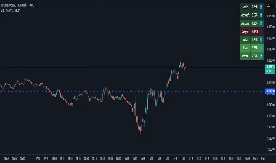
Big 7 NASDAQ📊 Big 7 NASDAQ % Change Heatmap with Trend Arrows
This indicator displays a real-time performance table for the "Big 7" NASDAQ stocks:
Apple (AAPL), Microsoft (MSFT), Amazon (AMZN), Google (GOOGL), Meta (META), Tesla (TSLA), and Nvidia (NVDA).
🔎 Features:
Live Daily % Change: Calculates the percentage change between today’s open and the current price.
Color Gradient: Background color intensity reflects the strength of the move (from mild to strong bullish/bearish).
Trend Arrows: Visual arrows 🔺 (up) and 🔻 (down) represent the direction of movement.
Position Mode Selector:
"Buy" – highlights with green tones
"Sell" – highlights with red tones
"Neutral" – uses dynamic coloring based on individual stock moves
📍 Placement:
The table is positioned in the top-right corner of the chart for easy reference without cluttering your main view.
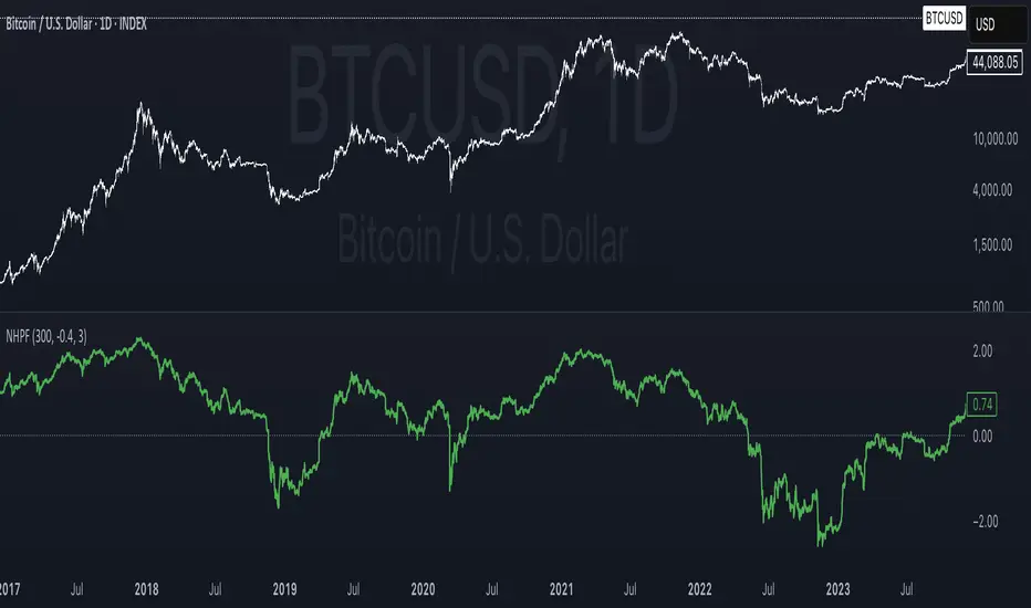
NHPF (Normalized Hodrick-Prescott Filter)This indicator applies a normalized Hodrick–Prescott filter (NHPF) to Bitcoin’s price data. It separates the underlying trend from short-term cyclical fluctuations by recursively smoothing the price using a user-defined lambda (HP Filter Period). The raw trend is then normalized by calculating a ratio between the trend and the current price, which is scaled and shifted according to subjective parameters (Mean and Scale). The result is a dimensionless value that highlights deviations from the long-term trend—serving as a signal for potential overbought (positive values) or oversold (negative values) market conditions. A zero line provides a clear reference, allowing traders to visually gauge when Bitcoin’s price is significantly above or below its expected trajectory.
Feel free to adjust the inputs to best match your analysis preferences.
ES vs Bond ROCThis Pine Script plots the Relative Rate of Change (ROC) between the S&P 500 E-mini Futures (ES) and 30-Year Treasury Bond Futures (ZB) over a specified period. It helps identify when equities are overperforming or underperforming relative to long-term bonds—an insight often used to detect risk-on/risk-off sentiment shifts in the market.

Master Litecoin Miner Sell PressureBrief Description:
Purpose: The indicator overlays on a chart to highlight periods of high miner sell pressure for Litecoin.
Data Sources:
miner_out: Fetches daily Litecoin miner outflows (amount of LTC moved out by miners) using the INTOTHEBLOCK:LTC_MINEROUTFLOWS dataset.
miner_res: Fetches daily Litecoin miner reserves (amount of LTC held by miners) using the INTOTHEBLOCK:LTC_MINERRESERVES dataset.
Calculation:
Computes a ratio m by taking the 14-day sum of miner outflows and dividing it by the 14-day simple moving average (SMA) of miner reserves.
Calculates Bollinger Bands around m:
bbl: Lower band (200-day SMA of m minus 1 standard deviation).
bbu: Upper band (200-day SMA of m plus 1 standard deviation).
Visualization:
If the ratio m exceeds the upper Bollinger Band (bbu), the background is colored blue with 30% opacity, indicating potential high sell pressure from miners.

BTC & SPX vs Yield Curve: Recession Risk ZonesBTC & SPX vs Yield Curve – Recession Risk Zones
This tool helps you track Bitcoin (BTC) and the S&P 500 (SPX) against key macro signals from the U.S. yield curve to spot potential recession risks.
🟪 Color Legend:
🔴 Red = Yield curve is inverted (warning starts)
🟡 Yellow = Projected 6–18 month recession risk (if inversion still active)
🟠 Orange = Active 6–18 month risk window (after inversion ends)
💜 Fuchsia = Real historical U.S. recessions
📈 What’s Plotted:
🔵 BTCUSD (blue line) – Normalized price
🟢 S&P 500 (green line) – Normalized price
🟠 10Y–2Y Yield Spread – Macro signal for risk
✅ Use it to:
Spot macro pressure zones
See how BTC and SPX behave around economic stress
Stay cautious when red/orange/yellow areas appear
Let me know if you'd like to enable toggles to hide/show BTC or SPX independently!

Power Balance Bull&Bear - CoffeeKillerPower Balance Bull&Bear - CoffeeKiller Indicator Guide
Welcome traders! This guide will walk you through the Power Balance Bull&Bear indicator, a unique and powerful market analysis tool developed by CoffeeKiller that visualizes the ongoing battle between buyers and sellers in any market.
Core Concept: Buyers vs. Sellers
The foundation of this indicator rests on a simple yet profound concept: every price movement in the market represents a battle between buyers and sellers.
Positive Green Line: Buyer Power
- Represents cumulative buying pressure in the market
- Tracks positive directional movement over a specified period
- Rising positive line indicates increasing buying momentum
- Peaks in the positive line show moments of maximum buyer dominance
Negative Red Line: Seller Power
- Represents cumulative selling pressure in the market
- Tracks negative directional movement over a specified period
- Falling negative line indicates increasing selling momentum
- Troughs in the negative line show moments of maximum seller dominance
Master Line: Market Balance
- Calculated as the difference between positive and negative movements
- Above zero: buyers are in control
- Below zero: sellers are in control
- Peaks and troughs: moments of extreme buyer or seller dominance
Core Components
1. Directional Movement Analysis
- Cumulative measurement of price changes in both directions
- Normalization for consistent visualization
- Optional smoothing for clearer signals
- Custom box size for sensitivity control
2. Distance Measurement
- Calculation of separation between buyer and seller lines
- Convergence and divergence thresholds
- Dynamic fill coloring based on distance trends
- Distance trend visualization
3. Peak Detection System
- Identification of local maxima and minima in buyer/seller dominance
- Background highlighting of significant peaks
- Zero-line cross detection for trend changes
- Visual cues for market extremes
4. Trend Analysis
- Buyer/seller line crossovers for major trend signals
- Distance trending for momentum confirmation
- Status monitoring (Near, Far, Normal)
- Direction tracking for both buyer and seller lines
Main Features
Time Resolution Settings
- Normal mode: calculations based on chart timeframe
- Custom resolution mode: calculations based on specified timeframe
- Multi-timeframe analysis capabilities
- Flexible time projection options
Visual Elements
- Color-coded buyer and seller lines
- Dynamic fill coloring based on convergence/divergence
- Background highlighting for significant peaks
- Distance line with threshold markers
Signal Generation
- Buyer/seller crossover alerts
- Convergence/divergence notifications
- Peak detection signals
- Status change alerts
Analysis Table(I personally don't use the table it was coded to take longer signals to show strength or weakness in overall trend)
- Current distance measurement
- Distance trend indication
- Status monitoring (Near, Far, Normal)
- Buyer and seller line trend tracking
Trading Applications
1. Trend Identification
- Buyer line crossing above seller line: bullish trend beginning
- Seller line crossing above buyer line: bearish trend beginning
- Distance between lines: trend strength
- Distance trending: momentum confirmation
2. Reversal Detection
- Peak formation after extended trend: potential exhaustion
- Buyer/seller line convergence: decreasing trend strength
- Distance falling below convergence threshold: potential trend change
- Background highlighting: visual cue for significant peaks
3. Momentum Analysis
- Increasing distance: accelerating trend
- Decreasing distance: decelerating trend
- Distance above divergence threshold: strong momentum
- Distance below convergence threshold: weak momentum
4. Market Balance Assessment
- Buyer line trend: indicates strength/weakness of bulls
- Seller line trend: indicates strength/weakness of bears
- Master line position relative to zero: overall market bias
- Distance between lines: consensus or disagreement in the market
Optimization Guide
1. Period Settings
- Longer period: smoother signals, less noise, fewer false signals
- Shorter period: more responsive, captures minor moves, potentially more noise
- Default (20): balanced approach for most timeframes
2. Box Size Parameter
- Smaller box size: more sensitive to price changes
- Larger box size: less sensitive, focuses on major moves
- Default (0.001): calibrated for typical price ranges
3. Distance Thresholds
- Convergence threshold: determines when lines are considered "near"
- Divergence threshold: determines when lines are considered "far"
- Adjusting these based on volatility of the instrument
4. Color Customization
- Positive Green line: representing buyer strength
- Negative Red line: representing seller strength
- Diverging fill: when the gap between buyers and sellers is increasing
- Converging fill: when buyers and sellers are moving closer together
Best Practices
1. Signal Confirmation
- Wait for buyer/seller crossovers to confirm
- Look for background highlighting at peaks
- Check distance trends for momentum confirmation
- Use the analysis table for additional context
2. Timeframe Selection
- Lower timeframes: more signals, potential noise
- Higher timeframes: cleaner signals, less frequent
- Custom resolution: allows comparison across timeframes
- Consider using multiple timeframes for confirmation
3. Market Context
- Strong buyer line rising + weak seller line: very bullish
- Strong seller line falling + weak buyer line: very bearish
- Both lines rising: volatile uptrend
- Both lines falling: volatile downtrend
4. Combining with Other Indicators
- Use with trend indicators for confirmation
- Pair with oscillators for overbought/oversold conditions
- Combine with volume analysis for validation
- Consider support/resistance levels when peaks form
Advanced Trading Strategies
1. Buyer/Seller Balance Strategy
- Enter long when buyer line crosses above seller line
- Enter short when seller line crosses above buyer line
- Use distance trend for filtering quality of signals
- Exit when distance falls below convergence threshold
2. Peak Trading Strategy
- Identify significant peaks with background highlighting
- Look for consecutive lower peaks in buyer line for shorting opportunities
- Look for consecutive higher troughs in seller line for buying opportunities
- Use master line crosses through zero as confirmation
3. Convergence/Divergence Strategy
- Enter positions when distance exceeds divergence threshold (strong trend)
- Take partial profits when distance starts decreasing
- Exit fully when distance falls below convergence threshold
- Re-enter when a new trend forms with increasing distance
4. Line Trend Combination Strategy
- Strongest bullish signal: Rising buyer line + falling seller line + increasing distance
- Strongest bearish signal: Falling buyer line + rising seller line + increasing distance
- Potential reversal signal: Decreasing distance + peak formation + line trend change
- Continuation signal: Consistent buyer/seller dominance + increasing distance after consolidation
Practical Analysis Examples
Bullish Market Scenario
- Buyer line trends upward as buying pressure increases
- Seller line remains flat or trends downward as selling pressure decreases
- Distance between lines expands, showing divergence (strong trend)
- Positive background highlights appear at new peaks in buyer dominance
- Master line moves further above zero
Bearish Market Scenario
- Seller line trends downward as selling pressure increases
- Buyer line remains flat or trends downward as buying pressure decreases
- Distance between lines expands, showing divergence (strong trend)
- Negative background highlights appear at new troughs in seller dominance
- Master line moves further below zero
Consolidation Scenario
- Buyer and seller lines move sideways
- Distance between lines narrows, showing convergence
- Few or no new peak highlights appear
- Master line oscillates close to the zero line
- Analysis table shows "Stable" trends for both buyer and seller lines
Understanding Market Dynamics Through Power Balance
At its core, this indicator provides a unique lens to visualize the ongoing battle between bulls and bears:
1. **Relative Strength**: When the buyer line rises faster than the seller line, bulls are gaining strength relative to bears - a bullish signal. When the seller line falls faster than the buyer line, bears are dominating - a bearish signal.
2. **Market Consensus**: Convergence between lines suggests market participants are reaching consensus about price direction. Divergence suggests growing disagreement and potential for stronger moves.
3. **Exhaustion Signals**: Major peaks in either line that are highlighted by background colors suggest moments where one side (buyers or sellers) has reached maximum strength - often precursors to reversals.
4. **Trend Confirmation**: The status indicators (Near, Far, Normal) provide context about the current market phase, helping confirm whether a trend is establishing, continuing strongly, or potentially fading.
Remember:
- Combine signals from buyer/seller lines, distance measurements, and peak formations
- Use appropriate timeframe settings for your trading style
- Monitor the analysis table for additional context
- Consider market conditions and correlate with price action
This indicator works best when:
- Used as part of a comprehensive trading system
- Combined with proper risk management
- Applied with an understanding of current market conditions
- Signals are confirmed by price action and other indicators
**DISCLAIMER**: This indicator and its signals are intended solely for educational and informational purposes. They do not constitute financial advice. Trading involves significant risk of loss. Always conduct your own analysis and consult with financial professionals before making trading decisions.

Crypto Money Flow TrackerAlerts now trigger automatically – no manual setup needed!
✔ Alerts will notify you when:
OI change (15m) is greater than or below the threshold
Price change (15m) is greater than or below the threshold
✔ Messages will display exact percentage changes in OI and price.

M2SL/DXY RatioA custom financial ratio comparing:
Numerator: M2 Money Supply (M2SL)
U.S. monetary aggregate measuring cash, checking deposits, and easily convertible near money
Denominator: US Dollar Index (DXY)
Trade-weighted geometric mean of USD value against six major currencies

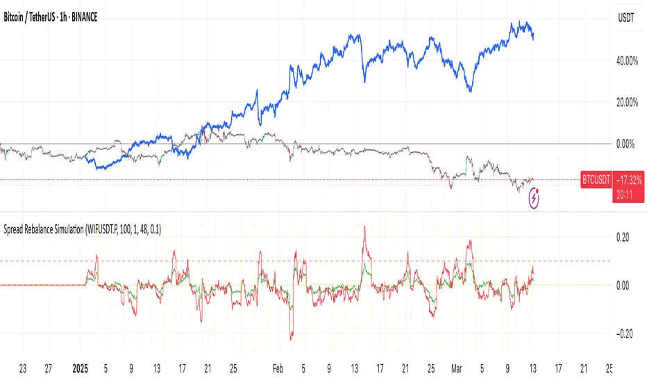
Spread Rebalance SimulationThe Spread Rebalance Simulator is a tool designed to help visualize the effect of rebalancing on spread trading returns. Typically, TradingView charts are used to display spread charts, but this method assumes that the ratio remains unchanged on each bar. In real trading scenarios, the ratio constantly changes, and this indicator allows traders to see a more accurate representation of spread trading.
The next version will include support for input ratio and trading cost.
To use this simply select any chart (as a long pair) then fill the symbol name for the short pair. Then choose the rebalance period. The blue line will show you the equity of this pair combination.
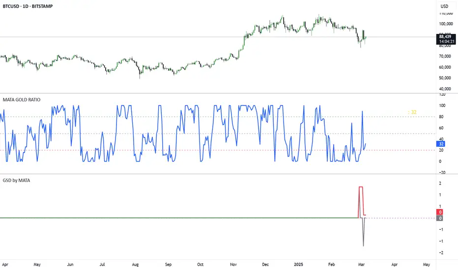
GSD by MATAGSD by MATA - Gold-Sensitive Divergence Indicator
Overview:
The GSD by MATA indicator is designed to analyze the inverse correlation between an instrument’s price movement and gold (XAU/USD) over a selected time period. It helps traders identify whether the instrument tends to move in the opposite direction of gold, providing insights into potential hedging opportunities or market sentiment shifts.
How It Works:
User-Defined Time Period:
The user selects a time frame for comparison (1 Day, 1 Week, 1 Month, 3 Months, 6 Months, or 12 Months).
The indicator calculates the percentage change in both the instrument’s price and gold price over this period.
Inverse Movement Calculation:
If gold increases and the instrument decreases, the indicator registers a negative inverse change.
If gold decreases and the instrument increases, the indicator registers a positive inverse change.
If both move in the same direction, no inverse movement is recorded.
Cumulative Tracking:
The Reverse Change line shows the instant inverse movement.
The Total Change line accumulates the inverse movements over time, helping traders spot trends and long-term divergences.
How to Use:
A rising Total Change line (green) suggests that the instrument frequently moves in the opposite direction of gold, indicating a possible hedge effect.
A falling Total Change line (red) means the instrument has been moving in sync with gold rather than diverging.
The 0 reference line helps identify whether the cumulative effect is positive or negative over time.
SRT - NK StockTalkSRT stands for Speculation Ratio Territory. It's a technique used in the stock market to identify the top and bottom of an index, which helps define the buying and selling zones.
Here's a brief overview of how it works:
Calculation: The SRT value is calculated by dividing the index value (like Nifty) by the 124-day Simple Moving Average (SMA) on a daily chart.
Range: The SRT value typically ranges between 0.6 (bottom) and 1.5 (top)2.
Investment Strategy:
Buying Zone: Ideal entry points are when the SRT value is between 0.6 and 0.9.
Selling Zone: It's recommended to start booking profits when the SRT value is above 1.3 and exit when it reaches around 1.4
This method helps investors make informed decisions about when to enter or exit the market, aiming for better returns and reduced risks.
