Elliott Wave - HAP [PRO] █ OVERVIEW
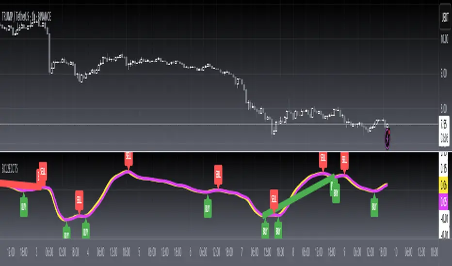
Meet HAP WAVE's real-time automated wave drawing tool on the chart. HAP WAVES Indicator is a technical analysis tool that uses Elliott Wave Theory and various technical indicators to analyze price and volume data in financial markets, such as crypto, stocks, and forex. It automatically draws Elliott Waves on the chart in real-time and provides features to identify potential buy and sell signals. The indicator can be used to identify target areas for waves 3, 5, and C, and shows both downward and upward waves. Additionally, the tool displays the real-time ratio of each wave and allows users to adjust wave rules flexibly. The tool also provides pre-sign analysis to help users predict future waves and includes alerts for various events, such as the start of a wave or the failure of a wave pattern. The indicator includes a trend channel and has several pairs of scan-wave tools. including real-time wave counting
════════════════════════
🎯 Feature
• Can draw wave lines in real time, indicating at that moment what wave the market is in.
• Automatically identify the target area of waves 3, 5, and C.
• Keep drawing waves automatically. All waves
• Shows both a downward wave (Bear) and an upward wave (Bull).
• Displays the real time ratio of each wave. (when hovering over the wave number)
• Each wave rule can be adjusted flexibly.
• Pre-show signs analyze waves that may occur in the future.
• Alert yourself when you encounter waves that are likely to occur in advance.
• Notify when meeting the start of a given wave.
• Alert when wave 2,4,A,B fail
• Notify when the wave is expanding again
• Multiple alert formats (save your alert, set it up just once, and receive all alerts according to 9–12)
• Hit Trend Channel from Automatic Coupled Price Swing
*There are also several pairs of scan wave tools.
════════════════════════
🔻Components
🎯 Unlocking the Power of the Elliott Wave Theory
feature that can set the starting point of the wave. by yourself
Trend Following Of course, adding this could be an element to help you make your decision easier.
Support and resistance
🎲 Scan version
This :
================================
🎯 Explanation of the wave counter setting section
════════════════════════
⬜ Understanding its basic principles and rules
Elliott Wave Prediction
Elliott Wave Theory is a technical analysis tool that seeks to identify patterns in financial market data and to make predictions about future price movements. The theory was developed by Ralph Nelson Elliott in the 1930s and is based on the idea that financial markets move in repetitive patterns, or waves, that can be analyzed and traded.
The Elliott Wave Theory has specific rules and guidelines for counting waves and determining their characteristics, including direction, size, and duration. The theory divides waves into two categories: motive waves (1, 2, 3, 4, and 5) and corrective waves (A, B, C). Motive waves are those that move in the direction of the overall trend and are subdivided into five smaller waves. Corrective waves are those that move against the trend and are subdivided into three smaller waves.
The theory also includes guidelines for determining the end of a wave and the start of a new wave, as well as rules for determining the characteristics of each wave, such as its size and duration. By analyzing the characteristics of waves and applying the rules and guidelines of the Elliott Wave Theory, traders and investors can make informed decisions about buying and selling in financial markets.
In summary, the Elliott Wave Theory is a technical analysis tool that seeks to identify patterns in financial market data and to make predictions about future price movements. The theory is based on the idea that financial markets move in repetitive patterns, or waves, and has specific rules and guidelines for counting and analyzing these waves.
>> The Elliott Wave Theory divides financial market movements into two categories: motive waves and corrective waves. Each wave has its own cycle and purpose, and understanding these cycles is important for making informed decisions about buying and selling in financial markets.
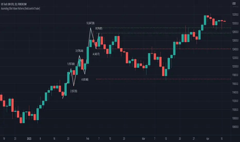
Motive Waves: Motive waves move in the direction of the overall trend and are subdivided into five smaller waves. The five waves of a motive wave cycle are:
•Wave 1: The first wave of a motive wave cycle is often referred to as the "impulse wave." This wave represents the beginning of a new trend and is characterized by strong price movements in the direction of the trend.
•Wave 2: The second wave is a corrective wave that retraces a portion of the gains made in Wave 1. This wave is usually smaller and less intense than Wave 1.
•Wave 3: The third wave is usually the longest and strongest wave of the motive wave cycle, and it represents the continuation of the trend. This wave is characterized by strong price movements in the direction of the trend and is usually much larger than Waves 1 and 2.
•Wave 4: The fourth wave is a corrective wave that retraces a portion of the gains made in Wave 3. This wave is usually smaller and less intense than Waves 1 and 3, and it provides a temporary pause in the trend.
•Wave 5: The fifth wave is the final wave of the motive wave cycle and is usually the shortest and weakest wave. This wave represents the end of the trend and is characterized by a final push in the direction of the trend.
Corrective Waves: Corrective waves move against the trend and are subdivided into three smaller waves. The three waves of a corrective wave cycle are:
•A. Wave A: The first wave of a corrective wave cycle is often referred to as the "A wave." This wave is characterized by a downward move against the trend and represents the start of a correction.
•B. Wave B: The second wave of a corrective wave cycle is the "B wave." This wave is characterized by an upward move against the trend, and it represents the counter-trend rally.
•C. Wave C: The final wave of a corrective wave cycle is the "C wave." This wave is characterized by a downward move in the direction of the trend, and it represents the completion of the correction.
In summary, the Elliott Wave Theory divides financial market movements into two categories: motive waves, which move in the direction of the trend, and corrective waves, which move against the trend. Understanding the cycle of each wave is important for making informed decisions about buying and selling in financial markets.
════════════════════════
🎯 CONCEPTS (Disclaimer)
Elliott Wave Count
The HAP WAVES indicator is designed for experienced traders who are familiar with advanced trading techniques. This tool is intended for day traders and long-term investors who have a solid understanding of the market and are looking to improve their trading strategy. The indicator was created by a well-known market analyst and is based on the principles and techniques documented in several books, including those by `Jason Perl`.
It is recommended that users of the HAP WAVES indicator have a good understanding of the concepts and techniques discussed in the books that cover this indicator. Before using the tool, it is important to have a good understanding of the underlying principles and techniques in order to make the most of the indicator and potentially improve your trading performance.
════════════════════════
🎯 Rules and Principles of this Indicator
* This description only addresses bullish (uptrend) markets, while bearish (downtrend) gives let you look a vice versa.
• ▶ HAP WAVES Requirements for Wave 1
The Wave 1 HAP WAVES requirements for a bullish (rising) market require that the market has closed a minimum of 21 bars below all 20 previous closes, then closes a maximum of 13 bars above all 12 previous closes, and finally reaches an 8 bar close below all 7 previous closes, to confirm that Wave 2 has formed.
• ▶ HAP WAVES Requirements for Wave 2
The first requirement for Wave 2 is the last requirement for Wave 1, which is a close of at least 8 bars with a close less than the previous 7 bars. Wave 2 continues until the market records a 21-bar close above all 20 previous closes, indicating the start of Wave 3.
• ▶ HAP WAVES Requirements for Wave 3
Wave 3 is confirmed after Wave 2 closes at 21 bars high, and it continues until there is a 13 bar close, indicating the end of Wave 3 and the start of Wave 4.
• ▶ HAP WAVES Requirements for Wave 4
The first requirement for Wave 4 is that there is a close at 13 bars after the end of Wave 3. Wave 4 is complete when the market records a 34 bar close (above all previous 33 closes), indicating the start of Wave 5.
• ▶ HAP WAVES Requirements for Wave 5
The first requirement for Wave 5 is a 34 bar close, signaling the end of Wave 4. The wave is considered complete when a 13 bar close is published, resulting in Wave A.
• ▶ HAP WAVES Requirements for Wave A
The HAP WAVES Requirements for Wave A state that the first call for Wave A is a 13 bar close (close below all previous 12 closes), signaling the end of Wave 5. Wave A is considered complete with an 8 bar high close (close above previous 7 closes), leading to the start of Wave B.
• ▶ HAP WAVES Requirements for Wave B
The first requirement for Wave B is a 8 bar high close (close above the previous 7 closes) after Wave A. Wave B is complete when there is a 21 bar low close (close below all 20 previous closes).
• ▶ HAP WAVES Requirements for Wave C
Wave C starts with a close of 21 bars low for Wave C, meaning the market close is below all 20 previous closes. Wave C is considered closed when the market closes below the close low of Wave A.
* Additional rules to apply the HAP WAVES indicator to the bullish trend
• The peak of Wave 3 must be higher than the close of Wave 1, and the peak of Wave 5 must be higher than the peak of Wave 3.
• If the pullback from Wave 1 is shallow, and the market later retraces above the high close of Wave 1, Wave 1 will slide to the right to align with the new high close.
• If the pullback from Wave 3 is shallow, and the market later retraces above the high close of Wave 3, Wave 3 will slide to the right to align with the new high close.
• Wave 5 will only be confirmed if Wave C crosses the low close of Wave A. If Wave B closes above the high close of Wave 5, Waves A, B and C will be erased and Wave 5 will slide to the right.
• If Wave 2 closes below the low close of Wave 1, the countdown will start over, and if Wave 4 closes below the low close of Wave 2, Wave 2 will move to the location of Wave 4.
• After Wave C crosses the low close of Wave A, Wave 5 will be locked in and cannot move. If the market later retraces above the high close of Wave 5, it will be marked as a new advance in Wave 1 rather than a blur of the previous Wave 5.
════════════════════════
Pine Script® indicatorPaid script