SilverHawk Trend Flow Part of SilverHawk Suite
This script is designed to be used with the SilverHawk Suite workflow (context → trigger → confirmation → execution).
It works standalone, but the highest accuracy comes from using the full suite together.
Where it fits:
• Role: Context
What it does:
Colors candles based on detected trend regime, so you trade with the prevailing direction and avoid fighting structure.
How to use:
• Bullish color: prefer long triggers only
• Bearish color: prefer short triggers only
• No clear trend / transition: stand down and wait for the suite trigger + confirmation
Visual Tip: (important)
If candles look “hidden”: Settings → Visual Order → Bring To Front
Alerts:
New Up Trend / New Down Trend alerts trigger on confirmed candles (non-repainting style).
Suite note:
For full workflow and loadouts, start with: “SilverHawk Suite — Start Here (Workflow Guide)” (free)
Credits / License
Based on PhantomFlow Trend Detector (MPL-2.0). This script remains MPL-2.0.
Search in scripts for "Fractal"

Days Of The Week📌 Indicator Description
Days of the Week (Color + UTC-5 Auto) is a visual time-structure indicator designed to clearly separate trading days on the chart and highlight the day of the week using customizable colors.
It is especially useful for traders who analyze market behavior by weekday or who want a clean and intuitive way to identify weekly cycles, weekend transitions, and session-based structure.
🔹 Key Features
1. Automatic New York Timezone (UTC-5 / UTC-4 with DST)
The indicator automatically calculates time using the America/New_York timezone with full daylight saving time support.
This ensures that day changes, weekdays, and labels always align with the New York trading session regardless of the chart’s local timezone.
2. Day Separator Background (Vertical Highlighting)
A vertical background separator is drawn at the beginning of each New York trading day.
Users can independently customize:
-Weekday separator color
-Saturday separator color
-Sunday separator color
-Separator transparency
This makes weekends and weekly boundaries instantly visible on any timeframe.
3. Day-of-Week Text Labels at NY 09:00
At exactly 09:00 New York time, the indicator displays a text label at the bottom of the chart showing the current day of the week.
Sunday displays “Beginning of week – Sunday”
Monday through Friday display their respective weekday names
Saturday displays “Saturday”
This timing aligns with the New York session open, making it useful for intraday and session-based traders.
4. Separate Color Control for Weekdays vs Weekends
Text colors are fully customizable and separated into:
Weekday text color
Saturday text color
Sunday text color
Additionally, the script supports dark-background and light-background text modes, allowing the user to toggle which version is displayed depending on their chart theme.
5. Minimal, Non-Intrusive Design
No repainting
No future-looking logic
No impact on price data
Lightweight and optimized
The indicator is purely visual and does not interfere with other studies or trading systems.
🔹 Customization Options
Users can control:
Whether the day separator is shown
Separator colors for weekdays, Saturday, and Sunday
Separator transparency
Whether dark or light background text is displayed
Individual text colors for weekdays, Saturday, and Sunday
All settings update instantly from the indicator’s settings panel.

Swing Elite Supply & Demand [Free]This indicator automatically identifies and draws institutional supply and demand zones based on the Rally-Base-Rally (RBR), Drop-Base-Rally (DBR), Drop-Base-Drop (DBD), and Rally-Base-Drop (RBD) patterns.
🔍 What It Does
The indicator scans for explosive candles preceded by consolidation (base) candles to identify areas where institutions have placed large orders. These zones act as potential support and resistance levels where price is likely to react.
Zone Types Detected:
RBR (Rally-Base-Rally): Demand zone formed when price rallies, consolidates, then rallies again
DBR (Drop-Base-Rally): Demand zone formed when price drops, consolidates, then rallies
DBD (Drop-Base-Drop): Supply zone formed when price drops, consolidates, then drops again
RBD (Rally-Base-Drop): Supply zone formed when price rallies, consolidates, then drops
📈 How To Use
Finding Entries:
In an uptrend, wait for price to pull back into a demand zone (RBR/DBR) for long entries
In a downtrend, wait for price to rally into a supply zone (DBD/RBD) for short entries
Fresh (untested) zones typically offer the best reaction
Zone Quality:
Zones with strong explosive candles breaking out of the base indicate higher institutional interest
Smaller base candles (tight consolidation) often produce more precise zones
Zones that align with higher timeframe structure increase probability
Zone Mitigation:
When price penetrates a zone, it becomes "mitigated" and is automatically removed
This keeps your chart clean with only active, tradeable zones
⚙️ Settings
Show Demand/Supply Zones: Toggle each zone type on/off
Zone Colors: Customize demand and supply zone colors
Zone Width Type: "Preferred" uses candle bodies, "Wider" uses full wicks
Show Zone Labels: Display RBR/DBR/DBD/RBD labels on zones
Label Size: Tiny, Small, Normal, or Large
Extend Zones: How far zones extend to the right (bars)
Remove Mitigated Zones: Auto-remove zones when price penetrates them
Max Zones: Limit displayed zones to keep chart clean
💡 Tips
Use on Daily and Weekly timeframes for the strongest institutional zones
Combine with trend direction — trade demand zones in uptrends, supply zones in downtrends
Look for zones that align with key support/resistance levels
Wait for confirmation candles when price enters a zone before entering trades
Fresher zones (recently formed, not yet tested) typically produce better reactions
⚡ Pro Version Available
The Pro version includes additional features:
All timeframes (not just Daily/Weekly)
Multi-Timeframe zone detection
Big Brother (HTF) zone coverage detection
Level on Level (LOL) zone merging for stronger zones
FLIP levels (broken structure zones)
Gap Finder
Stop Loss lines with customizable padding
Advanced candle detection thresholds
Zone expiry after price moves too far
Info dashboard
Price alerts

Scalping ~ Maniesh🔥 Fibonacci Scalping Indicator
This indicator is built for precision scalping using ACR (Average Candle Range) combined with Fibonacci-based premium & discount zones.
It helps traders identify high-probability reaction areas instead of chasing random moves.
🧠 Indicator Logic
Calculates ACR to understand current market volatility
Uses Fibonacci levels on the ACR range
Clearly marks Premium & Discount zones
Helps filter overextended price moves
Designed for reaction-based scalping, not blind entries
⏱ Best Timeframes
1m / 3m
Works best during London & New York sessions
📌 How to Use
Look for price reaching Fib
Wait for price reaction or confirmation
Enter scalps with tight stop-loss
Ideal for quick entries & partial exits
This indicator does not give buy/sell signals.
It is a framework tool to improve execution and timing.
⚠️ Disclaimer
Trading involves risk.
Always use proper risk management and backtest before live trading.

Forex Sniper @24 Support is based on Asia high and low , plus shows New York sessions and London
Background with out cuts only shows volativity times

Smart Money Concepts - Absorption Smart Money Concepts - Absorption (SMC-ABS)
Absorption event detector using split-volume VWMA ribbons, entropy filtering, and elasticity validation
Overview
This indicator highlights potential absorption/defense events: moments where price touches a volume-weighted band and then rejects, while additional filters confirm that market conditions are not random/noisy.
What it plots
• Energy ribbons (bands): two split-volume VWMA ribbon sets - Buy-weighted (cyan) and Sell-weighted (magma).
• ABS markers: printed when touch + rejection + validation conditions are met (see Logic section).
• Dashboard (HUD): real-time metrics such as price/volume z-scores, delta, entropy state, and resonance momentum states.
Core logic
1) Volume engine
The script builds Buy Volume and Sell Volume series using one of two modes:
• Geometry (candle-range split): estimates buy/sell participation from the close position within the candle range.
• Intrabar (precise): uses lower-timeframe up/down volume to derive buy/sell flows when data is available.
2) Split-VWMA resonance score
For multiple periods (5, 10, 20, 30, 40, 50), the script computes:
• A standard SMA of price.
• A Buy-weighted VWMA of price (weighted by Buy Volume).
• A Sell-weighted VWMA of price (weighted by Sell Volume).
Resonance is derived from the normalized divergence between the SMA and the split VWMAs, aggregated across the available periods.
3) Validation filters
Signals can be filtered by the following components (each toggleable):
• Volume-weighted entropy: a fractal-efficiency style disorder metric (TR-sum vs range) adjusted by relative volume; high entropy blocks signals.
• Momentum alignment (resonance velocity) : direction filter requiring positive velocity for buy events and negative velocity for sell events.
• Elasticity (recoil vs penetration): rejection quality check based on the bounce-back strength relative to the penetration depth into the fast band.
Absorption event conditions (ABS markers)
ABS markers are generated using the fastest ribbon band (length 5) for the touch/rejection logic:
• Buy absorption: low touches/penetrates the Buy band and the candle closes back above it, with filters passing.
• Sell absorption: high touches/penetrates the Sell band and the candle closes back below it, with filters passing.
Note: acceleration/deceleration is displayed in the HUD as a state; the primary directional filter is the resonance velocity.
Settings
• Volume Model: choose Geometry or Intrabar.
• Intrabar LTF: lower timeframe used by the Intrabar model (only applies when Intrabar is selected).
• Global Lookback: lookback window used for z-score statistics and related calculations.
• Quantum Filters: toggles and thresholds for entropy, momentum alignment, and elasticity validation.
• Dashboard Settings :/ Energy Ribbons / Absorption Events: controls for visuals and filtering behavior.
Usage notes and limitations
• Signals are most reliable after candle close. On the forming candle, conditions can change until the bar closes.
• Results depend on the availability and quality of volume data for the selected symbol and exchange.
• The Geometry mode is an estimate based on candle structure; it is not tick-accurate order flow.
• Terms such as “quantum” and “physics” are metaphorical labels for statistical filters and validation heuristics.
Disclaimer
This tool is provided for analytical and educational use only. It does not constitute investment advice. Trading involves risk.
Important note about Intrabar data and TradingView plan limits
This indicator is volume-dependent. When using the Intrabar model, the best results typically come from very low intrabar timeframes such as 1 tick or 1 second (if your symbol and data feed support it). Please check your TradingView subscription plan and data entitlements - access to 1-second/1-tick lower timeframes is commonly restricted to higher-tier plans (often referred to as Premium/Ultra tiers). If intrabar data is not available, the script falls back to relative buy/sell volume estimation (Geometry mode), and results may be less precise.

Nau Pro CheckListMy strategy
1 : Preia lichiditate 1h si intra intrun fvg pe 1h
2 Inchide un fvg, deci formeaza un IFVG
3 Creaza un fvg + confluenta CISD 5 min
4 Entry pe IFVG sau FVG
5 SL deasupra FVGUL creat sau swingului
6 TP pe urmatorul Swing ( tre sa fie minim 2 RR)

Adaptive Trend-Based Fib Extension + TrendlinesThis advanced analysis tool is designed to take the guesswork out of Fibonacci trading. By combining Adaptive Fibonacci Extensions with multi-method Pivot Detection, Dynamic Trendlines, and Horizontal Support/Resistance, this indicator provides a comprehensive roadmap for any market trend.
Learn volume trading - @pricevolumetraders
Key Features
Adaptive Fibonacci Engine: Unlike static tools, this indicator uses an ATR-based adaptive factor to adjust extension levels according to current market volatility.
Smart Trend Detection: Automatically identifies trend direction using EMA cross-overs or Higher High/Higher Low sequences to determine whether to plot Bullish or Bearish extensions.
Multi-Method Pivots: Choose from six different pivot detection methods, including Volume-Based, Fractal, ATR-Based, and Long Wick detection, to suit your specific trading style.
Automated Trendlines & S/R: High-probability diagonal trendlines and horizontal S/R levels are drawn only when they meet a minimum "touch" requirement and volume confirmation.
Institutional Zones: Highlights the "Golden Zone" between the 127.2% and 161.8% extension levels, where trends often reach exhaustion or find major targets.
How to Use
Trend Alignment: Use the built-in Dashboard to quickly identify the current trend (Bull/Bear) and RSI momentum.
The 3-Point Setup: The indicator automatically finds Point 1 (Trend Start), Point 2 (Impulse End), and Point 3 (Retracement/Last Touch) to project future price targets.
Entry Confirmation: Look for price action near the 61.8% or 78.6% Retracement levels for high-probability entries in the direction of the trend.
Targeting: Use the extension levels (100%, 127.2%, 161.8%) as your primary Take Profit zones.
Confluence: The strongest setups occur when a Fibonacci level aligns perfectly with a Horizontal S/R line or a Diagonal Trendline.
Technical Settings
Pivot Settings: Adjust 'Left' and 'Right' bars to change the sensitivity of swing high/low detection.
Fib Timeframe: You can anchor Fibonacci levels to a higher timeframe (e.g., 1-hour levels) while trading on a lower timeframe (e.g., 5-minute).
Volume Multiplier: Filter for horizontal levels that were formed with significant institutional volume.
Disclaimer: Trading involves significant risk. This tool is for educational and analytical purposes only and should be used in conjunction with a complete trading plan.

A program written by a beginner# TXF Choppy Market Detector (Whipsaw Filter)
## Introduction
This project is a technical indicator developed in **Pine Script v5**, specifically optimized for **Taiwan Index Futures (TXF)** intraday trading.
The TXF market is known for its frequent periods of low-volatility consolidation following sharp moves, often resulting in "whipsaws" (double-loss scenarios for trend followers). This script utilizes **volatility analysis** and **trend efficiency metrics** to filter out noise and detect potential "Stop Hunting" or "Liquidity Sweep" setups within range-bound markets.
## Methodology & Algorithms
The strategy operates on the principle of **Mean Reversion**, combining two core components:
### 1. Market Regime Filter: Choppiness Index (CHOP)
We use the Choppiness Index (originally developed by E.W. Dreiss) to determine if the market is trending or consolidating based on **Fractal Dimension** theory.
* **Logic**:
The index ranges from 0 to 100. Higher values indicate low trend efficiency (consolidation), while lower values indicate strong directional trends.
* **Condition**: `CHOP > Threshold` (Default: 50).
* **Application**: When this condition is met, the background turns **gray**, signaling a "No-Trade Zone" for trend strategies and activating the Mean Reversion logic.
### 2. Whipsaw Detection: Bollinger Bands
Bollinger Bands are used to define the dynamic statistical extremities of price action.
* **Logic**:
We identify **Fakeouts** (False Breakouts) that occur specifically during the choppy regime identified above. This is often where institutional traders hunt for liquidity (stops) before reversing the price.
#### Signal Algorithms (Pseudocode)
**A. Bull Trap (Washout High)**
A false upside breakout designed to trap long traders.
```pine
Condition:
1. Is_Choppy == true (Market is sideways)
2. High > Upper_Bollinger_Band (Price pierces the upper band)
3. Close < Upper_Bollinger_Band (Price fails to hold and closes back inside)

STUDENT WYCKOFF Volume ClimaxSTUDENT WYCKOFF Volume Climax highlights potential buying and selling climaxes by combining abnormally high volume with wide spread bars.
It is a simple Wyckoff-style tool that helps you see where effort (volume) and result (spread) reached extreme levels and may signal exhaustion or stopping action.
━━━━━━━━━━
1. Concept
━━━━━━━━━━
The script looks for bars where:
• Volume is many times higher than its recent average.
• The spread (high–low range) is much wider than usual.
• The candle has a real body (not a tiny doji).
• The bar is fully confirmed (closed).
Such bars are marked as:
• **BC (Buying Climax)** – wide up bar on very high volume.
• **SC (Selling Climax)** – wide down bar on very high volume.
The idea is not to call exact tops or bottoms, but to mark places on the chart where effort and result spike together, so you can then judge context, background and next bars in the Wyckoff sense.
━━━━━━━━━━
2. How the indicator works
━━━━━━━━━━
Inputs:
• Volume lookback – number of bars used for the average volume.
• Spread lookback – number of bars used for the average spread (high–low).
• Volume multiplier – how many times above the average volume a bar must reach to be considered “climactic”.
• Spread multiplier – how many times above the average spread the bar’s range must be.
• Min body / spread – minimum body size as a fraction of spread (0–1) to filter out near-doji candles.
Internally the script calculates:
• Range = high − low.
• Average volume = SMA(volume, volume lookback).
• Average spread = SMA(range, spread lookback).
• Body fraction = |close − open| / range.
A bar is a **climax bar** only if:
1) Volume > averageVolume × volumeMultiplier,
2) Spread > averageSpread × spreadMultiplier,
3) BodyFraction ≥ Min body / spread,
4) Bar is closed (barstate.isconfirmed).
Classification:
• If close > open → **Buying Climax (BC)**.
• If close < open → **Selling Climax (SC)**.
━━━━━━━━━━
3. Visuals
━━━━━━━━━━
The indicator works in a separate pane (overlay = false) and shows:
1) **Histogram in the subwindow**
• Value = Volume / AverageVolume (ratio).
• 1.0 line marks average volume.
• Bars are colored:
– Green for BC,
– Red for SC,
– Neutral grey for all other bars.
2) **Labels on price with force overlay**
• On BC bars a small “BC” label is plotted above the bar high.
• On SC bars a small “SC” label is plotted below the bar low.
• Labels are drawn with `force_overlay=true`, so they appear directly on the price chart even though the indicator itself is in the lower pane.
All signals are generated **only on bar close** to reduce repainting behaviour. The last, still forming bar is not treated as a confirmed climax.
━━━━━━━━━━
4. How to use it
━━━━━━━━━━
Typical applications:
• Wyckoff-style reading of climactic action
– Look for BC near potential buying climaxes in up moves, especially after long rallies or in the last part of a trend.
– Look for SC near potential selling climaxes after panics or shake-outs.
• Effort vs Result analysis
– Ask whether the market gets a lot of “effort” (volume + wide spread) but then fails to continue in the same direction.
– Pay attention to the next 1–3 bars after a BC/SC: is there follow-through or immediate failure?
• Scanning for zones of interest
– On higher timeframes BC/SC can highlight areas worth marking as potential stopping, climactic or reversal zones.
– On intraday timeframes they can show where very aggressive activity hit the tape (news, open/close auctions, liquidations).
The labels and histogram are **not** trading signals by themselves. They are context markers that tell you: “Here was a big push with big spread; now check structure, background and test behaviour.”
━━━━━━━━━━
5. Notes and disclaimer
━━━━━━━━━━
• Works on any symbol and timeframe available on TradingView.
• Uses only standard built-in volume and price data; no exotic calculations.
• Signals are calculated on confirmed bars with `barstate.isconfirmed`, so they do not repaint after the bar closes.
This script is published for educational and analytical purposes only.
It does not constitute financial or investment advice and does not guarantee any performance. Always test your ideas, understand the logic behind your tools and use proper risk management.

Liquidity ZonesThis indicator automatically identifies and plots high-probability support and resistance zones based on institutional flow and pivot math. Unlike standard indicators that show every possible level, this script uses a smart "Volume & Velocity" filter to only display zones where significant market activity occurred.
These zones represent Market Inefficiencies. They mark specific price levels where the market moved aggressively away from 'zones' without looking back. These 'gaps' in the auction process often act as magnets for price, forcing a return to the zone to fill pending institutional orders and rebalance the market
Key Features
1. Smart Filtering: Only plots zones created during selected timeframes with Strong Trend
Momentum or Price/Volume Divergence. Weak zones are automatically ignored to keep the
chart clean.
2. Auto-Invalidation: Zones are projected forward in time until price touches them. Once price
enters a zone, it automatically turns gray and stops extending, indicating the liquidity has
been tested.
How to Use
1. Blue Boxes (Fresh Zones): These are untested liquidity levels. Look for price reactions
(reversals or bounces) when price approaches these extended blue zones.
2. Sky Blue Boxes (Tested Zones): Once a candle touches a blue box, it turns Sky Blue. This
means the level is no longer "fresh" and should be treated with caution or ignored.
3. Timeframes: This indicator is fractal, meaning it works on any timeframe, you can use 1,3,5 for ltf confirmations and scalping and 15,30,1h for htf confluence or intraday trading
Settings
# Show Filtered Zones: Toggle the visibility of the boxes on/off.
# Zone Timeframe: Controls the data used to calculate the zones.
# Colors: Customize the color of Fresh (Untested) vs. Touched (Tested) boxes.
-- 1nonly V

50-Point Psych Levels (Multiples of 50)50-Point Psychological Levels (Multiples of 50)
This indicator plots static psychological price levels at fixed point intervals (default every 50 points) across the chart. These levels are commonly watched by traders as natural areas of reaction, balance, support, and resistance, especially on index futures such as NQ, ES, YM, and RTY.
The script automatically centers the levels around the current market price and draws them across a configurable range above and below price. All levels extend across the entire chart and are drawn once only, keeping the display clean and preventing redraw lag.
Key Features
Plots horizontal levels at fixed point spacing (default: 50 points)
Automatically anchors around the latest price
Configurable range above and below price
Customizable line color, width, and style
Lightweight, non-repainting, static reference levels
Best Use Cases
Identifying psychological support and resistance
Confluence with VWAP, EMA structure, ORB levels, and volume
Futures trading (NQ, ES, YM, RTY), indexes, and large-tick instruments

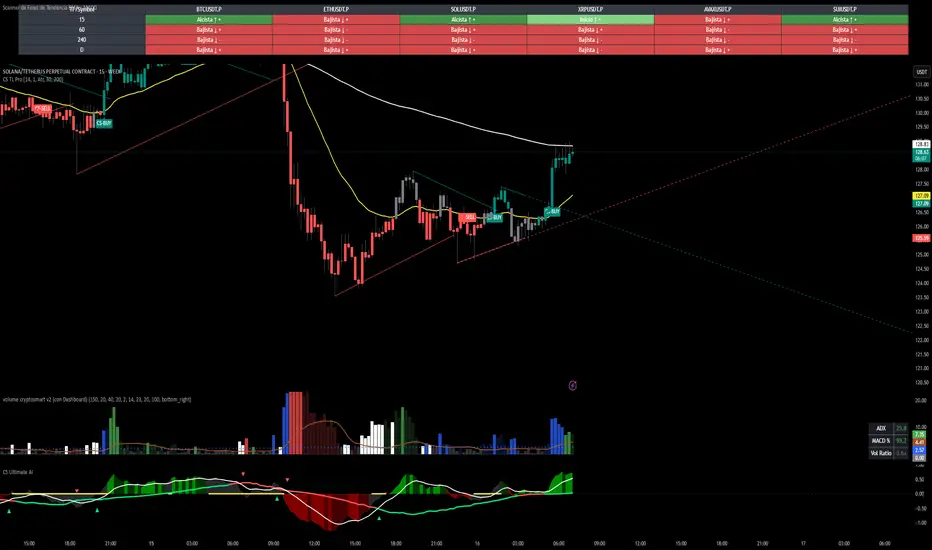
CS Trendline ProTitle: CS Trendline Pro
Description:
CS Trendline Pro is a comprehensive scalping and day-trading system designed to filter out noise and identify high-probability breakout setups. It combines the structural precision of Fractal Trendlines with a robust Dual-EMA Filter, visualized through an intuitive "Traffic Light" color system.
This tool is specifically engineered for traders who want to trade Trendline Breakouts but need a safety mechanism to avoid false signals (fakeouts) and counter-trend traps.
🚦 How the "Traffic Light" Logic Works
The core feature of this script is the dynamic coloring of the candles, which acts as a visual filter for your entries:
🟢 GREEN Zone (Safe Buy):
Condition: A Bullish Trendline Breakout has occurred AND the price is holding ABOVE the EMA 30 (Yellow Line).
Meaning: Momentum is bullish, and you are in a safe zone to look for Long entries.
🔴 RED Zone (Safe Sell):
Condition: A Bearish Trendline Breakout has occurred AND the price is holding BELOW the EMA 30 (Yellow Line).
Meaning: Momentum is bearish, and you are in a safe zone to look for Short entries.
⚪ GRAY Zone (No Trade / Wait):
Condition: A breakout occurred, but the price is on the "wrong side" of the EMA 30.
Meaning: Indecision. The market structure is conflicting with the immediate momentum. It is recommended to stay out until the color changes.
🛠️ Key Features
** automated Trendlines:** Automatically draws Support and Resistance dynamic trendlines based on pivot points (LuxAlgo engine).
Dual EMA Filter:
EMA 30 (Yellow): Acts as the immediate "Safe Zone" filter.
EMA 200 (White): Displays the macro trend. (Pro Tip: Only take Green signals if price is above the White line).
CS-BUY / CS-SELL Labels: Clear text markers appear exactly when a valid breakout occurs.
Customizable: Adjustable sensitivity (Length), EMA periods, and Slope calculation methods (ATR, Stdev, Linreg).
📉 How to Trade with CS Trendline Pro
For Scalping (5m / 15m):
Identify the Main Trend: Look at the White EMA (200).
If Price > EMA 200 → Focus on BUY signals.
If Price < EMA 200 → Focus on SELL signals.
Wait for the Signal:
Wait for the candle to turn Teal (Green) or Red.
Ensure the candle closes with the new color.
Risk Management:
Place Stop Loss below the recent swing low (for buys) or above the swing high (for sells).
Target a 1.5 Risk/Reward ratio or trail your stop using the EMA 30.
⚠️ Important Note on Backpainting
This indicator uses pivot points to draw trendlines. By nature, a pivot point can only be confirmed after a few bars have passed (Lag).
Backpaint Setting (Default ON): Keeps your historical chart clean by connecting the exact pivot points in the past.
Real-Time Behavior: In live trading, the trendline and signal will appear once the pivot is confirmed (based on your 'Length' setting). This is normal behavior for any trendline script.
Settings Recommended:
5-Minute Chart: Length 10 or 14.
15-Minute Chart: Length 14.
Enjoy trading with precision! ~ CS Trading
Risk & Order Size Calculatorhello,
this will calculate the risk and you may change the script as per your risk appetite, my advise do not risk more than 2% of your capital.
Thank you

Wavelet Candle Constructor (Inc. Morlet) 2Here is the detailed description of the **Wavelet Candle** construction principles based on the code provided.
This indicator is not a simple smoothing mechanism (like a Moving Average). It utilizes the **Discrete Wavelet Transform (DWT)**, specifically the Stationary variant (SWT / à Trous Algorithm), to separate "noise" (high frequencies) from the "trend" (low frequencies).
Here is how it works step-by-step:
###1. The Wavelet Kernel (Coefficients)The heart of the algorithm lies in the coefficients (the `h` array in the `get_coeffs` function). Each wavelet type represents a different set of mathematical weights that define how price data is analyzed:
* **Haar:** The simplest wavelet. It acts like a simple average of neighboring candles. It reacts quickly but produces a "boxy" or "jagged" output.
* **Daubechies 4:** An asymmetric wavelet. It is better at detecting sudden trend changes and the fractal structure of the market, though it introduces a slight phase shift.
* **Symlet / Coiflet:** More symmetric than Daubechies. They attempt to minimize lag (phase shift) while maintaining smoothness.
* **Morlet (Gaussian):** Implemented in this code as a Gaussian approximation (bell curve). It provides the smoothest, most "organic" effect, ideal for filtering noise without jagged edges.
###2. The Convolution EngineInstead of a simple average, the code performs a mathematical operation called **convolution**:
For every candle on the chart, the algorithm takes past prices, multiplies them by the Wavelet Kernel weights, and sums them up. This acts as a **digital low-pass filter**—it allows the main price movements to pass through while cutting out the noise.
###3. The "à Trous" Algorithm (Stationary Wavelet Transform)This is the key difference between this indicator and standard data compression.
In a classic wavelet transform, every second data point is usually discarded (downsampling). Here, the **Stationary** approach is used:
* **Level 1:** Convolution every **1** candle.
* **Level 2:** Convolution every **2** candles (skipping one in between).
* **Level 3:** Convolution every **4** candles.
* **Level 4:** Convolution every **8** candles.
Because of this, **we do not lose time resolution**. The Wavelet Candle is drawn exactly where the original candle is, but it represents the trend structure from a broader perspective. The higher the `Decomposition Level`, the deeper the denoising (looking at a wider context).
###4. Independent OHLC ProcessingThe algorithm processes each component of the candle separately:
1. Filters the **Open** series.
2. Filters the **High** series.
3. Filters the **Low** series.
4. Filters the **Close** series.
This results in four smoothed curves: `w_open`, `w_high`, `w_low`, `w_close`.
###5. Geometric Reconstruction (Logic Repair)Since each price series is filtered independently, the mathematics can sometimes lead to physically impossible situations (e.g., the smoothed `Low` being higher than the smoothed `High`).
The code includes a repair section:
```pinescript
real_high = math.max(w_high, w_low)
real_high := math.max(real_high, math.max(w_open, w_close))
// Same logic for Low (math.min)
```
This guarantees that the final Wavelet Candle always has a valid construction: wicks encapsulate the body, and the `High` is strictly the highest point.
---
###Summary of ApplicationThis construction makes the Wavelet Candle an **excellent trend-following tool**.
* If the candle is **green**, it means that after filtering the noise (according to the selected wavelet), the market energy is bullish.
* If it is **red**, the energy is bearish.
* The wicks show volatility that exists within the bounds of the selected decomposition level.
Here is a descriptive comparison of **Wavelet Candles** against other popular chart types. As requested, this is a narrative explanation focusing on the differences in mechanics, interpretation philosophy, and the specific pros and cons of each approach.
---
###1. Wavelet Candles vs. Standard (Japanese) CandlesThis is a clash between "the raw truth" and "mathematical interpretation." Standard Japanese candles display raw market data—exactly what happened on the exchange. Wavelet Candles are a synthetic image created by a signal processor.
**Differences and Philosophy:**
A standard candle is full of emotion and noise. Every single price tick impacts its shape. The Wavelet Candle treats this noise as interference that must be removed to reveal the true energy of the trend. Wavelets decompose the price, reject high frequencies (noise), and reconstruct the candle using only low frequencies (the trend).
* **Wavelet Advantages:** The main advantage is clarity. Where a standard chart shows a series of confusing candles (e.g., a long green one, followed by a short red one, then a doji), the Wavelet Candle often draws a smooth, uniform wave in a single color. This makes it psychologically easier to hold a position and ignore temporary pullbacks.
* **Wavelet Disadvantages:** The biggest drawback is the loss of price precision. The Open, Close, High, and Low values on a Wavelet candle are calculated, not real. You **cannot** place Stop Loss orders or enter trades based on these levels, as the actual market price might be in a completely different place than the smoothed candle suggests. They also introduce lag, which depends on the chosen wavelet—whereas a standard candle reacts instantly.
###2. Wavelet Candles vs. Heikin AshiThese are close cousins, but they share very different "DNA." Both methods aim to smooth the trend, but they achieve it differently.
**Differences and Philosophy:**
Heikin Ashi (HA) is based on a simple recursive arithmetic average. The current HA candle depends on the previous one, making it react linearly.
The Wavelet Candle uses **convolution**. This means the shape of the current candle depends on a "window" (group) of past candles multiplied by weights (Gaussian curve, Daubechies, etc.). This results in a more "organic" and elastic reaction.
* **Wavelet Advantages:** Wavelets are highly customizable. With Heikin Ashi, you are stuck with one algorithm. With Wavelet Candles, you can change the kernel to "Haar" for a fast (boxy) reaction or "Morlet" for an ultra-smooth, wave-like effect. Wavelets handle the separation of market cycles better than simple HA averaging, which can generate many false color flips during consolidation.
* **Wavelet Disadvantages:** They are computationally much more complex and harder to understand intuitively ("Why is this candle red if the price is going up?"). In strong, vertical breakouts (pumps), Heikin Ashi often "chases" the price faster, whereas deep wavelet decomposition (High Level) may show more inertia and change color more slowly.
###3. Wavelet Candles vs. RenkoThis compares two different dimensions: Time vs. Price.
**Differences and Philosophy:**
Renko completely ignores time. A new brick is formed only when the price moves by a specific amount. If the market stands still for 5 hours, nothing happens on a Renko chart.
The Wavelet Candle is **time-synchronous**. If the market stands still for 5 hours, the Wavelet algorithm will draw a series of flat, small candles (the "wavelet decays").
* **Wavelet Advantages:** They preserve the context of time, which is crucial for traders who consider trading sessions (London/New York) or macroeconomic data releases. On a wavelet chart, you can see when volatility drops (candles become small), whereas Renko hides periods of stagnation, which can be misleading for options traders or intraday strategies.
* **Wavelet Disadvantages:** In sideways trends (chop), Wavelet Candles—despite the smoothing—will still draw a "snake" that flips colors (unless you set a very high decomposition level). Renko can remain perfectly clean and static during the same period, not drawing any new bricks, which for many traders is the ultimate filter against overtrading in a flat market.
###Summary**Wavelet Candles** are a tool for the analyst who wants to visualize the **structure of the wave and market cycle**, accepting some lag in exchange for noise reduction, but without giving up the time axis (like in Renko) or relying on simple averaging (like in Heikin Ashi). It serves best as a "roadmap" for the trend rather than a "sniper scope" for precise entries.

GeoWave v1.0See what other traders can't. GeoWave is the most sophisticated geometric indicator ever built for TradingView - a real-time pattern recognition engine that transforms raw price action into precise harmonic measurements and time cycle projections.
Advanced XABCD Pattern DNA
Automatically detects and measures the last 4 swings, calculating 6 critical harmonic ratios that reveal the hidden mathematical relationships governing market movements:
BcD Ratio (CD/BC) - Classic retracement relationships that predict reversal zones
AB/CD Ratio (CD/AB) - Primary harmonic structure defining complete market cycles
X1 Ratio (AD/BC) - Diagonal extensions that extend beyond traditional boundaries
X2 Ratio (AD/XC) - Complex cross relationships uncovering multi-dimensional patterns
XcD Ratio (CD/XC) - Extended retracements that capture prolonged market phases
XaD Ratio (AD/XA) - Time-space intersections where temporal and spatial forces converge
Precision Targeting Engine
Projects multiple target zones simultaneously with unprecedented accuracy:
Retracement Targets: BcD-based levels (0.382, 0.618, 1.618, 2.618) that pinpoint exact reversal points
Extension Targets: AbCd projections beyond pattern completion that anticipate future movements
Cross Targets: AdBc & AdXc harmonic intersections that identify high-probability convergence zones
Time Cycle Mastery
Don't just predict price. Predict time. GeoWave projects historical swing durations forward, identifying when turning points are statistically likely to occur. Project time cycles at 50%, 100%, and 200% (and more) of historical durations to anticipate market rhythm.
Multi-Level Geometric Analysis
Scans across 18 swing levels simultaneously, revealing nested harmonic structures that single-level indicators completely miss. Each level uses advanced adaptive filtering for precision detection of market's fractal nature.
Square the Range Integration
Implements W.D. Gann's "Square the Range" theory, creating geometric boxes where price and time vectors intersect at critical confluence zones that define major market turning points.
Intelligent Signal Scoring
Proprietary scoring algorithm weighs Fibonacci proximity, ratio type importance, and multi-level confluence. Color-coded signals highlight high-probability setups with detailed breakdown tooltips revealing the mathematical strength of each opportunity.
Adaptive Noise Cancellation
Proprietary filtering technology eliminates insignificant market noise, focusing only on structurally meaningful swing points that actually drive price direction and determine market fate.
Stop guessing. Start measuring. GeoWave doesn't draw pretty lines - it quantifies market geometry with mathematical precision, giving you the edge that institutional traders pay millions to develop.
Join the elite traders who've discovered the hidden geometric order behind every market move.
