Nasan Hull-smoothed envelope The Nasan Hull-Smoothed Envelope indicator is a sophisticated overlay designed to track price movement within an adaptive "envelope." It dynamically adjusts to market volatility and trend strength, using a series of smoothing and volatility-correction techniques. Here's a detailed breakdown of its components, from the input settings to the calculated visual elements:
Inputs
look_back_length (500):
Defines the lookback period for calculating intraday volatility (IDV), smoothing it over time. A higher value means the indicator considers a longer historical range for volatility calculations.
sl (50):
Sets the smoothing length for the Hull Moving Average (HMA). The HMA smooths various lines, creating a balance between sensitivity and stability in trend signals.
mp (1.5):
Multiplier for IDV, scaling the volatility impact on the envelope. A higher multiplier widens the envelope to accommodate higher volatility, while a lower one tightens it.
p (0.625):
Weight factor that determines the balance between extremes (highest high and lowest low) and averages (sma of high and sma of low) in the high/low calculations. A higher p gives more weight to extremes, making the envelope more responsive to abrupt market changes.
Volatility Calculation (IDV)
The Intraday Volatility (IDV) metric represents the average volatility per bar as an exponentially smoothed ratio of the high-low range to the close price. This is calculated over the look_back_length period, providing a base volatility value which is then scaled by mp. The IDV enables the envelope to dynamically widen or narrow with market volatility, making it sensitive to current market conditions.
Composite High and Low Bands
The high and low bands define the upper and lower bounds of the envelope.
High Calculation
a_high:
Uses a multi-period approach to capture the highest highs over several intervals (5, 8, 13, 21, and 34 bars). Averaging these highs provides a more stable reference for the high end of the envelope, capturing both immediate and recent peak values.
b_high:
Computes the average of shorter simple moving averages (5, 8, and 13 bars) of the high prices, smoothing out fluctuations in the recent highs. This generates a balanced view of high price trends.
high_c:
Combines a_high and b_high using the weight p. This blend creates a composite high that balances between recent peaks and smoothed averages, making the upper envelope boundary adaptive to short-term price shifts.
Low Calculation
a_low and b_low:
Similar to the high calculation, these capture extreme lows and smooth low values over the same intervals. This approach creates a stable and adaptive lower bound for the envelope.
low_c:
Combines a_low and b_low using the weight p, resulting in a composite low that adjusts to price fluctuations while maintaining a stable trend line.
Volatility-Adjusted Bands
The final composite high (c_high) and composite low (c_low) bands are adjusted using IDV, which accounts for intraday volatility. When volatility is high, the bands expand; when it’s low, they contract, providing a visual representation of volatility-adjusted price bounds.
Basis Line
The basis line is a Hull Moving Average (HMA) of the average of c_high and c_low. The HMA is known for its smoothness and responsiveness, making the basis line a central trend indicator. The color of the basis line changes:
Green when the basis line is increasing.
Red when the basis line is decreasing.
This color-coded basis line serves as a quick visual reference for trend direction.
Short-Term Trend Strength Block
This component analyzes recent price action to assess short-term bullish and bearish momentum.
Conditions (green, red, green1, red1):
These are binary conditions that categorize price movements as bullish or bearish based on the close compared to the open and the close’s relationship with the exponential moving average (EMA). This separation helps capture different types of strength (above/below EMA) and different bullish or bearish patterns.
Composite Trend Strength Values:
Each of the bullish and bearish counts (above and below the EMA) is normalized, resulting in the following values:
green_EMAup_a and red_EMAup_a for bullish and bearish strength above the EMA.
green_EMAdown_a and red_EMAdown_a for bullish and bearish strength below the EMA.
Trend Strength (t_s):
This calculated metric combines the normalized trend strengths with extra weight to conditions above the EMA, giving more relevance to trends that have momentum behind them.
Enhanced Trend Strength
avg_movement:
Calculates the average absolute price movement over the short_term_length, providing a measurement of recent price activity that scales with volatility.
enhanced_t_s:
Multiplies t_s by avg_movement, creating an enhanced trend strength value that reflects both directional strength and the magnitude of recent price movement.
min and max:
Minimum and maximum percentile thresholds, respectively, based on enhanced_t_s for controlling the color gradient in the fill area.
Fill Area
The fill area between plot_c_high and plot_c_low is color-coded based on the enhanced trend strength (enhanced_t_s):
Gradient color transitions from blue to green based on the strength level, with blue representing weaker trends and green indicating stronger trends.
This visual fill provides an at-a-glance assessment of trend strength across the envelope, with color shifts highlighting momentum shifts.
Summary
The indicator’s purpose is to offer an adaptive price envelope that reflects real-time market volatility and trend strength. Here’s what each component contributes:
Basis Line: A trend-following line in the center that adjusts color based on trend direction.
Envelope (c_high, c_low): Adapts to volatility by expanding and contracting based on IDV, giving traders a responsive view of expected price bounds.
Fill Area: A color-gradient region representing trend strength within the envelope, helping traders easily identify momentum changes.
Overall, this tool helps to identify trend direction, market volatility, and strength of price movements, allowing for more informed decisions based on visual cues around price boundaries and trend momentum.
Search in scripts for "bands"

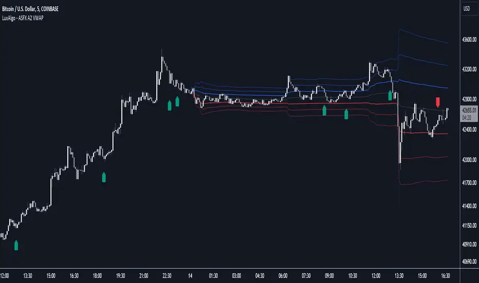
ASFX A2 VWAP [LuxAlgo]The ASFX A2 VWAP is a toolkit based on A2 signals and daily anchored VWAP bands, a methodology proposed by trader & educator Austin Silver (ASFX).
Pre-built alerts are also included.
🔶 USAGE
The A2 strategy involves identifying potential trades using specific signals and confirmation from the 21 EMA (Exponential Moving Average). Below we can see a bullish A2 signal triggering as price is closing below the 21 EMA with less than half of the candles closing price.
Within the settings, we have enabled the stop loss setting to assist us with trade setups generated from A2 signals.
Users can enable multiple layers of StDev multipliers on the AAVWAP to find areas of support & resistance alongside the A2 signals & other features included.
🔶 DETAILS
If 'Filter Based On VWAP' is enabled, bullish signals will only be displayed if located above the anchored VWAP, while bearish signals will only be displayed when located under the VWAP. The image above illustrates this, with transparent signals showing the ones that are supposed to be filtered.
The Stop Loss is based on the most recent A2 signal, and is constructed from the 1.618 Fibonacci retracement using the following points depending on the A2 signal:
Bullish: From candle low to the current daily maximum.
Bearish: From candle high to current daily minimum.
🔶 SETTINGS
🔹 A2
Validation EMA Period : Period of the EMA used to validate triggered A2 signals.
Trigger EMA Period : Period of the EMA used to trigger A2 signals.
Filter Based On VWAP : Filter A2 signals based on their location relative to the VWAP output.
🔹 VWAP
source : Input data for the anchored VWAP calculation
Show Central AVWAP : Display central VWAP on the chart
StDev Multiplier 1 : Display first VWAP bands, using a StDev multiplier of 1 by default.
StDev Multiplier 2 : Display second VWAP bands, using a StDev multiplier of 2 by default.
StDev Multiplier 3 : Display third VWAP bands, using a StDev multiplier of 3 by default.
🔹 Stop Loss
Stop Loss : Display stop loss based on the most recent A2 signal
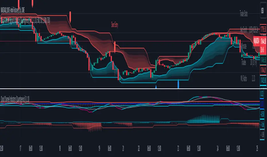
Cloud Channel Signals Indicator [Quantigenics]The Cloud Channel Signals script is a key element of the Cloud Channel Signal System. It primarily focuses on identifying breakout and reversal trades through a sophisticated cloud channel overlay. The script, designed for overlay on the price portion of charts, displays a “cloud-like” channel that signals potential breakout and reversal points around the candles/bars, offering insights into price movements, volatility, and potential support or resistance zones at the outer bands of the channel.
As with all of our scripts, the "Cloud Channel Signals" script, is designed to work on ANY symbol and time frame. The input parameters can be adjusted to fit your specific trading style.
Technical Composition :
Cloud Channel Construction : The Cloud Channel Signals Script is characterized by its innovative Cloud Channel, a proprietary formulation that advances beyond traditional channel calculations. This channel is not a mere adaptation of Bollinger Bands or Donchian Channels; it sets itself apart through a complex blend of calculations. While incorporating elements like standard deviation and high/low price ranges, it notably introduces EMA-based adjustments and integrates intricate mathematical models. This sophisticated algorithmic approach results in a channel that adeptly marks price extremes and dynamically adapts to market volatility and trend shifts. Enhanced by advanced statistical methods, the Cloud Channel offers nuanced insights into market behavior. Its configuration is based on specific range calculations derived from price fluctuations over a defined period, paired with an evolved standard deviation method. This results in a multifaceted analytical tool that surpasses typical channel indicators in depth and sophistication, providing traders with a comprehensive, nuanced view of support and resistance areas.
Signal Generation Mechanism :
> Breakout Signals :
The script identifies breakout signals by assessing price crossover relative to a dynamically constructed channel. This channel is derived from a blend of moving averages and price extremes over a specified period. Oscillator crossovers aid in confirming breakout signals. These crossovers are determined by comparing the oscillator line, calculated as a difference between a transformed moving average and a kernel estimation, with a signal line derived from an exponential moving average of the oscillator.
> Reversal Signals :
Reversal signals are generated through mathematical analysis of price proximity to the channel's edges, which are calculated using a combination of EMA (Exponential Moving Average) values and the highest/lowest price points within a given time frame. The oscillator's role in identifying reversals involves assessing its value relative to its historical range, which is dynamically adjusted based on market conditions.
Oscillator Dynamics :
The oscillator is constructed using a combination of rational quadratic and Gaussian kernel functions applied to close prices. The length parameter of the oscillator controls the window of these calculations, impacting its responsiveness. The dynamic level adjustment in the oscillator is based on a calculated average of its peak and trough values over a specified period, offering adaptive sensitivity.
Channel Gradient Smoothness :
The gradient smoothness of the channel is a function of the variance between the channel's upper and lower bounds. This is visually represented through color intensity changes, reflecting the level of volatility and market momentum.
Trend Bias Assessment :
Trend Bias is calculated using a combination of high/low averages and smoothed price data. This involves taking the average of the highest and lowest prices over a specified length, then applying an exponential moving average to this average for trend direction assessment. This mathematical assessment of trend direction complements the breakout and reversal signals by aligning them with the prevailing market trend.
How to Use the Cloud Channel Signals System :
Usage Considerations:
The script must be configured with precision to ensure it aligns with the trader’s strategy. This involves meticulous setting of channel lengths, oscillator parameters, and trend bias length. For effective application, it’s essential to synchronize the input parameters with the companion "Cloud Channel Indicators" script, ensuring a unified analytical perspective. The option to choose real-time vs. post-bar-closure signal generation offers flexibility in trading styles, catering to both aggressive and conservative trading approaches.
Integration with Cloud Channel Indicators script :
> Use the "Cloud Channel Signals" script alongside the "Cloud Channel Indicators" script for comprehensive market analysis. Ensure identical input parameters across both scripts for consistency.
> Note: The lower indicators are from the 'Cloud Channel Indicators' script, complementing the 'Cloud Channel Signals' script seen here, which generates the 'cloud' and signals on the price chart.
> The 'Cloud Channel Indicators” script can be found here:
Understanding On-Chart Signals :
The script displays entry signals directly on the chart, offering visual cues for both breakout and reversal trading opportunities. Traders can toggle the display of these signals for either breakout or reversal trades, allowing customization based on their trading strategy.
Identifying Entry Points :
> Breakout Trades : Enable 'Show Break Out Trades' to view signals where the price crosses the cloud channel, coupled with oscillator crossovers. A bullish breakout is indicated when the price crosses above the top channel, and a bearish breakout when it crosses below the bottom channel.
> Reversal Trades : Activate 'Show Reversal Trades' to identify potential reversal points. These are highlighted when the price rebounds from the cloud channel's edges, supported by oscillator and trend bias indicators.
Setting Stop Losses Using Outer Bands : Employ the outer bands of the cloud channel as dynamic stop-loss levels. Position stop losses below the lower band for long trades and above the upper band for short trades, adjusting as the bands shift with market conditions.
Executing and Managing Trades : Enter trades based on the script’s breakout or reversal signals, in line with your risk management rules.
Adjust stop-loss levels : Adjust stop-loss levels according to the outer band movements and exit the trade based on reversal signals or profit targets determined by significant support or resistance levels indicated by the cloud channel.
Customizable Alerts for Trading Efficiency :
Set up TradingView alerts to notify you of crucial trading signals like breakout or reversal opportunities, or when the price reaches critical levels defined by the cloud channel.
Adapting Strategy to Market Dynamics:
Input Parameter Settings :
Important Usage Guidance : For seamless integration with its counterpart, the "Cloud Channel Indicators" script, it's crucial to align the input parameter settings across both scripts. When adjusting values from their defaults, ensure that corresponding parameters in both scripts are identically set. This synchronization is key to achieving a cohesive and accurate representation on your charts.
Intra-Bar Order Generation (IntraBar) : Allows traders to choose if signals are generated within the current bar (real-time) or after the bar closes, providing flexibility in signal timing.
Show Break Out/Reversal Trades (BreakOutTrades, ReversalTrades) : Enables traders to toggle the visibility of specific trade types - breakout or reversal trades - on the chart.
Show Text Labels (ShowSignalLabels) : Option to display text labels for signals, enhancing the clarity and readability of the chart.
Inner/Outer Channel Length (InnerChannelLength, OutterChannelLength) : Sets the calculation periods for the inner and outer channels, affecting the sensitivity and responsiveness of the cloud channel.
Oscillator Length (OscillatorLength) : Determines the length for the precision oscillator calculation, impacting its sensitivity to market movements.
Top/Bottom Level (TopLevel, BottomLevel) : Establishes the upper and lower bounds for the oscillator, used to identify overbought and oversold conditions.
Use Dynamic Level (Dynamic_Level_OnOff) : Provides an option to use dynamic levels in the oscillator, for a more adaptive and responsive analysis.
Trend Bias Length (TrendBiasLength) : Adjusts the period for the Trend Bias calculation, crucial for understanding the overall market trend.
Top/Bottom Channel Color (TopChannelColor, BottomChannelColor) : Customization options for the color of the top and bottom channels.
Smoothness of The Gradient (Smoothness) : Controls the smoothness level of the channel's gradient, allowing for visual customization.
Alert Setting Guidance :
The script includes a versatile alert system for notifying traders of critical trading signals:
Breakout and Reversal Trade Alerts : These alerts are activated for breakout and reversal signals based on the script’s analysis, which can be crucial for timely entries and exits.
Custom Alert Conditions : Traders can set up alerts in TradingView’s system to get notified under specific conditions, like when a new signal (arrow up/down) appears on the chart, tailoring the alerts to their trading strategies.
The "Cloud Channel Signals " script offers a valuable tool for traders looking to capitalize on breakout and reversal opportunities. Its advanced channel and oscillator settings, combined with customizable alert options, make it a valuable addition to any trader's arsenal. Users are encouraged to explore these settings to fully leverage the script's capabilities, keeping in mind that trading involves risks and past performance does not guarantee future results. For optimal results, this script is designed to be used in conjunction with the "Cloud Channel Indicators .
You can see the “Author’s instructions" below to get immediate access to Cloud Channel Signals Indicators & the rest of the “Quantigenics Premium Indicator Suite”.
Filtered Momentum Indicator (FMI)The Filtered Momentum Indicator (FMI) is a tool created to assist traders in identifying changes in momentum and gaining insights into potential shifts in price trends. By combining the concepts of momentum and Bollinger Bands, the FMI offers a unique perspective on momentum values and their relationship to price movements, helping traders make informed trading decisions. The FMI is calculated using two main components:
-- Momentum Calculation : Momentum measures the strength and velocity of price changes. It is calculated by comparing the current price to the price 14 (default) periods ago and expressing it as a percentage.
-- Bollinger Bands Calculation : Bollinger Bands are based on the momentum values and provide a range within which the momentum is expected to fluctuate. The upper and lower bands are determined using a specified period (default of 20) and deviations (default of 2.0).
The FMI consists of two lines : F+ (Filtered Plus) and F- (Filtered Minus). These lines help gauge the strength of bullish and bearish momentum:
-- F+ represents the difference between the upper Bollinger Band and the momentum values. It indicates the strength of bullish momentum. F+ is colored aqua.
-- F- represents the difference between the momentum values and the lower Bollinger Band. It indicates the strength of bearish momentum. F- is colored yellow.
When analyzing the FMI, pay attention to the relationship between F+ and F-:
-- If F- is greater than F+ , it suggests potential bullish momentum, indicating that prices may have room to rise.
-- If F+ is greater than F- , it suggests potential bearish momentum, indicating that prices may have room to decline.
Coloration of the FMI enhances its interpretability - when F- is greater than F+, the indicator color is set to lime (green), signaling potential bullish momentum; when F+ is greater than F-, the indicator color is set to fuchsia (purple), signaling potential bearish momentum.
The FMI can be applied in various ways for trading strategies:
-- Identifying Potential Reversals : Watch for crossovers between the F- and F+ lines, as they may indicate a potential shift in momentum and offer opportunities to enter or exit trades.
-- Confirmation Tool : Combine the FMI with other technical indicators or price patterns to validate potential trend reversals or continuations. By aligning signals from different indicators, you can strengthen your trading decisions.
-- Trade Timing : Consider taking trades in the direction of the dominant FMI color. When the indicator shows strong bullish momentum (F- > F+), consider going long. Conversely, when it shows strong bearish momentum (F+ > F-), consider going short.
It is essential to be aware of the limitations of the FMI:
-- False Signals : The FMI, like any indicator, may generate false signals, especially during low volatility or choppy market conditions. Always use the FMI in conjunction with other analysis techniques for confirmation.
-- Lagging Nature : The FMI relies on historical price data, causing it to lag behind sudden market moves. Keep in mind that the FMI provides insights based on past momentum and may not capture immediate changes in market conditions.
By combining momentum and Bollinger Bands, this indicator provides a unique perspective for making informed trading decisions. Utilize the FMI in conjunction with other analysis techniques, considering its limitations, to enhance your trading strategy and improve decision-making.

Bollinger Band Alert with RSI Filter IndicatorThis code is for a technical analysis indicator called Bollinger Band Alert with RSI Filter. It uses two tools: Bollinger Bands and Relative Strength Index (RSI) to identify potential trading signals in the market.
Bollinger Bands are lines plotted two standard deviations away from a simple moving average of the price of a stock or asset. They help traders determine whether prices are high or low on a relative basis.
The RSI is a momentum indicator that measures the strength of recent price changes to evaluate whether an asset is overbought or oversold.
The code has some input parameters that a user can change, such as length and multiplier, which are used to calculate the Bollinger Bands, and upper and lower RSI levels to define the overbought and oversold zones.
The code then uses if statements to generate alerts if certain conditions are met. The alert condition is triggered if the close price of an asset crosses above or below the upper or lower Bollinger Bands, and if the RSI is either above or below the overbought or oversold threshold levels.
Finally, the code generates plots to visualize the Bollinger Bands and displays triangles above or below the bars indicating when to enter a long or short position based on the strategy's criteria.

Range Band (Expo)█ Overview
Range Band (Expo) measures an asset's volatility and price movements to plot the most relevant price range. Identifying ranges in trading is extremely important for traders to assess the current market and make informed decisions about when to enter and exit positions.
By identifying ranges, traders can identify support and resistance levels , and use these levels to determine when to enter and exit a trade. Ranges also help traders to identify potential entry and exit points and set stop-loss and take-profit levels. Additionally, ranges can help traders to identify potential trends and reversals .
█ How to use
Identify potential trading opportunities
For example, if the price is bouncing between the upper and lower range bands, it may indicate that traders could potentially profit from short-term contrarian trades. Similarly, if the price is trading near the upper or lower range band, it may indicate that traders could potentially profit from long-term trend trades.
Price Ranges and SR Levels
Range bands help traders identify price ranges that are likely to be profitable. It is a graphical representation of price movement and is typically used to identify support and resistance levels. Range bands are also used to identify potential entry and exit points.
Trends
Range bands are used in to identify trends.
Reversals
Range bands are used in technical analysis to identify potential reversal points.
Overbought and Oversold
When the price reaches the upper range band, it may indicate that the asset is overbought and that the price is likely to fall. When the price reaches the lower range band, it may indicate that the asset is oversold and that the price is likely to rise.
-----------------
Disclaimer
The information contained in my Scripts/Indicators/Ideas/Algos/Systems does not constitute financial advice or a solicitation to buy or sell any securities of any type. I will not accept liability for any loss or damage, including without limitation any loss of profit, which may arise directly or indirectly from the use of or reliance on such information.
All investments involve risk, and the past performance of a security, industry, sector, market, financial product, trading strategy, backtest, or individual's trading does not guarantee future results or returns. Investors are fully responsible for any investment decisions they make. Such decisions should be based solely on an evaluation of their financial circumstances, investment objectives, risk tolerance, and liquidity needs.
My Scripts/Indicators/Ideas/Algos/Systems are only for educational purposes!

Double RSI + BBRSI stands for Relative Strength Index.
Bollinger Bands stands for a channel open by standard deviation values plotting upper, lower lines.
Double RSI with Bollinger bands adapted Bollinger bands to RSI not using overlay mode. It tries to filter fake signals while giving more good signals according to volatility even below overbought areas or above oversold areas. This way you can use greater values for RSI, like 25 and 100, increasing smoothness with less market noise.
We added an extra gap spacer to smooth Bollinger bands while widening the channel with a lower multiplier.
I found better results when Fast RSI crosses back into Bollinger bands channel.
You can play with the following settings:
• Source
Close is the most used
• Fast RSI length
Default to 25
• Slow RSI length
Default to 100
• RSI Smoothing
To filter out some graphic noise
• RSI Overbought, Oversold
Regular overbought, oversold lines handled by a single value. For 70/30, set it to 20 although with longer RSI something around 15 is enough.
• Bollinger Spacer
Ads thickness to the channel with lower multiplier
• Bollinger Length
Regular Bollinger length applied to slow RSI
• Bollinger Multiplier
Regular Bollinger multiplier applied to slow RSI
Disclaimer:
For study purposes only, trading without a good risk management can be regrettable, do your own research, always add confirmations, use it as is, at your own risk.

MA ChannelThis indicator creates a high and low channel of moving average type selected, it also can draw deviation bands based on the channel for a unique representation of squeezes.
Features
Moving average channel displays constant high and low price trend.
Center band displays color representative of trend direction constantly.
High price trend line disappears during downtrends, and low price trend line disappears during uptrends.
Deviation band display accurately reports squeezes between price and channel data.
Deviation band fill reports price range expansion as possible trend weakness.
Settings
Period adjusts historical price data to use for trend analysis.
Average Type adjusts the type of average calculation used in the trend plots.
Show Deviation Band toggles display of deviation bands and their fill.
Deviation Multiplier adjusts the deviation calculation, 2.0 is common.
Style adjustments include up/down trend strong/weak color customization (default theme supports color blindness).
Color Bar displays overall trend color on each bar.
Deviation Band Fill With Squeeze Measurement adjusts opacity to represent deviation band squeeze, when bands contract the colors disappear, when bands expand the colors reappear.
Usage
Trend Analysis
When price has broken above the channel then it's an uptrend, price below the channel is a downtrend.
Pay attention to when inverse trend line appears only momentarily, these could be excellent trend continuation entry areas.
Reversals
Reversal areas can be spotted where price breaks the channel central ribbon but doesn't close outside on the opposite end of previous trend.
Squeeze
Band fill squeeze mode aims to make it a simple task to see when a squeeze may be weakening, with the color trend brightening during periods of expansion, and disappearing during periods of contraction (squeezing).
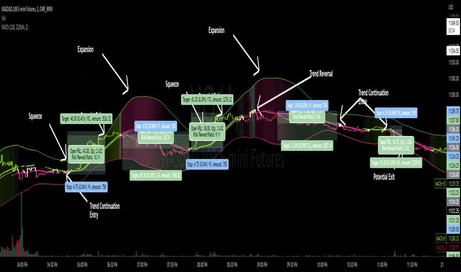
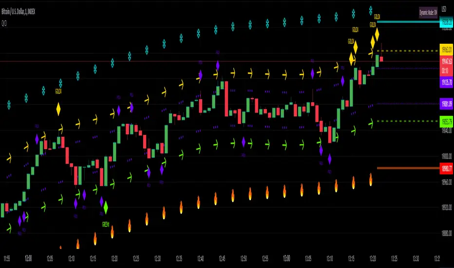
Quantitative Kernel DelimiterQuantitative Kernel Delimiter QKD - aka "Fire and ICE" - is a six-level multiple Kernel regression estimator with cross-timeframe semi-coordinated delimiters (bands) enabled by mathematical validation to our own Kernel regression code with historical Kernel formulas having custom variable bandwidths , mults , and window width – all achieving an advanced alerting system and directional price-action pointers for Novice, Intermediate and Advanced Traders within the TradingView Graphical User Interface.
In the course of our work, we have found that such six delimiters are ideal for generating signals of varying strengths.
99.9% of observations should be in our delimiters' range:
Kernel regression is a nonparametric smoothing method for data modeling.
Kernel regression of statistics was derived independently by Nadaraya and Watson in 1964 with a mathematical foundation given by Parzen’s earlier work on kernel density estimation.
If you are interested in reading more about the mathematical basis of this method from which our code is derived, you can follow these scholarly links:
Expert Trading Systems: Modeling Financial Markets with Kernel Regression
Estimation of the bandwidth parameter in Nadaraya-Watson
Adaptive optimal kernel density estimation for directional data
How kernel regression differs from the other Moving Averages?
In most MA's data points in the specified lookback window are weighted equally. In contrast, the Gaussian Kernel function used in this indicator assigns a higher weight to data points that are closer to the current point. This means that the indicator will react more quickly to changes in the market.
Regression method from which our code is derived is a widely known formula that is laid out in many sources, we used this source:
Kernel regression estimation
Kernel
During the regression counting process, a `kernel function` is used, which is traditionally chosen from a wide variety of symmetric functions.
In this indicator, we use the Gaussian density of statistics as the kernel function.
The Gaussian Kernel is one of the most commonly used Kernel functions and is used extensively in many Machine Learning algorithms due to its general applicability across a wide variety of datasets.
The kernel regression averages all the data contained within the range of the kernel function.
The effective range of the kernel function is defined by its window width .
Kernel Delimiters (Bands / Levels)
This indicator has 6 tailored price range* delimiters:
Cold / Fire - the furthest delimiters. In a range market when the price enters the cold/fire zones it is assumed that it has deviated strongly from the average and there is a high probability that it will immediately return to the average, or at least into the underlying zone, also in a trending market it signals a change in trend.
ALERT: the indicator performs best during relatively sideways price action within an established range. The trader must check higher timeframes during hits on the extreme Cold or Fire delimiter bands as a break in the lower, or even higher timeframe price range may result in a need to reset the regression calculation once price velocity calms down after a major move allowing the indicator to best function again. The reset will be done automatically by the indicator’s code. The indicator is not intended for use with unusually aggressive pricing behavior. Always beware of extreme market conditions. The indicator is intended as an ordinary range trading tool.
Gold / Green - we call it the middle ground / golden mean / happy medium zone. When the price comes out here but the momentum is not enough to get to the higher zone we consider it a good signal.
Pro - most often we receive signals in this area. We call it the professional zone because it is literally the zone for professional traders who know what they are dealing with.
*NOTE: the indicator is intended to be used as a range trading tool, and does not protect against total BREAKS from one Range to a new Range, wherein the bands reset for the trader.
Alerts / Labels
We have spent a lot of time implementing and testing signal labels* and alerts**.
Now you have access to an advanced alert system.
*NOTE: DUE TO the ongoing regression calculations performed by our code, the trader will note that a label may change color at a later point in time, or even soon after the hit on the quantitative delimiter band in question. This is a process that was reviewed and is favored to achieve visual clarity over historical accuracy for the trader. Real-time trading hits of price line to band, along with alerts generated, remain accurate. We look forward to receiving feedback on this issue from the end users. Additional revisions by our team on this matter are anticipated if a harmony between visual clarity and historical accuracy is not satisfied.
**NOTE: Smaller and especially micro timeframes will result in more repeated alerts given the tight proximity with price vis-à-vis the quantitative delimiter. Larger timeframes tend to eliminate any issue with repeated alerts aside from obvious re-contacting of the quantitative delimiter by the active price line.
You can turn off alerts you don't need in the indicator settings.
All alerts are set with one click.
Themes
Different people like different things, which is why we decided to make several visual design themes so you can choose what suits you.
Themes will continue to evolve over time.
Pro Theme:
Modern Theme:
How to remove colored text labels next to price scale to maximize screen space on mobile:
Go to General Chart Settings :
Click on “SCALES”
Un select “Indicators and financial name.”
Dynamic Mode
Projection of Indicator bands on history is subject to repainting due to its regressive calculation nature. Be cautious: old signals are drawn once at the first loading of the chart and by default (to speed up the start-up time of the indicator) correspond to the current regression levels. All labels remain in their places as the chart progresses. Also new, real-time labels appear on the chart, and do not disappear. In order to display the old signals on the chart as they were at the time of their appearance, uncheck the "History labels transition" in the indicator settings (it may increase the initial loading time of the chart but will give you an opportunity to check the alerts you received before and may also be useful for visual backtesting).
Because of the very nature of modeling financial markets (i.e., thousands of data records and perhaps hundreds of candidate predictors), the need for computational speed is paramount.
The use of kernel regression in data modeling for the types of problems associated with financial markets requires careful consideration of computational time.
Once we acknowledge that the order of the data is important, then the choice of the learning-data-set becomes crucial. The time dimension introduces another level of complexity to the analysis: how much importance do we attach to recent data records as opposed to earlier records? Is there a simple way to take this effect into consideration? Common sense leads us to the basic conclusion that if we are to predict a value of Y at a given time, we should only use learning data from an earlier time. But this procedure tends to be overly restrictive. This problem has a simple solution: All that one must do is to make the learning data set dynamic . In other words, once a record has been tested, it is then available for updating the learning data set prior to testing the next record. The analyst can allow the learning data set to grow, or, alternatively, for each record added, the earliest remaining record in the learning set can be discarded. These two alternatives have led us to the necessity of using moving window option and adding a disclaimer that dynamic mode is enabled.
This indicator will be updated frequently based on community feedback see the Author’s instructions below to get instant access
―――――――――――――――――――――
Liability Disclaimer
Never fully rely on one indicator as you trade. Successful trading may require an orchestral mindset and harmonіc blend of trading tools, know-how, and devices. VIP Trader . com is not responsible for any damages or losses incurred by use or misused of this indicator. Neither this description above, nor the indicator, is intended to be used as financial advisory tool, nor to be used without proper education or training in the field of trading.
Ultimate IndicatorThis is a combination of all the price chart indicators I frequently switch between. It contains my day time highlighter (for day trading), multi-timeframe long-term trend indicator for current commodity in the bottom right, customizable trend EMA which also has multi-timeframe drawing capabilities, VWAP, customizable indicators with separate settings from the trend indicator including: EMA, HL2 over time, Donchian Channels, Keltner Channels, Bollinger Bands, and Super Trend. The settings for these are right below the trend settings and can have their length and multiplier adjusted. All of those also have multi-timeframe capabilities separate from the trend multi-time settings.
The Day Trade Highlight option will draw faint yellow between 9:15-9:25, red between 9:25-9:45, yellow between 9:45-10:05. There will be one white background at 9:30am to show the opening of the market. while the market is open there will be a very faint blue background. For the end of the day there will be yellow between 15:45-15:50, red between 15:50-16:00, and yellow between 16:00-16:05. During the night hours, there is no coloring. The purpose of this highlight is to show the opening / closing times of the market and the hot times for large moves.
The indicators can also be colored in the following ways:
1. Simple = Makes all colors for the indicator Gray
2. Trend = Will use the Donchian Channels to get the short-trend direction and by default will color the short-term direction as Blue or Red. Unless using Super Trend, the Donchian Channel is used to find short-term trend direction.
3. Trend Adv = Will use the Donchian Channels to get the short-trend direction and by default will color the short-term direction as Blue or Red. Unless using Super Trend, the Donchian Channel is used to find short-term trend direction. If there is a short-term up-trend during a long-term down-trend, the Blue will become Navy. If short-term down-trend during long-term up-trend, the Red will be Brown.
4. Squeeze = Compares the Bollinger Bands width to the Keltner Channels width and will color based on relative squeeze of the market: Teal = no squeeze. Yellow = little squeeze. Red = decent squeeze. White = huge squeeze. if you do not understand this one, try drawing the Bollinger Bands while using the Squeeze color option and it should become more apparent how this works. I also recommend leaving the length and multiplier to the default 20 and 2 if using this setting and only changing the timeframe to get longer/shorter lengths as I've seen that changing the length or multiplier can more or less make it not work at all.
Along with the indicator settings are options to draw lines/labels/fills for the indicator. I enjoy having only fills for a cleaner look.
The Labels option will show Buy/Sell signals when the short-term trend flips to agree with the long-term trend.
The Trend Bars option will do the same as the Labels option but instead will color the bars white when a Buy/Sell option is given.
The Range Bars option shows will color a bar white when the Close of a candle is outside of a respective ranging indicator option (Bollinger or Keltner).
The Trend Bars will draw white candles no matter which indicator selection you make (even "Off"). However, Range Bars will only draw white when either Bollinger or Keltner are selected.
The Donchian Channels and Super Trend are trending indicators and should be used during trending markets. I like to use the MACD in conjunction with these indicators for possibly earlier entries.
The Bollinger Bands and Keltner Channel are ranging indicators and should be used during ranging markets. I like to use the RSI in conjunction with these indicators and will use 60/40 for overbought and oversold areas rather than 70/30. During a range, I wait for an overbought or oversold indication and will buy/sell when it crosses back into the middle area and close my position when it touches the opposite band.
I have a MACD/RSI combination indicator if you'd like that as well :D
As always, trade at your own risk. This is not some secret indicator that will 100% win. As always, the trades you see in the picture use a 1:1.5 or 1:2 risk to reward ratio, for today (August 8, 2022) it won 5/6 times with one trade still open at the end of the day. Manage your account correctly and you'll win in the long term. Hit me up with any questions or suggestions. Happy Trading!

Bollinger CloudsThis indicator plots Bollinger Bands for your current timeframe (e.g 5 minutes) and also plots the Bollinger Bands for a higher timeframe (15 minutes for 5 minute timeframe). Then the gaps between the current and higher timeframe upper and lower bands is filled to create clouds which can be used as entry zones. Like Bollinger Bands, this indicator shouldn't be solely used for entries, use it in conjunction with other indicators.
Bollinger Band Timeframes
Current / Higher
1 minute / 5 minutes
3 minutes / 10 minutes
5 minutes / 15 minutes
10 minutes / 30 minutes
15 minutes / 1 hour
30 minutes / 2 hours
45 minutes / 1.5 hours
1 hour / 4 hours
2 hours / 8 hours
2.5 hours / 10 hours
4 hours / 1 Day
1 Day / 3 Days
3 Days / 9 Days
5 Days / 2 Weeks
1 Week / 1 Month

Bitcoin Power Law Zones (Dunk)Introduction When viewed on a standard linear chart, Bitcoin’s long-term price action can appear chaotic and exponential. However, when analyzed through the lens of physics and network growth models, a distinct structure emerges.
This indicator implements the Bitcoin Power Law , a mathematical model that suggests Bitcoin’s price evolves in a straight line when plotted against time on a "log-log" scale. By calculating parallel bands around this regression line, we create a "Rainbow" of valuation zones that help investors visualize whether the asset is historically overheated, undervalued, or sitting at fair value.
The Math Behind the Model The Power Law dictates that price scales with time according to the formula: Price = A * (days since genesis)^b
This script uses the specific parameters popularized by recent physics-based analyses of the network: Slope (b): 5.78 (Representing the scaling law of the network adoption). Amplitude (A): 1.45 x 10^-17 (The intercept coefficient).
While simple moving averages react to price, this model is predictive based on time and network growth physics, providing a long-term "gravity" center for the asset.
Guide to the Valuation Zones
Upper Bands (Red/Orange): Extr. Overvalued, High Premium, Overvalued. Historically, these zones have marked cycle peaks where price moved too far, too fast ahead of the network's steady growth. The Baseline (Black Line): Fair Value. The mathematical mean of the Power Law. Price has historically oscillated around this line, treating it as a center of gravity. Lower Bands (Green/Blue): Undervalued, Discount, Deep Discount. These zones represent periods where the market price has historically lagged behind the network's intrinsic value, often marking accumulation phases.
Note: The lowest theoretical tiers ("Bitcoin Dead") have been trimmed from this chart to focus on relevant historical support levels.
How to Use Logarithmic Scale: You MUST set your chart to "Log" scale (bottom right of the TradingView window) for this indicator to function correctly. On a linear chart, the bands will appear to curve upwards aggressively; on a Log chart, they will appear as smooth, parallel channels. Timeframe: This is a macro-economic indicator. It is best viewed on Daily or Weekly timeframes. Overlay Labels: The indicator includes dynamic labels on the right-side axis, allowing you to instantly see the current price requirements for each valuation zone without manually tracing lines.
Credits This script is based on the Power Law theory popularized by Giovanni Santostasi and the original Corridor concepts by Harold Christopher Burger .
Disclaimer This tool is for educational and informational purposes only. It visualizes historical mathematical trends and does not constitute financial advice. Past performance of a model is not indicative of future results.
Further Reading
www.hcburger.com
giovannisantostasi.medium.com

KC-BB Squeeze Trend Trader█ OVERVIEW
The KC-BB Squeeze Trend Trader identifies volatility compression and expansion by detecting when Bollinger Bands contract inside Keltner Channels and then release with confirmed momentum. It highlights potential trend-starting breakouts by combining squeeze detection, directional momentum, trend bias, and optional volume filters.
During periods of low volatility, price consolidates and energy builds. When volatility expands again, strong directional moves often follow. This tool helps traders spot those opportunities early with clear visual cues and optional performance tracking.
█ KEY FEATURES
Squeeze detection using Bollinger Bands inside Keltner Channels
Automatic identification of volatility expansion after the squeeze ends
Optional filters for momentum, trend direction, volume, and signal cooldown
Dynamic color fills for squeeze, bullish expansion, bearish expansion, and neutral states
Dashboard showing squeeze duration, tightness, momentum, trend, and volume context
Optional win-rate analytics using ATR-based target and stop evaluation
Multi-timeframe confirmation for higher-quality breakouts
█ HOW IT WORKS
A squeeze occurs when both Bollinger Bands sit inside the Keltner Channels.
A breakout begins when the Bollinger Bands expand outside the KCs.
Long signals appear when squeeze release aligns with bullish momentum and trend strength.
Short signals appear when bearish momentum and trend conditions agree.
Volume and cooldown filters help reduce noise and avoid low-quality entries.
█ HOW TO USE
Wait for a squeeze period (yellow fill).
Monitor duration and tightness: longer/tighter squeezes often lead to stronger moves.
When a long or short signal appears, use the plotted ATR-based target and stop as reference levels.
Watch for contraction or exit hints when momentum fades or volatility narrows again.
Higher timeframes generally provide cleaner and more reliable signals.
█ TIMEFRAME GUIDANCE
Crypto: 4H or 1D; consider increasing KC multiplier for high volatility.
Forex: 1H–4H; longer squeeze duration can improve selectivity.
Stocks: 1D–1W; consider slightly higher BB multiplier on slow-moving markets.
█ SETTINGS SUMMARY
Adjustable Bollinger Band and Keltner Channel lengths and multipliers
Three momentum modes: Linear Regression, Price–SMA, or ROC
Trend and volume filters (optional)
Configurable minimum squeeze duration and signal cooldown
ATR-based target and stop multipliers
Optional historically tight squeeze filter (percentile-based)
█ ALERTS
Squeeze Detected
Squeeze Released
Long Entry
Short Entry
Exit Hint
Historically Tight Squeeze
█ NOTES
ATR-based win-rate calculations provide simplified performance estimates.
Past behavior does not guarantee future movement.
Use position sizing and risk management appropriate for the instrument and timeframe.
█ CREDITS
Inspired by the Bollinger Band and Keltner Channel squeeze concept popularized by John Carter’s TTM Squeeze, with added enhancements for squeeze strength, filtering, and real-time performance metrics.

Cora Combined Suite v1 [JopAlgo]Cora Combined Suite v1 (CCSV1)
This is an 2 in 1 indicator (Overlay & Oscillator) the Cora Combined Suite v1 .
CCSV1 combines a price-pane Overlay for structure/trend with a compact Oscillator for timing/pressure. It’s designed to be clear, beginner-friendly, and largely automatic: you pick a profile (Scalp / Intraday / Swing), choose whether to run as Overlay or Oscillator, and CCSV1 tunes itself in the background.
What’s inside — at a glance
1) Overlay (price pane)
CoRa Wave: a smooth trend line based on a compound-ratio WMA (CRWMA).
Green when the slope rises (bull bias), Red when it falls (bear bias).
Asymmetric ATR Cloud around the CoRa Wave
Width expands more up when buyer pressure dominates and more down when seller pressure dominates.
Fill is intentionally light, so candlesticks remain readable.
Chop Guard (Range-Lock Gate)
When the cloud stays very narrow versus ATR (classic “dead water”), pullback alerts are muted to avoid noise.
Visuals don’t change—only the alerting logic goes quiet.
Typical Overlay reads
Trend: Follow the CoRa color; green favors long setups, red favors shorts.
Value: Pullbacks into/through the cloud in trend direction are higher-quality than chasing breaks far outside it.
Dominance: A visibly asymmetric cloud hints which side is funding the move (buyers vs sellers).
2) Oscillator (subpane or inline preview)
Stretch-Z (columns): how far price is from the CoRa mean (mean-reversion context), clipped to ±clip.
Near 0 = equilibrium; > +2 / < −2 = stretched/extended.
Slope-Z (line): z-score of CoRa’s slope (momentum of the trend line).
Crossing 0 upward = potential bullish impulse; downward = potential bearish impulse.
VPO (stepline): a normalized Volume-Pressure read (positive = buyers funding, negative = sellers).
Rendered as a clean stepline to emphasize state changes.
Event Bands ±2 (subpane): thin reference lines to spot extension/exhaustion zones fast.
Floor/Ceiling lines (optional): quiet boundaries so the panel doesn’t feel “bottomless.”
Inline vs Subpane
Inline (overlay): the oscillator auto-anchors and scales beneath price, so it never crushes the price scale.
Subpane (raw): move to a new pane for the classic ±clip view (with ±2 bands). Recommended for systematic use.
Why traders like it
Two in one: Structure on the chart, timing in the panel—built to complement each other.
Retail-first automation: Choose Scalp / Intraday / Swing and let CCSV1 auto-tune lengths, clips, and pressure windows.
Robust statistics: On fast, spiky markets/timeframes, it prefers outlier-resistant math automatically for steadier signals.
Optional HTF gate: You can require higher-timeframe agreement for oscillator alerts without changing visuals.
Quick start (simple playbook)
Run As
Overlay for structure: assess trend direction, where value is (the cloud), and whether chop guard is active.
Oscillator for timing: move to a subpane to see Stretch-Z, Slope-Z, VPO, and ±2 bands clearly.
Profile
Scalp (1–5m), Intraday (15–60m), or Swing (4H–1D). CCSV1 adjusts length/clip/pressure windows accordingly.
Overlay entries
Trade with CoRa color.
Prefer pullbacks into/through the cloud (trend direction).
If chop guard is active, wait; let the market “breathe” before engaging.
Oscillator timing
Look for Funded Flips: Slope-Z crossing 0 in the direction of VPO (i.e., momentum + funded pressure).
Use ±2 bands to manage risk: stretched conditions can stall or revert—better to scale or wait for a clean reset.
Optional HTF gate
Enable to green-light only those oscillator alerts that align with your chosen higher timeframe.
What each signal means (plain language)
CoRa turns green/red (Overlay): trend bias shift on your chart.
Cloud width tilts asymmetrically: one side (buyers/sellers) is dominating; extensions on that side are more likely.
Stretch-Z near 0: fair value around CoRa; pullback timing zone.
Stretch-Z > +2 / < −2: extended; watch for slowing momentum or scale decisions.
Slope-Z cross up/down: new impulse starting; combine with VPO sign to avoid unfunded crosses.
VPO positive/negative: net buying/selling pressure funding the move.
Alerts included
Overlay
Pullback Long OK
Pullback Short OK
Oscillator
Funded Flip Up / Funded Flip Down (Slope-Z crosses 0 with VPO agreement)
Pullback Long Ready / Pullback Short Ready (near equilibrium with aligned momentum and pressure)
Exhaustion Risk (Long/Short) (Stretch-Z beyond ±2 with weakening momentum or pressure)
Tip: Keep chart alerts concise and use strategy rules (TP/SL/filters) in your trade plan.
Best practices
One glance workflow
Read Overlay for direction + value.
Use Oscillator for trigger + confirmation.
Pairing
Combine with S/R or your preferred execution framework (e.g., your JopAlgo setups).
The suite is neutral: it won’t force trades; it highlights context and quality.
Markets
Works on crypto, indices, FX, and commodities.
Where real volume is available, VPO is strongest; on synthetic volume, treat VPO as a soft filter.
Timeframes
Use the Profile preset closest to your style; feel free to fine-tune later.
For multi-TF trading, enable the HTF gate on the oscillator alerts only.
Inputs you’ll actually use (the rest can stay on Auto)
Run As: Overlay or Oscillator.
Profile: Scalp / Intraday / Swing.
Oscillator Render: “Subpane (raw)” for a classic panel; “Inline (overlay)” only for a quick preview.
HTF gate (optional): require higher-timeframe Slope-Z agreement for oscillator alerts.
Everything else ships with sensible defaults and auto-logic.
Limitations & tips
Not a strategy: CCSV1 is a decision support tool; you still need your entry/exit rules and risk management.
Non-repainting design: Signals finalize on bar close; intrabar graphics can adjust during the bar (Pine standard).
Very flat sessions: If price and volume are extremely quiet, expect fewer alerts; that restraint is intentional.
Who is this for?
Beginners who want one clean overlay for structure and one simple oscillator for timing—without wrestling settings.
Intermediates seeking a coherent trend/pressure framework with HTF confirmation.
Advanced users who appreciate robust stats and clean engineering behind the visuals.
Disclaimer: Educational purposes only. Not financial advice. Trading involves risk. Use at your own discretion.

Litecoin Rainbow Chart by Crypto LamaThis script adapts the popular Bitcoin Rainbow chart to Litecoin to visualize Litecoin's long-term price trend on a logarithmic scale.
It highlights potential buying or caution zones based on a power law growth model tied to Litecoin's halving cycles.
What it does:
The indicator overlays 23 colored bands from purple/blue (undervalued) to orange/red (overvalued) around a power law trend line.
It supports forward projections by extending the chart with user-defined future bars.
How it works:
The core trend uses a power law formula: P(t) = 10^(0.5 + 4.34 * log10(h + 1)), where h represents time in halving cycles.
23 colored bands are constructed by applying multipliers with a decaying factor that narrows over time.
To put it simple, it is the same power law trendline shifted up or down 23 times.
For projections, it adds future bars to the timeline and recalculates the trend and bands accordingly.
How to use it:
Apply the indicator to a Litecoin chart (VANTAGE:LTCUSD for best results).
Adjust the "Future Bars" input to extend projections, usually staying below 600 future bars prevents visual bugs.
Blue/green bands signal potential accumulation zones, as has been demonstrated for Bitcoin, an average price close to these levels will likely prove to be an excellent buying opportunity, while orange/red suggest distribution or caution.
This indicator should be used to visualize the macro long-term trend of Litecoin, and it is not supposed to be used for short-term forecasts as its accuracy decreases.
Originality:
While inspired by Bitcoin's Rainbow Chart, this version is customized for Litecoin by incorporating its unique halving schedule and calibrated power law parameters in the power law formula, offering a tailored tool for LTC-specific analysis.
Note: This is not financial advice. Use it alongside other tools and manage risks appropriately!

RSI: chart overlay
This indicator maps RSI thresholds directly onto price. Since the EMA of price aligns with RSI’s 50-line, it draws a volatility-based band around the EMA to reveal levels such as 70 and 30.
By converting RSI values into visible price bands, the overlay lets you see exactly where price would have to move to hit traditional RSI boundaries. These bands adapt in real time to both price movement and market volatility, keeping the classic RSI logic intact while presenting it in the context of price action. This approach helps traders interpret RSI signals without leaving the main chart window.
The calculation uses the same components as the RSI: alternative derivation script: Wilder’s EMA for smoothing, a volatility-based unit for scaling, and a normalization factor. The result is a dynamic band structure on the chart, representing RSI boundary levels in actual price terms.
Key components and calculation breakdown:
Wilder’s EMA
Used as the anchor point for measuring price position.
myEMA = ta.rma(close, Length)
Volatility Unit
Derived from the EMA of absolute close-to-close price changes.
CC_vol = ta.rma(math.abs(close - close ), Length)
Normalization Factor
Scales the volatility unit to align with the RSI formula’s structure.
normalization_factor = 1 / (Length - 1)
Upper and Lower Boundaries
Defines price bands corresponding to selected RSI threshold values.
up_b = myEMA + ((upper - 50) / 50) * (CC_vol / normalization_factor)
down_b = myEMA - ((50 - lower) / 50) * (CC_vol / normalization_factor)
Inputs
RSI length
Upper boundary – RSI level above 50
Lower boundary – RSI level below 50
ON/OFF toggle for 50-point line (EMA of close prices)
ON/OFF toggle for overbought/oversold coloring (use with line chart)
Interpretation:
Each band on the chart represents a chosen RSI level.
When price touches a band, RSI is at that threshold.
The distance between moving average and bands adjusts automatically with volatility and your selected RSI length.
All calculations remain fully consistent with standard RSI values.
Feedback and code suggestions are welcome, especially regarding implementation efficiency and customization.

Regression Channel (ShareScope-style, parallel)What it does
Replicates ShareScope’s Trend of displayed data look: a single straight linear-regression line (dashed) across a chosen window with parallel, constant-width bands above and below, plus optional shading.
Use it to see the overall trend gradient for a period and a statistically sized channel based on the fit’s residual error.
How it works (math, short)
Computes an OLS regression once over the analysis window.
Residual standard error s is derived from SSE and degrees of freedom (n−2).
Band half-width is constant across the window:
Mean CI (narrower): half = z * s / √n
Prediction (wider): half = z * s * √(1 + 1/n)
Three straight, parallel lines are drawn from the regression endpoints; midline is dashed.
This is intentionally not a tapered CI (which widens at the ends). It matches the visual behaviour of ShareScope’s shaded trend line channel.
Inputs
Source – Price series (Close, High, Low, HL2, etc.).
Use last N bars / N (bars) – Rolling window length.
From / To (date mode) – Alternative fixed date window.
Confidence (%) – 90 / 95 / 99 / Custom (uses z≈t).
Custom Z (t) – Override the quantile if desired.
Prediction bands – Use wider prediction envelope instead of mean CI.
Shade region + colors / opacity / line width.
Usage
To mimic ShareScope exactly, pick the same date span (use date mode) and set Confidence 99%.
Choose Prediction OFF for a tighter “confidence” look; ON for a wider, more permissive channel.
If ShareScope used High as source, set Source = High here as well.
Notes & limitations
TradingView does not expose the visible viewport to Pine. The script cannot auto-read “displayed data.” Use last N bars or date range.
Bands are parallel by design. Prices may close outside; the channel does not bend.
Window capped at 5,000 bars for performance. No alerts are emitted.
Differences vs TV’s native tools
Linear Regression (drawing) – manual object; no statistical sizing or shading.
Linear Regression Channel (indicator) – uses price standard deviations around the regression; width is a user stdev multiple.
This script – uses residual error of the OLS fit and a z/t quantile to size a statistically meaningful parallel channel.
Changelog
r3.1 – Guard fix (no return at top level), minor refactor, stable line updates.
r3 – Switched to single-fit OLS with parallel constant-width bands (ShareScope look).
(Earlier experimental builds r1–r2.2 implemented rolling/tapered CI; superseded.)
Disclaimer: Educational use only. Not investment advice.

BBKC Combined Channels OverlayBBKC Combined Channels Overlay (Volatility & Mean Reversion)This indicator provides a clean, single-view envelope combining the Bollinger Bands (BB) and Keltner Channels (KC) directly onto your price chart. It is an essential tool for traders operating with Volatility Compression (The Squeeze) and Mean Reversion strategies in fast-moving markets like Futures, High BTC Beta Equities, and Crypto. The goal of this tool is twofold: to visually frame the market's current volatility state and to identify high-probability entry points based on expansion or extreme contraction. How to Use the BBKC Overlay: Spotting the Squeeze (Accumulation Phase):The Squeeze is identified when the Bollinger Bands (BB) contract and fit inside the Keltner Channels (KC).The area is clearly marked with a subtle Orange Background Highlight on the main chart. This is the Accumulation phase, signaling low volatility before a potential large directional move. Trading Mean Reversion: When price pushes aggressively outside the outermost bands (the BB Upper/Lower), it signals an extreme volatility expansion and over-extension. This is a strong setup for mean reversion—a high-probability trade targeting a snap-back towards the central Basis Line (SMA).Customizing for Extreme Compression: For traders looking only for the tightest, highest-probability Squeezes, adjust the following setting: KC Multiplier (ATR): Lower this value from the default of 1.5 down to 1.25 or 1.0. This narrows the KC, forcing the Bollinger Bands to contract even further to trigger the Squeeze signal, thus filtering for only the most minimal volatility. Recommended Synergy: For a complete volatility system, pair this BBKC Combined Channels Overlay (your visualization tool) with the BBKC Squeeze Indicator (the sub-pane momentum histogram).Overlay (Main Chart): Shows where the Squeeze is occurring and identifies mean reversion targets. Squeeze Indicator (Lower Pane): Shows if the Squeeze is active and the directional momentum building up, helping you time the breakout entry for the Manipulation/Distribution phase.

Universal Valuation ~ GForge
🎯 Universal Valuation - GForge
Overview:
The Universal Valuation indicator is a sophisticated technical analysis tool that combines 14 different technical indicators into a single, normalized composite Z-score. This revolutionary approach provides traders and investors with a comprehensive view of an asset's relative valuation state, helping identify potential overvalued and undervalued conditions across any market, any timeframe .
🌟 Key Features:
Multi-Indicator Fusion: Combines RSI, CCI, Bollinger Bands, Price Analysis, Chande Momentum, Disparity Index, Hurst Exponent, IMI, TEMA, VWAP, Intraday Momentum, and advanced Risk Ratios (Sharpe, Sortino, Omega)
Universal Compatibility: Works seamlessly across stocks, forex, crypto, commodities, indices, and any tradeable asset
Multi-Timeframe Support: Optimized for all timeframes from 1-minute scalping to monthly long-term analysis
Professional Visualization: 9 stunning color themes with gradient effects and customizable styling
Comprehensive Dashboard: Real-time table displaying individual indicator scores and overall valuation phase
Smart Alert System: Built-in notifications for extreme valuation conditions
Z-Score Normalization: All indicators standardized for consistent comparison and interpretation
🔬 Technical Methodology:
The indicator employs advanced statistical normalization using Z-scores to transform disparate technical indicators into a unified measurement system. This revolutionary approach solves the fundamental problem of combining indicators with different scales and ranges.
1H MNT
Z-Score Normalization Process:
Raw Calculation: Each indicator is first calculated using its traditional formula (RSI 0-100, CCI unlimited range, etc.)
Statistical Analysis: For each indicator, the system calculates a rolling mean and standard deviation over a customizable lookback period
Z-Score Conversion: Current reading is converted using: Z = (Current Value - Rolling Mean) / Rolling Standard Deviation
Standardization: All Z-scores are clamped between -5 and +5 to prevent extreme outliers from dominating the composite
Democratic Weighting: Each normalized indicator contributes equally to the final composite score
Composite Calculation: Final score = Sum of all active Z-scores / Number of active indicators
Why Z-Scores Make It Universal:
Z-scores transform any indicator reading into "how many standard deviations away from normal this reading is." This means:
• An RSI of 85 on a volatile crypto might have the same Z-score as an RSI of 75 on a stable stock
• A CCI reading of +200 in a trending market might be less extreme than +100 in a ranging market
• Price movements are automatically adjusted for each asset's historical volatility
• Different timeframes are automatically normalized for their typical volatility patterns
This mathematical approach ensures the indicator adapts to any asset's unique characteristics and market conditions.
📊 Detailed Component Analysis:
Technical Indicators:
RSI (Relative Strength Index):
Calculates momentum by comparing recent gains to recent losses over a customizable period (default 21). Values above 70 traditionally indicate overbought conditions, while values below 30 suggest oversold conditions. The Universal Valuation converts these raw RSI values into Z-scores, providing a normalized view of how extreme current RSI readings are compared to historical patterns.
CCI (Commodity Channel Index):
Measures the current price level relative to an average price level over a given period (default 30). CCI compares the typical price (high+low+close)/3 to its simple moving average and divides by the mean absolute deviation. Values above +100 or below -100 indicate price extremes. Our Z-score normalization helps identify when CCI readings are statistically significant.
Bollinger Bands Position:
Calculates where the current price sits within the Bollinger Bands envelope. A value of +1 means price is at the upper band, -1 at the lower band, and 0 at the middle (SMA). This component measures price deviation from the mean in standard deviation units, making it naturally statistical. The Z-score normalization reveals when band position readings are historically extreme.
Price Z-Score:
Direct statistical measurement of how far the current price deviates from its historical mean in standard deviation units. This is the purest form of valuation measurement, showing whether an asset is trading at statistically significant levels relative to its historical price range.
Momentum Indicators:
Chande Momentum Oscillator (CMO):
Unlike RSI, CMO uses the sum of gains and losses rather than averages, making it more sensitive to recent price changes. It calculates (sum of gains - sum of losses) / (sum of gains + sum of losses) × 100. Values range from -100 to +100. The Z-score normalization helps identify when momentum readings are unusually extreme.
Disparity Index:
Measures the percentage difference between current price and its simple moving average: (Price - SMA) / SMA × 100. This shows how far price has deviated from its average, with positive values indicating price above average and negative values below. Z-score normalization reveals when these deviations are statistically significant.
Intraday Momentum Index (IMI):
Similar to RSI but uses intraday price movements instead of closing prices. It compares gains and losses within each session (close vs open) rather than session-to-session changes. This captures intraday sentiment and momentum that closing-based indicators might miss. Particularly useful for detecting intraday reversal patterns.
Intraday Momentum:
Simple but effective measurement of daily price movement: (Close - Open) / Open × 100. This shows the percentage gain or loss within each trading session. When Z-score normalized, it reveals when intraday movements are historically extreme, often indicating climax buying or selling conditions.
Advanced Indicators:
TEMA (Triple Exponential Moving Average):
A sophisticated moving average that applies exponential smoothing three times to reduce lag while maintaining responsiveness. TEMA = 3×EMA₁ - 3×EMA₂ + EMA₃, where each EMA is applied to the previous result. The Z-score of TEMA helps identify when price has moved significantly away from this responsive trend line.
VWAP (Volume Weighted Average Price):
Calculates the average price weighted by volume, giving more importance to prices where more volume occurred. VWAP = Σ(Price × Volume) / Σ(Volume). This represents the "fair value" based on actual trading activity. Z-score normalization shows when current VWAP is statistically extreme relative to historical VWAP levels.
Hurst Exponent:
Advanced mathematical concept measuring market efficiency and trend persistence. Values near 0.5 indicate random walk (efficient market), above 0.5 suggest trending behavior, and below 0.5 indicate mean-reverting markets. The indicator converts this to an oscillator: (Hurst - 0.5) × 100, then applies Z-score normalization to identify extreme efficiency/inefficiency periods.
Risk Ratios:
Sharpe Ratio:
Classic risk-adjusted return measure: (Return - Risk-free Rate) / Standard Deviation of Returns. Higher values indicate better risk-adjusted performance. The Z-score normalization reveals when current risk-adjusted returns are historically high or low, helping identify periods of exceptional or poor risk-adjusted performance.
Sortino Ratio:
Improvement over Sharpe ratio that only penalizes downside volatility: (Return - Risk-free Rate) / Downside Deviation. This gives a more accurate picture of risk-adjusted returns since upside volatility isn't necessarily bad. Z-score normalization helps identify when downside risk-adjusted returns reach extreme levels.
Omega Ratio:
Sophisticated risk measure that considers the probability-weighted ratio of gains versus losses above a threshold: Σ(Gains above threshold) / Σ(Losses below threshold). Values above 1.0 indicate positive expected returns above the threshold. Z-score normalization reveals when probability-weighted risk/reward ratios reach historically significant levels.
🎨 Valuation Phases:
The composite Z-score translates into clear valuation phases:
🔵 Extremely Undervalued: Z-Score ≤ -2.0 (Rare buying opportunities)
🟦 Strongly Undervalued: Z-Score ≤ -1.3 (Strong buying signals)
🟨 Moderately Undervalued: Z-Score ≤ -0.65 (Potential value plays)
⚪ Fairly Valued: Z-Score -0.65 to 0.5 (Neutral territory)
🟨 Slightly Overvalued: Z-Score 0.5 to 1.2 (Caution advised)
🟧 Moderately Overvalued: Z-Score 1.2 to 2.0 (Consider profit-taking)
🔴 Strongly Overvalued: Z-Score > 2.0 (High risk, potential sell signals)
12H GOLD
🌍 Universal Application:
Why "Universal"?
Timeframe Independent: Statistical normalization adapts to any timeframe's volatility characteristics
Market Neutral: Works across different market conditions (trending, ranging, volatile, calm)
Configurable Components: Enable/disable specific indicators based on asset type and market conditions
Adaptive Parameters: All lookback periods are customizable for different trading styles
💡 Optimal Use Cases:
Swing Trading: Identify intermediate-term reversal points
Position Trading: Long-term value assessment for portfolio allocation
Day Trading: Intraday extreme condition alerts
Risk Management: Position sizing based on valuation extremes
Multi-Asset Analysis: Compare relative value across different instruments
Market Timing: Entry and exit point optimization
⚙️ Customization Options:
Component Selection: Enable/disable any of the 14 indicators
Lookback Periods: Adjust Z-score calculation periods for each component
Visual Themes: 9 professional color schemes plus custom colors
Alert Thresholds: Configurable extreme condition notifications
Dashboard Display: Toggle individual component visibility
Background Highlighting: Visual emphasis for extreme conditions
🎯 Interpretation Guide:
For Long Positions:
• Look for Z-scores below -1.3 for entry opportunities
• Consider profit-taking when Z-scores exceed +1.2
• Use extreme readings (< -2.0) for high-conviction entries
For Short Positions:
• Look for Z-scores above +2.0 for entry opportunities
• Cover positions when Z-scores fall below +0.5
• Avoid shorting during extreme undervaluation (< -1.3)
For Risk Management:
• Reduce position sizes during overvalued conditions
• Increase allocation during undervalued periods
• Use neutral zones (±0.5) for position adjustments
🔔 Alert System:
Built-in alerts notify you when:
Composite score enters/exits strong overvalued territory (±2.0)
Composite score enters/exits strong undervalued territory (±1.3)
Extreme conditions are reached (±2.5 for overvalued, -2.0 for undervalued)
Neutral crossovers occur (useful for trend changes)
📈 Performance Optimization:
The indicator includes several performance optimizations:
Efficient calculation methods to minimize processing load
Clamped Z-scores to prevent extreme outliers
Optimized table rendering for smooth operation
🎨 Visual Elements:
Main Plot: Composite Z-score line with dynamic gradient coloring
Zone Fills: Visual bands showing valuation regions
Reference Lines: Key threshold levels clearly marked
Background Highlighting: Extreme condition emphasis
Dashboard Table: Comprehensive component breakdown
Bar Coloring: Optional candlestick coloring based on valuation
🔧 Technical Requirements:
Requires sufficient historical data for accurate Z-score calculations
Recommended minimum: 300+ bars for optimal performance
Works on all TradingView subscription levels
📚 Educational Value:
This indicator serves as an excellent educational tool for:
Understanding statistical normalization in trading
Learning how multiple indicators can be combined effectively
Studying market valuation concepts across different assets
Developing a systematic approach to market analysis
⚠️ Important Notes:
The indicator works best with sufficient historical data
Consider market context and fundamental factors alongside technical signals
Backtest thoroughly before implementing in live trading
Adjust parameters based on specific asset characteristics and trading timeframe
Use in conjunction with other analysis methods for best results
---
⚠️ DISCLAIMER:
This indicator is provided for educational and informational purposes only and should not be considered as financial advice, investment advice, trading advice, or any other type of advice.
The Universal Valuation indicator is a technical analysis tool that provides statistical information about price movements and market conditions. It does not guarantee profits or predict future market movements with certainty.
---
Developed with precision for the TradingView community ~ GForge

RSI Oscillator fxdealBased on the Pine Script code you provided, here is a detailed description of the indicator's features and functionality.
Indicator Overview
This is the Heikin Ashi RSI Oscillator (HARSI), a custom-built indicator for TradingView. It combines the principles of Heikin Ashi candles and the Relative Strength Index (RSI) to provide a smoothed, trend-focused oscillator in a separate pane below the main chart. The indicator visualizes trend strength, overbought/oversold conditions, and momentum changes using a series of configurable plots and lines.
Key Components and Features
Heikin Ashi RSI Candles: This is the core component. Instead of traditional price data, the indicator uses a custom Heikin Ashi calculation applied to the RSI values. This creates a smoothed, momentum-driven "candle" visualization that filters out market noise, making it easier to identify the direction and strength of the trend. The color of these candles changes to reflect bullish (teal) or bearish (red) momentum.
RSI Plot & Histogram: The indicator includes a standard RSI line plot and an optional histogram. The RSI can be displayed in "Smoothed Mode," which applies a Heikin Ashi-like smoothing to the RSI line itself to reduce volatility and improve trend identification. The histogram visually represents the RSI's value, with its height corresponding to the magnitude of the RSI.
Stochastic RSI: An optional Stochastic RSI is included to provide a different perspective on momentum. This is a "momentum of momentum" indicator that can be used for confirming trend changes or identifying overbought/oversold conditions within the RSI's own range. It can be plotted as either a ribbon (showing the K and D lines filled) or as individual lines.
Bollinger Bands (Stepline Style): The indicator overlays Bollinger Bands on the RSI. These bands adapt to the volatility of the RSI, providing dynamic overbought and oversold levels. The middle band is a simple moving average of the RSI. The upper and lower bands are plotted using a stepline style, giving them a distinct, staggered appearance.
Horizontal Lines: Several fixed horizontal lines are plotted to define key zones:
Overbought/Oversold (OB/OS) Zones: Customizable horizontal lines define overbought and oversold regions, with additional lines for "extreme" levels. These are based on the indicator's zero-median scale.
Traditional RSI Levels: Optional dotted horizontal lines at 70, 50, and 30 help users who are accustomed to traditional RSI readings quickly identify overbought, neutral, and oversold conditions.

SR Zones - ADA 4HThink of ADA’s price like a ball bouncing in a hallway. This script watches the **4‑hour** chart to spot where the ball keeps **turning around**—those become **floors (support)** and **ceilings (resistance)**. It groups nearby turnarounds into **thick colored bands** (green floors, red ceilings), makes bands **wider when the market is jumpy** and **narrower when it’s calm**, and **strengthens** a band each time price bumps it. Old or weak bands get **cleaned up**, overlapping ones get **merged**, and the bands **extend forward** so you can see likely bounce zones ahead

BB next+2This indicator extends the standard Bollinger Bands by allowing you to project future Bollinger Bands based on assumed closing prices for the next trading day (+1) and the day after (+2).
Key Features:
Plots standard Bollinger Bands (supports SMA, EMA, etc.)
Allows manual input of assumed closing prices for the next trading day (+1) and the day after (+2)
Displays projected Bollinger Bands (basis, upper, and lower) based on the input values
Option to restrict display to the latest bar or confirmed bars only
Intelligent Moving📘 Intelligent Moving – Adaptive Neural Trend Engine
Intelligent Moving is an invite-only, closed-source indicator that dynamically adjusts itself to evolving market conditions using a built-in neural optimizer. It combines a custom adaptive Moving Average, ATR-based deviation bands, and a fully internal virtual trade simulator to deliver smart trend signals and automatic parameter tuning — all without repainting or manual intervention.
This script is built entirely from original code and does not use any open-source components or built-in TradingView indicators.
🧠 Core Logic and Visual Structure
The indicator plots:
- A central moving average (optimized dynamically),
- Upper and lower deviation bands based on ATR × adaptive coefficients,
- Buy (aqua) and Sell (orange) arrows on reversion signals,
- Color-coded trend zones based on price vs. moving average.
All three bands change color in real time depending on the price’s position relative to the MA, clearly showing uptrends (e.g. blue) and downtrends (e.g. red).
📈 Signal Logic: Reversion from Extremes
- Buy Signal: After price closes below the lower deviation band, it then closes back above it.
- Sell Signal: After price closes above the upper deviation band, it then closes back below it.
These signals are not based on crossovers, oscillators, or lagging logic — they are pure structure-based reversion entries, designed to detect exhaustion and reversal zones.
🤖 Built-In Neural Optimizer (Perceptron Engine)
At the heart of Intelligent Moving lies a self-training engine that uses simulated (virtual) positions to test multiple configurations and pick the best one. Here’s how it works:
🔄 Virtual Trade Simulation
At regular intervals (user-defined), the script:
- Simulates virtual buy/sell positions based on its signal logic.
- Applies virtual Stop-Loss (just beyond the signal zone) and virtual Take-Profit (when price crosses back over the MA).
- Calculates simulated profit for each combination of:
- - MA periods,
- - Upper/lower ATR multipliers.
🧠 Neural Training Process
- A perceptron-like engine evaluates the simulated results.
- It selects the best-performing configuration and applies it to live plotting.
- You can choose whether optimization uses a base value or the last best result from the previous training pass.
This process runs forward-only and never overwrites history or uses future data. It's completely transparent and non-repainting.
⚙️ Customization and Parameters
Users can control:
- MA period range, step, and training type (base vs last best)
- Deviation multiplier ranges and step
- Training depth (number of bars in history)
- Training interval (how often to retrain)
- Spread simulation, alert options, and all visual settings
💡 What Makes It Unique
- ✅ Self-optimization with virtual trades and perceptron logic
- ✅ Adaptive deviation bands based on ATR (not standard deviation)
- ✅ No built-in indicators, no repaints, no curve-fitting
- ✅ Clear trend zones and reversal signals
- ✅ Optimized for live use and consistent behavior across assets
Unlike typical moving average tools, Intelligent Moving thinks, adapts, and reacts — turning a standard concept into a living, learning trend engine.
📊 Use Cases
- Trend detection with adaptive coloring
- Reversion trading from volatility extremes
- Dynamic strategy building with minimal manual input
- Alerts for automated or discretionary traders
🔒 Invite-Only Notice
This script is invite-only and closed-source.
The optimization logic, trade simulation system, and perceptron engine were developed from scratch, specifically for this indicator. No built-in functions (e.g. MA, BB, RSI) or public scripts were used or copied.
All decisions and calculations are based on current and past price only — no repainting, retrofitting, or future leakage.
⚠️ Disclaimer
This indicator is for educational and analytical use only.
It does not predict future prices or guarantee profits. Always use appropriate risk management and test thoroughly before live trading.