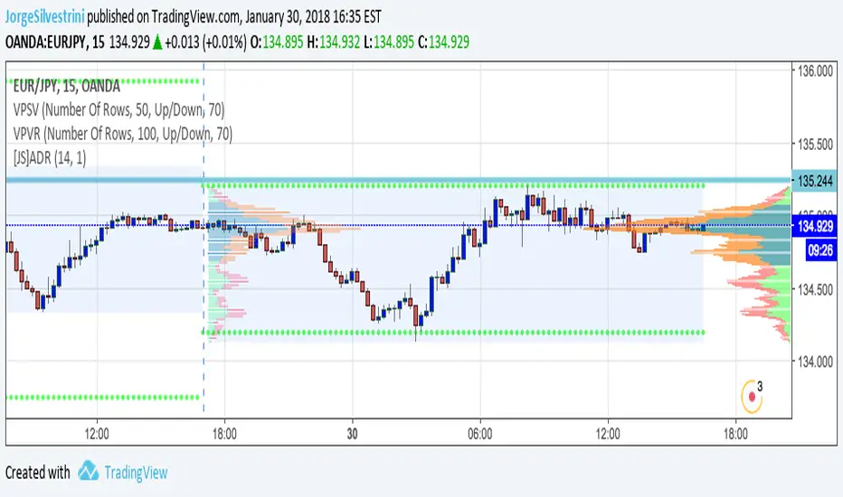
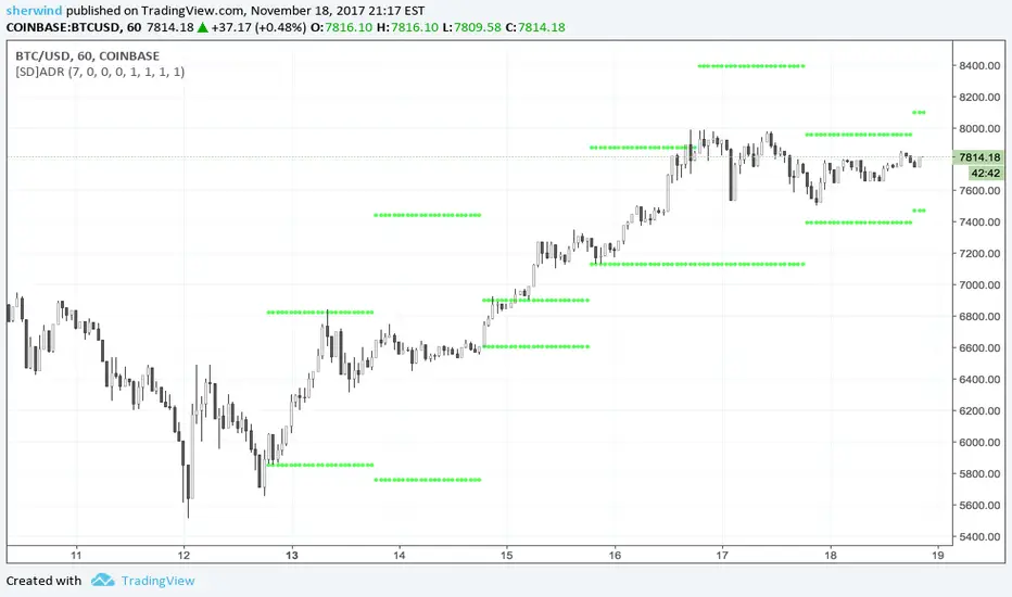
It Screams When Crypto BottomsGet ready to ride the crypto rollercoaster with your new favourite tool for catching Bitcoin at its juiciest, most oversold moments.
This isn’t just another boring indicator — it screams when it’s time to load your bags and get ready for the ride back up!
Expect it to scream just once or twice per cycle at the very bottom, so you know exactly when the party starts!
Why You'll Love It:
Crypto-Exclusive Magic: It does not really matter what chart you are on; this indicator only bothers about the original and realised market cap of BTC. We all know the rest will follow.
Big Picture Focus: Designed for daily. No noisy intraday drama — just pure, clear signals.
Screaming Alerts: When the signal hits, it’s like a neon sign screaming, “Crypto Bottomed!"
Think of this indicator as your backstage pass to the crypto world’s most dramatic moments. It’s not subtle — it’s bold, loud, and ready to help you time the market like a pro.
P.S.: Use it only on a daily chart. Don’t even try it on shorter timeframes — it won’t scream, and you’ll miss the show! 🙀
Search in scripts for "daily"
Volume Rate of Change (VROC)Volume Rate of Change (VROC) is an indicator that calculates the percentage change in trading volume over a specific period, helping analyze market momentum and activity. It is calculated as:
VROC = ((Current Volume - Past Volume) ÷ Past Volume) × 100
This indicator shows changes in market interest. Positive values indicate increasing volume, while negative values signal a decrease. High VROC values often suggest potential trend reversals or breakouts.
Applications:
Breakout Validation: VROC > 200% confirms strong breakouts; below this may signal false moves.
Market Stagnation: VROC < 0% suggests shrinking volume and range-bound markets.
Trend End Alert: A drop below 0% during trends may indicate weakening momentum.
Adjusting for Timeframes: Tailor VROC to timeframes.
Examples:
Daily: VROC(5) compares with last week's same day; VROC(20) with 1 month ago.
Monthly: VROC(12) compares with the same month last year; VROC(1) with last month.
Intraday: VROC(24) (hourly) and VROC(288) (5 minutes) for the same time yesterday.
Checklist By TradeINskiChecklist By TradeINski
First Things First
This indicator is a supporting tool for trading momentum burst that is 2 Lynch setup by stock bee aka Pradeep Bonde.
Disclaimer: This indicator will not give any buy or sell signal. This is just a supporting tool to improve efficiency in my trading.
Apply Indicators and then open indicator settings and read the following simultaneously to understand better.
Default color settings are best suited for light themes. Which is also my personal preference.
Users can change most of the default options in settings according to their personal preference in settings.
When we open settings we can see 3 tabs that are {Inputs tab} {Style tab} {Visibility tab} each tab have its own options, Understand and use it accordingly.
Indicator will be only visible in the Daily time frame as its primary TF is daily. In the lower time frame nothing is plotted.
An indicator is plotted on an existing plane and overlaid on the existing plane.
Contents
My Checklist Lynch
Table Header Settings
Position
Size
Text Color
Background Color
“ON/OFF” Header “Text Box” “Info”
Table Content
Text Color
Background Color
“ON/OFF” R (1 - 10) “Text Box” T (1 - 10) “Text Box”
My Checklist - 2Lynch
This is the checklist I use while placing the trade just to make use of not missing anything based on predefined rules of the setup I trade.
2 - The stock should not be Up more than 2 days in a row, Minor movement can be acceptable.
L - The stock price movement should be linear, validation of established momentum
Y - Young trend in preference 1 - 3rd breakout from base
N - Narrow Range or -ve day before breakout
C - Consolidation should be narrow, linear and low volume. No more than one 4% breakdown.
H - The candle should close near high or at least 20% within when entered.
Table Headers Settings
Position - “Drop Down” with 9 different options which are self explanatory. Users can change the position of the table as per their preference.
Size - “Drop Down” with 6 different options which are self explanatory. Users can change the size of all the text printed in the table as per their preference.
Text Color - “Default Color is White” This setting is specifically only for header text. And users can change the text color of the header as per their preference.
Background Color - “Default Color is Blue” This setting is specifically only for header
background color. Users can change the background color of the header as per their preference.
“ON/OFF” Header “Text Box” “Info”
“Check Mark” - To show or hide the header that is “ON/OFF”.
“Header” - Heading of the table.
“Text Box” - Users can input as per their preference.
“Info” - Info symbol that shows short form and important note that is (Max 50 characteristics for all text boxes) .
Table Content
Text Color - “Default Color is White” This setting is specifically for table texts. And users can change the text color of the all content table texts as per their preference.
Background Color - “Default Color is black” This setting is specifically for content table texts background color. Users can change the background color of the header as per their preference.
“ON/OFF” R (1 - 10) “Text Box” T (1 - 10) “Text Box”
“Check Mark” - To show or hide the complete Row. Users have options and can change as per their preferences.
R (1-10) - “R” stands for Row and (1-10) is Number of rows available for users to enter text. Users have 10 different options.
“Text Box” - Place to enter text that users want to print on column 1 of the table.
T (1-10) - “T” stands for table and (1-10) is Number of text boxes available for users to enter text. Users have 10 different options.
“Text Box” - Place to enter text that users want to print on column 2 of the table.
(mab) Dynamic Bitcoin NVT SignalBitcoin`s NVT is calculated by dividing the Network Value (market cap) by the USD volume transmitted through the blockchain daily. Note this equivalent of the bitcoin token supply divided by the daily BTC value transmitted through the blockchain, NVT is technically inverse monetary velocity.
Credits go to Willy Woo for creating the Network Value Transaction Ratio (NVT). Credits go also to Dimitry Kalichkin improving NVT and creating the NVT Signal (NVTS).
According to its creator, the NVT Ratio is somewhat similar to the PE Ratio used in equity markets. When Bitcoin`s NVT is high, it indicates that its network valuation is outstripping the value being transmitted on its payment network, this can happen when the network is in high growth and investors are valuing it as a high return investment, or alternatively when the price is in an unsustainable bubble.
I created this indicator because the NVT indicator I was using suddenly stopped working. I tried a number of other NVT indicators, but all of them seem to have the same problem and stopped updating after a certain date. The cause is that the data feed from 'Quandl' that is used by most NVT indicators is no longer updated through the previous API.
Instead TradingView created a special API to access 'Quandl" data. This indicator not only uses the new API for 'Quandl', it can also access data from other providers like 'Glassnode', 'CoinMetrics' and 'IntoTheBlock'. However, the 'Quandl' data feed seems to produce the best results with this indicator.
The indicator provides dynamically adjusting overbought and oversold thresholds based on a two year moving average and standard devition with adjustable multipliers. It also implements alerts for NVT going into overbought, oversold or crossing the moving average.
Version 1.0
--
Version history
0.1 Beta
- Initial version
1.0
- First release
Cycles: 4x dual inputs: Swing / Time Cycles projected forward//Purpose/Premise:
To project forward vertical 'cycle' lines based on user-input anchor points, and to search for confluence.
The idea being that if several well-anchored cycles agree (i.e. we see multiple bunched vertical line confluence in the future), then this may add support to an already existing trade idea, or may indicate an increased likelihood of a shift in direction.
//Usage & notes:
~In the above chart I've anchored to obvious swing lows and swing highs in Btc/Usd from 2020-2022. You could also use fixed time-based cycles from a favored start anchor point. Bars per cycle are printed at the top of each cycle box if your're interested in time cycles. I.e. for 1, 2, 3 month cycles: for BTC you could use 30, 60, 90 bars on daily; for S&P you could use 20, 40, 60 bars on daily.
~On first loading the indicator you will be asked select 'start date', and 'end date' for each of 4 sessions (8x clicks on chart). After this you can easily reset points by clicking the indicator display line three dots>> reset points. Or you can simply drag the vertical box edges (purple lines) to change your cycle anchor points.
~Be sure the start anchor point is before the end anchor point or box/lines won't appear.
~When you drop down to low timeframes you might get bar_index error due to history available: you need then to click the three dots on indicator display line >> reset points >> 8x clicks on the chart.
~Vertical projected lines will match the color of the cycle box they origninate from.
~Lines will project into the future as far as is allowed by tradingview (500 bars max)
//Inputs:
~Time start and end dates for each cycle (change these as described above, or input manually)
~Show/hide each cycle (default is show all 4)
~Formatting options: color of forward projected lines, line width, line style, line / box / text color.
~Box transparancy: Set to 100 to make boxes invisible & declutter the chart. Set to 0 for maximum opacity. Default is 80.
thanks to @Sathyamurthie for his ideas on cycle confluence which caused me to write this.
Baseline Indicator [SS]Hello,
This is the Baseline Indicator. I modelled it after one of my favourite Tradingview chart types, the baseline type (shown in image below):
I really love this chart, but I wanted a way for it to:
a) Be static and not move with the chart; and
b) Auto calculate the baseline average for a specified period of time.
So I created this indicator which does essentially that.
What it does:
The indicator will calculate the average between the high and low of a user defined timeframe. The timeframe is customizable, but it defaults to daily. It will then plot the average (or baseline) of the high and low over that specified timeframe. The default plot is a candle plot. It will change the colours of the candles to green (for above the baseline) and red (for below the baseline). The chart below shows an example of the indicator with candles on SPY. The Baseline timeframe is set to 1 hour:
You can choose whether you want to plot the current baseline average or the previous.
The advantage to plotting the previous is that this provide a static reference point and can be helpful on the 30 and 60 minute timeframe. Here is an example:
In this example on SPY, the indicator is plotting the previous average. You can see SPY is using this as support and creating a "staircase" pattern. This is indicative of a trend.
The example above is using the previous day average on the daily timeframe during a sideways day. You can see that the price action accumulates and is consistently drawn to this point.
Inversely, you can manually select your own baseline price if you want a static, self-calculated baseline reference point.
Options and Settings:
Below is an outline of the menu as well as a brief explanation of the options and settings:
To view your chart as a baseline chart, make sure you select the "Line" input and then hide the candles on your chart using your chart settings (see image below):
The purple arrow shows how to hide the candles. You select the "Eye" Icon which should then become greyed out and you will be left with the baseline chart from the indicator.
Why use baseline average?
The average between the high and low of a designated timeframe is a very helpful value. In choppy markets, this acts as a key point of frequent return. In trendy markets, this acts as a reference point of trend direction and strength. I encourage you to play around with the indicator and review some historical charts using it, and you will see some patterns emerge!
Final thoughts:
I have also done a quick tutorial video on the indicator for your reference, you can check that out below:
Thanks for checking out the indicator and I hope you like it!
Supply and DemandThis is a "Supply and Demand" script designed to help traders spot potential levels of supply (resistance) and demand (support) in the market by identifying pivot points from past price action.
Differences from Other Scripts:
Unlike many pivot point scripts, this one offers a greater degree of customization and flexibility, allowing users to determine how many ranges of pivot points they wish to plot (up to 10), as well as the number of the most recent ranges to display.
Furthermore, it allows users to restrict the plotting of pivot points to specific timeframes (15 minutes, 30 minutes, 1 hour, 4 hours, and daily) using a toggle input. This is useful for traders who wish to focus on these popular trading timeframes.
This script also uses the color.new function for a more transparent plotting, which is not commonly used in many scripts.
How to Use:
The script provides two user inputs:
"Number of Ranges to Plot (1-10)": This determines how many 10-bar ranges of pivot points the script will calculate and potentially plot.
"Number of Last Ranges to Show (1-?)": This determines how many of the most recent ranges will be displayed on the chart.
"Limit to specific timeframes?": This is a toggle switch. When turned on, the script only plots pivot points if the current timeframe is one of the following: 15 minutes, 30 minutes, 1 hour, 4 hours, or daily.
The pivot points are plotted as circles on the chart, with pivot highs in red and pivot lows in green. The transparency level of these plots can be adjusted in the script.
Market and Conditions:
This script is versatile and can be used in any market, including Forex, commodities, indices, or cryptocurrencies. It's best used in trending markets where supply and demand levels are more likely to be respected. However, like all technical analysis tools, it's not foolproof and should be used in conjunction with other indicators and analysis techniques to confirm signals and manage risk.
A technical analyst, or technician, uses chart patterns and indicators to predict future price movements. The "Supply and Demand" script in question can be an invaluable tool for a technical analyst for the following reasons:
Identifying Support and Resistance Levels : The pivot points plotted by this script can act as potential levels of support and resistance. When the price of an asset approaches these pivot points, it might bounce back (in case of support) or retreat (in case of resistance). These levels can be used to set stop-loss and take-profit points.
Timeframe Analysis : The ability to limit the plotting of pivot points to specific timeframes is useful for multiple timeframe analysis. For instance, a trader might use a longer timeframe to determine the overall trend and a shorter one to decide the optimal entry and exit points.
Customization : The user inputs provided by the script allow a technician to customize the ranges of pivot points according to their unique trading strategy. They can choose the number of ranges to plot and the number of the most recent ranges to display on the chart.
Confirmation of Other Indicators : If a pivot point coincides with a signal from another indicator (for instance, a moving average crossover or a relative strength index (RSI) divergence), it could provide further confirmation of that signal, increasing the chances of a successful trade.
Transparency in Plots : The use of the color.new function allows for more transparent plotting. This feature can prevent the chart from becoming too cluttered when multiple ranges of pivot points are plotted, making it easier for the analyst to interpret the data.
In summary, this script can be used by a technical analyst to pinpoint potential trading opportunities, validate signals from other indicators, and customize the display of pivot points to suit their individual trading style and strategy. Always remember, however, that no single indicator should be used in isolation, and effective risk management strategies should always be employed.
Multi-Timeframe High Low (@JP7FX)Multi-Timeframe High Low Levels (@JP7FX)
This Price Action indicator displays high and low levels from a selected timeframe on your current chart.
These levels COULD represent areas of potential liquidity, providing key price points where traders can target entries, reversals, or continuation trades.
Key Features:
Display high and low levels from a selected timeframe.
Customize line width, colors for high and low levels, and label text color.
Enable or disable the display of high levels, low levels, and labels.
Receive alerts when the price takes out high or low levels.
How to use:
It is important to note that using this indicator on it's own is not advisable. Instead, it should be combined with other tools and analysis for a more comprehensive trading strategy.
Possibly look to use my MTF Supply and Demand Indicator to look for zones to trade from at these levels?
If the price breaks above a high level, you might consider entering a long position, with the expectation that the price will continue to rise. Conversely, if the price breaks below a low level, you may think about entering a short position, anticipating further downward movement.
On the other hand, you can also use high or low levels to look for reversal trades, as these areas can represent attractive liquidity zones.
By identifying these key price points, you could take advantage of potential market reversals and capitalise on new trading opportunities.
Always remember to use this indicator in conjunction with other technical analysis tools for the best results.
Additionally, you can enable alerts to notify you when the price takes out high or low levels, helping you stay informed about significant price movements.
This indicator could be a valuable tool for traders looking to identify key price points for potential trading opportunities.
As always with the markets, Trade Safe :)
BTC Performance Table / BTC Seasonality Visualization
This script visualizes Bitcoins "seasonality", in form of a colored table (based on the idea from "BigBangTheory")
The history table shows you which months do statistically perform better/worse in comparison to other months.
How to use this script:
Choose ticker "BLX" ("BraveNewCoin Liquid Index for Bitcoin").
Set the charts time frame to weekly or daily. Tables position on the screen and its colors are configurable.
Table explanation:
Cells show whether a gain or a loss occured from month to month, since BTC came out in 2010.
The price difference, between monthly open and monthly close, determines the cell color (negative -> red, positive -> green).
The year column shows total gain (green) or loss (red) for that particular year.
Each value is presented as a rounded percentage number.
How this script works:
The script calculates the price difference between each monthly and yearly open and close, storing those numbers inside arrays.
Then it populates the table, by using those numbers and doing the cell coloring (there will be a yellow cell, in case no change should occur).
German Short-Description
Prozentuale Übersicht in Tabellenform, der monatlichen, sowie jährlichen, Performance des Bitcoin (basierend auf der Idee von "BigBangTheory").
Hierdurch wird die "Saisonalität" des Bitcoin sichtbar. D.h. welche Monate des Jahres, im Vergleich zu anderen Monaten, statistisch gesehen öfter positiv/negativ schließen.
Zwecks vollständiger Darstellung muss der Ticker "BLX" ("BraveNewCoin Liquid Index for Bitcoin") im weekly oder daily time frame aktiv sein.
MA20 Hi-Lo-Close Magic BandThis is an improvement over my previous MA20 High Low Magic Band, as it keeps a central 20 MA reference point. So it can help find the up from MA20 lows and down from MA20 highs resisted or supported by MA20 average before final entry. Usable in any time frame of choice - 15m, 30m, Hourly or Daily. In the Hourly / Daily time frame, the signal used with the volume data may work in 6/10 events or more ... Happy trading!
Reverse Ehler Instantaneous Trendline - TraderHalaiThis script uses a reverse function of the famous Ehler Instantaneous Trendline to calculate the source price required in order to change from Bullish to bearish
From my analysis, the reverse price does appear to be rather choppy, though it is 100% accurate. This is because Ehler's Instantaneous Trendline tends to remain trending for longer periods of time with above average hold periods.
The main suitability for this would be higher level timeframes, such as Weekly, 5 daily, 3 daily. From my findings Smoothed Heikin Ashi Trend, tends to provide better risk-adjusted returns across most timeframes (Higher return to drawdown ratio)
As I have spent a bit of time getting the reverse function mathematics to work, I decided to publish this as open source for the benefit, scrutiny and for further development by the TradingView community anyways.
Enjoy!
Inflation Adjusted Performance: Ticker/M2 money supplyPlots current ticker / M2 money supply, to give an idea of 'inflation adjusted performance'.
~In the above, see the last decade of bullish equities is not nearly as impressive as it seems when adjusted to account for the FED's money printing.
~Works on all timeframes/ assets; though M2 money supply is daily data release, so not meaningful to plot this on timeframe lower than daily.
~To display on same pane; comment-out line 6 and un-comment line 7; then save, remove and re-add indicator.
~Scale on the right is meaningless; this indicator is just to show/compare the shape of the charts.
Session High Low
This indicator shows Session High Low line and prices.
1: Session range is adjustable based on your timeframe. Nomore confusing timezone settings.
You can choose your timezone then set your Session start and end time.
Script will show you the following session high and low lines which is extendable until next session.
2: All historical lines and price levels are can be partially or fully hidden.
And line colors are adjustable so you can use suitable color on your chart.
Based on session you choose this script can be used as a session break strategy AKA (Asian session break, London session break strategy).
You can create your own trading Session and high lows.
Personally I monitor how price reacts on London session high lows during the NewYork trading session.
In this chart Session starts at 8am (London open) and closes at 12:30 (NewYork open). Script is showing high lows only in this session range.
Always double confirm with your trading style. It's not a Financial advice.
Inputs:
1: Hide history - Hides all historical lines and prices that means you can see only todays session.
2: Show price - Shows price level of session high lows. You can hide price level if you want to see only lines.
3: Session time - You can set your time range of session.
4: Start time - Session start time. You can see vertical line on your chart or you can hide line.
5: End time - Session end time. You can see vertical line on your chart or you can hide line.
6: Line extend time - End of the high low lines. You can draw line until the end of the session or you can draw short line.
7: All line and price colors are optional.
Thank you.
Stock ScreenerThis indicator helps monitoring QQE Mod and RMO of 20 tickers simultaneously.
This indicator shows last 4/8 indicator results of particular ticker.
Left side: 8 last colors of both indicator on current timeframe. Most left is older.
Right side: 4 last colors of both indicator on selected higher timeframe. Most right is newer.
Icon color is QQE Mod.
Background color is RMO color.
This indicator is suitable for daily or swing trade.
Recommended timeframe is 2 Hours, and recommended higher timeframe is Daily.
ATRvsDTR + ADR Zone + SSS50%This Script is to be used for intra day as far as the adr zones. The adr zones are used as support and resistance but also can be used to determine whether the stock is breaking out or not. Also being that the adr zones are calculated using a 5 or 10 day period unless you change the settings, and are set when price opens. It does really help you know whether a stock is moving more than it does on average to me it just signifies its directional. So I added the atr vs dtr so you can see what a stock moves on average versus what it has moved today.
The atr period is calculated based on the daily period unless you change the settings. I added to the original script 3 more percentages the atr vs dtr will change as it goes higher so that you can be aware when the stock is getting closer to moving 100% of its atr. Even though a stock breaks above or below the adr that doesn't mean it has moved more than it normally moves.
I also have the weekly open on the script as I trade the strat and I want to know, at what price the the week will change from bearish to bullish and vice versa. So that I can understand the trend when I am trading intraday.
The 50% lines were added for Sara strat snipers 50% rule and you can change the timeframes on them. This is used to know whether a candle will go 3. This also can help with retracements vs reversals, because in traditional technical analysis 50% is around where people start think its a reversal more so than a retracement.
I believe the script will be very help as it can show you price being directional but can also let you know when the stock is getting close to moving more than it normally has or if it has moved more than it normally has. As well as being able to see if something is a retracement vs a reversal. I trade TheStrat strategy so this can be very helpful in that regard
The 50% retracement levels are default 1h and daily. You can change them and whether or not they show
In the example chart you can see we are below weekly open which is bearish and you can also see where price reverses out of the upper adr zone. As well as how much of the atr we have moved on this day in time.
Oversold RSI with tight SL Strategy (by Coinrule)This is one of the best strategies that can be used to get familiar with technical indicators and start to include them in your trading bot rules.
ENTRY
1. This trading system uses the RSI ( Relative Strength Index ) to anticipate good points to enter positions. RSI is a technical indicator frequently used in trading. It works by measuring the speed and change of price movements to determine whether a coin is oversold (indicating a good entry point) or overbought (indicating a point of exit/entry for a short position). The RSI oscillates between 0 and 100 and is traditionally considered overbought when over 70 and oversold when below 30.
2. To pick the right moment to buy, the strategy enters a trade when the RSI falls below 30 indicating the coin is oversold and primed for a trend reversal.
EXIT
The strategy then exits the position when the price appreciates 7% from the point of entry. The position also maintains a tight stop-loss and closes the position if the price depreciates 1% from the entry price. The idea behind this is to cut your losing trades fast and let your winners ride.
The best time frame for this strategy based on our backtesting data is the daily. Shorter time frames can also work well on certain coins, however in our experience, the daily works best. Feel free to experiment with this script and test it on a variety of your coins! With our backtesting data a trading fee of 0.1% is taken into account. The fee is aligned to the base fee applied on Binance, which is the largest cryptocurrency exchange by volume. In the example shown, this strategy made a handsome net profit of 39.31% on Chainlink with 61.54% of trades being profitable.
Oversold RSI with Tight Stop-Loss Strategy (by Coinrule)KRAKEN:LINKUSD
This is one of the best strategies that can be used to get familiar with technical indicators and start to include them in your rules on Coinrule .
ENTRY
1. This trading system uses the RSI (Relative Strength Index) to anticipate good points to enter positions. RSI is a technical indicator frequently used in trading. It works by measuring the speed and change of price movements to determine whether a coin is oversold (indicating a good entry point) or overbought (indicating a point of exit/entry for a short position). The RSI oscillates between 0 and 100 and is traditionally considered overbought when over 70 and oversold when below 30.
2. To pick the right moment to buy, the strategy enters a trade when the RSI falls below 30 indicating the coin is oversold and primed for a trend reversal.
EXIT
The strategy then exits the position when the price appreciates 7% from the point of entry. The position also maintains a tight stop-loss and closes the position if the price depreciates 1% from the entry price. The idea behind this is to cut your losing trades fast and let your winners ride.
The best time frame for this strategy based on our back testing data is the daily. Shorter time frames can also work well on certain coins, however in our experience, the daily works best. Feel free to experiment with this script and test it on a variety of your coins! With our back testing data a trading fee of 0.1% is taken into account. The fee is aligned to the base fee applied on Binance, which is the largest cryptocurrency exchange by volume. In the example shown, this strategy made a handsome net profit of 52.6% on Chainlink with 66.67% of trades being profitable.
You can execute this strategy on your favorite exchanges with Coinrule .
Creentrend Pressure SignalsThe hull moving average is my favorite moving average, as well as slower (55ma Bollinger Bands dev@(1.618)) is my favorite standard deviation indicator. Lets combine the two to evaluate overbought, oversold, and pressure.
Use for all time frames- I PREFER daily.
Bollinger band MA at 55
Hull ma at 55
The Hull is more reactive and faster than any band on the BB (both at 55)
When HULL closes BELOW LOWER BAND- it will print a buy signal, remember- over sold and overbought in VOLATILITY could be dangerous on low time frames, as swift moves typically have short term reversals but return to the main trend eventually, this is why i reccomend daily candles.
When PRICE closes ABOVE UPPER BOLLINGER BAND- it will print a green ^ signal under candle indicating upward pressure.
When HULL closes ABOVE UPPER BOLLINGER BAND- it will print a red resistance line. Complex tops happen a lot with bitcoin so take a 1-5% stop above it if shorting.
Simple Trader - LevelsThis indicator plots the below levels in the chart.
Note: This is not a buy/sell recommendation. Reach Simple Trader to understand how to trade these levels.
Current day open,
Prev. day close,
Prev. day high,
Prev. day low.
Prev. week high,
Prev. week low,
Prev. month high,
Prev. month low.
Ehlers Moving Average Difference Indicator [CC]The Moving Average Difference Indicator was created by John Ehlers (Stocks and Commodities Oct 2021 pg 23) and this is essentially his version of the famous MACD indicator. He calls this indicator the "thinking mans" MACD because his thought process for creating the lengths is based on half of the period of the dominant cycle. These are the default lengths that he created but feel free to test it out with your own variations and please let me know if you come up with a better one. I'm sorry for my long delay from TV. Sometimes I just need to step away and collect my thoughts before I burn myself out with the many scripts I keep publishing daily. I will try to get back into publishing daily again because I have a personal backlog of over 50 scripts ready to go that I haven't published yet. As always I have included strong buy and sell signals in addition to normal ones so darker colors are strong and lighter colors are normal. Buy when the line turns green and sell when it turns red.
Let me know if there are any other scripts you would like to see me publish!
Multi Range VWAP PivotsMulti Range VWAP Pivots turned out to be one of my most accurate pivot indicators to date!
Multi Range VWAP Pivots works by recognizing the high and low of the timeframe selected (D, W, M, 6M, and 12M) and plotting range high to VWAP averages and range low to VWAP averages.
After further examination of each completed range, I came to the conclusion that due to the nature of averages, high and low respectively would need to be completed within the current range, for the averages to actually display pivots correctly. This means that if all averages appear to be "pivoting" correctly after or during a break lower of higher, then we can only assume the most recent break higher or lower could be exhaustion and price will be reverted to the mean (VWAP). OR, this could be the most accurate hindsight indicator on the planet.
*DISCLAIMER*: This indicator repaints. DO NOT backtest or set alerts with this indicator.
Williams %R Color MapThis script is used to have a quick view for my triple screen trading system.
I use it in 1 hour chart so that the higher timeframe is 5-hour and daily.
Visual for the current price on which fib area of 5-hour and daily chart.
EMA BANDS//Trades have been checked periodically on daily charts with normal, basically, you'll set in trades for weeks, months, and years in some cases depending on the time frame and strategy you use, DO NOT TRADE ON MARGIN INTEREST WILL RUIN YOU.
//You can use the strategies on lower timeframes, however, you'll need to be able to execute trades during all market hours if you choose anything less than a daily.
//You MUST stay in your trade until the very end. that means even if you open the trade and you're super in red DON'T DUMP.
//Set stop losses to no more than 50% of your entry price. Less is better but understand that you may be stomped out of a trade that could reverse after a 40-49% pullback.
//I suggest you pull initial capital out after you 2x to lock in your profit.
//You must also have the ability to sell/buy after market hours, you'll make your trades generally one-two hours post-market in most cases.
//The green line gives a simple average of the last 1618 candles. The further price action is from the mean, the more the price will be pulled back. (Ideally)
//Strategy One (Safe/Slow)
//Buy when the closing price is less than the lower bounds of all bands. This does not include the green "Mean" line
//Sell when the closing price is greater than the upper bounds of all bands. Again, this does not include the green "Mean" line
//Strategy Two (Neutral)
//Buy when the closing price is less than the bounds of 3-4 out of the 4 bands.
//Sell when the closing price is greater than the bounds of 3-4 out of the 4 bands.
//This means that you execute trades even if the closing price is still within one band.
//You'll still execute orders even if the closing price is outside of all bands
//Strategy Three (Least Safe/Fast)
//Buy when the closing price is less than the bounds of 2-4 out of the 4 bands.
//Sell when the closing price is greater than the bounds of 2-4 out of the 4 bands.
//This means that you execute trades even if the closing price is still within two bands.
//You'll still execute orders even if the closing price is outside of all bands
//You'll still execute orders even if the closing price is outside of 3 of 4 bands