Search in scripts for "ichimoku"

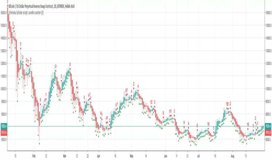
Ichimoku Scholer script: candle counterCoded for the #HeikinAshiChallange
Counts Heikin ashi candles till colour flip occurse.
Ichimoku_SignalIchimoku gives us many signals, but it's really hard to catch all of them.
This indicator represent them by means of a graph.
Green...bull
Red...bear
If you find a little gray in green or red, the trend will finish before long.
If you find much gray, it's sideways trend.


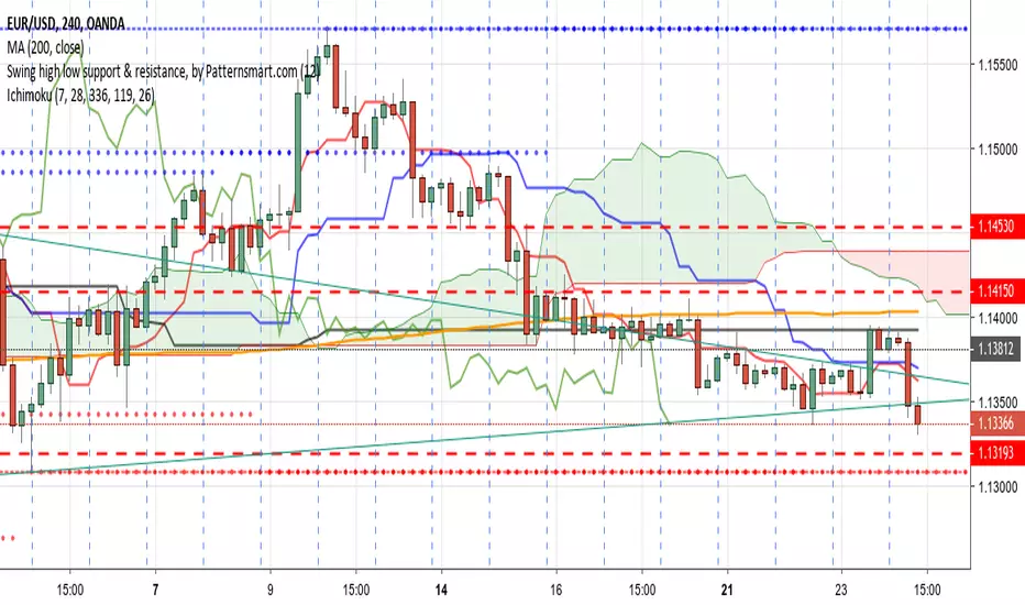
Ichimoku Cloud(Crypto mode)Adapted to Cryptocurrency market, with a larger range . simple and familiar , visualy accord with classic interface.
Polarium ISC, inc.

Crypto Chronicles CloudIchimoku Cloud with crypto settings
Best used on longer time frames (24hr, 3d etc.)

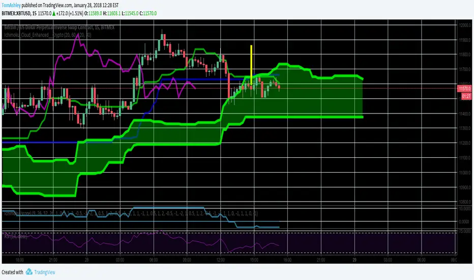
Ichimoku Cloud Enhanced For CryptoIntervals have been changed to account for a 24/7 cryptocurrency trading period. Values were then doubled so that the trader can avoid fakeout breakouts/traps. This leads to a bit less signals but rather, more sure signals instead. Very useful and more safe, even in smaller timeframes. Colors were set to the standard and breakout arrows are now enabled by default.


Ichimoku Cloud with Josh Olszewicz Crpyto Adjusted Settingslets you adjust your cloud to view higher timeframe cloud on lower timeframe by double or tripling timeframe

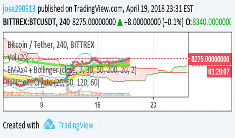
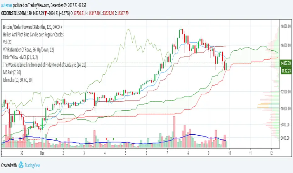
Ichimoku CriptomoneyConfigured for criptomonedas in its first version, testing the new configuration based on 10,30,60


Ichimoku PanOptic TM-V5 by BrainZZUpdate of the previous script.
New functions added:
- Highlight of price crossing KS
- Highlight of TS/KS crossing
- Highlight of rising/falling periods of KS
- Critical levels for SSB, KS and TS/
