Recommendation Indicatorالوصف بالعربية
استراتيجية تداول مبنية على ٦ مؤشرات تأكيدية لرصد حركة السوق واتجاهه.
تعتمد على عدّ الشموع الصاعدة والهابطة المتتالية كعامل أساسي، وتدمج معها مؤشرات إضافية للتأكيد.
عند توافق المؤشرات معًا، يتم توليد إشارة شراء (BUY) أو بيع (SELL) واضحة على الرسم البياني.
هذا يعزز دقة الإشارات ويقلل من التذبذبات أو الإشارات الكاذبة، مما يجعلها مناسبة للمتداولين الباحثين عن قوة الاتجاه وتأكيده قبل الدخول في الصفقة.
🔎 ملاحظات الاستخدام
الاستراتيجية تحتوي على ٦ أدوات تأكيد مجتمعة لضمان إشارات أدق.
يُفضل استخدامها مع اختبار رجعي (Backtesting) قبل التداول الفعلي.
يمكن تعديل إعدادات المؤشرات لتناسب السوق أو الإطار الزمني المستخدم.
لا تعتبر توصية مالية مباشرة، وإنما أداة تعليمية وتجريبية.
---
📌 Description in English
A trading strategy built on 6 confirmation indicators to track market movements and trends.
It uses consecutive up and down bars as the core logic, combined with additional indicators for confirmation.
When all confirmations align, the strategy generates clear BUY or SELL signals on the chart.
This approach improves signal accuracy, reduces noise, and helps traders confirm market direction before entering a trade.
🔎 Usage Notes
The strategy incorporates 6 confirmation tools working together for higher accuracy.
Backtesting is recommended before applying it to live trading.
Indicator parameters can be adjusted to fit different markets and timeframes.
This is not financial advice, but an educational and experimental tool.
Search in scripts for "indicator"

Turtle Trading System IndicatorKey Features & Components
Donchian Channels
The core of the indicator is the Donchian Channel, represented by the upper and lower blue bands.
Upper Channel: The highest price over a user-defined period.
Lower Channel: The lowest price over the same period.
Middle Line: The midpoint between the upper and lower channels.
These channels are used to identify potential breakouts, which form the basis for trade entries.
Trading Signals
The script automatically generates clear, non-repainting signals for potential trades:
Long Entry (Green ▲): A green upward-facing triangle appears below the candle when the closing price breaks above the upper Donchian channel, signaling the start of a potential uptrend.
Short Entry (Red ▼): A red downward-facing triangle appears above the candle when the closing price breaks below the lower Donchian channel, signaling the start of a potential downtrend.
Long Exit (Green X): A green cross appears above the candle when the price crosses below the middle line, suggesting the uptrend is weakening.
Short Exit (Orange X): An orange cross appears below the candle when the price crosses above the middle line, suggesting the downtrend is losing momentum.
Integrated Risk Management
A crucial element of the Turtle strategy is disciplined risk management, which is built into this indicator.
Volatility-Based Position Sizing
You can enable position sizing that adapts to market volatility using the Average True Range (ATR). When an entry signal occurs, a label appears showing a calculated position size unit. The formula aims to normalize risk, meaning you would trade smaller sizes in volatile markets and larger sizes in calmer markets. The formula used is:
Volatility Unit=
100
Risk %
×
4×ATR
Close Price
Dynamic Stop Loss
Upon a long or short entry, a stop-loss level is plotted on the chart as red circles. This level is calculated based on the ATR, automatically adjusting to the market's current volatility to provide a data-driven exit point for managing losses. It is calculated as:
Long Stop: Close Price - 1.8 * ATR
Short Stop: Close Price + 1.8 * ATR
On-Chart Information Panel
A convenient table is displayed in the bottom-right corner of the chart, showing the current ATR value and the calculated Position Size unit for quick and easy reference.
Customizable Settings
You can tailor the indicator to your specific strategy and risk tolerance:
Donchian Channel Period: Sets the lookback period for the channels. The default is 20. Shorter periods will be more sensitive and generate more signals.
ATR Period: Sets the lookback period for the Average True Range calculation, affecting both position size and stop-loss levels. The default is 14.
Risk Percentage: The percentage of equity you wish to risk per trade. This directly influences the position size calculation.
Use Volatility Position Sizing: A simple checkbox to turn the ATR-based position sizing on or off.

Failure Swing IndicatorIdentify Failure Swing nice and easy
J. Welles Wilder Jr. describes Failure Swings as specific chart patterns used in conjunction with the Relative Strength Index (RSI) to identify potential reversals in price trends.
These patterns signal weakening momentum and can indicate a shift in market direction
Wilder emphasized that these patterns are more reliable when confirmed by price action or other technical indicators.
QuantumSync Pulse [ w.aritas ]QuantumSync Pulse (QSP) is an advanced technical indicator crafted for traders seeking a dynamic and adaptable tool to analyze diverse market conditions. By integrating momentum, mean reversion, and regime detection with quantum-inspired calculations and entropy analysis, QSP offers a powerful histogram that reflects trend strength and market uncertainty. With multi-timeframe synchronization, adaptive filtering, and customizable visualization, it’s a versatile addition to any trading strategy.
Key Features
Hybrid Signals: Combines momentum and mean reversion, dynamically weighted by market regime.
Quantum Tunneling: Enhances responsiveness in volatile markets using volatility-adjusted calculations.
3-State Entropy: Assesses market uncertainty across up, down, and neutral states.
Regime Detection: Adapts signal weights with Hurst exponent and volatility ROC.
Multi-Timeframe Alignment: Syncs with higher timeframe trends for context.
Customizable Histogram: Displays trend strength with ADX-based visuals and flexible styling.
How to Use and Interpret
Histogram Interpretation
Positive (Above Zero): Bullish momentum; color intensity shows trend strength.
Negative (Below Zero): Bearish momentum; gradients indicate weakness.
Overlaps: Alignment of final_z (signal) and ohlc4 (price) histograms highlights key price levels or turning points.
Regime Visualization
Green Background: Trending market; prioritize momentum signals.
Red Background: Mean-reverting market; focus on reversion signals.
Blue Background: Neutral state; balance both signal types.
Trading Signals
Buy: Histogram crosses above zero or shows positive divergence between histograms.
Sell: Histogram crosses below zero or exhibits negative divergence.
Confirmation: Match signals with regime background—green for trends, red for ranges.
Customization
Tweak Momentum Length, Entropy Lookback, and Hurst Exponent Lookback for sensitivity.
Adjust color themes and transparency to suit your charts.
Tips for Optimal Use
Timeframes: Use higher timeframes (1h, 4h) for trend context and lower (5m, 15m) for entries.
Pairing: Combine with RSI, MACD, or volume indicators for confirmation.
Backtesting: Test settings on historical data for asset-specific optimization.
Overlaps: Watch for histogram overlaps to identify support, resistance, or reversals.
Simulated Performance
Trending Markets: Histogram stays above/below zero, with overlaps at retracements for entries.
Range-Bound Markets: Oscillates around zero; overlaps signal reversals in red regimes.
Volatile Markets: Quantum tunneling ensures quick reactions, with filters reducing noise.
Elevate your trading with QuantumSync Pulse—a sophisticated tool that adapts to the market’s rhythm and your unique style.

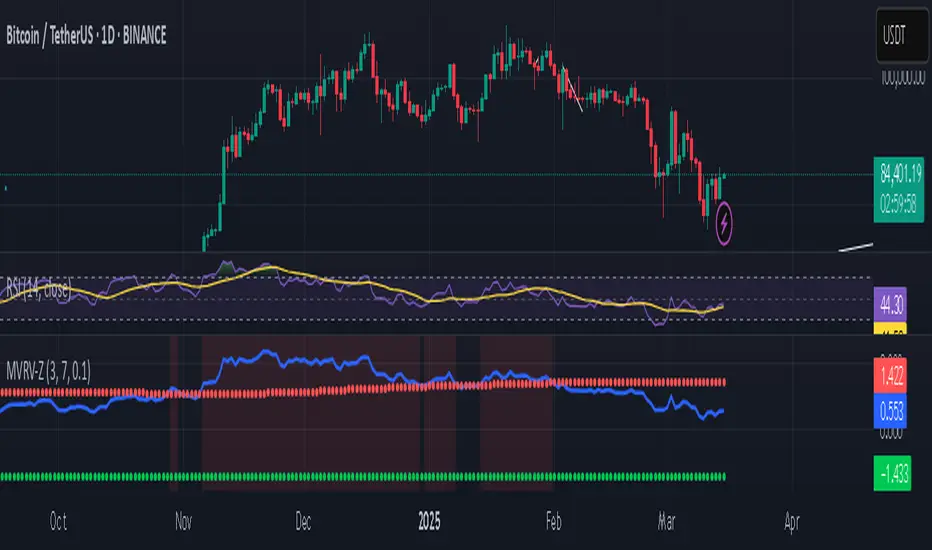
Bitcoin MVRV Z-Score Indicator### **What This Script Does (In Plain English)**
Imagine Bitcoin has a "fair price" based on what people *actually paid* for it (called the **Realized Value**). This script tells you if Bitcoin is currently **overpriced** or **underpriced** compared to that fair price, using math.
---
### **How It Works (Like a Car Dashboard)**
1. **The Speedometer (Z-Score Line)**
- The blue line (**Z-Score**) acts like a speedometer for Bitcoin’s price:
- **Above Red Line** → Bitcoin is "speeding" (overpriced).
- **Below Green Line** → Bitcoin is "parked" (underpriced).
2. **The Warning Lights (Colors)**
- **Red Background**: "Slow down!" – Bitcoin might be too expensive.
- **Green Background**: "Time to fuel up!" – Bitcoin might be a bargain.
3. **The Alarms (Alerts)**
- Your phone buzzes when:
- Green light turns on → "Buy opportunity!"
- Red light turns on → "Be careful – might be time to sell!"
---
### **Real-Life Example**
- **2021 Bitcoin Crash**:
- The red light turned on when Bitcoin hit $60,000+ (Z-Score >7).
- A few months later, Bitcoin crashed to $30,000.
- **2023 Rally**:
- The green light turned on when Bitcoin was around $20,000 (Z-Score <0.1).
- Bitcoin later rallied to $35,000.
---
### **How to Use It (3 Simple Steps)**
1. **Look at the Blue Line**:
- If it’s **rising toward the red zone**, Bitcoin is getting expensive.
- If it’s **falling toward the green zone**, Bitcoin is getting cheap.
2. **Check the Colors**:
- Trade carefully when the background is **red**.
- Look for buying chances when it’s **green**.
3. **Set Alerts**:
- Get notified when Bitcoin enters "cheap" or "expensive" zones.
---
### **Important Notes**
- **Not Magic**: This tool helps spot trends but isn’t perfect. Always combine it with other indicators.
- **Best for Bitcoin**: Works great for Bitcoin, not as well for altcoins.
- **Long-Term Focus**: Signals work best over months/years, not hours.
---
Think of it as a **thermometer for Bitcoin’s price fever** – it tells you when the market is "hot" or "cold." 🔥❄️
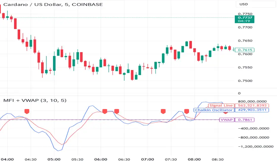
Money Flow Indicator (Chaikin Oscillator) with VWAPStrategy Overview
Entry Conditions:
Buy Entry:
The Chaikin Oscillator crosses above the signal line.
The current price is above the VWAP.
Sell Entry:
The Chaikin Oscillator crosses below the signal line.
The current price is below the VWAP.
Exit Conditions:
Profit Taking:
Take profit when a target profit is reached (e.g., a 2% increase from the entry price).
Stop Loss:
Set a stop loss, for example, at a 1% decline from the entry price.
Risk Management:
Manage risk by limiting each trade to no more than 1-2% of the account balance.
Calculate position size based on risk and trade accordingly.
Trend Confirmation:
Use other indicators (like moving averages) to confirm the overall trend and focus trades in the direction of the trend.
In an uptrend, prioritize buy entries; in a downtrend, prioritize sell entries.
Specific Trade Scenarios
Example 1: Buy Entry:
Enter a buy position when the Chaikin Oscillator crosses above the signal line and the price is above the VWAP.
Set a stop loss 1% below the entry price and a profit target 2% above the entry price.
Example 2: Sell Entry:
Enter a sell position when the Chaikin Oscillator crosses below the signal line and the price is below the VWAP.
Set a stop loss 1% above the entry price and a profit target 2% below the entry price.
Additional Considerations
Backtesting: Test this strategy with historical data to evaluate performance and make adjustments as needed.
Market Conditions: Pay attention to market volatility and economic indicators, adjusting the trading strategy flexibly.
Psychological Factors: Avoid emotional decisions and follow clear rules when trading.
Window Seasonality IndicatorThis is a time window seasonal returns indicator. That is, it will provide the mean returns for a given time window based on a given number of lookbacks set by the user. The script finds matching time windows, e.g., 1st week of March going back 5 years or 9:00-10:00 window of every day going 50 days, and then calculates an average return for that window close price with respect to the close price in the immediately preceding time window, e.g. last week of February or 8:00-9:00 close price, respectively.
There are 4 input options:
1) Historical Periods to Average: Set the number of matching historical windows with which to calculate an average price. The max is 730 lookback windows. Note: for monthly or weekly windows, setting too large a number will cause the script to error out.
2) Use Open Price: calculates the seasonal returns using the open price rather than close price.
3) Show Bands: select from 1 Gaussian standard deviation or a nonparamateric ranked confidence interval. As a rough heuristic, the Gaussian band requires at least 30 lookback periods, and the ranked confidence interval requires 50 or more.
4) Upper Percentile: set the upper cutoff for ranked confidence interval.
5) Lower Percentile: set the lower cutoff for ranked confidence interval.
Please be aware, this indicator does not use rigorous statistical methodology and does not imply predictive power. You'll notice the range bands are very wide. Do not trade solely based on this indicator! Certain time windows, such as weekly and monthly, will make more sense applied to commodities, where annual cycles play a role in its supply and demand dynamics. Hourly windows are more useful in looking at equities markets. I like to look at equities with 1-hr windows to see if there is some pattern to overnight behavior or for market open and close.

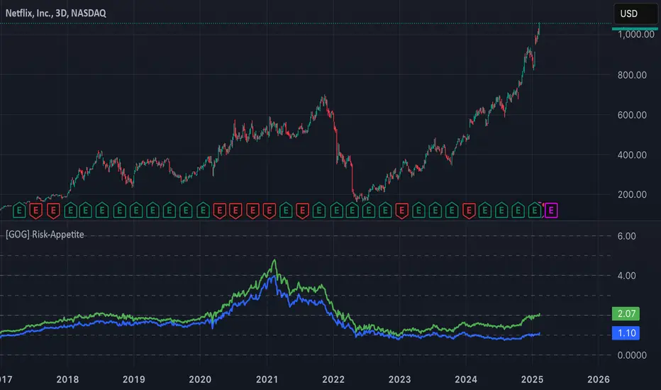
[GOG] Risk-Appetite IndicatorOverall tradfi risk appetite indicator. Plotting ARKK/SPX and ARKW/SPX. Look for divergences to your risk assets to look for entries and exits. Also generally useful to compare to past peaks to spot euphoria.
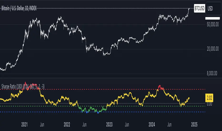
Sharpe Ratio Indicator (180)Meant to be used on the 1D chart and on BTC.
The Sharpe Ratio Indicator (180 days) is a tool for evaluating risk-adjusted returns, designed for investors who want to assess whether BTC is overvalued, undervalued, or in a neutral state. It plots the Sharpe Ratio over the past 180 days, color-coded to indicate valuation states:
- Red: Overvalued (Sharpe Ratio > 5).
- Green: Undervalued (Sharpe Ratio < -1).
-Blue: Critically Undervalued (Sharpe Ratio <-3).
- Yellow: Neutral (between -1 and 5).
Note that you can change those values yourself in the settings of the indicator.
Strengths:
- Real-time feedback on risk-adjusted returns helps in making timely investment decisions.
- Color-coded signals (red, green, blue and yellow) provide an intuitive, visual indication of the asset's valuation.
- Flexible: Easily adjustable to different subjective valuation levels and risk-free rates.
All hail to Professor Adam and The Real World Community!
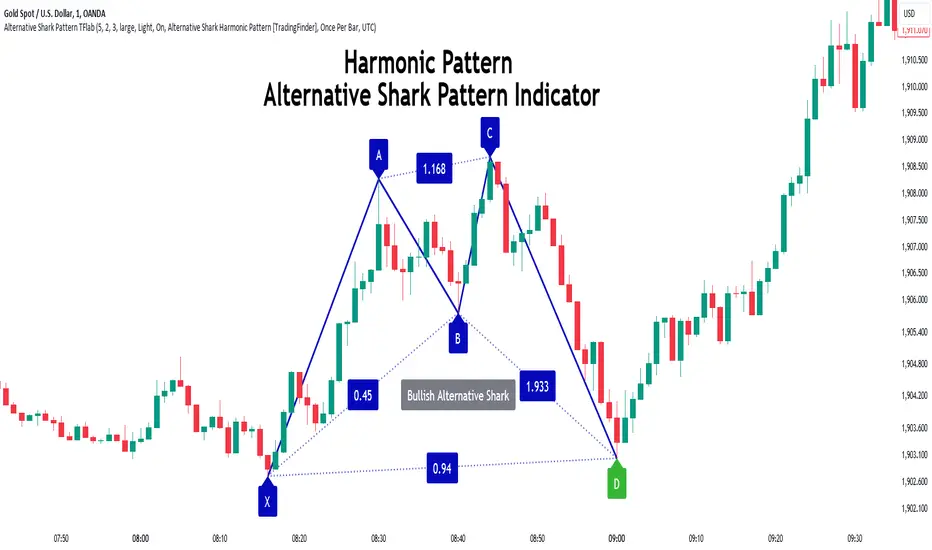
Alternative Shark Harmonic Pattern [TradingFinder] ALT Shark🔵 Introduction
The Alternative Shark harmonic pattern, similar to the original Shark harmonic pattern introduced by Scott Carney, is a powerful tool in technical analysis used to identify potential reversal zones (PRZ) in financial markets.
These harmonic patterns help traders spot key turning points in market trends by relying on specific Fibonacci ratios. The Alternative Shark pattern is particularly unique due to its distinct Fibonacci retracements within the PRZ, which differentiate it from the standard Shark pattern and provide traders with more precise entry and exit signals.
By focusing on harmonic patterns and utilizing tools like the Harmonic Pattern Indicator, traders can easily identify both the Shark and Alternative Shark patterns, making it easier to find PRZs and capture potential trend reversals. This enhanced detection of potential reversal zones allows for better trade optimization and improved risk management.
Incorporating the Alternative Shark pattern into your technical analysis strategy enables you to enhance your trading performance by identifying market reversals with greater accuracy, improving the timing of your trades, and reducing risks associated with sudden market shifts.
🟣 Understanding the Types of Alternative Shark Pattern
The Alternative Shark harmonic pattern, much like the original Shark pattern, forms at the end of price trends and is divided into two types: Bullish and Bearish Alternative Shark patterns.
Bullish Alternative Shark Pattern :
This pattern typically forms at the end of a downtrend, signaling a potential reversal into an uptrend. Traders can use this pattern to identify buy entry points. The image below illustrates the core components of the Bullish Alternative Shark Pattern.
Bearish Alternative Shark Pattern :
Conversely, the Bearish Alternative Shark Pattern appears at the end of an uptrend and signals a potential reversal to a downtrend. This variation allows traders to adjust their strategies for selling. The image below outlines the characteristics of the Bearish Alternative Shark Pattern.
🟣 Differences Between Shark and Alternative Shark Patterns
Although both patterns share similar structures and serve as tools for identifying price reversals, there is one key difference between them :
AB to XA Ratio : In the Shark pattern, the AB leg retraces between 1 and 2 of the XA leg, whereas in the Alternative Shark pattern, this retracement is reduced to 0.382 to 0.618 of the XA leg. This difference in the retracement ratio leads to slightly different trade signals and can affect the timing of entry and exit points.
Other ratios and reversal signals remain consistent between the two patterns, but this difference in the AB to XA ratio provides traders with more nuanced opportunities to optimize their trades.
🔵 How to Use
🟣 Trading with the Bullish Alternative Shark Pattern
The Bullish Alternative Shark Pattern functions similarly to the traditional Bullish Shark, acting as a reversal pattern that helps traders recognize the end of a downtrend and the beginning of an uptrend.
The main distinction lies in the reduced AB retracement, which can offer more refined entry signals. Once the pattern completes, traders can look to enter buy trades and place a stop-loss below the lowest point of the pattern for effective risk management.
🟣 Trading with the Bearish Alternative Shark Pattern
The Bearish Alternative Shark Pattern operates much like the Bearish Shark pattern but with the adjusted AB to XA ratio. This difference provides traders with unique entry points for sell trades. Once the pattern is fully identified, traders can enter short positions, placing a stop-loss above the highest point of the pattern to safeguard against market fluctuations.
🔵 Setting
🟣 Logical Setting
ZigZag Pivot Period : You can adjust the period so that the harmonic patterns are adjusted according to the pivot period you want. This factor is the most important parameter in pattern recognition.
Show Valid Forma t: If this parameter is on "On" mode, only patterns will be displayed that they have exact format and no noise can be seen in them. If "Off" is, the patterns displayed that maybe are noisy and do not exactly correspond to the original pattern.
Show Formation Last Pivot Confirm : if Turned on, you can see this ability of patterns when their last pivot is formed. If this feature is off, it will see the patterns as soon as they are formed. The advantage of this option being clear is less formation of fielded patterns, and it is accompanied by the latest pattern seeing and a sharp reduction in reward to risk.
Period of Formation Last Pivot : Using this parameter you can determine that the last pivot is based on Pivot period.
🟣 Genaral Setting
Show : Enter "On" to display the template and "Off" to not display the template.
Color : Enter the desired color to draw the pattern in this parameter.
LineWidth : You can enter the number 1 or numbers higher than one to adjust the thickness of the drawing lines. This number must be an integer and increases with increasing thickness.
LabelSize : You can adjust the size of the labels by using the "size.auto", "size.tiny", "size.smal", "size.normal", "size.large" or "size.huge" entries.
🟣 Alert Setting
Alert : On / Off
Message Frequency : This string parameter defines the announcement frequency. Choices include: "All" (activates the alert every time the function is called), "Once Per Bar" (activates the alert only on the first call within the bar), and "Once Per Bar Close" (the alert is activated only by a call at the last script execution of the real-time bar upon closing). The default setting is "Once per Bar".
Show Alert Time by Time Zone : The date, hour, and minute you receive in alert messages can be based on any time zone you choose. For example, if you want New York time, you should enter "UTC-4". This input is set to the time zone "UTC" by default.
🔵 Conclusion
The Alternative Shark harmonic pattern, despite its structural similarity to the traditional Shark pattern, introduces a key difference in the AB to XA ratio, making it a valuable addition to the trader’s toolkit. This subtle variation enables traders to pinpoint reversal points with greater accuracy and fine-tune their trading strategies.
As with any technical pattern, it is crucial to use the Alternative Shark pattern in combination with other technical indicators and strong risk management practices. Incorporating this pattern into a broader trading strategy can help traders enhance their ability to detect and capitalize on market reversals more effectively.
Bullish/Bearish Volume Indicator ABDJO1- red bars are bearish volume
2- yellow bars are a weakness of bearish volume.
3-green bars are a strong bullish volume.
4-Orange bars are a weakness of bullish volume.
1. Price Movements
The chart does not explicitly show price movements, but the volume bars can give us indirect clues. Typically, a transition from green (strong bullish volume) to red (bearish volume) suggests a potential reversal from an uptrend to a downtrend. The presence of orange bars (weakness of bullish volume) following green bars indicates a decrease in buying momentum, which often precedes a price decline.
2. Trading Volume
Green Bars: Represent strong bullish volume, indicating strong buying interest.
Orange Bars: Indicate a weakening of bullish volume, suggesting that buyers are losing strength or interest at higher price levels.
Yellow Bars: Represent a weakening of bearish volume, which could indicate that selling pressure is decreasing and a potential reversal or stabilization in price might occur.
Red Bars: Signify strong bearish volume, indicating strong selling pressure.
3. Price-Volume Relationship
The transition from green to orange and then to red bars shows a typical pattern where initial strong buying interest (green) is followed by a decrease in buyer enthusiasm (orange), and eventually overtaken by sellers (red). This pattern often corresponds to a peak in prices followed by a reversal to the downside.
4. Technical Indicators
Without specific price data, traditional indicators like MA (Moving Averages), MACD (Moving Average Convergence Divergence), or KDJ (Stochastic Oscillator) cannot be calculated directly. However, the volume pattern itself can be used as a rudimentary momentum indicator, with decreasing bullish volume (orange) and increasing bearish volume (red) suggesting a bearish momentum.
5. Support and Resistance Levels
Support Level: Could be hypothesized near the transition point from yellow to green bars, where buyers previously started to overpower sellers.
Resistance Level: Likely near the transition from green to orange bars, where sellers begin to regain control and buying momentum fades.
6. Overall Trend Patterns
The overall trend, inferred from the volume bars, suggests a bullish phase losing momentum and transitioning into a bearish phase. This is typical of a market top where buying interest wanes and sellers begin to dominate.
7. Future Projections and Recommendations
Given the observed shift from bullish to bearish volume, there is a higher likelihood of a downward price movement in the near term. Investors should consider this a potential sell signal, especially as bearish volume (red bars) increases. Caution is advised for buyers, and it might be prudent for holders to take profits or set stop-loss orders to protect against potential declines.

Cinnamon_Bear Indicators MA LibraryLibrary "Cinnamon_BearIndicatorsMALibrary"
This is a personal Library of the NON built-in PineScript Moving Average function used to code indicators
ma_dema(source, length)
Double Exponential Moving Average (DEMA)
Parameters:
source (simple float)
length (simple int)
Returns: A double level of smoothing helps to follow price movements more closely while still reducing noise compared to a single EMA.
ma_dsma(source, length)
Double Smoothed Moving Average (DSMA)
Parameters:
source (simple float)
length (simple int)
Returns: A double level of smoothing helps to follow price movements more closely while still reducing noise compared to a single SMA.
ma_tema(source, length)
Triple Exponential Moving Average (TEMA)
Parameters:
source (simple float)
length (simple int)
Returns: A Triple level of smoothing helps to follow price movements even more closely compared to a DEMA.
ma_vwema(source, length)
Volume-Weighted Exponential Moving Average (VWEMA)
Parameters:
source (simple float)
length (simple int)
Returns: The VWEMA weights based on volume and recent price, giving more weight to periods with higher trading volumes.
ma_hma(source, length)
Hull Moving Average (HMA)
Parameters:
source (simple float)
length (simple int)
Returns: The HMA formula combines the properties of the weighted moving average (WMA) and the exponential moving average (EMA) to achieve a smoother and more responsive curve.
ma_ehma(source, length)
Enhanced Moving Average (EHMA)
Parameters:
source (simple float)
length (simple int)
Returns: The EHMA is calculated similarly to the Hull Moving Average (HMA) but uses a different weighting factor to further improve responsiveness.
ma_trix(source, length)
Triple Exponential Moving Average (TRIX)
Parameters:
source (simple float)
length (simple int)
Returns: The TRIX is an oscillator that shows the percentage change of a triple EMA. It is designed to filter out minor price movements and display only the most significant trends. The TRIX is a momentum indicator that can help identify trends and buy or sell signals.
ma_lsma(source, length)
Linear Weighted Moving Average (LSMA)
Parameters:
source (simple float)
length (simple int)
Returns: A moving average that gives more weight to recent prices. It is calculated using a formula that assigns linear weights to prices, with the highest weight given to the most recent price and the lowest weight given to the furthest price in the series.
ma_wcma(source, length)
Weighted Cumulative Moving Average (WCMA)
Parameters:
source (simple float)
length (simple int)
Returns: A moving average that gives more weight to recent prices. Compared to a LSMA, the WCMA the weights of data increase linearly with time, so the most recent data has a greater weight compared to older data. This means that the contribution of the most recent data to the moving average is more significant.
ma_vidya(source, length)
Variable Index Dynamic Average (VIDYA)
Parameters:
source (simple float)
length (simple int)
Returns: It is an adaptive moving average that adjusts its momentum based on market volatility using the formula of Chande Momentum Oscillator (CMO) .
ma_zlma(source, length)
Zero-Lag Moving Average (ZLMA)
Parameters:
source (simple float)
length (simple int)
Returns: Its aims to minimize the lag typically associated with MA, designed to react more quickly to price changes.
ma_gma(source, length, power)
Generalized Moving Average (GMA)
Parameters:
source (simple float)
length (simple int)
power (simple int)
Returns: It is a moving average that uses a power parameter to adjust the weight of historical data. This allows the GMA to adapt to various styles of MA.
ma_tma(source, length)
Triangular Moving Average (TMA)
Parameters:
source (simple float)
length (simple int)
Returns: MA more sensitive to changes in recent data compared to the SMA, providing a moving average that better adapts to short-term price changes.

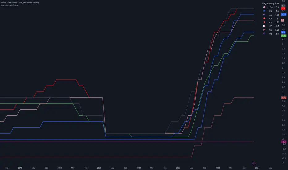
Interest Rate IndicatorThis script offers a overview of Year-over-Year (YoY) interest rates for key countries. The interest rate data utilized by default are sourced from TradingView Tickers, but they can be modified to any preferred source via the settings.
The script does not perform any calculations; its primary function is to present a comparative view of interest rates across different countries in a single indicator.
Key features include:
Interest rate data for the USA, European Union, Australia, Canada, Switzerland, Japan, United Kingdom, and New Zealand (Interest Rate Symbols are editable in the settings).
A table displaying country flags, names, and the latest interest rates, providing a clear and immediate comparison.
Country-representative colors for easy identification and visual distinction between different countries' data.
This indicator is designed for traders and analysts looking for a quick and efficient way to monitor and compare the interest rates of major economies directly within TradingView, facilitating better informed financial and investment decisions.
Gap Removal IndicatorThis gap indicator shows the price of your chosen instrument as if no gaps had occurred overnight. It can be especially useful on highly-volatile exchange-listed instruments that track other 24/7 assets, because the normal candlestick chart of these instruments will create a large amount of noise that may decrease the accuracy of your indicators or make the trend harder to see.
Gaps are determined with the following code:
daychange = ta.change(dayofmonth)
gapup = daychange and open > math.max(open,close)
gapdown = daychange and open < math.min(open,close)
Whereas the gap value is determined by taking the overnight difference in prices:
downgap_change = math.min(open,close) - open
upgap_change = open - math.max(open,close)
The gap changes are cumulatively added and subtracted from the initial closing price to create the gap-adjusted price. The price will depend on how many bars your subscription allows, so pay more attention to the relative differences and/or trend than the cumulative gap-adjusted price itself.
The gap indicator comes pre-built with normal candlestick and Heikin-Ashi candle types, and four indicators (two EMAs, Bollinger bands, and a supertrend). All elements are configurable.

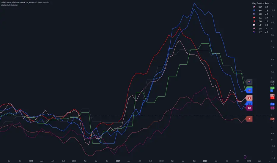
Inflation IndicatorThis script provides a great view of Year-over-Year (YoY) inflation rates for key countries.
The inflation data used per default are TradingView Tickers, but you can change them to anything you want from the settings.
There is no calculation in this script, all it does is providing a overview of inflation rates in a single indicator.
Inflation data for the USA, European Union, Australia, Canada, Switzerland, Japan, United Kingdom, and New Zealand (Inflation Symbols editable in the settings)
Customizable static line to indicate a specific threshold value (default: 2.0).
Table displaying country flags, names, and the latest inflation rates.
Country-representative colors for easy identification.
Qullamaggie ADR and Volatility and Price Change IndicatorElevate your trading strategy with Qullamaggie ADR, a dynamic indicator inspired by the Kristjan Qullamaggie trading approach. Gain a deeper understanding of market dynamics, daily price movements, and potential turning points.
Key Features:
Qullamaggie ADR: Assess market volatility through the QullaADR, offering customizable time intervals (5, 10, 15, 20 days) to adapt to various trading styles.
Today's Change: Monitor price changes relative to the low of the current trading day, providing valuable intraday insights.
PrevDay price differentials from the previous day's low, aiding in the identification of potential trend reversals.
Track the percentage change from the opening price, offering a snapshot of intraday market sentiment.
Percent from 10-day SMA: Visualize the percentage difference between the closing price and a 10-day Simple Moving Average (SMA), a key trend-following indicator.
Usage:
Utilize QullaADR to set realistic profit targets and stop-loss levels based on current market conditions.
Identify potential trend shifts by observing changes from the previous day's low with Today's QullaChange.
Incorporate QullaPercent from 10-day SMA for trend confirmation and well-informed trading decisions.
Strategy Inspiration:
QullaADR draws inspiration from the Kristjan Qullamaggie trading strategy, aiming to complement your trading toolkit and enhance decision-making.
Disclaimer:
Trading involves risk, and past performance is not indicative of future results. Use this indicator as a supplementary tool within a comprehensive trading strategy.
Version: 1.0

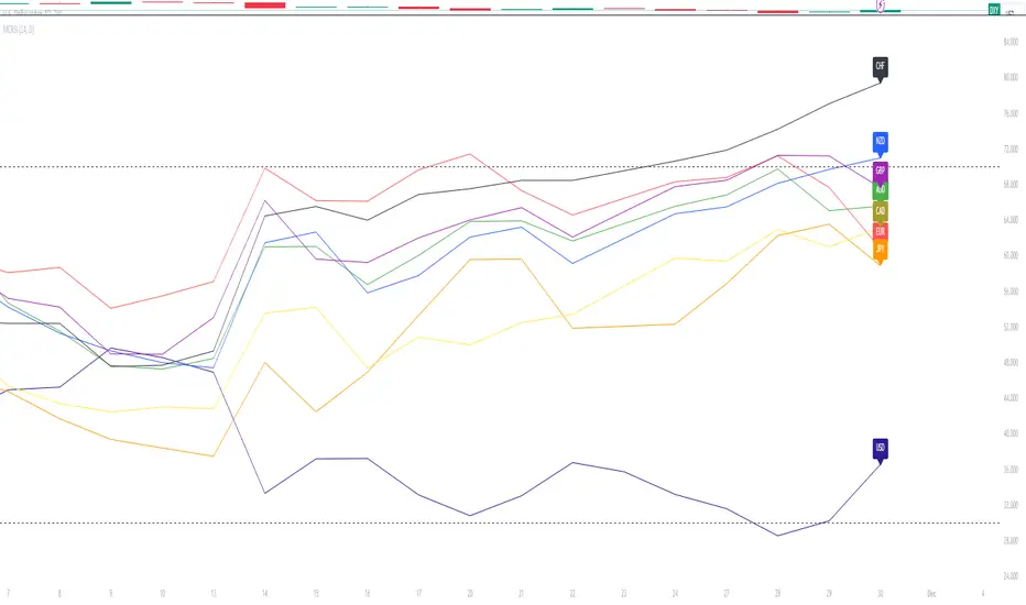
Major Currency RSI Indicator (MCRSI)Experience the power of multi-dimensional analysis with our Multi-Currency RSI Indicator (MCRSI). This innovative tool allows traders to simultaneously track and compare the Relative Strength Index (RSI) of eight different currencies in a single chart.
The MCRSI calculates the RSI for USD (DXY), EUR (EXY), JPY (JXY), CAD (CXY), AUD (AXY), NZD (ZXY), GBP (BXY), and CHF (SXY), covering a broad range of the forex market. Each RSI line is color-coded for easy differentiation and equipped with labels at the last bar for a clutter-free view.
Our indicator is designed with user-friendly customization features. You can easily adjust the length of the RSI and the time frame according to your trading strategy. It also handles gaps in the chart data with the barmerge.gaps_on option, ensuring accurate and consistent RSI calculations.
Whether you are a novice trader seeking to understand market dynamics better or an experienced trader wanting to diversify your technical analysis, the MCRSI offers a unique perspective of the forex market. This multi-currency approach can help identify potential trading opportunities that could be missed when analyzing currencies in isolation.
Harness the power of multi-currency RSI analysis with our MCRSI Indicator. It's time to step up your trading game!
Features:
Tracks 8 different currencies simultaneously
Color-coded RSI lines for easy identification
Customizable RSI length and time frame
Handles gaps in chart data
Last bar labels for a clutter-free view
Ideal for forex traders of all experience levels
How to Use:
Add the MCRSI to your TradingView chart.
Adjust the RSI length and time frame as needed.
Monitor the RSI lines and their intersections for potential trading signals.
Happy trading!
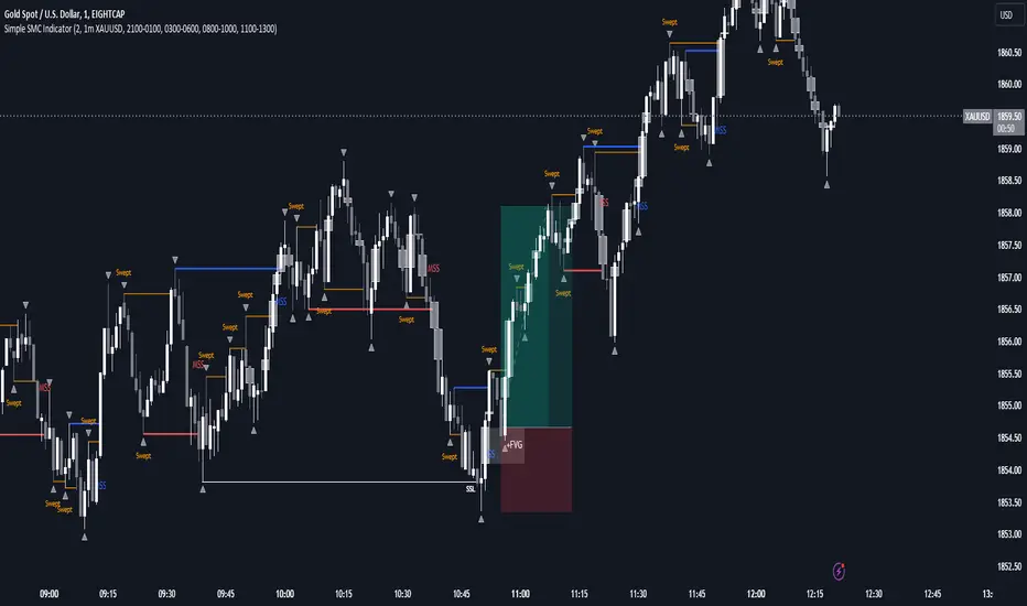
SMC Indicator With WebhookThis indicator includes
- Liquidity sweeps
- FVG
- MSS
- Sessions
The alert system is set up for Discord webhooks. Discord webhook can be set up by creating a webhook in your Discord server then pasting the webhook url into the webhook url input box for the alert you create on the indicator.
You can create different alerts for different timeframes and symbols. E.g. HTF liquidity sweeps and LTF MSS.
Recession Indicator (Unemployment Rate)Unemployment rate
percentage of unemployed individuals in an economy among individuals currently in the labour force. It is calcuated as Unemployed IndividualsTotal Labour Force × 100 where unemployed individuals are those who are currently not working but are actively seeking work.
The unemployment rate is one of the primary economic indicators used to measure the health of an economy. It tends to fluctuate with the business cycle, increasing during recessions and decreasing during expansions. It is among the indicators most commonly watched by policy makers, investors, and the general public.
Policy makers and central banks consider how much the unemployment rate has increased during a particular recession to gauge the recession’s impact on the economy and to decide how to tailor fiscal and monetary policies to mitigate its adverse effects. In addition, central banks carefully try to predict the future trend of the unemployment rate to devise long-term strategies to lower it.
This indicator is a representation of yearly rate of change of Unemployment rate. Historically (not always) when ROC(Yearly) of Unemployment rate crossover zero line was a signal of recession or economic contraction.
Tetra Trendline Indicator 2.0This script is designed to help traders visualize and identify potential overbought and oversold conditions in a financial instrument's price chart using four customizable trendlines. It also provides the option to set alerts for these conditions. Users can adjust the input parameters to tailor the indicator's behavior to their trading preferences.
Input Parameters: The script allows users to configure various input parameters to customize the behavior of the indicator. These parameters include:
showTrendlineX: Boolean inputs to control whether to show each of the four trendlines (Trendline 1, Trendline 2, Trendline 3, and Trendline 4).
trendlineColorX: Color inputs to specify the color of each trendline.
trendlineWidthX: Numeric inputs to set the width of each trendline.
trendlineLengthX: Numeric inputs to determine the length of each trendline.
alertOnTrendlineXBreak: Boolean inputs to enable or disable alerts for each trendline when they are breached.
Trendline Calculations: The script calculates the coordinates for each of the four trendlines. It does this by identifying the starting and ending points of each trendline based on user-defined parameters and the highest or lowest price levels within a specified length.
Plotting Trendlines: The script uses the plot function to display the calculated trendlines on the price chart. It also fills the area between the trendlines to visually emphasize the region.
Alert Conditions: The script defines alert conditions for each trendline. Alerts are triggered when certain price conditions are met:
Trendline 1: An alert is triggered when the price crosses above the Trendline 1 (indicating overbought conditions).
Trendline 2: An alert is triggered when the price crosses below the Trendline 2 (indicating oversold conditions).
Trendline 3: Similar to Trendline 1, an alert is triggered when the price crosses above Trendline 3 (overbought).
Trendline 4: Similar to Trendline 2, an alert is triggered when the price crosses below Trendline 4 (oversold).

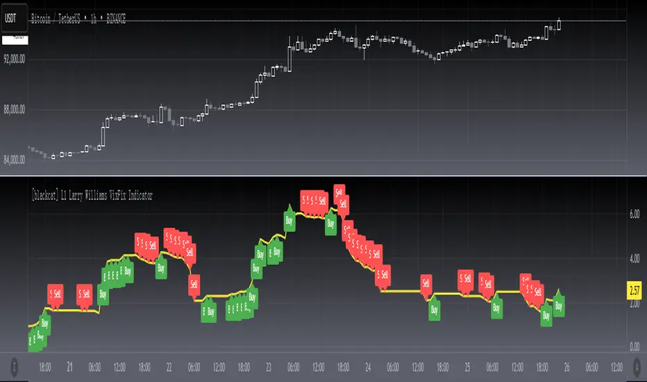
[blackcat] L1 Larry Williams VixFix IndicatorLevel : L1
Larry Williams, had this idea to create a synthetic VIX for more than just the main stock indices. Check out the formula for Williams VixFix:
```
VIX Fix Formula = (Highest(Close, 22) – Low) / (Highest(Close, 22)) * 100
```
What does this even mean? In normal person terms, here's what it's all about:
1. Find the highest close over the last 22 days and subtract today's low (or the current bar).
2. Divide that by the highest close of the past 22 days.
3. Multiply the result by 100 to "normalize" the indicator.
Why 22 days, you ask? That's how long the normal month of trading days is.
So, you see, the formula is pretty chill. It's just a way to measure the price volatility of the last 22 trading days. It's a bit of a lagging indicator, but it gets the job done.
Here my version of this scriptcreates a custom technical indicator called "L1 Larry Williams VixFix" that measures the distance between the highest high and the lowest low of a security's price over a specified period.
The user can adjust the period length and source price used in the VixFix calculation. The period length is set to 22 by default, but can be modified by the user with the "Length" input parameter. The source price is set to "close" by default, meaning it will use the closing price of each bar to calculate the VixFix. However, the user can also choose a different type of price data, such as open, high, or low.
The VixFix is calculated as a percentage of the difference between the highest close and the lowest low over the specified period. This percentage is then multiplied by 100 to create a more readable value.
Finally, the code plots the VixFix line on the chart with a yellow color and a thickness of 2. This allows the user to easily visualize the VixFix value and incorporate it into their trading decisions.
Overall, this script provides a powerful tool for technical analysis that can help traders identify potential trend changes and market reversals.
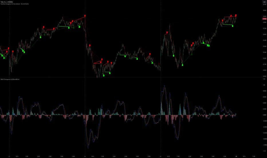
Realtime Divergence for Any Indicator - By John BartleThe main purpose of this script is to show historical and real-time divergences for any oscillating indicator. The secondary purpose is to give the user a lot of precise control over identifying divergences and determining what they are. This is an improved version of my other script which is similarly called "Realtime Divergence for Any Indicator"
There are four types of divergences that are offered:
Bull divergence
Hidden bull divergence
Bear divergence
Hidden Bear divergence
There are three types of potential(real-time) divergences which include:
1) Without right side bars for rightside pivots. Plus without waiting for the rightside pivot bar to complete
2) Without right side bars for rightside pivots. Plus with waiting for the rightside pivot bar to complete
3) With right side bars for rightside pivots. Plus without waiting for the rightside pivot right-most bar to complete
A definite divergence occurs when all specified bars are accounted for and fully formed.
Potential divergences use dashed lines and definite(historical) divergences use solid lines.
In addition to several other categories of settings to filter out unwanted divergences or manipulate the search process, this script also offers Alerts. Remember that alerts must not only be set within this scripts settings but also your "Alerts" panel on your right. It's strange but BOTH must be set for alerts to work...
Other interesting Things To Know:
1)I actually don't trade and so I have no need of a paid account. Unpaid accounts don't have the playback feature so I haven't really tested this script out very well. Sorry. Just let me know if something seems off and IF I have time I'll try to fix it.
2)Keep in mind that Pinescript limits the number of lines that can be shown at one time. This means that if your settings allow for a large number of divergence lines they will be removed from the leftward side of your chart but appear in the rightward side.
3) The time and the values for the price or oscillator are not the same things as each other nor are they physical things with physical space. This means that slopes of lines using the time as X and value as Y can not have definite angles. Consequently, under the setting "DIVERGENCES: SLOPE ANGLE EXCLUSION" YOU have to decide what slope equals what angle by using the setting called "Normalization Factor".
4) Remember that some individual settings apply to both the oscillator and price chart. This means that even if the setting's conditions are fulfilled in one they may not be fulfilled in the other.
5) Under the category "DIVERGENCES: INTERSECTION ALLOWANCE", if you set the "Measurement Type" to Relative Percentage then FYI any single given length will equate to an increasingly smaller percentage the further away from zero it is. Because of this, I think "Reletive Percentage" is probably only useful for price charts or oscillators with big values. Maybe >200 is OK ?
Errors:
1) If you get the error mentioning that the script must complete execution within X amount of time, this is because this is a big script and sometimes takes longer than your service plan's allotted time limit. You can just disable some of the settings to reduce the scripts amount of work and time. The biggest time savers will be to disable some lines and labels
2) If you get an error saying the script accessed a negative index(e.g. ) then try temporarily increasing the "Add More Array Elements" setting to 100-200. Sometimes it fixes the problem.
3) You may sometimes temporarily get an error that reads: "Pine cannot determine the referencing length of a series. Try using max_bars_back in the study or strategy function".
If this happens there are several things that you can do:
3A) Create a copy of my script. Then edit the section of code that looks like this ")//, max_bars_back = INSERT_YOUR_QUANTITY_HERE)" and transform it to look like this new code ", max_bars_back = INSERT_YOUR_QUANTITY_HERE)" then repeatedly try replacing "INSERT_YOUR_QUANTITY_HERE" with an increasingly larger number greater than 244 but less than 5000.
This method will increase your system resources and could cause other problems. Try changing the code back after a few hours and see if all is well again. It is a Pinescript limitation issue and happens when certain functions or variables don't get used at least once within the first 244 bars.
3B) Adjust your settings to hopefully find a divergence within the first 244 bars. If one is found then the problematic variables or functions should get used and the Pinescript 244 bar limitation should be temporarily resolved.
3C) Wait for X number of new bars to occur. If a divergence is eventually found within the first 244 bars that should solve the issue.
Tips:
1) If the amount that a setting changes value is undesirable for each time you click it then you can change that amount in the code. To do that, you'll need your own copy of my script. To make your own copy just click on "create a working copy" in the brown colored strip area above the code. Then within approximately the first 108 lines find the title of the setting you want to change. Then look to it's right to find the parameter called "step =". Change what the step equals to whatever you want. FYI, you can hover your mouse over the blue colored code and a popup will tell you what parameters(i.e. settings) that function(e.g. "input.int()") has available.
Market Smith IndicatorsMarket Smith has a collection of tools that are useful for identifying stocks. On their charts they have a 21/50/200 day moving averages, high and low pivot points, a relative strength line, and a relative strength rating. This script contains indicators for the following:
21/50/200 Day Moving Averages
High and Low pivot points
A Relative Strength line
A Relative Strength rating
21/50/200 Day Moving Averages
The 21/50/200 Day moving averages are simple moving averages. They are visible in any chart increment but to use them properly you need to set you charts to be by day. Labels will appear on the right of the lines to show that they are representative of 21/50/200 day moving averages.
High and Low pivot points
The High and Low pivot points are green for high pivot points and red for low points. They are show in the Market Smith style with the numbers simply above the pivot points.
Relative Strength line
The Relative Strength line is a line that shows the strength of the stock compared to the S&P 500. In this case we utilize the SPX ticker to compare the stock to. This line is almost identical to the Market Smith tool and is an excellent tool to determine how a stock is doing compared to the market. When movements in the stock and shown with sideways trending of the RS line that means that the stock is following the market. When a stock is outperforming the market the RS line will follow.
Relative Strength rating
Thank you to ©Fred6724 for the RS Rating inspiration. They wrote excellent open source code for a RS Rating comparable to Market Smith. As the RS Rating in Market Smith is not open source it is difficult to know exactly how it is being calculated. After simplifying Fred's code and building upon a few ideas I had I compared the RS Rating to multiple Market Smith Ratings. The rating is close but often off by multiple points. If there is anyone who has a better idea on how to get this rating or how to improve on the code please send me a PM or fork this project. This rating is a good indicator to see how a certain stock compares to other stocks in the market. In Market Smith they are able to utilize their database to compare it to all other stocks. Since we do not have access to the same tools we are only able to compare it to the percentage of stocks above the 200, 150, 100, 50, and 20 day moving average.
Using these tools together are a small fraction what make people like Bill O'neill and Jim Roppel so successful. I plan on updating the RS Rating as I continue to work on this project so if there is anyone who has ideas then please send me a PM. Ultimately the goal of this project is to have a solution that is identical to Market Smith.
