NQ 65 Point Futures Session 30 Second Opening RangeNQ 65 Point Futures Session Open Range Pro
Overview
This Pine Script indicator is designed specifically for NASDAQ-100 E-mini (NQ) futures traders who utilize opening range breakout strategies across multiple global trading sessions. The indicator provides comprehensive session-based opening range analysis with advanced 65-point interval projections.
Key Features
Multi-Session Opening Range Analysis
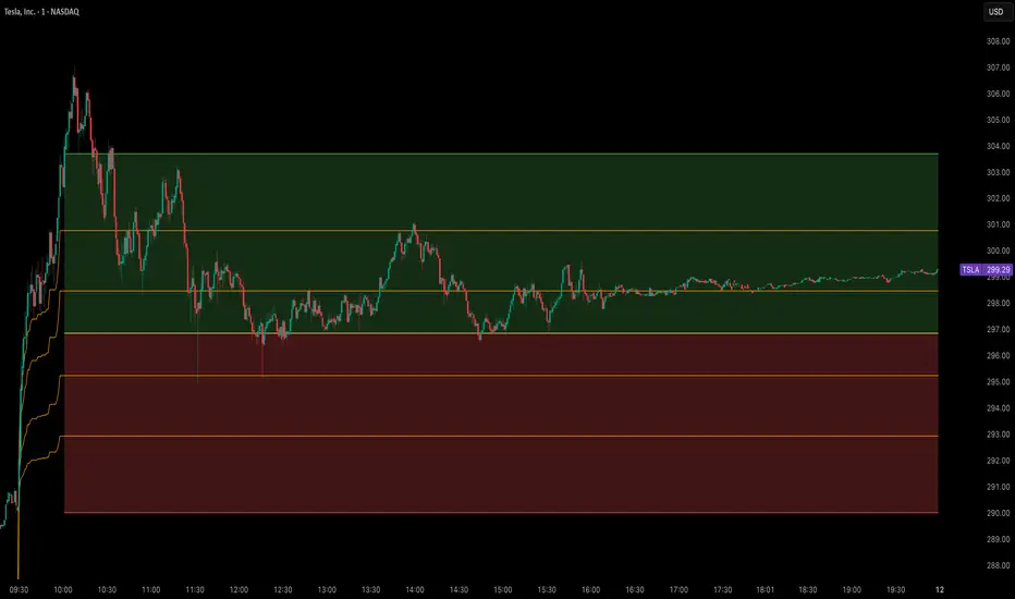
RTH (Regular Trading Hours): 8:30 AM CT - New York session opening range
Globex (Asian Session): 5:00 PM CT - Asian market session opening range
Europe Session: 2:00 AM CT - European market session opening range
Core Functionality
High/Low/Mid Lines: Displays opening range boundaries and midpoint for each session
Customizable Colors: Full color customization for each session's lines
Price Labels: Optional price display on all levels with session identification
Statistics Table: Real-time table showing high, low, and range width for active sessions
Advanced 65-Point Interval System
RTH-Specific Feature: Plots 5 levels above and below RTH opening range at 65-point intervals
Projection Levels: +65, +130, +195, +260, +325 above RTH high and corresponding negative levels below RTH low
Customizable Labels: Toggle price display and session names on interval lines
Color-Coded: Separate colors for upside and downside projections
Enhanced Trading Tools
Breakout Detection: Automatic identification of opening range breakouts with visual signals
Alert System: Built-in alerts for all session breakouts (up and down)
Range Boxes: Optional visual boxes highlighting opening ranges
Multiple Timeframe Support: Works across various chart timeframes
Display Options
Label Customization: Multiple size options (Tiny, Small, Normal, Large)
Session Toggle: Individual on/off controls for each session
Transparency Controls: Adjustable transparency for range boxes
Professional Styling: Clean, professional appearance suitable for live trading
Trading Applications
This indicator is particularly valuable for:
Gap Trading: Identifying key levels after overnight gaps
Breakout Trading: Clear visual confirmation of range breakouts
Support/Resistance: Using opening ranges as dynamic S/R levels
Session Transition: Understanding how price behaves across global sessions
Risk Management: Using 65-point intervals for position sizing and target setting
Technical Specifications
Version: Pine Script v5
Overlay: True (plots directly on price chart)
Max Lines: 500 (accommodates extensive level plotting)
Timezone: America/Chicago (Central Time)
Data Frequency: 30-second precision for opening range calculation
Usage Notes
Designed specifically for NQ futures but may work on other instruments
Best performance on intraday timeframes (1m, 5m, 15m, 30m)
Opening ranges calculated based on first 30 seconds of each session
All alerts are customizable through TradingView's alert system
Customization Options
The indicator offers extensive customization including:
Color schemes for each session
Label display preferences
Line transparency and thickness
Statistical table positioning
Alert message customization
Pine Script® indicator