Search in scripts for "weekly"

wPiv21This is a customised indicator highlighting key levels of support and resistance on the weekly time frame.

wPiv11This is a customised indicator highlighting key levels of support and resistance on the weekly time frame.
wPiv4This is a customised indicator highlighting key levels of support and resistance on the weekly time frame.
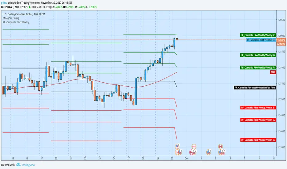
Camarilla Fibo Weekly (pffxcz)Camarilla Fibo Weekly ( Pivot +R1 - R3 and S1 - S3)
R1/S1 = 38.2
R2/S2 = 61.8
R2/S3 = 100
Close of relevant previous periodThis indicator puts the previous close value of a higher relevant time frame on the chart, it adepts to the period of the chart. Relevant means that it puts:
Close of previous year in monthly chart
Close of previous month in weekly chart
Close of either previous month of week in daily chart, default setting is week
Close of previous week in 4hourly and 3hourly charts
Close of previous day in 30minute and higher intraday charts
Not bother the user below 30 minutes.


Pivots Daily Weekly Monthly YearlyDaily, Weekly, Monthly and yearly pivot lines
Just the pivot lines without the support and resistance lines

Eminaest Pivots V2Simple Pivot Points plotting script.
You can choose to plot Daily, Weekly and Monthly Pivot Points. Separate or two of them or all together.

Moving Average Trend ToolsI. How M.A.T.T. Adds Value to the TradingView Community:
The "Moving Average Trend Tools" (M.A.T.T.) is a versatile Pine Script v6 indicator that empowers traders with clear trend analysis, reliable trade signals, and real-time insights. Its intuitive design and robust features make it a valuable addition to the TradingView Community Scripts by catering to traders of all levels. Here’s why it stands out:
Clear Trend Visualization: M.A.T.T. plots a moving average (MA) with dynamic coloring—green for rising, red for falling, and gray for flat—based on a user-defined lookback period. This simplifies trend interpretation, helping traders quickly assess market momentum.
Reliable Trade Signals : The script identifies price crossovers above or below the MA, plotting green circles for bullish crosses and red for bearish, confirmed on closed bars to prevent repainting. These signals guide entry and exit points for trend-following or reversal strategies.
Real-Time Extension Detection : M.A.T.T. calculates percentage price deviations from the MA, displaying real-time labels when thresholds (e.g., 6%) are exceeded. This highlights overextended moves, ideal for spotting reversals or pullbacks, with alerts to keep traders informed.
Extensive Customization : Traders can tailor the MA type (SMA, EMA, WMA, HMA), length, colors, line width, and label sizes. This flexibility supports diverse strategies across markets like stocks, forex, and crypto, from scalping to swing trading.
Automated Alerts : Alert conditions for crossovers and extensions integrate seamlessly with TradingView’s system, enabling traders to stay updated without constant chart monitoring.
M.A.T.T. combines trend analysis, signal generation, and overextension detection into a single, user-friendly tool. Its accessibility, reliability, and educational value for Pine Script learners make it a compelling contribution to the community.
II. What M.A.T.T. Does, How It Works, and Its Originality:
What It Does :
M.A.T.T. enhances trend analysis and trade decision-making through three core features:
Dynamic MA Visualization: Plots a customizable MA (SMA, EMA, WMA, or HMA) with trend-based coloring to reflect rising, falling, or flat market conditions.
Price Crossover Signals : Marks bullish (green circles) and bearish (red circles) crossovers, confirmed on closed bars, with alerts for trade opportunities.
Price Extension Labels : Displays real-time percentage deviations of price from the MA, with alerts when user-defined thresholds are breached, signaling potential reversals.
How It Works :
M.A.T.T. leverages Pine Script v6 for precise calculations and user-friendly outputs:
Inputs: Users select MA type, length, lookback period, colors, and thresholds for extensions, plus label styles and sizes for customization.
MA Calculation : A switch function computes the chosen MA (e.g., ta.ema(close, 21) for EMA). Trend direction is determined using ta.rising or ta.falling over the lookback period, coloring the MA accordingly.
Crossover Logic : Bullish crossovers (close > ma and close < ma ) and bearish crossovers (close < ma and close > ma ) are plotted as circles on confirmed bars (barstate.isconfirmed) to ensure reliability. Alerts trigger only on the first bar of a crossover.
Extension Logic : Percentage deviations are calculated as ((price - ma) / ma) * 100, using the high for above-MA extensions and low for below. Labels appear in real-time when thresholds are exceeded, with alerts on transitions to avoid noise.
Why It’s Original
M.A.T.T. distinguishes itself through a unique blend of features and thoughtful design:
All-in-One Design : It integrates dynamic MA coloring, non-repainting crossover signals, and real-time extension detection, addressing trend identification, trade signals, and overextension warnings in one tool—unlike most MA indicators that focus on a single aspect.
Real-Time Extension Labels : Displaying percentage deviations with customizable thresholds is a rare feature, ideal for volatile markets and not commonly found in standard scripts.
Non-Repainting Signals : Confirmed crossover signals enhance reliability for live trading, setting M.A.T.T. apart from less rigorous indicators.
Optimized Alert Condtions : Alerts trigger only on transitions (e.g., first bar of a crossover or extension), reducing noise and improving usability.
Visual and Functional Flexibility : Support for four MA types, extensive customization, and a clean interface (dynamic colors, tiny circles, clear labels) make it adaptable and user-friendly.
While MA plotting or crossovers exist elsewhere, M.A.T.T.’s seamless integration, real-time extension detection, alert conditions, and focus on reliability and customization create a distinctive, practical tool. Its balance of simplicity and sophistication makes it a unique asset for the TradingView community.

Candle Type w/only 3-1This script is a "fork" of Crinklebine's excellent "Candle Type" script for Rob Smith's ( aka RobInTheBlack) #thestrat methodology. 1 strategy that's becoming increasingly popular is looking for 3-1 (outside-inside) set-ups per #thestrat. The idea is that as the inside candle breaks, the target to take profits is given by the high/low of the previous outside range. This script is for traders who only want to look for this specific candle combo (3-1) and highlights up/dn breaks of the inside candle. It's designed to work with or without "Candle Type" (so traders who want all bars labelled can also select Crinklebine's Candle Type script to run concurrently). I've had traders specifically request this script from me, so I thought others may be interested as well and I'm sharing it here.

Candle Type w/2Up + 2Dn v2.0This script builds on Candle Type w/2Up + 2Dn by incorporating signals for inside + up, outside + up, + rev strat set-ups. All of these can be turned off if they compete w/ other indicators or just clutter up the chart.
Briefly, the script works based on #thestrat developed by Rob Smith and the 1-2-3 bar script coded by @Crinklebine. Candle Type w/2Up + 2Dn is a "fork" of @Crinklebine's excellent indicator. I find the visualization of U-D-I-O (up/dn/inside/outside candles) easier to scan through 100's of charts than 1-2-3's. This is just personal preference, but they work based on the exact same principles. Performance is enhanced with a trend filter like @boardriderb's "TC" script or similar timeframe continuity filters based on the #thestrat developed by Rob Smith. I also prefer an ATR-based trailing stop; Rob recommends pSAR for trailing stops.
Together these indicators form a power system, but users are still responsible for their own trade management, entries & exits, risk profiles, stop loss, etc.

Candle Type w/2Up + 2DnCandle Type is based on @robintheblack's "THE STRAT" philosophy and @crinklebine's "candle type" pine script.
This version distinguishes 4 potential candle types:
I = Inside previous bar's range
O = Outside previous bar's range
U = Up (high is greater than previous bar's range & NOT outside)
D = Down (low is lower than previous bar's range & NOT ouside)

Differential Three Lines BreakThis is an indicator called DTLB for short...
Alhough the work in the script is simple, it's still worthy of 1,000 $ at least in my opinion
By the way, who can offer me a job in investment or automatic trading? lol
Still studying for an engineering doctorate now, contact me via clxzen@sina.com if you are intetested

PonoTrading WDRWeekly Dealing Range Indicator
Overview
The Weekly Dealing Range indicator identifies range + volatility based pivot levels that form at the close of the first trading session and extend for the entire week. This tool provides key reference points for both trending and range-bound market conditions.
What It Provides
Range High & Low: Weekly session extremes
Median Level: Mid-point of the weekly range
Weekly Open: First session opening price
Standard Deviation Extensions: Calculated levels above the high and below the low
Practical Application
These levels serve as:
Reversal zones for mean reversion setups
Support/resistance reference points
Target levels for existing positions
Framework for building trade ideas around high-probability pivot areas
Key Features
Traditional price crosses level alerts
Automatically updates each week
Clean, uncluttered chart display
Works across all timeframes
Suitable for all markets and instruments

ATR Screener with Labels and ShapesWeekly Daily ATR Pine Scanner
To find out tightness or contraction in a stock we needs to check if volatality is decreasing as well as compared to previous 14 or 10 bars volatility . we check this for weekly and then for Daily , so that we can enter in a stock which is tightest in recent times.
Condition is :
1. Weekly Candle ATR x 0.8 < 10 Week ATR
2. Daily Candle ATR x 0.6 < 14 Day ATR
When both of the conditions are met then they signifies that the stock has tightened in weekly and daily aswell . so now we can find ways to enter during max squeeze.
How to scan in Pine Scanner ?
FIrst add indicator as favourite and Go to pine scanner page in trading view and then scan your watchlist and there you will see 3 columns 1 with only Weekly conditions met , 2 with only Daily and 3rd with Both conditions met .
Select stocks and move to new watchlist and now you have those stocks which has contracted the most in recent times .

RLSWEEKLY LAYOUT
It aims to indicate favorable points for entering, stopping and exiting positions in the weekly chart time (position trade and buy n´ hold).
My way of using:
ENTERING POINTS
Potentially buying regions in green areas (by exceeding the maximum considering, mainly, company data and the daily chart as a trigger);
Potentially selling regions in the red zones (due to loss of minimum considering, mainly, company data and the daily chart as trigger);
Purchases to exceed the maximum of the 1st candle that closed above the average in green (considering the daily chart as a trigger);
Sales in the maximum loss of the 1st candle that closed below the average in red (considering the daily chart as a trigger);
Search for purchases on the daily chart (against the trend) by touching the green BBI region; and
Search for sales on the daily chart (against the trend) by touching the region in red BBS.
STOP / OUTPUTS
Stop adjustment in buying positions in the region in red BBS (considering the daily chart as adjustment by minimums); and
Stop adjustment in selling positions in the region in green BBI (considering the daily chart as adjustment by maximums).
Contains alarms for the main criterias.
I consider target for the weekly and triggers for the daily.
-------------------------------------------------------------------------------------------------------------------------------------------------------------------------------------------
LAYOUT SEMANAL
Tem como objetivo indicar pontos favoráveis para entrada, stop e saída de posições no tempo gráfico semanal (position trade e buy n´ hold).
Minha forma de utilização:
ENTRADAS
Regiões potencialmente compradoras nas zonas verdes (por superação de máxima considerando, principalmente, dados da empresa e o gráfico diário como gatilho);
Regiões potencialmente vendedoras nas zonas vermelhas (por perda de mínima considerando, principalmente, dados da empresa e o gráfico diário como gatilho);
Compras na superação de máxima do 1º candle que fechou acima da média em verde (considerando o gráfico diário como gatilho);
Vendas na perda de máxima do 1º candle que fechou abaixo da média em vermelho (considerando o gráfico diário como gatilho);
Busca por compras no gráfico diário (contra a tendência) ao toque na região em verde BBI; e
Busca por vendas no gráfico diário (contra a tendência) ao toque na região em vermelho BBS.
STOP/SAÍDAS
Ajuste de stop em posições compradoras na região em vermelho BBS (considerando o gráfico diário como ajuste por mínimas); e
Ajuste de stop em posições vendedoras na região em verde BBI (considerando o gráfico diário como ajuste por máximas).
Contém alarmes para os principais critérios.
Considero alvo pelo semanal e gatilhos pelo diário.

Weekly Vertical Lines (Sunday 6 PM) Weekly BarsSimply a light blue vertical line at the beginning of each week at exactly Sunday at 6 pm.

Weekly Futures VWAP (Major Indices) - StableAutomatically puts the VWAP anchor on Sunday opening of futures at 16:00, you are able to toggle on/off VWAP bands and of course enter alerts

Weekly Breakout Screenermencari harga saham yang kuat breakout harga mingguan. potensi swing trading
