Titans Engulfing Retracement ZonesThe Titan Engulfing Retracement Zones indicator detects Engulfing Candlesticks on a higher user defined timeframe, and uses that event to plot retracement and extension levels on the chart for ease of users' chart reading and trade execution. The four retracement levels, two of which delimit the target entry zone, and another two delimiting the target exit zone, are also user defined.
The user of this indicator is advised that the default levels provided are unoptimized. The user of this indicator is advised to use this indicator at his or her own risk.
To further filter out the results of Engulfing Candlestick detection, a long wick condition has been included into the detection mechanics.
Search in scripts for "zone"

BTC 1D Safety tradeImportant: use only the BTC/USD pair on the 1D timeframe
The indicator is designed to determine the zones for entry to buy or sell, as well as for closing deals.
The indicator is based on a moving average with a period of 12.
The parameters are not changeable, since the optimal settings (Safety trade) were used for the BTC/USD pair on the 1D timeframe.
The code is open, please change it according to your parameters.
Upper zones for closing long or opening short.
Lower zones for opening long or closing short.

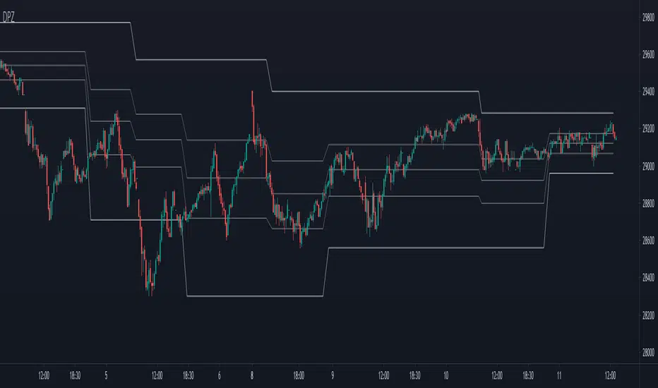
[PX] Pivot ZonesHello everyone,
I was having some fun with the new gradient function, arrays and pivots. Decided that i would publish my little playground :)
This script basically draws lines or zones for detected pivot high and lows and counts the number of candles those levels have been untested.
Tested levels will stop at the candle, which breaks them.
How does it work?
- Define the number of candles that make up the pivot point with the "Pivot Left" and "Pivot Right" parameter (I took more extreme values to showcase the indicator).
- Select your "Layout Type": This can be either a line at the pivot point, a zone between the pivot point and its body or the average of the two.
- You can in-/decrease the number of lines with the "Number of Lines/Zones" parameter.
The older a line becomes the more it will lose of its original transparency.
Hope that might be useful to some of you :)
Please click the "Like"-button and follow me for future open-source script publications.
If you are looking for help with your custom PineScript development, don't hesitate to contact me directly here on Tradingview or through the link in my signature :)
Dynamic Price ZoneThis indicator dynamically divides the price range into six zones.
1. Over Resistance (Strong up trend)
2. UpperMiddle to Resistance
3. Middle to UpperMiddle
4. Middle to LowerMiidle
5. LowerMiddle to Support
6. Under Support (Strong down Trend)
Resistance and Support are calculated by HMA.
Usage:
It is recommended to use this indicator on the higher time frames.
The image is 15 minutes chart and resolution 1hour for indicator.
Pay attention to whether the range from resistance to support is shrinking or expanding!
A major trend begins with a break in resistance and support.
The five lines also work as a support or resistance.
When the zone changes, the price is likely to reach the next line.
UpperMiddle and LowerMiddle settings can be selected from 3 types.
75%, 66%, 61.8%(fibonacci) for UpperMiddle.
Futures time zoneMarks the different time zones of futures. The time zones are Globex, Kill zone, Pre market, Post market and lunch time

Underworld Hunter + Base ZoneUnderworld Hunter + Base Zone is designed to keep traders out of ranging markets by establishing a "dead zone" between the bands where price may be choppy or trends may be short lived. The original Underworld Hunter from @greenmask9 adapted Bollinger Bands by changing the basis from SMA to the EMA of the EMA of the EMA. This version now allows the user to select which moving average they would like to utilize for the calculation.
If price is outside of the upper bands, price may be bullish. If price is outside the lower bands, price may be bearish.
If price is within the green or red areas of the bands, a trend may be forming.
The system also plots when RSI has become over extended above the thresholds selected (70/20 is the default).
MA Period is the length/period the moving average is calculated with
MA Mode is the type of moving average that will be utilized in the basis calculation
The "Standard MA Calculation" Option changes the basis to calculate the moving average selected in MA Mode only once, instead of 3 times
Deviation 1 and Deviation 2 determine how far the dead zone bands will be from the basis
RSI Period is the length/period the RSI function is calculated with
RSI Extended - High Cutoff is the level RSI must reach to be marked as over extended. Most traders refer to this zone as "Overbought"
RSI Extended - Low Cutoff is the level RSI must reach to be marked as over extended. Most traders refer to this zone as "Oversold"
As many NNFx traders know, overbought and oversold essentially do not exist, though the zones can still be utilized
The remaining options are utilized for specific moving average calculations and are set to what is typically considered as "standard" for their values.
There are many options available for this code. The code has not been optimized but merely compiled. Settings should be adjusted for the instrument(s) you are trading.
Adapted from user @greenmask9
Multiple MA Options Credits to @Fractured and @lejmer
Bits and Pieces from @AlexGrover, @Montyjus, and @Jiehonglim
As always, trade at your own risk.

Indicators: Volume Zone Indicator & Price Zone IndicatorVolume Zone Indicator (VZO) and Price Zone Indicator (PZO) are by Waleed Aly Khalil.
Volume Zone Indicator (VZO)
------------------------------------------------------------
VZO is a leading volume oscillator that evaluates volume in relation to the direction of the net price change on each bar.
A value of 40 or above shows bullish accumulation. Low values (< 40) are bearish. Near zero or between +/- 20, the market is either in consolidation or near a break out. When VZO is near +/- 60, an end to the bull/bear run should be expected soon. If that run has been opposite to the long term price trend direction, then a reversal often will occur.
Traditional way of looking at this also works:
* +/- 40 levels are overbought / oversold
* +/- 60 levels are extreme overbought / oversold
More info:
drive.google.com
Price Zone Indicator (PZO)
------------------------------------------------------------
PZO is interpreted the same way as VZO (same formula with "close" substituted for "volume").
Chart Markings
------------------------------------------------------------
In the chart above,
* The red circles indicate a run-end (or reversal) zones (VZO +/- 60).
* Blue rectangle shows the consolidation zone (VZO betwen +/- 20)
I have been trying out VZO only for a week now, but I think this has lot of potential. Give it a try, let me know what you think.

ASIA + Zones (1st/2nd) + Trend Table (M1/M3/M5..D1) Disegna il box della sessione Asia (23:00–07:00 Roma) e ne calcola High/Low.
Evidenzia le ZONE e salva quelle fuori dalla sessione Asia.
Tabella trend in alto a destra con BULL/BEAR/NA per i timeframe selezionabili:
M1, M3, M5, M15, H1, H4, D1, colori personalizzabili.
La direzione viene stimata con pivots (break dell’ultimo pivot high = BULL, break dell’ultimo pivot low = BEAR).
Draws the Asia session box (23:00–07:00 Rome time) and calculates its High/Low.
Highlights the zones and stores those outside the Asia session.
Trend table in the top-right corner showing BULL / BEAR / NA for selectable timeframes:
M1, M3, M5, M15, H1, H4, D1, with fully customizable colors.
Trend direction is estimated using pivots:
Break of the last pivot high → BULL
Break of the last pivot low → BEAR

All OB + FVG + Overlap Zones + Alerts (v6 safe)//@version=6
indicator(
"All OB + FVG + Overlap Zones + Alerts (v6 safe)",
overlay = true
)
// === USER INPUTS ===
maxBarsBack = input.int(500, "Max Bars Back to Display OB/FVG", minval = 1)
extendBars = input.int(10, "Extend OB/FVG Boxes Forward", minval = 1)
// === COLORS ===
bullOBColor = color.rgb(139, 0, 0) // Deep Red
bearOBColor = color.rgb(75, 0, 130) // Deep Purple
bullFVGColor = color.rgb(0, 100, 0) // Deep Green
bearFVGColor = color.rgb(184, 134, 11) // Deep Yellow
overlapColor = color.rgb(0, 255, 255) // Cyan for OB+FVG overlap
// === HELPER FUNCTION ===
inRange(offset) =>
bar_index - offset >= last_bar_index - maxBarsBack
// === ORDER BLOCK LOGIC ===
bullOB = close < open and close > open
bearOB = close > open and close < open
// === COLOR OB CANDLE ===
barcolor(
bullOB and inRange(1) ? bullOBColor :
bearOB and inRange(1) ? bearOBColor :
na,
offset = -1
)
// === DRAW EXTENDED OB BOXES ===
if bullOB and inRange(1)
box.new(
left = bar_index - 1,
right = bar_index - 1 + extendBars,
top = high ,
bottom = low ,
bgcolor = color.new(bullOBColor, 70),
border_color = bullOBColor
)
if bearOB and inRange(1)
box.new(
left = bar_index - 1,
right = bar_index - 1 + extendBars,
top = high ,
bottom = low ,
bgcolor = color.new(bearOBColor, 70),
border_color = bearOBColor
)
// === FVG LOGIC (3-candle imbalance) ===
bullFVGFormed = low > high
bearFVGFormed = high < low
// === DRAW FVG BOXES AND STORE TOP/BOTTOM ===
var float bullFVGTop = array.new_float()
var float bullFVGBot = array.new_float()
var float bearFVGTop = array.new_float()
var float bearFVGBot = array.new_float()
var box bullFVGBoxes = array.new_box()
var box bearFVGBoxes = array.new_box()
if bullFVGFormed and inRange(2)
fvgBox = box.new(
left = bar_index - 2,
right = bar_index - 2 + extendBars,
top = low,
bottom = high ,
bgcolor = color.new(bullFVGColor, 80),
border_color = bullFVGColor
)
array.push(bullFVGBoxes, fvgBox)
array.push(bullFVGTop, low)
array.push(bullFVGBot, high )
if bearFVGFormed and inRange(2)
fvgBox = box.new(
left = bar_index - 2,
right = bar_index - 2 + extendBars,
top = high,
bottom = low ,
bgcolor = color.new(bearFVGColor, 80),
border_color = bearFVGColor
)
array.push(bearFVGBoxes, fvgBox)
array.push(bearFVGTop, high)
array.push(bearFVGBot, low )
// === CHECK AND HIGHLIGHT OB + FVG OVERLAPS ===
var float overlapLevelsTop = array.new_float()
var float overlapLevelsBot = array.new_float()
if bullOB and inRange(1) and array.size(bullFVGBoxes) > 0
for i = 0 to array.size(bullFVGBoxes) - 1
obTop = high
obBot = low
fvgTop = array.get(bullFVGTop, i)
fvgBot = array.get(bullFVGBot, i)
overlapTop = math.min(obTop, fvgTop)
overlapBot = math.max(obBot, fvgBot)
if overlapTop > overlapBot
box.new(
left = bar_index - 1,
right = bar_index - 1 + extendBars,
top = overlapTop,
bottom = overlapBot,
bgcolor = color.new(overlapColor, 80),
border_color = overlapColor
)
array.push(overlapLevelsTop, overlapTop)
array.push(overlapLevelsBot, overlapBot)
if bearOB and inRange(1) and array.size(bearFVGBoxes) > 0
for i = 0 to array.size(bearFVGBoxes) - 1
obTop = high
obBot = low
fvgTop = array.get(bearFVGTop, i)
fvgBot = array.get(bearFVGBot, i)
overlapTop = math.min(obTop, fvgTop)
overlapBot = math.max(obBot, fvgBot)
if overlapTop > overlapBot
box.new(
left = bar_index - 1,
right = bar_index - 1 + extendBars,
top = overlapTop,
bottom = overlapBot,
bgcolor = color.new(overlapColor, 80),
border_color = overlapColor
)
array.push(overlapLevelsTop, overlapTop)
array.push(overlapLevelsBot, overlapBot)
// === ALERT CONDITIONS ===
overlapAlert = false
for i = 0 to array.size(overlapLevelsTop) - 1
if close <= array.get(overlapLevelsTop, i) and close >= array.get(overlapLevelsBot, i)
overlapAlert := true
// === ALERTCONDITION (v6 compatible) ===
alertcondition(overlapAlert, "OB + FVG Overlap", "⚡ Price entered an OB + FVG overlap zone! ⚡")
alertcondition(bullOB, "Bullish OB Formed", "🔴 Bullish OB formed!")
alertcondition(bearOB, "Bearish OB Formed", "🟣 Bearish OB formed!")

TX Ultra Zone Consolidation Detector## TX Ultra Zone Consolidation Detector ##
Overview TX Ultra Zone is an advanced market structure utility designed to automatically detect periods of consolidation, indecision, and sideways movement. By isolating ranging markets, it helps traders avoid "choppy" conditions and prepare for high-probability breakouts.
What It Does
Automatic Detection: Draws visual boxes around price action when volatility compresses.
Breakout Projection: Once price breaks the box, it projects a "Shadow Zone" forward. This shadow serves as a key reference for Support-becomes-Resistance (or vice versa) retests.
Noise Filtering: Helps you stay out of the market when no clear trend exists.
How It Works (Conceptual) The script uses a multi-layer detection engine:
Regime Detection: It analyzes market efficiency and volatility (using adaptive logic) to determine if the market is trending or ranging.
Geometry Confinement: When a range is detected, the script locks the High and Low boundaries.
Expansion & Breakout: The box dynamically expands if price pushes the boundary slightly without a true breakout. A valid breakout closes the box and triggers the Shadow Extension.
How to Use
Add to Chart: Works best on volatility-sensitive assets (Forex, Crypto, Indices).
Wait for the Box: When a Purple Box appears, the market is resting. Do not trade trends inside the box.
Trade the Breakout: Wait for a candle close outside the box.
Use the Shadow: The Grey Shadow Extension indicates where price might return to "retest" the breakout level. This is often a prime entry zone.
Settings & Tuning
Detection Engine: Switch between Adaptive Volatility (Standard) or Momentum Compression (Alternative).
Zone Threshold:
45-50: Sensitive (More boxes, catches micro-ranges).
55-60: Strict (Only catches very clear, tight consolidation).
Shadow Extension: Adjust how far into the future the support/resistance zone is projected.
Disclaimer This tool is for educational and analytical purposes only. Past performance does not guarantee future results. Always use proper risk management.

ATR Channels 1-2-3 + Elder Value Zone V2This indicator combines volatility-based ATR channels with the Elder value zone to provide a structural view of trend and pullbacks.
It plots a central moving average and three pairs of ATR channels at 1, 2, and 3 times the Average True Range, giving a clear visualization of price extension relative to current volatility. The channels are linear and non-adaptive, serving strictly as a volatility envelope, not as support or resistance levels.
In addition, the indicator plots the Elder fast and slow exponential moving averages (EMA 13 and EMA 26) and highlights the area between them as the Elder value zone. This zone represents the price area where pullbacks occur within an established trend, and where continuation setups are typically evaluated.
The indicator does not generate signals or trading rules. It is designed for contextual analysis, helping to assess trend structure, volatility expansion or contraction, and whether price is extended or trading within a normal corrective range.

Algorithmic Volume Rejection Zones [AVRZ]Hello traders,
I am pleased to release the Algorithmic Volume Rejection Zones (AVRZ). This is a specialized decision-support system designed to identify high-probability reversal points by synthesizing candle geometry, market structure, and statistical volume anomalies.
Trading reversals often presents a dilemma: wait for confirmation and miss the move, or enter early and get stopped out by noise. AVRZ solves this by quantifying "Institutional Absorption." It filters out weak price probes and highlights only the specific moments where significant volume has stepped in to defend a price level.
🛡️ The Concept: Attacking The Zonesl
You will often see price aggressively "attack" a support or resistance level with speed and high volume. To the untrained eye, this looks like a breakout. However, professional analysis reveals that this is often an Efficiency Event—liquidity is being absorbed by passive limit orders.
The AVRZ indicator is specifically engineered to detect this phenomenon. When price strikes a level and volume spikes (>2.0 Sigma), it signals that the auction is becoming efficient and a reversal is imminent. The script captures this "Attack" via the Climax Bypass logic, plotting a fresh zone immediately to mark where the liquidity was defended.

Aroon RSI Logic — Customizable + No-Trade RSI ZoneThis indicator — **“Aroon RSI Logic — Customizable + No-Trade RSI Zone”** — is designed to help traders identify high-probability turning points in the market by combining **trend momentum (Aroon)** with **relative strength dynamics (RSI)**, while also protecting against emotional or impulsive trading through structured filters and psychological safeguards.
---
### 🧠 **Concept Overview**
At its core, the system balances **trend confirmation** with **momentum moderation**. It seeks to enter trades only when technical alignment suggests both exhaustion of a recent move and early signs of a potential reversal — while filtering out market noise and emotionally driven trades in neutral or extreme conditions.
This design encourages **discipline**, **patience**, and **objectivity**, three of the most critical psychological traits of successful traders.
---
### 📊 **Core Components**
#### 1. **Aroon Structure Awareness**
The Aroon indicator measures how recently price has reached a new high or low within a specific period, reflecting trend strength and potential exhaustion.
* When **Aroon Down** approaches the predefined target level, it suggests the market has not made new lows for several bars — an early indication that bearish momentum may be fading.
* Conversely, when **Aroon Up** nears the target, bullish strength may be waning.
This mechanism trains the trader’s mind to **look for transitions** — moments when dominant sentiment begins to lose control.
---
#### 2. **RSI Momentum Confirmation**
The RSI (Relative Strength Index) and its smoothed version act as dual filters to confirm emotional extremes and trend shifts in momentum.
* When RSI significantly diverges from its smoothed version, it often reflects **emotional spikes** or **unsustainable acceleration**.
* The system only allows trades when the RSI difference remains within a defined limit, fostering entries during **balanced, rational phases** of the market rather than moments of panic or euphoria.
This approach supports **emotional discipline**, discouraging entries when crowd psychology dominates decision-making.
---
#### 3. **No-Trade RSI Zone**
A critical safeguard is the **“No-Trade Zone”**, defined by specific RSI thresholds.
When RSI is too low (oversold) or too high (overbought), traders are often tempted to act impulsively — either out of fear or greed.
By preventing entries during these phases, the indicator helps traders **avoid psychological traps** such as:
* Chasing reversals prematurely.
* Getting caught in continuation moves driven by crowd emotion.
It reinforces a mindset of **restraint** and **selective participation**.
---
#### 4. **Time-Based Discipline Filter**
The session filters allow trading only within designated market hours (for example, morning and afternoon sessions).
This enforces **structured activity**, reducing exposure to low-volume, erratic periods when decision fatigue or overtrading tendencies often arise.
It mirrors the behavior of professional traders who work within time-framed playbooks rather than emotional impulses.
---
### 🟢 **Buy Logic**
Buy opportunities arise when:
* Downward momentum (Aroon Down) weakens near the target level,
* RSI behavior supports balanced momentum or mild recovery, and
* Emotional extremes are absent.
This combination reflects a **calm, data-driven reversal environment**, ideal for contrarian but controlled entries.
---
### 🔴 **Sell Logic**
Sell signals appear when:
* Upward momentum (Aroon Up) softens around the target,
* RSI confirms slowing bullish pressure, and
* Market sentiment shows fatigue without panic.
It aligns with a **psychologically sound exit or shorting scenario**, avoiding reactionary decisions.
---
### 🧩 **Psychological Philosophy**
This tool isn’t just a signal generator — it’s a **trader’s behavioral framework**.
By combining structured logic, volatility filters, and emotional control zones, it helps cultivate:
* **Patience** to wait for qualified setups.
* **Confidence** to act when all conditions align.
* **Detachment** from impulsive market movements.
It transforms trading from a reactive habit into a **strategic execution process** rooted in logic and emotional balance.
---

HPZ — 4H Sell Zones (Ultra High Quality)Only finds sell setups.
Only shows overlaps between 4H Fair Value Gaps and Bearish Order Blocks.
Filters out small gaps or candles with too little momentum.
Displays a red box(HPZ) only when overlap is valid.
Optionally shows a “HPZ sell” label when price enters the zone.
Includes tiny swing markers for visual reference.

HPZ — 4H Buy Zones (Ultra High Quality)Only finds BUY setups.
Only shows overlaps between 4H Fair Value Gaps and Bullish Order Blocks.
Filters out small gaps or candles with too little momentum.
Displays a green box (HPZ) only when overlap is valid.
Optionally shows a “HPZ BUY” label when price enters the zone.
Includes tiny swing markers for visual reference.
Macias Golden ZoneThe Macias Golden Zone indicator automatically detects the most recent pivot leg and draws the key Fibonacci retracement band between 0.618 – 0.790, with the 0.706 midline highlighted.
🔑 Features:
• Auto-detects swing legs from pivot highs/lows
• Shaded Golden Zone for easy visualization of prime reaction areas
• Optional 0.706 midline for sniper entries
• Optional 0.079 retrace line for deeper confluence
• Works with wicks (High/Low) or closes
📈 Use it to identify high-probability pullback zones where price often reacts during trending moves.
⚠️ This tool is for educational purposes only. Not financial advice. Always manage risk.
From Christopher Macias and the Golden zone family

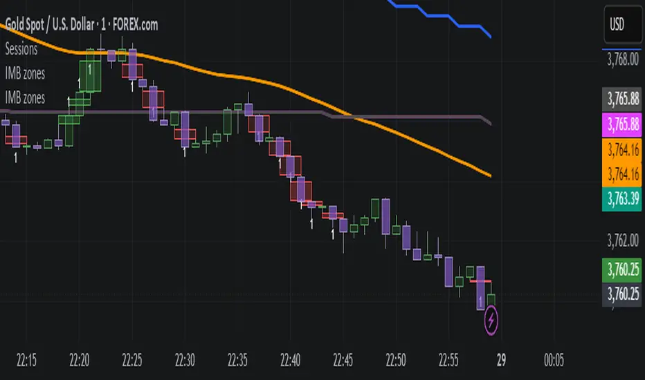
IMB zones, alerts, 8 EMAs, DO lvlThis indicator was created to be a combined indicator for those who use DO levels, IMBs, and EMAs in their daily trading, helping them by providing a script that allows them to customize these indicators to their liking.
Here you can set the IMBs, DO levels, and EMAs. Its special feature is that it uses alerts to indicate which IMB zones have been created, along with the invalidation line for the new potential IMB.
The program always calculates the Daily Opening (DO) level from the opening of the broker, and you can set how many hours the line should be drawn.
Help for use:
There are 3 types of alerts:
- Use the "Bullish IMB formed" alert if you are looking for Bull IMBs.
- Use the "Bearish IMB formed" alert if you are looking for Bear IMBs.
- Use the "Either IMB" alert if you are looking for Bull and Bear IMBs.
Tip: Set the alert type "Once per bar close" if you do not want to set new alerts after an IMB is formed.
IMBs:
- Customizable IMB quantity (1-500 pcs)
- Zone colors and borders can be customized
- Potential IMB line can be customized
EMAs:
- You can set and customize 8 EMA lengths
- Only the current and higher timeframe EMAs are displayed
Daily Open Level:
- Displays today's Daily Open level
- Note: The DO level does not work in Replay mode
Last OFR:
"Show True OFR" checkbox added.
It displays the latest OFR, and hides the old ones.
ICT Silver Bullet Zones (All Sessions, Custom Labels)CT Silver Bullet Zones
This indicator is designed for traders who follow the ICT *Silver Bullet* concept.
It automatically marks the **Silver Bullet window** (10:00–11:00 by default) across the **London, New York AM, New York PM, and Asia sessions**, with customizable settings for each session.
### Features:
* Separate adjustable time windows for **London, NY AM, NY PM, and Asia Silver Bullet sessions**.
* Colored session boxes with individual **opacity controls**.
* **Session labels placed at the top** of each zone, with customizable text size, color, and background opacity.
* Works on all timeframes and highlights only the Silver Bullet trading windows.
This tool is meant to help traders quickly identify ICT Silver Bullet opportunities in all major sessions without manual plotting.

Fibonacci Zone + EMA RibbonThis script combines two well-known concepts into a single indicator: the Fibonacci Zone and the EMA Ribbon.
The Fibonacci Zone highlights potential support and resistance levels derived from recent price ranges, helping traders identify key breakout or reversal areas.
The EMA Ribbon overlays multiple exponential moving averages, providing a clear visual representation of market trend and momentum.
Together, these two tools allow traders to assess both dynamic support/resistance and trend direction at a glance, making it easier to spot confluence zones and high-probability trading opportunities.
This indicator can be effectively applied on shorter timeframes such as 5m, 15m, or 30m for active trading.
For additional confirmation of medium- to long-term trend direction, it is recommended to complement it with the 20-period SMA from the 4H timeframe.

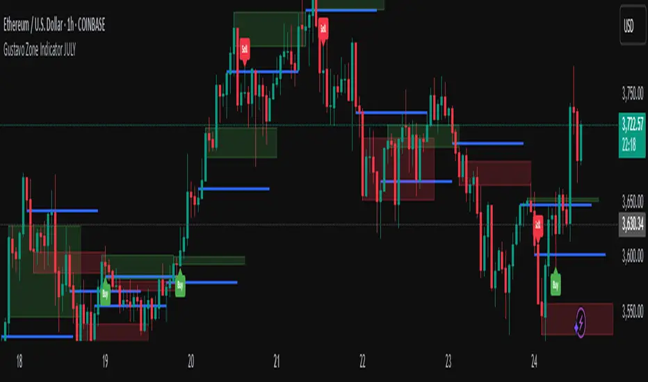
Gustavo Zone Indicator JULYThis indicator watches for runs of at least three consecutive green (or red) candles followed by an opposite-color candle, then marks that reversal zone by drawing a rectangle from the wicks of the first two run candles. It optionally plots a horizontal “target” line at the wick of the third run candle. While the zone is active, if three bars in a row close beyond both the zone boundary and the target line, it issues a customizable “Sell” label above the bar (after bullish runs) or a “Buy” label below the bar (after bearish runs). All colors, text labels, sizes, offsets, and toggles for the zones, lines, and signals can be adjusted in the input settings.
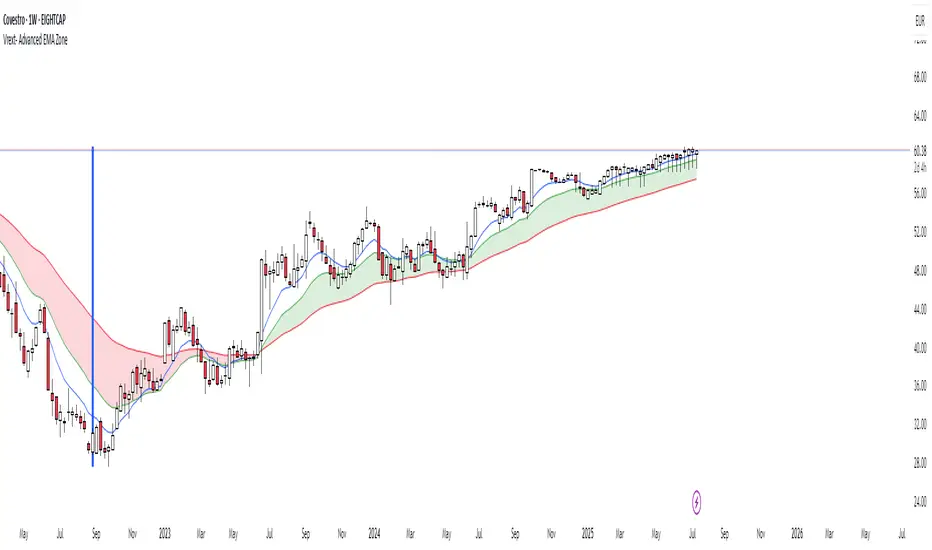
Vrext- Advanced EMA ZoneThe indicator highlights an area between two manually adjustable EMA-s to visibly mark a zone. A zone where the larger EMA is bellow the smaller one (indicating an uptrend) is marked green. On the opposite hand where higher EMA is above the lower the zone (indicating a downtrend) is marked red.
For correct zone marking enter EMA-s in descending order.
The indicator also allows you to add further additional EMA-s, which do not have a zone drawn between them and are just stand alone EMA-s. They are fully customisable in terms of colour, width. etc.
Additionally the indicator allows you to plot a vertical line ''xyz'' candles in the past. The idea behind it is that if you want to only focus on the previous 150 candles, there will be a clear line at the 150th candle for easier navigating.
LTHB & HTLB Zones with AlertsIn price action trading, the Lowest Tick of the Highest Bar (LTHB) and the Highest Tick of the Lowest Bar (HTLB) are important concepts for support/resistance identification, trend exhaustion, and reversal confirmation. Here's what they mean and why they matter:
🔹 Definitions
1. Lowest Tick of the Highest Bar (LTHB):
The lowest price (tick) of the bar (candlestick) with the highest high in a recent price swing.
Significance: It marks the support inside an upward swing. If price breaks below this, it often indicates loss of upward momentum or reversal.
2. Highest Tick of the Lowest Bar (HTLB):
The highest price of the bar with the lowest low in a swing.
Significance: It acts as a resistance inside a downward swing. If price moves above this, it can signal a bullish reversal.
🔸 Why Are They Significant?
Concept LTHB HTLB
Trend Reversal - Break below LTHB → possible bearish reversal Break above HTLB → possible bullish reversal
Swing Confirmation -Holding above LTHB → continuation of uptrend Holding below HTLB → continuation of downtrend
Trap Detection - Stop hunts often occur just below LTHB Stop hunts often occur just above HTLB
Risk Management -Acts as logical stop-loss in long trades Acts as logical stop-loss in short trades
🔸 Uses in Strategy
1. Breakout Traders use these levels as entry triggers.
2. Reversal Traders look for price failing to hold these levels for early reversal signs.
3. Structure-Based Traders use them to confirm higher highs/lower lows.
4. Stop Placement: Tight stops just beyond LTHB/HTLB help manage risk in swing trades.
🔔 How to Set Alerts in TradingView:
Add the script to your chart.
Open the "⚠️ Alerts" tab.
Click "Create Alert".
In the "Condition" dropdown, select one of:
Enter LTHB Zone
Exit LTHB Zone
Enter HTLB Zone
Exit HTLB Zone
Set desired alert frequency (e.g., once per bar or once).
Click Create.

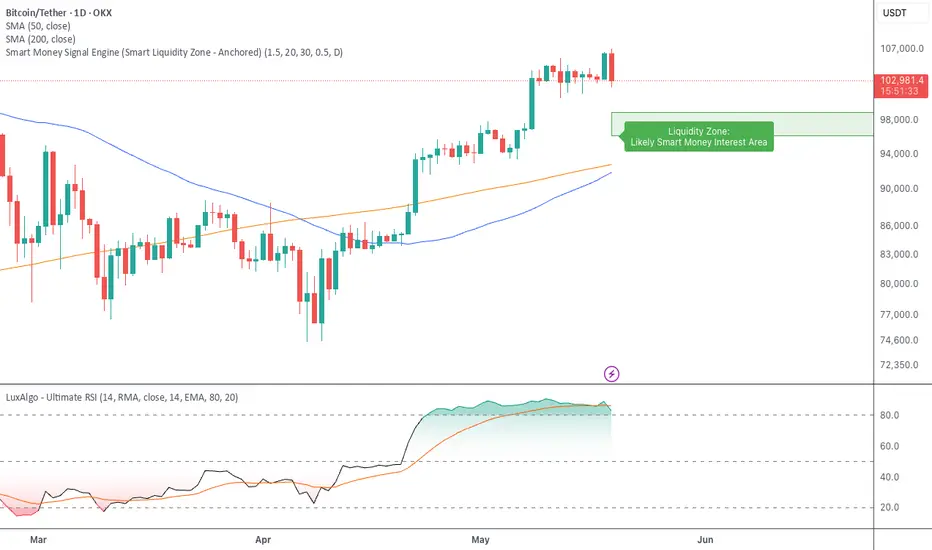
Smart Money Signal Engine (Smart Liquidity Zone - Anchored)🧭 Smart Liquidity Zone Indicator – Simple Guide
✅ What This Does
This tool helps you spot:
1. Smart Money Buy Zones (green box)
2. Fake Breakouts (trap alerts)
3. Real Breakouts (momentum alerts)
⸻
1. 🟩 Liquidity Zone (Green Box)
What it means:
Where big players (smart money) are likely interested in buying.
What you do:
• If price enters the box and holds → consider buying
• If price drops through fast → wait or look for short setups
⸻
2. 🔴 Trap Alert (Smart Money Trap)
What it means:
Price goes up fast with volume…
But no real buying power underneath = likely fakeout
On chart:
You’ll see a red label that says “Trap”
What you do:
• ❌ Don’t chase the pump
• ✅ Wait for reversal or short entry
⸻
3. 🟢 Breakout Alert
What it means:
Price breaks above a key level with strong volume
Smart money is likely behind the move
On chart:
You’ll see a green label that says “Breakout”
What you do:
• ✅ You can enter a momentum trade
• ✅ Place stop below previous structure
⸻
🔔 How to Turn on Alerts
Go to:
• TradingView > Alerts > Condition
• Choose:
• Smart Money Trap Alert
• Breakout Confirmed Alert
This way, TradingView notifies you instantly when:
• A fakeout is happening
• A real breakout begins