Shift 3M - 30Y Yield Spread🟧 Shift 3M - 30Y Yield Spread
- This indicator visually displays the **inverse of the US Treasury short-long yield spread** (3-month minus 30-year spread reversal signal) in a "price chart-like" form.
- By default, the spread line is shifted by 1 year to help anticipate forward market moves (you can adjust this offset freely).
- Especially customized to be analyzed together with the movements of US indices like the S&P 500, and to help understand broader market cycles.
✅ Description
- Normalizes the spread based on a rolling window length you set (default: 500 bars).
- Both the normalization window and offset (shift) are fully customizable.
- Then, it scales the spread to match your chart’s price range, allowing you to intuitively compare spread movements alongside price action.
- Instantly see the **inverse (reversal) signals of the short-long yield spread**, curve steepening, and how they align with actual price trends.
⚡ By reading macro yield signals, you can **anticipate exactly when a market crash might come or when an explosive rally is about to start**.
⚡ A perfect tool for macro traders and yield curve analysts who want to quickly catch major market turning points!
copyright @invest_hedgeway
============================================================
🟧3개월 - 30년 물 장단기 금리차 역수
- 이 인디케이터는 미국 국채 **장단기 금리차 역수**(3개월물 - 30년물 스프레드의 반전 시그널)를 시각적으로 "가격 차트"처럼 표시해 줍니다.
- 기본적으로 스프레드 선은 **1년(365봉) 시프트**되어 있어, 시장을 선행적으로 파악할 수 있도록 설계되었습니다 (값은 자유롭게 조정 가능).
- 특히 S&P500 등 미국 지수 흐름과 함께 분석할 수 있도록 맞춤화되었으며, 시장 사이클을 이해하는 데에도 큰 도움이 됩니다.
✅ 설명
- 지정한 롤링 윈도우 길이(기본: 500봉)를 기준으로 스프레드를 정규화합니다.
- 정규화 길이와 오프셋(시프트) 모두 자유롭게 설정 가능
- 이후 현재 차트의 가격 레인지에 맞게 스케일링해, 가격과 함께 흐름을 직관적으로 비교할 수 있습니다.
- **장단기 금리차의 역전(역수) 시그널**, 커브 스티프닝 등과 실제 가격 움직임의 관계를 한눈에 확인
⚡ 거시 금리 신호를 통해 **언제 폭락이 올지, 언제 폭등이 터질지** 미리 감지할 수 있습니다.
⚡ 시장의 전환점을 빠르게 캐치하고 싶은 매크로 트레이더와 금리 분석가에게 완벽한 도구!
copyright @invest_hedgeway
Treasuryyield

USTS Yield Curve InversionsVisualization of the inverted portions of the USTS yield curve.
Red means that portion of the curve is inverted.
If 1M is red, it means it's less than RRP%.
Multi Yield CurveAn inversion between the 2 year and 10 year US treasury yield generally means a recession within 2 years. But the yield curve has more to it than that. This script helps analysis of the current and past yield curve (not limited to US treasury) and is very configurable.
"A yield curve is a line that plots yields (interest rates) of bonds having equal credit quality but differing maturity dates. The slope of the yield curve gives an idea of future interest rate changes and economic activity." (Investopedia)
When the slope is upward (longer maturity bonds have a higher interest rate than shorter maturity bonds), it generally means the economy is doing well and is expanding. When the slope is downward it generally means that there is more downside risk in the future.
The more inverted the curve is, and the more the inversion moves to the front, the more market participants are hedging against downside risk in the future.
The script draws up to 4 moments of a yield curve, which makes it easy to compare the current yield curve with past yield curves. It also draws lines in red when that part of the curve is inverted.
The script draws the lines with proper length between maturity (which most scripts do not) in order to make it more representative of the real maturity duration. The width cannot be scaled because TradingView does not allow drawing based on pixels.
This script is the only free script at time of writing with proper lengths, showing multiple yield curves, and being able to show yield curves other than the US treasury.
█ CONFIGURATION
(The following can be configured by clicking "Settings" when the script is added to a chart)
By default the script is configured to show the US treasury (government bond) yields of all maturities, but it can be configured for any yield curve.
A ticker represents yield data for a specific maturity of a bond.
To configure different tickers, go to the "TICKERS" section. Tickers in this section must be ordered from low maturity to high maturity.
• Enable: draw the ticker on the chart.
• Ticker: ticker symbol on TradingView to fetch data for.
• Months: amount of months of bond maturity the ticker represents.
To configure general settings, go to the "GENERAL" section.
• Period: used for calculating how far back to look for data for past yield curve lines. See "Times back" further in this description for more info.
• Min spacing: minimum amount of spacing between labels. Depending on the size of the screen, value labels can overlap. This setting sets how much empty space there must be between labels.
• Value format: how the value at that part of the line should be written on the label. For example, 0.000 means the value will have 3 digits precision.
To configure line settings per yield curve, each has its own "LINE" section with the line number after it.
• Enable: whether to enable drawing of this line.
• Times back: how many times period to go back in time. When period is D, and times value is 2, the line will be of data from 2 days ago.
• Color: color of the line when not inverted.
• Style: style of the line. Possible values: sol, dsh, dot
• Inversion color: color of the line when the curve inverses between the two maturities at that part of the curve.
• Thickness: thickness of the line in pixels.
• Labels: whether to draw value labels above the line. By default, this is only enabled for the first line.
• Label text color: text color of value label.
• Label background color: background color of value label.
To configure the durations axis at the bottom of the chart, go to the "DURATIONS" section.
• Durations: whether to show maturity term duration labels below the chart.
• Offset: amount to offset durations label to be below chart.
█ MISC
Script originally inspired by the US Treasury Yield Curve script by @longfiat but has been completely rewritten and changed.

S&P 500 Earnings Yield SpreadThis indicator compares the attractiveness of equities relative to the risk-free rate of return, by comparing the earnings yields of S&P 500 companies to the 10Y treasury yields. "Earnings yield" refers to the net income attributable to shareholders divided by the stock's price - effectively the inverse of the PE ratio. The tangible meaning of this metric is "the annual income received by (attributable to) shareholders as a percent of the price paid to receive said income." Therefore, earnings yield is comparable to bond yields, which are "the annual income received by bond holders as a percent of the price paid to receive said income."
This indicator subtracts the earnings yield of S&P 500 companies from the current 10-year treasury bond yield, creating a "spread" between the yields that determines whether equities are currently an attractive investment relative to bonds. That is, if the S&P 500 earnings yield exceeds the 10Y treasury yield, then equity investors are receiving more attributable income per dollar paid than bondholders, which could be an indication that equities are an attractive purchase relative to the risk-free rate. The same applies vice-versa; if the 10Y treasury yield exceeds that of the S&P 500 earnings yield, then equities may not be an attractive investment relative to the risk-free rate.
Since data on S&P 500 companies' earnings yields are pulled on a monthly basis, this indicator should be used on a monthly timeframe or longer. Historical data has shown that the critical zones for the indicator are at -4% and +3%, i.e. when equities are trading with a 4% greater yield than 10Y T-bonds and when equities are trading with a 3% lower yield than 10Y T-bonds, respectively. In the "Oversold" case (-4%), equities are trading at a steep discount to the risk-free rate and has often represented a strong buying opportunity. In the "Overbought" case (+3%), equities are trading at a premium to the risk-free rate, which may be an indication that caution should be exercised within the stock market. When the indicator first crosses into "Oversold" territory, this has historically been near a the bottom of a crash on the S&P 500. When the indicator first crosses into the "Overbought" territory, this has often precipitated a correction of 15% on the S&P 500.
Some notable "misses," crashes that this indicator missed, include the 1973 stock market crash and the 2008 global recession. However, both of these cases were largely precipitated by unprecedented economic events, as opposed to stocks simply being "Overbought" relative to treasury yields. Nonetheless, this indicator should form only a small portion of your fundamental analysis, as there are many macroeconomic factors that could lead to major corrections besides the impact of treasury yields. Furthermore, it should also be noted that since markets are "forward looking," future earnings growth or interest rate hikes may become "priced into" both the stock and bond markets, affecting the outputs of this indicator. However, since both the stock and bond markets should account for these factors simultaneously, the impact has historically been minimized.
I hope you find this indicator to be beneficial to your strategies. Stay safe, and happy trading.

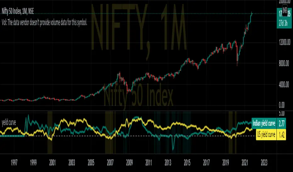
Nifty yield curveREAL-CASE SCENARIO:-
IN10Y(10yr yield t- bill) are govt. backed bonds provide basic interest or coupon rate. If the coupon rate falls below (yield =(1/price) the coupon rates of 3 month bond IN03MY(3m yield t- bill), investors are pessimistic about future growth of the economy.
This pessimistic behavior can be seen in the graph when change in background color.
While optimistic behavior scenario when investors no longer interested in long-term bonds and dumping 10Y T-bills causing yields to raise above short term 3m T-bill .
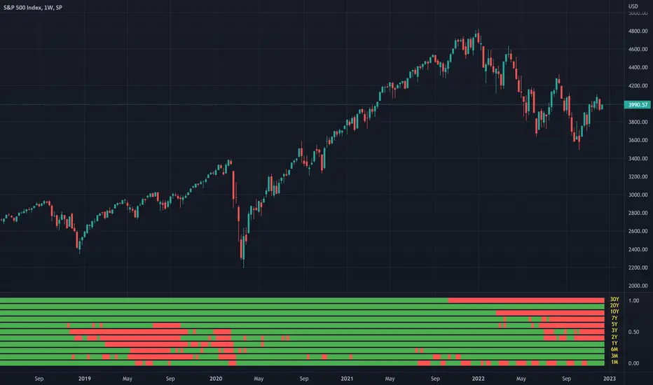
Yield CurveThis script tracks the U.S. 2Yr/10Yr Spread and uses inversions of the curve to predict recessions. Whenever a red arrow appear on the yield curve, expect a recession to begin within the next 2 years. Use this signal to either exit the market, or hedge current positions. Whenever a green arrow appears on the yield curve, expect a recession to have nearly ended. Use this signal to enter the market, or cut current hedges against a recession. (I may update this script in the future to better incorporate the effective federal funds rate into exit points, but for now I am satisfied with the results).

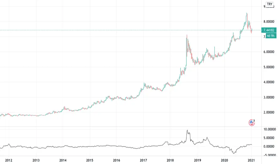
Turkey Yield Curve SpreadYield spreads are used to see investors' perception of future risk and predict a recession. The spread is the value obtained by subtracting the near term bond from the distant one. This indicator plots this value historically. I used 3-year and 10-year Turkey treasury bond yields instead of 2-year and 10-year Turkey treasury bond yields due to lack of historical data on Tradingview.