Liquidity Levels - PMH/PWH/PDH/HODWhat is it?
An indicator that tracks the main liquidity levels on TradingView, displaying the highs and lows of reference for month, week, previous day and current day.
What's it for?
It identifies price zones where there are many pending orders (liquidity). Traders use it to:
Find support and resistance points
Identify areas where price could bounce or break through
Receive alerts when price touches or breaks these levels
Which levels does it show?
LevelDescriptionColorLinePMH/PMLPrevious month's high and lowPurpleSolidPWH/PWLPrevious week's high and lowBlueSolidPDH/PDLPrevious day's high and lowOrangeSolidHOD/LODCurrent day's high and lowGrayDotted
How to use it?
Apply the indicator to your chart
Customize colors and enable/disable the levels you prefer
Set alerts to receive notifications when price touches or breaks levels
Use the levels to make trading decisions (entry, exit, stop loss)
Perfect for: Scalping, Day Trading, Swing Trading on any asset (forex, crypto, stocks)
Volume

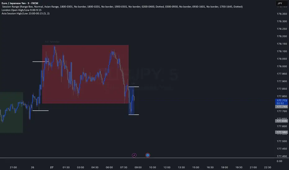
Asia Session High/Low 23:00-00:15This indicator shows highs and lows 1 hour before Asia session and the first 15min of Asia session.
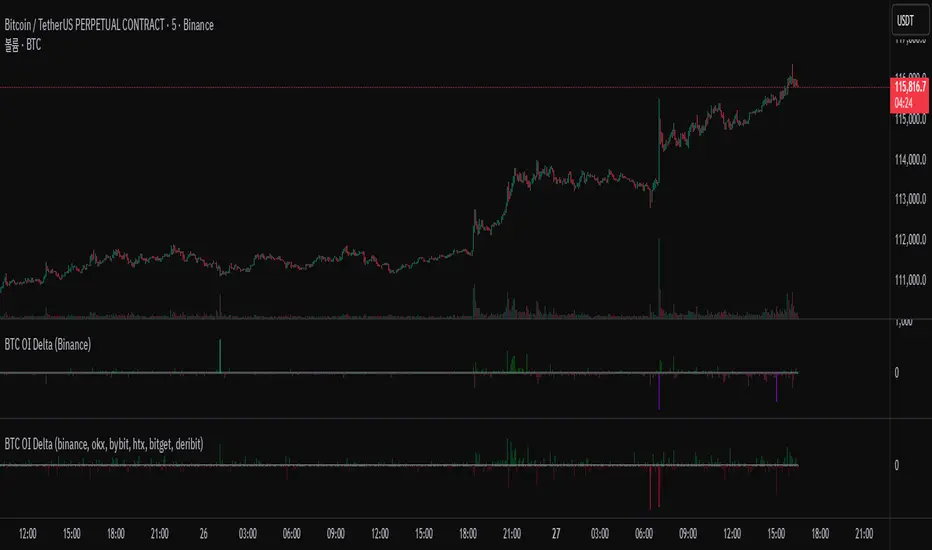
BTC OI Delta (binance, okx, bybit, htx, bitget, deribit)📊 BTC Open Interest (OI) Delta (Binance, OKX, Bybit, HTX, Bitget, Deribit)
📝 Overview
This Pine Script indicator tracks and visualizes the changes (delta) in Bitcoin (BTC) open interest (OI) for perpetual futures across multiple major crypto exchanges: Binance, OKX, Bybit, Bitget, HTX, and Deribit. It calculates the total net delta by summing the OI delta from each exchange and displays positive (OI increase) and negative (OI decrease) deltas as separate column charts. Users can choose which exchanges to include or exclude and utilize the spike highlight feature to differentiate delta intensity with color based on user-defined thresholds.
⚡ Key Features
🌐 Multi-exchange OI delta tracking
Fetches and calculates BTC perpetual futures OI delta individually from Binance, OKX, Bybit, Bitget, HTX, and Deribit.
📈 Total net delta calculation
Sums the OI delta from all selected exchanges to represent overall market open interest changes.
🎨 Visualization
Column plots: Displays net OI increases (positive delta) and decreases (negative delta) as separate column charts for intuitive trend analysis.
Spike highlights: Changes in OI delta are color-coded according to user-defined thresholds to make significant moves easily identifiable.
⚙️ User settings
Users can select which exchanges to display, enable/disable spike highlights, and set thresholds for “strong” and “very strong” OI delta changes.
🛠 Input Settings
Show Zero Line (bool, default: true): Show a zero baseline on the chart.
Highlight Spikes (bool, default: true): Enable color highlighting based on OI delta intensity.
Strong Threshold (int, default: 1000): Delta value considered a “strong” change (in BTC).
Very Strong Threshold (int, default: 2000): Delta value considered a “very strong” change (in BTC).
Show Binance (bool, default: true): Include Binance OI delta.
Show OKX (bool, default: true): Include OKX OI delta.
Show Bybit (bool, default: true): Include Bybit OI delta.
Show Bitget (bool, default: true): Include Bitget OI delta.
Show HTX (bool, default: true): Include HTX OI delta.
Show Deribit (bool, default: true): Include Deribit OI delta.
🔢 Calculation Method
🧮 Individual OI request
Uses request.security() to fetch OI data from each exchange.
➕ Delta calculation
Current bar OI minus previous bar OI (oi - oi ).
❌ Handling na values
If OI data is missing (exchange disabled or no data), the delta is treated as 0 to avoid sum errors.
🔗 Total net delta
Sums all selected exchange deltas as totalCombinedDelta.
↔️ Separate net increase/decrease
Positive (netIncreaseCombined) and negative (netDecreaseCombined) parts of total delta are split.
🎨 Color determination
getNetDeltaHighlightedColor function dynamically sets column colors based on highlightSpike and threshold settings.
🎨 Color Scheme
Highlight disabled:
Positive delta: teal shades
Negative delta: red shades
Highlight enabled:
Positive delta (normal): dark teal (#026628)
Positive delta (strong): bright teal (#00ff95)
Positive delta (very strong): yellow (#eeff00)
Negative delta (normal): dark red (#6b0d0d)
Negative delta (strong): bright red (#ff1044)
Negative delta (very strong): pink (#ff00ea)
📊 Usage
💹 Market sentiment analysis
Total net OI delta increase → capital inflow and position building
Total net OI delta decrease → capital outflow and position liquidation
⚖️ Position interpretation
BTC rising + positive OI delta → increasing long positions
BTC falling + negative OI delta → decreasing long positions
BTC falling + positive OI delta → increasing short positions
BTC rising + negative OI delta → decreasing short positions
📈 Trend confirmation
Sustained positive delta → bullish signal
Sustained negative delta → bearish signal
🌪 Volatility prediction
“Strong” or “very strong” spikes may indicate increased price volatility.
🏦 Exchange-specific impact
Enable/disable exchanges to analyze how each exchange’s OI changes affect the overall market.
VolumeAnlaysis### Volume Analysis (VA) Indicator
**Overview**
The Volume Analysis (VA) indicator is a dynamic overlay tool designed for traders seeking to identify high-volume breakouts, retests, and multi-timeframe volume-driven price cycles. By combining volume spikes with price action and support/resistance boxes, it highlights potential trend continuations, reversals, and cycle shifts. Ideal for intraday and swing trading on stocks, forex, or crypto, it uses a Fibonacci-inspired 1.618 multiplier to detect significant volume surges, then maps them to visual boxes and key levels for actionable insights.
This indicator draws from volume profile concepts but focuses on **breakout confirmation** and **cycle momentum**, helping you spot when "smart money" volume aligns with price extremes. It's particularly useful in volatile markets where volume precedes price moves.
**How It Works**
1. **Volume Break Detection**:
- Identifies a "Volume Break" when the current bar's volume exceeds 1.618x the highest volume from the prior 5 bars. This signals unusual activity, often preceding breakouts.
- A "Volume Retest" triggers exactly 3 bars after a break if volume has been falling steadily over those 3 bars—indicating a pullback for re-accumulation/distribution.
2. **Visual Annotations**:
- **Labels**: Green/red/yellow labels mark Volume Breaks and Retests, positioned above/below the bar based on candle direction for clarity.
- **Demand/Supply Boxes**:
- Blue semi-transparent boxes form around Retest bars, extending rightward to act as dynamic support/resistance.
- Green (bullish) or red (bearish) boxes draw from Volume Breaks, based on the original candle's open/close, highlighting potential zones for continuation.
- Limited to 5 boxes max to avoid chart clutter; older boxes fade as new ones form.
3. **Box Interaction Signals**:
- When price enters a box:
- **Reversal Hints**: Maroon (bearish rejection) or lime (bullish rejection) labels on closes against the trend with opening price momentum.
- **Breakout Arrows**: Up/down arrows on crossovers/crossunders of box tops/bottoms from Retest boxes.
- Scans all active boxes for interactions, prioritizing recent volume events.
4. **Multi-Timeframe Volume Cycles**:
- Aggregates the "Volume Break Max" level (a proxy for key price extremes tied to volume spikes) across timeframes: 1min, 5min, 10min, 30min, and 65min (using `request.security`).
- Computes **MaxVolBreak** (highest extreme) and **MinVolBreak** (lowest extreme) for trend-following levels.
- Tracks **Percent Volume Greater/Less Than Close**: Sums volumes from TFs where price is below/above these levels, creating a momentum ratio.
- **CrossClose**: Plots the prior close where this ratio crosses (gray line), signaling cycle shifts—bullish below MinVolBreak, bearish above MaxVolBreak.
- **Fills**: Red fill above CrossClose/MaxVolBreak (bearish cycle); green below CrossClose/MinVolBreak (bullish cycle).
5. **Plots**:
- Black lines for MaxVolBreak (⏫) and MinVolBreak (⏬).
- Gray 🔄 for CrossClose.
- Colors dynamically adjust (green/red) based on close relative to levels.
**Key Features**
- **Trend vs. Reversal Modes**: Toggle alerts for trend-following breaks (crosses of Max/MinVolBreak) or reversal signals (crosses of CrossClose).
- **Multi-TF Fusion**: Optionally include the chart's native timeframe in Max/Min calculations for finer tuning.
- **Box Management**: Auto-prunes to 5 boxes; focuses on retest/break alignments for "inside bar" logic.
- **Momentum Filters**: Uses rising/falling opens and crossovers for label precision, reducing noise.
- **Customizable**: Simple inputs for alert visibility and timeframe inclusion.
**Settings**
| Input | Default | Description |
|-------|---------|-------------|
| Show Volume Reversal Breaks | False | Enables alerts/labels for CrossClose crosses (cycle reversals). |
| Show Trend Following Breaks | True | Enables alerts for Max/MinVolBreak crosses (trend signals). |
| Use Current Time | False | Includes chart's native TF in multi-TF Max/Min calculations. |
**Alerts**
- **Reversal Alerts** (if enabled): "Volume Reverse Bullish/Bearish Break of " on close crosses of CrossClose.
- **Trend Alerts** (if enabled): "Trend Volume Bullish/Bearish Signal" on close crosses of Max/MinVolBreak; plus notes if prior low/high aligns with levels.
- All alerts include ticker and level value for easy scanning. Use `alert.freq_once_per_bar` to avoid spam.
**Trading Ideas**
- **Bullish Entry**: Green box formation + price holding MinVolBreak + upward arrow on retest box. Target next resistance.
- **Bearish Entry**: Red box + close above MaxVolBreak + red fill activation. Stop below recent low.
- **Cycle Trading**: Watch CrossClose crosses for regime shifts—fade extremes in overextended cycles.
- **Best Timeframes**: 5-30min for intraday; combine with daily for swings. Works best on liquid assets with reliable volume data.
**Limitations & Notes**
- Relies on accurate volume data (e.g., stocks/forex); less effective on low-volume or synthetic instruments.
- Boxes extend rightward but don't auto-delete—monitor for clutter on long histories (max_bars_back=500).
- Some logic (e.g., exact 3-bar retest) is rigid; backtest for your market.
- Open-source under MPL 2.0—fork and tweak as needed!
For questions or enhancements, drop a comment below. Happy trading! 🚀

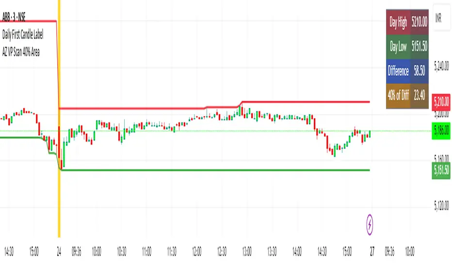
AZ VP Scan 40% AreaThis indicator is developed by Ankur Zaveri, Gujarat, India. This indicator marks the Day's High and Day's Low for the underlying and calculates the difference between the two extrme values of the day in a separate table on the chart. It also shows 40% value of the difference between the Day's High and Day's Low to help scan the underlyings for taking trades based on Volume Profile.
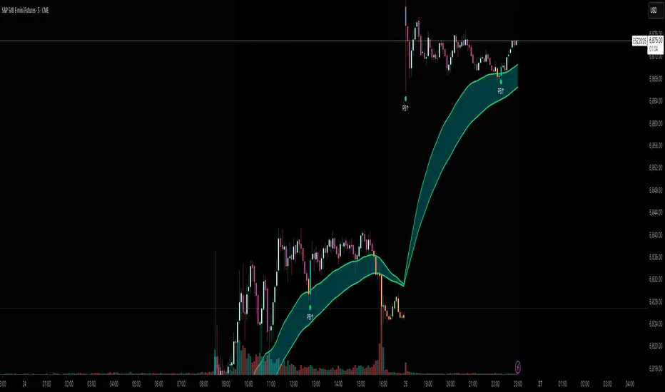
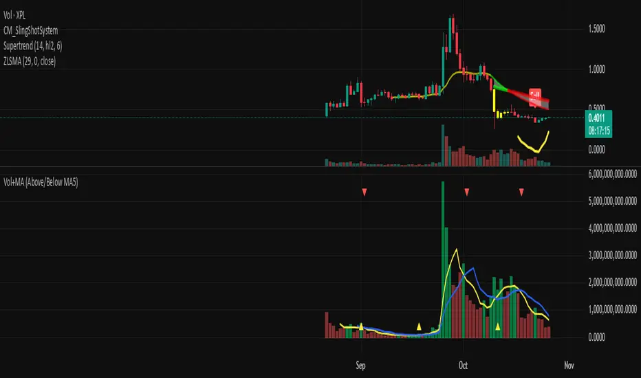
Flux AI PullBack System (Hybrid Pro)Flux AI PullBack System (Hybrid Pro)
//Session-Aware | Adaptive Confluence | Grace Confirm Logic//
Overview:
The Flux AI PullBack System (Hybrid Pro v5) is an adaptive, session-aware pullback indicator designed to identify high-probability continuation setups within trending markets. It automatically adjusts between “Classic” and “Enhanced” logic modes based on volatility, volume, and ATR slope, allowing it to perform seamlessly across different market sessions (Asian, London, and New York).
Core Features:
Hybrid Auto Mode — Dynamically switches between Classic (fast-moving) and Enhanced (strict) modes.
Session-Aware Context — Optimized for intraday trading in ES, NQ, and SPY.
Grace Confirmation Logic — Validates pullbacks with a follow-through condition to reduce noise.
Adaptive EMA Zone (38/62) — Highlights pullback areas with dynamic aqua fill and transparency linked to trend strength.
Noise Suppression Filter — Prevents false pullbacks during EMA crossovers or unstable transitions.
Weighted Confluence Model — Combines trend, ATR, volume, and swing structure for confirmation strength.
Pine v6 Compliant Alerts — Constant-string safe, ready for webhooks and automation.
Visual Elements:
Aqua EMA Zone: Displays the “breathing” pullback band (tightens during volatility spikes).
PB↑ / PB↓ Markers: Confirmed pullbacks with subtle transparency and fixed label size.
Bar Highlights: Yellow for pullbacks; ice-blue for confirmed continuation.
Use Cases
Perfect for:
Intraday trend traders
0DTE SPX / ES scalpers
Futures traders (NQ, MNQ, MES)
Algorithmic strategy builders using webhooks
Recommended Timeframes:
1–15 minute charts (scalping / intraday)
Higher timeframes for swing confirmations.
Attribution:
This open-source script was inspired by Chris Moody’s “CM Slingshot System” and JustUncleL’s Pullback Tools, but it was built from scratch using AI-assisted code refinement (ChatGPT).
All logic and enhancements are original, not derived from proprietary software.
License: MIT (Open Source)
© 2025 Ken Anderson — You may modify, use, or redistribute with credit.
Keywords:
Pullback, Reversal, AI Trading, EMA Zone, Session Aware, Futures Trading, SPX, ES, NQ, ATR Filter, Volume Confirmation, Flux System, Pine Script v6, Non-Repainting, Adaptive Trading Indicator.

Momentum Breakout Filter + ATR ZonesMomentum Breakout Filter + ATR Zones - User Guide
What This Indicator Does
This indicator helps you with your MACD + volume momentum strategy by:
Filtering out fake breakouts - Shows ⚠️ warnings when breakouts lack confirmation
Showing clear entry signals - 🚀 LONG and 🔻 SHORT labels when all conditions align
Automatic stop loss & profit targets - Based on ATR (Average True Range)
Visual trend confirmation - Background color + EMA alignment
Signal Types
🚀 LONG Entry Signal (Green Label)
Appears when ALL conditions met:
✅ MACD crosses above signal line
✅ Volume > 1.5× average
✅ Price > EMA 9 > EMA 21 > EMA 200 (bullish trend)
✅ Price closes above recent 20-bar high
🔻 SHORT Entry Signal (Red Label)
Appears when ALL conditions met:
✅ MACD crosses below signal line
✅ Volume > 1.5× average
✅ Price < EMA 9 < EMA 21 < EMA 200 (bearish trend)
✅ Price closes below recent 20-bar low
⚠️ FAKE Breakout Warning (Orange Label)
Appears when price breaks high/low BUT lacks confirmation:
❌ Low volume (below 1.5× average), OR
❌ Wick break only (didn't close through level), OR
❌ MACD not aligned with direction
Hover over the warning label to see what's missing!
ATR Stop Loss & Targets
When you get a signal, colored lines automatically appear:
Long Position
Red solid line = Stop Loss (Entry - 1.5×ATR)
Green dashed lines = Profit Targets:
Target 1: Entry + 2×ATR
Target 2: Entry + 3×ATR
Target 3: Entry + 4×ATR
Short Position
Red solid line = Stop Loss (Entry + 1.5×ATR)
Green dashed lines = Profit Targets:
Target 1: Entry - 2×ATR
Target 2: Entry - 3×ATR
Target 3: Entry - 4×ATR
The lines move with each bar until you exit the position.
Chart Elements
Moving Averages
Blue line = EMA 9 (fast)
Orange line = EMA 21 (medium)
White line = EMA 200 (trend filter)
Volume
Yellow bars = High volume (above threshold)
Gray bars = Normal volume
Background Color
Light green = Bullish trend (all EMAs aligned up)
Light red = Bearish trend (all EMAs aligned down)
No color = Neutral/mixed
MACD (Bottom Pane)
Green/Red columns = MACD Histogram
Blue line = MACD Line
Orange line = Signal Line
Info Dashboard (Bottom Right)
ItemWhat It ShowsVolumeCurrent volume vs average (✓ HIGH or ✗ Low)MACDDirection (BULLISH or BEARISH)TrendEMA alignment (BULL, BEAR, or NEUTRAL)ATRCurrent ATR value in dollarsPositionCurrent position (LONG, SHORT, or NONE)R:RRisk-to-Reward ratio (shows when in position)
How To Use It
Basic Workflow
Wait for setup
Watch for MACD to approach signal line
Volume should be building
Price should be near EMA structure
Get confirmation
Wait for 🚀 LONG or 🔻 SHORT label
Check dashboard shows "✓ HIGH" volume
Verify trend is aligned (green or red background)
Enter the trade
Enter when signal appears
Note your stop loss (red line)
Note your targets (green dashed lines)
Manage the trade
Exit at first target for partial profit
Move stop to breakeven
Trail remaining position
What To Avoid
❌ Don't trade when you see:
⚠️ FAKE labels (wait for confirmation)
Neutral background (no clear trend)
"✗ Low" volume in dashboard
MACD and Trend not aligned
Settings You Can Adjust
Volume Sensitivity
High Volume Threshold: Default 1.5×
Increase to 2.0× for cleaner signals (fewer trades)
Decrease to 1.2× for more signals (more trades)
Fake Breakout Filters
You can toggle these ON/OFF:
Volume Confirmation: Requires high volume
Close Through: Requires candle close, not just wick
MACD Alignment: Requires MACD direction match
Tip: Turn all three ON for highest quality signals
ATR Stop/Target Multipliers
Default settings (conservative):
Stop Loss: 1.5×ATR
Target 1: 2×ATR (1.33:1 R:R)
Target 2: 3×ATR (2:1 R:R)
Target 3: 4×ATR (2.67:1 R:R)
Aggressive traders might use:
Stop Loss: 1.0×ATR
Target 1: 2×ATR (2:1 R:R)
Target 2: 4×ATR (4:1 R:R)
Conservative traders might use:
Stop Loss: 2.0×ATR
Target 1: 3×ATR (1.5:1 R:R)
Target 2: 5×ATR (2.5:1 R:R)
Example Trade Scenarios
Scenario 1: Perfect Long Setup ✅
Stock consolidating near EMA 21
MACD curling up toward signal line
Volume bar turns yellow (high volume)
🚀 LONG label appears
Red stop line and green target lines appear
Result: High probability trade
Scenario 2: Fake Breakout Avoided ✅
Price breaks above resistance
Volume is normal (gray bar)
⚠️ FAKE label appears (hover shows "Low volume")
No entry signal
Price falls back below breakout level
Result: Avoided losing trade
Scenario 3: Premature Entry ❌
MACD crosses up
Volume is high
BUT trend is NEUTRAL (no background color)
No signal appears (trend filter blocks it)
Result: Avoided choppy/sideways market
Quick Reference
Entry Checklist
🚀 or 🔻 label on chart
Dashboard shows "✓ HIGH" volume
Dashboard shows aligned MACD + Trend
Colored background (green or red)
ATR lines visible
No ⚠️ FAKE warning
Exit Strategy
Target 1 (2×ATR): Take 50% profit, move stop to breakeven
Target 2 (3×ATR): Take 25% profit, trail stop
Target 3 (4×ATR): Take remaining profit or trail aggressively
Stop Loss: Exit entire position if hit
Alerts
Set up these alerts:
Long Entry: Fires when 🚀 LONG signal appears
Short Entry: Fires when 🔻 SHORT signal appears
Fake Breakout Warning: Fires when ⚠️ appears (optional)
Tips for Success
Use on 5-minute charts for day trading momentum plays
Only trade high volume stocks ($5-20 range works best)
Wait for full confirmation - don't jump early
Respect the stop loss - it's calculated based on volatility
Scale out at targets - don't hold for home runs
Avoid trading first 15 minutes - let market settle
Best during 10am-11am and 2pm-3pm - peak momentum times
Common Questions
Q: Why didn't I get a signal even though MACD crossed?
A: All conditions must be met - check dashboard for what's missing (likely volume or trend alignment)
Q: Can I use this on any timeframe?
A: Yes, but it's designed for 5-15 minute charts. On daily charts, adjust ATR multipliers higher.
Q: The stop loss seems too tight, can I widen it?
A: Yes, increase "Stop Loss (×ATR)" from 1.5 to 2.0 or 2.5 in settings.
Q: I keep seeing FAKE warnings but price keeps going - what gives?
A: The filter is conservative. You can disable some filters in settings, but expect more false signals.
Q: Can I use this for swing trading?
A: Yes, but use larger timeframes (1H or 4H) and adjust ATR multipliers up (3× for stops, 6-9× for targets).

Volume Surge by MashrabThe "Volume Surge" indicator is like a simple market health checkup. It looks at how much of an asset (like a stock or crypto) is being traded right now and compares it to the recent past. Think of it as a way to quickly see if interest in that asset is suddenly spiking, fading, or staying the same.
The indicator shows this information in an easy-to-read table right on your chart.
How it works:
The indicator keeps track of two main things for you:
Current Volume: The total trading volume over the last "N" days (or whatever time period you choose).
Previous Volume: The total trading volume over the period right before that
Then, it gives you a summary:
The "Ratio" tells you how many times bigger or smaller the current volume is.
The "Percent Change" shows the percentage jump in volume.
How to use it:
This indicator helps you see when something interesting might be happening. Here are a few ways traders use it:
Confirm Breakouts: If a stock breaks above a key price level and the indicator shows a huge volume surge, it’s a stronger signal that the move is real and not a false alarm.
Spot Reversals: If a stock has been trending up but the volume starts to drop off, it could mean the trend is losing steam. A sudden, massive volume surge on a down day might indicate panic selling, which can sometimes happen right before the price turns around.
Check Trend Strength: A healthy trend usually has increasing volume going in the same direction. For example, if a stock is in an uptrend, you want to see lots of volume on the days it goes up.
This indicator isn't a crystal ball, but it's a great tool for understanding the "who" and "how much" behind a price move. It helps you see when a price change is backed by a lot of market activity, which often makes the move more trustworthy.

Aggregated VWAP D/W/M/Q/Y multi exchange aggregated vwap with standard deviation bands
best used with 3 perp + 3 spot for each ticker

TFT VIP TRADE (V2)This indicator helps traders quickly evaluate candle strength and momentum in real time.
It compares each 5-minute candle’s body and volume to the last 10 candles, then scores market strength using three powerful filters:
• Body/Range ratio – measures how decisive the candle is.
• RVOL (Relative Volume) – shows if today’s volume is unusually high.
• ATR/Close (%) – checks if the stock has enough volatility to move.

Enhanced Level Breakout Strategy ProEnhanced Level Breakout Strategy Pro — Executive Summary
Level-driven breakout engine with single-position governance, three staged targets, and live USD/INR currency awareness. It operationalizes last session levels and swing structure to generate actionable entries only when price confirms and volume validates.
What it does
Surfaces breakouts of previous day and previous week high/low/open/close.
Confirms with optional volume expansion.
Enters one position at a time. Manages SL + TP1/TP2/TP3 and auto-expires after time.
Tracks outcomes and KPIs, including a rolling 30-day dashboard.
Auto-detects INR vs USD charts and handles live USD/INR conversion for capital displays.
How trades are found
Levels
Uses completed prior Daily and Weekly OHLC as reference rails.
Breakout up: close > prior high/open/close.
Breakout down: close < prior low/open/close.
Volume filter (optional)
Current volume > 20-SMA(volume) × threshold.
Swing context (visual only)
Marks most recent 3–4-bar swing high/low to show nearby structure.
Entry logic
Long if any daily/weekly upside breakout confirms on the closed bar and volume filter passes.
Short if any downside breakout confirms with the same gating.
Single-trade mode by default. You can allow new trades before completion if required.
Risk model and exits
Stop-loss
Long: min(low , low )
Short: max(high , high )
Targets
TP1 = 1.5R, TP2 = 2R, TP3 = 3R.
Hitting TP3 implies TP2 and TP1 are counted as achieved.
Time exit
Force close after 50 bars if no TP/SL.
Labels/lines
Entry, SL, TP1/2/3 plotted only while the trade is active.
Capital and currency enablement
Initial Capital and Risk % per trade drive the on-chart capital panel.
Auto-detects chart currency (INR for NSE/BSE tickers, else USD).
Live USD/INR pull with fallback to manual rate.
Shows position size (float units), investment amount, and risk amount in the selected display currency.
On-chart UX
Level rails
Daily levels on the left (custom color).
Weekly levels on the right (custom color).
Swing tags: SH / SL at the latest swing points.
Signal markers: Entry labels on the confirmation bar.
Two tables
Performance (top-right): trades, win rate, average P/L, TP1/2/3 hit counts and accuracies, 30-day counts and average TP profits, SL stats, configuration flags.
Capital (bottom-left): capital, risk/trade, position size, investment, stop distance, R:R set, conversion rate and source.
KPIs tracked
All-time: total trades, win rate, average P/L, TP1/TP2/TP3 accuracy and average profit, SL accuracy.
Last 30 days: number of trades hitting TP1/TP2/TP3 or SL, plus average TP1/TP2/TP3 profit across those hits.
Configuration levers
Currency: Auto / INR / USD, live or manual USD/INR rate.
Components: toggle daily/weekly levels and entry generation.
Swing: lookback 2–10, show/hide.
Risk: initial capital, risk % per trade.
Filters: volume on/off and threshold.
Display: TP/SL lines, labels, transparent tables, one-trade policy, wait-for-completion.
Styling: independent colors and thickness for daily/weekly/swing levels.
Governance and constraints
One active position unless you opt out.
Entries trigger on bar close to avoid repaint.
Level references are always previous completed sessions.
Arrays capped to manage memory; stats keep recent history efficiently.
Operating procedure
Select timeframe. Add to chart.
Set capital and risk %. Confirm currency mode.
Optional: enable volume filter and set threshold.
Monitor left/right level rails. Trade fires on confirmed breaches.
Manage optional discretion using swing markers and stop distance readout.
Review top-right KPIs for continuous improvement. Iterate thresholds as needed.
Tips
Use higher timeframes for fewer but higher-quality signals.
Keep volume filter on during trend days to avoid weak breaks.
For INR equities, prefer AUTO currency with Live conversion enabled for cleaner dashboards.
If you scale manually, keep single-trade mode enabled to avoid overlapping signals.

Yellow candle MMAThrough this candle we can infer the strength of the previous supply and demand zone or the current zone it is in.

Oliver Kell Cycle of Price Action• Overview
Oliver Kell Cycle of Price Action codifies Oliver Kell’s growth-trading workflow: 10/20 EMA rhythm, CAN SLIM trend filters, and the “money pattern” wedge pop.
Identifies where institutional money typically accumulates by tracking velocity vs. EMAs, dry-up volume, and stacked moving averages.
Adapts visually to light/dark charts with an institutional palette, compact labels, and a top-right dashboard summarizing state and telemetry.
Core Methodology
10/20 EMA stack drives directional bias, while 50/200 SMAs enforce CAN SLIM trend alignment and perfect-stack detection.
Extension engine flags capitulation and exhaustion as % distance from the 10 EMA paired with volume climaxes.
Base detector monitors multi-week contractions near the EMAs, tracking tightening range and optional volume dry-ups before breakout.
Market context (optional) requires the chosen benchmark to trend above its 21/50 EMAs and the instrument’s relative strength line to rise.
Primary Signals
Wedge Pop: tight pullback or extension reset beneath the EMAs that snaps back above both with confirming volume.
Base & Break: qualifying base with sufficient duration and (optionally) dry-up volume that clears the pivot on volume expansion.
EMA Crossback: low-risk pullback to the 10/20 EMA stack after trend confirmation, highlighting secondary entries.
Extension Markers: ▲/▼ icons annotate exhaustion and reversal extremes, including distance readouts in tooltips.
Controls & Customization
Sensitivity group lets you mandate extension-first wedges and dry-up confirmation or relax them to surface more opportunities.
Volume analysis inputs manage surge, dry-up multipliers, and participation ratio; adjust to suit the symbol’s liquidity profile.
Context toggles enable short-side patterns, benchmark symbol selection, and relative strength smoothing for broader compatibility.
Institutional styling panel offers theme presets and color controls so the script blends with professional chart layouts.
Alert Framework
Built-in alerts fire for every entry (wedge pop/drop, EMA crossbacks, base break) and for key exit governance (20 EMA violation, vertical extension) plus new exhaustion/reversal extremes.
Matching alertcondition() hooks expose these events in TradingView’s picker; configure one-click alerts with custom messages.
Usage Notes
Default settings target daily growth equities; for intraday or crypto, relax the base length and volume filters or disable market context.
Combine with broader CAN SLIM screening (earnings/industry strength) and always verify signals on the weekly timeframe.
Use the dashboard to confirm market context, relative strength, and MA alignment before acting on highlighted patterns.

Volume + MA5 & MA10This Volume + MA5 & MA10 (Technical Volume Trend Analysis)
The Volume + MA5 & MA10 indicator provides a precise view of market participation and volume momentum by combining raw volume data with two moving averages (MA5 and MA10). It’s designed for traders who rely on volume-based confirmation to validate price movements, breakouts, and trend reversals.
🔍 Overview
This indicator displays volume bars alongside two smooth volume averages — MA5 (short-term) and MA10 (medium-term) — making it easier to detect shifts in market activity.
When the short-term average crosses above or below the long-term average, it signals a potential change in trading intensity or market sentiment.
⚙️ Key Features
Dual Volume Moving Averages (MA5 & MA10) for short- and medium-term analysis.
Dynamic Bar Coloring based on whether current volume exceeds MA5 or MA10.
Crossover Detection with visual markers for MA5/MA10 intersections.
Alert Conditions to notify you of significant volume trend shifts.
Fully customizable appearance and smoothing options.
📊 How to Interpret
MA5 > MA10 → Increasing short-term volume activity (strengthening momentum).
MA5 < MA10 → Decreasing short-term volume (weakening participation).
Rising volume with price → Confirms trend strength.
Falling volume with rising/falling price → Suggests potential reversal or reduced conviction.
💡 Applications
Confirm breakouts and trend continuations.
Identify momentum divergences between price and volume.
Filter out low-volume or weak-trend setups.
Combine with RSI, MACD, or moving averages for enhanced signal validation.
✅ Advantages
Simple yet powerful structure for clean visual analysis.
Works across all timeframes and markets (crypto, stocks, forex, indices).
No repainting — reliable for both live and historical backtesting.
Use Volume + MA5 & MA10 to strengthen your technical analysis and gain a deeper understanding of how market participation drives price trends.
Simple VWAP + BandsSimple VWAP + Bands
A clean and customizable VWAP (Volume Weighted Average Price) indicator with standard deviation bands and RTH (Regular Trading Hours) session support.
Features:
- VWAP Line: Volume-weighted average price calculation
- Three Standard Deviation Bands: Configurable bands at 1σ, 2σ, and 3σ levels (above and below VWAP)
- RTH Session Support: Option to calculate VWAP only during regular trading hours
- Customizable Session Times: Configure your own trading session hours and timezone
- Clean Visualization: Line breaks between sessions prevent messy connections across non-trading periods
- Toggle Bands: Show/hide individual standard deviation bands as needed
Use Cases:
- Identify overbought/oversold conditions relative to volume-weighted price
- Track price deviation from VWAP during trading sessions
- Support and resistance levels based on standard deviations
- Mean reversion trading strategies

VWAP + EMA Smart SignalsThis indicator combines VWAP (Volume Weighted Average Price) and EMA (Exponential Moving Average) to help visualize trend direction and potential momentum shifts.
It highlights smart confluence points where both trend and volume alignment occur, using compact on-chart signals for clarity.
Features:
VWAP and EMA combination for trend confirmation
Compact “smart signal” markers for potential momentum shifts
Adjustable EMA length and VWAP settings
Optional trend-colored candles for quick visualization
Works across all timeframes and instruments
Purpose:
Designed for traders who prefer a simple yet informative visual cue of price alignment with volume-weighted and moving-average trends.
This indicator is intended for educational and analytical purposes only and does not represent financial advice or guaranteed performance.

Kalman VWAP Filter [BackQuant]Kalman VWAP Filter
A precision-engineered price estimator that fuses Kalman filtering with the Volume-Weighted Average Price (VWAP) to create a smooth, adaptive representation of fair value. This hybrid model intelligently balances responsiveness and stability, tracking trend shifts with minimal noise while maintaining a statistically grounded link to volume distribution.
If you would like to see my original Kalman Filter, please find it here:
Concept overview
The Kalman VWAP Filter is built on two core ideas from quantitative finance and control theory:
Kalman filtering — a recursive Bayesian estimator used to infer the true underlying state of a noisy system (in this case, fair price).
VWAP anchoring — a dynamic reference that weights price by traded volume, representing where the majority of transactions have occurred.
By merging these concepts, the filter produces a line that behaves like a "smart moving average": smooth when noise is high, fast when markets trend, and self-adjusting based on both market structure and user-defined noise parameters.
How it works
Measurement blend : Combines the chosen Price Source (e.g., close or hlc3) with either a Session VWAP or a Rolling VWAP baseline. The VWAP Weight input controls how much the filter trusts traded volume versus price movement.
Kalman recursion : Each bar updates an internal "state estimate" using the Kalman gain, which determines how much to trust new observations vs. the prior state.
Noise parameters :
Process Noise controls agility — higher values make the filter more responsive but also more volatile.
Measurement Noise controls smoothness — higher values make it steadier but slower to adapt.
Filter order (N) : Defines how many parallel state estimates are used. Larger orders yield smoother output by layering multiple one-dimensional Kalman passes.
Final output : A refined price trajectory that captures VWAP-adjusted fair value while dynamically adjusting to real-time volatility and order flow.
Why this matters
Most smoothing techniques (EMA, SMA, Hull) trade off lag for smoothness. Kalman filtering, however, adaptively rebalances that tradeoff each bar using probabilistic weighting, allowing it to follow market state changes more efficiently. Anchoring it to VWAP integrates microstructure context — capturing where liquidity truly lies rather than only where price moves.
Use cases
Trend tracking : Color-coded candle painting highlights shifts in slope direction, revealing early trend transitions.
Fair value mapping : The line represents a continuously updated equilibrium price between raw price action and VWAP flow.
Adaptive moving average replacement : Outperforms static MAs in variable volatility regimes by self-adjusting smoothness.
Execution & reversion logic : When price diverges from the Kalman VWAP, it may indicate short-term imbalance or overextension relative to volume-adjusted fair value.
Cross-signal framework : Use with standard VWAP or other filters to identify convergence or divergence between liquidity-weighted and state-estimated prices.
Parameter guidance
Process Noise : 0.01–0.05 for swing traders, 0.1–0.2 for intraday scalping.
Measurement Noise : 2–5 for normal use, 8+ for very smooth tracking.
VWAP Weight : 0.2–0.4 balances both price and VWAP influence; 1.0 locks output directly to VWAP dynamics.
Filter Order (N) : 3–5 for reactive short-term filters; 8–10 for smoother institutional-style baselines.
Interpretation
When price > Kalman VWAP and slope is positive → bullish pressure; buyers dominate above fair value.
When price < Kalman VWAP and slope is negative → bearish pressure; sellers dominate below fair value.
Convergence of price and Kalman VWAP often signals equilibrium; strong divergence suggests imbalance.
Crosses between Kalman VWAP and the base VWAP can hint at shifts in short-term vs. long-term liquidity control.
Summary
The Kalman VWAP Filter blends statistical estimation with market microstructure awareness, offering a refined alternative to static smoothing indicators. It adapts in real time to volatility and order flow, helping traders visualize balance, transition, and momentum through a lens of probabilistic fair value rather than simple price averaging.

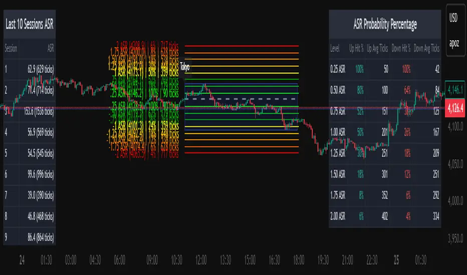
Average Daily Session Range PRO [Capitalize Labs]Average Daily Session Range PRO
The Average Daily Session Range PRO (ADSR PRO) is a professional-grade analytical tool designed to quantify and visualize the probabilistic range behavior of intraday sessions.
It calculates directional range statistics using historical session data to show how far price typically moves up or down from the session open.
This helps traders understand session volatility profiles, range asymmetry, and probabilistic extensions relative to prior performance.
Key Features
Asymmetric Range Modeling: Separately tracks average upside and downside excursions from each session open, revealing directional bias and volatility imbalance.
Probability Engine Modes: Choose between Rolling Window (fixed-length lookback) and Exponential Decay (weighted historical memory) to control how recent or historic data influences probabilities.
Session-Aware Statistics: Calculates values independently for each defined session, allowing region-specific insights (e.g., Tokyo, London, New York).
Dynamic Range Table: Displays key metrics such as average up/down ticks, expected range extensions, and percentage probabilities.
Adaptive Display: Works across timeframes and instruments, automatically aligning with user-defined session start and end times.
Visual Clarity: Includes clean range markers and labels optimized for both backtesting and live-chart analysis.
Intended Use
ADSR PRO is a statistical reference indicator.
It does not generate buy/sell signals or predictive forecasts.
Its purpose is to help users observe historical session behavior and volatility tendencies to support their own discretionary analysis.
Credits
Developed by Capitalize Labs, specialists in quantitative and discretionary market research tools.
Risk Warning
This material is educational research only and does not constitute financial advice, investment recommendation, or a solicitation to buy or sell any instrument.
Foreign exchange and CFDs are complex, leveraged products that carry a high risk of rapid losses; leverage amplifies both gains and losses, and you should not trade with funds you cannot afford to lose.
Market conditions can change without notice, and news or illiquidity may cause gaps and slippage; stop-loss orders are not guaranteed.
The analysis presented does not take into account your objectives, financial situation, or risk tolerance.
Before acting, assess suitability in light of your circumstances and consider seeking advice from a licensed professional.
Past performance and back-tested or hypothetical scenarios are not reliable indicators of future results, and no outcome or level mentioned here is assured.
You are solely responsible for all trading decisions, including position sizing and risk management.
No external links, promotions, or contact details are provided, in line with TradingView House Rules.
Jesses 1.2This indicator detects Break of Structure (BOS) using a strict “break-only + one opposite candle to the left” rule. On confirmation, it draws a sticky zone box (orange for BUY, teal for SELL) anchored to the origin candle and extends it until breached. It includes session filtering (Sydney/Tokyo, London, New York in NZ time), optional origin-candle tint with adjustable opacity, and alerts that trigger only when a box is created. Internally it tracks bullish/bearish runs, enforces one-per-reference logic, rotates recent boxes, and freezes active boxes at the daily boundary.

KayeDinero TrendSetter Klarity v6 - by Kulture MetricsPrecision. Discipline. Klarity.
Klarity v6 is a trend-recognition and risk-mapping framework built for traders who demand focus over noise.
It blends classical SMA trend structure with ATR-based precision targeting, revealing actionable BUY / SELL zones in real time.
• Orange line = Core trend (Simple Moving Average)
• Green / Red bands = Dynamic target & stop levels
• Labels & alerts = Execution triggers once per signal
Klarity adapts easily to equities (Detroit grit) or growth momentum (Atlanta drive) — built by Kulture Metrics for traders chasing Billions in clarity, not chaos.
Usage
Add to any chart, any timeframe.
Set alerts → “Once per bar close” on Klarity BUY or Klarity SELL conditions.
Tune ATR Multiplier & R:R Ratio to your volatility.
Kulture Metrics • Detroit × Atlanta • Billions Mindset • © 2025
🧠 How to Publish Privately / Publicly
In Pine Editor → click Publish Script.
Choose:
Public knowledge-sharing if you want it visible on your profile.
Private (Invite-Only) if you want to control access.
Paste the description above into the “About this script” field.
Add tags:
#KultureMetrics #KayeDinero #Klarity #Detroit #Atlanta #Billions #TrendTrading #ATR #SMA

MMT AI IndicatorOverview
The MMT AI INDICATOR is an advanced technical indicator used to predict trends in price movements by utilizing a combination of traditional AI techniques, and the Momentum Model.

Fabio + Waqar SMC AlertThis script is a custom TradingView indicator designed to combine elements of a trend‑following VWAP approach (inspired by the “Fabio” strategy) with a smart‑money‑concepts framework (inspired by Waqar Asim). Here’s what it does:
* **Directional bias:** It calculates a 15‑minute VWAP and compares the current 15‑minute close to it. When price is above the 15‑minute VWAP, the script assumes a long bias; when below, a short bias. This reflects the trend‑following aspect of the Fabio strategy.
* **Liquidity sweeps:** Using recent pivot highs and lows on the current timeframe, it identifies when price takes out a recent high (for potential longs) or low (for potential shorts). This represents a “liquidity sweep” — a fake breakout that collects stops and signals a possible reversal or continuation.
* **Break of structure (BOS):** After a sweep, the script confirms that price is breaking away from the swept level (i.e., higher than recent highs for longs or lower than recent lows for shorts). This BOS confirmation helps avoid false signals.
* **Entry filters:** For a long setup, the bias must be long, there must be a liquidity sweep followed by a BOS, and price must reclaim the current‑timeframe VWAP. For a short setup, the opposite conditions apply (short bias, sweep + BOS to the downside, and price rejecting the VWAP).
* **Alerts and plot:** It provides two alert conditions (“Fabio‑Waqar Long Setup” and “Fabio‑Waqar Short Setup”) that you can attach to notifications. It also plots the intraday VWAP on your chart for visual reference.
In short, this script watches for a confluence of trend direction, liquidity sweeps, structural shifts, and VWAP reclaim/rejection, and then notifies you when those conditions align. You can use it as an alerting tool to identify high‑probability setups based on these combined strategies.
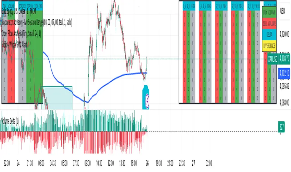
Delta Pro VOLUME DELTA – FULL BREAKDOWN
WHAT IS DELTA?
→ Net difference between aggressive BUYING and SELLING per bar
→ Shows WHO is in control: buyers (ask hits) or sellers (bid hits)
CALCULATION (IN SCRIPT):
delta = volume * (close > open ? +1 : close < open ? -1 : 0)
• GREEN BAR (Up candle) → +DELTA → Buyers hit the ASK
• RED BAR (Down candle) → -DELTA → Sellers hit the BID
• DOJIS → 0 Delta
WHAT YOU SEE ON CHART:
• GREEN/RED BARS → Per-bar Delta (size = aggression)
• PURPLE LINE → Cumulative Delta (net order flow all session)
• ZERO LINE → Baseline (above = net buying, below = net selling)
TRADING EDGE (3 KILLER SETUPS):
1. DIVERGENCE = REVERSAL
Price: New high
Delta: Lower high → NEGATIVE DIVERGENCE
→ SHORT the breakdown
2. DELTA EXPLOSION = BREAKOUT
+500k green bar + price breaks resistance
→ GO LONG with momentum
3. ABSORPTION = FADE
Price drops hard
Delta flat/rising → Buyers absorbing supply
