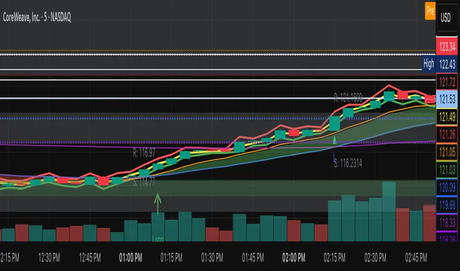
Ant_JJun 5분봉 데이 트레이딩 지표[체험판]Ant_JJun — 5분봉 단기 규칙 기반 데이 트레이딩 프레임워크
(Ichimoku 구조 + 거래량 논리 기반)
이 지표는 BTC 5분봉 환경에서의 단기 트레이딩 의사결정을 돕기 위해 설계되었습니다.
목표는 진입 신호의 빈도를 늘리는 것이 아니라, 추세 구간과 비추세 구간을 구별하여 불필요한 노출을 줄이는 것에 있습니다.
많은 보조지표는 가격이 이미 움직인 뒤에만 유효하게 작동합니다.
이 시스템은 반대로, 방향성이 형성되기 전의 횡보 구간에서 자본 손실을 억제하는 것을 우선합니다. 이를 위해 일목 구조(선행스팬 기반)로 환경을 분류하고, 거래량 비대칭과 캔들 성향을 추가 필터로 사용합니다.
핵심 작동 개념
• 선행스팬 기반 구조 판별로 추세/중립 환경을 분리
• 구조 + 거래량 + 캔들조건이 모두 정렬될 때만 방향 라벨 출력
• 정렬되지 않을 경우 진입 강제가 아닌 ‘대기’ 상태 유지
• 리페인트 없음 / 사후 라벨 생성 없음 / 실시간 판정
사용 환경
• 5분봉 단기 매매
• 데이터 발표 등 변동성 이벤트 인접 구간 관찰 목적
• 자동매매가 아닌 규칙 기반 의사결정 필터링용
이 스크립트는 독자적 방식이 포함되어 있어 공개 배포되지 않습니다.
Ant_JJun — 5-Minute Rule-Based Day-Trading Framework
(Ichimoku structure + volume logic)
This indicator is designed to support short-term decision-making on the BTC 5-minute chart.
Its goal is not to increase signal frequency, but to reduce unnecessary exposure by distinguishing trending from non-trending conditions.
Most indicators only function effectively after price has already moved.
This framework prioritizes capital protection during pre-move consolidation.
It classifies market context using Ichimoku leading spans, and adds volume imbalance and candle behavior as additional filters.
Core operating logic
• Leading-span structure to classify trend vs. neutral zones
• Directional labels only when structure + volume + candle conditions align
• When alignment is absent, the system remains in a waiting state rather than forcing entries
• No repainting / no post-hoc labels / real-time evaluation only
Intended environment
• 5-minute intraday trading
• Particularly around volatility events such as economic data releases
• Used as a rule-based decision filter rather than an automation engine
This script is not publicly distributed due to proprietary methodology.
Volume

Ant_JJun 5-Minute Day-Trading IndicatorThis invite-only indicator is designed for short-term BTC and crypto trading, focusing on precision during volatile data-driven markets and capital protection during sideways conditions.
It integrates Ichimoku-based structure mapping with volume asymmetry analysis and proprietary rule-based filters.
Unlike a traditional mashup, this system does not simply overlay multiple indicators.
It uses Ichimoku’s leading spans to classify structural bias (trend vs. neutral), then evaluates directional confirmation through candle displacement and volume pressure imbalance.
Only when both structure and momentum align is a directional label printed.
If the system detects indecision (flat or overlapping clouds with contracting volume), it enters a neutral state to avoid unnecessary exposure.
Key concept:
— Preventing bleed during non-trending phases
— Adaptive response around macro/volatility events (e.g., CPI, PMI)
— Rule-based execution to remove emotional decision-making
Usage notes:
— Intended for 5-minute intraday use
— Long/Short labels appear only on rule-confirmed entries
— No repainting / no backfill logic
— Analytical use only — not investment advice

Advanced Weis Wave Volume [Afnan]Advanced Weis Wave Volume is an enhanced upgrade of the classic Weis Wave concept. It measures accumulated volume within price swings to show where buying and selling pressure truly shift — but with one major edge: optional consolidation detection.
Most wave volume indicators simply plot bullish and bearish waves. Advanced Weis Wave Volume goes further by giving you the choice to highlight sideways or low-momentum consolidation phases, making it easy to spot when the market lacks real momentum. This helps traders instantly filter out weak, low-probability setups and focus only on the high-energy waves that truly matter.
⚙️ Key Features
Weis Wave Method – Uses ATR-based wave calculation to identify directional volume accumulation with precision.
Optional Consolidation Highlighting – You control it. Enable or disable consolidation detection based on your trading style. When enabled, it visually marks low-momentum or range-bound conditions, helping you instantly recognize when the market is consolidating.
Smart Volume Alignment – Choose to include or exclude the reversal candle's volume in new waves for more accurate readings.
Clear Visuals – Color-coded waves for Bullish (Green), Bearish (Red), and optional Consolidation (Orange) phases.
Compact Status Table – Displays the current market condition (Bullish, Bearish, or Consolidation) directly on your chart.
Flexible Display Options – Plot all waves above zero line, customize colors, and control what information you see.
💡 Why This Indicator Is Superior
✅ vs. Other Wave Volume Indicators:
Others only show waves; they can't identify consolidation. Advanced Weis Wave Volume gives you the option to enable consolidation detection — saving you time by automatically filtering weak market phases when you need it.
✅ vs. Standard Volume Bars:
Regular volume bars show isolated candle data. Advanced Weis Wave Volume shows accumulated directional pressure, revealing true trend strength and institutional activity.
✅ vs. Basic Weis Wave Indicators:
Standard Weis Wave indicators lack consolidation awareness. This indicator adds that layer of intelligence while keeping the classic wave calculation intact.
Bottom Line:
This is the only Weis Wave volume indicator that gives you control over consolidation filtering. Others show every move equally — Advanced Weis Wave Volume shows what actually matters, when you want it to.
📈 How to Use
Trading with the Waves:
🟢 Green Waves (Bullish): Building buying pressure — look for long setups.
🔴 Red Waves (Bearish): Rising selling pressure
🟠 Orange Zones (Consolidation): (When enabled) Market is ranging — avoid new trades .
Large waves: Strong trends and high-probability continuations.
Shrinking waves: Weakening momentum or possible reversal ahead.
Critical Insight - Avoiding False Volume Signals:
Large waves aren't always reliable. If you see a wave colored in orange (consolidation), it means the market was moving sideways but no real directional momentum.
This is crucial because:
❌ A big green wave in consolidation ≠ strong upside buying
❌ A big red wave in consolidation ≠ strong downside selling
✅ These are just range-bound volume accumulations that mislead traders
With consolidation detection enabled, you can instantly identify and ignore these deceptive Consolidation waves, focusing only on directional volume that actually reflects true buying or selling pressure. This prevents you from entering trades based on false volume signals during sideways markets.
📌 Practical Applications:
Breakout Confirmation: Real breakouts show expanding volume waves; false breakouts show weak waves or consolidation-marked volume.
Trend Validation: In a healthy trend, waves in the direction of the move are stronger, larger, and show clear directional color (green/red).
Consolidation Avoidance: (When enabled) Orange zones warn you to step aside and preserve capital — even if the wave looks large. Size doesn't matter if momentum is absent.
Filter False Volume: Avoid trading large waves that occur during consolidation — they don't represent genuine directional moves, just sideways accumulation.
Divergence Detection: Price makes new highs/lows, but wave volume shrinks — a sign of exhaustion or reversal.
Analyzing Ranges: During accumulation or distribution, Advanced Weis Wave Volume helps identify how institutional players are participating within the range — revealing when a breakout is likely to occur.
✨ The Competitive Advantage
Many Weis Wave indicators exist on TradingView - they all show volume waves. Only Advanced Weis Wave Volume gives you optional consolidation detection. That single feature transforms wave volume from a pure analysis tool into a flexible trading system that adapts to your style.

mfi_maThis combination is a powerful technical analysis strategy that merges momentum and volume (from the MFI) with the underlying trend direction (from the Moving Average). The core philosophy is simple: Use the Moving Average to determine the market's direction, and use the MFI to find optimal entry points within that trend.
This approach moves beyond using the MFI in isolation, which can generate false signals in a strong, trending market. It adds a crucial layer of context, significantly improving the quality of your signals.
BETA: Reversal confluence signalThis script is designed to accurately identify swing and scalp reversals.
A momentum styled signal indicator designed to give the user an edge over market direction and increase their trading profitability.
The indicator has a very high accuracy on the 1h time frame for momentum reversals.

VWAP Composites📊 VWAP Composite - Advanced Multi-Period Volume Weighted Average Price Indicator
═══════════════════════════════════════════════════════════════════
🎯 OVERVIEW
VWAP Composite is an advanced volume-weighted average price (VWAP) indicator that goes beyond traditional single-period VWAP calculations by offering composite multi-period analysis and unprecedented customization. This indicator solves a common problem traders face: traditional VWAP resets at arbitrary intervals (session start, day, week), but significant price action and volume accumulation often spans multiple periods. VWAP Composite allows you to anchor VWAP calculations to any timeframe—or combine multiple periods into a single composite VWAP—giving you a true representation of average price weighted by volume across the exact periods that matter to your analysis.
═══════════════════════════════════════════════════════════════════
⚙️ HOW IT WORKS - CALCULATION METHODOLOGY
📌 CORE VWAP CALCULATION
The indicator calculates VWAP using the standard volume-weighted formula:
• Typical Price = (High + Low + Close) / 3
• VWAP = Σ(Typical Price × Volume) / Σ(Volume)
This calculation is performed across user-defined time periods, ensuring each bar's contribution to the average is proportional to its trading volume.
📌 STANDARD DEVIATION BANDS
The indicator calculates volume-weighted standard deviation to measure price dispersion around the VWAP:
• Variance = Σ / Σ(Volume)
• Standard Deviation = √Variance
• Upper Band = VWAP + (StdDev × Multiplier)
• Lower Band = VWAP - (StdDev × Multiplier)
These bands help identify overbought/oversold conditions relative to the volume-weighted mean, with high-volume price excursions having greater impact on band width than low-volume moves.
📌 COMPOSITE PERIOD METHODOLOGY (Auto Mode)
Unlike traditional VWAP that resets at fixed intervals, Auto Mode creates composite VWAPs by combining the current period with N previous periods:
• Period Span = 1: Current period only (standard VWAP behavior)
• Period Span = 2: Current period + 1 previous period combined
• Period Span = 3: Current period + 2 previous periods combined
• And so on...
Example: A 3-period Weekly composite VWAP calculates from the start of 2 weeks ago through the current week's end, creating a single VWAP that represents 21 days of continuous price and volume data. This provides context about where price stands relative to the volume-weighted average over multiple weeks, not just the current week.
═══════════════════════════════════════════════════════════════════
🔧 KEY FEATURES & ORIGINALITY
✅ DUAL OPERATING MODES
1️⃣ MANUAL MODE (5 Independent VWAPs)
Define up to 5 separate VWAP calculations with custom start/end times:
• Perfect for anchoring VWAP to specific events (earnings, Fed announcements, major reversals)
• Each VWAP has independent color settings for lines and deviation band backgrounds
• Individual control over calculation extension and visual extension (explained below)
• Useful for tracking multiple institutional accumulation/distribution zones simultaneously
2️⃣ AUTO MODE (Composite Period VWAP)
Automatically calculates VWAP across combined time periods:
• Supported periods: Daily, Weekly, Monthly, Quarterly, Yearly
• Configurable period span (1-20 periods)
• Always up-to-date, recalculates on each new bar
• Ideal for systematic analysis across consistent timeframes
✅ DUAL EXTENSION SYSTEM (Manual Mode Innovation)
Most VWAP indicators only offer "on/off" for extending calculations. This indicator provides two distinct extension options:
🔹 EXTEND CALCULATION TO CURRENT BAR
When enabled, continues including new bars in the VWAP calculation after the defined end time. The VWAP value updates dynamically as new volume enters the market.
Use case: You anchored VWAP to a major low 3 weeks ago. You want the VWAP to continue evolving with new volume data to track ongoing institutional positioning.
🔹 EXTEND VISUAL LINE ONLY
When enabled (and calculation extension is disabled), projects the "frozen" VWAP value forward as a reference line. The VWAP value remains fixed at what it was at the end time, but the line and deviation bands visually extend to current price.
Use case: You want to see how price is behaving relative to the VWAP that existed at a specific point in time (e.g., "Where is price now vs. the 5-day VWAP that existed at last Friday's close?").
This dual system gives you unprecedented control over whether you're tracking a "living" VWAP that incorporates new data or using historical VWAP levels as static reference points.
✅ CUSTOMIZABLE STANDARD DEVIATION BANDS
• Adjustable multiplier (0.1 to 5.0)
• Independent background colors with opacity control for each VWAP
• Dashed band lines for easy visual distinction from main VWAP
• Bands extend when visual extension is enabled, maintaining zone visibility
✅ COMPREHENSIVE LABELING SYSTEM
Each VWAP displays:
• Current VWAP value
• Upper deviation band value (High)
• Lower deviation band value (Low)
• Extension status indicator (Calc Extended / Visual Extended)
• Color-coded for quick identification
═══════════════════════════════════════════════════════════════════
📖 HOW TO USE THIS INDICATOR
🎯 SCENARIO 1: EVENT-ANCHORED VWAP (Manual Mode)
Use case: A stock gaps down 15% on earnings and you want to track where institutions are positioning during the recovery.
Setup:
1. Switch to Manual Mode
2. Enable VWAP 1
3. Set Start Time to the earnings gap bar
4. Set End Time to current time (or leave far in future)
5. Enable "Extend Calculation to Current Bar"
6. Watch how price respects the VWAP as a dynamic support/resistance
Interpretation:
• Price above VWAP = buyers in control since the event
• Price testing VWAP from above = potential support
• Volume-weighted standard deviation bands show normal price range
• Price outside bands = potential exhaustion/mean reversion setup
🎯 SCENARIO 2: MULTI-WEEK INSTITUTIONAL ACCUMULATION ZONE (Auto Mode)
Use case: You trade swing setups and want to identify where institutions have been accumulating over the past 3 weeks.
Setup:
1. Switch to Auto Mode
2. Select "Weekly" period type
3. Set Period Span to 3
4. Enable standard deviation bands
Interpretation:
• 3-week composite VWAP shows the true average institutional entry
• Price bouncing off VWAP repeatedly = strong support (institutions defending their average)
• Price breaking below VWAP on high volume = potential distribution
• Deviation bands contracting = consolidation; expanding = volatility increase
🎯 SCENARIO 3: COMPARING MULTIPLE TIME HORIZONS (Manual Mode)
Use case: You want to see short-term vs medium-term vs long-term VWAP alignments.
Setup:
1. Switch to Manual Mode
2. VWAP 1: Last 5 trading days (blue)
3. VWAP 2: Last 10 trading days (orange)
4. VWAP 3: Last 20 trading days (purple)
5. Enable "Extend Calculation" for all
6. Set different background colors for visual separation
Interpretation:
• All VWAPs aligned upward = strong trend across all timeframes
• Price between VWAPs = finding equilibrium between different trader timeframes
• Short-term VWAP crossing long-term VWAP = momentum shift
• Price rejecting at higher-timeframe VWAP = that timeframe's traders defending their average
🎯 SCENARIO 4: HISTORICAL VWAP REFERENCE LEVELS (Manual Mode)
Use case: You want to see where the 1-month VWAP was at each month-end as static reference levels.
Setup:
1. Switch to Manual Mode
2. VWAP 1: Set to last month's start/end dates
3. VWAP 2: Set to 2 months ago start/end dates
4. VWAP 3: Set to 3 months ago start/end dates
5. Disable "Extend Calculation"
6. Enable "Extend Visual Line Only"
Interpretation:
• Each VWAP represents the volume-weighted average for that complete month
• These become static support/resistance levels
• Price returning to old monthly VWAPs = institutional memory/gap fill behavior
• Useful for identifying longer-term value areas
═══════════════════════════════════════════════════════════════════
🎨 CUSTOMIZATION OPTIONS
GENERAL SETTINGS
• Show/hide labels
• Line style: Solid, Dashed, or Dotted
• Standard deviation multiplier (impacts band width)
• Toggle standard deviation bands on/off
MANUAL MODE (Per VWAP)
• Custom start and end times
• Line color picker
• Background color picker (with transparency control)
• Extend calculation option
• Extend visual option
• Show/hide individual VWAPs
AUTO MODE
• Period type selection (Daily/Weekly/Monthly/Quarterly/Yearly)
• Period span (1-20 periods)
• Line color
• Background color (with transparency control)
═══════════════════════════════════════════════════════════════════
💡 TRADING APPLICATIONS
✓ Mean Reversion: Use deviation bands to identify stretched prices likely to return to VWAP
✓ Trend Confirmation: Price sustained above VWAP = bullish bias; below = bearish bias
✓ Support/Resistance: VWAP often acts as dynamic S/R, especially on higher volume periods
✓ Institutional Positioning: Multi-day/week VWAPs show where large players have established positions
✓ Entry Timing: Wait for pullbacks to VWAP in trending markets
✓ Stop Placement: Use VWAP ± standard deviation as volatility-adjusted stop levels
✓ Breakout Confirmation: Breakouts from consolidation with price reclaiming VWAP = stronger signal
✓ Multi-Timeframe Analysis: Compare short vs long-period VWAPs to gauge momentum alignment
═══════════════════════════════════════════════════════════════════
⚠️ IMPORTANT NOTES
• The indicator redraws on each bar to maintain accurate visual representation (uses `barstate.islast`)
• Maximum lookback is limited to 5000 bars for performance optimization
• Time range calculations work across all timeframes but are most effective on intraday to daily charts
• Standard deviation bands assume volume-weighted distribution; extreme events may violate assumptions
• Auto mode always calculates to current bar; use Manual mode for fixed historical periods
═══════════════════════════════════════════════════════════════════
This indicator is open-source. Feel free to examine the code, learn from it, and adapt it to your needs.

VOLUME PROFILE WITH FOOTPRINT AND IMBALANCEVOLUME PROFILE WITH FOOTPRINT AND IMBALANCE
A professional-grade market structure analysis tool that combines three powerful trading concepts into one comprehensive indicator: Volume Profile, Footprint Charts, and Imbalance detection. This script provides optimum-level market analysis for trading.
KEY FEATURES
1. Multi-Day Volume Profile
Customizable Row Density: Adjust price level granularity for precise volume distribution analysis
Point of Control (POC): Automatically identifies the price level with highest traded volume
Value Area Calculation: Highlights the price range containing 70% of the day's volume (customizable percentage)
Value Area High (VAH) & Low (VAL): Clear demarcation of institutional acceptance zones
Horizontal Volume Bars: Visual representation of buying vs. selling pressure at each price level
Color-Coded Volume: Distinguishes between value area volume and outlier volume for better visual clarity
2. Previous Day Reference Levels
Previous Day High/Low (PDH/PDL): Critical support/resistance levels from prior session
Previous Day POC: Yesterday's highest volume node - often acts as magnetic price level
Previous Day VAH/VAL: Prior session's value boundaries for gap analysis and mean reversion setups
All previous day levels extend into current session with customizable colors and line styles
3. Virgin Point of Control (VPOC)
Untouched POC Identification: Automatically tracks POC levels that haven't been revisited by price
Real-time Validation: Monitors whether subsequent price action has tested each historical POC
Multi-Day Tracking: Maintains VPOC levels across multiple sessions until filled
High-Probability Targets: Virgin POCs often act as magnets for future price action
4. Footprint Zone Analysis
Footprint Zone Detection: Identifies price levels touched only once during the session
Automated Ribbon Consolidation: Groups consecutive Footprint Zone into visual zones
Price Range Sensitivity: Automatically adjusts granularity based on instrument price
Historical Persistence: Consolidates previous day's footprint zones for multi-day context
Auction Failure Zones: Footprint Zone often indicate areas of poor liquidity and potential reversal points
5. Three-Candle Imbalance Detection
Bullish Imbalance
Bearish Imbalance
Visual Markers: Clear circular indicators on all three candles forming the imbalance
Customizable Colors: Separate colors for bullish and bearish imbalances
Gap Validation: Ensures meaningful price displacement before flagging imbalance

Volume Heatmap + Buy/Sell splitits the most powerful volume based heatmap you can see on this platform. It tells you when the high volume is coming into the market with clear signs.
Sell - You will see the red bar below the split to confirm its a sell and the strength or the sell you can see above the split line in various colors e.g. lite green (low) to Dark red (extra high).
Buy - If there is a Buying trade being registered, it will appear above the spit line in opaque green with the heatmap colors to show the strength of volume.
This tool will help you identify the volume strength and based on that you can plan your trade.
PS, its always recommended to not to rely on a single oscillator and combine few. I would recommend you to use RSI and S/R lines with this for better decision.
Note, this tool has been put together for educational purposes and I do not take any responsibility of your trade.

Velocity Pressure Index | AlphaNattVelocity Pressure Index (VPI) | AlphaNatt
A sophisticated momentum oscillator that combines price velocity analysis with volume pressure dynamics to identify high-probability trading opportunities.
📊 KEY FEATURES
Dual Analysis System: Merges price velocity measurement with volume pressure analysis for comprehensive market momentum assessment
Dynamic Normalization: Automatically scales values between -100 and +100 for consistent readings across all market conditions
Adaptive Zones: Self-adjusting overbought/oversold levels based on recent price history
Multi-Layer Confirmation: Combines momentum, acceleration, and crossover signals for robust trade identification
Volume-Weighted Pressure: Differentiates between bullish and bearish volume to gauge true market sentiment
📈 HOW IT WORKS
The VPI calculates price velocity using linear regression of price changes, then weights this velocity by the difference between bullish and bearish volume pressure. This creates a momentum reading that accounts for both price movement speed and the volume conviction behind it.
Signal Generation:
Price velocity is measured over the specified period
Volume is separated into bullish (close > open) and bearish (close < open) pressure
Velocity is amplified or dampened based on volume pressure differential
The resulting index is normalized to oscillate between -100 and +100
A signal line smooths the oscillator for crossover detection
🎯 TRADING SIGNALS
Long Signals (Cyan #00F1FF):
Strong Bull: VPI > Signal with positive momentum and acceleration
Crossover Bull: VPI crosses above signal while above oversold zone
Divergence: Price makes lower low while VPI makes higher low
Short Signals (Magenta #FF019A):
Strong Bear: VPI < Signal with negative momentum and deceleration
Crossover Bear: VPI crosses below signal while below overbought zone
Divergence: Price makes higher high while VPI makes lower high
⚙️ CUSTOMIZABLE PARAMETERS
Velocity Settings:
Velocity Period (14): Lookback for price velocity calculation
Pressure Period (21): Volume analysis window
Smoothing Factor (3): Final oscillator smoothing
Signal Configuration:
Signal Type: Choose between SMA, EMA, or DEMA
Signal Length (9): Signal line smoothing period
Normalization Period (50): Range calculation window
Dynamic Zones:
Zone Lookback (100): Period for adaptive overbought/oversold calculation
Percentiles: 80th/20th percentiles for dynamic zones
📐 VISUAL COMPONENTS
Main Oscillator: Color-coded line showing current momentum state
Signal Line: White line for crossover detection
Momentum Histogram: Shows velocity differential at 50% scale
Dynamic Zones: Self-adjusting overbought/oversold bands
Extreme Levels: ±50 dotted lines marking extreme conditions
Background Shading: Subtle highlighting of overbought/oversold regions
💡 USAGE TIPS
Trend Trading: Use strong bull/bear signals in trending markets for continuation entries
Range Trading: Focus on crossovers near extreme zones for reversal trades
Divergence Trading: Watch for price/oscillator divergences at market extremes
Multi-Timeframe: Combine with higher timeframe VPI for directional bias
Volume Confirmation: Stronger signals occur with aligned volume pressure
⚠️ BEST PRACTICES
The VPI works best in liquid markets with reliable volume data. For optimal results, combine with price action analysis and use appropriate risk management. The indicator is most effective during trending conditions but can identify reversals when divergences occur at extremes.
🔔 ALERTS AVAILABLE
VPI Long/Short Signals
Bullish/Bearish Crossovers
Extreme Overbought/Oversold Conditions
Version 6 | Pine Script™ | © AlphaNatt

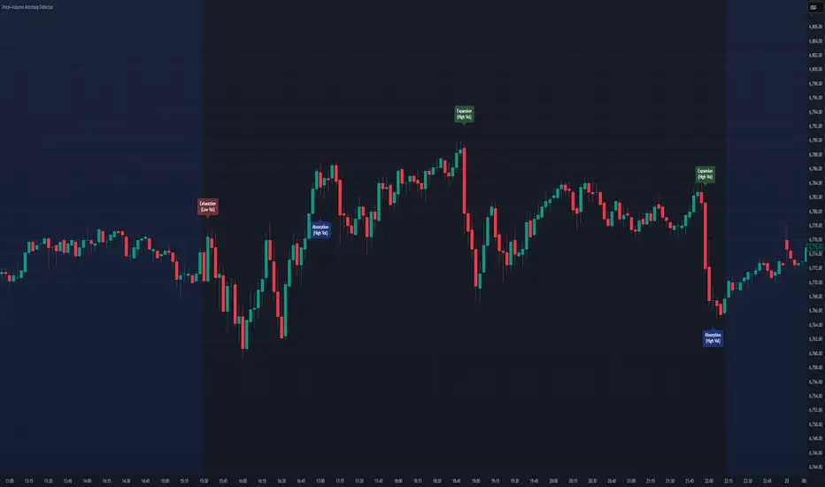
Price–Volume Anomaly DetectorDescription
This indicator identifies unusual relationships between price strength and trading volume. By analyzing expected intraday volume behavior and comparing it with current activity, it highlights potential exhaustion, absorption, or expansion events that may signal changing market dynamics.
How It Works
The script profiles average volume by time of day and compares current volume against this adaptive baseline. Combined with normalized price movement (ATR-based), it detects conditions where price and volume diverge:
Exhaustion: Strong price move on low volume (potential fade)
Absorption: Weak price move on high volume (potential reversal)
Expansion: Strong price move on high volume (momentum continuation)
Key Features
Adaptive time-based volume normalization
Configurable sensitivity thresholds
Optional visibility for each anomaly type
Adjustable label transparency and offset
Light Mode support: label text automatically adjusts for dark or light chart backgrounds
Lightweight overlay design
Inputs Overview
Volume Profile Resolution: Defines time bucket size for expected volume
[* ]Lookback Days: Controls how quickly the profile adapts
Price / Volume Thresholds: Tune anomaly sensitivity
Show Expansion / Exhaustion / Absorption: Toggle specific labels
Label Transparency & Offset: Adjust chart visibility
How to Use:
Apply the indicator to any chart or timeframe.
Observe where labels appear:
🔴 Exhaustion: strong price, weak volume
🔵 Absorption: weak price, strong volume
🟢 Expansion: strong price, strong volume
Use these as context clues, not trade signals — combine with broader volume or trend analysis.
How It Helps
Reveals hidden price–volume imbalances
Highlights areas where momentum may be fading or strengthening
Enhances understanding of market behavior beyond raw price action
⚠️Disclaimer:
This script is provided for educational and informational purposes only. It is not financial advice and should not be considered a recommendation to buy, sell, or hold any financial instrument. Trading involves significant risk of loss and is not suitable for every investor. Users should perform their own due diligence and consult with a licensed financial advisor before making any trading decisions. The author does not guarantee any profits or results from using this script, and assumes no liability for any losses incurred. Use this script at your own risk.
CVD with DivergenceThis indicator combines Cumulative Volume Delta with divergence signals to help spot potential market reversals and trend changes. It visually highlights key shifts in buying and selling pressure, making it easier to see when momentum is building or fading and helping you make more informed trading decisions.

Cumulative Volume Delta Divergence Periodic EMACumulative Volume Delta Divergence Periodic EMA
extended indicator
TFT VIP TRADE BODY & VOLUME RANGE x-times (LAST BAR): Body & Volume vs Last 10 compares the current candle’s body size and volume to the SMA of the last N candles (default 10) and shows the result as “×ratio”. It’s designed to keep the chart uncluttered while giving you two key reads from the 5-minute timeframe:
• Previous 5m (closed) bar → fixed label with its final ratios.
• Current 5m (running) bar → live-updating label with real-time ratios.
Multi-timeframe behavior
• On 1-minute charts:
• A stamp for the last closed 5m is placed on that 5m block’s final 1-minute bar.
• A live label shows the current 5m ratios on the current 1-minute bar.
→ You’ll always see two labels max (closed 5m + running 5m).
• On 5-minute charts:
• One label on the previous 5m candle (closed).
• One label on the current 5m candle (running).
• On other timeframes:
• A single label shows the current 5m ratios on the last bar.
What the numbers mean
• Body ×r = abs(Close − Open) compared to SMA(body, N) on the reference TF.
• Vol ×r = Volume compared to SMA(Volume, N) on the reference TF.
• Color cue: ≥3× red, ≥2× orange, otherwise teal.
Inputs
• Lookback (bars): N for the SMA comparison (default 10).
• Decimals: number of decimals in the ×ratios.
• Vertical position: Above bar / Below bar.
• Layout: Side by side (previous left, current right) or Stacked.
• Horizontal offset (bars): space left/right from the anchor bar (for side-by-side).
• Vertical offset (ATR×): lift/drop labels using ATR for consistent spacing.
Notes & Tips
• Focuses on candle body, not high–low range.
• Keeps the chart clean: at most two labels on 1m/5m.
• Great for spotting impulsive 5m moves (body expansion) and volume surges relative to recent history.
Limitations
• No alerts baked in (by design).
• Ratios use SMA of the last N bodies/volumes; change N to suit volatility.
⸻
If you want, I can add a short tagline version for the “short description” box or wire in alert conditions (e.g., trigger when Body ≥ 2× or Vol ≥ 3×).

WAD : Whale Activity Detector🐋 WAD: Whale Activity Detector
WAD (Whale Activity Detector) automatically detects periods of abnormally high trading volume compared to the average, identifying potential whale (institutional) buy or sell activity and visualizing it directly on the chart.
🔍 How It Works
1. Buy/Sell Volume Separation
Each candle’s trading volume is categorized based on its direction:
Bullish candle → Buy volume
Bearish candle → Sell volume
This separation helps distinguish the actual strength of buying vs. selling pressure, rather than looking at total volume alone.
2. Average Volume Calculation
Over a user-defined lookback period (default: 34 bars), the indicator calculates the moving average of both buy and sell volumes, establishing a baseline for what constitutes “normal” activity.
3. Whale Activity Detection
When the current volume exceeds n times the average volume (default: 4×), the indicator flags it as a Whale Zone — a potential sign of large player involvement.
Volume surge on a bullish candle → Whale Buy
Volume surge on a bearish candle → Whale Sell
4. Visual Display
🟢 Green bars: Whale buy activity
🔴 Red bars: Whale sell activity
BUY/SELL labels: Appear above the chart when an anomaly is detected
Average line toggle: Users can turn the average volume lines on or off for clarity
5. Alerts
Whenever whale buy/sell signals are detected, real-time alerts are triggered.
Example: 🐋 Whale Buy – NVDA! 🟢
⚙️ Indicator Meaning
Rather than showing raw volume, WAD tracks “abnormal volume relative to the average.”
It filters out noise and highlights the moments where large entities begin to move.
Essentially, it visualizes intentional and impactful trades hidden within standard volume activity.
🚀 Example Use Cases
Whale accumulation tracking – Repeated strong buy signals may indicate sustained institutional accumulation.
Short-term breakout confirmation – Price often rallies shortly after whale buy signals appear.
Support/resistance analysis – Whale sell zones frequently align with short-term resistance areas.
In short:
WAD identifies when trading volume exceeds its historical norm to highlight where big money enters or exits the market.
===============================================================================
🐋 WAD : 세력 매매거래 추적기
WAD(Whale Activity Detector) 는 특정 종목의 거래량 패턴 속에서
‘평균 대비 비정상적으로 큰 거래량이 발생한 구간’을 자동으로 감지해
세력(Whale)의 매수·매도 활동을 시각화하는 지표입니다.
🔍 작동 원리
매수·매도 거래량 분리
각 캔들이 양봉인지, 음봉인지에 따라 거래량을 분리합니다.
양봉 시 발생한 거래량 → 매수 거래량(buy volume)
음봉 시 발생한 거래량 → 매도 거래량(sell volume)
이렇게 분리함으로써 단순 거래량이 아닌,
실제 매수세/매도세의 힘을 구분할 수 있습니다.
평균 거래량 계산
사용자가 지정한 기간(기본 34봉)을 기준으로
매수·매도 거래량의 이동평균선을 각각 계산합니다.
이는 ‘정상적인 거래량 수준’을 판단하는 기준선으로 활용됩니다.
이상치 탐지 (Whale Activity Detection)
현재 거래량이 평균 거래량의 n배(기본 4배)를 초과할 경우,
그 구간을 세력 개입 구간(Whale Zone) 으로 판단합니다.
양봉에서 급증 → 세력 매수 (Whale Buy)
음봉에서 급증 → 세력 매도 (Whale Sell)
시각적 표시
초록색 기둥 : 세력 매수 거래량
빨간색 기둥 : 세력 매도 거래량
라벨 표시 (BUY / SELL) : 이상치 발생 시 차트 상단에 표시
평균선 표시 옵션 : 사용자가 원할 때 평균선을 켜거나 끌 수 있음
알림(Alerts)
세력의 매수·매도 신호가 감지되면,
알림 메시지를 통해 실시간으로 통보받을 수 있습니다.
(예: 🐋 Whale Buy - NVDA! 🟢)
⚙️ 지표의 의미
단순 거래량이 아니라, ‘평균 대비 비정상적 거래량’ 을 추적합니다.
즉, “세력이 본격적으로 움직이기 시작한 구간” 만 걸러내는 지표입니다.
노이즈가 많은 거래량 차트 속에서 의도 있는 거래의 흔적을 포착할 수 있습니다.
🚀 활용 예시
세력 매집 구간 포착 : 큰 매수 시그널이 반복적으로 발생하는 구간은 세력의 누적 매집 가능성을 의미함
단기 급등 신호 확인 : 매수 이상치가 발생한 직후 가격이 급등하는 경우가 많음
지지/저항 분석과 병행 활용 : 세력 매도 구간은 단기 저항으로 작용하는 경향이 있음
copyright @invest_hedgeway

Stop point MMAAn indicator that determines an important stopping area by overcoming the blue candle. The overriding party is determined by buyers or sellers, as it must be confirmed by two candles closing below
Daily Pivot Points LEVELS S-RThis indicator plots daily pivot points based on the previous day’s high, low, and close. It displays the main pivot line, as well as the first levels of support (S1) and resistance (R1), with optional second levels (R2, S2) for additional reference. Ideal for
All-in-One Confluence DashboardHELLO FRIENDS
This indicator will help us find the trend and sentiment of the market and on every chart and segement so that by finding the correct trend we can plan our trade accordingly....thank you.
Nifty 50 Weighted Volume IndicatorThis takes the volume of the cash market as per the composite weighted average of the Nifty 50 Components.
You can use this at your discretion to take calls on Index trades.

PheeTrades - Value Area Levels (VAH / VAL / POC Visualizer)This script helps traders quickly visualize key Volume Profile–style levels such as Value Area High (VAH), Value Area Low (VAL), and Point of Control (POC) using recent price and volume data.
While TradingView’s built-in Volume Profile tool is great for manual analysis, this indicator automatically calculates and plots approximate value zones directly on your chart — ideal for traders who want to identify high-probability support and resistance areas without drawing a fixed range every time.
Features:
Calculates short-term VAH, VAL, and POC based on a user-defined lookback period.
Plots color-coded levels for quick visual reference.
Helps identify “fair value” zones where most trading activity occurred.
Useful for detecting breakout or mean-reversion opportunities around value extremes.
How to use:
Apply the script to any chart and set your preferred lookback period.
VAH (red line): potential upper resistance or overbought zone.
VAL (green line): potential lower support or accumulation zone.
POC (orange line): price level with the highest traded activity — often a magnet for price.
Note:
This is a simplified Value Area model meant for educational and analytical use. It does not replace TradingView’s official Volume Profile or broker-level volume distribution data.
Kyle凯尔ATR精控引擎2.0What this indicator does
Blends Heikin Ashi smoothing with a Supertrend-style engine and an EMA filter to generate directional flips (Buy/Sell).
Auto-draws Supply/Demand zones with POI (point of interest) and marks BOS (Break of Structure).
Prints ATR-based Entry, Stop Loss, and TP1/TP2/TP3 levels; includes alerts.
Shows two dashboards: trend & momentum panel (top-right) and liquidity snapshot (bottom-right).
Adds auto trendlines and multi-timeframe horizontal S/R for context.
Quick start
Add the indicator to any symbol/timeframe.
Act on a fresh flip:
Long when direction flips Up and price is above EMA.
Short when direction flips Down and price is below EMA.
Look for confluence: reaction at Demand/Supply, BOS, trendline break, horizontal S/R, ADX > 20, supportive RSI and volume.
Manage risk with the ATR targets. Scale at TP1/TP2, let TP3 run (targets can “roll” after TP3 to rid trends).
Set alerts once per bar close for reliability.
How signals are formed
Heikin Ashi reduces noise by averaging price; ATR bands around HA price form two rails.
Direction flips when HA price crosses the opposite rail; EMA filter blocks counter-trend flips.
Buy/Sell signals are only valid on the bar close.
Supply/Demand, POI & BOS
Swing pivots create Supply (red) above and Demand (green) below; each zone shows a POI mdline.
When price breaks a zone boundary, the script stamps BOS at the midline and retires the old zone.
ATR risk targets
On a fresh signal, the tool snapshots Entry, then computes SL and TP1/2/3 as ATR multiples.
When TP3 hits, the module rolls targets from the new price to help ride sustained trends.
Optional on-chart lines + labels show Entry/SL/TPs.
Dashboards (how to read)
Top-right panel:
Direction (Up/Down/Neutral)
Momentum (close vs close 10 bars ago)
RSI(2) smoothed by 7: oversold/overbought cues + value
Volume bias: OBV minus its EMA (>0 = bullish)
ADX: >20 suggests stronger trend conditions
Multi-TF direction: 1m/5m/15m/1h/4h/D; more agreement = stronger setups
Bottom-right panel (“Liquidity”):
HA bias & intensity %, relative volume vs 20-SMA, and ATR.
Overlays
Trendlines auto-connect short/long window extremes; alerts on breaks.
Multi-TF S/R draws recent pivot highs/lows across selected TFs with de-overlapped labels.
Inputs to tune (common)
ATR Period / Multiplier: higher = smoother, fewer flips.
EMA Period: higher = stricter trend filter.
Supply/Demand: pivot sensitivity (swing_length), zone depth (box_width), number of zones to keep.
Risk/Targets: slMultiplier, tp1/2/3Multiplier (in ATRs), line/label toggles, colors.
Dashboards/Overlays: enable, position, size, S/R TFs, label spacing.
Suggested starting points (XAUUSD, intraday)
ATR(14), ATR Mult 1.3–1.6, EMA 9–21.
Risk: SL = 1.0–1.2 ATR; TPs at 1/2/3 ATR.
S/D: swing_length 8–12, box_width ~2–3.
Adjust per instrument and timeframe.
Example playbooks
Trend continuation: Fresh Buy (Up + above EMA) + pullback into Demand or near the midline; ADX > 20 preferred; scale at TP1/TP2, let TP3 run.
BOS retest: After BOS, trade the first retest into the broken area/POI in alignment with higher-TF direction; confirm with volume bias.
Breakout: Combine trendline break + Buy/Sell flip + S/R breach. Avoid low-liquidity hours.
Alerts included
Buy signal / Sell signal
Trendline break (Up/Down)
TP1/TP2/TP3 reached
Use “Once per bar close”.

Huge VolumesHuge Volumes indicator plots areas on the chart where trading volume spikes — showing where strong buying or selling pressure takes place.
It helps visualize how large players move in and out of positions, making it easier to spot potential turning points or confirm trends.

VipPro VWAP Momentum Tracker — Auto Buy/Sell + Fibonacci TPVipPro VWAP Momentum Tracker is an auxiliary tool designed to complement the main VipPro Realtime indicator.
It is primarily used on lower timeframes to filter false entries and refine intraday precision.
The script combines VWAP (Volume Weighted Average Price) with short-term momentum analysis and Fibonacci-based target projection.
It automatically generates two technical profit levels derived from Fibonacci extensions — 1.27 and 1.61 — providing a structured approach to short-term trade management.
VWAP acts as the dynamic reference line (orange).
When price is above VWAP, it reflects buying pressure and potential long setups.
When price is below VWAP, it suggests selling pressure and potential short opportunities.
The VWAP represents the market’s fair-value zone based on both price and volume, making it one of the most reliable metrics for identifying institutional positioning and volume-weighted trend direction.
This tool can be used independently or in combination with VipPro Realtime, especially when confirming signals from the upper dashboard that summarizes:
Market trend
Liquidity conditions
Momentum strength
RSI and volatility context
Overbought/Oversold signals
Results may vary depending on the trader’s experience and ability to interpret market structure in conjunction with VWAP behavior and momentum alignment.

Statistical Price Deviation Index (MAD/VWMA)SPDI is a statistical oscillator designed to detect potential price reversal zones by measuring how far price deviates from its typical behavior within a defined rolling window.
Instead of using momentum or moving averages like traditional indicators, SPDI applies robust statistics - a rolling median and Mean Absolute Deviation (MAD) - to calculate a normalized measure of price displacement. This normalization keeps the output bounded (from −1 to +1 by default), producing a stable and consistent oscillator that adapts to changing volatility conditions.
The second line in SPDI uses a Volume-Weighted Moving Average (VWMA) instead of a simple price median. This creates a complementary oscillator showing statistically weighted deviations based on traded volume. When both oscillators align in their extremes, strong confluence reversal signals are generated.
How It Works
For each bar, SPDI calculates the median price of the last N bars (default 100).
It then measures how far the current bar’s midpoint deviates from that rolling median.
The Mean Absolute Deviation (MAD) of those distances defines a “normal” range of fluctuation.
The deviation is normalized and compressed via a tanh mapping, keeping the oscillator in fixed boundaries (−1 to +1).
The same logic is applied to the VWMA line to gauge volume-weighted deviations.
How to Use
The blue line (Price MAD) represents pure price deviation.
The green line (VWMA Disp) shows the volume-weighted deviation.
Overbought (red) zones indicate statistically extreme upward deviation -> potential short-term overextension.
Oversold (green) zones indicate statistically extreme downward deviation -> potential rebound area.
Confluence signals (both lines hitting the same extreme) often mark strong reversal points.
Settings Tips
Lookback length controls how much historical data defines “normal” behavior. Larger = smoother, smaller = more sensitive.
Smoothing (RMA length) can reduce noise without changing the overall statistical logic.
Output scale can be set to either −1..+1 or 0..100, depending on your visual preference.
Alerts and color fills are fully customizable in the Style tab.
Summary:
SPDI transforms raw price and volume data into a statistically bounded deviation index. When both Price MAD and VWMA Disp reach joint extremes, it highlights probable market turning points - offering traders a clean, data-driven way to spot potential reversals ahead of time.

Vip Pro Realtime VipPro Realtime — Technical Overview
VipPro Realtime is a multi-layer analytical indicator designed for real-time liquidity and momentum tracking across all markets on TradingView.
It integrates price structure, volatility, and volume dynamics into a unified dashboard that allows traders to visually interpret market phases in seconds.
🔹 Core Components
Directional Framework (Trend Logic)
VipPro Realtime uses a dual-EMA structure to determine short- and mid-term momentum alignment.
When both layers confirm, the background color changes to visualize the prevailing trend:
🟢 Green → bullish momentum
🔴 Red → bearish momentum
⚪ Gray → corrective or neutral phase
Liquidity & Volume Mapping
The script evaluates volume pressure relative to its moving average and applies a dynamic volume-to-volatility ratio.
This helps detect where actual market participation occurs instead of relying only on price movement.
RSI & Volatility Filters
RSI and ATR values are normalized to reduce noise.
The indicator highlights overbought/oversold conditions and provides contextual volatility levels to help avoid false signals in low-liquidity environments.
VWAP Integration
A VWAP baseline defines fair-value zones and helps identify extension points for potential mean reversion setups.
Open Interest Layer (OI Monitor)
When available, the indicator requests aggregated open interest data from related perpetual markets and calculates short-term deltas to visualize:
📈 Increasing OI with rising price → potential long buildup
📉 Increasing OI with falling price → potential short buildup
⚠️ Decreasing OI → profit-taking or liquidation reduction
Wave & Fibonacci Targeting
The tool automatically identifies impulsive and corrective phases and projects short-term expansion levels (1.27 and 1.61) based on recent swings.
Dashboard Interface
The top-center table summarizes all key parameters:
Trend direction
Liquidity state
Momentum strength
Volatility context
RSI condition
Signal status
OI condition
🔹 Use Case
VipPro Realtime is built for traders who need quantitative confirmation of price behavior rather than subjective pattern recognition.
It helps interpret when a movement is supported by real liquidity inflow/outflow, allowing better timing for entries and exits across intraday or swing strategies.
🔹 Compatibility
✅ Works on all TradingView timeframes
✅ Applicable to crypto, forex, stocks, and commodities
✅ Requires no external data feeds or third-party services
🔹 Important Note
This script does not provide financial advice or guaranteed results.
Its purpose is to enhance situational awareness by merging multiple layers of market data (trend, volume, momentum, and OI) into one simplified view.
Traders should always confirm signals with their own risk management and market understanding.
Feel free to ask any questions at amr@mobeline.de .
