Basic Odds Enhancer: Supply Zone for ShortsHow to Use/Adjust:
On your chart, it marks bars where a 20-bar high coincides with high volume and bearish divergence—flag these as supply zones.
Tweak supply_threshold to 2.0 for stricter volume (fewer but stronger signals).
For zones, manually draw rectangles around the flagged area (use Drawing Tools > Rectangle).
Backtest: Apply to historical data (e.g., EUR/USD 4H) and check win rate with shorts on retests.
This setup typically yields 2-5 signals per week on major pairs, depending on volatility. Test on a demo account, and combine with market context (e.g., avoid shorts in strong uptrends).
Volume

Odds Enhancer: Volume + RSI DivHow it Works: This flags potential demand zones where price hits a 20-bar low with a volume spike and bullish RSI divergence. Customize for supply zones by flipping logic.

Blizzard TradingBlizzard Trading is an advanced technical indicator designed to identify trends, structural changes, and potential entry zones in the market. It combines multiple layers of analysis — such as overall trend direction, momentum, and price structure — to provide a clear view of market behavior.
Visually, it highlights bullish and bearish phases through colors and shaded areas, making the chart easier to interpret. It also generates automatic alerts when significant changes in trend or price structure are detected. The indicator is mainly aimed at scalping and intraday trading, helping traders spot quick opportunities with precise visual confirmations.

Footprint Bubble VolumeIndicator Name: Footprint Bubble Volume (Shapes + Numbers, Filters)
Description:
This indicator visualizes buy and sell volume as bubbles above or below candles, helping traders see where significant buying or selling activity occurs. Bubble sizes scale with volume, and numbers can optionally display the exact volume in K / M / B format for readability.
Features:
Buy/Sell Bubbles: Green bubbles above bars for buy volume, red bubbles below bars for sell volume. Size grows with higher volume.
Volume Numbers: Optional numeric labels showing scaled volume.
Volume Filters: Only display bubbles when volume is significant:
None: absolute minimum volume.
PctAboveAvg: X% above average volume over a lookback period.
ATRBased: volume exceeds ATR * multiplier over a lookback period.
Split Volume: Optionally estimate buy/sell split within a bar based on close position relative to high/low.
Scaling: Bubble sizes and number formatting adjust dynamically for easier visualization on high-volume instruments.
Inputs:
Absolute Min Volume: Minimum raw volume to show bubbles.
Bubble Size Scale: Controls bubble growth with volume.
Show Volume Numbers: Toggle numeric labels on/off.
Split Volume Proportionally: Approximate buy/sell split inside bar.
Filter Type: None / Percent Above Avg / ATR-Based.
Lookback Period: For volume or ATR calculations.
Percent Above Avg Vol: Threshold for percentage-above-average filter.
ATR Multiplier: Threshold multiplier for ATR-based filter.
Use Case:
Ideal for spotting footprint-like volume clusters and identifying high activity areas without relying on DOM data. Works on stocks, futures, and crypto charts.

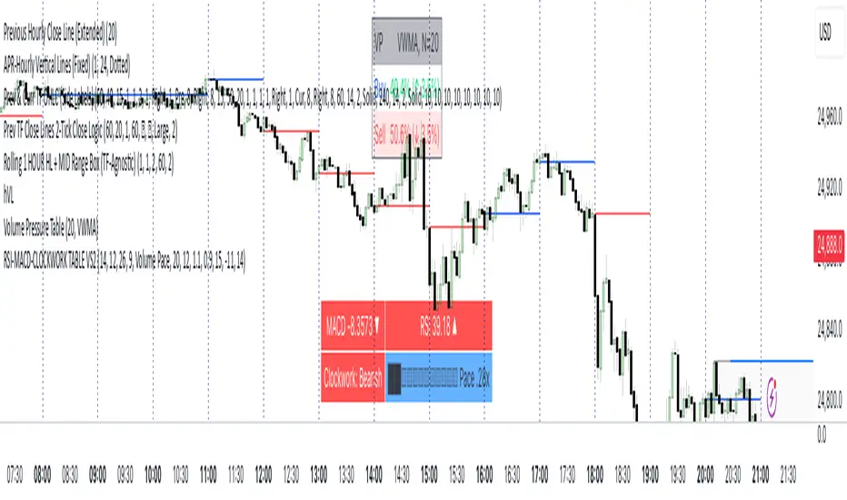
RSI MACD CLOCKWORK TABLEWhat you get, at a glance:
• MACD Cell — Shows the current MACD value and a small direction icon (▲ rising, ▼ falling, ⏺ flat). The background color adapts to regime: green above zero, red below zero, gray near the line. Lengths are configurable (fast/slow/signal).
• RSI Cell — Plots the latest RSI with an identical direction icon and background logic (green above 50, red below 50, gray around 50). RSI length is configurable.
• Clockwork Row — This is the structure check. The script computes the slope (in degrees) of EMA(5), EMA(8), and EMA(13). If all three exceed your bullish threshold, you’ll see “Clockwork: Bullish” (lime). If all three are below your bearish threshold, you’ll see “Clockwork: Bearish” (red). Otherwise, it’s “Neutral” (gray). Thresholds are fully user-tunable.
Smart right-hand cell (choose your readout):
• Duplicate — Mirrors the Clockwork label.
• Time to Close — A clean mm:ss countdown for the current timeframe (with safe defaults on unusual timeframes).
• Slope Degrees — Prints the 5/8/13 EMA slopes in degrees (e.g., +12.3°).
• Slope Pack ▲▼ — Only the direction of each slope (less noise, more speed).
• EMA Spread (5↔13) — Shows the slope differential (degrees) between short and long EMAs.
• Volume Pace — Projects end-of-bar volume from live progress, compares it to your N-bar average, and renders a tiny text progress bar (██░░…) with a neutral “thermo” palette: black = hot (> high threshold), light blue = cold (< low threshold), silver = typical. All inputs (length, bar width, thresholds) are configurable.
• ATR — Current ATR with direction vs previous bar (▲/▼/⏺).
Quality-of-life:
• Optional top padding (~20px) to keep the table visually separated from other overlays.
• Lightweight string/emoji UI for clarity without heavy graphics.
• Defensive guards around timeframe math so the TTC keeps working smoothly.
How to use:
Add to any symbol/timeframe.
Set your MACD/RSI lengths and Clockwork slope thresholds to match your system’s sensitivity.
Pick a right-cell mode that complements your workflow (TTC for day trading, Volume Pace for intrabar context, ATR for volatility).
Note: This tool is informational, not a standalone signal generator. Combine the Clockwork alignment with your entries/exits and risk management.
Swing Dashboard - Pro Trader Metrics with MTF & Enhanced VolumeDESCRIPTION:
A comprehensive real-time dashboard designed for swing traders and active investors trading US equities. Displays all critical metrics in one customizable panel overlay - no need to clutter your chart with multiple indicators.
KEY FEATURES:
📊 Relative Strength Analysis:
Stock vs Market (SPY/QQQ/IWM/DIA)
Stock vs Sector (automatic sector ETF detection)
Sector vs Market comparison
Customizable lookback period (5-60 days)
📈 Price & Range Metrics:
Daily range, change, and gap percentages
Distance from SMA20, SMA50, VWAP
52-week position percentage
ATR% and ADR% for volatility assessment
Range/ADR ratio for breakout detection
💪 Advanced Volume Analysis:
RVOL (full day volume vs 20-day average)
Volume Strength (bar-by-bar analysis)
Volume Trend (5-day vs 20-day momentum)
Customizable RVOL alert thresholds
Non-repainting volume calculations
⚙️ Multi-Timeframe (MTF) Mode:
View daily charts with 5-min or 15-min metric updates
Perfect for monitoring positions without switching timeframes
All calculations remain accurate across timeframes
🎨 Fully Customizable:
Choose which metrics to display
9 position options for the dashboard
Adjustable text size and colors
Toggle individual metrics on/off
Sector-specific ETF mapping for accurate RS calculations
TECHNICAL SPECIFICATIONS:
✅ Non-repainting - all calculations use confirmed bar data
✅ No lookahead bias or future data
✅ Optimized for US stocks with proper sector mapping
✅ Works on any timeframe (best on 5m-Daily)
✅ Pine Script v6 with best practices
✅ Handles edge cases and missing data gracefully
IDEAL FOR:
Swing traders monitoring multiple positions
Day traders needing quick metric overview
Investors tracking relative strength and momentum
Anyone who wants institutional-grade metrics in one place
SECTOR ETF MAPPING:
Automatically maps to correct sector ETFs: XLK, XLF, XLV, XLY, XLP, XLE, XLB, XLI, XLRE, XLC, XLU
HOW TO USE:
Green = Positive/Strong | Red = Negative/Weak | White = Neutral
RS > 0 = Outperforming benchmark/sector
RVOL > 1.5x = High volume day
VWAP% negative = Price below VWAP (mean reversion opportunity)
R/ADR > 100% = Extended range (potential exhaustion)
Perfect for traders who need professional-grade analysis without chart clutter.
TAGS:
dashboard, swing, relativestrengrh, sectoranalysis, volume, rvol, multitimeframe, mtf, tradingdashboard, metrics, daytrading, swingtrading, momentum, vwap, atr, volatility, volumeanalysis
3 Red Heikin Ashi with Higher Lows3 Red Heikin Ashi with Higher Lows will give Buy signal when 3 Red Heikin Ashi with Higher Lows is formed

Buy/Sell Volume Bubbles on Candles🎯 New Big Order Filter Features:
Volume Filter Settings (New Group):
Enable Big Order Filter (Default: ON)
Toggle to show only significant volume
When OFF, shows all bubbles
Volume Threshold (Default: 1.5x)
Overall volume must exceed average by this multiple
1.5 = 150% of average (only big volume candles)
Range: 0.5x to 5.0x
Min Buy Volume Threshold (Default: 1.2x)
Buy volume must exceed average buy volume
1.2 = 120% of normal buying
Filters out small buy orders
Min Sell Volume Threshold (Default: 1.2x)
Sell volume must exceed average sell volume
1.2 = 120% of normal selling
Filters out small sell ordersPractical Examples:
Conservative (Show fewer, bigger orders):
Volume Threshold: 2.0x (only double-average volume)
Buy/Sell Threshold: 1.5x (only strong buying/selling)
Result: Very clean chart, institutional-sized orders only
Moderate (Default - Good balance):
Volume Threshold: 1.5x
Buy/Sell Threshold: 1.2x
Result: Shows significant orders, filters noise
Aggressive (Show more activity):
Volume Threshold: 1.0x
Buy/Sell Threshold: 0.8x
Result: More bubbles, captures medium orders
Use Cases:
🐋 Whale Watching (Set 2.5x+):
Only massive institutional orders
Spot market makers and big players
📊 Swing Trading (Set 1.5x):
Significant volume clusters
Key support/resistance confirmation
⚡ Active Trading (Set 1.2x):
More frequent signals
Better order flow visibility
Chart Clarity:
✅ No more bubble clutter
✅ Focus on significant orders
✅ Easy to spot institutional activity
✅ Independent buy/sell filtering

Sessions [Trade Tribe HQ]Color-coded session ranges with ADR% labels to help you trade smarter, not harder.
This tool marks New York, London, Tokyo, and Sydney sessions, showing their ranges, highs/lows, VWAPs, and ADR%.
🔹 Key Features
Colored session boxes (NY, London, Tokyo, Sydney)
Session highs & lows, VWAP, and trendlines
Dashboard showing active sessions, volume, and %ADR
ADR% labels at session close
🔹 How It Helps
Spot session traps, moves, and reversals faster
Manage expectations using ADR% (no chasing over-extended moves)
Identify overlap zones (London → NY) for volatility spikes
Simplify cycle tracking across global markets
Market Sessions Marker—making it easy to see where the energy has been spent and where opportunity is building next.
Created with ❤️ by TraderChick – part of the Trade Tribe HQ community.
If you found this tool useful, check out my profile for more strategies, classes, and resources.

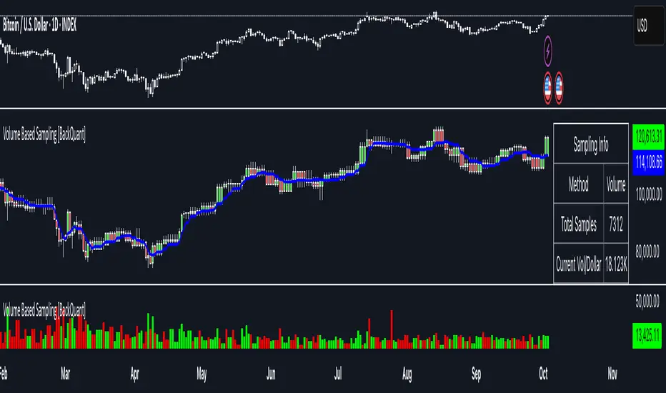
Volume Based Sampling [BackQuant]Volume Based Sampling
What this does
This indicator converts the usual time-based stream of candles into an event-based stream of “synthetic” bars that are created only when enough trading activity has occurred . You choose the activity definition:
Volume bars : create a new synthetic bar whenever the cumulative number of shares/contracts traded reaches a threshold.
Dollar bars : create a new synthetic bar whenever the cumulative traded dollar value (price × volume) reaches a threshold.
The script then keeps an internal ledger of these synthetic opens, highs, lows, closes, and volumes, and can display them as candles, plot a moving average calculated over the synthetic closes, mark each time a new sample is formed, and optionally overlay the native time-bars for comparison.
Why event-based sampling matters
Markets do not release information on a clock: activity clusters during news, opens/closes, and liquidity shocks. Event-based bars normalize for that heteroskedastic arrival of information: during active periods you get more bars (finer resolution); during quiet periods you get fewer bars (coarser resolution). Research shows this can reduce microstructure pathologies and produce series that are closer to i.i.d. and more suitable for statistical modeling and ML. In particular:
Volume and dollar bars are a common event-time alternative to time bars in quantitative research and are discussed extensively in Advances in Financial Machine Learning (AFML). These bars aim to homogenize information flow by sampling on traded size or value rather than elapsed seconds.
The Volume Clock perspective models market activity in “volume time,” showing that many intraday phenomena (volatility, liquidity shocks) are better explained when time is measured by traded volume instead of seconds.
Related market microstructure work on flow toxicity and liquidity highlights that the risk dealers face is tied to information intensity of order flow, again arguing for activity-based clocks.
How the indicator works (plain English)
Choose your bucket type
Volume : accumulate volume until it meets a threshold.
Dollar Bars : accumulate close × volume until it meets a dollar threshold.
Pick the threshold rule
Dynamic threshold : by default, the script computes a rolling statistic (mean or median) of recent activity to set the next bucket size. This adapts bar size to changing conditions (e.g., busier sessions produce more frequent synthetic bars).
Fixed threshold : optionally override with a constant target (e.g., exactly 100,000 contracts per synthetic bar, or $5,000,000 per dollar bar).
Build the synthetic bar
While a bucket fills, the script tracks:
o_s: first price of the bucket (synthetic open)
h_s: running maximum price (synthetic high)
l_s: running minimum price (synthetic low)
c_s: last price seen (synthetic close)
v_s: cumulative native volume inside the bucket
d_samples: number of native bars consumed to complete the bucket (a proxy for “how fast” the threshold filled)
Emit a new sample
Once the bucket meets/exceeds the threshold, a new synthetic bar is finalized and stored. If overflow occurs (e.g., a single native bar pushes you past the threshold by a lot), the code will emit multiple synthetic samples to account for the extra activity.
Maintain a rolling history efficiently
A ring buffer can overwrite the oldest samples when you hit your Max Stored Samples cap, keeping memory usage stable.
Compute synthetic-space statistics
The script computes an SMA over the last N synthetic closes and basic descriptors like average bars per synthetic sample, mean and standard deviation of synthetic returns, and more. These are all in event time , not clock time.
Inputs and options you will actually use
Data Settings
Sampling Method : Volume or Dollar Bars.
Rolling Lookback : window used to estimate the dynamic threshold from recent activity.
Filter : Mean or Median for the dynamic threshold. Median is more robust to spikes.
Use Fixed? / Fixed Threshold : override dynamic sizing with a constant target.
Max Stored Samples : cap on synthetic history to keep performance snappy.
Use Ring Buffer : turn on to recycle storage when at capacity.
Indicator Settings
SMA over last N samples : moving average in synthetic space . Because its index is sample count, not minutes, it adapts naturally: more updates in busy regimes, fewer in quiet regimes.
Visuals
Show Synthetic Bars : plot the synthetic OHLC candles.
Candle Color Mode :
Green/Red: directional close vs open
Volume Intensity: opacity scales with synthetic size
Neutral: single color
Adaptive: graded by how large the bucket was relative to threshold
Mark new samples : drop a small marker whenever a new synthetic bar prints.
Comparison & Research
Show Time Bars : overlay the native time-based candles to visually compare how the two sampling schemes differ.
How to read it, step by step
Turn on “Synthetic Bars” and optionally overlay “Time Bars.” You will see that during high-activity bursts, synthetic bars print much faster than time bars.
Watch the synthetic SMA . Crosses in synthetic space can be more meaningful because each update represents a roughly comparable amount of traded information.
Use the “Avg Bars per Sample” in the info table as a regime signal. Falling average bars per sample means activity is clustering, often coincident with higher realized volatility.
Try Dollar Bars when price varies a lot but share count does not; they normalize by dollar risk taken in each sample. Volume Bars are ideal when share count is a better proxy for information flow in your instrument.
Quant finance background and citations
Event time vs. clock time : Easley, López de Prado, and O’Hara advocate measuring intraday phenomena on a volume clock to better align sampling with information arrival. This framing helps explain volatility bursts and liquidity droughts and motivates volume-based bars.
Flow toxicity and dealer risk : The same authors show how adverse selection risk changes with the intensity and informativeness of order flow, further supporting activity-based clocks for modeling and risk management.
AFML framework : In Advances in Financial Machine Learning , event-driven bars such as volume, dollar, and imbalance bars are presented as superior sampling units for many ML tasks, yielding more stationary features and fewer microstructure distortions than fixed time bars. ( Alpaca )
Practical use cases
1) Regime-aware moving averages
The synthetic SMA in event time is not fooled by quiet periods: if nothing of consequence trades, it barely updates. This can make trend filters less sensitive to calendar drift and more sensitive to true participation.
2) Breakout logic on “equal-information” samples
The script exposes simple alerts such as breakout above/below the synthetic SMA . Because each bar approximates a constant amount of activity, breakouts are conditioned on comparable informational mass, not arbitrary time buckets.
3) Volatility-adaptive backtests
If you use synthetic bars as your base data stream, most signal rules become self-paced : entry and exit opportunities accelerate in fast markets and slow down in quiet regimes, which often improves the realism of slippage and fill modeling in research pipelines (pair this indicator with strategy code downstream).
4) Regime diagnostics
Avg Bars per Sample trending down: activity is dense; expect larger realized ranges.
Return StdDev (synthetic) rising: noise or trend acceleration in event time; re-tune risk.
Interpreting the info panel
Method : your sampling choice and current threshold.
Total Samples : how many synthetic bars have been formed.
Current Vol/Dollar : how much of the next bucket is already filled.
Bars in Bucket : native bars consumed so far in the current bucket.
Avg Bars/Sample : lower means higher trading intensity.
Avg Return / Return StdDev : return stats computed over synthetic closes .
Research directions you can build from here
Imbalance and run bars
Extend beyond pure volume or dollar thresholds to imbalance bars that trigger on directional order flow imbalance (e.g., buy volume minus sell volume), as discussed in the AFML ecosystem. These often further homogenize distributional properties used in ML. alpaca.markets
Volume-time indicators
Re-compute classical indicators (RSI, MACD, Bollinger) on the synthetic stream. The premise is that signals are updated by traded information , not seconds, which may stabilize indicator behavior in heteroskedastic regimes.
Liquidity and toxicity overlays
Combine synthetic bars with proxies of flow toxicity to anticipate spread widening or volatility clustering. For instance, tag synthetic bars that surpass multiples of the threshold and test whether subsequent realized volatility is elevated.
Dollar-risk parity sampling for portfolios
Use dollar bars to align samples across assets by notional risk, enabling cleaner cross-asset features and comparability in multi-asset models (e.g., correlation studies, regime clustering). AFML discusses the benefits of event-driven sampling for cross-sectional ML feature engineering.
Microstructure feature set
Compute duration in native bars per synthetic sample , range per sample , and volume multiple of threshold as inputs to state classifiers or regime HMMs . These features are inherently activity-aware and often predictive of short-horizon volatility and trend persistence per the event-time literature. ( Alpaca )
Tips for clean usage
Start with dynamic thresholds using Median over a sensible lookback to avoid outlier distortion, then move to Fixed thresholds when you know your instrument’s typical activity scale.
Compare time bars vs synthetic bars side by side to develop intuition for how your market “breathes” in activity time.
Keep Max Stored Samples reasonable for performance; the ring buffer avoids memory creep while preserving a rolling window of research-grade data.
Delta Bubbles by exp3rtsDelta Bubbles is a powerful volume-based order flow tool that detects aggressive market activity, highlights trapped traders, and visualizes key liquidity zones on your chart — perfect for scalpers, intraday traders, and anyone trading momentum or reversals.
🧠 What It Does:
📈 Buy/Sell Bubbles: Detects aggressive buying/selling pressure using a volume delta approximation.
🟩 Trap Zones: Highlights areas where traders likely got trapped (buying in downtrends or selling in uptrends).
⚠️ Potential Traps: Shows lighter “setup” zones for trades that may become traps.
🟥🟩 Colored Bars: Optional trend coloring for visual clarity (based on 50 EMA).
📉 Zone Liquidation: Automatically removes zones once price revisits them.
🧩 Customizable Settings:
Bubble sensitivity and size thresholds.
Trap zone width and minimum bubble size.
Toggle trap liquidation, potential zones, colored bars, and bubble visibility.
📌 How to Use It:
Look for trap zones forming against the trend (e.g., bearish bubble in an uptrend → green trap zone).
Watch for retests of zones — these can be key levels for fades or breakouts.
Combine with price action, support/resistance, VWAP, or other confluence tools.
🚀 Best For:
Scalping and reversal trading on intraday timeframes (5m, 15m).
Futures, indices (e.g., NASDAQ, S&P 500), crypto, or any liquid market.

Cumulative Relative Volume- Intraday (RVOL)This Indicator checks the current day's cumulative volume at sometime t and compares it to the average cumulative volume traded over the last 14 days, till the particular time t. this helps in identifying how the trajectory of the volume is growing or reducing through the day. if the RVOLS are high and remains high throughout the session, then the intensity of buying is high. along with any price action this could give a confirmation to a breakout or a breakdown

Smart Money Concept v1Smart Money Concept Indicator – Visual Interpretation Guide
What Happens When Liquidity Lines Are Broken
🟩 Green Line Broken (Buy-Side Liquidity Pool Swept)
- Indicates price has dipped below a previous swing low where sell stops are likely placed.
- Market Makers may be triggering these stops to accumulate long positions.
- Often followed by a bullish reversal.
- Trader Actions:
• Look for a bullish candle close after the sweep.
• Confirm with nearby Bullish Order Block or Fair Value Gap.
• Consider entering a Buy trade (SLH entry).
- If price continues falling: Indicates trend continuation and invalidation of the buy-side liquidity zone.
🟥 Red Line Broken (Sell-Side Liquidity Pool Swept)
- Indicates price has moved above a previous swing high where buy stops are likely placed.
- Market Makers may be triggering these stops to accumulate short positions.
- Often followed by a bearish reversal.
- Trader Actions:
• Look for a bearish candle close after the sweep.
• Confirm with nearby Bearish Order Block or Fair Value Gap.
• Consider entering a Sell trade (SLH entry).
- If price continues rising: Indicates trend continuation and invalidation of the sell-side liquidity zone.
Chart-Based Interpretation of Green Line Breaks
In the provided DOGE/USD 15-minute chart image:
- Green lines represent buy-side liquidity zones.
- If these lines are broken:
• It may be a stop hunt before a bullish continuation.
• Or a false Break of Structure (BOS) leading to deeper retracement.
- Confirmation is needed from candle structure and nearby OB/FVG zones.
Is the Pink Zone a Valid Bullish Order Block?
To validate the pink zone as a Bullish OB:
- It should be formed by a strong down-close candle followed by a bullish move.
- Price should have rallied from this zone previously.
- If price is now retesting it and showing bullish reaction, it confirms validity.
- If formed during low volume or price never rallied from it, it may not be valid.
Smart Money Concept - Liquidity Line Breaks Explained
This document explains how traders should interpret the breaking of green (buy-side) and red (sell-side) liquidity lines when using the Smart Money Concept indicator. These lines represent key liquidity pools where stop orders are likely placed.
🟩 Green Line Broken (Buy-Side Liquidity Pool Swept)
When the green line is broken, it indicates:
• - Price has dipped below a previous swing low where sell stops were likely placed.
• - Market Makers have triggered those stops to accumulate long positions.
• - This is often followed by a bullish reversal.
Trader Actions:
• - Look for a bullish candle close after the sweep.
• - Confirm with a nearby Bullish Order Block or Fair Value Gap.
• - Consider entering a Buy trade (SLH entry).
🟥 Red Line Broken (Sell-Side Liquidity Pool Swept)
When the red line is broken, it indicates:
• - Price has moved above a previous swing high where buy stops were likely placed.
• - Market Makers have triggered those stops to accumulate short positions.
• - This is often followed by a bearish reversal.
Trader Actions:
• - Look for a bearish candle close after the sweep.
• - Confirm with a nearby Bearish Order Block or Fair Value Gap.
• - Consider entering a Sell trade (SLH entry).
📌 Additional Notes
• - If price continues beyond the liquidity line without reversal, it may indicate a trend continuation rather than a stop hunt.
• - Always confirm with Higher Time Frame bias, Institutional Order Flow, and price reaction at the zone.

Candles de Agressão (by Lucas Vasquez)Indicator created to assist in the identification of aggressive candles, both buyer and seller. Thus, enabling decision making with high probability.

TR Volume Candles (Lite)Volume candles for your trading pleasure.
What it does
A lightweight recreation of Traders Reality’s “vector candle” coloring. It repaints the price candles (body, wick, and border) based on relative volume and spread×volume so you can spot high-activity bars at a glance—without the overhead of pivots, sessions, zones, or request.security calls.
Logic (matches TR)
Compute the average of the previous 10 bars’ volume (current bar excluded).
Compute volSpread = (high − low) × volume, and compare to the highest volSpread of the previous 10 bars (current bar excluded).
Color rules:
Green / Red (highest priority): volume ≥ 2× 10-bar average or volSpread ≥ highest of prior 10.
Blue / Violet: volume ≥ 1.5× 10-bar average (and not already green/red).
Regular: none of the above.
Colors (defaults align with TR)
Bull candles: Green (2× / spread×vol), Blue (1.5×), otherwise Light Gray.
Bear candles: Red (2× / spread×vol), Violet (1.5×), otherwise Dark Gray.
Why it’s fast
No external libraries, no symbol overrides, no multi-timeframe requests—just native series math on the current chart.
Inputs
Colors only (keep TR defaults or customize). Thresholds and lookback are fixed to TR standards to ensure identical behavior.
Alerts
“Any Vector Candle,” plus individual alerts for Green, Red, Blue, and Purple. For confirmed signals, set alert to Once per bar close.
Notes
Works on all timeframes.
Candle width is unchanged (uniform, as in your screenshot).
Heikin Ashi or other synthetic candle types will color based on those candles’ OHLC/volume; for strict equivalence, use standard candles.
Volume is exchange-feed dependent; anomalies (splits/halts) can spike the logic temporarily.
Use cases
Quickly highlight expansion bars that often precede/confirm momentum. Combine with your trend tools (EMAs, VWAP, MavilimW) or Darvas/box structures for context.

Fixed-Range Volume-Profile ZonesFixed Range Volume Profile Zones (with Dynamic Percentile Buffers)
This indicator calculates a fixed‑range volume profile over a user‑defined lookback period and identifies three key zones:
– VAL (Value Area Low)
– POC (Point of Control)
– VAH (Value Area High)
Volume is grouped into user‑selected price bins to create a profile of where the most trading activity occurred.
The script then splits the distribution into three zones and highlights the extremes (VAL/VAH) and the highest‑volume price (POC).
Dynamic Percentile Buffers
Instead of static offsets, this version computes the 10th and 90th percentile prices (user‑adjustable) of recent closes over the same lookback window.
These percentiles are used to create adaptive buffers above VAH and below VAL.
The buffers automatically expand or contract with market volatility and recent price distribution, filtering out weak or noisy touches.
Visual Elements:
– Green/orange/red horizontal lines = VAL / VAH / POC
– Green shading below VAL = buy zone
– Red shading above VAH = sell zone
– Down arrows above bars = closes above VAH + buffer
– Up arrows below bars = closes below VAL – buffer
Inputs:
– Lookback Days: number of bars used to build the profile
– Number of Bins: controls resolution of the volume profile
– VAH Percentile and VAL Percentile: choose which percentile levels to use for dynamic buffers
Use Cases:
– Quickly identify areas of high participation (POC) and potential support/resistance (VAL/VAH)
– Filter out weak breakouts using dynamic buffers
– Combine with other signals to improve entries/exits
⚠️ Disclaimer:
This script is for educational and informational purposes only.
It does not constitute financial advice or a recommendation to buy or sell any security.
Past performance or historical data does not guarantee future results.
Always perform your own analysis and use risk management when trading.

Edge Algo
EDGE ALGO is a trend-following and momentum-based algorithm designed to deliver precise Buy and Sell signals with built-in risk management through dynamic Take Profit and Stop Loss levels.
This invite-only tool was created to assist traders in identifying high-probability trade setups while filtering out market noise and avoiding choppy price action.
🧠 How It Works
Edge Algo combines multiple layers of logic to increase the quality of trade signals:
1. Trend Detection
* A dynamic ATR-based channel determines when the price breaks out in a new direction.
* The trend flips to Bullish or Bearish when price action crosses the adaptive channel, avoiding late entries.
2. Momentum Confirmation
* Custom logic involving RSI (Relative Strength Index) and CMO (Chande Momentum Oscillator) helps filter fake signals.
* Buy conditions require RSI to be under 25 and CMO to confirm upward momentum.
* Sell conditions require RSI to be over 75 and CMO to confirm downward momentum.
3. Support/Resistance Pivot Zones
* Recent highs/lows are used as confirmation points to strengthen entries around key price levels.
4. Entry Logic
* When trend change + momentum filter + pivot confirmation align, the script generates a Buy or Sell signal.
* Each signal is clearly displayed on the chart with custom labels.
🎯 Risk Management (SL/TP Logic)
For every valid entry, the script automatically calculates:
✅ Stop Loss (SL) based on a user-defined percentage
✅Take Profit 1 (TP1) at 1R
✅ Take Profit 2 (TP2) at 2R
✅ Take Profit 3 (TP3) at 3R
This allows traders to follow a consistent risk-to-reward ratio and manage trades using partial exits or full closes at target levels.
📊 Visualization Features
* Optional Cloud Moving Average to visually represent market direction
*Buy/Sell labels on chart with clean styling
* Clearly marked Entry, TP1, TP2, TP3, SL levels
* Real-time alerts for Buy and Sell signals
* Fully customizable styling (colors, cloud, labels, etc.)
⚙️ Best Use Cases
* Timeframes: optimized for 15min to 4H charts
* Pairs: works with Forex, Crypto, Indices, Commodities, and Stocks
* Styles: suitable for scalping, intraday trading, and swing trading
🔒 Why Invite-Only?
Edge Algo PRO contains proprietary logic developed specifically for real-time application with an edge in volatile markets.
To protect the intellectual property and ensure quality use, access is granted only upon request.

VWAP / ORB / VP & POCThis is an all-in-one technical analysis tool designed to give you a comprehensive view of the market on a single chart. It combines three powerful indicators—VWAP, Opening Range, and Volume Profile—to help you identify key price levels, understand intraday trends, and spot areas of high liquidity.
What It Does
The indicator plots three distinct components on your chart:
Volume-Weighted Average Price (VWAP): A benchmark that shows the average price a security has traded at throughout the day, based on both price and volume. It's often used by institutional traders to gauge whether they are getting a good price. The script also plots standard deviation or percentage-based bands around the VWAP line, which can act as dynamic support and resistance.
Opening Range Breakout (ORB): A tool that highlights the high and low of the initial trading period of a session (e.g., the first 15 minutes). The script draws lines for the opening price, range high, and range low for the rest of the session. It also colors the chart with zones to visually separate price action above, below, and within this critical opening range.
Volume Profile (VP): A powerful study that shows trading activity over a set number of bars at specific price levels. Unlike traditional volume that is plotted over time, this is plotted on the price axis. It helps you instantly see where the most and least trading has occurred, identifying significant levels like the Point of Control (POC)—the single price with the most volume—and the Value Area (VA), where the majority of trading took place.
How to Use It for Trading
The real strength of this indicator comes from finding confluence, where two or more of its components signal the same key level.
Identifying Support & Resistance: The POC, VWAP bands, Opening Range high/low, and session open price are all powerful levels to watch. When price approaches one of these levels, you can anticipate a potential reaction (a bounce or a breakout).
Gauging Intraday Trend: A simple rule of thumb is to consider the intraday trend bullish when the price is trading above the VWAP and bearish when it is trading below the VWAP.
Finding High-Value Zones: The Volume Profile’s Value Area (VA) shows you where the market has accepted a price. Trading within the VA is considered "fair value," while prices outside of it are "unfair." Reversals often happen when the price tries to re-enter the Value Area from the outside.
Settings:
Here’s a breakdown of all the settings you can change to customize the indicator to your liking.
Volume Profile Settings:
Number of Bars: How many of the most recent bars to use for the calculation. A higher number gives a broader profile.
Row Size: The number of price levels (rows) in the profile. Higher numbers give a more detailed, granular view.
Value Area Volume %: The percentage of total volume to include in the Value Area (standard is 70%).
Horizontal Offset: Moves the Volume Profile further to the right to avoid overlapping with recent price action.
Colors & Styles: Customize the colors for the POC line, Value Area, and the up/down volume bars.
VWAP Settings:
Anchor Period: Resets the VWAP calculation at the start of a new Session, Week, Month, Year, etc. You can even anchor it to corporate events like Earnings or Splits.
Source: The price source used in the calculation (default is hlc3, the average of the high, low, and close).
Bands Calculation Mode:
Standard Deviation: The bands are based on statistical volatility.
Percentage: The bands are a fixed percentage away from the VWAP line.
Bands Multiplier: Sets the distance of the bands from the VWAP. You can enable and configure up to three sets of bands.
ORB Settings (Opening Range)
Opening Range Timeframe: The duration of the opening range (e.g., 15 for 15 minutes, 60 for the first hour).
Market Session & Time Zone: Crucial for ensuring the range is calculated at the correct time for the asset you're trading.
Line & Zone Styles: Full customization for the colors, thickness, and style (Solid, Dashed, Dotted) of the High, Low, and Opening Price lines, as well as the background colors for the zones above, below, and within the range.

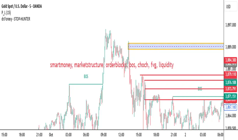
HUNT_line [Dr.Forexy]HUNT_line Indicator
📊 **Category:** Price Action & Market Structure
⏰ **Recommended Timeframe:** 5-minute and higher
🎯 **Purpose:** Advanced market structure visualization for professional traders
⸻
⚡ **Key Features:**
• Break of Structure (BOS) and Change of Character (CHOCH) detection
• Internal & Swing Market Structure analysis
• Order Blocks identification with smart filtering
• Fair Value Gaps (FVG) visualization
• Premium/Discount Zones
• Multi-timeframe support
• Real-time structure alerts
⸻
🛠 **How to Use:**
1. Apply on 5M or higher timeframes for best results
2. Monitor BOS/CHOCH for trend direction changes
3. Use Order Blocks as potential support/resistance areas
4. Watch for FVG fills as price inefficiency zones
5. Combine multiple confluences for higher probability setups
⸻
⚠️ **Risk Disclaimer:**
This indicator is for educational purposes only.
Not financial advice. Always conduct your own research.
⸻
🔹 **Credits:**
Inspired by LuxAlgo's "Smart Money Concepts" with custom improvements
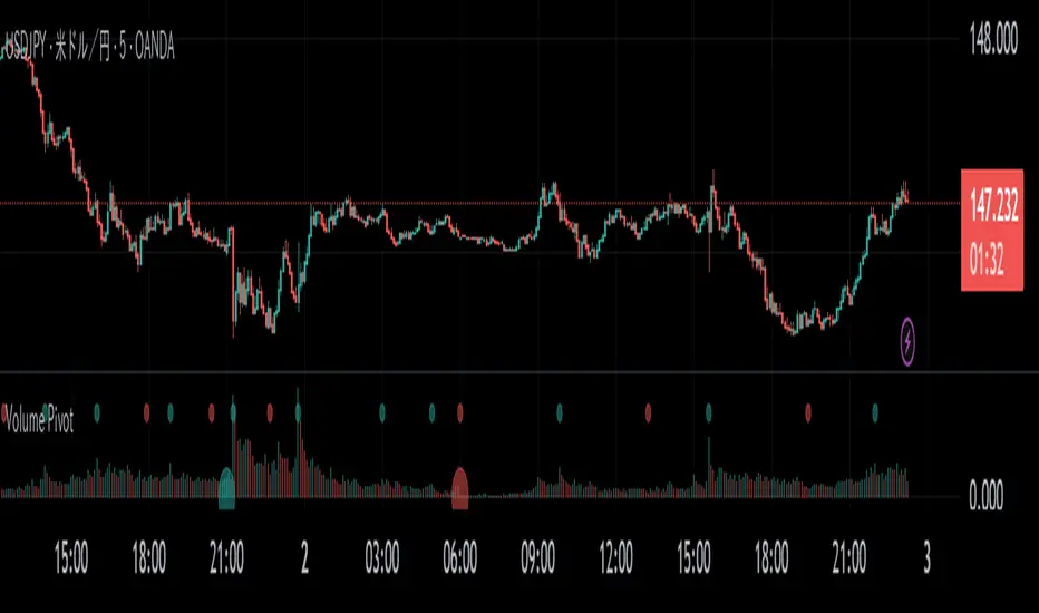
Volume PivotOVERVIEW
Volume Pivot is a technical analysis tool for TradingView designed to identify key turning points in the market by focusing on volume rather than price. It detects peaks and troughs (pivots) in trading volume to pinpoint moments of maximum market interest or exhaustion.
This indicator performs its analysis on both the Current Timeframe (CTF) and a user-defined Higher Timeframe (HTF). This dual-perspective approach allows traders to simultaneously grasp short-term market reactions and long-term structural shifts, leading to more informed and high-conviction trading decisions.
FEATURES
Automatic Pivot Detection
Automatically identifies and plots Volume Pivot Highs (peaks) and Pivot Lows (troughs) based on a user-defined Lookback Length.
Dual Timeframe Display
- CTF Signals : Plotted as tiny circles directly above the corresponding volume bars for immediate, short-term context.
- HTF Signals : Plotted as slightly larger circles at the bottom of the indicator pane, making them easy to distinguish as signals of higher significance.
Flexible HTF Configuration
Customize which higher timeframe to use for analysis based on your current chart timeframe. For example, you can set the indicator to reference the 1-hour chart as the HTF when you are on the 5-minute chart, and the Daily chart as the HTF when you are on the 1-hour chart.
Intuitive Volume Bars
The volume bars are color-coded to show whether volume is increasing (bullish color) or decreasing (bearish color) compared to the previous bar, offering a quick visual gauge of market momentum.
Full Customization
Easily toggle the visibility of CTF and HTF signals and customize the colors for bullish and bearish pivots to match your charting preferences.
GoldenJet - Cumulative Volume DeltaCumulative Volume Delta (CVD) Indicator - Understand Market Sentiment
Overview
The Cumulative Volume Delta (CVD) indicator will help traders decode market sentiment through volume trends. It provides clear visuals and real-time metrics to reveal the strength and direction of market forces.
Benefits for Traders
Gauge Sentiment: CVD uses colored candlesticks to display buying or selling pressure, making it easy to identify bullish or bearish market moods.
Spot Momentum Shifts: Tracks changes in volume flow to highlight emerging trends or weakening momentum.
Flexible Timeframes: Adjust analysis periods (e.g., intraday or daily) to suit your trading approach.
Real-Time Insights: A table shows live volume flow and its changes, offering a quick view of market dynamics.
Key Features
Customizable Display: Set table position and size (small, medium, large) for a clear chart setup.
Intuitive Visuals: Green (buying) or red (selling) candles for instant sentiment recognition.
Trend Metrics: Indicates rising or falling volume trends and their speed for deeper context.
How to Use
Apply CVD to your TradingView chart for any asset.
Configure timeframe and table settings to match your analysis needs.
Interpret candle colors and table data to assess market sentiment.
Combine with other indicators to validate trend direction.
Why It Helps
CVD empowers traders by revealing volume-driven market sentiment, helping you understand whether buyers or sellers are in control. This insight supports better decision-making across various trading strategies.

Actually Engulfing CandlesticksThis thing attempts to find price reversals with actually engulfing candlesticks with volume spikes and RSI values as confirmation. It works well on mean reverting assets I guess.
Green dots below bars = bullish reversal
Fuchsia dots above bars = bearish reversal
Have fun!

Anchored VWAP + Prev Session Levels by Avenoircustom vwap for weekly, monthly, quarterly and yearly vawp.
also highlighting previous vwaps.

VWAP Daily/Weekly/Monthly - Automatic AnchoredExplanation:
This script plots Volume-Weighted Average Price (VWAP) lines that are automatically anchored to the beginning of key timeframes — daily, weekly, and monthly. VWAP is a widely used trading indicator that shows the average price of an asset weighted by trading volume, making it useful for identifying fair value and institutional trading levels.
The “automatic anchored” feature means that you don’t have to manually select starting points. Instead, the script automatically resets the VWAP at the start of each day, week, or month, depending on the chosen setting. This ensures the VWAP always reflects the true average price for that period, providing traders with a consistent reference for support, resistance, and trend direction across multiple timeframes.
Notice:
On the chart, you may notice visible “jumps” in the VWAP lines. These are intentional. Each jump marks the reset point at the start of a new day, week, or month, depending on the selected setting. This design keeps the VWAP history from the previous period intact, allowing you to clearly see how price interacted with VWAP in past sessions.
By keeping these historical resets, you can easily compare short-term (daily) VWAP behavior against longer-term levels like weekly and monthly VWAP. This provides valuable context, helping you spot when price respects or diverges from fair value across different timeframes.
In short:
Daily VWAP resets at the start of each trading day.
Weekly VWAP resets at the beginning of each trading week.
Monthly VWAP resets at the start of each month.
This makes it easy to analyze how price interacts with VWAP levels across different time horizons without manual adjustments.