Understanding Market Structure Through Arcs
Market structure always seems simple when explained on YouTube. But open up a chart, and suddenly it feels puzzling, inconsistent, even frustrating. Imagine this: you’re analyzing the structure of a forex pair, confidently tracking highs and lows. Everything makes sense. Then you switch to a different pair—or even just a different date on the same chart—and suddenly it feels like your skill vanished. Yesterday you “understood” market structure, but today you don’t. So, what’s happening?
The truth is, when this confusion sets in, it’s usually because you’re looking for the wrong signs. Traders often get caught up searching for zigzags, breaks of structure (BoS), market shifts, supply and demand zones, or liquidity sweeps. But the key to truly understanding market structure comes down to one core skill: identifying strong and weak structures.
Redefining Market Structure
Market structure is not simply a zigzag. It’s not just supply and demand. Market structure is a collection of structures that, when viewed together, naturally form zigzags, supply/demand areas, and BoS/market shift levels.
And here’s the important part: not all structures are created equal. But don’t worry—you don’t need to memorize dozens of “types.” There are only two: strong structures and weak structures.
How to Identify Structures
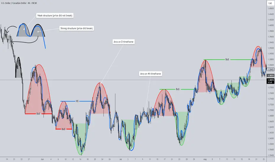
This is where things get surprisingly simple. To identify structure, look for arcs. Yes—the charting tool no one ever uses. An arc represents price dipping and then returning to its prior high or low.
• If price closes beyond the previous high/low, the structure is strong.
• If price fails to break the previous high/low and closes within it, the structure is weak.
That’s it. Look at the chart example provided—you’ll see how clear this becomes once you train your eye. The Red/Green arcs represent arcs that were identified on the D timeframe (HTF). The blue squiggly line represents a collection of arcs identified on the 4h timeframe (LTF).


Multi-Timeframe Power
Here’s where arcs become even more powerful. A structure on one timeframe (say, the 4H) is essentially a supply/demand zone. Drop down to a lower timeframe (4H → 1H), and that same structure becomes a full swing move. This allows you to navigate multiple timeframes seamlessly—simply by plotting structures on the higher timeframe.
The Arc as the Foundation
Once you learn to spot arcs, everything clicks into place. An arc is supply and demand. It is liquidity boundaries. It defines strong/weak highs and lows. It creates the zigzag. In short: structure identification is the only skill you need to master market structure—and it’s surprisingly quick to learn.
Additional Notes
• A valid arc requires at least three candles. Anything less is not structure.
• Two candles may represent a reaction to supply/demand or a liquidity sweep, but they don’t form a structure.
• Why? Because structure requires balance—a brief pause where price enters, slows, stabilizes, and then reverses. That balancing process cannot be captured in one or two candles.
My Advice
For now, set aside the broader concept of “market structure” and focus only on arcs.
1. Practice identifying arcs in live price action—don’t worry about backtesting yet.
2. Mark them on your chart, and classify them as strong or weak.
3. Once you’re comfortable spotting them, move into backtesting. Watch arcs unfold in motion.
4. With enough practice, you’ll be able to recognize them instantly and without hesitation.
That’s when you return to market structure as a whole. With the skill of arc recognition in place, you’ll finally see how everything ties together—and your understanding will be unshakable.
Previous Post; Complete Market Structure: Order Flow and Multiple Timeframes
Although I felt that this was a great take on market structure, the indicator provided falls short in a sense that market it relies on alternating internal shifts, when in market structure shifts can happen consecutively instead of strictly alternating. I have developed a different tool that will help identify structural levels without missing a single arc. It is called Supply/Demand Zones (Synthetic SMA Candles). I will provide a link below. It identifies arcs and classifies them as supply/demand zones. It also provides alerts which can be helpful if you are the type of trader that likes to trade passively without being glued to the charts.

Arc Identifying Indicator (Supply/Demand)

Market structure always seems simple when explained on YouTube. But open up a chart, and suddenly it feels puzzling, inconsistent, even frustrating. Imagine this: you’re analyzing the structure of a forex pair, confidently tracking highs and lows. Everything makes sense. Then you switch to a different pair—or even just a different date on the same chart—and suddenly it feels like your skill vanished. Yesterday you “understood” market structure, but today you don’t. So, what’s happening?
The truth is, when this confusion sets in, it’s usually because you’re looking for the wrong signs. Traders often get caught up searching for zigzags, breaks of structure (BoS), market shifts, supply and demand zones, or liquidity sweeps. But the key to truly understanding market structure comes down to one core skill: identifying strong and weak structures.
Redefining Market Structure
Market structure is not simply a zigzag. It’s not just supply and demand. Market structure is a collection of structures that, when viewed together, naturally form zigzags, supply/demand areas, and BoS/market shift levels.
And here’s the important part: not all structures are created equal. But don’t worry—you don’t need to memorize dozens of “types.” There are only two: strong structures and weak structures.
How to Identify Structures
This is where things get surprisingly simple. To identify structure, look for arcs. Yes—the charting tool no one ever uses. An arc represents price dipping and then returning to its prior high or low.
• If price closes beyond the previous high/low, the structure is strong.
• If price fails to break the previous high/low and closes within it, the structure is weak.
That’s it. Look at the chart example provided—you’ll see how clear this becomes once you train your eye. The Red/Green arcs represent arcs that were identified on the D timeframe (HTF). The blue squiggly line represents a collection of arcs identified on the 4h timeframe (LTF).
Multi-Timeframe Power
Here’s where arcs become even more powerful. A structure on one timeframe (say, the 4H) is essentially a supply/demand zone. Drop down to a lower timeframe (4H → 1H), and that same structure becomes a full swing move. This allows you to navigate multiple timeframes seamlessly—simply by plotting structures on the higher timeframe.
The Arc as the Foundation
Once you learn to spot arcs, everything clicks into place. An arc is supply and demand. It is liquidity boundaries. It defines strong/weak highs and lows. It creates the zigzag. In short: structure identification is the only skill you need to master market structure—and it’s surprisingly quick to learn.
Additional Notes
• A valid arc requires at least three candles. Anything less is not structure.
• Two candles may represent a reaction to supply/demand or a liquidity sweep, but they don’t form a structure.
• Why? Because structure requires balance—a brief pause where price enters, slows, stabilizes, and then reverses. That balancing process cannot be captured in one or two candles.
My Advice
For now, set aside the broader concept of “market structure” and focus only on arcs.
1. Practice identifying arcs in live price action—don’t worry about backtesting yet.
2. Mark them on your chart, and classify them as strong or weak.
3. Once you’re comfortable spotting them, move into backtesting. Watch arcs unfold in motion.
4. With enough practice, you’ll be able to recognize them instantly and without hesitation.
That’s when you return to market structure as a whole. With the skill of arc recognition in place, you’ll finally see how everything ties together—and your understanding will be unshakable.
Previous Post; Complete Market Structure: Order Flow and Multiple Timeframes
Although I felt that this was a great take on market structure, the indicator provided falls short in a sense that market it relies on alternating internal shifts, when in market structure shifts can happen consecutively instead of strictly alternating. I have developed a different tool that will help identify structural levels without missing a single arc. It is called Supply/Demand Zones (Synthetic SMA Candles). I will provide a link below. It identifies arcs and classifies them as supply/demand zones. It also provides alerts which can be helpful if you are the type of trader that likes to trade passively without being glued to the charts.
Arc Identifying Indicator (Supply/Demand)
Disclaimer
The information and publications are not meant to be, and do not constitute, financial, investment, trading, or other types of advice or recommendations supplied or endorsed by TradingView. Read more in the Terms of Use.
Disclaimer
The information and publications are not meant to be, and do not constitute, financial, investment, trading, or other types of advice or recommendations supplied or endorsed by TradingView. Read more in the Terms of Use.