Busted Chart Patterns...What They Are?Hello traders,
Ever saw that textbook double bottom with all rules applied? Price broke the swing high and stayed above, clear entry, stop loss and tp targets. All of a sudden, price reverts and continues the move downwards. But why? its a double bottom for god's sake!! Every guru said its a guaranteed trade.
This was not a double bottom. This was "busted double bottom". So what is a busted pattern?
--------------------------------------------------------------------------
🔍 What defines a busted chart pattern?
A pattern is considered "busted" when all of the following occur:
1️⃣ Typical price breakout
Price closes above resistance or below support, or outside a pattern boundary (e.g., triangle trendline).
2️⃣ Limited follow-through
Price travels no more than ~10-15% in the breakout direction.
3️⃣ Failure & reversal
Volume and momentum stalls and price reverses
4️⃣ Invalidation close
Bearish breakout → price closes back above the top of the pattern
Bullish breakout → price closes back below the lowest low of the pattern
--------------------------------------------------------------------------
🔄 Can a single pattern bust more than once?
Yes.
Patterns can experience: Single (most common), double or triple bust.
Price could oscillate for days, weeks or months, repeatedly failing in both directions. Usually that is a clear sign of distribution, accumulation, or liquidity sweeping.
--------------------------------------------------------------------------
🧩 How this fits modern price action?
Busted patterns often align with:
- Liquidity grabs
- False breakouts
- Stop-hunt behavior
--------------------------------------------------------------------------
🛠️ How to capitalize on this in our trading?
If the normal pattern momentum is fading, wait for failure confirmation
- Use the reclaimed level as invalidation
- Expect expansion in the opposite direction
- Risk is often cleaner than chasing breakouts
--------------------------------------------------------------------------
📌 Examples
Busted Head & Shoulders
Busted Double Top
--------------------------------------------------------------------------
Patterns fail not because they are “wrong.” But because our mindset becomes one-sided.
Educational content only. Always manage risk and do your own analysis.
This knowledge and concepts are adapted from Thomas Bulkowski’s chart pattern research
If you find value in this content, please support the effort with a like & a comment
Chartanalysis

Most Traders Lose Because They Don’t Know What a Trend Really IsDOW THEORY – THE FOUNDATION OF TREND READING
1. The Market Moves in Trends – Not Randomly
- Price does not move randomly. What looks like chaos is actually structured movement driven by collective behavior.
A trend exists when the market consistently creates:
+ Higher Highs & Higher Lows → Uptrend
+ Lower Highs & Lower Lows → Downtrend
As long as this structure remains intact, the trend remains valid regardless of news, opinions, or emotions.
2. Every Trend Has Three Levels of Movement
- Understanding timeframe hierarchy is critical.
Markets move in three simultaneous layers:
+ Primary Trend – the dominant direction (weeks to months)
+ Secondary Move – corrective phases against the main trend
+ Minor Swings short-term noise
Most traders lose money because they trade against the primary trend, reacting to minor swings and mistaking them for reversals.
3. The Three Phases of a Trend
A trend does not start or end suddenly. It evolves through three psychological phases:
1️⃣ Accumulation Phase
Smart money quietly builds positions
Price moves sideways, volatility is low
Public interest is minimal
2️⃣ Participation Phase
Trend becomes clear
Breakouts occur
Most trend-following profits are made here
3️⃣ Distribution Phase
Late buyers enter emotionally
Volatility increases
Smart money exits
Understanding these phases helps traders avoid buying tops and selling bottoms.
4. Structure Is the Only Valid Trend Confirmation
A trend is not confirmed by indicators alone.
A trend is confirmed when:
+ Price breaks structure in the trend direction
+ Pullbacks respect previous swing levels
+ Momentum continues after corrections
If structure is not broken, there is no reversal only a correction.
This is why predicting tops and bottoms is dangerous.
5. Volume Confirms Direction, Not Timing
Volume does not tell you when to enter — it tells you whether the move is real.
- Rising volume in the direction of the trend = confirmation
- Weak volume during pullbacks = healthy correction
- High volume against structure = warning sign
Price leads. Volume confirms.
6. A Trend Continues Until Proven Otherwise
This is the most ignored rule and the most important.
A trend does NOT end because:
- Price “already went too far”
- Indicators are overbought/oversold
- Social media says “top is in”
A trend ends only when structure breaks and fails to recover.
HOW TO APPLY THIS IN REAL TRADING
Simple, repeatable framework:
- Identify the dominant trend (HH/HL or LH/LL)
- Wait for a correction not a reversal
- Enter only after structure resumes in trend direction
- Place stop-loss where structure becomes invalid
- Hold until the market changes structure
No prediction. No guessing. Just reading what price is already telling you.
FINAL THOUGHT
Most traders don’t lose because they lack indicators.
They lose because they don’t understand trend behavior.
When you stop predicting and start reading structure,
the market becomes clear, calm, and repeatable.

Trading Psychology: Inside the Mind of a Successful Trader🔥 Trading Psychology: Inside the Mind of a Successful Trader
⭐ 1. Why Most Traders Fail: The Battle Inside Their Own Mind
The majority of traders spend all their time trying to predict the market:
- “Will it go up or down?”
- “What if I lose this trade?”
- “What if I miss the move?”
This constant anxiety leads to emotional decisions chasing entries, closing profits too early, ignoring stoploss, overtrading…
A professional trader thinks differently:
👉 Once they enter a trade, they accept that the result is out of their control.
👉 Instead of worrying, they focus on improving their strategy and execution.
This shift in mindset separates amateurs from professionals.
⭐ 2. Avoid the Ego Trap: Overconfidence Destroys Traders
Many traders lose because they believe they are “right.”
They fall in love with their bias… and the market humbles them brutally.
A successful trader never assumes they know what the market will do.
They write everything down:
- their entry
- their exit
- their emotions
- the market structure
- what went well
- what failed
This trading journal becomes their mirror the place where REAL improvement happens.
⭐ 3. Learning From Losses: A Superpower Only Pros Have
Most retail traders quit after a few losses.
A professional trader studies those losses like gold.
Markets expose your weaknesses instantly.
A losing streak doesn’t define you — it teaches you:
- Was it a bad setup?
- Was it a psychological mistake?
- Did you violate your plan?
- Was it a normal statistical loss?
A winning trader accepts losses calmly.
Losses are information.
Information becomes experience.
Experience becomes confidence.
⭐ 4. Risk Management: Where Psychology Meets Survival
One of the most dangerous psychological traps is entering a trade even when there is no real opportunity.
Traders do this because:
- They are bored
- They fear missing out
- They want to “make back” losses
- They want to feel active in the market
But a professional trader knows:
👉 Protecting capital ALWAYS comes before making profits.
👉 You trade only when the market gives you a valid opportunity.
👉 You use stoploss not because you expect to lose, but because you respect the market.
Risk management is not technical it’s psychological discipline.
⭐ 5. Successful Traders Don’t Gamble - They Follow a Process
- Most people enter the stock or crypto market with no plan.
- They follow random advice, copy strangers online, or chase someone else’s profits.
This creates inconsistent results and emotional chaos.
A successful trader:
✔️ studies the market
✔️ researches proven strategies
✔️ practices before trading real money
✔️ learns from veteran traders
✔️ builds a personal trading system
✔️ follows that system with discipline
A system turns trading from gambling… into a professional process.
⭐ 6. The Habits That Build a Winning Trading Psychology
Here are the habits every long-term successful trader shares:
✔️ Have a trading plan and follow it strictly
It won’t guarantee profit every time, but it WILL guarantee long-term survival.
✔️ Don’t take shortcuts
Discipline is what separates consistent winners from emotional gamblers.
✔️ Don’t chase profits
The market offers opportunities daily — desperation kills clarity.
✔️ Only trade what you’re willing to lose
You can’t trade with courage if you trade with fear.
✔️ Accept losses without emotional collapse
A single trade does not define your career — your process does.
✔️ Trust your system, not your emotions
Your strategy knows more than your feelings.
🔥 Conclusion: Master Your Mind, Master the Market
To become a successful trader, psychology is everything.
You cannot control the market.
But you can control:
- your reactions
- your discipline
- your mindset
- your decisions
With the right psychology, your trading becomes calmer, more consistent, and more profitable.
Your wins become systematic.
Your losses become lessons.
And your journey becomes sustainable.
A winning psychology is not something you are born with it is something you build through habits, discipline, and time.
Trade like a professional. Think like a professional And your results will follow.

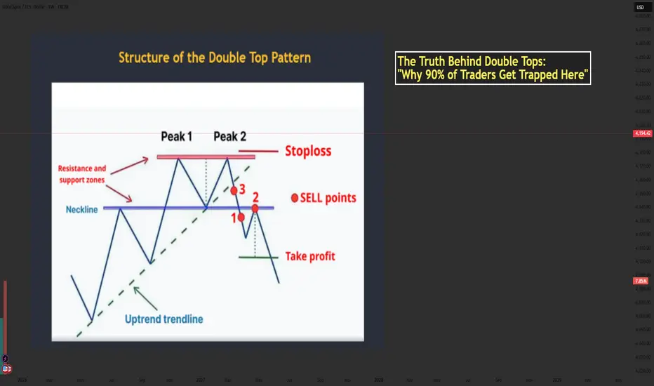
The Truth Behind Double Tops: Why 90% of Traders Get Trapped...📘 Mastering the Double Top Pattern — Structure, Psychology & How Smart Money Uses It
- The Double Top is one of the most powerful reversal patterns in technical analysis. When used correctly, it helps traders catch the transition from bullish momentum → bearish reversal with high accuracy.
- Let’s break down the structure using the chart you provided and enhance it with professional-level insights.
🔶 1. Structure of the Double Top
1️⃣ The First Top
- Price pushes upward strongly during an uptrend.
- Buyers are in full control and create the first peak.
- After reaching resistance, price pulls back → forming the neckline.
This pullback is normal and represents the market taking profits.
2️⃣ The Second Top
- Price rallies again but fails to break above Peak 1.
- This failure is extremely important — it shows bulls are losing strength.
- The second top traps late buyers who expect a breakout.
3️⃣ The Neckline Break
- Once price breaks below the neckline, the structure is officially confirmed.
- This represents sellers overwhelming buyers.
- A break of structure → shift in market control.
📌 Professional traders only consider the pattern valid AFTER the neckline break.
🔶 2. Market Psychology Behind the Double Top
Understanding the pattern’s psychology is what separates beginners from professional traders.
1️⃣ At Peak 1
Bulls believe the trend will continue.
Retail traders buy aggressively.
2️⃣ Pullback to Neckline
A healthy correction occurs; no one expects a reversal yet.
3️⃣ At Peak 2
This is where emotions start to shift:
- Retail buyers expect a breakout.
- Smart Money uses this area as a liquidity zone to trigger buy stops.
- Institutions often sell into this liquidity, creating the foundation for reversal.
4️⃣ Neckline Break
Panic begins:
Buyers trapped at Peak 2 start closing positions.
Sellers enter aggressively.
Momentum shifts — the trend has reversed.
5️⃣ Retest
The retest is a psychological trap:
- Trapped buyers hope for “one more push up.”
- Sellers add positions at better prices.
- When price rejects the neckline → the downtrend accelerates.
💡 This is why the retest is the safest sell entry.
🔶 3. Conditions for a High-Quality Double Top
To avoid fake patterns, check these criteria:
✔️ Must appear after a clear uptrend
✔️ Both tops should be similar in height
✔️ Volume should decrease on the second top
✔️ Neckline breakout must be decisive and clean
✔️ Better if second peak creates a stop-hunt wicking above Peak 1
✔️ Even more powerful when aligned with:
- HTF resistance
- Institutional zones
- Liquidity sweeps
- Overbought RSI
- Divergence
🔶 4. How to Trade the Double Top
1️⃣ Entry (Sell Zone)
Best Entry:
👉 SELL on the neckline retest after the breakout.
This gives:
- Best accuracy
- Best risk–reward
- Confirmation that the market has shifted bearish
2️⃣ Stop Loss Placement
Place SL:
- Above Peak 2
- Or above Peak 1 (more conservative)
🛑 SL must sit outside the structure to avoid fake moves.
3️⃣ Take Profit Target
The classic measurement:
- Distance from Peak → Neckline
- Projected downward
This gives the first TP.
TP2 can be placed at:
Next support zone
- Fib 1.618 extension
- HTF demand area
🔶 5. Real Market Example
Your image shows:
- Two clear peaks forming under a resistance zone
- Neckline support holding price
- A strong break below the neckline
- Sell entries at the ideal points:
+ Point 1 → aggressive breakout trader
+ Point 2 → safest retest entry
+ Point 3 → early anticipation entry (riskier)
The downward projection after the pattern aligns perfectly with the expected target zone.
🔶 6. Trader Psychology: Why People Lose with Double Tops
Most traders get trapped because they:
❌ Sell too early (before neckline break)
❌ Expect the second top to drop immediately
❌ Ignore volume or candle strength
❌ Enter without waiting for retest
❌ Fear missing out and chase price after the big drop
Smart Money uses these emotions:
- Greed → traps buyers at Peak 2
- Fear → forces panic selling at neckline break
- FOMO → attracts late sellers at the worst price
Your job is to stay patient and enter only at the retest, where probability is highest.
🔶 7. Professional Tips to Master the Double Top
✔️ Wait for structure confirmation → neckline break
✔️ Don’t sell inside the range between the two peaks
✔️ Use RSI divergence to strengthen accuracy
✔️ Look for stop-hunt wicks above Peak 2
✔️ Combine with trendline breaks for timing
✔️ Use a top-down approach (H4 + H1 → M15 entry)
✨ Final Message for Traders
The Double Top is not just a pattern it is a reflection of fear, greed, and trapped liquidity.
Master the psychology behind it, and it becomes one of your most reliable reversal tools.
If this helped your trading, drop a comment and share your thoughts!
Let’s grow together. ❤️📈
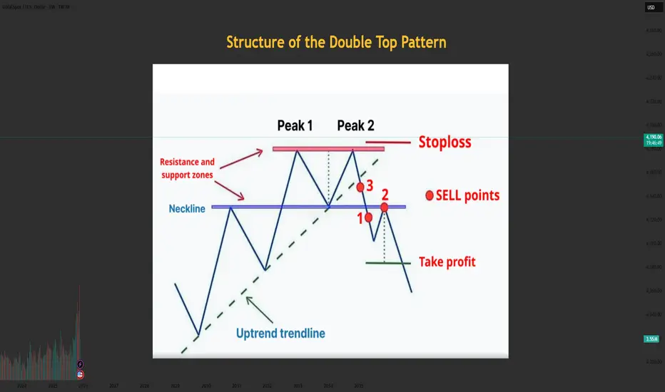
Structure of the Double Top PatternStructure of the Double Top Pattern
The Double Top consists of three main components:
1. First Top
- Price rises strongly and forms the first peak.
- Then price pulls back → creating the middle low (neckline).
2. Second Top
- Price rallies again but fails to break above the first top.
- This indicates weakening bullish pressure.
3. Neckline Breakout
- When price breaks below the neckline, the pattern is confirmed.
- This is the safest SELL entry.
Meaning of the Double Top Pattern
- Buying pressure weakens after the second top is formed.
- Sellers begin to dominate.
- Once the neckline is broken → a new downtrend begins.
- It is considered a strong and reliable reversal pattern when it forms after a clear uptrend.
Conditions for a Valid & High-Quality Double Top
✔️ The prior trend must be strongly bullish
✔️ Both tops should be approximately equal in height
✔️ Volume is usually higher on the first top and lower on the second
✔️ A strong neckline break with high volume → solid confirmation
How to Trade the Double Top Pattern
1. SELL Entry
Enter when price breaks the neckline and retests it.
✔️ The safest entry: SELL on the neckline retest → higher probability.
2. Stop Loss Placement
- Place SL slightly above the second top (or the first top).
- SL should be placed outside the structure to avoid false breakouts.
3. Take Profit (TP)
- How to estimate the target:
- Measure the distance from the top to the neckline, then project it downward.
Tips to Avoid Getting Trapped by a Double Top
1. Do NOT SELL just because price forms the second top → not confirmed yet
2. Only SELL when the neckline is clearly broken
3. Check volume or candle strength to increase accuracy
4. Combine with RSI, FVG, Trendline, Liquidity concepts for higher probability
Don’t forget to like and share your thoughts in the comments! ❤️❤️❤️
How to Use Simple Moving Averages (SMA) to Predict Price TargetsIn this video, you’ll learn exactly how to use the Simple Moving Average (SMA) to find both short-term and long-term price targets.
I explain which SMA settings work best, how to spot trend direction, and most importantly:
When you should take a trade and when you should stay OUT of the market to avoid losses.
What You’ll Learn:
How the Simple Moving Average works (SMA 9, 21, 50)
How to use SMA for short-term and long-term price targets
Best SMA crossover strategies
When to enter a trade using SMA
When to stop trading / avoid traps
How institutions use SMA to set levels
Tips to improve your accuracy and timing

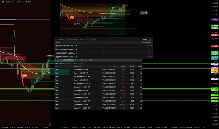
Trades with B – Daily Recap (Nov 7, 2025) "Lesson Learned"Ticker: QQQ / NQ1!
Strategy: ORB Pro + Fib Confluence + EMA Trend Filters
Result: Small red day – self-inflicted
🧭 Market Context
Today’s price action gave a clear short opportunity during the mid-morning fade, but momentum stalled mid-session. The first entries lined up beautifully with the ORB breakdown and EMA confluence, offering solid profits early on.
Where it fell apart was after the first wins — I overstayed, chasing secondary flushes that never came. The market started to base, and I kept expecting continuation instead of taking what the chart gave me.
📉 Trade Summary
Multiple put entries between $601–$602 levels
Early trades locked quick gains (+$271.94, +$159.94)
Gave back a chunk re-entering late into chop
Final P/L across contracts: -$205.66 total
Cumulative Options P/L breakdown:
QQQ $602.50 07 Nov 25 Put – +$51.89
QQQ $575 10 Nov 25 Put – -$4.11
QQQ $598 07 Nov 25 Put – -$57.11
QQQ $601 07 Nov 25 Put – -$196.33
💡 Lessons & Takeaways
The first clean move is often the best move. Don’t overcomplicate a confirmed win.
Late-day trades = low probability. Volume dries up, conviction fades.
Protect the capital, not the ego. There’s no “making up” missed points — only protecting what’s already earned.
🧘♂️ Reflection
“The setup worked, but I didn’t. I tried to extract more from a move that was already complete. Next time, once my target hits, I’m walking away.”
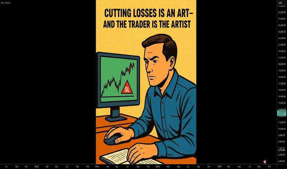
Cutting Losses is an Art – and the Trader is the Artist.🎨 Cutting Losses is an Art – and the Trader is the Artist.
Why Traders Struggle with Losses
In theory: cut your losses early, let your winners run.
In practice? It's an art – forged through discipline, experience, and the battle within.
Many enter the market quickly, full of hope, with no plan or risk awareness.
One wrong click – and they rely on luck instead of a system.
Anyone who trades without a setup or stop-loss isn't playing the game –
they're gambling.
Stop-Loss Isn’t Just Technical – It’s a Mirror of Your Discipline
It should be placed where your idea is objectively invalidated,
not where it just "feels okay."
Why is that so hard?
Because money is emotional
Because losses feel like personal failure
Because the market teaches you with pain if you don’t learn
🧠 “You should consider the money gone the moment you enter a trade.”
That’s not cynicism – it’s psychological armor.
If the trade fails, your self-worth and peace of mind remain intact.
That’s how you protect your mental capital and stay in the game – in trading and in life.
Technical Control + Psychological Honesty = Survival
Ask yourself:
Where is my personal pain threshold?
When do my hands start to sweat?
What is “a lot of money” – to me, objectively and emotionally?
Can I lose without falling apart emotionally?
Because the market will test you.
📉 It will test your ego.
💸 It will take without giving – if you're not prepared.
⏳ Patience is your sharpest weapon.
⚔️ And your greatest enemy? Greed, fear, hope.
A Pro Cuts Losses Mechanically – Not Emotionally
Every trade is just a try – with risk, with expectation, but no guarantee.
In the end, it’s not about how often you win –
it’s about how little you lose when you’re wrong.
📊 Chart Examples: Real-World Loss Management in Action
✅ Disciplined Exit
Clean stop-loss executed as planned. No hesitation, no hope.
“My setup was invalidated. The loss was expected, sized correctly, and accepted.”
❌ Emotional Hold
Ignored the stop-loss, hoping for a reversal.
“I hoped instead of acted. This was costly and unnecessary.”
⚖️ Clean Loss Despite Perfect Setup
All rules followed – but still hit the stop.
“Good trade, bad outcome. Still the right decision. Long-term edge remains.”
💬 How do YOU handle losses? Share your thoughts in the comments below.
🔔 Follow me for more on trading psychology, risk management & real chart breakdowns.
Master Horizontal Lines on Trading Charts | Signal & Structure 2In this second episode of the Signal and Structure series, we dive deep into one of the most fundamental yet powerful tools in technical analysis - horizontal support and resistance lines. This practical tutorial demonstrates a systematic approach to identifying and marking key price levels across multiple timeframes.
What You'll Learn:
Color-Coded Line System for Multiple Timeframes:
Monthly (Black, thickness 4) - The strongest levels from monthly candle closes
Weekly (Maroon/Brown, thickness 3) - Key weekly support/resistance zones
2-Day (Red, thickness 2) - Intermediate term levels
12-Hour (Orange, thickness 1-2) - Short-term trading levels
3-Hour (Yellow, thickness 1) - Day trading reference points
Key Concepts Covered:
Why monthly candle closes often matter more than wicks (with live examples)
How previous resistance becomes new support - demonstrated on Bitcoin's chart
Identifying distribution and accumulation ranges using horizontal levels
The importance of avoiding chart clutter - when NOT to add more lines
Using transparent candles to see through to your levels and indicators
Practical Techniques:
Live demonstration on TradingView using Bitcoin/USD charts
How to identify the most significant levels from each timeframe
Creating "boxes" to visualize trading ranges and distribution zones
Brief introduction to Wyckoff theory concepts (spring patterns)
Tips for maintaining clarity when working with multiple overlapping levels
Chart Setup Tips:
Why exchange charts (KuCoin, Gate.io) provide better volume data than index charts
Continuing emphasis on logarithmic scale for crypto analysis
How to organize your workspace for multi-timeframe analysis
This 20-minute tutorial walks you through the exact process of building a professional-grade support and resistance framework on your charts. The presenter demonstrates each concept in real-time on TradingView, making it easy to follow along and implement these techniques immediately.
Perfect for traders who want to move beyond random line drawing and develop a systematic, color-coded approach to identifying key market levels. Whether you're scalping on the 3-hour or position trading on the monthly, this hierarchical system helps you see exactly where the important levels are at a glance.
Next episode preview: Diagonal trend lines, channels, and Fibonacci levels - including a unique approach to stacking channels that provides an edge in the markets.

The Silent Truth: The Market Reflects You“Every chart you look at is not showing the market. It’s showing you.”
Most traders think they’re fighting the market.
But the truth is — the market has no reason to fight you.
It doesn’t know your entry, your stop, your target, or your fear.
What it does know is this: your reaction .
When price moves fast against you, what do you feel?
When it slowly grinds in your favor, what thoughts rise?
When you miss a setup, what story do you tell yourself?
The market reflects these things back at you.
The frustration is yours.
The hesitation is yours.
The overconfidence is yours.
Price is just price.
Neutral. Silent. Indifferent.
But through that silence, it becomes a mirror.
And until you stop projecting your own fear and greed onto the chart, you’ll keep seeing ghosts that don’t exist.
The real edge is not in finding the perfect setup.
It’s in facing the reflection without distortion.
📘 Shared by @ChartIsMirror
If this resonates, share your thoughts in the comments. Sometimes the most important discussion in trading isn’t about levels or entries — it’s about the trader in the mirror.

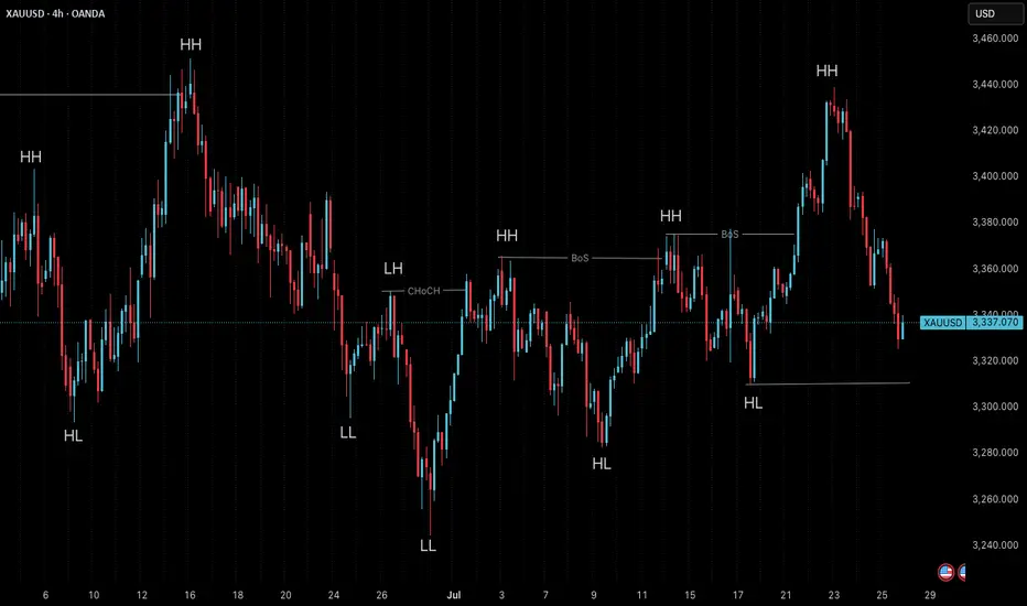
Market Structure is Not Strategy — It’s Your Starting Point“The chart doesn’t hide anything. But your mind does.”
Before any indicator, setup, or signal… comes structure.
🔍 What is Market Structure?
At its core, market structure is the sequence of higher highs (HH) and higher lows (HL) in an uptrend, or lower lows (LL) and lower highs (LH) in a downtrend.
It is the skeleton of price .
Everything else — entries, zones, signals — is just clothing.
If you can’t see the skeleton, you’re reacting to noise.
🎯 Why It Matters:
It’s not a signal. It’s context .
It tells you whether you’re trading with the market or against it .
It defines where your patience begins — not where your entry is.
Market structure helps you let go of the urge to chase. It brings order to the chaos.
🧩 Key Components to Track:
Break of Structure (BoS): Confirms trend continuation
Change of Character (ChoCH): Signals a potential reversal
Swing Points: Define the intent behind price moves
Liquidity Sweeps: Often mask real structure beneath short-term traps
🛑 Common Mistake:
Most traders jump straight to the setup without asking the most important question:
“Where am I in the structure?”
They try to buy a pullback — in a downtrend.
They try to fade a move — right before continuation.
They chase candles — instead of waiting for alignment.
That’s not strategy. That’s stress.
🛠 Tip to Practice:
Use this simple framework to build clarity:
Start from the H4 chart — this gives you the broader directional bias
Drop to M15 — here’s where structure begins to form tradeable setups
Finally zoom into M1 — this is where confirmation happens before entry
Ask yourself:
Where did the last BoS or ChoCH happen on each timeframe?
Is M15 aligning with H4 intent — or contradicting it?
Did you enter after M1 confirmation , or based on impulse?
You don’t need to predict price. You need to align with it.
🪞 Final Thought:
Structure isn’t strategy.
It’s the mirror that shows what’s real before your bias speaks.
When you master structure, you stop forcing trades — and start flowing with them.
💬 Want more like this?
If this post resonated with you — drop a comment below.
Let me know what you'd like to dive deeper into — price action, gold setups, market structure, or the psychology behind your trades.
I’ll build future tutorials based on what matters to you.
📘 Shared by @ChartIsMirror
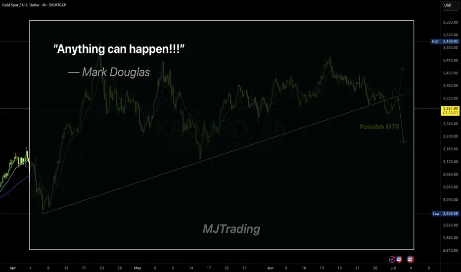
Embracing Uncertainty
In trading, the illusion of certainty is often our biggest enemy.
Even the cleanest setups—like a MTR (Major Trend Reversal)—can fail.
Mark Douglas said it best:
“Anything can happen.”
This simple truth is what keeps professional traders humble and disciplined.
Respect the market, manage your risk, and never assume you know what comes next.
Stay sharp.
#MJTrading
#GoldTrading #XAUUSD #TradingPsychology #AnythingCanHappen #MarkDouglas #ForexMindset #TradingQuotes #PriceAction #RiskManagement #MindOverMarkets #ChartOfTheDay #MJTrading
Timeframes in Trading: Which Chart Tells You WhatHello, traders! 👋🏻 Why can the same chart tell a different story on 1D, 4H, or 15M? You’ve probably been there. BTC looks bullish on the daily… bearish on the 4-hour… and totally sideways on the 15-minute. So, which one is right?
The truth is: none of them is wrong. They’re just telling different parts of the story. Understanding timeframes in trading isn’t just a technical skill. It’s how you decode what the market is actually doing.
Every Timeframe Has a Role
Think of timeframes like zooming in and out on a map: The 1W chart tells you where the mountain ranges are, the macro trend. The 1D chart shows the highways and the current direction within that macro. The 4H chart reveals city streets, the local trend swings. And the 15M chart? That’s the back alleys, where the noise and micro moves live. BTC, for example, doesn't behave the same way across these views, and it shouldn't.
What Happens If You Ignore Timeframes?
You try to short a "breakdown" on the 15M, only to realize you just sold into 4H support.
You enter a 1D bullish breakout, only to panic when price pulls back aggressively on the 4H… forgetting that the 4H was just doing a retest. Or worse, you start trading against the macro trend, thinking the 15M chart holds more weight than it actually does.
How Professionals Read Timeframes (BTC Example)
Example:
You can start high, work down: 1W → 1D → 4H → 1H/15M. Check the macro first. Is BTC bullish, bearish, or ranging on the 1D or 1W? Then, you can map key levels: Support/resistance from higher timeframes is 10x more meaningful on lower timeframes. For example, BTC’s $30K, a weekly level, creates reactions even down on 5-minute charts. And, align context: A bullish setup on 15M is excellent, but check if it aligns with the 4H trend direction. If the 4H is also bullish, your setup has context. If not, expect chop.
🔗 BTC Right Now: Timeframe Confusion in Action
Just look at the current BTC structure. On the 1W, BTC is still trending higher, higher highs and higher lows from the $15K bottom in 2023. On the 1D, BTC trades inside a broad consolidation range after a strong uptrend. The price has repeatedly tested the $107K–$112K zone, acting as a key resistance cluster, while forming a series of higher lows. It's not a breakdown but a correction inside a bullish structure, testing previous supply zones. The 4H? Chaos. The price bounces between $105K and $112K, which is pure range behavior. The 15M? Traders are getting whipped trying to catch fake breakouts that mean nothing in the daily or weekly context.
Which Chart Tells You What?
All of them. But differently.
THE 1W TELLS YOU THE NARRATIVE.
THE 1D SHOWS YOU THE CURRENT DIRECTION.
THE 4H REVEALS TRADEABLE SWINGS WITHIN THAT DIRECTION.
THE 15M CAPTURES THE NOISE, THE TRAPS, AND THE MICRO OPPORTUNITIES.
If you’re only looking at one timeframe, you’re only seeing part of the picture. So, timeframes aren’t about right or wrong. They’re about perspective. If you’re a day trader, you probably live on the 5-minute to 15-minute charts, while still peeking at the 1H or 4H for structure.
If you’re a swing trader, the 4H and 1D are your home base, with the weekly chart guiding the bigger story. And if you’re thinking in months or quarters, the 1W and 1M are what actually matter – everything else is just noise.
So next time BTC feels “confusing”… zoom out. Or zoom in. The answer is probably hiding in the chart, just not the one you were looking at. Which timeframe do you trust the most when trading crypto? Drop it in the comments!

How to Analyze a Technical Chart: Practical Guide (BTC EXAMPLE)Hello, traders! ✍🏻
Understanding a chart isn't about predicting the future — it’s about recognizing what’s already happening. Whether you're evaluating a Bitcoin breakout or watching a new altcoin pump, technical chart analysis is one of the most powerful tools traders use to make sense of price movements. But how exactly do you read a technical analysis chart? What matters most — and what’s just noise?
Let’s break it down.
1. Look at the Big Picture: Price Trends and Structure
Before zooming in, zoom out. Start with the daily or weekly chart to identify the primary trend. Is the asset making higher highs and higher lows (an uptrend)? Or is it stuck in a sideways channel?
In Price Analysis, Market Structure Is Your Anchor:
Uptrend: Higher Highs and Higher Lows
Downtrend: Lower Highs and Lower Lows
Consolidation: Sideways Moves with Clear Support/Resistance
This high-level view helps you avoid common traps, like going long in a downtrend or shorting near long-term support.
2. Use Support and Resistance Like a Map
Support and resistance levels form the backbone of chart technical analysis. They show you where price reacted in the past — and likely will again.
Support: A Price Level Where Buyers Previously Stepped In.
Resistance: A Level Where Sellers Pushed Price Down.
The more times a level is tested, the more important it becomes. These zones can act as entry/exit points or as signals for potential breakouts or reversals.
3. Add Indicators — But Don’t Overload!
Indicators are helpful — if used right. The key is to complement price action, not replace it. Start Simple:
RSI (Relative Strength Index): Detect Overbought/Oversold Conditions
Volume: Confirms Strength Behind Price Moves
Moving Averages: Help Identify Trends and Dynamic Support/Resistance
Avoid piling on too many indicators. If your technical analysis chart looks like a control panel, you might be overcomplicating your decision-making.
4. Timeframes Matter — And So Does Context
Don’t mix signals across timeframes without context. A bullish setup on the 15-minute chart can collapse under a bearish daily trend.
Watch for Multi-Timeframe Analysis:
Weekly: Macro Trend
Daily: Trading Bias
4H/1H: Entry and Exit Planning
This layered approach helps you stay aligned with momentum while avoiding short-term noise.
Full Breakdown: Technical Chart Analysis of BTC/USDT (1W)
The BTC/USDT weekly chart presents a textbook example of how price evolves through well-defined market phases, structural levels, and momentum shifts. Let’s walk through each component in detail — not just what is shown on the chart, but also why it matters and how it’s typically identified in technical analysis.
We begin by examining the market structure. From mid-2020 to late 2021, Bitcoin followed a strong uptrend, consistently printing higher highs and higher lows. This kind of price action is characteristic of bullish expansion phases, where momentum builds gradually and pullbacks are shallow. Technically, an uptrend is confirmed when each new peak surpasses the previous, and support continues to form above former lows. In this case, the trend accelerated rapidly into the $60K–$70K zone before exhaustion set in.
The shift occurred in late 2021, as the market transitioned into a macro correction. From a structural standpoint, the pattern reversed — lower highs began to form, and key support levels were breached. This downtrend, lasting through 2022, is a typical bear phase in a market cycle, where distribution outweighs accumulation. Price made several failed attempts to reclaim previous highs, confirming bearish control and increased selling pressure.
What followed was an extended period of sideways movement between late 2022 and early 2023 — a classical accumulation zone. This phase is often overlooked but is critical in technical chart analysis. Here, price consolidated in a narrow range, with volatility contracting and RSI hovering near oversold territory. This kind of stabilization often signals that selling pressure has subsided and that larger players may be building positions ahead of a breakout. It is identified not just by price flattening, but by volume dropping and the absence of directional follow-through in either direction.
By mid-2023, a recovery structure began to emerge. Bitcoin started printing higher lows and eventually broke above prior resistance zones, indicating the formation of a new trend. As of early 2025, this trend appears to be unfolding, though price is once again facing historical resistance near its all-time highs — the $69K–$74K zone. This region has acted as a ceiling in both the 2021 and 2024 cycles, making it a well-established historical resistance level. In technical terms, the more times a level rejects price, the more significant it becomes, as market participants tend to place orders around such zones in anticipation of repeated behavior.
One of the most important structural zones on the chart lies around the $50K–$53K range. This mid-zone has acted as support during the 2021 bull run, flipped into resistance during the 2022 downtrend, and has once again returned to functioning as a support area in the current recovery. This phenomenon — where old support becomes new resistance and vice versa — is a classic concept in technical chart analysis, signaling that market memory is active and that this level is psychologically and technically significant.
At the lower end, the $30K level has held repeatedly across multiple market phases, establishing itself as a long-term support zone. Its durability, despite heavy corrections, suggests significant accumulation and investor interest at that level. This zone has marked major bottoms and remains a key threshold that, if broken, could signal a structural shift in sentiment.
Momentum analysis further confirms these phases. The Relative Strength Index (RSI), plotted beneath the price chart, hovered in overbought territory during both the 2021 and 2024 peaks, exceeding 70 and signaling potential exhaustion. In contrast, the RSI dipped into the 30s in 2022, aligning with the end of the downtrend and beginning of accumulation. These signals are not to be taken in isolation, but when combined with structure and volume, they add powerful confirmation to trend shifts. At the time of writing, RSI sits around 48 — neutral ground, indicating the market has not yet committed to a new directional move.
This layered approach — combining trend structure, support and resistance zones, and momentum indicators like RSI — is fundamental to technical chart analysis. It enables traders to navigate through market noise and identify phases of expansion, correction, and re-accumulation with greater clarity. Each of these elements, when aligned, increases the probability of high-conviction setups and helps avoid emotionally driven decisions in volatile environments.
Final Thought
Mastering technical chart analysis isn’t about memorizing patterns — it’s about training your eyes to read structure, sentiment, and context. And like any skill, the more charts you read, the sharper you get.
This is only an isolated analysis of the macro trend — a high-level look at Bitcoin’s price structure using weekly timeframes. In reality, technical analysis can be performed across multiple timeframes, combining far more indicators, chart patterns, and volume-based tools depending on your strategy and goals.
Platforms like TradingView offer a wide range of features for deeper technical insight — from advanced oscillators to custom scripting and community-driven indicators. The chart above serves as a historical case study, not a trading signal. It provides a reference point for how sentiment shifts can be visualized over time through structure and momentum.
If you’d like to explore other educational breakdowns or real-time analysis, feel free to check out more content on our TradingView page. This post is not financial advice, but 100% a technical perspective on past price action and market behavior.
💬 What’s your go-to indicator or setup when doing token price analysis?
This analysis is performed on historical data, does not relate to current market conditions, is for educational purposes only, and is not a trading recommendation.

Double Top Trading Pattern: A Classic Reversal SetupHello, Traders! 👋🏻
Have you ever noticed a market attempting to break through the same resistance level twice, only to fail both times?
This formation is known as the double top pattern and often signals a potential bearish reversal. But is a double top bullish or bearish across all markets? Let’s dive into the meaning of the double top pattern and how to identify it on your charts!
What Is a Double Top? 👀
A double top is a chart formation where the price reaches a high, pulls back, and then rallies again to the same or a very close high but fails to break through. This second failure to surpass the previous peak suggests buyers are losing momentum, paving the way for a potential downtrend.
Key Points of the Double Top Chart Pattern:
Two Prominent Highs: The peaks are usually at similar price levels.
Neckline (Support Level): The interim low between the two peaks forms a support line.
Bearish Sentiment: When the price breaks below the neckline, it confirms a potential trend reversal to the downside.
Is a Double Top Bullish or Bearish?
The double top pattern is bearish because it signals that the uptrend is weakening and sellers are gaining control. After the neckline breaks, it often results in a significant price drop.
Key Features of a Bearish Double Top Pattern
The Two Peaks Are Nearly Equal in Height.
Volume Declines on the Second Peak, Showing Reduced Buying Pressure.
A Breakdown Below the Neckline Confirms the Pattern and Triggers the Downtrend.
Advantages of a Double Top Pattern
Clear Trend Reversal Signal: A double-top chart pattern visually indicates a potential shift from an uptrend to a downtrend.
Defined Resistance Level for Risk Management: The two peaks at similar price levels create a strong resistance zone. This allows traders to place Stop-Loss orders effectively and set profit targets with more confidence.
Volume Confirmation for Stronger Signals: During a valid double top trading pattern, volume often decreases as the second peak forms and increases when the neckline breaks. This helps confirm the authenticity of the breakout and strengthens trade decisions.
Favorable Risk-Reward Ratio: Because the expected price drop is often equal to the pattern's height, the potential reward is typically larger than the initial risk. This can make the double-top pattern an attractive setup for risk-management-focused traders.
Disadvantages of a Double Top Pattern
Not Always Reliable (False Signals): Like any technical pattern, the double top can fail, leading to false breakouts. Prices may temporarily create two peaks but then continue upward instead of reversing.
Subjectivity in Pattern Recognition: Traders may interpret the double top pattern meaning differently based on variations in peak height, neckline positioning, or symmetry. This subjectivity can lead to inconsistent trade execution.
Variations Across Different Markets: Not all double top chart formations look the same. Some may have uneven peaks, wider time frames, or irregular structures, making setting precise entry and exit points harder.
Limited Profit Potential in Some Cases: While the projected price drop is based on the pattern's height, market conditions may prevent the price from reaching the expected target.
Final Thoughts: Why the Double Top Pattern Matters
The double top chart pattern is a bearish reversal signal that helps traders identify when an uptrend is losing momentum. So, traders, have you ever caught a double top trading pattern before a major price drop? Your experiences and strategies are valuable to the trading community. Share them in the comments and let's learn from each other!

What I think trading is...
Hello, traders.
If you "Follow", you can always get new information quickly.
Please click "Boost".
Have a nice day today.
-------------------------------------
Thank you @TradingBrokersView for the great article.
🚨 Bitcoin update! 🚨 BTC rejected at MA50 (4h) inside a Channel Down pattern. If history repeats, we could see a Lower Low at 95K (-10.7%), aligning with MA100 (1d) support. RSI (4h) is confirming bearish momentum.
🔥 Trading Plan: Sell now before further downside!
I was thinking about how to say it, and I came up with this idea.
Thank you again.
------------------------------------
#BTCUSDT 1M
As shown in the chart, it has risen a lot, so it is natural to feel downward pressure.
No one knows how big this downward pressure will be.
However, what I can tell you is the flow of funds.
To see a more detailed flow, you need to look at the gap occurrence status on the 1D chart, but when looking at the overall flow of funds, it is true that a lot of funds are flowing into the coin market.
Selling all of this inflow of funds means that you will not be able to overcome the volatility in the upcoming bull market and will rather increase the probability of suffering losses.
The reason is that the average purchase price is likely to be set too high and is likely to be located in the volatility range.
Therefore, you need to respond according to your investment style.
In other words, if your investment style is one that wants to trade quickly and urgently, a strategy that sells whenever it shows signs of falling would be appropriate to gain profits.
If not, if you have a longer-term outlook or trade mainly in spot transactions, I think it would be better to leave coins (tokens) corresponding to profits rather than selling all of them so that you can more easily purchase them in the future bull market.
Leaving a coin (token) corresponding to the profit means a coin (token) with a purchase principal of 0.
In other words, it means that when the price rises after purchase, the purchase principal is sold.
In that sense, when looking at the BTCUSDT 1M chart, you can see that the Fibonacci ratio point of 1.618 (89050.0) is a very important support and resistance area.
#BTCUSDT 1D
This volatility period is expected to continue until January 31.
Therefore, it is expected that the key will be whether there is support near 101947.24 after this volatility period.
If it falls without support near 101947.24, it is expected that the trend will be determined again by touching the M-Signal indicator on the 1W chart.
If you have been reading my ideas, you will understand that you should not try to create a trading strategy by analyzing charts.
As I mentioned earlier, you should create a trading strategy that suits your investment style with the information obtained from chart analysis.
That is why the opinion that it will fall now and sell everything can be interpreted differently by different people, so you need to be careful.
Some people are currently making profits and others are losing money.
Those who are making profits will have the luxury of waiting even if the price falls, and those who are losing money may be suffering from psychological pressure.
The information I am giving you is to provide information on how to respond to all of these people.
In that sense, you need to focus on the price that I am talking about, that is, the support and resistance points or sections.
If your average purchase price is below the support and resistance points or sections that I am talking about, you can check the downward trend and intensity and judge the situation.
If not, you need to create a response strategy based on how much cash you currently have.
If your current cash holding is less than 20% of your total investment and you feel unstable psychologically, it is a good idea to sell some of it to secure cash.
This will allow you to secure the ability to purchase more even if the price falls, so you will be able to secure a certain level of psychological stability even if the price falls.
I think trading is about responding to your investment style and psychological state in this way.
Therefore, you should calmly look at your current psychological state, check your cash holdings, and create a response strategy that suits your investment style.
This is the strategy I can tell you.
-
Thank you for reading to the end.
I hope you have a successful trade.
--------------------------------------------------

Example of explanation of chart analysis and trading strategy
Hello, traders.
If you "Follow", you can always get new information quickly.
Please click "Boost" as well.
Have a nice day today.
-------------------------------------
There was an inquiry asking for detailed information on how to analyze charts and create trading strategies accordingly, so I will take the time to explain it.
Before reading this article, you need a basic understanding of charts.
That is, you need to understand candles and price moving averages.
If you study this first and then read this content, I think you will have some understanding of trading.
---------------------------------------
Whether you are trading spot or futures, marking support and resistance points according to the arrangement of candles on the 1M, 1W, and 1D charts is the first task you need to do before trading.
To do this, you need to understand the arrangement of candles.
Therefore, before using my indicator, it is better to study candles first and understand the arrangement of candles.
When studying candles, it is better not to try to memorize the names or shapes of various patterns.
This is because the overall understanding of candles is important, not the various patterns of candles.
If you study with a book or video, you will be able to understand candles after reading or watching them at least 3 times.
We study charts to trade, not to analyze charts and teach them to others, so we need to study efficiently and save time.
-
If you study candles, you will naturally understand the price moving average.
The indicator corresponding to the price moving average is the MS-Signal indicator.
This MS-Signal indicator consists of the M-Signal indicator and the S-Signal indicator, and the main indicator is the M-Signal indicator.
Therefore, we added the M-Signal indicator of the 1W chart and the M-Signal indicator of the 1M chart to the 1D chart so that we can see the overall trend.
-
You can see the arrangement of the MS-Signal (M-Signal of 1M, 1W, 1D charts) indicators in the example chart.
Currently, since the M-Signal of the 1M chart > the M-Signal of the 1W chart, we can see that it is a reverse array.
If you understand the price moving average, you will understand that we should not trade when it is a reverse array, but when it is a regular array.
Therefore, since the current state of the example chart is a reverse array, it is not suitable for trading.
However, the reason we brought this chart in this state is because the M-Signal indicators of the 1M and 1W charts are converging.
As convergence progresses, it will eventually diverge.
Therefore, since the possibility of price volatility increases, the possibility of capturing the timing for trading increases depending on whether there is support at the support and resistance points.
-
The indicators included in the example chart are drawn as horizontal lines to indicate support and resistance points.
This work performs the same role as the support and resistance points drawn on the 1M, 1W, and 1D charts according to the arrangement of the candles mentioned above.
Therefore, on the 1M, 1W, and 1D charts, horizontal lines are drawn on the indicators to indicate support and resistance points.
You can draw horizontal lines on indicators that are horizontal for at least 3 candles, and if possible, 5 candles.
-
Among the HA-MS indicators, the important indicators are the HA-Low and HA-High indicators.
The HA-Low and HA-High indicators are indicators created for trading on the Heikin-Ashi chart.
Therefore, it is the next most important indicator after the MS-Signal (M-Signal on 1M, 1W, 1D charts) indicator that can tell the trend.
You can create a trading strategy depending on whether there is support near the HA-Low, HA-High indicators.
-
The next most important indicator is the BW(0), BW(100) indicator.
When this indicator is created or touched, it is time to respond in detail.
That is, when you are trading with a trading strategy created from the HA-Low, HA-High indicators, when the BW(0), BW(100) indicators are created or touched, you can choose whether to proceed with a split transaction.
In addition, you can understand the OBV, +100, -100 indicators as response points for split transactions.
Therefore, you do not need to indicate support and resistance points for the OBV, +100, -100 indicators.
However, it is recommended to mark support and resistance points for the HA-Low, HA-High, BW(0), BW(100) indicators.
-
If you look at the price position in the example chart, you can see that it is located in the 0.03347-0.03485 range.
And, the M-Signal indicator of the 1W chart is passing through this range, and the HA-High indicator of the 1W chart is acting as support and resistance.
Therefore, whether there is support near 0.03485 is an important key point.
If support is confirmed near 0.03485, it is a time to buy.
However, since the MS-Signal (M-Signal on the 1D chart) indicator is passing between 0.03485-0.03814, the point to watch is whether the MS-Signal (M-Signal on the 1D chart) indicator can break through upward.
As I mentioned earlier, if the MS-Signal indicator passes, a trend change will occur, so it is significant.
Therefore, in order to turn into a short-term uptrend, it is likely to be supported around 0.03814-0.03982.
Therefore, the first split selling section will be around 0.03814-0.03982.
At this time, whether to sell or hold depends on your investment style and investment period.
-
Since the M-Signal indicator on the 1M chart is passing around 0.04341, it is likely to start when the price is maintained above the M-Signal indicator on the 1M chart in order to turn into a long-term uptrend.
Therefore, the second split selling period will be around the M-Signal indicator on the 1M chart.
This is also something you can choose.
-
An important volume profile section is formed around 0.03038.
Therefore, the 0.03038 point corresponds to a strong support section.
-
(30m chart)
When the time frame chart you are trading is below the 1D chart, it is recommended to activate the 5EMA indicator on the 1D chart.
(I just used the 30m chart as an example. The same principle applies to any time frame chart you usually use.)
This is because there is a high possibility of volatility when the 5EMA of the 1D chart and the M-Signal indicator of the 1M, 1W, and 1D charts are touched.
In other words, you can understand that it plays a certain role of support and resistance.
If it touches the HA-High, BW(100) indicator and falls and falls below the MS-Signal indicator, it will basically touch the HA-Low or BW(0) indicator.
On the other hand, if it touches the HA-Low, BW(0) indicator and rises and rises above the MS-Signal indicator, it will basically touch the HA-High or BW(100) indicator.
However, since it may not do so and may rise or fall in the middle, it is necessary for the support and resistance points drawn on the 1M, 1W, and 1D charts as mentioned earlier.
The support and resistance points drawn on the 1D chart are currently indicated at the 0.03347 point.
Therefore, even if it falls below the MS-Signal indicator, you can understand that there is a possibility of rising again around 0.03347.
Since the 5EMA of the 1D chart and the M-Signal indicator of the 1W chart are passing around 0.03485, we can see that the area around 0.03485 is an important support and resistance zone.
-
Since the StochRSI indicator is currently above 50, we should focus on finding a time to sell.
Since it has fallen below the BW(100) and HA-High indicators, it has fallen too much to start trading with a sell (SHORT) position.
However, if you can respond quickly, you can enter a sell (SHORT) position when it falls from the 0.03411 point where the MS-Signal indicator is passing.
When the StochRSI indicator falls below 50, we should focus on finding a time to buy.
At this time, you can trade based on whether there is support or resistance at the support and resistance points drawn on the 1M, 1W, and 1D charts or around the MS-Signal (M-Signal on the 1M, 1W, and 1D charts), 5EMA, HA-Low, HA-High, BW(0), and BW(100) indicators on the 1D chart.
As mentioned earlier, you should not forget that trading strategies can be created based on whether there is support at the HA-Low and HA-High indicators.
Therefore, if possible, it is recommended to trade based on whether there is support near the HA-High indicator point of 0.03443.
-
Thank you for reading to the end.
I hope you have a successful trade.
--------------------------------------------------
3 Must-Know Chart Patterns to Spot Winning Trades!Morning Trading Family
Understanding chart patterns is super important for trading success! In this video, I’ll walk you through the top 3 patterns every trader should know: Head and Shoulders, Double Top/Bottom, and Bullish/Bearish Flags. I’ll show you how to spot them, when to jump into a trade, and how to manage your risk. Whether you’re trading stocks, forex, or crypto, these patterns can make a big difference. We’ll even look at live charts together to keep it simple. Let me know in the comments which pattern is your favorite!
Kris/Mindbloome Exchange
Trade What You See

Avoiding the Pump and Dump: A Beginner's GuideAvoiding the Pump and Dump: A Beginner's Guide to Protecting Your Investments
In the dynamic world of stock trading, new traders are constantly seeking ways to maximize profits and minimize risks. Unfortunately, one of the most deceptive and harmful schemes that can easily trap beginners is the infamous pump and dump scheme. This fraudulent practice has been around for decades, targeting unsuspecting traders by artificially inflating a stock's price and then swiftly cashing out, leaving the victims with significant losses. For traders on platforms like TradingView, especially those just starting, it’s crucial to understand how to spot these schemes and avoid falling prey to them.
This guide will provide you with the knowledge you need to recognize pump and dump schemes by analyzing monthly, weekly, and daily charts, identifying repetitive patterns, and understanding market sentiment. By the end, you'll know exactly what to look for to safeguard your investments.
What is a Pump and Dump?
A pump and dump scheme occurs when a group of individuals, often coordinated through social media or private channels, artificially inflates the price of a stock. They "pump" up the stock by spreading misleading information or creating hype around the asset, leading to increased buying interest. Once the stock price has risen significantly, the perpetrators "dump" their shares at the elevated price, leaving uninformed buyers holding a stock that will soon plummet in value.
The key elements to watch out for are:
Unusual price spikes without any corresponding fundamental news.
High trading volume during these spikes, suggesting that a group of individuals is actively manipulating the price.
Aggressive promotion through emails, forums, or social media channels, often making exaggerated claims about a stock's potential.
Understanding Timeframes: Monthly, Weekly, and Daily Charts
One of the most effective ways to spot pump and dump schemes is by analyzing various timeframes—monthly, weekly, and daily charts. Each timeframe provides different insights into the stock's behavior, helping you detect irregular patterns and red flags.
Monthly Charts: The Big Picture
Monthly charts give you a broad overview of a stock's long-term trends. If you notice a stock that has been relatively inactive or stagnant for months, only to suddenly surge without any substantial news or developments, this could be a sign of manipulation .
What to look for in monthly charts:
Sudden spikes in price after a prolonged period of flat or declining movement.
Sharp volume increases during the price rise, especially when the stock has previously shown little to no trading activity.
Quick reversals following the price surge, indicating that the pump has occurred, and the dump is on its way.
For example, if a stock shows consistent low trading volume and then experiences a sudden burst in both volume and price, this is a classic sign of a pump. Compare these periods with any news releases or market updates. If there’s no justifiable reason for the spike, be cautious .
Weekly Charts: Spotting the Mid-Term Trend
Weekly charts help you see the mid-term trends and can reveal the progression of a pump and dump scheme. Often, the "pump" phase will be drawn out over several days or weeks as the schemers build momentum and attract more buyers.
What to look for in weekly charts:
Gradual upward trends followed by a sharp, unsustainable rise in price.
Repeated surges in volume that don’t correlate with any fundamental analysis or positive news.
Recurrent patterns where a stock has previously been pumped, experienced a sharp decline, and is now showing the same pattern again.
Stocks used in pump and dump schemes are often cycled through multiple rounds of pumping, so if you notice that a stock has undergone several similar spikes and drops over the weeks, it’s a strong indicator that the stock is being manipulated.
Daily Charts: Catching the Pump Before the Dump
Daily charts provide a more granular view of a stock's price movement, and they can help you detect the exact moments when a pump is taking place. Because pump and dump schemes can happen over just a few days, monitoring daily activity is critical.
What to look for in daily charts:
Intraday price spikes that happen suddenly and without any preceding buildup in momentum.
A huge increase in volume followed by rapid price drops within the same or subsequent days.
Exaggerated price gaps at market open or close, indicating manipulation during off-hours or lower-volume periods.
On a daily chart, if a stock opens significantly higher than the previous day's close without any news or earnings report to back it up, this could be the start of the dump phase. The manipulators are looking to sell their shares to anyone who has bought into the hype, leaving retail traders holding the bag.
Repeated Use of the Same Quote: A Telltale Sign of a Pump and Dump Scheme
Another red flag is when the same stock or "hot tip" keeps resurfacing in social media, forums, or emails. If you notice that the same quote or recommendation is being promoted repeatedly over time, often using the same language, this is a strong sign of manipulation. The scammers are likely trying to pump the stock multiple times by reusing the same tactics on new, unsuspecting traders.
Be cautious of stocks that:
Have been heavily promoted in the past.
Show a history of sudden spikes followed by rapid declines.
Are promoted with vague, overhyped language like "the next big thing" or "guaranteed gains."
If the same stock is mentioned multiple times in trading communities, check its historical chart. If the stock has undergone previous pumps, you will likely see sharp rises and falls that align with the promotional periods.
How to Avoid Pump and Dump Schemes
Now that you know how to spot the signs, here are actionable steps you can take to protect yourself from becoming a victim of a pump and dump scheme:
Do Your Research: Always verify the information you receive about a stock. Check if there’s legitimate news, earnings reports, or significant company developments that justify the price movement. Avoid relying solely on social media or forums for your stock tips.
Look at Fundamentals: Focus on stocks with solid fundamentals, such as earnings growth, revenue increases, and strong management. Stocks targeted for pump and dump schemes often have weak or non-existent fundamentals.
Use Multiple Timeframes: As we've discussed, examining stocks across different timeframes—monthly, weekly, and daily—can help you spot abnormal price behavior early on.
Monitor Volume and Price Movements: If you see large, unexplained surges in volume and price, be skeptical. Legitimate price increases are usually accompanied by news or fundamental changes in the company.
Avoid Low-Volume Stocks: Pump and dump schemes often target low-volume, illiquid stocks that are easier to manipulate. Stick to stocks with healthy trading volumes and liquidity.
Set Stop Losses: Always use stop losses to protect yourself from sudden price drops. Setting a stop loss at a reasonable level can help limit your losses if you accidentally invest in a stock being manipulated.
Be Wary of Promotions: If a stock is being aggressively promoted, ask yourself why. More often than not, aggressive promotions are a sign that the stock is part of a pump and dump scheme.
Conclusion
Pump and dump schemes prey on traders’ fear of missing out ( FOMO ) and the allure of quick profits . However, by using a disciplined approach to trading, analyzing charts across multiple timeframes, and paying close attention to volume and price movements, you can avoid falling victim to these schemes.
Remember: If something seems too good to be true, it probably is. Protect your investments by staying informed, doing thorough research, and trusting your analysis. By following these guidelines, you can navigate the markets with confidence and avoid the pitfalls of pump and dump schemes.
Happy trading, and stay safe!

Misconceptions and Truths about Paper Trading
Hello, traders.
If you "Follow", you can always get new information quickly.
Please click "Boost".
Have a nice day today.
-------------------------------------
TradingView also supports Paper Trading.
For more information, please click the link below. www.tradingview.com
More flexibility: change your Paper Trading account currency :
www.tradingview.com
Even more seamless order design — directly on chart :
www.tradingview.com
---------------------------------------
Paper Trading is thought to support trading practice for beginners.
However, this is a wrong idea.
If you lack prior knowledge about trading or have no concept of trading strategy, you should not do paper trading.
The reason is that the psychological burden is different.
The success or failure of a trade is thought to be the result of trading strategy or response ability, but in reality, it can be said that it is determined by the battle with oneself and psychological state.
This means that psychological state has a significant impact on trading.
Therefore, paper trading should be considered as a transaction that is conducted to confirm one's trading strategy and response strategy after completing chart analysis.
If you have completed some verification of your trading strategy or response strategy, you should continue to conduct actual trading even if you suffer a loss.
The reason is that you should not forget that you can only gain know-how in trading through actual trading.
Therefore, paper trading should not be used to practice mid- to long-term trading, but should be used to verify trading strategies or response strategies for short-term trading or day trading.
In order to do so, you must close the transaction by selling or cutting your loss.
-------------------------------------------
For more information on trading orders in paper trading, please refer to the explanation through the link above.
-
You can proceed with Paper Trading by clicking the Trading Panel at the bottom menu of the TradingView chart.
If you connect to a Paper Trading account, you can start with an initial fund of 100,000.
If the Buy/Sell button is not activated, activate the chart settings to activate the Buy/Sell button before proceeding with the trade.
Right-click on the space in the price candle area to activate the window, and then hover your mouse over the Trade section to check the trading order or trading settings (when you click the Trading menu in the Chart Settings window).
-
In addition, TradingView is linked to a real exchange and supports real trading.
It supports various exchanges, so I recommend you to check if there is an exchange that you are trading on.
-
Have a good time.
Thank you.
--------------------------------------------------

MARKET STRUCTURE explained (THE ULTIMATE SIMPLIFIED GUIDE)(In this guide I will attempt for explain Market Structure in the most simplified and easy to understand terms)
WHAT IS MARKET STRUCTURE?
Market structure is the overall framework of a market that helps traders understand price movements and trends. Think of it as the skeleton of the market, showing how prices move over time and where key levels of support and resistance are located.
COMPONENTS OF MARKET STRUCTURE:
TRENDS:
Trends are the general direction in which the market is moving. There are three main types of trends:
- UPTREND: This is when the market is moving upwards. It is characterized by a series of higher highs (HH) and higher lows (HL). Imagine a staircase going up; each step represents a higher high and a higher low.
- HIGHER HIGH (HH): The highest point reached during a price movement before the price starts to fall again.
- HIGHER LOW (HL): The lowest point reached during a price movement before the price starts to rise again.
- DOWNTREND: This is when the market is moving downwards. It is characterized by a series of lower lows (LL) and lower highs (LH). Think of a staircase going down; each step represents a lower low and a lower high.
- LOWER LOW (LL): The lowest point reached during a price movement before the price starts to rise again.
-LOWER HIGH (LH): The highest point reached during a price movement before the price starts to fall again.
- SIDEWAYS/RANGE-BOUND: This is when the market is moving horizontally, neither up nor down. It is characterized by equal highs (EQH) and equal lows (EQL). Picture a flat road; the price moves back and forth within a certain range.
- EQUAL HIGH (EQH): The highest point reached during a price movement that is roughly the - EQUAL LOW (EQL): The lowest point reached during a price movement that is roughly the same as previous lows.
SUPPORT & RESISTANCE LEVELS:
- SUPPORT: A support level is a price point where the market tends to find buying interest, preventing the price from falling further. Think of it as a floor that supports the price.
- RESISTANCE: A resistance level is a price point where the market tends to find selling interest, preventing the price from rising further. Think of it as a ceiling that resists the price.
SWING POINTS:
Swing points are the peaks and troughs that form the structure of the market. They help in identifying the trend direction.
- SWING HIGH: A peak formed when the price reaches a high point and then starts to decline.
- SWING LOW: A trough formed when the price reaches a low point and then starts to rise.
ANALYZING MARKET STRUCTURE:
IDENTIFY THE TREND:
To identify the trend, look at the sequence of highs and lows on the price chart:
- UPTREND: Look for a series of higher highs and higher lows.
- DOWNTREND: Look for a series of lower lows and lower highs.
- SIDEWAYS: Look for equal highs and equal lows.
MARK KEY LEVELS:
Identify and mark significant support and resistance levels on the chart. These levels are where the price has previously reversed or paused.
OBSERVE PRICE ACTION:
Analyze how the price reacts at these key levels. Look for patterns such as:
- BREAKOUTS: When the price moves above a resistance level or below a support level.
- REVERSALS: When the price changes direction after reaching a support or resistance level.
- CONSOLIDATIONS: When the price moves within a narrow range, indicating indecision in the market.
RISK MANAGEMENT:
Always use stop-loss orders to manage risk. Place stop-loss orders:
- Below support levels in an uptrend.
- Above resistance levels in a downtrend.
==================================================================================
This is the basics of Market Structure, explained in the most simplified manner as possible. I hope this publication was simple and easy to understand and helps you understand Market structure better.
I will be doing more easy to understand publications like this within the upcoming days so stay tune...
==================================================================================
HAPPY TRADING :)

These Market Structures Are Crucial for EveryoneIn this article, we will simplify complex market structures by breaking them down into easy-to-understand patterns. Recognizing market structure can enhance your trading strategy, increase your pattern recognition skills in various market conditions. Let’s dive into some essential chart patterns that every trader should know.
Double Bottom / Double Top
A double bottom is a bullish reversal pattern that occurs when the price tests a support level twice without breaking lower, indicating strong buying interest. This pattern often suggests that the downtrend is losing momentum and a potential uptrend may follow. Conversely, a double top signals a bearish reversal, formed when the price tests a resistance level twice without breaking through. This pattern indicates selling pressure and suggests that the uptrend may be coming to an end.
Bull Flag / Bear Flag
A bull flag is a continuation pattern that appears after a strong upward movement. It typically involves a slight consolidation period before the trend resumes, providing a potential entry point for traders looking to capitalize on the ongoing bullish momentum. On the other hand, a bear flag forms during a downtrend, signaling a brief consolidation before the price continues its downward movement. Recognizing these flags can help traders identify potential breakout opportunities.
Bull Pennant / Bear Pennant
A bull pennant is a continuation pattern that forms after a sharp price increase, followed by a period of consolidation where the price moves within converging trendlines. This pattern often indicates that the upward trend is likely to continue after the breakout. Conversely, a bear pennant forms after a sharp decline, with the price consolidating within converging lines. This pattern suggests that the downtrend may resume after the breakout.
Ascending Wedge / Descending Wedge
An ascending wedge is a bearish reversal pattern that often forms during a weakening uptrend. It indicates that buying pressure is slowing down, and a reversal may be imminent. Traders should be cautious as this pattern suggests a potential downtrend ahead. In contrast, a descending wedge appears during a downtrend and indicates that selling pressure is weakening. This pattern may signal a bullish reversal, suggesting a possible upward breakout in the near future.
Triple Top / Triple Bottom
A triple top is a bearish reversal pattern that forms after the price tests a resistance level three times without breaking through, indicating strong selling pressure. This pattern can help traders anticipate a potential downtrend. Conversely, a triple bottom is a bullish reversal pattern where the price tests support three times before breaking higher. This pattern highlights strong buying interest and can signal a significant upward move.
Cup and Handle / Inverted Cup and Handle
The cup and handle pattern is a bullish continuation pattern resembling a rounded bottom, followed by a small consolidation phase (the handle) before a breakout. This pattern often indicates strong bullish sentiment and can provide a solid entry point. The inverted cup and handle is the bearish counterpart, signaling potential downward movement after a rounded top formation, suggesting that a reversal may occur.
Head and Shoulders / Inverted Head and Shoulders
The head and shoulders pattern is a classic bearish reversal signal characterized by a peak (head) flanked by two smaller peaks (shoulders). This formation indicates a potential downtrend ahead, helping traders to identify possible selling opportunities. The inverted head and shoulders pattern serves as a bullish reversal indicator, suggesting that an uptrend may follow after the price forms a trough (head) between two smaller troughs (shoulders).
Expanding Wedge
An expanding wedge is formed when price volatility increases, characterized by higher highs and lower lows. This pattern often indicates market uncertainty and can precede a breakout in either direction . Traders should monitor this pattern closely, as it can signal potential trading opportunities once a breakout occurs.
Falling Channel / Rising Channel / Flat Channel
A falling channel is defined by a consistent downtrend, with price movement contained within two parallel lines. This pattern often suggests continued bearish sentiment. Conversely, a rising channel indicates an uptrend, with price moving between two upward-sloping parallel lines, signaling bullish momentum. A flat channel represents sideways movement, indicating consolidation with no clear trend direction, often leading to a breakout once the price escapes the channel.
P.S. It's essential to remember that market makers, whales, smart investors, and Wall Street are well aware of these structures. Sometimes, these patterns may not work as expected because these entities can manipulate the market to pull money from unsuspecting traders. Therefore, always exercise caution, and continuously practice and hone your trading skills.
What are your thoughts on these patterns? Have you encountered any of them in your trading? I’d love to hear your experiences and insights in the comments below!
If you found this breakdown helpful, please give it a like and follow for more technical insights. Stay tuned for more content, and feel free to suggest any specific patterns you’d like me to analyze next!

Charting the Markets: Top 10 Technical Analysis Terms to KnowWelcome, market watchers, traders, and influencers to yet another teaching session with your favorite finance and markets platform! Today, we learn how to marketspeak — are you ready to up your trading game and talk like a Wall Street pro? We’ve got you covered.
This guide will take you through the top technical analysis terms every trader should know. So, kick back, grab a drink, and let’s roll into the world of candlesticks, moving averages, and all things chart-tastic!
1. Candlestick Patterns
First up, we have candlesticks , the bread and butter of any chart enthusiast. These little bars show the opening, closing, high, and low prices of a stock over a set period. Here are some key patterns to recognize next time you pop open a chart:
Doji : Signals market indecision; looks like a plus sign.
Hammer : Indicates potential reversal; resembles, well, a hammer.
Engulfing : A larger candle engulfs the previous one, suggesting a momentum shift.
Want these automated? There's a TradingView indicator for that.
2. Moving Averages (MA)
Next, we glide into moving averages . These are practically lines that smooth out price data to help identify trends over time. Here are the big players:
Simple Moving Average (SMA) : A straightforward average of prices over a specific period of days.
Exponential Moving Average (EMA) : An average of prices but with more weight to recent prices, making it more responsive to new information.
3. Relative Strength Index (RSI)
The RSI is your go-to for spotting overbought and oversold conditions. Ranging from 0 to 100, a reading above 70 means a stock might be overbought (time to sell?), while below 30 suggests it could be oversold (time to buy?). Super common mainstay indicator among traders from all levels.
4. Bollinger Bands
Bollinger Bands consist of a moving average with two standard deviation lines above and below it. When the bands squeeze, it signals low volatility, and when they expand, high volatility is in play. Think of Bollinger Bands as the mood rings of the trading world!
5. MACD (Moving Average Convergence Divergence)
The MACD is all about momentum. It’s made up of two lines: the MACD line (difference between two EMAs) and the signal line (an EMA of the MACD line). When these lines cross, it can be a signal to buy or sell. Think of it as the heartbeat of the market.
6. Fibonacci Retracement
Named after a 13th-century mathematician, Fibonacci retracement levels are used to predict potential support and resistance levels. Traders use these golden ratios (23.6%, 38.2%, 50%, 61.8%, and 100%) to find points where an asset like a stock or a currency might reverse its direction.
7. Support and Resistance
Support and resistance are the battle lines drawn on your chart. Support is where the price tends to stop falling — finds enough buyers to support it — and resistance is where it tends to stop rising — finds enough sellers to resist it. Think of these two levels as the floor and ceiling of your trading room.
8. Volume
Volume is the fuel in your trading engine. It shows how much of a stock is being traded and can confirm trends. High volume means high interest, while low volume suggests the market is taking a nap from its responsibilities.
9. Trend Lines
Trend lines are your visual guide to understanding the market’s direction. Technical traders, generally, are big on trend lines. You can draw them by connecting at least a couple of lows in an uptrend or at least a couple of highs in a downtrend. They help you see where the market has been and where it might be headed.
10. Head and Shoulders
No, it’s not shampoo. The head and shoulders pattern is a classic reversal pattern. It consists of three peaks: a higher middle peak (head) between two lower peaks (shoulders). When you see this take shape in your chart, it might be time to rethink your position.
What’s Your Favorite?
So there you have it, a whirlwind tour of the top technical analysis terms that’ll help your trading yield better results and, as a bonus, make you sound like a trading guru. What’s your favorite among these 10 technical analysis tools? Share your thoughts in the comments below!
