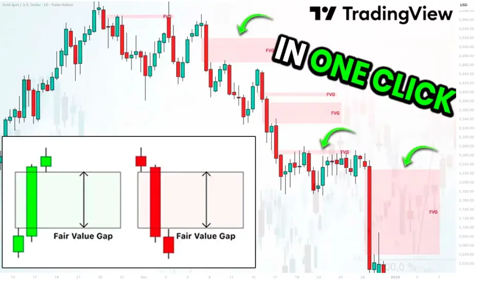
Best Free Fair Value Gap FVG Technical Indicator on TradingView
This free indicator accurately identifies Fair Value Gaps FVG on any market.
It is available on TradingView and it is very easy to set it up.
In this article, I will show you how to use this indicator and how to find a fair value gap easy in one click.
Let's start with my definition of a fair value gap because it is different from trader to trader.
FVG is a sudden, sharp price move that happens so fast that it leaves behind a price zone where very little trading actually occurred.
Because this zone saw almost no trading, it creates an imbalance .
Such a move is usually created by a large candle.
A candle with a big body and almost no wicks.
Among classic Japanese candlesticks, there is one such a candle.
It is called Marubozu.
Here are bullish and bearish structures of that candle.
A green one represents extremely strong bullish momentum. The price opened at the low of the period and closed at the high of the period. There were no pullbacks ; buyers were in complete control from the opening bell to the close.
Its bearish variation has the same logic.
The price opened at the high of the period and closed at the low of the period, with a very little trading activity within.
Our technical indicator will look for such a candle.
The indicator that we will use is called "All Candlestick Patterns".
In the settings of this indicator, we should select Marubozu White (bullish candle) and Marubozu Black (bearish candle).
After we click "OK", the indicator will immediately start working.
The indicator will show valid and significant Fair Value Gaps FVG on any time frame and any trading instrument.
Like any other indicator, it will miss some Fair Value Gaps, but while you are learning to identify them, it will help you to spot the most important ones.
❤️Please, support my work with like, thank you!❤️
I am part of Trade Nation's Influencer program and receive a monthly fee for using their TradingView charts in my analysis.
Trading Tools
FVG & ORB5-Minute ORB + FVG Day-Trading Playbook (ES/NQ)
What you need
Platform: TradingView for markup; your execution platform (e.g., TopstepX / your broker) for orders.
Chart: ES (S&P 500 futures) or NQ (Nasdaq futures). Timeframe: 5 minutes.
Indicators:
Volume
Fair Value Gap
Key Levels (15-Min/5-Min Opening Range, New York Session or London)
Chicago time (your local): NY cash open is 8:30 a.m. CT. The “US evening reopen” (the Globex reopen) is 5:00 p.m. CT (use with caution; liquidity can be thin).
The strategy in one page
1) Define the Opening Range
Use the first 5-minute bar after the NY cash open (8:30:00–8:34:59 CT).
Mark ORH = that bar’s high, ORL = that bar’s low.
2) Direction filter = FVG
Bearish setup: Price breaks below ORL, and there is a bearish FVG nearby that has not been fully filled.
Bullish setup: Price breaks above ORH, and there is a bullish FVG nearby that has not been fully filled.
If an FVG fills/invalidates immediately after the break, skip the trade.
3) Entry
Enter on the break (or on a tiny retrace back to the level) in the FVG direction:
Below ORL with a short bias when a bearish FVG stands.
Above ORH with a long bias when a bullish FVG stands.
4) Stop & Target (bracket)
Stop: default at the opposite OR level (conservative).
Short below ORL → stop just above ORL (or the nearest invalidation level if tighter is justified).
Long above ORH → stop just below ORH.
Target: aim for 2R (risk:reward = 1:2), close above half, and trail the rest.
Example: If your stop is 10 ES points (=$500 per contract), target 20 ES points (=$1,000 per contract).
5) Risk per trade
Pick a fixed dollar risk that protects your account limits. With a $50k evaluation & ~$2,000 trailing max loss, many traders use $100–$300 per trade and micros (MES/MNQ) to scale precisely.
Contract & tick quick-ref
ES: 1 point = $50 (tick = 0.25, $12.50/tick)
NQ: 1 point = $20 (tick = 0.25, $5/tick)
MES (micro ES): 1 point = $5
MNQ (micro NQ): 1 point = $2
Sizing example, with MES (conservative)
You want a max loss of $200~300.
Signal requires 4 ES points to stop (=$200/contract).
Trade 1 ES or 4 MES (same risk), target 8 ES points for 2R.
Exact checklist (print this)
Pre-market
Chart on 5m, session = New York.
Mark ORH / ORL after the first 5-min bar closes.
Confirm bias by FVG: bullish FVG above / bearish FVG below, still unfilled.
News/Volatility check (FOMC/CPIs/major earnings): be extra cautious or skip.
Entry
Price breaks ORH/ORL in the same direction as the FVG.
No immediate fulfillment of that FVG.
Place bracket: Stop at opposite OR level (or clear invalidation), Target = 2R.
Manage
Set-and-forget if you struggle with tinkering.
If it snaps back and fully fills the FVG, early flattening is allowed by your rules (consistency > perfection).
No averaging losers.
Post-trade
Journal the screenshot, OR values, FVG state, R multiple, and any deviation from the plan.
When to skip
The first break immediately reverses and fully fills the FVG.
The OR is abnormally wide; the stop would exceed your risk budget.
Chop: multiple whipsaws through ORH/ORL within a few bars.
Event risk minutes away (e.g., CPI/FOMC); spreads/volatility unpredictable.
Low volume conditions (late sessions, holidays), unless your data says you have an edge there.
A realistic take on funded accounts & pacing
Evaluations often have daily loss, trailing drawdown, and max position rules. Treat the trailing specifically as if it’s glued to your closed PnL high-water mark—don’t let one impulsive add blow the account.
Keep resets rare by capping loss/day (e.g., 1–2R). One clean 2R win can offset two 1R losses.
Micros let you keep your exact dollar risk steady as the OR width changes day to day.
Routines that help
Two windows: TradingView (markup) and Execution DOM/ladder. Copy ORH/ORL and draw a rectangle for the FVG if your execution platform lacks the indicator.
Auto-brackets: pre-define your $ risk and 2R target so every entry is consistent.
Two sessions max: NY opens first; optionally, the US evening reopens (5:00 p.m. CT) only if your data says you have positive expectancy there.
Trade less, filter more: It’s normal to get 2–3 quality trades/week. No setup → no trade.
A compact rules card (copy/paste)
Timeframe: 5m. Levels: First 5-min bar → ORH/ORL.
Filter: Trade only with an unfilled FVG in the same direction as the OR break.
Entry: Break of ORH (long) or ORL (short).
Invalidation: FVG fully filled right after break → stand down/exit.
Stop: Opposite OR level (or nearest structure that truly invalidates).
Target: 2R.
Risk: Fixed $ per trade; use micros to fit the plan.
Daily max: 1–2R down → stop for the day.
Journal every trade (screenshot + R result + notes).
Journal template (quick)
Date / Ticker / Session (NY/Evening)
ORH / ORL values; OR width (points)
FVG direction & location (filled? unfilled?)
Entry price & rationale (break + FVG alignment)
Stop (points/$), Target (points/$), Size (contracts)
Outcome (R): __
Did I follow the plan? Y/N (what deviated?)
Screenshot link
Guardrails (important)
“Making money in days” is possible but not typical; survivorship bias is real. Your edge is strict filtering + small, repeatable risk + patience.
Commissions/slippage matter—micros help sizing but raise the per-rake cost %; include this in your journaling.
Don’t scale to full contracts until your live track record shows consistency over at least 20–30 trades following the exact rules.
Screener:
www.tradingview.com

Value to Price Contraction PatternVPC Overview
What to Watch During Corrections
Stay engaged. Corrections are when future leaders reveal themselves.
Breadth divergence = danger. If indexes rise while the percentage of stocks above the 200-DMA is less than 50% (especially in the 30s), expect a pullback; rallies are narrow and fragile.
Look beyond cap-weighted indexes. Check equal-weight S&P, S&P 400 (midcaps), and Russell 2000; if they lag, leadership is thin.
Distribution vs. accumulation. Clusters of distribution days with few/brief accumulation days = risk-off regime.
How Leaders Reveal Themselves (3 Phases)
Predictive (during the correction):
Stocks hold up the best, often within ~25% of 52-week highs while the market is weak.
The RS line makes new highs even if the price is flat/down. Keep them on the A-list.
Right off the lows (post-FTD):
Explosive moves straight from lows, first into new high ground.
These often become the cycle’s monsters; wait for the first tight add-on/base if the initial thrust is extended.
Confirming (after the turn):
Breadth broadens; more proper bases are complete; opportunities are more obvious but still fruitful.
Entry Playbook
Require a Confirmed Uptrend: A follow-through day (FTD) + real setups. FTD alone is not a buy signal.
Focus on VCP bases (Volatility Contraction Pattern): successively tighter swings, drier volume, and right-side strength; buy as it clears the pivot with power.
RS Line New Highs into/at Breakout = Green Light.
Recent IPOs: prime “magnitude plays”; catch early primary bases coming out of corrections.
Progressive Exposure (when trades work)
Start with ~25% exposure (e.g., 4–5 x 5% “pilot” positions or one 20–25%).
If pilots gain traction, move quickly to ~50%, concentrating on the best names (add to winners).
If strength persists, scale to 75–100%.
Do not scale up if pilots aren’t working; reduce instead.
Selling & Timeframe
Define intent up front: trade (harvest faster, lower drawdown) vs campaign (accept drawdowns for bigger targets).
Sell into strength when the extension vs. key MAs is wide and the downside is greater than the upside.
For developing skill: take partials at 2–3× your initial risk (R) to “free-roll” the position; trail the rest.
Never raise cash just because the index is red; raise cash when your stocks show deterioration or hit stops.
Risk & Stops
Enter with a tight risk (Minervini style: often 3–5% below a well-defined pivot/low).
Position size so a stop hit costs ~1–2% of equity per idea.
Don’t average down. Cut quickly; the strategy is better than you—your job is to execute it.
Five Fast Filters for New Leaders
Shallow corrections from highs (ideally ≤25%) and quick recoveries.
Bases forming within long-term uptrends; VCP tightenings.
Fastest back to new highs after the market low; frequent up-days > down-days (“ants”: ≥12 up in 15).
The RS line is making new highs before/at breakout.
Recent IPOs with real growth.
Mindset
Commit to one sound strategy and master it; discipline is greater than prediction.
Trust the stocks, not the headlines. When the market confirms and the leaders set up, act.
Scanner:
www.tradingview.com
Screener SystemThe Gabriel Quantitative Screener Series transforms the way traders approach technical and fundamental confluence.
Each filter was designed not just to identify market opportunities but to model institutional behavior, where volume, efficiency, and volatility compression merge into repeatable, high-conviction setups.
By mastering these tools, traders can adapt dynamically across multiple environments:
From high-growth rotations and momentum squeezes to value recoveries and fundamental leadership trends.
From swing trades that capture early rotations to short-term intra-day bursts driven by liquidity spikes.
Each screener operates independently, but together they provide a panoramic framework of market rhythm and capital flow dynamics—helping you trade in harmony with institutional footprints rather than noise.
⚙️ 1. Gabriel’s TTM Squeeze—Volatility Compression and Momentum Ignition
Credit to John Carter from Simpler Trading.
Concept:
The TTM Squeeze identifies moments when volatility contracts to its tightest levels, signaling a buildup of market energy before a potential breakout. Gabriel’s version refines this principle by combining EMA structure alignment, Stochastic crossovers, liquidity thresholds, and volatility gating to isolate high-probability expansion phases.
Core Technical Framework:
EMA (8), EMA (21), EMA (34), EMA (55), and EMA (89) create a layered exponential trend structure that reveals directional stacking.
Bullish alignment: EMAs stacked upward (momentum acceleration).
Bearish alignment: EMAs inverted (momentum exhaustion).
Bollinger Bands (20) within Keltner Channels (20)—defines volatility compression and the "squeeze" zone.
Stochastic (5,3,3), (8,3.3), (14,3,3)—ensures that it's ready and primed.
ADR > 2% & ATR (14) ≥ 0.5—ensures range expansion potential.
Volume ≥ 500K—confirms institutional-grade activity.
Market Cap ≥ $2B—eliminates illiquid small caps.
How It Works:
Detects volatility contraction as BBs narrow inside KCs.
Confirms directional alignment using multi-EMA structure and R.A.F. proxy.
Screens for expansion-ready setups where energy release often follows compression.
Ideal Use Case:
Perfect for swing and intraday traders who capitalize on volatility transitions. Best applied before earnings or major news catalysts when institutional positioning drives breakout volatility.
🚦2. Gabriel’s TRW Squeeze—Trend Rotation Wave Screener
Credit to Aayush Sharma from Stock Campus.
Description:
The Gabriel’s TRW Squeeze screener identifies trend rotation wave setups using volatility compression signals combined with multi-SMA alignment. It is designed to detect the moment when price, volatility, and structure synchronize—signaling a potential momentum release after a quiet consolidation phase.
While Gabriel’s TTM Squeeze focuses on exponential momentum acceleration, the TRW Squeeze emphasizes smoothed trend strength, ideal for swing traders and portfolio rotations.
Core Framework
🔹 Moving Average Structure
SMA(9), SMA(21), SMA(50), SMA(200) define the multi-horizon trend.
Alignment of these SMAs reveals institutional rotation and trend maturity.
Bullish Bias: price above SMA(9) > SMA(21) > SMA(50) > SMA(200).
Bearish Bias: reverse order or price below all SMAs.
🔹 Volatility Compression
Bollinger Bands (20) contracting inside Keltner Channels (20) marks the volatility “squeeze.”
This condition reflects a market equilibrium about to shift—the “coiling spring” pattern.
Once Bollinger Bands expand beyond the Keltner Channel, momentum is likely to surge.
🔹 Liquidity & Volatility Filters
Market Cap ≥ 2 B USD—avoids microcaps and ensures institutional-grade volume.
Volume ≥ 500 K—screens only actively traded stocks.
ATR(14) ≥ 0.5—ensures sufficient daily range for tradeable volatility.
ADR ≤ 2%—filters excessive overnight risk.
How It Works
Compression Detection—The screener finds assets where Bollinger Bands are inside the Keltner Channel, signaling low volatility.
Trend Alignment—SMA structure confirms the directional bias of the underlying trend.
Expansion Trigger—A breakout from the squeeze with aligned SMAs marks a high-probability trend continuation or reversal wave (TRW).
⚡ 3. Gabriel’s Low Float Mover—High-Volatility Momentum Screener
Credit to Ross Cameron from Warrior Trading.
Description:
Gabriel’s Low Float Mover is engineered to detect high-momentum, low-float stocks exhibiting abnormal volume surges, strong pre-market strength, and breakout behavior. It filters for equities within the $2.5–$25 range, making it ideal for traders targeting parabolic intraday and swing moves driven by speculative rotation, news catalysts, or short squeezes.
Core Filters
⚙️ Liquidity & Market Cap
Price: $2.50–$25 Focuses on the sweet spot for retail and small-float momentum plays.
Market Cap: $300M–$2B Captures low- to mid-float tickers with enough liquidity to run but small enough to move violently on volume.
🔥 Momentum & Volume Criteria
Relative Volume ≥ 5× Ensures today’s activity is at least 5× higher than normal—confirming crowd participation or news-based rotation.
New High (1 Month) Filters for fresh breakouts or stocks reclaiming momentum from consolidation.
Pre-Market Change ≥ 2%— Detects early strength before the open, a key tell for potential runners.
⚖️ Risk Control
ADR ≥ 2% Limits overnight tracking error and ADR volatility, focusing on domestic tickers with cleaner price action.
How It Works
Identifies low-float, mid-cap stocks within the preferred retail volatility range.
Confirms momentum ignition using relative volume, recent highs, and pre-market confirmation.
Highlights tickers most likely to experience intraday breakouts, halts, or squeezes.
Use Case
Built for day traders, momentum scalpers, and swing traders who thrive in fast-moving markets. The screener surfaces potential runners before market open, allowing early preparation and pre-market watchlist building.
⚖️ 4. Gabriel’s VPC—Value-to-Price Compression Screener
Credit to Mark Minervini.
Concept:
The Value-to-Price Compression (VPC) model identifies stocks transitioning from deep value recovery to early momentum, trading between their 52-week extremes.
It captures the “middle zone” where institutional accumulation typically begins—not too oversold, not too overbought.
Core Framework:
Price ≥ 30% above 52W Low—signals strength recovery from a value base; the more the better, preferably higher than 100%.
Price ≤ 30% below 52W High—leaves headroom for continued upside; the closer to the 52-week high, the better.
SMA (50), SMA (150), and SMA (200) measure long-term compression and potential golden-cross structure.
Market Cap ≥ $300M, Volume ≥ 2M, ATR ≥ 0.5, ADR ≤ 2%—ensure clean, tradeable liquidity profiles.
How It Works:
Detects stocks recovering from lows but not yet overextended.
Confirms trend compression via SMA alignment.
Highlights candidates basing or consolidating before major continuation.
Ideal Use Case:
Best for swing and position traders aiming for sustained mid-cycle entries—the sweet spot between growth investing and technical momentum.
💹 5. Gabriel’s CANSLIM—Fundamental Growth & Institutional Leadership Screener
Credit to William O'Neil.
Description:
Gabriel’s CANSLIM identifies elite growth stocks that exhibit accelerating earnings, strong sales expansion, operational efficiency, and improving institutional interest—while still trading within 30% of their 52-week highs.
This screener merges O’Neil’s original CANSLIM principles with modern quantitative filters, designed to surface leaders emerging from consolidations with robust fundamentals and liquidity.
Core Framework
📈 C – Current Quarterly & Annual Earnings
EPS Growth (Quarterly YoY ≥ 25%)—highlights recent earnings acceleration.
EPS Growth (TTM YoY ≥ 15%)—confirms consistency across annual cycles.
Operating Margin (TTM ≥ 4.25%)—ensures profitable, scalable business models.
💰 A – Annual Earnings Growth
Revenue Growth (TTM YoY ≥ 25%)—sustained top-line expansion validates structural growth.
Net Margin (TTM ≥ 3%)—filters out low-quality revenue growth with poor conversion efficiency.
🧭 N – New Highs, Products, or Market Leadership
Price ≤ 30% below 52-week high—positions within breakout range of institutional accumulation.
ROCE (TTM ≥ 12%)—indicates strong capital efficiency and competitive advantage.
🏦 S / L / I / M – Supply, Leadership, Institutional Demand, Market Direction
Market Cap ≥ $300 M USD—ensures institutional-grade tradability.
Volume ≥ 5 M—screens for active institutional participation, the RS indicator.
Net Debt / EBITDA ≤ 17—avoids over-leveraged names that can’t scale efficiently.
ATR (14) ≥ 0.5 & ADR ≤ 2%—ensures both volatility for momentum and manageable risk.
How It Works
Filters fundamentally strong companies growing earnings and sales ≥ 20 % with efficient capital allocation.
Targets those near technical breakout zones—above institutional support but below euphoria.
Surfaces leaders capable of multi-quarter momentum continuation during strong market cycles.
💬 6. Gabriel’s Zulu Principle — Undervalued Growth with Technical Precision
Description:
Gabriel’s Zulu Principle is inspired by Jim Slater’s legendary small-cap investment philosophy — focusing on “niche growth at a reasonable price.” This screener merges the value discipline of fundamental analysis with technical alignment, surfacing emerging growth companies before institutional recognition.
It’s designed to identify small- and mid-cap stocks that are growing earnings rapidly yet remain undervalued by traditional metrics, sitting quietly in volatility contraction zones — the perfect setup for asymmetric upside.
🔥7. Stocks In Play, ORB — Opening Range Breakout Momentum Screener
Description:
“Stocks In Play, ORB” is a high-momentum liquidity screener built to identify intraday breakout candidates showing explosive activity around the Opening Range Breakout (ORB) window.
It focuses on high relative volume, strong ATR expansion, and clean volatility structure to surface equities with enough participation and range for active day trading.
This is your go-to pre-market and intraday watchlist generator for finding the tickers that matter today.
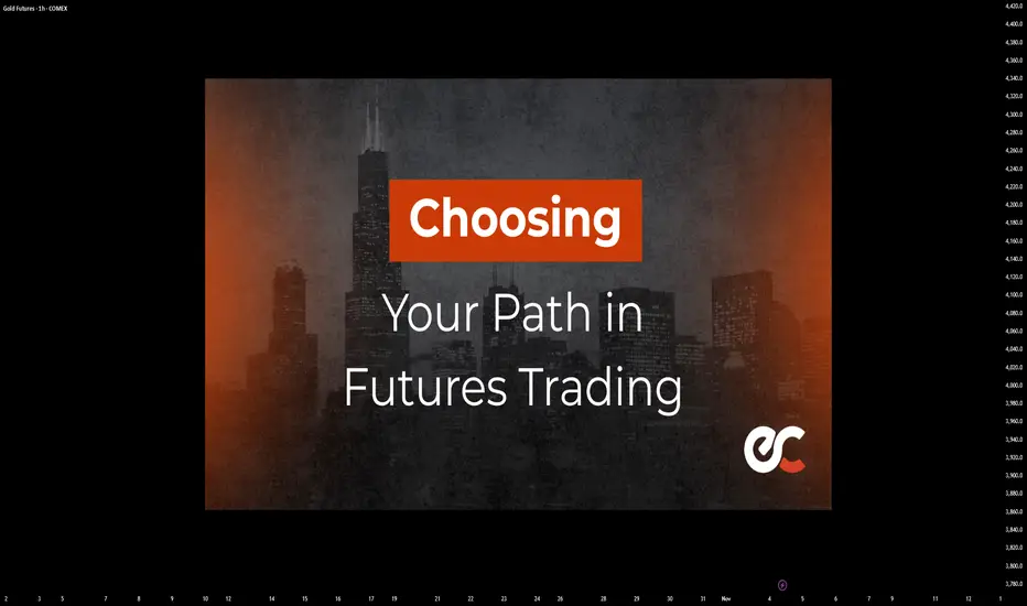
Choosing Your Path in Futures TradingThere’s more than one way to participate in the futures markets. Whether you're hands-on or prefer a more passive approach, selecting the right method depends on your trading goals, risk tolerance, and available time. Here’s a breakdown of the most common approaches used by active and aspiring futures traders.
1. Self-Directed Trading
If you like full control over your trades, this approach is for you. It requires staying up to date on market news, analyzing charts, and executing your own trades according to a plan and framework which can be referred to as your “strategy.” Experienced traders may prefer this model for its flexibility and transparency.
Past performance is not indicative of future results.
2. Automated Trading Systems
These systems use predefined rules to analyze data and execute trades without manual intervention. They can be ideal for traders who want to capitalize on algorithmic speed and logic while minimizing emotional decision-making, or for traders who might not have the time to dedicate to self-directed trading.
EdgeClear offers connectivity to a handful of automated programs, if you are interested in learning more please contact us.
3. Managed Futures
For a more passive route, managed futures allow you to invest in futures contracts through a Commodity Trading Advisor (CTA) or Commodity Pool Operator (CPO). The advisor handles the trading, using their expertise to manage risk and seek opportunity.
4. Broker-Assisted Trading
Prefer to have a trusted guide by your side? With broker-assisted trading, a professional helps execute trades, manage risk, and offer support—all tailored to your preferences.
Key Takeaway
Every trader’s journey in the futures markets looks different. Whether you thrive on taking full control of your trades, prefer automated systems, or rely on professional guidance, the key is to find the approach that aligns with your goals, risk tolerance, and lifestyle.
Understanding the options available self-directed, automated, managed, or broker-assisted empowers you to trade more confidently and effectively.
Call to Action
At EdgeClear, we’re dedicated to helping traders at every level find the tools, guidance, and support they need to succeed. Explore our platforms, connect with our expert brokers, or follow us on TradingView to discover more Trade Ideas and educational content to refine your edge.
HOW-TO: Ranger in TradingViewChart patterns and ranges are essential in technical analysis, helping traders identify potential support/resistance zones, volatility expansions, and reversal points. However, manually detecting daily or weekly ranges can be time-consuming and subjective. In this post, we describe how to effectively use the Automatic Range Detection feature inside the ZenAlgo - Ranger indicator, which calculates VWAP-based ranges and standard deviation lines automatically to save time and improve accuracy.
Using the Range Detection Feature
Add the Indicator : Access the ZenAlgo - Ranger and add it to your chart. It works on any timeframe up to 4H for optimal performance.
Key Settings :
Show Today's VWAP Range : Enabled by default. This displays the current day's range based on VWAP ±2.0 standard deviations (core range).
Show Previous Day's Range : Toggle to view historical daily ranges (up to 70 days back).
Show Monday Range : Activates weekly-like ranges derived from Monday's data (shiftable forward for projection).
Standard Deviation Lines : Customize visibility for ±3.0 to ±10.0 (and halves like ±0.5, ±1.5). Highlighted lines (e.g., ±5.0, ±10.0) use solid styles for emphasis.
Monday Range StdDev Lines : Extended up to ±40.0 for advanced volatility analysis.
Box Transparency : Adjust for visual clarity (0-100%).
Tip : Start with defaults – today's range in teal, previous in gray, Monday in yellow/blue – and tweak based on your asset's volatility.
The indicator uses a locked 1-min VWAP calculation for precision, incorporating buy/sell volume delta from 4H data to color ranges dynamically.
Range Detection Overview
ZenAlgo - Ranger detects and plots:
Daily Ranges : VWAP-centered core (±2.0 std) with extensions via std dev lines. Supports up to 50 previous days.
Monday (Weekly Projection) Ranges : Special ranges from Tuesday's data (representing Monday's VWAP), extendable up to 30 weeks. Includes core levels (25%, 50%, 75%) and extreme std devs (±40.0).
Half StdDev Lines : For finer granularity (e.g., ±2.5, ±3.5).
Volume Delta : Integrated buy/sell volume calculation for each range, helping identify bullish/bearish bias.
Return Labels : Automatically labels entries back into the range (e.g., "dS" for daily short return above RH).
Detection relies on VWAP and std dev thresholds – higher std lines indicate potential overextensions.
Examples
Here are some practical examples on BTCUSD (see chart snapshots below):
Daily Range in Action : The red box shows today's VWAP range (±2.0 std). Notice how price bounces off the midrange (MID) acting as resistance.
Previous Ranges for Context : Gray boxes overlay past days. In a trending market, price often respects these as dynamic S/R – e.g., breaking below a previous RL signals strength.
Monday Range Projection : Yellow core with blue borders. Shift forward to project weekly volatility. The 50% midline often acts as equilibrium.
StdDev Extensions : ±5.0 (solid) and ±10.0 lines for extreme targets. Useful in high-vol assets like crypto.
Tips
Validate ranges with volume delta for bias confirmation.
Use on intraday charts; combine with other indicators for entries.
For volatile markets, enable higher STDs on Monday ranges.
The Monty Hall Paradox in TradingMost traders think the Monty Hall paradox has nothing to do with markets.
But every time you refuse to change your bias — it plays out right in your chart.
At the beginning of October, I started looking for signs of a drop in gold.
They came very late.
Instead, from October 1st, gold rallied more than 5000 pips before dropping.
I was aware of the Monty Hall paradox — and yet, I didn’t switch.
And this post is not about why I didn’t switch.
It’s about understanding the paradox itself, and how it quietly plays out in trading every single day.
Because yes — gold eventually dropped, and it dropped hard.
But before falling 5,000 pips, it first rose 5,000 pips — and before that rise even began, the market clearly opened a door just before breaking above 4,000 pips — a door I chose to ignore.
That’s exactly what this article is about: recognizing when the market opens new doors, and understanding why switching — just like in the Monty Hall paradox — often gives you the better odds.
🎭 The Original Paradox
The Monty Hall problem comes from an old game show called "Let’s Make a Deal ".
There are three doors: behind one is a car, and behind the others are goats.
You pick one door.
The host, who knows what’s behind them, opens another door — always showing a goat.
Then he asks:
“Do you want to stay with your first choice or switch?”
Most people stay
But mathematically, you should switch — because the probability of winning jumps from 1/3 to 2/3 after that reveal.
The host didn’t change the car’s position — he changed the information you have.
And that’s what makes all the difference.
If you’ve never heard of the original paradox, you might remember it from the film "21" with Kevin Spacey — the scene where he teaches probability through deception, using the Monty Hall setup to show how humans instinctively trust their first choice.
That’s exactly what markets do: they give you partial information, make you feel confident, and then quietly shift the odds while you’re still defending your initial pick.
📊 The Trading Version
In trading, there are no doors — only biases.
But the logic is identical.
When you open a trade, you’re making a probabilistic choice based on incomplete data.
You think it’s 50–50 — up or down — but it’s not.
You’re guessing direction, but also timing.
In reality, your initial bias might have a 1/3 chance of being fully correct.
Then the market — our version of Monty Hall — reveals new information:
a failed breakout, a strong reversal candle, a macro shift, a sudden volume surge.
That’s the door opening.
And now you face the same question:
“Do you stay with your first choice or switch?”
🧠 Why Most Traders Don’t Switch
Because switching feels like admitting you were wrong.
Ego and attachment to our analysis make us defend our initial position, even as evidence piles up against it.
But the market doesn’t reward stubbornness — it rewards adaptation.
Refusing to switch isn’t strength; it’s emotional inertia.
🔁 What “Switching” Really Means
It doesn’t always mean reversing your trade.
It can mean:
- Cutting your loss early instead of waiting for stop loss
- Closing a position that started “right” but begins behaving wrong.
- Flipping your bias when the structure proves you wrong.
- Or simply, pausing — accepting that the setup no longer fits the data.
In each case, you’re doing what the smart contestant in Monty Hall does:
You’re updating your probabilities as new information arrives.
💬 The Lesson
The paradox isn’t about doors — it’s about humility.
About understanding that the first choice you make in trading could end up not being the best one.
The best traders don’t need to be right.
They need to be flexible enough to become right later.
So the next time the market “opens a door” — don’t get defensive.
Recalculate. Reassess.
Sometimes, switching is the only way to stay in the game.
🚀 Closing Thought
The Monty Hall paradox isn’t about luck; it’s about using information wisely.
The same rule applies to trading:
If the market gives you new data, use it — even if it means admitting your first bias was wrong.
Because the moment you stop defending your first choice, you finally start trading with probability — not pride.
P.S.
Although I did manage to make some profit on short trades, that’s beside the point.
What truly matters is that the market clearly opened a door at the beginning of October — and even though I saw it, I ignored it.
Yes, the market eventually dropped as initially expected, but that too is beside the point.
This isn’t about being right in the end; it’s about recognizing when the market opens new doors and having the courage to walk through them.

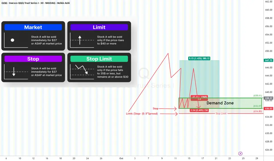
Why My Stop Loss Didn’t Trigger?”🛑 “Why My Stop Loss Didn’t Trigger?”
Let’s talk about Stop Orders, Stop Limits, Spreads, and the Outside-RTH trap.
Before we blame the broker, it’s crucial to understand how each order type actually works:
🔹 Market Order
Executes immediately at the best available price.
✅ Guarantees execution
⚠️ Doesn’t guarantee price (can slip during volatility).
🔹 Limit Order
Executes only at your specified price or better.
✅ Price control
⚠️ Might never fill if market doesn’t reach your limit or gap down.
🔹 Stop Order (Is a Stop “Market” Order)
Activates when price hits your stop level, then converts into a market order.
✅ Great for stop-loss protection
⚠️ May fill at much lower price than your stop due to slippage.
🔹 Stop Limit Order
Activates at the stop trigger, then becomes a limit order — meaning it only executes if the market trades at your limit price or better.
✅ Full control over fill price
⚠️ Risk of not executing at all if price moves away quickly.
Regular Trading Hours (RTH):
Market orders are supported → Stop Market
Outside RTH (Pre/Post-market):
Market orders are not supported therefore, only Stop Limit works.
Now, Why Your Stop Might Not Trigger?
1- You used a Stop-Limit (not Stop Market)
If the market gaps beyond your limit, there’s no fill (Buyer) at this price.
Price “touched” your stop — but never traded through your limit price.
2- You traded Outside RTH
During pre-market or after-hours, If you didn’t enable “Outside RTH” trading, your stop simply didn’t activate.
3- Thin Liquidity
Low volume = fewer buyers/sellers near your stop → delayed or partial fills.
This is especially true Outside RTH, where spreads widen and depth disappears. Or you are trading an equity or ETFs with slim volume (check the volume first before trading any asset)
✅ Recommendation:
Use Stop-Limit + “Allow Outside RTH+GTC” and make your limit “marketable” to ensure execution.
Offset guide for Stop-Limits (Δ):
• At least 0.5× spread
• Or ¼ to ½ ATR(5) for your timeframe
Example for a long position:
• You bought at $100, want to exit if it breaks $99.80.
• Pre-market spread = $0.12
• Set: Stop = 99.80, Limit = 99.68 (≈0.12 below stop)
→ Gives room for spread expansion and slippage so the stop fills quickly.
How to Set a Reliable Stop-Limit
Market Order Type Settings Notes
Equities & ETFS (RTH) Stop Market Standard stop Fastest execution
Equities & ETFS (Outside RTH) Stop Limit + GTC Limit offset = Spread Needed for after-hours fills
Futures / FX / Crypto Stop Market 24h trading Market fills OK
The Best Setup
✅ Inside RTH → Stop Market (guaranteed execution)
✅ Outside RTH → Stop Limit + GTC enabled with marketable offset
✅ Always give buffer beyond supply/demand levels (0.1–0.3%)
✅ Watch spread and volume before placing stops
Final Takeaway
Your stop loss isn’t just a line on the chart — it’s an engineered safety net.
Use the right order type for the session, give it breathing room, and understand how spread, liquidity, and RTH rules impact execution.
Because a stop loss that doesn’t trigger… isn’t a stop loss at all. 🛑
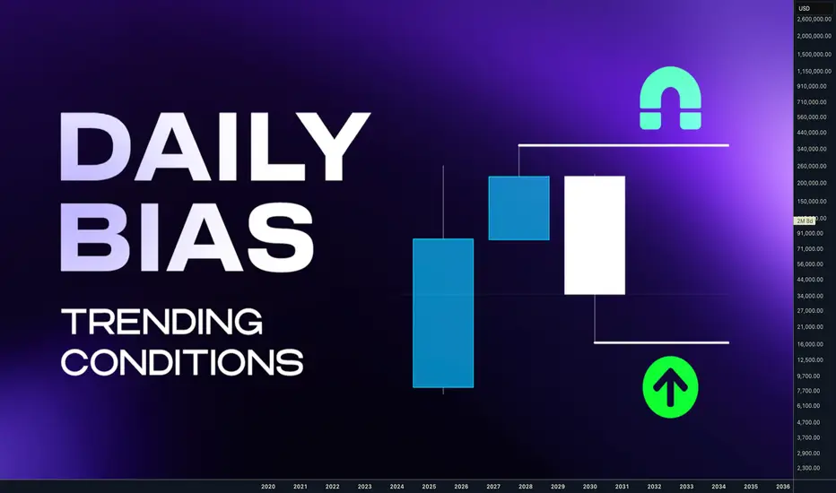
Easy method to determine next target based on candle closeHey traders today we are going to look in how to determine Daily Bias. Its actually not that complicated how many people thinks.
Please forget about higher highs, and higher lows, channels and moving averages. Yes these can be also used, but we will be looking at the market in terms where is the liquidity and we will be determining the bias based on candle closes which tell us where the liquidity is resting.
We will look at the Daily bias, but as I mentioned this many times in my posts - price is fractal so you can use this at any timeframe. But, If I can give you recommendations look for Higher timeframe bias on Daily and Weekly and H4 / H1 Structure and M15 entries.
This post will be about continuation setups in a trend, I will touch a bit reversal because it's part of setup on LTF in the continuation. Something will be shown on bearish examples something bullish I hope you can use imagination for both sides.
⁉️ Where is the liquidity ? Always follow the Daily / Weekly candle close.
📈 Continuation
If todays daily candle closed above previous days high and its still not reaching the key level, then liquidity is above todays high. Why ? Because people have intentions to sell highs to early, so and price will most likely go there. So we are bullish. Bullish Close 📈 Reversal
If todays candle wicked above previous day high, but closed below , then we can expect liquidity is below Previous days low. Why? Because mostl likely traders entered fake high break out they put SL below days low. It's signs of reversal. Every significant reversal wicked above PDH and closed inside, if not seen on PDH than its on weekly. ‼️ Yes, Its that simple - this is how I predict my bias for the setups.
There is obviously little bit more regarding the market context, because I want to be always selling highs and buying lows. Hence there must but pullback deep enough. I have explained how to buy low and sell highs in this post below. 🔗 Click the picture to learn more 👇 This is not about catching every significant highs and lows, you don't need it to be profitable. We are looking for the high probability trend continuation setups. We can catch highs and lows in the trend. After the stop hunt.
🧪In downtrend you want sell after stop hunt of short term highs 🧪In the uptrend you want be buying after stop hunts of short term lows I have explained more about stop hunts in this post. 🔗 Click the picture to learn more 👇https://www.tradingview.com/chart/XAUUSD/1J6LLshN-The-Art-of-the-Stop-Hunt-Trading/ Now, If we know the bias based on the Daily / Weekly candle close our goal is to position ourself in the right time for the continuation setup which will be during the lower timeframe reversal.
📌 Reversal Setup
first lets have a look to the reversal. We want see a candle high being taken and closed below. In that case draw on liquidity is below the daily low. Sign of reversal. So we can position ourselves in a trade as described on the picture, wick above and close inside is not enough for the signifcant HTF reversal. But its enough for our continuation setup,
📌 Continuation setup
We want to see bullish candle close above previous days high and not liquidity taken above that wick. Then we can assume that liquidity is still resting above and we want to position ourselves during the LTF reversal in the direction of the HTF liquidity. same case will be for this bearish example where we can see how candles closed below the previous days low and last low was not swept hence we can expect price to visit that low again, we have spotted potential reversal by wicking above the candles high and close below and than we can position ourselves to the short and target daily lows. 📌 Continuation LTF reversal timing
same case now you must already see it bullish close above PDH and that high was not swept so liquidity is still above , next day is inside candle once price dips below inside candle low we cans spot reversal setup on LTF and by creation of order block we enter the position during the NY session manipulation 📌 No Stop hunt = No trade
if liquidity was not taken don't enter. Yes you can miss a trade it doesnt happen always, but if it doesnt happen it's not your setup so you didnt miss anything. On this example you can see that we had almost same setup. Bullish daily candle close. High was not swept, and than 2 inside candles. 3 candle manipulated lows and another candle was expansion. Now still focus the the picture above 2nd candle that candle is a range you are entering it after that range was manipulated. Look how price reached 50% of that range , retraced and than it went full range. Its Trading model 1 and Model 2. You mostly get 2 chances to trade it. Trading ranges is in my opinion least subjective approach and unlike diagonal drawings or multiple various pattern it has defined rules. I have described this strategy in details in this post below. 🔗 Click the picture to learn more 👇https://www.tradingview.com/chart/BTCUSDT.P/PkQJvVm4-Complete-system-for-Day-Swing-Traders/ 📌 Final example for today - Schematics
Now try it alone - step by step
1) How are candles closing
2) Was the Liquidity on the low taken ? No - price might go there - Im bearish
3) Lets wait for the LTF reversal - bearish this scheme was actually traded and posted here on Tradingview as a Continuation setup Model 1 & 2 🔗 Click picture below to learn how price action developed 👇 💊 Here are few more examples based on this trading logic
1️⃣ GBPUSD Daily range - Continuation setup Model 1 & 2
🔗 Click picture below to learn how price action developed 👇https://www.tradingview.com/chart/GBPUSD/VSZwqjUj-GBPUSD-Daily-CLS-Range-Key-Level-OB-Distribution-Phase/ 2️⃣ AUDUSD Daily range - Continuation setup Model 1 & 2
🔗 Click picture below to learn how price action developed 👇https://www.tradingview.com/chart/AUDUSD/YzC7vNOf-AUDUSD-I-Daily-CLS-range-I-Manipulation-I-Short/ 3️⃣ DOGE Daily range - Continuation setup Model 1 & 2
🔗 Click picture below to learn how price action developed 👇https://www.tradingview.com/chart/DOGEUSDT.P/t48YbkXb-DOGE-Daily-range-I-Key-Level-FVG-Setup-is-ready/ Final words
Is this holy grail ? Almost.
Why is this approach great ? It's mechanical system for analysis - No subjective guessing.
Does it prevent me from losses ? No, I can make and I sometimes I do mistakes in analysis, Im not perfect.
Dont trust me , Im just a guy from the internet. Verify it by yourself and see if you take some of it to your trading arsenal.
Adapt useful, Reject useless and something specifically your own.
David Perk aka Dave Fx Hunter
Normal ModelThis idea will cover the Normal Model and why its important to have in your toolbelt while exploring the world of cryptocurrency.
Core of the Normal Model.
Normal Model Build
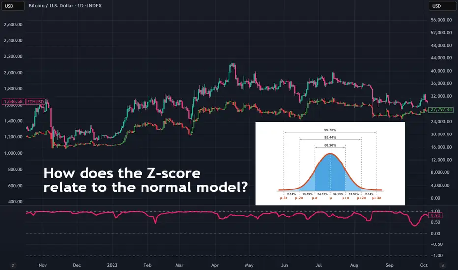
The normal model or the normal distribution is a symmetric bell-shaped probability curve, its core is to measure the mean, median and mode these are located at the center of the distribution.
Normal Model Calculation
The model shows mean at the center.
-1σ / 1σ - (1 standard deviation) covers 68.2% of data.
-2σ / 2σ covers 95.4% of data.
-3σ / 3σ covers 99.7% of data.
This means that 1σ is 1 standard deviation above the mean, while -1σ is 1 standard deviation below the mean.
This applies to 1σ, 2σ, 3σ and -1σ, 2σ, 3σ.
Normal Model Use case
We will now provide an example using a unimodal normal distribution.
Example delivery time, we have a mean of 30 with a standard deviation of 5.
This tells us that.
68.2% of the times are between 25 - 35 mins. Which is -1σ / 1σ.
95.4% of the times are between 20 - 40 mins.Which is -2σ / 2σ.
99.7% of the times are between 15 - 45 mins. Which is -3σ / 3σ
We can now do a calculation with the formula Z = (X - μ) / σ Where X is the data point, μ is the mean, and σ is the standard deviation.
The formula above is the Z-score formula and its used to measure how far a data point is from its mean in terms of standard deviations.
Z-score
Z-score is very valuable to learn and understand and has several use cases. For example, it’s very useful when it comes to identifying outliers a high or low z-score would be unusual compared to the data. If the data follows a normal distribution, the z-score allows you to calculate the probability, helping you understand whether an outcome or value is rare or not.
Imagine you want to compare different crypto coins: Bitcoin gains a few percent while ETH gains 50%+. The z-score allows you to see which coin is moving more extremely relative to its usual volatility. This can be used to identify trends in the market that normal indicators might not be able to see or adjust your risk.
Normal Model / Correlation between assets.
Now that we understand how the Normal Model and Z-Score work, we can apply this knowledge to the markets. There are many use cases, but we’ll focus on the most reliable one: correlation between assets.
Let’s take BTC and ETH as an example. Your correlation indicator gives you a stream of values (e.g., between -1 and +1). We take the history of this indicator's values and treat this history as our normal distribution.
We then calculate the Z-Score for the current correlation value using the historical average and standard deviation of the indicator itself. This tells us if the current correlation is statistically unusual.
By using Z-Scores, we can spot when the correlation is unusually high or low compared to its historical average.
Use case of new knowledge.
If Z-Score is very high, BTC and ETH are moving together more than usual indicating a strong trend continuation.
If the Z-Score is very low, the coins are moving together less than usual could signal a potential reversal.
You can use the information above to adjust your approach manage risk and entries. Now you have more then just a correlation understanding but also a statistical perspective.
The Control TrapNOTE – This is a post on mindset and emotion. It is not a trade idea or strategy designed to make you money. My intention is to help you preserve your capital, focus, and composure so you can trade your own system with clarity and confidence.
You’ve spent months - maybe years designing your system.
You know its logic.
You’ve backtested the data.
You trust the probabilities.
And yet… mid-trade, something shifts.
The candles stall.
The pullback looks deeper than usual.
You feel the muscles in your stomach tighten.
Your hand hovers over the mouse.
Maybe I’ll just move the stop a bit tighter.
Maybe I’ll exit early, just this once.
Maybe I’ll skip this signal - it doesn’t look right today.
It feels like precision.
Like prudence.
Like control.
But look closer.
Every time you interfere, you reinforce the belief that you can’t trust yourself.
And that belief quietly eats away at your confidence - trade by trade, decision by decision.
What’s really happening:
When you second-guess your own rules, it’s rarely about the system.
It’s about safety.
Your mind is trying to avoid the discomfort of uncertainty - that raw, restless sensation that comes with surrendering control to probabilities.
Your body feels it first.
The quickened pulse.
The micro-tension in your shoulders.
The eyes darting to every tick, searching for reassurance.
You’re not refining your edge - you’re soothing anxiety.
The irony is that this constant adjustment creates the very instability you’re trying to avoid.
The more you step in, the more you teach your brain that it can’t be trusted to hold steady.
And so the cycle repeats - tighter control, lower trust, higher stress.
How to shift it:
Next time you feel the urge to tweak or touch the trade - pause.
Notice the emotion under the surface.
Is it fear? Doubt? A need to be right?
Let yourself feel that pull without acting on it.
Remind yourself:
“I built this system for a reason. My job now is to execute, not interfere.”
Try sitting through one trade, fully hands-off.
Let the outcome be what it is.
And observe what happens inside you, not just on the chart.
That awareness is where emotional control begins.
Trading well isn’t just about the quality of your system
It’s about the quality of your state while running it.
If this article resonated, check out the post I’d written on System Hopping. Link below:
The best thing you can do as a crypto traderLike many who trade crypto, I’ve got a bitter taste in my mouth after Friday night’s chash.
But with years in the market, I know it’ll pass.
Still, I wanted to give one honest piece of advice to anyone new to this space:
The best thing you can do is stay away from social media.
Everything you see there is fake.
The Lambos.
The “next 100x.”
The guys screaming into the mic about how to become a millionaire, how this coin will make you rich, or how “Trump will print millionaires again.”
You’ll hear about one whale wallet buying — next hour/day, another one selling — and you’ll ask yourself: why?
You’ll see the same people saying for over two years that the mythical altcoin season is just around the corner.
The same people who call for a “100x” no matter what the market does.
The same people who promise that XRP will hit $10,000 on November 21, and when that date passes, it magically becomes “by Christmas, by Summer, by Horses Easter (Romanian expression :) )”
And when one person says something ridiculous and it gets views, a hundred others copy it.
Then a thousand more come and make it even louder, more dramatic, more viral — because attention is currency, not accuracy.
Social media isn’t a place for trading.
It’s a place for noise.
For emotional manipulation.
For dopamine hits disguised as “alpha.”
If you want to survive in this market, learn to think independently.
The moment you stop looking for answers in influencers’ voices (of course, there are exceptions, but...), you’ll start hearing your own.
And that’s when you actually begin to grow as a trader.
P.S. And by the way — instead of scrolling on TikTok or whatever, pick up a real trading book.
At least there, you’ll find something concrete — not another fairytale about how to become a millionaire with the next meme coin.

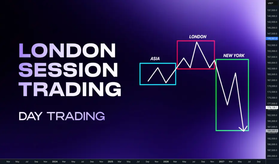
High probability strategies for the London SessionHey traders, let's break down the London session trading . In my opinion key session for the forex trading mainly for the EUR, GBP and CHF. I ll show you two high probability setups and its conditions to trade and when not to trade. Make notes and backtests so you got statistics and you can improve yourself over time. You will find out, that if you focus only on these 2 setups on 3 mentioned currencies. You will have 3-5 high probability opportunities per week.
Which is enough to make 6R gains in a week. Which is 3% on prop account with risk 0.5% per trade. And it's enough to make trading your main income.
📌 Asian Session
Low volatility & accumulation phase — the market usually consolidates inside a tight range after the previous New York close. If the Asia session is trending, London will be continuation setup.
📌 London Session
The highest-probability setups often occur during this session.
If Asia was tight range, London usually manipulates the Asian range sweeping stops above or below then reverses and starts the true daily move. London will be Reversal setup. Often sets the daily high or low of the day
📌 New York Session
Brings in the highest volume and often continuation or reversal of the London move. Based what has happen in London and on relationship with key levels and market phases. We can build market narrative for our trades.
🧪 London Continuation Bearish setup
•Narrative: Asia did the manipulation → London does the continuation.
• Asia session already made a manipulation into a key level
• Price displaced away from that level
• CIOD / OB on M15 or H1 before London open
• H1: Asia runs above the stops above H1 high into a key level
• It gets rejected and followed by order block and displacement
• At London open, price retraces into M15 premium key level and continues in the same direction
❌Invalidation: the manipulation high/low from Asia session
🧪 London Continuation Bullish setup
• Narrative: Asia did the manipulation → London does the continuation.
• Asia session already made a manipulation into a key level
• Price displaced away from that level
• CIOD / OB on M15 or H1 before London open
• H1: Asia runs bellow the stops above H1 high into a key level
• It gets rejected and followed by order block and displacement
• At London open, price retraces into M15 discount key level and continues in the same direction
❌Invalidation: the manipulation high/low from Asia session
🧪 London Reversal Bearish setup
• Narrative: London performs the manipulation → price reverses.
• Asia session consolidates near a higher timeframe key level
• London open initiates the manipulation into the key level
• Price reject at the key level and created M15 order block • H1: Asia consolidates Bellow Key Level
• London opens, price runs Asia high into that Key Level
• M15 breaks down → Change in order flow → clean short setup
• Target: higher timeframe draw on liquidity (e.g., previous day low)
❌Invalidation: the London session high (manipulation point)
🧪 London Reversal Bullish setup
• Narrative: London performs the manipulation → price reverses.
• Asia session consolidates near a higher timeframe key level
• London open initiates the manipulation into the key level
• Price reject at the key level and created M15 order block • H1: Asia consolidates above the Key Level
• London opens, price runs Asia high into that Key Level
• M15 breaks up → Change in order flow → clean short setup
• Target: higher timeframe draw on liquidity (e.g., previous day low)
❌Invalidation: the London session low (manipulation point)
🧩 to trade this method successfully you need to understand Order Blocks
🔗 Click the picture below to learn more 👇https://www.tradingview.com/chart/BTCUSD/LJ69Z8r4-Order-Block-Powerful-Key-level-and-Entry-confirmation/ 🕐 Timing is important
1️⃣Continuation setup can occur in first part of the London session. during the start of the settlement 2️⃣ Reversal setup needs a bit more time. I suggest don't enter before the 10 CET
wait for clear change in order flow after the manipulation 🧩 Day Trading doesn't mean trading every day. For highest probability setups trade only within the higher timeframes H4/D1/W1 trends.
📌 Down Trend - Trade Stop hunts above the highs
Trade London continuation or Reversal if the H4 Downtrend has run above the highs (stop hunt) It will give you chance to catch big expansion moves 📌 Up Trend - Trade Stop Hunt below the lows
Trade London continuation or Reversal if the H4 Downtrend has run below the lows (stop hunt) It will give you chance to catch big expansion moves. 🧩 In other words you want be buying loses and Selling highs.
🔗 Click the picture below to learn more 👇 I have explained how to do it in this post bellow Trend is your friend so H4 is minimum trend requirement for the London session traders. But if you want to take it to next level and enter on the sniper entries during the London session, you should also know daily and weekly trends within the monthly range. This opens a whole new world where you can catch London session model with HTF range move and it can be +10RR trades if you patient enough.
📈 Bullish LTF Ranges within HTF Range
Analyze HTF range (monthly) and define daily ranges, and wait for the London setups on the lows of the previous days within HTF trend. Always follow the same process in the London session on LTF. Asia either make manipulation - go with continuation setup or Asia consolidates and wait for the manipulation during the London session - go with London Reversal setup. 📉 Bearish LTF Ranges within HTF Range
Analyze HTF range (monthly) and define daily ranges, and wait for the London setups on the highs of the previous days within HTF trend. Always follow the same process in the London session on LTF. Asia either make manipulation - go with continuation setup or Asia consolidates and wait for the manipulation during the London session - go with London Reversal setup. ‼️ In trading, you make most money by making precisely best decisions and controlling your risk. Hence understanding the different probabilistic scenarios we can start focusing on quality over quantity by avoiding lower probability conditions. The aim is to improve our decision making process by knowing when it's better to trade and when not.
❌ Low Probability London Session Conditions
• After a series of 3 consecutive bullish daily candles - Avoid Longs.
• After a series of 3 consecutive bearish daily candles - Avoid Shorts.
• After FOMC event that produces an extreme range.
• Ahead of NFP and CPI data release
• Multiple high and medium impact news events.
• The Asian Range is has been trending and is larger than 40 pips.
• If the Asian Range is not visually consolidating.
• Absence of a candle range
✅ High Probability London Session Conditions
• The market has recently reacted off of Daily /H4 key level
• The Asian Range is visually a consolidating and smaller than 40 pips.
• Presence of a clean visual candle range
• Presence of a higher timeframe key level.
• Clean higher timeframe draw on liquidity.
✅ High Probability Intraday Setups
The highest importance is placed on the H TF Daily or 4h direction:
• Clean orderflow.
• Clean higher timeframe draw on liquidity and directional bias.
• Strong price based narrative.
• Strong time based narrative.
• 4h candle range
• 4h Key level.
• Key time
Adopt this simple concept and master it. You will not need to pay any signals group and other nonsense anymore. Just sacrifice 6 months to one strategy in one time window and find repetitiveness. Build confidence based on statistical data. Become independent.
✨ Trading Mastery is reflection of your life
Have a longterm plan, No Alcohol & Drugs, Ignore others, Focus on your journey , Backtest regularly, Review your weeks, Journal mistakes, Exercise, Sleep well, Read books, Walks in nature (no phone) , Meditate, Reduce social media time, Spend time with family, Live Life.
Trading is hard, but not impossible. I believe in you 💪
David Perk aka Dave Fx Hunter
A simple Introduction to Footprint charts
Welcome to this educational video on footprint charts .
I decided to do this introduction because I feel it would benefit so many traders who are unfamiliar with this chart type and once understood it can serve as a very powerful additional confluence in your day to day trading .
I hope I have delivered this lesson in a simple and understandable format for you too
understand the following .
The problem with just watching the price
What is order flow
Delta explained
What is open interest
How to tie it all together to produce better entries , exists and oversight into knowing when to take your trades.
I welcome any feedback or questions and I really hope that this serves you well.
*The link to the Tradingview guide is in the designated box on the right hand side I encourage everybody to use this resource .

Stop Losses: The Good, The Bad and The UglyLet’s be honest — few things trigger more emotion in trading than a stop loss being hit.
But not all stop losses are created equal.
Even though the title says “The Good, the Bad, and the Ugly”, let’s start with the Bad — because that’s where most traders get stuck.
________________________________________
🚫 The Bad Stop Loss
The bad stop loss is the arbitrary one.
You know the type:
“I trade with a 50-pip stop loss.”
“My stop is always 1% below entry.”
No matter what the chart looks like.
No matter what the volatility of the asset is.
No matter if you’re trading Gold, EurUsd, or Nasdaq.
This kind of stop loss doesn’t respect market structure or context — it’s just a random number.
You might get lucky a few times, but over the long run, it’s a losing game.
If your stop loss doesn’t make sense on the chart, then it doesn’t make sense in the market either.
There’s no nuance here — it’s bad, period.
________________________________________
✅ The Good Stop Loss
The good stop loss is strategic.
It’s placed based on structure, volatility, and logic — not habit or emotion.
You define it after you’ve studied:
• Where invalidation occurs on your idea
• The volatility range of the asset
• The natural “breathing room” of the market
When this kind of stop loss is hit, it’s not a tragedy.
It’s information.
It means your prediction was wrong.
You expected the market to go up, but it went down — simple as that.
No panic. No revenge trading.
You step away, clear your mind, and wait until the next day.
Then, you redo your analysis without bias.
If the new structure confirms that the market has truly flipped direction — then, and only then, you can trade the opposite way.
That’s professionalism.
That’s how you stay consistent.
________________________________________
😬 The Ugly Stop Loss
Now, this one hurts.
The ugly stop loss is the good stop loss that gets hit… and then the market reverses immediately.
You were right — but your stop was just a little too tight.
That’s the emotional pain every trader knows.
But here’s the key:
This situation only counts as ugly if your original stop loss was good — meaning, logical and based on structure.
If it was arbitrary, then it’s not ugly — it’s just bad.
So, what do we do when a good stop loss turns ugly?
We do exactly the same thing:
• Wait until the next day.
• Reanalyze the chart with fresh eyes.
• If the setup is still valid, re-enter in the original direction.
It’s rare for both the first and second stop to be “hunted.”
Patience gives you clarity — and clarity gives you edge.
________________________________________
💭 Final Thoughts
Stop losses aren’t just a risk tool — they’re a psychological mirror.
They reveal whether you trade with emotion or with structure.
The bad stop loss shows a lack of respect for the market.
The good stop loss shows discipline and logic.
The ugly one shows that even good decisions can lead to short-term pain.
But pain is not failure — it’s feedback.
So the next time your stop gets hit, don’t see it as punishment.
See it as a test of your ability to stay rational when the market challenges you.
Because in the long run, consistency doesn’t come from winning every trade.
It comes from handling the losing ones correctly. ⚖️

Stacking logarithmic (log) channels - Secret tool in crypto Ep 3Stacking Logarithmic Channels - Bitcoin's Hidden Fractal Structure | Signal & Structure Episode 3
In this third episode of Signal and Structure, we explore a powerful but little-known technique: stacking logarithmic channels to identify critical support and resistance levels in exponentially growing assets like Bitcoin.
Core Technique Revealed:
The Logarithmic Channel Stacking Method
Start with a base channel on log scale (demonstrated from November 2011)
Copy and stack identical channels above/below the original
The midline of one channel becomes the boundary of adjacent channels
Creates a fractal structure that respects Bitcoin's exponential growth pattern
Key Principles:
Always use logarithmic scale for crypto channels
Midlines are as important as channel boundaries
Multiple touches validate channel placement
Channels maintain proportional relationships when stacked
Practical Demonstrations:
Historical Validation Points
November 2013: Top of first channel ($1,200)
December 2017: Top of second stacked channel ($19,000)
November 2021: Bottom of third stacked channel ($69,000)
March 2023: Bottom of fourth stacked channel ($15,500)
Current Market Analysis:
Bitcoin dancing around the midline of the current channel
Lower boundary support around $90-92K (aligning with CME gap)
Technical ceiling projections discussed with appropriate caveats
Channel Construction Details:
Monthly channels: Black, thickness 4, 30% opacity
Weekly channels: Maroon/brown, thickness 3
Always include midlines for additional confluence
Adjust opacity to prevent chart clutter
Advanced Insights:
Why log scale channels reveal patterns invisible on linear scale
How to validate channels using midline touches
The relationship between channel midlines and new channel boundaries
Dealing with ambiguous channel placement (multiple valid options)
Time-Saving Tips:
Use TradingView's copy/paste to maintain exact channel angles
Set consistent color coding for different timeframes
Keep channels semi-transparent for better visibility
This technique works because logarithmic scale represents percentage moves consistently - a 100% move always appears the same height regardless of price level. This creates natural harmonic levels that price tends to respect over long timeframes.
While specific price projections should be taken as possibilities rather than certainties, the method itself provides a robust framework for understanding Bitcoin's price structure across its entire history. The convergence of these channel levels with other technical factors (like CME gaps) adds additional weight to these zones.
Remember: Channels are guides, not guarantees. Use them for context and confluence, not as standalone trading signals.

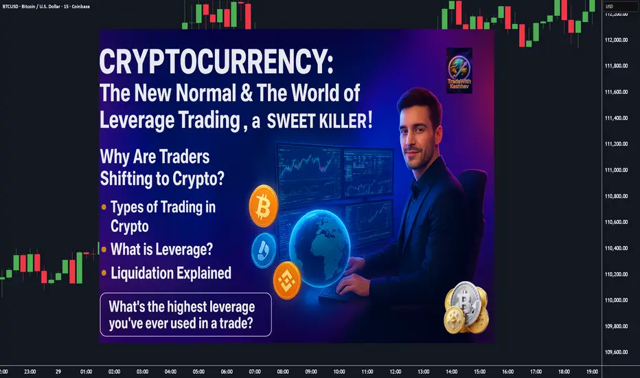
Cryptocurrency : The New Normal & The World of Leverage Trading.📌 Cryptocurrency: The New Normal & The World of Leverage Trading ⚔️ ( A Sweet Killer! )
🌍 Why Are Traders Shifting to Crypto? COINBASE:BTCUSD BITSTAMP:ETHUSD COINBASE:SOLUSD
✔️ Lower capital required compared to stocks
✔️ Fewer gaps (24/7 market = no overnight gap-up/down shockers)
✔️ High leverage opportunities (control bigger trades with smaller margin)
✔️ Global accessibility (Binance, Bybit, OKX, CoinDCX, Mudrex etc.)
📊 Types of Trading in Crypto
💠 **Spot Trading** → In India, 30% tax on capital gains ( check according to your country ).
💠 **Options & Futures** → Taxed as *Business Income* ( like F&O in stocks ). No flat % rule.
⚡ What is Leverage?
👉 Leverage means using *small capital* to control a *large trade size* , because the exchange lends you money.
Think of it like **margin trading** in stocks — but much more aggressive.
🔹 Example 1 : Normal Trade style ( No Leverage )
suppose you have 💰 Capital = $10,000
Bought BTC at Price = $10,000,000
* You can buy 0.001 BTC ( 10000 ➗ 10,000,000 ).
* If BTC rises 10% → Profit = $1,000 (+10%)
* If BTC falls 10% → Loss = $1,000 (-10%)
👉 Risk & reward move in proportion to your capital.
🔹 Example 2 : Leverage Trade style ( 10x Leverage )
suppose you have 💰 Capital = $10,000
opted Leverage = 10x
New Trade Size ( margin ) = $1,00,000 ( you can now utilize this margin amount for trading )
* You can buy 0.01 BTC ( 10000 ➗ 10,000,000 ).
* If BTC rises 10% → Profit = $10,000 (+100% return)
* If BTC falls 10% → Loss = FULL $10,000 ( Liquidation 🚨 )
👉 A 10% move = your account will be blown.
🔹 Example 3:
suppose you have 💰 Capital = $10,000
opted Leverage = 50x (Extreme ⚠️)
New Trade Size ( margin ) = $5,00,000 ( you can now utilize this margin amount for trading )
* You can buy 0.05 BTC ( 50000 ➗ 10,000,000 ).
* If BTC rises just 2% → Profit = $10,000 (+100% return)
* If BTC falls just 2% → FULL $10,000 loss ( Liquidation 🚨 )
* If BTC rises just 10% → Profit = $50,000 (+500% return)
* If BTC falls just 10% → FULL $10,000 loss ( Liquidation 🚨 )
👉 Tiny moves in high volatile asset class = jackpot or wipeout/blown.
⚔️ Key Takeaways :
1️⃣ Leverage multiplies profits 💸 but also multiplies losses too💀 ( a sweet killer! )
2️⃣ Crypto is *highly volatile* (10–20% daily moves are common) → High leverage is extremely risky, if not managed well.
3️⃣ Beginners should **never use more than 2x–3x leverage**
👉 In simple words: **Leverage is a double-edged sword ⚔️**
Used wisely → You’re a king 👑
Used recklessly → You’re broke 🥀
---
🚘 Liquidation Explained ( ex: Car Analogy )
Imagine you pay $10,000 ( as a security ) to rent a car worth $1,00,000. (That’s 10x leverage).
* The car is in your hands, but $90,000 still belongs to the owner of car (exchange).
* If the damage goes beyond your $10,000 margin → the owner takes back the car immediately.
👉 That’s liquidation: when your loss = your margin.
🔹 Case 1: Normal Trade style ( No Leverage )
Margin = $10,000 → Buy BTC.
If BTC drops 10% → Loss = $1,000.
You still have $9,000 left.
✅ No liquidation. Just a normal loss.
🔹 Case 2: 10x Leverage Trade style
Margin = $10,000
New Trade Size ( margin ) = $1,00,000
* BTC rises 10% → Profit = $10,000 (+100%)
* BTC falls 10% → Margin wiped = Liquidation 🚨
🔹 Case 3: 20x Leverage Trade style
Margin = $10,000
New Trade Size = $2,00,000 ( margin )
* BTC rises 5% → Profit = $10,000 (+100% return)
* BTC falls 5% → Margin wiped = Liquidation 🚨
👉 Just 5% against you = Account gone.
🔹 Case 4: 50x Leverage Trade style (High-Risk Zone ⚠️)
Margin = $10,000
New Trade Size = $5,00,000 ( margin )
* BTC rises 2% → Profit = $10,000 (+100% return)
* BTC falls 2% → FULL $10,000 loss = Liquidation 🚨
👉 Just 2% against you = Blown account = Game over.
🎯 Final Word
Leverage = Power ⚡
But in crypto’s volatile world, it’s also a **trap for the impatient**.
* Liquidation is directly proportionate to Leverage.
* Smart traders use small leverage.
* Impulsive traders burn out with high leverage.
💬 Question for you: What’s the **highest leverage** you’ve ever used in a trade? Drop it below 👇 (Be honest—we’ve all been tempted!)
If this Idea gave you a value information then please, Boost it, share your thoughts in comments, and follow for more practical trading!
Happy Trading & Investing!
@TradeWithKeshhav and team
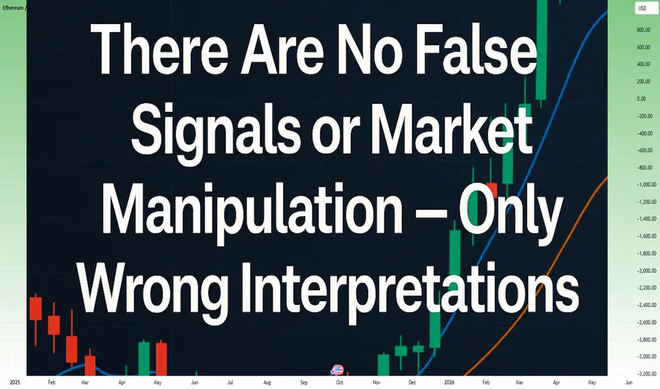
Stop Blaming Market Manipulation: It’s Your Wrong InterpretationThe Excuse Factory
Recently, Bitcoin dropped from 118k to 108k. Suddenly, TikTokers, YouTubers, and X posters spiraled into paranoia, copy-pasting the same narrative: the “big masterminds,” reptilians, or aliens manipulated the market to liquidate 1.7 billion in buy orders.
Let’s pause for a second. A 10% pullback in Bitcoin is now considered a “market crash”?
If we look deeper... Ethereum fell about 20% from its top — but this same ETH had already grown 300% since April.
Was that also “manipulation”? Or does manipulation only happen when you are losing money?
How do you think markets work in general? Do they move only upward, just to make you richer?
The truth is simpler: there is no manipulation conspiracy here. There are no “false signals.” What exists are wrong interpretations.
The Market Is Neutral
The market doesn’t care about your position. It doesn’t send “false” signals; it simply moves. Price action reflects the sum of supply and demand in each moment.
When traders label a signal as “false,” what they really mean is:
• They misread the context.
• They didn’t account for a higher timeframe.
• Their stop placement wasn’t aligned with market structure or was too close.
The market doesn’t lie. It only reveals how much or how little you understand it.
Examples of Misinterpretation
• The “false breakout” myth – What you see as a false breakout on the 1H chart may be a perfect retest on the daily timeframe. The market wasn’t wrong—you were looking at it from the wrong lens.
• Stop hunting paranoia – Many traders cry “manipulation” when price takes out a cluster of stops. But think: stops are liquidity, and liquidity is where big players need to fill orders. That’s not manipulation—it’s how markets function.
• News volatility – Many traders call sudden spikes around economic releases “market tricks.” In reality, it’s about liquidity gaps. There aren’t buy and sell orders evenly distributed at every price level. When major news hits, price “rearranges” itself to include the new information and moves sharply until it finds liquidity — usually around strong support or resistance zones.
The Psychology Behind Blame
Blaming manipulation is easier than admitting error. It protects the ego. If the loss was due to some shadowy force, you don’t have to change. But this mindset locks traders into a cycle of frustration. Progress begins when you stop blaming the market and start analyzing your own decision-making.
Case Study: Ethereum’s Current Setup
As the saying goes, a picture says more than a thousand words.
Since April, Ethereum has rallied over 300% in just six months. On this path upward, the chart shows two apparent “false breaks” of support.
The question now is: will the current move be the third “false break,” or the first real break? As I wrote in yesterday’s analysis, confirmation is key...
But even if ETH drops further, say to 3600, nothing truly changes in the broader picture. Such a move would only be a healthy correction of the trend that started in April — perfectly aligning the price with the 38% Fibonacci retracement and the rising trendline support.
Conclusion: The Trader’s Responsibility
There are no false signals. There is no hidden enemy in the market. There is only your interpretation.
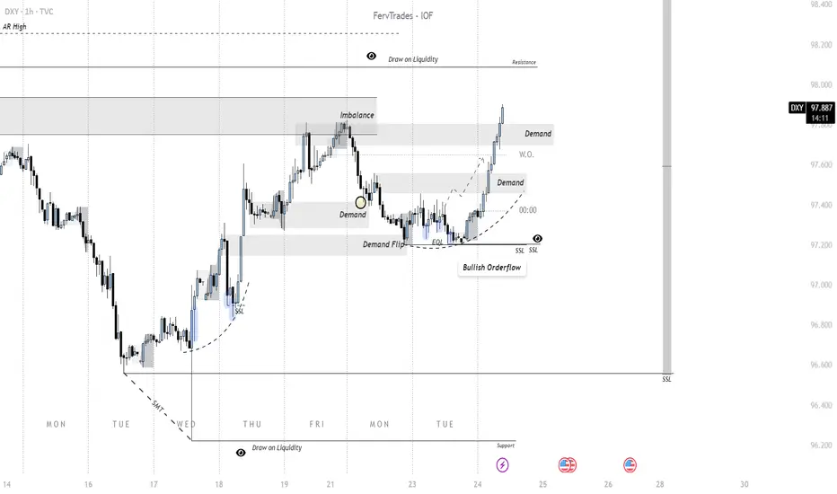
Importance of DXY for all CFD and Futures Assets The 1H DXY chart shows a clear shift in orderflow from bearish to bullish, framed within an auction-theory context where price continuously seeks liquidity to facilitate rebalancing. Early in the week, supply overwhelmed demand, driving the dollar lower into a region of resting liquidity (sell-side liquidity/SSL). This liquidity grab served as the catalyst for demand to reassert itself, evident in the sharp recovery that flipped prior supply zones into demand. The chart highlights a demand flip and multiple demand re-entries, showing how buyers defended levels once liquidity was secured.
Auction-wise, the market auctioned downward until sellers exhausted at a support zone near SSL, where bids were reintroduced. This led to an imbalance that buyers corrected by driving higher, reclaiming inefficiencies (noted in the imbalance box). Subsequent consolidation acted as a re-auctioning phase to validate demand before continuation. Now, the bullish orderflow is steering price toward resting liquidity overhead (draw on liquidity), with demand zones forming higher as the market reprices.
In short: orderflow reveals a demand-driven transition, with the auction process shifting value upward after clearing downside liquidity. The next key behavior will be how DXY reacts once it taps into overhead resistance and whether new demand sustains the auction higher or supply reasserts.
Introduction to a Trading System 1: Setting timeframes + bonusIntroduction to a Trading System: Setting Timeframes & Logarithmic Scaling
This educational video is the first in the "Signal and Structure" series, where an experienced crypto trader with 5+ years in cryptocurrency and additional forex background shares their systematic approach to chart analysis and trading.
Key Topics Covered:
Logarithmic Scale Fundamentals
- Why log scale is essential for cryptocurrency trading
- How it provides better perspective on price movements across different time periods
- Demonstrates using Bitcoin's price history how log scale reveals the true magnitude of moves and shows market maturation
Strategic Timeframe Selection System
- Introduces a unique 5-timeframe system based on dividing by 4:
- Monthly (30 days) - the base unit
- Weekly (≈30÷4 days)
- 2-Day (≈week÷4)
- 12-Hour (48 hours÷4)
- 3-Hour (12÷4)
Trading Philosophy
- Emphasizes simplification over complexity in trading
- Explains why using non-standard timeframes (2-day instead of daily) provides an edge
- Discusses how higher timeframes show cleaner structure while lower timeframes display more chaos
- Advocates for making trading easier by reducing noise and confusion
Practical Insights
- Higher timeframes (monthly/weekly) show more reliable patterns and are watched by institutional traders
- Lower timeframes become increasingly chaotic but still contain tradeable patterns
- The importance of stepping back to see the bigger picture in markets
The instructor brings a unique perspective influenced by classic traders like Gann and Wyckoff, and has developed over 140 custom indicators for their trading system. The video sets the foundation for understanding market structure before diving into signals and trading strategies in future episodes.

The Technical Analysis Superpower (That Isn’t Real)Imagine this: You spot the perfect candlestick pattern. It feels like the market’s secret code just unlocked. You hit buy. An hour later you’re staring at a loss, asking yourself: “What the hell just happened?”
That’s the illusion of control at play. I’ve been there. We all have.
How the illusion shows up:
You believe one pattern guarantees the next move.
You stack indicators thinking more = more control.
You convince yourself you’ve finally “cracked the code.”
The emotional side:
It feels good to play wizard. Technical analysis (TA) gives us tools, but it doesn’t give certainty. The market doesn’t care about your Fibonacci line or your perfect breakout. TA only tilts the odds—not controls them.
So what actually matters?
Keep it simple: 2–3 tools max. Start with trend. When you are following the higher timeframe bias, you are following the trend. The top 5-6% of traders get 90-100% of their profit from a selective bias.
Always ask: “If I’m wrong, where’s my exit? wher's my Stop loss?”
Backtest and track results. Aim for probability, not perfection.
Respect patience. Most fakeouts die fast—wait for confirmation.
Bottom line:
TA is not a superpower. It’s a probability framework. The real edge isn’t in control—it’s in discipline, trend recognition, and managing yourself when the market doesn’t care.
👉 What’s your biggest illusion of control story? Drop it in the comments—I want to hear how TA has tricked you.
— Skeptic

Best Lot Size for Gold Trading (XAUUSD) Explained
If you trade Gold with fix lot, I prepared for you a simple manual how to calculate the best lot size for your XAUUSD trading account.
Step 1
Find at least the last 10 trades that you took on Gold.
Step 2
Measure stop losses of all these trades in pips
Step 3
Find the trade with the biggest stop loss
In our example, the biggest stop loss is 680 pips
Step 4
Open position size calculator for XAUUSD
Step 5
Input your account size, 1,5% as the risk ratio.
In "stop loss in pips" field, write down the pip value of your biggest stop loss - 680 pips in our example.
Press, calculate.
For our example, the best lot size for Gold will be 0.22.
The idea is that your maximum loss should not exceed 1,5% of your account balance, while the average loss will be around 1%.
❤️Please, support my work with like, thank you!❤️
I am part of Trade Nation's Influencer program and receive a monthly fee for using their TradingView charts in my analysis.

Forget the USD–Gold Correlation: Trade What MattersI took my first steps in the markets back in 2002 with stock investments. Real trading, however—the kind involving leverage, speculation, and active decision-making—began for me in 2004.
Like any responsible beginner, I started by taking courses and reading the classic trading books. One of the first lessons drilled into me was the inverse correlation between the US dollar and gold.
Fast forward more than 20 years, and for the past 15, XAUUSD has been my primary focus. And here’s the truth: I’m here to tell you that relying on USD–gold correlation is a mistake.
In this article, I’ll explain why you should avoid it, and more importantly, I’ll show you how to think like a “sophisticated” trader—especially if you can’t resist looking at the DXY .
Let’s Dissect the Myth
And for those who will say: “How on earth can you call this a mistake? Everyone knows gold moves opposite to the dollar!” — let’s dissect this step by step.
There couldn’t be a better example than 2025. We’re in the middle of a clear bullish trend in gold. Prices are climbing steadily, but not only against USD.
If gold were truly just the inverse of DXY, this overall rally wouldn’t exist. But it does. Why? Because the real driver isn’t the dollar falling — it’s demand for gold itself . Central banks are buying, funds are reallocating, and investors see gold as a store of value.
The Simple Logic That Breaks the Correlation
If it were truly a mirror correlation, then XAU/EUR would have been flat for years. Think about it: if gold only moved as the “inverse of the dollar,” then against other currencies it should show no trend at all. But the charts tell a completely different story.
Gold has been rising not just in USD terms, but also in EUR, GBP, and JPY. That means the move is not about the dollar being weak — it’s about gold being in demand.
This simple observation destroys the illusion of a strict USD–gold inverse correlation. If gold climbs across multiple currencies at the same time, the driver can’t be the dollar. The driver must be gold itself.
Why Correlation Thinking Creates Frustration
This is exactly why I tell you to ignore the so-called correlation: because it distracts you. You end up staring at the DXY when in reality, you’re trading the price of gold.
And that’s where frustration kicks in. You’re sitting on a position, watching the dollar index going higher, and you start yelling at the screen: “DXY is going up, so why isn’t gold falling? Why is my short position bleeding instead of working?”
I’ve been there many years ago, I know that feeling. But here’s the truth: gold doesn’t care about your correlation. It doesn’t care that DXY is green, red or pink. It moves on its own flows. And when you finally accept that, your trading becomes much cleaner. You stop being trapped by illusions and start focusing on the only thing that matters: the demand and supply of gold itself.
Where the Confusion Comes From
So where does all this confusion come from? Let’s take an example: imagine we get a very bad NFP number. That translates into a weaker USD. What happens? XAUUSD ticks higher.
Now, most traders immediately scream: “See? Inverse correlation!” But that’s not what’s really happening. The move you’re seeing is just a re-alignment of gold’s price in dollar terms. It’s noise, not a fundamental shift in gold’s trend.
If gold is in a downtrend overall, this kind of move doesn’t suddenly make it bullish. It’s just a temporary adjustment because the denominator (USD) weakened. On the other hand, if gold itself is already strong, such an event can act as an accelerator, pushing the trend even stronger.
The key is this: the dollar can influence the short-term pricing of XauUsd, but it doesn’t define the trend of gold. That trend is driven by demand for gold as an asset.
A Recent Example That Says It All
Let’s take a very recent example. Over the past month, DXY has been stuck in a range — no breakout, no major trend. Yet gold hasn’t just pushed higher in USD terms, it has made new all-time highs in XAU/EUR, XAU/GBP, and other currencies as well.
Why? Because gold rose. Not because the dollar fell, not because of some neat inverse chart overlay. Gold as an asset was in demand — globally, across currencies.
This is the ultimate proof that gold trades on its own flows. When buyers want gold, they don’t care whether DXY is flat, rising, or falling. They buy gold, and the charts across multiple currencies show it.
What Sophistication Really Looks Like
If you really want to be sophisticated, here’s what you do:
You see a clear bullish trend in XAUUSD. At the same time, you notice a clear bearish trend in EURUSD — which means the dollar is strong. Most traders get stuck here. Their brain short-circuits: “Wait, how can gold rise if the dollar is also strong?”
But the sophisticated trader doesn’t waste time arguing with a textbook correlation. Instead, they look for the trade that makes sense: buy XAU/EUR.
Because if gold is strong and the euro is weak, the real opportunity isn’t in fighting with DXY — it’s in positioning yourself where you can earn more. That’s not correlation thinking. That’s flow thinking.
Final Thoughts
The dollar–gold inverse correlation is a myth that refuses to die. Traders cling to it because it feels simple and safe. But real trading requires letting go of illusions and facing complexity head-on.
Gold is an independent asset. It rises and falls because of demand, not because the dollar happens to be moving the other way. Once you stop staring at DXY and start trading the flows that actually drive gold, you’ll leave frustration behind and step into sophistication.
🚀 If you still need DXY to tell you where gold is going, you’re not trading gold — you’re trading your own illusions.