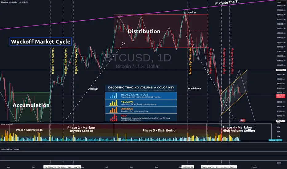
Confirming Chart Patterns With VolumeIn the chart above, one can clearly recognize the Wyckoff Market Cycle pattern. The pattern's legitimacy can be confirmed by volume. The volume is represented in the lower portion of the chart.
Low to average volume candles are blue. Average volume is indicated by light blue candles. Yellow candles represent higher than average volume. Orange is high volume. And red represents extremely high volume.
You will see each phase of the Wyckoff Market Cycle pattern confirmed by this volume on our current Bitcoin chart.
First, the market enters the accumulation phase. Market volume is fairly high, as seen in the accumulation quadrant in the lower left on the chart. However, it is important to note that there is an equal distribution of high-volume selling days as there are high-volume buying days. Thus, price tends to trend sideways within the channel until the true buying power comes into action.
Next, the buyers step in and take the price higher. This is generally indicated by a high-volume day when the price breaks above the accumulation channel. When buyers step in, most of the yellow and orange volume candles are, in fact, buyers in the markup phase. You can verify this is true by lining these higher-than-average volume candles up with the green price candles on the Bitcoin chart. This indicates the markup phase has begun and is underway.
Then, we come to the distribution phase on our chart. Notice the volume in that 3rd quadrant, the distribution quadrant. It is mostly average volume. Institutional sellers are attempting to carefully exit quietly. But you can also see that near the end of the distribution phase, sellers are starting to step in, tipping their hats and indicating that the distribution phase is about to end.
Finally, sellers take back full control, dropping us from the distribution channel altogether. High volume selling confirms this move and the pattern. The final quadrant in the bottom right proves that mostly sellers have control, as the majority of higher volume candles (yellow, orange, and red) are credited to the sellers.
Our Wyckoff Market Cycle pattern is now confirmed, and further selling can be expected until volume is once again taken back by the buyers. One will need to see clearly that high-volume candles are in line with green price candles. In this chart, that is not yet the case. Thus, more selling should be expected until it is clearly evident that buyer command control once again.
Hope you found this brief educational write-up informative and helpful, as volume can often be utilized in many uncertain pattern formations to find pattern legitimacy and confirmation.
✌️Stew
Volumeanalysis
High Probability Setups: Divergence in Price and VolumePrice defines direction, but volume defines participation. High probability setups emerge when both align. When they separate, conditions change. Divergence between price and volume is one of the clearest tools for assessing whether a move is supported by real commitment or driven by diminishing participation.
In strong market conditions, impulsive price movements are accompanied by stable or increasing volume. This shows that traders are actively committing capital in the direction of the move. Pullbacks during these phases typically show reduced volume, confirming that counter-moves are corrective rather than a shift in control. This alignment between price expansion and volume participation supports continuation.
Divergence forms when price continues to extend while volume contracts. The market is still moving, but fewer participants are involved. This shift indicates that momentum is weakening beneath the surface. The move becomes more fragile, and continuation requires increasingly less resistance to fail. These conditions often develop before structural changes become visible on price alone.
The relevance of divergence increases at key locations. When price reaches major highs or lows, premium or discount zones, or obvious liquidity pools, declining volume signals absorption. Orders are being filled without follow-through. Late participants provide liquidity rather than fuel. This explains why many apparent breakouts stall or reverse shortly after forming.
Volume behaviour also clarifies breakout quality. Breaks that occur with low or declining volume often lack acceptance. Price may move beyond a level, but without participation the market struggles to sustain the new range. When price quickly re-enters the prior structure, divergence explains the failure before structural confirmation appears.
During consolidation phases, volume provides insight into preparation. Falling volume reflects compression and balance. Rising volume within a range reflects active engagement and positioning. Divergence during these phases often precedes resolution, especially when combined with liquidity interaction at range boundaries.
High probability setups form when divergence aligns with location and structure. Volume refines what price presents. It helps identify whether a move is being supported, absorbed, or exhausted. Reading this relationship consistently improves timing, reduces false entries, and keeps execution aligned with real market participation rather than surface-level movement.

Volume EPO – One bar, seven volume stories Volume EPO – One bar, seven volume stories (VAKFN, Borsa Istanbul)
This idea illustrates how different volume-classification methods can produce very different interpretations of the same bar. The Volume EPO overlay is used as a research tool to display seven methods side by side in a compact HUD.
The example is taken from VAKFN on Borsa Istanbul. On this market, TradingView provides extended intrabar volume data (BIST volume data plan), which allows the Intrabar row of the table to be built from lower-timeframe up/down volume and used as a high-precision benchmark.
Price is shown on the daily chart inside an ascending channel. The last daily bar in that structure is analyzed with the Volume EPO table on the right. Total volume on that bar is the same for every row (66.49M), but each method splits it into buy / sell / delta differently:
- Intrabar (Ref) – lower-timeframe up/down volume
≈ 36.66M buy vs 29.83M sell → delta +6.83M (moderate net buying; benchmark “truth layer”).
- BVC (Smart) – probabilistic split via normal CDF on normalized price change
Delta ≈ +7.61M, very close to Intrabar (Diff ≈ 1.1%), confirming a mild buy imbalance.
- Tick Rule – classic uptick/downtick classifier
Because the close is above the previous close, the whole 66.49M is classified as buy volume
→ delta +66.49M (Diff ≈ 90%), an extremely bullish reading.
- Lee-Ready Style – delayed midpoint quote test with Tick fallback
On this bar the close falls on the sell side of the delayed midpoint, so the entire volume is classified as selling
→ delta −66.49M (Diff ≈ 110%), the exact opposite of Tick Rule.
- Wick Imbalance – geometric supply/demand from upper vs lower wicks
A strong upper wick and weak close again lead to a full sell reading
→ delta −66.49M (Diff ≈ 110%).
- ML-Logit – logistic model of normalized return and volume deviation
Shows only a small negative imbalance
→ delta ≈ −1.38M (Diff ≈ 12.1%), close to neutral flow.
- Geometry – legacy CLV-style candle approximation
With the close near the low of the range, more volume is assigned to sellers
→ delta ≈ −33.25M (Diff ≈ 60.1%), strong selling.
On this single daily bar of VAKFN, the conclusions range from “mild net buying” (Intrabar, BVC) to “massive buying” (Tick Rule), “massive selling” (Lee-Ready Style, Wick Imbalance), “almost neutral” (ML-Logit), and “strong selling” (Geometry).
Only the Intrabar row uses actual lower-timeframe up/down volume from TradingView; all other rows are models built on top of OHLCV. Access to deeper intrabar history on small timeframes (such as 1s/5s, depending on data plan and subscription level for BIST) strengthens this benchmark layer and makes it easier to see which methods stay close to the underlying flow and which ones drift away.
This idea is presented as a research and educational example on VAKFN, not as a trade signal or financial advice.

HOW TO WATCHLIST TABLE-VIEW VOLUME & EXTENDED HOURSComplete Process: HOW TO WATCHLIST TABLE-VIEW VOLUME & EXTENDED HOURS
1️⃣ Open the Watchlist Panel
➺ The Watchlist panel is located on the right side of the Trading-View interface.
➺ If it is hidden, click the small arrow on the right edge to open it.
2️⃣ Locate the Table-View Tool
➺ At the top of the watchlist panel, you will see three dot icon.
➺ This icon opens the table-view tool inside the watchlist.
3️⃣ Open the Table-View
Step-by-step:
➺ Click the table icon at the bottom of the watchlist.
➺ The watchlist will switch from the normal list-view to the table-view layout.
4️⃣ Understanding the Table-View Layout
The table-view displays additional columns and organized data in a tabular format.
Typical columns include:
⤷ Symbol
⤷ Last Price
⤷ Change (%)
⤷ Volume
⤷ High / Low
⤷ Session Data
⤷ Custom fields (depending on settings)
The table-view allows users to compare multiple symbols more clearly.
5️⃣ How to Add Columns in Table-View
Step-by-step:
➺ Hover on the column header area.
➺ Click the plus (+) icon or “Add Column” option.
➺ Choose the data you want to add:
⤷ Price
⤷ Change
⤷ Bid / Ask
⤷ Volume
⤷ Open Interest
⤷ Fundamentals (if supported)
⤷ Other available fields
The selected column will appear immediately.
6️⃣ How to Remove Columns
Step-by-step:
➺ Hover over the column header you want to remove.
➺ Click the three-dot menu (⋮) on that column.
➺ Select “Remove Column”.
➺ The column will be removed from the table.
7️⃣ How to Reorder Columns
Step-by-step:
➺ Click and hold the column header.
➺ Drag it left or right.
➺ Release to place it in the new position.
This helps personalize the table layout.
8️⃣ Sorting Symbols in Table-View
Step-by-step:
➺ Click any column name (for example: Price, Change %, Volume).
➺ Clicking once sorts the column ascending.
➺ Clicking again sorts descending.
➺ A small arrow appears showing the sort direction.
9️⃣ Switch Back to Normal Watchlist View
Step-by-step:
➺ Click the same table icon at the bottom again.
➺ The watchlist returns to the default list-view.
🎯 Short Summary (Optional for Captions)
⤷ Open Table-View → Bottom table icon
⤷ Add Columns → Add Column option
⤷ Remove Columns → Three-dot menu → Remove
⤷ Reorder → Drag column headers
⤷ Sort → Click column name
⤷ Return to List → Click table icon again

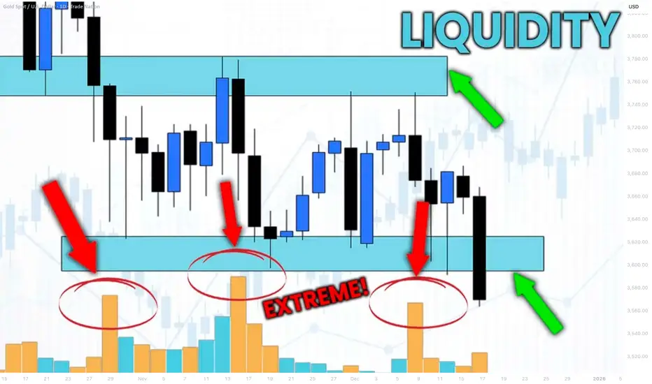
How to Identify Liquidity in Chart with VOLUME Indicator
Smart Money Concept is all about finding the liquidity .
Liquidity analysis is the essential element of profitable trading SMC.
In this article, I will teach you how to use volume indicator to identify liquidity - supply/demand clusters and hidden zones that move the market.
First, let's discuss what exactly we mean by liquidity.
Analysing any forex pair, you should know that orders of the market participants are not equally distributed among all the price levels.
While some levels and the zones will lack the interest of the market players, some will attract huge trading volumes.
We will call such zones - liquidity zones.
To find these zones, you can execute volume analysis.
By using volume indicator, we will look for volume spikes - it will indicate strong buying and selling activity.
Examine NZDUSD chart on a daily time frame with default volume indicator being added.
I highlighted a recent volume spike.
The elevated volume level confirms that there was strong institutional participation in the formation of this candle.
But you can see that this particular candle has quite a wide rage.
So how do we know where exactly and on what levels liquidity concentrates?
We will need to use another indicator to find liquidity zones - a volume profile.
Here is what this indicator does.
Think of the chart as a battlefield. The Volume Profile shows you exactly where the major fighting between buyers and sellers is taking place. It reveals the price levels where the most orders have been executed.
While a classic volume indicator shows when volume occurred, it lights up the specific price levels where the most trading activity is concentrated.
Analyzing Volume Profile on NZDUSD, we can easily find the exact zone where liquidity was concentrated.
We simply take the entire range of a high volume candle and look for a volume profile spike within.
To identify other liquidity zones, continue searching for volume spikes in Volume indicator.
By the way, adding a Simple Moving Average on your Volume indicator will help you find these spikes easier.
Here are 4 significant liquidity zones that I found using this method.
Please, note that there are 3 high volume candles that were formed within the same liquidity zone.
A combination of a classic Volume indicator and Volume Profile will help you to accurately identify the exact moments of volume increase and the price levels where this rise occurred.
That will be a reliable strategy to find important liquidity zones.
❤️Please, support my work with like, thank you!❤️
I am part of Trade Nation's Influencer program and receive a monthly fee for using their TradingView charts in my analysis.
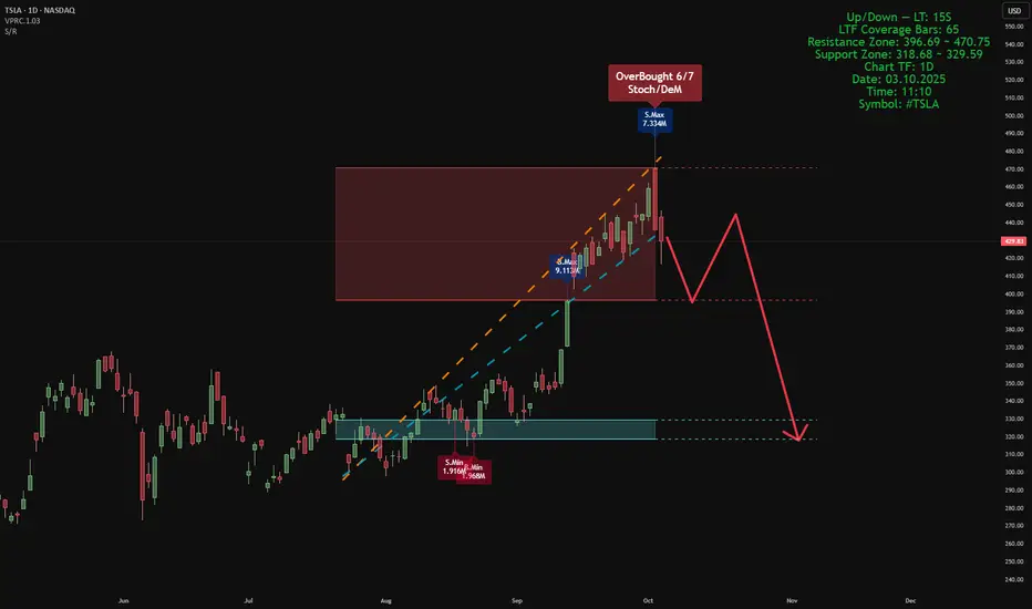
Smart Money Support/Resistance + ATAI Volume Analysis —PracticalApplication
When these two indicators work together — Smart Money Support/Resistance (Lite) and ATAI Volume Analysis with Price Action — the chart begins to speak a clearer language: one defines where the reaction zones form, and the other explains what happens inside them. The purpose is not prediction but understanding the balance between smart money pressure and retail momentum.
1. Parameter Alignment
On the right side of the chart, the green info panel confirms that both indicators share identical configurations. In this example, the lookback period is set to 52, chosen deliberately because it must be smaller than the total number of LTF coverage bars (65). For the Smart Money Support/Resistance indicator, the projection is set to 26 — extending the detected zones forward without adding excessive visual noise. This alignment is crucial; mismatched parameters can desynchronize volume readings and structural boundaries.
2. Reading the Chart
In this sample chart, the upper red area represents a Smart Money resistance zone — a region of concentrated selling pressure detected from lower timeframe volume. Simultaneously, ATAI Volume Analysis signals an Overbought (6/7) condition, meaning multiple oscillators confirm exhaustion while seller volume (S.Max) begins to outweigh buyer volume (B.Min). This overlap suggests that liquidity has shifted and the prior bullish impulse is weakening. From here, price may consolidate within the zone or initiate a structured retracement toward the blue support area, previously defined by accumulation volume. The red projected path simply visualizes one potential structural scenario; it is not a prediction or trade signal.
3. Broader Context
This example serves only as a demonstration of how these two tools interact when properly tuned. Different assets and timeframes naturally yield unique structures and behaviors, yet the principle remains consistent: define the territory first with Smart Money Support/Resistance, then interpret market behavior within it using ATAI Volume Analysis.
This content is for educational purposes only — not financial advice. User feedback and practical observations play a key role in refining future versions of both indicators.
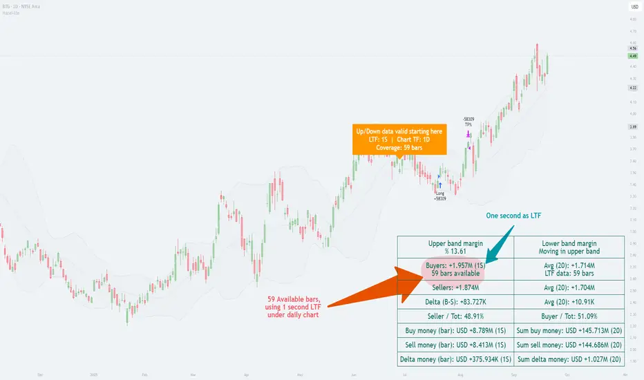
Explaining the Lower Timeframe Function and Its Role in Trading Introduction
Candlesticks on higher timeframes summarize long periods of trading activity, but they hide the internal balance of buying and selling. A daily candle, for instance, may show only a strong close, while in reality buyers and sellers may have fought much more evenly. To uncover this hidden structure, Pine Script offers the requestUpAndDownVolume() function, which retrieves up-volume, down-volume, and delta from a chosen lower timeframe (LTF).
Function in Practice
By applying this function, traders can measure how much of a move was supported by genuine buying pressure and how much came from selling pressure. The function works across timeframes: when analyzing a daily chart, one can select a one-minute or one-second LTF to see how the volume was distributed within each daily bar . This approach reveals details that are invisible on the higher timeframe alone.
Helper for Data Coverage
Lower-timeframe data comes with strict limitations. A one-second chart may only cover a few hours of history, while a one-minute chart can stretch much further back. To make this limitation transparent, a helper was implemented in our code: it shows explicitly how far the available LTF data extends . Instead of assuming full coverage, the trader knows the exact portion of the higher bar that is represented.
//══════════════
// Volume — Lower TF Up/Down
//══════════════
int global_volume_period = input.int(20, minval=1, title="Global Volume Period", tooltip="Shared lookback for ALL volume calculations (e.g., averages/sums).", group=grpVolume)
bool use_custom_tf_input = input.bool(true, "Use custom lower timeframe", tooltip="Override the automatically chosen lower timeframe for volume calculations.", group=grpVolume)
string custom_tf_input = input.timeframe("1", "Lower timeframe", tooltip="Lower timeframe used for up/down volume calculations.", group=grpVolume)
import TradingView/ta/10 as tvta
resolve_lower_tf(bool useCustom, string customTF) =>
useCustom ? customTF :
timeframe.isseconds ? "1S" :
timeframe.isintraday ? "1" :
timeframe.isdaily ? "5" : "60"
get_up_down_volume(string lowerTf) =>
= tvta.requestUpAndDownVolume(lowerTf)
var float upVolume = na
var float downVolume = na
var float deltaVolume = na
string lower_tf = resolve_lower_tf(use_custom_tf_input, custom_tf_input)
= get_up_down_volume(lower_tf)
upVolume := u_tmp
downVolume := d_tmp
deltaVolume := dl_tmp
//──── LTF coverage counter — counts chart bars with valid Up/Down (non-na) 〔Hazel-lite〕
var int ltf_total_bars = 0
var int last_valid_bar_index = na // new: remember the bar_index of the last valid LTF bar
if not na(deltaVolume)
ltf_total_bars += 1
last_valid_bar_index := bar_index
int ltf_safe_window = ltf_total_bars
var label ltf_cov_label = na // label handle for the “coverage” marker
Use in Strategy Development
Because both the main function and the helper for data coverage have been implemented in our work, we use the Hazel-nut BB Volume strategy here as a practical example to illustrate the subject. This strategy serves only as a framework to show how lower-timeframe volume analysis affects higher-timeframe charts. In the following sections, several charts will be presented and briefly explained to demonstrate these effects in practice.
In this example, the daily chart is used as the main timeframe, while a one-second lower timeframe (LTF) has been applied to examine the internal volume distribution. The helper clearly indicates that only 59 one-second bars are available for this daily candle. This is critical, because it shows the analysis is based on a partial window of intraday data rather than a full day.
The up/down volume split reveals that buyers accounted for about 1.957 million units versus sellers with 1.874 million, producing a positive delta of roughly +83,727. In percentage terms, buyers held a slight edge (≈51%), while sellers were close behind (≈49%). This near balance demonstrates how the daily candle’s bullish appearance was built on only a modest dominance by buyers.
By presenting both the margin values (e.g., upper band margin 13.61%) and the absolute money flow, the chart connects higher-timeframe Bollinger Band context with the micro-timeframe order flow. The annotation “Up/Down data valid starting here” reinforces the importance of the helper: it alerts the user that valid LTF volume coverage begins from a specific point, preventing misinterpretation of missing data.
In short, this chart illustrates how choosing a very fine LTF (1 second) can reveal subtle buyer–seller dynamics, while at the same time highlighting the limitation of short data availability. It is a practical case of the principle described earlier—lower-timeframe insight enriches higher-timeframe context, but only within the boundary of available bars.
Analysis with One-Minute LTF
In this chart, the daily timeframe remains the base, but the lower timeframe (LTF) has been shifted to one minute. The helper indicates that data coverage extends across 353 daily bars, a much deeper historical window than in the one-second example. This means we can evaluate buyer/seller balance over nearly a full year of daily candles rather than just a short slice of history.
The up/down split shows buyers at ≈2.019M and sellers at ≈1.812M, producing a positive delta of +206,223. Here, buyers hold about 52.7%, compared to sellers at 47.3%. This stronger bias toward buyers contrasts with the previous chart, where the one-second LTF produced only a slim delta of +83,727 and ratios closer to 51%/49%.
Comparison with the One-Second LTF Chart
Data coverage: 1s gave 59 daily bars of usable history; 1m extends that to 353 bars.
Delta magnitude: 1s produced a modest delta (+83k), reflecting very fine-grained noise; 1m smooths those micro-fluctuations into a larger, clearer delta (+206k).
Interpretation: The 1s chart highlighted short-term balance, almost evenly split. The 1m chart, backed by longer history, paints a more decisive picture of buyer strength.
Key Takeaway
This comparison underscores the trade-off: the lower the LTF, the higher the detail but the shorter the history; the higher the LTF, the broader the historical coverage but at the cost of microscopic precision. The helper function bridges this gap by making the coverage explicit, ensuring traders know exactly what their analysis is built on.
Impact of TradingView Plan Levels
Another factor shaping the use of this function is the user’s access to data. TradingView accounts differ in how much intraday history they provide and which intervals are unlocked.
◉ On the free plan, the smallest available interval is one minute, with a few months of intraday history.
◉ Paid plans unlock second-based charts, but even then, history is measured in hours or days, not months.
◉ Higher tiers extend the number of bars that can be loaded per chart, which becomes relevant when pulling large volumes of lower-timeframe data into higher-timeframe studies
Conclusion
With requestUpAndDownVolume(), it becomes possible to see how each symbol behaves internally across different timeframes. The helper function makes clear where the data stops, preventing misinterpretation. By applying this setup within strategies like Hazel-nut BB Volume, one can demonstrate how changing the lower timeframe directly alters the picture seen on higher charts. In this way, the function is not just a technical option but a bridge between detail and context.
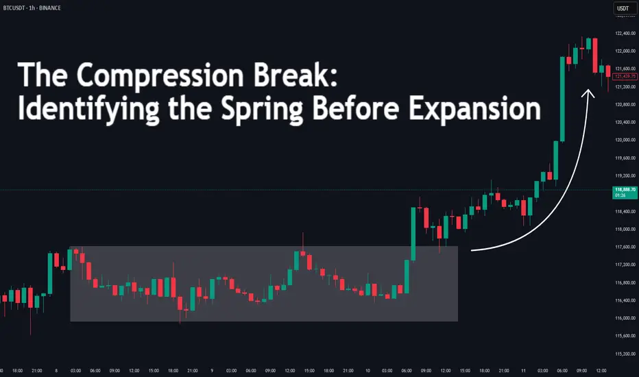
The Compression Break: Identifying the Spring Before ExpansionDifficulty: 🐳🐳🐳🐋 (Intermediate)
This article is for traders who want to recognize and trade explosive moves that form after periods of tight price compression. Perfect for those familiar with structure, volume, and volatility concepts.
🔵 INTRODUCTION
Price doesn’t move in a straight line — it breathes. It expands when there’s imbalance, and it compresses when the market is building energy. The most powerful moves often start with a compression phase — a tight, controlled price range — before a sudden breakout.
Learning to spot these “springs” before they snap can give you trades with excellent risk/reward ratios and clear invalidation points.
🔵 WHAT IS COMPRESSION?
Compression occurs when price volatility shrinks, and each swing becomes smaller than the last. It looks like price is being “squeezed” between converging support and resistance levels.
Common causes of compression:
Liquidity build-up before a major session open
Market waiting for a news release or key event
Institutional positioning before a drive
The tighter the range, the bigger the potential release.
🔵 WHY IT MATTERS
Compression is important because:
It reveals where the market is balanced and undecided
It creates a high-energy environment — a small push can trigger big moves
It offers tight stop-loss placement and clear breakout targets
Think of it like a coiled spring: the more it’s compressed, the more explosive the release.
🔵 HOW TO IDENTIFY COMPRESSION
1️⃣ Price Action Clues
Consecutive smaller candles with overlapping ranges
Lower highs + higher lows (triangle formation)
Reduced wick size in the final stages before breakout
2️⃣ Volume Clues
Declining volume during the squeeze
Sudden volume spike as breakout begins
3️⃣ Volatility Clues
ATR (Average True Range) dropping to local lows
Bollinger Bands narrowing (optional)
🔵 TRADING THE COMPRESSION BREAK
Step 1: Define the Box
Mark the high and low of the compression range. This will be your breakout reference.
Step 2: Wait for Volume Confirmation
Avoid jumping in on the first tick outside the box. Wait for a volume surge or strong close beyond the boundary.
Step 3: Trade in the Breakout Direction
Entry: After confirmed breakout close
Stop Loss: Inside the compression range
Target: Equal to the height of the compression box or previous swing high/low
🔵 EXAMPLE SCENARIO
Price compresses for more then 10 bars into a tight range
Volume steadily declines → ATR hits a local low
A big body bullish candle breaks above range high with 2× average volume
Entry at breakout close, stop inside range, target = box height projected upward or 1:2 RR
🔵 ADVANCED TIPS
Align with higher timeframe trend for higher probability
Watch for false breakouts (liquidity sweeps) before real move
Combine with order blocks or VWAP to refine entries
Use session timing — many compression breaks happen at market opens
🔵 CONCLUSION
Compression is the market’s way of loading a trade with potential energy. When you spot it, you’re seeing the buildup before the burst. Trade it with patience, volume confirmation, and proper structure, and it can become one of your highest-probability setups.
Have you traded compression breaks before? Share your best example in the comments!
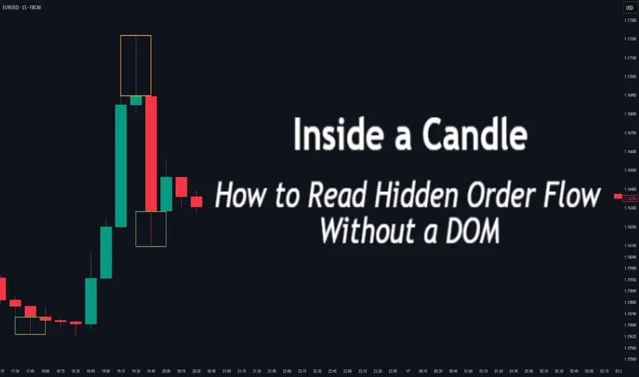
Inside a Candle: How to Read Hidden Order Flow Without a DOM
Difficulty: 🐳🐳🐳🐋🐋 (Intermediate+)
This article is for traders who want to understand the “story” behind a candle’s shape — and learn to spot aggressive buying/selling, absorption, and traps without needing footprint or order book tools.
🔵 INTRODUCTION
Most traders see candles as static shapes — green or red, big or small. But each candle is a battlefield of orders . Even without access to a DOM or volume footprint, you can still extract valuable information from just the candle's body, wick, and context .
🔵 ORIGINS: WHERE CANDLESTICKS COME FROM
Candlestick charts trace back to 18th-century Japan, where rice traders needed a way to visualize price movements over time. A legendary trader named Munehisa Homma , who traded rice futures in Osaka, is credited with developing the earliest form of candlestick analysis.
Homma discovered that price wasn’t just driven by supply and demand — but also by trader psychology . He created visual representations of market sentiment by tracking:
The opening and closing price of rice
The highest and lowest price reached during the session
This system became known as the “Sakata rules,” and it laid the foundation for many patterns still used today — such as Doji, Engulfing, and Marubozu.
Western traders only began using candlesticks widely in the 1990s, when analyst Steve Nison introduced them to the broader financial world through his book Japanese Candlestick Charting Techniques.
Today, candlesticks remain one of the most powerful and intuitive ways to visualize order flow, momentum, and market psychology — even without a Depth of Market (DOM) or depth of book.
In this article, you’ll learn how to read hidden order flow by analyzing:
Wick length and positioning
Body-to-range ratios
Candle clustering and sequences
🔵 HOW A CANDLE FORMS
Before you can read a candle, you need to understand how it comes to life . A single candle represents the full auction process during its time window.
Here’s how it builds, step by step:
Candle opens — this is the open price .
As price moves up during the session → the high] updates.
As price moves down → the low] updates.
The final traded price when the time closes → this becomes the close price .
The wick = price areas that were tested but rejected
The body = where the majority of aggressive trades occurred
If buyers push price up quickly but sellers slam it down before the close — the candle will have a long upper wick and close near the open, revealing seller absorption.
Understanding this flow helps you recognize traps, fakeouts, and reversals in real time.
🔵 CANDLE BODY: WHO'S IN CONTROL
The body of the candle reflects the result of the battle between buyers and sellers. A wide body with minimal wicks means dominance and commitment.
Big body, small wick → clear conviction
In an uptrend: buyer aggression
In a downtrend: panic or aggressive selling
Small body, long wicks → indecision, absorption, or trap
Often appears near tops/bottoms
Indicates both sides were active but neither won clearly
www.tradingview.com
🔵 WICKS: THE SHADOWS OF REJECTION
Wicks are not just “leftovers” — they show where price was rejected after being tested.
Long upper wick = seller presence or absorption at highs
Long lower wick = buyer defense or trap spring
Double wick = liquidity sweep / false breakout
Use wick direction to spot:
Failed breakouts
Smart money traps
Exhaustion candles
🔵 HIDDEN ORDER FLOW PATTERNS
1️⃣ Absorption Candle
A large wick with little movement afterward — shows that big orders absorbed market pressure.
2️⃣ Trap Candle
A candle that sweeps above/below a key high/low and closes opposite — classic smart money fakeout.
3️⃣ Imbalance Candle
Large-bodied candle that closes near the high/low with no wick on the other end — implies one-sided aggression (and often leaves an imbalance).
🔵 CLUSTERING & SEQUENCES MATTER
Never read a candle alone. The sequence of candles tells the full story:
3+ rejection wicks near resistance? Liquidity building before breakout or trap
Bearish engulfing after long upper wick = smart money selling into retail buying
Tight-range dojis + volume spike = compression before expansion
Context + volume + structure = hidden flow decoded.
🔵 PUTTING IT TOGETHER: A REAL EXAMPLE
Price breaks above previous high
Candle closes with long upper wick and smaller body
Next candle opens, dumps fast, leaving imbalance behind
Buyers trapped — move likely to continue down
This is how you read order flow from candle anatomy .
🔵 TIPS FOR MASTERY
Use a lower timeframe (1M–5M) to see microstructure
Watch how wicks behave near S/R or OBs
Confirm with volume spikes or delta-style indicators
Use replay mode to slow down the story and study cause/effect
🔵 CONCLUSION
Every candle is a message. You don’t need expensive tools to read order flow — just your eyes, context, and curiosity.
Learn to see candles not as symbols, but as evidence of behavior . Absorption, imbalance, and traps are all visible if you look closely.
Building Liquidity: What It Really Means🔵 Building Liquidity: What it really means
Professional traders often need liquidity (buyers and sellers) to enter/exit large positions without moving the market too much.
This means manipulating the market within a pre-determined range, which serves as the operating center for everything that follows.
🔹 How is liquidity built
Price Ranging: Sideways consolidation before big moves attracts both buyers and sellers.
False Breakouts (Stop hunts): Price may briefly break support/resistance to trigger retail stop-losses and fill institutional orders.
News Timing: Pro traders often execute during or just before major news when volatility brings liquidity.
🔹 How can you spot a Liquidity-building zone
🔸 Volume
Unusual spikes in volume: Often indicate institutional activity.
Volume clusters at ranges or breakouts: Suggest accumulation/distribution zones.
Volume with price divergence: Price rises but volume falls = possible exhaustion. Volume rises and price consolidates = potential accumulation.
🔸 Price Action
Order Blocks / Imbalance zones: Sharp moves followed by consolidations are often pro trader footprints.
Break of Structure (BoS): Institutions often reverse trends by breaking previous highs/lows.
Liquidity sweeps: Price moves aggressively above resistance or below support then reverses = stop-loss hunting.
🔸 News Reaction
Watch pre-news volume spikes.
Look for contrarian moves after news — when price moves opposite to expected direction, it often reveals smart money traps.
Analyze price stability post-news — slow movement shows absorption by pros.
Wick traps and reversals around news events = stop hunting.
🔸 Narrative is Everything
Higher timeframe trends show intent.
Lower timeframes show execution zones.
Look for alignment between timeframes in a specific direction.
🔹 Why do whales move the market in an orderly manner
To fill large positions at optimal prices.
To create liquidity where there is none.
To trap retail on the wrong side of the move.
To trap other whales on the wrong side of this move.
To rebalance portfolios around economic cycles/news.
🔹 Professionals never forget what they've built
When you track price, volume, and news, you’ll find specific bars that form areas that are the foundation for the short-term direction.
This is pure VPA/VSA logic, the interplay of Price Analysis ,Volume Analysis and News, where each bar is not just a bar , but a clue in the story that professionals are writing.
When you monitor volume, price, and news together and perform multi-timeframe analysis, it becomes clear what the whales are doing, and why.
🔹 From the chart above
The market reached a weekly resistance level and then pulled back slightly after whales triggered the stop-losses of breakout traders.
Prior to the breakout, whales had accumulated positions by creating a series of liquidity-rich buying zones on the daily timeframe.
It's essential to understand the broader context before choosing to participate alongside them—whether you're planning to buy or sell.
🔴 Tips
Use volume and price analysis together, not separately.
Monitor any unusual volume bars before economic market news.
Monitor news and volatility spikes to detect traps and entries.
Combine this with liquidity zones (support/resistance clusters).
Build a "narrative" per week: What is smart money trying to do?
A smart trader understands the tactics whales use, and knows how to navigate around them.

Volume Droughts and False Breakouts: Your Summer Trading TrapsThe market’s heating up — but is your breakout about to dry up? Here’s a word about the importance of summer trading success (helped by volume — the main character).
☀️ Welcome to the Liquidity Desert
Summer’s getting ready to slap the market with a whole flurry of different setups. Picture this — the beaches are full, your trading desk is half-abandoned, and the only thing more elusive than a decent breakout is your intention to actually read that big fat technical analysis book you bought last year.
And yet, here you are — eyes glued to the chart — watching a clean breakout above resistance that’s just begging for you to hit “buy.” Everything looks perfect. Price rips through the level like it’s made of butter. But there’s just one tiny problem: no volume. None. Nada. Niente.
Congratulations. You’ve just bought the world’s most attractive false breakout.
🏝️ Summer Markets: Where Good Setups Go to Die
Let’s set the scene.
It’s June. The big dogs on Wall Street are golfing in the Hamptons and sipping mezcal espresso martinis, interns are running the order flow, and every chart you love is doing just enough to get your hopes up before crushing them like a half-melted snow cone.
This isn’t your usual high-volatility playground. Summer markets — especially between June and August — are notorious for thin liquidity . That means fewer participants, smaller volume, and a much higher likelihood of being tricked by price action that looks strong… until it’s not.
And it’s not just stocks. Forex, crypto, commodities — even the bond boys — all face the same issue: when fewer people are trading, price becomes more fragile. And fragile price = bad decisions.
🚨 Why False Breakouts Love Quiet Markets
False breakouts happen when price appears to break above resistance (or below support), only to reverse sharply — often trapping late traders and triggering stop hunts.
But in summer? It’s a whole different beast. Here’s why:
No liquidity cushion : In normal markets, you need strong volume to fuel a breakout. Without that, the breakout doesn’t necessarily have the gas to keep going.
Market makers get bored : Thin markets mean it’s easier for a few big orders to push prices where they want. Welcome to manipulation season (there, we said what we said!).
Algos go wild : With fewer humans around, algorithms dominate. And they love playing games around key levels.
🧊 The Mirage Setup: A Cautionary Tale
Let’s say you’re watching GameStop NYSE:GME stock. Resistance at $30. Price hovers there for days, teasing a breakout. Then — boom — a sudden 6% pop above.
You buy. Everyone buys. The trading community goes nuts. “This is it bois!”
But there’s a problem. Look at the volume: a trickle. Not even half the average daily volume. Ten minutes later, NYSE:GME is back below $30, your stop loss is hit, and you’re left explaining to your cat why you’re emotionally invested in a ticker.
Moral of the story? Don’t trust breakouts when no one’s trading.
📉 Volume: Your Summer Lie Detector
Volume is more than just a histogram under your chart. It’s your truth serum. Your smoke alarm. Your buddy who tells you to think twice before jumping in that trade.
Here’s how to read it right when everyone else is checking out:
Confirm the move : If price breaks out, but volume doesn’t spike at least 20–30% above the average — be suspicious.
Look for acceleration : Healthy moves gather steam. You want to see volume growing into the breakout, not fizzling.
Watch for volume cliffs : A sudden volume drop right after a breakout often signals that the move is running on fumes.
Add Volume Profile Indicators : Just to be safe, you can always add Volume Profile Indicators to your chart — they analyze both price and volume and can highlight what your keen eye might miss.
Remember what happened last summer? And how we all learned the downside of something called "carry trade"? Those who were short the Japanese yen remember .
🧠 Context Over Candles: Be a Liquidity Detective
Let’s say you see a double top pattern — your favorite. Clean lines. Tight price action. Perfect setup.
But now zoom out.
It’s July 3. Pre-holiday half-day. No volume. And the S&P 500 SP:SPX has moved 0.04% all day. Still want in?
Technical analysis doesn’t work in a vacuum. Chart patterns lose their predictive power when the environment they live in is compromised. And thin liquidity is a compromised environment.
🐍 Snakes in the Sand: How Market Makers Bait Traps
Market makers (and large players) are like desert snakes — quiet, patient, and very good at making you move when you shouldn’t.
Here’s how they bait traders in illiquid markets:
Run stops above resistance to trigger breakout buyers.
Dump shares immediately after breakout to trap retail.
Ride the reversal as trapped longs scramble to exit.
They’re so powerful some say they run the game — and can stop it anytime it’s not going their way (remember the GameStop freeze? ) It’s a psychological game — and in the summer, it’s easier to do shenanigans because most players aren’t watching.
Don’t be the one jumping at shadows. Be the trader who expects the trap.
🛠️ How to Survive (and Thrive) in the Summer Slump
Not all is lost. You can still trade — smartly.
Here’s your Summer Survival Toolkit :
Wait for volume confirmation on every breakout.
Lower your position size . Less liquidity = more slippage risk.
Set wider stops , or better yet, sit out the chop.
Focus on trending names with relative strength and solid weight (think: tech titans, oil plays, or financials).
Use alerts instead of staring at charts . Don’t mistake boredom for opportunity.
And most importantly: Know when not to trade . Discipline is a position too.
🔚 Final Word: This Isn’t the Off-Season. It’s the Setup Season.
Summer might feel slow, but it’s not dead.
Smart traders know that the best trades of Q3 and Q4 often begin in July — as early trendlines form, consolidation patterns develop, and institutional footprints quietly appear in the tape.
So use this time wisely. Don’t force trades. Watch volume like a hawk. And never forget: the best breakouts don’t need hype — they bring their own thunder.
Stay cool, stay patient, and trade smart. The mirage may be tempting, but the oasis always belongs to the ones who go far enough and don’t give up.
Off to you : How are you navigating trading during the summer months? Staying poolside with one eye on the charts or actively seeking out opportunities while folks catch a break? Share your insights in the comments!

Why Volume Bar Colors Can Mislead You█ The Truth Behind Volume Bars — What Do Green and Red Actually Mean?
Most traders learn early on that green volume bars mean bullish activity, and red bars mean bearish pressure. But is it really that simple? What does volume truly reflect, and are we making assumptions that can mislead us?
█ What Volume Actually Is
Volume represents the number of shares/contracts traded during a specific time interval. Every transaction includes both a buyer and a seller. So, volume itself doesn’t distinguish whether a trade was bullish or bearish. Instead, platforms color volume bars based on price movement:
Green: If price closed higher than it opened.
Red: If price closed lower than it opened.
Some platforms, like TradingView, allow you to color volume based on whether the price closed higher or lower than the previous candle’s close.
So YOU, as a trader, have the chance to decide whether to assign volume bars either bullish or bearish! It’s a setting parameter anyone can change. Traders around the globe might look at the same volume bar, but some interpret it as bearish, while others interpret it as bullish. What is the most correct way?
█ The Assumption Behind the Color
This coloring assumes that:
A rising price means buyers were more aggressive (lifting the ask).
A falling price means sellers were more aggressive (hitting the bid).
This is a proxy — an approximation. It simplifies market pressure into a binary outcome: if price goes up, it's bullish volume; if it goes down, it's bearish. But the market isn't always so binary.
However, the assumption is only an approximation of buying vs. selling. In reality, every single trade involves both a buyer and a seller, so volume itself isn’t inherently “buy” or “sell” – what matters is who initiated the trades. As one trading expert explains, talking about “buying volume” vs “selling volume” can be misleading: for every buyer there is a seller, so volume cannot be literally split into purchases and sales. Instead, what traders really mean by “bullish volume” is that buyers were more aggressive (lifting offers) and drove the price up, whereas “bearish volume” means sellers were more aggressive (hitting bids) and drove the price down. The colored volume bar is essentially a proxy for which side won the battle during that bar.
█ Why This Can Mislead You
Price might close higher, not because there were more buyers than sellers (there never are — every trade has both), but because buyers were more urgent. And sometimes price moves due to other forces, like:
Short covering.
Stop-loss runs.
Liquidity vacuums.
This means a green bar might not reflect strong demand, just urgency from the other side closing their positions.
⚪ Example:
Take the well-known GameStop short squeeze as an example. If you looked only at the volume bars during that rally, you’d see a wall of strong green candles and high volume, which might suggest aggressive bullish buying.
However, that interpretation would be misleading.
Under the surface, the surge wasn't driven by fresh bullish conviction — it was massive short covering. Traders who were short were forced to buy back shares to cover their positions, which drove prices even higher. The volume was categorized as bullish, but the true intent behind the move had nothing to do with new buying pressure.
This demonstrates why relying solely on volume color or candle direction can lead to false conclusions about market sentiment.
Does this simple up/down volume labeling truly reflect buying vs. selling pressure? To a degree, yes – it captures the net price outcome, which often corresponds to who was more aggressive. For example, if many buyers are willing to pay higher prices (demand), a bar will likely close up and be colored green, reflecting that buying interest. Conversely, if eager sellers are dumping shares and undercutting each other, price will drop, yielding a red bar that flags selling pressure. Traders often use rising volume on up-moves as confirmation of a bullish trend’s strength, and high volume on down-moves as a warning of distribution, which indeed aligns with traditional analysis
That said, the method has important limitations and nuances, documented both anecdotally and in research:
⚪ Volume is not one-dimensional: Since every trade has both a buyer and seller, one cannot literally count “buy volume” vs “sell volume” without more information. The green/red coloring is a blunt classification based on price direction, not an actual count of buys or sells. It assumes the price change direction is an adequate proxy for the imbalance of buying vs. selling. This is often true in a broad sense, but it’s not a precise measure of order flow.
⚪ Intrabar Dynamics Are Lost: A single bar’s color only tells the end result of that interval, not the story of what happened during the bar. For instance, a 4-hour candle might be red (down) overall, but it could have contained three hours of rally (buying) followed by a steep selloff in the final hour that erased the gains. The volume bar will be colored red due to the net price drop, even though significant buying occurred earlier in the bar. In other words, a large red bar can mask that there were pockets of bullish activity within – the selling just happened to win out by the close of that period. Without looking at smaller time frames or detailed data, one can’t tell from a single color how the buying/selling tug-of-war progressed within the bar.
⚪ Gap Effects and Criteria Choices: The choice of using open vs. close or previous close can alter the interpretation of volume. As discussed, a day with a big gap can be labeled differently under the two methods. Neither is “right” or “wrong” – they just highlight different perspectives (intraday momentum vs. day-over-day change). Traders should be aware that colored volume bars are an approximation. A green volume bar under one method might turn red under the other method for the same bar. This doesn’t mean volume changed – it means the classification scheme changed. For example, a stock that closes below its open but still higher than yesterday will show a red volume bar by the intraday method but would be considered an “up-volume day” in OBV terms (previous close method).
⚪ No Indication of Magnitude or Commitment: A single color also doesn’t convey how much buying or selling pressure there was, only which side won. Two green volume bars might both be green, but one could represent a modest uptick with tepid buying, whereas another could represent an aggressive buying spree – the color alone doesn’t distinguish this (other than one bar likely being taller if volume was higher). Traders often need to consider volume relative to average (e.g. using volume moving averages or looking for volume spikes) to judge the significance of a move, not just the color.
█ Summary
The coloring of volume bars is a visual shortcut, not an exact science. It’s a guess based on price direction — useful, but imperfect. Understanding this helps traders avoid reading too much into what a green or red volume bar actually means.
-----------------
Disclaimer
The content provided in my scripts, indicators, ideas, algorithms, and systems is for educational and informational purposes only. It does not constitute financial advice, investment recommendations, or a solicitation to buy or sell any financial instruments. I will not accept liability for any loss or damage, including without limitation any loss of profit, which may arise directly or indirectly from the use of or reliance on such information.
All investments involve risk, and the past performance of a security, industry, sector, market, financial product, trading strategy, backtest, or individual's trading does not guarantee future results or returns. Investors are fully responsible for any investment decisions they make. Such decisions should be based solely on an evaluation of their financial circumstances, investment objectives, risk tolerance, and liquidity needs.

Ranging? Not Really. The Big Guys’ Plan Is Already Set…Ever wondered what the crowd is really doing behind the candles?
This video breaks down how to read Cumulative Volume Delta (CVD)—
from retail behavior to sentiment charts, and why the market doesn’t always follow logic.
✅ When price moves one way but the crowd trades the other...
✅ When sideways markets aren’t as neutral as they look...
✅ When emotions take over—and how to spot it in advance.
We’re lifting the hood. The engine’s running. Let’s see what drives it.

Trading with multiple VAMAsI want to show you how to analyse multiple timeframe VAMAs for trading opportunities. This is an interesting approach that can reveal valuable market structure information.
For this example I am using a 15m, 1h and. 4h VAMA, but you can use this on lower or higher timeframes as well. First, let's understand what each timeframe VAMA represent in this case:
The 15-minute VAMA indicates short-term trends and momentum
The 1-hour VAMA reveals intermediate trend direction
The 4-hour VAMA represents the broader market structure
When these VAMAs overlap on your lower timeframe chart (15m in this case), they create what we might call "zones of interest." Think of it like layers of support and resistance that have different degrees of significance based on their timeframe. Here's how we can interpret and use this information:
Convergence Zones
When multiple VAMAs cluster in a tight price range, this creates a significant zone of interest. For example, if your 15-minute, 1-hour, and 4-hour VAMAs are all within a narrow price band, this often indicates a strong support or resistance level. These zones typically exhibit one of two behaviors:
Price Bounces:
When price approaches a convergence zone from above or below, it often respects these levels. The more timeframes that have converged, the stronger the zone becomes. A bounce from such a zone with corresponding volume can present a high-probability trade opportunity.
Zone Breaks:
If price successfully breaks through a convergence zone, especially with increased volume, this often signals a strong trend continuation or reversal, depending on the direction of the break.
Hierarchical Trending
You can identify the strength and maturity of trends by examining how the different timeframe VAMAs are arranged:
Strong Uptrend Structure:
4H VAMA lowest
1H VAMA above 4H
15min VAMA above 1H
This "stacking" of VAMAs shows a healthy trend structure. The higher timeframe VAMAs act as dynamic support levels in an uptrend (or resistance in a downtrend).
Trade Entry Opportunities
Alignment Trades:
Look for moments when all VAMAs are pointing in the same direction and properly stacked. These situations often present high probability setups. For example: In an uptrend Price pulls back to test the 15-minute VAMA while the 1H and 4H VAMAs continue trending up.This creates a "buy the dip" opportunity with multiple timeframe confirmation.
Divergent Zone Trades:
When the faster VAMAs (1min, 15min) show divergence from the slower ones (1H, 4H), this can indicate potential reversal points: If the 1min and 15min VAMAs start curling up while price is testing the 1H VAMA as support. This divergence in shorter timeframes while respecting longer timeframe support can signal a reversal opportunity.
Breakout Confirmation:
Use the multiple timeframes to confirm breakout trades:
When price breaks above a convergence zone
Look for the faster VAMAs (1min, 15min) to cross above the slower ones
Volume should increase during the break
The previous resistance zone (marked by the VAMAs) should become support

How To identify the Jesse Livermore Buy PatternAs traders, we're always on the lookout for reliable patterns that can give us an edge in the market. One such pattern, popularized by the legendary trader Jesse Livermore, is the Accumulation Cylinder with Widening Mouth.
This pattern is a rare but potentially explosive formation that can signal a significant price move.
What is the Accumulation Cylinder with Widening Mouth?
The Accumulation Cylinder with Widening Mouth is a technical analysis pattern where the price of an asset moves back and forth between two non-parallel lines, creating a cylinder-like shape.
Over time, the "mouth" of the cylinder widens as the price continues to fluctuate within the pattern. This pattern is often seen during periods of consolidation, where the market is accumulating before a potential breakout.
Key Characteristics
Non-Parallel Lines: The price moves between two trendlines that are not parallel.
Widening Mouth: The distance between the trendlines increases over time.
Consolidation: The pattern typically forms during a period of consolidation, where the price is ranging within a defined area.
Volume: You must see that the volume size is as pictured in the schema.
This post is real evidence that such a pattern does exist.
In addition, you can see that the consolidation period takes time to develop...
No need to rush...
Also, if you have not got on it from the start, by looking at the past, you can estimate that the runup is just starting, so you can still get some of the cream.
The Plus and Minus are showing increasing volume vs decreasing volume.

what is Volume?Volume Indicators are technical analysis tools that evaluate the strength of a trend or price movement based on trading volume, which represents the number of shares, contracts, or units of an asset traded over a given period. Volume indicators provide insights into the participation and conviction behind price moves, helping traders confirm trends, spot potential reversals, or detect breakouts.
Why Volume Matters
Volume reflects market activity and interest:
High Volume: Suggests strong participation, confirming the validity of price movements. - Low Volume: Indicates weak interest, often leading to uncertainty about the sustainability of price moves.
For example:
In an uptrend, rising prices with increasing volume confirm the bullish trend. - Conversely, falling prices with increasing volume confirm a bearish trend.
Popular Volume Indicators
On-Balance Volume (OBV):
OBV measures cumulative buying and selling pressure by adding volume on up days and subtracting it on down days.
Signal: If OBV rises while the price is flat, it indicates hidden buying pressure, suggesting a potential price breakout.
Volume Weighted Average Price (VWAP):
VWAP calculates the average price of an asset weighted by volume, providing a benchmark for institutional traders.
Signal: If the price is above VWAP, it\u2019s considered bullish; below VWAP is bearish.
Volume Oscillator:
The Volume Oscillator compares short-term and long-term moving averages of volume.
Signal: Positive readings indicate increasing volume momentum, while negative readings suggest declining momentum.
Chaikin Money Flow (CMF):
CMF measures buying and selling pressure by analyzing volume and price movement.
Signal: A positive CMF indicates accumulation (buying), while a negative CMF indicates distribution (selling).
Accumulation/Distribution Line (A/D):
Tracks the flow of money into or out of an asset by analyzing volume and price close relative to its range.
Signal: Rising A/D suggests accumulation (buying), while falling A/D suggests distribution (selling).
How to Use Volume Indicators
Confirm Trends: - Use volume to validate price movements. For example, a breakout above resistance is more reliable with strong volume. 2. Spot Divergences: - If price moves up while volume decreases, it could indicate a weakening trend and a potential reversal. 3. Detect Breakouts: - Sudden spikes in volume often accompany significant price breakouts from consolidation patterns. 4. Evaluate Trend Strength: - Increasing volume during a trend suggests strength, while declining volume signals weakness.
Limitations of Volume Indicators
False Signals: High volume alone doesn\u2019t guarantee a sustainable price move. - Market Context Needed: Volume behavior differs across asset classes (e.g., stocks vs. cryptocurrencies). - Timeframe Sensitivity: Volume signals can vary based on the chosen timeframe.
By understanding and using volume indicators effectively, traders can gain a deeper perspective on market dynamics and improve decision-making.

Stock Market Logic Series #12
TradingView is so awesome that they let you change any piece of the chart .
You can use this chart template for visual clarity.
FYI, all my chart templates, are for visual clarity trading purposes, you can choose anyone that looks good for your eyes.
So in this chapter in the series #12 lets see what we have here.
1 - The trendline is still alive.
2 - On the correction, you can see that there is a high volume on the upside. So it means that the puppet master is buying.
3 - You could see that there are 3 down candles, on increasing volume, but their spread is smaller and smaller. So it means that the puppet master also buying on the downside, also, stops where hit there strongly, and many people stopped out directly into the hands of the puppet master, classic puppet master move.
4 - The biggest volume is on the up side ! since this is the last (recent) piece of information, this is what counts! so currently, the chart is LONG biased.
5 - Crack pattern AWARENESS- if the price will test the low, it will be the crack pattern and then the price can go down up until $105 again. It will also be a break of trendline so it makes sense that there will be a fast SHORT move. But if the price goes to test $135 and then makes $140 push, it will be a failure of the crack pattern, which increases even more dramatically the LONG bias. WHY? Because if it is short... the crack pattern should materialize... since it can't materialize... it means it is not short, so it is LONG.
####
I already showed the same exact logic, in AMD, failed crack pattern (in the past posts).
####
2 & 3 & 4 Examplify beautifully my concept of FORCE of the puppet master.

Beyond Basic Candlestick Pattern AnalysisLearning to Recognize Who Is Controlling the Stock Price
There is a plethora of training on Candlestick Pattern Analysis and interpretation, and yet this remains one of the most problematic areas for Technical Traders who want to trade at the expert level.
Once the basics of Japanese Candlestick Patterns are understood, it is time to move up to the next tier of analysis. That is being able to recognize not only where a pattern is, but also who forms that pattern, why they are capable of creating that pattern, what automated orders generate that pattern, and which Market Participant Groups react or chase that pattern.
Nowadays it has become critical to include Volume with Candlestick Analysis, because this provides the basis for recognizing which Market Participant Group created that candle pattern.
Candlestick Pattern Analysis at the expert level involves more than just one to three candles. Instead it includes a larger group of candles in the near term. This is what I call "Relational Analysis." This is especially useful for Swing Traders, Momentum Traders, Velocity Traders, Swing Options Traders, and Day Traders using Swing Style Intraday action.
The NYSE:RAMP chart is an excellent example of a Candlestick Pattern for Swing Style Trading.
See where High Frequency Traders (HFTs) took control of price, and gapped the stock down for one day on extreme volume. Selling did not continue the following two days, and Volume was above the Moving Average, but much lower than the High Frequency Traders' spiking Volume pattern.
This was the first accumulation level for this stock. Dark Pools started buying the stock even though High Frequency Traders were selling, since they typically miss this initial buy mode of the giant Institutions.
High Frequency Traders typically create the final gap down to the low which, if it reverses quickly, indicates a Buy Zone area for the Dark Pools. These patterns are what I call "Shifts of Sentiment." They happen in bottom formations where buying is generally dominated by the Largest Institutions' quiet accumulation.
The next phase will be when Professional Traders and then High Frequency Traders discover the Dark Pool accumulation. The bottom is not complete, but it shifts sideways if more Dark Pools decide to buy.

How to Use Stock Volume in CFD TradingHow to Use Stock Volume in CFD Trading
Volume is one of the fundamental aspects of all markets. If you're wondering, "What does volume mean in the stock market?," you're about to discover how this critical measure of shares traded can unlock deeper insights into market trends and investor behaviour. We delve into how to use stock volume to improve your trading, offering practical approaches for confirming market sentiment, trends, reversals, and more.
What Is Volume in the Stock Market?
The volume in the stock market definition refers to the total number of shares traded during a specific time frame. It's a vital indicator of market activity and investor interest in a particular stock.
High volume often signals strong investor interest and market movement, either upward or downward. Conversely, low volume may indicate decreased interest or uncertainty in a stock. In essence, it provides insights into sentiment, helps confirm trends, and aids in identifying potential reversals or breakouts.
As we walk through the varying insights volume offers stock traders, you may gain the best understanding by applying your knowledge to real-time charts. Head over to FXOpen’s free TickTrader platform to see how volume affects hundreds of unique stocks.
Volume and Market Sentiment
When considering volume in a stock, meaning its traded shares, its relationship with market sentiment becomes pivotal. This sentiment, essentially the collective attitude of traders towards a stock, is often inferred from volume patterns.
At its most basic, high trading activity during a stock's price increase is often seen as a confirmation of positive sentiment, showing trader confidence. Such a scenario often reflects a robust demand overpowering supply.
In contrast, if a stock declines on high volume, this may signal negative sentiment, suggesting a strong selling pressure. This situation typically indicates that investors and traders are actively offloading their shares.
Volume and Price Movement
So, how does volume affect stock prices? Volume acts as a force behind price movements, as discussed.
However, its impact isn't always straightforward. A stock might rise on low volume, which can be a sign of caution, as it may indicate a lack of conviction among traders, potentially making the price rise unsustainable. Similarly, a drop on low volume might not necessarily signify a bearish trend but rather a temporary lack of interest.
Additionally, the number of shares traded can be crucial in identifying a stock’s tops or bottoms. For instance, a sudden spike after a long period of price increase might signal a top, as it could represent a final push by exhausted buyers before a reversal. Similarly, a significant increase in market activity at a low could indicate a bottom.
Identifying Trading Signals with Volume
Learning how to trade volume involves recognising nuanced trading signals that volume fluctuations can offer. Beyond the basic interpretations of high or low volume, traders look for specific patterns or anomalies in activity data to make informed decisions.
One key signal is the volume spike. A sudden increase in trading activity, especially when it deviates notably from the norm, may indicate a significant event or sentiment change. For instance, a volume spike accompanying a breakout from a consolidation pattern might confirm the strength of a new trend, offering a buying opportunity for traders.
Conversely, an unexpected, sustained drop in interest during a steady trend might be a warning sign. This could suggest that the current trend is losing momentum and might be nearing its end, reflecting a potential exit point or even a reversal opportunity.
Another aspect to consider is the trend over time. Gradually increasing volume in a trending market reinforces the trend's validity and vice versa.
Overall, trading volume isn't just about high or low numbers. It's about understanding the context of these changes and how they align with price movements.
Volume Indicators and Tools
When exploring how to use volume in trading, several key indicators and tools stand out. These provide insights into market dynamics, aiding in decision-making:
- On Balance Volume (OBV): OBV totals volume during up periods and subtracts it during down periods. A rising OBV usually suggests bullish trends, while a falling OBV indicates bearish trends. It's used to confirm movements or spot divergences.
- Volume Price Trend (VPT): VPT combines volume and price change to assess the strength of price moves. An increasing VPT usually indicates strong buying pressure, while a decreasing VPT suggests selling pressure.
- Accumulation/Distribution Line: This indicator considers the trading range and the volume. It helps identify whether a stock is being accumulated (bought) or distributed (sold). A rising line usually suggests accumulation, while a falling line indicates distribution.
- Chaikin Money Flow (CMF): CMF combines price and volume to measure buying and selling pressure over a set period. A positive CMF usually demonstrates buying interest, while a negative CMF suggests that sellers are in charge.
Volume as an Indicator of Liquidity
Lastly, volume is a key indicator of liquidity in the stock market. High trading activity reflects that a significant number of shares are being bought and sold, which typically indicates good liquidity. This liquidity may help traders execute trades quickly and at prices close to the market rates, reducing the cost of transactions.
Conversely, low volume signals poor liquidity, where fewer shares are traded. In such scenarios, executing large orders may be challenging without significantly impacting the stock. Such a lack of liquidity can lead to larger bid-ask spreads and potentially less favourable execution prices for traders.
The Bottom Line
As we've journeyed through the intricate world of stock volume, it's clear that understanding volume is more than a skill – it's an essential aspect of savvy trading. From recognising sentiment to navigating various market conditions, volume serves as a powerful tool in your trading arsenal.
To put this knowledge into practice and experience the dynamic world of trading, consider opening an FXOpen account. Once you do, you'll have the opportunity to apply these insights in real-time, potentially enhancing your trading journey with informed decisions driven by volume analysis. Happy trading!
This article represents the opinion of the Companies operating under the FXOpen brand only. It is not to be construed as an offer, solicitation, or recommendation with respect to products and services provided by the Companies operating under the FXOpen brand, nor is it to be considered financial advice.

HFTs gaps: Learn how to enter a stock before a huge gap up.High Frequency Trading companies are market makers/takers that provide liquidity for the public exchanges, and they now use AI. HFTs have a huge impact on your profitability. You can make higher profits from trading ahead of the HFT gaps and riding the momentum upward or downward.
In this short video, you'll learn some basics on how to identify the patterns that precede HFT gaps, which I call Pro Trader Nudges . Learn what to look for in Volume patterns and pre-gap price action.
Make sure you are not chasing HFTs but riding the wave of momentum they create, just like professional traders do.

What are Volume Candles and how to use themVolume Candles are a great chart type you can use to integrate volume analysis into your trading. TradingView is a superb platform that offers this chart type in real-time, so you can immediately get a completely different feel of what the market is actually doing.
As an experienced trader, understanding volume candles is crucial in getting a deeper insight into market dynamics. Unlike standard candlestick charts, which focus primarily on price movement, volume candles combine price action with the strength of trading activity (volume). This offers a unique perspective that can give you an edge in reading market sentiment and momentum.
What Are Volume Candles?
Volume candles are modified candlestick charts where the width of the candle is proportional to the trading volume during the corresponding time period. The typical candlestick elements—open, high, low, and close prices—are still present, but the volume aspect adds an additional layer of information, enhancing the clarity of price action.
Key Features of Volume Candles:
Height: Represents price movement (just like in regular candlesticks).
Width: Indicates the volume of trades within that period.
Unique Information You Can Extract from Volume Candles:
1. Volume-Driven Price Action Volume candles show how much trading interest exists at various price levels. When you observe a large volume candle, it tells you that a lot of market participants were active at that price. Conversely, a thin candle signals lower activity. This helps you:
A. Identify levels where strong participation occurs (institutional players what I call the puppet master).
B. Spot consolidation zones where volume is low, which often precedes significant price moves.
2. Momentum Confirmation High-volume candles that align with price trends suggest strong momentum.
Wide Bullish Candles: If you see a wide up candle during an uptrend, it indicates that the buying pressure is backed by solid volume. This gives more credibility to the uptrend and hints at a continued move upward.
Wide Bearish Candles: Similarly, a wide down candle during a downtrend signals strong selling pressure.
Volume Candle Chart can also be used for day trading purposes where you need to act FAST.
This TradingView chart type is extremely good so you don't need to compare the traditional volume bars on the bottom of the chart.
IMPORTANT: You must understand the puppet master mentality, which gives you context.
*** EXTRA: You can use this theme color.

Stock Market Logic Series #10Do you think the above is a coincidence?
There are no coincidences in life - only cause and effect.
You are where you are because of a cause that is bound to physical and natural laws.
The same pressure of physics that works on the airplane wing, or the balloon that wants to push its way up when pressed into water (pool), also works in the stock market.
You just have to KNOW how to SEE it. follow my explanation.
If you follow the price action, you can see clearly where the high-pressure volume comes in, you can't miss it. It is obviously seen.
Then you need to wait for the correction, and you want to see that the correction is demonstrating a low-volume pressure behavior.
When you see this low volume pressure behavior, the stock has DRIED UP.
This DRYING-UP effect is a key indicator of a probable future LIFT and stock movement.
You want to ask yourself the question:
Why the stock is not falling down anymore?
The question of "WHY" is searching for the cause BEHIND the stock movement.
The stock movement is only the effect!
In previous posts, I explained the other LOGIC behind this pattern, and explained why the price should not fall down and with a high probability of going up.
If you read any of the books of Jesse Livermore, he clearly states that you need to "KNOW" that the stock will move your way, first let the market "SHOW YOU" exactly what will happen, and only then you put in a trade.
The KEY CONCEPT in this idea is the DRYING UP OF VOLUME.
When you understand the WHY behind the stock movement, buying and selling are emotionless.
The focus should be only a trading setups that you "KNOW" it is highly probable to move in your expected trade direction. You "KNOW" because you have stock market LOGIC to back it up.
If you want a specific post about Jesse Livermore's trading rules, let me know in the comments.
It is always important to make sure that you have the correct perspective on the stock market, otherwise, you get confused. There is only at every given time only ONE side to the market as Jesse Livermore said, "The RIGHT SIDE". This goes back to my idea, that at every given time the puppet master ONLY buys or sells but NOT BOTH.

Decoding Money Flow within Markets to Anticipate Price DirectionI. Introduction
In the intricate world of financial markets, understanding the flow of capital between different assets is paramount for traders and investors aiming to anticipate price movements. Money doesn't move haphazardly; it often follows patterns and trends influenced by a myriad of factors, including economic indicators, geopolitical events, and inter-market relationships.
This article delves into the concept of money flow between markets, specifically analyzing how volume movements in one market can influence price directions in another. Our focus centers on two pivotal markets: the 10-Year T-Note Futures (ZN1!) and the Light Crude Oil Futures (CL1!). Additionally, we'll touch upon other significant markets such as ES1! (E-mini S&P 500 Futures), GC1! (Gold Futures), 6E1! (Euro FX Futures), BTC1! (Bitcoin Futures), and ZC1! (Corn Futures) to provide a comprehensive view.
By employing the Granger Causality test—a statistical method used to determine if one time series can predict another—we aim to unravel the nuanced relationships between these markets. Through this exploration, we aspire to equip readers with insights and methodologies that can enhance their trading strategies, particularly in anticipating price directions based on volume dynamics.
II. Understanding Granger Causality
Granger Causality is a powerful statistical tool used to determine whether one time series can predict another. While it doesn't establish a direct cause-and-effect relationship in the strictest sense, it helps identify if past values of one variable contain information that can predict future values of another. In the context of financial markets, this can be invaluable for traders seeking to understand how movements in one market might influence another.
Pros and Cons:
Predictive Power: It provides a systematic way to determine if one market’s past behavior can forecast another’s, helping traders anticipate potential market movements.
Quantitative Analysis: Offers a statistical basis for analyzing market relationships, reducing reliance on subjective judgment.
Lag Dependency: The test is dependent on the chosen lag length, which may not capture all relevant dynamics between the series.
Not True Causality: Granger Causality only suggests a predictive relationship, not a true cause-and-effect mechanism.
III. Understanding Money Flow via Granger Causality
The data used for this analysis consists of daily volume figures for each of the seven markets described above, spanning from January 1, 2018, to the present. While the below heatmap presents results for different lags, we will focus on a lag of 2 days as we aim to capture the short-term predictive relationships that exist between these markets.
Key Findings
The results of the Granger Causality test are presented in the form of a heatmap. This visual representation provides a clear, at-a-glance understanding of which markets have predictive power over others.
Each cell in the matrix represents the p-value of the Granger Causality test between a "Cause" market (row) and an "Effect" market (column). Lower p-values (darker cell) indicate a stronger statistical relationship, suggesting that the volume in the "Cause" market can predict movements in the "Effect" market.
Key Observations related to ZN1! (10-Year T-Note Futures):
The heatmap shows significant Granger-causal relationships between ZN1! volume and the volumes of several other markets, particularly CL1! (Light Crude Oil Futures), where the p-value is 0, indicating a very strong predictive relationship.
This suggests that an increase in volume in ZN1! can reliably predict subsequent volume changes in CL1!, which aligns with our goal of identifying capital flow from ZN1! to CL1! In this case.
IV. Trading Methodology
With the insights gained from the Granger Causality test, we can develop a trading methodology to anticipate price movements in CL1! based on volume patterns observed in ZN1!.
Further Volume Analysis with CCI and VWAP
1. Commodity Channel Index (CCI): CCI is a versatile technical indicator that when applied to volume, measures the volume deviation from its average over a specific period. In this methodology, we use the CCI to identify when ZN1! is experiencing excess volume.
Identifying Excess Volume:
The CCI value for ZN1! above +100 suggests there is an excess of buying volume.
Conversely, when CL1!’s CCI is below +100 while ZN1! is above +100, it implies that the volume from ZN1! has not yet transferred to CL1!, potentially signaling an upcoming volume influx into CL1!.
2. Volume Weighted Average Price (VWAP): The VWAP represents the average price a security has traded at throughout the day, based on both volume and price.
Predicting Price Direction:
If Today’s VWAP is Above Yesterday’s VWAP: This scenario indicates that the market's average trading price is increasing, suggesting bullish sentiment. In this case, if ZN1! shows excess volume (CCI above +100), we would expect CL1! to make a higher high tomorrow.
If Today’s VWAP is Below Yesterday’s VWAP: This scenario suggests bearish sentiment, with the average trading price declining.
Here, if ZN1! shows excess volume, we would expect CL1! to make a lower low tomorrow.
Application of the Methodology:
Step 1: Identify Excess Volume in ZN1!: Using the CCI, determine if ZN1! is above +100.
Step 2: Assess CL1! Volume: Check if CL1! is below +100 on the CCI.
Step 3: Use VWAP to Confirm Direction: Compare today’s VWAP to yesterday’s. If it’s higher, prepare for a higher high in CL1!; if it’s lower, prepare for a lower low.
This methodology combines statistical insights from the Granger Causality test with technical indicators to create a structured approach to trading.
V. Case Studies: Identifying Excess Volume and Anticipating Price Direction
Case Study 1: May 23, 2024
Scenario:
ZN1! exhibited a CCI value of +265.11
CL1!: CCI was at +12.84.
VWAP: Below the prior day’s VWAP.
Outcome:
A lower low was made.
Case Study 2: June 28, 2024
Charts for this case study are at the top of the article.
Scenario:
ZN1! exhibited a CCI value of +175.12
CL1!: CCI was at -90.23.
VWAP: Above the prior day’s VWAP.
Outcome:
A higher high was made.
Case Study 3: July 11, 2024
Scenario:
ZN1! exhibited a CCI value of +133.39
CL1!: CCI was at +0.23.
VWAP: Above the prior day’s VWAP.
Outcome:
A higher high was made.
These case studies underscore the practical application of the trading methodology in real market scenarios.
VI. Conclusion
The exploration of money flow between markets provides valuable insights into how capital shifts can influence price movements across different asset classes.
The trading methodology developed around this relationship, utilizing the Commodity Channel Index (CCI) to measure excess volume and the Volume Weighted Average Price (VWAP) to confirm price direction, offers a systematic approach to capitalizing on these inter-market dynamics. Through the case studies, we demonstrated the practical application of this methodology, showing how traders can anticipate higher highs or lower lows in CL1! based on volume conditions observed in ZN1!.
Key Takeaways:
Granger Causality: This test is an effective tool for uncovering predictive relationships between markets, allowing traders to identify where capital might flow next.
CCI and VWAP: These indicators, when used together, provide a robust framework for interpreting volume data and predicting subsequent price movements.
Limitations and Considerations:
While Granger Causality can reveal important inter-market relationships, it is not without its limitations. The test's accuracy depends on the chosen lag lengths and the stationarity of the data. Additionally, the CCI and VWAP indicators, while powerful, are not infallible and should be used in conjunction with other analysis tools.
Traders should remain mindful of the broader market context, including economic events and geopolitical factors, which can influence market behavior in ways that statistical models may not fully capture. Additionally, effective risk management practices are crucial, as they help mitigate potential losses that may arise from unexpected market movements or the limitations of any predictive models.
When charting futures, the data provided could be delayed. Traders working with the ticker symbols discussed in this idea may prefer to use CME Group real-time data plan on TradingView: www.tradingview.com This consideration is particularly important for shorter-term traders, whereas it may be less critical for those focused on longer-term trading strategies.
General Disclaimer:
The trade ideas presented herein are solely for illustrative purposes forming a part of a case study intended to demonstrate key principles in risk management within the context of the specific market scenarios discussed. These ideas are not to be interpreted as investment recommendations or financial advice. They do not endorse or promote any specific trading strategies, financial products, or services. The information provided is based on data believed to be reliable; however, its accuracy or completeness cannot be guaranteed. Trading in financial markets involves risks, including the potential loss of principal. Each individual should conduct their own research and consult with professional financial advisors before making any investment decisions. The author or publisher of this content bears no responsibility for any actions taken based on the information provided or for any resultant financial or other losses.
