Why Bitcoin Hits Your Stop Loss Before the Real MoveWhy Bitcoin Hits Your Stop Loss Before the Real Move
Have you ever placed a Bitcoin trade and noticed this? 🤔
Your stop loss 😭💸 gets hit… just a few pips from your entry… then the price suddenly rockets 🚀💎 in the direction you were expecting!
This is not bad luck. It’s a Stop Loss Hunt 💥, used by smart money 🏦💰 to collect liquidity before the real trend begins.
1️⃣ Liquidity Pools Above Highs & Below Lows 📊💎
Retail traders place stop losses at obvious highs/lows 📈📉
These stops create liquidity zones 💧, which smart money targets 🔍
Price moves to these zones to collect liquidity → fuels the next trend 🚀
Example:
BTC trending upward 📈
Traders place buy stops above the previous high ⬆️
Smart money pushes price to trigger stops 💥 → collects liquidity 💎 → then moves the price in the real trend direction 🚀
2️⃣ Stop Loss Sweep 💥⚡
Price triggers retail stop losses 🛑
Retail traders get stopped out 😭💸
Institutions enter large positions with minimal resistance 💹
Key Insight:
Price needs liquidity 💧 to move strongly.
Without collecting stops, smart money cannot drive momentum efficiently ⚡
3️⃣ Fake Breakouts & Wicks 🌪️🔥
Watch for wick spikes or sudden breakouts 🕵️♂️
These are stop loss hunts
Many traders panic 😱 and exit positions
Smart money uses this to trap retail traders and continue the trend 🚀
4️⃣ The Real Move Begins 🚀🔥
After liquidity is collected 💎💧
The true trend resumes 📈
Traders who waited can enter safely 🧘♂️💹
Often, the move is stronger and faster ⚡ because institutions now control the market
5️⃣ Market Psychology Behind Stop Hunts 🧠💭
Retail traders panic when stops are triggered 😅💸
Fear is used to manipulate sentiment 🧲
Recognizing this psychological trap helps you stay calm 🧘♂️ and trade strategically 🏆
6️⃣ How to Trade Stop Loss Hunts 💡🧠
✅ Avoid stops at obvious highs/lows 🚫
✅ Wait for liquidity sweep ⏳💧
✅ Watch for wick spikes 🌟 — early signs of stop hunts
✅ Follow market structure 📊 (BOS/CHoCH)
✅ Trade after confirmation ⏱️
✅ Patience + discipline = profits 💎💹
7️⃣ Examples in Bitcoin Trading 🔍
Double top wicks above high → triggers stops 💥 → continues trend 🚀
Price dips below support → triggers stops 😭 → rebounds ⬆️
💡 Observation: Every wick tells a story 🌟 — learn to read it!
💬 Key Takeaways
Stop Loss Hunts = institutional footprints 👣
Price hunts liquidity 💧 — that’s why your SL is hit 💥
Understanding this helps you:
Trade smarter 💎
Avoid losses 😅💸
Spot trends before they happen 🚀
Community ideas

just for watchingdon't expect this to happen but is here to show odds and probabilities
10:1 4:1 or a 3:1 choice is yours but could all be wrong as the market is caught up in major chop.

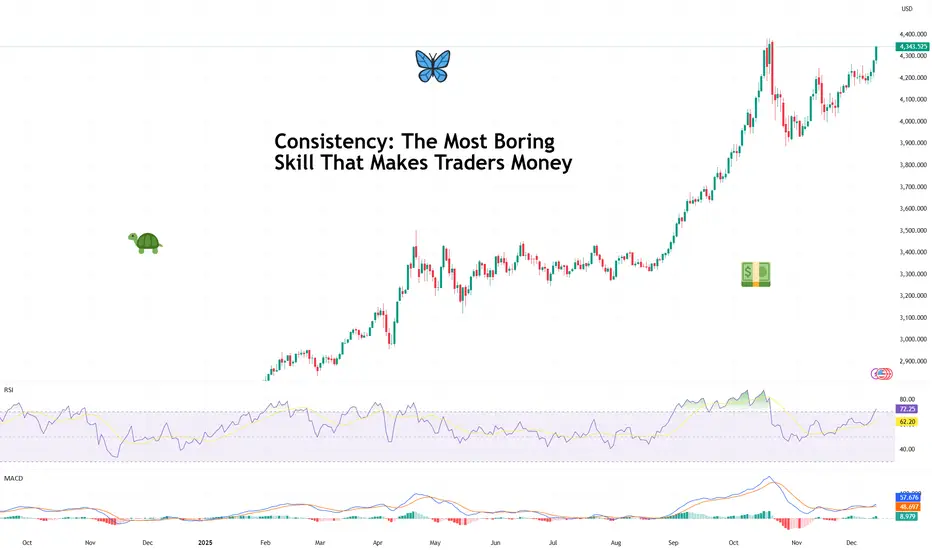
Consistency: The Most Boring Skill That Makes Traders MoneyAsk traders how they made their money and you’ll hear stories about perfect entries, heroic conviction, and that one legendary going-for-the-jugular trade they’ll mention at every dinner party.
What you almost never hear about is consistency — because it’s not glamorous, it doesn’t screenshot well, and it definitely doesn’t come with fireworks.
But consistency is the skill that turns trading from an emotional roller coaster into a durable business. It’s boring. It’s repetitive. And it’s responsible for more profitable careers than any secret indicator ever will.
🧠 Why the Market Rewards the Unexciting
Markets don’t pay you for being clever. They pay you for being repeatable.
Consistency works because markets are probabilistic systems. No single trade matters in the long run. What matters is what happens over time, across dozens or hundreds of decisions. (Good time to look back and see how you did this year.)
The trader who makes reasonable decisions again and again — even without brilliance — will eventually outperform the trader who occasionally nails a perfect call but can’t stop freelancing.
Think of it less like poker and more like compound interest. It doesn’t wow you at first. Then one day, you realize you’ve done pretty darn well.
📊 The Myth of the Big Trade
Every trader remembers their biggest win. And there’s nothing wrong with that. Some big trades can pay for a lot of small mistakes .
Big wins feel validating. They trigger confidence. But they also create dangerous expectations. Traders start chasing that feeling — trading bigger, faster, looser — and consistency quietly exits through the back door.
Professional traders know that a great trade doesn’t prove skill. A series of disciplined trades does.
The market doesn’t care how exciting your best trade was. It cares how well you behaved on the other ninety-nine.
🧮 Consistency Is Math, Not Motivation
Consistent traders don’t wake up feeling like it’s their lucky day.
They operate within a framework that reduces randomness in their decisions. They trade fewer setups, not more. They accept that being flat for the week is a position. They understand that not every day is designed to reward them.
This isn’t about grinding harder. It’s about removing unnecessary choices so execution becomes automatic.
Ironically, the less you try to be exceptional, the more real and reliable your results become.
📉 Losing Is Part of the Job
Consistency shows up most clearly during losing streaks. Anyone can look disciplined after a winning week. The test comes when trades stop working, narratives shift, and the urge to “make it back” creeps in.
Consistent traders don’t panic. They don’t revenge trade . They don’t rewrite their strategy after three red days.
Instead, they understand that drawdowns are not failures — they’re rent paid for staying in the game. The goal isn’t to avoid losses. It’s to keep losses from changing behavior.
🧠 Confidence Comes from Repetition
One of the quiet benefits of consistency is confidence — the real kind. Not the loud, chest-thumping confidence that comes from a hot streak. But the calm assurance that comes from knowing you’ve executed your plan a hundred times before.
That confidence allows traders to stay neutral when others get emotional. To reduce size when conditions change. To wait without feeling left out.
It’s the difference between reacting to the market and responding to it. Regardless if it’s fever-pitch earnings season or the Economic Calendar is jam-packed with events.
🕰️ The Long Game Always Wins
With that in mind, trading careers aren’t built in viral moments. They’re built in years upon years of working on your craft.
The traders who last aren’t necessarily the smartest or fastest. They’re the ones who made it boring enough to sustain it. And eventually, almost accidentally, the process builds itself into something that looks a lot like success.
Off to you : What’s your consistency strategy saying? Is boring beautiful or is risk-taking maxed out in your portfolio? Share your thoughts in the comments!
Volume Do Not Predict Price! - It Explains It!Most traders look at volume the wrong way.✖️
They expect volume to tell them where price will go next.
But volume’s real job is much more important:
Volume explains why price moved the way it did.
If you learn to read volume correctly, price action becomes clearer, not noisier.
1️⃣ Price Up + Rising Volume = Commitment
When price moves higher and volume expands, it means buyers are committed, not just reacting.
This is not random buying.
This is participation.
📈Rising volume during an impulse confirms that the move is supported by real interest, not just thin liquidity.
Strong trends are built on expanding volume.
2️⃣ Price Up + Falling Volume = Warning
When price continues higher but volume dries up, something changes.
The move still exists... but conviction doesn’t.
This often signals:
- exhaustion
- a potential pause
- or an upcoming correction
That’s when professionals stop chasing and start managing risk.
3️⃣ Sideways Price + Rising Volume = Accumulation or Distribution
This is where most traders get confused:
Price isn’t moving much, but volume is increasing.
That’s not boredom.
That’s positioning.
Large players don’t chase price.
They build positions quietly while price looks “dead.”
Breakouts that follow these zones tend to be fast and decisive, because the work was already done.❗️
4️⃣ Breakouts Without Volume Are Suspect
A breakout candle looks exciting.
But without volume, it’s just a move, not a decision.
Low-volume breakouts often lead to:
- fakeouts
- traps
- fast reversals
🏹Volume doesn’t need to explode... but it needs to confirm participation.
💡The Big Picture
Volume is not a signal by itself. It’s context.
Price tells you what happened, while Volume tells you how serious that move really was.
✔️When price and volume agree, trades feel easy.
✖️When they disagree, something important is hiding underneath.
⚠️ Disclaimer: This is not financial advice. Always do your own research and manage risk properly.
📚 Stick to your trading plan regarding entries, risk, and management.
Good luck! 🍀
All Strategies Are Good; If Managed Properly!
~Richard Nasr

BITCOIN'S ALL TIME HISTORY CHART(KEY INSIGHTS)This is a breakdown of all major waves that have occurred in Bitcoin's History. This chart might explain why CRYPTOCAP:BTC has been the most successful coin while also answering if the growth will be sustained. This is a pretty standard 5 wave move- Waves 1 to 4 having been completed(shown in Red). We are on our last Major wave before it becomes a complete 5 wave impulse.
Wave 1(Red) was followed by a Zigzag correction for Wave 2, hence we expected a Flat correction For Wave 4. Keep in mind, this Flat correction had been predicted almost 2 and a half years before, when Wave 2 was completed! Wave 4 had 3 internal waves namely A,B and C- shown in Blue.
With Wave 4 complete, it was time to launch our 5th Wave of the Major impulse. This 5th Wave has 5 internal waves as is typical for impulses and are shown in Green. Once again, when Wave 1(Green) completes we see a Flat correction for Wave 2 meaning our Wave 4 would most likely be a Zigzag correction. Note that these two corrections are best seen on the Weekly and Daily Charts.
With Wave 4(Green) complete, what we are left with is Wave 5(Green) in its final developments. Once this Wave 5 is complete, this will be the Wave 5(Red) of Bitcoin. When this happens, it will be the end of the first impulse that started in 0ct. 2009 and the beginning of Wave 2, which will be a massive correction!

5 Must-Know Tips for Trading Gold. XAUUSD Must Know Secrets
After more than 9 years of Gold trading, I decided to reveal 5 essential trading tips , that will save you a lot of money, time and effort.
Of course, these trading recommendations won't make you rich, but they will certainly help you to avoid a lot of losing trades.
Whether you are new to Gold trading or an experienced trader, these insights will dramatically improve your trading.
Don't trade gold with a small account
I always repeat to my students that in gold trading, the risk per trade should not exceed 1% of a trading account.
It means that if your trades close with stop loss, you should lose maximum 1% of your deposit.
For the majority of the day trading and swing strategies, you will require at least 2000$ deposit to risk 1% per trade. Trading with a smaller account size, it will be challenging to follow this risk management principle of not exceeding 1%
Here is a day trade on Gold.
With a stop loss of 619 pips and a trading account of 10000$,
a lot size for this trade will be 0.02.
If the trade closes on stop loss, total risk will be 100$ or 1% of a trading account.
With a 100$ account, trading with a minimal lot 0.01, your potential risk will be 50$ or half of your trading account.
Check spreads
Spread may dramatically fluctuate on Gold.
High spreads can make it difficult for day traders to catch small price movements, reducing the profit potential of their trades.
Wide spreads can lead to slippage , where day traders may end up buying at a higher price and selling at a lower price than expected, increasing the risk of losses.
Gold has the lowest spreads during London and New York sessions,
while trading the Asian session is not recommended.
Personally, I don't trade Gold if the spread exceeds 100 pips.
In the picture above, you can see a current spread on Gold.
It is 30 pips. It is a relatively low spread, so we can trade.
Don't trade on US holidays
When US banks are closed, liquidity drops substantially on Gold.
It leads to increased spreads and higher probabilities of manipulations,
reduced volatility and very slow market.
For that reason, it is better not to trade Gold during US holidays.
You can easily find the calendar of US banking holidays on Google.
Simply take a break during these trading days.
Don't trade ahead of important US news
US news may dramatically affect Gold prices.
Such events as FOMC or FED Interest rate decision may trigger a high volatility and very impulsive movements.
My recommendations to you is to stay away from trading Gold one hour ahead of the important news releases.
You can find important US news in the economic calendar .
Just sort out the calendar in a way that it would display only significant news and pay attention to them.
Above, you can see the important US news for the coming days in the economic calendar.
Do not open multiple orders
Here is what many Gold traders do wrong:
once they place an order, instead of patiently waiting for a stop loss or take profit being reached, they start opening more orders.
Please, open one single trade per your prediction.
Open a new trade if only you see a new trading setup or your initial trade is already risk-free with a stop loss move to entry level.
Here is the example, a newbie trader decides to buy Gold and opens a long positions.
The market moves in the projected direction, and a trader opens one more trade.
The one can open even dozens of positions like that.
However, the problem is that the market can always suddenly reverse and all these trades will be closed in a loss.
It can lead to a substantial account drawdown.
Open a one single trading position instead.
I truly believe that these trading tips will help you improve your gold trading. Carefully embed these rules in your trading plan and watch how your trading performance improves.
❤️Please, support my work with like, thank you!❤️
I am part of Trade Nation's Influencer program and receive a monthly fee for using their TradingView charts in my analysis.

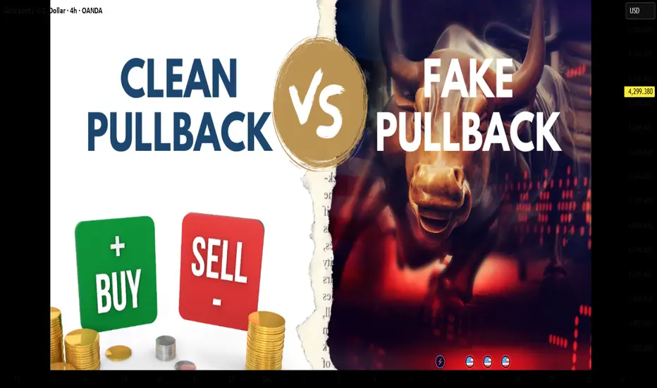
Clean vs Trap Pullbacks — Don’t Get FooledIn trading, a pullback can be an opportunity…
but it is also one of the most common traps that causes traders to lose money.
Some pullbacks allow you to enter with low risk, clean RR, and follow the trend smoothly.
Others look perfectly reasonable… until the market reverses and wipes out your stop loss.
So how do you tell a clean pullback from a trap pullback?
1. Clean Pullback – A Pause Before Continuation
A clean pullback is a healthy correction within a strong, intact trend.
Think of it as the market catching its breath before the next push.
Key characteristics of a clean pullback:
◆ The main trend remains clear
Higher highs – higher lows (uptrend)
Lower lows – lower highs (downtrend)
◆ The retracement is weaker than the impulse move
Smaller candles, shorter bodies, long wicks
No structural break
◆ Volume decreases during the pullback
Selling (or buying) pressure is not aggressive
The market is simply “resting”
◆ Price pulls back into a logical area
Previous support/resistance
Structural zones
Common Fibonacci levels (38.2 – 50 – 61.8)
👉 A clean pullback does not damage the trend’s integrity — it only tests it.
2. “Trap” Pullback – Looks Like a Retracement, Acts Like a Reversal
Trap pullbacks usually appear after a trend has extended too far or when momentum starts to fade.
They make traders think:
“It’s just a normal pullback…”
But in reality, smart money is already distributing.
Signs of a trap pullback:
◆ Trend strength is clearly weakening
New highs fail to exceed previous highs
Previous lows start getting broken
◆ The retracement is strong and aggressive
Large-bodied candles closing deep
Price moves confidently against the trend
◆ Volume increases during the pullback
This is no longer a technical retracement
Real money is changing direction
◆ Market structure breaks
Key highs/lows are violated
Break → retest → continuation in the opposite direction
👉 Trap pullbacks exploit a trend trader’s overconfidence.
3. A Common Mistake: “Price Pulls Back = Enter Trade”
Many traders don’t lose because of bad analysis,
but because they enter too early.
Familiar thoughts:
“It pulled back to support — buy.”
“The trend is still bullish.”
“That candle is just a retracement.”
But the market doesn’t care what you think.
It only cares about where the money is flowing.
4. How to Avoid Trap Pullbacks – Survival Rules
If you remember these three rules, you’ll avoid most pullback traps:
◆ Never enter just because price pulls back
Wait for confirmation:
rejection candles
small break & retest
clear reaction at structure
◆ Always check market structure first
Is the structure intact or broken
Are key highs/lows still respected?
◆ Compare impulse vs retracement
Strong impulse – weak pullback → trend is alive
Strong pullback – weak impulse → reversal risk
MASTERING RISK MANAGEMENT: THE SURVIVAL SYSTEM FOR TRADERSRisk management is not just a safety net; it is the specific system used to control losses and protect your trading capital. Without a strict risk plan, even a highly profitable strategy will eventually fail. A few bad trades should never have the power to wipe out your account.
WHY IT IS CRUCIAL
Markets are inherently unpredictable. No matter how good the analysis is, probabilities dictate that losses will occur. Risk management:
1. Protects against emotional trading (fear and greed).
2. Ensures long-term survival so you can stay in the game long enough to be profitable.
3. Stabilizes your equity curve, avoiding massive drawdowns.
OUR CORE RISK RULES
1. PER TRADE RISK LIMIT
Never risk more than 0.7% to 2% of your total account balance on a single trade. This ensures that a losing streak does not destroy your capital.
Example:
If you have a $10,000 account, your maximum risk per trade should be between $70 and $200.
2. DAILY LOSS LIMIT
Do not open too many positions simultaneously. You must have a hard stop for the day. Your total daily loss limit should be a maximum of 15% of your portfolio. If you hit this limit, stop trading immediately for the day to prevent emotional revenge trading.
KEY TOOLS FOR RISK CONTROL
Use a Risk Calculator to automate your position sizing. Do not guess your lot size.
Stop Loss (SL): An order that automatically exits a losing trade at a specific price. This is your insurance policy. Never trade without it.
Take Profit (TP): An order that locks in gains at predefined levels.
Risk-to-Reward Ratio (RRR):
Always aim for 1:2 or better. This means if you are risking 50 pips/5%, your target should be at least 100 pips/10%. With a 1:2 ratio, you can be wrong 50% of the time and still be profitable.
ADVANCED TACTIC: MOVING STOP-LOSS TO ENTRY (BREAK-EVEN)
Moving the Stop-Loss to the Entry price is a technique used to eliminate risk exposure in an active trade. It involves adjusting your stop loss level to the exact price where you entered the market.
Why do this?
If the trade reverses against you after moving to entry, you lose $0. You have eliminated the risk while keeping the potential for profit open.
ADVANCED TACTIC: CLOSING PART OF A TRADE (PARTIALS)
You do not have to close 100% of a trade at once. Closing a portion (partial closing) is vital for managing psychology and banking revenue.
By taking profits on 50% or 75% of a position, you lock in gains immediately. You can then leave the remaining portion of the trade running to catch a larger trend with zero stress, as you have already banked profit.
COMING UP NEXT
In the next article, we will be diving into Types of Traders & Their Risk Management Styles
Disclaimer: This content is for educational purposes only and does not constitute financial advice. Trading involves significant risk.
- Tuffy (Team Mubite)
#RiskManagement #CapitalProtection #TradingSurvival #RiskReward

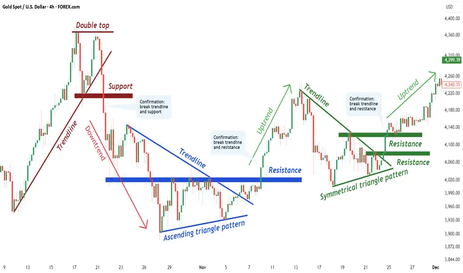
How to Use Chart Patterns in a High-Probability Way Tutorial #1In this tutorial, I explain how to use chart patterns in a structured and high-probability way, focusing on confirmation, market logic, and clean execution.
WHAT IS A CHART PATTERN?
A chart pattern is a visual representation of price behavior that forms due to market psychology, supply and demand, and repeated trader reactions.
Chart patterns help identify potential continuations or reversals when confirmed correctly.
CHART PATTERNS COVERED IN THIS TUTORIAL
1.) Double Top
2.) Ascending Triangle Pattern
3.) Symmetrical Triangle Pattern
WHAT IS A DOUBLE TOP?
A Double Top is a bearish reversal pattern formed after an uptrend.
Price fails to break a resistance level twice, signaling buyer exhaustion and a potential shift in control from buyers to sellers.
WHAT IS AN ASCENDING TRIANGLE PATTERN?
An Ascending Triangle is a bullish continuation pattern characterized by higher lows pressing against a flat resistance level.
It reflects increasing buyer strength and often leads to a breakout once resistance is broken with confirmation.
WHAT IS A SYMMETRICAL TRIANGLE PATTERN?
A Symmetrical Triangle represents consolidation, where higher lows and lower highs compress price action.
The breakout direction defines the next impulsive move once volatility expands.
GENERAL STEP-BY-STEP PROCESS
1.) Identify the chart pattern on the chart
(Unconfirmed structure forming)
2.) Draw the key trendlines and neckline
(Support and resistance define structure validity)
3.) Wait for a break of BOTH the trendline and the neckline
(This confirms the chart pattern)
4.) Move to a lower timeframe and look for an entry
(Trade in the direction of the confirmed breakout using clean price action)
If you want PART 2 , leave a like and a comment.
Follow for high-quality trading education and clean technical logic.
DISCLAIMER
This content is for educational purposes only and does not constitute financial advice.
Trading involves risk. Always conduct your own analysis.
I am not responsible for any decisions or losses based on this material.
Surviving this market for 10 years taught me thisI’ve been trading this market for over 10 years.
In the beginning, all I cared about was how much I could make.
That’s what most people focus on.
What I learned the hard way is this:
If the account doesn’t survive, nothing else matters.
No funds means no next trade.
No next trade means no edge, no learning, no comeback.
There were long periods where I wasn’t making money.
But I was protecting my ability to stay in the game.
That mattered more than being right.
This chart isn’t about profits.
It’s about still being here.

Why Central Banks Buy Gold — The Ultimate Asset of PowerWhen a central bank decides to buy gold, it is not simply adding another metal to its reserves. It is reinforcing the foundation of national financial power — a form of strength that does not rely on promises, carries no debt obligation, and cannot be manipulated by any superpower. In a modern financial system where nearly every asset represents someone else’s liability — from U.S. Treasuries to fiat currencies like USD or EUR — gold stands apart. It is not anyone’s debt, is immune to political influence, and cannot be printed. This absolute independence makes gold the ultimate anchor of national trust.
Gold carries a dual nature: it is both a durable financial asset and a geopolitical instrument. It protects national wealth in ways fiat currencies cannot. A country with substantial gold reserves possesses a shield for its currency, reducing vulnerability to exchange-rate shocks and enhancing stability during global cycles of volatility. History has repeatedly confirmed this pattern: during major inflationary periods — from 2008–2011, through the 2020 pandemic peak, to the inflation surge of 2022 — gold followed the same rule. When money lost value, gold rose. When central banks expanded money supply, gold became the final line of defense.
On the geopolitical level, gold’s role is even more pronounced. It does not depend on the U.S. dollar system, does not require SWIFT for settlement, and—most importantly—cannot be frozen like foreign exchange reserves. In an increasingly polarized world, gold has become the safest asset a nation can hold: silent power, yet profoundly real.
Central banks do not buy gold like retail investors. They accumulate it gradually and strategically over long periods, quietly, without disturbing prices or signaling intentions. Within reserve structures, gold sits alongside USD and U.S. Treasuries as a three-pillar framework: gold for systemic risk protection, USD for liquidity, and bonds for yield. In times of crisis, gold becomes an “activation asset” — sold to obtain USD, defend the exchange rate, stabilize confidence, and prevent currency collapse. This logic also explains the accelerating trend of de-dollarization across Asia, the Middle East, and especially the BRICS bloc.
Real-world examples reinforce gold’s role. China has consistently increased gold reserves from 2019 to 2025, according to PBoC disclosures, aiming to reduce USD dependence and strengthen the renminbi amid rising trade tensions. Russia provides the clearest case: after sanctions in 2022 froze most USD and EUR assets, gold remained untouched — serving as Russia’s financial immune system. In Turkey, when inflation surged to 60–80% between 2021 and 2023, the central bank expanded gold reserves to stabilize confidence in the lira — a strategy acknowledged in IMF surveillance reports.
The 2023–2025 period has revealed an undeniable truth: in a world marked by high inflation, a strong dollar, geopolitical conflict, and global recession risks, countries with large gold reserves — such as China, Russia, and India — maintained relative stability, while nations with weaker reserves struggled with currency crises, external debt, and inflation. When everything else depends on trust, gold depends on nature — and that is why it remains a pillar of national power even in the 21st century.

Overtrading Gold – Biggest Account KillerOvertrading Gold – Biggest Account Killer
🧠 What Overtrading REALLY Means in Gold
Overtrading is not just trading too often — it’s trading without edge, patience, or contextual alignment.
In XAUUSD, overtrading usually looks like:
Multiple entries in the same range
Chasing price after impulsive candles
Trading every wick, every breakout, every news spike
📌 Gold gives the illusion of opportunity every minute — but institutions trade very selectively.
🧨 Why Gold Is the Perfect Trap for Overtraders
Gold is engineered (by behavior, not conspiracy) to punish impatience 👇
🔥 Extreme volatility
🔥 Fast candles & long wicks
🔥 Sudden reversals
🔥 News-driven manipulation
🔥 Liquidity sweeps above & below range
💣 Result?
Retail traders feel forced to trade — and end up trading against structure and liquidity.
🧩 The Overtrading Cycle (Account Destruction Loop)
Most gold traders repeat this cycle unknowingly ⛓️
1️⃣ Enter early (no confirmation)
2️⃣ Stop-loss hit by wick
3️⃣ Re-enter immediately (revenge)
4️⃣ Increase lot size
5️⃣ Ignore bias & HTF context
6️⃣ Emotional exhaustion
7️⃣ Big loss → account damage
📉 This cycle has nothing to do with strategy — it’s pure psychology.
🧠 Why Strategy Stops Working When You Overtrade
Even a 60–70% win-rate strategy will fail if:
❌ Trades are taken outside optimal time
❌ Entries ignore higher-timeframe direction
❌ Risk increases after losses
❌ Rules are bent “just this once”
📌 Gold exposes discipline weakness faster than any other market.
⏰ Time Is the Hidden Edge in Gold
Gold does NOT move efficiently all day ⏱️
🟡 Asian Session → Range & traps
🟡 London Open → Liquidity grab
🟢 New York Session → Real direction
Overtraders:
❌ Trade Asian noise
❌ Enter mid-range
❌ Chase NY expansion late
Smart traders:
✅ Wait for liquidity first
✅ Trade after manipulation
✅ Enter once direction is clear
📉 Statistical Damage of Overtrading
Let’s talk numbers 📊
🔻 More trades = more spread & commission
🔻 Lower average R:R
🔻 Lower win probability
🔻 Higher emotional stress
🔻 Faster drawdowns
💡 One A-grade setup can outperform 10 random gold trades.
🧠 Psychology: The Real Root Cause
Overtrading is driven by internal pressure 👇
😨 Fear of missing out
😡 Anger after stop-loss
😄 Overconfidence after win
😴 Boredom during ranges
Gold feeds emotions — and then punishes them.
📌 Institutions wait. Retail reacts.
🛑 How Professionals Control Overtrading
Real solutions — not motivational quotes 👇
✅ Maximum 1–2 trades per session
✅ Trade only at predefined time windows
✅ Fixed risk per trade (no exceptions)
✅ Daily stop after 2 losses max
✅ Journal every impulsive entry
📘 If it’s not planned before price moves, it’s emotional.
🏆 Golden Rule of XAUUSD
💎 Gold is not hard because it’s random
💀 Gold is hard because it exposes impatience
You don’t need more trades.
You need more discipline.
📌 Final Truth
Most XAUUSD accounts don’t blow because of:
❌ Bad indicators
❌ Bad analysis
❌ Bad strategy
They blow because of overtrading driven by emotion.
📉 Overtrading is the biggest account killer in gold trading.

Trading Seasonality: When the Calendar Matters More Than NewsTrading Seasonality: When the Calendar Matters More Than News
Markets move not just on news and macroeconomics. There are patterns that repeat year after year at the same time. Traders call this seasonality, and ignoring it is like trading blindfolded.
Seasonality works across all markets. Stocks, commodities, currencies, and even cryptocurrencies. The reasons vary: tax cycles, weather conditions, financial reporting, mass psychology. But the result is the same — predictable price movements in specific months.
January Effect: New Year, New Money
January often brings growth to stock markets. Especially for small-cap stocks.
The mechanics are simple. In December, investors lock in losses for tax optimization. They sell losing positions to write off losses. Selling pressure pushes prices down. In January, these same stocks get bought back. Money returns to the market, prices rise.
Statistics confirm the pattern. Since the 1950s, January shows positive returns more often than other months. The Russell 2000 index outperforms the S&P 500 by an average of 0.8% in January. Not a huge difference, but consistent.
There's a catch. The January effect is weakening. Too many people know about it. The market prices in the pattern early, spreading the movement across December and January. But it doesn't disappear completely.
Sell in May and Go Away
An old market saying. Sell in May, come back in September. Or October, depending on the version.
Summer months are traditionally weaker for stocks. From May to October, the average return of the US market is around 2%. From November to April — over 7%. Nearly four times higher.
There are several reasons. Trading volumes drop in summer. Traders take vacations, institutional investors reduce activity. Low liquidity amplifies volatility. The market gets nervous.
Plus psychology. Summer brings a relaxed mood. Less attention to portfolios, fewer purchases. Autumn brings business activity. Companies publish reports, investors return, money flows back.
The pattern doesn't work every year. There are exceptions. But over the past 70 years, the statistics are stubborn — winter months are more profitable than summer.
Santa Claus Rally
The last week of December often pleases the bulls. Prices rise without obvious reasons.
The effect is called the Santa Claus Rally. The US market shows growth during these days in 79% of cases since 1950. The average gain is small, about 1.3%, but stable.
There are many explanations. Pre-holiday optimism, low trading volumes, purchases from year-end bonuses. Institutional investors go on vacation, retail traders take the initiative. The mood is festive, no one wants to sell.
There's interesting statistics. If there's no Santa Claus rally, the next year often starts poorly. Traders perceive the absence of growth as a warning signal.
Commodities and Weather
Here seasonality works harder. Nature dictates the rules.
Grain crops depend on planting and harvest. Corn prices usually rise in spring, before planting. Uncertainty is high — what will the weather be like, how much will be planted. In summer, volatility peaks, any drought or flood moves prices. In autumn, after harvest, supply increases, prices fall.
Natural gas follows the temperature cycle. In winter, heating demand drives prices up. In summer, demand falls, gas storage fills, prices decline. August-September often give a local minimum. October-November — growth before the heating season.
Oil is more complex. But patterns exist here too. In summer, gasoline demand rises during vacation season and road trips. Oil prices usually strengthen in the second quarter. In autumn, after the summer peak, correction often follows.
Currency Market and Quarter-End
Forex is less seasonal than commodities or stocks. But patterns exist.
Quarter-end brings volatility. Companies repatriate profits, hedge funds close positions for reporting. Currency conversion volumes surge. The dollar often strengthens in the last days of March, June, September, and December.
January is interesting for the yen. Japanese companies start their new fiscal year, repatriate profits. Demand for yen grows, USD/JPY often declines.
Australian and New Zealand dollars are tied to commodities. Their seasonality mirrors commodity market patterns.
Cryptocurrencies: New Market, Old Patterns
The crypto market is young, but seasonality is already emerging.
November and December are often bullish for Bitcoin. Since 2013, these months show growth in 73% of cases. Average return is about 40% over two months.
September is traditionally weak. Over the past 10 years, Bitcoin fell in September 8 times. Average loss is about 6%.
Explanations vary. Tax cycles, quarterly closings of institutional funds, psychological anchors. The market is young, patterns may change. But statistics work for now.
Why Seasonality Works
Three main reasons.
First — institutional cycles. Reporting, taxes, bonuses, portfolio rebalancing. Everything is tied to the calendar. When billions move on schedule, prices follow the money.
Second — psychology. People think in cycles. New year, new goals. Summer, time to rest. Winter, time to take stock. These patterns influence trading decisions.
Third — self-fulfilling prophecy. When enough traders believe in seasonality, it starts working on its own. Everyone buys in December expecting a rally — the rally happens.
How to Use Seasonality
Seasonality is not a strategy, it's a filter.
You don't need to buy stocks just because January arrives. But if you have a long position, seasonal tailwind adds confidence. If you plan to open a short in December, seasonal statistics are against you — worth waiting or looking for another idea.
Seasonality works better on broad indices. ETFs on the S&P 500 or Russell 2000 follow patterns more reliably than individual stocks. A single company can shoot up or crash in any month. An index is more predictable.
Combine with technical analysis. If January is historically bullish but the chart shows a breakdown — trust the chart. Seasonality gives probability, not guarantee.
Account for changes. Patterns weaken when everyone knows about them. The January effect today isn't as bright as 30 years ago. Markets adapt, arbitrage narrows.
Seasonality Traps
The main mistake is relying only on the calendar.
2020 broke all seasonal patterns. The pandemic turned markets upside down, past statistics didn't work. Extreme events are stronger than seasonality.
Don't average. "On average, January grows by 2%" sounds good. But if 6 out of 10 years saw 8% growth and 4 years saw 10% decline, the average is useless. Look at median and frequency, not just average.
Commissions eat up the advantage. If a seasonal effect gives 1-2% profit and you pay 0.5% for entry and exit, little remains. Seasonal strategies work better for long-term investors.
Tools for Work
Historical data is the foundation. Without it, seasonality is just rumors.
Backtests show whether a pattern worked in the past. But past doesn't guarantee future. Markets change, structure changes.
Economic event calendars help understand the causes of seasonality. When quarterly reports are published, when dividends are paid, when tax periods close.
Many traders use indicators to track seasonal patterns or simply find it convenient to have historical data visualization right on the chart.

Mastering the Art of the Exit With a Simple Trick.Mastering the Art of the Exit With a Simple Trick.
Let me share a situation with you that has caused me more anxiety in the market than any other.
You buy a stock, a currency, or a cryptocurrency.
And this time... yes! It starts to climb. And climb. You are up 5%. Then 10%!! Suddenly, you are staring at a 15% gain!!!!
It feels brilliant. You have nailed the entry point, and your ego starts to whisper that you might just be a GENIUS.
But, my friend, this is the easy part of trading . Finding entry points is relatively simple.
The complexity of trading lies in the exit.
And this is exactly where our brain serves us a banquet of overwhelming anxiety.
Do we take that 15% and call it a win?
Do we get out?
But what if I sell and it shoots up to 30%? I entered so perfectly, I better stay.
I couldn’t bear missing the rally... But what if it suddenly turns around and we drop back to 0%?
If you have ever invested a single dollar, this internal dialogue must resonate deeply within you.
This anxiety is born from a lack of control.
Because we lack control over when to exit, our minds go wild, tossing scenarios into the air like someone plucking petals off a flower to decide their future.
REGAINING CONTROL
Today, I want to hand you a tool that will help you identify the precise moment it becomes interesting to reduce positions in a bull market, or even start considering a short position.
This strategy is incredibly simple to execute, and it works on any stock or listed market.
In the charts below, I have marked a few specific candles. These are magnificent candles for identifying when a bullish cycle is coming to an end, or at the very least, is about to take a significant pause.
What do you think they have in common?
Notice that these are charts from very different companies and sectors, in bullish, sideways, or bearish situations.
But all of them mark moments of change . They are highly interesting moments to sell.
What do you believe these candles share?
I am going to give you the answer in a moment, but whether you guessed right or not, I would love to know what went through your mind.
I’ll read you in the comments!
The answer, once you know it, is quite obvious, and it might even make you feel a little frustrated (my apologies!) .
But the truth is, the answer has always been right there in front of you.
It is like when you do not understand a language: you hear the sounds, but you do not comprehend the meaning. In this case, you have seen it, but perhaps you haven’t realized its significance.
Come on, let me give you one more clue.
Do you see it now?
Precisely.
The volume on those days is absolutely ridiculous.
When you compare it with the surrounding days, these days clearly fall below the average.
In fact, for those of you who love the data, we are talking about volumes in the 2nd or 3rd percentile maximum. That means out of every 100 trading days, we are looking for the 2 or 3 days with the least volume.
We are looking for the rare ones!
Important Note: You must NOT count public holidays or the days immediately preceding them. During Christmas, August, and other holidays or semi-holidays, volume is low per se. We are looking for low volume on normal trading days.
THE PSYCHOLOGY OF LOW VOLUME
The market moves based on the buying and selling of its participants.
When you buy, an immutable record remains of how many shares were bought and at what price. The sum of these shares and prices creates the trading volume.
When many people are interested in a stock, volume rises. Many shares change hands rapidly, causing the price to climb and climb, provoking even more transactions.
But sometimes, something incredible happens.
The price is making new highs, or is very close to them, yet the volume is ridiculous.
Why?
It means we have reached a point where we have run out of buyers. However, at the same time, the sellers do not want to "undersell" . They are waiting for that buying pressure to appear again.
When it doesn’t happen, and we see a day of low volume because buyers want it cheaper and sellers (for now) don’t want to lower their prices , we see a standoff.
No exchanges are achieved.
When the smartest sellers realize this, they begin to lower their prices in search of liquidity. As this drop in price initiates, the rest of the sellers begin to sell, entering into a progressively greater panic.
These candles indicate a lack of transactions due to a misalignment of supply and demand. The day following this misalignment, we typically see a forceful candle confirming that the price needs to be in a different zone, one where we are all willing to transact.
These days can signal both trend continuation and trend reversal, but that is a detail requiring a depth we won’t cover today.
Today, I will focus on the days of trend reversal.
Notice that in addition to working in bearish trends, this works equally well for bullish reversals. In fact, on the same chart, you can find opposite examples and make money in both directions, like this:
It even works well on higher timeframes like the Weekly, especially when combined with larger Chart Patterns, such as the Double Bottom.
HOW TO DETECT THEM
To spot these moments, TradingView offers a very interesting, and quite unknown free indicator.
It is called High/Low Volume.
It marks percentile lines, which helps you visualize the days with the lowest volume. Remember to be careful, many of these marks will be holidays, or days near Christmas or August. Discard those.
I hope that the next time you see a day of low volume, provided it isn’t a holiday, you will see the market through a different lens.
I invite you to start analyzing if this is happening at support or resistance levels , or if it fits with a larger chart pattern to guide your way.
🎁 Let’s make a simple deal.
I will handle the heavy lifting to create content like this for free, and you just HIT the 🚀 Rocket and Follow for more!
🤝 Deal?

How to Use Divergence in a High-Probability Way — Tutorial #1In this tutorial, I explain how to use Wide and Tight Divergence in a structured and practical way.
WHAT IS DIVERGENCE?
Divergence occurs when price makes a new high/low while momentum indicators move in the opposite direction. This signals weakening momentum and a potential reversal or correction.
WHY DOES DIVERGENCE WORK?
Divergence exposes momentum weakness before price actually reverses. It helps traders identify exhaustion early, improving accuracy and timing.
TWO MAIN TYPES OF DIVERGENCE
1.) WIDE DIVERGENCE
Price forms a large, extended swing while the indicator creates a smaller swing in the opposite direction. This signals strong exhaustion and is often followed by a bigger reversal.
2.) TIGHT DIVERGENCE
Price forms a small higher high or lower low while momentum moves opposite. This reflects micro-exhaustion and often appears before sharp pullbacks.
STEPS FOR WIDE DIVERGENCE
1.) Identify wide swings
Look for a clear extended higher high or lower low compared to recent structure.
2.) Check RSI moving in the opposite direction
This is the initial (unconfirmed) divergence.
3.) Draw a trendline + mark nearest support/resistance zone
These structural levels help filter weak signals.
4.) Wait for a break of both the trendline AND the S/R level
This confirms the divergence.
5.) Drop to a lower timeframe for entry
Use clean price action and break–retest structure to refine entry.
STEPS FOR TIGHT DIVERGENCE
1.) Identify small, shallow swings
Look for minor higher highs or lower lows forming weak structure.
2.) Check RSI moving in the opposite direction
This signals early momentum failure.
3.) Draw a trendline + nearest S/R level
Tight Divergence requires smaller structural zones.
4.) Wait for a break of both levels
A confirmed divergence requires a clean break.
5.) Drop to a lower timeframe for precise entry
Tight Divergence usually leads to fast corrective moves.
If you want PART 2, leave a like and a comment.
Follow for high-quality trading education and clean technical logic.
DISCLAIMER :
This post is for educational purposes only and does not constitute financial advice. Trading involves risk, and you should always conduct your own analysis. I am not responsible for any decisions or losses based on this content.

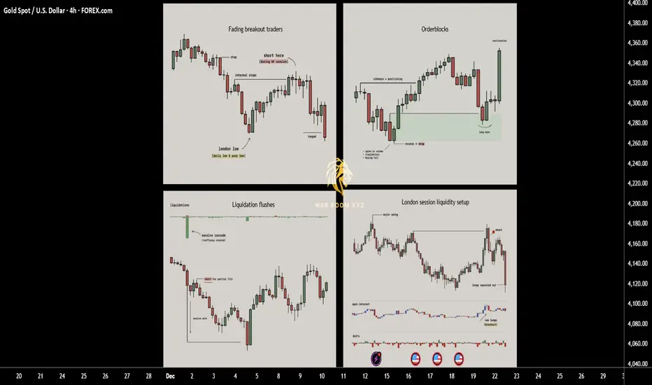
How Price Really Moves: 4 Entry Triggers Driven by LiquidityThis breakdown explains four recurring entry triggers that appear consistently across real market structure.
These are not indicators and not prediction tools. They are observable behaviors driven by liquidity, positioning, and trader psychology.
Each trigger is rooted in why price moves, not what price might do next.
1. Fading breakout traders (Failed Momentum / Trap Model)
When price breaks a key level and open interest jumps, breakout traders rush in expecting continuation. If price quickly snaps back, those new traders become trapped and their exits fuel a move in the opposite direction. This creates one of the cleanest reversal triggers since you are trading directly against failed momentum.
► What usually happens
Markets frequently approach obvious highs, lows, or range boundaries where:
•Retail breakout traders anticipate continuation
•Algorithms and short-term momentum systems enter aggressively
•Open interest or volume often expands rapidly
At this moment, new positions are created late , directly into resistance or support.
► The key failure
If price:
•Breaks a key level
•Fails to hold acceptance beyond it
•Quickly closes back inside the prior range
Then the breakout has failed structurally.
This means:
•Buyers who entered above resistance are now trapped
•Sellers who entered below support are trapped
•Their exits (stops + panic closes) become fuel for the opposite move
► Why this works
Markets move efficiently when traders are positioned correctly.
They move violently when traders are positioned incorrectly.
A failed breakout converts hope-based positions into forced exits.
► Educational takeaway
You are not trading the level,
you are trading the failure of belief at the level.
This is why failed breakouts often produce:
•Fast reversals
•Clean directional candles
•Strong continuation after rejection
2. Liquidation flushes (Forced Exit & Rebalance Model)
Sharp liquidation events create long wicks and temporary price inefficiencies. Markets tend to rebalance after these shocks as liquidity returns, which is why these wicks often get filled quickly. This setup works well in volatile phases and near exhaustion points where forced selling or buying pushes price too far.
► What a liquidation flush is
A liquidation flush occurs when:
•Price moves aggressively in one direction
•Overleveraged positions are forcibly closed
•Stops and liquidations cascade simultaneously
This often creates:
•Long wicks
•One-sided impulsive candles
•Temporary price inefficiencies
Importantly, this move is not driven by new conviction, but by forced exits.
► What happens after
Once forced liquidations are complete:
•Selling or buying pressure rapidly decreases
•Liquidity returns to the market
•Price frequently retraces part or all of the wick
This retracement is not random
it is the market rebalancing after stress.
► Where flushes matter most
Liquidation flushes are most meaningful when they occur:
•Near prior highs/lows
•At range extremes
•After extended directional moves
•During high-volatility sessions
► Educational takeaway
A liquidation wick does not mean “strong trend”.
It often means the move is temporarily exhausted.
You are not trading momentum,
you are trading the absence of remaining pressure.
3. Orderblocks
Orderblocks are zones where previous heavy participation occurred, usually during sideways movements before a strong move away. When price revisits these levels, the same participants often defend the area, creating reliable reaction points. Clean pivots with no messy wicks are the strongest since they signal clear institutional activity.
► What an orderblock represents
Orderblocks are areas where:
•Large participants accumulated or distributed positions
•Price moved sideways briefly
•A strong directional move followed immediately after
This sideways phase exists because large players cannot enter all at once without moving price against themselves.
► Why orderblocks matter
•When price returns to these zones:
•Previous participants may still be active
•Unfilled orders may remain
•Defensive reactions are more likely than random continuation
Clean orderblocks typically show:
•Tight consolidation
•Minimal wicks
•Strong departure afterward
Messy structures often indicate mixed participation and weaker reactions.
► How orderblocks are used
Orderblocks are reaction zones , not signals.
They provide:
•Logical areas to expect interest
•Defined risk zones
•Context for entry triggers like wicks or failed breaks
► Educational takeaway
Orderblocks work because institutions remember their prices , even if retail traders forget them.
You are trading where participation previously mattered, not arbitrary support or resistance.
4. London session liquidity setup
London frequently sets the daily low or high early in the session. Later in the day price often returns to sweep internal liquidity around that level before continuing the trend. This repeatable behavior offers structured entries based on predictable liquidity grabs tied to session mechanics.
► Why London matters
The London session is:
•One of the highest liquidity windows globally
•Often responsible for setting the initial daily structure
•Heavily watched by institutions and algorithms
In many markets, London establishes:
•The daily high
•The daily low
Or a key internal liquidity level early in the session
► The repeatable behavior
Later in the day (often London continuation or New York):
•Price returns to that London high or low
•Sweeps internal liquidity around it
•Rejects after stops are collected
•Continues in the higher-timeframe direction
This is not coincidence,
it is session-based liquidity engineering.
► Why it works
Institutions prefer:
•Liquidity-rich entries
•Known pools of resting stops
•Session transitions for execution
London levels provide exactly that.
► Educational takeaway
Sessions are not just time zones,
they are liquidity cycles.
Understanding when liquidity is created is just as important as where.
How These Triggers Fit Together
These models are not standalone strategies.
They are contextual tools.
Very often:
•A London sweep causes a liquidation wick
•A failed breakout forms at an orderblock
•A liquidation flush completes a failed momentum move
The strongest setups occur when multiple triggers overlap , but each can stand alone as a learning framework.
Why These Triggers Work Long-Term
They work because they are based on:
• Trader positioning
• Forced behavior (stops, liquidations)
• Institutional execution constraints
• Repeating session mechanics
They do not rely on:
•Indicator crossovers
•Lagging calculations
•Pattern prediction
Price moves because someone is forced to act.
These triggers show where and why that happens.
These 4 triggers work because they exploit trapped traders, forced liquidations and consistent liquidity patterns rather than relying on indicators. Keep them simple, wait for clean context and let the setups come to you.
Note
These concepts are:
•Descriptive, not predictive
•Contextual, not mechanical
•Dependent on execution skill and risk management
The goal is not to trade more,
it is to wait for situations where the market gives you an advantage.
I have made a script which might help identify all 4 triggers.
Disclaimer
The script is provided for educational and informational purposes only.
It does not constitute financial advice, investment advice, or a recommendation to buy or sell any instrument.
The script does not execute trades, manage risk, or replace the need for trader discretion. Market behavior can change quickly, and past behavior detected by the script does not ensure similar future outcomes.
Users should test the script on demo or simulation environments before applying it to live markets and must maintain full responsibility for their own risk management, position sizing, and trade execution.
Trading involves risk, and losses can exceed deposits. By using the script, you acknowledge that you understand and accept all associated risks.
Global Supply Chain Sequence Explained1. Raw Material Extraction and Sourcing
The supply chain begins with the extraction or harvesting of raw materials. These materials include:
Minerals (iron, copper, lithium)
Agricultural goods (wheat, cotton, soybeans)
Energy resources (oil, natural gas)
Forest products (timber, pulp)
Companies may source these materials from multiple countries to minimize cost, access better quality, or diversify risk. For example, lithium may come from Chile, cobalt from Congo, rubber from Thailand, and cotton from India. Sourcing decisions are influenced by prices, geopolitical relationships, trade policies, and environmental conditions.
Once extracted, raw materials are shipped to processing facilities through bulk cargo vessels, freight trains, or trucks.
2. Processing and Primary Manufacturing
The next stage is converting raw materials into usable inputs. This includes:
Oil → Plastics
Cotton → Yarn
Iron ore → Steel
Timber → Paper or fiberboard
Processing plants may be located in countries with:
Cheap labor
Access to natural resources
Established industrial infrastructure
Favorable tax policies
For instance, Southeast Asia and China are major hubs for primary manufacturing due to large skilled labor forces and efficient logistics.
Processed materials are then shipped to secondary or final manufacturing units, often across borders.
3. Component Manufacturing and Assembly
Most modern products consist of many components, each produced in specialized factories. A smartphone alone may have:
Chips from Taiwan
Screens from South Korea
Batteries from China
Cameras from Japan
Software from the U.S.
This stage involves:
CNC machining
Electronics fabrication
Chemical processing
Textile weaving
Automotive parts production
Manufacturers build components based on specifications provided by global brands. These components then move to assembly plants where the final product is built.
Global manufacturing hubs like China, Vietnam, India, Mexico, and Eastern Europe dominate this stage due to strong infrastructure and large workforce availability.
4. Global Transportation and Logistics
After components or assembled goods are ready, they need to move across borders. This involves:
Modes of Transport
Sea Freight
Cheapest and widely used for large volumes (containers, bulk cargo).
90% of world trade moves by sea.
Air Freight
Fastest but expensive. Used for electronics, perishables, and urgent shipments.
Rail Freight
Popular for trade between Europe–Asia via the Silk Route.
Road Transport
Essential for last-mile connectivity.
Shipping Containers
Standardized containers have revolutionized trade by allowing goods to seamlessly transition between ships, trucks, and trains. This intermodal system cut costs and reduced damage.
Ports and Customs
Goods pass through:
Export customs clearance
Transshipment hubs
Import customs clearance
This stage is heavily influenced by:
Trade regulations
Duty structures
Geopolitical relations
Port congestion
Documentation accuracy
Delays at customs can disrupt entire supply chains.
5. Warehousing and Distribution Centers
Once goods arrive in the destination region, they are stored in warehouses or distribution centers. These facilities perform:
Sorting and grading
Packaging or repackaging
Inventory management
Barcode/label printing
Quality checks
Modern warehouses use automated robots, RFID scanners, and data analytics for efficient operations.
Distribution centers are usually strategically located near major highways, ports, or airports to enable fast delivery to wholesalers, retailers, and online consumers.
Large companies like Amazon, Walmart, Flipkart, and Alibaba operate highly sophisticated fulfillment centers with AI-driven inventory systems.
6. Sales, Marketing, and Demand Management
This stage involves analyzing customer demand and planning inventory accordingly. Companies use:
Forecasting models
Market research
Data analytics
ERP systems
Accurate demand forecasting helps avoid:
Overstocking (causes high storage cost)
Stockouts (lost sales)
Production inefficiencies
Retailers and global brands rely on digital tools to align supply with changing consumer preferences.
7. Retail and Last-Mile Delivery
Finished goods are finally delivered to retailers, wholesalers, e-commerce warehouses, or directly to consumers. This involves:
Retail distribution networks
Online marketplaces
Courier services
Local transportation
Last-mile delivery is often the most expensive and time-consuming part of the supply chain, especially in urban areas with traffic congestion or rural areas with poor infrastructure.
E-commerce companies solve this through:
Micro-fulfillment centers
Hyperlocal delivery partners
AI route optimization
Cash-on-delivery logistics
8. After-Sales Services and Returns
The supply chain doesn’t end with delivery. After-sales activities include:
Warranty repairs
Return management
Replacement of defective products
Customer support
The reverse movement of goods—known as reverse logistics—is crucial for electronics, fashion, and e-commerce. Returned products may be:
Refurbished
Recycled
Resold
Disposed of responsibly
Efficient reverse logistics reduces waste and enhances customer satisfaction.
9. Recycling and Circular Supply Chains
As sustainability becomes a global priority, many companies now close the loop by recycling products. Examples:
Plastics → Recycled granules
Electronics → Recovered metals
Paper → Recycled pulp
Batteries → Reused chemicals
Circular supply chains reduce environmental impact and dependence on raw materials. Governments in Europe, the U.S., and Asia also push for extended producer responsibility (EPR) policies.
10. Digital Technologies Connecting the Supply Chain
Modern global supply chains increasingly rely on digital solutions for transparency and efficiency. Key technologies include:
Blockchain → Secure tracking of shipments
IoT sensors → Real-time temperature and location monitoring
AI & Machine Learning → Demand forecasting, route optimization
Robotics & Automation → Smart warehouses
Cloud platforms → Integrated supply chain management
Big data analytics → Reducing waste and cost
These technologies allow companies to respond faster to disruptions.
11. Risks and Disruptions in the Global Supply Chain
Global supply chains face many risks:
Geopolitical tensions (trade wars, sanctions)
Natural disasters (floods, earthquakes, pandemics)
Port congestions
Labor strikes
Currency fluctuations
Inflation in shipping costs
Regulatory changes
Events like COVID-19, the Suez Canal blockage, and U.S.–China tensions showed how vulnerable global trade systems can be. Companies now diversify suppliers and build resilient, multi-country networks.
Conclusion
The global supply chain sequence is a complex network involving raw materials, manufacturing, global transportation, warehousing, distribution, retail, and reverse logistics. Supported by modern technologies, each stage plays a vital role in ensuring products move efficiently from one part of the world to another. As globalization advances and digital transformation accelerates, supply chains are becoming smarter, faster, and more interconnected than ever before—yet they remain sensitive to global risks and require continuous adaptation.

MSFT Potential Upside Squeeze SetupMSFT is currently forming a constructive structure with clearly defined levels.
On the downside, the 475 put support has been defended three separate times, signaling strong positioning interest and consistent absorption of selling pressure. Price continues to hold above the HVL , with an extremely narrow transition zone and a broadening upward-tilted positive GEX profile — all reinforcing structural stability.
If price breaks upward from the first call wall at 480 , this typically favors continuation rather than any sustained move lower.
Upside levels :
The next major call resistance sits at 500 — which also aligns with the 8/8 level on the MM grid system . This creates a very strong confluence, making 500 a significant resistance zone.
If price cleanly accepts and pushes through 500, dealer hedging flows can accelerate, potentially triggering an upside squeeze — with an initial upside extension capped near 520 .
If momentum continues to build above 500, the next substantial call resistance sits at 520 , currently the second-largest call wall on the chain.
As long as price remains above HVL and the 475 support zone holds, the risk-reward skew favors continuation to the upside, with 480 as the trigger level and 500 as the speculative call-positioning target .
However — critical risk scenario:
If 475 breaks and we do not see a fast rebound from the 470/460 negative squeeze zone , this could initiate a sharp downward move and a trend shift. Currently, the largest protective put concentration sits at 475 — and the put side only begins to melt if price can reclaim 480 .
At least based on the aggregated options chain, MSFT is now under immense compression with clear trigger points .
MSFT tightening under GEX squeeze pressure

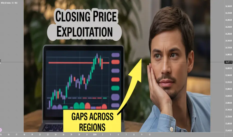
Closing Price Exploitation and Gaps Across Regions1. What Is Closing Price Exploitation?
Closing price exploitation refers to strategic actions taken by market participants—often large institutions, hedge funds, or algorithmic traders—to influence or take advantage of the closing price of a market. The closing price is a benchmark for:
Portfolio valuation
ETF/Index calculation
Mutual fund NAV
Margin requirements
Options settlement (for some markets)
Technical analysis (candles form based on closing price)
Because the closing price is so influential, it becomes a target for potential manipulation or strategic trading.
1.1 Why the Closing Price Matters
The closing price is considered the most important price of the trading day. It represents:
The final consensus of value
The point where liquidity peaks
A reference for next day’s sentiment
The price used by analysts and chartists
Any move near the close can change the market’s perception and technical structure.
1.2 How Exploitation Happens
Marking the Close
Large players place aggressive buy or sell orders in the last few minutes to push the closing price toward a desired level.
Example: A fund wants its quarterly report to show strong performance, so it pushes up prices of its holdings near the close (window dressing).
Exploiting Low Liquidity
In many markets, liquidity thins out near the close.
Even moderate orders can shift prices significantly.
High-frequency traders (HFTs) also exploit thinning order books to trigger stop-losses or manipulate closing auctions.
Taking Advantage of Index Rebalancing
Index funds must buy or sell assets at the close when weights change.
Smart money trades ahead of index funds, capturing profitable price moves.
Closing Auction Strategies
Some markets use auction mechanisms for the final trade.
Traders exploit mispricing during this auction by submitting large imbalance orders.
Influencing Options Expiry
In markets where options settle based on closing prices, aggressive buying/selling near expiry can shift settlement prices, generating profits on derivatives positions.
1.3 Who Performs Closing Price Exploitation
Hedge funds
HFT firms
Proprietary trading desks
Market makers
Large institutional investors
Retail traders rarely benefit from such strategies because they lack capital and execution speed.
2. Price Gaps Across Global Regions
Because different markets open and close at different times, prices across regions rarely move in a smooth, continuous way. Instead, they often show gaps caused by offshore developments.
2.1 What Is a Price Gap Across Regions?
A regional gap occurs when the price of an asset jumps or drops between the previous region’s close and the next region’s open due to:
Overnight news
Economic data releases
Commodity price moves
FX volatility
Geopolitical events
Market sentiment arising in other time zones
2.2 How Time Zones Create Gaps
Financial trading follows a global cycle:
Asia opens first (Japan, China, India)
Europe opens next (UK, Germany, France)
US opens last
When US markets close, Asia is still inactive. During the hours Asia is offline:
US equities move
Commodities like crude oil trade overnight
Bond yields react to news
Forex markets continue 24/5
When Asia opens again, prices adjust suddenly, creating a gap up or gap down.
2.3 Examples of Regional Gaps
US closes strong → Asia gaps up
If NASDAQ rallies 2% at night, markets like Nikkei, Hang Seng, or Nifty may open with a positive gap.
Europe experiences a crisis → US gaps down
Events like Brexit-related shocks caused large pre-market gaps in US indices.
Oil shocks → Middle East markets gap
Crude oil futures trade almost non-stop. Sudden spikes cause Gulf markets to open sharply higher.
US tech earnings → Global tech sector gaps
Apple, Google, or Tesla results released after US close impact Asia and Europe the next morning.
2.4 Categories of Gaps
Globally, gaps can be classified as:
Common gaps – small, frequent gaps due to routine overnight flow
Breakaway gaps – large gaps signaling trend reversals or breakouts
Runaway gaps – mid-trend, caused by strong momentum
Exhaustion gaps – appear at the end of strong moves, often reversing soon
Across regions, breakaway gaps and runaway gaps are more common because global news often triggers sharp repricing.
3. Why Gaps Occur More in Some Regions Than Others
Different exchanges have different characteristics:
3.1 Asia Has More Gaps
Because Asia reacts to both US and Europe overnight moves, Asian markets frequently open with big adjustments.
3.2 Europe Has Mid-Cycle Gaps
Europe reacts to Asia’s early moves and anticipates US market openings.
3.3 US Has Fewer Opening Gaps
Although US markets gap as well, they trade after-hours through futures, reducing the magnitude of opening shocks.
4. How Traders Exploit Price Gaps Globally
Professional traders use regional gaps as profitable opportunities.
4.1 Futures Arbitrage
Futures on indices (like Nifty, DAX, Nikkei, S&P 500) trade almost 24 hours.
When spot markets open with gaps, traders exploit:
Spot–futures discrepancy
Mispriced options
Imbalance in global cues
4.2 ADR vs. Local Stock Arbitrage
Many global companies have ADRs listed in the US.
Example: Tata Motors, Infosys, HDFC Bank.
ADR moves overnight in the US
Local shares in India gap up/down next morning
Arbitragers exploit the difference
4.3 Currency Influence
If INR/USD, EUR/USD, or JPY/USD moves sharply overnight:
Stocks sensitive to FX (IT, exporters) show gaps
Traders position for pre-market moves based on FX indicators
4.4 Commodities and Global ETFs
Gold, crude oil, natural gas, and global ETFs trade almost 24/7.
Their overnight fluctuations cause:
Gaps in commodity-dependent equities
Gap-up/gap-down opening in resource-heavy markets
5. Risks of Closing Price Exploitation and Global Gaps
Both phenomena introduce risks.
5.1 False Signals for Retail Traders
Closing price manipulation can make a stock appear bullish or bearish falsely.
5.2 Stop-Loss Hunting
Gaps can trigger stop-losses instantly at open, causing slippage.
5.3 Overreaction and Volatility
Markets may overreact to overnight news during open, leading to rapid reversals.
5.4 Liquidity Shock
Gaps often occur during low liquidity, amplifying price distortions.
6. How Traders Protect Themselves
Avoid placing tight stop-losses overnight
Track global futures (SGX GIFT Nifty, Dow Futures, DAX Futures)
Observe ADR movements
Watch commodity and FX trends
Monitor geopolitical calendars
Use options hedging (protective puts or strangles)
Conclusion
Closing price exploitation and regional gaps are inherent features of a globally interconnected financial system. The closing price is a key benchmark, making it vulnerable to strategic manipulation. Meanwhile, regional gaps arise naturally due to time zone differences and continuous global market flow.
High Probability Setups: Divergence in Price and VolumePrice defines direction, but volume defines participation. High probability setups emerge when both align. When they separate, conditions change. Divergence between price and volume is one of the clearest tools for assessing whether a move is supported by real commitment or driven by diminishing participation.
In strong market conditions, impulsive price movements are accompanied by stable or increasing volume. This shows that traders are actively committing capital in the direction of the move. Pullbacks during these phases typically show reduced volume, confirming that counter-moves are corrective rather than a shift in control. This alignment between price expansion and volume participation supports continuation.
Divergence forms when price continues to extend while volume contracts. The market is still moving, but fewer participants are involved. This shift indicates that momentum is weakening beneath the surface. The move becomes more fragile, and continuation requires increasingly less resistance to fail. These conditions often develop before structural changes become visible on price alone.
The relevance of divergence increases at key locations. When price reaches major highs or lows, premium or discount zones, or obvious liquidity pools, declining volume signals absorption. Orders are being filled without follow-through. Late participants provide liquidity rather than fuel. This explains why many apparent breakouts stall or reverse shortly after forming.
Volume behaviour also clarifies breakout quality. Breaks that occur with low or declining volume often lack acceptance. Price may move beyond a level, but without participation the market struggles to sustain the new range. When price quickly re-enters the prior structure, divergence explains the failure before structural confirmation appears.
During consolidation phases, volume provides insight into preparation. Falling volume reflects compression and balance. Rising volume within a range reflects active engagement and positioning. Divergence during these phases often precedes resolution, especially when combined with liquidity interaction at range boundaries.
High probability setups form when divergence aligns with location and structure. Volume refines what price presents. It helps identify whether a move is being supported, absorbed, or exhausted. Reading this relationship consistently improves timing, reduces false entries, and keeps execution aligned with real market participation rather than surface-level movement.

The Retail Trend-Following MythThe Illusion of Simple Profits: A Quantitative Analysis of Moving Average Trend Following Strategies and the Gap Between Retail Mythology and Institutional Reality
The proliferation of retail trading education has created a widespread belief that trend following through moving average crossover systems represents a reliable path to consistent profits. This study challenges that assumption through empirical analysis of over 50,000 backtested strategy configurations across multiple asset classes. Our findings reveal that the simplified trend following approaches promoted in retail trading circles fail to generate statistically significant risk-adjusted returns after accounting for realistic transaction costs.
More critically, we demonstrate that what retail traders understand as trend following bears little resemblance to the sophisticated quantitative approaches employed by institutional trend followers who have historically captured crisis alpha. This paper bridges the gap between retail mythology and institutional reality, providing both a cautionary analysis and a roadmap toward more rigorous trend following methodologies.
1. Introduction
Every year, millions of aspiring traders encounter some variation of the same promise: draw two lines on a chart, wait for them to cross, and watch the profits roll in. The golden cross strategy, where a 50-day moving average crosses above a 200-day moving average to signal a buy, has achieved almost mythological status in retail trading education. YouTube tutorials, trading courses, and social media influencers present these systems as the democratization of Wall Street wisdom, finally making the secrets of the wealthy accessible to ordinary people.
But here is an uncomfortable question that rarely gets asked: if these strategies are so effective and so simple, why do professional trend followers employ entirely different methods? Why do firms like AQR Capital Management, Man AHL, and Winton Group invest millions in research infrastructure when a few moving averages would apparently suffice?
This study was designed to answer that question empirically. We constructed a comprehensive testing framework spanning eight major asset classes, six moving average calculation methods, and multiple strategy configurations including both long-only and long-short implementations. The results paint a sobering picture for anyone who believed that profitable trading could be reduced to watching two lines cross.
Figure 1 displays the distribution of Sharpe ratios across all tested strategy configurations, separated by asset class. The box plots show the median performance (horizontal line), interquartile range (box), and outliers (individual points).
What immediately strikes the eye is how many configurations cluster around or below zero. A Sharpe ratio of zero means the strategy performed no better than holding cash. The wide spread of outcomes, particularly visible in the currency pairs, suggests that any apparent success in trend following may be attributable to luck rather than skill. Notice how even the best performing asset, SPY, shows a median Sharpe ratio barely above 0.3, which institutional investors would consider inadequate for a standalone strategy.
2. Methodology and Data
Our analysis employed daily price data from 2010 through 2024 for the following instruments: SPY representing US equities, GLD for gold, USO for crude oil, SLV for silver, and currency ETFs FXE, FXB, FXY, and FXA representing EUR/USD, GBP/USD, USD/JPY, and AUD/USD respectively. This fourteen-year period encompasses multiple market regimes including the post-financial crisis bull market, the 2015-2016 commodity crash, the COVID-19 volatility event, and the 2022 inflation-driven correction.
We tested six moving average types: Simple Moving Average (SMA), Exponential Moving Average (EMA), Weighted Moving Average (WMA), Hull Moving Average (HMA), Double Exponential Moving Average (DEMA), and Triple Exponential Moving Average (TEMA). Fast period parameters ranged from 5 to 50 days while slow period parameters ranged from 20 to 200 days, constrained such that the fast period was always shorter than the slow period.
Critically, each configuration was tested in two modes. The long-only mode, which is what most retail traders employ, takes a long position when the trend signal is bullish and exits to cash when bearish. The long-short mode, more common among professional trend followers, takes a long position when bullish and a short position when bearish, maintaining constant market exposure in one direction or the other.
Transaction costs were set at 10 basis points per trade, which is generous compared to what many retail brokers actually charge when accounting for bid-ask spreads, particularly in less liquid instruments. Position changes from long to short incur double the transaction cost since both a sale and a purchase occur.
Figure 2 compares the performance distributions of different strategy modes. Each box represents thousands of backtested configurations. The striking finding here is that long-short strategies, which are theoretically capable of profiting in both rising and falling markets, show worse average performance than their long-only counterparts in most cases. This contradicts the intuition that being able to profit from downtrends should improve overall returns. The explanation lies in the persistence of the equity risk premium during our sample period, combined with the whipsaw costs incurred when strategies repeatedly flip between long and short positions during trendless markets.
3. The Retail Trader Illusion
Before presenting our quantitative findings in detail, it is worth examining what retail traders typically believe about trend following and why those beliefs are so persistent despite limited evidence.
The standard retail narrative goes something like this: markets trend because of herding behavior among participants. Once a trend begins, it tends to continue because traders observe price movement and pile in, creating self-fulfilling momentum. Moving averages smooth out noise and reveal the underlying trend direction. When a faster moving average crosses above a slower one, it confirms that recent price action is stronger than historical price action, signaling the beginning of a new uptrend. The reverse signals a downtrend.
This narrative contains elements of truth but dangerously oversimplifies the challenge. What it omits is far more important than what it includes.
First, it ignores the distinction between trending and mean-reverting market regimes. Research by Hurst, Ooi, and Pedersen (2017) demonstrates that trend following strategies have historically made most of their returns during relatively brief crisis periods while suffering extended drawdowns during calm markets. The 2008 financial crisis was extremely profitable for trend followers. The 2009 to 2019 period was largely a grind. Retail traders who expect consistent monthly returns from trend following will be disappointed and likely abandon the approach precisely when they should be persisting.
Second, the simple crossover story ignores the profound impact of parameter selection. Our analysis tested thousands of parameter combinations. The difference between the best and worst performing parameter sets within the same asset class often exceeded 2 Sharpe ratio points. This creates a severe multiple testing problem. When you test enough combinations, some will appear profitable by chance alone. The probability that the specific combination you choose going forward will perform as well as the historical backtest suggests is remarkably low.
Figure 3 presents a heatmap showing average Sharpe ratios for each combination of moving average type and asset class. Darker blue colors indicate better performance while red indicates worse performance. The pattern is immediately revealing. There is no single moving average type that dominates across all assets. EMA works reasonably for SPY but poorly for currencies. HMA shows promise in gold but disappoints in crude oil. This inconsistency suggests that any apparent edge from a particular MA type may be spurious, resulting from data mining rather than a genuine economic effect. A truly robust strategy should show more consistency across markets.
Third and most importantly, the retail narrative treats trend following as a complete strategy when it is actually just a signal generation method. Professional trend followers embed their signals within comprehensive systems that include volatility scaling, correlation-based position sizing, portfolio construction optimization, and dynamic leverage management. The signal is perhaps ten percent of the system. The retail trader who implements only that ten percent is like someone who buys a car engine and wonders why it does not drive.
4. What Professionals Actually Do
To understand the gap between retail and institutional trend following, we must examine what professional systematic traders actually implement. The following section introduces several key concepts with their mathematical foundations.
4.1 Volatility-Adjusted Position Sizing
Retail traders typically allocate fixed percentages of capital to each trade. Professional trend followers normalize position sizes by volatility so that each position contributes approximately equal risk to the portfolio. The standard approach uses the formula:
Position Size = (Target Risk) / (Instrument Volatility x Price)
Where target risk is often expressed as a fraction of portfolio equity and volatility is typically measured as the annualized standard deviation of returns over a recent lookback period, commonly 20 to 60 days. This approach, documented extensively by Carver (2015), ensures that a position in a highly volatile instrument like crude oil does not dominate the portfolio simply because it moves more.
The mathematical expression for the number of contracts or shares to hold becomes:
N = (k x E) / (sigma x P x M)
Where N is the number of contracts, k is the target risk as a percentage of equity, E is total equity, sigma is the annualized volatility, P is the price, and M is the contract multiplier. This seemingly simple formula has profound implications. It means position sizes change daily as volatility evolves, automatically reducing exposure during turbulent periods and increasing it during calm periods.
4.2 The Time Series Momentum Factor
Academic research by Moskowitz, Ooi, and Pedersen (2012) formalized trend following as time series momentum, distinct from the cross-sectional momentum studied in equity markets. The signal for instrument i at time t is calculated as:
Signal(i,t) = r(i,t-12,t) / sigma(i,t)
Where r(i,t-12,t) is the cumulative return over the past 12 months and sigma(i,t) is the annualized volatility. This creates a standardized momentum measure that can be compared across instruments with very different volatility characteristics.
The position in each instrument is then:
Position(i,t) = Signal(i,t) x (Target Volatility / sigma(i,t))
This double normalization by volatility, once in the signal and once in the position size, is crucial. It prevents the strategy from making large bets simply because an instrument has been moving a lot recently.
4.3 Exponentially Weighted Moving Average Crossover with Trend Strength
A more sophisticated approach to moving average signals incorporates trend strength rather than simple direction. The trend strength measure advocated by Baz et al. (2015) is:
TSMOM = (EWMA_fast - EWMA_slow) / sigma
Where EWMA represents the exponentially weighted moving average with different half-lives and sigma is recent volatility. Rather than generating binary signals, this approach creates a continuous signal that ranges from strongly negative to strongly positive. Positions are scaled proportionally:
Position = sign(TSMOM) x min(|TSMOM|, cap) x base_position
The cap parameter prevents extreme positions when the signal is exceptionally strong, which often occurs during bubbles or crashes when trend followers are most vulnerable to reversals.
4.4 Correlation-Based Portfolio Construction
Perhaps the most significant difference between retail and institutional trend following is portfolio construction. Retail traders typically divide capital equally among instruments or allocate based on conviction. Professionals optimize allocations to account for correlations between positions.
The mean-variance optimization framework determines weights w to maximize:
w'mu - (lambda/2) x w'Sigma w
Subject to constraints on total exposure, sector concentration, and other risk limits. Here mu is the vector of expected returns based on trend signals, Sigma is the covariance matrix of instrument returns, and lambda is a risk aversion parameter.
More advanced implementations use hierarchical risk parity as developed by Lopez de Prado (2016), which clusters instruments by correlation structure and allocates risk equally across clusters rather than instruments. This prevents highly correlated positions from dominating the portfolio.
4.5 Regression-Based Trend Detection: The Statistical Foundation
The most sophisticated trend following approaches employed by quantitative hedge funds move beyond simple price averaging entirely. Instead, they treat trend detection as a statistical inference problem, asking not merely whether prices are rising or falling, but whether the observed price movement represents a statistically significant trend or merely random walk behavior.
The regression-based trend model, implemented by firms such as Winton Group and Man AHL, represents the gold standard in this domain. Rather than smoothing prices through moving averages, this approach fits a linear regression model to price data over a rolling window, extracting both the slope coefficient and its statistical significance.
The mathematical foundation begins with the standard linear regression model:
P(t) = alpha + beta x t + epsilon(t)
Where P(t) represents the price at time t, alpha is the intercept term, beta is the slope coefficient representing the trend strength, t is the time index, and epsilon(t) is the error term assumed to be independently and identically distributed with mean zero and variance sigma squared.
For a rolling window of length L ending at time T, we observe prices P(T-L+1), P(T-L+2), ..., P(T). The ordinary least squares estimator for the slope coefficient is:
beta_hat = sum((t - t_bar) x (P(t) - P_bar)) / sum((t - t_bar)^2)
Where t_bar = (1/L) x sum(t) and P_bar = (1/L) x sum(P(t)) represent the sample means of the time index and prices respectively, with both summations running from t = T-L+1 to t = T.
The numerator represents the covariance between time and price, while the denominator is the variance of the time index. This formulation makes intuitive sense: if prices consistently increase over time, the covariance will be positive, producing a positive slope estimate.
However, extracting the slope alone is insufficient. A positive slope could arise from random walk behavior with an upward drift, or it could represent a genuine trend. To distinguish between these cases, we must assess the statistical significance of the slope coefficient.
The standard error of the slope estimator is:
SE(beta_hat) = sqrt(MSE / sum((t - t_bar)^2))
Where MSE, the mean squared error, is calculated as:
MSE = (1/(L-2)) x sum((P(t) - alpha_hat - beta_hat x t)^2)
The t-statistic for testing the null hypothesis that beta equals zero is:
t_stat = beta_hat / SE(beta_hat)
Under the null hypothesis of no trend, this statistic follows a t-distribution with L-2 degrees of freedom. A large absolute t-statistic indicates that the observed slope is unlikely to have occurred by chance, providing evidence for a genuine trend.
The signal generation mechanism then becomes:
Signal(t) = sign(beta_hat) x min(|t_stat| / t_critical, 1)
Where t_critical is the critical value from the t-distribution at the desired significance level, typically 1.96 for a two-tailed test at the five percent level. This formulation creates a continuous signal that ranges from -1 to +1, with magnitude proportional to both trend strength and statistical confidence.
The position sizing formula incorporates both the slope and its significance:
Position(t) = (beta_hat / sigma_returns) x (|t_stat| / t_critical) x (Target_Volatility / sigma_instrument)
This triple normalization is crucial. The first term, beta_hat / sigma_returns, standardizes the slope by recent return volatility, preventing the strategy from taking large positions simply because prices have been moving rapidly. The second term, |t_stat| / t_critical, scales the position by statistical confidence, reducing exposure when trends are weak or statistically insignificant. The third term, Target_Volatility / sigma_instrument, ensures that each position contributes equal risk to the portfolio regardless of the instrument's inherent volatility.
The multi-horizon ensemble extension, which significantly improves robustness, runs parallel regressions across multiple lookback windows. Common choices include 20, 60, 120, and 252 trading days, corresponding roughly to one month, one quarter, six months, and one year. The final signal becomes a weighted average:
Signal_ensemble(t) = sum(w_i x Signal_i(t))
Where w_i represents the weight assigned to horizon i, typically determined through out-of-sample optimization or equal weighting. Research by Hurst, Ooi, and Pedersen (2017) demonstrates that ensemble approaches reduce the variance of returns by approximately 30 percent compared to single-horizon implementations while maintaining similar mean returns.
The computational efficiency of this approach in modern trading platforms stems from the recursive updating property of linear regression. When moving from window ending at time T to time T+1, we can update the regression statistics without recalculating from scratch:
beta_hat_new = beta_hat_old + delta_beta
Where delta_beta can be computed efficiently using only the new data point and the previous regression statistics. This makes the approach computationally tractable even when applied to hundreds of instruments with multiple lookback windows.
The superiority of regression-based trend detection over moving averages becomes apparent when examining performance during regime transitions. Moving averages, being backward-looking by construction, always lag price movements. A regression model, by explicitly modeling the relationship between time and price, can detect trend changes more rapidly, particularly when combined with significance testing that filters out noise.
Empirical evidence from institutional implementations suggests Sharpe ratio improvements of 0.2 to 0.4 points compared to equivalent moving average systems. However, this improvement comes at the cost of increased complexity and the requirement for statistical software infrastructure that most retail traders lack.
Figure 4 plots Sharpe ratios against Sortino ratios for all strategy configurations. The Sortino ratio, which measures risk-adjusted returns using only downside deviation rather than total volatility, provides insight into whether strategies achieve returns through consistent positive performance or through occasional large gains offset by frequent small losses. Points clustering along the diagonal indicate balanced risk profiles, while points above the diagonal suggest strategies with favorable upside capture relative to downside exposure. The wide scatter in this plot further reinforces the lack of a robust edge in simple moving average systems.
Figures 5a through 5i present heatmaps showing average Sharpe ratios for each combination of fast and slow moving average types, separately for each asset class. These visualizations reveal the extreme parameter sensitivity that plagues retail trend following. Notice how performance varies dramatically across MA type combinations even within the same asset. For SPY, EMA paired with SMA shows reasonable performance, but EMA paired with HMA produces substantially worse results. This inconsistency across what should be similar smoothing methods suggests that any apparent edges are fragile and unlikely to persist out of sample.
Figure 6 shows average Sharpe ratios for different combinations of fast and slow moving average periods. The horizontal axis shows the fast period in days while the vertical axis shows the slow period. Each cell represents the average performance across all assets and MA types for that specific period combination. Notice the inconsistent pattern. There is no clear sweet spot where performance is reliably strong. Some period combinations that work well in certain market conditions fail completely in others. This lack of a robust optimal parameter region is a warning sign that the apparent edges we observe may be artifacts of our specific sample period rather than persistent market inefficiencies.
5. Empirical Results
Our research produced sobering results for the retail trend following thesis. Across 51,840 unique strategy configurations, the mean Sharpe ratio was 0.18 with a standard deviation of 0.42. Only 23 percent of configurations produced Sharpe ratios above 0.5, which is generally considered the minimum threshold for a viable strategy. A mere 8 percent exceeded 1.0.
Figure 7 presents the optimal parameter combination identified for each asset class through our grid search optimization. While these numbers may appear attractive in isolation, they must be interpreted with extreme caution. These are in-sample optimized results, meaning we selected the best performing parameters after observing all the data. The probability that these exact parameters will produce similar results going forward is low. Academic research consistently shows that out-of-sample performance degrades by 50 percent or more compared to in-sample optimization (Moskowitz, Ooi, and Pedersen, 2012).
The asset class breakdown reveals further challenges. Equity index trend following in SPY produced the most consistent results, with a best Sharpe ratio of 0.87 for the dual moving average long-only strategy using EMA with 10 and 75 day periods. Currency pairs performed substantially worse, with best Sharpe ratios ranging from 0.31 to 0.52. Commodities fell in between, with gold showing 0.68 and crude oil at 0.54.
These results align with the academic literature. Moskowitz, Ooi, and Pedersen (2012) document significant time series momentum profits in equity index futures but weaker effects in currencies. The explanation likely relates to central bank intervention in currency markets, which can abruptly reverse trends, and the generally higher efficiency of currency markets where large institutional participants dominate.
Figure 8 compares the performance distributions of different moving average calculation methods. Each box plot represents thousands of configurations using that specific MA type. The most striking finding is the absence of a clearly superior method. Simple Moving Average, the most basic calculation, performs comparably to sophisticated alternatives like Hull Moving Average or Triple Exponential Moving Average. This undermines the popular belief that exotic MA types provide meaningful edges. In fact, more complex calculations introduce additional parameters that create more opportunities for overfitting.
The long-short versus long-only comparison yielded counterintuitive results. Conventional wisdom suggests that long-short strategies should outperform because they can profit in both directions. Our data shows the opposite in most cases. The long-short configurations produced mean Sharpe ratios of 0.12 compared to 0.24 for long-only. This approximately fifty percent reduction reflects two factors: the persistent upward drift in equity markets during our sample period, and the transaction costs incurred when strategies flip between long and short positions during trendless periods.
Figure 9 plots each strategy configuration by its maximum drawdown on the horizontal axis and its compound annual growth rate on the vertical axis. Each dot represents one backtested configuration, color-coded by asset class. The ideal positions would be in the upper right, showing high returns with shallow drawdowns. Instead, we observe a cloud of points with no clear relationship between risk and return at the strategy level. Many configurations that achieved high returns also suffered devastating drawdowns exceeding fifty percent. Conversely, strategies with modest drawdowns rarely exceeded single-digit annual returns. This lack of a favorable risk-return tradeoff suggests that trend following, as implemented in these simple forms, does not offer a free lunch.
6. Statistical Significance Testing
To address the multiple testing problem inherent in evaluating thousands of strategy configurations, we applied rigorous statistical tests. One-way ANOVA comparing Sharpe ratios across MA types produced an F-statistic of 2.34 with a p-value of 0.038. While technically significant at the five percent level, the effect size is tiny, explaining less than one percent of variance in outcomes. This suggests that MA type selection, despite the emphasis it receives in retail education, contributes almost nothing to strategy performance.
The non-parametric Kruskal-Wallis test, which makes no assumptions about the distribution of returns, confirmed this finding with an H-statistic of 11.2 and p-value of 0.047. Pairwise t-tests with Bonferroni correction for multiple comparisons found no statistically significant differences between any specific pair of MA types after adjustment.
Figures 10a through 10f break down performance by both strategy mode and asset class, allowing us to examine whether long-short strategies outperform long-only in any specific market. The answer is predominantly negative. Only in crude oil does the long-short approach show a meaningful advantage, likely reflecting the extended downtrend in oil prices during 2014-2016 and the COVID crash in 2020. For equities and currencies, long-only strategies dominate. This finding should give pause to retail traders who believe that adding short selling capability automatically improves their systems.
Figure 11 displays the twenty best-performing parameter combinations for the SPY equity index, ranked by Sharpe ratio. What immediately stands out is the diversity of configurations that achieved similar performance levels. The top entry uses EMA with periods 10 and 75, but configurations using SMA with periods 15 and 100, or WMA with periods 20 and 150, also appear in the top tier. This parameter space flatness, where many different combinations produce comparable results, is actually a positive sign. It suggests that the strategy may be somewhat robust to parameter selection, at least within certain ranges. However, the fact that the best Sharpe ratio barely exceeds 0.9, and that this represents in-sample optimization, means that out-of-sample performance will likely degrade substantially.
Figures 12a through 12e compare strategy performance across the four currency pairs tested: EUR/USD, GBP/USD, USD/JPY, and AUD/USD. The results are uniformly disappointing. No currency pair produced a best Sharpe ratio above 0.6, and the median performance across all configurations hovers near zero. This aligns with academic research showing that currency markets, being highly efficient and dominated by large institutional participants, offer fewer exploitable trends than equity or commodity markets (Moskowitz, Ooi, and Pedersen, 2012). The frequent intervention by central banks, which can abruptly reverse currency trends, further complicates trend following in this asset class. Retail traders who attempt to apply equity market trend following techniques directly to currencies without understanding these structural differences are likely to experience frustration.
Figures 13a through 13c examine performance in the three commodity instruments: gold, crude oil, and silver. Gold shows the strongest results, with a best Sharpe ratio of 0.68, while crude oil and silver both cluster around 0.5. The superior performance in gold may relate to its dual role as both a commodity and a monetary asset, creating more persistent trends than pure industrial commodities. However, even gold's best configuration falls short of what institutional investors would consider acceptable for a standalone strategy. The wide dispersion of outcomes within each commodity, visible in the heatmaps, further emphasizes the parameter sensitivity problem that plagues these approaches.
Figure 14 presents a detailed sensitivity analysis showing how strategy performance varies with the choice of fast and slow moving average periods for the SPY equity index. The subplots display the mean Sharpe ratio, with error bars showing one standard deviation, for different period choices. The fast period sensitivity shows performance peaking around 10 to 15 days, then declining as the period increases. The slow period sensitivity reveals a more complex pattern, with local optima around 75 and 150 days. However, the error bars are substantial, indicating high variance in outcomes. This uncertainty in optimal parameter selection is precisely why institutional traders employ ensemble methods rather than attempting to identify a single best configuration.
Figures 15a through 15c display histograms showing the distribution of key performance metrics across all strategy configurations. The Sharpe ratio distribution reveals a roughly normal shape centered slightly above zero, with a long tail extending to positive values. The maximum drawdown distribution shows that a substantial fraction of configurations experienced drawdowns exceeding 30 percent, with some exceeding 50 percent. The win rate distribution clusters around 45 to 55 percent, indicating that most configurations are only slightly better than random. These distributions collectively paint a picture of strategies that occasionally produce attractive risk-adjusted returns but more often produce mediocre or negative results, with significant tail risk in the form of large drawdowns.
7. Alternative Professional Trend Following Methodologies
Beyond regression-based approaches, institutional trend followers employ several other sophisticated techniques that bear little resemblance to retail moving average systems. Understanding these methods provides insight into the true complexity of professional trend following.
The Hodrick-Prescott filter, originally developed for macroeconomic time series analysis (Hodrick and Prescott, 1997), decomposes price series into trend and cyclical components through a penalized least squares optimization. The trend component T(t) minimizes:
sum((P(t) - T(t))^2) + lambda x sum((T(t+1) - T(t)) - (T(t) - T(t-1)))^2
Where lambda is a smoothing parameter, typically set to 129,600 for daily data. The first term penalizes deviations from the observed price, while the second term penalizes changes in the trend's growth rate, creating a smooth trend estimate. Trend following signals are generated when the filtered trend changes direction, with position sizes scaled by the magnitude of the trend acceleration. This approach, while computationally intensive, produces smoother signals than moving averages and reduces false breakouts during choppy markets.
Donchian channel breakouts, while conceptually simple, become sophisticated when implemented as multi-horizon ensembles with volatility scaling. Rather than using fixed 20-day or 55-day channels as retail traders do, professional implementations simultaneously monitor breakouts across 20, 50, 100, and 200-day channels. Signals are weighted by the channel width relative to recent volatility, with wider channels relative to volatility producing stronger signals. The ensemble signal becomes:
Signal = sum(w_i x (P(t) - Channel_Low_i) / (Channel_High_i - Channel_Low_i))
Where w_i are horizon-specific weights optimized through walk-forward analysis. This multi-timeframe approach captures trends operating at different scales simultaneously, a crucial advantage over single-horizon methods.
Ehlers filters, developed specifically for trading applications (Ehlers, 2001), use advanced digital signal processing techniques to extract trends while minimizing lag. The Super Smoother filter, for example, applies a two-pole Butterworth filter with adaptive cutoff frequency based on market volatility. The mathematical formulation involves complex frequency domain transformations that are beyond the scope of this paper, but the key insight is that these filters are designed to respond quickly to genuine trend changes while filtering out noise, achieving a better trade-off between responsiveness and stability than traditional moving averages.
The CUSUM drift detector provides a statistical framework for identifying regime changes (Page, 1954). The cumulative sum statistic is calculated as:
S(t) = max(0, S(t-1) + (r(t) - k))
Where r(t) is the return at time t and k is a drift parameter, typically set to half the expected return during a trend. When S(t) exceeds a threshold h, a trend is declared. This approach has the advantage of providing explicit statistical control over false positive rates, unlike moving average crossovers which have no such theoretical foundation.
Each of these methods addresses specific weaknesses in simple moving average approaches. Regression-based methods provide statistical significance testing. HP filters produce smoother trends. Donchian ensembles capture multi-scale trends. Ehlers filters minimize lag. CUSUM detectors provide statistical rigor. Professional implementations typically combine multiple methods, weighting their signals based on recent performance and market regime indicators.
Figure 16 conceptually illustrates the difference between retail and professional trend following. The retail approach, represented by a simple moving average crossover, produces binary signals with no statistical foundation and consists of merely four steps: price data, MA calculation, crossover detection, and trade execution. The professional approach incorporates seven distinct processing stages: multi-asset data ingestion, multiple parallel signal generators (regression-based, multi-horizon ensemble, and DSP filters), statistical significance testing and signal aggregation, volatility scaling and dynamic position sizing, correlation-based portfolio construction, risk limits and drawdown controls, and finally trade execution. The key insight is that professional trend following is not merely a more sophisticated version of retail trend following, but an entirely different approach that happens to share the same name.
8. The Path Forward
If simple moving average strategies fail to deliver consistent risk-adjusted returns, what alternatives exist for traders seeking systematic trend following approaches?
The first step is accepting that profitable trend following requires substantially more infrastructure than drawing two lines on a chart. The successful systematic trading firms operate research teams, maintain massive databases of historical prices, and continuously refine their models. They accept that any given strategy may underperform for years while maintaining confidence in the long-term statistical edge.
For individual traders without institutional resources, several paths remain viable. The first is specialization. Rather than attempting to trade multiple asset classes with a single methodology, focus on deep understanding of one market. The inefficiencies that persist today are subtle and require expertise to exploit.
The second is ensemble approaches. Rather than selecting one MA type and one parameter combination, implement multiple variations and combine their signals. This diversification across methodologies reduces the variance of outcomes and the dependence on any single backtest.
The third is incorporation of additional factors. Pure price trend is just one source of potential edge. Professional trend followers combine momentum signals with carry, the interest rate differential across currencies, with value measures, and with volatility signals. Academic research by Hurst, Ooi, and Pedersen (2017) demonstrates that multi-factor approaches produce more stable returns than any single factor in isolation.
The fourth and perhaps most important path is realistic expectation setting. Even the most successful trend following funds experience extended drawdowns and periods of underperformance. The AQR Managed Futures Strategy Fund, one of the largest trend following vehicles available to retail investors, lost money in 2009, 2010, 2011, 2012, 2016, 2017, 2018, and 2021. Seven losing years out of thirteen. Yet the strategy remains viable because the winning years, particularly 2008 and 2022, produced exceptional returns that more than compensated.
9. Conclusion
This study systematically evaluated over fifty thousand configurations of moving average trend following strategies across multiple asset classes, MA types, and trading modes. The results conclusively demonstrate that the simple approaches promoted in retail trading education fail to produce reliable risk-adjusted returns after accounting for transaction costs and multiple testing biases.
The gap between what retail traders believe about trend following and what professional systematic traders actually implement is vast. Retail approaches treat the entry signal as the complete system. Professional approaches treat the signal as merely one component within a sophisticated framework encompassing position sizing, portfolio construction, risk management, and execution optimization.
This does not mean that trend following is without merit. Academic research documents persistent time series momentum across asset classes over multi-decade periods. Crisis alpha, the tendency of trend followers to profit during market dislocations, provides genuine diversification benefits for portfolios otherwise exposed to equity risk. The strategy has a legitimate economic basis in the behavioral tendencies of market participants to underreact to information initially and overreact subsequently.
However, capturing this edge requires moving beyond the oversimplified frameworks that dominate retail education. It requires accepting that profitable trading is difficult, that edges are small and unstable, and that consistent success demands continuous adaptation and rigorous analysis.
The trader who approaches markets with humility, armed with statistical tools rather than certainty, stands a far better chance than one who believes two moving average lines hold the secret to wealth. No evidence, no trade. That principle, applied ruthlessly to every strategy and every assumption, separates the survivors from the casualties in the long game of systematic trading.
References
Baz, J., Granger, N., Harvey, C.R., Le Roux, N. and Rattray, S. (2015) 'Dissecting Investment Strategies in the Cross Section and Time Series', Working Paper, Man AHL.
Carver, R. (2015) Systematic Trading: A Unique New Method for Designing Trading and Investing Systems. Petersfield: Harriman House.
Ehlers, J.F. (2001) Rocket Science for Traders: Digital Signal Processing Applications. New York: John Wiley and Sons.
Hodrick, R.J. and Prescott, E.C. (1997) 'Postwar U.S. Business Cycles: An Empirical Investigation', Journal of Money, Credit and Banking, 29(1), pp. 1-16.
Hurst, B., Ooi, Y.H. and Pedersen, L.H. (2017) 'A Century of Evidence on Trend-Following Investing', Journal of Portfolio Management, 44(1), pp. 15-29.
Lopez de Prado, M. (2016) 'Building Diversified Portfolios that Outperform Out of Sample', Journal of Portfolio Management, 42(4), pp. 59-69.
Moskowitz, T.J., Ooi, Y.H. and Pedersen, L.H. (2012) 'Time Series Momentum', Journal of Financial Economics, 104(2), pp. 228-250.
Page, E.S. (1954) 'Continuous Inspection Schemes', Biometrika, 41(1/2), pp. 100-115.

Side-by-Side Proof Retail Wealth Was Structurally Extracted!This is not an opinion.
This is comparative math.
--------------------------------------------------
OLD CYCLES VS THIS CYCLE
THEN (2017–2021)
Typical altcoin launch:
- Launch market cap: $20M – $200M
- Circulating supply: 60–90%
- FDV approximately equal to market cap
- Unlocks: minimal or short
Result:
- Public markets performed price discovery
- Clear risk → reward asymmetry
- CRYPTOCAP:TOTAL3ES expanded 10×–20×
--------------------------------------------------
NOW (POST-2021)
Typical altcoin launch:
- Launch FDV: $2B – $10B
- Circulating supply: 10–20%
- FDV far above market cap
- Unlocks: 3–5 years, linear
Result:
- Valuation discovery happens before retail access
- Public markets absorb scheduled exits
- CRYPTOCAP:TOTAL3ES remains structurally capped
This is not market weakness.
This is valuation engineering.
--------------------------------------------------
EXAMPLES:
CRYPTOCAP:SUI
- Max supply: 10B
- Circulating supply: ~35%
- Market cap: ~6B
- FDV: ~16B
Sol-normalized fair value: ~3B
Retail entry conditions:
- ~2× normalized value
- ~65% supply still pending unlocks
--------------------------------------------------
CRYPTOCAP:APTO
- Launch FDV: ~10B
- Circulating supply: <15%
- Unlock schedule extends to 2030
Public markets were not designed to reprice APT upward.
They were designed to distribute supply over time.
--------------------------------------------------
CRYPTOCAP:ARBI
- Launch FDV: ~12B
- Circulating supply: ~12%
- Persistent unlock pressure
Network usage increased.
Token price did not compound.
This is design working as intended.
--------------------------------------------------
WHY RETAIL HAD NO WINNING STRATEGY
Retail could not:
- Buy early
- Influence supply
- Avoid unlock schedules
- Participate in valuation setting
All paths led to:
- Time exposure
- Dilution
- Opportunity cost
This was not misexecution by retail.
It was structural exclusion.
--------------------------------------------------
CONCLUSION
There will be no traditional alt season because this cycle was designed so that:
- Upside was realized privately
- Risk was transferred publicly
- Protocol success did not require token appreciation
HOW TO USE IMPORT & EXPORT LIST IN WATCHLISH IN TRADINGVIEWThis video explains how to use the import and export list feature in the Trading-View watchlist. It covers how watchlists can be imported, exported, and managed using the available tools within the platform. The focus is on understanding the interface and the correct usage of these features to organize and transfer watchlists efficiently.
This content is purely instructional and is intended to help users learn how to work with the import and export watchlist tools inside Trading-View, without any market analysis or trading recommendations.
