The Market Doesn't Care About Your Thesis"The market can remain irrational longer than you can remain solvent." - John Maynard Keynes
A month ago, I wrote about the brutality of trading and introduced a concept I called the "trading pandemic" - when a chain of events clouds judgment, breaks confidence, and brings down even the best traders.
Life has a dark sense of humor. Shortly after publishing that post, I found myself living through exactly what I'd described.
The Storm That Found Me
Last week, I took significant losses. Not from ignorance. Not from recklessness. But from something far more dangerous: the very conviction that makes me a disciplined trader became the weight that pulled me under.
My thesis wasn't built on hopium or hunches. It was constructed on macro fundamentals:
The Setup:
IG:BITCOIN halving cycle suggesting the rally should fade by September
TVC:GOLD due for a correction as recession stress builds
SP:SPX primed for a rollover amid a macro death cross between inflation ECONOMICS:USINTR and unemployment ECONOMICS:USUR
The U.S. government shutdown on October 1st - echoing 2008 crisis conditions
And the blackout of key data reinforcing the uncertainty
Everything pointed to significant market stress. The fundamentals weren't just bearish - they were screaming. I waited patiently for the setup. I did the analysis. I had conviction backed by historical parallels and macro reality.
Then the market did what it does best: it ignored the script and wrote its own story.
When the Market Rewrites the Rules
Week two of October, IG:BITCOIN didn't just hold - it broke through ATH. TVC:GOLD continued its relentless climb. SP:SPX kept grinding higher with controlled strength that suggested continuation, not exhaustion.
Not with the kind of instability you'd expect during a government shutdown. Not with the fear you'd anticipate when economic data goes dark. But with the kind of structural strength that signals something bigger is happening beneath the surface.
What I started seeing instead was a completely different story unfolding:
Dedollarization accelerating faster than models predicted
Sovereigns accumulating TVC:GOLD at record pace
Institutional capital flooding IG:BITCOIN breaking cycle theory entirely
SP:SPX pricing in policy accommodation before stress even surfaced
Assets moving as if they're pricing in a paradigm shift, not a recession
The thesis wasn't wrong about stress in the system. It was wrong about how markets would price that stress.
Maybe this resolves later and my macro read proves correct on a longer timeframe. Maybe this controlled bull market is just an extended distribution before the real move down. Or maybe - and this is the hardest thing to accept - the market is telling me the playbook changed, and I'm still trading the old game.
I expected liquidation, but the market priced transformation.
The Paradox of Deep Conviction
Here's what last week reminded me: The same deep macro understanding that separates sophisticated traders from noise traders is also the double-edged sword that can cut you down.
You don't forget that conviction without risk management is dangerous. You know this. I know this. But when your thesis isn't just technical - when it's built on macro lens, death crosses, historical crisis parallels, cycle theories - conviction doesn't feel like opinion anymore. It feels like inevitability.
And that's when you start making exceptions:
"The 2008, and year 2000 parallels are undeniable - history doesn't lie"
"Government shutdown + data blackout = liquidity stress is coming"
"Dedollarization and sovereign gold buying confirms the global system is cracking"
" TVC:GOLD can’t keep climbing into a deflationary panic."
" Halving cycles has been the most accurate prediction of IG:BITCOIN for over a decade."
You're not abandoning your principles. You're just... trusting the depth of your research. This isn't a coin flip - you've done the macro work. You understand what's happening at a structural level.
But sometimes, conviction blinds you to what price is screaming: the rules changed.
When Fundamentals and Price Disagree
Here's the hardest pill to swallow: You can have an airtight macro thesis and still get destroyed if the market is playing a different game than the one you're analyzing.
I wasn't wrong to study the 2008 crisis parallels. I wasn't wrong to watch the unemployment-inflation death cross. I wasn't wrong to position for stress when the government shut down and economic data went dark. I wasn't even wrong about sovereign de-risking - that's actually happening.
But I was wrong about what markets would do with that information.
The markets didn’t ignore stress they front-ran the policy response.
Assets aren't climbing despite the fundamentals - they're climbing because of what those fundamentals imply about the future of fiat currencies, monetary policy, and the global financial system.
TVC:GOLD isn't rallying because everything's fine - it's rallying because sovereigns are losing faith in dollar hegemony
IG:BITCOIN isn't breaking halving theory because technicals matter less - it's breaking them because institutional adoption is rewriting the cycle dynamics
SP:SPX isn't ignoring the shutdown - it's pricing in that monetary policy remains accommodative no matter what happens
I was positioned for crisis.
The market was positioning for transformation.
Same data, entirely different interpretation and timeline...
When Knowing Isn't Enough
Nothing I learned this week was new. I got reminded.
Reminded that macro analysis tells you what might happen, not when or how markets will price it.
Reminded that historical parallels inform probabilities but don't dictate outcomes - especially when structural forces are shifting.
Reminded that when fundamentals say "crisis" but price action says "transformation," you don't fight price - you reassess your interpretation of the fundamentals.
Reminded that the market doesn't humble you because you're ignorant. It humbles you because you forgot that being right about the problem doesn't mean being right about the solution markets will price in.
The irony? The conviction that comes from deep macro research, from understanding sovereign behavior, from recognizing historical patterns - that same conviction blinds you to the moment you stop asking "What if markets are pricing this differently than 2008?" and start insisting "I know what's coming because I know what happened before."
The Trading Pandemic, Revisited
The trading pandemic isn’t when you’re lost.
It’s when you’re certain - certain enough to ignore what price is saying.
You stop asking “What if this time it’s different?” and start defending why it shouldn’t be.
You stop respecting liquidity dynamics and start fighting them.
And when you’re already drained personally or emotionally, that conviction turns to concrete. You don’t bend - you break.
The Double-Edged Sword
Here's the brutal truth: What makes us sophisticated traders - deep macro research, historical pattern recognition, fundamental analysis - is precisely what makes the storm hit us harder when markets reprice the narrative.
The trader who randomly bought IG:BITCOIN , TVC:GOLD , and SP:SPX in September and held? They're up significantly.
Not because they saw the shift - but because they had no thesis to be wrong about.
But when you lose after being this prepared - after reading every indicator, watching every pattern - it shakes more than confidence. It shakes identity.
Because if you can be this right on fundamentals and still be this wrong on timing, what does that say?
It says the market just handed you a gift wrapped in pain: the reminder that understanding the fundamentals doesn't guarantee understanding how markets will discount those fundamentals.
What the Market Reminded Me
Not taught. Not showed. Reminded.
That 2008 parallels matter less when the monetary system itself is being questioned
That a macro death cross doesn’t guarantee a crash - it can precede a reflationary melt-up.
That government shutdown + data blackout doesn't always trigger fear - it can mean "Fed will do whatever it takes"
That Bitcoin breaking halving cycles isn't a bug - it might be the feature of institutional adoption
That being unable to get updated economic data doesn't stop markets from pricing in what they expect that data to show
That when fundamentals and price diverge, price is telling you your interpretation is early
The Humbling Truth
Maybe my macro thesis resolves later - markets realize the stress, panic ensues, and the correction comes. Maybe this controlled bull market across IG:BITCOIN , CAPITALCOM:GOLD , and equities is just a longer distribution phase before reality hits.
Or maybe I'm watching the market tell me in real-time that we're not repricing a 2008-style crisis - we're repricing the end of dollar dominance, and I'm still trying to trade it like 2008.
Either way, it doesn't matter right now. What matters is that I was positioned for my version of the story, and the market is writing its own.
The government shut down October 1st. Data went dark. And instead of fear, markets priced in transformation. Instead of crisis, they priced in paradigm shift.
I was trading the problem. They were trading the solution.
Moving Forward
The losses hurt not because I didn’t know better - but because I did.
I knew that fundamentals don’t dictate timing.
I knew liquidity rules all.
But I trusted the thesis more than the tape.
Maybe it all reverses. Maybe it doesn't. But my job isn't to insist on my macro thesis - it's to respect what's happening right now and position accordingly, even when it contradicts everything my research suggests should happen.
The infinite game continues. The conviction that hurt me last week is the same conviction that's made me successful countless times before. I'm not trying to kill the macro analysis. I'm trying to keep it humble in the face of price action.
Final Word
The market only truly beats the trader who quits.
But it tests the trader who stays by reminding them, again and again, that mastery isn't having the right macro thesis. It's respecting price action even when - especially when - it contradicts every fundamental you've studied.
October 1st came. Government shut down. Data went dark. Death crosses formed. 2008 parallels aligned. Halving Cycle completed.
And yet, here we are - breaking every rule the old playbook taught us.
My thesis might still be right eventually. But "eventually" doesn't pay the bills, and it certainly doesn't save your account when you're positioned for a crisis and the market is pricing a transformation.
This week was expensive tuition for a lesson I already knew:
The market can remain irrational - or perhaps perfectly rational in a way you don't yet understand - longer than you can remain solvent betting against it.
Rise, remember, and keep playing the infinite game. 💚
Educationalposts

XAUUSD 2025: Recalibrate Your Thinking or You Won’t SurviveThesis: If you don’t recalibrate your volatility expectations for Gold, you won’t survive this market. What felt like a “big move” in 2021 is just noise in 2025.
________________________________________
1) Context: What Actually Happened (2020 → 2025)
• 2020–2023: Gold largely oscillated in a broad range around the $1,700–$2,000 handles (with occasional spikes beyond). Many traders anchored their risk and target expectations to this regime.
• March–April 2024: A decisive breakout to fresh all-time highs shifted the regime from compression to expansion.
• Late August 2025: Price broke out of a symmetrical triangle around the ~3330 zone and then advanced near-vertically into late September, ushering in a burst of exceptional volatility.
Bottom line: The market transitioned from a four-year consolidation into a powerful expansion phase. Your playbook must evolve accordingly.
________________________________________
2) Volatility Math: Same %, Bigger Dollars → Bigger “Pips”
Many retail platforms quote XAUUSD so that 1 pip ≈ $0.10. Using that convention:
• In the $1,900–$2,000 environment, a 2% move ≈ $38–$40 → 380–400 pips.
• At $3,300–$3,800, the same 2% ≈ $66–$76 → 660–760 pips.
So those “300–400 pip moves” you treated as significant in 2021 or2022 are structurally too small for 2025.
In expansion phases, 1,000+ pip swings are perfectly normal.
Key takeaway: If price doubles, absolute fluctuations for the same percentage move roughly double too. Stop using yesterday’s pip yardstick.
________________________________________
3) Why Recalibration Matters
The market is not static. Traders who survive across cycles are those who adapt to new volatility regimes. Anchoring to outdated benchmarks—whether in pips, percentage moves, or psychological comfort zones—leads to poor decisions.
It is not enough to have a strategy. You need the right frame of reference for volatility, risk, and expectations.
A system built for a $1,800 gold market cannot simply be copied and pasted into a $3,500 gold market without adjustment.
________________________________________
4) The Psychological Shift
Recalibration is not only technical but also mental:
• Old anchors: What once felt like a big move is now an intraday fluctuation.
• Risk perception: A number that once signaled danger may now be just routine volatility.
• Flexibility: The willingness to redefine “normal” is the mark of a trader who lasts.
This is not abstract theory. For example, I started writing this article when Gold was trading at 3860. By the time I reached this paragraph, price had already dropped to 3815, after making a low at 3810—an almost 700-pip drop from today’s all-time high in just three hours.
By the time you read this, it may be trading at a completely different level. That’s the reality of expansion volatility.
And here’s the perspective shift: these days, being happy about booking 100 pips on Gold is like being happy for 10 pips on EURUSD. It’s not that 100 pips don’t matter—it’s that the scale of the game has changed, and your mindset must change with it.
________________________________________
5) Moving Forward
Your survival depends on continuous mental updates. Understand that volatility is relative to price, that regimes change, and that clinging to old measures is a recipe for losses. General principles—risk discipline, patience, and adaptability—remain constant, but their practical application shifts with the environment.
Recalibrate, or the market will do it for you.

Support and Resistance in Crypto: Why They Work1. Introduction
Every trader has heard of support and resistance. They are the most common levels drawn on charts, and for good reason: markets consistently react to them.
But what makes these levels so powerful? Why do millions of traders watch them and why does price often respect them?
Support and resistance are not magic. They are simply psychological levels, supply and demand zones, and self-fulfilling expectations all converging.
2. Defining Support and Resistance
Support: A price level where demand is strong enough to stop price from falling further. Traders buy here, creating a “floor.”
Resistance: A price level where selling pressure outweighs demand, stopping price from rising further. Traders sell here, creating a “ceiling.”
Think of them as zones, not exact lines. Markets are messy, and price often wicks through before reacting.
3. Why They Work: The Psychology
Support and resistance function because traders remember these levels:
Fear & Greed: Traders who missed buying at support wait for price to return. Sellers at resistance wait to “get out at breakeven.”
Anchoring: Once a level has reacted multiple times, more traders trust it.
Stop Placement: Traders often put stop losses beyond support/resistance, creating liquidity pools that attract price.
In short: these levels represent collective memory of the market.
4. The Supply and Demand Connection
Behind every level is a simple truth: markets move because of imbalances.
At support, buyers step in, creating excess demand.
At resistance, sellers dominate, creating excess supply.
5. Types of Support and Resistance
Not all levels are created equal. Common ones include:
Horizontal Levels – obvious highs/lows on the chart.
Trendlines – diagonal support/resistance following direction of trend.
Moving Averages – dynamic levels that act as support in uptrends and resistance in downtrends.
Psychological Round Numbers – like $1,000 or $2,000 on ETH, where traders naturally cluster orders.
6. How Traders Use Them
Support and resistance are used in multiple ways:
Entries: Buying near support, selling near resistance.
Exits: Taking profit at resistance, cutting loss below support.
Stop Loss Placement: Stops often go just below support or above resistance.
Breakouts: When resistance breaks, it can turn into new support (and vice versa).
7. Limitations and Traps
Support and resistance are not invincible.
False Breakouts: Price can wick beyond levels to trigger stops before reversing.
Changing Market Conditions: A strong support can fail in a new trend.
Overcrowding: When everyone sees the same level, liquidity hunts occur.
Good traders combine S/R with confirmation, volume, candlestick signals, or broader market context.
8. Closing Thought
Support and resistance work because markets are driven by human behavior and collective memory. They reflect where buyers and sellers previously fought and where they are likely to fight again.
But the real edge isn’t just knowing the levels. It’s knowing how to act when price reaches them, and how to manage risk if they fail.
WEEKLY PERFORMANCE RECAPTotal Trades Taken This Week: 3
Result:
2 losses
1 win
Net Gain: +2.56%
Each position followed a consistent approach:
3% fixed risk per trade
3R target
Compounded execution based on available equity
All profits are withdrawn at month end, in line with protocol.
No deviations. No emotional adjustments.
Just process, precision, and data-driven execution.

I Should Have Noticed This Pattern (Episode 1)
Just today I zoomed out on my GS chart and noticed for the first time this almost perfect triangle pattern. How did I completely miss this?
-There are many times in my short trading career that I have come across things I should have noticed. Whether it's chart patterns, correlation, volume spikes, or indicators indicating; I kick myself for my neglect!
-Now the least I can do is point out those mistakes and share them with you as I see them, in the hopes that more get noticed in the future.
-This is an example of a symmetrical triangle which is considered the most common type of triangle pattern. Despite the name, the triangle does not have to be symmetrical and like all patterns is evaluated in the approximate. Some imagination is required. Most triangles are a representation of consolidation before continuation, but can sometimes represent a top or bottom before reversal. When price does break out of a triangle, volume should spike and this example clearly shows that. This example also shows a false breakout which would have been discovered when closing for the day back "inside" the pattern. Also like all patterns, the larger the time interval, the more important the pattern. Daily and longer are preferred.
-Again this is what I see after the fact and far too late. I would not enter this trade now. Please let me know if I missed something or if you were able to trade this in real time and there was details that I left out. Also, did anyone make money on noticing this pattern? Am I mistaken in any way?
QE and YCC: What does it all mean?ECONOMICS:USCBBS
CBOT:ZB1! CBOT:ZN1! CME_MINI:NQ1!
There is growing market speculation that the Fed may tolerate inflation above 2% for longer, consistent with its Average Inflation Targeting (AIT) framework introduced in 2020.
This also implies that real rates i.e., nominal rates minus inflation are likely to fall significantly. Given this, we anticipate gold to continue trending higher as the U.S. dollar's purchasing power erodes with mounting debt, persistently higher inflation, and falling real yields.
What is QE?
Quantitative Easing (QE) refers to the Fed injecting liquidity into financial markets by purchasing large quantities of assets such as Mortgage-Backed Securities (MBS) and U.S. Treasuries, especially during periods of economic stress like the Global Financial Crisis (2007–2008) and the COVID-19 downturn.
How Does QE Work?
Asset Purchases: The Fed buys large volumes of Treasuries and MBS from financial institutions.
Balance Sheet Expansion: These purchases expand the Fed's balance sheet (now hovering near $6.6 trillion, per FRED).
Increased Liquidity: Banks receive excess reserves in exchange, increasing system-wide liquidity.
Lower Interest Rates: Demand for bonds pushes prices higher and yields lower.
Economic Stimulus: Lower borrowing costs promote credit creation, investment, and consumer spending.
However, a key drawback of QE is asset price inflation. As seen between the GFC and the COVID-19 pandemic, low rates and excess liquidity drove significant appreciation in equities, housing, and other financial assets, even while consumer inflation remained near target.
QE vs. Stimulus Checks
If traditional interest rate policy is Monetary Policy 1 (MP1), then QE is MP2. Stimulus checks, or government handouts, fall under MP, a fusion of monetary and fiscal policy.
While QE primarily injects liquidity into financial institutions, stimulus checks inject purchasing power directly into households. This approach where the Treasury issues debt and the Fed purchases that debt, stimulates demand for real goods and services. We saw this during the post-COVID recovery, which brought a sharp rebound in consumer activity but also a surge in inflation, reaching a peak of 9.1% in June 2022 (CPI YoY).
QE impacts Asset Price Inflation
Stimulus Checks impact Goods & Services Inflation
What is YCC? (Yield Curve Control)
Yield Curve Control (YCC) is a policy whereby the central bank buys government debt across various maturities to control yields not just at the short end (via rates), but across the entire yield curve.
A prime example is the Bank of Japan, which has used YCC since 2016 to anchor 10-year JGB yields near zero. The Fed has not formally adopted YCC, but market participants believe it may lean in that direction in the future especially during crises where long-end rates rise undesirably. Mounting US debt and rising long end yields may prompt the Fed to step in and adopt YCC like BoJ has done previously.
Front-End Control: Managed via policy rates
Long-End Control: Central bank buys 5Y, 10Y, 20Y, 30Y Treasuries to anchor yields
Potential Risks of YCC:
Credibility Risk: If inflation rises while the central bank suppresses yields, it may lose market trust.
Currency Pressure: Artificially low yields may trigger speculative pressure on the currency (as seen with the yen under BoJ YCC).
We’ve kept this concise and digestible for now, but there’s more to unpack—especially on the long-term implications of coordinated monetary-fiscal policy (MP3), debt sustainability, and central bank credibility.
The Fed’s balance sheet chart shows how Fed’s balance sheet has increased:
Aug 1, 2008: $909.98B
Jul 1, 2017: $4.47T
Aug 1, 2019: $3.76T
Feb 1, 2020: $4.16T
Mar 1, 2022: $8.94T
Aug 1, 2025: $6.61T
Note that this is not just a US phenomenon. It is a world wide phenomena looking at many of the developed and emerging markets. The Debt to GDP ratios are increasing, Central Banks balance sheets are rising in tandem with rising government debt.
With the rate cutting cycle starting, it is a matter of time that we also see QE restarting.
If you’d like us to dive deeper into any of these topics in future educational blogs, let us know. We're happy to build on this foundation with more insights.
Art of Technical Analysis: How Traders Decode MarketTrading the financial markets may seem mysterious at first glance. Prices move up and down within minutes, news headlines shake investor confidence, and charts look like random zig-zag patterns. But behind this chaos, there lies a structured language – the language of technical analysis (TA).
Technical analysis is the study of past price action and chart patterns to forecast future market behavior. Unlike fundamental analysis, which focuses on economic data, earnings, and macroeconomic events, technical analysis is about understanding the psychology of buyers and sellers as reflected in the price chart.
Why Technical Analysis Matters
Markets are driven by human behavior – fear, greed, uncertainty, and confidence. These emotions repeat themselves over time, creating recognizable patterns. Technical analysis doesn’t predict the future with 100% certainty, but it helps traders identify high-probability scenarios.
For example:
- If price consistently bounces from a certain level, traders call it support.
- If price struggles to move above a particular level, it becomes resistance.
- When these levels break, a new trend often begins.
By combining these concepts, traders can build strategies for intraday trading, swing trading, or even long-term investing.
The Core Principles of Technical Analysis
Before diving into charts, let’s outline the three golden principles that technical analysts believe in:
Market Discounts Everything
Every piece of information – economic data, news, investor sentiment – is already reflected in the price. The chart tells the whole story.
Price Moves in Trends
Markets are not random. They move in uptrends, downtrends, and sideways ranges. Identifying the trend is the first step in any analysis.
History Repeats Itself
Patterns like triangles, head and shoulders, flags, and channels have been repeating for decades because human behavior remains consistent.
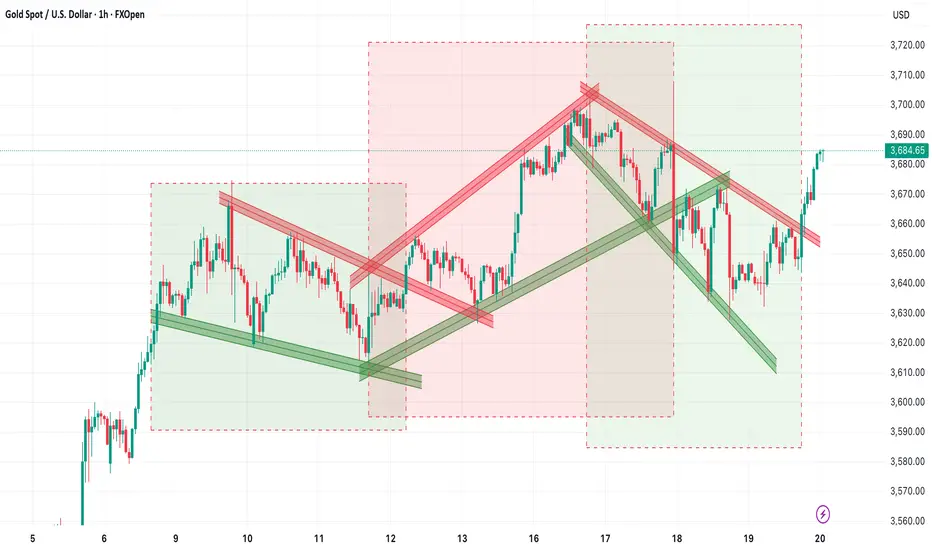
Decoding the Chart: Support, Resistance & Trendlines
Take a look at the Gold (XAU/USD) chart. At first, it may look like price is simply bouncing around. But once we draw trendlines and mark levels, a clear story unfolds.
1. Support and Resistance
- Support is where demand is strong enough to prevent the price from falling further. On the chart, the green trendlines show these bounce points.
- Resistance is where supply prevents the price from rising higher. The red trendlines highlight these areas.
Example:
If Gold bounces multiple times from the $3,630 zone, traders call it support. If it fails to cross $3,700 several times, that becomes resistance.
Traders often:
- Buy near support (with stop-loss below).
- Sell near resistance (with stop-loss above).
2. Trendlines
- Trendlines are diagonal lines drawn across swing highs or swing lows. They act like dynamic support and resistance.
- An uptrend line connects higher lows, showing bullish momentum.
- A downtrend line connects lower highs, signaling bearish pressure.
In the Gold chart:
- The green rising lines show bullish phases.
- The red falling lines show bearish corrections.
- When price breaks a trendline, it often signals a shift in trend.
3. Wedge & Patterns
- A Wedge is formed when price moves between two trendlines – one acting as support, the other as resistance.
- Ascending Wedge = Bullish structure.
- Descending Wedge = Bearish structure.
- Symmetrical Triangle = Consolidation.
- Sideways Channel = Consolidation.
In the chart, Gold moved within wedge before breaking out. This tells traders when to trade the range and when to prepare for breakout momentum.
Chart Patterns That Repeat in Every Market
Beyond support and resistance, technical analysis studies chart patterns. These are the footprints of market psychology.
1. Continuation Patterns
Indicate that the current trend will likely continue.
- Flags and Pennants
- Ascending Triangles
- Rectangles
2. Reversal Patterns
Suggest that the trend is about to change.
- Head and Shoulders
- Double Tops / Bottoms
- Descending Triangles
3. Breakouts
- When price escapes from a channel, triangle, or range, it signals a big move ahead.
In the Gold chart, you can clearly see multiple breakout points where price surged after leaving a Wedge.
Risk Management: The True Game Changer
Even the best technical setup can fail. That’s why risk management is the backbone of trading success.
Rules every trader should follow:
- Never risk more than 1-2% of account balance on a single trade.
- Always place a stop-loss.
- Follow a risk-to-reward ratio (RRR) of at least 1:2+.
- Example: Risking $100 to potentially make $200.
Avoid overtrading; patience pays.
Pros and Cons of Technical Analysis
Advantages
✔ Works across all markets – stocks, forex, crypto, commodities.
✔ Useful for intraday, swing, and long-term trading.
✔ Focuses on price action, the most direct reflection of market psychology.
Limitations
✘ False signals occur during low volume.
✘ Over-analysis can cause “paralysis by analysis.”
✘ Works best when combined with fundamentals and risk management.
Final Thoughts: Technical Analysis as a Trader’s Compass
- Technical analysis is not about predicting the market with magic. It’s about understanding probabilities, spotting patterns, and managing risks.
- When you master support, resistance, trendlines, and candlestick psychology, charts stop looking like random chaos – and start telling you stories.
Remember:
- Price is the ultimate truth.
- Risk management protects your capital.
- Consistency builds profits over time.
Whether you trade Gold, stocks, or crypto, the principles remain the same. The more you practice, the sharper your eye becomes in spotting opportunities.
So the next time you look at a chart, don’t just see candles. See the psychology of thousands of traders battling it out – and use technical analysis as your compass to navigate the markets.
Thread>>Live Examples
BEARISH SHIFT OR BULLISH CONTINUATION? ALL EYES ON SUPPLY ZONEOne of the most powerful things about the financial market:
The same system, the same discipline, and the same execution applies whether you’re trading a $100 account, a $100,000 account, or even $10 million and beyond.
Nothing changes.
Trading doesn’t change when capital increases only risk awareness does.
Same system. Same % risk. Same structure. Every week.
When you scale to larger capital (like $10M or $100M), there are certain precautions to take mainly to avoid slippage or your own orders working against you. But even then, the core process remains unchanged.
That’s the beauty of trading it’s scalable, repeatable, and completely system driven.

WEEKLY TRADE RECAPThis week offered limited opportunities just two valid trades presented by the system on Tuesday and Wednesday, both executed and managed according to plan.
✅ 3% risk per trade
✅ 3RR target
✅ Compounded as always
📈 +18.81% gain this week
At the end of each month, all profits are withdrawn, and the new month begins with a fresh starting balance. This has always been the process structured, repeatable, and disciplined.

MARKET PROFILE🔸🔸🔸 1 - Back to the Roots: Learn the Theory, Improve Signal 🔸🔸🔸
Becoming a successful trader starts with building a strong foundation of knowledge. This foundation comes from time spent in the markets and real experience. While the basic idea is easy to understand, actually building this solid base takes effort and patience.
Trading experience, careful observation, focusing on what truly matters, and understanding basic technical principles are all key parts of this foundation. Patience and awareness also play a big role in making it stronger.
Without this foundation, it’s difficult to trade well over the long term. But when you have it, you can think more clearly, make better decisions, and trust your own judgment.
In today’s fast-paced markets, some traders try to skip this step, only to realize later how important it really is. The good news is, it’s never too late to start building this foundation—you just need to dedicate the time and be ready to put in the work.
If you grasp the lessons from these experiences, you’ll see that they apply directly to your own journey as a trader. Along the way, you might also discover fresh insights about how markets really work today.
🔸🔸🔸 2 - Peter Steidlmayer 🔸🔸🔸
Peter Steidlmayer is the creator of Market Profile, a powerful tool that traders today often use through Market Profile analysis. What makes his idea special is that it didn’t come only from books or classrooms — it was shaped by his life experiences growing up on a ranch in California.
From an early age, Peter learned important lessons about value and fairness from his father. On their family ranch, his father would only sell crops when the price was fair, aiming for a reasonable profit instead of chasing big gains. If prices were too low, he’d hold on to the grain rather than selling at a loss. When buying, whether groceries or used farm equipment, his father was careful not to overpay, always seeking a fair deal. This taught Peter that value is not just a price number — it’s a relationship between price, time, and need. Paying too much means time works against you; paying less means time is on your side.
Later in college, Peter took a statistics course where he learned about the bell curve—a way to find patterns in what might look like random data. This gave him the idea that market prices also have a “fair value” area, where most trading happens, and areas away from this center that create opportunities.
He combined this with the ideas of value investing from Graham and Dodd and the concept of the “minimum trend” by John Schultz, which measures the smallest meaningful price movements. By grouping these price movements, Peter saw that prices tend to cluster around a fair value zone, forming a bell curve shape. This became the foundation for Market Profile and later, Volume Profile.
🔸🔸🔸 3 - Market Profile 🔸🔸🔸
Before we dive into Market Profile, it’s important to understand Peter Steidlmayer’s journey and how he developed Market Profile.
Through his research and testing different systems, Peter noticed that although some methods worked at first, none gave consistent or reliable results over time. The most important insight he gained was that all these approaches tried to predict future market prices — something he came to believe is impossible.
Instead of guessing where prices might go, Peter focused on finding value , which he called fair value . The goal of Market Profile is not to provide buy or sell signals but to help traders find where the true value lies.
Market Profile is a tool, not a trading system. To use it effectively, you need to understand its core principles, not just memorize fixed rules. Unlike simple buy/sell systems that stop working when market conditions change, Market Profile helps you see those changes as they happen and adapt your strategy accordingly.
Remember, market decisions always require your own judgment. Market Profile cannot predict the future — no tool can — but it helps you understand what is happening right now, so you can make better trading decisions.
Before we move on to interpreting Market Profile, we will first look at three key steps that will help build a clear foundation
Market Profile Graph: How the profile is drawn and what it represents
Market Profile on TradingView: How you can access and use this tool on TradingView
Anatomy of a Market Profile: Explanation of the key components
Once we cover these basics, we’ll be ready to focus on interpreting Market Profile and applying it in trading decisions.
📌 3.1 - Market Profile Graph
If you understand the basic principles behind Market Profile, you will be able to recognize key patterns easily, without getting confused by changes in how they are displayed.
To make this clear, I will draw the Market Profile for the trading session between 9:00 and 15:00. This will help you see how time and price interact at different levels during that trading session.
3.1.1 - Understanding the Letters in a Market Profile Chart
In a Market Profile chart, each letter represents a 30-minute time period during the trading day. The sequence starts with the letter A for the first half-hour (9:00–9:30), then B for the next half-hour (9:30–10:00), and continues alphabetically until the market closes.
This way, the chart shows not only which prices were traded but also exactly when they were active during the day.
3.1.2 - A Period (9:00 – 9:30)
This price level is where we start placing the letter A to represent the first 30 minutes. The trading day opens at 2685, marked by an arrow on the left side of the profile. (Shape a).
Shortly after the open, the price rises to 2690 (Shape b), so we place the letter A at 2690. Then, the price falls to 2680 (Shape c), and we add the letter A down to that level as well.
Next, the price climbs again to 2690 before settling back to 2680 (Shape d), which becomes the final price of the first half-hour. We do not add another A where one already exists.
The closing price of this period, 2680, is marked with an arrow on the right side of the profile.
(Note: Price Movement Shape in the chart is drawn to illustrate how the price moved within this 30-minute period.)
3.1.3 - B Period (9:30 – 10:00)
The second half-hour opens at 2680, so we place the letter B—which represents this time period—at that price level. Since the first column already has the letter A, we place this B in the second column (Shape a).
Then, the price drops to 2670, and we add the letter B down to this level, always filling the leftmost empty column. This period closes at 2675 (Shape b).
The price falls further to 2665, which is where the second half-hour ends. The final price of this period, 2665, is marked with an arrow on the right side of the profile (Shape c).
(Note: Price Movement Shape in the chart is drawn to illustrate how the price moved within this 30-minute period.)
3.1.4 - Completing the Market Profile for the Day (10:00-15:00)
As the day progresses, we continue placing the letters in this way. During the third half-hour (10:00–10:30), the decline continues. The market moves between 2665 and 2620, closing this period at 2640.
If we assume the drawing process is now understood from these examples, we can move to the end of the day. Throughout the session, prices move between 2695 and 2620, closing the day at 2670. At this point, we have the complete Market Profile for the day.
When we compare this type of chart with a candlestick chart, we see that both show the same basic information. However, the purpose here is not to track the exact price movement, but to see the value area created during the day.
By focusing on the value area, we can see how price and time interact.
The more time the price spends at a certain level, the more trading volume builds there. The higher the volume, the more the market sees that price as value.
Price + Time = Value
📌 3.2 - Market Profile on TradingView
Before we explore the key components of a Market Profile chart, it’s important to know how to display it on TradingView. There are two main ways to do this—either by changing the chart type to TPO or by adding it through the Indicators menu.
1. Enable TPO View from Chart Type Menu
Click on the Candles button at the top of your chart.
Select Time Price Opportunity (TPO) from the list of chart types.
2. Add Market Profile via Indicators
Click the Indicators button on the toolbar.
Go to the Technicals section and scroll to Profiles.
Choose Time Price Opportunity or Session Time Price Opportunity depending on whether you want the profile for the whole chart or for individual sessions.
📌 3.3 - Anatomy of a Market Profile
Let’s first explore the main components of a Market Profile chart—TPOs, Initial Balance, Extremes, Range Extensions, Fair Value, Unfair High, Unfair Low, and Value Areas. In this section, we’ll not only define each of them but also show how they appear on the chart for better understanding.
Key Components of a Market Profile Chart
Visualizing Components on a TradingView TPO Chart
3.3.1 - Key Components of a Market Profile Chart
Detailed explanations of each element that forms the structure of a Market Profile.
TPOs (Time Price Opportunities)
Each letter on the Market Profile chart is called a TPO (Time Price Opportunity). A TPO represents a specific price traded during a specific time period, showing both when and at what level the market was active. The sequence begins with capital letters (A, B, C, …), and once these are used up, it continues with lowercase letters (a, b, c, …) to represent later time periods.
Initial Balance
The Initial Balance marks the price range established during the first two letter time periods, usually represented by the letters A and B. It shows where the market first found a trading range and is often indicated on the left side of the profile with a vertical line.
Note:
If the letter time period is set to 15 minutes, each letter represents 15 minutes of trading, so the Initial Balance covers only the first 30 minutes in Tradingview.
In TradingView, you can use the Initial Balance (IB) range feature to define the key price range at the start of the session. By default, it covers 2 letters (A and B), but if you prefer, you can adjust the range to 3, 4, 5, or more bars to suit your analysis.
Extremes
An extreme is the activity that occurs at the very top or bottom of a price range, represented by two or more single TPO prints standing alone. It forms when the market tests a price level, then quickly rejects it and moves away, showing that the opposite side (buyers or sellers) stepped in with strength.
Extremes appear when the market rejects prices at the top or bottom of the range, leaving behind either a buying tail(single prints at the bottom) or a selling tail (single prints at the top). Visually, the value area forms the main “body” of the profile, while extremes extend outward like “tails.”
Note:
An extreme cannot occur in the last time period of the day, since there is no following trade to confirm rejection.
Range Extension
A range extension happens when the price moves beyond the initial balance (A and B TPOs). This expansion happens because longer-term traders step in with enough volume to push prices higher or lower. An upside extension signals active buyers, while a downside extension signals active sellers. Range extensions help reveal the influence of longer-term participants and provide important context about the market’s directional bias.
Fair Value
In a Market Profile chart, the price level with the highest number of letters (TPOs) is called the fair value. This level often corresponds to the price with the highest traded volume. If the profile shows more than one fair value level, the one closest to the midpoint of the day’s trading range is selected.
Unfair High
The highest price level of a distribution where trading activity is low. It represents an “unfair” or advantageous selling area because prices moved too high for buyers to remain interested. This level often marks the top of the range.
Unfair Low
The lowest price level of a distribution where trading activity is low. It represents an “unfair” or advantageous buying area because prices moved too low for sellers to remain interested. This level often marks the bottom of the range.
Value Area
The price range where most trading activity occurs, usually about 70% of TPOs. It shows where the market accepts price as fair, with buyers and sellers actively rotating around this level. Prices above the value area are advantageous for the longer-term seller; prices below it are advantageous for the longer-term buyer. The calculation process is:
Start with the price level that has the highest volume.
If this alone doesn’t reach 70%, compare the total volume of the one price levels above with the one price levels below.
Add the larger of the one to your total.
Repeat this process until you reach about 70% of the day’s total volume.
3.3.2 - Visualizing Components on a TradingView TPO Chart
Demonstration of how these components look directly on TradingView using the TPO chart.
With the Expand Block feature, the Market Profile is shown as separate columns, where each letter is placed in its own block. This helps you clearly see which price levels were active in each 30-minute.
Shifting the letters into the empty left column serves a special purpose. Instead of focusing on the exact price movements, this view highlights the value area created during the session. It allows traders to see where the market spent the most time and built the strongest acceptance, rather than just tracking short-term fluctuations.
🔸🔸🔸 4 - Principles of Market Profile 🔸🔸🔸
Now that we have learned how to draw the profile and the key terms used, we can move on to how to read a Market Profile chart.
Market Profile is not a ready-made trading system—it is a tool designed to support your decision-making. To use it well, you need to understand the principles behind how it works. No matter how advanced a tool is, your trading decisions will always require your own judgment—Market Profile can’t replace that.
It also cannot predict the future—but then again, no one can. What it does do is give you a clear picture of the current market situation. By understanding what’s happening right now, you put yourself in a stronger position to make better, more informed decisions.
📌 4.1 - The Auction Framework
The Auction Framework explains how the market works like an auction, helping people buy and sell. When prices go up, more buyers are attracted, willing to pay higher prices. When prices go down, more sellers enter, ready to sell at lower prices.
The market moves like an auction in two main ways: first, it pushes prices higher until there are no more buyers willing to pay more. Then, it reverses and moves down until there are no more sellers willing to sell at lower prices.
In this way, the market constantly moves up and down, balancing buyers and sellers. When the upward movement ends, the downward movement begins, and this cycle keeps repeating.
Looking a bit closer, the market moves in one direction and “asks” the other side (buyers or sellers) to respond. When the opposite side responds enough to stop the current move, the market changes direction.
In short, the market is like a continuous auction, where prices rise and fall as buyers and sellers compete—until one side runs out of interest.
📌 4.2 - Negotiating Process
When the market moves in one direction, it creates boundaries for the price range. These boundaries are called the unfair low at the bottom and the unfair high at the top. They represent price levels where the market has gone too far — these are called excesses .
Once these limits are established, the market starts trading inside this range. It moves between the unfair low and unfair high to find a fair price , which we call value . In other words, the market negotiates within this range to settle on value.
If you pause the market at any moment, you will notice three important points:
Unfair low (the lowest excess)
Unfair high (the highest excess)
Value (somewhere in the middle)
These three points show how buyers and sellers negotiate prices in the market.
📌 4.3 - Time Frame
Markets are always shaped by two different forces: short-term traders and long-term traders. Both are active at the same time, but their goals are very different.
Short-term traders are focused on “fair price” for the day. When the market opens, price moves up and down as these traders search for a balance point where both buyers and sellers agree. If the open is inside the previous day’s range, short-term activity usually dominates. They don’t wait for the perfect deal—they just need a reasonable price to complete their trades quickly, like a business traveler who buys a ticket at the going rate without shopping around.
Long-term traders , on the other hand, are more strategic. They are not in a hurry to trade today. They wait for an advantageous price—something too high or too low compared to value. When they step in with enough volume, they can break the balance and extend the market range. This is how trends begin. You can think of them as a vacation traveler who has time to wait for the best discount fare.
Because long-term buyers see value at low prices and long-term sellers see value at high prices, they rarely meet in the middle. Instead, the market swings: rising to create opportunity for sellers, falling to create opportunity for buyers.
The result is a constant cycle: balance, imbalance, and back to balance. Day-to-day order flow is shaped by short-term traders, but big moves and directional trends come from long-term players. At the extremes—whether too high or too low—it’s always the long-term traders who take control.
📌 4.4 - Balance and Imbalanced
The market helps people buy and sell by moving repeatedly between states of imbalance and balance. This happens both within a single trading session and over longer-term trends.
When the market is balanced , buying and selling are roughly equal. This means the market has found an opposing force and is trading around a fair price where buyers and sellers agree.
When the market is imbalanced , either buying or selling dominates. The market moves up or down directionally, searching for the opposite reaction and a fair price to trade around.
In short:
A balanced market has found a fair price.
An imbalanced market is still looking for that fair price.
This is simply another way of stating the law of supply and demand: buyers want to buy, sellers want to sell, and the market is either in balance or trying to get there.
📌 4.5 - Day Timeframe Structure
The idea of day structure comes from how the market looks for a fair price where both buyers and sellers are willing to trade. If a price is unfair, trading will stop there, and the market will move until balance is found.
The first hour of trading sets the initial balance . This range is like the “base” of the day. A wide base is more stable, while a narrow base is weak and often leads to bigger moves later in the day. Just like the base of a lamp keeps it standing, a wide initial balance provides stability, while a narrow initial balance is easier to “knock over,” leading to bigger moves and range extensions.
When longer-term traders enter, they can break this balance. If they act small, the market moves only a little. If they act strong, the market can move far and leave signs, like tails on the profile. Tails show where longer-term traders rejected extreme prices.
By watching the initial balance and the activity of longer-term players, traders can recognize different day types . Each type gives clues about short-term trading opportunities and the market’s bigger direction.
The main balanced types are:
Normal Day
Neutral Day
The main imbalanced types are:
Normal Variation Day
Trend Day
4.5.1 - Normal Day
On a Normal Day , the market is in balance and longer-term traders have little influence. The Market Profile often looks like a classic bell curve , where most trading happens around a fair central price. At the extremes, prices are rejected—buyers stop above and sellers stop below—keeping the market balanced.
Key Characteristics:
The key sign of a Normal Day is the initial balance (first hour’s range), which usually makes up about 85% of the entire day’s range . In other words, the first hour often defines how the rest of the day will unfold.
If any range extension happens, it usually comes late in the session.
Dynamics:
In terms of volume, around 80% comes from short-term traders and only 20% from longer-term participants . Because long-term players are mostly inactive, the market doesn’t trend strongly and instead stays contained within the initial balance area.
4.5.2 - Neutral Day
A Neutral Day occurs when both long-term buyers and sellers are active, but neither side gains control. Their efforts cancel each other out, so price extends beyond the initial balance in both directions , then returns to balance.
Key Characteristics:
Range extensions above and below the initial balance.
Close near the middle of the day’s range.
Initial balance is moderate in size —not as wide as a Normal Day, not as narrow as a Trend Day.
Often shows symmetry : the upside and downside extensions are about equal.
In terms of volume, around 70% comes from short-term traders and only 30% from longer-term participants .
Dynamics:
Uncertainty dominates. Long-term traders test prices higher and lower, but without strong follow-through, their activity neutralizes. Short-term traders make up most of the volume, keeping the market contained. This indecision often leads to repeated neutral days , as neither side has enough conviction to drive a clear trend.
4.5.3 - Normal Variation Day
A Normal Variation Day happens when long-term traders play a more active role than on a Normal Day, usually making up 20–40% of the day’s activity.
Key Characteristics:
Their involvement leads to a clear day extension beyond the initial balance, often about twice the size of the first hour’s range.
The initial balance is not as wide as on a Normal Day, making it easier to break.
As the day develops, long-term traders enter with conviction and push price beyond the base (range extension).
Price may extend in one direction but eventually finds a new balance area.
Volume split: 60–80% short-term traders, 20–40% longer-term traders.
Dynamics:
Early trading looks balanced and controlled by short-term participants. Later, longer-term buyers or sellers step in more aggressively, causing the day’s range to expand. If the extension is small, their influence is limited.
4.5.4 - Trend Day
A Trend Day occurs when long-term traders dominate the market, pushing it strongly in one direction. Their influence creates maximum imbalance and range extension , often lasting from the open to the close.
Key Characteristics:
The close is usually near the day’s high or low (about 90–95% of the time).
Volume is split roughly 40% short-term traders and 60% long-term traders .
The profile shape is elongated and thin , unlike the balanced bell curve of a Normal Day.
Price moves in one-timeframe fashion : each period makes higher highs in an uptrend or lower lows in a downtrend, with little to no rotation.
Dynamics:
Trend Days often start with a narrow initial balance , quickly broken as long-term participants step in with strong conviction.
The move may be triggered by news, stop orders, or a strong shift in sentiment.
As the trend unfolds, new participants are drawn in, fueling continuous directional movement.
There are two types:
Standard Trend Day – one continuous directional move.
Double-Distribution Trend Day – an initial balance and pause, followed by a second strong directional push that creates a new distribution area.
📌 4.6 – Initiative and Responsive Activity
In Market Profile, it’s important to know whether longer-term traders are acting with initiative (pushing the market) or responding (reacting to prices that look too cheap or too expensive). You can figure this out by comparing the day’s action with the previous day’s value area.
Responsive Activity happens when traders behave in an expected way.
Buyers step in when prices drop below value (cheap).
Sellers step in when prices rise above value (expensive).
This behavior maintains balance and is typical in Normal or balanced days.
Example: price falls below yesterday’s value area → buyers enter → responsive buying.
Initiative Activity happens when traders behave in an unexpected way.
Buying takes place at or above value (where you’d normally expect selling).
Selling takes place at or below value (where you’d normally expect buying).
This shows strong conviction and usually drives imbalance or trend.
Example: price above yesterday’s value area continues to attract buyers → initiative buying.
Quick Rules (relative to the previous day’s value area):
Above value → Selling = responsive, Buying = initiative
Below value → Buying = responsive, Selling = initiative
Inside value → Both buying and selling are considered initiative , but weaker than outside activity.
Why it matters
Responsive action keeps the market balanced → often short-term focused.
Initiative action pushes the market to new areas of value → often starts trends.
In short, responsive moves are reactions to “fair or unfair” prices, while initiative moves show conviction to create new value levels.
🔸🔸🔸 5 - Strategy 🔸🔸🔸
Trading is never about finding a magic formula—it’s about reading the market and making decisions with context. Market Profile doesn’t give you fixed answers like “buy here, sell there.” Instead, it provides market-generated information that helps you recognize when conditions are shifting and when an opportunity has a higher probability of success.
Just like in teaching, if someone only looks for answers without understanding the reasoning, they miss the bigger lesson. In trading, the same is true: rules without context are dangerous. Market Profile teaches us how to think about the market, not just follow signals blindly.
That said, there are special situations in Market Profile where the structure itself points to a high-confidence setup. These are not guarantees, but they often create trades that “almost have to be taken,” provided the overall market context supports them.
Below are a few of the special strategies I’ll cover in detail. The goal is not to memorize fixed rules but to understand the logic behind them. By learning the reasoning, you’ll see why these setups matter and how to use them in practice with your Market Profile indicator.
3-1 Days
Neutral-Extreme Days
Spike
📌 5.1 - 3-1 Days
Among the special setups in Market Profile, the 3-1 Day is one of the most well-known. It signals a strong conviction from longer-term traders and often leads to reliable follow-through the next session.
Below is a practical, step-by-step guide you can follow when you spot a potential 3-1 Day. I give rules for identification, entry options (conservative → aggressive), stops, targets, trade management and failure signals. Keep it mechanical but always use judgement.
What is a 3-1 Day
A 3-1 Day occurs when three things line up in the same direction:
an initiative tail (single-print tail showing rejection at an extreme),
range extension beyond the Initial Balance, and
TPO distribution that favors the same direction.
When they align, longer-term players are showing conviction and follow-through is likely.
Step 1 - Identify & confirm the 3 signals
Confirm all three before trusting the set-up:
Initiative tail
• Look for single-print tail(s) at an extreme (top for selling tail, bottom for buying tail).
• The tail must be initiative, not just reactive — ideally it sits outside or within prior day value area and is followed by continued action in the same direction.
• A tail is valid only if price is rejected in at least one subsequent time period (i.e., it’s confirmed).
Range extension
• Price extends beyond the Initial Balance (A+B hour).
• The extension should be clear (not just a one-tick TPO). On many 3-1 examples extension is large and directional.
TPO count / profile bias
• The profile shows more TPOs on the extension side.
• TPOs favor the trend (more time/acceptance on the extension side).
Step 2 — Decide entry approaches
Conservative (recommended)
• Wait for the next day open to be within or better than the previous day’s value area (statistically highly probable after a 3-1).
• If next-day open confirms (opens in the trend direction or inside value but not against you), enter with a defined stop just beyond the tail/extreme.
• Advantage: extra confirmation, lower chance of false continuation.
Standard intraday (balanced)
• Enter after the tail + extension + TPO bias are visible and price pulls back to a logical support/resistance area:
• Buy: pullback into single-print area / inside single prints or into the upper edge of the prior value area.
• Sell: mirrored logic for downside.
• Place stop just beyond the tail extreme (a few ticks/pips beyond the single prints), or a tight structural stop below/above the retest.
Aggressive
• Enter as soon as price breaks out of the initial balance and shows range extension.
• Because this approach carries more risk of a false breakout, you should use the smallest position size and the tightest stop. If the breakout continues, you capture the move early and maximize reward. If it fails, your loss is limited because of the tight stop and small size.
📌 5.2 - Neutral-Extreme Day
A Neutral-Extreme Day starts as a neutral day (range extensions both above and below the Initial Balance) but closes near one extreme . That close signals a short-term “victor” among longer-term participants and gives a high-probability bias into the next session.
Neutral-Extreme Days are powerful because they combine both-sided testing (neutrality) with a clear winning side at the close. That winner often carries conviction into the next session — but always use proper stops and watch for early failure signs. Treat the setup as a probability edge, not a certainty.
Step 1 - Identify the Neutral-Extreme Day
Confirm the day was neutral : range extensions occurred both above and below the IB during the session.
Check the close : it is near the day’s high (neutral→high close) or near the day’s low (neutral→low close).
Note:
The close near an extreme indicates one side “won” the day and increased conviction.
Step 2 - Decide entry approaches
Conservative (recommended)
• Wait for the next days' open.
• If price of following days' opens
above the Neutral Day’s Value Area and the Neutral Day closed near the high => Long
below the Neutral Day’s Value Area and the Neutral Day closed near the low => Short
• Place stop just beyond the opposite edge of the previous day’s VA or slightly beyond today’s extreme.
Standard intraday (balanced)
• Wait for the next day’s first 30–90 minutes
• If price above the Neutral Day’s VA(or below the Neutral Day’s VA for short)
• Enter during the next day when early initiative activity confirms continuation
• Place stop just beyond the opposite edge of the Neutral day’s VA
Aggressive
• Enter at close of the Neutral-Extreme day, expecting continuation
• Use small size and a tight stop because overnight/new-session risk exists.
Example - 1
Example - 2
📌 5.3 - Spike
A spike is a fast, a few time periods move away from Value Area of trading session. Because it happens near the close, the market has not had time to “prove” the new levels (Price + Time = Value). The next session’s open and early activity tell you whether the spike will be accepted (continuation) or rejected (reversion).
1 - How to identify a spike
A spike starts with the period that breaks out of the day’s value area (the breakout period).
The spike range is from the breakout period’s extreme to the day’s extreme in the spike direction.
It is typically a quick, directional move in the last few time periods of the session.
2 - Acceptance vs Rejection - what to watch for next day
Because the move happened late, you must wait until the next trading day to judge follow-through. Early next-day activity shows whether value forms at the spike levels (acceptance) or not (rejection).
Accepted spike (continuation):
Next day opens beyond the spike (above a buying spike, below a selling spike), or
Next day opens inside the spike and then builds value there (TPOs/volume accumulate inside the spike).
Both cases mean the market accepts the new levels and continuation in the spike direction is likely.
Rejected spike (failure):
Next day opens opposite the spike (below a buying spike or above a selling spike) and moves away.
This indicates the probe failed and price will likely move back toward prior value.
3 - Spike Reference Points
Openings within the spike:
If next day opens inside the spike range → day is likely to balance around the spike.
Expect two-timeframe rotational trade (sideways activity) within or near the spike.
Treat the spike as a short-term new base : use the spike range (top-to-bottom of spike) as an estimate for that day’s range potential.
Openings outside the spike:
Open above a buying spike: very bullish - initiative buyers in control.
Trade idea: look to buy near the top of the spike (spike top becomes support).
Caution: if price later auctions back into the spike and breaks the spike top, the support may fail quickly.
Open below a selling spike: very bearish — initiative sellers in control.
Trade idea: look to short near the bottom of the spike (spike bottom becomes resistance).
Open above a selling spike (rejecting the spike): bullish day-timeframe signal, often leads to rotations supported by the spike top as support.
Open below a buying spike (rejecting the spike): bearish.
4 - Decide entry approaches
Conservative (recommended)
• Wait for next-day open and confirmation (open beyond spike or open inside then build value inside spike).
• Enter on a pullback toward the spike extreme (top for long, bottom for short).
• Place stop just beyond the opposite spike extreme.
Standard intraday (balanced)
• Enter at the open if it is above/below the spike in the spike direction.
• Use tight size and tight stop (higher risk / higher reward).
Aggressive
• Enter when early session shows initiative in spike direction (strong TPO/volume buildup).
• Stop under/above the spike extreme or an early structural swing.
🔸🔸🔸 6 - Conclusion 🔸🔸🔸
Becoming a proficient trader is much like designing with wood. At first, you study the fundamentals—understanding different types of wood, their strengths, how they react under load, and how joints transfer forces. Then you begin by following standard rules and templates, carefully measuring and cutting according to the book. Along the way, the tools you use—whether it’s a simple saw or advanced CNC machines—shape the quality of your work. Without the right tools, even solid knowledge can fall short. With practice, however, you learn not only how to apply the theory but also how to make the most of your tools, combining both into a process that feels natural and efficient. Eventually, you stop focusing on each detail step by step and instead feel how to create a structure that is both strong and elegant. Trading develops in the same way—starting from theory, moving through repetition, and finally reaching intuitive proficiency.
Success in trading is not about memorizing every pattern but about combining three essential elements: Theory + Your Judgment + Tools = Results . Theory provides the foundation, judgment comes from experience and self-awareness, and tools like TradingView allow you to test, visualize, and refine your edge. Together, these elements build the confidence to act decisively in live markets.
The strategies we explored—such as 3-1 Days, Neutral-Extreme Days, and Spikes —are valuable examples of how Market Profile structure can highlight high-probability opportunities. But now that you understand how profiles are built and the principles behind them, you are equipped to create and test your own strategies. Developing a personal approach not only strengthens your decision-making, it also raises your confidence level—one of the most important skills a trader can have.
In the end, Market Profile is not about rigid answers but about learning to think in market terms. Once theory and experience merge into intuition, opportunity becomes something you recognize instinctively—just as a fluent speaker understands meaning without translation. That is the essence of proficiency: not just knowing the rules, but mastering the ability to trade with clarity and conviction.
🔸🔸🔸 7 – Resources 🔸🔸🔸
If you’d like to deepen your knowledge of Market Profile and its applications, the following books are highly recommended:
A Six-Part Study Guide to Market Profile – CBOT
A clear and structured guide that introduces Market Profile theory step by step, making it accessible for both beginners and intermediate traders.
Steidlmayer on Markets: Trading with Market Profile – J. Peter Steidlmayer, Steven B. Hawkins
Written by the creator of Market Profile, this book lays out the foundational concepts and demonstrates how profiles reveal the auction process behind price movement.
Markets in Profile: Profiting from the Auction Process – James F. Dalton, Eric T. Jones, Robert B. Dalton
A modern exploration of how the auction process applies to today’s markets, combining Market Profile concepts with behavioral finance and practical strategy.
Mind Over Markets: Power Trading with Market Generated Information – James F. Dalton, Eric T. Jones, Robert B. Dalton
Considered a classic, this book provides a comprehensive framework for understanding and applying Market Profile. It bridges theory with practical trading insights, making it a must-read for serious traders.
GBPUSD LONGPrice has continued to push upward as anticipated in yesterday’s analysis. A short-term pullback may be on the horizon possibly this week or next but we don’t have confirmation yet.
For today’s trade, we stayed aligned with the current bullish momentum:4H demand remains in control, supported by 5M structure. Entry was taken on the 15s chart as usual. Exited clean at 3RR.
Same system. Same rules. Just executing it everyday
MT5& Chart entry in the comments

GBPUSD LONGHey, I’ve been away from the charts for the past week — took some time off to enjoy a family vacation and fully unplug. But we’re back now, as if we never left.
Last week, I shared a bullish bias based on the 4H timeframe, noting the liquidity resting above that could attract price. The market moved exactly as expected, sweeping that liquidity zone.
At this stage, I anticipate a potential short-term pullback — or, if momentum continues, we may see the bullish move extend further.
For today’s trade:
Price remained bullish on the 4H, and 5M demand continued holding. Took a long and exited clean at 3RR, following system rules.
MT5&Entry Charts in the comments

EURUSD: Big Liquidity Trap in Play – Smart Money Short AheadLiquidity sweep is done. Refined 1H supply zone above price is where Smart Money is waiting. Here’s the full breakdown 👇
🔎 Market Context
Weekly CHoCH confirmed bullish rally from 1.1608 lows.
Price swept the H Week of 1–5 → H Week of 8–12, tapping into liquidity.
Now consolidating mid-range, showing signs of distribution.
---------------------------------------------------------------------------------------------------
📌 Key Observations
Liquidity Grab above prior highs into supply.
Refined 1H POI overhead (purple zone) = high-probability short trigger.
BOS confirms bearish intent after rejection.
Multiple downside liquidity targets remain untested.
---------------------------------------------------------------------------------------------------
🎯 Trade Plan
Entry: Wait for mitigation + rejection inside 1H POI (confirmation on lower TFs).
Stops: Above 1.1784 liquidity sweep.
Targets:
TP1 → 1.1700 (first liquidity shelf)
TP2 → 1.1661 (Weekly Low 8–12)
TP3 → 1.1608 (major demand zone)
------------------------------------------------------------------------------------------------------
⚖️ Risk–Reward
Setup offers 3R–5R potential.
Bias remains bearish unless price reclaims & closes above 1.1779.
-------------------------------------------------------------------------------------------------------
📢 Final Note
This idea highlights how liquidity sweeps + POI refinement create low-risk, high-reward setups. Patience pays — don’t chase inside chop.
💬 What’s your bias on EURUSD? Do we reject the supply zone or break higher? Drop your thoughts 👇

Forget the USD–Gold Correlation: Trade What MattersI took my first steps in the markets back in 2002 with stock investments. Real trading, however—the kind involving leverage, speculation, and active decision-making—began for me in 2004.
Like any responsible beginner, I started by taking courses and reading the classic trading books. One of the first lessons drilled into me was the inverse correlation between the US dollar and gold.
Fast forward more than 20 years, and for the past 15, XAUUSD has been my primary focus. And here’s the truth: I’m here to tell you that relying on USD–gold correlation is a mistake.
In this article, I’ll explain why you should avoid it, and more importantly, I’ll show you how to think like a “sophisticated” trader—especially if you can’t resist looking at the DXY .
Let’s Dissect the Myth
And for those who will say: “How on earth can you call this a mistake? Everyone knows gold moves opposite to the dollar!” — let’s dissect this step by step.
There couldn’t be a better example than 2025. We’re in the middle of a clear bullish trend in gold. Prices are climbing steadily, but not only against USD.
If gold were truly just the inverse of DXY, this overall rally wouldn’t exist. But it does. Why? Because the real driver isn’t the dollar falling — it’s demand for gold itself . Central banks are buying, funds are reallocating, and investors see gold as a store of value.
The Simple Logic That Breaks the Correlation
If it were truly a mirror correlation, then XAU/EUR would have been flat for years. Think about it: if gold only moved as the “inverse of the dollar,” then against other currencies it should show no trend at all. But the charts tell a completely different story.
Gold has been rising not just in USD terms, but also in EUR, GBP, and JPY. That means the move is not about the dollar being weak — it’s about gold being in demand.
This simple observation destroys the illusion of a strict USD–gold inverse correlation. If gold climbs across multiple currencies at the same time, the driver can’t be the dollar. The driver must be gold itself.
Why Correlation Thinking Creates Frustration
This is exactly why I tell you to ignore the so-called correlation: because it distracts you. You end up staring at the DXY when in reality, you’re trading the price of gold.
And that’s where frustration kicks in. You’re sitting on a position, watching the dollar index going higher, and you start yelling at the screen: “DXY is going up, so why isn’t gold falling? Why is my short position bleeding instead of working?”
I’ve been there many years ago, I know that feeling. But here’s the truth: gold doesn’t care about your correlation. It doesn’t care that DXY is green, red or pink. It moves on its own flows. And when you finally accept that, your trading becomes much cleaner. You stop being trapped by illusions and start focusing on the only thing that matters: the demand and supply of gold itself.
Where the Confusion Comes From
So where does all this confusion come from? Let’s take an example: imagine we get a very bad NFP number. That translates into a weaker USD. What happens? XAUUSD ticks higher.
Now, most traders immediately scream: “See? Inverse correlation!” But that’s not what’s really happening. The move you’re seeing is just a re-alignment of gold’s price in dollar terms. It’s noise, not a fundamental shift in gold’s trend.
If gold is in a downtrend overall, this kind of move doesn’t suddenly make it bullish. It’s just a temporary adjustment because the denominator (USD) weakened. On the other hand, if gold itself is already strong, such an event can act as an accelerator, pushing the trend even stronger.
The key is this: the dollar can influence the short-term pricing of XauUsd, but it doesn’t define the trend of gold. That trend is driven by demand for gold as an asset.
A Recent Example That Says It All
Let’s take a very recent example. Over the past month, DXY has been stuck in a range — no breakout, no major trend. Yet gold hasn’t just pushed higher in USD terms, it has made new all-time highs in XAU/EUR, XAU/GBP, and other currencies as well.
Why? Because gold rose. Not because the dollar fell, not because of some neat inverse chart overlay. Gold as an asset was in demand — globally, across currencies.
This is the ultimate proof that gold trades on its own flows. When buyers want gold, they don’t care whether DXY is flat, rising, or falling. They buy gold, and the charts across multiple currencies show it.
What Sophistication Really Looks Like
If you really want to be sophisticated, here’s what you do:
You see a clear bullish trend in XAUUSD. At the same time, you notice a clear bearish trend in EURUSD — which means the dollar is strong. Most traders get stuck here. Their brain short-circuits: “Wait, how can gold rise if the dollar is also strong?”
But the sophisticated trader doesn’t waste time arguing with a textbook correlation. Instead, they look for the trade that makes sense: buy XAU/EUR.
Because if gold is strong and the euro is weak, the real opportunity isn’t in fighting with DXY — it’s in positioning yourself where you can earn more. That’s not correlation thinking. That’s flow thinking.
Final Thoughts
The dollar–gold inverse correlation is a myth that refuses to die. Traders cling to it because it feels simple and safe. But real trading requires letting go of illusions and facing complexity head-on.
Gold is an independent asset. It rises and falls because of demand, not because the dollar happens to be moving the other way. Once you stop staring at DXY and start trading the flows that actually drive gold, you’ll leave frustration behind and step into sophistication.
🚀 If you still need DXY to tell you where gold is going, you’re not trading gold — you’re trading your own illusions.
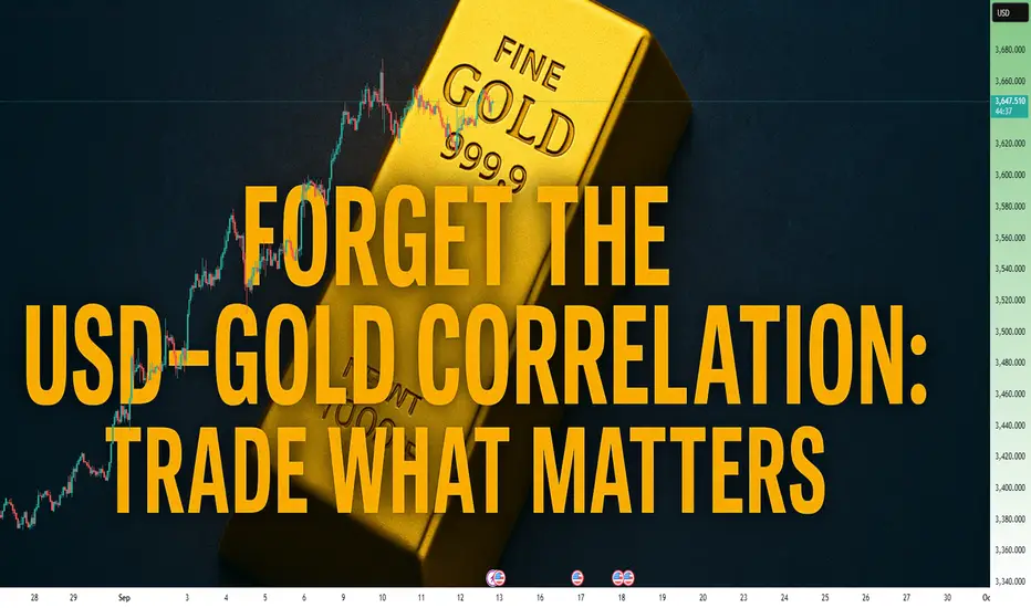
XAUUSD At Critical PRZ: Will Gold Reverse or Break to New Highs?Hello Traders And Investors
XAUUSD At Critical PRZ: Will Gold Reverse or Break to New Highs? 🔥”
The recent price action on Gold (XAUUSD) has reached a very critical level near $3,586 – $3,600, which aligns with a strong resistance zone. This area is marked as a Potential Reversal Zone (PRZ), where sellers may step back into the market.
🔍 Market Structure Breakdown:
Previous Liquidity Sweep
Price collected liquidity below the July lows before forming a Higher Low at the start of August.
This move gave the market strength to push higher, creating a clean bullish structure.
Strong Impulsive Rally
From mid-August onwards, gold showed a strong bullish impulse, breaking through minor resistance levels without much pullback.
However, such parabolic moves often lack sustainability, making them vulnerable to a healthy correction.
Resistance & PRZ Reaction
The current resistance zone has historically acted as a strong rejection level.
Price tapping into this zone suggests exhaustion in bullish momentum, increasing the probability of a short-term pullback.
🎯 Target Zones for Downside Move:
1st Target: $3,480 – $3,500
This area coincides with a previous demand block and will act as the first reaction point.
Final Target: $3,330 – $3,320 (Key Support)
If bearish momentum sustains, price could revisit this major support, completing the correction phase before potentially resuming the broader uptrend.

TATASTEEL LTD 240 MINS TIME FRAME - MY VIEW ONLYThe Structure looks good to us, waiting for this instrument to correct and then give us these opportunities as shown on this instrument (Price Chart).
Note: Its my view only and its for educational purpose only. Only who has got knowledge about this strategy, will understand what to be done on this setup. its purely based on my technical analysis only (strategies). we don't focus on the short term moves, we look for only for Bullish or Bearish Impulsive moves on the setups after a good price action is formed as per the strategy. we never get into corrective moves. because it will test our patience and also it will be a bullish or a bearish trap. and try trade the big moves.
We do not get into bullish or bearish traps. We anticipate and get into only big bullish or bearish moves (Impulsive Moves). Just ride the Bullish or Bearish Impulsive Move. Learn & Know the Complete Market Cycle.
Buy Low and Sell High Concept. Buy at Cheaper Price and Sell at Expensive Price.
Please keep your comments useful & respectful.
Keep it simple, keep it Unique.
Thanks for your support
Tradelikemee Academy
Saanjayy K G

Gold (XAUUSD) Technical OverviewPrice is currently moving within the 3445–3450 range, showing short-term bearish pressure. The area around 3430 is an important level to watch.
A sustained H4 close below 3430 could open the way toward the next support zone near 3405–3390.
If price instead shows a bullish reversal from the 3430 region, upside retests toward the 3460 resistance area may follow.
This setup highlights 3430 as a key pivot for short-term directional bias. Traders should monitor how price reacts around this zone before planning the next steps.

LAST SHORT & TRADE OF THE MONTHTook the short after 5M supply held the chain — a rare but high-quality 5M zone.
4H demand also held strong, and price cleared all remaining short-term liquidity.
There was no real reason for lower pricing after that point.
Exited at 3RR.
4H Bias
5M confirmation
15S Entry.

GBPUSD LONGTook a quick long from a 4H demand zone. I wasn’t fully confident the 4H zone would hold, but once the 5M order flow shifted, I stepped in. Took profit and stepped out — just managing risk with caution. The zone might still hold, but I chose to stay sharp, not stubborn.

GBPUSD LONG LOSSTried to follow up on the bullish move from the 4H, which aligned with 5M demand. Took it from the 5M inside bar — as shown on the screen.
Price did what it always does. Same system. Same rules. Different day.

GBPUSD Monday LONGEntry came earlier than expected — which was a good sign. Exited after 3RR. Clean start to the week. MT5 screenshot is now attached directly to the image for full clarity.
Also, a quick note: If you ever saw any of my posts hidden in your feed, it’s likely due to an MT5 Imgur link I shared. It was the only way to display execution screenshots at the time. That’s now fixed — all MT5 visuals will be directly uploaded from now on. Just documenting trades and system performance. Nothing else.

WEEKLY PERFORMANCE RECAPWeekly Performance Recap
Week Ending: August 22
Trades Taken: 6
Results: 3 Wins • 3 Losses
Risk Model: 3% per trade • 3RR target • Monthly compounding.
Week Outcome: +18.19% gain
Note: Any of my previous posts that were hidden were likely due to MT5 Imgur links, as confirmed by TradingView support. No promotions — just a documentation of trades and performance.

Just Because It’s Big Doesn’t Mean It’s SmartJPY Call Spread Breakdown: Bullish Signal — Or Just Obvious FOMO?
A new vertical call spread appeared in JPY options yesterday (per CME Globex data):
Long 0.0069 Call
Short 0.007025 Call
🎯 Target: 0.007025 — upside continuation play.
Open interest increased at both strikes → new position, not a roll.
Size? Relatively large for JPY (based on systematic observations).
⏰ When Was It Opened?
9:45 AM CT — after yesterday’s sharp rally in JPY futures.
In fact — right at the top of the move.
📌 Not before the move.
But after the impulse, on momentum.
🔍 Combining Flow + Chart Context:
Price had already spiked up.
The spread bets on further upside .
🧠 Key Takeaways:
✅ Sentiment: Bullish
❌ Predictive value: Low — nearly zero
Why?
The setup is too obvious.
No evidence of insider-like timing.
If this had been placed before the move — yes, it would matter.
But opening at the peak? That’s not edge — it’s FOMO dressed as strategy.
🚫 Will I go long JPY futures based on this?
No.
Not because I doubt the move.
But because this isn’t smart money behavior — it’s trend-chasing.
🎯 Final Lesson:
Not every large options trade is a signal.
Always ask:
When was it placed?
Why here?
Who’s behind it?
🔍 True edge isn’t in the trade itself — it’s in the context around it.