Unlocking Altseason: Chart Signals You Can't IgnoreAltseason without myths: what actually shows up on charts before alts go crazy
Everyone loves to say “altseason is coming” the same way kids say “summer is coming” in March. Feels good, zero responsibility.
But altseason isn’t magic. It’s just money rotating. And that rotation leaves fingerprints on the charts way before your favorite microcap does +500%.
Let me walk you through the main conditions I usually want to see before I start taking alt setups seriously – not memes, not hopium, just price.
1. King Bitcoin does his move first
Healthy altseasons rarely start from flat Bitcoin.
Typical pattern:
- First, a strong impulsive move up on BTC
- After that move, BTC stops trending and starts chopping in a range
- Volatility cools down, candles get smaller, volume drops
TL;DR: Big boys rode BTC, locked in chunky profits, and now their fresh capital is looking for higher beta plays. That’s when alts start feeling “lighter”.
If BTC is nuking or making fresh parabolic highs every day, alts usually just get dragged around like bags on a train.
2. BTC dominance stops climbing and starts bleeding
Open BTC.D (Bitcoin dominance) and zoom out.
Before most big alt runs, I usually see:
- A clear uptrend in dominance while BTC is running
- Then a topping structure: double top, lower high, or a fake breakout above the previous high
- And then – the key part – a confirmed breakdown with lower lows
That’s literally money leaving BTC relative to alts.
No need to overcomplicate:
Rising dominance – market respects Bitcoin.
Falling dominance – market starts gambling on the side quests.
3. ETH vs BTC wakes up
ETHBTC is my canary in the coal mine.
If ETH can’t even beat BTC, why should I expect your random GameFi coin to do it?
Before many altseasons I’ve watched:
- ETHBTC prints a base or higher low
- Breaks local resistance
- Starts grinding up, even if slowly
ETH often leads the rotation. When this pair wakes up, liquidity is starting to accept “more risk”.
4. Total alt market cap breaks structure
Open TOTAL2 or TOTAL3 – that’s your x-ray of altcoins as a whole.
What I like to see:
- A clear downtrend turning into a sideways accumulation range
- Higher lows forming under a big horizontal resistance
- Breakout of that resistance with expanding volume
That’s not your random lucky pump – that’s the whole sector getting repriced.
5. Volume rotation: BTC quiet, alts noisy
Check the volume bars:
- BTC: volume fades while it ranges
- Major alts: volume spikes on green days, pullbacks on lower volume
That’s exactly what “rotation” looks like. Money doesn’t appear from nowhere – it walks from chart to chart.
Maybe I’m wrong, but I think “altseason” is mostly a marketing word influencers use when they ran out of Bitcoin content. On charts it’s just a sequence:
BTC pumps → BTC chills → dominance tops → ETHBTC turns → alt market cap breaks out → volume rotates.
Last nuance: don’t try to guess the exact start like it’s New Year’s midnight. Focus on conditions, not dates. When several of these signals line up, I start hunting alt setups. When they disappear, I stop dreaming about 50x and go back to trading what the market actually gives.
In the end, altseason is just greed with a chart pattern. Learn to spot the pattern – and the greed will find you on its own.
ETH-D

Ethereum’s CME Gap: The Hidden Price Magnet Traders Are WatchingEthereum currently has a CME gap between $2,405 and $2,665, which remains unfilled. Historically, CME gaps tend to get filled over time, making them an important reference for both swing traders and long-term market participants. These gaps represent areas where liquidity was temporarily unavailable, and the market often “returns” to these levels to close the inefficiency.
At present, price has moved significantly away from this gap range. This makes a short-term fill less likely, as the market would need a meaningful correction or retracement to reach it. Momentum, overall trend strength, and macro factors can all influence how quickly or slowly the gap might be revisited.
Despite this, the gap should not be ignored. It remains a high-probability zone for future price action, potential support/resistance reactions, and liquidity collection. Traders should keep this range marked on their charts as a reference point.
In summary, while Ethereum may not fill this CME gap immediately, these levels are likely to be revisited eventually. Awareness of this zone can help traders plan entries, exits, and risk management strategies more effectively, keeping in mind that gaps often act as natural “magnets” for price over time.
If you have a coin or altcoin you want analyzed, first hit the like button and then comment its name so I can review it for you.
This is not a trade setup, as it has no precise stop-loss, stop, or target. I do not publish my trade setups here.

Ethereum turns bullish, confirmed through price action (PP: 40%)Since the start of the drop 14-January, Ethereum never managed to close more than two days green. Clearly showing an overwhelming pressure coming from sellers. This pattern has been broken and this is good news.
Ethereum already closed three days green and today is the fourth. The day started red, but all selling was quickly bought leaving the session with a long lower shadow. Bullish confirmation.
The previous all-time high started from a low 22-June 2025. The end of the correction and recovery is happening right around this level.
Today, Ether is moving back above this low, $2,113, showing that the bulls have gained control of this chart, with the chart the market.
The bulls now have control of the market, which simply means we are going up next. Do you agree?
The first target sits within a range between $2,800 - $3,000. That's a 40% move in the making short-term. Are you ready?
Thank you for reading.
Namaste.

Ethereum Price Continues to Range, is $946 Next?Ethereum price action continues to trade within a well-defined higher-timeframe trading range, with current conditions suggesting increased downside risk. Price is presently testing the point of control, which has produced a short-term bounce on the lower timeframes. While this reaction is technically valid, it appears weak in nature and lacks strong bullish follow-through.
On the weekly timeframe, this bounce is unfolding directly into a key bearish order block, reinforcing the importance of the current price zone. Historically, reactions into bearish order blocks within range environments often act as supply zones, where sellers reassert control. If Ethereum fails to reclaim acceptance above this region, the probability of rejection increases.
From a structural perspective, loss of the point of control would signal a shift back toward imbalance. Such a move would likely trigger a rotational move lower within the broader range structure. In this scenario, attention turns to the range low support near the $946 level, which represents the next major downside target.
From a technical, price action, and market structure perspective, Ethereum remains vulnerable. A confirmed rejection from the bearish order block combined with acceptance below the point of control would significantly increase the likelihood of a deeper corrective phase unfolding before any meaningful recovery attempt.

Ethereum long-term —The bear market is over?Ethereum did not produce a major new all-time high in 2025, there is no need for a major bear market.
A bear market is a long-term correction, the market seeking balance.
Extraordinary growth can lead to an extraordinary bear market. Poor or lackluster growth can lead to a poor, weak or short-lived bear market.
Ethereum can behave in unexpected ways in 2026 in comparison to the rest of the market and specially Bitcoin.
Bitcoin behaved in unexpected ways in 2024 and 2025. Growth in 2024 was beyond normal while in 2025 it was below expectations. Market price dynamics changed wildly. In 2026, similar things can happen.
This Ethereum chart shows a long-term double-top; August 2025 vs November 2021. It also shows long-term higher lows; February 2026 vs April 2025 vs November 2022 vs June 2022. The lowest point came June 2022 with each succeeding low being higher than the previous one.
This chart here is tricky, it can be read in different ways. I will give you the bullish scenario only because...
Ethereum long-term
ETHUSDT weekly found support at EMA377, the same level that worked as support back in April 2025.
Last week, a wick pierced below this level but the session closed above it, much higher. So EMA377 has been confirmed as a long-term support.
When this same event happened back in April 2025, a strong bullish period followed.
The only reason to expect lower right now is due to past conditioning and/or preconceived ideas as to how the market should behave. If we go by the data, anything is possible and a bearish continuation is not mandatory, not on ETH.
It is possible that the bearish cycle is over for ETHUSDT, based on the data coming from this chart. Something similar I saw on SOLUSDT.
Remember, the market continues to grow and evolve which in turn produces strong variations on how each cycle unfolds.
Last week Ether produced the highest bearish volume session in more than three years. This is normally read as a bearish signal calling for lower prices long-term, but there is a problem. This same signal showed up in November 2022, the highest bearish volume ever on a weekly session, yet, this wasn't followed by lower prices, instead, it signaled the start of a bullish phase.
This is just one exchange. Others exchanges are not showing the highest volume ever, just a normal bearish week with either high, standard or even low volume. This is to say that the volume signal here can be taken as a reversal signal.
I looked at Trading View's ETHUSD index and the volume bar last week, early February 2026, was much lower compared to November and June 2022. This is big, we are going with the reversal scenario for this signal as this is what the data calls for. Not based on my own bias but rather the natural choice coming from a logical, left brain, analytical mind, no feelings involved. True scientific thinking.
Now, I am only interpreting the data coming from the chart; when it comes to price action and what actually happens, anything goes.
It is likely that Ethereum already hit bottom, and from this bottom we grow.
We are going higher next.
Namaste.

Ethereum · Highest volume in 365 days · New all-time high?Look at this, a simple signal: The same day that Ether produced a correction low the action turned bullish closing green with the highest volume in a year.
Back on the 9th of April 2025, this date Ether ended a multiple months longs correction. Guess what happened?
The day turned bullish closing green with the highest volume until this day. So a correction low closing green rather than red, with a full candle, signals the end of the correction. The start of a reversal, a new market phase.
Seeing this signal makes me wonder, how far up will Ethereum go? How long will the bullish period last?
This is such a strong signal that the next move is bound to be something big.
When I was looking at Bitcoin going back to 2018, which matches in some ways what is happening today, I saw potential for a 98% rise as part of the current relief rally... I am not saying this will happen but this is what is possible.
2017 produced a blow-off top and also 2025. There are many similarities.
Now Ethereum is showing potential for several months of growth. Back above $2,000 with the correction ending as a higher low.
Higher lows lead to higher highs? Good question, right?
Namaste.

ETH Long-Term🧱 Price structure (most important)
Uptrend broken (lower black line) → this was the weekly BOS.
The market has broken out of the rising wedge/channel.
ETH is currently showing a HH/HL structure → a transition to distribution/bearish continuation.
This is no longer an uptrend.
🟩 Key Levels (Your lines are spot on)
🔴 Currently:
~1950–2120 USDT → zone that should act as resistance
Price hasn't returned above it = weakness
🟢 Higher (now resistance):
2588 USDT
3104 USDT
3955 USDT
Each of these levels is:
previous acceptance
large trading volume
potential short zone if there's a reaction
📉 Volume/order context (what's not visible in the RSI)
Although I don't see VP in the screenshot, with price action:
Declines are dynamic
Rises are corrective and jagged
➡️ This is typical of a seller-controlled market
If you add a Fixed Range Volume Profile:
POC from the last range will likely remain above the price
Price below POC = Bearish bias
📊 Indicators (auxiliary, not decisive)
RSI (weekly)
Drop below 50
No bullish divergence
➡️ Downward momentum
Stoch RSI
Bounces only to the middle of the range
No overbought hold
➡️ Typical of bear market rallies
MACD
Fresh downward crossover
Histogram deepening
➡️ Confirmation of the downtrend
🎯 Scenarios (specific)
🐻 SCENARIO 1 – baseline (more likely)
Retest of 1950–2120 from below
Rejection
Movement towards 1236 USDT
If this breaks → 561 USDT (macro support)
➡️ This is a classic breakdown + pullback
🐂 SCENARIO 2 – Rescue (less likely)
Conditions:
Weekly close ABOVE 2588
Return to structure
POC defense
Only then:
target 3100–3950
Without this → every increase is a correction

$ETH 1W Update: Zoomed out thoughts Ethereum remains constructively bullish on the weekly timeframe despite the recent sell-off, which has brought price back into a major historical demand zone around 2,000–2,100. This area has acted as a long-term pivot multiple times in the past and aligns with prior range support, making the current pullback look corrective rather than trend-breaking. ETH has rejected from the upper resistance at 4,700, but the broader structure still resembles a large multi-year range, with price now rotating back toward the lower-mid portion of that range. As long as ETH holds above ~2,000, the higher-timeframe market structure remains intact and favors consolidation followed by continuation. A sustained reclaim of 2,726, then 3,488, would signal momentum recovery and open the door for a renewed push toward range highs. Failure to hold the 2k region would weaken the bullish thesis, but at present this move fits a standard bull-market retracement, with patience favored while ETH builds a base at support.

Ethereum - Looking To Sell Pullbacks In The Short TermH4 - Strong bearish move.
No opposite signs.
Currently it looks like a pullback is happening.
Expecting bearish continuation until the two Fibonacci resistance zones hold.
If you enjoy this idea, don’t forget to LIKE 👍, FOLLOW ✅, SHARE 🙌, and COMMENT ✍! Drop your thoughts and charts below to keep the discussion going. Your support helps keep this content free and reach more people! 🚀

ETH — Price Slice. Capital Sector. 1839.34 BPC 3© Bolzen | The Architect | BPC Framework
Bolzen Market Institute
🏷 ETH — Price Slice. Capital Sector.
Publication date on TradingView: 08.02.2026
🏷 1839.34 — at the time of publication, the price had not been reached.
🏷 BPC — The Bolzen Price Covenant — Strength Index: 3
The energy block reflects the intentions of capital. The direction of capital flow is determined dynamically. The key mechanism of liquidations lies in the tendency of price to gravitate toward areas where real participants of the system are concentrated — regardless of whether they are in longs or shorts.
Such zones represent areas of asymmetric advantage: when the price approaches them, some participants are forced to close positions at a loss, others lock in profits, and a third group (institutional players) uses this flow to enter in the direction of the next concentration zone.
Institutional players generate energy blocks through miners. Subsequently, these energy blocks form the range of capital movement across various timeframes for exchange speculators. However, the ultimate goal in ensuring liquidity is to reach the energy block mark.
The results are presented in the dashboard for the international arena. It is necessary to manually determine, without third-party software, the direction of the impact node and the concentration of real system participants. This is achieved through high cognitive and intellectual effort — without templates and solely through pure chart analysis.
Three-dimensional analytics is intellectual property. The methodology is closed and does not require evaluation from the standpoint of the old world. We offer the ability to think but do not provide trading recommendations and are not educators.
We thank you and regard TradingView as an impartial platform for demonstrating the transition into a new analytical reality.
Quantum structure of obligations and capital movement in price formation within energy blocks.
🏷 Vertical chart — Energy Grid Dashboard.
🏷 Static tape No. 1: The price is published according to the production order of the energy block.
🏷 The energy block price is already ordered — not by time but by the priority of block execution. It is important not to confuse: block priorities dynamically reorganize in response to hidden energetic impulses, while the execution order of prices fixes their manifestation in the market. Each price in the dynamic tape is linked to energy production measurement indicators, unavailable to the general public. Those who see the structure before its manifestation do not follow the price — they anticipate it.
EΞ2Φ8Ψ45Θ·ζ⁻¹·106Λ732·Ω²
📎 Screenshot:
🏷 When trading from levels, use liquidation zones from BPC 10 and higher.
🏷 Bolzen Liquidity Map — ETH (numerical equivalent of the map):
Updated versions of the Bolzen Liquidity Map — ETH are in restricted access.
The permanent Energy Grid Dashboard for ETH and BTC is publicly available and intended for international institutional review.
Dear international community,
I thank the TradingView moderation for their neutrality and support of analytical work on a global scale, as well as everyone who follows my research. This platform serves as a space to demonstrate the contribution to analytical development.
Attention and time are your key resources. ATH — is emotion; timeframes — are your best allies. Thank you.
— The Architect
BPC — The Bolzen Price Covenant

ETH putting in some work but needs a bit moreETH remains in a higher timeframe downtrend, trading below declining moving averages. Price is reacting at a key demand zone, but no bullish structure is confirmed.
Overhead resistance remains heavy, suggesting any upside is likely corrective unless structure shifts. Momentum is stabilizing, not reversing.
Key takeaway
This is a wait for structure zone. No chase, let confirmation lead.

Bearish momentum to continue?Ethereum (ETH/USD) is rising towards the pivot, which is a pullback resistance that aligns nicely with the 50% Fibonacci retracement and could reverse to the 1st support.
Pivot: 2,618.80
1st Support: 1,823.98
1st Resistance: 3,053.33
Disclaimer:
The opinions given above constitute general market commentary and do not constitute the opinion or advice of IC Markets or any form of personal or investment advice.
Any opinions, news, research, analyses, prices, other information, or links to third-party sites contained on this website are provided on an "as-is" basis, are intended to be informative only, and are not advice, a recommendation, research, a record of our trading prices, an offer of, or solicitation for, a transaction in any financial instrument and thus should not be treated as such. The information provided does not involve any specific investment objectives, financial situation, or needs of any specific person who may receive it. Please be aware that past performance is not a reliable indicator of future performance and/or results. Past performance or forward-looking scenarios based upon the reasonable beliefs of the third-party provider are not a guarantee of future performance. Actual results may differ materially from those anticipated in forward-looking or past performance statements. IC Markets makes no representation or warranty and assumes no liability as to the accuracy or completeness of the information provided, nor any loss arising from any investment based on a recommendation, forecast, or any information supplied by any third party.

ETH — Price Slice. Capital Sector. 2378.10 BPC 7.3© Bolzen | The Architect | BPC Framework
Bolzen Market Institute
🏷 ETH — Price Slice. Capital Sector.
Publication date on TradingView: 08.02.2026
🏷 2378.10 — at the time of publication, the price had not been reached.
🏷 BPC — The Bolzen Price Covenant — Strength Index: 7.3
The energy block reflects the intentions of capital. The direction of capital flow is determined dynamically. The key mechanism of liquidations lies in the tendency of price to gravitate toward areas where real participants of the system are concentrated — regardless of whether they are in longs or shorts.
Such zones represent areas of asymmetric advantage: when the price approaches them, some participants are forced to close positions at a loss, others lock in profits, and a third group (institutional players) uses this flow to enter in the direction of the next concentration zone.
Institutional players generate energy blocks through miners. Subsequently, these energy blocks form the range of capital movement across various timeframes for exchange speculators. However, the ultimate goal in ensuring liquidity is to reach the energy block mark.
The results are presented in the dashboard for the international arena. It is necessary to manually determine, without third-party software, the direction of the impact node and the concentration of real system participants. This is achieved through high cognitive and intellectual effort — without templates and solely through pure chart analysis.
Three-dimensional analytics is intellectual property. The methodology is closed and does not require evaluation from the standpoint of the old world. We offer the ability to think but do not provide trading recommendations and are not educators.
We thank you and regard TradingView as an impartial platform for demonstrating the transition into a new analytical reality.
Quantum structure of obligations and capital movement in price formation within energy blocks.
🏷 Vertical chart — Energy Grid Dashboard.
🏷 Static tape No. 1: The price is published according to the production order of the energy block.
🏷 The energy block price is already ordered — not by time but by the priority of block execution. It is important not to confuse: block priorities dynamically reorganize in response to hidden energetic impulses, while the execution order of prices fixes their manifestation in the market. Each price in the dynamic tape is linked to energy production measurement indicators, unavailable to the general public. Those who see the structure before its manifestation do not follow the price — they anticipate it.
EΞ2Φ8Ψ45Θ·ζ⁻¹·106Λ732·Ω²
📎 Screenshot:
🏷 When trading from levels, use liquidation zones from BPC 10 and higher.
🏷 Bolzen Liquidity Map — ETH (numerical equivalent of the map):
Updated versions of the Bolzen Liquidity Map — ETH are in restricted access.
The permanent Energy Grid Dashboard for ETH and BTC is publicly available and intended for international institutional review.
Dear international community,
I thank the TradingView moderation for their neutrality and support of analytical work on a global scale, as well as everyone who follows my research. This platform serves as a space to demonstrate the contribution to analytical development.
Attention and time are your key resources. ATH — is emotion; timeframes — are your best allies. Thank you.
— The Architect
BPC — The Bolzen Price Covenant

ETH — Price Slice. Capital Sector. 1732.77 BPC 30© Bolzen | The Architect | BPC Framework
Bolzen Market Institute
🏷 ETH — Price Slice. Capital Sector.
Publication date on TradingView: 08.02.2026
🏷 1732.77 — at the time of publication, the price had not been reached.
🏷 BPC — The Bolzen Price Covenant — Strength Index: 30
The energy block reflects the intentions of capital. The direction of capital flow is determined dynamically. The key mechanism of liquidations lies in the tendency of price to gravitate toward areas where real participants of the system are concentrated — regardless of whether they are in longs or shorts.
Such zones represent areas of asymmetric advantage: when the price approaches them, some participants are forced to close positions at a loss, others lock in profits, and a third group (institutional players) uses this flow to enter in the direction of the next concentration zone.
Institutional players generate energy blocks through miners. Subsequently, these energy blocks form the range of capital movement across various timeframes for exchange speculators. However, the ultimate goal in ensuring liquidity is to reach the energy block mark.
The results are presented in the dashboard for the international arena. It is necessary to manually determine, without third-party software, the direction of the impact node and the concentration of real system participants. This is achieved through high cognitive and intellectual effort — without templates and solely through pure chart analysis.
Three-dimensional analytics is intellectual property. The methodology is closed and does not require evaluation from the standpoint of the old world. We offer the ability to think but do not provide trading recommendations and are not educators.
We thank you and regard TradingView as an impartial platform for demonstrating the transition into a new analytical reality.
Quantum structure of obligations and capital movement in price formation within energy blocks.
🏷 Vertical chart — Energy Grid Dashboard.
🏷 Static tape No. 1: The price is published according to the production order of the energy block.
🏷 The energy block price is already ordered — not by time but by the priority of block execution. It is important not to confuse: block priorities dynamically reorganize in response to hidden energetic impulses, while the execution order of prices fixes their manifestation in the market. Each price in the dynamic tape is linked to energy production measurement indicators, unavailable to the general public. Those who see the structure before its manifestation do not follow the price — they anticipate it.
EΞ2Φ8Ψ45Θ·ζ⁻¹·106Λ732·Ω²
📎 Screenshot:
🏷 When trading from levels, use liquidation zones from BPC 10 and higher.
🏷 Bolzen Liquidity Map — ETH (numerical equivalent of the map):
Updated versions of the Bolzen Liquidity Map — ETH are in restricted access.
The permanent Energy Grid Dashboard for ETH and BTC is publicly available and intended for international institutional review.
Dear international community,
I thank the TradingView moderation for their neutrality and support of analytical work on a global scale, as well as everyone who follows my research. This platform serves as a space to demonstrate the contribution to analytical development.
Attention and time are your key resources. ATH — is emotion; timeframes — are your best allies. Thank you.
— The Architect
BPC — The Bolzen Price Covenant

Bolzen Liquidity Map — BTCBolzen Liquidity Map — BTC
11.01.2026
Liquidity Map in Numerical Form
Treat the listed levels as entry nodes. All zones are certified under the Bolzen Price Covenant (BPC) ≥ 10, confirming their status as structural power nodes. These levels remain valid as of the current Execution Tithe . As new prices emerge with BPC ≥ 10, adjust your framework accordingly. This is not advice—it is documented capital geometry.
132850
126520
121300
116340
111680
107210
102340
97991.66
93920.67
89973.32
86181.26
82440.69
79023.21
74715.11
71689.50
🏷 I. Interactive Reference Guide: BPC — The Bolzen Price Covenant
🏷 P.S. English is not my native language — I offer no apologies for stylistic imperfections. What you see here is not a post. It is a demonstration of another level of preparation: the symbiosis of human intuition and algorithmic precision. Mathematics and aggressive market analysis — against the machine of liquidations.
When trading from levels, it is essential to consider entry points exclusively from strong price zones defined within the Bolzen Price Covenant (BPC) framework, with a strength index of 10 or higher. Everything else is noise.
Many services depict liquidation maps as static images—an approach that bears no relation to the actual price sector or the required precision. Such visualizations are illustrative rather than analytical in nature.
Use the liquidation map with intention—these are precisely the points where capital makes critical decisions. Volume profiles and conventional indicators are not foundational; at best, they may serve as supplementary context to analytical judgment, but more often act as sources of misinformation.
Note the exceptional precision of this liquidation map. I recommend opening it on your PC, saving it to a dedicated folder on TradingView, and sequentially switching between timeframes—you will clearly observe its structural coherence and energetic integrity.
The Architect
BPC — The Bolzen Price Covenant

BTC — Price Slice. Capital Sector. 59333.69 BPC 10© Bolzen | The Architect | BPC Framework
Bolzen Market Institute
🏷 BTC — Price Slice. Capital Sector.
Date of publication on TradingView: 08.02.2026
🏷 59333.69 — at the time of publication, the price has not been reached.
🏷 BPC — The Bolzen Price Covenant — Strength Index: 10
The energy block reflects the intentions of capital. The direction of capital flow is determined dynamically.
The key liquidation mechanism lies in the price’s tendency to move toward areas where real system participants are concentrated — regardless of whether they are in longs or shorts.
Such zones represent areas of asymmetric advantage: as the price approaches them, some participants are forced to close positions with losses, others take profits, and a third group (institutional players) uses this flow to enter in the direction of the next concentration zone.
Institutional players, through miners, generate energy blocks. These blocks subsequently form the range of capital movement on various timeframes for market speculators. However, the ultimate goal in ensuring liquidity is to reach the energy block mark.
The results are presented in the dashboard for the international stage.
It is necessary to determine manually, without the use of external software, the direction of the impact node and the concentration of real system participants.
This is achieved through high cognitive and intellectual work — without templates, using pure chart analysis only.
Three-dimensional analytics is intellectual property. The methodology is closed and does not require evaluation through the lens of the past world. We offer the opportunity to think, but we do not provide trading recommendations and are not educators.
Thank you, and we consider TradingView an unbiased platform for demonstrating the transition into a new analytical reality.
Quantum structure of commitments and capital movement in price formation within energy blocks.
🏷 Vertical chart — Energy Grid Dashboard.
🏷 Static tape No. 1: the price is published in the order of energy block production.
🏷 The price energy block is already ordered — not by time, but by execution priority.
It is important not to confuse: block priority is dynamically rearranged in response to hidden energy impulses, while the order of price execution reflects their manifestation in the market. Each price in the dynamic tape is tied to measurement indicators of energy production inaccessible to the general public. Those who see the structure before its manifestation do not follow the price — they anticipate it.
EΞ2Φ8Ψ45Θ·ζ⁻¹·106Λ732·Ω²
📎 Screenshot:
🏷 When trading from levels, use liquidation zones from BPC 10 and above.
🏷 Bolzen Liquidity Map — BTC (numerical equivalent of the map):
Updated Bolzen Liquidity Map — BTC — available in restricted access.
The permanent energy grid dashboard for ETH and BTC is publicly available and intended for international institutional review.
Dear international community,
I thank the TradingView moderation for impartiality and support of analytical works at the global level, as well as everyone who follows my research.
This platform serves as a space to demonstrate a contribution to the development of analytics.
Attention and time are your main resources. ATH is emotions; timeframes are your best allies. Thank you.
— The Architect
BPC — The Bolzen Price Covenant

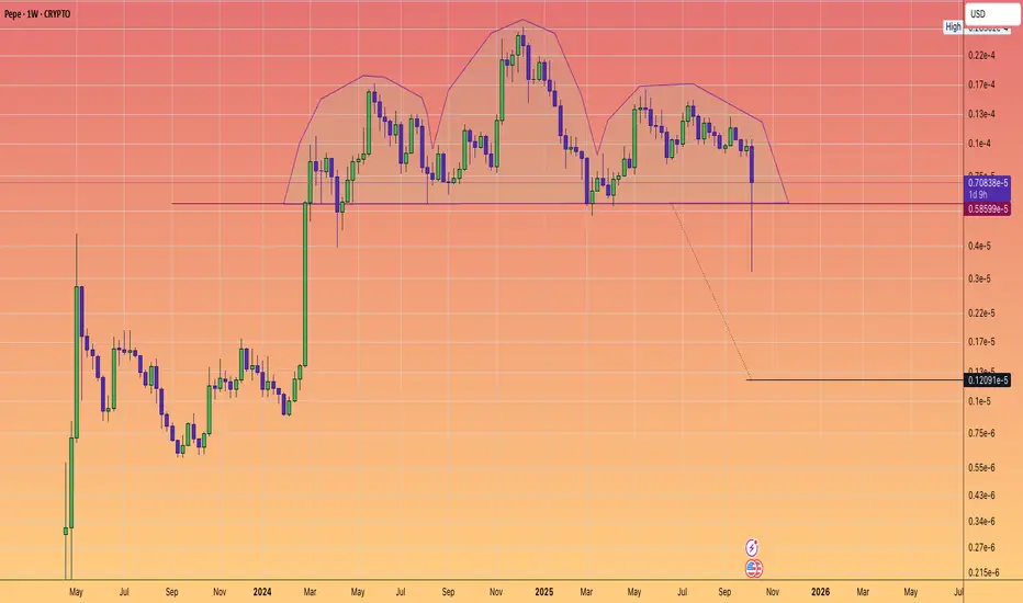
$PEPE: MAJOR HEAD and SHOULDERS BREAKDOWN WARNING.🐸🐸🐸
⚠️⚠️⚠️
Pattern formed, Big Move Ahead?
The weekly chart of #Pepe has confirmed a classic head and shoudlers pattern - a powerful bearish setup.
After over 1.5 years of building this structure, price decisively pierced the neckline with a sharp drop.
Suggesting that a weekly close below the neckline could trigger an accelerative towards the pattern target.
Key Levels
Neckline: $0.0000058599
Target: $0.0000012091
Why does it matter?
Head and shoulders are the most trusted reversal technical patterns. Coupled with declining and weakening sentiment. This pattern warns of more downside--- unless buyers can mount a quick rescue.
What's your strategy?
Are you shorting the breakdown, waiting for the target, or looking for a fake-out reversal?
Drop your thoughts/Analysis or questions in the comments!
ETHUSD(ethereum)The chart speaks for itself. As you can see, the price is moving inside a very large wedge. If the price finds support in the PRZ zone, it could rise toward the top of the wedge — and I believe this is likely. After completing the five-wave Elliott impulse, the market has finished its ABC corrective structure, and now it’s time for a new five‑wave bullish cycle to begin. If this upward wave sequence starts, the price could potentially rise to around $5,700.
Don’t forget to like and share your thoughts in the comments! ❤️

EthereumI'm more bullish on Ethereum since 3/4 charts I analyze are bullish at the moment.
3M-Bull
M-Bull
W-Bull
D-Bear
I'm anticipating price to fall into the $800 - $1200 range to find support. I'll be more interested once price action closes below $1530.
I'll update my thoughts as it unfolds.

2063.38 ~ 2261.70: Support zone forming
Hello, traders!
Follow us to get the latest information quickly.
Have a great day!
-------------------------------------
(ETHUSDT 1D chart)
The current position can be viewed from two perspectives.
First, we need to consider whether the price can rise after finding support in the 1597.76 ~ 1879.61 range.
This is because, as seen in the chart above (), if it declines, it will enter a range with no end in sight.
Therefore, to maintain the uptrend, the price must remain above the 1597.76 ~ 1879.61 range.
-
Second, we need to consider whether the price can rise after finding support in the currently forming DOM(-60) and HA-Low indicator ranges.
The range we are trying to create, i.e., the DOM(-60) ~ HA-Low range, is the 2063.38 ~ 2261.70 range.
If support is found in this range, it would be a good time to buy.
This is because, as seen in the chart above, the upward trend can only continue if the price rises above the 2419.83 to 2706.15 level.
-
When a new candlestick is formed, we need to check whether the BSSC indicator rises above the 0 level.
This is because a rise above the 0 level indicates that buying pressure is dominant.
Therefore, the price is likely to rise.
However, as mentioned earlier, the key question is whether buying pressure can gain enough momentum to break above the 2419.83 to 2706.15 level.
To determine this, we need to check whether the On-Bottom Volume (OBV) indicator rises above the High Line and remains there.
Currently, the OBV indicator is showing signs of re-entering the Low Line, so we need to see if the price maintains the 2063.38 to 2261.70 range and rises toward the High Line.
Therefore, to break above the 2419.83 ~ 2706.15 range and continue the uptrend, the StochRSI, BSSC, and OBV indicators must show upward trends.
If possible,
1. The StochRSI indicator should not enter the overbought zone.
2. The BSSC indicator should remain above zero.
3. The OBV indicator should maintain prices above the High Line.
A rise in the OBV indicator above the High Line indicates a high probability of a decline below the High Line in the near future.
In other words, a re-crossing of the High Line indicates a decline from the high range.
If the StochRSI indicator also rises to the overbought zone and then declines, this also indicates a decline from the high range. Therefore, it is recommended to monitor the movements of the StochRSI indicator alongside the OBV indicator.
The BSSC indicator is a comprehensive evaluation of the MFI, AD Line, and Williams %R indicators.
Therefore, like the StochRSI and OBV indicators, it is a leading indicator, so I believe it can be helpful for intuitively identifying trends.
Leading indicators aren't always ideal.
This is because real-time indicator movements can make chart interpretation more difficult.
In other words, during periods of volatility, real-time indicator movements can lead to false positives, misinterpreting price movements.
Therefore, when referencing indicators, it's important to check for support and resistance points or support within a range.
In conclusion, the most important factor is how influential support and resistance points are drawn on the 1M, 1W, and 1D charts.
The success of a trade depends on considering the characteristics of the support and resistance points, assessing whether support is present near them, and developing a trading strategy accordingly.
The indicators used in this chart are StochRSI, OBV, and MACD as basic indicators, with modified indicators like HA-Low, HA-High, DOM(-60), and DOM(60).
The key indicators here are the HA-Low and HA-High, which initiate trades.
By combining the HA-Low and HA-High indicators with the DOM(-60) and DOM(60) indicators, you can create a basic trading strategy.
This basic trading strategy involves buying in the DOM(-60) to HA-Low range and selling in the HA-High to DOM(60) range.
However, if the HA-High to DOM(60) range rises, a stepwise upward trend is likely, while if the DOM(-60) to HA-Low range falls, a stepwise downward trend is likely.
Therefore, trading should be done in segmented phases.
Basically, the best time to buy is when support is found in the DOM(-60) ~ HA-Low range.
However, if support is found in the HA-High ~ DOM(60) range and the price rises, a step-like upward trend is likely. While buying in this range is possible, it carries a higher risk. It's best to day trade and switch to short-term trading when the price begins to rise above the DOM(60) indicator.
-
I believe the timeframe for confirming support in the coin market is shorter than in the stock market.
This is because the coin market offers significantly more trading time.
Therefore, confirming support in the coin market requires a period of one to three days.
Confirming support doesn't necessarily mean an upward trend.
This is because the price may move sideways as it enters a sideways trading range.
To determine whether the current price is in a sideways range, you need to examine whether it falls within the Low Line and High Line of the On-By-Value (OBV) indicator.
You can also determine whether the sideways range is rising or falling by examining whether the channel formed by the Low Line and High Line is a rising or falling channel.
-
Before asking whether the price will rise or fall, I believe it's best to first examine the movements of the indicators provided on the chart to determine the current situation.
Ultimately, you can only make trades based on your own judgment.
ETH's next volatility period is around March 2nd, while BTC's next volatility period is around February 17th. Therefore, we need to examine the direction in which the price deviates from the 1879.61 to 2419.83 range by February 17th.
-
Thank you for reading to the end. We wish you a successful transaction.
--------------------------------------------------

Ethereum · The ABC correction is over —volume analysisLet's see if we can figure out what is happening here.
Ethereum is producing great volume today, really high, at least twice or even thrice as much as the daily average yet prices are not rising. What is happening here?
I can speculate that this is happening because of massive selling. There are tons of (misguided) sellers but all this selling is being bought. So prices are not rising but neither dropping. Volume continues to rise and it is going to be a huge volume day.
Here is what is going to happen: Once all the selling is absorbed, we get a strong bullish jump.
I will keep this one short.
The correction is over, it is as clear as a cloudless sky. It cannot be denied.
The ensuing rise will put ETHUSDT at $3,000 in a flash; this is the first resistance level, right below $3,000.
I am certain we will go higher in this bullish phase. How high? I don't know, but the recovery won't end at 3K, it will go much higher. Just buy and hold, go long.
We are looking at the best entry possible. It will become complicated to buy once prices start to grow. There will be strong volatility, big price swings. It will be hard... But, if you enter now, it is already over and it is just too easy.
Namaste.

$BMNR: The $161 Ghost Top – Will the Great price void be filled?💀📉 💀📉
We need to talk about #BMNR.
Tom Lee’s vision of an 'Ethereum Treasury' is a grand experiment, but for retail investors, it’s becoming a house of mirrors.
The Trap: Thousands of retail accounts are trapped at the $100+ entry levels. With the current price at $25, the psychological damage is already done.
The Gap: Look at the monthly chart. There is a massive, unfilled gap from $12.38 down to the $4.57 zone.
The Reality: $4 billion of unrealised losses on just $79.3M in revenue is not a business; it's a high-stakes bet with YOUR capital. $200M stake on youtuber is a massive gamble. Completely unrelated to bringing Tradfi on chain.
Warning: If we lose the $24.33 support, the next unfulfilled targets will likely be met.
With $16.70 a high conviction probability imho.
#BMNR #TomLee #Ethereum #StockMarketCrash #RetailTrap #DilutionWarning
📉 3 Red Flags
1. The "Split-Adjusted" Illusion & High-Price Trap
The stock reached an all-time high of $161 earlier in the year but is currently trading around $25.10.
The Danger: Retail investors who "bought the top" are now sitting on 84% losses.
The Gap: There is a significant technical gap back toward the $3.20 - $5.00 range (the 52-week low). If the market loses faith in the "Ethereum Treasury" narrative, the stock could gravity-pull toward its DCF (Discounted Cash Flow) fair value of just $0.18.
2. The "Alchemy of 5%" vs. Extreme Dilution
Tom Lee’s strategy, "The Alchemy of 5%," aims to control 5% of the total ETH supply.
The Dilution: To fund this, Lee recently asked shareholders to approve a 100x increase in authorised shares—from 500 million to 50 billion.
The Warning: While Lee claims this keeps the share price "reasonable," it effectively ensures that current retail holders will be massively diluted unless ETH prices go parabolic immediately.
3. The Financial "Flippening"
The company’s latest financials (Q1 2026) showed a staggering $5.2 billion net loss, flipping from a profit just one quarter prior.
Fragile Model: Despite having $14 billion in assets, the revenue from staking.
Is only revenue if sold for Dollars.
He made himself a Eth whale --- where dumping is part of the business model.
The Risk: This creates a situation where the stock trades purely on the sentiment of ETH, but with the overhead of a massive corporate cash-burn.

What are your thoughts on BTC from here for a swing trade?Do you think BTC heads lower toward the 57k range from here, or could it first push higher toward 79k? Is a clean break above 79k possible, with bulls targeting 88k next?
