GOLD 10/02 – H4 ROUTE MAP | RECOVERY CHANNEL UNDER PRESSUREConservative LDP faction controls Japan's House of Representatives → accepts weak JPY, high debt in exchange for growth.
Market expects JPY to continue structurally weakening → USD benefits relatively.
USD maintains strength causing capital to withdraw from safe-haven channels, including gold.
➡️ In this context, gold still reacts to geopolitical risks,
but lacks strong macro conditions to reopen a sustainable upward trend.
ROUTE MAP – KEY PRICE ZONES
🔴 UPPER ZONE – SELL REACTION ZONE
5250 – 5350
FVG H4
Fib 0.786
Old distribution zone
➡️ If price approaches but cannot hold, the recovery ends.
5400 – 5450
High FVG
Only when clearly accepted, the upward structure is reactivated.
🟢 LOWER ZONE – SUPPORT / SHORT-TERM REACTION
4920 – 4950
Fib 0.5
Current recovery FVG
➡️ Balance zone – prone to tug-of-war.
4800 – 4820
Fib 0.382
Important H4 support.
4600 – 4650
Liquidity low
Extended scenario if USD pressure continues to dominate.
HOW LUCASGRAY VIEWS THE MARKET NOW
News is creating short-term momentum, but not reversing the structure.
Quick recovery in price easily triggers emotions,
but the market only speaks the truth when it holds key price zones.
We focus on:
Observing reactions at FVG + Fibonacci
Clearly distinguishing:
Scalp based on intraday reactions
and structural acceptance for swing
Further updates will continue based on actual price reactions, not predictions.
— LucasGrayTrading
Forextrading

XAUUSD (H2) – Liam Market Structure XAUUSD (H2) – Liam Market Structure
Gold reacting at resistance, upside remains corrective
Gold is currently trading below a cluster of strong resistance, where Fibonacci expansion and psychological levels are aligning. The recent push higher is best viewed as a corrective bounce, not a trend continuation.
🔍 Technical breakdown
Price is capped below strong resistance near 5100, where multiple failed attempts signal weak acceptance.
Above current price, two major sell zones stand out:
5432 – Fibonacci + psychological resistance
5780 – Higher-timeframe extension and swing sell zone
The market is holding above the 4932 buy zone, which acts as short-term support and trendline confluence.
As long as price holds above 4932, a further push toward 5100 → 5432 remains possible. However, this move is still a liquidity-driven rotation into supply, not a confirmed bullish reversal.
🎯 Trading logic (structure first)
Upside: corrective rally into 5100 / 5432 → look for sell-side reactions.
Downside risk: loss of 4932 would invalidate the bounce and reopen downside exploration.
Bias: sell rallies until price proves acceptance above resistance.
🧠 Liam’s view
This is a market trading into resistance, not breaking out.
Let price show its hand at supply before committing.
Patience beats prediction.
Trade the structure.
Respect the levels.
— Liam

EURUSD CHoCH Confirmation After Sell-Side Liquidity SweepEURUSD Price Action Analysis – CHoCH Confirms Bullish Continuation
EURUSD is showing early bullish structure shift after an extended consolidation phase. Price has respected a well-defined demand zone, swept sell-side liquidity, and is now printing a Change of Character (CHoCH) — a classic sign of potential trend reversal.
🔍 Market Structure Breakdown
Price formed a Lower Low (LL), grabbing downside liquidity.
Strong bullish reaction followed, reclaiming internal range highs.
CHoCH confirmed as price broke previous minor structure resistance.
Current move has created a Higher High (HH), strengthening bullish bias.
📊 Liquidity & Order Flow
Sell-side liquidity below the range has been fully swept.
Price is now targeting buy-side liquidity resting above the range.
Previous supply zone overhead may act as a short-term reaction area, but overall flow favors continuation.
📈 Bullish Scenario (Primary Bias)
If price holds above the reclaimed structure:
Expect a pullback into demand / discount zone
Continuation toward 1.1940 – 1.2000 liquidity pool
Momentum suggests higher highs & higher lows structure
⚠️ Risk Consideration
Failure to hold above CHoCH level could lead to deeper retracement
A break back below demand would invalidate the bullish setup
🧠 Trading Insight
This setup aligns with smart money concepts, focusing on:
Liquidity grab
Structure shift
Demand respect
Targeting external liquidity
Best suited for intraday to short-term swing traders waiting for confirmation on lower timeframes.

XAUUSD Range Breakout from Trendline Support – Demand Zone in FoGold is respecting a clean ascending trendline while ranging inside a well-defined consolidation box. After a sharp fake breakdown below the trendline, price quickly reclaimed the structure — a classic liquidity sweep and breakout scenario.
Now price is compressing near the upper boundary of the range while holding above trendline support, showing strength from buyers. The highlighted demand zone around 5080 is the key area to watch. A sustained move above the range high can trigger bullish continuation toward 5100–5120.
Key Points:
• Ascending trendline acting as dynamic support
• Liquidity sweep below structure followed by strong recovery
• Range consolidation before potential expansion
• Demand zone providing strong base for buyers
• Breakout setup forming for bullish continuation
Plan:
Wait for a clean breakout and retest above the range for safer long confirmation.
Patience inside ranges often leads to the best breakout trades.

EURUSDHello Traders! 👋
What are your thoughts on EURUSD?
After retesting the previously broken zone, EUR/USD has resumed its bullish move. This area has successfully acted as a strong support following the breakout.
As long as price holds above this support zone, we expect the bullish momentum to continue and price to rise at least toward the highlighted target levels. The overall market structure remains bullish, and the recent pullback can be considered a healthy correction within the dominant uptrend.
Don’t forget to like and share your thoughts in the comments! ❤️

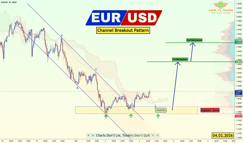
EUR/USD - Upside Expansion Next? (04.02.2026)📝 Description🔍 Setup FX:EURUSD
EUR/USD has been trading inside a descending channel and recently showed signs of structure shift after breaking and retesting the channel boundary.
Price reacted multiple times from the demand/support zone, forming higher lows.
Ichimoku shows a cloud cross and improving momentum, hinting at potential upside continuation.
This suggests sellers are weakening while buyers gradually gain control.
📍 Support & Resistance
🟥 Support Zone: 1.1790 – 1.1770
🟩 1st Resistance: 1.1895
🟩 2nd Resistance: 1.1940
⚠️ Disclaimer
This idea is for educational purposes only.
Forex trading involves risk. Always manage your risk and follow your own plan.
💬 Support the Idea 👍 Like if you see bullish continuation
💬 🔁 Share with fellow EUR/USD traders
#EURUSD #Forex #PriceAction #ChannelBreakout #BullishSetup #TradingView #SupportResistance #IntradayTrading #Kabhi_TATrading
XAUUSD – Brian | Liquidity Hold XAUUSD – Brian | Liquidity Hold & Continuation Structure (M15)
Gold continues to trade within a constructive short-term structure after a clear CHoCH earlier in the session. Price has been holding firmly above the intraday demand zones, showing that buyers are absorbing pullbacks rather than allowing deeper retracements.
From a market structure perspective, the series of higher lows remains intact. The recent consolidation just below the sell-side liquidity zone (5042 – 5064) suggests controlled price behaviour, not distribution. This typically reflects a pause before continuation rather than exhaustion.
Key technical zones to focus on:
Sell-side liquidity / resistance: 5042 – 5064
Intraday support: 4985 – 5005
Deeper demand / strong low: 4800 – 4850
As long as price holds above the intraday support, upside liquidity remains the primary magnet. A clean acceptance above the sell-side zone would open the path for expansion higher. However, rejection from that area may trigger a healthy pullback into demand before the next directional move.
Market context today
Despite ongoing macro uncertainty, gold continues to attract bids on dips, reflecting a defensive positioning bias and sustained demand. Short-term volatility is being absorbed efficiently, which supports the case for structured continuation rather than impulsive reversals.
In this phase, liquidity and structure matter more than indicators. Let price show its intent at key zones.
📌 Follow the TradingView channel to stay ahead of market structure shifts, liquidity behaviour, and real-time gold insights.

XAUUSD (H2–H4) – Liam Market ViewXAUUSD (H2–H4) – Liam Market View
Gold at a critical decision zone as macro pressure builds
Gold is currently trading inside a broad corrective range, with price struggling to reclaim key supply after the previous impulsive sell-off. The recent rebound remains technical in nature, driven by short-term liquidity rotation rather than a confirmed trend reversal.
🔍 Technical Structure (from the chart)
Price is capped below the mid-range resistance around 5000–5050, showing weak acceptance.
The 5386 – 5580 zone remains the dominant sell-side supply, aligned with higher-timeframe distribution.
Downside liquidity is clearly defined near 4730 – 4760, acting as the primary demand base.
As long as gold trades below 5386, the structure continues to favour sell-on-rallies rather than breakout continuation.
This keeps the market in a range-to-bearish rotation, where rallies are corrective unless proven otherwise.
🌍 Macro & Cross-Market Context (Today)
Rising expectations of faster BOJ rate hikes are supporting JPY and adding pressure across USD pairs.
At the same time, USD strength remains a headwind for gold, limiting upside expansion.
Ongoing warnings about JPY volatility intervention add uncertainty to FX markets, increasing the probability of liquidity-driven swings across risk assets and commodities.
With global central banks shifting toward tighter policy paths, gold is struggling to sustain upside momentum despite its safe-haven role.
🎯 Scenarios to Watch
Primary bias – Sell the rally
Rejections into 5000 → 5386 favour rotation back toward 4730 liquidity.
Alternative scenario – Range continuation
Price may oscillate between 4730 and 5050 as markets wait for clearer macro catalysts.
Bullish invalidation
Only a clean acceptance above 5386 would shift the bias and reopen upside toward higher supply.
🧠 Liam’s Take
This is a market of levels, not emotions.
Gold is reacting to macro pressure and liquidity mechanics, not trending freely. Until price proves acceptance above supply, patience and level-based execution remain key.
Trade the structure.
Let liquidity show intent.
— Liam

Gold (XAU/USD) using a combination of key technical levelsThis chart analysis is focused on trading Gold (XAU/USD) using a combination of key technical levels and a specific entry, stop loss, and target strategy. Let’s break down the key components and ideas from the chart:
1. Price Structure and Trend:
The chart shows an overall sideways movement or consolidation pattern, with price moving within a certain range. It appears to be in a pullback after a prior upward move, with a possible bullish reversal expected from this point.
The purple curved line suggests the trader expects the price to rebound and move upwards, based on the price pattern and technical analysis.
2. Entry Point:
The entry point is marked at approximately 4,964.30, where the price is expected to start moving up. This level is significant because the price appears to be at a support zone (highlighted in green), and traders are looking for a buy position at this point, anticipating a breakout or reversal to the upside.
3. Target Level:
The target is identified around 5,080.00 (blue zone), where the trader expects the price to go if the trend continues upwards. This level is set with the idea of capturing potential profits if the price reaches or exceeds it.
The target area is likely determined based on resistance or past price highs, where the price has previously struggled to push higher.
4. Stop Loss:
The stop loss is placed around 4,840.00 (red zone). The stop loss is designed to limit potential losses if the price moves in the opposite direction of the trade (downwards).
The stop loss level appears to be just below a key support zone, ensuring that if the price falls below this level, it would signal that the bearish trend may continue, invalidating the trade idea.
5. Risk/Reward Setup:
The setup shows a favorable risk/reward ratio. The price has a chance to move up to the target (5,080.00) while limiting potential losses if the price falls to the stop loss (4,840.00).
If the trade is successful, the potential profit could significantly outweigh the potential loss, which is ideal for risk management.
6. Technical Indicators and Price Action:
The price action suggests that the market may be forming a double bottom pattern or similar reversal pattern near the entry point, signaling a potential shift to an uptrend.
The chart has a bullish bias, as indicated by the trader's setup for a long position and the price potentially breaking above resistance levels.
7. Conclusion/Trade Idea:
Buy near 4,964.30 (Entry Point) if the price shows signs of reversal or breaking through resistance.
Set a stop loss around 4,840.00 to manage risk.
The target is set at 5,080.00, expecting the price to reach this level if the bullish trend continues.
This setup relies on the idea that the market is in a bullish reversal phase, and the trader aims to profit from an upward movement.
This trading strategy focuses on technical analysis (support, resistance, price action) and aims to capitalize on the reversal after a pullback. The trader is positioning for a possible breakout and looking to manage risk using a well-placed stop loss.

EURUSD H4 Bullish Trend – DMA 100/200, RSI ConfirmationEURUSD on the H4 timeframe is maintaining a clear bullish trend.
Price is holding above the 200 DMA, confirming a strong overall bullish bias. On Friday, price made a healthy pullback to the 100 DMA and bounced strongly to the upside, showing active buyer participation.
The DMA alignment (100 above 200) with an upward slope supports trend continuation.
RSI remains bullish and holds above the Almost 50 level, confirming positive momentum.
As long as price stays above the 100 and 200 DMA, the buy-side bias remains valid.
Pullbacks with confirmation are expected to offer buy continuation opportunities.
Buy Entry: 1.8160
Targets: First Target: 1.19500, Final Target: 1.20800
Stop Loss: Below DMA 200 (H4 close basis)
Always follow proper risk management and avoid entries without confirmation.

Range Support Bounce | Bullish Reversal SetupBitcoin is trading on the 1-hour timeframe after completing a corrective decline and forming a clear range structure. Price has recently reacted strongly from the lower demand/support zone, indicating buyer interest at this level.
Technical Breakdown:
Support Zone: Price bounced from a well-defined green demand area, aligning with a cyclical low and previous accumulation.
Structure Shift: After making a higher low, BTC is attempting to reclaim the mid-range, suggesting a short-term bullish reversal.
ALMA Indicator: Price is stabilizing around the ALMA, which often acts as a dynamic trend filter. Holding above it favors upside continuation.
Cycle Projection: The curved projection highlights a potential move toward the upper range resistance, following previous cyclical behavior.
Momentum: The oscillator shows recovery from oversold conditions, supporting the bullish bounce scenario.
Trade Idea:
Entry: Near current levels or on a minor pullback above the support zone
Target: Upper resistance / range high area
Invalidation: A clean break and close below the demand zone would invalidate the bullish setup
Bias:
📈 Bullish toward range high, as long as price holds above support.
⚠️ Always wait for confirmation and manage risk accordingly.

USDCHFUSDCHF price is near the support zone of 0.77528-0.77352. If the price fails to break through 0.77352, a rebound is expected.
🔥Trading futures, forex, CFDs and stocks carries a risk of loss.
Please consider carefully whether such trading is suitable for you.
This content is not financial advice. Always conduct your own financial due diligence.
>>GooD Luck 😊
❤️ Like and subscribe to never miss a new idea!

How Much Are You Really Risking Per Trade?How Much Are You Really Risking Per Trade? | The 1% Rule Explained
Most traders focus on entries and targets, but the real difference between consistent traders and losing traders is risk management. The most important question is not how much you can make, but how much you can afford to lose per trade.
The 1% risk rule is a widely used capital protection method. It means risking only 1% of your total account balance on a single trade, regardless of the setup or confidence level.
Why Risk Management Matters More Than Strategy
Even the best trading strategy can fail if risk is not controlled. Large losses create emotional pressure, leading to overtrading, revenge trades, and poor decisions. By limiting risk, traders stay objective and allow probability to work over time.
A small, controlled loss keeps you in the game. A large loss can end it.
How to Calculate Your Risk Per Trade
Formula:
Account Balance × Risk % = Dollar Risk
Example:
Account Balance: $10,000
Risk per trade: 1%
Maximum loss per trade: $100
Your position size should always be adjusted so that if your stop loss is hit, you only lose that amount.
Why the 1% Rule Works
Protects trading capital
Reduces emotional stress
Prevents account drawdowns
Allows long-term consistency
Supports compounding growth
Professional traders focus on survival first, profits second.
Common Mistakes Traders Make
Increasing risk after a loss
Risking more on “high-confidence” trades
Ignoring stop loss placement
Focusing on profits instead of preservation
These mistakes usually lead to blown accounts, especially in volatile markets like Gold (XAUUSD).
Final Thoughts
You don’t need to win every trade to be profitable. You only need discipline, patience, and controlled risk. Mastering how much you risk per trade is the foundation of professional trading.
Protect your capital first. Profits follow discipline.

XAGUSDHello Traders! 👋
What are your thoughts on SILVER?
Silver experienced a sharp decline after a strong rally and printing a local high, correcting nearly 50% from its peak. Upon reaching the highlighted support zone, price showed a bullish reaction, indicating the presence of buyers and the validity of this demand area.
At this stage, we expect price to spend some time moving sideways and ranging within this zone before attempting a bullish corrective move toward the specified upside levels.
As long as price remains below the key resistance areas, any upside move should be considered corrective rather than trend-reversing.
Don’t forget to like and share your thoughts in the comments! ❤️

EURUSD: Support & Resistance Analysis for Next Week 🇪🇺🇺🇸
Here is my latest structure analysis and important
supports and resistances for EURUSD for next week.
Consider these structures for pullback/breakout trading.
❤️Please, support my work with like, thank you!❤️
I am part of Trade Nation's Influencer program and receive a monthly fee for using their TradingView charts in my analysis.

XAUUSD (H2) – Liam View Rally into supply XAUUSD (H2) – Liam View
Rally into supply | Volatility risk rising
Gold is rebounding from the 4550–4600 demand base, but the broader H2 structure still points to a sell-side environment. The current move higher looks corrective, driven by short covering and liquidity rotation rather than a confirmed trend reversal.
From the chart, price is rotating back toward 4900–5030, a zone where previous distribution and liquidity rest. Unless price can accept above this area, rallies should be treated as sell-side opportunities, not breakout confirmation.
Key technical zones
Major sell zone: 5536 – 5580 (HTF supply)
Near-term reaction zone: 5000 – 5030
Key demand / base: 4550 – 4600
Intraday support: ~4730
Market context
Recent US political headlines and institutional reviews add another layer of headline-driven volatility, increasing the risk of sharp swings and liquidity sweeps. In such conditions, gold often reacts erratically intraday, but higher-timeframe structure tends to reassert itself once the noise fades.
Outlook
As long as price stays below 5030, the bias remains sell-side dominant.
Failure to hold above 4730 would reopen downside risk toward the demand base.
Only a clean H2 acceptance above 5030 → 5100 would neutralise the bearish structure.
Execution note
Avoid chasing momentum in news-driven sessions.
Let price come to levels. Trade the reaction, not the headlines.
— Liam

XAUUSD – Brian | M15 Liquidity Reaction XAUUSD – Brian | M15 Liquidity Reaction & Short-Term Structure
Gold is currently trading within a short-term recovery leg after sweeping downside liquidity earlier in the week. The rebound from the lows shows clear liquidity absorption, but price is now approaching a critical sell-side reaction zone, where sellers previously defended aggressively.
On the M15 structure, price has formed a sequence of higher lows, indicating short-term strength. However, this move is still unfolding inside a broader corrective phase, not a confirmed trend reversal. The upper zone around 5034 – 5067 remains a key SELL liquidity area, aligned with prior distribution and intraday resistance.
From a fundamental perspective, recent news around the US commitment to partial UN payments helped stabilise risk sentiment, but did not create strong directional conviction. This supports the view of range-based trading rather than impulsive continuation.
Key zones to watch:
Sell zone: 5034 – 5067 (liquidity & resistance)
Intraday reaction zone: current consolidation area
Demand support: previous liquidity sweep lows below
➡️ Scenario:
Price may attempt a final push into upper liquidity before facing rejection. Failure to hold above intraday support would open the door for a pullback back into demand.
In this phase, reaction at liquidity zones matters more than prediction. Patience and structure confirmation remain key.
Follow the TradingView channel to stay updated on real-time market structure and liquidity behaviour.

XAUUSD – H1 Outlook: Liquidity Build XAUUSD – H1 Outlook: Liquidity Build While Risk Premium Supports Gold | Lana ✨
Gold is holding firm after a clean rebound from the sell-side liquidity sweep, and the current price action suggests the market is now building structure rather than trending aggressively.
📌 Technical picture (SMC/flow-based)
Price has transitioned from the sell-side sweep into a steady climb, now respecting the upper trendline.
The 4,940–4,970 region is acting as a short-term balance / re-accumulation zone where price is pausing and collecting liquidity.
Above current range, buyside liquidity is visible near the recent highs, with a key magnet around 5,015.
A healthy pullback into 4,920–4,940 would still keep the bullish intraday structure intact and often provides a better re-entry opportunity than chasing highs.
🎯 Scenarios to watch
Bullish continuation: Hold above 4,940–4,970 → reclaim highs → seek liquidity toward 5,015, then extension higher if price accepts.
Corrective dip first: A brief sweep below the range toward 4,920–4,940 → bounce back into the trendline → continuation to highs.
🌍 Macro backdrop (short & relevant)
ETF inflows into oil are rising sharply as US–Iran tensions increase, which typically lifts the geopolitical risk premium. When risk sentiment tightens, gold often benefits as a defensive hedge — supporting the idea that pullbacks may remain corrective, not reversal-driven.
✨ Stay patient, trade the levels, and let liquidity guide the next expansion.
Follow Lana for more intraday updates and share your view in the comments.

USDCAD: Bullish Outlook Explained 🇺🇸🇨🇦
USDCAD will likely continue rising on Monday, following
a confirmed breakout of a resistance line of a falling channel.
The violation occurred after a test of a strong intraday support.
Expect a rise at least to 1.704 level.
❤️Please, support my work with like, thank you!❤️
I am part of Trade Nation's Influencer program and receive a monthly fee for using their TradingView charts in my analysis.

Demand ZXAUUSD (Gold) H1 – one Reversal Trade IdeaMarket Structure
Gold is trading within a broader descending trendline, indicating a short-term bearish structure. However, price has reacted strongly from a well-defined H1 demand zone, suggesting buyers are stepping in at discounted levels.
Key Levels
Demand Zone: ~4,670 – 4,720
Immediate Resistance: ~4,895 (trendline + horizontal resistance)
Target 1: ~4,965
Target 2: ~5,059
Trade Idea (Counter-trend Bounce)
Bias: Short-term bullish correction within a bearish trend
Entry: Bullish confirmation from the demand zone (engulfing / strong H1 close above minor resistance)
Stop Loss: Below the demand zone low
Take Profit:
TP1 at first resistance / structure high
TP2 near the descending trendline resistance
Invalidation
A strong H1 close below the demand zone would invalidate the bullish setup and favor continuation to the downside.
Summary
This setup focuses on a technical bounce from demand, targeting nearby resistance

Bearish Pullback Into Resistance, Downside Target in FocusMarket Structure
Price previously made a strong impulsive drop, followed by a rounded bottom / corrective recovery.
That recovery looks corrective, not impulsive (overlapping candles, curved structure), suggesting a bearish continuation setup rather than a trend reversal.
Key Zones
Major Resistance (≈ 5,100 – 5,130)
This zone previously acted as support, then flipped to resistance (classic S/R flip).
Price is projected to retest this zone before rejecting.
Support / Target Zone (≈ 4,750)
Strong demand zone where price previously reacted sharply.
Labeled clearly as the downside target.
Pattern & Bias
The white projection suggests a pullback → lower high → continuation down.
This resembles a bearish retracement into resistance, aligned with:
Prior breakdown level
Failure to reclaim key resistance
Momentum on the right side is weaker than the prior sell-off → bearish divergence in structure.
Trade Idea (Based on the Drawing)
Bias: Bearish below resistance
Entry Area: Near the resistance zone (~5,100)
Invalidation: Clean break and hold above resistance
Target: Support zone around ~4,750
Summary
Gold appears to be in a bearish continuation phase, with price likely retracing into resistance before rolling over. As long as resistance holds, the path of least resistance remains downward toward the marked

XAUUSD (H45) – Liam ViewXAUUSD (H45) – Liam View
Geopolitical risk rising | Gold reacting from demand
Gold is stabilising around the 4745 demand zone, where price is reacting from the rising trendline after a corrective sell-off. The current structure suggests short-term accumulation, with buyers defending value rather than aggressive selling continuation.
From a macro perspective, escalating tensions between the US and Iran—especially risks around the Strait of Hormuz, a key global oil route—are increasing geopolitical uncertainty. Historically, this type of risk environment tends to support safe-haven demand, keeping downside pressure on gold limited while volatility expands.
Technical structure (from the chart)
Key buy zone: 4745 (trendline + demand alignment)
Immediate resistance / liquidity: 5000 – 5100 (buyside liquidity)
Upper imbalance (FVG): 5250 – 5300
Major supply: 5575 (higher-timeframe sell zone)
Price holding above 4745 keeps the bounce scenario active, with potential rotation toward 5000–5100 to rebalance liquidity. Acceptance above this zone would open a path toward the FVG area, where sell-side reactions are expected.
Failure to hold 4745 would invalidate the short-term bullish thesis and reopen downside exploration.
Liam’s takeaway
This is not blind risk-on buying — it’s a measured response to rising geopolitical stress and technical demand.
Trade the zones.
Respect the volatility.
Let price confirm before committing.
— Liam

Gold Volatility Rises as NFP Delayed by US Shutdown | Feb 6 2026OANDA:XAUUSD Gold Volatility Rises as NFP Delayed by US Shutdown | Feb 6 2026
📌 Market Update: NFP Delayed (Feb 6, 2026)
The January 2026 U.S. Non-Farm Payrolls (NFP) report has been delayed due to a partial U.S. government shutdown, removing a major macro catalyst from today’s session. The absence of fresh labor data has increased uncertainty around Federal Reserve policy expectations, contributing to heightened volatility across currencies, equities, and precious metals.
Gold remains especially sensitive in this environment, as traders reassess inflation, interest rate trajectories, and systemic risk without confirmation from employment data.
Gold Performance – February 5, 2026 (Yesterday)
Gold extended its sharp correction as a stronger U.S. dollar and broad risk rebalancing triggered heavy liquidation. A rising USD pressured gold prices by making the metal more expensive for non-dollar buyers, reducing global demand.
Spot gold closed 1.8% lower at $4,872.83/oz, after falling to an intraday low near $4,791.69/oz. April gold futures also weakened, settling 1.2% lower at $4,889.50/oz, opening the session with a gap down from the prior close. Analysts noted intraday declines of nearly 4%, largely driven by margin calls, profit-taking after the historic multi-month rally, and the unwinding of leveraged long positions.
Despite the aggressive sell-off, long-term sentiment among institutional buyers remained constructive.
Gold Performance – February 6, 2026 (Today)
Gold rebounded modestly in early trade amid dip-buying and continued global equity weakness. As of early GMT hours, spot gold recovered to around $4,860–4,880/oz, gaining roughly 2% from yesterday’s lows.
Trading remains choppy, reflecting ongoing uncertainty and reduced liquidity. CME Group has raised margin requirements on gold and silver futures for the third time this year, signaling concern over extreme volatility and speculative excess.
Broader Outlook and Key Drivers
Major banks remain divided on gold’s trajectory. JP Morgan continues to project upside potential toward $6,300/oz by year-end, citing sustained central-bank accumulation, geopolitical risks, and growing concerns around fiscal dominance. In contrast, consensus forecasts remain more conservative, highlighting the wide divergence in market expectations.
In India, domestic gold prices also softened, with 24-carat gold trading near ₹15,235 per gram, reflecting global price pressure and currency effects.
Conclusion
Gold remains structurally bullish on a long-term basis, but short-term price action is dominated by volatility, forced liquidations, and macro uncertainty. With NFP delayed and markets lacking a key directional catalyst, traders should expect continued sharp swings until clarity emerges on U.S. fiscal stability, Fed policy direction, and risk sentiment.
Patience and risk management are critical in this environment.
