Reading institutional intentions through Volume ProfileReading institutional intentions through Volume Profile
Price moves where money flows. Simple truth that most traders overlook the most obvious source of money information: volume.
Volume Profile shows where trading happened. Not when, but where. The histogram on the side reveals which levels attracted buyers and sellers. While beginners draw support lines by candle wicks, money flows elsewhere.
Value zones versus noise zones
Point of Control (POC) marks the price level with maximum trading volume for the period. Price spent most time here. Buyers and sellers agreed on this price. Fair value at this moment.
Value Area covers 70% of traded volume. Boundaries of this zone show where the market considers the asset undervalued or overvalued. Price gravitates back to Value Area like a magnet.
Look at the practice. Price broke the high, everyone expects growth. Check Volume Profile—volume on the breakout is tiny. Big players didn't participate. Fake breakout. Price will return.
High Volume Node and Low Volume Node
HVN appears as thick sections on the profile. Many transactions, lots of liquidity. Price slows down at HVN, reverses, consolidates. These are market anchors.
LVN shows as thin sections. Few transactions, little liquidity. Price flies through LVN like a hot knife through butter. Nothing to grab onto there.
Traders often place stops behind HVN. Big players know this. Sometimes price deliberately hits those stops to accumulate positions. Called stop hunt .
Profile types and their meaning
P-shaped profile: one wide POC in the middle, volume distributed evenly. Market in balance. Breaking boundaries of such profile produces strong moves.
b-shaped profile: volume shifted to the bottom. Buyers active at low levels. Accumulation before growth.
D-profile: volume at the top. Distribution before decline. Big players exit positions.
Using profile in trading
Find areas with low volume between zones of high volume. LVN between two HVNs creates a corridor for fast price movement. Enter at HVN boundary, target the next HVN.
When price moves outside Value Area boundaries and volume appears there—trend gains strength. New value zone forms. Old levels stop working.
If price returns to old Value Area after strong movement—look for reversal. Market rejects new prices.
Session profiles versus weekly ones
Daily profile shows where trading happened today. Weekly shows where positions accumulated all week. Monthly gives the picture of big money distribution.
Profiles of different periods overlay each other. Daily profile POC can match weekly Value Area boundary. Strong zone. Price will react here.
On futures, account for session times:
Asian session forms its profile
European forms its own
American forms its own, with heavier volume weight
Profile rotation
Price migrates between value zones. Old Value Area becomes support or resistance for the new one. Last week's POC works as a magnet on current week.
When profiles connect—market consolidates. When they separate—trend begins.
Volume and volatility
Low volume at some level means price didn't linger there. Passed quickly. On return to this level, reaction will be weak.
Volume grows at range boundaries. Battle of buyers and sellers happens there. Winner determines breakout direction.
Composite profile
Built from several trading days. Shows where main battle happened over the period. Removes noise of individual days. Picture becomes clearer.
Composite profile helps find long-term support and resistance zones. Monthly composite shows levels institutional traders will work from all next month.
Many traders build Volume Profile directly on Trading View charts. Adjust the period, watch volume distribution, plan trades.
Learningtotrade

Trading Seasonality: When the Calendar Matters More Than NewsTrading Seasonality: When the Calendar Matters More Than News
Markets move not just on news and macroeconomics. There are patterns that repeat year after year at the same time. Traders call this seasonality, and ignoring it is like trading blindfolded.
Seasonality works across all markets. Stocks, commodities, currencies, and even cryptocurrencies. The reasons vary: tax cycles, weather conditions, financial reporting, mass psychology. But the result is the same — predictable price movements in specific months.
January Effect: New Year, New Money
January often brings growth to stock markets. Especially for small-cap stocks.
The mechanics are simple. In December, investors lock in losses for tax optimization. They sell losing positions to write off losses. Selling pressure pushes prices down. In January, these same stocks get bought back. Money returns to the market, prices rise.
Statistics confirm the pattern. Since the 1950s, January shows positive returns more often than other months. The Russell 2000 index outperforms the S&P 500 by an average of 0.8% in January. Not a huge difference, but consistent.
There's a catch. The January effect is weakening. Too many people know about it. The market prices in the pattern early, spreading the movement across December and January. But it doesn't disappear completely.
Sell in May and Go Away
An old market saying. Sell in May, come back in September. Or October, depending on the version.
Summer months are traditionally weaker for stocks. From May to October, the average return of the US market is around 2%. From November to April — over 7%. Nearly four times higher.
There are several reasons. Trading volumes drop in summer. Traders take vacations, institutional investors reduce activity. Low liquidity amplifies volatility. The market gets nervous.
Plus psychology. Summer brings a relaxed mood. Less attention to portfolios, fewer purchases. Autumn brings business activity. Companies publish reports, investors return, money flows back.
The pattern doesn't work every year. There are exceptions. But over the past 70 years, the statistics are stubborn — winter months are more profitable than summer.
Santa Claus Rally
The last week of December often pleases the bulls. Prices rise without obvious reasons.
The effect is called the Santa Claus Rally. The US market shows growth during these days in 79% of cases since 1950. The average gain is small, about 1.3%, but stable.
There are many explanations. Pre-holiday optimism, low trading volumes, purchases from year-end bonuses. Institutional investors go on vacation, retail traders take the initiative. The mood is festive, no one wants to sell.
There's interesting statistics. If there's no Santa Claus rally, the next year often starts poorly. Traders perceive the absence of growth as a warning signal.
Commodities and Weather
Here seasonality works harder. Nature dictates the rules.
Grain crops depend on planting and harvest. Corn prices usually rise in spring, before planting. Uncertainty is high — what will the weather be like, how much will be planted. In summer, volatility peaks, any drought or flood moves prices. In autumn, after harvest, supply increases, prices fall.
Natural gas follows the temperature cycle. In winter, heating demand drives prices up. In summer, demand falls, gas storage fills, prices decline. August-September often give a local minimum. October-November — growth before the heating season.
Oil is more complex. But patterns exist here too. In summer, gasoline demand rises during vacation season and road trips. Oil prices usually strengthen in the second quarter. In autumn, after the summer peak, correction often follows.
Currency Market and Quarter-End
Forex is less seasonal than commodities or stocks. But patterns exist.
Quarter-end brings volatility. Companies repatriate profits, hedge funds close positions for reporting. Currency conversion volumes surge. The dollar often strengthens in the last days of March, June, September, and December.
January is interesting for the yen. Japanese companies start their new fiscal year, repatriate profits. Demand for yen grows, USD/JPY often declines.
Australian and New Zealand dollars are tied to commodities. Their seasonality mirrors commodity market patterns.
Cryptocurrencies: New Market, Old Patterns
The crypto market is young, but seasonality is already emerging.
November and December are often bullish for Bitcoin. Since 2013, these months show growth in 73% of cases. Average return is about 40% over two months.
September is traditionally weak. Over the past 10 years, Bitcoin fell in September 8 times. Average loss is about 6%.
Explanations vary. Tax cycles, quarterly closings of institutional funds, psychological anchors. The market is young, patterns may change. But statistics work for now.
Why Seasonality Works
Three main reasons.
First — institutional cycles. Reporting, taxes, bonuses, portfolio rebalancing. Everything is tied to the calendar. When billions move on schedule, prices follow the money.
Second — psychology. People think in cycles. New year, new goals. Summer, time to rest. Winter, time to take stock. These patterns influence trading decisions.
Third — self-fulfilling prophecy. When enough traders believe in seasonality, it starts working on its own. Everyone buys in December expecting a rally — the rally happens.
How to Use Seasonality
Seasonality is not a strategy, it's a filter.
You don't need to buy stocks just because January arrives. But if you have a long position, seasonal tailwind adds confidence. If you plan to open a short in December, seasonal statistics are against you — worth waiting or looking for another idea.
Seasonality works better on broad indices. ETFs on the S&P 500 or Russell 2000 follow patterns more reliably than individual stocks. A single company can shoot up or crash in any month. An index is more predictable.
Combine with technical analysis. If January is historically bullish but the chart shows a breakdown — trust the chart. Seasonality gives probability, not guarantee.
Account for changes. Patterns weaken when everyone knows about them. The January effect today isn't as bright as 30 years ago. Markets adapt, arbitrage narrows.
Seasonality Traps
The main mistake is relying only on the calendar.
2020 broke all seasonal patterns. The pandemic turned markets upside down, past statistics didn't work. Extreme events are stronger than seasonality.
Don't average. "On average, January grows by 2%" sounds good. But if 6 out of 10 years saw 8% growth and 4 years saw 10% decline, the average is useless. Look at median and frequency, not just average.
Commissions eat up the advantage. If a seasonal effect gives 1-2% profit and you pay 0.5% for entry and exit, little remains. Seasonal strategies work better for long-term investors.
Tools for Work
Historical data is the foundation. Without it, seasonality is just rumors.
Backtests show whether a pattern worked in the past. But past doesn't guarantee future. Markets change, structure changes.
Economic event calendars help understand the causes of seasonality. When quarterly reports are published, when dividends are paid, when tax periods close.
Many traders use indicators to track seasonal patterns or simply find it convenient to have historical data visualization right on the chart.

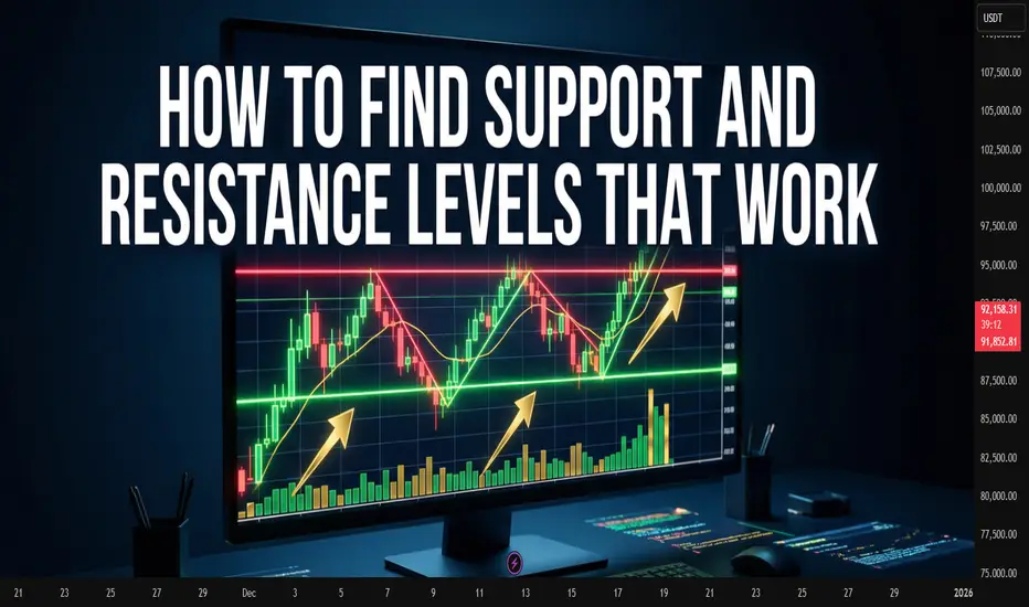
How to Find Support and Resistance Levels That Actually WorkHow to Find Support and Resistance Levels That Actually Work
Price never moves in a straight line. It bounces off invisible barriers, pauses, reverses. These barriers are called support and resistance levels.
Sounds simple. But traders often draw lines where they don't exist. Or miss truly strong zones. Let's figure out how to find levels where price reacts again and again.
What Support and Resistance Are
Imagine a ball thrown in a room. It hits the floor and ceiling. The floor is support, the ceiling is resistance.
Support works from below. When price falls to this zone, buyers activate. They consider the asset cheap and start buying. The decline slows or stops.
Resistance works from above. Price rises, reaches a certain height, and sellers wake up. Some lock in profits, others think the asset is overvalued. Growth slows down.
Why Levels Work at All
Thousands of traders look at the same chart. Many see the same reversal points in the past.
When price approaches this zone again, traders remember. Some place pending buy orders at support. Others prepare to sell at resistance. It becomes a self-fulfilling prophecy.
The more people noticed the level, the stronger it is.
Where to Look for Support and Resistance
Start with weekly or daily charts. Zoom out to see history for several months or years.
Look for places where price reversed multiple times. Not one bounce, but two-three-four. The more often price reacted to a level, the more reliable it is.
Look at round numbers. Trader psychology works so that levels like 100, 1000, 50 attract attention. Orders cluster around these marks.
Look for old highs and lows. A 2020 peak can become resistance in 2025. A crisis bottom turns into support a year later.
Drawing Levels Correctly
A level is not a thin line. It's a zone several points or percent wide.
Price rarely bounces from an exact mark. It can break through a level by a couple of points, collect stop-losses and return. Or stop a bit earlier.
Draw a horizontal line through candle bodies, not through wicks. Wicks show short-term emotional spikes. The candle body is where price closed. Where traders agreed on a compromise.
Don't clutter your chart with a hundred lines. Keep 3-5 most obvious levels. If you drew 20 lines, half of them don't work.
How to Check Level Strength
Count touches. Three bounces are more reliable than one. Five bounces - that's a powerful zone.
Look at volume. If there's lots of trading at a level, it confirms its significance. Large volume shows major players are active here.
Pay attention to time. A level that worked five years ago may lose strength. Fresh levels are usually stronger than old ones.
When a Level Breaks
A breakout happens when price closes beyond the level. Not just touched with a wick, but closed.
After a breakout, support becomes resistance. And vice versa. This is called polarity shift. Traders who bought at old support now sit in losses and wait for return to entry point to exit without losses.
A breakout must be confirmed. One candle beyond the level is not a breakout yet. Wait for the day to close, check volume, verify price didn't return.
False breakouts happen all the time. Major players deliberately knock out stops to collect liquidity.
Common Mistakes
Traders draw levels on small timeframes. A five-minute chart is full of noise. Levels from hourly or daily charts work better.
Traders ignore context. Support in an uptrend is stronger than in a downtrend. Resistance in a falling market breaks easier.
Traders enter exactly at the level. Better to wait for a bounce and confirmation. Price can break through a level by several points, knock out your stop, then reverse.
Diagonal Levels
Support and resistance aren't only horizontal. Trendlines work as dynamic levels.
In an uptrend, draw a line through lows. Price will bounce from this line upward.
In a downtrend, connect highs. The line becomes dynamic resistance.
Trendlines break just like horizontal levels. A trendline break often signals a trend reversal.
Combining with Other Tools
Levels don't work in isolation. Their strength grows when they coincide with other signals.
A level at a round number + cluster of past bounces + overbought zone on an oscillator - this is a powerful combination for finding reversals.
Traders often add technical indicators to their charts to help confirm price reaction at levels. This makes analysis more reliable and reduces false signals.
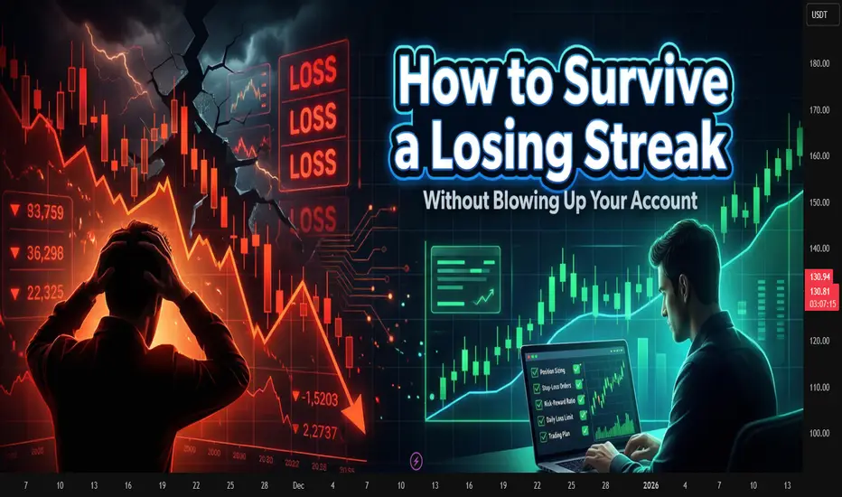
How to survive a losing streak without blowing up your accountHow to survive a losing streak without blowing up your account
Drawdown hits the account, but the real damage lands in your head.
A real trading career always includes stretches of pure red. Five, seven, even ten losses in a row can appear without anything "being wrong" with the setup. At that point the market stops looking like candles and levels, and starts looking like a personal enemy. Without a plan written in advance, the usual reaction is to increase size and "win it back."
The drawdown itself is not the main threat. The danger sits in what happens inside the drawdown: revenge trades, oversized positions, random entries just to feel in control again.
Turn the losing streak into numbers
The feeling "everything goes wrong" is vague and dangerous. Numbers are less emotional.
Simple tracking is enough:
Current drawdown in percent from the equity peak
Number of losing trades in a row
Total hit of the streak in R (risk units per trade)
Example: risk per trade is 1%, and you take five consecutive stops. That is -5%. With a personal limit of 10% drawdown, the account is still alive, but the mind is already tense. At that point the numbers matter more than mood. They show whether there is still room to act or time to stop and regroup.
Why losing streaks bend your thinking
The market does not change during a streak. The trader does.
Typical thoughts:
"The strategy is dead" after only a few stops
Desire to prove to the market that you were right
Sudden shift from clear setups to anything that "might move"
In reality it is normal distribution at work. Losses cluster. Most traders know that in theory, but very few accept it in advance and prepare a plan for that specific phase.
Build a risk frame for bad runs
Risk rules for streaks should live in writing, not in memory.
For example:
Define 1R as 0.5–1% of account size
Daily loss limit in R
Weekly loss limit in R
Conditions for a mandatory trading pause
A simple version:
1R = 1%
Stop trading for the day once -3R is reached
Stop trading for the week once -6R is reached
After a weekly stop, take at least two market sessions off from active trading
This does not make performance look pretty. It simply keeps one emotional spike from turning into a full account blow-up.
A protocol for losing streaks
Rules are easier to follow when they read like a checklist, not a philosophy.
Sample protocol:
After 3 consecutive losses: cut position size in half for the rest of the day
After 4 consecutive losses: stop trading for that day
After 5 or more consecutive losses: take at least one full day off and do only review and backtesting
Return to normal size only after a small series of well-executed trades where rules were respected
Printed rules next to the monitor work better than "mental promises." In stress the brain does not recall theory, it reads whatever sits in front of the eyes.
A drawdown journal
A regular trade log tracks entries and exits. During drawdowns you need an extra layer dedicated to the streak.
For each drawdown period, you can record:
Start date and equity at the beginning
Maximum drawdown in percent and in R
Main source of damage: risk, discipline, setup quality, or flat market conditions
Any mid-streak changes to the original plan
Outside factors such as sleep, stress, or heavy workload
After some months, the journal starts to show patterns. Many discover that the deepest drawdowns came not from the market, but from trading while tired, distracted, or under pressure outside the screen.
Coming back from a drawdown
The drawdown will end. The key part is the exit from it. Jumping straight back to full size is an easy way to start a new streak of losses.
You can describe the return process in stages:
Stage 1. One or two days off from live trading. Only review, markups, statistics.
Stage 2. Half-size positions, only the cleanest setups, strict cap on trade count.
Stage 3. Back to normal risk after a short series of trades where rules were followed, even if the profit is modest.
The drawdown is over not when the equity line prints a new high, but when decisions are again based on the plan instead of the urge to "get it all back."
Where tools and indicators help
A big part of the pressure in a streak comes from the mental load: levels, trend filters, volatility, news, open positions. That is why many traders rely on indicator sets that highlight key zones, measure risk to reward, send alerts when conditions line up, and reduce the need to stare at the screen all day. These tools do not replace discipline, but they take some of the routine off your plate and give more energy for the hard part: staying calm while the equity curve is under water.
A daily trading plan: stop trading your moodA daily trading plan: stop trading your mood and start trading your system
Most traders think they need a new strategy. In many cases they need a clear plan for the day.
Trading without a plan looks very similar across accounts. The platform opens, eyes lock onto a bright candle, the button gets pressed. Then another one. The mind explains everything with words like “intuition” or “feel for the market”, while the journal in the evening shows a pile of unrelated trades.
A daily plan does not turn trades into perfection. It removes chaos. The plan covers charts, risk, loss limits, number of trades and even the trader’s state. With that in place, the history starts to look like a series of experiments instead of casino slips.
Skeleton of a daily plan
A practical way is to split the day into five blocks:
market overview from higher timeframes
watchlist for the session
risk and limits
scenarios and entry checklist
post-session review
The exact form is flexible. The important part is to write it down instead of keeping it in memory.
Market overview: higher timeframe sets the background
The day starts on the higher chart, not on the one-minute screen. H4, D1 or even W1. That is where major swings, large reaction zones and clear impulses live.
A small template helps:
main asset of the day, for example BTC or an index
current phase: directional move or range
nearest areas where a larger player has strong reasons to act
Descriptions work best when they are concrete. Not “bullish market”, but “three higher lows in a row, shallow pullbacks, buyers defend local demand zones”. A month later these notes show how thinking about trend and risk evolved.
Watchlist: stop chasing every ticker
Next layer is a focused list of instruments. With less experience, a shorter list often works better. Two or three names are enough for the day.
Selection can rely on simple filters:
recent activity instead of a dead flat chart
structure that is readable rather than random noise
enough liquidity for clean entries and exits
Once the list is fixed, outside movement loses some emotional grip. Another coin can fly without you, yet the plan keeps attention on the few markets chosen for that day.
Risk and limits: protection from yourself
This block usually appears only after a painful streak. Until then the brain likes the story about “just this one time”.
Minimal set:
fixed percentage risk per trade
daily loss limit in R or percent
cap on number of trades
For example, 1% per trade, daily stop at minus 3R, maximum of 5 trades. When one of these lines is crossed, trading stops even if the chart shows a beautiful setup. That stop is not punishment. It is a guardrail.
Breaking such rules still happens. With written limits, each violation becomes visible in the journal instead of dissolving in memory.
Scenarios and entry checklist
After the bigger picture and limits are set, the plan moves to concrete scenarios. Clarity beats variety here.
For every instrument on the list, write one or two scenarios:
area where a decision on price is expected
direction of the planned trade
SEED_ALEXDRAYM_SHORTINTEREST2:TYPE of move: breakout, retest, bounce
[*stop and targets in R terms
Example: “ETHUSDT. H4 in an uptrend, H1 builds a range under resistance. Plan: long on breakout of the range, stop behind the opposite side, target 2–3R with partial exit on fresh high.”
An entry checklist keeps emotions in check.
$ trade goes with the higher-timeframe narrative
$ stop stands where the scenario breaks, not “somewhere safer”
$ position size matches the risk rules
$ trade is not revenge for a previous loss
If at least one line fails, entry is postponed. That small pause often saves the account from “just testing an idea”.
Post-session review: where real learning sits
The plan lives until the terminal closes. Then comes the review. Not a long essay, more like a short debrief.
Screenshots help a lot: entry, stop, exit marked on the chart, with a short note nearby.
was there a scenario beforehand
did the market behave close to the plan
which decisions looked strong
where emotions took over
Over several weeks, this archive turns into a mirror. Profitable setups repeat and form a core. Weak habits step into the light: size jumps after a loss, early exits on good trades, stop removal in the name of “room to breathe”.
Where indicators fit into this routine
None of this strictly requires complex tools. A clean chart and discipline already move the needle. Many traders still prefer to add indicators that highlight trend, zones, volatility and risk-to-reward, and ping them when price enters interesting regions. That kind of automation cuts down on routine work and makes it easier to follow the same checklist every day. The decision to trade still stays with the human, while indicators quietly handle part of the heavy lifting in the background.

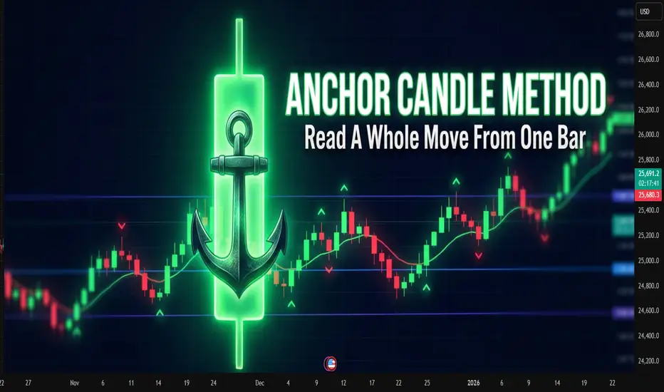
Anchor Candle MethodAnchor Candle Method: How To Read A Whole Move From One Bar
Many traders drown in lines, zones, patterns. One simple technique helps simplify the picture: working around a single “anchor candle", the reference candle of the pulse.
The idea is simple: the market often builds further movement around one dominant candle. If you mark up its levels correctly, a ready-made framework appears for reading the trend, pullbacks and false breakouts.
What is an anchor candle
Anchor candle is a wide range candle that starts or refreshes an impulse. It does at least one of these:
Breaks an important high or low
Starts a strong move after a tight range
Flips local structure from “choppy” to “trending”
Typical traits:
Range clearly larger than nearby candles
Close near one edge of the range (top in an up impulse, bottom in a down impulse)
Comes after compression, range or slow grind
You do not need a perfect definition in points or percent. Anchor candle is mostly a visual tool. The goal is to find the candle around which the rest of the move “organizes” itself.
How to find it on the chart
Step-by-step routine for one instrument and timeframe:
Mark the current short-term trend on higher timeframe (for example 1H if you trade 5–15M).
Drop to the working timeframe.
Find the last strong impulse in the direction of that trend.
Inside this impulse look for the widest candle that clearly stands out.
Check that it did something “important”: broke a range, cleared a local high/low, or started the leg.
If nothing stands out, skip. The method works best on clean impulses, not on flat, overlapping price.
Key levels inside one anchor candle
Once the candle is chosen, mark four levels:
High of the candle
Low of the candle
50% of the range (midline)
Close of the candle
Each level has a function.
High
For a bullish anchor, the high acts like a “ceiling” where late buyers often get trapped. When price trades above and then falls back inside, it often marks a failed breakout or liquidity grab.
Low
For a bullish anchor, the low works as structural invalidation. Deep close under the low tells that the original impulse was absorbed.
Midline (50%)
Midline splits “control”. For a bullish anchor:
Holding above 50% keeps control with buyers
Consistent closes below 50% shows that sellers start to dominate inside the same candle
Close
Close shows which side won the battle inside that bar. If later price keeps reacting near that close, it confirms that the market “remembers” this candle.
Basic trading scenarios around a bullish anchor
Assume an uptrend and a bullish anchor candle.
1. Trend continuation from the upper half
Pattern:
After the anchor candle, price pulls back into its upper half
Pullback holds above the midline
Volume or volatility dries up on the pullback, then fresh buying appears
Idea: buyers defend control above 50%. Entries often come:
On rejection from the midline
On break of a small local high inside the upper half
Stops usually go under the low of the anchor or under the last local swing inside it, depending on risk tolerance.
2. Failed breakout and reversal from the high
Pattern:
Price trades above the high of the anchor
Quickly falls back inside the range
Subsequent candles close inside or below the midline
This often reveals exhausted buyers. For counter-trend or early reversal trades, traders:
Wait for a clear close back inside the candle
Use the high of the anchor as invalidation for short setups
3. Full loss of control below the low
When price not only enters the lower half, but closes below the low and stays there, the market sends a clear message: the impulse is broken.
Traders use this in two ways:
Exit remaining longs that depended on this impulse
Start to plan shorts on retests of the low from below, now as resistance
Bearish anchor: same logic upside-down
For a bearish anchor candle in a downtrend:
Low becomes “trap” level for late sellers
High becomes invalidation
Upper half of the candle is “shorting zone”
Close and midline still help to judge who controls the bar
The structure is mirrored, the reading logic stays the same.
Practical routine you can repeat every day
A compact checklist many traders follow:
Define higher-timeframe bias
On working timeframe, find the latest clear impulse in that direction
Pick the anchor candle that represents this impulse
Mark high, low, midline, close
Note where price trades relative to these levels
Decide: trend continuation, failed breakout, or broken structure
This method does not remove uncertainty. It just compresses market noise into a small set of reference points.
Common mistakes with anchor candles
Choosing every bigger-than-average candle as anchor, even inside messy ranges
Ignoring higher timeframe bias and trading every signal both ways
Forcing trades on each touch of an anchor level without context
Keeping the same anchor for days when the market already formed a new impulse
Anchor candles age. Fresh impulses usually provide better structure than old ones.
A note about indicators
Many traders prefer to mark such candles and levels by hand, others rely on indicators that highlight wide range bars and draw levels automatically. Manual reading trains the eye, while automated tools often save time when many charts and timeframes are under review at once.
New Year rally: a seasonal move without the fairy taleNew Year rally: a seasonal move without the fairy tale
The “New Year rally” sounds like free money on holidays. In reality it is just a seasonal pattern that sometimes helps and sometimes only pushes traders into random entries.
The point is to understand what qualifies as a rally, when it usually appears, and how to plug it into an existing system instead of trading by calendar alone.
What traders call a New Year rally
A New Year rally is usually described as a sequence of trading sessions with a clear bullish bias in late December and in the first days of January.
Typical features:
several days in a row with closes near daily highs
local highs on indexes and leading names get taken out
stronger appetite for risk assets
sellers try to push back but fail to create real follow-through
On crypto the picture is less clean, but the logic is similar: toward year end, demand for risk often increases.
Why markets tend to rise into year end
The drivers are very down to earth.
Funds and year-end reports
Portfolio managers want their performance to look better on the final statement. They add strong names and trim clear losers.
Tax and position cleanup
In markets where taxes are tied to the calendar year, some players close losing trades earlier, then come back closer to the holidays with fresh positioning.
Holiday mood
With neutral or mildly positive news flow, participants are more willing to buy. Any positive surprise on rates, inflation, or earnings gets amplified by sentiment.
Lower liquidity
Many traders and funds are away. Order books are thinner and big buyers can move price more easily.
When it makes sense to look for it
On traditional stock markets, traders usually watch for the New Year rally:
during the last 5 trading days of December
during the first 2–5 trading days of January
On crypto there is no strict calendar rule. It helps to track:
behavior of major coins
dominance shifts
whether the trend is exhausted or still fresh
A practical trick: mark the transition from December to January for several past years on the chart and see what your market actually did in those windows.
How to avoid turning it into a lottery
A simple checklist before trading a “seasonal” move:
higher timeframes show an uptrend or at least a clear pause in the prior selloff
main indexes or key coins move in the same direction instead of diverging
no fresh, heavy supply zone sitting just above current price
risk per trade is fixed in advance: stop, position size, % of equity
exit plan exists: partial take-profit levels and a clear invalidation point
If one of these items fails, it is better to treat the move as market context, not an entry signal.
Common mistakes in New Year rallies
entering just because the calendar says “late December”
doubling position size “to catch the move before holidays”
buying right at the end of the impulse when distribution has already started
skipping the stop because “they will not dump the market into New Year”
Seasonal patterns never replace risk management. A setup that does not survive March will not magically improve in December.
A note on indicators and saving time
Many traders prefer not to redraw the whole market every December. It is convenient when an indicator highlights trend, key zones and momentum, and the trader only has to read the setup. In that case New Year rallies become just one more pattern inside a consistent framework, not a separate holiday legend.

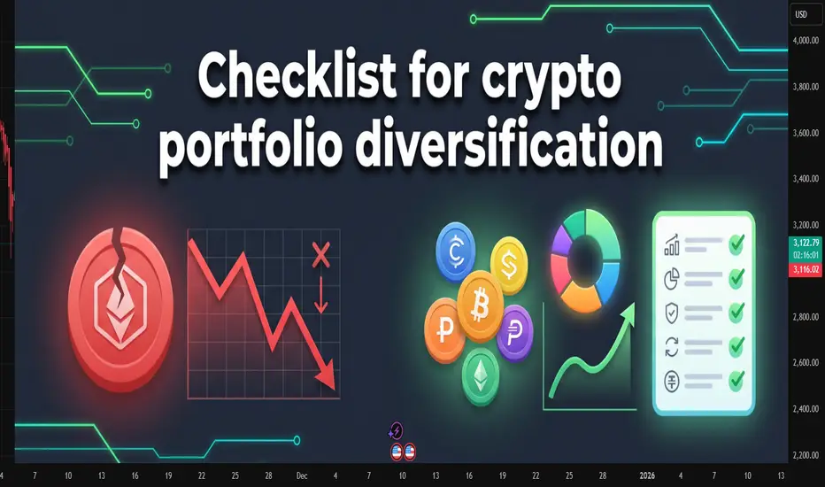
Crypto diversification checklist for your portfolioCrypto diversification checklist for your portfolio
When the market runs hot, it feels tempting to dump all capital into one coin that moves right now. The story usually ends the same way. Momentum fades, the chart cools down, and the whole account depends on one or two tickers. Diversification does not make every decision perfect. It simply keeps one mistake from breaking the account.
What a diversified crypto portfolio really means
Many traders call a mix of three alts and one stablecoin a diversified basket. For crypto it helps to think in a few clear dimensions:
asset type: BTC, large caps, mid and small caps, stablecoins
role in the portfolio: capital protection, growth, high risk
sector: L1, L2, DeFi, infrastructure, memecoins and niche themes
source of yield: spot only, staking, DeFi, derivatives
The more weight sits in one corner, the more the whole portfolio depends on a single story.
Checklist before adding a new coin
1. Position size
One coin takes no more than 5–15% of total capital
The total share of high risk positions stays at a level where a drawdown does not knock the trader out emotionally
2. Sector risk
The new coin does not fully copy risk you already have: same sector, same ecosystem, same news driver
If the portfolio already holds many DeFi names, another similar token rarely changes the picture
3. Liquidity
Average daily volume is high enough to exit without massive slippage
The coin trades on at least two or three major exchanges, not on a single illiquid venue
The spread stays reasonable during calm market hours
4. Price history
The coin has lived through at least one strong market correction
The chart shows clear phases of accumulation, pullbacks and reactions to news, not only one vertical candle
Price does not sit in a zone where any small dump is enough to hurt the whole account
5. Counterparty risk
Storage is clear: centralized exchange, self-custody wallet, DeFi protocol
Capital is not concentrated on one exchange, one jurisdiction or one stablecoin
There is a simple plan for delisting, withdrawal issues or technical outages
6. Holding horizon
The time frame is defined in advance: scalp, swing, mid term, long term build
Exit rules are written: by price, by time or by broken thesis, not only “I will hold until it goes back up”
Keeping the structure stable
Diversification helps only when the rules stay in place during noise and sharp moves. A simple base mix already gives a frame:
core: BTC and large caps, 50–70%
growth: mid caps and clear themes, 20–40%
experiments: small caps and new stories, 5–10%
cash and stablecoins for fresh entries
Then the main routine is to rebalance back to these ranges every month or quarter instead of rebuilding the whole portfolio after each spike.
A short note on tools
Some traders keep this checklist on paper or in a spreadsheet. Others rely on chart tools that group coins by liquidity, volatility or correlation and highlight weak spots in the structure. The exact format does not matter. The key is that the tool makes it easy to run through the same checks before each trade and saves time on charts instead of adding more noise. Many traders simply lean on indicators for this routine work because it feels faster and more convenient.
Chasing the last train: how late entries ruin good trendsChasing the last train: how late entries ruin good trends
The picture is familiar.
The asset has already made a strong move, candles line up in one direction, chats are full of profit screenshots.
Inside there is only one thought: "I am late".
The buy or sell button is pressed not from a plan, but from fear of missing out.
This is how a classic "last train" entry is born.
This text breaks down how to spot that moment and how to stop turning each impulse into an expensive ticket without a seat.
How the last train looks on a chart
This situation has clear signs.
Long sequence of candles in one direction with no healthy pullback.
Acceleration of price and volatility compared to previous swings.
Entry happens closer to a local high or low than to any level.
Stop is placed "somewhere below" or moved again and again.
The mind focuses on other people’s profit, not on the original plan.
In that state the trader reacts to what already happened instead of trading a prepared setup.
Why chasing the move hurts the account
The problem is not just "bad luck".
Poor risk-reward .
Entry sits near an extreme. Upside or downside left in the move is small, while a normal stop needs wide distance. In response there is a temptation to push the stop further just to stay in.
Large players often exit there .
For them the trend started earlier. Where retail opens first positions, they scale out or close a part of the move.
Strategy statistics get distorted .
A system can work well when entries come from levels and follow a plan. Once late emotional trades appear in the mix, the math changes even if the historical chart still looks nice.
How to notice that the hand reaches for the last train
Knowing your own triggers helps.
This symbol was not in the morning watchlist, attention appeared only after a sharp spike.
The decision comes from news or chat messages, not from calm chart work.
There is no clear invalidation level, the stop sits "somewhere here".
Many timeframes blink at once, the view jumps from 1 minute to 15 minutes and back.
Inner talk sounds like "everyone is already in, I am the only one outside".
If at least two of these points match, the trade is most likely not part of the core system.
Simple rules against FOMO
Work goes not with the emotion itself, but with the frame around trades.
No plan, no trade .
A position opens only if the scenario existed before the spike. Fresh "brilliant" ideas during the impulse are placed into the journal, not into the order book.
Move distance limit .
Decide in advance after what percentage move from a key zone the setup becomes invalid.
For example: "if price travels more than 3–4 percent away from the level without a retest, the scenario is cancelled, next entry only after a pause and new base".
Trade from zones, not from the middle of the impulse .
Plans are built around areas where a decision makes sense, not around the fastest part of a candle.
Time filter .
After a sharp move, add a small pause.
Five to fifteen minutes with no new orders, only observation and notes.
What to do when the move has already gone
The smart choice is not "grab at least something".
Better to:
save a screenshot of the move;
mark where the trend started to speed up;
write down whether this symbol was in the plan and why;
prepare a setup for a pullback or the next phase, where entry comes from a level, not from the middle of noise.
Then the missed move turns into material for the system instead of three revenge trades in a row.
A short checklist before pressing the button
Was this symbol in the plan before the run started.
Do I see the exact point where the idea breaks and is the stop parked there.
Is the loss size acceptable if this trade repeats many times.
Can I repeat the same entry one hundred times with the same rules.
If any line sounds weak, skipping this "train" often saves both money and nerves.
The market will send new ones. The task is not to jump into every car, but to board the ones that match the timetable of the trading plan.

How to choose what to invest inHow to choose what to invest in: a practical checklist for traders and investors
Many beginners start with the question “What should I buy today?” and skip a more important one: “What role does this money play in my life in the next years?”
That is how portfolios turn into random collections of trades and screenshots.
This text gives you a compact filter for picking assets. Not a magic list of tickers, just a way to check whether a coin, stock or ETF really fits your time horizon, risk and skill level.
Start from your life, not from the chart
Asset selection starts before you open a chart. First, you need to see how this money fits into your real life.
Three simple points help:
When you might need this money: in a month, in a year, in five years.
How painful a 10, 30 or 50 % drawdown feels for you.
How many hours per week you truly give to the market.
Example. Money is needed in six months for a mortgage down payment. A 15 % drawdown already feels terrible. Screen time is 2 hours per week. In this case, aggressive altcoins or heavy leverage look more like a stress machine than an investment tool.
Another case. Ten-year horizon, regular contributions, stable income from a job, 30 % drawdown feels acceptable. This profile can hold more volatile assets, still with clear limits on risk.
Filter 1: you must understand the asset
First filter is simple and strict: you should be able to explain the asset to a non-trader in two sentences.
The label is less important: stock, ETF, coin or future. One thing matters: you understand where the return comes from. Growth of company profit. Coupon on a bond. Risk premium on a volatile market. Fees and staking rewards in a network.
If your explanation sounds like “price goes up, everyone buys”, this is closer to magic than to a plan. Better to drop this asset from the list and move on to something more clear.
Filter 2: risk and volatility
The market does not care about your comfort. You can care about it by choosing assets that match your stress level.
Key checks:
Average daily range relative to price. For many crypto names, a 5–10 % daily range is normal. Large caps in stock markets often move less.
Historical drawdowns during market crashes.
Sensitivity to events: earnings, regulator news, large players.
The sharper the asset, the smaller its weight in the portfolio and the more careful the position size. The same asset can be fine for an aggressive profile and a disaster for a conservative one.
Filter 3: liquidity
Liquidity stays invisible until you try to exit.
Look at three things:
Daily traded volume. For active trading, it is safer to work with assets where daily volume is many times larger than your typical position.
Spread. Wide spread eats money on both entry and exit.
Order book depth. A thin book turns a big order into a mini crash.
Filter 4: basic numbers and story
Even if you are chart-first, raw numbers still help to avoid extremes.
For stocks and ETFs, it helps to check:
Sector and business model. The company earns money on something clear, not only on a buzzword in slides.
Debt and margins. Over-leveraged businesses with thin margins suffer in stress periods.
Dividends or buybacks, if your style relies on cash coming back to shareholders.
For crypto and tokens:
Role of the token. Pure “casino chip” tokens rarely live long.
Emission and unlocks. Large unlocks often push price down.
Real network use: transactions, fees, projects building on top.
Build your personal checklist
At some point it makes sense to turn filters into a short checklist you run through before each position.
Example:
Time. I know the horizon for this asset and how it fits my overall money plan.
Risk. Risk per position is no more than X % of my capital, portfolio drawdown stays inside a level I can live with.
Understanding. I know where the return comes from and what can break the scenario.
Liquidity. Volume and spread allow me to enter and exit without huge slippage.
Exit plan. I have a level where the scenario is invalid and levels where I lock in profit, partly or fully.
Connect it with the chart
On TradingView you have both charts and basic info in one place, which makes this checklist easier to apply.
A typical flow:
Use a screener to find assets that match your profile by country, sector, market cap, volatility.
Open a higher-timeframe chart and see how the asset behaved in past crashes.
Check liquidity by volume and spread.
Only then search for an entry setup according to your system: trend, level, pullback, breakout and so on.
Before clicking the button, run through your checklist again.
Common traps when choosing assets
A few classic traps that ruin even a good money management system:
Blindly following a tip from a chat without knowing what the asset is and why you are in it.
All-in on one sector or one coin.
Heavy leverage on short horizons with low experience.
Averaging down without a written plan and clear risk limits.
Ignoring currency risk and taxes.
This text is for educational purposes only and is not investment advice. You are responsible for your own money decisions.

Gold Target $4054 Year 2025-2026 With Reasons & 4$rules.1st Tp completed at 3341
2nd Tp 3437
3rd Tp 3622
4th Tp 3747
Final target is $ 4054 for Year 2025 to 2027
Below the Base line mentioned in chart will be the Seller profit zone which is marked as 1st Support, 2nd Support, 3rd Support & 4th Major Support.
Current Major reasons mentioned in the chart and future will be running of food, drinking water crisis and health issues will remain on high alerts (after covid 19 and pollution issues) and Insurance companies profits will be on Top of every Monthly trading results.

Understanding the U.S. Dollar IndexThe U.S. Dollar Index (USDX) is a critical tool for traders, investors, and economists alike, as it provides a measure of the overall strength of the U.S. dollar relative to a basket of major foreign currencies. The image shared highlights the core elements of the U.S. Dollar Index: its history, composition, calculation, and its economic implications. In this article, we’ll delve into what the USDX is, why it matters, and how you can trade or invest in it.
What Is the U.S. Dollar Index?
The U.S. Dollar Index is a numerical representation of the U.S. dollar's value compared to a basket of foreign currencies. It serves as a benchmark to measure the dollar's strength in the global economy. The USDX is calculated using exchange rates and reflects the dollar’s performance against six major world currencies.
The index is maintained and traded in financial markets, offering investors a way to speculate on or hedge against changes in the dollar’s value. A rising USDX indicates a stronger dollar, while a declining USDX signals a weakening dollar.
History of the USDX
The U.S. Dollar Index was established in **1973** by the Intercontinental Exchange (ICE) shortly after the Bretton Woods Agreement was dissolved. This agreement, which pegged global currencies to the U.S. dollar and gold, collapsed, leading to floating exchange rates.
The initial value of the USDX was set at 100. Over the years, the index has fluctuated based on the economic conditions, monetary policies, and geopolitical events influencing the U.S. dollar’s demand and supply. Its all-time high was approximately 164.72 in 1985, while its lowest was 70.698 in 2008.
Why Does the Strong Dollar Matter?
A strong dollar impacts the global economy in numerous ways:
1. Trade Impacts:
A stronger dollar makes U.S. exports more expensive for foreign buyers, potentially reducing demand for American goods. Conversely, imports into the U.S. become cheaper, which can benefit American consumers.
2. Economic Implications:
For emerging markets, a strong dollar increases the burden of dollar-denominated debt, as countries must repay loans in a currency that has gained value.
3. Investment and Market Effects:
A rising dollar tends to attract foreign investors to U.S. assets like Treasury bonds, increasing demand for the currency further. However, it can also pressure commodities like gold and oil, which are priced in dollars.
Understanding the dollar’s strength through the USDX helps businesses, traders, and governments make informed financial and economic decisions.
What Does the Dollar Index Tell You?
The Dollar Index provides insights into:
Market Sentiment:
A rising USDX signals increased confidence in the U.S. economy, while a declining index indicates weaker sentiment.
Monetary Policy Expectations:
The USDX often moves in anticipation of Federal Reserve policy changes, such as interest rate hikes or cuts.
Global Economic Health:
The index indirectly reflects how the global economy interacts with the dollar, as it is the world’s primary reserve currency.
Traders use the USDX as a tool to gauge the relative strength of the dollar in real-time, helping them make informed decisions in currency, commodity, and equity markets.
What Currencies Are in the USDX Basket?
The U.S. Dollar Index measures the dollar’s performance against a **basket of six major currencies**, each with a specific weight in the calculation:
1. Euro (EUR)~57.6% weight
2. Japanese Yen (JPY)~13.6% weight
3. British Pound (GBP)~11.9% weight
4. Canadian Dollar (CAD)~9.1% weight
5. Swedish Krona (SEK)~4.2% weight
6. Swiss Franc (CHF)~3.6% weight
The dominance of the euro in the basket highlights the close economic ties between the U.S. and the European Union. Other currencies in the basket represent major global economies and trading partners.
How to Invest or Trade in the Dollar Index
There are several ways to invest in or trade the USDX:
1. Futures and Options:
The USDX is traded as a futures contract on the Intercontinental Exchange (ICE). Futures and options on the USDX allow traders to speculate on the dollar’s movements or hedge against currency risks.
2. Currency Pairs:
Trading major currency pairs, such as EUR/USD or USD/JPY, offers indirect exposure to the dollar index. For instance, if the USDX is rising, the EUR/USD pair is likely falling.
3. Exchange-Traded Funds (ETFs):
Some ETFs track the performance of the U.S. Dollar Index, providing an accessible way for investors to gain exposure without directly trading futures.
4. Forex Market
Spot forex trading allows traders to speculate on the dollar’s strength against specific currencies in the USDX basket.
5. Commodities:
The USDX indirectly affects commodities like gold and oil. A strong dollar typically puts downward pressure on these assets, offering additional trading opportunities.
Limitations of the U.S. Dollar Index
While the USDX is a valuable tool, it has some limitations:
Narrow Currency Basket:
The index only measures the dollar against six currencies, primarily from developed markets. It doesn’t account for emerging market currencies like the Chinese yuan, which are increasingly important in global trade.
Euro Dominance:
The euro’s large weighting means the index heavily reflects the euro-dollar relationship, potentially overlooking other factors influencing the dollar’s global strength.
Static Composition:
The basket has not been updated since its creation, which means it doesn’t fully reflect changes in the global economic landscape over the past decades.
Ending thoughts
The U.S. Dollar Index is a vital tool for understanding and navigating the global financial markets. By tracking the dollar’s performance against a basket of major currencies, the USDX provides insights into market sentiment, monetary policy expectations, and economic trends. Whether you’re an investor, trader, or policymaker, understanding the USDX can help you make informed decisions.
If you’re looking to invest or trade the dollar index, there are multiple avenues to explore, from futures contracts and ETFs to spot forex trading. However, always consider the limitations of the index and ensure your strategies account for its biases and composition.
The U.S. dollar remains the cornerstone of the global economy, and the USDX is your window into its strength and influence.

Recommended Books for a Trader from Beginner to ExpertHere is my subjective list of recommended books for traders. While there is some overlap in the material—especially regarding technical analysis and risk management—each book offers unique concepts and tools, enriching your learning path and expanding your skillset. I'm not sharing any links but all books are easily accessible on the internet.
Beginner Level:
1. “Trading the Trends” by Fred McAllen
This book introduces readers to the fundamentals of market operations, technical analysis, and option trading. McAllen, a retired stockbroker and active investor, emphasizes the importance of recognizing market trends early and provides strategies suitable for long-term investing. The book includes real-world examples to help readers understand and apply trend-trading techniques effectively.
2. “How to Swing Trade” by Brian Pezim & Andrew Aziz
Co-authored by experienced traders, this book focuses on swing trading strategies, which involve holding positions for several days to weeks. It covers topics such as identifying profitable trades, managing risk, and understanding market psychology. Additionally, the book introduces fundamental analysis concepts, aiding traders in making informed decisions. Andrew Aziz is the founder of Bear Bull Traders, a community of independent stock traders and analysts.
Intermediate Level:
3. “Charting and Technical Analysis” by Fred McAllen
In this comprehensive guide, McAllen delves deeper into technical analysis, teaching readers how to interpret price movements and market trends. The book covers various charting techniques, candlestick patterns, and indicators, providing readers with the tools needed to make informed trading decisions. It's designed to help traders recognize market tops and bottoms, entry and exit points, and understand the dynamics of buying and selling pressures.
4. “How to Day Trade for a Living” by Andrew Aziz
This book offers a comprehensive overview of day trading strategies, including risk management principles and the configuration of stock screeners. Aziz shares his personal experiences and insights, making complex concepts accessible to intermediate traders. The book also provides guidance on developing a trading plan and maintaining discipline in the fast-paced world of day trading. Andrew Aziz is the founder of Bear Bull Traders, a community of independent stock traders and analysts.
5. “The Wyckoff Methodology in Depth” by Rubén Villahermosa
Villahermosa provides an in-depth exploration of the Wyckoff methodology, focusing on principles such as accumulation/distribution, markup/markdown, cause-effect and other. The book includes numerous case studies that demonstrate the application of these techniques, making it suitable for both day and swing traders. Readers will gain a solid understanding of market cycles and the behavior of different market participants.
Expert Level:
6. “Wyckoff 2.0” by Rubén Villahermosa
Building upon his previous work, Villahermosa introduces Volume Profile analysis and integrates it with Wyckoff principles. This advanced material is designed for experienced traders looking to deepen their understanding of market dynamics and enhance their trading strategies. The book provides detailed explanations and practical examples to help traders apply these concepts effectively.
7. “Markets in Profile” by Jim Dalton
Authored by a renowned industry expert, this book explores Market Profile analysis, a tool used by many traders to understand market behavior. While it may not be highly practical for all readers, it offers substantial insights and encourages traders to think critically about market structure and participant behavior. The book emphasizes the importance of context in trading and provides a framework for understanding market movements.
All Levels:
8. “Trading in the Zone” by Mark Douglas
Focusing on trading psychology, this book addresses the mental aspects of trading, such as discipline, confidence, and risk perception. Douglas provides insights into developing a winning mindset and overcoming common psychological barriers that traders face. It's a valuable read for traders at any level seeking to improve their mental approach to trading.
Let me know what you think

INDIGO shared @ 3300 Made 26% in Just 1 month !!NSE:INDIGO shared as BO levels and after multiple pullbacks it reached to a new high of 4180, means almost 27% in just one month time.
Its time to trail, Happy trading !!

Have you heard about the Aroon Indicator? Anybody who’s used momentum oscillators can tell you that they’re useful. Want to understand trends? Momentum oscillator. Looking for trading signals? Momentum oscillator. Ranging or trending? Momentum oscillator.
The umbrella of momentum indicators solves most scenarios. Popular examples include RSI, Stochastic Oscillator, and… the Aroon Indicator! Yes, Aroon is not as popular as the others but it does have merits.
Meet the Aroon Indicator
Security prices hit highs and lows based on various factors. This can lead to new trends, and reversals or the security might simply hit a range and stay there for a while.
The Aroon measures both for a given time period using two indicators known as the Aroon Up and Aroon Down, after which it will calculate the strength of the trend.
The result will be a number between 0 to 100. The best part - you have the liberty to choose the time period (n). The “n” can thus be 14, 20, or whatever you want it to be.
1. Aroon Up Formula
n - Days Since Recent High / n
2. Aroon Down Formula
n - Days Since Recent Low / n
Notice how there’s a special focus on the time when it comes to Aroon? That’s because Aroon is one of the rare indicators to show you time relative to price.
Usually, other oscillators show you the price relative to time. This sets Aroon apart from the rest.
Interpreting the Aroon Indicator
1. Values
A higher Aroon value indicates stronger trends
Aroon Up = 100: new bullish trend
Aroon Up = 30 to 70 & Aroon Down = 0 to 30: potential bullish trend
Aroon Down = 100: new bearish trend
Aroon Down = 30 to 70 & Aroon Up = 0 to 30: potential bearish trend
2. Crossover
When the Aroon Up and Aroon Down intersect/crossover, the following may be likely:
Aroon Up moves above Aroon Down: potential bullish trend
Aroon Up moves below Aroon Down: potential bearish trend
No Crossover: price consolidation/ranging
But… the Aroon Indicator can generate false trading signals. That’s why it would be wise to use Aroon in conjunction with other indicators.
P.S.: Aroon isn’t the only indicator that’s prone to false trading signals. Bollinger Bands too can generate a “headfake”, which we’ve covered in this blog about Bollinger Bands Indicator.
Above is an example of how the Aroon indicator looks on the Reliance chart
Conclusion
Aroon oscillators can be viewed as leading or lagging oscillators, depending on how you look at them. Essentially, the indicator attempts to determine trends just before or during their occurrence. This makes it a potential leading indicator. However, the trading signals that Aroon generates can be late and as a result, it is also a lagging indicator.
We hope you find this information useful about the indicators. We usually post about trading and investing on blog.dhan.co (do check this out)
Let us know what should we write about next.
Until then happy trading!
Disclaimer: Recommended stock name is only used as an example.

Luna speculative structuresPinning down suspected structures.. zooming out to the Weekly chart looks to be an accumulation range overall. These are smaller local structures I'm finding within that, usually seen on the 4hr timeframe. Please, I'm by no means an expert.. just reviewing as we go along and keeping these as my own reflections.

Possible Continuance of BTC/USDT ReversalPrediction: After a few more tests on the $48,800ish area on the hourly chart where there is some resistance, I think there will be a breakout to the bottom finishing before the end of the year to the $48,000 level.
This is my prediction due to the fact that BTC has broken through the 200ma 100ma and the 50ma along with the uptrend that has lasted since the 20th of Dec seemingly ending. I also saw what I think is called a golden cross of the 50 and 100ma signaling a downtrend coming.
The time for this prediction to run till would be 31 of Dec 2021 and no later than 2 of Jan 2022. I would also consider this prediction to be wrong if BTC hits around the $50,500 point.
DISCLAIMER: I have only started really looking into this technical analysis stuff over the last few weeks and am using this as a way to track my learning, if any person who is more experienced in this area would like to add a comment so I can learn more about this topic, it would be greatly appreciated. :)

AUDJPYAs a SMC trader/learner, I've spotted an OB for a short trade on AUDJPY, 4h tf. Lets see how the market will react to the OB, will be risking just 1% for this trade.
I'm not a financial advisor please take risk based on your own mm.
If you have any idea based on AUDJPY, do drop a comment and let's discuss it. Sharing ideas is a great way to broaden our way of seeing the market.

GBPJPYGBPJPY seems to have an OB on the left on the 4H tf, as a SMC learner/trader, I'll probably just risk 1% of my trading account as in this scenario its against the trend, won't risk much on this trade. Lets see how the market will react to the OB.
I'm not a financial advisor, please risk based on your own mm.

AUDCADLearning how to trade is a great thing, there's lots more for me to learn for the time being. SMC is great to learn. With a great market structure I've taken this trade on Audcad on the 4H TF today lets see how it goes by the end of this week.

KOSSAN - Potential ST Long (Learning Notes #12) (Paper Trade #1)Enter above RM 4.05
TP 1 RM 4.55
TP 2 RM 5.16
CL RM 3.75
Hello Traders,
I am currently learning Technical Analysis , and the ideas I post are what I call ("Learning Notes").
Comments on my analysis are very much welcome and will be greatly appreciated.
If you like my analysis, kindly drop a like and follow me! :)
Let us learn together, and grow together to be a better trader!
Sincerely,
Kenneth Lee
Disclaimer:
This is not a long/short recommendation, nor should it lead to any market actions and/or activities. Trade at your own risk.

ECOHLDS (Learning Notes #11)Entry : RM 0.235
Cl : RM 0.23 (-6%)
TP1 / TP2 : RM 0.27 (10%) / RM 0.29 (18%)
Risk Reward : 1.67 / 3
Hello Traders,
I am currently learning Technical Analysis , and the ideas I post are what I call ("Learning Notes").
Comments on my analysis are very much welcome and will be greatly appreciated.
If you like my analysis, kindly drop a like and follow me! :)
Let us learn together, and grow together to be a better trader!
Sincerely,
Kenneth Lee
Disclaimer:
This is not a long/short recommendation, nor should it lead to any market actions and/or activities. Trade at your own risk.

XRP - How Now Brown Cow? (Learning Notes #9)Hello Traders,
I am currently learning Technical Analysis , and the ideas I post are what I call ("Learning Notes").
Comments on my analysis are very much welcome and will be greatly appreciated.
Let us learn together, and grow together to be a better trader!
Sincerely,
Kenneth Lee
Disclaimer:
This is not a buy/sell recommendation, nor should it lead to any market actions and/or activities. Trade at your own risk.
