XAUUSD Outlook: From Liquidity Grab to Bullish Breakout SetupGold (XAUUSD) is currently transitioning from a corrective bearish phase into a potential bullish continuation, as highlighted by recent market structure developments and liquidity behavior.
🔍 Market Structure Overview
After printing a Higher High (HH) near the 5,600 zone, price experienced a sharp selloff that resulted in a Change of Character (CHoCH), confirming a temporary bearish shift. This move led to a strong displacement lower, ultimately forming a Lower Low (LL) around the 4,400–4,500 demand region.
However, this sell-side liquidity grab was quickly absorbed, signaling institutional demand at discounted prices.
📈 Bullish Recovery & Internal Structure
From the demand zone, Gold established a Higher Low (HL) and began forming internal Higher Highs and Higher Lows, suggesting buyers are regaining control. The recent consolidation above the 5,000 psychological level further strengthens the bullish case.
Price is currently holding above a key equilibrium zone, indicating acceptance and accumulation rather than distribution.
🧠 Key Levels to Watch
Support: 4,950 – 5,000 (pullback & reaction zone)
Demand Zone: 4,600 – 4,800 (bullish invalidation below)
Resistance / Supply: 5,400 – 5,550 (previous premium & sell-side imbalance)
🚀 Bullish Scenario
If price delivers a controlled pullback into the 5,000 region and holds above structure support, a continuation move toward 5,200+ and eventually 5,400–5,500 becomes highly probable. This aligns with the projected path marked on the chart.
⚠️ Invalidation
A decisive breakdown below the current HL would weaken the bullish bias and open the door for deeper retracements toward the demand zone.
📌 Conclusion
Gold is no longer in free fall. The combination of liquidity sweep, higher low formation, and consolidation above equilibrium suggests smart money accumulation. As long as structure holds, bullish continuation remains the favored scenario.
Liquidity

ISM over 50 is Needed for Bull, but Liquitity / Debt Lowest...The ISM is finally pushing back above 50, which has been required for each of the last 2 major 'Bull Markets' prior to 2025.
But the last bull market didn't even get close.
What is the likely outcome?
Also the ratio of US Net Liquidity + M2 Money Supply / US Debt (FRED) continues to head lower to the lowest levels ever recorded.
Right now, ISM has finally pushed back above 50, which says “manufacturing is growing again.” At the same time, the “US Net Liquidity + M2 / US Debt” ratio is near record lows, which tells us debt is still compounding faster than true liquidity and money in the system.
The surface data looks healthy, but the cushion under the system is getting thinner.
In that context, the Fed quietly stopped QT in December 2025 but hasn’t officially launched QE.
That’s a classic halfway house: they’re no longer draining liquidity, but they’re not yet openly printing to support markets or the government’s interest bill. They know rates have already made the federal interest tab uncomfortably large, but they don’t want to wave a big “we’re monetizing the debt” flag while ISM and growth data look okay.
So what are they likely to do next?
Go slow on cuts: They’ll talk tough on inflation and only cut gradually, trying to lower the average interest cost on the debt over time without admitting that’s the real goal.
Use stealth liquidity tools: With QT over, the next steps are more behind‑the‑scenes—managing reserves, using repo facilities, and working with Treasury on issuance—before they ever label anything “QE.”
Lean on financial repression: Over the next few years, the path of least resistance is to let inflation and nominal growth run just enough above real rates to slowly erode the debt burden, instead of “fixing” it with real austerity.
For traders and crypto investors, the key takeaway is: today’s mix (ISM back in expansion, QT stopped, but no official QE and a worsening debt/liquidity ratio) is a setup for choppy policy and periodic “something broke” moments.
Each time stress appears, the odds rise that the Fed shifts from this quiet pause into more obvious liquidity support—historically the windows when Bitcoin, gold, and other scarce assets tend to outperform.
Either way, will be watching to see if the ISM can continue climbing, or if this is a classic Bear Flag pattern. Macro metrics don't usually follow standard 'TA' patterns, but since they're all based on human psychology, we'll see.
I think markets continue lower to BTC $50k, until Sept/October. But we'll have to see!

Reading volume flow: $38 billion real-time example 🎤 Testing testing. 1 million, 2 million, 3 million...
That's how much volume is flowing into Bitcoin ETF (IBIT). If you multiply it a dozen thousand times. Last week we saw highest ever recorded volume on Bitcoin ETF. It's about two to three times more than the typical weekly volume.
Here's IBIT on a weekly timeframe.
945 million shares. Or about 38 billion in USD, spiking out like a monolith in an empty desert.
Who's buying? Deep pockets at Wall Street? Wrong question for reading flows. We actually don't care who, or why. We only take note that someone is buying (and someone sold), with a lot of money on the table.
Let's study how to read volume flows, what they might mean and how we can find confluence to form trading bias for them. With a real-time, practical example.
🔍 Interpreting the flows
Let's start with where the price is located. We're sitting at around $40, which served as higher timeframe resistance for 245 days in the past.
This in itself is significant. This is where you'd expect price to naturally struggle moving through. What was once resistance, is now support. But why is that?
Resistance is created by liquidity, in other words buy and sell orders sitting in an orderbook. When large amount of orders is clustered around a narrow area, overwhelming supply is created. Demand needs to exceed it in order for price to move through.
This is what we call "deep liquidity". We know there was deep liquidity hanging around the price level, because it held for 245 days despite many attempts. Supply simply exceeded demand.
Ultimately the supply gave in and buyers got through it, but this doesn't mean the level becomes irrelevant. Liquidity that is broken through leaves a "memory imprint" where it once was, for psychological and structural reasons. Trading algorithms for example take note of volume clusters like this and place bets at them.
This same level is likely to gather liquidity again in the future, and we can tell this is exactly what happened, as seen by the volume spike. The sudden burst of volume tells us liquidity (advertised orders) was realized into volume (finalized orders), suddenly and fast.
We can observe price is truly struggling to move through, meaning the same level has dense liquidity, once again.
📚 Historical case study: Apple
We can find volume spikes everywhere, but one that matches particularly well is Apple, also on weekly timeframe. Higher timeframe resistance turned into support, with high volume spike.
Here too, price found dense liquidity at the 336-day resistance and found it again on a re-test, as shown by the volume spike. What follows is a reversal, but let's again think through why.
Deep liquidity is the path of hard resistance. In other words, opposite direction is the path of least resistance. Moving price up takes less effort than moving it down.
Like a balloon under water, the harder you push it down, the more the force works against you. The natural, effortless motion is to the opposite direction, making it the higher probability one.
This is why price tends to reverse. Not for any particular reason in itself, just because it's the easy way. That's all there is to it, and from a trading perspective, that's all you need to know.
So, does this mean IBIT will reverse too? Before we get ahead of ourselves, let's stick to what we can observe now - path of hard resistance is found. This is thinking in terms of flows, not price.
Let's then look at what supporting factors we can find to get more conviction for this path of least resistance realizing into proper upside. One simple way is to find evidence of pain.
➕ Confluence from open interest
One way to look for pain trade evidence is by seeing how trading positions are forming. Many ways to do this too, but arguably one of the most accurate ones is using open interest.
Open interest tells us amount of open trading positions in terms of contracts (e.g. 1 contract = 1 unit of the asset). That doesn't tell us whether the trading position is long or short, though. We also can't easily conclude how many contracts is significant or insignificant.
This is Open Interest Flow, one of our TradingView indicators completing that information. The indicator estimates whether open interest is from longs or shorts and how extreme the flows are, displayed in a human friendly format.
Here we have hopped on the daily chart for more detail, feeding open interest from Binance to the indicator. This tells us how Binance traders in particular are positioning. We can see green bars pointing down to a value of -1.5 or so.
This tells us long outflows (buyers closing their positions) are 1.5x higher than average, for a few days straight. This coincides in an interesting way with what we see with the volume spike - we can tell longs are exiting on actual crypto markets.
That's +1 evidence for a pain trade thesis.
🔗 Get Open Interest Flow on TradingView
Open Interest Flow is an open source indicator, available for everyone to use on TradingView. Find more information about the indicator, how it works and how to use it here:
📌 Pinning it down
Major level, outrageous volume and longs bleeding. So, what's the verdict for charts like these?
The underlying truly observable fact is that price found liquidity. A lot of it. Someone puked it and someone absorbed it. On Apple (and many other charts if you pay attention), this kind of anomaly is significant and typically precedes a reversal.
Open interest tells us longs are exiting at extreme rates, speaking of pain. Path of least resistance is to the upside and early longs got flushed out. This forms a solid foundation for expecting a reversal or at the very least a halt for the downtrend.
Given we are on a weekly timeframe, setups like this can play out over weeks. Maybe longer. But as with any type of analysis it's best to stick with what's in front of you and take it as it comes. Reacting > predicting.
Thanks for reading. May the flows be in your favor.

QQQ Update — Still in Range - Weekend Volatility
As we’ve been discussing, since October QQQ continues to trade inside a broad range.
Lows around ~580. Highs around ~630–637.
Different headlines, same structure.
Today we closed around 613, slightly green by the end of the day after last week’s sell-off. But year-to-date performance remains basically flat. We’ve seen not only rotation out of tech recently, but also broader hesitation across growth names, which helps explain the choppiness in price action.
Last week, we swept liquidity around 600, extended into the mid-590s, and then bounced. Structurally, the move made sense. But for me, it wasn’t at a level I consider truly discounted, so I stayed patient.
I exited my QQQ options positions on Jan 28 as i previously mentioned and haven’t re-entered since. I’ve been focused on other opportunities (mentioned MU in a previous post, took a small stock position), but QQQ remains on watch.
Macro is adding fuel to volatility:
CPI tomorrow cooler data could support growth and tech.
Hot print? That likely pressures rate cut expectations.
Shutdown rumors this weekend add uncertainty and short-term whipsaw risk in the markets overall
When uncertainty rises, liquidity gets hunted faster.
So what am I watching?
If price pushes into 630–635 with strong participation, that’s a conversation.
If we rotate back toward the 585 area, that’s a different conversation.
But mid-range between roughly 595 and 625? That’s just noise (ABSORPION)
As always, the goal isn’t to trade every move.
The goal is to protect capital and engage when location + structure align.
For now, patience and observation.
If you have questions, feedback, or want to understand my approach in more depth, feel free to reach out. I answer every message personally for free. Your feedback helps me grow, and we all learn in the process. Likes and comments are always appreciated :)
Journal entry. Not financial advice.
#TY7BLESS

AUD/JPY Market Analysis: Macro + Structure [MaB]1. The Macro Context (The "Why") 🌍
Hi traders! Before looking at the candles, let's look at the money.
My fundamental scoring table is giving us a clear signal: we have a +6 differential, pointing toward a Bullish (Moderate) bias that we simply can't ignore.
🏦
Key Factor Analysis:
🏦 Current Rates: Explanation: AUD 3.6% level is attractive for carry trade vs JPY 0.75% (among the lowest G7), resulting in negative carry for JPY. Score AUD: +1 | Score JPY: -1
🌍 Economic Regime: Explanation: AUD is in Reflation with accelerating inflation (+0.79%), while JPY is in Expansion/Goldilocks but with concerningly low GDP (0.5%). Score AUD: +2 | Score JPY: +1
📊 Rate Expectations: Explanation: RBA is hawkish and the only one tightening (+25bp February); BoJ is hawkish but currently in a post-hike pause. Score AUD: +1 | Score JPY: +1
⚖️ Risk Sentiment: Explanation: Current market appetite is in a neutral regime with no specific bias. Score AUD: 0 | Score JPY: 0
🏛️ COT Score: Explanation: Strong Long positions + acceleration for AUD; strong Short positions for JPY despite some recent buying. Score AUD: +2 | Score JPY: 0
Currency Score Summary: Total Score AUD: +7 (Strong) Total Score JPY: +1 (Weak)
Synthesis: 💡 AUD (Strong, Score +7): Driven by high rates (3.6%), booming services PMI (56.3%), and 100% COT Long acceleration. 💡 JPY (Weak, Score +1): Penalised by low carry and stagnant GDP (0.5%) despite a hawkish central bank stance.
Conclusion: Given this fundamental backdrop, we are strictly looking for Long setups. Going against this bias would be statistical suicide.
🚫
2. The Technical Setup (The "Where") 📉
Timeframe: 15m | Pair: AUD/JPY
The SMC Market Structure + Price Zones indicator has confirmed our statistical edge.
Here’s the probabilistic data from the dashboard:
🚀 Continuation Rate (64.7%): We are currently above the 60% threshold.
This confirms a healthy directional trend where continuation has a much higher probability than a reversal.
🔥 Streak Analysis (0): We are currently on impulse number 1 (following a fresh BOS).
Expected Streak: 1 | 2 | 45 (Percentile: 50%)
Remaining Moves: This indicates a Young trend. The statistical range (20th-80th pct) suggests a typical duration of 1 to 2 impulses.
🔄 Retest & Reaction:
Retest Prob (66.7%): The probability of the price returning to test the zone after a BOS.
BOS/Ret Rate (63.8%): Once inside the zone, this is the probability of a positive reaction leading to a new BOS.
🎯 Extension & Projection:
Extension Range: The expected extension for this single leg is between 1.55x and 3.14x (Expected: 1.86x).
Compound Extension (2.66x): This is the total projected move based on the remaining expected impulses.
By multiplying the current zone height by this factor, we find our ultimate target.
3. Execution Plan on Chart 🎯
Moving over to the charts, we are using these statistics to define our operational levels:
📍 Entry and Stop Loss: We are placing a limit entry within the Demand Zone 15m (Blue Band) .
The stop loss is tucked a few pips outside the zone to protect against structural invalidation.
🏁 Statistical Take Profit: Instead of an arbitrary target, we are leveraging the Compound Extension .
We project the target at 2.66x relative to the pullback zone height.
This allows us to capture the full extension projected by the algorithm. 🏆
Trade Parameters: 💰 Entry Price: 109.084 🛡️ Stop Loss: 108.509 🏆 Take Profit: 113.705
⚠️ Disclaimer: This analysis is based on a proprietary algorithm and is shared exclusively for educational and didactic purposes.
It does not constitute financial advice or investment solicitation in any way. Trading involves significant risk.

ICP: waiting for a flush? key levels and targets for the days ahICP. Waiting for one more flush before the real move? Recent headlines about regulators eyeing alt projects plus a boring Bitcoin range keep sucking liquidity out of mid caps, and ICP has been quietly bleeding back to the 2.3 zone. According to market chatter, funds keep rotating into majors, leaving charts like this one oversupplied on every bounce.
On the 4H chart price sits under a fat resistance cluster around 2.4–2.6, right below the main volume node, while RSI hangs near 40 and can’t get above 50. Trend is still a clean staircase down, so I’m leaning to the downside over the next sessions, expecting a retest of the green support near 2.1 and maybe the 2.0 psychological level. I might be wrong, but for now every pump looks more like exit liquidity than accumulation. ⚠️
My base plan: watch for a rejection in the 2.4–2.5 area to hunt shorts toward 2.15 then 2.0, with invalidation if we get a strong 4H close above 2.6. If bulls suddenly reclaim 2.6 on volume and RSI pushes back over 50, that flips the script and opens the way to 2.8–3.0 where the next big supply zone waits. I’m staying flat until price tags one of these levels instead of chasing in the middle.

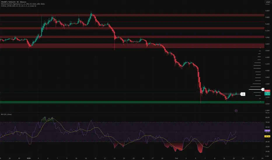
TRUMP: ready for a bounce? key levels to watch for the next daysTRUMP. Tired of watching this election meme bleed or ready for the next squeeze? According to market chatter, the latest political headlines cooled off the whole election-narrative sector, so the hype premium got flushed out. Now price is sitting right on that big green demand zone where earlier buyers finally woke up.
On the 4H chart the trend is still clearly down, but we just bounced off support around 3.0 and started to grind sideways. RSI printed oversold and is curling up with a small bullish divergence, while above us the volume profile leaves a nice liquidity pocket toward 3.7-4.0. I lean to a corrective pop upward rather than an immediate new low, especially if fresh headlines bring back spec money.
My base plan: only interested in longs while price holds that green zone around 3.0-3.2, with short-term targets at 3.6 and then 3.9-4.0 ✅. If buyers fail and we close 4H candles below the green box, I treat it as trend continuation with room for fresh lows and step aside. I might be wrong, but for now I see this as a dead-cat that still has one good bounce left in it.
AUD/CHF Market Analysis: Macro + Structure [MaB]1. The Macro Context (The "Why") 🌍
Hi traders! Before looking at the candles, let's look at the money.
My fundamental scoring table is giving us a clear signal: we have a +7 differential, pointing toward a Strong Bullish bias that we simply can't ignore. 🏦
Key Factor Analysis:
🏦 Current Rates: Explanation: RBA at 3.6% offers an attractive carry trade level compared to the SNB's 0.0%, which is the lowest in the G7. Score AUD: +1 | Score CHF: -1
🌍 Economic Regime: Explanation: AUD is in a strong reflationary phase with accelerating inflation (+0.79%), while CHF shows weak reflation with only moderate inflation increases. Score AUD: +2 | Score CHF: +1
📊 Rate Expectations: Explanation: RBA remains hawkish with a recent +25bp hike and active tightening trend; SNB is neutral, holding rates steady since September. Score AUD: +1 | Score CHF: 0
⚖️ Risk Sentiment: Explanation: Market sentiment is currently neutral for both currencies with no specific bias. Score AUD: 0 | Score CHF: 0
🏛️ COT Score: Explanation: Speculators are heavily long on AUD with accelerating purchases; CHF shows strong shorts despite some recent buying. Score AUD: +2 | Score CHF: 0
Currency Score Summary: Total Score AUD: +7 (Strong Bullish) Total Score CHF: 0 (Neutral)
Synthesis: 💡 AUD (Strong, Score +7): Hawkish RBA, solid GDP (2.3%), and booming services PMI (56.3) drive strong demand. 💡 CHF (Neutral, Score 0): Despite a manufacturing rebound, 0% rates and slight deflation keep the franc under pressure.
Conclusion: Given this fundamental backdrop, we are strictly looking for Long setups. Going against this bias would be statistical suicide. 🚫
2. The Technical Setup (The "Where") 📉
Timeframe: 15m | Pair: AUD/CHF
The SMC Market Structure + Price Zones indicator has confirmed our statistical edge.
Here’s the probabilistic data from the dashboard:
🚀 Continuation Rate (65.4%): We are currently above the 60% threshold.
This confirms a healthy directional trend where continuation has a much higher probability than a reversal.
🔥 Streak Analysis (1): We are currently on impulse number 1.
Expected Streak: 1 | 2 | 4 (Percentile: 20th-80th)
Remaining Moves: This indicates a Young trend. The statistical range suggests we are at the beginning of a potential multi-impulse expansion.
🔄 Retest & Reaction:
Retest Prob (80.8%): The probability of the price returning to test the zone after a BOS is very high.
BOS/Ret Rate (65%): Once inside the zone, this is the probability of a positive reaction leading to a new BOS.
🎯 Extension & Projection:
Extension Range: The expected extension for this single leg is between 1.48x and 2.42x (Expected: 1.68x).
Compound Extension (1.68x): This is the total projected move based on the remaining expected impulses.
3. Execution Plan on Chart 🎯
Moving over to the charts, we are using these statistics to define our operational levels:
📍 Entry and Stop Loss: We are placing a limit entry within the Demand Zone 15m (Blue Band) .
The stop loss is tucked a few pips outside the zone to protect against structural invalidation.
🏁 Statistical Take Profit: Instead of an arbitrary target, we are leveraging the Compound Extension .
We project the target at 1.68x relative to the pullback zone height.
This allows us to capture the full extension projected by the algorithm. 🏆
Trade Parameters: 💰 Entry Price: 0.54248 🛡️ Stop Loss: 0.53949 🏆 Take Profit: 0.55620
⚠️ Disclaimer: This analysis is based on a proprietary algorithm and is shared exclusively for educational and didactic purposes.
It does not constitute financial advice or investment solicitation in any way. Trading involves significant risk.

BTCUSD — 56,253.27 Liquidity | CORE5 PEMLiquidity remains visible near 56,253.27 while price trades around 66,000, and engagement conditions remain incomplete.
Market data behavior observation.
No prediction. No instruction.
— Danel Fadejev
CORE5 Tradecraft

MNQ Analysis & Day Trading - Tuesday February 10 2026 part 11-2 so far on the day, +$8. continue the day with me in part 2.
-------------
As a learning, beginner day trader I go through the market replay predefining what I am looking for to enter a trade and walk through my thoughts as I experience the market action bar by bar throughout the entire day to see how I handle various events and assess my execution.
This is for me and others to learn if you desire.

M: poised for a move? key levels and targets for todayM. Who’s bored of chasing BTC wicks and wants a clean alt setup instead? Lately liquidity has been rotating back into second-tier perps according to market desks, and M is sitting right on a fat 4H value area around 1.40 - that’s usually where smart money quietly reloads, not where it panic exits.
On the 4H chart price keeps hugging this orange HVN zone while RSI chills near 45 after cooling off from overbought. I’m leaning long from here: buyers defended this area after the last liquidation spike and every dip into 1.38-1.40 gets absorbed. First real supply is stacked above at 1.47-1.50, then 1.55+ if momentum kicks in.
My base plan: look for a reclaim of 1.45 with strong 4H candle bodies and I’ll ride it toward 1.50 and possibly 1.55 ✅. If we lose the orange block with a clean 4H close under 1.37, I expect a slide into the green demand near 1.30 where I’d rather wait for a fresh bounce. I might be wrong, but for now the chart still looks more like quiet accumulation than distribution.

AMPG Orderflow (Daily)
No Bullish mBOS/CHoCH yet (@$3.29)
FVG from 13/11/2026 - 17/11/2026 fully mitigated .
Testing bullish gap up from 13/11/2026 - 14/11/2026 (gap fill @$2.66)
Sellside liquidity under $2.76. Buyside Liquidity over $3.16 & $3.29.
Weak short term Substructure Swing High @$3.16 if Fractal Swing Low @$2.70 does not get taken out.
Looking for Absorption candles & trapped shorts (i.e Daily close above Bearish Imbalance/s).

HYPEUSDT – Analyzing Key Liquidity Levels & Zone ReactionsCurrently monitoring HYPEUSDT as it approaches critical supply and demand zones. I am waiting for a high-probability reaction within these marked levels. If we see a confirmed bounce or a strong rejection supported by a surge in volume, I’ll be looking to enter a position targeting the next major liquidity areas. Patience is key—waiting for the market to confirm the strength before execution.

EURCHF BiasLooking into EURCHF today get to realized is on downtrend
Shorting with the setup posted
NFA and manage your risk

US500 Probability Corridor → Bearish Scenario Building | ARVEX SUS500 is currently trading inside a structured probability corridor following a lower-high formation, suggesting weakening bullish momentum on the 4H timeframe.
The ARVEX Scenario Engine has locked a bearish directional bias, projecting two downside target zones derived from recent swing behavior and volatility conditions.
Z1 represents the conservative path — the area where price is statistically more likely to react first.
Z2 reflects an extended volatility path if downside momentum accelerates.
As long as price remains inside the corridor and fails to reclaim higher structure, the current framework favors continued downside exploration.
A confirmed breakout beyond the corridor would invalidate this scenario and trigger a new structural analysis.
This publication is intended for market context and analytical purposes only — not financial advice.

EUR/AUD Market Analysis: Macro + Structure [MaB]1. The Macro Context (The "Why") 🌍
Hi traders! Before looking at the candles, let's look at the money.
My fundamental scoring table is giving us a clear signal: we have a -5 differential, pointing toward a Bearish (Moderate) bias that we simply can't ignore. 🏦
Key Factor Analysis:
🏦 Current Rates: Explanation: AUD offers a significantly higher and more attractive rate at 3.6% compared to the Euro's 2.15%. Score EUR: 0 | Score AUD: +1
🌍 Economic Regime: Explanation: Both regions are in reflation, but AUD shows accelerating inflation (+0.79%) while EUR inflation remains weak/stable. Score EUR: +1 | Score AUD: +2
📊 Rate Expectations: Explanation: ECB is on a neutral holding pattern, while the RBA remains hawkish with a recent +25bp hike and a tightening trend. Score EUR: 0 | Score AUD: +1
⚖️ Risk Sentiment: Explanation: The market regime is currently neutral for both currencies, offering no specific directional bias from sentiment alone. Score EUR: 0 | Score AUD: 0
🏛️ COT Score: Explanation: Both currencies show a COT Index of 100% with strong long positioning and purchase acceleration. Score EUR: +2 | Score AUD: +2
Currency Score Summary: Total Score EUR: +2 (Neutral) Total Score AUD: +7 (Strong)
Synthesis: 💡 EUR (Weak, Score +2): Showing signs of stagnation with a low GDP of 0.7% and manufacturing PMI still in contraction (49.5%). 💡 AUD (Strong, Score +7): Robust economy with 2.3% GDP and a surging services PMI at 56.3%.
Conclusion: Given this fundamental backdrop, we are strictly looking for Short setups. Going against this bias would be statistical suicide. 🚫
2. The Technical Setup (The "Where") 📉
Timeframe: 15m | Pair: EUR/AUD
The SMC Market Structure + Price Zones indicator has confirmed our statistical edge. Here’s the probabilistic data from the dashboard:
🚀 Continuation Rate (66.1%): We are currently above the 60% threshold. This confirms a healthy directional trend where continuation has a much higher probability than a reversal.
🔥 Streak Analysis (0): We are currently at the start of a potential new cycle.
Expected Streak: 1 | 2 | 5
Remaining Moves: This indicates a Young trend. The statistical range suggests we are positioned early in the structural movement.
🔄 Retest & Reaction:
Retest Prob (69.9%): The probability of the price returning to test the zone after a BOS.
BOS/Ret Rate (61%): Once inside the zone, this is the probability of a positive reaction leading to a new BOS.
🎯 Extension & Projection:
Extension Range: The expected extension for this single leg is between 1.56x and 3.16x (Expected: 1.78x).
Compound Extension (2.47x): This is the total projected move based on the remaining expected impulses. By multiplying the current zone height by this factor, we find our ultimate target.
3. Execution Plan on Chart 🎯
Moving over to the charts, we are using these statistics to define our operational levels:
📍 Entry and Stop Loss: We are placing a limit entry within the Supply Zone 15m (Red Band) . The stop loss is tucked a few pips outside the zone at 1.68740 to protect against structural invalidation.
🏁 Statistical Take Profit: Instead of an arbitrary target, we are leveraging the Compound Extension . We project the target at 2.47x relative to the pullback zone height. This allows us to capture the full extension projected by the algorithm. 🏆
Trade Parameters: 💰 Entry Price: 1.68410 🛡️ Stop Loss: 1.68740 🏆 Take Profit: 1.66764
⚠️ Disclaimer: This analysis is based on a proprietary algorithm and is shared exclusively for educational and didactic purposes. It does not constitute financial advice or investment solicitation in any way. Trading involves significant risk.

ETHUSD Market Analysis: Macro + Structure [MaB]1. The Macro Context (The "Why") 🌍
Hi traders! Before looking at the candles, let's look at the money. My fundamental scoring table is giving us a clear signal: we have a Negative (-14) differential, pointing toward a Bearish bias that we simply can't ignore. 🏦
Key Factor Analysis:
🏦 Current Rates: Explanation: While the Fed is expected to continue cutting rates in early 2026, USD still maintains a significant yield advantage over ETH's staking rewards in a risk-off environment. Score ETH: -1 | Score USD: +2
🌍 Economic Regime: Explanation: The US is navigating a "fiscal expansion" regime with growth rebounding to 2.2%, favoring the Greenback over speculative crypto assets. Score ETH: -2 | Score USD: +1
📊 Rate Expectations: Explanation: Markets are pricing in a neutral Fed stance around 3.00%–3.25%, while ETH faces headwinds from a potential rotation back to traditional yields. Score ETH: -1 | Score USD: +2
⚖️ Risk Sentiment: Explanation: Heightened global trade uncertainty and tariff-related risks are driving safe-haven flows toward the USD. Score ETH: -2 | Score USD: +1
🏛️ COT Score: Explanation: Recent exchange data shows a sharp 20% decline in ETH value throughout early February, suggesting institutional distribution. Score ETH: -1 | Score USD: +1
Currency Score Summary: Total Score ETH: -7 (Bearish) Total Score USD: +7 (Bullish)
Conclusion: Given this fundamental backdrop, we are strictly looking for Short setups. Going against this bias would be statistical suicide. 🚫
2. The Technical Setup (The "Where") 📉
Timeframe: 15m | Pair: ETHUSD
The SMC Market Structure + Price Zones indicator has confirmed our statistical edge. Here’s the probabilistic data from the dashboard:
🚀 Continuation Rate (73.8%): We are currently above the 60% threshold, confirming a healthy directional trend.
🔥 Streak Analysis (0): We are currently on impulse number 1, with an expected streak of 1.4, indicating a Young trend with more moves to come.
🔄 Retest & Reaction: Retest Prob (72.6%) and a BOS/Ret Rate (64.3%) suggest a high probability of a successful entry reaction.
🎯 Extension & Projection: The expected extension for this leg is 1.8x , projecting a deep target based on structural momentum.
3. Execution Plan on Chart 🎯
Moving over to the charts, we are using these statistics to define our operational levels:
📍 Entry and Stop Loss: We are placing a limit entry within the Supply Zone 15m (Red Band) . The stop loss is tucked a few pips outside the zone at 2034.8 to protect against structural invalidation.
🏁 Statistical Take Profit: Leveraging the Compound Extension (1.8x) , we project the target at 1799.5 to capture the full algorithmic move.
Trade Parameters:
💰 Entry Price: 2008.1
🛡️ Stop Loss: 2034.8
🏆 Take Profit: 1799.5
⚠️ Disclaimer: This analysis is based on a proprietary algorithm and is shared exclusively for educational and didactic purposes. It does not constitute financial advice or investment solicitation in any way. Trading involves significant risk.

BTCUSDT Intraday Short — Contextual ExpectationWithin the framework of last week’s established initial balance, the broader daily dynamics remain constructive.
However, on a local scale, signs of upside exhaustion are starting to appear.
The current context is defined by:
-a local market buyer block
-presence of minor liquidation activity
-temporary weakness in acceptance above current levels
As long as these factors remain unchanged, the near-term bias stays short-oriented.
Zone of interest for short setup:
69,800 – 70,400
Targets:
-67,300 — first target
-66,300 — second target
Idea invalidation:
Acceptance and consolidation above 72,300.
All decisions should be made according to your own trading system and risk management rules.

BTCUSD Distribution Phase | Lower High Structure Favors BearsBTCUSD experienced a sharp sell-off followed by a reactive bounce, but the recovery failed to regain bullish control. Price transitioned into a distribution range, where upside attempts were consistently sold into.
The structure now reflects weak demand and dominant supply, keeping downside risk elevated.
🔹 Structural Breakdown
Initial Break in Market Structure (BMS) to the downside set the bearish tone
Rally formed a Lower High (LH) inside premium pricing
Buyers failed to reclaim key resistance → no trend reversal confirmation
Recent Higher Low (HL) failed to expand → signs of exhaustion
This price behavior suggests range distribution, not accumulation.
🔹 Why This Looks Like Distribution
Instead of impulsive bullish continuation, price is:
Stalling near prior supply
Creating overlapping candles
Respecting resistance zones
Compressing before expansion
These conditions often precede range breakdowns, especially after a strong bearish impulse.
🔹 Bearish Continuation Scenario
If price loses the mid-range support, liquidity is likely to be drawn toward the sell-side resting below the range, targeting deeper discount zones.
The projected path reflects:
Range expansion logic
Unfilled inefficiencies below
Liquidity magnet toward prior lows
Pullbacks into resistance remain sell-favorable, not buy opportunities.
🔹 Invalidation
A sustained reclaim and acceptance above the distribution highs would invalidate the bearish continuation thesis and shift bias neutral-to-bullish.
🔹 Trading Bias
📉 Bias: Bearish
📊 Market Phase: Distribution → Expansion
🎯 Focus: Sell rallies, avoid premature longs

MNQ Analysis & Day Trading - Friday March 7 2025 part 2Day: 1-1-1, +$93.
decent execution and vision today, not close to good or great.
Week: 5-6-2, +$228.
my win% goal is only 55-60%
----------
As a learning, beginner day trader I go through the market replay predefining what I am looking for to enter a trade and walk through my thoughts as I experience the market action bar by bar throughout the entire day to see how I handle various events and assess my execution.
This is for me and others to learn if you desire.

MNQ Analysis & Day Trading - Friday March 7 2025 part 11-1 so far on the day, +$93. continue the day with me in part 2.
----------
As a learning, beginner day trader I go through the market replay predefining what I am looking for to enter a trade and walk through my thoughts as I experience the market action bar by bar throughout the entire day to see how I handle various events and assess my execution.
This is for me and others to learn if you desire.

MNQ Analysis & Day Trading - Monday February 9 2026 part 2great 4-0 day, +$648.
never risked more than $125 on any trade.
-------------
As a learning, beginner day trader I go through the market replay predefining what I am looking for to enter a trade and walk through my thoughts as I experience the market action bar by bar throughout the entire day to see how I handle various events and assess my execution.
This is for me and others to learn if you desire.

MNQ Analysis & Day Trading - Monday February 9 2026 part 12-0 so far on the day, +$355. continue the day with me in part 2.
-------------
As a learning, beginner day trader I go through the market replay predefining what I am looking for to enter a trade and walk through my thoughts as I experience the market action bar by bar throughout the entire day to see how I handle various events and assess my execution.
This is for me and others to learn if you desire.
