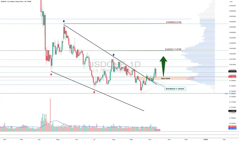
QuyetP | Bitcoin start melting...?BITSTAMP:BTCUSD start dumping as expected.
$100B has been wiped out of the crypto market.
At the moment, with rising global geopolitical tensions, it’s completely understandable that money flows are getting out of Bitcoin.
I won’t buy BTC just because the US dollar is weakening.
My view remains the same: sell Bitcoin toward the 78k–74k zone and reassess price action there.
“Every trade with a proper stop-loss is a good trade — regardless of the outcome.”
Let me know what you think, traders!
Money

Gold ATH Is Not Random – It’s a War to Defend the USDBombs and bullets are just smoke screens.
The real war is about who still controls the world’s money.
And that’s why Trump appears at the right time.
This is not a shooting war.
It’s a war to protect the US dollar.
If you look at US actions separately, everything feels messy:
Pressure on Iran
Sanctions and control over Venezuela
Tough stance with Russia, yet still talking
For new traders → it looks chaotic.
But once you put everything on one chessboard, there’s only one objective:
👉 Make sure the world still needs USD.
Not oil.
Not Iran.
Not Venezuela.
👉 Settlement currency.
Why is USD so important?
The US today:
Doesn’t compete on cheap labor
Doesn’t mass-produce low-cost goods
Doesn’t live off exports
👉 The US lives on money and the financial system.
If USD loses its central role:
Printing money becomes hard
National debt becomes a real burden
Military power loses its “credit-backed” strength
👉 Lose USD = lose superpower status.
Where does the real problem start?
Some countries sell oil to China without using USD, instead using:
Chinese yuan
Bilateral swaps
Systems outside US control
👉 For the US, this is a direct attack on the foundation of its power,
without firing a single bullet.
So what is Trump doing?
Not fighting to seize oil.
Not fighting to take land.
👉 Trump is making non-USD oil trading risky.
Very pragmatic moves:
Creating controlled instability
Disrupting “off-system” oil flows
Forcing countries back to USD because… it’s safer
A simple example for traders
Imagine a market where only one currency is accepted.
You want to buy anything?
You must use that currency.
One day, some stalls say:
“We’ll accept another currency. It’s cheaper.”
The market owner doesn’t shut them down.
He just:
Makes selling harder
Increases delivery risks
Tightens inspections
👉 Eventually, those stalls go back to the old currency to avoid headaches.
That’s exactly how USD and oil work.
Putting it all together – the trader’s view
Iran – Venezuela – Middle East
These are not random events.
👉 This is a war to maintain the monetary order.
Trump:
Isn’t fighting for oil
Isn’t fighting for morality
👉 He’s fighting for the settlement currency.
Anyone who makes the world less dependent on USD
automatically becomes a target.
CONCLUSION – trader style, slightly sarcastic 😄
Gold ATH is not the market being crazy.
👉 It’s the result of a war to protect the global “toll currency.”
If you understand this:
Charts feel less “stupid”
You stop wanting to short every high candle
Your account suffers less heart attacks
But wait 😄
The real question is:
If the big players are fighting a monetary chess game,
where should retail traders stand to avoid getting wiped out?
In the next part, I’ll talk about:
Why SELLING gold at ATH is extremely hard to survive
When chasing BUYs is stupid – and when it’s actually right
How traders can protect their rice bowl when the chart runs like it’s being chased
👉 If this hits home, drop a 🚀
Enough 🚀 and I’ll continue – no secrets 😏

MNQ LONGS head and shoulders was pretty obvious today bear flag and trap after trap. We havent quite swept NYSE PM low;s. For a short term scalp im targetting my neckline with a SL of 822.5. forming a possible tripple bottom bear just be cautious you still are in a bear flag but that doesnt mean you can scalp longs for free money within a bearish pattern

Short Fans XAU/USDToday the focus wasn’t on guessing price, but on waiting for the market to confirm and executing only when the context allowed it.
🔎 **Broader context**
* Intraday bullish trend.
* Key decision zone between **4420 – 4430**.
* Market in an acceptance phase after the breakout, with multiple continuation attempts and the risk of false breakouts.
In this kind of environment, patience makes the difference.
🧠 **Process followed**
* **No breakout anticipation.**
Waited for a close and acceptance on higher timeframes (**M15 / M5**).
* **No entries in the noise zone.**
While price was inside the box, there was no trade.
* **Wait for structure.**
Breakout + pullback + higher low.
* **Lower-timeframe confirmation.**
Momentum aligned (**RSI > 50, MACD turning up after the pullback**).
* **Clean execution.**
Fixed risk, moderate RR (~**1:1.2**), no overtrading.
👉 The trade wasn’t taken because it “looked like it was going up,” but because the market stopped being ambiguous.
✅ **Execution**
* Entry after a confirmed breakout + implicit retest.
* SL placed at **structural invalidation**, not emotional levels.
* TP defined from the start.
* No moving stops out of anxiety.
* No adding positions.
This type of execution protects the account even when the trade fails.
📊 **Possible scenarios for the rest of the day**
🟢 **Scenario 1 – Continuation**
As long as price holds above the acceptance zone, and pullbacks remain corrective (low volume),
→ look for continuation on clean pullbacks.
🟡 **Scenario 2 – Range / Distribution**
If price returns to congestion with no momentum,
→ no trade. Waiting is a valid position.
🔴 **Scenario 3 – Structural failure**
A clear loss of intraday supports with volume,
→ invalidates longs and opens the door to a deeper rotation.
🎯 **Key idea of the day**
The one who trades the most doesn’t win — the one who chooses *when* to trade wins.
Today the value wasn’t in the outcome, but in:
* filtering noise,
* respecting the plan,
* executing without improvisation.
That’s what builds real consistency over the long run.
Good trading and patience.

Single-Family Home Prices Priced in Gold (1971–2026)📊 Single-Family Home Prices Priced in Gold (1971–2026)
This chart shows the price of a U.S. single-family home measured in ounces of gold, not dollars, going back to the early 1970s.
Why this matters:
Tight Credit is not good for markets! Bad JUJU!
Gold acts as a long-term monetary benchmark. Pricing homes in gold strips out currency effects and helps reveal real cycles, not nominal noise. It gives us insight into how the market is looking at credit going forward.
🔎 What the chart shows (facts)
Home prices in gold move in long, multi-decade cycles
Peaks tend to occur during periods of:
easy credit
suppressed interest rates
strong belief in “housing always goes up”
Troughs tend to follow:
monetary tightening
credit contraction
stress resets in the financial system
Historically, these cycles are not random and not short-term.
Bottom line
This chart is about relative value, monetary regimes, and long-term structure.
For new traders:
Learn to separate nominal prices from real purchasing power, "VALUE" and you’ll start seeing markets more clearly.
Structure first. Emotion later.
The home didn't change
The Currency did.
I strongly encourage traders and investors to understand the operational mechanics of the monetary system. There is a meaningful distinction between money and currency, and this chart highlights that difference clearly.
Understanding that distinction changes how you interpret cycles, value, and risk.
If you enjoy the work:
👉 Drop a solid comment
Let’s push it to 6,000 and keep building a community grounded in raw truth, not hype.

SPX to 6792Its hard to see on a 30 minute chart but you created your inverse head and shoulders and you are forming your bull flag. Unless if invalidated and LOD breaks your heading up here EMA's are slightly pointing up. Pay attention to the clue's

SPY LONG BULL FLAGCheck the chart and my levels for daily guidance I predict movement befroe it happens

NQ Bear FlagLooking at the chart here still room down going off my levels from last week would need to break out of this flag to have any room up

NQ levels BearishTake a look at my charts and levels I call things ahead of things and see action before it happens

SHORT ON US30Us30 has created a head and shoulder pattern at a major supply area/zone.
FOMC is coming out in a few minutes and this could be a major catalyst to US30 falling.
Strictly going off technical's with the chart. Looking to make 1k-2k points.

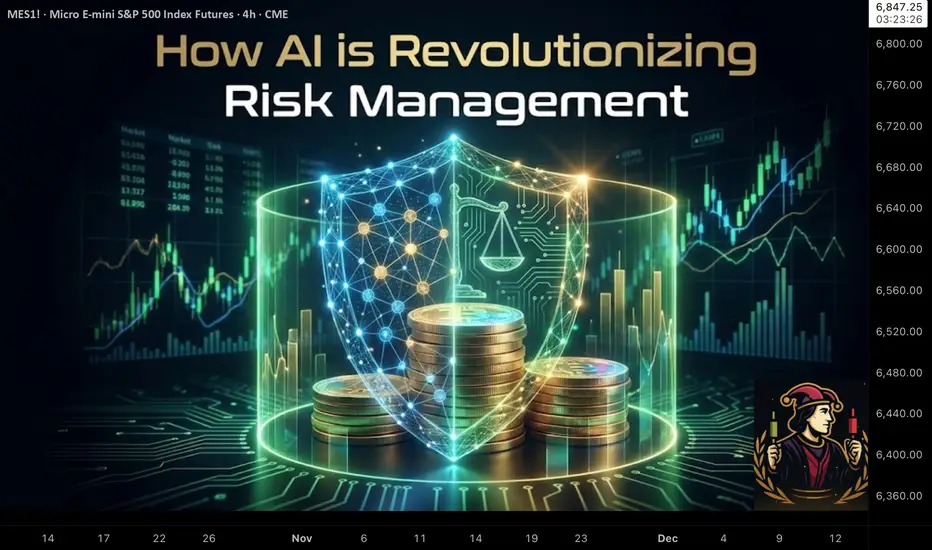
How AI is Revolutionizing Risk ManagementIn a world where bots can fire off hundreds of orders in the time it takes you to sip your coffee, risk management isn't a checkbox at the end of your plan it's the core operating system.
AI has given traders incredible leverage:
Faster execution than any human
Exposure to more markets and instruments
Complex position structures that would be impossible to manage manually
But that same leverage cuts both ways. When something breaks, it doesn't trickle it cascades.
The traders who survive this era won't be the ones with the most aggressive models. They'll be the ones whose risk frameworks are built to handle both human mistakes and machine speed.
Why Old-School Risk Rules Aren't Enough Anymore
For years, the standard advice looked like this:
"Never risk more than 1–2% per trade"
"Always use a stop loss"
"Diversify across assets"
Those principles still matter so much. But AI and automation helped improve and changed the landscape:
Orders can hit the market in microseconds your "mental stop" is useless
Correlations spike during stress what looked diversified suddenly moves as one
Multiple bots can unintentionally stack risk in the same direction
Feedback loops between algos can turn a normal move into a cascade
In other words: the classic rules are the starting point , not the full playbook.
How AI Supercharges Risk Management (If You Let It)
Used well, AI doesn't just place trades it monitors and defends your account in ways a human never could.
Dynamic Position Sizing
Instead of risking a flat 1% on every trade, AI can adjust size based on:
Current volatility
Recent strategy performance
Correlation with existing positions
Market regime (trend, range, chaos)
When conditions are favorable, size can step up modestly.
When conditions are hostile, size automatically steps down.
The goal isn't to swing for home runs.
It's to press when the wind is at your back, and survive when it's in your face.
Smarter Stop Placement
Fixed stops at round numbers are magnets for liquidity hunts.
AI can analyze:
ATR-based volatility bands
Clusters of swing highs/lows
Liquidity pockets in the book
Option levels where hedging flows are likely
Stops get placed where the idea is broken, not where noise usually spikes.
Portfolio-Level Heat Monitoring
Most traders think in single trades. AI thinks in portfolios.
It can continuously measure:
Total percentage of equity at risk right now
Sector and theme concentration
Correlation clusters (everything tied to the same macro factor)
Worst-case scenarios under shock moves
If your "independent" trades are all secretly the same bet, a good risk engine will tell you.
The 4-Layer Risk Stack for AI Traders
Think of your protection as layered armor:
Trade Level
Clear stop loss
Defined target or exit logic
Position size tied to account risk, not feelings
Strategy Level
Max number of open positions per strategy
Daily loss limit per system
"Three strikes" rules after consecutive losing days
Portfolio Level
Total open risk cap (for example: no more than 2% at risk at once)
Limits by asset class, sector, and narrative
Rules to prevent over concentration in one theme (AI stocks, crypto, etc.)
Account Level
Maximum drawdown you're willing to tolerate
Hard kill switch when that line is crossed
Recovery plan (size reductions, pause period, review process)
AI can monitor all four layers at once every position, every second and trigger actions the moment a rule is violated.
Kelly, Edge, and Why "More" Is Not Always Better
The Kelly Criterion is a famous formula that tells you how much of your account you could risk to maximize long‑term growth.
Kelly % = W - ((1 - W) / R)
Where:
W = Win probability
R = Average Win / Average Loss
Example:
Win rate (W) = 60%
Average win is 1.5× average loss (R = 1.5)
Kelly = 0.60 - (0.40 / 1.5) ≈ 0.33 → 33%
On paper, that says "risk 33% of your account each trade." In reality, that's a fast path to a margin call.
Serious traders and any sane AI risk engine treat Kelly as the ceiling , then scale it down:
Half‑Kelly (≈ 16%)
Quarter‑Kelly (≈ 8%)
Or even less, depending on volatility and confidence
AI can recompute W and R as fresh trades come in, adjusting risk when your edge is hot and cutting risk when your edge is questionable.
Designing Your AI‑Era Risk Framework
You don't need hedge‑fund infrastructure to think like a pro. Start with five questions:
What is my absolute pain threshold?
At what drawdown (%) would I stop trading entirely?
Write that number down. Build backwards from it.
How many consecutive losses can I survive?
If you want to survive 10 straight losses at 20% max drawdown, your per‑trade risk must be ~2% or less.
How will I shrink risk when volatility spikes?
Tie your size to ATR, VIX‑style measures, or your own volatility index.
What are my circuit breakers?
Daily loss limit
Weekly loss review trigger
Conditions where all bots shut down automatically
Is everything written down?
If it's not in rules, it's just a wish.
Rules should be clear enough that a bot could follow them.
Four AI Risk Mistakes That Blow Accounts Quietly
Over‑optimization - Training models until the backtest is perfect… and live trading is a disaster.
Ignoring tail risk - Assuming the future will look like the backtest, and underestimating rare events.
No true kill switch - Letting a "temporary" drawdown turn into permanent damage.
Blind trust in the model - Assuming "the bot knows best" without understanding its logic.
AI should be treated like a high‑performance car: powerful, fast, and absolutely deadly if you drive it without brakes.
Discussion
How are you handling risk in the age of automation?
Do you size positions dynamically or use fixed percentages?
Do you cap total portfolio risk, or just think trade by trade?
Do your bots or strategies have clear kill switches?
Drop your thoughts and your best risk rules in the comments. In the future of trading AI will be the one watching your back.....
NQ Levels 12/92/2025 PT 25,963Pretty simple setup here. Look for your structure to combat the noise intraday and overnight. I'm long here.

Gold (GC1!) Forecast: The Squeeze & Release Path via DSRTL MatriCategory: Trend Analysis / Chart Patterns
Symbol: GC1! (Gold Futures)
In this analysis, we use the DSRTL-ML (Dynamic Support & Resistance) engine to map the current structural context for Gold. The indicator is tagging the state as “TESTING RES – Bias: Neutral”, highlighting a consolidation phase right underneath a major resistance band. Structurally, this is a spot where static friction meets dynamic momentum.
1. The Current Structure: Compression Phase
The Matrix currently sits at S2 | D3 (Testing Resistance).
- The Ceiling (Static R): Price is capped by a high-volume resistance node (orange zone: ~4.24K–4.31K), acting as a lid on price action.
- The Floor (Dynamic S): At the same time, the rising DSRTL trend line (dynamic support) is pushing the lows higher inside the channel.
Taken together, this can be viewed as an early ascending-triangle–style squeeze: price is consolidating between a flat static lid and a rising dynamic floor, while DSRTL keeps the official bias neutral and labels the state as a resistance test.
2. Path of Least Resistance
The dashboard shows a positive Net Delta of +8.36K, suggesting that buyers have been active right below the resistance band.
- Projected Path: In the absence of a clear break, price can continue to oscillate within this narrowing pocket between static resistance and the rising channel.
- Breakout Vector: The combination of constructive volume flow and an upward-sloping dynamic channel creates a supportive backdrop if an upside break occurs, even though DSRTL itself still prints a Neutral bias here.
3. Scenario & Structural Objectives
- Trigger: A confirmed close above the top of the Static R band (~4.31K) would move the Matrix out of its S2 “testing” state toward an S1-type breakout environment.
- Next Structural Area: Above that level, the next area of interest becomes the upper rail of the DSRTL dynamic channel (pink line), where the system could start migrating toward its higher “extension” states.
Invalidation:
If price breaks and closes below the rising pink dynamic support, the bullish squeeze thesis is invalidated. In that case, the Matrix would likely rotate toward Neutral/Bearish or Bearish-Pullback configurations, depending on how price interacts with the underlying static support band.
Disclaimer: This forecast is based on structural scenarios derived from the DSRTL-ML engine and is provided strictly for educational and illustrative purposes.

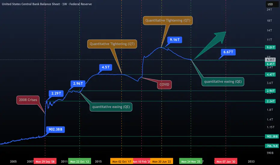
The Era of Gentle Money (QE)- This chart features labels for all key dates, offering a clear and comprehensive overview, including trillions in money creation, QT and QE phases, crises, and flash printing events.
- To truly understand stocks, cryptocurrencies, or precious metals, you first need to understand the monetary system and how it drives inflation.
- The market has been heavily suppressed since June 2022, when the Fed began its Quantitative Tightening (QT), the Fed kicked off a new QE phase on December 1, 2025.
- This is the primary driver behind yesterday’s BTC market surge.
- To complement this, we will soon have a new Fed President, Most likely, they will continue cutting rates, printing more money, and Banks will increase lending, encouraging people to take more risks, which could drive markets higher. Bearish sentiment is premature at this stage.
The heart of truth beats in the printer and in the river of liquidity !
Happy Tr4Ding !
Gold Market at turning point | target inside The Gold is running in the bullish trend, it can change the direction into the bearish when the price touch 4189 to 4211, then the price can fall till 4157.
If price breaks 4223, it can fly till 4247, if the price respects 4189 to 4211, it can give us more pips and we can see a big drop.
What's your idea about it.

Here are two trading ideasComment, criticize, and say what you think without holding back. How do you think gold will perform this week?

HighRisk QuickScalp #GBPJPY📌 Market Insight: {#GBPJPY }
⚠️ Risk Assessment: {High}
🚀 Approach:
Super Risky Setup .... at Edge of Structure
Just for QuickScalp
No Rush
Need valid momentum Structure and LTF entry Sign
#Ash_TheTrader #Forex #GBPJPY #MarketAnalysis #TradingSetup #RiskManagement #GOLD #Scalper #NQ #EURUSD

#USDJPY BuySide QuickScalp📌 Market Insight: {#USDJPY }
⚠️ Risk Assessment: {High}
🚀 Approach:
UJ is still in my watchlist but i just take it if it show us a momentum structure ...
#USDCAD is VALID too .
#Ash_TheTrader #Forex #GBPJPY #MarketAnalysis #TradingSetup #RiskManagement #GOLD #Scalper #NQ #EURUSD

The Market Is Loading Up for a Breakout… Here’s the Exact TargetUltra-Detailed Professional Analysis
Based on the visible structure, the chart is showing signs of a local exhaustion of bearish momentum and the early formation of a bullish reversal structure. Here is the full breakdown:
---
1. Market Structure Shift (MSS)
The price has been in a continuous downtrend, making lower highs and lower lows. However, in the most recent area (where you drew the black diagonal line), the slope of the lows is starting to flatten.
This flattening implies:
Bearish pressure is weakening
Selling is no longer accelerating
Buyers are starting to absorb liquidity at the lows
This is typically the earliest sign of a possible market structure shift.
---
2. Bullish Divergence Signatures
Even though your screenshot doesn’t show indicators, the shape of the price movement suggests a classic divergence setup:
Price is making equal lows or slightly lower lows
Momentum is decreasing (suggested by slowing downward volatility)
This often precedes a short-term bullish push into nearby resistance zones.
---
3. Liquidity Mapping
The clustered price action under the descending structure suggests the market is:
Gathering sell-side liquidity beneath the recent lows
Preparing to use that liquidity for a stop-run and reversal
The red arrow you drew aligns with a typical liquidity-based move:
break out of the diagonal, collect stops, then push upward into a liquidity pocket.
---
4. Imbalance (Fair Value Gap) Above Price
The chart shows a noticeable price void / imbalance above the current level.
Markets often retrace to fill these inefficiencies.
The blue line at the tip of your arrow sits right inside this imbalance zone, making it a high-probability magnet for price.
---
5. Supply & Demand Mapping
You have several purple zones drawn above — these appear to be:
Old supply clusters, created during previous sell-offs
Untested levels, meaning price hasn’t fully revisited them yet
Markets often return to untested supply/demand zones due to:
Algorithmic targeting
Liquidity replenishment
Market maker rebalancing
Your blue level aligns with this higher-timeframe supply magnet.
---
6. Break of the Micro-Downtrend Line
The black diagonal line you drew marks the local bearish control zone.
A breakout above this line often triggers:
Short covering
Breakout buying
Acceleration into the next liquidity pool (your blue line)
The chart suggests the market is coiling beneath this line, indicating a possible compression → expansion move.
---
7. Volatility Compression Pattern
The price action in the last segment is contracting.
Compression almost always leads to explosive directional expansion.
Given:
A flat support base
Weakening bearish momentum
Clear imbalance above
…the higher probability expansion direction is upward.
---
Final Professional Summary
The reason the price is expected to move toward the blue line above the arrow is due to a confluence of bullish catalysts:
✔ Weakening bearish momentum
✔ Market structure flattening
✔ Liquidity buildup below & liquidity vacuum above
✔ Imbalance (FVG) acting as a price magnet
✔ Untested supply zones overhead
✔ Volatility compression preceding expansion
Together these create a high-probability short-term bullish corrective move toward the level marked in blue.
---
If you liked this analysis, leave a like and drop a comment to share your thoughts!

a BuySide QuickScalp #USDCAD📌 Market Insight: {#USDCAD }
⚠️ Risk Assessment: {High}
🚀 Approach:
Not a Quality one ... need to have a Momentum Structure first .... Don't rush .
#Ash_TheTrader #Forex #GBPJPY #MarketAnalysis #TradingSetup #RiskManagement #GOLD #Scalper #NQ #EURUSD

Argentina Money Supply Reduced Along With InflationWe once again see that MMT ("Modern" Monetary Theory) is 100% wrong. Milton Friedman wins again.
"Inflation is always and everywhere a monetary phenomenon."
Don't let modern economic hacks fool you.

EURJPY Long 5 Fundamental Stacks 7 Technical Tacks. Confluence OANDA:EURJPY
We are trading odds on every trade that is our edge. Its a big edge especially when we have 5 fundamental stacks and 7 Technical stacks. The reason why we do this is so when we close our eyes and night and wake up the next day we are pretty sure we know the outcome. This method fused with proper money management is a sure fire winning strategy over time. We need to be able to sustain 4 or 5 maybe 7 loses and remain in the game so don't trade more then your account can handle. Stop losses are your best friend and you should always remember that. I wish you all the best of luck. Happy Trades.

Friday - the day the market shows its true faceEveryone loves chasing moves early in the week - Monday, Tuesday, news, data drops. But if you look closer, the most honest market signals usually appear on Fridays. By that time, the fight between buyers and sellers is settled, and the price reveals who really has control.
When big funds and banks are confident about direction, they don’t rush to close positions before the weekend. The market often ends the week at its highs - and Monday continues the same move. But if selling pressure picks up late on Friday, it’s usually a warning sign: traders are nervous and prefer not to hold risk over the weekend.
Friday’s close isn’t just another candle - it’s the verdict for the entire week. A close near the top of the range means demand is strong; near the bottom means fear and profit-taking are taking over.
Retail traders often close everything before the weekend to “stay safe.” But smart money uses those thin Friday hours to shake out weak hands and grab liquidity. That’s why the real moves often begin right after those late-week impulses.
What to keep an eye on:
1. Watch where the price closes within the weekly range - it sets the tone for Monday.
2. Check volume during the last trading hours - it tells you who’s really in control.
3. A strong Friday move with no news? Often that’s the setup for next week’s trend.
Friday’s action is rarely random. It’s the final scene before the next act of the market drama.