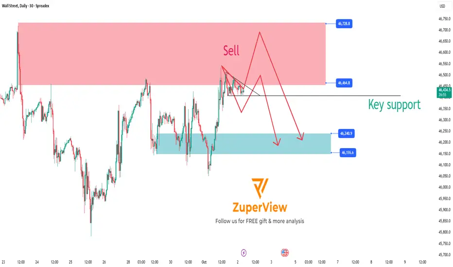
US30: Key support breakdown signals potential sell opportunity
1. Current Market Overview 🌐
The SPREADEX:DJI index is approaching a significant resistance zone where selling pressure is expected to be strong. The price is currently consolidating and moving sideways around this area, preparing for a major move.
2. Technical Signals and Momentum Indicators 📊
Momentum indicators such as MFI, RSI, and Stochastic have all entered the oversold territory, while also showing signs of price compression (consolidation), indicating the market is waiting for the next breakout.
The strong resistance zone and the Overbought/Overextended (OB/OS) signals suggest that buying pressure is weakening, which is favorable for sellers.
3. Sell Scenario on Key Support Breakdown 🔻
If the price breaks below the important Key Support level shown on the chart, this will confirm the beginning of a downtrend.
Traders can consider opening sell positions as soon as the breakout occurs to take advantage of the downward momentum.
The price target is expected to move toward lower support zones where buying interest may emerge to cause a price correction.
4. Risk Management ⚠️
Place stop-loss orders above the resistance zone or the nearest recent highs to protect against unexpected market moves.
Adjust your position size according to your risk tolerance.
5. Conclusion 🔑
The sell setup on US30 is very clear with a strong resistance zone and momentum signals indicating a potential upcoming downtrend.
Main scenario: Breaking the Key Support will trigger a strong decline, providing a profitable trading opportunity for sellers.
Wait for a confirmed support break before entering the trade to ensure safety and effectiveness.
Please like and comment below to support our traders. Your reactions will motivate us to do more analysis in the future 🙏✨
Harry Andrew @ ZuperView
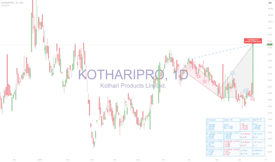
Overbought-oversold
KOTHARIPRO (BSE: 1D) — Volume Pressure Analyzer | OB 5/7 Tool used
Analysis made with ATAI Volume Pressure Analyzer (VPA), which decomposes daily flows into buy/sell volume, prints half-window deltas (C→B vs B→A), ATR-normalized wing slopes, α/β geometry at vertex B, and OverBought/OverSold spike labels confirmed by a 7-oscillator vote
1) Snapshot from HUD
◉ OB 5/7 fired on today’s +20% candle (RSI/Stoch/CCI/MFI/StRSI cluster).
◉ C→B (earlier half): Δ −14.21 → seller-tilted.
◉ B→A (recent half): Δ +72.25K → buyers in control.
◉ Angles: C→B wing both <0° (down), B→A wing both >0° (up).
◉ α=171.6°, β=188.4° → no red flags (thresholds are α>180 or β<180).
◉ Ranked zones:
- B1 High 93.0 / Low 77.0 (resistance)
- S1 Low 83.9 (support)
2) Interpretation
◉ The OB 5/7 tag warns of short-term exhaustion after an impulsive surge.
◉ Yet the right wing (B→A) shows positive deltas and slopes, meaning structure still favors buyers.
◉ No α/β stress flags, so the geometry is not “over-stretched.”
◉ The zone map is clean: B1 = resistance (93.0) and S1 = first support (83.9).
3) Scenarios
A) Base case — Pullback / Digestion
◉ Likely reaction into the S1 zone (≈84–87) after OB tag.
◉ Watch Δ(B→A): if it fades to ≤0 and wings flatten, pullback deepens.
B) Bullish continuation
◉ Requires daily acceptance above 93 with a buy-spike (TF_buy / SMA ≥1.6 or Z≥1.8).
◉ Validation = B→A Δ stays >0 and right wing >0°.
C) Bearish rotation
◉ Triggers if B→A Δ flips negative and right wing turns gray/red.
◉ Breakdown below 83.9 on a sell-spike would confirm shift.
4) Conclusion
Bias: Constructive with pullback risk.
◉ Immediate OB tag suggests a pause; however, the buyer regime in the recent half (B→A) is still active.
◉ Key invalidation = loss of 83.9 (S1) with negative Δ.
◉ Key confirmation = acceptance above 93 with buy-spike absorption.
The points above are the technical and educational details from the ATAI Volume Pressure Analyzer (VPA). Put simply, the takeaway is this:
The stock made a sharp +20% move today up to 93, and the indicator flagged an “OverBought” condition. That means buying pressure was unusually strong and the market may need to cool off with a pause or short pullback. Still, the recent volume balance shows buyers remain in control, so the broader structure is still constructive.
If price can hold above 93 with renewed strong buy-side volume, continuation to the upside is favored. But if it slips below 84 and selling pressure grows, that would mark the start of a deeper correction. In simple terms: the main trend is still positive, but after today’s surge it makes sense to expect some digestion before the next leg.
AERGO: Golden Pocket Hit – Crash Incoming?On April 3rd, AERGO hit a historic low of $0.04746—and just 13 days later, it's trading around $0.60, an astonishing +1500% surge in less than two weeks. The rapid rise begs the question: What are the bulls aiming for next, and how sustainable is this move?
Key Observations:
Explosive Rally:
AERGO’s meteoric move from $0.04746 to $0.70 in just 13 days has propelled the coin into uncharted territory. Such a dramatic spike is not only eye-catching but also raises concerns about overextension.
RSI Overbought:
The daily RSI sits at 98, indicating extreme overbought conditions. This level suggests that the current rally is unsustainable and may be ripe for a pullback.
Historical Resistance Levels:
Looking back at 2021, key highs were established around $0.60 to $0.62. These levels serve as critical resistance zones.
Fibonacci Confluence:
Taking the Fibonacci retracement from the low at $0.04746 to the previous rally's high at $1.0809 (April 13, 2024), the 0.618 level is projected at $0.68613. The bulls just tested that golden pocket.
Trade Strategy & Potential Setups:
For Longs:
With the market showing signs of being overbought (RSI at 98) and the explosive move possibly winding down, this may be the perfect opportunity to take profits rather than accumulate further.
Take Profit Consideration:
Target: Near the 0.618 fib retracement at $0.68613.
Observation: If bulls push beyond this level, the move might extend — however, the risk of a sharp pullback is high given current overbought conditions.
For Shorts:
A corrective move is very much on the table, and traders looking to short should focus on the key resistance zone between $0.60 and $0.70.
Short Setup:
Entry: Look to initiate shorts near the $0.60–$0.70 zone.
Target: $0.4 and $0.2 as take profit targets
The Big Question:
Will AERGO drop as sharply as it surged? Given the extreme overbought conditions and the rapid, unsustainable spike, a healthy—and perhaps brutal—correction seems very possible. Keep a close eye on volume and price action near the $0.60–$0.70 resistance zone and be ready to adjust positions accordingly.
Anyone riding this wave has experienced one of the wildest moves in recent memory. For those in long positions, consider taking profits now; for potential short traders, watch those key levels tightly. The market's rhythm will soon reveal its next chapter.

Another tariff u-turn: Oil overbought on news? President Trump announced a 90-day pause on reciprocal tariffs for countries that have not retaliated, sparking a sharp rally in U.S. markets. The Nasdaq 100 led gains with a 12.2% surge. The U.S. dollar also strengthened against safe-haven currencies such as the Japanese yen and Swiss franc.
Crude oil prices rebounded alongside equities, with oil futures rising more than 4% to trade above $62 per barrel.
However, the strength of the oil rally may be overstated. China, one of the world’s largest oil consumers, was among the first to retaliate against U.S. tariffs. Tensions between Washington and Beijing have worsened, prompting the U.S. to raise tariffs on Chinese goods to 125%.
Adding to the caution, analysts at Goldman Sachs revised down their 2026 average price forecasts for Brent and WTI, citing rising recession risks. The bank now expects Brent to average $58 per barrel and WTI to average $55.

How Do Traders Identify Overbought and Oversold Stocks?How Do Traders Identify Overbought and Oversold Stocks?
Identifying overbought and oversold stocks is a key part of technical analysis for traders. These conditions occur when a market’s price moves to extremes—either too high or too low—compared to its recent performance. By recognising these signals, traders can spot potential turning points in the market. This article explores what overbought and oversold stocks are, how to find them using technical indicators, and the risks involved in trading them.
What Is an Oversold Stock?
Oversold stocks are those that have experienced a significant price decline, often beyond what might seem reasonable based on their underlying value. This often happens when market sentiment is overly negative, even if the company’s fundamentals remain solid.
Several factors can lead to a stock becoming oversold. For instance, bad news about a company, such as a missed earnings report or legal troubles, can cause investors to sell off shares quickly. Broader market events, like economic downturns or changes in industry regulations, can also drive prices down across the board. Sometimes, even strong stocks get caught up in these waves of negativity.
The concept of overselling isn’t just about price falling, though—it’s about the potential for a reversal. When stocks fall too fast, too far compared to their actual financial performance or growth potential, this is where traders look for opportunities, analysing whether the market is poised for a potential recovery.
What Is an Overbought Stock?
Overbought stocks are those that have risen sharply in price, often to a point where they may no longer reflect the stock’s true value. When a stock is considered overbought, it means there’s been a lot of buying activity, pushing the price higher than what its fundamentals might justify. This often happens when market sentiment is extremely positive, driving demand even when shares may already be trading at high levels.
Several factors can lead to an overbought market. Sometimes, positive news about a company—such as strong earnings, new product launches, or positive analyst reports—can spark a wave of buying. Market-wide optimism, particularly during bullish phases, can also lead to an overbought stock market. Speculative buying, where traders hope to capitalise on short-term price movements, can further inflate the price.
Being overbought doesn’t necessarily mean the stock is due for an immediate correction, but it does suggest that the price may have gone too high, too quickly. The most overbought stocks are often viewed as being in a vulnerable position for a potential pullback, especially if there isn’t enough underlying support from the company’s financial health or growth prospects. Traders consider this an opportunity to sell stocks at potentially good prices.
How Traders Find Oversold and Overbought Stocks with Indicators
Traders use technical indicators to determine whether a stock might be undervalued (oversold) or overvalued (overbought) based on its price action. These indicators allow traders to assess whether a price movement has gone too far in one direction.
Technical indicators are tools that use historical price and volume data to measure things like price momentum and trend strength. When it comes to finding overbought or oversold stocks, momentum oscillators play a key role.
These oscillators measure the speed and magnitude at which an asset’s price is changing. If a market has been rising or falling too quickly, it could be a sign that it’s either overbought or oversold. Also, if a stock has moved too far away from its typical price range, it signals a possible reversal. Traders rely on indicators to determine when the price may be at an extreme, helping them find entry or exit points based on market conditions.
Now, let’s break down some of the most popular indicators used for this purpose.
Relative Strength Index (RSI)
The Relative Strength Index (RSI) is one of the most widely used overbought and oversold indicators. The RSI is a momentum indicator that gauges how fast and how much a stock's price is moving. It gives traders a visual signal of when a stock may have been pushed too far in either direction.
RSI compares the magnitude of recent gains to recent losses to assess whether a stock is overbought or oversold. The indicator ranges from 0 to 100 and is typically used to evaluate whether a stock is moving too fast in either direction. If the RSI falls below 30, the stock is considered oversold, suggesting it could be undervalued and due for a bounce. If the RSI rises above 70, the stock is seen as in an overbought zone, potentially signalling a price correction on the horizon.
While RSI can be helpful, it’s essential to look at it in the context of the broader market. For example, in a strong bull market, a stock might remain overbought for an extended period. Similarly, during a downturn, stocks can stay oversold longer than expected.
Stochastic Oscillator
The Stochastic Oscillator is another momentum indicator. It compares a stock's closing price to its price range over a certain period. The idea behind this indicator is that in an uptrend, prices will close near their highs, and in a downtrend, prices will close near their lows.
The Stochastic Oscillator helps traders identify when a stock’s price has potentially moved too far in either direction relative to its recent range. It’s similar in principle to the RSI, except the Stochastic is considered more useful for detecting shorter-term reversals.
It’s especially useful for identifying overbought and oversold conditions because it moves within a range — between 0 and 100 — similar to the RSI. The Stochastic Oscillator is made up of two lines: %K, which is the primary line, and %D, a moving average of %K. When these lines are above 80, the stock is considered overbought. When they are below 20, it’s considered oversold.
Given its sensitivity, it’s common to see the Stochastic signals a market is overextended for a longer period when there’s a strong trend. This makes it more prone to false signals than the RSI or MACD indicator and typically more useful for trading pullbacks in a broader trend.
MACD (Moving Average Convergence Divergence)
The Moving Average Convergence Divergence (MACD) is another popular overbought and oversold indicator. Unlike the RSI, which focuses primarily on oversold vs overbought levels, MACD is more about trend strength and its direction. It shows the relationship between two moving averages of an asset’s price and can help identify potential shifts in momentum.
The MACD consists of two lines: the MACD line (which is the difference between the 12-day and 26-day exponential moving averages) and the signal line (the 9-day moving average of the MACD line). When the MACD line crosses above the signal line, it indicates a potential bullish reversal. When it crosses below, it signals a bearish reversal.
Since the lines are based on the difference between two EMAs, it’s also possible to gauge an overbought/oversold stock by examining the distance of the lines between their current values and the 0 midpoint. If the lines are far away from 0 and their historical averages, it could indicate a stock is overbought or oversold.
However, generally speaking, MACD is less about pinpointing specific overbought/oversold levels and more about identifying when momentum is shifting. A rapid crossover of the lines, especially after a strong move, can signal that a reversal might be near.
Considerations When Using Momentum Indicators
While momentum indicators like the RSI and MACD can be useful for spotting overextended stocks, there are a couple of key points to keep in mind when using these oversold and overbought indicators:
Divergences
A divergence occurs when the price moves in the opposite direction to the indicator. For example, if a stock is making higher highs but the indicator is making lower highs, this can signal weakening momentum and a possible reversal. Divergences offer another layer of insight, so it's worth paying attention to them alongside other factors.
Timeframes
Different timeframes can produce different results. An indicator that shows a stock is oversold on a daily chart might not show the same on a weekly chart. It's important to choose the right timeframe for your trading strategy, whether short-term or long-term. Generally, many traders take a top-down approach, allowing higher timeframe signals to better inform your analysis on lower timeframes.
Risks of Trading Oversold and Overbought Stocks
Trading oversold and overbought stocks can be appealing, as these conditions often suggest a potential reversal in price. However, there are some risks to consider when relying on these signals. A few important points to bear in mind include:
- False Signals: Just because a market is oversold or overbought doesn’t guarantee a reversal. Prices can continue to decline or rise despite what momentum indicators suggest. Traders need to be cautious about assuming that every extreme condition will result in a price correction.
- Extended Trends: In strong bullish or bearish trends, a stock can remain in overbought or oversold territory for longer than expected. This can lead to premature trades, where investors get in too early or expect a reversal that doesn’t come for a while.
- Market Sentiment: Sometimes, external factors like news events or broader economic conditions can overpower technical indicators. If there’s overwhelming optimism or pessimism in the market, a stock may continue in its overbought or oversold condition for longer than anticipated.
- Lack of Confirmation: Relying on a single indicator can be risky. It’s common to use multiple indicators or combine technical and fundamental analysis for a more balanced view. There may be no other supporting signals when a stock is oversold, meaning the trade carries higher risk.
The Bottom Line
Understanding overbought and oversold stocks, along with the indicators used to identify them, can help traders spot potential market opportunities. While these conditions may signal a reversal, it’s important to recognise there is no one best overbought and oversold indicator and use multiple tools for confirmation. Ready to apply these insights? Open an FXOpen account today to access more than 700 markets, including a huge range of stock CFDs, and four advanced trading platforms.
FAQ
What Is Overbought and Oversold?
Overbought and oversold are terms used to describe extreme price movements in markets. A stock is considered overbought when its price has risen rapidly and above its underlying value, which potentially makes it overvalued. It’s oversold when the price has fallen sharply and below its underlying value, which makes it undervalued. These conditions can signal that a price reversal may be coming, though they don’t guarantee it.
What Does It Mean for a Stock to Be Overbought?
The overbought stock meaning refers to a stock that has increased quickly and is potentially trading higher than its actual value. This often occurs due to strong demand or market optimism. Overbought conditions might signal that the price is at risk of a pullback.
What Does It Mean When a Stock Is Oversold?
The oversold stock meaning refers to a stock that has dropped significantly and may be below its true value. This often happens when there’s been excessive selling, and it could suggest that its price is due for a rebound.
How Can You Find Oversold Stocks?
Traders often use technical indicators like the Relative Strength Index (RSI) to find the most oversold stocks. An RSI reading below 30 typically suggests that a stock is oversold and may present a buying opportunity. Other indicators, like the Stochastic Oscillator, are also commonly used to identify oversold conditions.
This article represents the opinion of the Companies operating under the FXOpen brand only. It is not to be construed as an offer, solicitation, or recommendation with respect to products and services provided by the Companies operating under the FXOpen brand, nor is it to be considered financial advice.

DownSelling over bought in a down trend, quick fall to target in 1-2 days else just wait will it hit tp or sl

Price overextension: misconceptions and common mistakesPrice overextension remains a widely misunderstood concept in trading, causing both novice and seasoned traders to make errors in their decision-making. This misinterpretation often leads to placing trades in the wrong direction or, equally detrimental, overlooking profitable opportunities.
In essence, price overextension signifies that the market has undergone a rapid and excessive movement in one direction. Such movements are often perceived as unsustainable. Numerous indicators, such as Stochastic, RSI, Bollinger Bands and many other, attempt to identify such "abnormal" price movements so traders could capitalize on them. Despite variations in statistical methods and calculations, their common goal is to detect instances where price went or down too much and is likely to reverse.
In this discussion, I will use Relative-Strength-Index (RSI), a popular indicator, to convey my perspective on price overextension. While some traders argue for customization, the elusive question of "how" often remains unanswered. From my experience, there are no universally perfect settings that consistently yield optimal results.
I’ll draw my examples from the recent SPY bar chart (February 2024).
The first misconception
The first misconception is that if price is overextended it is time to immediately start looking for a trade in the opposite direction. The most important phrase here is “start looking”. Many beginners misinterpret this as an invitation to commence trading, leading to the premature initiation of short positions during perceived market "overextension" and vice versa.
So, the first and foremost important advice is to never try guessing top/bottom based on one indicator or gut feeling. Simple as it seems I remember many times breaking this rule myself because the temptation was too strong. It rarely ended up well.
On the graph, I've highlighted three recent instances where the RSI exceeded 70 (indicating overbought conditions). What stands out is that, following each occurrence, the price surged significantly before consolidation set in, inflicting losses upon short traders.
Even experienced traders, who look for confluence of signals, may fall into this trap. In the first two examples, bearish candlestick patterns failed to prevent subsequent price increases. Most likely, those candles were “created” by weak hands traders, who tried to short market, while it was actually controlled by strong buyers.
These instances could have been avoided by considering the daily graph, revealing a robust bullish context – price was in an uptrend, one-time-framing up on weekly. There were couple of moments when bears gained short term control (Tuesdays 13th and 20th) but they never could take the previous week low; bulls always confirmed their control.
The second advice is to avoid trading against higher level context. While sometimes those trades might work the result is usually mediocre and most of the times you’ll simply lose. If you really wish to trade against context you need to construct a solid dossier of evidence, supporting your trade.
The second misconception
What is the second misconception? It is that when price overextended it is not time to go with the market. In this scenario, traders refrain from initiating long trades after RSI indicates overbought conditions, potentially causing them to miss profitable opportunities. It might not hurt your account but who likes missing good opportunities?
Surprisingly, seizing these trades correctly is not much harder than any other trade. It simply requires prudence and discipline and getting rid-off cognitive biases. For example, in the second example on the graph a trader could win up to 1% if he played off gap-up open after seeing that the new price has found acceptance.
Conclusion
It is possible to build a profitable strategy that relies on “price overextension” concept. However, it demands more than a cursory examination of a single indicator and adherence to textbook candle patterns. Personally, I reached a point where I entirely abandoned the use of RSI and similar tools because, instead of providing clarity, they seemed to cloud my thinking.
Opting for a more effective approach involves keenly observing actual market behavior, which often defies conventional expectations. Study of high-level contexts, understanding key levels, and discerning confluence in price action signals on lower timeframes consistently prove invaluable. This method helps steer clear of common pitfalls and contributes to enhancing overall trading results.

Bitcoin(BTC): First Weakness In 60 Days = Liquidity Hunt StartsThird Week: We are seeing a nice rejection happening near the $44,500 zone, where the last weekly candle closed with nice and good dominance from bears. With that being said, we are seeing the first weakness kick in since October 16th (2 months of straight green candles).
Now that the first weak link has accrued, we are seeing a nice start of downward movement, which can easily reclaim a lot of FVG zones on the lower timeframes, where also the majority of liquidity is!
The start is nice, so let's see if we can keep it up from this point!

Ripple(XRP): Multiple Selloffs = Soon Drop?We've observed significant sell-offs, characterised by long wicks, which indicate selling pressure. The market appears to be bouncing, forming a series of broken zones, yet no significant movement to lower zones has happened!
As we navigate through this choppy terrain, we're keeping a close watch on the intersection of the Bollinger Bands' middle line and the major support trendline. A decisive break below this confluence has intensified selling momentum, pushing prices towards the lower Bollinger Band or beyond.
Our gameplan is to wait for some sort of re-test in the upper zones (closer back to the middle line of Bollinger bands). Once we are near that zone, we are going to look for a potential further downward movement, and we will catch it as well if we can.

Is TSLA overbought and ready for a retracement?TSLA has run up over 100% this year in two separate waves. Some traders based on the
the magnitude of the current wave say it is overbought? But is it or are they just trying to
rationalize a short trade at what they think is the top? Are Jim Cramer and Kathie Wood wrong?
On the daily chart of TSLA, I have added a long term volume profile, an anchored VWAP
with lines for the mean and = /1 two standard deviations. I have drawn two zones of
horizontal resistance based on pivots in the past couple of years. Zero-lag MACD and RSI
indicators are added as well. I make the following points:
(1) Price is above the high volume area of the profile but not significantly so.
(2) Price is below the resistance zones and TSLA may have enough momentum to break through them without hesitation.
(3) Price has crossed over the mean anchored VWAP but has a long way to go before it ascends
to the second standard deviation where institutional traders may be prone to take short
positions ( overbought)
(4) The MACD indicator shows K/D lines in parallel and ascending above the histogram. With no lag to contend with a cross of the lines would be an early indication of an overbought condition.
Bearish divergence would suggest TSLA is overbought but there is none.
(5) The better RSI indicator shows the value rising from 40 to 70 in the current uptrend. A rise over 80 and then a drop to show bearish divergence would be an indication of an overbought condition. This has not occurred.
Based on all of this, I can easily conclude that TSLA is not overbought. Any traders who
say it is overbought may be simply trying to discourage further buying. I suppose that they might do so because they are in a short position that is now essentially self-liquidating.
If that is the case, their better approach might be to get rid of their position, buy to cover
and help TSLA move higher.
I will continue to try to add to my long position in TSLA when I see daily lows on
the 15 or less-minute time frame. From the overhead resistance, I can appreciate
there is still significant profit potential with TSLA especially since the resistance may
evaporate away letting TSLA bull run its way " blue sky".

Does SPY want a correction? Maybe not but it will get one.SPY has had a good run this spring. However, things are changing. Just this week, the debt \
ceiling got raised. The fed will be auctioning large amounts of treasuries to pay bills. This is
money that will not go into the equities markets. Buying volume on a dollar basis will likely go
down as a consequence.
On the daily chart with a double Bollinger Band setup, SPY is more overbought than ever.
The part of the body of the last candle of this past week went outside of both the inner and
outer bands. Looking back this has not occurred in well over a year. Candle wicks did go
outside the bands in late October 22 and mid-December 22. On lower time-frames SPY
has already pulled back into the Bollinger Bands and begun a reversal. I believe that
many traders will take their profits off the table and take another look at bonds and treasuries.
ETFs like TLT and TMF may see significant inflows no matter for stocks in general may not.
I see this as a SPY pullback or correction upcoming for which to take a short trade.
I will look at SPY and QQQ put options with very short DTEs as well as call options on SQQQ.
For stock purchases, I might go with the ETFs SPXS and SPXU. The simple and basic analysis is
their chart shows price candles partially below the lower Bollinger Bands, the inverse of
the SPY. They are oversold and accordingly available for purchase at a discount.

Introducing the Dynamic Fusion OscillatorHello, it's Stock Justice here! In our latest video, we delve into the world of the Dynamic Fusion Oscillator (DFO) - a tool that blends the power of the Relative Strength Index and the Stochastic Oscillator. I walk you through how it works, from understanding these two base components to how we fuse them to create a balanced and sensitive tool for identifying market trends and reversals.
We dive deep into how the DFO uses moving averages to signal potential bullish or bearish trends, and how divergence within the DFO can indicate trend reversals or continuations. I also touch on the DFO's capacity for multi-timeframe analysis, giving you the bigger picture of market trends.
Wrapping up, I remind you of the DFO's value as a versatile trading tool, but also emphasize the importance of using it alongside proper risk management and other technical analysis components. All in all, this video is a must-watch for traders aiming to enrich their toolkit and navigate the market more effectively!

Tips to Help Demystify the RSIPrimary Chart: Tips to Help Demystify the RSI
Introduction to Momentum Indicators
Many indicators exist for technical analysis. And a number of them focus on momentum, which is distinguishable from other core technical concepts such as trend, support and resistance, volatility, and standard deviation. Momentum tools measure the velocity of a directional price move. Using a train as an analogy, momentum considers the speed, velocity and magnitude of the train's movement in a given direction, e.g., north or south. In a sense, it helps determine the strength and speed of the directional travel of the train.
By contrast, trend analysis considers whether a price move is consistently heading in a given direction. A trend can be valid despite corrective retracements, where price retraces a portion of the prior move, consolidates a portion of the prior move, and then resumes movement in the trend's direction. Using the same train analogy, trend analysis considers how effectively and persistently the train is moving in a given direction, such as north or south. Momentum, though, considers the train's speed and velocity in whatever direction the train is moving.
Many momentum indicators also are not limited to analyzing momentum and may have utility as a trend gauge as well. For example, Stochastics, MACD and RSI all have the additional capacity to help analyze trends.
Basic Concepts and Calculation of RSI
Created by J. Welles Wilder, the RSI is one of the most widely used and well-known momentum indicators. The acronym "RSI" means relative strength index. RSI should not be confused with the concept of relative strength, which compares one instrument or security against another to determine its outperformance or underperformance. Some other common momentum indicators that have been in use for many years include the Rate-of Change, Chande Momentum Oscillator, Stochastics, MACD, and CCI. Most momentum indicators, including RSI, share some conceptual aspects, such as overbought and oversold conditions and divergences, even though they may vary in the way they are calculated and interpreted.
Reviewing the way an indicator is calculated can sometimes help to sharpen one's understanding of it and interpret it more effectively. RSI's calculation is not as complex as some indicators. So reviewing its calculation remains an accessible exercise, but this is not essential to mastering the indicator. TradingView's RSI description contains a useful summary of how the indicator is calculated. See the Calculation section of the RSI description at this link: www.tradingview.com(close%2C%2014).
Another excellent description of how RSI is calculated may be found on this reputable technical-analysis website: school.stockcharts.com
To summarize, RSI's basic formula is as follows: RSI = 100 – (100 / 1 + RS), where RS = average gain / average loss.
Using the default lookback period of 14 (note that any lookback period can be selected), the calculation then proceeds to include 14 periods of data in the RS portion of the calculation (average gain / average loss). So the average gain over the past 14 periods is divided by the average loss over the past 14 periods to derive "RS," and then this RS value is plugged into the formula at the start of this paragraph. The subsequent calculations also have a lookback of 14 periods (using the default settings) but smooth the results.
Smoothing of these values then occurs by (1) multiplying the previous average gain by 13 and adding the current period's gain, if any, and dividing that sum by 14, and (2) multiplying the previous average loss by 13 and adding the current period's loss, if any, and dividing that sum by 14. If the lookback period is adjusted from the default of 14, then the formula and smoothing techniques will have to adjust for that different period.
In short, the calculation reveals that RSI's core function is to compare the size of recent gains against the size of recent losses and then normalize that result so the indicator's values may fluctuate between 0 to 100. Note that if a daily period is used, for example, the average day's gain is compared against the average day's loss over the lookback period selected. Similarly, if hours are used, the average hour's gain is compared against the average hour's loss over the relevant lookback period.
RSI can be used on any timeframe, including a 1-minute or 5-minute chart, and simply calculates its values based on the period to which the indicator is applied, based on a default using closing prices for the period specified. With TradingView's RSI indicator, traders have a great deal of flexibility in adjusting such defaults to some other preferred value, so the closing price need not be used—the default can be changed to the open, the high, the low, high+low/2, high+low+close/3, or several other options.
Interpreting RSI's Overbought and Oversold Signals
With some exceptions, the higher-probability RSI overbought (OB) and oversold (OS) signals align with the direction of the trend. The old trading adage remains valid for RSI as with other forms of technical analysis: the trend is your friend. In the chart below, consider the yellow circles flagging OS signals that could have been effective in the Nasdaq 100's uptrend in 2021.
Supplementary Chart A: Example of RSI OS Conditions That Align with an Uptrend and Key Support
As with other technical trade signals, countertrend setups should be avoided in the absence of overwhelming confirmation from other technical evidence. If a countertrend setup is traded, use extra caution and smaller position size. In this context, trading RSI signals against the trend means selling or entering a short or bearish position in an uptrend when an OB signal appears, or it means buying or entering bullish positions in a downtrend when an OS signal appears. It may also mean trading counter-trend positions as soon as RSI begins exiting an OB or OS zone.
Stated differently, trading overbought and oversold signals against the trend will likely result in mounting losses. Countertrend trades require much technical experience and significant trading expertise—and even the most experienced trading veterans and technical experts say that the counter-trend trades tend to be low probability setups. In short, never trade the RSI's OB and OS signals mechanically without considering any other technical evidence.
Supplementary Chart B: NDX OB Condition in an Uptrend
In the chart above, note how the Nasdaq 100 (NDX) reached a fairly high daily RSI reading of 77.17 on July 7, 2021. This chart shows an example of how even very high OB conditions can persist much longer than expected. RSI remained above 70 for over a trading week. And the ensuing pullback was not that significant, and it didn't reverse the uptrend at all. The risk-reward for mechanically trading this setup would have been poor, and stops would probably have been ignored at some point in the days following the signal. For an experienced trader with small position size, perhaps the second RSI peak immediately following the July 7, 2021 peak would have worked for a short-term trade given that a divergence arose (higher price high coinciding with a lower RSI high). But it would still have been a difficult trade requiring excellent timing and precision.
In summary, OB / OS signals should not be interpreted and traded mechanically. The trend and other technical evidence should always be considered. OB / OS signals work best when aligned with the direction of the trend on the relevant time frame. They also work best when taken at crucial support or resistance.
Consider several other tips and tricks when interpreting OB / OS signals on RSI.
1. The importance of an OB / OS signal depends not only on the context of the trend in which it arises but also on the time frame on which it appears and the lookback period used in its calculation. This is intuitive, but it helps to keep this in mind. For example, an OB / OS reading has a greater effect on the weekly or monthly chart than on the daily, and an OB / OS reading has a greater effect on daily chart than on the hourly or other intraday chart. Furthermore, if the RSI lookback period is set to 5 periods on a given time frame, the effect of an OB / OS reading will less significant than if the RSI lookback period is set to 14 (the default setting).
2. Consider past OB / OS readings for the same security or index being considered (using the same time frame for past and current OB / OS readings). Each security or index may have OB / OS levels that differ somewhat from other securities or indices. In addition, the OB / OS readings that are typical for a given a security, index or instrument may vary over time in different market environments. It may help to draw support or resistance lines on the RSI indicator within the same market environment and trend to determine what RSI OB / OS levels are typical. RSI support or resistance levels in an uptrend should not drawn to be applied and used in a downtrend for the same index or security.
Supplementary Chart C.1: RSI Support and Resistance Levels for NDX in 2021 on Daily Chart
Supplementary Chart C.2: Two RSI Downward Trendlines Drawn on BTC's Weekly Chart to Help Identify Resistance
3. Divergences can strengthen the effect of an OB / OS signal. Stated simply, a divergence occurs when the RSI and price are in conflict. For example, consider two or three subsequent higher highs in price that occur (this can happen in an uptrend or a bear rally or in a trading range). When price makes the second or third high, a divergence arises if RSI makes a lower high. Or consider two or three subsequent lower lows in price. When price makes the second or third lower low, a divergence arises if the RSI makes a higher low. A greater number of divergences presents a stronger signal than a lower number of divergences. And having divergences on multiple time frames can also be helpful. Finally, a divergence should not be traded until confirmation comes from price itself, i.e., a trendline or other support / resistance violation.
Supplementary Chart D: Example of RSI Bearish or Negative Divergence at NDX's All-Time High in November 2021
4. OB / OS signals also can be helpful in chop when they arise at the upper boundary of a well-defined trading range. In choppy trading ranges, one has a better trading edge at the edge. OB / OS signals that arise at the edge (at critical support / resistance) are the most useful. But depending on the trading strategy, setups in choppy trading ranges can be more difficult and lower probability than setups in strong trends.
Using RSI as a Trend-Analysis Tool
While primarily a momentum tool, the RSI has trend-analysis aspects. Because the RSI will likely remain in overbought (OB) or oversold (OS) for extended periods, it helps evaluate the strength and duration of price trends.
In an uptrend or bull market, the RSI (daily) tends to remain in the 40 to 90 range with the 35-50 zone acting as support. In a downtrend or bear market the RSI (daily) tends to stay between the 10 to 60 range with the 50-65 zone acting as resistance. These ranges will vary depending on the RSI settings, time frame, and the strength of the security or market’s underlying trend. As mentioned above, RSI readings will also vary from one security or index to another. They also vary in different market environments, e.g., a strong uptrend vs. a weak uptrend will have different OB / OS readings.
So the RSI can help confirm the trend when it moves within the RSI range that is typical of that security or index when trending. As a hypothetical example example, if a major index appears to be making higher highs and lower highs, respecting trendline and other key supports, and showing technical evidence of an uptrend, then RSI can help confirm this trend analysis by marking OS lows within the 35-50 range (perhaps 30 on a volatile pullback). RSI can also help time entries and exits when reaching the area that has been where RSI has found support in its current market environment.
The following points summarize how RSI tends to operate during trending price action:
During an uptrend, RSI will trend within the upper half of the range (roughly), moving into OB territory frequently (and at times persisting in the OB zone) and finding support around 35-50. When RSI finds support around 35-50, this may represent tradeable a price pullback—a retracement of the recent trend’s price move—that may work as a bullish entry if other technical evidence confirms.
During a downtrend, RSI will trend within the lower half of the range (roughly), moving into OS territory frequently (and at times persisting in the OS zone) and finding resistance around 50-65. When RSI finds resistance around 50-65 (sometimes higher given the violent nature of short-squeeze induced bear rallies), this may represent tradeable a price bounce—a retracement of the recent trend’s price move —that may work as a bearish entry if other technical evidence confirms.
RSI, like other indicators, cannot produce perfectly reliable and consistently accurate signals. Like other indicators, it can help identify higher probability trade setups when used correctly and when confirmed with other technical evidence. When considering trade setups in terms of probabilities rather than certainties, traders will find position sizing and risk management to be a vital part of any strategy that relies in part on the RSI.

Wave exhaustionThe main purpose of analyzing waves is to understand when the current wave is exhausted aka overextended aka overbought aka oversold.
What is every1 seem to miss is that exhaustion is not based exclusively on "price gone too far", but also on "too much time passed" and "not much volume was traded" as well. That's one of the main reasons why your comparative analysis, divergences on so called "indicators" do not work properly. It simply can't. These methods do not gain time & volume information from the data.
When you analyze order flow on any resolution, be it 1 minute, 5 years or tick chart, you're interested in 2 waves: current wave and *the very last (previous) wave in the same direction .
* including the imaginary waves
Don't forget to turn in log scale when it's needed!
You compare these 2 as the current wave develops and keep updating the answer to the binary question, "which of these two waves is weaker". Strength of a wave = it's ability to continue. Every wave starts strong and goes weaker and weaker, the factors are:
1) Time. Horizontal size of a wave (in bars), more time (more bars) - weaker ;
2) Range. Vertical size of a wave, higher range - weake r;
3) Volume, or inferred volume. You sum up all the volume within a wave, or sum up all the bar sizes within a wave. Less volume - weaker .*
* in order not to sum up anything within a wave yourself, here you can turn in volume/range bars and simply count em.
And from that moment it's like "Best of 3" comparison.
1) Time. Wave A 10 bars, wave B 5 bars. Wave B is stronger;
2) Range. Wave A 546 points, wave B 890 points. Wave A is stronger;
3) Volume. Wave A 10k, wave wave B 8k. Wave A is stronger;
So at that point, wave A was stronger = wave B was weaker.
This will be giving you a binary answer which wave is weaker. When the current wave becomes weaker than the last wave in the same direction, current wave is considered exhausted.
P.S.: wave start in time (first bar of the wave) is the level origin itself or the first bar that touched a level if we talked about a new wave starting from an already positioned level, or about a wave started after clearing a positioned level.
The more you'll think about the more it'll make sense. An example. Remember seeing fast price jumps? After some, the price reverses very fast and goes back, after others prices continues in the direction of the jump. In most of the cases the current wave (the jump) gets exhausted in terms of price, but not exhausted in terms of time (the jump was very fast). So in terrms of time and price both waves are 50/50. What is different is volume. If the current wave (the jump) had a huge volume, overall it's still not exhausted, hence it continues. Sounds familiar? Sounds logical?
Just the last simple and obvious thing, in most cases you won't need to calculate sum volumes/ranges, usually at the moment of analysis the current wave is already longer and higher than the previous one in the same direction, hence the current wave is already exhausted.
Yessir

Overbought & OversoldIf you can identify overbought or oversold conditions, as a trader, this can be highly profitable. In particular, these are two definitions that refer to the extreme values of the price in addition to their intrinsic value. So, when these conditions appear, a reversal of the direction of the price is highly expected.
What is Overbought?
When something is ‘overbought’, it means that the price is thriving for a long peri. Because of this, it’s trading at a higher price than it actually should be. In other words, the asset is overly expensive and a sell-off is about to happen.
What is Oversold?
When something is ‘oversold’, it means the price is in a negative momentum for an extended period. Because of this, it’s trading at a lower price than it actually should be. In other words, the asset is overly cheap and an upward rise is about to happen.
Indicators
Moreover, there’re plenty of technical indicators which you could use in technical analysis. To confirm the Overbought and Oversold conditions the three indicators commonly used are:
Bollinger Bands,
Relative Strength Index and
Stochastics
Bollinger Bands
The Bollinger Bands appear as a channel. Specifically, the middle line is often a twenty-period moving average. On the other hand, the upper band is the moving average plus two times its standard deviation. Furthermore, the lower band is the moving average minus two times its standard deviation. As a result, the price seems to fluctuate in this channel and normally doesn’t move out of the bands. However, when the price tends to move out of the upper band the price can be considered as overbought. Likewise, the same thing happens when the price moves out of the lower band, the price can be considered oversold.
Relative Strength Index
The Relative Strength Index is a momentum oscillator where the horizontal axis appears as a function of time and the vertical axis as on a scale of 0 to 100. In addition, the standard amount of periods used for this indicator is 14.
So, the Relative Strength Index measures the magnitude and the speed of recent price action. The indicator compares a security strength on days when prices go up to its strength on days when prices go down. Yet when the Relative Strength Index has a value higher than 70 the price can be considered as overbought. When the opposite happens and the price drops down a value of 30 the price can be considered as oversold.
Stochastics
Stochastics is like the Relative Strength Index, a momentum oscillator where the horizontal axis appears as a function of time and the vertical axis is displayed on a scale of 0 to 100. However, the stochastic oscillator is predicated on the assumption that closing prices should move in the same direction as the current trend.
Meanwhile, the Relative Strength Index is measuring the magnitude and the speed of the current price action. The Stochastic oscillator does calculate this value and expresses this value into a %K.
In addition, the standard amount of periods used for this indicator is 14. When the %K crosses a value of 80 the price can be considered as overbought. When the opposite happens and the price drops down a value of 20 the price can be considered as oversold.
Combined
One indicator that matches the criteria for being ‘overbought’ or ‘oversold’ can suggest a small trend reversal. But once all 3 indicators combined are matching the criteria, the assumption of a trend reversal is very likely to happen. Therefore, for trading in general this can be a profitable and low-risk strategy.

Soooooooo... CONTINUATION?! Or nah...I think everythings gonna keep moving the same way! I mean, AJ might've roc'd me a bit but that 200pip move on gold was saucy! EU did me som justice too. They also BLEW TF UP AGAIN! But, its not about trading all the time, its about trading well often ;)
So with that being said, make it do what it do my trading family!! Happy trading <3

Overextended Markets (Overbought And Oversold)1) Bollinger Bands:
Some traders will determine the market as "over-extended"
when the price is piercing above or below the Bollinger bands.
If above then the price is considered overbought and price may start to reverse.
If below then the price is considered oversold and the price may start to reverse.
2) Stochastic RSI:
some traders will determine the market as "over-extended" once the price is over the 70% line or below the 30% line.
The bottom 30% means the price might be oversold and buyers are projected to come in.
When the price is above the 70% line the market is considered overbought and sellers are projected to come in.
3) Supply And demand
When we have 3x continuation patterns in a row DBD or RBR in a row, we can draw a downward or upward aggressive trend line (momentum line).
When this happens, we consider the market overextended and call it the “elastic band effect”.
stretch out an elastic band to the breaking point and let go, the elastic band snaps back at a high-speed force and hurts.
This is the same for trading, When the market is overextended and breaks the downward or upward momentum line, we can assume the market will snap back and remove 2 if not 3 of the opposing zones that gave us the ability to draw the aggressive momentum line.
Buying or selling the pullback into the demand or supply is usually a good call if the criteria are met for a good trade.

MULTIPLE TIMEFRAME ANALYSISHaving Received countless of Approach on How I look at the Market to gain the Right Directional Bias, here I laid it out bear for your digestion.
I will like to say thank you for reading all my previous post and do not hesitate to comment or ask question.
TOP DOWN ANALYSIS APPROACH
This makes it easier to know which Direction you want to plan your trade in alignment to the HIGHER TIME FRAME.
I hope this will help your ongoing trader development and takes out those confusion when it comes to organising your bias,when to trade and when to be patient and when to start looking for opportunities on lower timeframe to then reduce your risk and keep you focus.
I will start from the Monthly Chart on ONEUSD a cryptocurrency called HARMONY that I believe will 10X it’s current price as we progress in Blockchain takeover
MONTHLY CHART
Monthly TimeFrame Blue 12EMA
A Support that act like a trendline
WEEKLY CHART
Same like Monthly 12EMA
But here Orange 36EMA on Weekly:A
Retracement level to consider adding new
Position in the Direction of the HTF
We saw a slowing week on the last red
That leads to the last week bounce
DAILY CHART
36EMA rejection Bounce on DAILY
Cautious area to take profit
Look for Rejection
Look to BUY Cheaper on OTF
8 HOURLY CHART
36EMA on 8HR with a Candlestick or
PRICE ACTION to look for the Discounted
LONGS and 2 good Confluences
Candlesticks HAMMER Price Action +
36EMA bounce
In Between the 200EMA
633EMA is a VOLATILITY GAP
This is where I observably expect
price to bounce Couple times in
betweenbefore we can make a directional
headway.
A VOLATILE REGION You can identify
in any market as price proceeds. So this gives you
a readiness awareness of what to expect and
for how long. 8HOURS represent a whole trading
SESSION
6HOUR CHART
Higher High 200EMA Selloff
on 6hr Corresponds the36EMA
on DAILY
BULLISH ENGULFING on 6hr 36EMA
after a potential longer term 8hr
(All Asian Session) Price Bounce
And maintaining of Higher Low
Price Structure
4HOUR CHART
Short Term Break of Structure (BOS) on 4hr
Chart is a good caution to let us know that
price won't just rise so easily higher
2 HOUR CHART
For Price to Change Direction
We have seen 1st 2hrs of hitting
200EMA rejection
Another 2hours of Price Slowing
without making a new low follow by 2hrs
of another Price Slowing after a Preceding
Downward Selloff Spiral
A clear indication of good 6hrs of consolidation
That eventually break out higher.Now we have
a good reason to look for BUY OPPS on
Smaller TF
The lower timeframe analysis will follow on hourly to minute charts.

ES is due for a drop.So Es is due for a drop, maybe even a significant correction. But this is tough to call because markets only go up don’t cha’ know? Manipulation is tough to trade but I still take small bites of money on sells. And now think we are at a sell spot possibly. ES has been trading in parallel channel of yellow lines. Also this index is overbought on monthly, weekly and daily. Look back at past same such conditions and you see almost always selling off. So that is what i am to do somewhere between now and touch of top of yellow channel. Take a small bite of profit if it drops because today’s markets have so much of a lot of fuel. It’s got to drop big one f these days, and I will be ready for big drop. But I don’t think this is a setup to the big one.
I appreciate everyone support and nice thoughts.
Miss Bunny.

Finally in the zone of interestFrom overbought ATH around 61780 price fell down to oversold and showing us bullish divergence on 4H RSI. When we consider strong support FIBO zone around 52.4K we get great probability for trade with minimal risk. Longs positions are starting stabilize too. (green line above charts). After all of that I will still opening only a small position of my account to leave room for further maneuvering :D Because the price CAN have many obstacles upwards (56500,59300,60000 and ATH.)
15% of account i long at market price.
Comment below where you will buy or maybe where you will short: D
And if you agree like.
I will update this idea in close future so if you want, follow me.

The Hidden Divergence (2)Stock price and indicator have hidden divergence. Price is lower high, but indicator is higher high
Tips:
This is forex, not a stock. But the tips should apply as well.
2013 Nov 5, price and stochastic have a hidden divergence.
Stochastic is to value price momentum. Also can be treated as if stock overbought or oversold.
The divergence is a hidden divergence.
The hidden divergence means the price will continue the trend.
Here the trend is downtrend, means probably price will go down.
2013 Nov 5, stochastic showed overbought, possibly price go down.
The price also touched almost 50 ma, possibly price reverse down.
The price also touched almost resistance trend line, possibly price reverse down.
It is below 200 ma, should bias on downtrend. Plus this hidden divergence, it is a sell hint.

The Regular Divergence (1)Stock price is lower low, but indicator is higher low. This divergence can be a trading opportunity.
Tips:
This is forex, not a stock. But the tips should apply as well.
2014 apr 28, price and stochastic have divergence.
Stochastic is to value price momentum. Use 8,3,3 as the parameter can wipe out some market noise.
The divergence is a regular divergence. Over 200 ma, should have bias of doing uptrend. Hence, for regular divergence, should only trade when price is lower low, but indicators is higher low.
If below 200 ma, should be reverse, which is for regular divergence, should only trade when price is higher high, but indicator is lower high.
The price also dropped on 50 ma, more probable to bounce back.
Stochastic works only for a range price move. For strong trend, not working. Here the value is about 20, and not in a strong trend swing, means oversold. More probable to bounce back.
There is also a horizontal support below the price.
Over all these, a strong buy hint is here.

Volume Indicators Masterclass Part 1VOLUME INDICATORS
Volume is one piece of information that is often neglected by many market players, especially beginners.
However, learning to interpret volume brings many advantages and could be of tremendous help when it comes to analyzing the markets. The usage of volume indicators has long been restricted to just the Forex Markets. Thereby in the Volume Indicator Masterclass, we will be looking in-depth for a few volume indicators.
Traders often use volume which measures the number of shares traded during a particular time period as a way to assess the significance of changes in a security’s price.
Traders rely on it as a key metric because it lets them know the liquidity level of an asset, and how easily they can get into or out of a position close to the current price, which can be a moving target.
Volume analysis is a technique used to determine the trades you will make by discovering the relationships between volume and prices. In order words, it shows how many times the security has been bought or sold over a given timeframe. The time frame can be one minute, four hours, one day, or anything.
The volume transacted in the given timeframe is represented as a bar, which can be color-coded. The color of the bar shows whether the security’s price closes up or down.
A green bar is generally used to show that the security closed higher during the trading session
A red bar is used to indicate that the security closed lower
The height of the bar shows whether there’s an increase or a decrease in the volume of the security transacted a taller bar shows a higher volume while a shorter bar shows a lower volume.
Trend Confirmation :
If the volume increase with an increase in price or with a decrease in price, it indicates a strong buying or selling pressure.
Trend Non-Confirmation :
If the volume decrease with an increase in price or with a decrease in price, it indicates a weak buying or selling pressure.
There are various Volume Indicators, out of which we will be discussing the Money Flow Index in this Masterclass.
Money Flow Index
The Money Flow Index (MFI) is an oscillator that uses both price and volume to measure buying and selling pressure.
The indicator is synonymous with “volume-weighted RSI” as it integrates volume and mirrors the relative strength index (RSI) with respect to its mathematical formulation and categorical classification as a momentum oscillator MFI.
Calculation of the Money Flow Index:
Typical Price: (High + Low + Close) / 3
Money Flow: Typical Price x Volume
Positive Money Flow: The Money Flow on days where the Typical Price is greater than the previous day’s Typical Price.
Negative Money Flow: The Money Flow on days where the Typical Price is less than the previous day’s Typical Price.
Money Flow Ratio: 14-Period Positive Money Flow / 14-Period Negative Money Flow
Money Flow Index: 100 Money Flow Ratio / (1 + Money Flow Ratio)
Signal Generation
BUY When Money Flow Index crosses up 20 i.e. from the oversold region
SELL When Money Flow Index crosses down 80 i.e. from the overbought region
There a lot of more interesting Volume Indicators that can be used, about which we'll be talking in the next Masterclass of Volume Indicator.
STAY TUNED!
----------------------------------------------------------------------------------------
Your questions and comments are most welcome.
If you find the post useful, please like, share, and follow to make sure that you get more information once published.
- Mudrex
