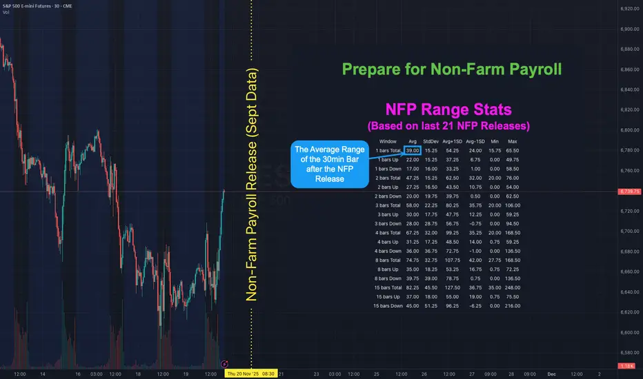
NFP is Back! Here's how to map out your playbook with statsHOW TO USE NFP RANGE STATS TO PREPARE YOUR PLAYBOOK
There has not been a Non-Farm Payroll release since Friday 5 September 2025 . Due to the government shutdown the September report that was originally set for Friday 3 October was postponed. It will finally be released on Thursday 20 November - a 48 day delay. With uncertainty around the labour data higher than usual it helps to know what “normal” looks like for ES S&P Futures. The table shows historical ranges after the 08:30 ET release on a 30-minute chart: 1 bar (30mins), 2 bars (60mins) 3 bars (90mins), 4 bars (2hrs), 8 bars (4hrs) and 15 bars (up to ~16:00 ET). The stats are based on the last 21 NFP releases (approx 2-years).
👉 If you think this would be useful as a script you can run yourself let me know (boost and drop a comment) and if there's enough interest I'll see if I can publish something.
WHAT THE COLUMNS MEAN
Avg - the typical move for that window based on past NFPs
StdDev - the variability around that average
Avg + 1 StdDev and Avg - 1 StdDev - quick upper and lower guardrails for a “normal” day
Min / Max - historical extremes in the sample
WAYS TO USE IT
1) Set guardrails for price discovery
Use Avg + 1 StdDev as a first “stretch” expectation for the window you trade. If price pushes beyond that level early you know we are outside normal and can adapt position size and expectations.
2) Pre-plan targets and emergency exits
Before 08:30 ET map a base scenario. Example for ES: if the 30m Avg post-release is X then a first take-profit can sit near X and a stretch target near Avg + 1 StdDev . Place an emergency stop beyond the Avg - 1 StdDev line if fading the first move.
3) Size positions to volatility
Translate the Avg 30m range into ticks or points and size so that a typical NFP bar does not exceed your defined risk. If your stats say the first 30m averages 9 points on ES do not run a size that cannot survive a 9-12 point swing.
4) Choose a playbook by window
1 bar (30m) - breakout or first-reaction mean-reversion
2-4 bars (60-120m) - continuation or reversal probabilities stabilise around the Avg envelope
8-15 bars - when the full session range is already at or beyond Avg + 1 StdDev be cautious chasing late moves
With the report 48 days late the probability of surprise is elevated. Go into the print with your ranges pre-mapped and your position sizing tied to those Avg and Avg ± StdDev bands. Clarity beats adrenaline.
👉 REMINDER:
If you think this would be useful as a script you can run yourself let me know (boost and drop a comment) and if there's enough interest I'll see if I can publish something.
Stats
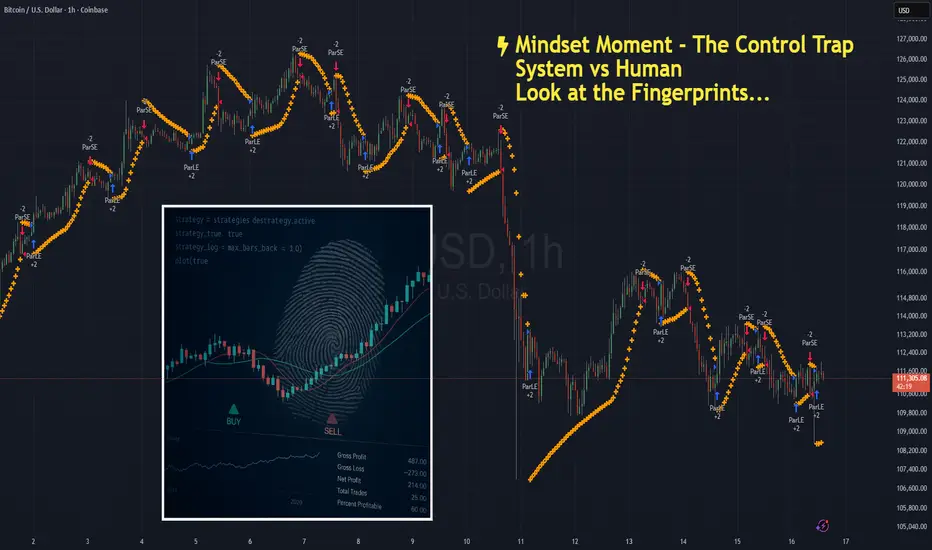
The Control TrapNOTE – This is a post on mindset and emotion. It is not a trade idea or strategy designed to make you money. My intention is to help you preserve your capital, focus, and composure so you can trade your own system with clarity and confidence.
You’ve spent months - maybe years designing your system.
You know its logic.
You’ve backtested the data.
You trust the probabilities.
And yet… mid-trade, something shifts.
The candles stall.
The pullback looks deeper than usual.
You feel the muscles in your stomach tighten.
Your hand hovers over the mouse.
Maybe I’ll just move the stop a bit tighter.
Maybe I’ll exit early, just this once.
Maybe I’ll skip this signal - it doesn’t look right today.
It feels like precision.
Like prudence.
Like control.
But look closer.
Every time you interfere, you reinforce the belief that you can’t trust yourself.
And that belief quietly eats away at your confidence - trade by trade, decision by decision.
What’s really happening:
When you second-guess your own rules, it’s rarely about the system.
It’s about safety.
Your mind is trying to avoid the discomfort of uncertainty - that raw, restless sensation that comes with surrendering control to probabilities.
Your body feels it first.
The quickened pulse.
The micro-tension in your shoulders.
The eyes darting to every tick, searching for reassurance.
You’re not refining your edge - you’re soothing anxiety.
The irony is that this constant adjustment creates the very instability you’re trying to avoid.
The more you step in, the more you teach your brain that it can’t be trusted to hold steady.
And so the cycle repeats - tighter control, lower trust, higher stress.
How to shift it:
Next time you feel the urge to tweak or touch the trade - pause.
Notice the emotion under the surface.
Is it fear? Doubt? A need to be right?
Let yourself feel that pull without acting on it.
Remind yourself:
“I built this system for a reason. My job now is to execute, not interfere.”
Try sitting through one trade, fully hands-off.
Let the outcome be what it is.
And observe what happens inside you, not just on the chart.
That awareness is where emotional control begins.
Trading well isn’t just about the quality of your system
It’s about the quality of your state while running it.
If this article resonated, check out the post I’d written on System Hopping. Link below:
(PNG) pangolinRussian Federation as a location is the highest percentage of traffic generated for Pangolin according to crunchbase.com powered by semrush. Specifically 39% of tested traffic. USA and Sweden being 2nd most and third most.

Understanding Your Statistical Edge STATISTICAL EDGE
A player's advantage in a game of chance that ensures favorable outcomes over the long run is referred to as a statistical edge. Think about a situation where a coin is rigged so that one side has a 51% chance of dropping heads while the other has a 49% chance. When a player wins, they are paid 1, and when they lose, their opponent is paid 1.
This establishes the rules of a game of chance, such as the likelihood of winning and losing, the reward for winning, and the penalty for losing. We may calculate the expectation using these parameters, which determines whether or not one has a statistical edge.
If the expectation is higher than 0, the player has a statistical advantage that could result in long-term financial success. The player who wins the coin game 51% of the time will make money in the long run because the expectation in this example is 0.02.
The metrics of a trading strategy are similar; the win rate, which measures the likelihood of winning, and the average Reward to Risk Ratio (RRR), which measures the average profit divided by the average loss of your trades, are both used. Consider a system that wins 40% of the time and has an RRR of 2, which means that winning is worth twice as much as losing. In this scenario, you risk 1R on each trade, and out of 100 trades, you win 40 and lose 60.
Your expectancy is then calculated by multiplying the number of winning trades by the reward (2R) and subtracting the number of losing trades by the risk (1R), resulting in a profit of 20R over 100 trades. Therefore, your expectancy is $0.2, meaning that for every 0.1 you risk on a trade, you earn $0.2 on average.
A successful approach, however, will fall short if proper risk management practices are not followed. A trading strategy is a tool, but risk management is what allows you to profit.
WINRATE & LOSES
The chart above displays your chances of having consecutive loses based win rate. As seen in chart above even if your trading method is 60% successful, there is still a 70% risk that you will suffer four consecutive losses. You have a greater than 50% risk of suffering eight consecutive losses if your strategy only succeeds 40% of the time. Knowing these numbers is very important as it helps with your psychology when you find yourself losing a lots of trades and you're questioning your strategy.
IMPROVING YOUR RISK TO REWARD
One way to improve your reward on trades is by using your MAE and MFE metrics to determine stops and take profit.
A trader's stop-loss and take-profit levels can be determined using the metrics MAE (Maximum Adverse Excursion) and MFE (Maximum Favorable Excursion).
No matter whether a trade is profitable or not, MAE calculates the maximum drawdown that can occur from the deal's highest point to its lowest position. However, regardless of whether a transaction is ultimately lucrative or not, MFE evaluates the highest profit a trade can achieve from its entry point.
In the above image we can see MAE calculations on trades. We can see that of all the trades taken the trades that have the best performance (above the blue line) are the trades with the least amount of drawdown. This information can help a trader determine at what point he/she should be closing trades if not running in their direction.
Trading professionals can better understand the behavior of the market and set more sensible stop-loss and take-profit levels by looking at the MAE and MFE of their transactions.
For instance, a trader may want to tighten their stop-loss level to reduce potential losses if they notice that their trades frequently encounter a significant MAE before eventually reaching their take-profit level. On the other hand, if a trader notices that their trades frequently encounter a significant MFE before being ultimately stopped out at a loss, they might want to think about establishing a broader stop-loss level to give their trades more breathing room. Overall, using MAE and MFE can assist traders in better understanding the advantages and disadvantages of their trading strategy and in adjusting their risk management plan accordingly.

Q&As: non-market dataThere's some curious personalities that trade (at least claim to trade) based on news, fundamental metrics, alt data n stuff. I don't mean invest, I mean trade. Well that looks like a skill to be proud off, superstimuli always feels cool aye? Good thing tho there no real reason in doing it all.
The most precise term to explain non-market data is, well, everything that ain't have a direct involvement with what happens inside the order matching servers of a given exchange.
So open interest is in fact a great example of non-market data.
The one & only real purpose for using all this data is to know (not to guess/predict/forecast, not to even anticipate), but to understand when the ACTION is going to happen. If you think deeper, ultimately it's all about asset selection to satisfy whatever purpose you got. if you ever got caught yourself feeling fooled when media release a bad info but prices go up, or media release a good info but prices go down, it's ok. It doesn't work that way, direction of prices can't be affected this way. Direction of prices is the result of how buyers meet sellers which is based on +inf number of factors, where a non-market data is simply just one of these +inf factors. It exclusively provokes action, meat, hype, momentum, volatility, whatever you call it. What's happening is that things start to happen very fast. Without a trigger event, the trading activity would've been the same, it just would've take longer to unwind. News don't change the structure, they make it all happen faster, that's it.
Examples of non-market data that can be used to expect action:
1) Trading schedule, eg the US, EU opening times;
2) Economic releases;
3) Commitment of traders reports;
4) Significant news;
5) Changes in yield curves;
6) "Fundamental" stock data;
7) Open interest;
8) etc etc etc
One really important thing to add is that, just like trading activity is understood in context (other resolutions), sizing also includes context (equity control, market impact), the same way every non-market data event lives in the context (previous releases, other releases, overall economy). You're interesting not in a new per se, but rather in what does it mean in the world. For example, inflation reports don't mean much when the rates are low, but when the rates are high, they trigger significant activity.
That's the area where statistical learning, automated learning, "machine" learning, 'Really' starts to make sense business-wise. The ultimate goal is to create a system that will process every kind of data you have (NLP and TDA should help) and output the tickers with raising/already risen levels of interest.

Bitcoin -11 Years Monthly Close Study-It's weekend, the beginning of February and therefore time for a statistics update...
Bitcoin made an incredible jump!
42k is currently the POC of the range above... important!
In February we can expect a green candle statistically.
8 green and 3 red bars (monthly close) in the last 11 years.
Another red would fit there... :)
On average, we would expect +24% or -15% this month!
Is everything really different this time?
The monthly candle has formed a nice bottom so far?
it's like the wave before.
-51% and 3 monthly red candles ....
99 days. That was the duration of the last correction.
The "bottom" also happened to be the POC of the entire range
The red downward trend line (psychological) is broken !
But we are also right in front of the 42k wall.
42 is the answer to everything!
Visually a clear resistance!
At 47.5-48k resistance comes in again.
Of course, watch out for the 44.444!
For fun, an EW count scribbled in. without rules, only as it would suit me.
I counted the S&P500!
Monday could be exciting!
Statistics from January
PS: What did I learn this month?
This pattern:
It apparently repeats in different dimensions and or timeframes, just watch for it!
looks like hedge funds shorting and asses manager are hodling the bags
check out the Bart-Simpson Pattern!

Tokyo Session Range + Weekly StatsReviewing statistics
Reviewing todays price action. Price has ranged between Tokyo's high and low range. London and New York's session price action has not yet broken out of this range.
Looking at the range so far this week $4850, the average weekly range is $7475.
Waiting for Tokyo open for more price action.

Ride The Wave Ride the wave, and cash out before earnings.
Technicals mean nothing for the Tesla Machine as investors want to buy in before earnings.
Does this indicate we are guaranteed an EPS beat and stellar conference call? What about future outlook?
I need your help on this one! Comment your thoughts on Tesla and research backed support is a must!
No Tesla fanboys allowed, I am looking for facts and I will be putting the research in myself and updating this publication daily and responding to comments daily.
Lets make this the ultimate hub for Tesla pre earnings
Happy trading to all!

Apple Declines & Stats since 2000Hey everybody i just want to share with you some interesting stats i found about the #1 (most important) stock on the planet since 2000. For me apple makes the major trend in use since it's the largest one as well, so it makes total sense to pay 101% attention to what will apple will do over the next months.
Some interesting points:
1. Buffet reduced his position
2. Possible H&S formation if you look at Weekly and Daily chart
3. RSI & MACD pointing downward
*There might be a 1% discrepancy between my results and the actuals ones, so please do not take them for granted 100%.

Dax daily: 25 Jul 2019 Yesterday we had a clear bullish bias as the statistics suggested the retest of previous day high and the gap closure. Both of these statistics were successfully fulfilled and those who took advantage of this might have scored nice profits. The beginning of yesterday's session started with a slight downward move caused by French and German PMI reports, before the price reversed to the upside as expected.
Important zones
Resistance: 12 576, 12 645
Support: 12 437, 12 470
Statistics for today
Detailed statistics in the Statistical Application
The statistical probability of closing the gap is 70%
Macroeconomic releases
13:45 CEST - ECB Main Refinancing Rate
14:30 CEST - ECB Press conference
Today's session hypothesis
Today's open started with a small ascending gap sized 17 points. Once again, this one has a good statistical probability of being closed. We've had two uptrending days in a row and the momentum is weakening. The price is currently at 12 576, which is a resistance level. It will be interesting to see the initial move out of here. Should Dax head even higher, then the next resistance area of our focus is 12 645. On the other hand, if bulls stay calm, we anticipate the slow down in yesterday's range. However, needless to say it's a super Thursday for ECB. The interest rate is expected unchanged and Mario Draghi needs to address some measures with regards to economic stagnation.

Quick notes about Inverted Head and ShouldersHello dear friends,
this is more of a study than a chart.
Here is what i did:
* I sampled 16 IHS that showed over the past year and were visible on the 4hr chart.
* I took in consideration sloppy patterns but ignored the ones that didn't complete or patterns that were too small or too big to discern on the 4hr.
* targets are calculated roughly based on the closest fib as result, some targets have fallen slightly above or below that number.
* By target i mean the peak price that was reached after pattern completion and within the timeframe equal to the time length of the pattern itself, and before reached a lower point than the low tip of the right shoulder
* The outcome post pattern defines what happens after that pattern has reached its target within the calculated timeframe. Lower means the price dropped below the right shoulder lowest point, higher means the price continued climbing higher before any drop
* The way i calculate IHS targets might be a bit unusual, but it works well for me. I calculate the length of the head from its lowest point to the meeting point with the right shoulder. Target calculations are a fib percent of that height.
* Mind you, this is a quick study, nothing bulletproof or scientifically sound.
And here are my key findings:
1. Out of 16, 3 failed, 7 reached 100% or above
2. the average success score is a retrace of 67% of the head size within the time length equal to the time length it took the pattern to form
3. 50% of the time, the price dropped lower than the pattern right shoulder or more after reach the pattern target
Details:
/
a. 50% / lower
b. 61.8% / higher
c. 100% / higher
d. 23.6% / lower
e. 100% / higher
f. 100% / higher
g. 0% / lower
e. 0% / lower
f. 23.6% / higher
g. 100% / lower
h. 78.6% / higher
i. 161% / lower
j. 23.6% / higher
k. 161% / lower
l. 0%/ lower
m. 100% / higher
Again please take these findings with a grain of salt, this is by no mean super accurate and can be prone to error. But as a broad overview, hope you'll find this insightful.

S&P 500 : Ahead of a massive bull market like 1995 ? ... noThis double chart have one and only purpose... to simply destroy any king of idea about the S&P that could be about to perform crazy like it did in the 1995-2000 rallye.
That's just non-sense and purely stupid. Not only the context is totally different... cause back then the GDP was the true gas of that rallye... as today everyone knows that we will never be able to match such growth nowadays...
Plus, the first chart highlights the fact that, related to GDP, we are actually pricing the S&P today just like we did in the top of the 2000 bullmarket, not the beginning of it ! So instead of giving a sign of bullish support this chart actually shows more bear probabilities !
And if this arguments doesn't convince you, then simply have a look at the durable goods order, the most reliable hard data to forecast earnings...
Do you see any kind of reliable following of the recent parabolic uptrend ? I don't !
So the real question is what drives the market ? Well this is a complex answer... But the only thing I can tell is that every person that argue this bull market is similar to 1995 is just non-sense !
Just to set things straight... I'm not saying I want to short the market tomorrow.. I just say that this theory that says the market is at the beginning of a massive bullish move.. well .. not likely to me ! and most likely reaching the endpoint soon.
Hope this idea will inspire some of you !
Don't forget to hit the like/follow button if you feel like this post deserves it ;)
You can check my indicators via my TradingView's Profile : @PRO_Indicators
Kindly,
Phil
