Why Volume Profile Changed the Way I TradeWhen I first started trading, I focused on what most beginners do — indicators, patterns, and endless strategies.
RSI. MACD. Support & resistance.
They worked sometimes.
But many times, price moved in ways that didn’t make sense.
It wasn’t until I truly understood Volume Profile that the market finally started to feel logical.
After trading for several years, I can confidently say:
👉 Price doesn’t move because of indicators.
👉 Price moves because of where money is traded.
And Volume Profile shows exactly that.
⸻
What Is Volume Profile (In Simple Words)
Volume Profile is a tool that shows:
• Where the most trading activity happened
• Where big players were interested
• Where price found real acceptance or rejection
Instead of looking at time (like normal volume bars), it shows volume at each price level.
In other words:
📍 It tells you where the market considers “fair value”
📍 And where price is likely to react again
⸻
The Market Leaves Footprints — Volume Profile Reveals Them
Think of the market like this:
Big institutions don’t enter randomly.
They build positions at specific price zones with high volume.
These zones often become:
✔ Strong support
✔ Strong resistance
✔ Major turning points
Volume Profile highlights these areas clearly through:
• High Volume Nodes (HVN) – areas of heavy trading
• Low Volume Nodes (LVN) – areas price moves quickly through
Once you learn to read them, you’ll start seeing:
“Ah… this is where real money stepped in before.”
⸻
Why I Trust Volume Profile More Than Most Indicators
Indicators are calculated from price.
Volume Profile is built from real market participation.
That’s a huge difference.
From my experience:
❌ Indicators react after price moves
✅ Volume shows interest before big moves happen
It helps me:
• Find high-probability entry zones
• Avoid chasing breakouts
• Hold trades with more confidence
⸻
How I Personally Use It in TradingView
Here’s my simple approach:
1. Identify major high volume areas (value zones)
2. Wait for price to return to these zones
3. Look for reaction or confirmation
4. Trade where risk is clear and controlled
No guessing.
No emotional entries.
Just trading around where the market already showed interest.
⸻
Final Thoughts (From a Trader, Not a Guru)
Volume Profile isn’t a magic tool.
But it gives you something most retail traders never look at:
The real story of where money flows in the market.
If I had learned this earlier, I would’ve avoided many bad trades.
For anyone serious about improving their trading —
understanding volume is not optional. It’s essential.
Trading Tools

Build the Mindset Before the MethodMoney Is a System
Strategy provides the method. Mindset builds the framework. Lacking an internal system to govern risk, patience, and review ensures failure. With this framework, even an elementary method compounds results.
1. Mindset Controls Decisions
Fast markets demand immediate, automatic responses. Clear judgment emerges when we slow down, prepare, and confirm before committing capital. This conflict between instinct and deliberation explains frequent trading errors.
A growth mindset proves essential. It views skill not as innate talent but as a quality refined through effort and feedback. This perspective encourages learning and consistent advancement after losses.
My Practice
I treat each trade as training data, not a test of ability. My focus is whether I adhered to my plan. I document this answer. This routine develops awareness and improves execution.
2. Primary Advantage: Position Sizing
Two traders may employ identical setups with vastly different outcomes. The distinction lies in capital risked per trade. Position sizing and precise risk protocols frequently outweigh entry technique.
Define one unit of risk as R. Measure the distance from entry to the point where the trade thesis fails. Adjust position size so monetary risk remains fixed. Track returns in R units to validate method profitability.
My Template
I maintain small, consistent risk while establishing proof. One R equals the entry to stop loss distance. Position size equals account value multiplied by risk percentage, divided by that R distance.
3. Survival Relies on Mathematics, Not Courage
A strategy can yield positive average returns yet still fail from excessive risk per trade. Risk of ruin defines the probability of incurring losses that halt trading before the statistical edge materializes. Slight increases in per trade risk dramatically elevate ruin probability.
I calculate ruin risk before adjusting size, ensuring it remains within my tolerance. Basic calculators illuminate this relationship.
4. Journaling Converts Action Into Skill
A trading journal creates a feedback loop: plan, action, review. It reveals hesitation, revenge trades, and premature exits. These costs stem from behavior; no indicator can correct them.
Educational literature and practitioner accounts confirm that disciplined journaling builds patience, timing, and pattern recognition.
My Journal Process
I record the trade rationale, defined risk, emotional state, and rule compliance. Weekly reviews identify and eliminate repeated errors.
5. Eliminate Destructive Habits
Many independent traders underperform basic benchmarks due to overconfidence, chasing trends, selling winners early, and holding losers. Awareness of these tendencies allows us to guard against them.
My Safeguards
I set all exits beforehand and honor invalidation points. I never adjust protective stops. I utilize alerts to prevent impulsive decisions.
6. My Operational Framework
Rule One: Define risk first, size positions to R, and journal every trade.
Rule Two: Concentrate on one setup, one market, and one risk template until data demonstrates stable performance.
Rule Three: Increase position size only after a statistically valid sample shows acceptable drawdown and minimal ruin risk.
Rule Four: Conduct monthly reviews of expectancy, maximum drawdown, rule violations, and timing errors.
Tracked Metrics
Win rate, average R per win/loss, system expectancy, maximum drawdown, trade duration, and an execution score for rule adherence.
7. Method Serves the Mind
I employ price action and market structure analysis with strict risk parameters and clear invalidation levels. Weekly review and data driven adjustment follow. Bias is inevitable. A rigorous process overcomes it, protects capital, and allows compounding to begin.Money Is a System
Strategy is the means. Mindset is the system. Without a system in your mind that governs risk, patience, and review, any setup fails. With it, even a simple setup can compound.

How I use the Volume Footprint ChartsIn this vide I talk about how I use the volume footprint charts
I explain the settings I use, and what I look for to enter trades. I go over several examples, explaining why I decided to enter and in which direction.

How to Build Trust With GBPUSD Before You Ever Place SizeMost traders don’t fail because they lack strategy.
They fail because they never slow down long enough to master one market.
In this video, I’m starting the only series I’m running in 2026: Mastering GBPUSD.
This is not about indicators or hype. It’s about rebuilding consistency by focusing on one pair, learning its rhythm, managing drawdown, and developing the discipline most traders avoid.
We cover
• Why mastering GBPUSD starts with a decision, not a strategy
• How to build trust in a market before increasing position size
• How to sit through normal drawdown without sabotaging your plan
• Practical ways to observe price, mark levels, and reduce overtrading
• Why alerts and walking away matter more than staring at charts
If you’ve traded before, had success, lost momentum, and you’re looking to get back into rhythm, this video is for you.
This series is about focus, patience, and self-mastery through one market.
Watch. Apply. Repeat.
Comment “GBPUSD only” if you’re committing to this journey, and subscribe so you don’t miss the next deep dive in the series.

The XRP chart is like from a textbook! Wyckoff tutorialWelcome! When finance professionals are watching, you can expect solid analytics and real education.
Today we’re going to break down Wyckoff market cycles using the XRP chart in real time.
Wyckoff cycles are not just theory - they are an established concept that works in all markets. This is a model of price behavior based on the actions of large players ("smart money"). It shows how professionals accumulate positions, drive the market, and distribute assets, creating repeating phases of growth and decline.
Any market moves cyclically. Wyckoff identified two major cycles:
Bull market cycle (Accumulation → Markup → Distribution → Markdown)
Bear market cycle (the mirror reflection of the first)
Each cycle consists of four phases:
-Accumulation
-Markup (Growth)
-Distributio
-Markdown (Decline)
Phase 1. Accumulation
This is the phase when "smart money" buys the asset in large volumes while trying not to push the price too high. Conditions are created where regular market participants do not want to buy the asset, and may even sell it near market lows. Usually during this period there is bad news, lack of confidence, etc. Large players quietly buy up all this negativity.
Phase 2. Markup (Growth)
An impulsive upward movement begins - a trend that everyone notices when it is already too late. The crowd starts to wake up and enters the market at high prices.
Phase 3. Distribution
The price again enters a trading range, but now major participants sell their positions to retail traders who come in euphoric after the rise. Usually, the news is excellent here, everyone expects further growth, there is general euphoria, people load into the asset to the maximum while large players quietly unload their positions.
Phase 4. Markdown (Decline)
Professionals have sold everything they wanted, and now the market goes down almost without resistance. Retail - back to the factory.
TOP 5 TRADINGVIEW TOOLS 2026 (NOT INDICATORS)Most traders don’t need more indicators — they need better tools and better habits.
In this video, I break down my top 5 TradingView tools that I actually use to stay focused, reduce overtrading, and trade with clarity. These aren’t indicators or complicated systems. These are practical tools that help you read price, manage risk, and step away from the charts without missing opportunity.
If you’ve ever felt burned out, distracted, or stuck staring at charts all day, this video will help you simplify your approach and trade with intention.
Watch to learn:
• How to use alerts to protect your focus
• Why rectangles beat lines for real market structure
• How replay mode builds consistency like target practice
• The risk tool most traders ignore (but shouldn’t)
• How slowing down improves your price reading
CTA
If this video helped you, like and subscribe for more practical trading breakdowns. Drop a comment and tell me which TradingView tool you’re committing to use better starting today.

The Fractality of Financial MarketsMarkets, much like nature, are fractal.
A fractal is a structure that repeats itself across different scales. Whether you zoom in or zoom out, the underlying pattern remains the same. Coastlines, trees, lungs, rivers, snowflakes, each displays complexity born from repetition, not randomness.
Financial markets behave in exactly the same way.
This single truth explains why markets are complex, why precision is elusive, and why rigid certainty is dangerous.
Fractality in Nature: A Useful Analogy
Consider a few natural examples:
The coastline paradox: The closer you zoom into a coastline, the longer and more irregular it becomes. There is no “true” length, only scale-dependent structure.
Trees and branches: A tree trunk splits into large branches, which split into smaller branches, which split into twigs, each level resembling the whole.
The human diaphragm and lungs: Expansion and contraction occur rhythmically. Zoom into the lungs and you’ll find the same branching patterns repeating down to the alveoli.
Nature does not move in straight lines.
It expands, contracts, corrects, and continues.
Markets do the same.
Markets as a Living, Breathing System
Let’s say your highest timeframe (Daily) is in an uptrend.
That trend will not move vertically upward. It will:
Expand (impulse)
Collapse (correction)
Expand again
This expansion and contraction is the market’s “breathing”, very much like a diaphragm.
Now comes the crucial insight:
Every higher timeframe trend is built from lower timeframe counter-trends.
This is fractality in action.
The First Anomaly: Lower Timeframes Move First
If the Daily chart is trending up:
The 4H chart will be the first to show weakness when a Daily correction is approaching.
The 1H chart will show even clearer counter-trend structure.
The 15m chart will exaggerate that move entirely.
To the untrained eye, this looks like:
“The trend is broken.”
In reality, it’s simply:
The next breath out.
The lower timeframe always becomes the first anomaly, moving counter to the higher timeframe, before the higher timeframe corrects.
This is not failure.
This is structure.
Multi-Timeframe Alignment: Where Traders Get Trapped
Let’s assume a common approach:
Daily → Trend bias
4H → Structure (continuation vs correction)
1H → Entries
15m → Refinement
On paper, this is logical.
In practice, it comes with a hard truth:
You are going to be wrong, sometimes very wrong.
Why?
Because fractal markets cannot align perfectly across all timeframes at all times.
At some point:
The Daily is still bullish
The 4H is correcting
The 1H looks bearish
The 15m is aggressively selling
If you expect harmony, you will:
Overtrade
Cut winners early
Hold losers too long
Lose emotional control
Eventually lose capital
The Key Insight: Stop Trying to Eliminate Uncertainty
Markets are not designed to reward certainty.
They reward:
Context
Risk management
Patience
Acceptance of being wrong
If your fundamentals are aligned, the market will tell you when it’s ready:
Through slowing momentum
Through failed continuations
Through structure shifts on lower timeframes
Your job is not to predict the breath;
Your job is to survive the breathing.
Why This Realization Saves Capital
The moment a trader truly understands fractality:
They stop forcing precision
They stop seeking perfect entries
They stop believing one timeframe is “lying”
They stop risking everything on being right
They realize that:
Losses are not mistakes, they are structural costs of participation.
Just like waves erode a coastline, drawdowns erode weak strategies.
Strong ones adapt.
Markets are not machines.
They are organic systems, shaped by human behavior, fear, greed, and time.
Like nature:
They expand
They contract
They repeat themselves endlessly
They punish rigidity
They reward adaptability
Make peace with being wrong.
Because in a fractal market, survival is the only edge that compounds.

Risk Reward and Win Ratio - How to make $20K with just a 6R“I need to win more trades to be profitable.”
You don’t. Some of the most profitable traders I’ve studied and watched over the years win less than 50% of the time, and they still print money because their winners are built to pay for their losers. The real edge is not how often you win. The real edge is how much you win when you’re right compared to how much you lose when you’re wrong. That’s risk reward.
📌 1.Win rate alone means nothing if the math is against you
Win rate only tells you how often you end up on the right side of the move, but it does not tell you whether your account grows. You can win 70% of your trades and still lose over time if you’re risking too much to make too little, because those few losses wipe out a whole week of “small wins” and you end up trapped in a cycle where you feel good but your equity curve quietly drifts down. On the other hand, you can win only 40% of the time and still grow consistently if your winners are designed to be larger than your losers. In that scenario, you don’t need to be right often, you just need to be right enough, and that simple shift changes everything because it stops trading from being emotional and turns it into a numbers game you can actually manage. Win rate is frequency, but risk reward is impact, and impact is what pays you.
📌 2. Risk must be defined before you even think about profit
Most beginners start with the exciting part, which is targets and profits, but professionals start with the boring part, which is invalidation. That means the first thing you define is the level that proves your idea is wrong, and once that level is clear, the trade becomes clean because you’re not guessing anymore, you’re executing a plan that already includes a stop and a reason for that stop. Before I enter, I want clear answers to questions like: where is my idea wrong, where would structure have to break for me to admit I’m wrong, and where must I be out without negotiation. Only after that do targets start making sense. If you don’t know where you’re wrong, you don’t know what you’re trading, and if you don’t know what you’re trading, you’re basically gambling while pretending it’s analysis. 📌 3 .Good risk reward builds emotional stability, not just profit
This part is underrated, but it’s the reason most traders fail even with a decent strategy. When your risk is small and predefined, your losses stop feeling like personal attacks, and they start feeling like normal business expenses. You don’t hesitate as much because you’re not afraid of the outcome, you don’t revenge trade as much because one loss doesn’t crush you, and you don’t overtrade as much because you’re not trying to “fix” your day. You dont do nothing like that because you know distribution of trades can be random.
You may have a 65% percent win rate. It still means that you can have 35 losses out of 100 traders. Remember distribution of wins and losses is random , you never know outcome of next trade.
It could be win win loss win. Or loss loss loss win win. Or a brutal streak of seven losses before the market pays you back.
✅✅❌✅❌❌✅✅✅✅❌✅
When wins and losses are evenly distributed it's quite comfortable to continue in opening new trades. You still believe your strategy and it's simply normal to have loss time to time.
✅❌❌❌✅❌❌❌❌❌✅✅
But what you gonna do when such a streak comes? Are you gonna doubt your strategy? Are you gonna look for different strategy? Remember 65% success rate means 35 possible losses out of 100. If 20 losses comes in a row your long term statistics still was not broken.
Dont think this cant happen to you. If this didnt happen to you yet, you are not trading for long enough. It will come and it's better to be prepared. The reason is simple: no single trade can hurt you badly when risk is controlled. That’s why risk reward is not only account protection, it’s mindset protection, because your mind is your execution engine, and when it’s unstable you will sabotage even a good setup.
📌 4. Consistency is built in losing streaks
A lot of traders think consistency is about getting into a flow where everything goes right, but real consistency is about surviving the period when everything goes wrong without changing your system every two days. Winning streaks feel easy because confidence is high and everything seems to confirm your bias, but losing streaks are where discipline gets tested, because that’s when the brain starts whispering that the strategy is broken and you should start “improving” it in the middle of execution.
‼️ The big lesson
You don’t need to be right more often. You need your winners to matter more than your losers. When risk is controlled and reward is logical, trading stops feeling like a casino and starts feeling like execution, and the difference between those two states is literally the difference between a trader who survives and a trader who quits.
Now let’s go deeper, because this is where “good advice” becomes a real plan.
A statistical edge only becomes real through a mechanical you backtests on a large sample, you can start building expectations that are grounded in reality, like win rate, average risk reward, average drawdown, and the typical losing streak you should be prepared for.
Let’s say your backtest results look like this:
Win rate: 65%
Average RR: 2.3
That means for every $100 you risk, your average win is $230, and your average loss is $100. On paper, that looks like a smooth road to profits, and it can be, but only if you understand one brutal truth: reality is always worse than backtest. In real trading you will enter worse, exit earlier, hesitate, get slipped, pay spread, misread a level, or just have a bad day mentally, so your real performance will usually drop below your backtest numbers. 🧩 Your ability to hold matters more than your ability to enter
A lot of traders chase big RR trades like 1:5 because it looks sexy, but what they forget is that higher RR often comes with a lower win rate and more painful pullbacks. That means you might get stopped out several times before you catch the one big move, and even when you catch it, the trade will likely pull back enough to test your emotions. So the real question is not “can I find 1:5 setups,” the real question is “can I hold them without self-sabotage,” because if you can’t hold, you’ll never realize that RR anyway.
💎 Hence Im suggesting RR 2.3 Its what is working for me for years and this is usually target which I can reach without holding in overextended period and without huge pullbacks. Where I have to watch flowing profits back to the markets.
🧩 “$20,000 per month” goal, and why most traders approach it backward
Most traders try to hit big monthly percentage gains, and that’s where they lose discipline. In prop trading, the smarter route is to aim for consistent, modest growth and scale capital under management, because the payouts get big when the base gets big, not when your ego gets big.
🧩 The magic number in prop trading is 3% per month
3% sounds small until you do the payout math, and then you realize it’s enough to change your life if you scale properly. It’s also realistic enough that you don’t have to break your rules to achieve it, and that’s the entire point. 📌 How to make $20 000 a month ? Magic of 3%
Yes, you actually need to make only a 3% a month. Is it difficult ? No, It's not. You need 3 wins with 1:2 RR while risking 0.5% Risk.
1️⃣Your Ultimate goal - -$100K Funded account - 3% Gain - 80% Profit split = $2400 Payout
2️⃣Let's take it to $20 000 a Month
Don't try to increase your % gains per month, increase your capital under management
- Get another 4 x $ 100K Challenges pass them - You will have $500K AUM:
- $ 500 000 - 3% Gain - 80% Profit split = $12 000
3️⃣Reinvest buy another 3 - 5 challenges aim for $ 1000 000 funded across few solid props firms.
Now scale it instead of forcing it.
If you build to $500K funded across a few accounts, the same 3% month becomes:
$500,000 x 3% = $15,000 profit
80% split = $12,000 payout
And if you scale to $1,000,000 funded across solid firms, you’re looking at:
$1,000,000 x 3% = $30,000 profit
80% split = $24,000 payout This is why the path is patience, not pressure
This doesn’t happen in a few weeks. It’s a year plan for most people. The technical part is not the issue, the discipline is. My biggest mistakes in the past were always the same: trying to pass too quickly, forcing trades when the market was not giving my setup, and gambling during drawdowns because I wanted to “get back” to breakeven faster. That thinking is expensive.
🧩 Long-term plans require real planning, not motivation
Set aside 60 minutes, and treat this like a real project. Write answers on paper, not in your head.
What is my monthly target in % and in payout?
What is my fixed risk per trade?
What is my max daily loss?
What is my weekly trade limit?
What are my A+ setups and what is banned?
What will I do when a losing streak hits, so I don’t break rules?
🧠 Don’t fall for the fantasy
If you don’t trade well on a small account, a prop account will not fix you. Funding is leverage for skill, not a rescue plan for chaos, and expecting it to solve financial pressure is how people start gambling. 🧠 Trading is not hard, we overcomplicate it
Most traders already have enough good trades in a month to hit 3%. The real problem is they add too many unnecessary trades that drain the account. If you removed the bored trades, the revenge trades, and the “maybe” trades, you’d be shocked how close you already are.
🔑 Write this somewhere you will see it every day:
$1,000,000 funded
3% gain
80% profit split
$24,000 payout
I promised myself I’d become the person I once needed the most as a beginner. Below are links to a powerful lessons I shared on Tradingview. Hope it can help you avoid years of trial and error I went thru.
📊 Sharpen your trading Strategy
⚙️ 100% Mechanical System - Complete Strategy
🔁 Daily Bias – Continuation
🔄 Daily Bias – Reversal
🧱 Key Level – Order Block
📉 How to Buy Lows and Sell Highs
🎯 Dealing Range – Enter on pullbacks
💧 Liquidity – Basics to understand
🕒 Timeframe Alignments
🚫 Market Narratives – Avoid traps
🐢 Turtle Soup Master – High reward method
🧘 How to stop overcomplicating trading
🕰️ Day Trading Cheat Code – Sessions
🇬🇧 London Session Trading
🔍 SMT Divergence – Secret Smart Money signal
📐 Standard Deviations – Predict future targets
🎣 Stop Hunt Trading
💧 Liquidity Sweep Mastery
🔪 Asia Session Setups
🧠 Level Up your Mindset
🛕 Monk Mode – Transition from 9–5 to full-time trading
⚠️ Trading Enemies – Habits that destroy success
🔄 Trader’s Routine – Build discipline daily
💪 Get Funded - $20 000 Monthly Plan
🧪 Winning Trading Plan
🛡️ Risk Management
🏦 Risk Management for Prop Trading
📏 Risk in % or Fixed Position Size
🔐 Risk Per Trade – Keep consistency
Adapt useful, Reject useless and add what is specifically yours.
David Perk

Samurai Vector Trading: AI-Powered Bias Mitigation SystemIntroduction
In the fast-evolving world of FX trading in 2025, artificial intelligence (AI) is no longer just a tool for predictive modeling—it's a mirror for cognitive self-improvement. Drawing from Daniel Kahneman's seminal work, Thinking, Fast and Slow, traders often fall victim to System 1 biases: intuitive errors like overconfidence or anchoring that lead to impulsive decisions. This article introduces a novel approach inspired by the Samurai philosophy of Musashi Miyamoto's The Book of Five Rings: vectorizing trading setups into a multi-dimensional database to quantify alignment with an "ideal rock foundation" (a metaphor for a rock-solid entry setup). By calculating cosine similarity to this ideal vector, traders can objectively validate their intuition, rebuild neural pathways for better metacognition, and overcome biases. This hybrid of ancient discipline and modern embeddings bridges subjective "gut feel" with data-driven precision, applicable to Smart Money Concepts (SMC) and beyond. As Musashi Miyamoto wrote in The Book of Five Rings: "Fixation is the way to death; fluidity is the way to life." This principle underscores the system's emphasis on adaptive, bias-aware trading in ever-changing markets. This system addresses the era's demand for bias-free, adaptive trading amid AI hype and market volatility.
The Samurai Three-Stage Unsheathed Technique as a Vector Database
The Samurai Trading System is structured in three stages, rooted in Musashi's principles of grounding (System 1), institutional intent (System 2), and precise execution (System 3). It emphasizes "win not, lose not"—passing on 90% of opportunities to avoid losses. While not absolute, the stages can be customized by traders—replacing or adding elements like volume profile control lines to suit individual preferences, though this introduces risks of overfitting if not managed with metacognitive discipline. The system draws from Smart Money Concepts (SMC) for institutional footprints and Dow Theory for trend validation through swing highs/lows, ensuring a robust foundation.
System 1: Rock Foundation Quest (Kurata Bubota): Six elements filter for a solid base, typically analyzed on 4-hour charts: Cross (Ku: 5/20 SMA crossover), Line (Ra: trendlines/channels/past highs/lows), Touch (Ta: 75 SMA interaction), Order Block (Bu: yin-yang alignment + 2-step vacuum zone), Volume (Bo: depletion to surge), Time (Ta: London/NY sessions + indicators). This stage aligns with SMC's order blocks and liquidity pools, while Dow Theory's trendlines confirm overall market structure.
Caption: Six abstracted patterns illustrating diverse trendline/MA and price action interactions—reminding us that real markets rarely match ideals perfectly, requiring metacognitive adaptation.
System 2: Institutional Rock of Intent (Ku Yin-Yang 5 Dan-sa): Four elements refine order blocks, often on 4-hour or 1-hour charts: Cross vicinity (Ku), Yin-Yang (horizontal candle bodies), 5SMA entanglement (5), Step difference (Dan-sa: 2-step box). Note that the Cross (Ku) overlaps with System 1's for consistency and signal reinforcement, a deliberate design to verify momentum across stages without redundancy issues. This incorporates SMC's mitigation blocks (MB) for institutional position adjustments and Dow Theory's change of character (ChoCH) for structural shifts. The 'step difference' (Dan-sa) and '5S curve' are specifically designed to capture institutional two-legged mitigation patterns, overlapping with Dow Theory's higher lows (or lower highs) on lower timeframes to confirm trend continuation or reversal.
System 3: Moment of Unsheathed (5S 5 Break 5 Ride, with optional Handshake): Core elements time the entry, commonly on 1-hour or 15-minute charts: 5S curve (S-shaped 5SMA wiggle), 5 Break (OB breakout), 5 Ride (candle body on 5SMA), and optional Handshake (±2σ Bollinger Band touch + 5SMA walk) as a personal enhancement for volatility validation. This multi-timeframe progression (higher for context, lower for precision) aligns with standard trading practices but may cause signal conflicts in volatile markets—use metacognition to resolve. Specifically, it draws on SMC's two-legged mitigation (retracement after a structural break, allowing entry on the second leg for reduced risk) and Dow Theory's swing lows/highs (e.g., lower low break followed by higher low confirmation, requiring a preceding swing high to validate the order block as a key reversal zone). CHoCH typically occurs after mitigation block formation, with two-legged mitigation often providing the adjustment phase before confirmation in System 3. This confirmation step mitigates the timing lag between CHoCH signals and safe entry, preventing premature trades into institutional accumulation zones.
In standard SMC/ICT terminology, CHoCH (Market Structure Shift) typically precedes the full formation of a Mitigation Block — this is the textbook sequence.
In the Samurai Vector system, however, I intentionally frame the process with a reversed perspective: institutional mitigation (evidenced by a clear two-legged adjustment into a prior structure) is treated as the primary confirmation of "true intent," after which the subsequent CHoCH is considered validated. This is a deliberate meta-cognitive reconstruction to prioritize institutional footprints over purely structural labels, reducing false signals in high-probability setups (System 3).
The phrasing "CHoCH typically occurs after mitigation block formation" reflects this philosophical shift rather than a denial of conventional order, in other words, a commitment to Complete Verification — prioritizing the "cause" (institutional mitigation) over the "effect" (structural labels).
Caption: Historical USDJPY 4-hour chart demonstrating a successful Samurai three-stage setup. Yellow vertical lines mark significant volume spikes (Bo element: depletion to surge). White boxes highlight mitigation blocks exhibiting two-legged mitigation behavior (System 2 Ku Yin-Yang 5 Dan-sa refinement). Yellow shaded zones indicate dangerous areas of extreme SMA deviation where impulsive entries are prone to failure. The sequence shows clear 5SMA entanglement, breakout, and ride (System 3), resulting in a strong upward vacuum run after rock foundation completion. This example illustrates the system's power when all dimensions align near 98%+ similarity. Source:TradingView
Caption: As a successful setup example, this H1 excerpt from a past USDJPY setup demonstrates a completed System 3: dual white boxes forming the Ku Yin-Yang 5 Dan-sa, followed by clear 5S curve, OB breakout, and candle ride on the 5SMA—resulting in a strong upward vacuum run. Source:TradingView
To vectorize this, we define a 14-dimensional space where each element is a dimension (A=Cross, B=Line, ..., N=Handshake). The "ideal rock foundation" vector is , representing perfect alignment. Current chart conditions are scored 1-10 per dimension, forming a query vector. Cosine similarity measures how closely the setup matches the ideal, turning qualitative intuition into quantifiable insight.
Vectorization Process and Cosine Similarity
Vector embeddings, popularized in AI for semantic search, here embed trading criteria into numerical space. For a chart, score each dimension based on observable data (e.g., A=Cross: 10 if clear crossover, 1 if absent). Compute cosine similarity:
where A is the ideal vector and B is the query vector. This metric (ranging 0-1, or 0-100%) focuses on directional alignment, robust to scale variations in volatile markets. Tools like NumPy or scikit-learn can automate this in a custom chatbot, allowing real-time feedback. TradingView's high functionality, such as easily hiding candles to focus on raw SMAs, complements this process by stripping noise for clearer metacognitive analysis.(Detailed step-by-step candle-hiding analysis available in author's Japanese blog (translated versions coming soon))
Threshold for Action: A Disciplined Gatekeeper
Not every high similarity warrants entry—the Samurai ethos demands rigor. We set thresholds to enforce "win not, lose not":
Below 95%: Pass (aligns with 90% rejection rule; intuition's discomfort often stems from low scores in key dimensions like Volume or Order Block).
95-98%: Cautious entry (verify System 2/3, ensure risk-reward ratio >1:3).
98%+: Full unsheathing (rock foundation confirmed; expect 200-500 pips vacuum run).
These thresholds prevent System 1 overconfidence, forcing traders to confront biases through data. For instance, a 89.1% similarity signals "close but incomplete," prompting metacognitive reflection: Why the gap? Note that thresholds offer flexibility—increasing freedom (e.g., lowering to 90%) expands opportunities but risks deviation from ironclad patterns, potentially raising exposure to noise; strict adherence promotes universal adaptability across market regimes. Thresholds promote 'win not, lose not'—recognizing edge degradation from widespread adoption, focus on metacognitive evolution.
Case Study: USDJPY Analysis (December 30, 2025 – Late Session Update)
The latest USDJPY 4-hour chart as of December 30, 2025 (18:20 JST) shows a clear descending triangle consolidation, with high values capped by a horizontal resistance around 157 and lows cutting lower along a declining trendline. Following the December 19 Bank of Japan surprise rate hike that triggered a massive bullish candle and full retracement, the price has been in a mitigation phase—likely institutional sellers covering unfavorable short positions accumulated during the spike. The perfect SMA order (200 yellow gently upward, 75 blue horizontal, 20 red and 5 white downward) highlights long-term support clashing with short-term selling pressure, creating a zone where trapped sellers face growing unrealized losses near the 200SMA.
Scoring yields approximately: . Cosine similarity: ~89.1%.
Low scores: Persistent volume depletion (2), order block ambiguity (4), lack of handshake confirmation (1).
Notable observations: The steep drop after temporary 5SMA ride suggests potential two-legged mitigation in progress, with the 200SMA acting as a key lower boundary—aligning with Dow Theory swing low validation and SMC mitigation block behavior.
Decision: Pass—await clear triangle breakout or stronger institutional signals. This live example (updated from earlier session observations) illustrates the system's discipline: even in a dramatic retracement phase with trapped positions, incomplete rock foundation demands patience, quantifying the subtle System 1 discomfort traced to insufficient momentum and volume surge.
This example, drawn from ongoing Japanese blog analyses, showcases the system's real-world application.
Comparison with Other Trading Styles
To contextualize, compare the vectorized Samurai system with prevalent methods:
While individual elements—such as vector embeddings in quantitative strategies, metacognitive approaches in trading psychology, or philosophical discipline inspired by ancient texts—exist in isolation across the trading community, the Samurai system's distinctive integration stands apart. By quantifying a structured three-stage philosophical technique with cosine similarity thresholds specifically to detect and rebuild cognitive biases, it creates a novel hybrid that bridges intuitive artistry with rigorous, data-driven self-correction—not commonly found in existing frameworks.
Cognitive Bias Confrontation: Linking to Kahneman
Kahneman's dual-process theory underpins this: System 1 (fast, intuitive) drives 90% of trading errors, like confirmation bias (ignoring disconfirming signals) or anchoring (fixating on past highs). Vectorization acts as an "external System 2"—low scores in dimensions like Touch or Yin-Yang highlight these biases. For example, a trader's "gut feel" for entry might overlook volume depletion (score 2), revealing overconfidence. Over time, repeated use rebuilds neural circuits, fostering disciplined metacognition akin to Musashi's "void ring" (empty mind for pure observation). By treating AI as an external unit—an augmented 'System 2'—this approach provides a fail-safe layer: the vector similarity flags potential biases, but the trader retains ultimate discretion, ensuring human oversight in critical decisions, much like fail-safe mechanisms in aviation or medicine. In practice, AI can initially process chart images to extract and score features (e.g., using vision models to detect SMA crossovers or order blocks), providing a starting point for human-AI dialogue where the trader refines the scores through iterative feedback, thereby enhancing metacognitive awareness and tuning the system's accuracy without full reliance on automation. Note that AI image analysis can misrecognize complex financial charts in 20-50% of cases due to label overlap or noise, emphasizing the need for human verification in the dialogue loop.
Backtesting Insights & Limitations
– Preliminary simulations on 2024-2025 USDJPY/EURUSD data suggest 95% threshold reduces drawdowns by 80% while capturing high-RR trades, but full verification pending (e.g., Monte Carlo analysis for robustness).
Limitations include market randomness (news events skew vectors), overfitting risk (over-customizing dimensions), and subjectivity in initial scoring. While the system incorporates discretionary elements by design (e.g., multi-timeframe flexibility and dimension customization), this promotes personal metacognition and adaptation to market changes, though it may introduce variability—traders should verify and refine through ongoing practice. Always pair with Samurai discipline: vectors guide, but the trader's unyielding mind decides. Recognizing that past success offers no guarantee of future performance—a core tenet of financial engineering—the Samurai approach focuses on ongoing metacognitive refinement to ensure enduring adaptability. As with any trading edge, widespread adoption may lead to gradual degradation due to increased market participation—a common phenomenon in evolving markets. The Samurai system's emphasis on ongoing metacognitive refinement and adaptability ('Models break') positions it to evolve alongside these changes.
Future Extensions: Scaling to AI Advisors and Integrations
This framework extends beyond manual calculation: embed it in a chatbot using Grok/Gemini APIs for real-time vector scoring. For advanced use, integrate image recognition so AI initially analyzes uploaded charts to propose feature scores, allowing interactive tuning through conversation—e.g., "Reassess the order block ambiguity"—to fine-tune dimensions and strengthen metacognition. The system's components are not fixed; traders can swap or add elements (e.g., volume profile control lines) to personalize, enhancing universality across evolving markets while maintaining the core focus on eliminating wasteful trades through heightened metacognition. Imagine TradingView Pine Script indicators displaying similarity overlays, or OANDA API integrations for automated alerts. Globally, it could evolve into workshops/books on AI-driven cognition, or open-source tools for bias-free decision-making in non-trading fields like business strategy.
Conclusion: Build Your Own Samurai Vector Advisor
As Sun Tzu taught in The Art of War: "Every battle is won before it's ever fought." In the Samurai tradition, this victory is secured through rigorous pre-entry preparation and metacognitive discipline, deciding outcomes long before any trade is placed. True strength lies in the void—free from fixation, open to clarity." – Inspired by Musashi Miyamoto, The Book of Five Rings (Void Ring). The vectorized Samurai system transforms trading from a bias-riddled gamble to a metacognitive discipline. Its strength lies in this unique fusion: turning Musashi Miyamoto's timeless principles into a modern, quantifiable tool that actively confronts Kahneman's cognitive pitfalls through AI embeddings. Ultimately, the Samurai system positions AI not as a replacement for the trader, but as an external mirror granting fail-safe space for metacognitive correction—preserving the human element while empowering disciplined, bias-aware trading. As the author often reminds: "Models break." Embrace this truth, refine through dialogue, and trade with clarity. By quantifying intuition against an ideal foundation, it rebuilds trader cognition—one disciplined pass at a time.
Here's a refined prompt for your AI advisor:
"You are an AI advisor for the Samurai Trading System. Vectorize the three-stage unsheathing technique into a 14-dimensional vector database. Define the ideal 'rock foundation' vector as where dimensions are: A=Cross (System1 Ku), B=Line (Ra), C=Touch (Ta), D=Order Block (Bu), E=Volume (Bo), F=Time (Ta), G=Cross vicinity (System2 Ku), H=Yin-Yang (Yin-Yang), I=5SMA entanglement (5), J=Step difference (Dan-sa), K=5S curve (System3 5S), L=5 breakout (5 Nuke), M=5 ride (5 Norikakari), N=Handshake (Handshake). For a given chart situation, score each dimension 1-10 based on alignment. Compute cosine similarity to ideal vector. Identify low-score dimensions (<5) as sources of intuitive discomfort (System1 bias). Apply thresholds: <95% pass; 95-98% cautious entry; ≥98% full entry. Output: scores, similarity percentage, discomfort sources, and trading decision (pass/enter)."
Note: Customize dimensions as needed for personal adaptation.
Try it on your next chart—embrace the void, and trade with clarity. Feedback welcome at @KatanaiMakenaiFX.
Simple Guide to High Risk-Reward Setups Using Market ContextHey what’s up traders.
In this post we are going to look at high risk-reward trades. And I want to keep it simple, because most people overcomplicate this.
A high R:R trade is usually nothing more than this:
🎯 You trade a lower timeframe reversal that happens inside the higher timeframe trend.
That’s it. You are not guessing tops and bottoms. You are not trying to be clever. You are just aligning context from a higher timeframe, then using a lower timeframe shift to get a clean entry. Why its not easy to take such a trades because it require skill which you can gain only by practicing - Patience.
📈 EURAUD
We will break down step-by-step this setup. At first it can look complicated but you will find out that we just need to understand market context and we just logically extend the target of what we are doing every time 📌 1. Define the HTF trend
Define the trend by checking where the price is respecting level and where is potential liquidity where the market is heading - Equal lows often gives a clue. We are bearish
📌 2. Measure last swing with the Fibo
drop you fib to the last swing and measure 50% of it as we can see on the picture below.
If we are bearish you do not trade below a 50% pullback. You are looking to trade above the 50% the highs ( liquidity). There you also want to find a key level. 💊 Described above is most important part of trading. It's called Market context. We want to trade our Pattern in that right moment. And here is where many traders make mistakes, they are entering their patterns every time when it occurs without applying right market context.
Market context helps us to filter out low probability trades.
📌 3. Pattern with right context
At this moment when price is tapping in to the liquidity above the 50% of the swing (In other words in premium) we can identify the pattern. For me it's a CLS Candle created by market maker. That is only moment when Im interested doing anything on this specific market. until this moment. I had just my fib and levels and alarms set. 📌 4. Then Im dropping lower timeframe
Highlighting the CLS range and knowing above the key level above it. Waiting for the manipulation of the CLS candle and creation of the CIOD - Change in order flow In other words order block. Its hourly chart I have seen that this can layout but it took overnight and setup occurred next day in the London session. On the picture below you can see how we could ussually enter Let's zoom out.
📌 5. LTF entry in HTF Trend
We actually entered lower Timeframe setup in the Higher timeframe trend. Using the reaction on the key level and Relatively small SL from H1 to ride the trend on the daily. So we can extend our target the daily liquidity And here is what we get 📌 6. Patience
As we can see below trade developed extremely well. But it took over 10 days and it's still not in the TP. Would you be able to hold ?
🧩1) Always look for the higher timeframe trend and trade only stop hunts agains this trend, that is not reversals if price still didn't reach HTF Key Level or liquidity and its your best entries. 🧩2) Still stick to your strategy only scale it to the LTF, wait for the manipulation, entry and if you are within HTF trend, extend your TP to the HTF level. If you dont have your patience developed properly yet. You can take partials and keep just a small part of position size to the extended HTF Targets. It will help you build the confidence.
I promised myself I’d become the person I once needed the most as a beginner. Below are links to a powerful lessons I shared on Tradingview. Hope it can help you avoid years of trial and error I went thru.
📊 Sharpen your trading Strategy
⚙️ 100% Mechanical System - Complete Strategy
🔁 Daily Bias – Continuation
🔄 Daily Bias – Reversal
🧱 Key Level – Order Block
📉 How to Buy Lows and Sell Highs
🎯 Dealing Range – Enter on pullbacks
💧 Liquidity – Basics to understand
🕒 Timeframe Alignments
🚫 Market Narratives – Avoid traps
🐢 Turtle Soup Master – High reward method
🧘 How to stop overcomplicating trading
🕰️ Day Trading Cheat Code – Sessions
🇬🇧 London Session Trading
🔍 SMT Divergence – Secret Smart Money signal
📐 Standard Deviations – Predict future targets
🎣 Stop Hunt Trading
💧 Liquidity Sweep Mastery
🔪 Asia Session Setups
🧠 Level Up your Mindset
🛕 Monk Mode – Transition from 9–5 to full-time trading
⚠️ Trading Enemies – Habits that destroy success
🔄 Trader’s Routine – Build discipline daily
💪 Get Funded - $20 000 Monthly Plan
🧪 Winning Trading Plan
🛡️ Risk Management
🏦 Risk Management for Prop Trading
📏 Risk in % or Fixed Position Size
🔐 Risk Per Trade – Keep consistency
Adapt useful, Reject useless and add what is specifically yours.
David Perk

Happy New Year. Advice for traders (2026)It's 2026!
I remember ushering in the millennium... That was 26 years ago! Time flies 🚀
It is not just the start of a new month, but the start of a new year. New plans. New goals. New dreams. What's on your list?
I will have several goals. Trading-related and unrelated. I'm going to spend some time tomorrow morning pondering and writing.
I feel motivated. It helps that I've been off for the last month 🤣 But in all seriousness, I'm optimistic. I look forward to trading.
Here is my top advice for traders in 2026:
1️⃣ Keep up to date with financial market news. Trust me, your understanding of the markets and trading opportunities will increase significantly. The easiest way to do this is to watch Bloomberg TV (it's free) and TradingView's News page.
2️⃣ Diversify your trading. Don't just trade your norm. Instead, look for long-term opportunities in stocks and ETFs. Consider trading more currency pairs and indices. The more you watch, the more opportunities you'll see. Don't spread yourself too thin, but don't limit yourself to a single currency or market.
TradingView offers charting for all markets and products. From my single terminal, I can access tens of thousands of charts, including exotic FX, global stocks, and commodities, to name a few.
3️⃣ Keep records. The easiest way to do this is to link your trading account to a third-party site or app. If you have the time and expertise, keep your own records in Excel or a similar tool. You need to track your overall performance, your performance by month and by currency pair or market, your win rate, your average loss, and your average win.
🤞🤞 for a great 2026! Peace out.

The Only Stop Loss and Take Profit Strategy You Need
This stop loss and take profit strategy is unique: being very efficient, safe and accurate , it can be applied for day trading, swing trading and scalping.
In this article, I will teach you how to easily place stop loss and target, applying just one basic technical tool.
Imagine that you are planning to open a trading position. You may decide to open a swing trade on a daily, a day trade on an hourly time frame, or a scalping trade on 15 minutes time frame.
For the sake of the example,
we will take a short position on GBPUSD on a daily,
a short position on NZDUSD on an hourly time frame,
and a long position on USDCHf on 15 minutes time frame.
In order to identify safe levels for TP and SL on GBPUSD, identify the closest key horizontal support and resistance on a daily time frame.
When you underline key structures, make sure that you consider the candle closes and the wicks , so that the key structure would represent the area .
Your safe stop loss will be strictly above the closest horizontal resistance,
while your target will be the upper boundary of a key horizontal support.
Selling NZDUSD on an hourly time frame, identify the closest key horizontal support and resistance on an hourly time frame.
Your safe stop loss will lie above a key resistance,
and your take profit will be the upper boundary of a key support.
Buying USDCHF on 15 minutes time frame, you do the same thing.
You identify the closest support and resistance.
Your safe stop loss will be below a key support, while your take profit will be a lower boundary of a key resistance.
Planning your trade, always remember to assess th e reward to risk ratio of your trade.
If the risk is bigger than the reward, such reward to risk ratio will be called negative .
Such a trade is better not to take.
While, the trade where reward exceeds risk will have a positive r/r ratio.
Such a trade we can take.
This stop loss and take profit placement technique is not perfect.
With experience, you will learn to set even safe stop loss and take profits, but for beginners, that is one of the safest strategies to follow.
❤️Please, support my work with like, thank you!❤️
I am part of Trade Nation's Influencer program and receive a monthly fee for using their TradingView charts in my analysis.
What I Would Focus on If 2026 Was My First Serious Trading YearHere’s the blueprint I would follow if I were starting trading from scratch.
Not because this roadmap magically turns five years into one.
Not because everything suddenly becomes easy, smooth, or predictable.
But because the path becomes clearer.
You understand why you’re doing each step.
You know where you are in the process.
And you stop expecting results you haven’t earned yet.
So let’s begin.
Stage One: Education
Trading is no different from any serious skill — you don’t start without learning.
The problem is not whether to learn, but how.
There are many paths, many sources, and a lot of noise.
If I had to recommend one starting point, it would be
“The Handbook of Technical Analysis” by Mark Andrew Lim.
This book is so comprehensive that it can prepare you for IFTA CFTe Level 1 and 2 , one of the most respected technical analysis certifications.
But here’s the key question:
Do you need to read the entire book?
Absolutely not.
Over a thousand pages cover tools with heavy overlap and correlation.
Realistically, maybe 5% of the book will actually shape your trading.
So what should you focus on?
Chapter 2: Introduction to Dow Theory
This is the foundation of almost every technical concept.
If you don’t truly understand Dow Theory, everything else remains fragmented.
Chapter 4: Market Phase Analysis
Technical analysis is largely about recognizing structure.
This chapter is just as important as Dow Theory — and works best with it.
If you want to see how I apply this in actual trading, I’ve written a separate educational article on it. ( link )
Chapter 6: Volume Analysis
If you trade crypto without volume, you’re essentially navigating blind.
It’s like running downhill with your eyes closed.
I also recommend using one oscillator to assess momentum — especially if your trading style is momentum-based, as mine is.
For RSI and how I personally use it (sometimes differently from the book), I’ve shared a separate breakdown. ( link )
Chapter 14: Candlestick Analysis
You don’t need to memorize candle names.
Focus on understanding behavior, not labels.
That’s enough to write your first personal trading plan.
Stage Two: Backtesting
This step is essential.
I’ve already explained backtesting in depth in a separate educational idea that received Editor’s Pick, so I won’t repeat it here.
If you haven’t read it, start there. ( link )
Stage Three: Forward Testing
This is where most traders quit.
Not after a week.
Not after a month.
Sometimes after six months.
Sometimes after an entire year of near break-even results.
This phase is rarely discussed honestly.
I call it the “desolate prison pit” — the place Bruce Wayne escaped from.
It’s where patience, discipline, and identity are tested.
I’ve written about this phase separately if you want a deeper perspective. ( link )
Two critical notes here:
Do not abandon your strategy just because you’re not profitable after six months or a year.
Adjust it — don’t destroy it.
Do not quit.
Final Stage: Ownership
This is where things come together.
Writing your personal trading plan
Executing it with intention
Maintaining a daily trading journal
Practicing scenario writing (yes — the same skill I recently explained in detail)
Skipping this part means skipping responsibility.
You don’t drift into consistency.
You design it.
I could spend hours explaining daily analysis, journaling, and refinement — but attention spans are short now.
If you’ve read this far, you’re already ahead of most people.
I’ll leave you with a quote from Rango — from the Armadillo, Roadkill:
“I will see you on the other side.”
Peace out,
— Skeptic
Disclaimer:
This content is educational and reflects my personal experience and process.
The resources mentioned are shared for learning purposes only and are not sponsored or promotional.
Trading is complex, requires time, discipline, and emotional control, and is not a guaranteed or easy path to profitability.
There are no shortcuts, timelines, or promises implied in this framework.

How To Use Share List In Trading-ViewThis video explains how to use the Share List feature in TradingView in a simple and easy-to-understand way. It covers how share lists work, where to find this tool, and how it can be used to organize and manage symbols efficiently within the TradingView platform. The focus is on understanding the interface and using the feature correctly for better chart navigation.
This content is purely instructional and is created to help users learn how to use Trading-View tools effectively, without any market analysis or trading recommendations.

Backtesting vs Reality. A Year on the Charts - Lessons for 2026Backtesting is not optional. And this has nothing to do with being a beginner exploring a new trading strategy or a professional trader.
Think about UFC fighters. Think about boxers. Think about elite athletes at the highest level of their sport. They are champions. They already proved themselves. Yet they still train. Three, four, five times a week. They don’t stop just because they “made it”.
💊 Trading is no different.
If you stop training, you slowly lose your edge. You become sloppy. Emotional. Overconfident. And the market will remind you very fast who is in charge.
For us as traders, training means backtesting, forward testing, and reviewing our own trades. At least once a week. Ideally bi-weekly. This is our gym. This is our sparring session. This is where mistakes are exposed without costing real money.
This article is not about how to backtest. TradingView already gives you simple tools for that. Everyone can click candles and simulate trades.
3️⃣0️⃣0️⃣ is your number
If you run at least 300 trade backtests on any trade pattern, this is what happen to you:
• No pattern guessing or fitting to price action
• No overthinking — you just follow the same setup you know works
• Fixed SL and TP, fixed RR — no guesswork
• You know your win rate %
• You know your risk-reward %
• Repetitiveness builds confidence and clarity
• Confidence and clarity lead to improvements
• Improvements lead to mastery over time
‼️ Again a statistical edge is only possible through a mechanical trading approach and proper backtesting. If you’ve done your backtests and have statistical data on a large sample, let’s say:
📌 Win Rate: 65%
That means out of 100 trades, you’ll win 75 — but there can still be 25 losses.
You never know the distribution of wins and losses, you only know that you’ll win over a series of trades.
📌 Average RR: 2.3
That means for every $100 you risk, you’ll win $230 if you’re right, and lose $100 if you’re wrong.
The reality is always different than backtest, in reality you will perform worse. Here is what you should at least achieve Here is also important to consider your ability to hold in the trade. Its amazing to catch 1:5 risk reward trades, but it mostly comes with low win ratio in other words, you will get stopped out few times until you get big trade. Also 1:5 risk reward usually has a pullback during the move. Can you face it without emotions being affected?
Most importantly, you finally understand something every professional lives by: you don’t know the distribution of the trades.
You may have a 65% percent win rate. It still means that you can have 35 losses out of 100 traders. Remember distribution of wins and losses is random , you never know outcome of next trade.
It could be win win loss win. Or loss loss loss win win. Or a brutal streak of seven losses before the market pays you back.
✅✅❌✅❌❌✅✅✅✅❌✅
When wins and losses are evenly distributed it's quite comfortable to continue in opening new trades. You still believe your strategy and it's simply normal to have loss time to time.
✅❌❌❌✅❌❌❌❌❌✅✅
But what you gonna do when such a streak comes? Are you gonna doubt your strategy? Are you gonna look for different strategy? Remember 65% success rate means 35 possible losses out of 100. If 20 losses comes in a row your long term statistics still was not broken.
Dont think this cant happen to you. If this didnt happen to you yet, you are not trading for long enough. It will come and it's better to be prepared.
📌 Lets look at the Monte Carlo simulation with our 65% win ratio and 2RR
As we can see on the picture below if you start with 10K and follow your strategy in a short period of one month we can face drawdown and end unprofitable even when we did everything right.https://www.tradingview.com/x/lcWQSlUa/ Why? We did everything right and we have positive winning ratio and Risk reward
📌 Random distribution of the trades
I don't win every trade, you don't win every trade. No one does. Trading is longterm game and short term result can be a bit random. Because you are might trend trader and market can stay in the range during some months or you are a reversal trader and its still trading against you. So how to beat it - Time.
📌 Lets improve Risk reward to 2.3
You will be getting slightly bigger wins so every loosing streak will be recovered faster.
And you should not stay in the prolonged drawdowns for long periods 📌 Lets improve win ration to 70%
And its even better less often you got loss and 2.3 RR recover slightly better. 🧪 The above is what I have been able to get from my backtests, it means I should have a quite easy and profitable year. So let's examine what was the reality and if I did all right.
✅ 2025 Statistical Overview
My average R:R came out at 2.36. That tells me something very clear. Trades around 2.3R are the ones that hit cleanly. They run smoothly without deep pullbacks. They feel controlled. From experience, 2.3R is my sweet spot. That’s where I’m comfortable. That’s where my edge is strongest.
✅ Macro Outlook - Total Trades - Win RR - RR Across the year, I took 198 trades. Win rate was 62%. Total R was around 200. If I risked 1% per trade, that’s roughly 200% for the year. I personally risked slightly more, but that’s not the point of this post. On paper, this is solid data. But the real lessons came when I broke it down month by month.
✅ Monthly Results
Some months had win rates around 75, 78, even 80%. Other months dropped below 65%. Some went as low as 50% or even 33%. When I compared this with trade frequency, the pattern was obvious. Every month where I took more than 15 trades, my performance dropped. August was the worst example. Almost 30 trades. Worst month of the year.
‼️ This tells me something very simple. When I trade less, I wait for my best setups. When I trade more, I force trades. 15 trades per month is the sweet spot. Less really is more.
✅ Days of the week
Monday had a win rate of only 44%. Low R. Low quality. Clear message. Mondays are not worth it for me as it's mostly where market makers are setting initial balance for the week. Tuesday, Wednesday, and Thursday are usually strong for me as Monday range manipulation is great setup.
📍 Friday was one of the best days. (not big data sample to confirm)
Why? Because if it was a specific week with a strong moves earlier in the week, Friday often gives clean pullbacks or reversals. The market is tired. Liquidity behaves differently. Those setups are easier to manage.
✅ Trading Sessions
The highest win rate came from New York and the PM session. Late London into late New York.Most major reversals start late in the day. They continue into Asia. Sometimes the best entries are at the end of the session, not the beginning. If you wait for the next morning, you’re often late. Being in position overnight, when it makes sense, has paid off for me many times.
✅ Trading Pairs
I traded multiple FX pairs & Alt-coins, but mostly traded EUR and GBP, CHF, USD Index and Bitcoin as well. Although I had a great trades on the Gold overall it was losing for me. Best performers for me were Bitcoin, EUR, GBP, USD, and CHF. That’s where my edge lives. That’s what I’ll focus on.
✅ Trading Models & Timeframes
I use 2 Trading models. Model 3 is in development. Model 0 means I didn't stick to strategy. Model 1 is my main weapon. Best consistency. Best overall profit. Not always the highest R, but the most reliable. Model 2 and Model 3 also performed well. (Model 3 small data sample)
‼️ Model 0 is the problem.
Model 0 means I entered without confirmation. Trading on feeling. Impulse. Ego.
I must stop doing this.
✅ CLS Range - Timeframes
Daily and weekly levels worked best for me. Monthly works sometimes, but holding trades that long doesn’t suit my personality and H4 although it produced good results, trading this CLS ranges would mean spending too much time behind the charts. ✅ HTF Key Levels and LTF Entry Levels
You don’t need fifty type of the key levels. Although I trade also FVG and IFVG. Most of my trades comes from Order block. You don’t need to know everything. You need one or two tools that you truly master. That’s it. This is how backtesting came to reality, as you can see reality is different, but I was quite close.
Data from the past year are not based only a strategy, but also my behavior. Which is clear reflection of my mistakes - Now I know what to do to be even better in 2026.
🔑 Key Point for the Strategy in 2026
- Average target around 2.3R.
- Maximum 15 trades per month.
- No Mondays.
- Focus on New York and PM sessions.
- Trade only EUR, GBP, DXY, CHF, and Bitcoin.
- Stick to Models 1, 2, and 3. Eliminate Model 0.
- Daily and weekly ranges only.
- Order blocks as primary key levels.
📌 How to turn it in to a $24 000 a month in 4 steps?
Magic of 3% Yes, you actually need to make only a 3% a month. Is it difficult ? No, It's not. You need 3 wins with 1:2 RR while risking 0.5% Risk.
1️⃣ Your Ultimate goal
-$100K Funded account - 3% Gain - 80% Profit split = $2400 Payout
2️⃣ Let's take it to $24 000 a Month
- Don't try to increase your % gains per month, increase your capital under management
3️⃣ Get another 4 x $ 100K Challenges pass them
- You will have $500K AUM:
- $ 500 000 - 3% Gain - 80% Profit split = $12 000
4️⃣ Reinvest buy another 3 - 5 challenges
Aim for $ 1000 000 funded across few solid props firms. 🎯 $ 1000 000 - 3% gain - 80% Profit Split = $24 000 Payout
🎯 $ 1000 000 - 3% gain - 80% Profit Split = $24 000 Payout
🎯 $ 1000 000 - 3% gain - 80% Profit Split = $24 000 Payout
Lets goo !!!
I promised myself I’d become the person I once needed the most as a beginner. Below are links to a powerful lessons I shared on Tradingview. Hope it can help you avoid years of trial and error I went thru.
📊 Sharpen your trading Strategy
⚙️ 100% Mechanical System - Complete Strategy
🔁 Daily Bias – Continuation
🔄 Daily Bias – Reversal
🧱 Key Level – Order Block
📉 How to Buy Lows and Sell Highs
🎯 Dealing Range – Enter on pullbacks
💧 Liquidity – Basics to understand
🕒 Timeframe Alignments
🚫 Market Narratives – Avoid traps
🐢 Turtle Soup Master – High reward method
🧘 How to stop overcomplicating trading
🕰️ Day Trading Cheat Code – Sessions
🇬🇧 London Session Trading
🔍 SMT Divergence – Secret Smart Money signal
📐 Standard Deviations – Predict future targets
🎣 Stop Hunt Trading
💧 Liquidity Sweep Mastery
🔪 Asia Session Setups
🧠 Level Up your Mindset
🛕 Monk Mode – Transition from 9–5 to full-time trading
⚠️ Trading Enemies – Habits that destroy success
🔄 Trader’s Routine – Build discipline daily
💪 Get Funded - $20 000 Monthly Plan
🧪 Winning Trading Plan
🛡️ Risk Management
🏦 Risk Management for Prop Trading
📏 Risk in % or Fixed Position Size
🔐 Risk Per Trade – Keep consistency
Adapt useful, Reject useless and add what is specifically yours.
David Perk

THE 16 BIGGEST TRADING MISTAKES: WHY MOST TRADERS FAILBefore you take the plunge into the live markets, consider these common mistakes you should avoid. Whether you are trading Crypto, Forex, or Stocks, these are the main reasons new traders fail to become profitable.
1. TRADING WITHOUT A STOP LOSS
You should have a stop-loss order for every trade you take. If you start taking losses on a trade, the stop-loss prevents you from losing more than you can handle.
2. ADDING TO A LOSING DAY TRADE
Averaging down is adding to your position (the price you purchased the trade at) as the price moves against you, in the mistaken belief that the trend will reverse.
3. RISKING MORE THAN YOU CAN AFFORD TO LOSE
You should set a percentage for the amount you are willing to lose in a day. If you can afford a 3% loss in a day, you should discipline yourself to stop at that point.
4. GOING ALL IN
Traders might have had several losing trades in a row, which creates a revenge seeking streak. If you risk too much you are making a mistake, and mistakes tend to compound.
5. TRYING TO ANTICIPATE THE NEWS
Instead of anticipating the direction that news will take the market, have a strategy that gets you into a trade after the news release. You can profit from the volatility without all the unknown risks.
6. CHOOSE THE WRONG BROKER
Depositing money with a broker is the biggest trade you will make. If it is poorly managed, in financial trouble, or an outright trading scam, you could lose all your money.
7. TAKE MULTIPLE TRADES THAT ARE CORRELATED
If you see a similar trade setup in multiple pairs, there is a good chance those pairs are correlated. If you take multiple day trades at the same time, make sure they move independently of each other.
8. TRADING WITHOUT A PLAN
If a trader doesn't have a trading plan, it results in unnecessary gambles. Create a trading plan and test it on a demo account before trying it with real money.
9. OVER-LEVERAGING
While this feature requires less personal capital per trade, the possibility of enhanced loss is real. The use of leverage magnifies gains and losses, so managing the amount of leverage is key.
10. LACK OF TIME HORIZON
Each trading approach aligns itself to varying time horizons, therefore understanding the strategy will lead to gauging the estimated time frame used per trade.
11. MINIMAL RESEARCH
Studying the market as it should be, will bring light to market trends, timing of entry/exit points and fundamental influences as well. The more time dedicated to the market, the greater the understanding of the product itself.
12. POOR RISK-TO-REWARD RATIOS
A minimum risk:reward a trader should aim is 1:3, any trade setups below this shouldn't be taken.
13. EMOTION BASED TRADING
Traders frequently open additional positions after losing trades to compensate for the previous loss. These trades usually have no educational backing either technically or fundamentally.
14. INCONSISTENT TRADING SIZE
Trading size is crucial to every trading strategy. Many traders trade inconsistent lot sizes. Risk then increases and could potentially erase account balances.
15. TRADING ON NUMEROUS MARKETS
Many novice traders look to trade on multiple markets without success due to lack of understanding. Unfortunately, many traders entered at the "FOMO or Euphoria" stage which resulted in significant losses.
16. NOT REVIEWING TRADES
Frequent use of a trading journal will allow traders to identify possible strategic flaws along with successful facets.
SUMMARY
Trading is not a get-rich-quick scheme; it is a business of managing risk. If you can eliminate these 16 errors from your daily routine, you are already ahead of 90% of market participants.
Which of these mistakes is the hardest for you to avoid? Let me know in the comments below!
Disclaimer: This content is for educational purposes only. Trading involves significant risk.

Liquidity Sweep: All the Info You Ever Need to ConquerHi whats up guys, today lets try to do it in a bullet points instead of writing my stories.
• Liquidity is the reason price moves.
• Markets move toward areas where orders are stacked.
• Most orders sit above highs and below lows.
• That’s why price keeps attacking those areas again and again. 🧪 What a liquidity sweep really is
• A liquidity sweep is a move beyond a clear high or low.
• Its purpose is to trigger clustered stop losses.
• It is not personal and not about your stop.
• It is required so larger players can enter or exit positions. 🧪 Why most traders get caught
• Traders enter at obvious levels inside ranges.
• They usually use tight stop loss
• These areas become liquidity pools.
• Price must visit them before a real move starts. 🧪 Double tops and bottoms
• Repeated reactions are not strength.
• They are preparation.
• Every touch builds more resting stops.
• Triple tops and bottoms are even more attractive.
• Never enter before price runs into them. 🧪 How I read market structure
• I don’t focus on patterns in isolation.
• I focus on where liquidity is being collected.
• Structure is simply the path price takes to grab orders.
• The real move usually starts after the sweep.
1️⃣ USDCHF Sweep and Long - CIOD confirmation click picture👇https://www.tradingview.com/chart/USDCHF/2AbnD2TR-USDCHF-I-Daily-CLS-range-I-Key-Level-FVG-I-HTF-CLS/ 2️⃣ USDJPY Sweep andLong - CIOD confirmation - Click picture 👇https://www.tradingview.com/chart/USDJPY/j18Eh18R-USDJPY-Weekly-CLS-I-Key-Level-OB-Model-1/ 3️⃣ AUDUSD Turtle Sweep and short - CIOD confirmation click picture👇https://www.tradingview.com/chart/AUDUSD/YzC7vNOf-AUDUSD-I-Daily-CLS-range-I-Manipulation-I-Short/
📌 Up Trend - Trade Stop Hunt (LQ Sweep) buy below the lows
– Highs are broken
– Lows are respected
– Liquidity below is being cleaned 📌 Down Trend - Trade Stop hunts (LQ Sweep) sell above the highs
– Lows are broken
– Highs are respected
– Liquidity above is being cleaned 🧪 Stop hunts are not random
• Quick wicks at range extremes are intentional.
• Trendline breaks often appear before reversals.
• Breakout traders provide liquidity.
• The move after the stop hunt is what matters.
1️⃣ EURUSD Short Click picture below to see how price action formed 👇https://www.tradingview.com/chart/EURUSD/vgXOeYfG-EURUSD-Daily-Range-LQ-taken-Rates-cut-was-priced-in/ 2️⃣ GBPUSD Short Click picture below to see how price action formed 👇https://www.tradingview.com/chart/GBPUSD/FKtc84k9-GBPUSD-Daily-CLS-Liqudity-taken-Model-1-Oposing-side-target/ 3️⃣ USDCHF Long Click picture below to see how price action formed 👇https://www.tradingview.com/chart/USDCHF/WrvLuU3j-USDCHF-Daily-CLS-Model-Long-from-KL-rates-cut-is-priced-in/ It's effective because it capitalizes on the retail traders classic mistakes- FOMO and trading break out of the highs and selling the lows. While market makers are doing the opposite (don't get me wrong, Im also retail trader and you are too) trading so called smart money concepts doesn't make us smart money traders.
🧪 How I use stop hunts
• I never enter at the first touch of a level.
• I wait for price to go through it.
• Only after the sweep do I look for entries.
• This gives better timing and tighter risk.
📌 Bearish Scenario - (LTF view) - price (yellow has structured movements and should be crating AMD profiles on the edge of the range. We need to drop to LTF to read the structure. 📌 Bullish Scenario ITF view - Price should not have candle close below the range on the same timeframe otherwise setup is invalidated and new range created. 🧪 Where liquidity sweeps matter most
• Range highs and lows
• Previous week high or low
• Clear swing extremes
• Higher-timeframe key levels
• Daily and weekly ranges 🧪 CLS strategy connection
• Liquidity sweep is the foundation of my CLS approach.
• Fake breakouts create urgency and FOMO.
• Late buyers and sellers get trapped.
• I trade against that behavior.
🧠 Having mechanical system with backtested data is your EDGE.
💪 That is what makes you DISCIPLINED TRADER.
📌 Bullish continuation setups
Model 1 - Entry after manipulation - 50% target
Model 2 - Entry on pullback on level between 61.8 - 80% pullback 📌 Bearish Continuation setups
Model 1 - Entry after manipulation - 50% target
Model 2 - Entry on pullback on level between 61.8 - 80% pullback 🧪 Manipulation phase
• No manipulation means no institutional move.
• Liquidity must be taken first.
• Big candles after sweeps signal readiness.
• That is where opportunity appears.
🧪 Basic CLS workflow
• Define higher-timeframe trend
• Define the range near a key level
• Wait for price to sweep the high or low
• No candle close outside the range on that timeframe
• Enter only after manipulation
📌 Bullish LTF Range within HTF Range
Analyze HTF range and define models, then drop it to your TF and trade your ranges with the HTF range. Always follow the same process only on the LTF - Lower timeframe. 📌 BearishLTF Range within HTF Range
Analyze HTF range and define models, then drop it to your TF and trade your ranges with the HTF range. Always follow the same process only on the LTF - Lower timeframe. 🧪 Why this approach fixes psychology
• Rules remove hesitation
• Backtesting builds confidence
• Losses become expected data points
• Overtrading naturally disappears
🧪 Brief note on SMT
• Sometimes price moves without LQ sweep its because of SMT
• In other words Sweep has happen on correlated pair so it doesn't have to happen on the we are looking for.
• If it’s not at a key level, I ignore it.
📌 SMT EURUSD and GBPUSD Example
GU - just shallow manipulation but creates clean OB
EU - Deeper manipulation but OB created later.
🧪 Final perspective
• Liquidity is sweep / Stop hunt / manipulation is happening ona key levels where mostly traders enters false break to the wrong side and those who has been right are now taken out.
📌 Example of manipulation
Less informed traders bought early and other group of Turtles selling the break out of the lows, they are wrong on the lows. Sellers were used as liqudity and buyers are now trapped in the long where price reverse against them.
I promised myself I’d become the person I once needed the most as a beginner. Below are links to a powerful lessons I shared on Tradingview. Hope it can help you avoid years of trial and error I went thru.
📊 Sharpen your trading Strategy
⚙️ 100% Mechanical System - Complete Strategy
🔁 Daily Bias – Continuation
🔄 Daily Bias – Reversal
🧱 Key Level – Order Block
📉 How to Buy Lows and Sell Highs
🎯 Dealing Range – Enter on pullbacks
💧 Liquidity – Basics to understand
🕒 Timeframe Alignments
🚫 Market Narratives – Avoid traps
🐢 Turtle Soup Master – High reward method
🧘 How to stop overcomplicating trading
🕰️ Day Trading Cheat Code – Sessions
🇬🇧 London Session Trading
🔍 SMT Divergence – Secret Smart Money signal
📐 Standard Deviations – Predict future targets
🎣 Stop Hunt Trading
🧠 Level Up your Mindset
🛕 Monk Mode – Transition from 9–5 to full-time trading
⚠️ Trading Enemies – Habits that destroy success
🔄 Trader’s Routine – Build discipline daily
💪 Get Funded - $20 000 Monthly Plan
🛡️ Risk Management
🏦 Risk Management for Prop Trading
📏 Risk in % or Fixed Position Size
🔐 Risk Per Trade – Keep consistency
Adapt what is useful. Reject what is not. Add something of your own.
David Perk aka Dave FX Hunter

Why Reducing Trading Fees Is The Foundation of Risk ManagementMost traders obsess over entries, exits, indicators, and leverage.
Very few obsess over fees .
That’s odd; because unlike your strategy, your psychology, or the market itself, trading fees are guaranteed . They apply to every trade, in every market condition, whether you win or lose.
If risk management is about controlling what you can, trading fees should be the first place to start.
Trading Fees Are a Permanent Tax on Activity
Maker vs taker fees, VIP tiers, and exchange comparisons are well-known topics.
What’s often missed is the cumulative effect:
High-frequency trading multiplies fees rapidly
Lower timeframes amplify churn
Leverage magnifies fee impact on ROI
You can make correct directional calls and still watch profits evaporate simply due to volume-based costs.
Fees don’t care if your trade was “good”.
Why Traders Mentally Ignore Fees
Fees are usually framed as:
“The cost of doing business”
“Small enough not to matter”
“Something I’ll optimize later”
But later rarely comes.
Most traders optimize strategy first and infrastructure las t, even though infrastructure compounds quietly over time.
This is the same reason many traders focus on win rate instead of expectancy.
Referral Codes Aren’t Just Marketing Gimmicks
Here’s an under-discussed mechanic:
Exchanges pay affiliates a share of the trading fees generated by referred users.
Structurally, nothing forces affiliates to keep that commission.
Some setups return a portion of those fees back to the trader as ongoing rebates , effectively lowering trading costs indefinitely ; not as a one-time bonus, but as a permanent modifier.
That makes referral mechanics less about marketing and more about cost structure.
Fee Reduction Is Risk Management, Not Optimization
Reducing fees:
Improves expectancy without changing strategy
Reduces drawdowns during choppy conditions
Increases survivability during high-volume phases
Compounds positively over time
Unlike indicators, it doesn’t introduce noise.
Unlike leverage, it doesn’t increase risk.
It simply removes friction.
Why This Matters More for Active Traders
If you:
Trade frequently
Use algorithmic or semi-automated strategies
Operate on lower timeframes
Manage multiple positions
…then fee drag is one of the largest silent variables in your system.
Ignoring it is equivalent to ignoring slippage or execution quality.
Making Fee Reduction Part of Your Setup
Some traders handle this by:
Reaching higher VIP tiers
Negotiating institutional rates
Using rebate or cashback mechanisms
The key shift is treating fee reduction as infrastructure , not an afterthought.
If you already track risk, exposure, and performance metrics, fees deserve the same level of attention.
Final Thought
You can’t control the market.
You can’t guarantee execution.
But you can control how much friction you accept per trade.
If risk management is about stacking small, permanent edges, then reducing trading fees isn’t optional; it’s foundational.
For those curious about how traders automate fee rebates and make this part of their infrastructure, educational resources exist that break down the mechanics step by step (for example, how Bybit referral rebates work and how they can be applied even after account creation).
Understand Asia Session & Conquer London SetupsAsia is the “setup session.” Price often builds a tight box, prints equal highs and lows, and leaves obvious resting liquidity. London loves to raid that liquidity because it’s easy fuel. But before we go to the concept of how to trade it's also good to know why it is created. We already know that FX markets are controlled by CLS Market maker. Do we know it 100% ? No, but they trade almost 7 Trillion daily volume which is almost entire daily FX volume. This company is aggregator the many other bigger ones, they are collecting the orders during the the Asia and processes continuous settlement, during the next day the liquidity is found on the markets. (Im not promoting or something like that, this is institutional player which 99.9% of use here will not have access) Thats where they destroy most less informed traders, not purposely but their work is so effective that small % of traders succeed in this game.
🧩 Simplicity of the concept
You don't trade in the Asia session, Let Asia build the trap , Let price raid one side. Wait for proof it’s done raiding Enter on the retrace, not in the raid and trade contininuation during the London. In the scalping version . You can trader just one side of Asia range to the other side. This requires precisions on lower timeframes. Im planning to explain this later in the next post. For now let's do continuation setups during the London Session.
📌 Asian Session
Low volatility & accumulation phase — the market usually consolidates inside a tight range after the previous New York close. If the Asia session is trending, London will be continuation setup.
📌 London Session
The highest-probability setups often occur during this session.
If Asia was tight range, London usually manipulates the Asian range sweeping stops above or below then reverses and starts the true daily move. London will be Reversal setup. Often sets the daily high or low of the day
❌ Don't overthink it you need to understand HTF Bias
I you dont have HTF Bias your win ration will decrease, you will be frustrated and than you will typically jump to another strategy, like you did it already many times.
⁉️ Always start with question - Where is the liquidity
Always follow the Daily / Weekly candle close. Yes Daily and Weekly !! Even when you are trading intraday. You intraday trades must be within HTF flow. IT means you will not have a trade every day if you want hight win rate. You must be patient.
📈 Continuation
If todays daily candle closed above previous days high and its still not reaching the key level, then liquidity is above todays high. Why ? Because people have intentions to sell highs to early, so and price will most likely go there. So we are bullish. Bullish Close 📈 Reversal
If todays candle wicked above previous day high, but closed below , then we can expect liquidity is below Previous days low. Why? Because mostl likely traders entered fake high break out they put SL below days low. It's signs of reversal. Yes that simple it is. For more details scroll down and find my posts about Daily Bias.
🧩 4 X Potential Frameworks
If you drill what I will show you bellow you will see it on the charts happening at least 2 times a week. If you apply this to the 3 pairs. You got 6 high probability setups . Add patience and risk management = You will conquer the forex trading
🧪 London Continuation Bearish setup
•Narrative: Asia did the manipulation → London does the continuation.
• Asia session already made a manipulation into a key level
• Price displaced away from that level
• CIOD / OB on M15 or H1 before London open • H1: Asia runs above the stops above H1 high into a key level
• It gets rejected and followed by order block and displacement
• At London open, price retraces into M15 premium key level and continues in the same direction
❌Invalidation: the manipulation high/low from Asia session
🧪 London Continuation Bullish setup
• Narrative: Asia did the manipulation → London does the continuation.
• Asia session already made a manipulation into a key level
• Price displaced away from that level
• CIOD / OB on M15 or H1 before London open • H1: Asia runs bellow the stops above H1 high into a key level
• It gets rejected and followed by order block and displacement
• At London open, price retraces into M15 discount key level and continues in the same direction
❌Invalidation: the manipulation high/low from Asia session
🧪 London Reversal Bearish setup
• Narrative: London performs the manipulation → price reverses.
• Asia session consolidates near a higher timeframe key level
• London open initiates the manipulation into the key level
• Price reject at the key level and created M15 order block • H1: Asia consolidates Bellow Key Level
• London opens, price runs Asia high into that Key Level
• M15 breaks down → Change in order flow → clean short setup
• Target: higher timeframe draw on liquidity (e.g., previous day low)
❌Invalidation: the London session high (manipulation point)
🧪 London Reversal Bullish setup
• Narrative: London performs the manipulation → price reverses.
• Asia session consolidates near a higher timeframe key level
• London open initiates the manipulation into the key level
• Price reject at the key level and created M15 order block • H1: Asia consolidates above the Key Level
• London opens, price runs Asia high into that Key Level
• M15 breaks up → Change in order flow → clean short setup
• Target: higher timeframe draw on liquidity (e.g., previous day low)
❌Invalidation: the London session low (manipulation point)
‼️ In trading, you make most money by making precisely best decisions and controlling your risk. Hence understanding the different probabilistic scenarios we can start focusing on quality over quantity by avoiding lower probability conditions. The aim is to improve our decision making process by knowing when it's better to trade and when not.
❌ Low Probability London Session Conditions
• After a series of 3 consecutive bullish daily candles - Avoid Longs.
• After a series of 3 consecutive bearish daily candles - Avoid Shorts.
• After FOMC event that produces an extreme range.
• Ahead of NFP and CPI data release
• Multiple high and medium impact news events.
• The Asian Range is has been trending and is larger than 40 pips.
• If the Asian Range is not visually consolidating.
• Absence of a candle range
✅ High Probability London Session Conditions
• The market has recently reacted off of Daily /H4 key level
• The Asian Range is visually a consolidating and smaller than 40 pips.
• Presence of a clean visual candle range
• Presence of a higher timeframe key level.
• Clean higher timeframe draw on liquidity.
✅ High Probability Intraday Setups
The highest importance is placed on the H TF Daily or 4h direction:
• Clean orderflow.
• Clean higher timeframe draw on liquidity and directional bias.
• Strong price based narrative.
• Strong time based narrative.
• 4h candle range
• 4h Key level.
• Key time
❌ Common mistakes (quick and painful)
Trading every day, even when Asia is messy and wide
Entering during the sweep instead of after displacement
Stop too tight inside noise instead of beyond the actual swept point
Ignoring higher timeframe bias and wondering why London runs you over
Not journaling screenshots of the sweep + confirmation + entry (then you “feel” like it works, but you don’t know)
---------------------------
I promised myself I’d become the person I once needed the most as a beginner. Below are links to a powerful lessons I shared on Tradingview. Hope it can help you avoid years of trial and error I went thru.
📊 Sharpen your trading Strategy
⚙️ 100% Mechanical System - Complete Strategy
🔁 Daily Bias – Continuation
🔄 Daily Bias – Reversal
🧱 Key Level – Order Block
📉 How to Buy Lows and Sell Highs
🎯 Dealing Range – Enter on pullbacks
💧 Liquidity – Basics to understand
🕒 Timeframe Alignments
🚫 Market Narratives – Avoid traps
🐢 Turtle Soup Master – High reward method
🧘 How to stop overcomplicating trading
🕰️ Day Trading Cheat Code – Sessions
🇬🇧 London Session Trading
🔍 SMT Divergence – Secret Smart Money signal
📐 Standard Deviations – Predict future targets
🎣 Stop Hunt Trading
🧠 Level Up your Mindset
🛕 Monk Mode – Transition from 9–5 to full-time trading
⚠️ Trading Enemies – Habits that destroy success
🔄 Trader’s Routine – Build discipline daily
💪 Get Funded - $20 000 Monthly Plan
🧪 Winning Trading Plan
🛡️ Risk Management
🏦 Risk Management for Prop Trading
📏 Risk in % or Fixed Position Size
🔐 Risk Per Trade – Keep consistency
Never stop learning
David Perk aka Dave FX Hunter ⚔️
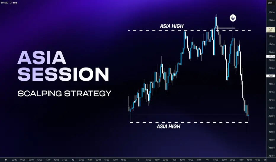
When to Trade — When to Stay OutHi everyone,
In the way I approach the market, I don’t see trading as a reflexive reaction to price movements. I see it as a structured decision-making process , built on clearly defined conditions. The market is active all the time, but constant activity alone does not create tradable opportunities. Acting without clear conditions means confusing movement with real advantage.
That’s why every decision starts with an analysis of the broader context . I only consider getting involved when the market structure is coherent, price dynamics are readable, and the environment allows for a clear assessment of risk. When the market becomes unstable, fragmented, or dominated by noise, every attempt to enter inevitably weakens decision quality. In those moments, staying out of the market is not passivity—it’s a rational act of protection .
Once the context is validated, my absolute priority becomes risk management . Before evaluating any potential reward, I need to know exactly where my scenario is invalidated. Without that information, no trade can be justified. A stop-loss is not an emotional safety net; it’s a fundamental part of decision logic. When risk is clearly defined and limited, the outcome of a trade becomes a matter of probabilities, not hope.
Even so, in a technically favorable environment, a decision remains fragile if it’s made in an unhealthy mental state . The market doesn’t punish analysis mistakes as much as it punishes execution errors driven by emotion. Any decision influenced by urgency, fear of missing out, or the desire to recover a previous loss immediately breaks the integrity of the process. In those conditions, not trading is the only decision aligned with discipline .
This is exactly why I consider the ability not to intervene a core skill. Most of the time, the market does not offer a structure with a clear edge. Being constantly in a position is neither an obligation nor a goal. Preserving capital, maintaining mental clarity, and protecting decision discipline are prerequisites for sustainable performance.
In conclusion , knowing when to trade and when to stay out is not a technical issue—it’s a mindset. When action is limited to genuinely favorable contexts and inaction is fully accepted as a strategic choice, trading stops being a chase for short-term results and becomes a controlled risk-management process . At that point, long-term performance is neither accidental nor emotional—it’s built on logic.
Wishing you profitable and disciplined trading.

HOW TO USE IMPORT & EXPORT LIST IN WATCHLISH IN TRADINGVIEWThis video explains how to use the import and export list feature in the Trading-View watchlist. It covers how watchlists can be imported, exported, and managed using the available tools within the platform. The focus is on understanding the interface and the correct usage of these features to organize and transfer watchlists efficiently.
This content is purely instructional and is intended to help users learn how to work with the import and export watchlist tools inside Trading-View, without any market analysis or trading recommendations.

How Investment Funds Really Make Money From Bitcoin📰 After years of closely following financial markets, one conclusion has become impossible for me to ignore:
most people fundamentally misunderstand how professional funds make money from Bitcoin.
Retail traders often assume funds operate the same way they do — buying low, selling high, and betting on direction.
If price goes up, they win.
If price goes down, they lose.
That assumption is overly simplistic — and largely incorrect.
🔍 For institutional funds, Bitcoin is not a directional gamble.
From what I’ve observed, large funds are not emotionally attached to whether Bitcoin rises tomorrow or drops next week.
Price direction is not their primary concern.
What truly matters is structure.
Funds are not rewarded for guessing the market correctly.
They are rewarded for controlling risk and systematically converting volatility into measurable returns.
🎯 Their real objective is volatility, not conviction.
When a fund allocates capital to Bitcoin, it is rarely driven by belief in a narrative or excitement around headlines.
They don’t follow influencers.
They don’t react to social media hype.
What they care about is quantifiable price movement.
Volatility is the raw input.
Mathematical models are the engine.
Decisions are driven by numbers, not emotions.
🧠 Buying Bitcoin does not automatically mean being bullish.
One of the most common misconceptions I encounter is the idea that institutional buying signals an expectation of higher prices.
In reality, a fund can purchase Bitcoin while remaining entirely neutral.
They can be delta-neutral, fully hedged, detached from market direction, and protected against both upside and downside moves.
This is why buying BTC is not a bet for them.
It is simply the first layer in a multi-stage trading structure.
📊 So how do funds actually profit from price movement?
By combining spot exposure with derivatives, funds build positions that benefit from movement itself rather than predicting direction.
When price rises, positions are adjusted and partial exposure is sold at higher levels to rebalance risk and lock in gains.
When price falls, exposure is rebuilt at lower prices to restore balance.
🔁 Price moves higher → exposure is reduced at better levels
🔁 Price moves lower → exposure is increased at cheaper levels
🔁 The process repeats with discipline and precision, free from emotion
This systematic process is known as gamma scalping — the quiet, continuous profit mechanism behind institutional trading.
💰 Where do their real profits come from?
Not from news headlines.
Not from influencers.
Not from ETF narratives.
Profits are generated through continuous hedge adjustments, realized volatility exceeding expectations, direction-neutral structures, and strict mathematical discipline.
⛔ The only environment that truly challenges these strategies is when the market stops moving altogether.
🧭 Let me be direct with you, speaking as a market professional.
You are not BlackRock.
You do not have their infrastructure.
You do not have their capital, execution speed, or risk frameworks.
Attempting to interpret or replicate their actions without understanding the underlying structure will not improve your trading — it will only increase confusion.
✍️ My conclusion is straightforward:
Funds do not profit from predicting the future.
They profit from engineering outcomes.
They do not trade stories.
They do not trade emotions.
They do not trade social media noise.
🎯 They trade structure.
And you?
Stop obsessing over what institutions are doing.
Start focusing on what you should be doing.
That is the line between surviving in the market
and being quietly pushed out of it.

How Funds Actually Make Money From BitcoinIf you spend more than five minutes on Crypto TikTok (YouTube or X are not much different), you’d think the entire market depends on:
- who “bought the dip,”
- who “sold the top,”
- and which whale “decided” to pump or dump.
The screamers with flashy thumbnails and zero understanding yell:
- “BlackRock is buying—BULLISH!”
- “Whales are selling—CRASH INCOMING!”
- “Institutions are entering the market!!!”
- No nuance.
- No structure.
- No clue.
Because here’s the truth:
What BlackRock buys or sells is almost irrelevant to you.
Funds do not make money the way TikTok believes.
They don’t need Bitcoin to go up.
They don’t need Bitcoin to go down.
They need one thing:
Movement. Volatility. Math.
Let’s destroy the hype and show how funds actually make money.
1. Why “BlackRock is buying BTC” tells you absolutely nothing
Retail sees a headline:
“ETF inflows: +5,000 BTC today!”
And jumps to conclusions:
“They know something!”
“Price HAS to go up!”
“Institutions are bullish!”
No.
A fund can buy BTC and still be:
- 100% hedged
- delta-neutral
- directionally flat
- risk-neutral
- fully protected against price movement
The purchase is not a bet.
It’s a component of a structured position.
Buying BTC is just Step 1.
What matters is Step 2, 3, 4, 5…—all the parts TikTok doesn’t even know exist.
2. Why TikTok “analysts” have no idea what they’re talking about
If someone:
- screams in every video,
- says “bullish” or “bearish” 40 times a minute,
- thinks “institutions pump price,”
- doesn’t know what delta, gamma, basis, hedging, ATM straddles are…
…then they are not explaining institutional flow.
They are farming views and likes, not teaching markets.
Let’s be blunt:
If you can’t explain a delta-neutral hedge, your opinion about what BlackRock “plans to do” or "is doing" is worthless.
So let’s walk through how a real fund uses BTC to print money without caring if price goes up or down.
3. How a real fund makes money from volatility (step-by-step, using $100,000 BTC)
Assume:
- BTC price = $100,000
- A fund wants exposure to volatility, not direction
- They buy a BTC ATM straddle (call + put at 100k)
- Delta ≈ 0
- Gamma > 0 → the part that generates money
- They also own BTC spot for hedging.
- Let’s say the fund holds 1 BTC worth $100,000 as inventory for hedge adjustments.
At the start:
Delta-neutral. No directional risk.
Now let’s see how they profit.
Step 2 – BTC goes up 10% → $110,000
Straddle delta becomes +0.5 BTC.
The fund is unintentionally long 0.5 BTC.
To go back to neutral:
The fund sells 0.5 BTC at $110,000.
Cash received:
0.5 × 110,000 = $55,000
Theoretical cost basis (100k):
0.5 × 100,000 = $50,000
👉 Profit from hedge = $55,000 – $50,000 = $5,000
Plus, the straddle increased in value due to volatility.
Step 3 – BTC drops 10% → $90,000
Now straddle delta flips negative: –0.5 BTC
To get back to neutral:
The fund buys 0.5 BTC at $90,000.
Cash paid:
0.5 × 90,000 = $45,000
If they later sell that BTC at the baseline of 100k:
👉 Profit = $50,000 – $45,000 = $5,000
Again, without needing BTC to go up or down, “as predicted.”
This is called:
Gamma scalping — the quiet, relentless engine behind institutional P&L.
Up move → sell high.
Down move → buy low.
Repeat. Print. Sleep.
4. Where does the REAL profit come from?
A fund earns from:
- hedge adjustments (buy low, sell high, but mathematically—not emotionally)
- straddle appreciation as realized volatility exceeds implied volatility
- basis differences between spot and futures
- neutrality to direction, allowing consistent compounding
They make money even if Bitcoin swings between 95k–105k for weeks.
The only time they lose?
When BTC does NOT move.
Because then the straddle premium decays.
That's it.
Nothing to do with faith, predictions, narratives, influencers, or ETF flows.
5. So why should YOU ignore what BlackRock is doing?
Because:
- You are not BlackRock.
- You do not run a delta-neutral book.
- You do not make money from gamma exposure.
- You do not scalp intraday hedges on $100M positions.
- You do not capture basis spreads across spot and derivatives.
- You do not have a trading desk rebalancing risk every hour.
But the TikTok screamers will still tell you:
“Institutional buying = bullish!”
“Institutional selling = bearish!”
“Whales know something!”
They don’t know anything.
Especially not about institutional structure.
So here’s the punchline:
Watching what funds do—without understanding why they do it—is the fastest path to confusion in the best case and destruction in the worst.
You don’t have their:
- tools,
- capital,
- execution speed,
- risk models,
- mandate,
- or mathematical framework.
So trying to mimic them is not just pointless —it’s dangerous.
Final Lesson: Ignore the noise, ignore the hype, ignore the TikTok parade.
BlackRock doesn’t care about bull markets or bear markets.
BlackRock doesn’t need Bitcoin to moon.
BlackRock doesn’t panic when Bitcoin drops.
Because BlackRock doesn’t trade the story.
They trade the structure.
And unless you operate like a fund — stop pretending their moves matter to your trading.
You’re not them.
You don’t have their machinery.
You don’t have their volatility book.
So:
Stop watching what institutions do.
Start understanding what you should do.
That’s the difference between surviving and blowing up.
P.S: BlackRock and TikTok are used just as an example:)
